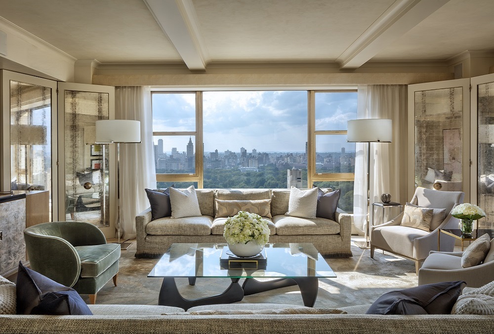
PRODUCT WATCH: Mother of Pearl decorative panels by Siminetti
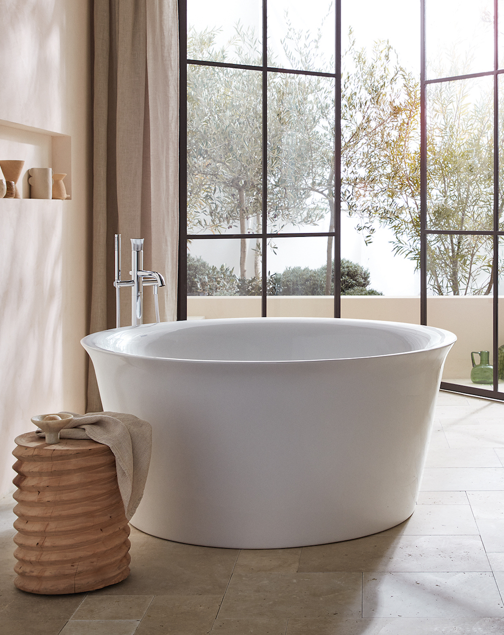
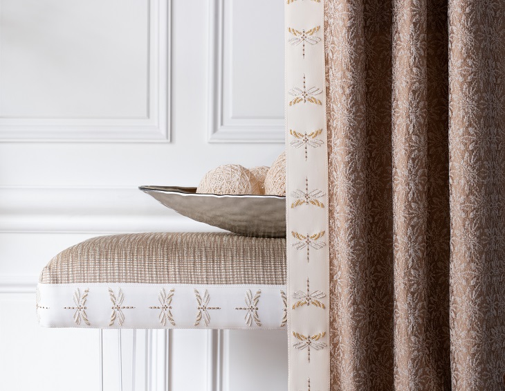
Siminetti’s Mother of Pearl decorative panels have been described as the next generation in Mother of Pearl surface finishes…
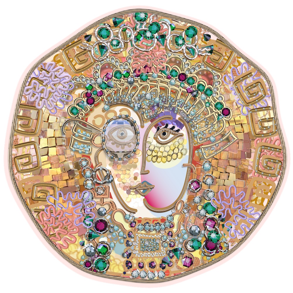
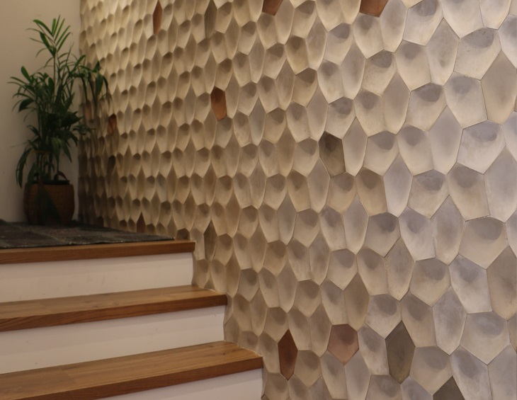
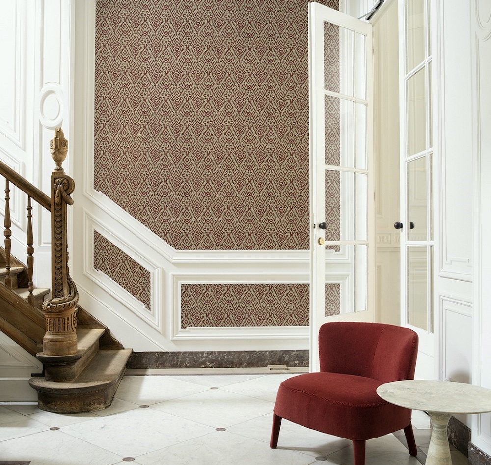
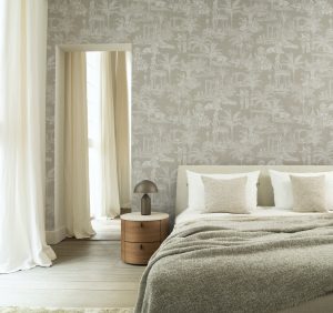
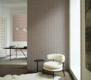
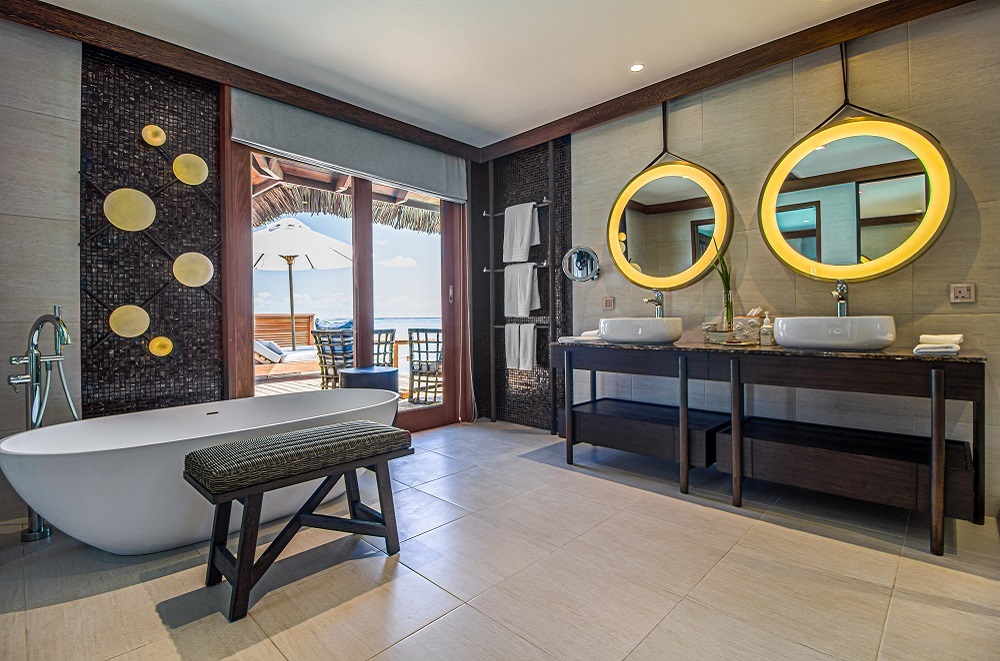
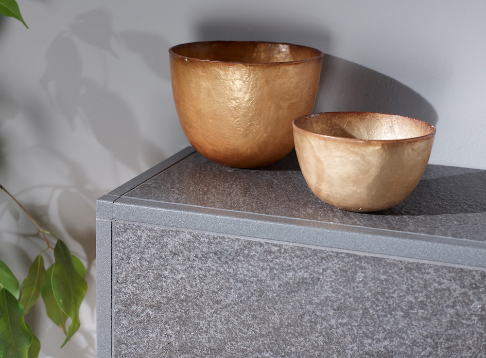
The ‘Imperial Whisper’ decorative panels, which are handcrafted by Siminetti’s team of artisans, capture the stunning natural beauty of Mother of Pearl that has, for centuries, been associated with luxury, sophistication and elegance.
Utilising a combination of Siminetti’s Saltwater Mother of Pearl, every panel carries its own bespoke appeal.
Image credit: Siminetti
Produced from fully sustainable Freshwater and Saltwater Pearl, each decorative panel is assembled to the clients exacting dimensions and can be produced in almost any shape up to maximum size of 240cm x 120cm. The individual Mother of Pearl pieces are hand placed onto a lightweight, robust, honeycomb backing which ensures they are also fully waterproof, making the decorative panels suitable for feature walls, elevators, splashbacks and furniture inlays but equally wet-room and shower environments. When covering larger surfaces where multiple decorative panels are required, the design is laid in a pattern match format, ensuring an almost seamless connection between each panel. Alternatively, colour co-ordinating panel strips can be used when looking to define each panel.
Smooth to the touch, installation is kept to a minimum as there is no grouting required and the panels can simply be wiped clean for day to day hygiene. Fully sealed to prevent ingress of oils and soaps, the decorative panels are truly one of the most luxurious surface finishes available.
Siminetti decorative panels are the luxurious alternative to tiles and are available in more than 30 stunning designs. Siminetti also offers a bespoke design service, allowing Designers, Architects and Specifiers to develop their own unique style.
Siminetti is one of the brands that has taken advantage of our Industry Support Package. To keep up to date with supplier news, click here.
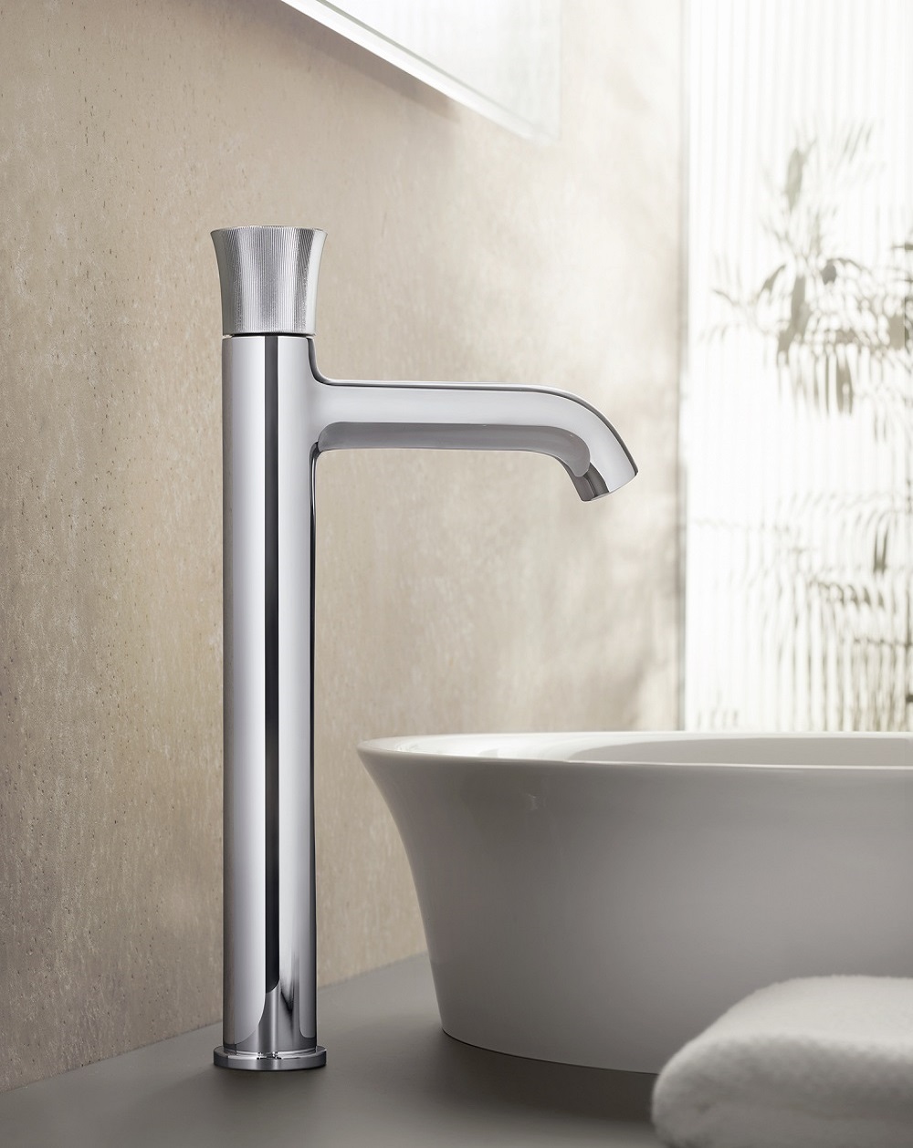
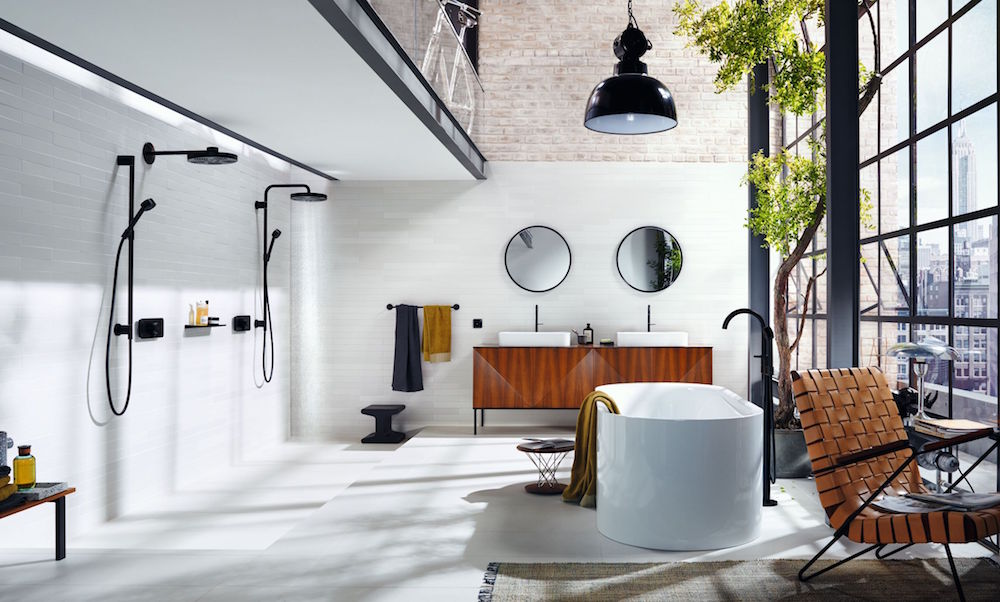
Wellness is boundless with Rainfinity by hansgrohe
The bold innovative qualities of Rainfinity by Hansgrohe have taken wellness in the bathroom up a notch to not just meet but exceed the expectations of modern travellers, argues editor Hamish Kilburn…
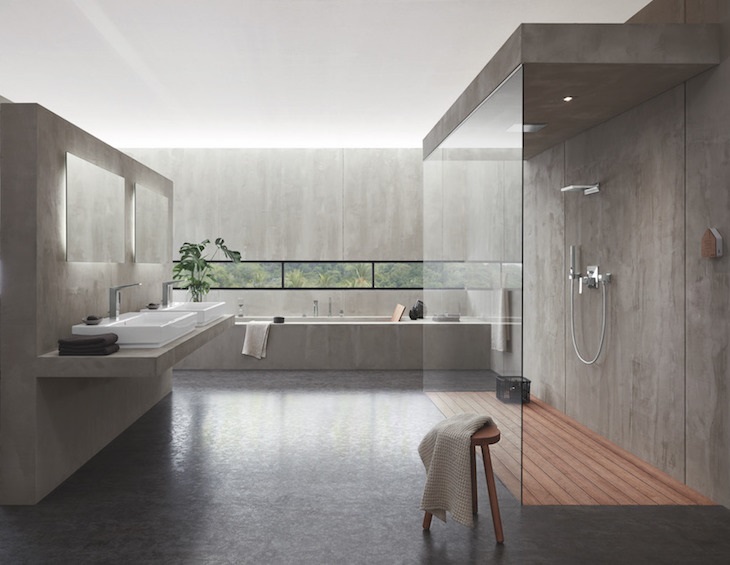
Since 1901, leading luxury bathroom manufacturer hansgrohe, has continuously pushed the boundaries of bathroom design and manufacturing to create products that combine intelligent functionality, outstanding design and enduring quality.
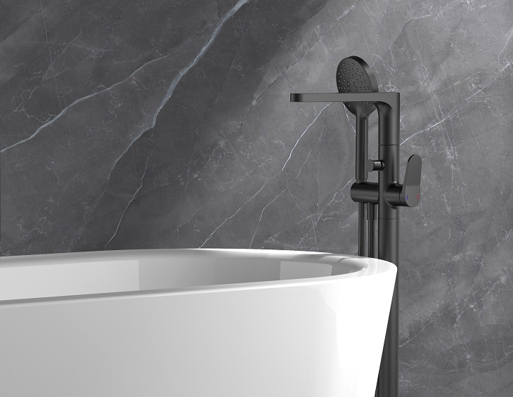
With its aim of helping people enjoy the beauty and simplicity of water, its latest range Rainfinity represents a new benchmark in modern shower design, marrying superior engineering with innovative technology and contemporary finishes. Offering the ultimate in showering indulgence, Rainfinity is truly unique.
Image credit: hansgrohe
The bathroom is increasingly the place to unwind and relax. With functional, clinical aesthetics being replace by spaces that enhance wellbeing, bathroom design is having to adapt to meet the demand. Due to its large circular showerhead and adaptable wall connection, Rainfinity offers the flexibility to envelop the entire body in soft cocooning water. The innovative wall connection allows the shower head to be tilted between ten and 30 degrees, eliminating the need for a conventional shower arm, making for a more comfortable showering experience and enabling the user to keep the head and face dry if required. The shower experience is further enhanced by Rainfinity’s slightly concave surface and its diffused arrangement of jet disc holes. This combination ensures spray isn’t limited to the head and shoulders but softly showers the entire body with aerated droplets.
Image credit: hansgrohe
Rainfinity’s shower head has three spray modes, designed to transform the daily shower routine into an extraordinary wellness experience at the simple click of a button. Inspired by the warm, misty droplets of the rainforest, PowderRain provides maximum relaxation. Thanks to six fine openings in every jet outlet, water is transformed into a fine spray that wrap the body in an ultra-quiet blanket of water for a velvety-soft sensation. Located in the centre of the jet disc, the Intense PowderRain mode uses a more concentrated jet of ultra-fine droplets to make light work of rinsing out shampoo. The invigorating RainStream mode delivers consistently high spray intensity through targeted jets, perfect for massaging the shoulders and back after a long day.
“The Rainfinity collection also comprises a comprehensive range of hand showers, available in either the traditional or geometric rod shape.”
The unique shower head design is available in the strikingly minimalist matt white and classic chrome finishes, with contrasting graphite spray discs. The Rainfinity collection also comprises a comprehensive range of hand showers, available in either the traditional or geometric rod shape. The range also boasts streamlined shoulder showers which enhance relaxation by sending powerful rain jets directly at the shoulers. Keeping the head and face completely dry, these shoulder showers come with integrasted shelving and concealed controls for a truly cohesive bathroom aesthetic. All parts come with the standard five-year manufacturer’s guarantee as an assurance of quality.
International, industry-wide recognition for Rainfinity confirms its quality and function are unparalleled. Its success in being awarded the ‘Best of Best’ Red Dot Award in 2019, iF Design Award 2019 and ‘Best of Best’ Iconic Award 2020, heralds Rainfinity as the shower range for discerning wellness and design enthusiasts.
FEATURE: Hotel staff demand smart hospitality post-pandemic
As hospitality businesses across the UK prepare for a safe reopening from tomorrow, an exclusive survey shows exactly the wages, conditions and training hospitality workers want. Planday’s industry expert Jonne Tanskanen explains…
Did you know 81 per cent of people frequently or always consider hotel reviews before booking?
Do you want to get an edge over your competitors? Do you want prospective customers to see that staying or dining at your hotel will be just the experience they are after post-lockdown?
Now — more than ever — the investment you make into creating memorable experiences will define your success going forward. It’s clear that as your hotel plans its reopening, competition to offer consumers the best-possible experience will only intensify and that means hotel owners and HR departments must step up to keep the people delivering those experiences for longer.
So what can you do to make your reopening a success and look after your people?
Smart businesses start by investing in keeping good staff. By embracing flexibility, transparency and open communication with your staff, you can keep quality staff for longer, creating better experiences for your customers and helping grow your business.
We spoke with more than 1,800 hospitality professionals from around the UK — at varying levels of seniority with a range of experience — to get a deeper understanding of exactly what they want from work and how smart businesses like yours should invest in getting the best results out of them.
And now it’s ready in an exclusive report you can download today.
We dive into the details of the annual salaries of hospitality professionals. We share insights into how many overtime hours workers in businesses like yours actually do each month.
And we have the list of what hospitality workers want to stay in the industry longer.
Hear exactly what your employees expect in benefits. Read about the drivers that keep them in their roles. See the training and development UK hospitality staff want to take their careers — and your business — to the next level.
Planday is one of the brands that has taken advantage of our Industry Support Package. To keep up to date with supplier news, click here. And, if you are interested in also benefitting from this three-month editorial package, please email Katy Phillips by clicking here.
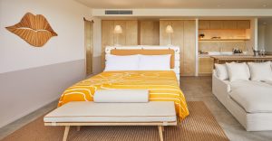
Each of the hotel’s 40 guestrooms are all uniquely designed and inspired by Cyprus’scraft heritage with balconies overlooking the picturesque city of Larnaca. Just a five-minute drive from the airport, the hotel is centrally located in one of Larnaca’s most historic areas, near the church of St. Lazarus and close to Finikoudes and Mackenzie beaches.
Image credit: Hotel Indigo
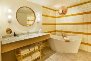
Within walking distance to the beach, the hotel combined two traditional Cypriot beach homes into a new hotel, marrying design elements from both old and new. The guestrooms have a modern yet contemporary feel by merging raw concrete with locally – made, brightly – coloured traditional textiles and light wooden furnishings. The en-suite bathrooms have spa-like rain showers, with brushed concrete flooring and original Cypriot tiling. All the balconies are fitted with traditional Mediterranean yellow shutters, reminiscent of old Cyprus, and mimicking the sunset amongst the surrounding mountains.
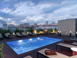
Hotel Indigo Larnaca also offers a stunning rooftop pool and Kampana Pool Bar with breathtaking views of the sea. The regionally inspired onsite restaurant, Avli, and the Oinotelia wine bar, are conveniently situated on the ground floor and are a destination for locals, tourists, and guests.
Image credit: Hotel Indigo
Mr. Savvas Kakos, President and CEO of Quality Group, said: “At Quality Group we are extremely happy and proud to welcome one of the most renowned hotel groups to the city of Larnaca. Unique and intriguing by definition, and one of the world’s largest boutique brands, Hotel Indigo is now part of the wider area of Saint Lazarus and a perfect addition to the heart of the city. On behalf of Quality Group, I convey my strong faith and certainty that this brand-new and organic collaboration with IHG and Hotel Indigo will leave its mark on the hotel industry in Cyprus.”
Inspired by the neighbourhood around each property, just as no places are alike, no two Hotel Indigo properties are the same. Each Hotel Indigo property features thoughtful design touches and vibrant restaurants and bars connected to the spirit of the local neighbourhood. Hotel Indigo Larnaca takes in the rich history of the Agios Lazaros area and is ideal for romantic getaways and caters to the most seasoned traveller.
Hotel Indigo Larnaca will operate under the international agreement between IHG (InterContinental Hotels Group), one of the largest hotel groups in the world, Sunnyseeker Hospitality which is the fastest growing hotel management company and Quality Group, one of the largest companies of land development and investment on the island.
There are currently 119 Hotel Indigo properties open globally including the recently opened Hotel Indigo Verona – Grand Hotel Des Arts, with another 104 in the pipeline to open in the next three to five years.
PRODUCT WATCH: Aqualisa zones into the smart bathroom
The use of technology as part of the hotel bathroom experience has taken a giant leap forward with Aqualisa, the showering innovation brand…
Personalisation is the mantra and while bespoke services surely must lie at the heart of the modern hotel offering, the bathroom has lagged behind in terms of an enhanced personal experience, which is surprising when showering and bathing have always been such significant differentiators when it comes to guest evaluation of hotel quality.
Of course, coronavirus too has accelerated the need for technology solutions that will give guests greater peace of mind in terms of personal safety and control, especially when it comes to zero touch facilities.
With the introduction of the first truly smart shower, Aqualisa has developed a genuinely contactless shower and bath fill solution that will completely change the hotel bathroom experience. Full wifi connectivity that allows activation from anywhere and a smart app menu to control flow, temperature and duration at last aligns the hotel bathroom experience to what consumers are increasingly demanding in their daily lives. “Turn on my shower” will be heard more and more in a hotel environment that will have to focus on private rather than communal areas to provide the premium customer experience.
Aqualisa’s leadership in digital showering, based on groundbreaking touch technology, dates back to 2001 and now takes showering forward into the smart revolution based on mobile and the IoT. Two smart ranges, the Quartz and Q Collections, both offer a full menu of shower settings which can be individually selected and managed from a smart device. A variety of modern and compact product design options, all connected and voice activated via Google Home and Amazon Alexa, will look good in all types of room style.
Image credit: Aqualisa
As well as the sheer convenience and indulgence, there are some clear commercial advantages of smart showering in terms of both installation and running costs. The intelligent Aqualisa SmartValve, which is the brains of the system, is sited away from the showering area for easy access but also freeing up more space in the showering area itself. It makes retrospective upgrades easy and straightforward as well as improving the design aesthetic. Perhaps even more compelling in the post Covid economy is the ability of hotel management to centrally monitor water usage and costs, if necessary, adjusting the water flow through hotel bathrooms
If millennials expect smart technology, future generations won’t know anything different and the hotel bathroom, always the litmus test for comfort and well-being, is where the opportunity lies to create an experience zone which plays to the increasingly personal needs of paying guests.
If you would like to talk more about smart showers contact Colin Sinclair on 07801 579958. For further information on Aqualisa’s smart shower collections visit the website or email projects@aqualisa.co.uk.
Bvlgari Hotels & Resorts to open debut property in Rome
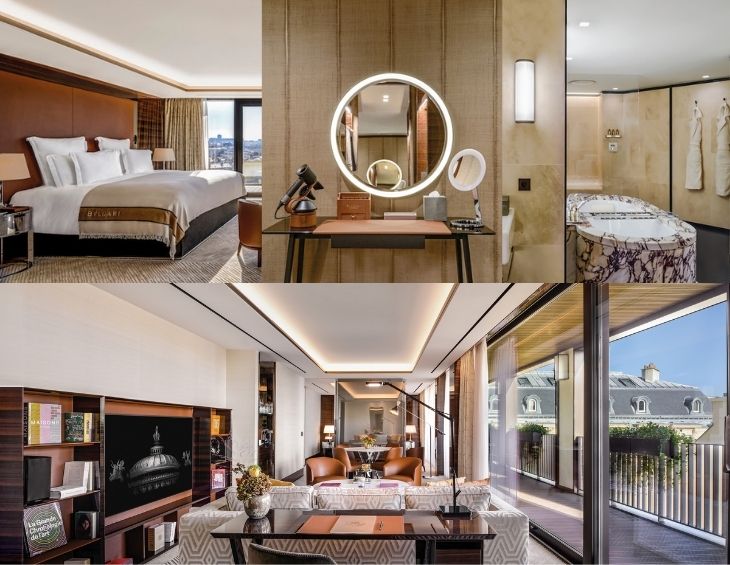
Bvlgari Hotel Roma, which is slated to open in 2022, will occupy a magnificent building in the heart of the Campo Marzio neighbourhood, a stone’s throw from the iconic Spanish Steps and the signature Bvlgari flagship on Via Condotti…
The decision to debut in capital of Italy has been described as a “full circle moment” for the Bvlgari Hotels & Resorts, but also a significant one, opening a hotel an iconic destination that is rooted in the luxury brand’s heritage.
The Bvlgari Hotel Roma, which is slated to open as early as 2022, will be strategically located in the central Piazza Augusto Imperatore. This is in the very heart of the Campo Marzio neighbourhood, a stone’s throw from Via del Corso and Via del Babuino, the iconic Spanish Steps and the signature Bvlgari flagship on Via Condotti.
Image credit: Bvlgari Hotels & Resorts
It will be sheltered in a magnificent building, which was built between 1936 and 1938 to a design by architect Vittorio Ballio Morpurgo, is owned by Edizione Properties who was assisted by CBRE Hotels for the tenant selection activity.
The rationalist building faces two of the most iconic Roman landmarks, the Ara Pacis and the Mausoleum of Augustus, the first Roman Imperator. It is currently under renovation and will reveal a monumental, modern architecture emphasised by the use of traditional Roman materials and colours, such as ochre Travertine marble and burnt red brick. The rigorous rationalist architectural appeal of the building is counterbalanced by Antonio Barrera’s frescos, running in the via della Frezza atrium and offering different views of the Mausoleum of Augustus, while the Southern face is decorated with a 70-square-metre mosaic by Ferruccio Ferrazzi, who offered his personal interpretation of the Roman foundation myth.
“Italian architectural firm Antonio Citterio Patricia Viel will be in charge of both the architectural project and the interior design of the new Bvlgari Hotel Roma.”
As for the other Bvlgari Hotels in the world, Italian architectural firm Antonio Citterio Patricia Viel will be in charge of both the architectural project and the interior design of the new Bvlgari Hotel Roma, which will count more than 100 rooms, most of them suites. In addition, the firm will design the prestigious “Il Ristorante” curated by Michelin-starred chef Niko Romito and “The Bvlgari Bar,” both located on the top floor to guarantee an unparalleled view of the Eternal City. The luxury hotel will also include a range of additional facilities, including a high-end spa with an indoor swimming pool, and a state-of-the-art gym, offering Bvlgari’s exclusive Workshop training method.
As unique feature, the Bvlgari Hotel Roma will also present a Reading Room containing a collection of precious volumes dedicated to the history of jewellery.
Standing out on the building’s façade, on top of a splendid fountain, a Latin inscription says: “This is the place where the Emperor Augustus’ soul flies through the air.”
This unique link between the new Bvlgari Hotel Roma and Emperor Augustus’ vision will be highlighted with an interior design balancing the rigor of the stones used in Imperial Rome, concise yet powerful details, as well as rich textures contrasting with the architectural essentiality of the building.
Seamlessly blending different references to the unique Roman heritage with the contemporary and timeless Bvlgari style, the new Bvlgari Hotel Roma will celebrate the extraordinary magnificence of its hometown, and will welcome its guests in an outstanding and unique environment.
“This hotel, to be opened in 2022, represents a remarkable achievement for Bvlgari that will finally have its own ‘temple’ right in the city where the Company was founded and that still represents nowadays the beating heart of the brand.” – Bvlgari CEO Jean-Christophe Babin.
“We are particularly proud to have secured such an extraordinary location for the new Bvlgari Hotel in Rome,” explained Bvlgari CEO Jean-Christophe Babin. “This hotel, to be opened in 2022, represents a remarkable achievement for Bvlgari that will finally have its own ‘temple’ right in the city where the Company was founded and that still represents nowadays the beating heart of the brand. It will be by far Roma most luxurious hospitality experience ever”.
“Together with all parties, public and private, involved in this important project, we are proud to have planned and executed this large, world class real estate investment in Rome, a key place for Edizione Property”, added Mauro Montagner CEO of Edizione Property SpA.
Rome being Bvlgari’s hometown, this opening will be a remarkable addition to the Bvlgari Hotels & Resorts Collection, which already counts six properties in Milan, London, Bali, Beijing, Dubai, Shanghai and which will be further extended, between 2021 and 2023, with inaugurations in Paris, Moscow and Tokyo.
Having followed a month of tempestuous headlines, editor Hamish Kilburn has come to the stark realisation that more education is needed in order to project equality in the global architecture and design arena…
I sat alone peering over London’s Leicester Square from a unique vantage point at a swanky rooftop bar. Glancing down, I was able to capture the colourful scene that was taking place below. Inspired, and feeling immensely proud, I began writing my latest Editor’s Letter, which gave a nod to diversity in design. It was Pride London 2019, and the square was packed – social distancing hadn’t yet been conceived – and I remember thinking how beautifully raw, eclectic and accepting the capital felt as the confetti cannons sounded while equality echoed from all surfaces.
Fast forward one year and here I am today, this time feeling somewhat melancholy while writing my monthly column for what feels like a parallel publication to one I was editing 12 months ago. I’m knocking on the doors, but hospitality is closed (for now) and no one appears to be home. ‘Covid-19’, a phrase we didn’t know existed in 2019, has infected my inbox, and every story in it. There’s hope, though. July 4 is re-opening day for many, but as I begin to feel optimistic (and I really am optimistic about hospitality post-pandemic), the next article I read in my morning catch-up of the headlines prevents me from showing any sign of euphoria.
A 46-year-old black male, named George Floyd, has died in the hands of two white policemen. It began with a report of a fake $20 (£16.20) bill, and ended with the death of Floyd after one of the policemen knelt on his neck, while blatantly ignoring the man’s pleas for help, for an agonising eight minutes and 46 seconds.
The footage of the incident spilled into the boundless realms of social media with the hashtag BlackLivesMatter. And like the virus itself that put a halt on our industry and forced us to adapt to meet new consumer demand, the protests for equality went global.
While on the one hand I felt concerned that social distancing and heart-felt protests are a fractious pairing, I also felt compelled to read and learn after seeing a friend’s status, which read: “I understand I will never understand. However, I stand.” It was at that point when I decided to delve into the history of our industry, and when I first read about John R. Williams and everything he was able to achieve while working in and for a society that today we would be ashamed of.
“He designed more than 2,000 homes (all of which differed in styles) and his clients included many celebrities, including Frank Sinatra, Lucille Ball and Desi Arnaz among others.”
Williams was an architectural pioneer who was largely responsible for Hollywood’s eclectic, colonial and California ranch-style architecture landscape. He designed more than 2,000 homes (all of which differed in styles). His clients included many celebrities, including Frank Sinatra, Lucille Ball and Desi Arnaz among others. In addition, the trailblazer designed other buildings, such as the Mutal Life Insurance Building and the LA County Courthouse. He also worked on the design of the iconic googie-styled Theme Building at Los Angeles International Airport, and in the 1940s, he was part of the team who redesigned of The Beverly Hills Hotel.
Having grown up as the only black child in his elementary school, Williams recognised that his clients of that era would feel uncomfortable sitting directly next to a black man, so he learned to draft and sketch upside down. And to avoid his clients having to shake his hand, he would often walk and talk with his hands either behind his back or in his pockets.
The real irony, in my opinion, was that so often Williams was not allowed to visit the public places he so painstakingly designed. Williams operated, where possible, under the radar in order to survive as a black architect in the western world.
“In 1957, he was the first Black architect elected a Fellow of the American Institute of Architects (AIA).”
In his career that spanned five decades, according to the Paul R Williams Project, William’s not only imagined thousands of buildings, but he also served on a number of municipal, state and federal commissions. He was carefully active in political and social organisations, which earned the admiration and respect of his peers. Williams frequently donated his time and skills to projects he believed furthered the health and welfare of young people, African Americans in Southern California and the greater society. In 1957, he was the first black architect elected a Fellow of the American Institute of Architects (AIA).
Williams retired from practice in 1973 and died in 1980 at the age of 85.
In 2017, his name joined legends such as Sir Norman Foster, Frank Gehry and Renxo Piano. Williams was posthumously awarded AIA’s 2017 Gold Medal, which is the highest annual honour that recognises individuals whose work has had a lasting influence on the theory and practice of architecture. In consequence to his many achievements, he is known today (and is documented in the history books) as Hollywood’s Architect.
Hotel Designs is not a political platform. It is, however, an educational podium where trending topics are discussed, debated and amplified. Racism and inequality in general is recurrently guised, and it is so rarely in plain sight. I hope that by looking back and identifying injustices, like how Williams felt forced to work under the radar (and arguably work harder than any other architect of his era), we can together ensure that history doesn’t repeat itself and instead celebrate and promote people for their talent and their talent alone, regardless of race, sexual orientation, disability and social standings.
I understand I will never understand. However, I stand.
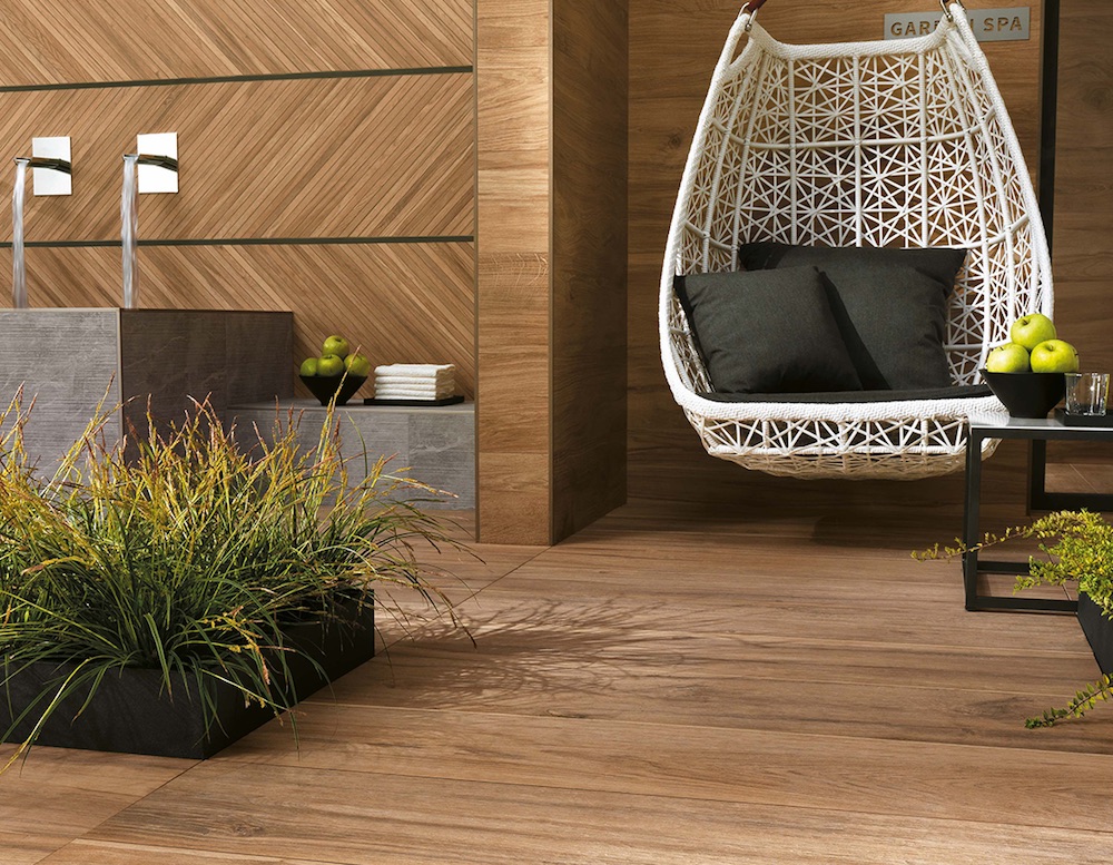
In line with the latest trends in contemporary living with an urban chic style, Atlas Concorde presents Boost Pro, a collection of porcelain floors tiles and white body wall tiles designed to decorate indoor and outdoor spaces with a metropolitan appeal.
Boost Pro complements the range of the Boost collection, based on the “cool” tones of the concrete effect, adding five warm colours. Produced using the same surface structure, they offer a unique colour palette in terms of breadth and variety, allowing architects, interior designers, and planners to create new, personalised combinations.
Image credit: Atlas Concorde
Ideal for the renovation of former industrial buildings transformed into residential lofts, workspaces, art galleries or places for hospitality and entertainment, Boost Pro underscores the structure’s industrial character with its strong personality and soft colours developed from earthy and powdery tones, from ivory to brown, giving rooms a lived-in charm.
For the floor, the slight “spatula” effect evokes the authenticity of craftsmanship, increasingly popular in contemporary design projects where the imperfection of a “handmade” look is an expression of value and attention to detail. For walls, the accents of Mustard and Powder Blue allow for strong creative discontinuities accentuated by the availability of material and graphic decorations with a strong visual impact.
Image credit: Atlas Concorde
In fact, the walls can also be transformed into spectacular three-dimensional frescoes thanks to the use of large porcelain slabs covered with tropical forests, Nordic forests and metropolitan views. Of the numerous formats available, the new 37.5×75 cm takes the classic 30×60 cm to a larger size. The availability of the 20 mm thickness also allows for outdoor use, for coordinated total-look projects.
Colours
On the floor: Ivory, Cream, Clay (light tones), Taupe and Tobacco (dark tones).
On walls: Ivory, Cream, Clay (light tones), Mustard and Powder Blue.
Formats
The exceptionally wide range includes different large formats, from 120×278 cm to 160×320 cm (in the colors of the collection and in the decorative version). The different thicknesses – 6, 9 and 20 mm – allow for their application in different design settings, both indoors and out. The white-body wall tiles are available in the classic 40×80 cm format in two different versions, natural and 3D Urban relief.
Decorations
The extensive range of Boost Pro decorations makes it possible to respond to different design requirements, even in combination with numerous other Atlas Concorde collections.
GROVE 120×278, thickness 6 mm
A forest of beech trees designed in graphite in Clay and Taupe tones.
PAINT 120×278, thickness 6 mm
Spatula-effect surfaces, marked by time, with strong material contrasts.
LEAVES 120×278, thickness 6 mm
The watercolor technique recreates the intensity of a tropical forest for spectacular walls with a green effect.
HEX MOSAIC
Colored Murano glass and classic hexagonal tiles add style and depth to Boost Pro walls.
SHAPES MOSAIC
Tiles with different shapes and irregular shades create a surprising, original overall effect.
30×30 MOSAIC
The minimalist simplicity of the classic mosaic and the warm tones are ideal for covering floors and walls of bathtubs and showers.
MINIBRICK 5×30.5
The rigour of the small rectangular tile for universal interior walls embellished with reflective inserts can be used in any room with all the colors of the collection.
Air-Reviver has introduced a range of air purification and disinfection systems that benefits from state of the art virus, bacteria and parasite eradicating technology…
One of the only available products of its type in the UK, Air-Reviver products clean and disinfect the air, creating a much healthier environment for enclosed spaces while also providing peace of mind due to its ability to neutralise harmful particles.
The Air-Reviver Technology
The Air-Reviver technology is a unique system based on patented BIpolar Ionization technology. It generates positive and negative ions, just like those found in nature. When it’s released in the air and mixes with existing H20 this causes a chemical reaction that neutralises harmful parasites, bacteria and viruses – the team are currently are awaiting tests on how this relates to the Covid-19, however, it is highly likely it can remove this virus as well.
Image credit: Air-Reviver
Tested by World-Renowned Institutions
The Air-Reviver technology has been tested in renowned laboratories around the world. Its efficiency has been scientifically proven and some of the impressive test results include:
Removes 99 per cent of Highly Pathogenic Influenza H5N1
Removes 98 per cent of Influenza Virus H1N1
Inactivates Staphylococcus Aureus by 99 per cent
Inactivates E.Coli by 91 per cent
Six layers of filtration
All the Air-Reviver units include a six layer air filtration system that allow the units to clean and disinfect the air, solving a wide range of air pollution issues.
Antibacterial Pre Filter – removes all pollutants bigger than one micron
Medical grade HEPA Filter Infused with Carbon – traps 99 per cent of particles greater than PM2.5
Charcoal Infused Filter that contains antibacterial agents
UV Light – UV radiation is widely in hospitals as an effective and safe disinfection system
Silver Ion filter – Kills bacteria and viruses by destroying their inner DNA
Air-Reviver Module – releases positive and negative Ions making all bacterias and viruses dormant
Image credit: Air-Reviver
Convenient smart control boxes and Wifi functions
Add-on smart functions which perform 24-hour monitoring of outdoor and indoor air quality, self-adjusting fan speed functions and customisable dashboards can be used on a large screen monitor, for instance in an office or hotel, giving staff and visitors a peace of mind.
The Air-Reviver Module
The Air-Reviver ranges include a standalone module, easily integrated with any air conditioning or ventilation unit, which can also be purchased with a Duct Fitting case, allowing the technology to be integrated in any duct ventilation system.
The Air-Reviver Stratus Unit
The Stratus Units is wall mounted or freestanding and comes in four models with different power and room size capabilities, ranging from 20sqm to 120sqm per unit.
The Air-Reviver Cumulus Unit
A modular system that can be combined together to suit any size room. A single unit can be placed on a desktop and room sizes range from 15sqm (One unit) to 90sqm (Six units)
The Air-Reviver Cube Unit
Freestanding, wall or ceiling hung, the cube comes in three models that are extremely quiet and elegant.
The Air-Reviver Peura Unit
The compact unit can be desktop wall or ceiling mounted and just requires a standard mains point. Each unit refreshes up to 60sqm of air, 2.5 times every hour.
The hotel, which is situated in the heart of Madrid, on the revered Paseo de la Castellana, will become Rosewood Hotels & Resorts’ first property in Spain and the fourth operation in Europe, where the group is sensitively expanding into other prime locations.
The beloved property will debut as Rosewood Villa Magna following a refurbishment, during which the property will remain open, that will incorporate a contemporary design, displaying an inspired interpretation of Spain’s capital city.
Image credit: Hotel Villa Magns
The hotel is centrally located, immediately neighbouring the prestigious Serrano shopping district, and other well-known nearby landmarks such as the Golden Triangle of Art, home to the Prado, Thyssen-Bornemisza and Reina Sofía Museums. Villa Magna is currently closed as a precautionary measure due to COVID-19 and will reopen on September 1, 2020 operating independently until Rosewood assumes management once the refurbishment works have come to an end towards late 2021.
“As one of the world’s most alluring cultural capitals, Madrid is an ideal destination in which to raise the Rosewood flag, and we are thrilled to have the opportunity to join together with our valued partners at RLH to breathe new life into one of the city’s most prolific properties, Villa Magna,” said Sonia Cheng, chief executive officer of Rosewood Hotel Group. “A mecca for arts, culture and cuisine that perfectly balances the old with the new, Madrid offers the perfect canvas for our guiding A Sense of Place philosophy. We look forward to bringing our differentiated approach to ultra-luxury hospitality to Spain with this special hotel.”
With a refreshed contemporary sense of style and service that speaks to today’s travellers, Rosewood Villa Magna will feature 150 thoughtfully appointed guestrooms and suites, distinct dining experiences and an inspired Sense, A Rosewood Spa.
“The iconic Villa Magna plays an important part in Madrid’s history, and as such we are proud to embark on this new journey with our exceptional team at the Villa Magna and together with Rosewood Hotel Group towards enhancing this unique asset that enjoys an irreplaceable location and taking it to the next level of luxury. We are excited to add our third Rosewood property to the RLH portfolio, alongside sister resorts Rosewood Mayakoba in Riviera Maya, Mexico and the upcoming Rosewood Mandarina in Riviera Nayarit, Mexico,” said Borja Escalada, CEO of RLH Properties.
Rosewood Villa Magna will add to Rosewood’s network of distinctive European properties, which currently includes Rosewood Castiglion del Bosco in Tuscany, Rosewood London and Hôtel de Crillon, A Rosewood Hotel in Paris. Additional properties set to open within the next three years include Rosewood Vienna (2022), Rosewood Munich (2023), Rosewood Venice (2023) and Rosewood Hotel, Grosvenor Square, London (TBD).
Inspired by the intricate beauty of Japanese design, Woven Image’s ION is the latest edition to a series of tactile wall panel that Hotel Designs has got its hands on…
Woven Image continues to innovate with the introduction of ION a beautiful embossed wall panel which is part of the Exquiste Evolution June 2020 product release.
Acoustic panels for the workplace environment, which modern travellers are now demanding in tomorrow’s lifestyle hotel, aren’t normally renowned for their originality, but Woven Image’s version interweave cutting-edge design with sustainability, reinventing interior acoustic panelling for the modern workplace.
Image credit: Woven Image
Evolving from the well-known hero product EchoPanel, ION is the second design in a growing collection of tactile wall panels designed for commercial interiors which follows on from the recent launch of Zen a vertical, rib-style textured wall panel. An innovation in non-woven wall panelling, Zen & Ion are specially designed to provide floor to ceiling acoustic solutions for commercial office interiors. Inspired by Modern Japonisme, the tactile wall panels reference the clean-lined, minimal, aesthetic long associated with Japan.
Image credit: Woven Image
ION has a sophisticated textured design evoking an asymmetrical crystalline effect which is inspired by the geometric shapes of origami and folded paper. A theme which encompasses the simplicity of a Japanese design as referenced with Zen’s corrugated design from a Zen garden.
Image credit: Woven Image
ION is comprised of 100 per cent PET which is 60 per cent recycled with a recycled non-woven backing and a coloured surface Mura (non-woven wallcovering) which is embellished with a compressed face. Dimensions of 2800mm high by 1130mm wide, allows the back of the panel to remain flat for ease of install for floor to ceiling applications. ION has been trimmed with a straight edge on all four sides to allow for an almost seamless finish and pattern match for continuous wall and double-height application. This allows ION to have the ability to be installed top to bottom as well as side by side.
ION is available in seven colourways from a deep onyx hue to mid-tone duck egg blue, peach blush, vineyard green as well as the classic neutrals of pebble, frost and cream.
Performing to commercial Industry standards for interior wall linings, ION achieves excellent environmental credentials, including Global GreenTag (GreenRate Level A), with the use of post-industrial waste streams and low VOC emissions.
Woven Image is one of the brands that has taken advantage of our Industry Support Package. To keep up to date with supplier news, click here.
OPINION: “Now is the time for your interiors to ‘WOW’
For anyone or any business about to reopen to the world, here’s Interefurb’s Gary Crosbie ‘hints and tips’ checklist on how to make your interiors sparkle post-pandemic…
There have been some interesting and engaging articles on Linkedin and teleconferencing discussions about ‘out with the old, and in with the new’.
Two that spring to mind are the musings of Graeme Hinde of LFX Network and the likes of Sarah De Freitas (interior design) and Chris Chadwick (space transformation). The common message appears to be, quite rightly, that as we start to release ourselves from this economic cloud, that has been coronavirus, not only will we be relieved – but for a real chance to succeed, there will need to be changes to practices. These could be branding, interiors, sustainability, infectious protocol and cleanliness etc. Well, here I just wanted to share some low-cost, quick fixes that operators in leisure, especially hotels, lodges, theme parks, hospitality, pubs and leisure operators might want to consider as we leave the ‘dark side’.
In previous articles and posts, we have spoken about safely closing and re-opening your hotel, bar or restaurant with the pandemic upon us. Now we are getting closer to re-engaging with our customers, owners need to be focused on presenting the very best version of their businesses and interiors. Some refer to it as ‘putting your best foot forward’.
Over the last few months, I have worked with several operators, who fall in to two definitive camps. 1) Those who are nervous about the future and have been so shocked by the disruption, that they are almost paralysed to make a decision; and 2) those who are relishing the opportunity to reopen and take advantage of the widely predicted boom in autumn staycations. Naturally, I’d like to share some case studies to the former, and work with both and the latter especially on the forward journey.
In business generally, we have either a product or service to sell. The hotel and hospitality sector has the added twist of selling both. In delivering great hospitality service, we need a great venue in which to attract guests over our threshold. First impressions really do count. Following the Covid closures ‘every penny is a prisoner’, we don’t all have a bottomless pit of money to spend on refurbishments, so where can we easily make a difference, without it costing a fortune?
One of the biggest barriers to carrying out any interiors refurbishment work is perceived to be loss of revenue whilst rooms are out of service. Maybe there are parallels or lessons that can be learned from this study: following 9/11, several canny operators took advantage of the quiet period and competitive prices in the supply chain, to bring their properties bang up to date and steal a lead on the competition when the market returned.
What, in my opinion is money wisely spent, and importantly how much will it cost? So some quick fixes to the interiors that might just resonate with you, starting outside with first impressions. Spruce up the area around the entrance. New door handles and entrance mat, decoration of the door and frame from around £200.
Signage – cleaned-up and make sure the lighting works. Again can be as little as £200, up to £500 dependent on specification. Little things, arguably money well spent without breaking the bank.
The interiors in the lobby – every guest spends time at your reception counter. It should therefore, be seen to be clean and smell nice. Create the ambience as they step in for the first time, or newcomers get that first experience. Fix any loose trims, refinish the worktop, don’t forget any shelving or storage units that are on view also. Make sure that all the lights have the same shade of bulbs. Take a look at the furniture, do you have tatty cushions or seating that can be spruced up with the additions of new ones. The same rules apply to restaurant and bar areas, especially with musty smells arising from long periods of not being used.
Image credit: Pixabay
Doors and frames – these normally get damaged with constant use and look tired very quickly it’s a very easy solution to make them look and feel more presentable with a repaint and change over of any damaged door handles. I’m a stickler for ensuring that all door handles match, unless a varied characteristic of disparate rooms is part of the sell and branding ambience. From only £50 per door.
Quite often corridors and public areas have a dado rail. The area below the dado can often be scuffed from baggage and trolley knocks. Why not think, that rather than paint the whole corridor a lick of paint to sparkle below the dado makes a great improvement. A little bit of that “WOW” which we encourage.
Image credit: Pixabay
Going in to the bedroom, your housekeeping is make or break, I’ve stayed in brand new properties which are badly cleaned and on the reverse I’ve stayed in older rooms where the house keeping is meticulous. Personally, I’d always choose content over style. So lets look at a typical bedroom and see what we can do to make some quick changes?
Image credit: Interefurb
Case goods – dressers and bedside tabletops take some hammer. Back painted glass tops are an easy fix and cost around £100. Whilst we are looking at case goods for around £5 each you can change the handles, and a couple of hours with some furniture stain will spruce up any minor scratches. So for around £200 you have another few years life span.
If you don’t want to go to the expense of a complete room redecoration, we have on many occasions, painted out or put a patterned paper on the headboard wall, this works out at less than £150. If you have wall lights maybe just change the shades, don’t forget matching bulb! And make sure the seam on the shade is hidden at the back.
There are many ways to add personality and style into an interior scheme, and what will work for one property will not work for others. If you would like to discuss your project with Interefurb’s team, please get in touch.
Interefurb is one of the brands that has taken advantage of our Industry Support Package. To keep up to date with supplier news, click here.
IN PICTURES: Sneak peek of Four Seasons Hotel Madrid
Opening this September, after being on the drawing boards for nearly a decade, Four Seasons Hotel Madrid has been designed in collaboration between designers from BAMO, BG Architecture, Martin Brudnizki Design Studio, AvroKO and Luis Bustamante…
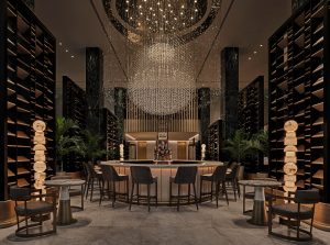
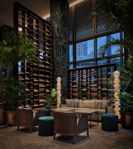
With a soaring grand lobby welcoming guests at its heart, the hotel is located within Madrid’s Centro Canalejas, also home to 22 Four Seasons Private Residences and the Galería Canalejas luxury shopping centre. Architects Estudio Lamela led the restoration, preserving more than 3,700 artefacts throughout. Inside, interiors are by an international team of designers including BAMO, BG Architecture, Martin Brudnizki Design Studio, AvroKO and Luis Bustamante.
Image credit: Four Seasons Hotel Madrid
“It’s truly been a labour of passion and love as these beautiful buildings transform into a fantastic setting for a new chapter in their histories,” says Christoph Schmidinger, Four Seasons Regional Vice President and the Hotel’s General Manager. “Our owner partners OHL Desarrollos and Mohari Hospitality, and our all-star team of artisans, culinarians and hoteliers, share our vision for offering a very personalised Four Seasons experience in a truly extraordinary setting.”
In a city that is ever changing but always welcoming, visitors will discover something new with every return visit. Four Seasons is just steps from Kilómetro Cero, the central point from which all distances in Spain are measured. In this truly pedestrian-friendly city, most of the main points of interest are within a 20-minute walk, including the 125 hectare (300 acre) Retiro Park with its incredible Glass Palace and endless pathways amid trees, fountains and ponds. Three of the world’s best museums – the Prado, the Thyssen-Bornemisza and the Museo Nacional Centro de Arte Reina Sofía – form a Golden Triangle in the neighbourhood around Four Seasons.
Image credit: Four Seasons Hotel Madrid
Spanish celebrity Chef Dani Garcia will unveil Dani, a new dining concept from the three Michelin-starred chef, with an unmatched rooftop setting envisioned by acclaimed London and New York-based designer Martin Brudnizki. Expect a bright and vivid brasserie with a sophisticated touch, where guests will savour Andalusian cuisine and panoramic views throughout the day and evening, both in the spacious indoors and out in the sunshine on the terrace.
Image credit: Four Seasons Hotel Madrid
Isa, a gastrobar located on the first floor, will continue to move forward the tapas trend that began in Spain, adding modern Asian flavours paired with cutting-edge cocktails in a space created by global design studio AvroKO. Adjacent to the Hotel’s lobby, El Patio also invites relaxed drinks and dining.
Image credit: Four Seasons Hotel Madrid
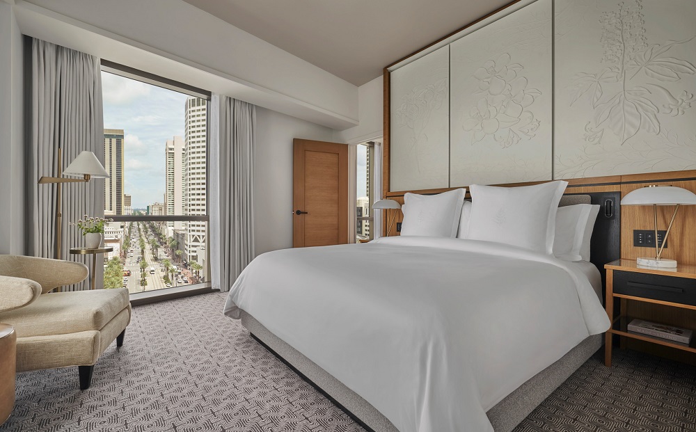
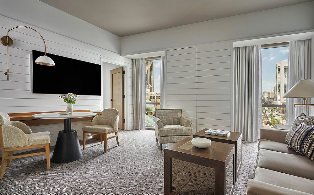
The hotel will shelter 200 guestrooms and suites – among them an exceptional triangular Royal Suite with double-height ceilings and numerous historic details.
Image credit: Four Seasons Hotel Madrid
Elsewhere, the luxury property will also boast the largest spa in the city, offering eight treatment rooms plus a salon and 24/7 fitness centre. It will also offer more than 1,400 square metres (15,400 square feet) of flexible function spaces – including the glamorous oval-shaped Sol Ballroom – can accommodate both business meetings and social events.
For the first time, customers in the UK will be able to order furniture directly from the USM website…
A carefully curated selection of beautiful pieces from USM, such as credenzas and bedside tables, can now be ordered in the UK and delivered directly in just three weeks.
USM Haller celebrates its 55th birthday in 2020 a testament to the timeless qualities of this exceptional modular furniture system. The success of USM is due to its simple yet ingenious design. From a few basic components a beautiful and iconic piece of furniture is built, USM Haller has been designed to grow with its environment ever changing needs, no matter what room it has been designed for.
It is the Swiss precision in which the components are made that give the furniture the strength, versatility and clean lines that have made USM Haller a design classic. Launched on to the market in 1965 the USM Haller system has become a watchword for timeless design all over the world. In 1988 it was decided in Germany for the first time ever that the USM Haller furniture system is a work of applied art and should be protected by copyright. Its acceptance into the Design Collection of the Museum of Modern Art (MoMA) in New York (USA) at the end of 2001 was a high distinction and confirmed the artistic character of the product. The design classic is used in offices, hospitality and public buildings and increasingly in the style conscious home.
Image credit: USM
The USM online shop offering consists of 24 built pieces of furniture, ranging from a small bedside table to a two unit wide and three unit tall credenza. All products are available in the signature 14 colours which range from monochromes to pops of colours including golden yellow and a gentian blue. The collection also features three pieces of Haller E furniture, Haller E is the newest innovation for USM integrating light and energy directly into the structure of its furniture – completely wirelessly. Dimmable lighting elements can be discreetly retracted into the moving rods to serve a wide variety of purposes: they can light shelves and display cases from the inside or effectively cover a wall in light to set the scene – choosing from a daylight glow or a warm white ambience. Light is not the only integral aspect of USM Haller E – mobile devices can also be charged directly from the structure. Just like the light sources, USB chargers can be attached wherever needed – plugged into pre-defined recesses, they are fully integrated into the rods and barely visible.
Once purchased the furniture can be reconfigured if desired with additional panels and tubes purchased through the USM London showroom.
USM Modular Furniture is one of the brands that has taken advantage of our Industry Support Package. To keep up to date with supplier news, click here.
The Bristol was born in 2015 when a commercial office building with historical character was marked for demolition. The Charlestowne Hotels group acquired it, hiring ESa (Earl Swensson Associates) to redesign and restore it, developing the eight-story brick building into a 65-key hotel.
Bristol is a town on the border of Virginia and Tennessee, and is commonly recognised as the birth place of country music: In 1927, Ralph Peer of Victor Records went out there to record some folks by the names of The Carter Family and Jimmie Rodgers. The rest is history. That’s why the address of the The Bristol is 510 Birthplace of Country Music Way. With such an eclectic location and history, The Bristol was going to have to incorporate those influences into its design.
Image credit: The Bristol Hotel/HVLG
The designers from ESa gathered together various pictures and mood boards that evoked the look and feel they were hoping to achieve and shared them with their HVLG source. The brand’s dedicated contract and hospitality representative in the area had a long-standing relationship with the lead designers, as well as a deep familiarity with the product.
As one of the standard products selected, Hudson Valley Lighting’s Humphrey pendants and chandeliers adorn many of the rooms. HVL’s contemporary classic feel meant these fixtures look as at home in the brand new rooms as they may have in the flourishing Art Deco period when the building was first constructed. Providing the ambient layer of light, these exquisite fixtures also contributed to a higher level of decorative sophistication for the space.
Corbett fixtures also enhance visitors’ experience; with their impressive scale and hand-applied leaf finishes, which the brand often says of its Corbett pieces that they have to be seen in person to be believed.
Additionally, the HVLG Contract Custom team got to work on designing a few special pieces, such as pendants for The Bristol’s awesome rooftop hangout, chandeliers for its banquet room, and a series of sconces for its conference room area. ESa reviewed initial drafts of the designs and made some adjustments. Once they were completely happy with the plan, the lighting brand proceeded to build these one-of-a-kind fixtures on time and on budget.
Image credit: The Bristol Hotel/HVLG/Joe Vaughn Photography
Sitting eight stories up in a town without a lot of high-elevation buidings, The Bristol’s special rooftop relaxation zone, Lumac, has a beautiful view of the surrounding environs — the painted brick sides of old buildings, the nearby hills, twinkling downtown lights, and the town’s charming entry gate. Originally built in the twenties, the whole thing feels almost like something out of a Baz Luhrmann film, with a distinct slice of heartwarming Americana. HVLG designed a custom outdoor pendant for this beautiful rooftop bar area, adding to its singular charm.
The Bristol Hotel is a good example of how HVLG can be your one-stop shop for a hospitality lighting project. Combining world-class standard product from across its four distinct brands (Corbett and Hudson Valley in this case) with custom pieces, the lighting specialists were able to satisfy this project’s requirements while providing lighting that elevated the environment.
Hudson Valley Lighting Group is one of the brands that has taken advantage of our Industry Support Package. To keep up to date with supplier news, click here.
Following a recently completed interior design renovation project, The Marriott Cancun Collection (JW Marriott Cancun and Marriott Cancun) is reopening calming spaces to cater to modern travellers’ demands in the post-pandemic climate. Editor Hamish Kilburn gets a closer look inside…
Only last week, I positioned Mexico’s region of Riviera Nayarit under our editorial spotlight to focus in on the hotel development projects that will soon be completed, and how the senstive renovation of its landscape will enhance the its appeal among modern luxury travellers.
On the completely other side of Mexico, 2,427 km east of Riviera Nayarit, you will find Cancun, a destination famous for its white sand beaches, near-perfect weather, and bright blue waters. Among of the assemblage of hotels in the city are the sister resorts Marriott Cancun and JW Marriott Cancun Resort & Spa, both of which have undergone renovations recently to their public areas, guestrooms and suites and are welcoming guests back into the refreshed spaces in the wake of the Covid-19 crisis.
Together known as Marriott Cancun Collection, the resorts have been given the green light to open their doors as a part of Quintana Roo’s phased re-opening strategy. JW Marriott Cancun opened June 8 and is already hosting guests, and Marriott Cancun Resort is trailing right behind with an expected opening date of July 1.
Image credit: Marriott Hotels
Having debuted the trendy, Tulum-inspired SacBé Beach Shack last summer and its new lobby in January, Marriott Cancun Resort’s renovations, paired with JW Marriott Cancun’s extensive $40 million upgrade to all 447 ocean-facing guestrooms, set the stage for a roaring first quarter.
“There’s no greater feeling than welcoming our guests back with refreshed, inviting spaces that lay the foundation for an exceptional vacation experience,” said Vice President and General Manager Christopher Calabrese. “We continuously strive to elevate our offerings, and that started with JW Marriott Cancun’s design-forward room renovation. When taken in combination with Marriott Cancun’s new lobby, the final touch of an earlier renovation, it feels like two virtually new hotels.”
Image credit: Marriott Hotels
Dubbed ‘The Great Room,’ Marriott Cancun’s airy entryway complements the chic design of the resort’s 450 guestrooms. The colour palette includes marbleised beige and cream accented by shades of indigo and turquoise that are inspired by Mexico’s natural beauty. The lofty space features clean, crisp lines, modern furniture of varying textures and cream shades, along with the resort’s signature paneled windows that peer out to the palm-lined grounds and the ocean beyond.
Image credit: Marriott Hotels
Also in the pipeline for 2020 is Hana, a Polynesian restaurant set to replace Argentinian eatery, La Capilla. Hana, a play on the Hawaiian word for family, will feature intricate wood detailing on the ceiling and distressed brick accents, along with pops of yellow. The contemporary furniture, wall planters and Polynesian-inspired images are intended to transport guests to the most exotic corner of the world, while SacBé Beach Shack is influenced by Tulum’s bohemian atmosphere. The new beach club offers a fusion of local flavours and traditional Mexican cuisine. Here, local street food is served to guests on swinging bar stools set beneath driftwood rods and adjacent to macramé hammocks, hand-painted art and dine-in-the-sand tables.
Image credit: Marriott Hotels
Next door, JW Marriott Cancun’s stylish room interiors pay homage to the intricate textiles found in ancient Mayan garments. Meanwhile, the room’s aerial-view photographs are indicative of the region’s famous cenotes, or natural sink holes. Meticulously carved wood accents, architectural light fixtures, herringbone-patterned floors, luxe rainfall showers and free-standing soaking tubs with complimentary lavender bath salts are now standard in all guest rooms. The property also remodelled its exclusive Club 91 lounge with navy blue and olive-hued furniture in combination with coral reef ceiling décor, providing guests a glimpse into what lies beyond the hotel’s shores.
The Foreign & Commonwealth Office currently advises British nationals against all but essential international travel. This advice is being kept under constant review.
CASE STUDY: Breathing new life into a ruined monastery in Naples
Kaldewei bathroom solutions perfectly blends a stylish mix of historical and modern styles inside this restored monastery in Naples, Italy…
It took one year and two months and a handful of premium Kaldewei bathroom products to restore a ruined monastery in Naples into a stylish, modern residential abode.
From the terrace, your gaze sweeps across the mountainside vineyards, olive groves and lemon trees, across the “lower town” of Naples to Vesuvius, the harbour and the Gulf of Naples as far as the island of Capri.
In the midst of this unique landscape, on Vormero Hill, Giovanni and Janine have turned their dream home into reality. They bought the ruined 14th century monastery, completely restored it and fitted it out with a stylish mix of modern and a timeless design. For the bathroom and guest WC, the couple chose Kaldewei’s steel enamel bathroom solutions that connect the historical and modern in a very unique way.
Image caption: The exposed shell of the 14th Century monastery before its sensitive renovation
Even as a teenager, Giovanni knew that one day he wanted to live with his family, right beside his parents’ home on Vormero Hill. Vormero is the 13th district of Naples and is known as the “upper town”. The houses stand on a green hill and can only be reached by cable car and, in part, only via steep stairs. This is where Giovanni grew up, and this area is still home to three generations of his family. “La famiglia” was also the reason why, after studying and working abroad, he returned to Italy. He and his wife Janine, whom he met on a trip to Rio de Janeiro, began with renting a small house next door to his parents’ home. When the hunt for a suitable property, for his own growing family produced no results, he decided to buy a ruined monastery nearby and rebuild it as a family home.
Special challenges: preservation order and logistics
After thoroughly checking the terms of the preservation order and establishing that the monastery had indeed been used as a residential property in the past, Janine and Giovanni started turning their dream into a reality. The restoration of this ancient building presented the young couple with many challenges. The strict provisions of the preservation order, for instance, specified that the same materials used to build the monastery around 700 years ago, such as chalk and regional sandstone, also had to be used for the restoration – no cement was used at all. In addition, the hilltop location, surrounded by vineyards, called for some special logistical solutions. 150 steps had to be scaled when transporting the required building materials and products. As a result, throughout the entire construction period of 15 months one person was solely employed to constantly drive up and down the hill with a tracked vehicle.
Giovanni gave up his job and devoted himself to managing the building site for a year. To help them implement their ideas, the couple called in the architect Antonio Gravagnuolo, who specialises in listed projects, and the German interior designer Stephan Poeppelmann. Together, they created a unique house that skilfully blends the past and the present.
“The colours are restrained and are reminiscent of the vineyard landscape.” – interior designer Stephan Poeppelmann
When tradition and modern collide
“We wanted to retain the character of the ruined monastery. That’s why it was particularly important for us to use traditional materials as much as possible both for the building and the internal restoration and to work with suppliers from the local region,” Janine says. The interior planning corresponded with those wishes: restrained and respectful of the ruin’s history – but at the same time incredibly brave.
Talking about the concept, Poeppelmann says: “In keeping with the building’s past life as a monastery which was now to be restored as a home and be a part of the landscape, we didn’t remove corners and niches in existing walls, for example, but used them as spaces to integrate shelves or seating. The colours are restrained and are reminiscent of the vineyard landscape. The main colours are a delicate pastel green and warm shades of brown.” Ancient floor tiles which were salvaged, undamaged during the building work were also used in the interior design concept, as were lots of little apothecary bottles made of coloured glass, some of which have been integrated into the walls, or serve as decorative elements and vases around the house.
Kaldewei bathroom solutions: perfect match between product and room design
“Today’s bathroom is a multi-purpose space with the highest standards of design. The harmonious fusion of architecture, design, functionality and perfect light produce the optimum solution in the bathroom,” adds Poeppelmann, describing the design approach for the bathroom.
Image credit: Kaldewei Cono
In fitting out the spacious bathroom, the designer was inspired by the former monastery’s distinctive vaulting. “Naturally, we were impressed by Kaldewei’s natural and classical yet modern shapes. Since we had a round-arched ceiling in the bathroom, we wanted to pick up on that shape with the bath and the washbasin. That’s why we decided on the Centro countertop washbasin, whose interior echoes the rounded shape, and the Meisterstück Classic Duo Oval bath,” says Janine, explaining the decision behind their choice. With its seamless panelling, the bath, made of elegant Kaldewei steel enamel, is the classic archetype of the freestanding bath. The Centro countertop washbasin with its spacious surround, designed by Anke Salomon, also exudes a sense of purity and simple elegance.
Image caption: Kaldewei Meisterstueck Classic Duo Oval bath
The Kaldewei trinity in the bathroom is completed with the floor-level Scona shower in a restrained Pearl Grey matt. This shower surface fits harmoniously into the colourfully tiled floor, while the round, centrally-positioned waste cover made of steel enamel also picks up on the round-arch shape. The space-saving wall-hung Cono washbasin works well in the guest WC. The characteristic design element of this rectangular washbasin is the square waste cover which is also enamelled. “With the Kaldewei steel enamel bathroom solutions we have created a perfect match between product and room architecture,” says Stephan Pöppelmann.
Image caption: Kaldewei Scona
Whether for a new-build or refurbishment, Kaldewei shower surfaces, washbasins and baths are a hit with builders worldwide. The enamelled bathroom solutions meet high aesthetic standards and, thanks to the huge range of different designs and sizes, they fit perfectly into virtually any room. As a material, Kaldewei steel enamel is exceptionally long-lasting and low-maintenance. Poeppelmann enjoys working with Kaldewei bathroom solutions: “The products are robust. At the same time, they have smooth, seamless lines. Thanks to the wide range of colours, I can pick up on current trends, if required. In addition, high-end design with a modern look should also always take functionality and the day-to-day habits of its users into account.”
Kaldewei is one of our recommended suppliers. To keep up to date with their news, click here. And, if you are interested in becoming one of our recommended suppliers, please email Katy Phillips by clicking here.
IN PICTURES: OKKO Hotels’ new design-led guestroom concept
On July of 2019, in the heart of Paris, along the platform No. 2 at Gare de l’Est, OKKO Hotels unveiled its second generation guestroom concept, designed by Studio Catoir, which chose two models from the Ligne Roset Contract collection as testimonies of a strongly claimed design ambition…
The concept of OKKO Hotels’ second generation guestroom is adapted to the use for a single person, as well as the use for a couple. Concretely, this means separated toilets, more storage space and redesigned ergonomics. The sleeping area has also been re-thought. Many changes had been made in line with sustainable development: choice of materials, implementation of sorting and recycling, use of water fountains. The wish to use natural materials, sometimes raw materials, has been kept. The idea of integrating the codes of interior design into hotel language also remains, by the choice of iconic pieces that are no longer used to being discovered in a nice apartment or a hotel. The choice of the Andrey lamp, design by the Studio Catoir and edited by Ligne Roset, with it design all in finesse and elegance is a great example.
Image credit: Ligne Roset/OKKO Hotels
Like most of the international luxury brands, the history of Ligne Roset is rooted in the French craft heritage. In 160 years, the brand has become the symbol of an elegance if life, the imprint of a luxury signed by the greatest contemporary design talents around the world. Ligne Roset, the leading creator-manufacturer-distributor of contemporary French furniture showcases nowdays a whole art of living through its full collection of seats, cabinet, decorative items, lightings, rugs, fabrics and know how to decline, adapt and blend in the bespoke décor imagined by architects and interior designers. It is the expertise of Ligne Roset Contract which is expressed today in the drawings of the Studio Catoir for Okko Hotels. For Okko Hotels, collaborating with a French brands which has an expertise that brilliantly combines craftsmanship and technicality is a strong guarantee of quality.
You will find in the bedrooms the Audrey light, the Rocher chair and Nubo desk.
The hats of the actress Audrey Hepburn inspired Studio Catoir for this lamp which combines great sophistication and resolutely design. A true piece of design, which brings a touch of refinement to the sleeping area of the hotel bedroom.
Image credit: Ligne Roset/OKKO Hotels
Iconic piece by the Berlin duo Hertel & Klarhoefer, manufactured by Ligne Roset, the chair Rocher adopts a fractal design, characterised by a faceted construction. The surface of the shell (seat / back and armrests) seems cut like a diamond. On four white lacquered legs, it brings a feeling of lightness as well as comfort and elegantly complements the office space.
With Nubo, designed by GamFratesi, aesthetic astonishment is provided by the unexpected meeting of the ‘déjà vu’ and a surprising new element: the simple spacesaving wall shelf metamorphoses into a treasure box, evocative of a suitcase such as the Air France blue fabric travelling case of the 1960s. Its rounded cloud shape and luminous yet warm association of natural oak and sky blue wool fabric also fall into the same vintage Scandinavian register.
Ligne Roset is one of the brands that has taken advantage of our Industry Support Package. To keep up to date with supplier news, click here.
A stone’s throw from the River Thames and London’s South Bank, the Hoxton Southwark opened its doors in September last year. The design team at Ennismore specified lighting products from Heathfield & Co to create a vibrant interior design scheme…
Hoxton Southwark, which opened last year, became the eighth property in the brand’s series.
The new-build hotel contains 192 rooms, various meeting and events spaces, and its two popular restaurants; Albie, an all-day dining spot and Seabird, a rooftop seafood restaurant with spectacular views across the capital.
Alongside owners Ennismore, Heathfield & Co’s experienced team of project managers, product designers and engineers worked on this incredible project for a year, supplying bespoke lighting across the hotel’s public areas. Aimed at creating a vibrant and welcoming space, the clients brief included vintage references and classic styles, which the team designed, developed and manufactured, resulting in 22 completely bespoke pieces, from table lamps and wall lights, to multiple ceiling fittings and pendants.
Image credit: Hoxton Southwark/Ennismore
Unique materials and specialist finishes come together in the production of this beautiful collection of bespoke lighting, each manufactured and assembled in Heathfield’s UK warehouse. A custom brass finish created specifically for the project will organically develop over time, harnessing the natural antiquing process.
Heathfield Lighting is one of the brands that has taken advantage of our Industry Support Package. To keep up to date with supplier news, click here.
Signbox creates new social distancing signs and graphics for hotels
The signage company Signbox has adapted its portfolio to include stylish social distancing signage and graphics for when the hospitality industry reopens…
As many venues start to reopen their doors to their employees and guests in readiness for the ‘new normal’, Signbox, the award-winning signage designer and manufacturer, is helping them ease back into business with a collection of exciting new social distancing signs and graphics.
The Hey! Collection of social distancing signs, graphics and stickers are ideally suited to hotel environments where staff and visiting guests can be welcomed calmly and coherently whilst allaying any potential stress following the restrictions imposed due to COVID-19. The collection represents a series of vital, yet informal reminders to stay alert and keep social distancing in mind as part of the national effort to keep the R below 1 and save lives.
The Signbox exclusive Hey! collection of signs and graphics for social distancing is backed by the organisation’s specialist wayfinding and safety signage design expertise that are designed to help hospitality venues welcome their workforces, visitors and guests back, safely and without stress.
Image credit: Signbox
Social distancing signs to reassure and inform
The Hey! Collection comprises fresh, vibrant design and typography and a friendly style that makes for an intuitive, reassuring user journey. The whole range of social distancing signs and graphics cover every touchpoint to create a socially distanced flow of people who can move seamlessly across any built environment.
The Signbox social distancing graphics collection can be used as a complete signage, messaging and safety package across any hotel and hospitality environment. The key for employers and building owners is getting the right safety messaging in place as early as possible in the process to ensure everyone knows what to expect when they return to their venue.
They Signbox Hey! messaging is calming and straightforward – the range includes guidance from workstation cleaning and hygiene advice, safety information and precautions, safe movement directions and safe distance guides that can be fitted and displayed across the hotel or hospitality venue. These social distancing signs and graphics are designed to motivate those in the hotel industry to adhere to government guidance in order to keep themselves and their colleagues and guests safe and protected.
Safety messaging floor stickers, spray-on stencils and ‘welcome back’ graphics
The Hey! collection includes digitally printed, laminated and anti-slip, self-adhesive vinyl safe distancing floor stickers with UV protection. You can also use social distancing stencils by spraying them directly onto walls and floors along with social distancing graphic signs for stairways and ‘welcome back’ safety messaging for welcoming reception areas.
Signbox has covered everything in this collection, including the integration of branding and corporate identities across the entire social distancing sign scheme – this presents a familiar, reassuring boost at a time when most workplace behaviour is far from seeming normal. Personalised signs can also be designed and, if and when the government’s guidelines are updated, Signbox can modify any signage schemes with a quick refresh to ensure compliance continues to confirm to new rules. All Hey! social distancing signs can be NFC (Near Field Communication) enabled with tags and links to website URLs to give real-time information through a straightforward, safe and contactless tap on a smartphone.
Signbox is one of our recommended suppliers. To keep up to date with their news, click here. And, if you are interested in becoming one of our recommended suppliers, please email Katy Phillips by clicking here.
The six new private residences open at Monkey Island Estate in Bray amid post-pandemic luxury consumer demands expecting a surge of self-isolated escapes…
Endearingly named to reflect their individual nature, the residences blend classic style and the warmth of a period home with contemporary and luxury comfort, each with its own intriguing history and story to tell. Guests staying in the residences can enjoy the freedom, space and privacy of staying with loved ones, whilst taking advantage of the hospitality and services of the hotel, just a stone’s throw away.
Image credit: YTL Hotels’ Monkey Island Estate
The residences
Long White Cloud is an embodiment of homely elegance, where Edward Elgar is known to have stayed and composed some of his greatest works. More recent residents include Formula One racing legend, Sir Stirling Moss. The magnificent 19th Century property has four large bedroom suites accompanied by an impressive kitchen and a charming garden, ideal for alfresco dining in the summer months. Sitting on the banks of the River Thames, Long White Cloud also offers a private pool and jetty, ideal for those who may wish to arrive by boat.
Brook House embodies another spacious offering with four generously sized suites, a lavish living room and a large garden with private outdoor/indoor swimming pool perfect for hot summer afternoons.
Sundial Cottage with its secluded secret garden is quaint yet spacious, steeped in the same exciting history as Monkey Island itself. Sundial Cottage boasts three gorgeous bedrooms with a kitchen-diner and cosy living room. Those staying in Sundial Cottage will share the same four walls as the famed Sylvia Anderson, the creator of Thunderbirds.
Bray House is a bijou gem just steps away from Bray’s church, offering the ideal country bolthole for those looking to escape the city. The three-bedroom residence has undergone multiple transformations over the years from stable block to cobblers’ shop, antique centre and family home.
Dormer Cottage enchants guests with standout features including wooden beams, a welcoming open fireplace and a dramatic silk-clad wall. The 500-year-old one-bedroom residence offers guests immediate access to the heart of Bray.
Lavender House also sits in the heart of the village offering three bedrooms. With an impressive double fronted cottage façade believed to date back to the early 1700s, the impressive property was once home to several local families in three terraced cottages.
Monkey Island, with its intriguing history dating back 800 years, has been the haunt of monks, monarchs, aristocrats and writers alike. Surrounded by elegant gardens, Monkey Island is accessed only by footbridge, boat or helicopter, offering a secluded country venue, yet is conveniently located less than an hour’s drive from Central London. The addition of the Private Residences offers those who want to enjoy this historic landmark and the delightful village of Bray even more opportunity to do so, in true comfort, style and privacy.
Main image credit: YTL Hotels’ Monkey Island Estate
INDUSTRY INSIGHT: The ‘anything is possible’ approach in interior design
Timothy Oulton is a British designer who has mastered the ‘anything is possible’ approach greater than most when it comes to interior and product design. Hotel Designs gets comfortable in the Apollo to learn its secrets…
Nothing epitomises the ‘anything is possible’ ethos that Timothy Oulton Studio is famous for better than Apollo.
It is a unique environment modelled to scale on the Apollo 11 spacecraft, encapsulated in a polished stainless steel shell and featuring luxurious, fully customisable interiors created in-house and by hand by the brand’s skilled cohort of makers and craftspeople.
Image caption: Apollo by Timothy Oulton Studio
Recent research points to just 16 per cent of holiday goers now considering trips abroad, yet the urge to escape the new normal is a powerful force. For the luxury and ultra-luxury hotelier the question of how best to create an experience capable of satisfying this desire, wherever in the world, is more pertinent than ever.
As a commercial interior design studio serving the hotel and hospitality industry, this question is one the Timothy Oulton Studio team has considered from its own perspective. Since the global Covid-19 pandemic took hold, studio founders Timothy Oulton and Simon Laws have been asking themselves what the changed future looks like for a market as vital as the travel and hospitality industry, and for the individual businesses that operate within it.
“Marry the impulse to be transported to another world with a sensitivity to the needs of this one.”
The practice is responsible for delivering unforgettable design concepts that enable its clients to attract, engage and wow visitors – impacting revenue streams by offering unmatched experiences. A potential answer to the question of what next? Marry the impulse to be transported to another world with a sensitivity to the needs of this one.
Image caption: Apollo by Timothy Oulton Studio
An outdoor iteration of the Apollo is something Timothy Oulton Studio has been asked for on numerous occasions. Now, after a year of research, development and prototyping, it is ready to be bought to market and – when the ability to be outdoors in small numbers holds great influence over decisions about where we go and how – the launch seems appropriately timed.
“A design like Apollo can pivot existing businesses in so many ways.” – Simon Laws, co-founder, Timothy Oulton Studio
For hotels with surrounding land or existing glamping facilities the outdoor Apollo creates a phenomenal point of difference in the luxury market, while larger businesses can use it is an attention-grabbing centrepiece inside or out. At Gordon Ramsey’s Bread Street Kitchen the Apollo is used as a private dining space, enabling small group to drink and eat separately within the buzzy atmosphere of the wider restaurant – this is something that the studio team is expecting more of, as Laws explains. “Now more than ever people want to get away, both physically and metaphorically, and I think perhaps hoteliers are seeing an opportunity to facilitate that for people within their own countries, removing the need to jump on a plane,” he says. “A design like Apollo can pivot existing businesses in so many ways.
“Being so unique and visually impactful also helps clients understand the value of this particular design – Instagrammability is front of mind for almost everyone in the industry. If it was prevalent before the pandemic it can only be more so now our circumstances have changed and we are out and about less frequently. You only have to take a glance at the breadstreetkitchen hashtag to see what a difference this kind of design makes to the popularity of a business.”
The Apollo can be viewed and bought at Timothy Oulton, Bluebird, 350 King’s Rd, Chelsea, London SW3 5UU.
Timothy Oulton Studio is one of the brands that has taken advantage of our Industry Support Package. To keep up to date with supplier news, click here.
Main image credit: Timothy Oulton Studio/Image caption: Apollo by Timothy Oulton Studio
INDUSTRY INSIGHT: F&B Design changes post-pandemic
Now that hospitality is beginning to open its doors once more, we asked Federico Schilling from Flair Studio to explore the challenges of designing F&B areas in the post-pandemic world…
With restaurants and pubs in UK set to reopen before the end of June/beginning of July, there is still a great deal of uncertainty about the measures and trends to be followed to provide a safe, yet engaging experience.
Everybody knows the Coronavirus outbreak is going to change the way we eat in restaurants but, while some of these changes will be short-lived, others will probably endure by becoming either a necessity or just good habits; In this short article I am about to explore how these challenges can change the restaurant design as well as how this can become an opportunity to generate new creative ideas through good design.
In the very short term, for those who have an outdoor space this will be highly valuable but also for those who haven’t, special initiatives so the business can spread outdoors can become very helpful. In this direction, the temporary pedestrianisation of high streets or neighbourhoods can be seen as an occasion to enable people to socialise again while keeping safety measures into place. The Soho Summer Street Festival can be a great example. It was announced last week by Soho Estates with the aim to ban cars from entering key streets of the area and to request a relaxation from Westminster Council for the licensing of the public highways.
Now l would like to shortly explore what are the restaurant design changes which are probably here to stay by looking into space planning, technology and trends.
It is common sense that initially, the internal layout of medium to large size Restaurants will be revised by reducing the number of tables and by promoting smaller tables, which can be more easily distanced and are more flexible than large banquettes or communal tables. But it is also likely that from early 2021 the layout density will slowly revert back to the pre-lockdown arrangements level with minor changes aimed to provide a safer experience.
On the other hand, costumers will want to avoid touching things which are seen as un-necessary for a longer time: things such as menus, salt and peppers and other shared items will probably disappear and costumers will especially be reluctant to enter toilets unless these haven’t been equipped with adequate measures. If contactless solutions as well as anti-microbial materials can be easily implemented, it is desirable that human interaction with the staff will slowly come back to normal after an initial reduction. Open buffets and food sharing concepts will probably suffer the most and for a longer term, with hotels being the most affected with their large venues for breakfast and business lunches. Also, materials and finishes will change in direction to easily washable, anti-microbial surfaces, sometimes muted from the cruise ship fit-out industry, sometimes from the outdoor furniture collections.
Whether the above will become game changers or not, I believe that we as designers have a duty of care to the end user so that these measures can be implemented without compromising on the quality of the overall guest experience and the design outcome. If safety and well-being are paramount, we also shouldn’t forget that an essential part of eating out is about sharing that experience with the other dining guests, including the importance of the spaces and the atmosphere we share with them. Differentiation through design will then become even more important and this can ultimately help generate new creative ideas.
Flair Studio is one of the brands that has taken advantage of our Industry Support Package. To keep up to date with supplier news, click here.
Granorte’s Trendcollection makes the beauty, sustainability and performance of cork flooring accessible to today’s hotels. From traditional cork tiles right through to printed designs using the latest solid rigid core technology, it’s a formidable collection that brings cork right up to date…
Nowhere is this better captured than in DESIGNTrend, a floor that combines the latest technology with cork’s natural, sustainable and renewable status.
Through direct digital print and a textured WEARTOP finish, DESIGNTrend brings the look and feel of wood with the ease of LVT without cutting down trees or containing any plastic.
Updated for 2020 with new looks, DESIGNTrend uses proven Uniclic joints for fast and easy installation, just like any laminate or click LVT, but also features a high-density natural cork composite wear layer and 1mm cork base layer for a warmer and quieter home. Treated with Microban® anti-bacterial protection, DESIGNTrend provides homes with a floor that’s not only easy to live with and kinder on the planet, but more hygienic too.
Paulo Rocha, product and R&D manager, Granorte, says: “Cork is a great material to work with, with numerous applications, and is certainly a material that resonates with today’s homeowners. Cork is no longer just about the ‘old fashioned’ glue-down tiles of old, it is a material that offers genuine benefits and designs that not only break convention but perhaps more importantly, fit with convention.
“DESIGNTrend exemplifies cork’s adaptability with the wood effects made popular by LVT and laminate, but without using any plastic and bringing all the acoustic, thermal and sustainable benefits of natural cork. As a plus, there’s no compromises in fitting, performance or ease of living either.”
DESIGNTrend is now available in 16 wood effects with oak in a wide-ranging palette of oak and the exclusivity of Larch Spice. Comfortable, quiet, warm, hardwearing, hygienic, telegraph-free and plastic-free; this is a collection made for today’s environmentally conscious hotels.
Granorte is one of the brands that has taken advantage of our Industry Support Package. To keep up to date with supplier news, click here.
FEATURE: The benefits of bespoke when designing fitness areas
In the post-pandemic world, hotel spas and fitness areas will need to work harder in their meaningful design schemes to meet modern travellers’ demands for safe and clean environments. The wellness designers at Gym Marine explain the benefits of designing bespoke…
Fitness facilities within the hospitality sector are often stuck between that of a commercial environment and a luxury environment.
A public area, gyms are often a prime reason people book a hotel and are particularly important if the hotel wants 5-star credentials as they need a gym. Therefore, it can’t be an area that lets the rest of the design down because the equipment is made for a 24hr gym rather than a luxurious environment. This can be a struggle for hotels, as traditional gym equipment is designed for commercial settings, where aesthetics is second to function. However, with the demand for luxury gym equipment continuously increasing, manufacturers are making equipment that is as beautiful as it is functional.
Image credit: Gym Marine
As part of their brand identity, hotels will have specific colours which form part of the property’s design. Boutique hotels are very reliant on interior design to differentiate themselves and get guests through the door. Incorporating their brand and unique interior style into their gym design will ensure a cohesive feel throughout the hotel, enhancing both their profile and guest’s experience.
One range of gym equipment that has been designed with luxury environments in mind is GM Custom. Created by the specialist wellness designer Gym Marine, their years of experience of designing and installing gyms in high-end locations gave them the insight on how to produce unique fitness equipment. First to be launched was the Classic and Diabolo Dumbbells, since then the range has been continuously expanding and now includes a Rack, Bench and Wallbars.
Image credit: Gym Marine
Each piece is bespoke, with a choice of materials to choose from such as woods and metals which are popular within many interiors and will complement the décor of the hotel. Alternatively, if there is a specific design element that features throughout the hotel, this can be featured within the GM Custom equipment as well. For that complete customisation, the kit can be branded with a hotel name or logo, adding an element of exclusivity whilst strengthening the brand.
Alongside the GM Custom range of items is the made-to-order aide of business where they undertake custom equipment designs for hotel gyms. Essential when an off the shelf solution doesn’t work. A few years ago, whilst working on the gym at the Mandarin Oriental in Hyde Park, Gym Marine were asked to incorporate a half rack and lifting platform into a space overlooking the swimming pool where there was a glass alcove. The alcove was slightly too small for a traditional half rack, in as much as you couldn’t get around the side of the frame to take the weight plates off. In this instance, they were able to create a bespoke piece which was slightly slimmer than usual and had angled weight plate holders to ensure easy access.
The principles of gym design which they incorporate across all of their projects are perhaps best suited to hotel designs – striking the perfect balance between luxury finishes and creating a functional space which has training options for everyone. GM Custom as a range helps solve this problem, as the freedom to offer bespoke pieces allows to break free of limitation to designs caused by aesthetic or space requirements.
Gym Marine is one of the brands that has taken advantage of our Industry Support Package. To keep up to date with supplier news, click here.
IN PICTURES: Italy’s Paragon 700 Boutique Hotel & Spa opens
The sensitively designed 11-key boutique jewel has opened in the heart of Italy’s White City, Ostuni, Puglia…
With Covid-19 stalling its inaugural opening, the team at Paragon 700 Boutique Hotel & Spa are finally able to officially open the doors. The elegantly restored red palace in the heart of Puglia’s White City, Ostuni, has been meticulously restored to boast 11 individually curated rooms, meaning guest numbers are naturally limited and exclusive takeovers are possible.
Standing in stark contrast to the whitewashed buildings of Ostuni, Paragon 700’s red brick façade cocoons a lush garden and swimming pool, a rare green space in the heart of the city, offering a spacious, tranquil and exclusive oasis, just a five-minute walk from the main square.
The Paragon 700 Boutique Hotel & Spa team painstakingly restored every inch of the former Italian palace using traditional handcrafted techniques, while injecting a splash of modern flair. French parquet flooring extends throughout all 11 rooms and suites, which feature stonewashed bed linen, cathedral ceilings, period frescos and fireplaces.
Image credit: 700 Boutique Hotel & Spa
Naturally, each guestroom is different, some offering terraces, balconies or in the case of the Paragon Suite, a sunken bathtub and private terrace with sun loungers. Guests who fall in love with the chic interiors will be delighted to discover that they can buy select furniture and décor to take home as the ultimate holiday memento. Any sold pieces will be replaced by the boutique hotel’s stylish owners, who will be happy of an excuse to indulge their passion for sourcing eclectic items.
Image credit: 700 Boutique Hotel & Spa
The hotel brings a fresh taste to Ostuni, with the opening of Restaurant 700. Head chef Giovanni Cerroni, the protégé of Michelin-starred Paulo Airaudo, offers an enticing menu that celebrates outstanding local ingredients and cuisine. Open to guests and locals alike, this new venue, including the quirky Bar 700, will offer an intimate dining experience, with impeccable service and the finest local vintages from the hotel’s impressive wine cellar.
Image credit: 700 Boutique Hotel & Spa
As the only hotel in the heart of the White City to offer a swimming pool and garden, Paragon 700 Boutique Hotel & Spa will also be an unrivalled haven for guests looking to unwind and recharge. The palace’s former water chamber has been transformed into a unique spa offering a Turkish bath, Himalayan salt wall, multi-sensory shower and a natural whirlpool dug into the ground.
Image credit: 700 Boutique Hotel & Spa
The team at the hotel have put in place a full range of cleanliness and safety measures in light of Covid-19, including daily temperature checks for staff and for guests on arrival, to ensure the safety and wellbeing of all those who wish to enjoy this exciting new boutique hotel.
Main image credit: Paragon 700 Boutique Hotel & Spa
PRODUCT WATCH: NOROCK – say goodbye to unstable tables!
The NOROCK team has been mastering table stabilising technology for more than 25 years. Lindhurst Group’s Robert Walton explains…
This isn’t an article about how to re-design a Restaurant or public space to cope with the latest guidelines regarding Covid 19, nor is it about how to attract customers back to your venue, this is about solving one of the biggest complaints from customers – “wobbly tables”.
Hoteliers, Restauranters, Café owners will be doing all they can to attract customers back with re-designs, amended work practices, reassurance on cleanliness and hygiene, appealing menus offering delicious food and so much more. Following all this hard work it is crucial that customers leave with a positive experience to make recommendations and to return.
Image credit: Wagamama London
Prior to Covid 19, almost 90 per cent of visitors to Restaurants and Cafes advised that their experience of eating out was affected by a wobbly table. So easy to solve with a folded piece of cardboard or napkin but is this good practice? Not only is it unsightly, it is unhygienic and requires frequent replacement. Many outlets have opted to use adjustable feet to try to overcome this problem but these need to be adjusted constantly when the table is moved to a new position and cannot be considered hygienic with employees having to get down on their hands and knees to rectify .
There is another way – NOROCK. The NOROCK team has been mastering stabilising technology for more than 25 years.
Through its partnerships with industry-leaders including McLaren, Toyota and Nissan, the company has pioneered global stability solutions with its patented design technology. This passion for design and technology has been brought to the hospitality sector through NOROCK table bases.
NOROCK was established in 2009 with its Head Office located in Australia. NOROCK comes from a line of stabilising innovations created by Chris Heyring. These stabilising innovations include the successful Kinetic Suspension Systems and Nauti-Craft Marine Suspension. Kinetic Suspension systems are used by some of the worlds leading automotive companies such as Toyota, Nissan and McLaren and Nauti-Craft is well advanced in designing water crafts under license for use in the Recreational and Offshore workboat markets in Europe and the Middle East. The basic functionality of a NOROCK table is closely related to the hydraulic systems used by Kinetic or Naut-Craft but NOROCK has been completely simplified and adapted to work as a purely mechanical system.
NOROCK bases use a simple mechanical system with four pivoting legs that are interconnected in such a way that they must reach an average weight loading on all four feet. When a table is placed on an uneven surface the feet will move until all four feet reach a state of equilibrium or more simply, a state of stability.
Whether Designing for an Indoor or Outdoor space NOROCK provides the solution to prevent wobbly tables. NOROCK table bases are designed for both indoor and outdoor use. The aluminium and steel bases are powder-coated with quality coatings providing a high level of corrosion protection, and the plastic product is naturally corrosion resistant. Stainless steel hardware is used for all critical and external components.
With seven modern designs and several colour options available, NOROCK can be matched in to fit almost every scheme incorporating table tops to fit the décor. It’s also possible to retrofit using existing table tops.
Many well renowned customers and leading Restaurant Groups have seen the benefit of using NOROCK and removed the chance of wobbly tables:
“The design of these tables is revolutionary. Since purchasing we haven’t had to wedge a piece of card to steady the tables – this is a first in table design. Why did we have to wait so long!” Chris Galvin, Head Chef and Owner – Galvin Restaurants UK
“No Rock [table bases] – these have addressed an age old problem for our operators and customers. The wobbly table issue is a niggly one as a real key customer touch point and something that has had various attempts at fixing over the years with varying results.The NoRock bases have really helped us whilst at the same time looking the part from a design perspective, being simple, clean and sleek engineering.”Michele Matonti, Head of Construction – Nandos UK
We, at The Lindhurst Group, are always looking out for innovative products to help solve regular day to day issues that can impact on the experience your customers have within your venue. Please make contact to discuss the benefits of Norock or to try to find another solution to a furnishing problem.
The Lindhurst Group is one of the brands that has taken advantage of our Industry Support Package. To keep up to date with supplier news, click here. And, if you are interested in also benefitting from this three-month editorial package, please email Katy Phillips by clicking here.
How hotels are keeping sustainability front and centre
To celebrate sustainability in practice, Hotel Designs asks Paisley Hansen to investigate what hotels are doing today in order to preserve tomorrow…
Everyone strives to be as kind to the environment as they can and hotels are no exception. As a matter of fact, with the amount of traffic they receive, hotels going green has been a significant inspiration for other businesses to follow suit.
To keep up with changing times, hotels have implemented many environmentally-friendly practices.
Utilising the power of the sun
There’s no doubt about it–solar energy is hot. If you’ve ever received a money-saving solar quote, or switched over yourself, you know how well it works. Hotels have made the same choice and decided it’s worth their while to invest in eco-friendly energy sources. Solar power is a no-brainer and it’s smart business to implement it now.
Image credit: Pixabay
Doing less laundry
Years ago when you’d book a hotel, you would get clean sheets and towels each day. Many hotels are now frowning on this wasteful practice, unless you specifically request it. Towels can be left to dry and reused the next day. This uses less water, detergent and saves the hotel money.
Lathering up in Bulk
Remember when you were a kid and hotels had all those fun little amenities? Although people loved to collect miniature bars of soap and tiny shampoo bottles, many hotels have opted to install bulk shampoo and soap dispensers. This is popular in Europe where each shower contains a press container that releases gel to be used as shampoo and body wash. These containers mean less packaging and plastic waste.
Image credit: MOB Hotel, Paris
Economical lighting solutions
Hotels are changing the way they provide lighting to reduce their carbon footprint. Many have decided to install LED lighting throughout the property. You may also come across motion sensor lights that turn on as you walk down a hallway, much like what you see in a supermarket freezer section. You may even find these upon entering your room, which is a big help if you check in after hours.
Image credit: Pixabay
Watching waste
Many hotels offer a continental breakfast and the patrons love the money they save on a meal. In the past, a lot of trash was generated by the use of paper cups and plates, so now, many hotels use glass dishes and coffee mugs with a tub to collect dirty dishes. This reduces an incredible amount of trash. Hotels are also placing recyclable bins around the property to collect plastic, metal and glass items, so don’t throw them in your regular trash can!
Going Chameleon
In many parts of the world, you’ll find hotels that are virtual chameleons. What this means is that they blend in seamlessly with their surroundings for many specific reasons. These hotels have made a conscious decision not to mar the landscape and instead, keep the area looking pristine. This practice is also animal-friendly as it doesn’t disturb, or interfere, with the rhythm of wildlife in the area.
Recycling water
Along with doing less laundry, more hotels are opting to save water through a process called greywater recycling. This procedure allows lightly used water, such as that used in showers or sinks, to be reused again for non-drinking purposes like irrigation or toilet flushing. Other hotels worldwide also collect and reuse rainwater in much the same manner.
Cleaning with a conscience
All these improvements sound wonderful, but what happens at the hotel when you’re not there? Green practices are now taking place at hotels behind the scenes, as well. That’s where environmentally-friendly cleaning products come into play. Hotels no longer feel that they need to use harsh, caustic chemicals when cleaning rooms. Many products have been developed that are made of lemon, vinegar and plant-based sources that still kill germs and sanitise rooms.
It’s everyone’s responsibility
Environmentally-friendly practices in hotels are becoming the norm, as they well should. From solar energy, to water recycling and protecting natural habitats, looking for better options is everyone’s responsibility. Using hotels as an example, find out how you can live greener in your own home.
Very recently an acquaintance of mine Jacqueline Goddard of Atticus Arts wrote an article for her blog & LinkedIn asking, “What was our USP?”.
It struck a chord with me as, while in lockdown, I have been trying to find a way to differentiate myself from other small Hospitality design studios out there.
What makes me unique in an industry that is saturated by designers that have been through the design school/University system? What can I offer my client that makes me differ from all the rest?
Jacqueline states: “What differentiates us from another is our life’s experiences”. Undoubtedly these experiences will be unique to every individual. My instinct is that no client can decide whether they want to take on my services unless they can resonate with what I have to say. And by that, I mean, what is behind my passion for hospitality design? Why do I do what I do and how did I get here? What makes me? What makes me an informed designer that will create & inspire. Why should a hotelier approach me to design their hotel, members club, Golf club, show home to name but a few?
Firstly, my love on interiors and design stems back to when as a young child l would build Lego models of my ideal home which then shifted into creating my own interior design projects in sketchbooks, tracing textile designs from Colefax & Fowler and drawing differing scales of pattern to place into a space. This was usually my then minuscule bedroom in my family home in West London. I constantly had my head in a sketchbook drawing and sketching what I saw around me. I wish to this day I had the time to still do this.
However, alongside this love of anything design related was my passion for live performance, theatrical arts and film. I would devour the old black and white films from “To kill a Mockingbird “ to “12 Angry men” to Some like it hot”. I would sing and dance & memorise all the routines from the Hollywood film musicals such as “Oklahoma”, “Oliver “& “Cabaret”. My family would spend spectacular evenings in London to see the latest big musical show that had hit the West End. Even to this day I remember the feeling of excitement as, sitting on those plush red velvet seats, the lights dimmed, and the curtains drew back to reveal stunning sets and characters while the orchestra launched into their overture. Those days of peering over the seat in front, chin resting on hands, stays with me to this day. That feeling of need to distance my actual surroundings and the story unfolding and the sheer joy that was beheld in that proscenium arch in front of me.
Image caption: The Relapse, Royal National Theatre
Image caption: Anything goes, RNT & Theatre royal Drury Lane
With a mother & grandmother, ballerinas in large scale Ballet productions pre and post war Europe accompanying Anna Pavlova & several other family members working as empresarios, my love of theatre and spectacle was entrenched in my psyche.
Rather than follow the traditional route into Interior design by studying at University or one of the established private schools such as KLC or Inchbald. I followed my heart by studying Set & Costume design combining my 2 passions design & theatre. Whilst studying, my Saturdays were spent working my way round every department of what was then Terence Conran’s Habitat. The interiors bug re-awakened.
What my studies taught me was that at every moment theatrical design has to resonate with the audience, to create an emotional reaction, depict a story, which in turn allowed for a longstanding memory. We had to work with the script to develop the character through setting, costume, texture, colour, sound & light. Create the world in which these characters lived & breathed. I can still recall so many details of the sets from the various productions I saw through the 80’s & 90’s down to the intricate detailing in the handmade period or contemporary costumes created for individual characters. My professional career took me to the worlds of Cole Porter & Bob Fosse musicals as well as French restoration comedies through to 1950’s American comedic theatre. They all have contributed over the years to this wealth of reference and the attention to detail stands me in good stead to this day when specifying the FF&E for projects I have worked and collaborated on.
Theatre is all about working as a team, it is a collaboration. One cannot work without the other. Just like in hospitality interiors. The designer cannot create without the client, the brand, the contractors and ultimately without the final experience that the hotelier/group want to impact on the guest. I learnt how to deal with personalities from directors to lead actors recently moved over from LA to tread the boards after decades of Hollywood film work. One cannot underrate the nerves that even the highest paid performers experience when stepping out onto that stage again. We had to reassure, understand & above all, listen. A skill often forgotten.
So, in hotel design how can we create these memories & experiences that will last a lifetime inspiring the guest to come back for more and how do we translate them into the hotel interior? We, the designer, have to tap into that unseen, sometimes un-describable reaction that we get from a given environment, location or atmosphere. Once we have succeeded, we are creating long lasting memories for hundreds of end users who we hope to entice back for another unforgettable stay.
Image caption: The Clubhouse Shanghai
Not only was my background in design and theatre a pre-cursor to my now passion for hospitality environments. But after graduating a stint in the Sales & marketing of luxury interior products instilled me with a desire to keep learning about innovative products & manufacturing. I learnt about the procurement process, what can be achieved by working alongside suppliers, manufacturers & crafts people to create a given look within a budget. It taught me how to design beautifully bespoke details that run through my work today. A move into Interior design in the early 00’s brought a number of years designing high end residential interiors, but it was always the hotels that drew my attention.
Image caption: The lobby inside St Regis Dubai
With this product knowledge came a sound sense of style and design history. I can be given any brief placed throughout time and place and produce an interior that demonstrates both a correct historical reference point but also empathy. Just imagine walking into a Lobby area where the whole effect takes your breath away! This is not just interior design but pure theatre!
One cannot realistically expect to understand what the client wants in a brand/Interior unless you understand human emotion, desires, ambitions, history, religion and culture. I often write about how important the locality and community are for a boutique hotel brand. Maximising on what is local to the property both geographically and naturally as well as culturally. My many travels and experience of living and working both in the Middle East (Dubai) and Asia (Hong Kong) have introduced me to many distinct and different design styles and cultures. How can I design an authentic space if I have no point of reference? How will my design be believed or resonate with the guest if I have not travelled to or experienced the culture? While designing luxury hotels across Asia I was called on to draw on my expertise in classical European interiors & architecture for a palatial project in Dubai. Whether right or wrong it was my heritage and European education that benefited this collaboration.
Image caption: Conclusion? This is me!
So, when considering what is “my” USP within this exceptional industry and what makes me distinctive, I quote another acquaintance Clare Farthing, business strategy coach, who I have had the pleasure of working with over the last few years: “You are your business”. My USP is my life’s journey and everything that is encompassed within that. No other individual will build on the same training, life experiences and responses. So, when I look back at what I have accomplished it is definitely with a sense of uniqueness that I am what I am and bring to the table a “rich theatre of life”.
Harris Jackson Design is one of the brands that has taken advantage of our Industry Support Package. To keep up to date with supplier news, click here. And, if you are interested in also benefitting from this three-month editorial package, please email Katy Phillips by clicking here.
Hotel Designs LIVE: Technology’s role in tomorrow’s hotel with Jason Bradbury
On June 23, Hotel Designs hosted its first ever virtual conference. To kickstart Hotel Designs LIVE, sponsored by Technological Innovations Group, editor Hamish Kilburn welcomed tech influencer and the former presenter of The Gadget Show Jason Bradbury to discuss technology’s role in tomorrow’s hotel…
Following a warm welcome from editor Hamish Kilburn to officially launch Hotel Designs LIVE – and quick-fire Q&A round with the event’s headline partner, Technological Innovations Group – Jason Bradbury made a dramatic entrance, on a hover board (we wouldn’t expect anything less). The former presenter of The Gadget Show, who has built an international career as a futurology and tech-trends corporate speaker, took the microphone to start the conference’s debut session entitled: Technology’s role in tomorrow’s hotel.
“The last 10 weeks have defined the next 10 years of innovation.” – Jason Bradbury
Sponsored by Hamilton Litestat, the session started by Bradbury suggesting that the current coronavirus crisis – and indeed all cultural changes in the past – opened up an opportunity for new technology to be utilised in the hotel experience. Using the case study of Bainland Park, which is a luxury escape just a few miles from his home in Lincoln, Bradbury explained how the resort is redesigning its concept to dissolve the conventional public areas altogether. “Bainland Park is completely self-sufficient, ideal for the post-corona consumer, and the architecture and design really does set the scene,” he said. “Before lockdown, the owners were intending to renovate the public areas. However, as a result of the pandemic, and the change of consumer demands, they are now eliminating the the communal areas completely. What’s most interesting is that this change has been driven in the last 10 weeks alone.”
“Technology that offer peace of mind and wellbeing are going to be central to the buying experience from consumers.” – Jason Bradbury
Another case study that Bradbury referred to when predicting technology’s role in the future hotel experience was Eccleston Square, a tech-savvy boutique gem that sits in the heart of London. With the aim being to understand where technology is heading in hotel design, in 2019, Hotel Designs asked Bradbury to review the hotel 30 years in the future. “The technology in Eccleston Square is almost invisible, if you exclude the media lounge,” he explained, “which results in a seamless experience for the guests. However, post-pandemic, I wonder if in the future we are going to see more overt instances of technology [when it comes to cleaning], because that will make us feel safer as consumers.
During the seminar, Hotel Designs LIVE featured a PRODUCT WATCH segment, which allowed the audience to hear from key-industry suppliers within within the technology sphere to ultimately find out about the latest innovations and products that have appeared on the hotel design scene recently.
In part two (see below), Bradbury continued to explore, through technology lenses, what he believes will likely be the hotel of the future. In addition, he answered some tough questions on which piece of technology he believes should never have been invited, what tech item he simply cannot live without and how long he could go living without technology…
Born in the chaotic realms of the coronavirus crisis, Hotel Designs LIVE, sponsored by Technology Innovations Group, is Hotel Designs’ way to simply, meaningfully and virtually keep the industry connected while keeping the conversation flowing. Bradbury’s future-gazing session, where he predicted technology’s evolution in the hotel experience, kickstarted a full day of insightful talks and panel discussions on topics such as Public Areas, Sleep and Wellness, which will all be published shortly.
The 62-key property has stood as one of the most prestigious hotels in Verona for years, and was reopened following an exciting redesign under the Hotel Indigo brand…
IHG’s Hotel Indigo brand currently has 119 properties open globally, and a further 104 in the pipeline. It’s latest unveiling, following a tense lockdown period for the entire industry, is located in the heart of Verona, Italy, a destination that continues to attract travellers from around the world with its links to Shakesphere’s Romeo and Juliet.
With 62 uniquely designed rooms, Hotel Indigo Verona – Grand Hotel Des Arts draws inspiration from the city’s passion of preserving history. With headboards throughout the bedrooms mimicking the beautifully preserved fresco paintings in the city, and the back panelling in the lobby that plays to the garden of Romeo and Juliet, guests will be able to find nods to the surrounding neighbourhood in the hotel’s design. Red marble native to Verona (Marmo rosso di Verona) throughout the public areas creates an elevated feel of a grand Italian residence – inspired by the most famous love story ever told. Hotel Indigo Verona – Grand Hotel Des Arts is a beautiful tribute to the city it calls home.
Right when you enter, the reception area combines two elements that characterise the city: The Arena and the Shakespeare theatre. The architecture draws inspiration from the theatrical facades, its draperies, the arches of the Arena, and Juliet’s terrace. The Arena in Verona is a Roman amphitheatre built in the 1st century and is one of the best conserved amphitheatres in Italy. Made up of 44 levels holding up to 22,000 spectators, it is still used today and is internationally famous for hosting some of the world’s most spectacular large-scale opera performances.
Image credit: IHG/Hotel Indigo
“We are very proud to announce the renovation and reopening of Hotel Indigo Verona – Grand Hotel Des Arts, thanks to our affiliation with IHG and the Hotel Indigo brand of boutique hotels in the chain, commented Luca Boccato, CEO of HNH Hospitality Group. “This new opening joins art, culture and comfort at a top level and is the perfect destination for both Italian and international tourists, thanks to the attractions in Verona. In a difficult moment for our sector, we look toward the future with faith, confident that a good project in such an important location will be a success.”
Image credit: IHG/Hotel Indigo
Perhaps the quirkiest Shakespearean touch is the meeting rooms named after the duelling families in Romeo and Juliet, Montechhi, and Capuleti. The event spaces are easily adjustable for different uses – conferences and small functions. The hotel also has an onsite bar,Arya Bar & Mixology, with a selection of locally inspired cocktails and nibbles, perfect for guests to have an aperitif and relax after a day exploring the neighbourhood.
Eric Viale, Managing Director, Southern Europe, IHG, added: “With its iconic architecture and historical charm, Verona is the perfect neighbourhood for Hotel Indigo’s unique design and distinctive guest experience. Hotel Indigo Verona – Grand Hotel Des Arts is the fourth location for the brand in Italy, signalling significant interest in boutique, design-led hotels in the region. Partnering once more with HNH Hospitality, we look forward to being part of the tourism recovery in Italy and welcoming guests from across the country and beyond.”
Image credit: IHG/Hotel Indigo
Inspired by the neighbourhood around each property, just as no places are alike, no two Hotel Indigo properties are the same. Each Hotel Indigo property features thoughtful design touches and vibrant restaurants and bars connected to the spirit of the local neighbourhood.
Rosewood Hotels & Resorts to manage Le Guanahani St. Barth
The iconic Caribbean resort on St. Barth will reveal a comprehensive refurbishment under the Rosewood flag, which is expected to be completed and revealed in Spring 2021…
Rosewood Hotels & Resorts will manage St. Barth’s renowned retreat, Le Guanahani, which is set to reopen in Spring 2021 following an extensive restoration of the fabled property.
Closed since 2017 due to the effects of Hurricanes Irma and Maria, the property will reopen as Rosewood Le Guanahani St. Barth with a property-wide rebuild and refurbishment that preserves the unique spirit of the resort and perfectly embodies Rosewood’s A Sense of Place philosophy, wherein the local sensibilities of the destination inspire the resort’s many offerings. Rosewood Le Guanahani St. Barth will mark the growing ultra-luxury brand’s third property in the Caribbean and first in the French West Indies.
Ideally situated over eighteen lush and secluded acres on a private peninsula overlooking two stunning beaches, Marigot Bay and Grand Cul-de-Sac, Le Guanahani originally opened in 1986 and quickly established itself as one of the most iconic resorts in the world celebrated by both families and couples for its incredible beaches and relaxed style that complements St. Barth’s chic ambience. With stunning architecture by David M. Schwarz Architects and unique interior design by Luis Pons Design Lab, the new Rosewood Le Guanahani St. Barth will evoke the rich and authentic French Caribbean heritage of the island with its signature colorful style featuring vibrant design hues of turquoise inspired by the Caribbean water, yellow reflecting the tropical sun and lavender as a nod to the South of France.
“We are honored to steward Rosewood Le Guanahani as it sets a new standard of luxury on St. Barth and around the world.” – Sonia Cheng, chief executive officer of Rosewood Hotel Group.
“A legendary resort cherished for its rich offerings, memorable service and captivating landscape, Le Guanahani is a jewel within the Caribbean and an idyllic destination for Rosewood’s affluential explorers,” said Sonia Cheng, chief executive officer of Rosewood Hotel Group. “We are honored to steward Rosewood Le Guanahani as it sets a new standard of luxury on St. Barth and around the world.”
Upon opening, Rosewood Le Guanahani St. Barth will debut with the complete renovation of all 66 guestrooms, suites and villas, many with new private pools. As the only full-service resort on St. Barth, the property will offer a range of updated amenities including a distinct beachfront dining concept and new pool, a Rosewood Explorers children’s club, fitness center, tennis court, Sense, A Rosewood Spa and dedicated event spaces. Surrounded by two beautiful beaches, including a reef-protected lagoon, and just a short distance from the dynamic downtown, Rosewood Le Guanahani St. Barth will further deliver endless opportunity for guests to discover all St. Barth has to offer through a myriad of watersports, hiking, and sea and town excursions.
Rosewood Le Guanahani St. Barth will continue to operate under the leadership of Managing Director Martein van Wagenberg, who has managed the property for the past six years. This marks the return to the Rosewood family for van Wagenberg, who previously held Managing Director positions at Rosewood Little Dix Bay and Las Ventanas al Paraíso, A Rosewood Resort. “For more than 30 years Le Guanahani has been renowned for its unique guest experiences and sustainable approach to hospitality – a true reflection of the destination,” said van Wagenberg. “Rosewood Hotels & Resorts is the perfect partner and one that shares our core values through their A Sense of Place philosophy, demonstrated through an unwavering commitment to our associates and community. This is an extraordinary opportunity for the Le Guanahani team to join Rosewood’s global network and stand alongside sister properties such as the iconic Hôtel de Crillon, A Rosewood Hotel in Paris, Las Ventanas al Paraíso in Los Cabos and The Carlyle, A Rosewood Hotel, in New York City. We are delighted to launch a new chapter of Le Guanahani’s storied legacy with Rosewood by our side.”
Rosewood Le Guanahani St. Barth will join Rosewood’s portfolio of distinguished Caribbean and Atlantic properties, which currently includes Rosewood Baha Mar in The Bahamas, Rosewood Bermuda, and Rosewood Little Dix Bay in Virgin Gorda, British Virgin Islands. Additional projects underway in the region include Rosewood Half Moon Bay in Antigua, set to open in 2023.
Designing bespoke feature lighting for public spaces (part 2)
Following on from part one of Inspired By Design’s bespoke lighting series, the company’s Simon Shuck focuses part two on materials used to create one-off lighting pieces…
In every type of project whether hospitality, residential or commercial and any space where there is a large ceiling void, a bespoke lighting feature is often commissioned to both illuminate the space and complete the design.
The question that faces designers is what type of feature light will match the design and complete the space.
The choice of material is particularly critical as its impact needs to be both visually stunning and work aesthetically in its surroundings.
The most common material used for large lighting features is crystal, which has the benefit of being available in a multitude of shapes, For example: octagons, triedri, rods, droplets, almonds, diamonds, alberts and spheres. The crystals can be either facetted or non-facetted and are available in every colour imaginable.
Crystals vary not only in shape and colour but in quality grades ranging from K9 (a Chinese crystal) at the lowest end of the price spectrum to Asfour and Swarovski at the high-end.
Image credit: Inspired By Design
Beyond crystal, there are many other materials that can achieve the desired effect. For example:
Blown glass spheres are very popular. These differ in size depending on the glass blowers’ capabilities; the finishes can be transparent, frosted or coloured (either solid colour or with streaks) or designed to mimic other materials such as alabaster.
Image credit: Inspired By Design
Alabaster itself is a popular choice as its gives warmth to the design but does have some dimensional limitations.
Textured glass is a good choice as artists can fuse colours to blend in with the finishes that are being used. Glass lengths can vary greatly depending on specification.
Acrylic is an under-utilised material and with a greater choice of finishes shapes and sizes it can provide a very satisfactory result. Worth considering if within the public area the fitting is sited close to the entrance where weather conditions could affect it.
Image credit: Inspired By Design
Laser cut is extremely popular at present. This enables other fixtures in the design to be replicated into a light fitting. Generally produced in metal and with a choice of finishes can match the metalwork used in the rest of the project. Laser cut can also be used with ceramic or porcelain.
Engineered solutions. This approach allows any type of metalwork to be manipulated to produce large or small fittings that run horizontally or vertically through the space.
Wood is an ideal material to use especially if the finish of the joinery element is very needed to be replicated. Finishes can be in Vermeer, laminate or solid wood.
As always our team is on hand to advise and assist you in the development of the light to suit your project and budget.
Inspired By Design is one of the brands that has taken advantage of our Industry Support Package. To keep up to date with supplier news, click here. And, if you are interested in also benefitting from this three-month editorial package, please email Katy Phillips by clicking here.
In (Lockdown) Conversation With: Dean Winter, Managing Director, Swire Hotels
Following his recent appointment as Managing Director of Swire Hotels, Dean Winter sits down (virtually) with editor Hamish Kilburn to explain the brand’s change of direction…
Dean Winter, who first started working with the hotel group in 2006, has more than 25 years’ experience as a hotelier and restaurateur in destinations such as London, Hong Kong and Singapore. Taking over from Toby Smith, who will now sit as Deputy Chairman for the group, Winter’s new role is part of a wider internal restructuring of management for the group with the aim to continue to inspire teams across the brands.
Following his appointment, I caught up with winter.
Hamish Kilburn: Dean, congratulations on your new role! What are you most looking forward to as Managing Director at Swire Hotels?
Dean Winter: People are central to what we do at Swire Hotels – both our guests and our dedicated team members – and their personal satisfaction is a main priority for me. By training our team and then empowering them to make decisions, we enable them to exceed expectations and build personal relationships with guests and other team members.
This dedication to service is core to our ethos at The House Collective and EAST, Hotels and I couldn’t be more excited to continue to support the people and guide the beliefs of a company that I’ve been part of for over a decade.
Image credit: The Middle House, Shanghai
HK: How much does the design of the hotel affect the guest experience of Swire Hotels?
DW: Design lies at the heart of Swire Hotels and its brands. First impressions matter to our guests. When you walk into a hotel, its interior design can affect the way you feel and can influence your mood.
Each hotel within The House Collective all have their own identity, which boast some of the best design signatures in the industry. For example, behind The Opposite House’s unique design as an art gallery-inspired hotel there is visionary architect Kengo Kuma, who made our hotel one of Beijing’s hottest spots to visit.
Image credit: The Temple House, Chengdu
Image credit: The Upper House, Hong Kong
HK: What are the key characteristic differences between Swire Hotels’ brands, The House Collective and EAST?
DW: All our hotels provide an extremely personalised service with each guest treated as a valued individual. The House Collective is all about design-led homes away from home, each with its own identity rooted in the destination, and a spirited, cultural soul. EAST is adapted to the new business traveller experience in destinations like Hong Kong, Beijing and Miami, blurring the line between business and leisure and enabling authentic experiences through art and design. At EAST, creating spaces that effectively accommodate guests at various points of life or of their day is also and important element. Examples of this would be the Domain spaces at our EAST hotels which function as cafés, meeting spaces, co-working zones and early evening bars; Sugar the rooftop bar is a popular nightspot for guests as well as locals and BEAST with well equipped gym, pool and wellness programmes helps keep our guest fit.
Image credit: EAST Beijing
Image credit: The Opposite House, Beijing
HK: Can you give us an overview of Swire Hotels’ commitment to sustainability?
DW: Swire Hotels is committed to making a positive impact on the environment and in order to manifest this change, we start from our people. What we envision is creating a healthy ecosystem of people who embody our values and care about our impact on the environment. We’re always looking to create meaningful initiative across our properties focusing on reducing water wastage, energy savings and better waste management. Some of these initiatives include removal of single-use packaging, amenities made of recyclable or biodegradable materials, paperless check-in and at EAST Miami, we have a smart pump that regulates water pressure throughout the hotel in order to reduce water usage. We are determined to find new ways to improve the sustainability of our properties, for our guests and the community around us. This way, we can continue delivering wonderful experiences not just for right now, but for many years to come.
“We have been taking advantage to accelerate some planned projects for both in terms of rooms and restaurants enhancements or systems development.” – Dean Winter, Managing Director, Swire Hotels
HK: What does 2021 look like for Swire Hotels?
DW: Overall I think everyone will have a more positive attitude towards travelling given how 2020 has unfolded. This year we’re celebrating the 10th Anniversary of EAST Hong Kong with new packages available to book directly from the hotel’s website and The Opposite House exciting new relaunch with the completion of an extensive renovation of the restaurant and bar spaces will have the celebration continue into the new year.
During the recent downtime, we have been taking advantage to accelerate some planned projects for both in terms of rooms and restaurants enhancements or systems development. So there will be more new spaces to reveal in 2021. We have also embarked on an expansion plan to grow both our brands, The House Collective and EAST, through management contracts throughout Asia Pacific and hope to have some announcement in 2021.
HK: Are you able to give us an insight into any new openings?
DW: We do have some evolving plans for new restaurant spaces next year. I’m excited by these opportunities and how we can continue to demonstrate our creativity on what is a core competency for the group.
Image credit: The Middle House, Shanghai
QUICK-FIRE ROUND
HK: Where’s next on your travel bucket list? DW: Montenegro; I’m facinated by the history and the architecture. Followed by a drive along The Adriatic; ideally in a classic sports car!
HK: What’s one item you cannot travel without? DW: A great novel!
HK: Can you describe the Swire Hotels ethos in three words? DW: Innovation, design, people.
Image credit: EAST Miami
Image credit: EAST Hong Kong
HK: How have Swire Hotels and its two brands been preparing to welcome guests back following the health crisis?
DW: The relationship between The House Collective and EAST, Hotels and our guests have always been centred around trust – we are dedicated to providing the best for our guests, and will continue to uphold our standard of service moving forward from this pandemic. We have already been hosting guests from neighbouring cities to our destinations and are looking forward to welcoming guests from all over the world again. We have introduced various prevention and control measures since the very beginning of the health crisis, such as temperature and travel history checks for all guests upon arrival including our staff members, increased frequency of deep cleaning as well as preparing care kits for our guests with hygiene wet wipes, hand sanitiser and face masks.
Achieving carbon-neutral production is an important milestone in GROHE’s 360-degree sustainability strategy, and is now working to ensure that all sales offices are climate-neutral by 2021…
As one of the first leading manufacturers for full bathroom solutions and kitchen fittings, GROHE has now achieved carbon-neutral production, achieving its pledge the brand announced in November 2019, a pivotal milestone in its long-term commitment to sustainability.
“The initiative ties in seamlessly with the numerous measures in our plants that promote the reduction of the carbon footprint and conserve resources. We are very proud to be a pioneer in our industry with GROHE goes ZERO,” said Thomas Fuhr, COO Fittings LIXIL International and CEO of Grohe AG. “And we are directly aiming for the next step: by the end of 2021 we want to make all our sales offices worldwide climate-neutral.”
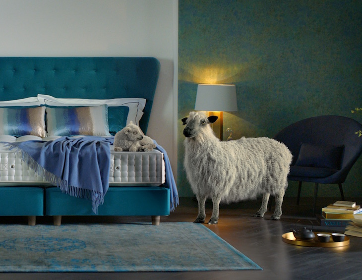
The initiative also contributes to a central goal of parent company LIXIL’s sustainability strategy, of which GROHE has been a part of since 2014: by 2050, achieve net-zero carbon emissions from housing and lifestyle solutions as well as operations.
In order to achieve its goal of carbon-neutral production, GROHE has been using green electricity since July 2019 at all five LIXIL EMENA production sites, which produce exclusively for the global brand, and in the German logistics centres. In addition, the brand is investing in solar technology, combined heat and power plants, and innovative manufacturing processes such as 3D metal-printing that save materials to ensure they are creating a value chain that conserves resources. In addition, its state-of-the-art dedicated testing laboratory in Hemer coupled with increased recycling of materials is also helping contribute to the steady reduction of its carbon footprint. As a result, GROHE has been able to reduce its greenhouse gas emissions by around 40% since the introduction of its 2014 sustainability programme, while at the same time increasing its energy efficiency by 24%. As a result, the original targets of 20% respectively by 2021 have been significantly exceeded ahead of schedule.
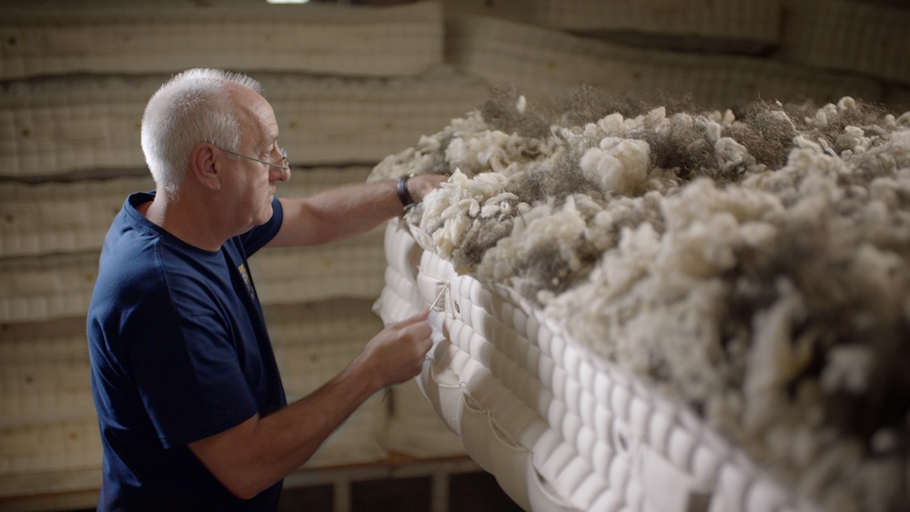
To offset any CO2 emissions it has not yet been able to reduce, GROHE provides significant investment into two global compensation projects: operational support of a hydroelectric power plant in India, which eliminates the need for coal-fired power plants, and a project in Malawi, which involves the repair and maintenance of boreholes used for drinking water abstraction.
As part of its carbon strategy, the sanitary brand intends to pursue the proven three-pronged approach of “avoid, reduce, compensate” and increase its energy efficiency every year by its own means, thereby reducing the share of compensation.
GROHE’s approach for a reduction of CO2 in consumers’ everyday lives
GROHE always strives to increase sustainability, not only with regard to its own production but through its intelligent technologies which can also help consumers to minimise their personal carbon footprint:
#1: Saving energy starts at the wash basin
Eco-conscious products designed for the family bathroom not only save energy but can also be easy on the wallet. Technologies such as GROHE SilkMove ES allow solely cold water to flow from the tap when the lever is positioned in the middle. Unnecessary hot water consumption can therefore be prevented and, for a four- person household, save approx. 279kg CO2 and around 31,412 liters of water per year.
#2 Sustainable showering
For many, a refreshing shower in the morning is a great way to start the day. However, people often wait unnecessary lengths of time to start their shower until they have found the ‘perfect’ shower temperature – hence valuable energy and water are then wasted in the process. GROHE thermostats equipped with its TurboStat technology provide a more sustainable showering experience, delivering the desired shower temperature within a fraction of a second and maintaining this for the duration of the shower.
#3 Filtered drinking water straight from the kitchen tap
Bottled water is ubiquitous in everyday life, but it is certainly harmful to the environment. Up to 600g CO2 are emitted during the production and transport process of one litre of bottled mineral water. One solution for consuming water more sustainably is the investment of water systems for the home such as GROHE Blue Home, a kitchen tap that supplies you with filtered and chilled water in still, medium or sparkling options. A family of four using a Blue Home water system can save up to 800 plastic bottles each year and reduce their CO2 emissions by up to 61 per cent.
GROHE is one of our recommended suppliers. To keep up to date with their news, click here. And, if you are interested in becoming one of our recommended suppliers, please email Katy Phillips by clicking here.
If there’s one thing we’ve noticed over the past few months, it’s been how much people have been connecting with nature.
In times of stress, we crave a relationship with the natural world – whether this be walking through our local park, filling our homes with houseplants or being able to relax in our gardens. Exposure to nature and the colour green has been shown to provoke the release of good endorphins; it can even help people heal faster. Mental health charities across the world also recommend spending more time outdoors to combat problems such as anxiety and depression.
So, with nature’s proven impact on our mental health and physical wellbeing, could biophilic design principles hold the key to creating sustainable and inviting spaces in the post-pandemic landscape?
How biophilic design can be applied in a hospitality setting
Wellbeing is huge industry that will only continue to grow. Spaces that can improve our health and wellness will play an ever bigger part as the hospitality sector looks to entice people back to international travel.
Biophilic design principles suggest that humans have an innate connection with the natural world. Through bringing elements of nature into our interiors, we can elevate the well-being of those inhabiting the space.
As shown in many studies show, biophilia has the potential to be very powerful within a hospitality setting. A cost-effective way of improving the experience for guests, Oliver Heath suggests that guests are willing to pay 23 per cent more for rooms with views of biophilic elements. This is something that can be clearly seen in the link between the price of hotel rooms and whether they have a sea view.
But biophilic design is not just about views or introducing plants to your spaces. Materials, textures, colour, shape, lighting and ventilation all combines in well-designed biophilic spaces to create an environment which is calming and inviting.
We’ve picked out a few key ways in which you can start to introduce biophilic design principles into your interiors:
Directly introduce nature into a space
Whether this be through framing a striking view out of the window or simply displaying a bunch of fresh flowers in a statement vase, bringing the great outdoors inside is easier than you may think. Layer up your greenery to create a statement feature or even invest in dried flowers if keeping plants watered is too much to handle. This is an easy and often affordable way to introduce biophilic design principles into a space.
As well as providing glimpses of nature within your interiors, consider how your building allows people to access the outdoors. Could you introduce outdoor seating onto a patio to create a place of refuge outdoors? Does your courtyard encourage people to spend time in it? An inviting outdoor space may well be key in a socially distanced future.
Introduce natural motifs
A pattern in the wallpaper, the form of a vase or the curves in a chair – organic forms that suggest shapes from nature are a great way to introduce another nod to nature into your interiors.
Make the most of natural materials
Textures that tempt our fingertips – combining materials such as cork, rattan, wool and wood in a space creates a natural material palette which can put us at ease. Tactile stimulation has been shown to help reduce our cortisol levels (which cause stress) and trigger the release of oxytocin (the love hormone) helping us to feel happier and more relaxed.
Image caption: Nest’s Ferm Living Arum Lamp | Image credit: Nest
Image caption: Nest’s &Tradition Little Petra Lounge Chair | Image credit: Nest
Consider the colour temperature of your lighting
Lighting can have a huge impact on our mood and alertness. There are now a number of circadian lighting systems on the market which mimic natural daylight through colour-changing LEDs. By subtly removing the stimulating blue spectrum of light in the mornings and evenings, these lighting systems help to improve both alertness and sleep quality by creating a more adaptable space.
As many of us continue to spend more time indoors, spaces that support us both physically and mentally will only continue to grow in importance.
Nest is one of the brands that has taken advantage of our Industry Support Package. To keep up to date with supplier news, click here. And, if you are interested in also benefitting from this three-month editorial package, please email Katy Phillips by clicking here.
It has been described as “Europe’s leading on-demand energy saving control”, Cheetah is a high-impact smart technology for a busy hotel kitchen. Hotel Designs explores…
The technology not only boasts financial savings (thousands per annum) but dramatically reduces a properties carbon footprint and improves the kitchen environment by reducing noise levels.
Cheetah is designed and manufactured in the UK and takes great pride on its robust ‘best of breed’ sensor technology and ‘proof in the pudding’ energy saving credentials.
Image credit: Quintex
What it does
Extract and supply fans in commercial properties are two of the biggest energy consumers in commercial kitchens and Cheetah offers one of the only proven technologies to effectively reduce their consumption while still offering the necessary level of performance.
Cheetah takes full control of the extract and supply fans in the kitchen and sensitively modulates them in relation to cooking activity; the higher the heat, smoke, or steam level the faster the fans will run and vice versa. Thus, meaning during periods of inactivity on the cookline the fans speeds will lower, reducing energy waste and therefore monetary waste. This is called demand-controlled ventilation (DCV).
How the technology works
After more than a decade of engineering and more than 8,000 systems in action worldwide, Cheetah were the first in Europe to patent the high-end optic and sensor components. This give the very best identification of variables in the canopy such as, steam, smoke, gases, and precise temperature changes to command the fans to act accordingly within seconds.
One of the systems unique selling points is its ability to remotely dial into the system to identify how it is performing and give energy savings data without the need for personnel to visit the site.
Is Cheetah suitable for your kitchen?
The beauty of Cheetah is that it is versatile in many ways. The system can be fitted into already existing kitchens that could even be decades old but can also be integrated with state-of-the-art HVAC designs in new build projects, the options are endless.
The manufacturer Quintex Systems offer a free site survey as part as the initial process. One of their qualified and knowledgeable HVAC engineers would attend site to carry out a full 360-degree report on the safety, suitability, and savings opportunity in that particular property.
In the last three months, Quintex Systems have made it even easier to purchase and implement the system, offering clients their Q Finance option. This allows new and existing business to explore the option of a financing deal to spread the overall cost and lower the initial capital outlay.
Cheetah has saved clients like Hilton, IHG, Radisson, and Marriott thousands of kilowatts and therefore thousands of pounds while also reducing their carbon footprint to achieve their sustainability goals. Will you be the next to make the step forward to a carbon neutral world?
Quintex is one of the brands that has taken advantage of our Industry Support Package. To keep up to date with supplier news, click here.
SPOTLIGHT ON: The role of landscape architecture in ‘glamping’ resorts
A Glamping resort is usually sited within a picturesque location whether forest, beach, lake, mountain, botanical or even an urban rooftop with a primary focus of ‘back to nature’ experience. Bushtec Safari Asia explores landscape architecture…
As a designer we have come across seven main landscape typologies (however there are probably more or even subsets):
Traditional Resort compound with highly ornamental plantings, flexible lawns spaces, sculptures with drop-off, restaurant and lobby
Natural Aesthetic to blend with or be part of the natural surrounds
Animal reserves and Zoological parks providing the time past safari experience
Themed Landscapes – most recently we have been developing a pet focused tented resort with agility course, dog pool, sand hill and even a cat climbing gym
Botanical which typically focusses on organic farming practices, wellness lifestyle choices and communal gatherings
Urban settings such as on rooftops with spectacular views
Pop-up Glamping which responds to short term events and festivals where tents are stored and reused year on year.
Image credit: Bushtec Safari Asia
There is as much skill, if not more, to touch the ground lightly and create a landscape aesthetic which looks part of natural surrounds however even more important, landscape architecture critically allows the tents to sinuously bring the outdoors indoors through 4 of the senses
sight-siting of tents to maximise vista’s and even lighting for nighttime effects,
touch-directing natural breezes through the tents,
smell-carefully selection of aromatic scents of flora and
sound-bird attracting plants, flowing water elements and selecting rustling trees.
Image credit: Bushtec Safari Asia
To enable a greater understanding of the role of landscape in glamping resorts a case study has been selected – Tiarasa Escape.
The site is located in Janda Baik, Mukim Bentong. Janda Baik (incidentally means good widow) is a small village about 50 km from Kuala Lumpur, capital of Malaysia.
The site included existing fruit trees (durian, rambutan, jackfruit and mangosteen), fish farm and located adjacent to a small river, Sungai Nerong and surrounded by vegetable gardens owned by the local villagers.
Image credit: Bushtec Safari Asia
Our approach is to take advantage of its special qualities, not imposing on the setting but enhancing and directing attention to the features of the landscape. The path, tents & buildings are sculptured fit into the site with minimum disturbance and embrace the rocks and slopes and trees, not see them as obstacles. The beauty and integrity of the landscape and its special qualities shine through each tent location. We have created the design for Glamping and treehouse within as an integrated construction process, adjusting pathway design as we discovered each rock and preserve the beauty of the natural site.
Creating places
As more travelers explore the world so does the expectation to create unique local experience. Our approach to any site is to take advantage of its natural qualities, not imposing on the setting but enhancing and directing attention to the landscape features. The buildings fit into the site with minimum disturbance and embrace the rocks, slopes and trees, not see them as obstacles. The beauty and integrity of the land and its special qualities shine through each concept. Tiarasa Escape resort is intended to “touch the earth” lightly, “teach the stories of the forest” and “discover the life withing a traditional kampung setting” all within a modern luxury escape.
Integrated within the site
Each of our glamping resorts has a design vision. We take the basic elements we know make resorts work and mix them with unique elements as well as specific client requests to create one overall feeling through the landscape and outdoor spaces. The landscape is designed at multiple scales so a guest will get a certain feeling upon arrival and continue discovering special features throughout their stay. Private spaces and large scale gathering areas both envelop the guest in the landscape which surrounds.
Immerse in nature
We subscribe to the belief that plants make the space. Our planting design is based on extensive understanding of the local environments and the desire to enhance native communities while inviting human inhabitation and enjoyment. Native fruit trees, productive planting and a focus on endangered species create places and enhance the environmental significance.
The planting design at Tiarasa Escapes glamping, pictured here, is based on the concept of the ‘Rainforest Orchard.’ Previously a kampung orchard, the site has mature Durian, Longan and Mangosteen trees which were all protected during construction. Further planting of native rainforest fruiting trees supports the enjoyment of the guests as well as ecological benefits for the other floral and fauna communities.
Landscape is a sensory element and critical to a glamping resort’s design aesthetic. It is about curating a holistic outdoor experience and landscape must always have a purpose. It’s more than just eye candy. It’s important that it looks beautiful but it must also convey a story, an underlining purpose and make a great contribution to physical environments by emphasising the protection of natural character and cultural identity.
Bushtec Creations is one of the brands that has taken advantage of our Industry Support Package. To keep up to date with supplier news, click here. And, if you are interested in also benefitting from this three-month editorial package, please email Katy Phillips by clicking here.
Originally designed by Geoffrey Bawa in collaboration with furniture designer Rico Taravella, Avani Kalutara Resort in Sri Lanka has completed an impressive renovation, revealing new facilities and refreshed guestrooms and suites, and F&B areas…
Avani Kalutara Resort has emerged from the pandemic with a new look, which includes fully-renovated suites and lobby, refreshed outdoor spaces as well as introducing brand new pool suites and dining venues and a 360-degree grand ballroom with panoramic views.
Originally designed in 1994 by Geoffrey Bawa, one of Sri Lanka’s most significant architects, in collaboration with furniture designer Rico Taravella, the vision of the entire Resort was to define a spacious amphitheatre which is achieved through a triton-like layout, as the accommodation wings expand off at angles from the centre. The 105-key resort sits where the Kalu Ganga (River) diverges into a lagoon and the Indian Ocean. The surrounding scenery amplifies the newlook of the Resort, which stays true to the tropical modern aesthetic while refreshing the property with crisp, bright touches.
Image credit: Avani Kalutara Resort
A completely revitalised look and vibe awaits guests at the Avani Ocean View Suites with their tropical airy layout, the brand new Avani Ocean View Pool Suites equipped with private plunge pool and two spacious terraces, and the Avani Deluxe Ocean View Rooms with views of the Indian Ocean and lagoon.
Bringing colour and cool to Sri Lanka’s southwest coast, Avani Kalutara offers a few culinary hotspots; Karadiya Bar provides a picture-perfect backdrop with a new pool bar experience, Miridiya Bar serves up refreshing drinks and bites by the riverside, the Mangrove Restaurant continues to feature the freshest, locally sourced ingredients brimming with local and international delights, along with the brand’s signature deli concept Pantry by Avani for visitors on the go, which offers freshly brewed coffee cold-pressed juices, artisanal sandwiches, and local tea flavours that the country is renowned for. For a more exclusive dining experience, resort chefs are ready to create in-room seafood feasts with Sri Lankan flair.
The brand new Ganga Ballroom, with an ode to its name, features stunning 360-degree views which encompass the Indian Ocean, Kalu Ganga and lagoon. Designed to cater up to 300 guests, a dedicated events planner oversees décor, catering, and logistics to ensure every wedding, party, meeting, or seminar runs smoothly and successfully.
Recreational facilities include a swimming pool surrounded by coconut palms, the 24-hour AvaniFit inspired gym, a Glider Adventure Tower for ziplining, climbing and abseiling, and water sports on the lagoon. Guests can also access adjacent sister property Anantara Kalutara Resort, including the award-winning Anantara Spa with Ayurvedic treatments.
“You can’t touch this” – handsfree sensor taps by GESSI
Bathroom brand GESSI has injected hygienic and antibacterial electronic hi-tech technology into its taps to cater to evolving modern traveller demands…
The sophisticated minimalism of the design by Gessi acquires an advanced technology that combines the beauty of the lines with the functionality of “no touch” electronics. The water supply doesn’t need to be handled or touched as it can be switched on by a movement as simple as the passage of the hand before the sensor.
Thanks to Gessi no-touch system, the beauty of the shape is pure and anti-fingerprint, achieving a better hygiene and avoiding possible damages to the tap.
Image caption: The GESSI 316 range | Image credit: GESSI
For the first time, Gessi sensor taps bring the refined elegance of a sophisticated design in public space, where aesthetically simple electronic taps are used to be installed, providing endless finishings with the possibility to choose among a wide range of nuances never seen before. Splendid Gessi Sensor Taps suit also private environments, of course.
Here’s a closer look at some of GESSI’s products, which now feature touchless tech…
GESSI316
Image caption: The GESSI 316 range | Image credit: GESSI
Woven steel
Gessi’s Creativity and style infuse a total new perceptibility into steel itself, giving a material which is usually “technical” and cold, an unprecedented heat, and a special furnishing capacity. Gessi has indeed enriched the body of the faucet with aesthetic and decorative details, such as textures and patterns with different tastes; the steel seems thus “dressed” by the texture. Handles and distinguishable reed valves, finishes of contemporary charm, and an innovative
New technology
Gessi electronic taps are in the vanguard and come available with different technological solutions. The sensor can be incorporated into the tap body or into the very spout, otherwise it can fit into a proper remote plate. In the first two cases the water flow is automatically switched on or off by bringing the hands towards the spout. In the case of the remote detector, the flow is activated or turned off simply by the hand crossing over the detector: it’s almost like a magic move.
Aesthetic and smart
The technology of the electronic taps by Gessi not only makes life easier but it’s also environmental friendly. Thanks to the automatic activation of the flow, water is delivered only for the time it is actually needed. Without any waste.
The warm modern style of New York design
From surface and floor coverings to lighting and furniture, the firm celebrates pro-duct design as a natural extension of its immersive environments. Drawing on an encyclopedic knowledge of design, Rockwell Group creates flexible, transformable products that support new ways of living, working, and communicating. The collaboration with Gessi on the firm’s first-ever line of bath fittings and accessories was a thrilling challenge for David Rockwell. Defined by simplicity and possibility, the Inciso Collection weds modern style with heritage details and finishes that invite tactile discovery.
Pure beauty
Thanks to its no touch system, the beauty of shapes is pure and free from prints, guarantying the hygiene and avoiding tap’s damages. Gessi electronic taps first provide the refined elegance of most sophisticated design to public settings, where electronic devices have usually simply aesthetics. What is more they are available in many finishings, giving the possibility to choose different nuance for the first time in this field. Of course, these beautiful taps are suitable also for private space.
Subtle and elegant industrial details
The bathroom interior fit with the Inciso Collection was not intended to feel unapproachably minimal, but rather calmly chic and warmingly inviting. The goal was to create a design that be both timeless and timely.
RILIEVO
Image caption: The Rilievo range by GESSI | Image credit: GESSI
A concept of tidiness and harmony
If harmony, based on order, is dictated by a mathematical/geometric ratio between parts, the maximum expression of purity of form is probably the enrolment of a circle into a square. This geometric and architectural figure has been greatly evocative through time and across continents and cultures. The circle evokes eternal movement; the square symbolises eternity and immutability.
Discreet and low-impact
The electronic detector can be connected to the normal electricity network or to a lithium battery, ensuring in both cases a minimum water consumption. The electronic technology fits in a graceful way to the tap, preserving the perfect shapes of its studied design, or even better enhancing its essential and simple beauty.
Inspiration meets with innovation
A circle inscribed into a square is the theme that RILIEVO brilliantly brings to life. This design gives gracing touch and sight and it evokes that body and soul equilibrium take center-stage in the bathroom. A new balance between style, emotion and functionality.
GOCCIA
The brilliant beauty of water
Goccia demonstrates how creativity and innovation, together with a content of poetry and respect for the world can turn dreams into objects. This is all Gessi’s accomplishment, a company different by nature
Not only is Goccia a style and a product philosophy, it’s also an eco-friendly creation. All of the Goccia taps are equipped with a technology allowing for a 50% saving of water without compromising the functionality of the tap itself. Goccia is indeed the epitome of a more intimate feeling for luxury, one attentive to the elegance and glamour of the objects as well as to their impact on the environment.
Matter, shape, function
Goccia is not a mere complement, it’s the very distinguishing feature of the design of an interior. It’s an original concept that induces new gestures, new interactions with water, living space and the person. Goccia makes the beauty and usefulness of water available wherever it is needed or desired, with charming and fresh solutions.
ANELLO & INGRANAGGIO
Gessi succeeds in developing its own distinctive and characteristic design language: pure lines with an emphatic recall to primary shapes, like the suggestive ring shape. Symbol of continuity and perfection, Anello evokes the most sober and elegant pledge of a deep blend.
The precious mark of metal
Gessi offers new options to choose and finishing combinations that boost the strong design peculiarity with colours and materials through different architectural effects. As a result, the new living design trends will be conveyed in bathroom spaces, creating also innovative and original creative solutions. The new deep and warm polished brass version and the fascinating and elegant rough burned brass finishing represent a surprising change respect the typical metallic surface of taps. Anello gives also the opportunity to realize innovative look thanks to a prestigious velvet opaque black, besides chrome, copper, black metal, and brushed ones.
Beyond its time
Anello concept meets the desire of freedom in décor and customisation of the bathroom, even more than other Collection before.
RETTANGOLO
Image caption: Rettangolo by GESSI | Image credit: GESSI
Original and iconic
To bring to life this unprecedented aspiration – moving the flow of water to wherever we desired – Gessi thought up a radical design based on the purity of an absolute, strong and rigorous form: abstraction in its essence, like parallel lines traced on a designer’s sketchbook, in any form.
The sign
Rettangolo was born from an expression of creative freedom, from the original and ironic exploration of iconic symbols, in simple yet evocative forms. The rectangle is a surprising and unusual geometric shape for taps, a perfect demonstration of how design, with its ability to infuse art and liveability in consumer and everyday products, can enrich the spaces in which we live, transforming simple, everyday actions and places into something special.
Visionary innovation
With a long-standing, 100-year history of brass castings and round taps, Gessi created the world’s first tap built of solid brass, providing it with a square, almost sharp body; an explosive concept of innovation.
GESSI is one of our recommended suppliers. To keep up to date with their news, click here. And, if you are interested in becoming one of our recommended suppliers, please email Katy Phillips by clicking here.
Hamilton Litestat to sponsor technology seminar at Hotel Designs LIVE
As part of its ongoing support as a solutions provider to the hotel sector, Hamilton Litestat will sponsor Hotel Designs LIVE, a one-day virtual conference for the hotel industry, to be held on June 23, 2020…
Hamilton Litestat will sponsor the technology seminar at Hotel Designs LIVE, which takes place on June 23.
The online conference consists of a series of engaging seminars featuring leading figures from the international hotel design sector, covering hot industry topics along with innovations that support the guest experience.
Hamilton will sponsor Hotel Designs LIVE’s first seminar, ‘Technology’s role in tomorrow’s hotel’, where Jason Bradbury, tech influencer and former presenter of The Gadget Show, will be in conversation with Hotel Designs’ editor, Hamish Kilburn. The pair will discuss products and innovations, and how technology will influence hotel design in the future.
“For decades, Hamilton has been supporting the hotel industry with technology and solutions that enhance the guest experience, and we’re pleased to support this discussion of innovation and the future of hotel design,” says Gavin Williams, Hamilton’s Sales & Marketing Director. “There are so many simple, easy to use and effective solutions that can make all the difference to a guest and keep them returning time and time again.”
With hotel rooms working as a multifunctional space – accommodating relaxing, sleeping, and often working – Hamilton will present its technologies to support the guest experience in suites and communal spaces. Its Smart Lighting Control solutions aid the versatility of these rooms, helping to transform them between the functional uses with just the touch of a button or swipe of a finger. Lighting in a hotel reception can really make a statement and set the mood for a stay, while pre-set lighting schemes can create an ambience that takes dining areas from breakfast to cocktail hour and through to cosy evening meals.
Hamilton’s smart lighting and audio control solutions are supported by a vast portfolio of on-trend decorative wiring accessories that can be selected to suit any hotel design scheme or functionality requirement, with a bespoke service also available to provide just the right finishing touch.
Designers, architects, hoteliers and developers who wish to attend the free conference can do so by registering online here (registration closes June 19 at 5pm (BST)).
Incorporating more hygiene in our everyday lives makes sense right now. Toto‘s Washlet is an ideal option for bringing greater hygiene into the bathroom…
Ensuring the greatest possible hygiene is essential during a pandemic. We accept this as a reality of our times, but are unaccustomed to it in many instances.
At the same time, we are slowly becoming aware of the fact that this situation will not change any time soon. Toto is here to show us that incorporating more hygiene actually enriches our everyday lives, and is beneficial to our overall wellbeing.. The Japanese bathroom supplier has developed a true hygiene powerhouse with its shower toilet, known as Toto Washlet. It is easy to clean, reduces germs to a minimum, and is as touch-free as possible. Many people who have switched to Toto Washlet describe it as “life-changing”. You can learn more about Toto’s innovative technologies on the Toto microsite.
Image credit: TOTO
Image credit: TOTO
Recently, we have all been forced to learn just how important prophylactic hygiene actually is – and not just in clinical settings, but in our everyday lives. According to the latest research*, most germs can survive only a few hours or a few days at most on surfaces. In contrast, dirt and other micro-organisms are capable of sticking around for several months and multiplying during this time. This presents a risk of infection, especially for people with compromised immune systems.
Invest in a higher standard of hygiene for the long-term
As many of these relevant facts and findings suggest, it makes sense to invest in products that contribute to a higher standard of hygiene over the long term. This is the exact focus of Toto’s sanitary products. The Japanese market leader has decades of expertise in the producing shower toilets, making Invest in a higher standard of hygiene for the long term
As many of these relevant facts and findings suggest, it makes sense to invest in products that contribute to a higher standard of hygiene over the long term. This is the exact focus of TOTO’s sanitary products. The Japanese market leader has decades of expertise in the producing shower toilets, making TOTO Washlets️ an outstanding solution.
Image credit: TOTO
A power-packed hygiene product
A Toto shower toilet has outstanding hygiene features at many levels. The special Cefiontect glaze is easy to clean, extremely smooth, and as hard as glass. This essentially prevents dirt from accumulating on the surface. One of the major innovations that Toto developed in conjunction with the shower toilet is the rimless toilet bowl and especially powerful, efficient flush. Hygiene medicine specialist Prof. Dr. med. Klaus Dieter Zastrow confirmed the following about Toto toilets in 2014: “…using a rimless toilet equipped with the Toto Tornado Flush (with circling water) essentially rules out the spread of gramnegative bacteria (intestinal germs).”
Using products that are touch free is also becoming increasingly important including taps and dryers.
Image credit: TOTO
Auto Taps for enhanced hygiene
TOTO automatic faucets no longer need power from the electrical outlet. The energy from the flowing water is used to charge a battery that powers the faucet, making an external power source unnecessary. A generator converts the energy from the flow of water to supply the microsensor with power. The integrated sensor registers hand-movement in order to dispense the exact amount of water needed. The sensor-based automatic system means that users no longer need to touch the faucets in order to use them. This keeps public washrooms in particular more hygienic.
Hand dryers offer a number of advantages over paper towels in public facilities. They are touch-free, and therefore very hygienic, especially for busy washrooms. Heavily used washrooms with hand dryers are far easier to keep clean. They have a better environmental balance and considerably lower operating costs.
TOTO is one of the brands that has taken advantage of our Industry Support Package. To keep up to date with supplier news, click here. And, if you are interested in also benefitting from this three-month editorial package, please email Katy Phillips by clicking here.
5 Minutes With: F&B talk with Mark Bithrey, Founder & Creative Director, B3 Designers
There is a serious question being put to the industry on whether public areas will ever be the same again. In an exclusive interview with Hotel Designs, Mark Bithrey, the Founder and Creative Director of B3 Designers sits down virtually with editor Hamish Kilburn to discuss F&B design in a post-pandemic world…
In just a few days time, Hotel Designs will go live to the world with its debut virtual conference. The topics we will explore during Hotel Designs LIVE will include technology, sleep, wellness and whether public areas will ever be the same again. In order to understand the role of F&B areas, while also getting an access-all-areas deeper look into the inner workings of the studio, I caught up with Mark Bithrey, the Founder and Creative Director of B3 Designers. The award-winning studio has transformed many F&B hospitality projects, such as The Prince Akatoki, Marriott Hotel Budapest and Ritz-Carlton Geneva among many others.
Hamish Kilburn: Thanks for joining me, Mark. How are you feeling right now as a hospitality interior designer?
Mark Bithrey: The world has been through really tough times, but this one has definitely knocked the hospitality industry for a six. I have always believed in 2 things: that hospitality will forever have a strong place in the world in some form or other, and two, that design plays a pivotal role in shaping a changing world. So I’m feeling a mix of anxious and eager.
HK: When restaurants do eventually open up, we are still looking at reduced covers and therefore revenue. What are your thoughts there?
MB: We have been helping clients redesign their restaurants for social distancing, with beautiful screens and additional features like plants and cushions. But you are right, it can mean reduced revenue. Some of our clients have been really creative and opened up whole new streams of revenue.
Image caption: Design in F&B has spilled into the marketing and packaging of products with a rise in demand for deliver/takeaway service. | Image credit: B3 Designers
HK: There is obviously a lot of focus on takeaways at the moment. How can F&B businesses be more creative when adapting to the times?
MB: Quick service has immense potential. Think about kiosks where you are able to churn out dishes quickly. Our clients at Mei Mei are doing just that, with Michelin star winning Chef Elizabeth Haigh at its helm. Also consider Itsu/Pret style shops, with impactful branding and graphics on the floor. You can look into takeaway/delivery-only kitchens with creative food packaging. Extra brownie points for eco-friendly packing! We are working with a Vietnamese restaurant in London at the moment to use clever packaging to build out loyalty, repeat orders, and engagement.
Image caption: Mei Mei has adapted its offer during the pandemic to focus on takeaway service | Image credit: B3 Designers
HK: Speaking of food delivery, it does mean that restaurants are reliant on the large delivery services that eat into their revenue considerably. How can they move away from using the shared delivery systems?
MB: Yes, indeed! Have you heard of Mumbai’s dabbawalas? It’s an incredible concept. Think localised kitchens, subscription meals, and your own fleet of delivery folk racing food on bicycles. Typically, a kitchen will cook a few hundred meals a day. The subscription lunch will include food that can be batch cooked – so a lentil dish, a curry, rice, and perhaps some bread. This is then packed into stainless steel “tiffin” boxes, and delivered quickly, while the food is still hot. Because the kitchens are localised, nobody is travelling more than a couple of kilometers and they are often the service teams themselves. The previous day’s box is picked up and brought back – no packaging waste!
Food trucks are another way to circumvent delivery commissions. With all the right permissions, you could set up in a park/outdoor space and serve up anything you want to, really. Think also about drive-throughs or walk-past counters for food pick up. You can even offer an interesting experience (graphics/games) while they wait in line.
HK: What about fine dining, how can businesses integrate social distancing into this concept?
MB: Without a doubt, fine dining is going to change for a while. Restaurants that get very crowded are going to have to give customers more room – which can be quite cool if you think about it.
Smaller restaurants however, are quite fortunate and can use their spaces to offer truly caring experiences. We have worked with Michelin star winning Chef Tom Aikens in the past, whose restaurant Muse spans 950 sq ft. “Muse is very unique in that it is for guests not only looking for great food in a very special restaurant, but welcomes them as if they were in their own home. Guests will always get special care and now more than ever, of being looked after and pampered,” said Aikens.
If you have outdoor space, however small, milk it. Erect pods or beautiful temporary structures. Adapt for weather changes with fans and space heaters. You could also think about bringing your restaurant completely outside – are you on a street that could be pedestrianised, or do you have parking space that could be converted?
For indoor spaces, think gorgeous on-brand free standing folding screens. In hotels, use your banquet rooms as restaurants so you can offer more space between tables.
If you want to be really creative, as the rules relax more, consider catering services for small gatherings, or even a fine dining experience that you can take to people’s homes. We may follow off where you mention that Muse is small, and say that it is massive in experience.
HK: Is there a way for F&B professionals to go where customers already are?
MB: Supermarkets and the internet! This is a great time to consider creating your own line of sauces/pastas/food kits. Paired with solid branding and graphics, it could open up a whole new stream of revenue. Could you create barbecue kits for example, with recipes and ingredients?
We are spending a ridiculous amount of time on the internet now. Host cooking lessons and sell kits after. And remember to up your digital presence – it is the only way people will learn of your restaurant/hotel’s F&B offerings.
INDUSTRY INSIGHT: Visualising the future of F&B spaces in hotel design
Hospitality will awake from the pandemic to face new challenges when it comes to designing F&B spaces. Hotel Designs turns to the CGI experts at North Made Studio to try and visualise the future of these public-facing outlets…
With the industry on a hiatus due to the COVID-19 pandemic, there will be some important future choices to make for hoteliers.
These choices will need to be made in all areas, but may become most stark within the F&B spaces of their hotels.
Until government guidelines are released, exactly how this sector of the hotel industry will proceed is a mystery. Dictating dates for reopening and the easing of certain measures will be crucial to define how the industry needs to adapt.
Image credit: North Made Studio
Should measures not be eased enough and distancing remain in place for the foreseeable future, questions will need to asked about profitably for certain spaces in a ‘socially-distanced’ world. Within the hotel sector F&B spaces may not be deemed a profitable use of available space.
From a visualisation perspective there may be more focus put on the finer details of a F&B space. Viewpoints centred around individual seating areas, up-selling the attributes of the table setting, rather then focusing on the overall aspect of the whole F&B interior area.
Image credit: North Made Studio
Some hoteliers my choose to get ahead of the game and move F&B spaces outdoors, allowing the potential for these spaces to open sooner. Over the last few years interior design for the luxury F&B sector has tried to bring the outdoors in, with Biophilia becoming a growing trend. This potential move of F&B spaces from indoor to outdoors would switch this around. Visually this could allow for outdoor F&B spaces to be depicted with extensive greenery, using the current trend and taking it beyond what was capable within an indoor environment. Or the alternative could happen, and a drive to bring the indoor aesthetic to outdoor spaces could become a trend.
The visualisation sector is geared up to work with both interior and exterior spaces, minimising any differentiation between the CG imagery produced in terms quality or realism.
Another possibly trend for F&B spaces within the hotel sector may be to move more than just the seating/eating areas outdoors. With the popularity of street food kiosks, van and trailers, There is the potential to move the complete catering service outside. Providing an innovative feature to the hotel experience that also opens up the F&B space to the general public, increasing potential custom.
Another great possibility of this is that the catering trailer/van can easily be switched out, to provide customers will different food and drink offerings on a regular basis. Incredible engaging visualisation can be produced for these kinds of external spaces. Creating the scene is just the start, population elements can be embedded within the scene to built a complete visual that includes food trailers, tables, chairs, different demographic of people. Finer details can also be added such as drinks on tables, litter bins. The more detailed the space is visualised, the more realistic and engaging it can be.
Image credit: North Made Studio
To further explore the future of F&B spaces in hotel design, we need to take things back to a pre-COVID stage. Many companies are simply waiting out the Coronavirus pandemic, putting projects on hold, in the hope that things will return to some semblance of normality. For these type of businesses the visual aspects of their F&B spaces will continue to follow current trends.
Experiential
Customers need to be enticed to utilise the F&B facilities within the hotel, creating engaging design with attractive styling is key. Sell these experiences during the early phases of a project with 360 degree viewpoints and visual reality tours can be a great way of boosting interest and getting designs approved.
Convenience
A core factor for F&B spaces in hotels is their convenience. Ensuring the spaces are easily accessible and positioned close to heavy footfall areas, will help to increase their usage. Positioning and ‘eye-catching’ features can be showcased via traditional still CG images, assisting the planing and development phases.
Variety
No two hotel customers are the same, with hotel spaces being used for both business and pleasure, the needs of specific customers will vary. Offering a variety of services with a F&B space will accommodate for ‘on the go’ customers as well as those customers who have more time to sit down and have a full meal. Showcase these innovative features via the use of cameo shot visuals.
Adaptability
The ability for a F&B space to be multi-purpose is vital. Catering for breakfast, lunch, snacks, dinner and drinks allows for the capture of more customers throughout the day.
With the core features of the space remaining the same, the F&B space can be created in CGI for visualisation purposes, and redressed several times to show the adaptability of the space.
Image credit: North Made Studio
Overall F&B spaces within hotels are facing some challenging times. But whatever happens in the future regarding reaction to COVID, these spaces will always be required in some form. And the visualisation sector will be there to assist with what changes to the design ethos are needed. If new ways to communicate a space are required, the technological advancements in virtual reality could be the key to creating ongoing engagement in the future.
North Made Studio is one of the brands that has taken advantage of our Industry Support Package. To keep up to date with supplier news, click here. And, if you are interested in also benefitting from this three-month editorial package, please email Katy Phillips by clicking here.
Italian artisanal manufacturer MASIERO has collaborated with industrial designer Marc Sadler to create a glamorous new contemporary yet classic lighting collection called Vegas…
The Vegas collection by MASIERO is all about luxury and high-end design. The striking pieces are very in tune with the contemporary yet also emanates a timeless quality.
As the name suggests, it was inspired by the bold, eye-catching styles and flamboyant energy of Las Vegas.
The Vegas collection is the result of a collaborative effort between lighting design firm MASIERO, and industrial designer Marc Sadler. Sadler is a French citizen who was born in Austria, and currently resides in Milan. Having graduated in 1968 from the ENSAD in Paris, he is an industry veteran whose career has taken him across Europe, Asia and North America. Sadler’s eclectic background and technical design prowess mean that today he works as a design consultant for a variety of companies across numerous industries. His work has been recognised with many international design awards, including four times being the recipient of the Compasso d’Oro ADI.
Image credit: The Vegas collection by MASIERO
The lighting collection brings together the two materials which are key for MASIERO: glass and metal. Rows of transparent glass strips are perfectly positioned and attached around a metal structure. The creation of invisible eyelets and an ultraviolet gluing process allows the strips to be held in place without the need to drill the glass or use visible screws. The bases, stems, and internal structure are made from metal which has been beautifully gilded in champagne gold leaf. Customers can also order other metal finishes to suit the look they desire. Illumination comes from LED strip lights that run along with the frame and sit behind plexiglass to ensure it is easy to clean. Most models have dimmable LED lights.
Image credit: The Vegas collection by MASIERO
This is an opulent and refined collection. The use of soft gold and a clear textured glass succeeds in giving it the desired classical feel. The strips of glass look much like ice, but also precious and jewel-like when lit. It is sculptural and there is a sense they are suspended delicately on the exterior of the lights.
The band of the inner metal structure provides the lights with a clean geometric form. Seen through the glass strip the metal has a lovely rippled gold effect, which adds depth. This is most striking on the curved vertical wall lights where the light shines from behind on both sides.
Each individual glass strip is completely unique. The ‘rock’ effect is created using a special process that deliberately deforms the thick glass pieces using heat. They each have a similar feel with imprisoned bubbles of air, yet no two will deform in precisely the same manner. It is a technique which the designer says gives the glass “an emotional allure that refers to the workings of the great glass masters.”
The Vegas collection boasts an extensive range of individual pieces. The design of the overall collection is strictly unified through materiality and the repeated use of curved rows of the glass strips nestled over a gold band.
Pendant styles are available in single lights as well as circular clusters of three or five lights. The single pendants range from 12cm all the way up to 60cm in diameter, and the largest cluster is 80cm in diameter. Rows of pendant lights in rectangular alignment come with three, five, or seven drops. There are also variations with multiple vertical tiers. The longest piece is 175cm in height, with a fine and elegant 27cm diameter.
Image credit: The Vegas collection by MASIERO
To stretch the length of dining tables or for use in billiard rooms, choose from sweeping oval shapes with vertical glass strips, or long tubular forms that run horizontally and echo the tiered drops. The collection also includes curved vertical wall lights and ceiling variations, plus an oval table lamp.
Experimentation and commitment to the design concept allowed this collection to be developed into an array of very refined shapes. This makes the range extremely versatile for use in both commercial and residential settings.
Masiero is one of the brands that has taken advantage of our Industry Support Package. To keep up to date with supplier news, click here. And, if you are interested in also benefitting from this three-month editorial package, please email Katy Phillips by clicking here.
GROHE’s digital shower wins German Innovation Award 2020
The innovative head shower GROHE Rainshower 310 SmartConnect was awarded a German Innovation Award 2020in the category “Excellence in Business to Consumer – Heating & Bathroom”…
The interdisciplinary jury of the German Innovation Award 2020 has named GROHE Rainshower 310 SmartConnect “Winner” in the category “Excellence in Business to Consumer – Heating & Bathroom”, believing it to be an innovation advancing the industry through its originality, implementation and effectiveness.
GROHE Rainshower 310 SmartConnect offers innovative water control. The head shower is connected via Bluetooth to a battery-powered, round remote control which enables users to select different spray patterns. Users can choose from the ActiveRain spray which is a powerful jet perfect for rinsing away shampoo or loosening tense muscles; and PureRain which delivers larger, softer droplets for a more luxurious, relaxing shower experience. Each spray can be activated by pushing the relevant pictograph on the control, with a third icon allowing you to combine both sprays at once. The wireless remote control can be conveniently positioned in an easily accessible place, either inside the shower enclosure or just outside, up to 10m, and can be screwed or glued onto the wall. The head shower is available in a round and a square design, has a comfortable diameter of 310mm and can be easily and quickly mounted on an existing standard size shower arm. GROHE Rainshower 310 SmartConnect impresses with flexibility and comfort and is a technical highlight in every modern bathroom.
Digitisation has fundamentally changed many areas of public and private life in recent years. As a result, digital solutions are increasingly finding their way into private living spaces, merging physical and digital dimensions. This development does not exclude the bathroom. Consumers are specifically looking for smart technologies with intuitive operation that enrich everyday bathroom routines. “Intelligent technologies are not a solution in themselves, but should be seen as ‘enablers’,” emphasises Thomas Fuhr, COO Fittings LIXIL International and CEO Grohe AG. “Whenever we develop new technologies or product innovations, we ask ourselves: What is the purpose? How will it affect consumers’ lives? Will it solve a problem and make life easier? For us, users and their needs are clearly the focus of attention. Because only with this customer-focused mindset we can develop technologies and products that offer real added value.”
GROHE is one of Hotel Designs’ recommended suppliers. To keep up to date with their news, click here. And, if you are interested in becoming one of our recommended suppliers, please email Katy Phillips by clicking here.
INDUSTRY INSIGHT: ‘Togetherness’ is the new luxury post-pandemic
‘Togetherness’ is a new phrase emerging as self-contained serviced apartments are in high demand as old friends and extended family seek to reconnect as lockdown eases…
As travel restrictions begin to relax, serviced apartment brands have seen a spike in bookings as the demand for self-contained apartment hotels increases. As a result, a new trend is starting to emerge: “togetherness”, which is being seen as the new luxury.
One of these brands that are seeing their bookings rise in the wake of the pandemic is SKYE Suites, developed by Crown Group. The group’s Chief Operating Officer, Pierre Abrahamse said the emergence of the “togetherness as the new luxury” trend would replace the focus on experiential travel that had prevailed in the luxury hotel market over the past decade. “Togetherness is emerging as the biggest trend for 2020 and beyond,” he said. “People want to reconnect with those they have been separated from for the past few months and hotels are responding.
“Guests are calling to ask can they book co-joining apartments so that they can enjoy a holiday with their kids and the grandparents in the one place, or so they can have friends who live in regional areas finally able to join them in the city for restaurant or gallery outings,” he said.
Image credit: SKY Suites
SKYE Suites offer spacious one-bedroom and two-bedroom hotel apartments sized from 43sqm to 80sqm, in Sydney, Green Square and Parramatta, each with open-air balconies or courtyards to take in fresh air. Guests can do their own cooking and washing with SMEG appliances and Vittoria or Nespresso coffee machines, or head out to the array of restaurants that have opened their doors again in the city.
There are ‘virtual concierge’ tablets in each suite for guests to access hotel services.Guests can also catch a movie or watch Netflix by streaming their own content to huge in-room TV screens. Sleeping Duck bedding allows them to choose mattress firmness on each side of the bed.
SKYE Suites opened its third hotel above Green Square train station in April 2020, which offers 90 luxurious apartments in a precinct designed by globally renowned Koichi Takada Architects and offering 18 retail and dining offerings including Butcher & The Farmer, Nam2 pho, Bashan noodles, KFC, McDonalds and Gong Cha bubble tea.
Image credit: SKY Suites
The SKYE SUITES brand first launched in August 2017 with the opening of the stunning SKYE Suites Parramatta, part of a mixed-use residential, retail and hotel development, V by Crown Group.
The building was designed by Allen Jack + Cottier and Koichi Takada Architects and Crown Group’s signature resort facilities including a beautiful outdoor pool area, well-equipped gym and expansive foyer.
The second SKYE Suites opened in October 2018 as part of the stunning Arc by Crown Group residential tower at 300 Kent St. This luxe and inviting enclave in the heart of the city was also designed by Koichi Takada Architects whose “ice cave” themed lobby and lap pool have become one of Sydney’s most Instagrammed spaces.
The building has become known for its eye-catching brickwork and glass and steel towers that soar dramatically into the city skyline. It has 73 plush and inviting hotel apartments.
The Sydney and Parramatta hotels have earned accolades at the HM Awards two years running, for Best Serviced Apartment Property and Best Tech Hotel.
Backhausen, as highlighted in previous articles, is renowned for its luxurious fabrics which are immersed in heritage, craftsmanship and quality.
Its dedication to innovation, individuality and exclusivity is represented by its venture into research and development for innovative technologies, as well as for its flexibility and capacity provided by the company’s exclusive bespoke service.
Backhausen offers designers and creative artists the opportunity to develop and produce custom-made fabrics together with its design team and expert weavers, translating any particular vision into unique, high-quality fabrics.
Image credit: Backhausen
The Backhausen bespoke service is exclusive, but most importantly it offers a high level of flexibility to accommodate key partners expectations, requirements and desires; before, during and after the fabric creation process. This personalised service is dedicated to exploring a new world of textiles, where the experience and craftsmanship of Backhausen is combined with the unique requests of its customers, in a coordinated and straightforward process, which is unusual in the world of textiles.
At the same time, the mission of Backhausen’s bespoke service is to strengthen and highlight the important, major role that fabrics play in different industries, as well as in our daily life.
Image credit: Backhausen
Selecting the right fabrics can add numerous technical characteristics to every design –textiles can be used as insulation tools, they can control and absorb humidity, they optimise acoustics and also bring ultimate comfort. Fashion is another industry hugely influenced by fabrics — this raw material is one of the most important elements when designing a new piece of apparel. In addition, fabrics have a strong influence on movies, as set designers carefully choose the right fabrics to communicate and create an exceptional mood via the screen.
Throughout various industries, fabrics also need to comply with specific strict regulations and certifications to be used for interiors. For these industries, among other certified fabrics on their collections, Backhausen has created a wool-viscose FR fabric. This natural fabric is specifically for curtains that gives the possibility for designers to maintain the aesthetics and quality of the wool, while still being high-performance. In addition, this innovative product has passed with great result the strict EASA aviation burning vertical test.
Right from the start of the bespoke service process, the expert design team and the advice of our experienced weavers are at the disposal of the client. The bespoke service involves a detailed approach and specifications to provide solutions encompassing quality standards, budgets, designs and time. Furthermore, the Backhausen’s bespoke service also focuses on sustainability, by offering its customers a choice from a range of natural fibres and materials such as silk, wool, cotton, and linen, as well as viscose.
The possibilities are endless with the Backhausen bespoke service and every request for bespoke fabrics varies depending on the customer, industry and design.
The Bespoke service process explained:
1) The customer interested in the service shares his/her ideas and visions for the bespoke fabric with the design team.
2) The design will then be reviewed to make sure that it is technically possible to proceed with the production of the fabric. Consequently, a form is filled out by the customer with further specifications and details – quantity (50m minimum), colors and materials.
3) If necessary, the design team advises on design development and improvements. The first sample is developed, which is then sent to the customer for approval and reviewing (approximately 1-3 weeks).
4) If further development is needed, the sample will be re-done according to the new information given, and the new sample will be sent again for approval and reviewing.
5) Once the customer approves and orders the fabric, the production operation starts and finishes (4-6 weeks) and the fabric is ready for shipment.
The development of individual fabric designs, and the support of the Backhausen team from the beginning of the process right to the final stage of shipping is enabled thanks to the flexibility of Backhausen’s own mill, located in north-eastern Austria.
Furthermore, the impressive archive owned by Backhausen, which dates back to the 19th century, opens up unlimited design and pattern possibilities. This incredible resource, composed of over 5,000 original patterns and designs from the Art Nouveau and the Wiener Werkstätte era, is also at the customer’s disposal as a reference for their custom projects.
The goal is to achieve a design which is unique to each customer, developing their vision, ideas and creativity into fabric while combining functionality and high- performance.
This flexible service is perfect for designers that are looking to create their individual designs and translate their visions into fabrics, also creating a unique experience for their clients.
Backhausen itself takes advantage of its own flexibility. This year Backhausen was able to produce a fabric made of 100 per cent ÖKO-TEX cotton for its sustainable, reusable non-medical masks during the COVID-19 pandemic. Furthermore, Backhausen is going back to its roots with a contemporary twist by bringing back old, heritage fabrics that were designed by renowned artists of the 19th and 20th centuries. These fabrics are being converted into sustainable art, by being manufactured once again, but this time using natural fibres and materials following the brand’s recent shift and focus.
Backhausen is one of the brands that has taken advantage of our Industry Support Package. To keep up to date with supplier news, click here. And, if you are interested in also benefitting from this three-month editorial package, please email Katy Phillips by clicking here.
Geberit launches premium flush plates for maximum design flexibility
Bathroom supplier Geberit has launched a new selection of flush plate finishes, offering hotels an even wider choice for enhanced design flexibility in hotel washrooms…
The new colourways of Geberits new flush plates will expand into four of its flush plate collections – the Sigma 21, Sigma 50, Sigma 20 and Sigma 30 – offering a range of different styles to suit every taste and space.
An industrial-inspired concrete and natural wood finish has been added to the Sigma21 and Sigma50 collections, allowing developers designers to incorporate the latest interior trends in the washroom.
Both new flush plates will also be available with a choice of brass, red gold and black chrome metal detailing.
Image credit: Geberit
With a host of sleek colourways available in addition to its latest launches, the black, white, mustang slate and customisable designs can be personalised with the new metal features.
Geberit has also expanded its Sigma20 and Sigma30 flush plate collection to include stylish matt black and matt white, combining aesthetics with a unique texture.
These new finishes join nine existing colourways, including white gloss chrome, black gloss chrome, matt chrome, gloss chrome and brushed stainless steel.
Geberit’s Head of Product Management, Peter Davis, said: “We are delighted to introduce Geberit’s new flush plate finishes, created with the latest interior trends in mind. Whether developers designers are specifying for hotels featuring a contemporary or traditional style, each elegant model brings a luxurious finishing touch to help transform the bathroom washroom into a sanctuary space.
“With more than 34 flush plate finishes available, Geberit flush plates are renowned for uncompromising functionality and high-quality craftmanship, meaning developers designers can be rest assured that whichever style or finish of flush plate they opt for, they offer unrivalled reliability as well as trendsetting style,” he added.
Geberit’s extensive range of flush plates complement its leading bathroom washroom innovations, including the revolutionary AquaClean shower toilet which is found in some of the UK’s top hotels, the Sigma concealed cistern and Duofresh odour extracting extraction technology.
Geberit is one of our recommended suppliers. To keep up to date with their news, click here. And, if you are interested in becoming one of our recommended suppliers, please email Katy Phillips by clicking here.
The idea for popham design was simple: to celebrate and maintain a traditional artisan craft, while updating it with modern patterns and colour combinations….
Founded in 2007 by Americans Caitlin and Samuel Dowe- Sandes, popham design is a design studio and bespoke tile workshop based in Marrakech, Morocco.
The company designs and manufactures handmade concrete tiles that are exported throughout the world, adorning luxury hotels, restaurants and residences from San Francisco to Sydney. The idea for popham design was simple: to celebrate and maintain a traditional artisan craft, while updating it with modern patterns and colour combinations. The collection draws inspiration from Morocco and its rich history of pattern, along with influences as diverse as the pattern of raindrops cascading down a windowpane, the shadow cast by a palm tree under the blazing African sun, or a delicate crescent moon aloft in a velvety sky.
Image credit: popham design/Casa Ceramica
Concrete tiles are part of the cultural and artistic heritage of Morocco. popham design is fortunate to have an enviable team of master artisans, many of whom have 20+ years experience in their craft. Each tile is lovingly hand made to order (three to five minutes per tile). Each tile is unique with subtle variations in colour and line. These “imperfections” distinguish a handmade product from a mass-produced one, lending depth, movement and character to installations. Tucked away in an olive grove on the road to the Atlas Mountains, the popham design workshop aims to respect the Moroccan countryside, treading as lightly as possible on the earth, and strives to implement eco-friendly policies wherever possible. This includes water filtration and rainwater reclamation systems, over 95 per cent locally sourced materials, recycled packaging, and solar-heated showers for the team.
Image credit: popham design/Casa Ceramica
popham design tiles are pressed in a hydraulic press, not kiln red like ceramic tile, so very little energy goes into their production. The tiles are cured and then air dried, and contain no lead or other harmful toxins. They are suited for commercial and residential applications – walls and floors – and perform very well partnered with radiant heat. The tiles are durable, functional, and easy to care for, and can be used indoors and out.
All patterns are available in any colour combination from the popham design palette, and all shapes are available in a single colour. Please note that custom colour tiles do have longer lead times.
Casa Ceramica is one of the brands that has taken advantage of our Industry Support Package. To keep up to date with supplier news, click here. And, if you are interested in also benefitting from this three-month editorial package, please email Katy Phillips by clicking here.
It’s a hat-trick! Ruby Hotels announces third hotel in London
Ruby Hotels, which only recently entered into the UK hospitality market, has announced that it will open a 173-key property in London’s Notting Hill area in 2023…
Ruby Zoe, which is being built in conjunction with UK investor and developer Frogmore, will shelter 173 rooms.
Led by founder and CEO Michael Struck, Ruby Hotels has set its sights on further international expansion with a third hotel planned for London. The new-build, 173-bed property will be in the heart of colourful Notting Hill and will include a spacious street-front public area combining retail and hotel elements.
“Based on the model of modern luxury yachts, we accommodate our luxury in a relatively small area and simply leave out the unimportant,” explains Struck. “We also organise ourselves using our own technical solutions in a very different way to the rest of the industry. We plan and build in a modular way, centralise more, and automate consistently behind the scenes. As well as helping us to make a luxurious and unique hotel experience affordable for our guests, this approach gives us a leaner and more adaptable cost structure and means lower risks for our real estate partners. This combination of advantages helps us especially in these unpredictable times.”
Image credit: Ruby Hotels/Frogmore
After the successful opening of Ruby Lucy on the South Bank earlier this year and Ruby Stella set to open in 2022 in Clerkenwell, expanding to the west of the city is the next logical step for Ruby in the thriving London hotel market.
Jo Allen, Chief Executive of Frogmore commented: “We are delighted to have secured Ruby Hotels as an occupier on our Notting Hill Gate Estate. When we asked Gerard Nolan and Partners to market the hotel opportunity in our West Block we received 13 bids from 10 different hotel operators. We really love Ruby’s approach and vision for the project which we believe will complement the area. The Ruby Team have been fabulous to work with, have convincing development and construction competence together with the financial resources to deliver something special which I hope will be enjoyed by many.”
Ruby Zoe follows Ruby Group’s Lean Luxury philosophy: a top location, high-quality fittings, and outstanding design. All of this is offered at an affordable price by rigorously cutting out the superfluous and focusing on the essential.
Skopos has almost 50 years’ experience of developing flame-retardant fabrics and soft furnishings for the contract market.
Sonno velvet is a recent addition to the Skopos base-cloth offer for all of Skopos’ beautiful print designs and will be the base-cloth for the (soon to be launched) Palmyra print (pictured). With a soft kitten touch and blackout lining, the Sonno quality is a popular choice to achieve blackout as a curtain in hotel bedrooms. 100 per cent Polyester, with FR backcoating, Sonno is also washable at 30°C. Adding a touch of luxury, but aiding a good night’s sleep, Sonno provides something completely different.
Skopos also offer a full range of antimicrobial fabrics and antimicrobial print base cloths, for added assurance during these times. Search the fabrics on our website for more detail. Free samples of all of our fabrics are available via our website, or by calling the sales team on 01924 436666.
Skopos is one of our recommended suppliers. To keep up to date with their news, click here. And, if you are interested in becoming one of our recommended suppliers, please email Katy Phillips by clicking here.
INDUSTRY INSIGHT: How to embrace the artisan revival
With the modern consumer more aware than ever before when it comes to sustainability, and clients willing to broaden their imagination when it comes to signing off new materials and products that can stand the test of time, the era of artisan is having a moment. Felicity Randolph from Cheeky Chairs explains why the demand for artisan is more than a trend…
One of the leading interior ‘trends’ of 2020 has been a return of traditional textiles and techniques. As the world increasingly turns to a more sustainable way of living, the culture of throwaway items has begun to fade and, in its place, there’s a growing emphasis on artisanal furnishings that will last. Consumers now want products that will stand the test of time, seeking furniture and furnishings that are made from natural materials and built using traditional methods. Within the hotel industry, this celebration of craftsmanship evokes a more unique style and allows brands to tell a personalised story through interior design.
The artisanal renaissance takes inspiration from history, embracing the natural methods and materials of the past. Hotels can achieve this look in a number of ways, from opting for authentic ornaments, ceramics and wall hangings to seeking out natural upholstery fabrics and working with companies that champion bespoke designs. Handcrafted décor items play a large role in achieving this look, creating a unique style that is warm, inviting and filled with personality.
“The bland and soulless designs from mass-produced pieces are increasingly being replaced with innovative products from creative designers.” – Felicity Randolph, Cheeky Chairs.
Choose tactile furniture
Furniture can make or break the overall look of a room, so it should be the first port of call in celebrating artisanal makers. The bland and soulless designs from mass-produced pieces are increasingly being replaced with innovative products from creative designers. As a result, the idiosyncrasies and nuances of craftsmanship has a new appeal for the public who are embracing the original and personal nature of artisanal pieces. The artisanal trend also lends itself well to tactile furniture, such as through textured fabrics, warm natural woods and soft furnishings that invite visitors to explore.
Image credit: Cheeky Chairs
For example, Cheeky Chairs create hand-crafted framed chairs with traditionally upholstered seats that make use of natural materials such as coir, hessian and wool. Each of the designs produced by Cheeky Chairs is made using tried and tested methods to create a product that is built to stand the test of time. These include using traditional joinery techniques. Compared to modern joinery which relies on the use of bindings, adhesives and fasteners, traditional joinery depends only on wooden elements for a strong and sturdy result. The use of natural materials helps to bring a more organic and calming atmosphere to any space – something that is of particular importance in hotels where you want your guests to feel relaxed and at home from the moment they arrive.
Image caption: Residential-style bar stools injected with an upholstered pop of personality | Image credit: Cheeky Chairs
Image caption: Darwin Pavillion chair in a lounge-like setting | Image credit: Cheeky Chairs
Historic details
Details can add unique touches to a space that are subtle yet effective. For example, architectural joinery such as well-considered skirting boards, door panel moulds or creative architraves. These details can improve the feel of a room immensely and provide a pop of individual style as well as a nod to the past. There’s also an opportunity to evoke certain eras with such detailing – for example, bobbin chairs are an example of traditional renaissance style that evokes the look and feel of this time period while also working well with modern furnishings. Using classic joinery techniques, such as those adopted by Cheeky Chairs, helps to create these more traditional finishes. For example, steam bending and hand-carved spindles such as those features on the Darwin or Elkin models, or the elegance of the smooth wooden style of the Marco chair, bring luxury to any space. The use of texture through smooth wooden spindles and backs, as well as different colour and types of wood grain, can create a warm and rustic look that pairs beautifully with cosy wools and natural materials for a welcoming ambiance.
Image caption: The Marco Armchair upholstered in Morrison’s Andean Vertical Stripe alongside Sanderson’s Linnean Indigo | Image credit: Cheeky Chairs
Design for guests
When interior designing, it’s important to remember that you’re designing for people, so emotions play a big role. Looking to artisans and traditional crafts is a great way of achieving an emotional response in a way that can’t be attained through off-the-shelf items. The tactility of good-quality, handmade items, whether that’s a carved frame chair, ceramics or a sumptuous artisanal blanket will remind you of luxurious spaces. Much like having a bespoke item of clothing elevates an outfit, using customised pieces in interior design creates a unique environment that can’t be found elsewhere. Artisan features with a hand-crafted look and feel are great for personalising a space and helping shift the eye around the room to create a comfortable yet interesting feel.
Image caption: Darwin Pavillion Set | Image credit: Cheeky Chairs
The desire for unique, traditionally-crafted furniture and classic textiles has led to an artisanal revival, both in residential properties and in businesses around the world. The hotel sector, in particular, as adopted this trend as a way of adding character and personality, using natural materials and traditional methods to create inviting spaces that are individual, creative and deliver a sensory experience. Thanks to innovative designers, handcrafted items are enjoying a second wave and the hotel industry is perfectly positioned to embrace this wonderfully creative trend.
Cheeky Chairs is one of the brands that has taken advantage of our Industry Support Package. To keep up to date with supplier news, click here. And, if you are interested in also benefitting from this three-month editorial package, please email Katy Phillips by clicking here.
LOCATION WATCH: Hot hotels opening soon in Riviera Nayarit, Mexico
Ever since Hotel Designs started the concept-to-completion article series with SB Architects to cover the honest journey to design and build Conrad Punta Mita, Riviera Nayarit has been on our editorial team’s radar. Here editor Hamish Kilburn discovers which other hotels are opening in the area soon…
Mexico’s Riviera Nayarit, a remote 192-mile-long coastline that frames the majestic Sierra Madre mountains, is tipped to be in hot demand once travel restrictions have lifted. Later this year, the region will welcome two new five-star luxury properties for those looking for isolated remote escapes whilst keeping hygiene, health, and wellness front of mind.
Riviera Nayarit is welcoming two unrivalled luxury hotel openings (Conrad Punta Mita and One & Only Mandarina), that will complete its extensive luxury hotel offering, in preparation to be one of the most anticipated destinations of 2021.
Accepting reservations now and opening in October, Conrad Punta de Mita is a new 325-key property that will offer a tranquil retreat for guests, surrounded by palm trees and the Pacific Ocean. Explored by our team throughout its design and build, the hotel draws influence from Mexico’s rich history and unique culture, indigenous artwork integrates with the luxurious amenities to create an environment that will allow visitors to connect authentically to nature and to the sophisticated, contemporary architectural design.
Image credit: Conrad Hotels/SB Architects
Dovetailing with the dramatic scenery, resort bungalows, pavilions, and cabanas are nestled in coastal vegetation and all boast views of the aquamarine ocean, with suites offering fully-furnished kitchens and living rooms, perfect for larger groups, large patios, plunge pools, freestanding soaking tubs and outdoor showers.
Image credit: Conrad Hotels/SB Architects
Hilton’s first Conrad-branded resort property in Mexico will be set in the same private development as the Litibu Golf Course, an 18-hole experience designed by Greg Norman.
One&Only Mandarina is located just north of Punta Mita, on a spectacular cliff-side overlooking the Pacific Ocean with dramatic vistas and a lush rainforest setting. Blending chic interiors amid the lush jungle wilderness, the resort offers a combination of 104 free-standing villas that float above the treetops or perch against the cliffs – each with their own private plunge pool.
Image credit: One&Only
Allowing nature to take centre stage, One&Only Mandarina has been designed and built to respect and blend with the environment. Experts were consulted on the development of the resort to minimise the effect on the existing natural landscape, and careful low-density planning has preserved the ecological importance of the destination.
Image credit: One&Only
In addition, the resort will feature 54 Private Homes, among the first One&Only residences in the world. Available to own, One&Only Mandarina Private Homes offer privacy, seclusion, and comfort with unparalleled service – offering luxury resort living for a privileged few.
The hotels will join an already thriving luxury hospitality scene and will sit alongside St. Regis Punta Mita Resort, Imanta Resorts Punta de Mita and other luxury hotels and villas.
Steve Webb of Webb Yates Engineers and Basha-Franklin’s Creative Director, Nicola Osborn, have been appointed as Co-Chairs of the Surface Design Awards for 2021…
Steve Webb and Nicola Osborn have joined the judging panel of the Surface Design Awards 2021, and will be joined by a multi-disciplinary team of fellow judges selected from the architecture and design communities.
The Co-Chairs invite their own team of design industry colleagues to join them on the judging panel. Steve Webb has invited Sarah Castle from IF_DO; Joseph Henry of GLA’s Regeneration Team and Architecture Initiative’s Lee Mainwaring.
“I am delighted that Sarah, Joseph and Lee have joined my team of judges, they bring a wealth of design knowledge and skill,” comments Steve Webb. “I know from being part of the 2020 judging team that they face an exciting and challenging task!”
Nicola Osborn has drawn on her contacts in the interiors world to bring together Nic Fallows of BNF Capital; Simona Auteri and Sofia Steffenoni from Matter of Stuff and Kresse Wesling MBE from Elvis + Kresse.
“I really enjoyed my experience of judging the Awards in 2015,” said Nicola Osborn. “I wanted to bring together a diverse team, so have invited a design-led property investor, a contemporary design & manufacturing consultancy and an environmental entrepreneur…judging day should be fun!”
For the 2021 Awards, greater emphasis will be paid both on the selection process for the different surface materials used in the entries and on their sustainability credentials with each entry being accompanied by a statement and calculation for the carbon footprint kgCO2/m2 of the cladding/material surface.
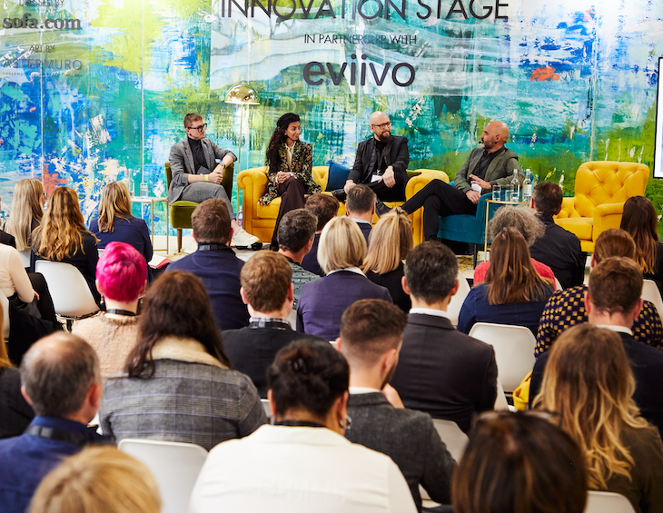
London’s Business Design Centre will be Sponsoring the 2021 Supreme Award – the project selected by the judges as being ‘the winner amongst winners.’
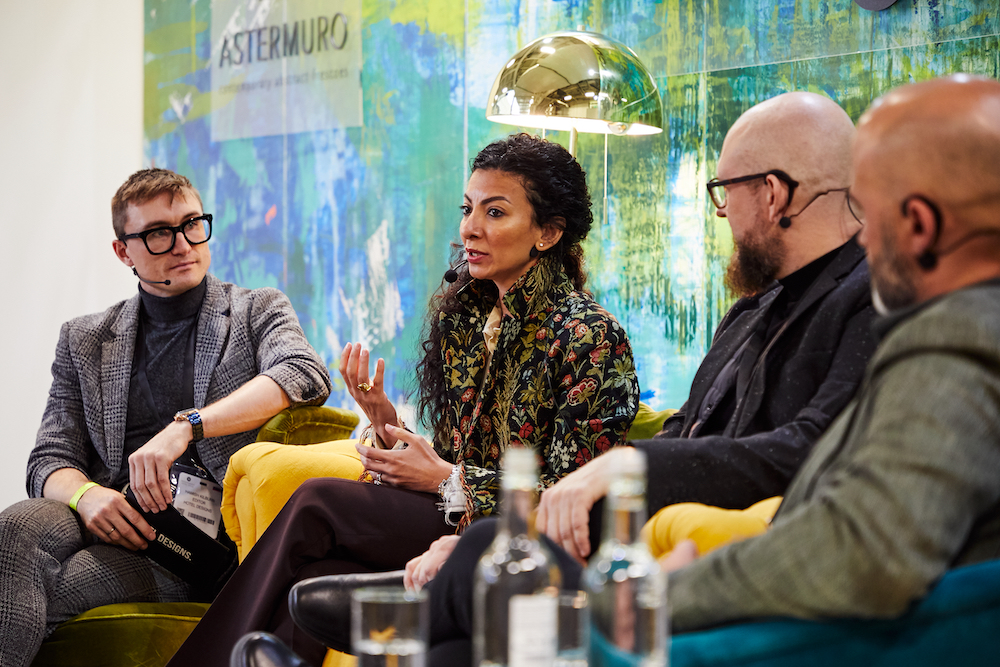
“The Awards Presentation is taking place at the Business Design Centre on Thurs 11 Feb next year and we are delighted once again to be sponsor of the Supreme Award,” said Max Bull, Executive Director of Venue Sales at the BDC. “The BDC is home to many design-led businesses and we are keen to support the sector.”
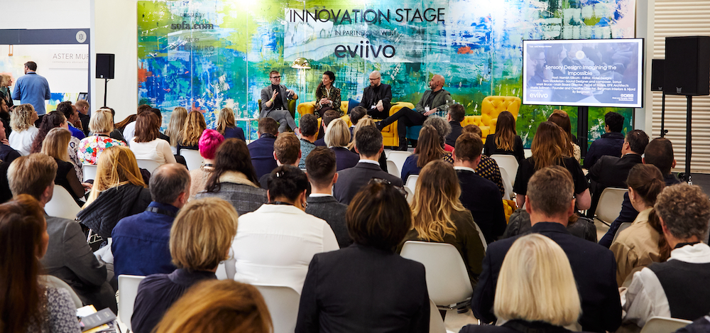
The 2021 Surface Design Awards will open for entries in June 2020 with a closing date of Friday 25 September 2020. The Awards Presentation ceremony will be on Thursday 11 February 2021 as part of the annual Surface Design Show taking place in London’s Business Design Centre from 9-11 February.
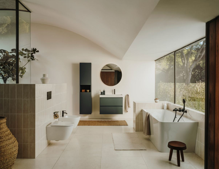
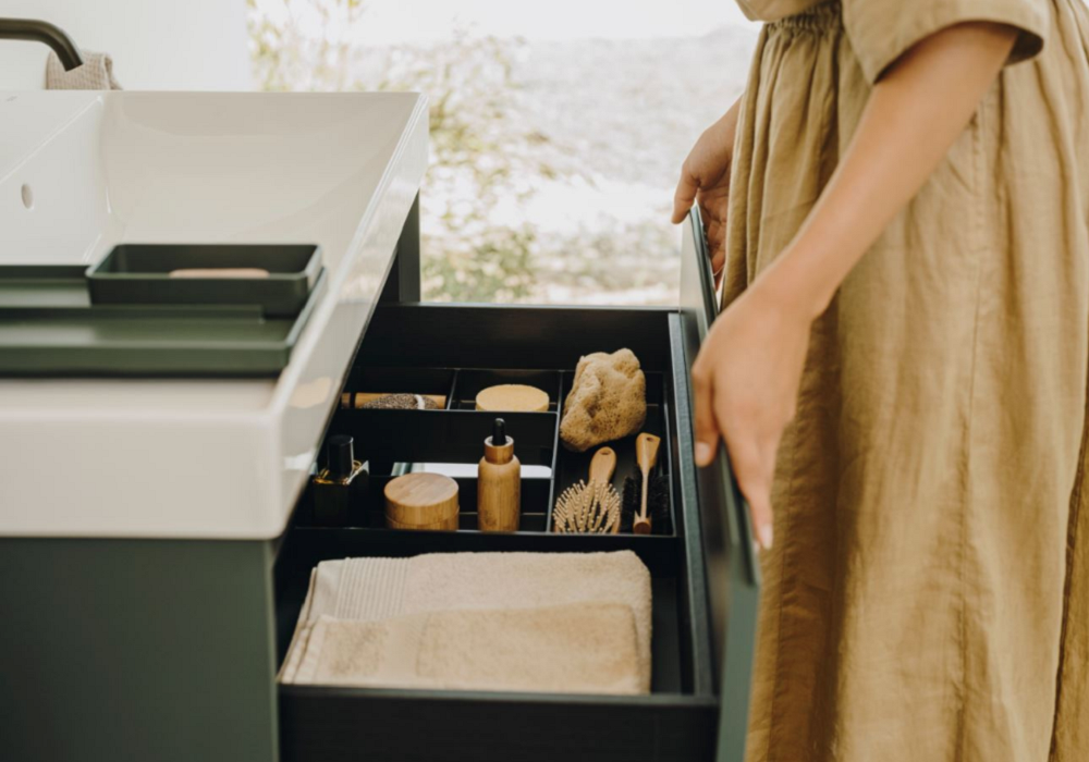
The Supreme Winner of the 2020 Surface Design Awards went to the Krushi Bhawan building in Bhubaneswar, India by Studio Lotus.
Other winners included Sterling Prize winner Goldsmith Street by Mikhail Riches with Cathy Hawley; Nobu Hotel in London by Ben Adams Architects; CF Toronto Eaton Centre Bridge by WilkinsonEyre and Zeidler Architecture and University of Sheffield Concourse by Arup Lighting.
FEATURE: When architecture and lighting design collide
Hotel Designs learns the story and latest lighting collection from Buster + Punch, a British home fashion label, founded in 2012 by Architect Massimo Buster Minale…
It all started in a garage in East London, building custom motorbikes. Buster + Punch innovates with solid metals, to transform ordinary functional fittings into extraordinary interior details for residential, hotels and commercial projects.
The brand is deep rooted in London’s fashion, music and sub-culture scene and harnesses this energy to elevate the products.The horizontal range of products comes in a limited palette of unique finishes to help designers specify with confidence and ensure a perfect match.
Exhaust is a new collection of the trailblazing interior spotlights inspired by motorbike exhaust just launched. The range features four new products; a fixed, an adjustable and a track spotlight, alongside a pendant light. Decorative yet functional, Exhaust is designed to elevate task lighting to a new level, providing directional illumination to interior surfaces and architectural detailing.
Image credit: Buster + Punch
Each Exhaust spotlight is fitted with a beautifully machined, solid metal baffle designed to capture and diffuse light. The unique baffle design features Buster + Punch’s unmistakable new linear knurl pattern and signature torx screws, alongside a precision-cut honeycomb grill, engineered to create a delicate metallic glow whilst also emitting a precise, non-glare, directional light.
“Exhaust finally puts functional lighting back in the spotlight,” explained Massimo Buster Minale, founder and creative director. All too often forgotten as back- ground lighting, we wanted to create a compelling range of decorative task lights that would fit seamlessly into any home or hospitality space, whilst remaining memorable – much like the roar of a motorbikes exhaust.”
Image credit: Buster + Punch
Developed by the Buster + Punch design studio, Burnt Steel is an innovative/ fashion-forward finish first launched in Spring 2020. When a motorbike exhaust runs lean, the excessive heat turns the metal into a stunning rainbow of blue, purple and yellow. Harnessing an oxide effect, when applied to marine-grade stainless steel the result is a highly original and unique metal effect. Burnt Steel leads the way in new metallics and unlike an applied finish, the cutting-edge process means that no two finishes are ever the same.
Buster + Punch is one of the brands that has taken advantage of our Industry Support Package. To keep up to date with supplier news, click here. And, if you are interested in also benefitting from this three-month editorial package, please email Katy Phillips by clicking here.
INDUSTRY INSIGHT: Getting ready to reopen your hotel
To start the week with a positive mental attitude, Hotel Designs understands more about how The Fine Cotton Company is looking at the practical aspects to consider – beyond the lobby and public areas – when it comes to re-0pening hotels after the pandemic…
It’s not a case of ‘if’, but ‘when’ the hotel industry can reopen its doors to guests.
Smart hoteliers who are ready to hit the ground running are taking a strategic view on reopening, and are looking for ways to redefine cleanliness while supporting guests’ personal wellbeing to give both their staff and guests confidence to return to their hotels.
Hospitality linen experts, The Fine Cotton Company are using their textiles expertise to support their boutique hotel clients by advising on specially selected products that offer guests confidence and reassurance as they return to enjoy your hotel.
So if, like many of their hotel clients, you’re hoping to welcome back guests as soon as possible, we asked them to share their recommendations to help you to ease back into business.
1) Protecting the guestroom on arrival
Naturally, you’ll want your staff and guests to feel safe, confident and protected during their stay with you.
So look for products that are designed to improve guest room cleanliness to reassure you and your team as you welcome them back.
Jane Robson, founder of The Fine Cotton Company says: “ The luxury experience guests expect from hotels will always be key. So it’s important that guests feel that you’ve thought about their every need for safety during this new season. It can be an opportunity for hoteliers to really review their guests’ experience”
Washable reusable three-layer face masks
Offering reusable three-layer certified face masks to guests to use is one way to enable them to feel secure in your hotel. The masks can be a gift left for them to take home and reuse. The Fine Cotton Company’s face masks can be made in any colour and even be branded with your hotel logo, which means they make a professional-looking option for spa staff and your cleaning team too.
Image credit: The Fine Cotton Company
Slippers to greet them at their door
Encourage your guests to remove their shoes as they enter their room with a shoe bag and slippers that greet them as they enter their guest room. Not only will they stop dirt from shoes being trailed around your room and protect your flooring, but it’s a thoughtful gesture that won’t go unnoticed.
Image credit: The Fine Cotton Company
Luggage mats to protect your bed linen
How many of your guests put their suitcase or overnight bag on your beautifully made bed to unpack? It’s probably a high number, often with dirty wheels that can mark and more worryingly, transfer bed bugs to your bed. Fortunately The Fine Cotton Company has a simple solution. A luggage mat. There’s are heavy-duty cotton sateen and washable at 60°C . Adding luggage mats to your housekeeping routine is reassuringly easy too, simply place on your beds as guests check-in, launder after unpacking then on check out day place a clean luggage mat back on the bed for packing.
2) Protecting your beds and mattresses
Large or small, Mattresses and bedding are huge investments for any hotel, it pays to ensure they are protected.
Choose encasement mattress protectors
Image credit: The Fine Cotton Company
These are waterproof, dust mite proof and bed bug proof and zip around the whole mattress to form a complete protective barrier. Be sure to look for a quality product though, The Fine Cotton Company’s encasement mattress protectors are made with a patented allergen barrier fabric and have just been certified to block viruses.
Protect your mattress, duvet and pillows with moisture-proof protection
If mattress and pillow protection makes you think of sweat-inducing, plastic crinkly feeling products you’ll be relieved to hear that The Fine Cotton Company’s team have sourced a collection of mattress, duvet and pillow made of Tencel with a breathable waterproof backing. Tencel is a super soft and naturally hygienic fibre that wicks away moisture to keep guests cool. It is more absorbent than cotton making it ideal as a waterproof layer between your bedding and linens.
The Fine Cotton Company recommend using zip-fastening pillow and duvet protectors to keep your pillows and duvets clean and fresh. Mattress protectors are like a waterproof fitted sheet, which simply need covering with your regular sheets, all can then easily be removed and laundered after each guests’ stay.
Image credit: The Fine Cotton Company
Washable duvets and pillows
If you wish to give your guests that extra reassurance with freshly cleaned duvets and pillows for each stay, look for light weight easily laundered products such as the Microfibre Duvet from The Fine Cotton Company to keep your laundering and drying costs down.
Opt for cotton throws you can wash at 60°C
Image credit: The Fine Cotton Company
With good reason, guest will look for every reassurance that their room and furnishings are clean. Heavy eiderdowns or blankets aren’t the best choice right now, opt for easy to clean, yet stylish cotton throws that can be laundered quickly and easily. The Fine Cotton Company have responded to their client’s requests and introduced a range of washable cotton waffle cotton throws that are easy to care for and come out the dryer ready to use.
3) In the bathroom
Image credit: The Fine Cotton Company
Lighter-weight towels and bath robes
Opt for lighter-weight cotton towels and bath robes which are designed to launder more regularly and cut down drying time. Consider offering smaller size guest towels for general hand washing in your bedrooms too instead of full-size hand towels with faster drying capabilities.
Image credit: The Fine Cotton Company
The last few months have been the most challenging our industry has ever known. We can now work together to build our reputation and kickstart the season with enhanced levels of cleanliness and hygiene to attract guests again. With unchartered territory ahead it’s reassuring that experts like The Fine Cotton Company are here to help and support you as you take steps to reopen.
The Fine Cotton Company is one of the brands that has taken advantage of our Industry Support Package. To keep up to date with supplier news, click here. And, if you are interested in also benefitting from this three-month editorial package, please email Katy Phillips by clicking here.
CASE STUDY: Creating statement lighting for Orlando World Center Marriott
With industry casting a spotlight on public areas, Hotel Designs explores how designONE studio created the statement lighting inside Orlando World Center Marriot…
At the Orlando World Center Marriott, Stephanie Head, Design Principal of designONE studio, teamed with Cameron Coxworth Adler of BP Lighting to meet the project’s lighting needs.
Providing a focal point for the lobby bar while adding much-needed sparkle at night, these staggering fireworks fixtures tied in to the Troy Odyssey pendants over the bar and satisfied the “undulating rhythm” requirement in three ways:
The arms of the fixture undulated
The metal shade cup for one of the class shades had an undulating pattern
And the large circular fixtures were hung in an undulating manner
Image credit: Marriot/Hudson Valley Lighting
Getting there was an easy collaborative process. Our team met several times with the designer as well as maintained good communication via multiple conference calls and emails to refine Head’s original concepts. The designer had some inspiration images of a massive single fixture to fill the space.
Due to the engineering that would be involved with a single fixture, we decided to create a large cluster of fixtures which would still be quite vast in scale instead.
Head wanted a variety of glass “orbs” to create interest. Exploring the deep reserves of the HVLG standard offering, she and our team pulled inspiration from the Troy Odyssey collection for one of the glass elements. This of course added to a sense of design unity throughout the space, as the bar is lit with Odyssey pendants.
HVLG Contract created models of the three glass “shades” for review, and once approved, the fixtures went into production. The end result is a dynamic and incredibly large-scale lighting display that perfectly fits the soaring ceilings of the lobby bar.
Hudson Valley Lighting is one of the brands that has taken advantage of our Industry Support Package. To keep up to date with supplier news, click here. And, if you are interested in also benefitting from this three-month editorial package, please email Katy Phillips by clicking here.
CASE STUDY: How Page8 Hotel has made its air cleaner
The ‘new normal’ in hospitality and hotel design will largely revolve and evolve from a demand for clean environments, which goes beyond wipe-clean surfaces, as Page8 Hotel has learned after installing Blueair purifiers…
In a YouGov survey commissioned by leading air purification brand Blueair, it was found that there is consumer demand for clean air hotels, with 54 per cent of Brits considering air quality to be important when choosing a hotel.
Prior to the government-stipulated lockdown, Page8 had begun its soft launch and was on the front foot thanks to its status as the first ‘clean air’ hotel in central London, a title it claimed by placing a Blueair air purifier in all 138 rooms.
Experts from the Swedish brand Blueair tested the difference in air quality before and after using an air purifier in the rooms of Page8 Hotel. Thanks to the efficiency of Blueair’s unique HepaSilent™ filtration technology, airborne particles were reduced by 96 per cent after using an air purifier for only one hour, making the air in the hotel rooms as pure as the Swedish Archipelago.
Philip Chan, Project Development Manager of Butterfly Hospitality Group explains why Page8 has opted for air purifiers and the importance of clean air for both guests and hoteliers alike.
Image credit: Blueair
Every little thing we do is to improve the experience of our guests – even if this is invisible.
Air quality is directly related to the quality of our health and environment. After a long day of activities, Page8 which is located in the heart of London, welcomes urban explorers back to the hotel with the purest air, detoxing them from the pollution of the city and providing a hygienic, clean environment for a quality night’s sleep. All 138 rooms, from single to family rooms, are equipped with a Blueair air purifier to ensure our guests are breathing the purest air throughout their stay.
Our urban explorers travel with a health-concerned state of mind.
By partnering with the best air purifier brand in the world, Page8 promises to provide the best indoor air quality for guests. A cozy well-designed hotel room is essential for a pleasurable trip, while breathing clean air in the room is an added value which is not commonly offered to guests of a hotel. Given now the world’s pandemic, we wish to provide the best confidence to our guests that we are dedicated to providing sanitised rooms with the best possible air quality resulting in less germs. Using a Blueair air purifier that removes airborne pollutants will go a long way towards helping our guests stay healthy by breathing cleaner air.
A great night’s sleep is everything.
Breathing pure air definitely improves your sleep quality and helps you to relax in a new sleeping environment. Blueair works so quietly that you can enjoy the best air quality without even hearing it. We aim to provide every guest with the best night’s sleep in the heart of London.
Page8 Hotel opted for Blueair’s Blue Pure 411 air purifiers. Based on Blueair’s proprietary HepaSilent™ technology, these air purifiers remove at least 99.97 per cent of airborne particles as small as 0.1 microns in size from the air. These compact air purifiers effectively clean the air while taking up little space and the colourful pre-filters can be changed to suit the décor of any hotel room!
Blueair is one of the brands that has taken advantage of our Industry Support Package. To keep up to date with supplier news, click here. And, if you are interested in also benefitting from this three-month editorial package, please email Katy Phillips by clicking here.
Why luxury spa linens need a lighter touch to be sustainable
With less than two weeks until it explores ‘wellness post-pandemic’ in Hotel Designs LIVE, Hotel Designs asks The Fine Cotton Company to explain what hoteliers and spa managers should consider when purchasing sustainable linens…
When choosing linens for luxury hotel spas, there’s a lot more to consider than just colour and quantity.
In an environment with oils and creams, pool water and frequent washing requirements it’s crucial to select the right towels and blankets that will perform well and last. That’s why leading luxury hotel spas like The Newt in Somerset Spa and The Spa at Carden come to hospitality linen suppliers The Fine Cotton Company to source sustainable bath robes, towels, throws and blankets that work for the demands of a spa environment.
The challenges when choosing spa linens
The linens used in spas need to be practical, as well as sustainable, but crucially for luxury hotels, emulate the same qualities as the luxury bath robes and towels found in their suites. No mean feat when they have to go through far more rigorous use in a spa than a bathroom.
And with aesthetics key to many hotel spas’ guest experience, hotels will often want linens in a bespoke darker colourway to match their brand, so when washed regularly at high temperatures, must retain their colour for as long as possible.
The solution
1) Lighter-weight cottons to save energy and laundry time
Bearing in mind the high turnover and use of spa linens, The Fine Cotton Company’s team recommend a lighter-weight robe and towels. For The Newt in Somerset Spa this was engineered to match the design of the towels and robes they supplied to the hotel guest rooms for a consistent guest experience.
A huge cost and time saver, the specially designed lighter-weight robes mean laundry time is reduced as the laundry team can fit more robes into a single wash and a lighter-weight product will dry quicker too meaning less stock is required with faster turn-around times.
2) Washable coloured linens at higher temperatures
Traditionally, coloured bath robes and towels generally can only be washed at 40°C to keep them colour safe.
Working with their expert dye house in Portugal, The Fine Cotton Company used a newly formulated dye which had been specially engineered for use in Spas in Europe to enable spas to wash towels and bath robes at 90°C
In a spa environment, where linens are exposed to treatment oils and creams being able to wash them at a higher temperature from time to time will help remove residual oils and keep the towels feeling fresh, soft and looking good for far longer.
The products
Bath Robes designed to last
Image credit: The Fine Cotton Company
The Dark Grey Rimini cotton velour robes The Fine Cotton Company supply luxury spas are the same design as the company’s Luxury Ravenna 420gsm robes used in boutique hotel rooms, but specifically created in a lighter 380gsm.
These robes are a generous fit, mid-calf length with a shawl collar and an integrated towelling lining which offers great absorbency and a gorgeous cosy feel.
All seams are flat-felled welted which give a very neat finish and adds to the strength and durability of the garment, which is especially important when investing in linens for any business.
Treatment towels that stand up to regularly hot washes
From jumbo spa towels for the treatment beds, bath mats to spa mitts, Th e Fine Cotton Company team supply lighter weight Amalfi 100% Cotton Spa Collection towels for spas which have been designed and engineered to withstand the rigours of spas use.
A simple narrow edge border design and lighter 450gsm weight contribute to a faster drying time and double stitched side seams strengthen and maximise durability in industrial laundering.
Light-weight spa pool towels
So that the design of pool towels match the rib detail of The Fine Cotton Company’s Como towels that are used in hotel bathrooms the team created a bespoke pool towel range, as they needed to be a lighter-weight than the Como 700gsm hotel towels, and are available in a popular dark grey colour which is forgiving in a spa environment.
The Como 550gsm pool towel with the rib edge is a combed 550gsm cotton with double stitched side seams for extra durability and are soft, strong and made to last.
Supplied together with a Como Dark Grey 800gsm bathmat they give pool and spa areas a consistent feel and are easy to maintain.
Cotton throws for treatment couches
For treatment couches, comfort and quality are at the forefront of hotelier’s requests when it comes to blankets. The Fine Cotton Company team create bespoke sizes of their white Kensington Floral Trail Matelasse designs, a light-weight and reassuringly tactile cotton blanket.
Made in Portugal, stonewashed for extra softness, they are pre-shrunk and washable to 60°C which reassuringly is the recommended temperature to wash hospitality linens to kill dust mites and allergens.
Portofino washable cotton throws
A popular new addition to The Fine Cotton Company’s spa range are their cotton waffle stone washed throws. These lightweight blankets have been designed specifically for use in Spa’s and Hospitality relaxation areas like The Spa at Carden.
Image credit: The Fine Cotton Company
Made with a fine cotton yarn to guard against snagging and designed with neat hemmed edges, these are no fuss throws that can be folded and put straight back into use as they come out of the dryer.
Being washable means it doesn’t matter if they get wet so they are ideal for use around pools, outdoor hot-tubs, or for use in relaxation areas both indoors and out.
“The Portofino waffle throws are an absolute joy to have in the Spa,” said Stephanie Parry, spa manager at The Spa at Carden. “Our clients love the soft cosy feel of the stone washed waffle and because the throws are washable it doesn’t matter if they get wet so they are ideal for use around the swimming pools, vitality pools as well as our outside seating areas, in the pods or around the firepit.
“The throws are wonderfully easy to care for. There is no creasing and they maintain their shape so can be folded and put straight back into use as they come out the dryer.”
The Fine Cotton Company is one of the brands that has taken advantage of our Industry Support Package. To keep up to date with supplier news, click here. And, if you are interested in also benefitting from this three-month editorial package, please email Katy Phillips by clicking here.
PRODUCT WATCH: 8 new upholstery ranges from Edmund Bell
Are you sitting comfortably? Hotel Designs takes a close look at Edmund Bell’s latest upholstery product launches…
So far, 2020 has witnessed eight new upholstery ranges launched by Edmund Bell. But not one to rest on its laurels, the fabrics supplier has made sure that these are no ordinary upholstery ranges.
The brand has also launched the ultimate solution offering unrivalled technology and protection for upholstery fabric: Enduracare.
Benefitting from enhanced performance features including anti-microbial, waterproof, stain resistant and flame retardant properties – furniture covered in an Edmund Bell Enduracare upholstery fabric will perform well for prolonged use.
There may have been a time when it was considered only a healthcare environment would need an upholstery fabric with anti-microbial properties, but reflecting on the current climate we find ourselves in, it is apparent that every sector will benefit from these additional performance features, especially the hospitality industry.
Here’s a detailed look at the brand’s latest products:
Characterised by luxury and evoking confident glamour, this velvet speaks volumes for perfect upholstery. It can command status in a modern warehouse location as well as a traditional townhouse. The entire spectrum of 42 colours is captivating and inspires full freedom of expression.
A sophisticated yet chunky look basket weave and a mastery of cross colour combination. The threads weave a story of artisan making and the dry warp and matt chenille, mix effortlessly in this colour woven substrate. An exciting mix of 12 colours and contrasting tones are sure to update every piece of upholstery.
More than just a plain, Meridian has a smart cross colour structure and subtle texture of a chic marled wool look. City greys and neutrals serve as useful basics, however punctuated with contemporary accents of mustard, blush, chilli, fuchsia, teal and navy.
A plush and radiant chenille Virtue has a durable structure with a matt and texture like structure. There is a generous range of 14 warm and cool neutral tones as well as heavenly blush, gold, ochre denim and teal.
Steeped in tradition and historic culture Aspen generously takes on a smart country tailored look with its engineered herringbone structure and wool look textured surface. A comprehensive selection of 25 warm and cool neutrals together with an admirable mix of stylish on trend shades.
Capturing that rough and ready texture so necessary in a successful upholstery substrate, the textured yarns weave a story of modern country ideal for all moods and seasons. Of the 12 colours available, straw, stone, ash, grey and mercury are the perfect answer to those necessary neutrals, whilst rose, chilli, teal and emerald punctuate as the new season’s highlights.
A basket like structure were the threads weave distinctively in a very handcrafted way, Inspire works to create a very natural looking fabric. The yarns work effortlessly fashioning a very handwoven look, organic in character and rich in performance. A great palette of 12 colours ranging from subtle yet earthy tones as well as chilli, teal and denim to give it a more modern look.
With a refined sense of luxury and elevated quality, Lustre captures a vintage metallic feel so elegant yet contemporary. The lustrous chenille yarns weave their magic with the matt warp to truly capture and enhance the old beaten metallic look. All 26 colours regardless remain harmonious yet maintain their luxurious appeal and add a perfect finishing touch.
Edmund Bell is one of the brands that has taken advantage of our Industry Support Package. To keep up to date with supplier news, click here. And, if you are interested in also benefitting from this three-month editorial package, please email Katy Phillips by clicking here.
In (Lockdown) Conversation With: Design legend Jean-Michel Gathy
If the renders on the boards are anything to go by, Jean-Michel Gathy, who is widely considered as one of the industry’s finest, has embarked on one of his most ambitious hospitality projects to date, to design Amaala Island. Editor Hamish Kilburn learns more…
There is not a hotel designer or architect alive today who has not heard of the name Jean-Michel Gathy, and for good reason. The creative mastermind, who doesn’t just design but more reinvents hotel experiences, has been repainting the backdrop of luxury for what is coming up to three decades.
Not shy of his ambition – he once stated that he wanted to be the first person to design a hotel on the moon – Gathy’s approach to a project is all-encompassing, allowing him to further push (and at times break through) conventional barriers.
Image credit: Capella Sanya, designed by Jean-Michel Gathy/Denniston
His latest project, Amaala Island will be an ultra luxury resort destination spanning three sites, a first for the region of Saudi Arabia. Designed to evolve and elevate the very best in travel, the island is an ultra-luxury destination that focuses on curating transformative personal journeys inspired by arts, wellness and the purity of the Red Sea.
Image credit: Amaala Island, designed by Jean-Michel Gathy/Denniston
To find out more about the project, and in homage to the designer’s award-winning career, I managed to speak to the architect/designer.
Hamish Kilburn: Jean-Michel, how will the ultra-luxe Amaala Island – aka the “Diamond of the Red Sea” – challenge conventional island developments?
Jean-Michel Gathy: The development of ‘The Island’ will be an immersive and interactive art-inspired jewel. Its lifestyle components, its landscaping, the museums, and art installations together with the art community will transform this island into the “Diamond of the Red Sea”. It will feature many different venues for permanent installations or temporary exhibitions and artistic performances. The graphic layout of its spine will be distinctive from the air and will be recognised internationally as an iconic landmark. The project features all elements programmed and reflects the areas, numbers and facilities. This is truly unique, nothing like it has ever been planned before.
“It’s not a matter of a specific place; it is the fact that when you travel, your mind is continually challenged by the happenings around you.” – Jean-Michel Gathy
HK: How does your approach differ when designing a destination from you’re designing a hotel?
JMG: Constant travel is a huge part of the job. It allows me to observe and to be constantly inquisitive about my surroundings. Travelling builds a subconscious library of ideas, which are expressed in my work and helps my ideas remain innovative and fresh. It’s not a matter of a specific place; it is the fact that when you travel, your mind is continually challenged by the happenings around you. It’s not about where you travel, either – what counts is that you explore. No matter where you are, every country has something new to offer in terms of inspiration.
Image credit: Image credit: The Chedi Muscat, Oman, designed by Jean-Michel Gathy/Denniston
HK: What have been some of your design highlights in your career?
JMG: Perhaps the one for which I am most renowned is the overwater hammocks or ‘basking nets’, which I initiated in the Maldives at the One&Only Reethi Rah in 2000. Until then, you would find balustrades around the terraces of villas. I decided to alter that – if anyone was going to fall off the terrace, they could fall on to the nets. And I put scatter cushions on them.
Image credit: One&Only Reethi Rah Maldives, designed by Jean-Michel Gathy/Denniston
Today, just about every hotel uses this idea. Another pioneering step was turning standalone tents for safari-style camps into a commodity. The accommodation at these hotels used to be basic but this started to change after I designed luxurious tents for the Amanwana in 1990. I am also known for my oversized, dramatic swimming pools such as the one on the roof of Marina Bay Sands in Singapore.
Image credit: The Setai Miami, designed by Jean-Michel Gathy/Denniston
QUICK-FIRE ROUND
HK: What has been the most demanding request you have received from a client to date?
JMG: I guess I take every client that I work with as a challenge more than a demanding request.
HK: Where’s next on your travel bucket list?
JMG: I would love to travel to Iceland to see its rugged landscapes, glaciers, rough seas, hot springs and volcanoes. I’d also like to visit the south of Chile and the peninsula of Kamchatka in Russia, which has extraordinary wildlife and endless forests.
HK: What’s your biggest indulgence when travelling?
JMG: Collecting art – I like to collect and invest in local artwork whilst on my travels.
HK: What lesson would you teach to your younger self?
JMG: The pathway to success is never easy, it takes hard work, dedication and passion.
HK: If you could design a hotel anywhere in the world, where would it be?
JMG: I’d love to design a hotel in Antarctica. There’s an ice hotel in Sweden, but that’s only open four months a year, so I want to do one that permanently remains ice.
HK: What’s been your favourite year on the international design scene?
JMG: To be honest, every year working with my team at Denniston has been and is special to me.
HK: What’s one item you cannot travel without?
JMG: I travel light, but I always ensure I have a cashmere scarf for the plane, and a sweater (I’m a big cashmere fan). I also travel with my camera, a Canon EOS 5D Mark III.
Image credit: Four Seasons Hotel Tokyo, designed by Jean-Michel Gathy/Denniston
“The hotels where you arrive and lay on the beach and do nothing have progressively disappeared.” – Jean-Michel Gathy.
HK: How is the perception of luxury changing – and how is this evolving the way in which you create spaces in the luxury arena?
JMG: Before, hotels were just a place where you go and relax. Today, guests are connected: they want spas, they want food and beverage, they want activities, they want things to do. The hotels where you arrive and lay on the beach and do nothing have progressively disappeared, because life is such that people have become more and more active. I think luxury property clients are now asking for more than simply great rooms. They want retail facilities, a cinema, an extraordinary spa, award-winning F&B offerings and outdoor activities all integrated into the hotel.
Image credit: Image credit: Aman New York, designed by Jean-Michel Gathy/Denniston
“In terms of reliability, price strategy, and brand positioning, Toyota is a fantastic commercial car – but I prefer a Bentley.” – Jean-Michel Gathy.
HK: What’s the value of having designers and architects in your practice?
JMG: There are many good architects, but we have a specific niche. I’m going to compare us to branding: thousands of people buy Toyotas, but few people buy Bentleys. I believe that we are more Bentley than Toyota. This doesn’t mean that a Toyota is not a good car. In terms of reliability, price strategy, and brand positioning, Toyota is a fantastic commercial car – but I prefer a Bentley. Designers are the same; many prefer commercial projects and properties, because their interest is financial. They just want to make money, which means they’re not romantic about their projects. Then you have other designers, which is where I belong, who are more interested in the success of the project, the excitement of the journey of designing a hotel, and having the pride of making something fantastic, even though you earn less money.
Image credit: One&Only Maldives, designed by Jean-Michel Gathy/Denniston
HK: Has the way in which you source inspiration changed over the years?
JMG: I’m someone who designs from the heart so my style is one that’s charismatic. It’s not an ego trip like the architects who design for themselves. I design elements that are a composition of dramatic effect; I create large and dramatic space, in opposition to intimate areas, so the space is always dynamic. Secondly, I design for the sensation you get out of it. I want every space in the hotel to be comfortable and for my clients to come back and say, I like this space. Sometimes they don’t know why they like it, but if they walk in and feel good, I know I’ve succeeded.
And succeeded Gathy has in widening the path of innovative hotel experiences in far-flung destinations around the world. While his past hotel projects have firmly etched his name into the architecture, design and luxury hospitality history books, his latest ideas and concepts that are currently on the boards highlight Gathy and Denniston’s ambitions. Inspired by his worldly perspective of design and architecture, I believe that Gathy’s aspiration is yet to peak as he continues to think big with the future landscape of luxury international hotel design patiently waiting in his sketchbook for its cue to emerge.
Hotel Designs goes behind the scenes to understand Barry Sternlicht and his team’s unique design ethos for 1 Hotel South Beach Miami, and why Ulster Carpets had the ultimate solution when it came to the commercial carpet design…
As designers and manufacturers of wool rich bespoke carpets, we have always been in the business of creating sustainable products that enhance any space both in terms of aesthetics and quality.
As industry pioneers we continually review our processes to find more efficient and sustainable ways to manufacture luxury carpet, helping our clients to meet their own sustainable goals.
Wool is a rapidly renewable material as well as luxurious and versatile, at Ulster Carpets we use only the best wool sourced from Britain, Ireland & New Zealand. Wool fleece re-grows every 12 months providing a constant supply of high quality raw material. Naturally stain repellent, flame resistant, non combustible and easily cleaned, wool is both sustainable and a safe choice.
There are many health benefits from including wool within indoor spaces. Research shows that wool carpets effectively trap dust and allergens in its top layer. Its natural filtering effect makes it perfect for people with asthma or allergies. Naturally absorbing humidity and volatile organic compounds (VOCs), a wool-rich carpet will provide a cleaner, more comfortable space to sit back, relax and breathe in.
Alongside the comfort of their guests, 1 Hotel is a brand whose focus, as with Ulster Carpets, is also on prioritising sustainability, environmental protection and community engagement. On their website, Barry Sternlicht their CEO & Chairman says: “I wanted to capture the beauty of nature in a hotel and commit to safeguarding it as best I can, a responsibility that I believe we all share. It’s 1 world. But 1 is more than a hotel – it’s a philosophy and a platform for change.”
Organic, raw, natural and reclaimed materials are therefore an important part of any design brief they develop. From using reclaimed driftwood as wall coverings, plant walls and green spaces to details such as ditching plastic key cards in favour of recycled wooden tags & providing hangers made from 100% post consumer waste.
Image credit: 1 Hotel South Beach, Miami FL | Design Firm: Meyer Davis | Photography – Eric Laignel
Therefore commissioning bespoke wool rich carpets from Ulster Carpets for their 1 Hotel South Beach, Miami was an obvious choice. A retreat wholly inspired by its natural surroundings, namely the 600-feet of beach along the Atlantic Ocean, Ulster Carpet’s creative team took inspiration from these elements to create the texture and look of wood grain, echoing the driftwood and natural materials in the interior of the hotel. The bold yet calming pattern moves though the hotel pulling all the strands together of this sustainable and luxurious hotel.
As a company, Ulster Carpets were delighted to be part of 1 Hotel’s vision, where our beautifully crafted product plays a role in delivering a sustainable experience without compromising on quality or artistic flair.
Visit Ulster Carpets website to learn more about their sustainable business and the beautiful carpets they have designed and manufactured across the globe.
Ulster Carpets is one of the brands that has taken advantage of our Industry Support Package. To keep up to date with supplier news, click here. And, if you are interested in also benefitting from this three-month editorial package, please email Katy Phillips by clicking here.
Main image credit: 1 Hotel South Beach, Miami FL | Design Firm: Meyer Davis | Photography: Eric Laignel
With less than two weeks until Hotel Designs goes live to the world on June 23 with its first ever virtual conference, TIG, which offers technology solutions from world-class brands such as Crestron, Black Nova, Embrava, Gude, Hoylu, Oblong, NFS and Salamander Designs, has been announced as the event’s headline partner.
Headed up by industry stalwart Robin van Meeuwen, TIG is an EMEA sales agency offering an ecosystem of compatible AV, UC, IT and control solutions from brands at the forefront of leading-edge technology development. The company specialises in engaging customers across all verticals including consultants, integrators and specifiers, to deploy fully integrated, tailor-made and future-proof smart spaces in any environment. With a hugely experienced leadership team and staff in locations across Europe, the Middle East and Africa, partnering with TIG gives organisations – whether in corporate, marine, education, residential or other smart spaces – a real edge over the competition.
During Hotel Designs LIVE, TIG will face editor Hamish Kilburn for a Quick-fire Q&A. “Considering that TIG is relevant for all of our four seminars that we have planned for Hotel Designs LIVE, it feels very fitting to welcome the technology company as our headline partner,” explained Kilburn. “I am excited for the quick-fire Q&A, which will allow the audience to understand more about TIG, while aptly serving as a warm-up during my editor’s welcome ahead of our first live seminar that is entitled: Technology’s role in tomorrow’s hotel.”
TIG is respected within the hotel design industry for pushing the boundaries of technological integration for Smart Spaces and, as a result, is able to create amazing experiences for the designer to integrate into the consumer journey.
Click here to see the line-up of Hotel Designs LIVE | Click here to secure you seats in the audience.
“TIG is excited to attend Hotel Design Live as the solutions TIG represents touch on every aspect of Hospitality,” said Petra van Meeuwen, Director of Media Relations at TIG. ” Innovation is key at TIG and with its ecosystem of world-class solutions from high tech brands combined with a long standing experience in the sector, TIG brings true innovation, collaboration, efficiency, security and safety to create smart hospitality spaces.
“TIG has just launched a virtual experience space to give visitors an engaging, life-like experience showcasing all its solutions whilst we are working hard to open our real Experience Spaces in London, Frankfurt, Paris, Jo’burg and Moscow when it is safe to do so.”
The Virtual Experience Space is an immersive online space as part of TIG’s new website that has been carefully designed to welcome and deliver an engaging and life-like experience for consultants, integrators, specifiers and end-users. By embarking on a ‘walk-through’ tour of the virtual space, accompanied by vocal explanations, visitors will understand how the ecosystem of solutions available from TIG integrate to transform smart spaces in any corporate, residential, hospitality, education or healthcare environment.
If you are a designer, architect, hotelier or developer and would like to join the live conversations on June 23, click here to secure your virtual seats in the audience.
In the absence of government guidance Design Equals, an agency network of creative experts for the hotel industry, has launched a new support service which will provide on-going business advice to the industry as it navigates the roadmap of re-opening.
The recovery package consists of initiatives – including a monthly subscription service to expert advice – to aid recovery of the hospitality industry, helping independents and small chains to rebuild their business, attract high-value guests and optimise cash flow.
Katie McCarthy, founder and design director at Design Equals, is behind some of the North’s most well-known hotel interiors, including the Lake District’s Storrs Hall and Cheshire’s boutique Ryland’s Hotel.
Image credit: Design Equals
She said: “The industry has unexpectedly evolved, almost overnight, due to Covid-19. The way our customers must experience hotels and short breaks will not be the same for some time, maybe never even the same again. We are working with our community, our partners, leading experts and from our European and are cascading that information to businesses in a simple, creative way – through Design= in a box.”
With a recent survey from Design Equals finding that 72 per cent of businesses saw increased footfall and 54 per cent saw a rise in profits following a refurbishment it’s now more important than ever to ensure that whilst hotels are adhering to new social distancing rules, they are retaining an appealing interior.
“There is no ‘one-size-fits-all’ solution for recovery.”
Image credit: Design Equals
There is no ‘one-size-fits-all’ solution for recovery, however with their eclectic team of creatives the company are able to offer a tailored approach to businesses, ensuring their unique core values are met and creative concepts of venues aren’t compromised.
There are three options for businesses to choose from, each offers different levels of guidance and addresses the main areas of priorities such as safety, space and style.
The most popular option is the ‘Back to Business’ subscription box which retails at £59.99 per month and will keep you up-to-date of the latest guidance and advice regarding Covid-19. It will also share details of design ideas, products and discounts to help you prepare for your re-opening. As well as interior design advice you will also receive operational guidance and insights into individual business’ plans, the Back to Business subscription box will ensure you’re well informed and prepared for the big open day.
‘The Essentials’ support box (RRP £180) is a one-off purchase which provides an extensive guide on preparing and prioritising your space for re-opening.
This includes a one to one consultation with a designer to discuss space, cost effective solutions such as revised use of seating arrangements, flow of operation safe spaces and flexible partitions for creating safe distancing.
The full-service ‘Invest In Your Future’ support kit (RRP £999) is a fully personalised business solution which is developed with you by a team of experts. Customers will receive three meetings with a dedicated DESIGN=creative team specifically selected with skill sets considered to the venue type.
The five biggest benefits seen by the hospitality industry from an interior design refurbishment have been revealed as:
Increased footfall (72 per cent)
Increased turnover/ profits (54 per cent)
Ability to increase prices/ improve margins (37 per cent)
Attracting a new, more desired customer base (36 per cent)
Attracting competitors customers (33 per cent)
The team are set to reveal the latest addition to their support package with their ‘S is for Safety Book’ in the coming weeks. The documents will explore how businesses can meet new safety measures while not compromising on style.
Katie added: “We wanted to launch a solution that would help hotel owners prepare for re-opening, including being ready to open their doors whilst adhering to new guidelines. We need to act now to be ready to successfully re-open. Our message to outlets is whilst your doors are closed be open to change.
“We have an army of creatives who are working together to provide sensible, educated and affordable ideas for the industry which will arm them with the knowledge and products to a successful re-opening.
“These Design Equals packages are the first step in our long journey to rebuild a more resilient, inclusive and sustainable hotel industry. We are all incredibly eager to return to this new normality awaiting us but we have to be responsible to protect yet survive to thrive once more.”
Design Equals is one of the brands that has taken advantage of our Industry Support Package. To keep up to date with supplier news, click here. And, if you are interested in also benefitting from this three-month editorial package, please email Katy Phillips by clicking here.
INDUSTRY INSIGHT: Shining light on cordless luxury for 2020
While new technologies are coming to the surface as the industry starts to emerge from lockdown, Hotel Designs asks Voltra Lighting to explain why designers are switching their attention to cordless luxury…
What is it about a luxury hotel that makes it so desirable to the discerning traveller? Be it the Six Senses, Waldorf Astorias or Four Seasons of the world, all of them exude a distinct aura – an elegant mix of ambience, design and attention to detail.
Design experts will agree that it takes strategically designed light installations to effectively tie all these elements together and truly elevate the hotel experience.
This is why high-end brands are constantly innovating to deliver more exclusive and advanced luxury lighting options. Currently, there is a big focus on fast-tracking a wireless lighting future. As legendary designer Philippe Starck puts it: “Everything that can disappear has to disappear [sooner or later].”
Designer brands that fabricate new-age portable lights, such as Voltra Lighting, can be found in some of the finest hotels in the world. Their iconic lamps are intelligently engineered and carefully crafted to enhance the ambience of the space. Inspired by the gentle flickering of a candle-light, Voltra’s elegant range of lamps are perfectly suited to deliver an atmosphere of intimacy and richness.
Image credit: Voltra Lighting
Insight into a new generation of luxury cordless lamps
As with most things in the world of design and technology, the wireless lights too will be constantly reimagined to enthrall the new generation of hotel patrons.
According to Voltra’s team of master designers, here are the cordless lighting trends that will feature in many a luxury hotel premises in 2020 and beyond:
Soft colors for added opulence: Ambient light diffusers in brushed gold, muted nickel and antique bronze are shades that are seen to work really well in delivering a rich glamorous look.
Go all natural : Increasingly, elegant and intimate cordless light-sources are being fashioned out of naturally available materials such as wood, bamboo and cork. Voltra’s Totem range is unique in its use of precision cut alabaster stone that offers a handcrafted look and creates even illumination.
The future is outdoor: Battery-operated outdoor lighting needs to be able to brave the elements and yet sport a slick design. Spearheading this trend is Voltra’s range of IP65-rated lamps that are resistant to both water and dust damage.
Circular lighting: Be it lighting up your bathroom vanity or hotel lobby, these circular vessels of light tend to also stand out as a central decorative object owing to their unique design.
Journey from a world of wired to battery-powered
The cordless movement began way back in the late 1980s. In those times, wireless lights came in rudimentary designs and delivered low power output – making them unlikely candidates to grace living spaces of luxury properties. But, today, since these lamps have evolved to deliver higher lumen output per watt; the status quo has completely changed.
Especially when seamlessly and tastefully integrated into the property’s architectural and interior design, the right lighting is seen to transform hotel spaces into an oasis of comfort and splendour.
So, when adding new lighting fixtures into the hotel suite or speciality restaurant, what must designers and hoteliers keep in mind?
For one, the lighting fixture should be a joy to behold – both for its form and function. Thoughtfully and intelligently curated and situated, it can create a strong impression in the minds of discerning travellers. Secondly, it needs to be able to adapt to the ever-changing luxury hotel interiors.
On both counts, high-end cordless lighting can deliver. The sheer mobility offered by ambient wireless lights also creates a flexible atmosphere and mood that can be hyper-personalised to each high-net worth guest.
Voltra Lighting is one of the brands that has taken advantage of our Industry Support Package. To keep up to date with supplier news, click here. And, if you are interested in also benefitting from this three-month editorial package, please email Katy Phillips by clicking here.
On the same day the company has been announced as headline partner of Hotel Designs LIVE, TIG has launched its Virtual Experience Space to showcase the impressive portfolio of AV, UC, IT and control solutions it represents.
The Virtual Experience Space is an immersive online space as part of the company’s new website that has been carefully designed to welcome and deliver an engaging and life-like experience for consultants, integrators, specifiers and end-users.
By embarking on a ‘walk-through’ tour of the virtual space, accompanied by vocal explanations, visitors will understand how the ecosystem of solutions available from TIG integrate to transform smart spaces in any corporate, residential, hospitality, education or healthcare environment.
Visitors will also benefit from TIG’s technical specialists, who are on hand to support them as they specify futureproof deployments, by recommending the most appropriate suite of solutions. TIG’s range of solutions have been chosen to complement one another to create superior, fully integrated and tailor-made smart spaces – whatever the client’s brief.
The world-class brands that TIG represents include:
Collaboration and residential smart space technology from Crestron
Remote monitoring and power distribution solutions from GUDE
Innovative tools and software from Hoylu for remote collaboration and accessible digital group learning
Stylish control panels for the hotel and home from Black Nova
Multi-user, multi-screen, multi-location visual collaboration platform from Oblong
User-friendly yet advanced meeting scheduling and management software from NFS
Made-to-order furniture from Salamander Designs that fits in perfectly with specific AV products
And, most recently, Embrava, whose Desk Sign and Blynclight ranges display employee and workspace availability, and indicate whether desks have been recently disinfected before next use
Robin van Meeuwen, TIG’s CEO, told Hotel Designs: “Here at TIG, we have been able to bring together experience, people and innovation through a collaboration with some of the finest technologically advanced brands to create a portfolio of class-leading solutions. These brands have been carefully selected for their contribution to the creation of tomorrow’s smart spaces – whether they are in the workplace, a university, a hotel, a hospital, or any other home, leisure or business environment.
“Our Virtual Experience Space will exhibit the best AV, UC, IT and control solutions for the constantly evolving way in which we live and work. It provides a solutions-based approach to answering how we can futureproof our smart space deployments, with a focus on efficiency, adaptability, safety and security. We look forward to welcoming our valued partners and customers to this revolutionary digital space!”
Amid the Covid-19 crisis, the opening of TIG’s ‘real-life’ Experience Spaces in London and Frankfurt has been rescheduled for September 2020. To explore the new Virtual Experience Space, visit the website. Following this, visitors are invited to arrange a more detailed ‘real’ visit, hosted one-to-one by one of our expert salespeople, by emailing.
PRODUCT WATCH: Kaldewei Cayonoplan Multispace receives Red Dot Award
The jury at the Red Dot Awards were “won over” by Kaldewei’s certified shower surface with integrated room for manoeuvre. Hotel Designs gets a closer look…
It is not only bathroom professionals, architects and builders who are captivated by Kaldewei’s world-first for barrier-free mini bathrooms.
At the Red Dot Award: Product Design 2020 the exceptional innovation and aesthetic of the Kaldewei Cayonoplan Multispace made it the winner of one of the most important international competitions for product design and architecture. The Red Dot Award is presented annually by a 40-member expert jury for the best designs in the areas of aesthetic, chosen materials, crafting of the surface structure, ergonomics and functionality; it is one of the most prestigious quality checkmarks for outstanding design.
Image credit: Kaldewei Cayonoplan Multispace in lava black matt with Secure Plus
“By giving us this award, the jury has highlighted the design quality of our new bathroom solution. For us, it is an affirmation of a very special combination of materials. With Kaldewei steel enamel, steel and glass form a long-lasting, hygienic and sustainable bond which is what the Kaldewei brand has stood for, for decades,” says Yvonne Piu, Director Marketing at Kaldewei. “There are a great many small bathrooms at last, with the Cayonoplan Multispace they too can be made into barrier-free yet design-oriented spaces – with all of the associated benefits for bathroom professionals and builders. Alongside the distinctive aesthetic, the advantages include maximum comfort and bathroom design in line with prescribed standards so grant applications for barrier-free bathroom refurbishments can be made with confidence.”
Barrier-free design for mini bathrooms
The Kaldewei Cayonoplan Multispace for floor-level installation is the first certified enamelled shower surface that meets all requirements relating to barrier-freedom; furthermore, 60 per cent of its surface area can be counted as room for manoeuvre in the bathroom. With Kaldewei’s shower system, even tiny bathrooms with an area of just four square metres can be easily equipped to meet accessibility requirements. The Cayonoplan Multispace is available in all twelve shades of the Coordinated Colours Collection and comes with the anti-slip Secure Plus finish as standard.
The Cayonoplan Multispace – truly excellent
“The winners of the Red Dot Award have proved that they have created truly excellent products that possess not only an exceptional aesthetic but are also uniquely functional. The award winners have raised the benchmark within their industry with their designs. I sincerely congratulate them on their success,” says Professor Dr. Peter Zec, initiator and CEO of Red Dot.
The Kaldewei Cayonoplan Multispace which was honoured at the Red Dot Award: Product Design 2020 will be installed on 22 June at the “Design on Stage” exhibition at the Red Dot Design Museum Essen which presents the winners selected from 18,000 entries.
Kaldewei is one of our recommended suppliers. To keep up to date with their news, click here. And, if you are interested in becoming one of our recommended suppliers, please email Katy Phillips by clicking here.
INDUSTRY INSIGHT: Art in hotels – an accessory or a necessity?
As the industry prepares to makes its grand return, there’s a debate forming around art’s vital role in meaningful interior design in hospitality. Hotel Designs asks the consultants at Portobello Art to investigate…
Art has always been present in hotels, but the role of art has evolved hugely over the last 20 years, possibly more so than any other element of hotel design.
In the 1990s and early 2000s hotel guests would see the same uninspired art of flower paintings and landscapes again and again in hotels all over the country. But the main reason for this wasn’t just the brands – it was also the technology.
It was poster artwork, where everything was on paper and what you saw is exactly what you got. The sole technology available 20 years ago was to buy cheap, mass-produced art from poster catalogues which were printed using offset lithography. Designers, chains and franchises would literally have to choose their images from the dozens of catalogues that were available to everybody, then hang them in nondescript frames.
But now, thanks to the digital revolution, printing pictures and customising them, is now so much more accessible. You can create any image in any colour, any size and you can print them on to a wide variety of materials. This has given hoteliers far more options for choosing artwork and tailoring it to fit their brand and location.
Art is no longer used as an accessory, nor as a way of following protocol for typical hotel design, but as a way of evoking emotion, playing a significant role in promoting the unique identity of a hotel and is recognised as being a key component of creating the feel and atmosphere and bringing colour, vitality and inspiration to all environments.
Something Angela Rawson, Director of AJ&Co Interior Design, with whom we’ve worked on several projects, wholeheartedly agrees. “The trend for personalisation, authenticity and a unique experience within hotel interior design is here to stay,” she says. “Hotels strive to create a sense of place for their guests to immerse themselves in local history, culture, and heritage. Visual art and curated pieces not only play a huge part in conveying this personalisation through the interior design but can add statement and talking point – whether it is literal or abstracted interpretation.
“Considered artwork enriches the personality and ambiance of a space and ties together the design narrative and interior design.”
So what kind of artwork can we expect to see?
Framed Prints are still very popular but with the help of digital enhancement even a group of framed images can mean so much more than a couple of pictures hanging on a wall as they used to be years ago. The framed images above were all created from different sized local images (of Edinburgh), enlarged, then close up details were cropped out, all resized to the same size and framed in the same simple style to create an interesting but uniform collection of prints.
At Portobello, almost every hotel project is for bespoke products and the style is different every time. Usually hoteliers or hotel designers will have a concept in mind with a particular theme, but it varies greatly depending on the hotel size, style and location. Generally we will advise on what sort of artwork would work best to create the right look and ambience in that particular hotel, whether it be for framed or canvas prints, mirrors, digital wallpaper or bric-a-brac.
There will usually be either a theme or colour scheme that would need to be adhered to and as art consultants, Portobello have access to literally millions of images from online image banks and we are happy to source these for you and with our technical expertise and in-house design capabilities we can then adapt any image to fit your individual requirements.
A prime example of this was a project for the Cigar room at 10 Manchester Street, London, where the designer wanted a gallery wall of cigar smoking celebrities which we suggested should be oil paintings rather than framed prints. So we asked our in-house artists for their own interpretation and were delighted with the overall effect.
Image credit: Bespoke Hotels – No. Ten Manchester Street/Portobello Art
Artwork must not only have relevance to the hotel’s design and location but must also be fun and memorable, tell a story and therefore make their hotel stand out from the crowd.
Digitally printed wallpaper has been popular for years for feature walls in open spaces, but one-piece wallpaper has gone a step further. This eradicates any previous issues, such as joining intrinsic designs seamlessly, as the ‘One Piece’ covers expansive areas eliminating the need for seams. There have always been some limitations with certain designs and images (like maps and faces) where the joins are notoriously difficult to match up but with one piece wallpaper the image is printed seamlessly up to five metres high and almost any width imaginable! This has now given us the ability to create enormous collages made up of numerous individual images which was not previously possible with normal digitally printed wallpaper.
One example which illustrates this is the Holiday Inn in Liverpool where they wanted to add some interest to a huge blank wall in the restaurant. This was great fun to create, first sourcing all the separate images, in a Liverpudlian theme of course, and then merging them all together to create a dramatic collage.
Image credit: Holiday Inn/Portobello Art
Visual art in hotels and their public spaces influences a visitor’s first impressions, and sets the tone for the rest of the hotel. Artwork isn’t just what hangs on the walls but also the Bric-a-brac (decorative accessories) displayed around the open spaces. One of the biggest trends over the last few years has been in hotel lobbies where it is no longer just a place for arrivals and departures. IHG’s introduction in 2013 of the Open Lobby Concept has created a flexible environment were guests can eat, drink, work, meet, relax, socialise and have fun in one integrated space.
Portobello is delighted to have been involved in IHG’s concept from the beginning and have provided artwork and bric-a-brac for many Holiday Inns over the last few years and indeed, as this trend has taken hold, to other hotel chains who are also embracing the concept as well.
Image credit: Holiday Inn/Portobello Art
Can a hotel be updated / refurbished by changing the artwork alone?
As a hotel owner or manager, you might dread the idea of going through a renovation. After all, it’s a huge expense — one that often requires you to scale back operations for a period of time and all of the work can be an inconvenience to your guests, which in turn can have an impact on future business.
However, simply avoiding renovations isn’t a wise choice, since it can diminish the attraction and value of your property.
So updating the artwork every 2 or 3 years, with a new coat of paint on the walls, could definitely give a refreshing lift to a hotel without going through the upheaval of a full renovation and replacing all the furniture, carpets and wallcoverings etc.
Certainly for bedrooms or corridors this is entirely possible. Normally the standard bedroom artwork will be fairly understated so designers often have one large piece of artwork above the bed, and these could easily be changed every few years.
Image credit: Holiday Inn/Portobello Art
It would be a bit more challenging in the lobby and reception areas where something more dramatic and memorable is needed to create that real WOW factor but as long as existing artwork can be replaced with a new image that compliments the existing décor.
This can be seen in the images below where we provided artwork for two very different hotels. The ultra-modern Holiday Inn in the centre of Bristol wanted a local image so we suggested having a black and white image of Brunel’s S.S. Great Britain, and created it as a huge picture on multiple tiled canvas prints. It certainly brought some drama to the contemporary reception area. And for The Langley, a luxurious 18th century manor house in Buckinghamshire, it had to be original paintings showing the opulence and timeless luxury of elegant country living.
Image credit: Holiday Inn/Portobello Art and The Langley, Marriott/Portobello Art
There has always been artwork on display in hotels but in the last 10 years art has become very on trend and in some cases is almost used as therapy; it can help inspire, console, comfort and reawaken us, and is necessary to create these emotions and lure the guest into the whole experience. Various scientific studies show that when looking at a beautiful art piece, you feel better, so it helps in uplifting the mood of the guests and making them feel at ease in that perfectly designed space.
Another designer we’ve done work for, Joanna Knight of J K Interiors, reinforces this. “The use of artwork in hospitality interiors is absolutely integral to the interior scheme,” she explains. “It can pull a whole scheme together, convey a deeper meaning to the guest, and invoke an emotional response that comforts, excites or stirs the inquisitive mind.
“Whatever feeling the designer is trying to elicit, can be reinforced or enhanced by the use of appropriate artwork. Conversely, poorly thought through and executed artwork can leave the guest feeling ‘flat’ and underwhelmed – which in turn can colour their judgement of the hospitality space and the time they want to spend in it.”
From boutique hotels to international chains all hotels will usually remain faithful to their brand image, simply because brand matters more than anything else in the hospitality industry. Guests will often choose the same hotel chain because they like the “feel” of it. Every aspect of the decor, including the art, needs to provide that comforting familiarity.
While artwork may not always be the first thing guests notice when they walk into a hotel, it can certainly make a big impact on the overall design and feel. When done right, artwork can be the focal point of any hotel lobby or guestroom, and should be considered as important as any other major design element.
Portobello Art is one of the brands that has taken advantage of our Industry Support Package. To keep up to date with supplier news, click here. And, if you are interested in also benefitting from this three-month editorial package, please email Katy Phillips by clicking here.
Main image credit: Marriott Courtyard/Portobello Art
PRODUCT WATCH: Sileather – a technical revolution in sustainable faux leather
Robert Walton, Managing Director of The Lindhurst Group, explains a break through technology in faux leather. Sileather is a sustainable, durable solution in the post-pandemic hospitality arena…
The Lindhurst Group has more than 50 years’ experience in identifying and finding solutions for issues experienced by operators in the hospitality sector with furniture and soft furnishings.
This has led to the discovery of break-through technology in faux leather. Whilst total lockdown due to Covid–19 put a halt to real life presentations, designers, specifiers and operators who have been working from home have taken the time to look at, and understand, these new technologies. Cue the discovery of Sileather.
“Sileather breaks all the conventions in that it is constructed of 100 per cent Silicone carried on recycled polyester backing without the use of any added chemicals.”
The challenges being presented by global warming have brought about the necessity for all businesses to review their activities and consider products being used within their supply chain. When it comes to the credentials for faux leather, Sileather breaks all the conventions in that it is constructed of 100 per cent Silicone carried on recycled polyester backing without the use of any added chemicals. Silicone is a recyclable product, and even the backing cloths are made of recyclable materials.
Image credit: Gantley Hall/The Lindhurst Group
The process for recycling silicone fabrics can be attained by separating the silicone from the cloth and recycling the two parts individually – silicone can even be reused in electronics!
Silicone is a unique material because of its sustainable qualities – it is one of the most common elements found in nature. Not only is the material less intrusive on the environment, but the production of the silicone is less taxing on natural resources. It takes less water, raw material, and electricity to produce compared to PU and PVC.
Image credit: The Lindhurst Group
Sileather has been developed to create a fabric that is not only beautiful, stylish and with high performance but is also sustainable and eco-friendly. The innovative and cutting-edge techniques for designing the silicone leather fabrics to perform to high standards has allowed the use of environmentally friendly methods.
From its beginning as simple quartz sand that is found everywhere in the world, silicone is a product that has its origins from nature itself. Once it is processed, it becomes a more familiar material that is seen everywhere: baking mats, oven gloves, baby bottle nipples, and now, silicone leather. Silicone products save nine times the quantity of greenhouse gases used in production and disposal by enabling energy saving technologies and a more efficient use of energy and materials
Whilst ticking all the boxes environmentally it is important that the material works from a practical viewpoint when presented through the supply chain to include interior designers, specifiers, furniture manufacturers, operators and , importantly, the final user. The key performance characteristics listed below serve to underline the benefits of this material across the chain:
inherently fire retardant to Crib 5 and IMO part 8 – no additional treatments required
naturally stain resistant to biro, denim bleed, coffee, red wine, ketchup, suntan lotion, mascara etc. wtc
weather resistant – remaining cool in the sun but able to withstand temperatures down as low as -40°C without losing felxibility
salt water resistant – for use on Cruise Ships and by the sea
chlorine resistant – for use around swimming pools
alcohol resistant
non toxic – safe to use on children’s furniture
highly durable – resistant to scuffing from buckles and belts
easy clean – biro can be wiped off with just a damp cloth
Pre-coronovirus these attributes had obvious advantages for all areas of the market but now the parameters are being challenged further to ensure that premises are doing all they can to regain the confidence of the customer by practicing strict cleaning regimes using strong disinfectants that will kill the virus.
In addition to these disinfectants, which can include concentrations of ethanol up to 95 per cent and bleach solutions using up to 10,000ppm of available chlorine, there will be copious hand sanitising stations using alcohol gels. Consideration needs be given to the durability of the fabrics selected and their ability to withstand such stringent regimes. Being constructed of a very stable material, Sileather is designed to withstand these regimes and maintain it’s appearance and structure for a long time.
Prior to Coronovirus, Sileather was gaining a reputation as the “magic” material to withstand staining from biro and denim bleed whilst also being sustainable and eco-fiendly. In a Coronavirus world Sileather retains these benefits buts adds it’s durability to withstand extreme cleaning practices.
The Lindhurst Group is one of the brands that has taken advantage of our Industry Support Package. To keep up to date with supplier news, click here. And, if you are interested in also benefitting from this three-month editorial package, please email Katy Phillips by clicking here.
CASE STUDY: Lighting the facade of Radisson Blu Hotel, Larnaca
The Radisson Blu, Larnaca was to be illuminated externally with dynamic lighting supplied by illumination Physics, and designed by Archtube, to draw attention, as well as provide a sense of arrival, which was critical to the marketing of the property…
The pace of development in Cyprus is rapid. The influx of ex-patriot investment and the opening of casinos for the first time has created an exciting yet competitive market.
Developers must therefore make strong visual statements if they are to stand out in the rapidly changing business landscape.
The Radisson Blu, Larnaca was no exception, and a statement was required. Therein lay the genesis of the lighting design that was conceived of by Cypriot lighting designers Archtube.
The property consists of two towers connected by a podium. The façade containing the main entrance is entirely populated with guestroom windows and other balconies. This face of the building would be naturally illuminated and did not require external treatment other than signage. It was the slab sides of the building that required illumination as well as the façades of the main tower and secondary tower that face each other across what would be otherwise very dark space. Illumination Physics’ instruction was to produce a synchronised dynamic display of indirect illumination that would be as homogeneous as possible given the limited locations that could be used to mount the light fixtures.
The dimensions of the building are modest; it does not exceed 18-storeys in height for the main tower and four less for the secondary tower. This meant that even the tallest façades would fall into the range of two new illumination Physics light fixtures – the IP Circular Wash Quattro (a 270-watt RGBW wash light) and the IP Rectangular Wash Mono (a 220-watt RGBW wash light).
The new powerful circular wash light uses heat pipe technology to cool the LEDs and represents a significant step forward for a powerful light fixture in such a compact and attractive package. Where appropriate rather than using a powerful circular fixture, illumination Physics choose rectangular fixtures producing a rectangular beam to add to the overall illumination.
Mounting the luminaires was illumination Physics’ greatest challenge, particularly for the two banks of twelve 270-watt lights that would illuminate the two prominent façades of the main tower.
The lights would be mounted into a frame designed by illumination Physics so that the grouping and spacing were fixed according to their optimal calculations.
The lighting of these two façades was complicated by the fact that the achievable and very shallow set-back was different on one side to the other and two focusses were required. To achieve this, overlapping beams of light with different lens angles were used.
In addition to the façade lighting, illumination Physics supplied the flag pole lights in white light. The IP Circular Series – Quattro 3-6 (25-watt) was ideal. Flag poles are a standard requirement of Radisson for all their hotels worldwide.
Martin Opolka, illumination Physics’ European manager, and illumination Physics partner and Technical Director, Peter Kemp, attended the on-site testing and commissioning, accompanied by illumination Physics’ own programmer who commissioned and programmed the control system. Illumination Physics’ work also included testing and the rectification of all data connections, including the aiming/focusing of all lights and the installation and setup of the complete control system.
Prior to the system being installed, an illumination Physics representative attended the site to instruct the installers on the installation of the data network and other requirements for their systems.
The control system illumination Physics set up provides a very useful control for a hotel client. Preprogramed scenes/sequences can easily be manually selected by the client via the large buttons on the laptop touch screen, which can be labelled with specific names and colours for easy identification. The standard sequence is programmed in consultation with the client and automatically runs every day, activated by the time of day or sunrise/sunset using Quadcore’s astronomical clock function.
This level of care is typical of illumination Physics’ inclusive project management in which they can guarantee a perfect outcome by controlling all aspects of the work.
The lighting effect exceeds the promise of the initial design and the ambition and intent of the lighting designer and their client. The value is such that plans have already begun for the illumination of the second Cypriot hotel of the same brand, currently under construction.
Illumination Physics is one of the brands that has taken advantage of our Industry Support Package. To keep up to date with supplier news, click here.
Main image credit: UNSEEN VIEWS (Charis Solomou Architectural Photography)
InterContinental Hotels Group (IHG) announces the signing of a franchise agreement with Westmont Hospitality Group and funds managed by Oaktree Capital Management, L.P., for a captivating property in the heart of Rome…
As the industry prepares to rebuild following the destruction caused by the Covid-19 pandemic, and while hotel chains are predicted to announce signings and growth plans in new destinations, IHG has announced the signing to open a new 160-key InterContinental-branded hotel in Rome.
A multi-million-euro investment is behind IHG’s plans to open InterContinental Rome in 2022, marking a welcome sign of confidence in the Italian tourism industry at this challenging time.
“The palazzo building was originally home to ambassadors staying in Rome, opening as a hotel in 1993.”
The luxury hotel will be set on the iconic Via Veneto, in the Ludovisi area of the city, close to the Villa Borghese. The existing property – which includes 160 guestrooms and suites, a restaurant, bar, spa and public areas – will be restored to create a sense of discreet, modern luxury for visitors and locals alike.
Designed in the early 1900s by architect Carlo Busiri Vici in the neo-renaissance style, the palazzo building was originally home to ambassadors staying in Rome, opening as a hotel in 1993. Guests will benefit from its proximity to the city’s wealth of art and history, thanks to a prime position less than a kilometre walk from the Galleria Borghese, the Spanish Steps and the Trevi Fountain. The hotel can be easily reached from Rome’s Ciampino or Fiumicino international airports and is less than 10 minutes from the city’s main rail station.
IHG joins a strong consortium including the US-based fund, Oaktree, Westmont Hospitality Group, strategic investment partner and operator, and UniCredit S.p.A, the project’s senior lending bank. The project is held by a newly established real estate investment fund managed by Milan-based Castello SGR, one of Italy’s premier real estate management companies.
Willemijn Geels, Vice President of Development, Europe, IHG, commented: “The signing of an InterContinental in Rome represents an important moment in the growth of our luxury portfolio and brand presence across Europe. In these challenging and unprecedented times, this signing shows the continued trust our Owners and partners place in IHG and our brands. We are delighted to partner with Oaktree Capital and Westmont Hospitality Group and look forward to offering InterContinental guests a rich and unforgettable experience in the Eternal City.”
“Confirmation by primary international investors of their commitment to Italy even in this difficult time is a strong signal of the country’s unimpaired attractiveness as a cultural, tourist and business destination,” added Alfredo Maria De Falco, Deputy Head of CIB and Head of CIB Italy at UniCredit. “UniCredit is a strategic partner for the development of large real estate projects and we are happy to support this important initiative in a sector, such as the luxury hotel industry, which can be a driving force for the recovery of tourism in Italy.”
InterContinental Hotels & Resorts is the world’s largest luxury travel hotel brand. Each of its 213 hotels is a destination in its own right with a distinctive style and ambience, from historic buildings to city landmarks and immersive resorts in every corner of the globe. The InterContinental in Rome will join a family of 34 iconic InterContinental properties in Europe, including InterContinental London – Park Lane, InterContinental Paris – Le Grand and InterContinental Berlin, many of which are undergoing multi-million-euro refurbishment programmes.
This announcement comes weeks after the signing of the Six Senses Rome, which is set to open in late 2021. IHG currently has 44 luxury hotels in Europe, with another 17 luxury hotels in the pipeline to open in the next three – five years. In Italy IHG has a portfolio of 29 hotels – across brands including Hotel Indigo, Crowne Plaza, Holiday Inn and Holiday Inn Express – and further four in the pipeline.
These recent signings in Rome are the latest in a string of developments for IHG’s global luxury portfolio, including InterContinental Khao Yai Swan Lake Resort in Central Thailand, InterContinental Chiang Mai Mae Ping Hotel and Regent Shanghai Pudong.
INDUSTRY INSIGHT: How smart technology can save energy
The experts at Quintex explain smart technology beyond what the consumer sees and experiences…
Room temperature and light control via apps and voice recognition are just a few examples of Smart Technology starting to be integrated into the hotel industry, to not only enhance the user experience but also to save energy.
However, Smart tech isn’t just in front of the house but, a big player behind the scenes in saving huge amounts of energy. In this article, I would like to highlight the impact Smart Tech can make in hotel kitchens around the world.
When you think about saving energy in the kitchen, the initial appliances that spring to mind would be ovens, grills, fryers and fridges, all very commendable choices but one area is unknowingly overlooked and that’s extract and supply fans. We are talking big workhorses, keeping the kitchen balanced and safe. Surveys have historically shown that most kitchen fans are running 24/7 in hotel kitchens when nine times out of 10 this is not needed. In a busy hotel kitchen, there is little to no time for the kitchen user to turn fan speeds up and down in line with kitchen activity.
Image credit: Quintex
Demand Controlled Ventilation (DCV) is slowly but surely becoming, a top priority in saving money in the commercial kitchen space. We’re finding that it is fast becoming a mandatory requirement in many new build specifications to keep in line with the various governmental guidelines, from the recent ESOS scheme, and looking further into the future and reaching the Net Zero by 2050 campaign. This is something we will see evermore increasing in business and operations as the months and years roll on to meet those targets set.
So, what is DCV, and what can it do to make an impact in my hotel I hear you ask!?
Demand Controlled Ventilation essentially is a fully automated system, that does not require any user input, that modulates the Extract and Supply fans in line with the activity on the cookline at any time during the day or night.
Image credit: Quintex
Cheetah, the market-leading DVC control in the EMEA, boasts some of the most comprehensive patented technology. This included high-end optical and temperature sensors to ensure the user is getting the highest degree of modulation and pick up to manage the fans appropriately and yield the highest level of energy-saving!
This smart technology is unlike any other technologies in the market that use inaccurate thimble sensors in conjunction with BMS systems that use broad set points and don’t offer the same level of saving as Cheetah. Due to the intricate design of Cheetah it can offer savings on energy consumption to up to 80 per cent depending on, kitchen design, fan sizes and other variables.
Cheetah is the market-leading DCV control and is recognised in the hotel market across Europe and the UAE. Cheetah’s installed across various estates in the hotel world, one of the systems biggest users, Marriott hotels, reduced their annual energy consumption across 45 hotels in Europe by 65 per cent, saving €500,000 a year on energy costs across those hotels. It’s not just the large savings on offer but the appetising payback timeframes with Cheetah. Marriott ROI for this project was just over a year, and this isn’t an unusual ROI found within kitchen hotels.
The product manufacturer Quintex are happy to talk further on how Cheetah can help save money, energy and improve kitchen conditions with smart technology.
Quintex is one of the brands that has taken advantage of our Industry Support Package. To keep up to date with supplier news, click here. And, if you are interested in also benefitting from this three-month editorial package, please email Katy Phillips by clicking here.
KAI Interiors were approached by Michelin starred chef Peter Joseph to design his first solo venture restaurant, Kahani…
Taking inspiration from the concept of sharing food and swapping stories, essences of Indian anecdotes and fables have been scattered around the restaurant, this led to the name ‘Kahani’ meaning stories in Hindi.
Set in the beautiful Sloane square, underneath the Phoenix House Hotel and opposite Cadogan Hall you will discover a deep green set of double doors nestled into the classic architecture of Wilbraham Place.
As you enter, you see a beautiful upholstered wall that is made of soft blush, woven leather, this leads guests down the stairs. Indian antiquities and Kavaad [Indian story boxes] line the steps. You pass a warm mustard velvet curtained private dining room that is inspired by India’s national bird, the peacock. It’s a luxurious room in deep blues and greens. Using a large deep blue leather table top with brass trim and an elegant slim brass chandelier above, this space creates a cosy environment in which guests can enjoy a unique and intimate experience.
The ceiling is filled with an imprint of millions of miniscule beads laid out in an elegant weaving pattern. The chairs are deep blue velvet with a woven leather backing. Bespoke wallpaper, beautifully hand drawn by the team at Lyons and Tigers Creative Agency hangs as a backdrop to the room. The private room overlooks the main restaurant space with a balcony style mezzanine level. From above you might be able to notice the K within the timber floor boards, laid in different angles with brass trims.
Image credit: Kahani/KAI Interiors
One of the main obstacles we had to face was that this is a lower ground floor restaurant, we wanted the space to feel indulgent and luxurious rather than like a basement. To do this the main restaurant opens out to a double height ceiling with beautiful bespoke, suede ribbon chandeliers emphasising the height and openness.
Additionally, the back wall of the restaurant is home to the extensive wine cellar, exposed through a huge wall of glass it again emphasises the scale of the space.
As you enter the main restaurant, on the left there is one of KAI’s favourite features, a beautiful mosaic wall. This involved mixing a special render to obtain the exact colour, then meticulously hand placing the small, square mosaic tiles piece by piece into a pattern that was taken from Indian architecture. Sat in line with the mosaic wall is beautiful teal velvet seating, embellished with Indian embroidered ribbon.
The room dividers give privacy to the bar area with a peacock feather embossed glass and timber panel. Sat in the back corner is the original fireplace with cosy armchairs and a traditional Indian carved table.
One of the challenges was finding a balance between making the interiors exciting and welcoming but without detracting too much from the food and drink. Peter’s food is amazing, it’s so colourful and we had to think about how it would look on the table. The edge of the tables were etched with a henna pattern which linked with the bespoke henna style wallpaper we had hand drawn. If you look closely you can follow several fables within the wallpaper. We’ve used warm colours in the upholstery that don’t detract and kept the walls quite neutral, we wanted to ensure hints of India enriched the space.
Image credit: Kahani/KAI Interiors
The toilets are intimate yet exciting spaces. Taking inspiration from a colourful wall painting in India. We developed a pattern that was filled with hands poised in different positions replicating the different Mudras (hand gestures), rich greens and soft pinks covered the walls. As you look in the mirror your reflection is engulfed in the pattern behind. Terrazzo basins echoed the colours from the walls, matched with elegant brass taps.
The bar, meanwhile, has been modelled on Chand Baori, which is a beautiful step well of 3,500 narrow steps built over a thousand years ago in the Indian state of Rajasthan. Textured wallpapers are a back drop to the brass cantilevered steps that appear to be floating whilst displaying the premium alcohol offering. Elegant tubular pendant lights glow above the bar counter which is timber with marble infill’s. The bar façade is a unique herringbone veneer to give a subtle nod to the back bar steps.
KAI Interiorsis one of the brands that has taken advantage of our Industry Support Package. To keep up to date with supplier news, click here. And, if you are interested in also benefitting from this three-month editorial package, please email Katy Phillips by clicking here.
The Mercury by Castrads represents one of the most flawlessly engineered cast iron radiator of our time. Darren Tothill, consultant from the brand, explains…
The Mercury radiator range by Castrads is four years in the making. It’s been developed in house and inspired by automotive surface design, and is the perfect statement piece for contemporary and classic properties alike.
With delicate V-detailing on crisp columns, elegantly tapered feet and flawlessly blended top curves, Mercury represents the pinnacle of cast iron radiator design. It’s our more versatile range, available in two, three, four, and six-column variants and a number of different heights.
Image credit: Castrads
The Mercury 2 Column, available in three heights, is only 70mm deep, making it perfect for hard to heat places like hallways, behind doors, and stair landings.
The Mercury 3 Column, available in four heights, has a relatively narrow depth of 101mm. The 3 Column is ideal for retaining a high heat output while taking up minimal space.
The Mercury 4 Column is also available in four heights. At 140mm deep, this size is great in large rooms where you require a lot of heat.
The Mercury 6 Column is 360mm in height and 215mm in depth. It was designed to fit perfectly under windows and provide a lot of heat.
Image credit: Castrads
What’s so special about Mercury?
First and foremost, Mercury is the largest range of cast iron column radiators in the world. It’s versatility and design lends itself to any home heating project. Secondly, it’s completely ours. It was designed from start to finish in house, using cutting edge technology. Our dedicated team 3D printed prototypes and used the most advanced design software to ensure an efficient and beautiful radiator.
We use stress and heat output tests and heat flow simulations to ensure that everything we design is modelled for optimal performance. The Mercury is as classic and beautifully designed as it’s Victorian-era predecessors, with all of the efficiency and accuracy of today’s technology.
The Mercury can be finished in a stunning range of bare metal finishes or paint from Little Greene, Farrow & Ball and Benjamin Moore.
Our curated collection of accessories, including valves, shrouds and base plates and wall stays, can be finished in a range of colours and will complete the look.
All of our radiators are tested in accordance with EN442 by BSRIA to ensure that we offer the highest standard of quality.
Castrads is one of the brands that has taken advantage of our Industry Support Package. To keep up to date with supplier news, click here. And, if you are interested in also benefitting from this three-month editorial package, please email Katy Phillips by clicking here.
Compact, energy-efficient and decorated with awards, the Blueair Blue Pure 411 is the ideal air purifier for bedrooms, office spaces and travelling. Simply plug in on the go and breath clean air indoors, as Hotel Designs discovers…
Indoor air pollution can be up to five times higher than outside so it’s important to invest in an air purifier and avoid the effects of air pollution. Blueair’s compact 411 is the perfect size for smaller spaces up to 15m2.
Indoor air pollution is made up of not only dust, but also particles and gases from everyday household products such as cleaning supplies, candles, paint and varnish to floors. Airborne traffic pollution can also get inside your home and pollute your indoor air. Breathing in this fine dust or PM2.5 (also known as fine particulate matter) can penetrate deep into the lungs and cause respiratory difficulties, heart and lung problems and a host of other diseases, studies show. Particles in the air can also contribute to anything from colds and flu to determining how well you sleep.
The Blue Pure 411, thanks to Blueair’s proprietary HEPASlient™ technology, removes at least 99.97 per cent of airborne particles as small as 0.1 microns in size such as viruses, pollen, dust, pet dander, mould spores, smoke, and allergens. Blueair’s compact air purifier kills 99 per cent of the 12 most common bacteria with thanks to its high CADR (Clean Air Delivery Rate) which measures the volume of clean air that is produced by an air purifier each minute. This is a great indication of how well bacteria, viruses and pollutants are removed from the air.
Alexander Provins, Director Europe, Blueair says: “Air purifiers have so many health benefits all-year round. It’s a common misconception that air purifiers are only for allergy and asthma sufferers. Anyone and everyone can and should enjoy the wonderful effects of cleaner air.”
Thanks to its unique 360-degree air intake, the 411 draws air into the filter from all sides, making it fully efficient wherever you place it. It has optional colourful pre-filters which catch larger particles and extend the life of the main filter; you can gently vacuum it or put it in your washing machine when it requires cleaning. Blueair’s compact air purifier is simple to operate, thanks to its one button speed control and easy to change filter.
What’s more, the Blue Pure 411 can refresh even your busiest rooms thanks to the combination filter with active carbon that’s effective against odours, gases and VOCs.
Blueair is one of the brands that has taken advantage of our Industry Support Package. To keep up to date with supplier news, click here. And, if you are interested in also benefitting from this three-month editorial package, please email Katy Phillips by clicking here.
Europe’s hotel construction pipeline continues to expand despite pandemic
Analysts at Lodging Econometrics (LE) report that at the close of the first quarter of 2020, Europe’s hotel construction pipeline expanded to near-record highs with 1,840 projects and 294,047 rooms, a 10 per cent increase in projects and a 15 per cent increase in rooms, year-over-year (YOY)…
Projects under construction in Europe stand at 878 projects, with an all-time high of 142,185 rooms; while projects scheduled to start construction in the next 12 months stand at 522 projects with a record-high 82,229 rooms. Projects in the early planning stage have 440 projects/69,633 rooms; up significantly at 27 per cent and 44 per cent respectively, YOY. During the first quarter of 2020, Europe opened 84 new hotels with 10,469 rooms.
The United Kingdom leads the construction pipeline with 342 projects with an all-time high of 52,231 rooms, and then Germany with 323 projects/58,935 rooms. France follows with 172 projects/21,070 rooms. Next is Portugal with 120 projects and a record 13,049 rooms and then Poland with 92 projects/14,529 rooms.
The cities in Europe with the largest pipelines are London with 96 projects and an all-time high 18,055 rooms, Dusseldorf at 58 projects/11,290 rooms, and Paris at 39 projects/6,108 rooms. Next is Hamburg, with 34 projects/7,294 rooms and then Lisbon with 33 projects/3,116 rooms.
Accor Hotels is the leading franchise company with the largest European pipeline by projects with 238 projects/32,763 rooms; followed closely by Marriott International, with 227 projects/37,764 rooms. Hilton Worldwide is next with an all-time high of 195 projects/30,289 rooms, then InterContinental Hotels Group (IHG) with 160 projects/25,632 rooms. These four global franchise companies account for 45 per cent of all projects in Europe’s pipeline.
The leading brands for these four companies are Accor Hotel’s Ibis brands with 108 projects/13,779 rooms and then Novotel and Mercure Hotels with 25 projects/3,890 rooms and 25 projects/3,177 rooms, respectively. Marriott International’s top brands are Moxy with 75 projects/13,386 rooms, Courtyard by Marriott has 28 projects/4,892 rooms, and Autograph Collection with 20 projects, and an all-time high 1,909 rooms.
Hilton Worldwide is led by Hampton by Hilton at an all-time high of 81 projects/ 12,736 rooms, Hilton Garden Inn with 42 projects/7,093 rooms, and DoubleTree by Hilton with an all-time high 28 projects having 3,354 rooms. IHG’s top brands include Holiday Inn Express with 70 projects/10,844 rooms, Holiday Inn with 31 projects/7,196 rooms, and Hotel Indigo with 16 projects/1,661 rooms.
Similar to other pipelines around the world, Europe’s hotel construction pipeline is experiencing temporary delays of approximately two to four months. Hotel construction across the region varies by country; some countries have resumed construction while others are still waiting for guidance on precautionary measures, guidelines and start dates.
Countries across Europe are working on plans to safely reopen existing hotels, with plans varying by country. Some countries have partially reopened under strict guidelines, while others plan to roll out “phased reopenings” through June and into July.
Taking cues from vintage style, Horo by Masiero is a striking new lighting collection featuring glass discs and brushed brass…
The sun is an ancient and enduring source of inspiration. Tapping into this, the design for Horo took the depiction of the sun as a circle and related icons like the Sun god Ra as its starting point.
The distinctive illuminated discs form a perfect archetypal representation of the sun and give this collection an eternal and graphic quality.
Horo is part of the Dimore Collection by MASIERO, and designed by Paris based interior designer Pierre Gonalons. In 2002 he graduated from École Camondo, which offers a five-year program in interior architecture and object design.
MASIERO is committed to the use of high-quality materials and material innovation. Horo is no exception.
Image credit: Masiero
The main diffuser is a sandwich construction, which comprises two circles of prismatic glass held together by an outer brass metal frame. An LED strip is placed inside the frame and shines between the two layers of glass. The diameter of each diffuser is 30cm.
To increase the luminance, Horo also features a second light source. This sits within a smaller brushed brass circle perpendicular to the main form.
The overall design is sleek and modern, whilst the finishes feel more vintage. Despite the very slim profile, Horo has a remarkably three-dimensional quality. Illuminated more brightly at the edges, the disc can appear almost globe-like.
The double light sources of Horo give it a unique look – a diffused glow as well as a soft directed light.
Image credit: Masiero
The glass itself is textured with a diamond pattern. This gives it a “vintage flavor that I like so much,” says Gonalons. The collection is available in various glass colors: transparent, green, powder pink, light blue and smoke. Gonalons explains that the colors reflect a desire for a contemporary palette, yet also take inspiration from the 1950s Italian style.
The design of Horo features two materials which are particularly important for MASIERO: glass and metal. The firm has extensive experience and a strong skill base in metalwork. Glass is an iconic material which is historically linked to nearby Venice and also widely sought after in lighting.
The material choices support and enrich the design concept.
Horo is a stunning collection that will sit equally well in domestic as well as commercial contexts. As a simple design that effectively balances the decorative with the functional, it could easily become a sought after classic fixture which interior designers readily incorporate into their projects.
The range includes wall, table, floor and hanging lights and it is available in several glass colors: transparent, pink, green, light blue and smoke.
Masiero is one of the brands that has taken advantage of our Industry Support Package. To keep up to date with supplier news, click here. And, if you are interested in also benefitting from this three-month editorial package, please email Katy Phillips by clicking here.
It is being described as the city’s new ‘lair’, Bespoke Hotels’ Hotel Brooklyn is slated to open in Leicester in 2022…
Hotel Brooklyn is set to open its second design-led hotel in Leicester in summer 2022, following the successful launch of its Manchester sibling in February.
Located beside the expanded Welford Road Stadium – home to the famous Leicester Tigers rugby team – Hotel Brooklyn, Leicester will boast 191 stylish guestrooms and once again push the bar when it comes to beautifully-designed accessibility for all.
Image credit: Bespoke Hotels
“We are thrilled to have secured this fantastic site in Leicester – right next door to the Welford Road Stadium”, commented Robin Sheppard, Chairman of Bespoke Hotels. “Being built by our trusted partners Marshall CDP, with whom we have worked several times before, we believe Hotel Brooklyn is a perfect fit for Leicester. It will bring a destination hotel into the heart of the city, attract a new audience of customers and, we hope, become a business of which the city will be truly proud’.
Designed by Squid Inc – the team behind renowned Hotel Gotham and Hotel Brooklyn, Manchester – the new Hotel Brooklyn will offer high-class corporate hospitality, versatile dining showcasing both European and American influences, and atmospheric accommodation with a number of skyline suites. Inclusive design of the hotel will again be driven by the design statement capability of Motionspot, the UK’s leading accessible design company, unashamedly positioning itself as Leicester’s most accessible hotel.
Hotel Brooklyn is a pioneer in accessible design – leading the way in Europe with its adaptability features: a trailblazer in accessible, sexy and modern design for all. Public spaces, including the reception, restaurant, bars, lifts and communal loos, will also entail an accessible design element.
“This hotel has a very unique neighbour in the form of ‘Leicester Tigers’ rugby club and will most definitely add a little extra inspiration into the design,” explained Oliver Redfern, Lead Interior Designer of Squid Inc. “Architectural features, such as the striking central atrium stretching over five floors, will allow us to take the Brooklyn ethos – a palpable anti-slick, anti-corporate sensibility – to a whole new level. This hotel will be irresistibly familiar: a place where outsiders become insiders, and a destination of true hospitality.”
VIRTUAL ROUNDTABLE: The role of UV lighting in hotel design
With the industry’s attention focused towards possible solutions following the Covid-19 crisis, Hotel Designs, in collaboration with the human-centric lighting brand humanlumen, has brought together a handful of industry experts to discuss UV lighting’s role in the post-pandemic world. Editor Hamish Kilburn moderates…
On the panel:
Andrew Boydell, Director of humanlumen
Ariane Steinbeck, Managing Director of RPW Design
Chris Peach, Principal Lighting Designer, humanlumen
David Mason, Director and Head of Hospitality at Scott Brownrigg
Dylan Wills, Associate at HBA
Matthew Voaden, Divisional Director, Hurley Palmer Flatt
Mark Elliott, Global Creative Director of FPOV
Neil Andrew, Associate Principal at Perkins&Will
Recently, humanlumen switched on our attention at Hotel Designs to focus our editorial gaze, during pandemic paralysis, towards the possibilities and boundaries of architectural lighting design. The launch of the brand’s Clean Air Series inspired us to investigate how figureheads of the industry are reacting to UV Lighting.
No question was off limit as the panel of interior designers and lighting designers put humanlumen through its paces to understand Clean Air Series and UV lighting’s role on tomorrow’s hygienic hospitality scene.
Hamish Kilburn: Andrew, so that everyone can familiarise themselves with the product, can you briefly explain humanlumen’s Clean Air Series?
Andrew Boydell: We have invested a lot of time and money in the new technology around UV lighting and its effects on bacteria in the workplace as well as in hospitality spaces. We believe that UV lighting in these areas is going to be fairly revolutionary going forward. From a hospitality point of view, we have developed Clean Air Series, a purification product that integrates a high level of UV light within the system. This allows up to 300 cubic-metres of air to be cleaned in four hours – think of it as a remote AC unit with multiple UV light chambers.
Image caption: humanlumen’s Clean Air Series UV Lighting unit.
Mark Elliott: There has been a lot of research around the risks attached to UV lighting around eyesight and artwork, for example. One of the benefits of using LED lights over halogen lights is that the reduced UV prevents issues such as degrading artwork/finishes. How have you considered this in Clean Air Series?
AB: The product that has gone to market is a completely sealed unit. There are nine high intensity UV bulbs within a purification unit, which is basically an aluminium housing. Within that unit is a motor, a cooling unit and a number of chambers. The air is passed through the chambers, and no UV light is exposed to the outside world. It has been a major consideration of ours, as well as an engineering challenge.
“As manufacturers and designers, we all need to start looking and thinking outside the box now!” – Chris Peach, Principal lighting designer, FUTURE Designs.
HK: Mark, has UV Lighting been on your radar as a lighting designer?
ME: From our perspective, to be honest, it’s not something we have been investigating, which is probably because our focus as lighting designers is the beautification of spaces while enabling task-based solutions. However, it’s interesting to hear how lighting is being used to create more sterile environments.
Chris Peach: As manufacturers and designers, we all need to start looking and thinking outside the box now! With the ability to integrate the UV element within a luminaire could have major benefits. UV lighting is used throughout hospital environments, and there has to be a way of integrating that in hospitality.
Ariane Steinbeck: I want to continuously led by science. What I know that has been proven is that the detectability of the Covid-19 virus continues for between two and three hours in an aerosol format. What scientists don’t know yet is how much virus is needed to make you sick. From a practical standpoint, when this lighting is switched on out of hours, and the virus has settled on different surfaces, what does your product do to eliminate it?
AB: There are three elements: airborne particulates, surface particulates and particulates carried on the person. Airborne has been tackled with a continuous clean air unit that will run 24/7. Essentially, you will leave that in a hospitality space throughout the day. The surface element is different. The exposed UV light’s role, to be used when someone is not in that space, will help to clean the surfaces, and be used in harmony with the cleaners. We have been investigating an exposed UV product that will clean 25 square-metres of space. Of course, there would have to be a very clear protocol of use and we are looking at this to be linked to a control system so it can be activated when the room is not active. For a typical hotel room, we are estimating that this process will take an hour.
HK: What are the pitfalls in today’s lighting design?
Dylan Wills: Across the board, everyone would value in being more educated in lighting technology. Too often is lighting an afterthought behind the interior design itself.
David Mason: A lot of clients realise the benefits of lighting designers. There was a time where we would only ever use lighting designers in high-end projects. Now, though, we collaborate with lighting designers for most of the hotel projects we work on.
“As soon as we all started to save energy and technology advanced, lighting design became a lot more convoluted.” – Mark Elliott, Global Creative Director, FPOV.
Neil Andrew: I worked on a project once where they didn’t have a lighting consultant. When I had won the argument to bring one on, they ended up removing 30 downlights, which of course saved a lot of money.
ME: As soon as we all started to save energy and technology advanced, lighting design became a lot more convoluted. As a lighting designer, keeping up-to-date with tech every day is very complex. That has driven designers to realise that they are not experts in that area.
HK: From a wellbeing perspective, how is lighting climbing up on the agenda in hospitality?
ME: I think we can take inspiration from the aviation industry. There have been studies carried out on how significant lighting can be to help combat jet lag. I’m not sure about UV lighting, but there are certainly applications at the moment on lighting being used to enhance wellbeing in hospitality.
NA: In terms of mental health, it’s hard to know the impact of Covid-19 right now, but I guess in general the big one for me is circadian lighting systems. The research and technology that will allow a room to intuitively adjust the lighting to where you have travelled from in order to aid jet lag is pretty impressive.
DM: We were working with a hotel chain to design windowless rooms. The idea behind the lighting was so that you could adjust the lighting to time zones. This also worked around your circadian rhythms.
HK: In these sessions, we always try to look at these new innovations and conversations with clients and budgets in mind. How realistic is it therefore for you to pitch these new innovations to clients?
DW: In this exact moment in time, the focus should be on the businesses that are having to reopen hotels in cost-effective ways. Adding new products that will incorporate expenditure will be a big focus. We have been speaking to hotel operators who are just moving furniture around and changing the lobby configuration because they simply don’t have the money to spend.
I can see UV lighting being integrated into new-builds. However, with existing buildings it will be difficult considering the financial positions of developers and operators at the moment.
ME: I believe there are two sides in this. On the one side there are people who are trying to cut corners, while others are trying to find a unique sales point. Also, the more a piece of technology gets adopted, the cheaper it becomes. When that happens, the benefits are then able to be used on a wider scale.
AS: I believe, at this point, everyone is trying to ‘out market’ their cleaning protocols. Personally, I doubt it will inspire the consumer to choose one brand over the other. There was a big opportunity missed to do something unanimous across all brands in all countries to inspire confidence. In terms of mandating improvements, it will be difficult because hotel owners are struggling to pay the bills.
HK: So Andrew, is the product better suited to new-builds?
AB: Not necessarily. We were approached yesterday by a boutique chain with nine hotels. They were looking for us to fit the UVC light units and the centric lighting units in their existing properties
DW: There is another sector of the market that we should highlight, and that’s distressed assets. As we move forward, we will see hotel operators purchasing those struggling hotels and rebranding them to become new products. There, I see the UV lighting working and it will instil security in consumers’ minds.
AS: What is the cost of one of these units?
AB: It’s variable depending on the volume. But if you work between the parameter of 1,200 – £1,700 per unit.
NA: How visible are these units?
AB: The best way I can describe them is similar to a free-standing water dispenser. The unit is mobile and will sit in the corner of the room.
Matthew Voaden: I’m assuming that you are looking at exposed UV units in guestrooms and the purification in public areas?
AB: The exposed UV will benefit the turnaround, for sure. The air purification unit will give a constant purification of the space.
HK: Where do you see lighting in hospitality going in the future?
“One of the main elements I see being a focus of innovation in the future is control systems.” – David Mason, Director and Head of Hospitality, Scott Brownrigg.
DM: The margin between too much lighting and not enough lighting is very small. Most guests, I would argue, checking into a hotel want something simple.
ME: David’s right, people want flexibility. They want it to be intuitive. It’s a challenge to operate all those functions and not have a complex control system as a result. It’s a mass quandary. One of the main elements I see being a focus of innovation in the future is control systems. I can see these systems using tech that is embedded in each fitting so that the consumer can control each light from one device.
DM: That, as well as Covid-19, will steer more things being operational from your own device.
ME: Lighting is a constant; it is everywhere. Development of lighting will be multiple carriers of different things, which as a result simplifies ceilings. A good lighting solution is tailored to work around any space.
DW: Lighting design and interior design have to work hand-in-hand. Decisions have to be communicated throughout the entire process.
DM: This is going to be a catalyst in a lot of industries. I believe there is going to be a lot more collaboration between other industries to discover purposeful solutions.
HK: What lighting solutions are you integrating into the projects you are working on at the moment?
ME: David and I are working on a hotel where in the public spaces there will be a focus on day to night technology.
DM: We wanted to create a particular experience in the corridors, which are currently long and bland. Together with FPOV, we developed and prototyped a light fitting and it will now be manufactured and installed. Together we were able to get the client on board with this and it really does come down to designers working closely together to produce the best solution.
AS: Making things simpler is our objective. If we can add benefits that are automatic then that’s even better and I am looking forward to seeing what added value UV lighting can bring to the table.
HK: So there you have it, collaborations between designers, manufacturers and specialists are allowing the industry to navigate a clean path forward in hospitality for a post-pandemic world. In case there was any doubt, UV lighting is now on the agenda as today’s hotel designers are looking for new ways to functionally adapt spaces so that they meet the hygienic demands of tomorrow’s travellers with the ever-evolving demands for characterful, design-led spaces. If you would like to have your say on UV Lighting and other lighting solutions, please tweet us @hoteldesigns.
humanlumen, which is based in Clerkenwell, is one of the brands that has taken advantage of our Industry Support Package. To keep up to date with supplier news, click here. And, if you are interested in also benefitting from this three-month editorial package, please email Katy Phillips by clicking here.
CASE STUDY: Sourcing outdoor furniture for the award-nominated Weston
Opened to the public in March 2019, The Weston is a new visitor centre for the Eastern entrance of Yorkshire Sculpture Park. When designing it, Feilden Fowles specified timeless outdoor furniture from Nest Contracts…
Nest Contracts, which is commonly referred to as a design destination, worked closely with the project architects to source and provide the outdoor furniture for this Stirling Prize nominated project.
Nestled within the site of an old quarry, the Weston is a new £3.6million visitor centre for the YSP. Designed by award-winning architects, Feilden Fowles, the project consists of a restaurant, gallery space, public foyer and shop. This beautiful, light-filled building aims to upgrade the visitor experience at the YSP and increase the capacity at this ever-popular open-air gallery site. In recognition of its exceptional design, this building was shortlisted for the 2019 RIBA Stirling Prize.
Image caption: YSP’s Weston visitor centre | Image credit: Max Hawley
Celebrating more than 40 years of art without walls, Yorkshire Sculpture Park is the leading international centre for modern and contemporary sculpture. An independent charitable trust, YSP is situated in the 500 acre, 18th-century Bretton Hall estate near Wakefield in West Yorkshire. Open all year round, the YSP hosts a variety of permanent and temporary exhibitions from international artists that have included Ai Weiwei, Barbara Hepworth and Joan Miró.
“Nest Contracts was delighted to source furniture for the Weston. The simple graphic lines and excellent durability of the Hay Palissade collection made it the perfect choice to complement this exceptional piece of public architecture.” – Nest Contracts
Sourcing the perfect furniture
Designed to have a minimum impact on the site, the use of pigmented concrete on the exterior of the Weston mirrors the native sandstone in the area, making the building very much a part of its surroundings. Natural materials have been used within the interiors, creating a minimal, Scandinavian inspired restaurant.
Image caption: YSP’s Weston visitor centre | Image credit: Max Hawley
Emerging from the slope of the historical landscape, The Weston’s low profile protects it from the nearby M1 motorway and provides a sheltered, sunken terrace from which to take in the stunning views over the park. Nest Contracts provided a selection of outdoor furniture from the Hay Palissade collection to furnish this terrace.
Enabling extra outdoor seating for the Weston’s restaurant and also acting as an informal resting place for dog walkers and visitors to the open-air gallery – the terrace needed to be furnished with outdoor pieces which matched the minimal, Scandinavian aesthetic of the project and that were also extremely durable. With a lightweight, powder-coated steel construction, the Hay Palissade collection is strong without being bulky and elegant without being fragile – the perfect choice for this project.
Nest.co.uk is not just an eCommerce site anymore – now delivering a very competitive contract offering thanks to long-standing relationships with established suppliers. Account managers will look after you from start to finish, with a care service that is second to none. From the initial specification to pricing and budgeting, all the way through to delivery and after service consultations, the team are on hand to ensure that everything runs smoothly.
Nest Contracts is one of the brands that has taken advantage of our Industry Support Package. To keep up to date with supplier news, click here. And, if you are interested in also benefitting from this three-month editorial package, please email Katy Phillips by clicking here.
Main image caption: YSP’s Weston visitor centre | image credit: Max Hawley
Volumes could be written about the man who founded Exclusive Tents, as editor Hamish Kilburn comes to discover when understanding Paul Zway’s journey through tents…
Paul Zway, the founder of Exclusive Tents, grew up surrounded by nature, and his passion for all things wild and free was as much a part of him as the blood in his veins.
As a schoolboy in South Africa, his bedroom was a self-styled zoo and sanctuary for all manner of animals. The extensive list includes snakes, such as the extremely venomous green and black mambas, squirrels, bush babies, a spotted eagle owl, a bullfrog, a monitor lizard and a sun gazer lizard, a jackal, a bat eared fox and hedgehogs. These features of the young Zway’s bedroom were a reflection of his informative years spent in the outdoors camping and catching snakes whilst developing a love of wildlife and a deep appreciation for being surrounded by nature. Something that would shape his life to come.
Image caption: Paul Zane and Anders watching a python | Image credit: Exclusive Tents
Game ranger
School was never as exciting as the great outdoors, and a career as the youngest ever professional game ranger in the famed Kruger National Park in South Africa soon followed. It was a natural evolution for him as the wildlife in which he immersed himself, spending seventeen years working as a game ranger and specialising in anti-poaching. Zway enjoyed the opportunity to flourish within his preferred environment which also presented the chance to discover the various types of accommodation that can be found experienced in the African Savannah.
“The immense protected reserve was where his affinity with tents was born and nurtured.”
He was first stationed at a remote wattle-and-daub thatched hut that was built in 1935. Located close to the Mozambique border in the northern Kruger Park, Zway spent two years living in the hut and using a tent as his office. The immense protected reserve was where his affinity with tents was born and nurtured, as were his sons. It is therefore not a surprise that they have followed in his footsteps and share his passion for nature, tents and the great outdoors.
Image caption: Paul Zway on patrol “| Image credit: Exclusive Tents
Anti-poaching specialist
In the late ’70s and early ’80s, rhino and elephant poaching became an organised affair and a serious problem. During this period, Zway specialised in anti-poaching and under-cover operations which led him to spend many extended periods of time camping in the bush looking for poachers or lying in wait to ambush them. These clandestine operations had a definite impact upon the poaching activities plaguing the area. With the operations occasionally leading him into direct conflict with the poachers, Zway became well known to this criminal element. If he had not had a family to care for, he would probably still be fighting the fight, however when threats were made against his sons, he chose to move his family abroad. They found themselves in Arizona in the United States and Zway, for the first time, found himself somewhat of his depth.
Luxury tents
Zway was, and still is, an avid explorer and adventurer. More comfortable in remote and wildly beautiful places in foreign countries, where he could immerse himself in different cultures and find ways of communicating and interacting. Thus, finding himself in America was a shock to the system and he had a difficult time adapting to driving a taxi and working in convenience stores to pay the rent. Never idle, he was, at the same time, setting up his first business venture importing BBQ tools and unusual outdoor gear from South Africa.
In 2004, he was contacted by the elderly owner of a tent factory in South Africa who came to visit him and his sons in Arizona and after a few nights around the fire the decision was made to try and bring the luxury tent concept into the USA. In the latter part of his career he had discovered the use of basic luxury tents for tourists in the private game reserves on the western boundary of the Kruger National Park. This was, effectively, the origin of Today’s Glamping (a contraction of ‘Glamorous camping’).
“Spurred on by the possibilities, very little in the bank, and his eldest son Zane helping him every afternoon after school, Zway launched Exclusive Tents.”
This suited Zway perfectly as most weekends he would be out in his jeep with his sons and his dog, “Puppy”, four-wheeling in his Jeep, and camping way out in the Sonoran Desert exploring new trails and old mining ghost towns in the mountains.
Zway already had a great deal of experience in camping. During his youth and game ranger days, the campsites made use of the typical frameless green cotton canvas and windowless tents. Hot, and quick to get smelly, they also leaked if you touched the inside of the canvas during rain showers: A far cry from the tents Paul would introduce to the World as the icons of luxury safari experience.
Spurred on by the possibilities, very little in the bank, and his eldest son Zane helping him every afternoon after school, Zway launched Exclusive Tents. There was only one tent design at the time, the ever-popular Serengeti Tent. With this, so began his journey with luxury tents that would see him revolutionise the entire industry.
Image credit: Exclusive Tents International
Innovation. Detail. Vision. Mission. Passion
Exclusive Tents’ innovative approach saw them creating new designs and bigger tents, perfecting the use of the very best fabrics and materials. Every element of a tent was assessed and traditional solutions innovated upon using insulation, steel and wood elements to create elegant and seductive tents. These new tents were safer in strong winds and extreme climates, while maintaining their essential ability to blend into nature and add to the surrounding aesthetic.
As a tribute, and now a tradition, Zway has named most of the tent designs after some of Southern Africa’s most legendary elephants, both past and present.
From those early beginnings, Exclusive Tents has evolved. With business partner Johan, Exclusive Tents’ Master Canvas Crafter, and his family doing the manufacturing in South Africa while Paul’s family handle the branding, marketing and sales, Exclusive Tents soon became the “go-to” company for luxury & bespoke tent designs. A unique two-family business with an emphasis in crafting the best tents. Without ‘suits’, conveyer belts and corporate bureaucracy, it is their personable and friendly approach that opens many doors and has Exclusive Tents speaking to some serious names in hospitality and amongst royalty.
Passionate about bringing conservation services to bear and integrating wildlife conservation and ecotourism with rural development where at all possible, Exclusive Tents offer solutions that bridge the gap between the wild and the luxurious.
Interestingly, Exclusive Tents also offer containerised sanitation, desalination, hybrid power and water purification solutions to minimise the impact on the environment. Factors that make them a family for the increasingly eco-conscious hospitality sector. From the start, Paul and his team have worked hard to make sure they combine quality, aesthetics, elegance and longevity with the best customer service possible: Their approach to this has been completely in character with his life-long quest to safeguard the best that nature offers us.
Zway and his wife, Angelika, have been immersed in the jungle of Belize living permanently in their own ‘Exclusive’ tents for the past seven years. Completely in character for a man who has never learnt how to cautiously dip his toe into anything, this invaluable time and experience contributes to their understanding of both their products and what is required of them by their owners and occupiers. The last twenty-four months bear the fruit of this experience, with a complete overhaul of the entire range of luxury tents, applying a variety of innovations to ensure their continued presence as the market leaders in Luxury Tents.
Image credit: Exclusive Tents International
A critical element
The critical element Zway has found for their own home is perfecting the marriage between living space and the surrounding jungle environment. In This way nature becomes an integral part of his and Angelika’s everyday life.
Johan and his wife Susan, equally great nature lovers, are also about to commence life as “Tent Dwellers” and are constructing their own new tent home in a beautiful and remote stretch of the African wilderness.
With both partners of Exclusive Tents living permanently in their own creations, it is living proof of the viability, versatility, and charm of living in thoughtfully designed and lovingly crafted luxury tents.
As undertaken in their own homes, Exclusive Tents team work with clients to achieve the most from choosing tents. There a numerous advantages to a life under canvas, whether in a personal or commercial context: The ‘footprint’ upon the environment is significantly reduced with no need for heavy infrastructure, land grading, heavy foundations, etc.; A site can very quickly be returned to its natural state when it is time to move on; Both powerful reasons to adopt a luxury existence under canvas, especially in beautiful, sensitive, or fragile environments such as National Parks or Areas of Outstanding Natural Beauty. Zway and his team are always pleased to help others explore the wildest ideas, for example the floating tents at four Rivers Floating Lodge.
Exclusive Tents has built a reputation of offering quality tented solutions that has resulted in many loyal customer relationships. “It is with much delight that I write to recommend the services (both supply and install) of Exclusive Tents and in particular, Paul Zway,” explained Robert A. Virgin from Limited Edition Hotels and Resorts. “We have worked with Exclusive Tents for the past 10 years, during which time they have been involved in the supply and installation of 10 tents over three separate projects on our Kasbah Tamadot property in Morocco.”
Zway believes that the Glamping sector will be one of the first hospitality sectors to recover from the impact of Covid 19 as people will want to reconnect and ground themselves in nature. The attributes of luxury tent lodges – their spaciousness & the space separating them – are ideally suited to these times. Furthermore, many people will not be traveling abroad for unique experiential vacations but finding these experiences closer to home.
As such, we may be at the forefront of a new chapter of hospitality, where the ‘Tent Dweller’ is king!
Exclusive Tents International is one of the brands that has taken advantage of our Industry Support Package. To keep up to date with supplier news, click here. And, if you are interested in also benefitting from this three-month editorial package, please email Katy Phillips by clicking here.
Bringing the outside in & reconnecting with nature
To continue our time putting outdoor style under the editorial spotlight, Hotel Designs reconnects with Harris Jackson Design to learn more about how to bring nature in…
To follow on we would like to consider the transference of bringing what is natural from our outside spaces into the interior. Whether it be inspiration from the gardens of our estates to the geological uniqueness of the surrounding landscape.
Re-connecting
So how are we going to re-connect with both our guests and nature and bring it into the practical and working hospitality environment? I’ve discussed locality and community in previous articles on LinkedIn and surely it is here is where one can bring what is unique from our locale into re-connecting with our hotel community.
What materials are environmentally friendly and can be sourced locally? We have an abundance of natural and raw materials on our doorstep which are native to our country. Whether these be stones, woods, shells or natural fabrics such a wool keeping touch with what exists around us is the key.
Natural elements
Near to where the Harris Jackson studio is based are the Purbeck hills situated to the East of the Jurassic Coast World Heritage site. The Purbecks are renowned for their raw variety of stones. Purbeck limestone is a hard-wearing, durable stone which reputedly improves with age, making it suitable for the wide variety of internal and external uses. Think if you will of how this material can be utilised outside surrounding a natural pool setting and followed through into a spa or all day dining/cafe area as a flooring finish. All Limestones have varying degrees of texture so can be used for may different configurations and end uses.
If we are using our surrounding as inspiration why not also look at the trees native to your area & property? In the New Forest where we are based the area is synonymous with ancient trees having stood the test of time throughout the ages. You can find a variety of different tree species in the Forest including mighty redwoods, oaks, beech and yew amongst others. Let’s utilise sustainable versions of these woods as interesting panelling for feature walls, sustainable hardwoods for flooring or feature table tops in the dining rooms.
Let’s make the most of our surroundings and appreciate and celebrate the beauty in them. A perfect example of this is the Chewton Glen in South Hampshire where they have offered the hotel guest a unique stay in their tree houses.
Image credit: Harris Jackson Design
Within the New Forest and many other natural parks around the UK can offer a multitude of inspiration to transfer inside. Colour inspiration can often be depicted by the flora that can be found there; carpets of bluebells in May and the bright yellow of celandines in the late winter months offering a burst of colour on the woodland floor. All these natural hues are a designers colour palette that can resonate within bedrooms, spas & public areas.
Picking out the colour from our surroundings can tie us to the outside in a most subtle of ways. We can look at incorporating the blues of sea, greens & browns of the forest, limestone neutrals & colours of the local flora & fauna at different times of the year.
Let the sun in
But the natural environment is not always made up of tangible objects accessible to the human touch. In these challenging times where we have been quarantined within our homes one of the things that we find ourselves craving is space and light. But rather than relying on electrical enlightenment why not search out natural sources? We can now rely on solar energy to power properties which is excellent and undoubtedly concretes a future of sustainable energy. However why not look to using light wells and harness the power of actual sunlight?
Image credit: Harris Jackson Design
Not merely a spectator
One of the most beautiful contemporary attempts at a country hotel residence stunningly immersing itself in its locale is Lympton Manor. This hotel is set in 28 acres of beautiful East Devon Countryside nestled between the Exe estuary and the untamed wilderness of Woodbury Common.
Image credit: Harris Jackson Design
The power of actual sunlight
Where we can open up the space with glazing that itself could utilise solar energy to light interiors. The Watergate Bay hotel uses glazing to its advantage. Not only to treat the guest to the most remarkable views but also to let the light in.
The hotel and its chef & patron is Michael Caines, the 2 Michelin starred chef has taken on the mantle of transforming the estate. It has sympathetically been restored & reinstated to help bring the grounds and the manor back to its former glory. In fact it is now far in excess of its former state. The restoration has successfully taken into consideration the surrounding environment and historical reference of the buildings features & grounds.
At every juncture of this beautiful property’s interior design is the connection to the exterior and surrounding nature. The colour palette imbues the soft watery and sandy tones of the Exe Estuary outside teamed with the rustic woody hues of the estate & landscape. Named after the extraordinary views down to Berryhead across Lyme Bay, the Berryhead restaurant presents sweeping drapes, crystal chandeliers and cool elegant tones depicting the views outside.
Image credit: Harris Jackson Design
Once a visitor to Lympton Manor it is quite apparent both the quintessential subtle grandeur of this beautiful country house not only moulds into its landscape bringing the outside in it also allows the guest to feel that “they are part of the view, not merely spectators”.
So utilising the areas unique local materials we can maintain our future in sustainability and staying connected to our environs. Surely guests want to feel part of the landscape that they visit, otherwise why would they visit a given area? We want to be connected with nature with an added emotional enhancement of contentment & security which familiarity gives us. Let’s make this connection an integral part of our stay in the future.
Harris Jackson Design is one of the brands that has taken advantage of our Industry Support Package. To keep up to date with supplier news, click here. And, if you are interested in also benefitting from this three-month editorial package, please email Katy Phillips by clicking here.
Originally released in 2013 with a range of patterns that celebrated classic design, Plaid has remained a popular and timeless choice for designers. Hotel Designs explores how it is has been integrated into Woven Image’s latest collection…
As part of Woven Image’s latest product release, Plaid has been given a contemporary twist and been reinvented on Muse acoustic panels; creating Muse Plaid.
Muse Plaid provides a striking and dynamic acoustic solution for wall applications in contract interior spaces including workplace and hospitality. The design plays with the traditional plaid pattern combining the simplicity of individual vertical and horizontal lines carefully repeated, creating an impactful floor to ceiling large-scale bold gradient visual.
The 2020 colour palette utilises matte and pearlescent inks, creating a unique finish for vertical use. The revived on-trend colours are available in six unique colourways, summer hues are reflected in the use of lilac, blush and coronet blue featured alongside deep merlot and rich ivy green tones.
Image credit: Woven Image
Muse Plaid panels are 2800mm x 1180 x 9mm thick and are printed with customised trim lines ensuring a continuous flow of line-work for floor to ceiling wall installations.
Continuing Woven Image’s uncompromising commitment to sustainable design, the panels utilises 68 per cent recycled PET and are printed with ecologically sustainable pigment inks. Muse panels achieve global GreenTag (GreenRate Level A) certification, so specifying these products can secure credits under sustainable building tools including Leadership in Energy and Environmental Design (LEED), WELL Building Standard and Green Star.
Woven Image is one of the brands that has taken advantage of our Industry Support Package. To keep up to date with supplier news, click here. And, if you are interested in also benefitting from this three-month editorial package, please email Katy Phillips by clicking here.
INDUSTRY INSIGHT: An ode to sustainable refurbishments
Designer and architect from Flair StudiosFederico Schilling explains the challenges and solutions regarding sustainable refurbishments…
Until the lockdown, we have seen a strong momentum for environmental causes culminating with the Extinction Rebellion movement and more industry-specific calls to action (including the RIBA Climate Challenge).
Architects and interior designers are called to take responsibility for the climate change by applying a more ethical approach and achieving a substantial reduction of carbon emissions, with special focus on the regeneration and adaptation of the existing buildings.
But making sustainable refurbishments which are also financially viable is a task that architects and interior designers can’t take on alone. The shortage of government funding or incentives to promote more sustainable alternatives still plays a deterrent in the U.K., especially for the consumer market. At the same time, the lack of legislation and implementation of building regulations allows for obsolete products and technologies to keep dominating the market. On the other hand, and although thanks to the above-mentioned campaigns the interest is growing more and more, not all clients are interested to embark on sustainability for refurbishment projects and especially when this involves more costs and complexity, sustainability has been often viewed as a nice-to-have item. Also, new measurement parameters for green refurbishments should be introduced, which are easier and less expensive than the industry standard (Breams and Leed) certificates.
“If development, design and government doesn’t join forces, unite as a powerful lobby and face the challenges ahead, we may stumble into a future in which the real value of everything we’ve built is nothing”, writes Christine Murray
Of Course, design professionals can play a huge role as specifiers by limiting the impact that a new building or a refurbishment has on the environment. They can do so by implementing and embedding more sustainable choices within the procurement route and by educating the client on the benefits in the medium and long term for more ethical and environmental choices. Unfortunately, and especially for commercial and hospitality projects, it is sometimes frustrating to see these solutions value-engineered out of the final build specification. In order to prevent this, design professionals should establish strong relationships with their clients and try to include a commitment to sustainability already at briefing stage, by establishing a link between sustainability and added value and explaining the advantages in terms of efficiency and well-being for customers or end-users.
Refurbishing a building or a space which then becomes more performant, ethical and desirable, as well as functionally and aesthetically appealing, is sometimes still seen as an hassle within the industry but should become a major priority instead. Sustainability can then become the driving factor to combat both climate change and the coronavirus crisis as it can contribute decisively to an environmentally friendly post-lockdown economic recovery.
A new generation of luxury: Curating art for hotels
As international art consultants, Artelier specialises in curating art for luxury hospitality, residential, yacht and aviation projects. Here, the brand explains how art curation is vast becoming the new luxury on the international hotel design scene…
When travelling the world in pursuit of new experiences or as part of a sophisticated business trip, what does the high-end traveller look for in a luxury hotel?
How could a hotel lobby or presidential suite be given an added edge, so that it exceeds the expectations of the discerning traveller who is accustomed to the highest standards of worldwide luxury?
Often, art in the hotel sector may veer into leaving an unremarkable impression – it can be tasteful and pleasing, but altogether unsurprising, as it blends into an invisible layer of the interior design scheme.
By contrast, hotel art collections that have been thoughtfully and intelligently researched, curated and commissioned are the ideal opportunity to offer guests something that rises to the calibre of the luxury connoisseur. Memorable art which resonates with the hotel context, whilst elegantly communicating the mood and design of a space, can set the tone for an experience that is not only first-class, but extraordinary.
Image credit: Artelier
Merging worlds of hospitality & private residential
Recently, the distinctions between hospitality and high-end residential have become increasingly blurred. London developments like the Mayfair Park Residences and 20 Grosvenor Square are examples of a new generation of super-prime private residences. They have not only been designed by the most revered interior designers with no expense spared on the finishes, furniture and collector’s art, but also provide for a lifestyle where the property is fully managed and serviced by five-star hotels – complete with 24hr concierge and a chauffeur driven Rolls Royce. The two worlds have seamlessly merged, whereby the private overseas home transcends into a permanent and completely exclusive presidential suite – no sharing this space with world leaders.
Whilst the customer service of the hospitality industry has brought new standards to private residences, the opportunity for the private residential world to inform hotel design and artwork curation has remained ever-elusive and behind closed doors. The typical hotel art consultant has had limited or often no involvement with the residences, private yachts and aircraft of this clientele. However, with the two worlds closer than ever before, the need to understand the expectations of the elite hotel guest has rarely been greater.
Offering a rare insight
As specialists in curating and commissioning art for a variety of luxury projects, Artelier has cross-sector expertise. Initially established as an art advisory for private clients, more than 70 per cent of their projects involve consulting directly with private clients and their team to deliver bespoke art in their residences, yachts, and private jets. Likewise, through their collaborations with luxury designers and developers, they have been privy to every stage of the design process behind the world’s most exclusive contexts.
Of these projects, a large proportion have been superyachts between 70-160m in length – with artwork collections delivered for 16 superyachts so far, many of which showcase at Monaco Yacht Show each year. Of course, private aircraft projects are few and far between, but over the years Artelier has had the privilege of developing bespoke artworks for a privately owned Boeing BBJ 737, Airbus A320 and most prestigious of all a Boeing BBJ 787 Dreamliner.
In order to protect the confidentiality and privacy of high-end clients, projects of this nature are always wrapped up with non-disclosure agreements; therefore, images and awareness of these elusive projects never surface, and remain tight-lipped amongst a closed community. Having established a trusted reputation within this sector and elite community, Artelier’s professional experience of working directly on these projects gives them an exceedingly rare insight into the artistic standards and tastes of the high net worth client, and an intimate understanding of what it takes to bring the best to luxury travellers.
Image credit: Artelier
Dismantling the typical luxury aesthetic
It goes without saying that anything that is easily found, ubiquitous and characteristically similar to its counterparts will fall not even close to the aesthetic criteria of a sophisticated and discerning client. The boom in internet art databases, online mood boards and interiors trends has provided a ready-made database where many art consultants simply browse for inspiration, often following trends and popular themes which leads them into a generic pool of luxury aesthetic. For Artelier to meet the expectations of its clients, it is vital for to avoid this type of research in order to create collections which present true originality of ideas, and innovative use of materials.
A guiding principle of their research methods is to discover artists organically, from the ground up – they seek to become embedded into international artist communities, and build a strong repertoire of associated artists through in-depth research and networking.
Artelier’s database of 10,000 artists is a culmination of 20 years of research and art market expertise, and is ever-expanding due to their team’s commitment to meeting artists at open-studios and spotting exciting emerging work at graduate shows. With a trained eye, it is possible to maintain the highest standards by looking for artistic integrity and quality of craftsmanship, rather than being driven by popular trends. Due to this organic research approach, the database is a reflection of the full spectrum of art practices in the world today.
Image credit: Artelier
Drawing on these artists, they can then respond to any theme that the client is interested in with high-quality artworks created by professional artists, who are capable of meeting the standards that such luxury projects demand. Since they do not rely on generic online searches for their research, it is possible to bypass the trappings of the “typical” luxury aesthetic, and present dynamic art collections that are ahead of the curve.
Nurturing artistic talent through commissions
The most exclusive clientele seek something that is not available elsewhere. A sense of luxury often comes from ultimate customisation, as the client receives art that is unique to their context, interests, tastes and property location. A key part of Artelier’s role is therefore collaborating with artists to explore concepts and to develop new artworks that are wholly unique to the client, and true to the vision of the project.
Image credit: Artelier
With 20 years’ experience of working with artists, Artelier has developed an instinct for which concepts will work, and which won’t. Close liaison with client and artist ensures that the client’s vision is fulfilled, making it advantageous to have the same team overseeing the commissioning process from concept to completion.
It is fundamental to have a comprehensive understanding of the artistic processes, techniques and different mediums. This leads to a mutually beneficial collaboration with the artist, and helps bring their creative insight to the project. The result is a one-of-a-kind artwork that creates impact in a space, and brings together the collective ideas of the client, art consultant and artist.
Every project necessitates fresh research that is focussed on the particular needs of the brief. Clients for a hotel project regularly want to incorporate artists, for example, who are linked to a specific region or heritage. Quality should not be compromised when working to such specific requirements; instead, it is crucial to filter for high-quality work and spot potential in emerging artists, and nurture their development to create ambitious new works. Supporting emerging artists from a local region in this way is a rewarding process for both client and artist; the client is acknowledged for supporting local grassroots arts practice, whilst the artist gains valuable professional experience and exposure.
Image credit: Artelier
The four pillars of luxury hotel art
Curating art that truly creates impact in hotel spaces comes down to our four critical standards
1) Quality research makes the difference – Responding to a client’s brief in a surprising way requires thorough, in-depth research, which is amassed over time. Artworks which are obvious choices, or are easily found online, will fall short of the expectations of a discerning client. Interpreting a theme in a way that is visually interesting requires a breadth of knowledge and creative thinking, in order to form subtle connections that go beyond design trends. Rather than seeking inspiration from online mood board platforms and search engines, discovering high-quality artists and establishing direct links with them gives a spectrum of interesting artworks that can be drawn on in response to a brief.
2) Rarity is Key – The rarity of an artwork is a fundamental consideration for the luxury market – an artist’s work should be sought after, yet have an element of exclusivity. Artists who produce a limited number of artworks for selected projects offer this kind of exclusivity, since they invest time and craftsmanship into their work. The client understands the value of high-quality pieces created specially for them, enjoying the knowledge that few others will have comparable artworks in their spaces. Commissioning your own bespoke art is an ultimate mark of rarity, as it allows the client to own an artwork unique to them.
3) Integrating with interiors – Art has a unique ability to elevate a space; rather than being an afterthought, it should therefore be considered at the conception of a development project. Specialist curatorial skill is required to read a space and identify opportunities for creating statement pieces which are also in harmony with their surroundings. Commissioning artworks allows a new level of customisation – it is possible to consult the artist and create art that enhances the design scheme, highlighting subtle colour palettes and metallic finishes by incorporating them in the artwork.
4) Presentation & framing – An outstanding artwork can be let down by careless final presentation, yet it is still an often overlooked aspect of incorporating art in a space. Both high and low value works enormously benefit from well-thought out framing and finishes – artworks can be cleverly enhanced simply through elegant framing solutions, considered curation within a space, and fine-tuning the installation. Final touches need not be expensive, as the economies of scale afforded by hotel projects often allow excellent relative costs in comparison to residential projects. Artelier has also developed an extensive fine art framing range, which offers full customisation depending on the needs of the project.
Artelier is one of the brands that has taken advantage of our Industry Support Package. To keep up to date with supplier news, click here. And, if you are interested in also benefitting from this three-month editorial package, please email Katy Phillips by clicking here.
Hotel Designs dives into Lusso Luxury Living by Lusso Stone…
The cornerstone of Lusso has always been our drive to create a truly luxurious brand and this book is a showcase of our work and purpose. The company has collaborated with some of the most prestigious brands, hotels, restaurants and businesses worldwide to create a book that exudes elegance and purpose.
Readers can expect in-depth interviews with some of the most in-demand interior designers from across the globe alongside insightful editorials on how architecture and interior design are evolving in 2020. We’ve also featured some of our favourite local luxury brands and spoke to prominent CEOs and figureheads working to make the North East a destination for luxury travellers.
“Lusso has always been about innovation and the Lusso Luxury Living book cements our position as a leading presence in the luxury home sector,” explained Wayne Sprigg, CEO of Lusso Stone. “We want to offer our clients more than just a place to buy bathroom furniture, we want to share our knowledge, our passion and our relationships with some of the most influential figures in our industry and beyond.”
The book is already becoming a staple item on coffee tables, show homes and hotel receptions across the UK and we’re delighted to announce that it is now on sale for our customers to buy.
Lusso Stone is one of the brands that has taken advantage of our Industry Support Package. To keep up to date with supplier news, click here. And, if you are interested in also benefitting from this three-month editorial package, please email Katy Phillips by clicking here.
CASE STUDY: Designing sleek bathrooms inside The Audo
The Audo is a unique design hybrid which now marries elegant design with work, hospitality and community in one sophisticated setting. When designing the bathrooms, it called for Unidrain’s sharp and contemporary bathroom products…
Unidrain is renowned for its work with leading architects and designers, whose imagination and insight enables them to create elegant, quirky, unique and always excellent structures.
The original Unidrain concept was the brain child of an architect so it comes as no surprise that an historic, bold red building located in the heart Denmark, once belonging to the Russian Trading Co is the latest project to incorporate Unidrain within their designs.
Image credit: Unidrain
The Audo; a unique design hybrid which now marries elegant design with work, hospitality and community in one sophisticated setting including a restaurant, café, concept store, material library, work and event area, plus hotel.
There are 10 suites in total and each of the bathrooms is equipped with Unidrain’s HighLine Custom solution, providing an almost invisible drain that blends elegantly with the large bathroom tiles. Stylish, discrete with a slight industrial air, Unidrain was the only choice for this project.
Image credit: The Audo
After a devastating fire almost destroyed the building, leading brand design agency, MENU teamed up with Norm Architects to restore it and create The Audo. It was the perfect platform for their new concept, at the start of the 19th century Copenhagen was moving on from beautiful neo-classicist architecture and embracing the dawn of early modernism. The original building was elegant on the exterior but internally it was an industrial concrete structure which willingly lent itself to this transformation.
Not only is the Audo MENU’s headquarters, but a hotel, whose cosy, earth-toned rooms double up as show spaces for MENU’s new furniture and homeware collections. “We wanted Menu to take a new approach to running a design business through openness, knowledge-sharing and collaboration,” explained Joachim Hansen, director of MENU. “By showing our collection in different contexts within hospitality we will make the collection become more alive,”
Image credit: Unidrain
To create the event area and showroom space most of the pre-existing partition walls were knocked through, forming a vast, open-plan ground level with concrete tile floors and perforated black metal ceilings. Adjacent to this is the hotel store, a small cafe and restaurant.
A large circular staircase leads to the Menu offices and communal workspace, which are hidden by glazed black-framed panels. Guests take a lift up to their rooms, which tucked away in the building’s former attic and situated underneath the original timber ceiling beams.
Unidrain is one of our recommended suppliers. To keep up to date with their news, click here. And, if you are interested in becoming one of our recommended suppliers, please email Katy Phillips by clicking here.
Editor Checks In: “And we’re going live in 3, 2, 1…”
During the COVID–19 pandemic, the team at Hotel Designs have announced initiatives to help further create conversations like no other. It’s safe to say that the editorial team have been anything but taking it easy during lockdown, as editor Hamish Kilburn explains…
I have come to the conclusion this month that there are two types of people at the moment: those who are twiddling their thumbs or baking banana bread as a result of being furloughed and those who are practically performing CPR on their brands and businesses in order to maintain a strong pulse of exposure.
To be honest, neither camps are principally inviting, as there really is no middle ground in between these two extreme circumstances.
Only by thinking outside the box and by creating robust media platforms can we really help the industry as a whole sail through these turbulent waters. If the pandemic was a storm, which I have heard it metaphorically referred to a number of times in recent days, we are in the eye, while hospitality is preparing to rebuild and adjust its thinking in order to live up to the hefty demands of tomorrow’s modern travellers.
Now, I believe, is the perfect time for the launch of a one-day virtual conference that will shelter meaningful conversations around how we move the market forward. Cue the launch of Hotel Designs LIVE, which is taking place on June 23 and aims to define the point on international design by putting four of the most relevant topics (technology, public areas, sleep and wellness) through the editorial lens. With world-renowned speakers confirmed such as Jason Bradbury (former presenter of The Gadget Show), Simon Naudi (CEO of Corinthia Hotels), Emma King (Head of Design at IHG (EU)), Greg Keffer (Partner-In-Charge at Rockwell Group) and many more, we have searched far and wide in our quest to bring together a wealth of experience and knowledge for our first ever virtual conference in order to find solutions to today’s problems.
In addition to the live seminar sessions – and to ensure that the event is bridging the gap between hospitality suppliers and designers, architects, hoteliers and developers – the conference will also include structured ‘PRODUCT WATCH’ pitches around each session, allowing suppliers the opportunity to pitch their products and services in a ‘live’ environment to the hospitality buyers that are tuned in.
What’s more, Hotel Designs LIVE is free to attend. So if you are a designer, architect, hotelier or developer and would like to be part in the audience, please register in order to save your complimentary seat in the audience.
In the meantime, feel free to keep in touch with our team on Twitter, Facebook, Instagram or LinkedIn, because one of the biggest lessons that Covid-19 has taught me is that the industry is stronger when its components work together.
USM introduces protective attachment screens that are suitable for USM Modular Furniture…
The hotel landscape has changed, and the design of the reception area needs to evolve to support this. Organisations are already investigating how they can make hotel spaces safer, effective, and efficient whist still adhering to government guidelines of social distancing.
One of the challenges that many hotels will have is how to ensure that their guests and employees feel protected at the reception area. Protective measures are essential so that employees feel safe and valued in these challenging times, whilst also reassuring guests.
Due to the spread of Covid-19, hygiene and protective measures must be treated with the highest priority. To protect employees and guests from mutual contact, devices are required that form a physical protective barrier against the transmission of bacteria and viruses through coughing, sneezing and human contact.
In keeping with the elegant clean design of USM Haller modular furniture there are different solution orientated variants with which you can quickly upgrade existing reception desks.
USM Modular Furniture is one of the brands that has taken advantage of our Industry Support Package. To keep up to date with supplier news, click here. And, if you are interested in also benefitting from this three-month editorial package, please email Katy Phillips by clicking here.
In the wake of the forced hibernation the industry has experienced in recent weeks, hotels are now making plans to re-open. But what will the ‘new normal’ look like? Rocco Bova, the general manager of Chable’ Yucatan, investigates hospitality post-lockdown…
While I honestly detest the fact that we will now have to provide a personalised, luxury experiences while wearing masks, gloves, shields and possibly even protective clothing, we so however need to get used to this new normal, at least until we will have more relaxed guidelines from the respective government’s health authorities.
The provision and wearing of PPE for staff is a minimum standard as it is the increased frequency of cleaning and sanitising to provide a healthy environment to guests, however my focus as a general manager will be more towards enhancing soft skills, EQ (emotional intelligence) and empathy, as part of my training and supervision of my team.
I forecast a higher level of concerns from our guests when travelling and therefore we will need to be ready to read their behaviour already at the arrival or even before, should we receive, for example, detailed email on what procedures we are using to sanitise our premises.
This means that they will come with much higher expectations, and we will need to manage them if we want to succeed in having them as ambassadors once more.
Image caption: Guest expectations will be higher in all areas of the hotel, but particularly in the F&B and public spaces. | Image credit: Chable’ Yucatan
The risk of losing the reputation is too high, particularly when the health and safety of a person can be at risk. Therefore, now is the time to show to our guests what and how we are doing to protect their health and overall wellbeing.
Here is where the EQ comes into action, where we listen and observe with empathy and we respond kindly to give comfort and respect. What do we know if this particular guest lost a loved one to COVID–19? If so, their response is quite normal and we should not dismiss them as exaggerated or overreacting. We need to know what, when and how to do it. Regardless of the rate paid, the new normal is an expected readiness and professional response from all us hoteliers globally.
In addition to the operational precautions and adaptive protocols, now more than ever, management needs to be visible for both staff and guests.
Staff need directions and supervision, as well as encouragement and motivation, and this can only be done in presence, face-to-face (maintaining the due distance) and with a positive behaviour, so that they can transmit it to the guests.
Guests, too, need to see management around and they want to make sure there is enough supervision and control over the new standards and ensure the correct procedures are applied all along their stay beside being able to speak to a senior member of the hotel in case they will encounter something inappropriate.
To us, it will offer the opportunity to check the pulse of the guests, continuously, watch their body language, ask with subtlety what their expectations are and how we have been doing so we are prepared to change the course of actions if needs be.
While I am preparing for all this as we tentatively look to reopen in June, I am also reflecting on something. Why did we not do anything like this to protect our staff and guests alike during SARS, MERS, ZIKA, malaria and other transmissible diseases? I don’t have an answer, but I am encouraged that the industry is taking action so that we can once again provide exceptional experiences for our guests.
Hotel Designs, which is the leading international hotel design website, has become a media partner for the European Hotel Managers Association (EHMA).
EHMA currently has 421 members in 27 European countries, corresponding to a market share of approx. 10 per cent, and is committed to growing this valuable network with the help of the meaningful exposure that Hotel Designs can offer. “EHMA is the most relevant Hotel Managers Association of European four and five star deluxe hotels,” explained a representative for the association. “The number one platform for collective intelligence, education, networking and professional development among its members whose objective and mission is the professional improvement to better serve the industry pursuing excellence. The Association thus establishes relationships with privileged trade and media partners such as Hotel Designs.”
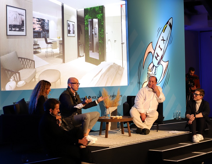
Today the association promotes Europe as a whole through its members in individual countries, encouraging training and job exchanges. The organisation has developed a modern and progressive approach, promoting an expansionist outlook that adapts renowned European know-how to the demands of the rapidly changing international hospitality industry.
“Our new-found relationship with the EHMA is invaluable as we recognise Europe’s growth in hotel development – a report in February 2020 from Lodging Econometrics showed that Europe’s hotel construction pipeline was up by 19 per cent in projects,” explained editor Hamish Kilburn. “Therefore, we are excited to start meaningful conversations with more hotel managers in Europe who are on the front line of this important development in hospitality.”
Main image credit: Daios Cove Luxury Resort & Villas
UK Bathrooms announces adds H2k Harrogate to its portfolio of luxury brands
UK Bathrooms, the leading online store for premium designer bathroom products has announced the addition of the luxury skincare and spa toiletry brand H2k Harrogate to its portfolio…
“We’ve been looking for a luxury skincare and spa toiletry brand for some time,” the Managing Director of UK Bathrooms, Graeme Borchard, told Hotel Designs.
We wanted a brand with values to match our own, a brand that places the environment at the heart of everything they do and whose products were safe for our customers, safe for wildlife and ethically sound.”
The award winning H2k Harrogate collections include a wide range of vitamins, extracts and oils which, when combined are gentle and kind, suitable for most skin types. Many of their products are now free of paraben’s, sulphates and artificial colours. Established in 2000, their founder Hazel Barry introduced Kalahari melon seed oil in to skincare. Kalahari melon is found across the Namibian desert and is an important source of water. The seed is used extensively in H2k products as it is packed full of antioxidants and vitamins helping to moisten, regenerate and rebalance all skin types.
Image credit: UKBathrooms
“Our Kalahari melon seed oil helps to calm the skin and makes the H2k formulas truly unique.” Hazel Barry, H2k Harrogate.
UK Bathrooms will be introducing products and gifts from the H2k Harrogate range which boasts only the finest natural ingredients including luxurious shower gels, shampoos and conditioners, hand care, premium candles and diffusers. And, right now, in conjunction with the Crosswater Sale UK Bathrooms are giving away a FREE H2k Harrogate Skin Kind and Stay Safe Hand Sanitiser and H2k Mischief Hand & Body Lotion to all Crosswater orders over £250*. (see www.ukbathrooms.com for full terms and conditions).
The Stay Safe Hand Sanitiser with 70 per cent alcohol kills 99.9 per cent bacteria is unperfumed as better for your skin, bearing in mind the high alcohol content (250ml). The Mischief Luxury Hand & Body Lotion is enriched with frankincense and thus deeply moisturising (250ml). Both products are in reusable/refillable bottles and presented in a beautiful gift box.
“H2k Harrogate is a perfect complement to our bathroom brands and we look forward to working with Hazel and her team here in Yorkshire,” added Borchard.
UK Bathrooms is one of our recommended suppliers. To keep up to date with their news, click here. And, if you are interested in becoming one of our recommended suppliers, please email Katy Phillips by clicking here.
Is UVC lighting on your design agenda for the post-pandemic world?
Lighting brand humanlumen has introduced Clean Air Series, UVC lighting that actively reduces bacterial and viral charge. Hotel Designs investigates…
humanlumen, a lighting brand that prides itself for having a uniquely human-centric approach, has introduced the Clean Air Series, a range of UVC Air Sterilisation Units.
The Clean Air Series is a range of efficient UVC lighting devices that actively reduce the bacterial and viral charge of the air in closed environments, such as offices, classrooms, hotel rooms and healthcare environments.
The International Ultraviolet Association (IUVA) believes that UV disinfection technologies can play a role in a multiple barrier approach to reducing the transmission of the virus causing COVID-19 and SARS-CoV-2, based on current disinfection data and empirical evidence.
Image credit: humanlumen
UVC Air Purification Unit
The powerful UVC radiation is totally isolated inside the Air Filtration System (AFS) as exposure of UV light, of any type, in high dosage to the naked eye will cause potential long-term health issues.
The system draws in contaminated air and removes all bacteria through a series of integral filters and then delivers clean air back into the space. Each unit cleanses up to 3,000 cubic square metres of open office space and is a simple plug and play system with no integration into the existing mechanical systems.
The clean air units work like an air purifier, but instead of filters it uses the UVC technology to eliminate the viruses. The fan located in the bottom of the fitting sucks in the air of the room and channels it through a series of UVC light canals that have the UVC lights. The UVC kills the viruses and the clean air is released in the room through a carbon filter.
The carbon filter’s main purpose is to clean the odours from the air, with an additional dust filter at the entrance of the fan, neither is essential to kill bacteria, this is the role of the UVC light.
humanlumen, which is based in Clerkenwell, is one of the brands that has taken advantage of our Industry Support Package. To keep up to date with supplier news, click here. And, if you are interested in also benefitting from this three-month editorial package, please email Katy Phillips by clicking here.
With a pedigree that flows from the acclaimed Palace Hotel Tokyo and designs on rewriting the playbook for lifestyle brands, the management arm of Palace Hotel Co. Ltd. has announced plans for a Q3 opening of Zentis Osaka, the first property of its new hospitality brand.
Internationally renowned UK designer, Tara Bernerd of Tara Bernerd & Partners, has been tapped for the property’s modern interiors while Café Co. – the esteemed Japanese food & beverage operator behind the one Michelin-starred CRAFTALE in Tokyo – will develop and operate the hotel’s restaurant, bar and lounge. A top-flight team of seasoned staffers from Palace Hotel Tokyo, the first Japanese-brand hotel to achieve the prestigious Forbes Five-Star rating, will guide the standards of service.
“We see an opportunity to really elevate expectations for service, accommodations and F&B in the upper reaches of the select-service category,” said Daisuke Yoshihara, president of Palace Hotel Co. Ltd. “We believe those critical aspects of the stay experience are what will emerge as key standouts to our guests, truly differentiating our brand from those already in the market.”
Image credit: Palace Hotel Management Company
With Zentis’ strong focus on design, the new property is a member of Design Hotels – a curated selection of independent hotels with a passion for genuine hospitality, cultural authenticity, thought-provoking design and architecture. “We are truly privileged to collaborate with Palace Hotel Management Company to bring Zentis to the Design Hotels community. I am certain that our trend-forward and design-conscious travelers will be inspired by this sophisticated lifestyle addition to our portfolio – and our first for Osaka,” said Jinou Park, Vice President of Asia Pacific.
An entirely new build, the 16-storey property’s contemporary yet laid-back feel flows from a natural colour palette of raw materials, including exposed brickwork and timber beams. A stone staircase anchors a lobby wrapped in floor-to-ceiling windows where a double-sided fireplace creates a focal point and connects an intimate lounge space with the landscaped green space that surrounds.
One floor above is the hotel’s bar and main dining area as well as an airy lounge and outdoor terrace featuring lofty, seven-meter-tall ceilings. Also on the second floor is the hotel’s fitness center – outfitted with Life Fitness equipment and accessible 24 hours.
Taking inspiration from the modular design and intuitive functionality of bento boxes, the 212 guestrooms feature the same fresh palettes that are found throughout the hotel. Polished wooden floors, muted tones and splashes of mustard as well as art on the walls commissioned from a local Japanese artist define spaces that make ingenious use of otherwise snug square footage.
At the helm of UPSTAIRZ – the hotel’s dining venue that is likely to emerge as a destination not only for guests, but also discerning locals – will be Executive Chef Shinya Otsuchihashi, who, after having honed his culinary skills over the last two decades in both Japan and France, will be closely overseeing the eatery’s concept and menus from his base at CRAFTALE.
Zentis Osaka is situated where the picturesque, riverside area of Dojimahama and the high-end business entertainment district of Kita-shinchi meet. Nakanoshima, an islet home to some of the city’s premium attractions – including the Osaka Science Museum and the National Museum of Art, Osaka – is a leisurely three-minute stroll from the hotel while Osaka Station, the city’s main rail hub, is a mere five-minute taxi ride away. The two major airports that service Japan’s third largest city – Kansai International Airport and Itami Airport (Osaka International Airport) – are located less than an hour’s drive away.
Main image credit: Palace Hotel Management Company
Kerakoll Design House is an integrated project for the Interior Design featuring innovative materials – cement, resin, handcrafted wood, micro-coatings, paints and glazes – coordinated in the10 colours of the inviting and neutral Piero Lissoni Warm Collection.
A new style of interior design, where materials, textures and colours blend together. Floors and coatings, walls, fixtures, furnishing accessories, lighting and heating fixtures all become a single seamless surface. Each material is hand made by skilled decorators, and any distinctive marks and irregularities in the surface are proof of its refined and exclusive nature.
Patina
A breathable natural “old look” plaster effect finish. Applied seamlessly by skilled applications the product is unique and available in the 10 Warm Collection colours. Patina is indicated for internal surfaces (walls); for all environments in the house, with the exception of shower cubicles and around kitchen units, and for all commercial areas.
Patina gives environments an “old-look” style with great personality. Creating a sense of unfinished and imperfect, that clothes the walls with charm. It simulates the effect of passing time that, by building up a characteristic patina, attenuates the original colours, adding unexpected shading or allowing underlying layers to shine through. The texture of Patina, which is soft to the touch and extremely beautiful, features ripples, marbling and vibrations.
Microresina
An eco-friendly decorative and protective microfilm, perfect for redesigning of existing ceramic walls & floors quickly and easily. Available in an extra matt finish and silk-touch effect. Microresina is suitable for internal surfaces either in the home or in commercial areas.
Microresina is comprised of a polyurethane elastic microfilm used to redesign existing wall surfaces. Following application the results provide a seamless colour of which, enhances patterns textures and irregularities to give rooms a fresh & contemporary look. The product redesigns and protects existing floorings and joints, transforming into a continuous surface that is completely non-absorbent, hygienic and safe.
Wallcrete
A continuous, two-layer coating, 3 mm thick, with a trowled cement texture. Hand made by skilled decorators, and any distinctive marks or irregularities in the surface are proof of its refined and exclusive nature. Wallcrete is indicated for internal surfaces (coatings on columns, shelves, worktops and other architectural elements); for all rooms in the house and for all commercial areas, including coating of shower interiors (with the insertion of Wallcrete Aquastop waterproofing). Wallcrete is a surface with a great aesthetic impact that enhances the physical texture of the cement.
Casa Ceramica is one of the brands that has taken advantage of our Industry Support Package. To keep up to date with supplier news, click here. And, if you are interested in also benefitting from this three-month editorial package, please email Katy Phillips by clicking here.
Whether you are an interior designer, an architect or hotelier finding that all important inspiration is key, and that is where Ulster Carpets’ Design Portal can make all the difference…
Inspiration comes in many forms. It could be a stunning view from the top of a mountain, a sparkle that catches your eye in the mundane grey of a city’s concrete jungle or these days your own abode.
Packed full of more than 9,000 designs, the company’s online archive is easy to use and is a great way to get those creative juices flowing.
You can get a sense of what is currently on-trend by taking a look at some of the most recent designs from the brand’s creative teams based across the world or browse the Gallery, where Ulster Carpets showcases some of our stunning installations.
Image credit: Ulster Carpets
If you want some ideas for organic designs, Japanese form or mineral styles, then you can browse the comprehensive Collections that have been expertly curated by the company’s own archivist.
Styles also have a habit of returning, so the archive is also a great place to look. It contains thousands of different designs ranging from Abstract and Art Deco to Classical, Floral, Contemporary and many more.
Design Portal is also fully searchable using key words or by design numbers while you can also create your own favourites to keep for future reference.
Image credit: Ulster Carpets
Once you’ve found the design you want, you can even recolour it to suit the project you’re working on. If we have created a custom design for you, then these can also be uploaded into your individual collection. You can then use our standard or neutral tuft boxes to choose from more than 650 colours and recolour to your heart’s content. A sample of your new creation can be requested on the fast three-day turnaround to assist you with your project development.
In terms of designs and colours, Design Portal offers an abundance of choice and a plethora of inspiration, so why not make the most of it?
If you would like to be inspired and enjoy the benefits of Design Portal but don’t have an existing username and password email marketing@ulstercarpets.com to find out more.
Ulster Carpets is one of the brands that has taken advantage of our Industry Support Package. To keep up to date with supplier news, click here. And, if you are interested in also benefitting from this three-month editorial package, please email Katy Phillips by clicking here.
Hotel performance in Asia Pacific were lowest ever recorded in April 2020
Reflecting the effects of the COVID–19 pandemic, the Asia Pacific hotel industry reported record lows in the three key performance metrics during April 2020, according to data from STR…
New data from STR shows that the absolute levels in occupancy, average daily rate and revenue per available room were the lowest for any month on record in the region of Asia Pacific.
U.S. dollar constant currency, April 2020 vs. April 2019
Occupancy: -60.3 per cent to 28.0 per cent
Average daily rate (ADR): -44.8 per cent to US$54.97
Revenue per available room (RevPAR): -78.1 per cent to US$15.38
Local currency, April 2020 vs. April 2019
South Korea
Occupancy: -70.8 per cent to 20.0 per cent
ADR: -21.0 per cent to KRW112,897.83
RevPAR: -76.9 per cent to KRW22,536.18
Each of the three key performance metrics were up from March but remained the lowest for any April on record in the country.Incheon & Seoul experienced a 75.2 per cent year-over-year decrease in occupancy (to 18.8 per cent).
Australia
Occupancy: -72.7 per cent to 19.9 per cent
ADR: -33.1 per cent to AUD119.87
RevPAR: -81.7 per cent to AUD23.85
The absolute occupancy, ADR and RevPAR levels were the lowest for any month in STR’s Australia database. Among key markets, Melbourne and Sydney saw year-over-year occupancy declines of 65.0 per cent and 73.7 per cent, respectively. Returning travellers are predominantly keeping occupancy up, as seen in Adelaide, where year-over-year occupancy declines eased slightly during April up to May 13 due to returning travellers from India. More information can be found in STR’s Pacific webinar recording.
Over the past few months, the majority of us have been forced into our homes with the door locked. And while the planet is enjoying a quality break from pollution, is the inside air we are breathing safe? Hotel Designs asks air purifier manufacturer Blueair to explain…
Did you know indoor air can be up to five times more polluted than outdoors?
Improved air quality is also conducive to a great night’s sleep which for most, if not all hoteliers, is the number one priority for their guests and patrons.
Polluted indoor air can trigger allergies and asthma, affect child development, disrupt sleep and more. Clean air improves our health and wellbeing, and it helps us to lead happier and healthy lives by improving sleep, concentration and physical performance. A Blueair air purifier, as used by top hotels in London such as the Page8 hotel, improves air quality for a better night’s sleep.
Image credit: Blueair
In a post Covid-19 world both business and leisure customers will be scrutinising hygiene and air quality much more closely as a deciding factor in where to stay. An air purifier in a hotel room not only massively improves the quality of air, but also gives peace of mind that guests are breathing the best possible air they can. For hoteliers, air purifiers should – and will be – a serious consideration for guest rooms going forward.
“Blueair’s air purifiers are designed to clean the air in a room up to five times an hour.”
Inspired by the fresh air of the Stockholm archipelago, Blueair’s purpose is to help protect us from the invisible threats of poor indoor air quality. More than two decades ago, Blueair’s Swedish founder built his first air purifier to protect the health of his new-born daughter, and consequently set out to make the world’s best air purifier.
By bringing together a team of talented designers and filtration experts who shared his passion for sustainability, quality, and design, the Blueair air purifiers were born. Since then, Blueair has expanded into one of the world’s leading producers of air purification solutions for home and professional use. Blueair delivers innovative, best-in-class, energy efficient products and services to consumers and commercial buildings such as hospitals, embassies and schools in over 60 countries around the world.
Blueair’s air purifiers are designed to clean the air in a room up to five times an hour. Thanks to proprietary HepaSilent™ technology, Blueair’s air purifiers remove at least 99.97 per cent of all airborne particles as small as 0.1 microns in size. This includes pollen, smoke, dust, mould spores, germs, pet allergens and microplastics.
Blueair was founded on the firm belief that freedom to breathe is a basic right and this should not be compromised when on holiday or staying away on business. Air pollution is the single biggest environmental threat to human health, and to the health of our planet. This is especially the case in busier cities where air pollution is much higher and smog and fumes from cars can enter buildings through ventilation. Hotels that invest in air purifiers are ensuring guests can breathe as nature intended. Blueair’s air purifiers are also whisper silent and so will not distract from a good night’s sleep.
Blueair’s air purifiers are among the most awarded in the UK. They have highly respected third party endorsements from Which?, Good Housekeeping Institute, Asthma Allergy Nordic and Quiet Mark, as well as awards from Ideal Home, IndyBest and MadeForMums.
Blueair is one of the brands that has taken advantage of our Industry Support Package. To keep up to date with supplier news, click here. And, if you are interested in also benefitting from this three-month editorial package, please email Katy Phillips by clicking here.
This website uses cookies to improve your experience. We'll assume you're ok with this, but you can opt-out if you wish.AcceptRejectRead More
Privacy & Cookies Policy
Privacy Overview
This website uses cookies to improve your experience while you navigate through the website. Out of these cookies, the cookies that are categorized as necessary are stored on your browser as they are essential for the working of basic functionalities of the website. We also use third-party cookies that help us analyze and understand how you use this website. These cookies will be stored in your browser only with your consent. You also have the option to opt-out of these cookies. But opting out of some of these cookies may have an effect on your browsing experience.
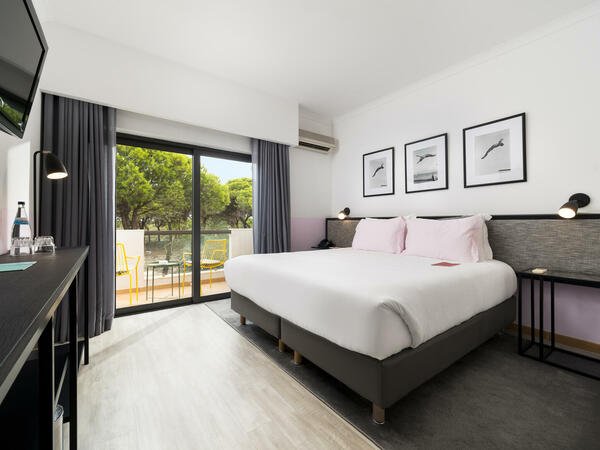
Necessary cookies are absolutely essential for the website to function properly. This category only includes cookies that ensures basic functionalities and security features of the website. These cookies do not store any personal information.
Any cookies that may not be particularly necessary for the website to function and is used specifically to collect user personal data via analytics, ads, other embedded contents are termed as non-necessary cookies. It is mandatory to procure user consent prior to running these cookies on your website.
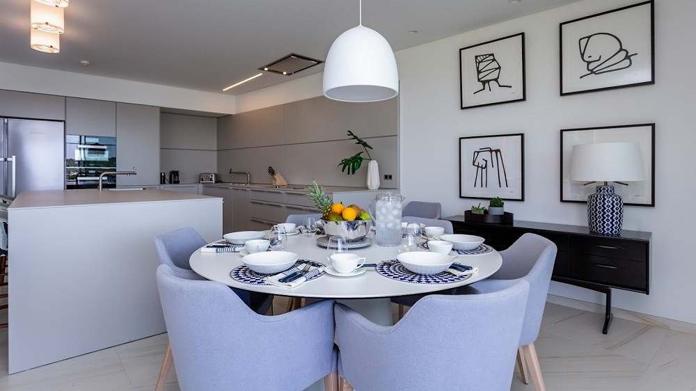
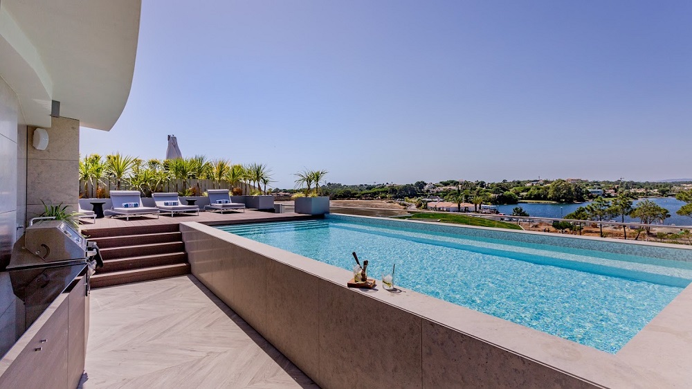
To keep up to date with all the latest news and features, sign up to receive our weekly newsletter and bi-monthly HD Edit.