Colour has the power to raise or lower our heartbeat, impact our sleep and influence our overall wellbeing. There’s a tremendous amount of research that’s gone into the psychology of colour and the impact it has on our health. Kicking off our colour series, brand strategist Emma Potter explores how conscious consumers are of their relationship with colour, especially when checking in to a hotel…
Depending on our upbringing, gender, values, geography, and other influencing factors – colour can have very different meanings. For example, orange is often considered friendly, confident and cheerful (think Amazon and Orange); red is excitement, youthful and bold (think Coca-Cola and Lego); blue is trustworthy, dependable and strong (think Unilever and PayPal). Colour evokes feelings and emotion, and choosing the right colours can make the difference between success of failure of a brand, business, and hotel environment – the colours that adorn and decorate these spaces will evoke feeling that make us connect.
Colour with purpose
Colour has the power to silently influence how consumers think and behave in an environment. Interior designers and hoteliers put a huge amount of effort into the hues they choose to decorate a spaced, be that a lobby, restaurant, bedroom or lounge area, as they appreciate the effect colour has on their consumers emotions. In order to create an appropriate scene for a certain target audience, it’s worth understanding the science of colour psychology and the tremendous ability it has to change entire moods.
A welcoming hotel reception and lobby has the ability to make or break a first impression when a customer walks through the doors. All sorts of creative elements are utilised to deliver the ‘Wow’ factor – this may include impressive sweeping stair cases (Plaza 18), bold curvaceous sculptures, wood-burning fire places that house a Italian marble mantel, sculptural sofas and alternative seating to make customers feel welcome and relaxed, and bold artwork – in some instances they may even look like a gallery.
Exploring colours that are timeless and evoke healthy wellbeing
Some may argue that using neutral colours (beige, cream, grey) will appeal to a broader market. While white may be a natural choice for a Greek Mediterranean style hotel (Mykonos Riviera Hotel & Spa), some people may associate white with cleanliness, whilst others may associate it with hospitals. Either way, white will significantly brighten up a room and will help to reflect light and colour.
Green typically symbolises growth and harmony, which is extremely grounding and brings us back to nature – think rolling countryside surrounded by lush leafy trees or blossoming flowers and open spaces. It is often associated with evoking a feeling of peace, trust and tranquillity, and it helps to reduce feelings of anxiety, whilst stimulating love, balance and harmony in the body. The ideal choice for rural hotels, some would argue. But it can also be injected into urban hotels, such as Nhow London, to add flair, vibrancy and electricity.
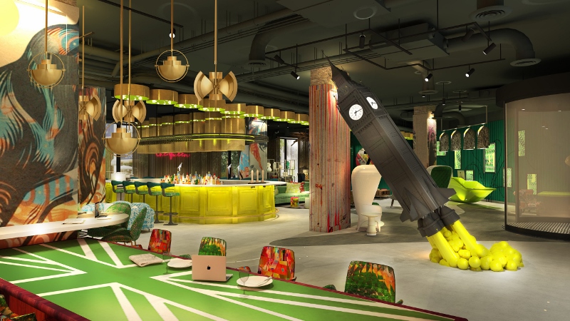
Image credit: Project Orange/Nhow
Blue symbolises trust and tranquillity, is often considered a calming colour, and goes well with grey and white to create a Scandinavian style. It’s reminiscent of flowing rivers, the ocean and the sky. The blue blossom of forget-me-nots help to stimulate mental clarity and creative expression, so floral arrangements also need to be considered from a design perspective. Perhaps the ideal choice for hotels by the sea or near water.
Oranges and reds symbolise energy, fire and passion, they resemble a sunset which represents creativity and emotion wellbeing. Mixing these colours with black would create a dramatic, mysterious ambience, perhaps lending themselves to Moroccan or Arabian interiors. However, where natural light is not in abundance, it may best to keep black to a minimum.
From the outset, a designer must work with the hotelier to decide upon the right colour palette to suit not only the style of the hotel, but the environment, ambience and setting they’re aiming to create, and the type of guest they’re aiming to attract.
Colour and the design process
There is no doubt about it, hotels are becoming more personalised – the recent renovation inside W London Leicester Square is a perfect example of this. As the saying in creative development goes: “Structure has integrity”, but designers – and guests checking in for that matter – are multi-faceted people, with multiple interests, so why just present one version ourselves? The core of our personality – or brand DNA / identity – will remain, but we give ourselves the permission to personalise aspects to make every room and space special and stand out in its own right. Be that through an aspect of design, a feature that’s maximised, lighting to create a mood, music to evoke a rhythm, technology to take us into the next millennia, temperature control to make it feel like a fresh spring morning or a hot summers day, it all plays its part in the personalisation process. I liken it to a menu in a restaurant – everything on the menu will reflect the chef behind the brand, but the choice each customer makes creates a unique, individual, memorable experience. Ideally one that each guest wants to talk about. In addition, lighting will change the atmosphere of a room or space, and this continues to be an ever-evolving trend.
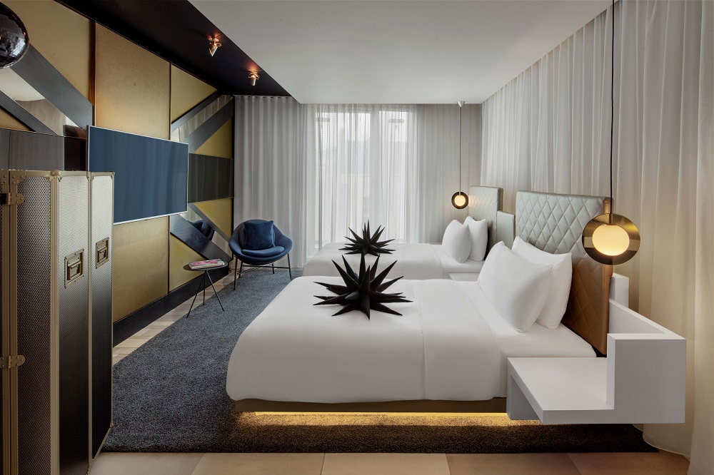
Image credit: W Hotels
Design trends through the decades
I’m sure, like many of us, we’re more influenced subconsciously by colour than we realise. Thankfully 2019 has represented a year where bright new colours have returned to the trending palette.
A new word for me this year is ‘Biophilia’ meaning ‘an innate and genetically determined affinity of human beings and the natural world’. To quote Angie Lee: “Biophilia is a design driver that engages the end user by connecting them to primal instincts about the relationship between humans and nature.” As the quest with technology continues to push the boundaries to supposedly make our lives better, more efficient, smarter and more connected – in reality what we crave as ‘human beings’ is connection, and being in nature, hearing the rhythm of waves, being able to touch natural surfaces like stone are wood, is what brings us to a state of consciousness where real life flows. No longer a place to pass through whilst checking in, I love the idea that the hotel lobby has become a place to connect and congregate. Moreover, now we often see artists being commissioned to create bespoke pieces for lobby areas, which ties the concept of ‘art and wallcoverings’ much closer together.
The return of bold colours in 2019
I appreciate that multiple shades and tones of grey have been in fashion for some time now and are timeless and therefore appropriate for the international hotel design scene, but consumers are beginning to become more drawn to bold, warm, vibrate colours such as pink and orange. So, it was heart-warming to see Pantone name ‘Living Coral’ as the colour of the year, described as follows ‘an animating and life-affirming coral hue with a golden undertone that energises and enlivens with a softer edge’. It certainly adds vibrancy and a natural injection of warmth that has perhaps been missing in recent years.
“Rooms should not be put together for show, but to nourish one’s own wellbeing.” – Albert Hadley
Global growth of the wellness industry
Spanning multiple sectors including personal care, beauty and anti-aging; wellness tourism; traditional and complimentary medicine; wellness real estate; and workplace wellness, global growth has sky rocketed in recent years, and at the end of 2018 the wellness economy was dubbed to be worth $4.2 trillion.
Moreover, the projected average annual growth rate for 2017-2022 has been noted at eight per cent for wellness real estate, 6.7 per cent for workplace wellness, and a staggering 6.4 per cent for spa facilities. Perhaps this is due to the human race living longer, poor health as we age, and the increased stress levels this induces? One thing is for sure, the wellness industry is a driving dynamic force that’s converging to create a more connected experience in all areas of our lives – personal, home, work, travel.
Whilst ‘Mindfulness’ may have grown in popularity in recent years, it seems 2019 is fast becoming the year of wellbeing and consciousness – in all areas and aspects of our lives. To quote Albert Hadley: “Rooms should not be put together for show, but to nourish one’s own wellbeing.” Interior design is deeper than simply decorating, colour schemes have the ability to cleverly transform and/or evoke emotions and designing with purpose as a whole will result in space that is more functional, more inviting and more appropriate to the guests checking in.
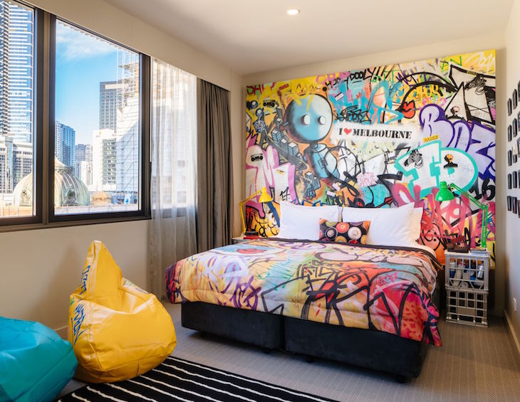
Main image credit: Hilton Doubletree