Our latest virtual roundtable, in association with Bathroom Brands Group, comes following Hotel Designs LIVE in May where we hosted the panel discussion entitled: ‘Bathrooms beyond practical spaces’. Extending what we learned at the event, Editor Hamish Kilburn invites a handful of designers to explore how to inject colour and personality into the bathroom…
Gone now are the days of bathrooms being used solely as practical spaces. When colour, pattern and material trends spilled over in the ’70s, the bathroom became an experiential area where designers could rip up the rule book to reflect personality. With the demand for experience-driven travel and the addition in recent years of wellness and wellbeing being top of modern travellers’ agendas – not to mention technology evolving at a rapid rate – the options designers can now use in the bathroom is phenomenal.
To see how far we can take colour and personality in the bathroom, we invited leading designers from multiple brands and studios to help us explore how we can meaningfully add a bit of flair in these once-forgotten spaces.
On the panel:
-
- Fiona Thomspon, Principal, Richmond International
-
- Akram Fhami, Co-founder, London Design House
-

- Nick Hickson, Co-Founder, THDP
-

- Diana Darmina, Interior Design Manager, Lamington Group
-

- David Balmer, Senior Projects consultant, Crosswater
-

- Tom Lowry, Key Accounts Manager, Projects
-
- Hamish Kilburn, Editor, Hotel Designs
-

- Paul Savage, Design Director, IA Architects
Hamish Kilburn: Traditionally, why did colour not play a large a role in the bathrooms?
Fiona Thompson: In the luxury hotel sector, the simple answer is that we were reflecting what had been done previously – so it was more a nod back to the heritage of the projects, which were usually sheltered in historic buildings. In terms of sanitaryware, there was a big change in the 70s from using colour to then only using white. And that’s probably because white represents cleanliness. However, in more trendy brands we are seeing colour being injected back into the bathrooms, but it is a big step for more luxury hotels.
The bathroom is the last thing that gets stripped out of a hotel, so anything we do has to stand the test of time.
“I have seen a shift toward a more experience-led design when it comes to bathrooms in hotels” – Diana Darmina, Interior Design Manager, Lamington Group.
-
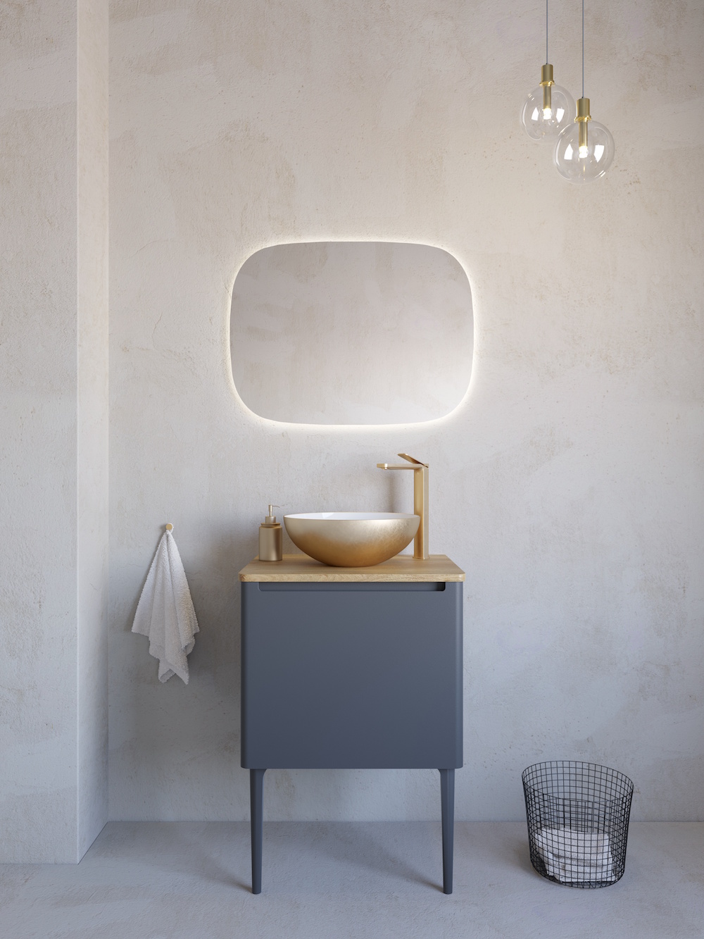
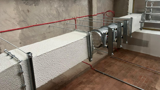
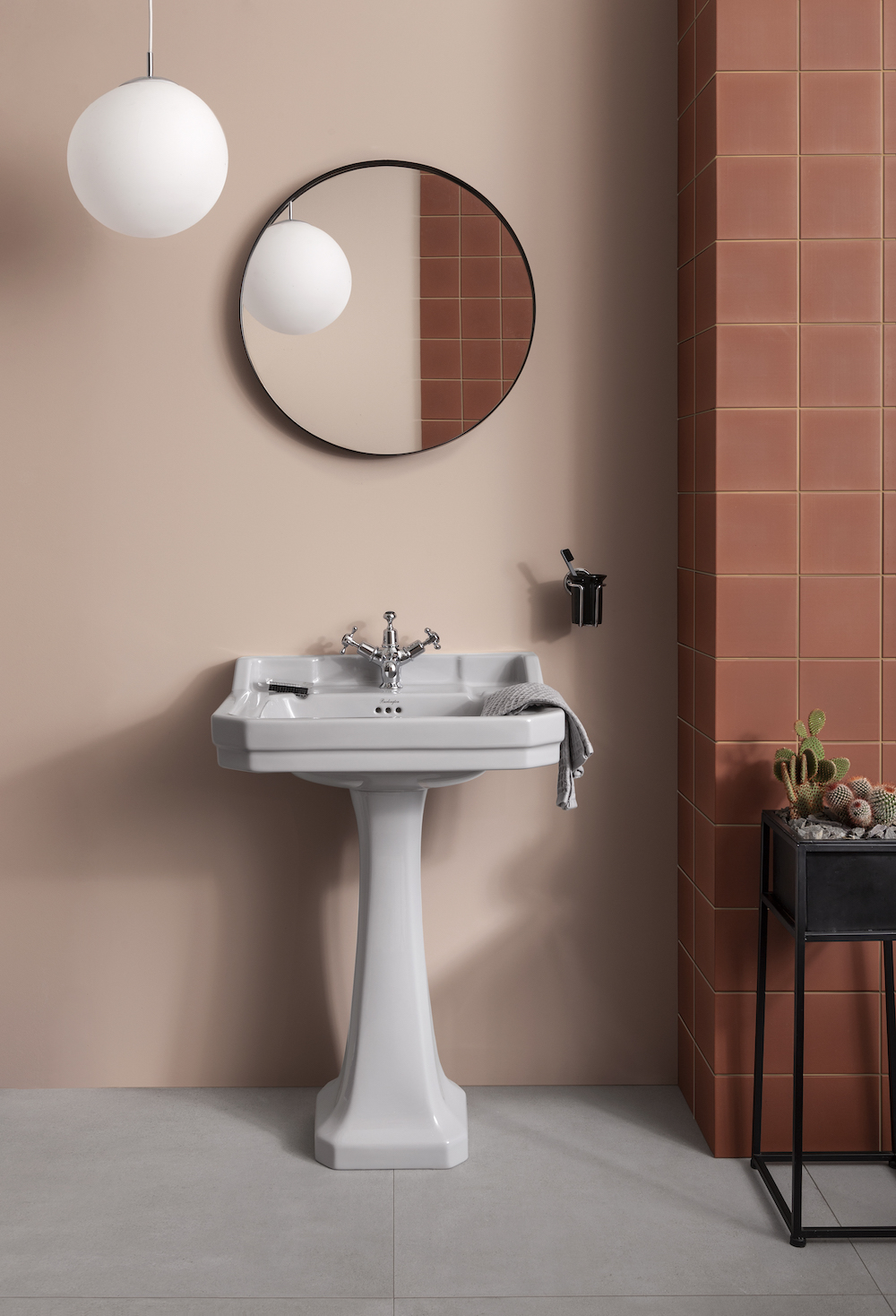
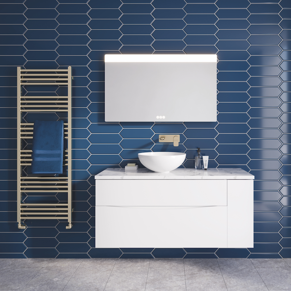
- Image credit: Bathrooms Brands Group
-
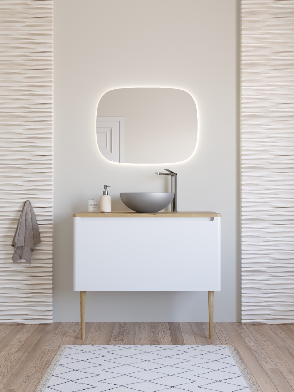
- Image credit: Bathrooms Brands Group
Akram Fahmi: I would say there has been a shift over the last 10 years of moving to blacks, dark bronzes for accent colour in the bathroom. But I think sanitaryware companies have been widening their colour ranges as styles and fashion has also moved on. I think black is here to stay; it’s now staple and consumers accept it’s a stylish option, but colour, bold colours, pastels are having a renaissance. We have been devoid of fun for almost two years, staring at our own bathrooms at home thinking, ‘I want something to lift me in the morning, perk me, surprise me continually’. I think colour has that ability to affect your mood. Bold yellows give you warmth and comfort, red is energetic and bold, green is calming and fresh. All these amazing feelings from colour, and designers need to be braver when it comes to utilising it in powder rooms and bathrooms. In fact, I think bathrooms are the perfect place to be a little quirky or offbeat. The bathroom is the most informal space in a house or hotel. It’s ultimately the space you need to feel comfortable without clothes on – and if you can’t have fun without clothes on, when can you!
Diana Darmina: Working in the hotel industry, I have seen a shift toward a more experience-led design when it comes to bathrooms in hotels. At room2 we always push for our bathrooms to be playful and energising in their look and feel. We always push for our bathrooms to be remembered as a place which guests love, but would probably not have the courage to do in their own homes.
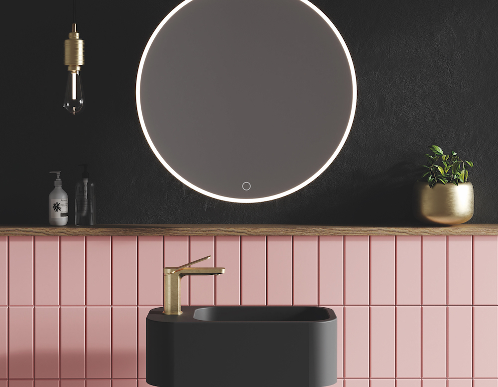
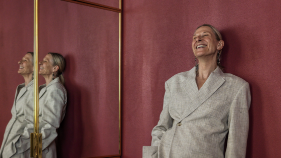
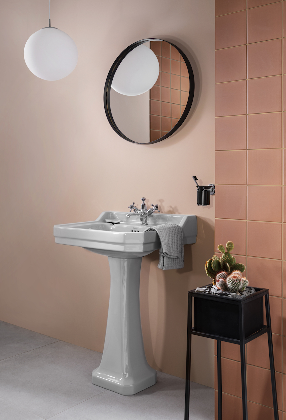
Image credit: Bathrooms Brands Group
Nick Hickson: Some brands are very prescriptive when it comes to brand standards and certainly with the sanitary ware being white. So, it’s tough to have conversations about injecting colour in. You could suggest minor changes, such as the shower tray being made from Quartz Stone or designing the space with tile surfaces.
Meanwhile, there are new brands entering that want to define new categories. Those lifestyle brands don’t want white or to feel corporate. Instead, they are reaching out for something more experiential – something coloured or made from other materials than simply white porcelain.
David Balmer: Also, with hygiene being such a big focus point, there is still that need and demand for the perception of cleanliness. So, what we are seeing is that colour is being used on the outside of ceramics and not on the inside to maintain that.
“Traditionally, we were concerned and timid to use coloured brassware because of the cost and quality.” – Paul Savage, Design Director, IA Architects.
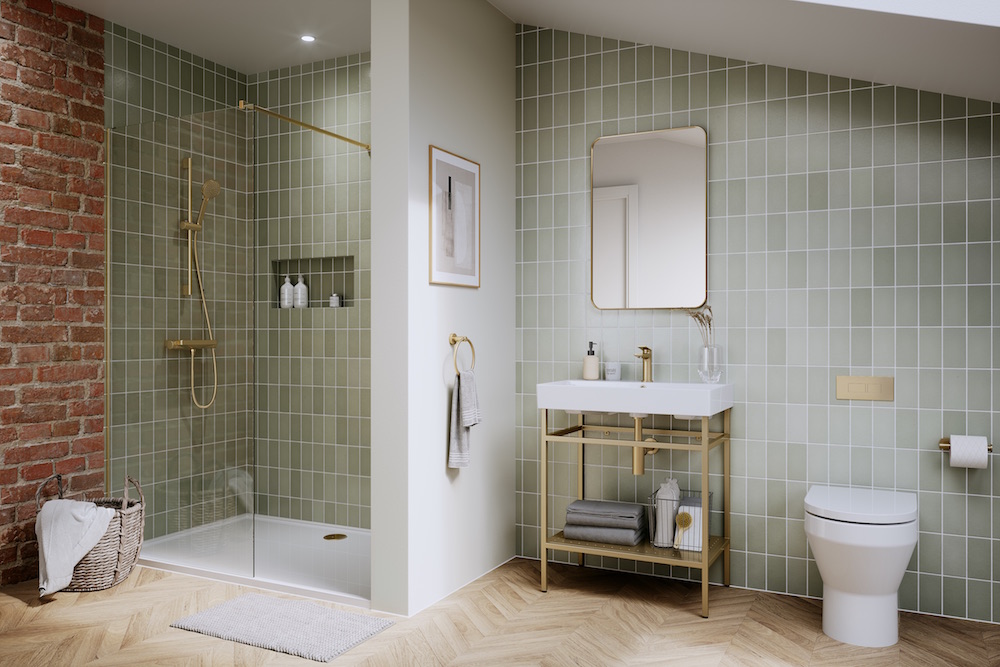
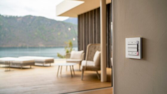
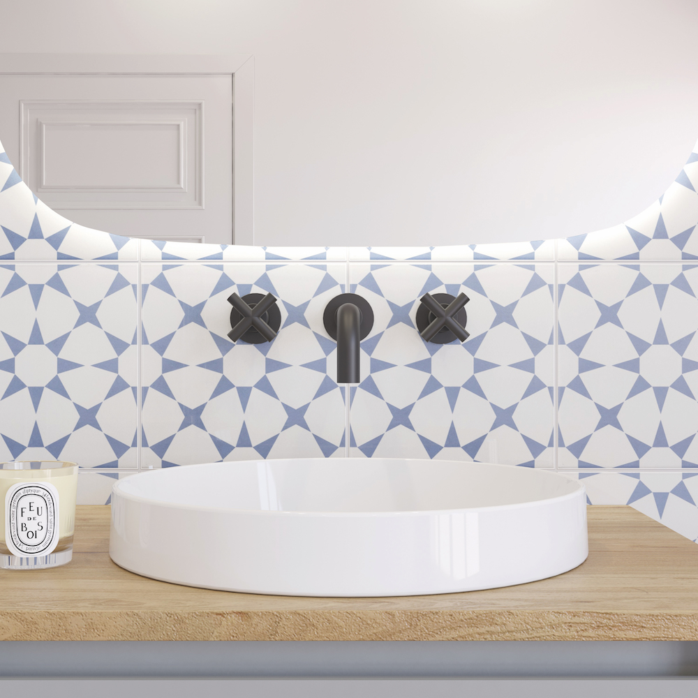
Image credit: Bathrooms Brands Group
HK: Crosswater, from a brand’s perspective, would you say those lifestyle brands have allowed you to inject colour in your products?
DB: Without a doubt. If you look at the new versions of the basins with the tinted brass or gold on the outside of the bowl you will see we are able to add more personality in our products thanks to the demand.
Paul Savage: From my previous experience of working with one of the large American operators, there was no colour in the bathrooms. If we take the high-luxury brands as an example, they want to achieve a classy look, and they are also protecting the owner’s investment. So typically we would expect a hard refurb of a bathroom every 14 years. Traditionally, we were concerned and timid to use coloured brassware because of the cost and quality. We would say that housekeeping would do the most damage to the rooms because of some of the strong cleaning solutions they use. Now that the quality has improved and the cost has come down I think we will see more of it.
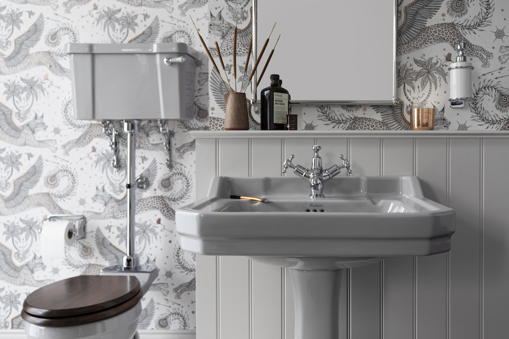
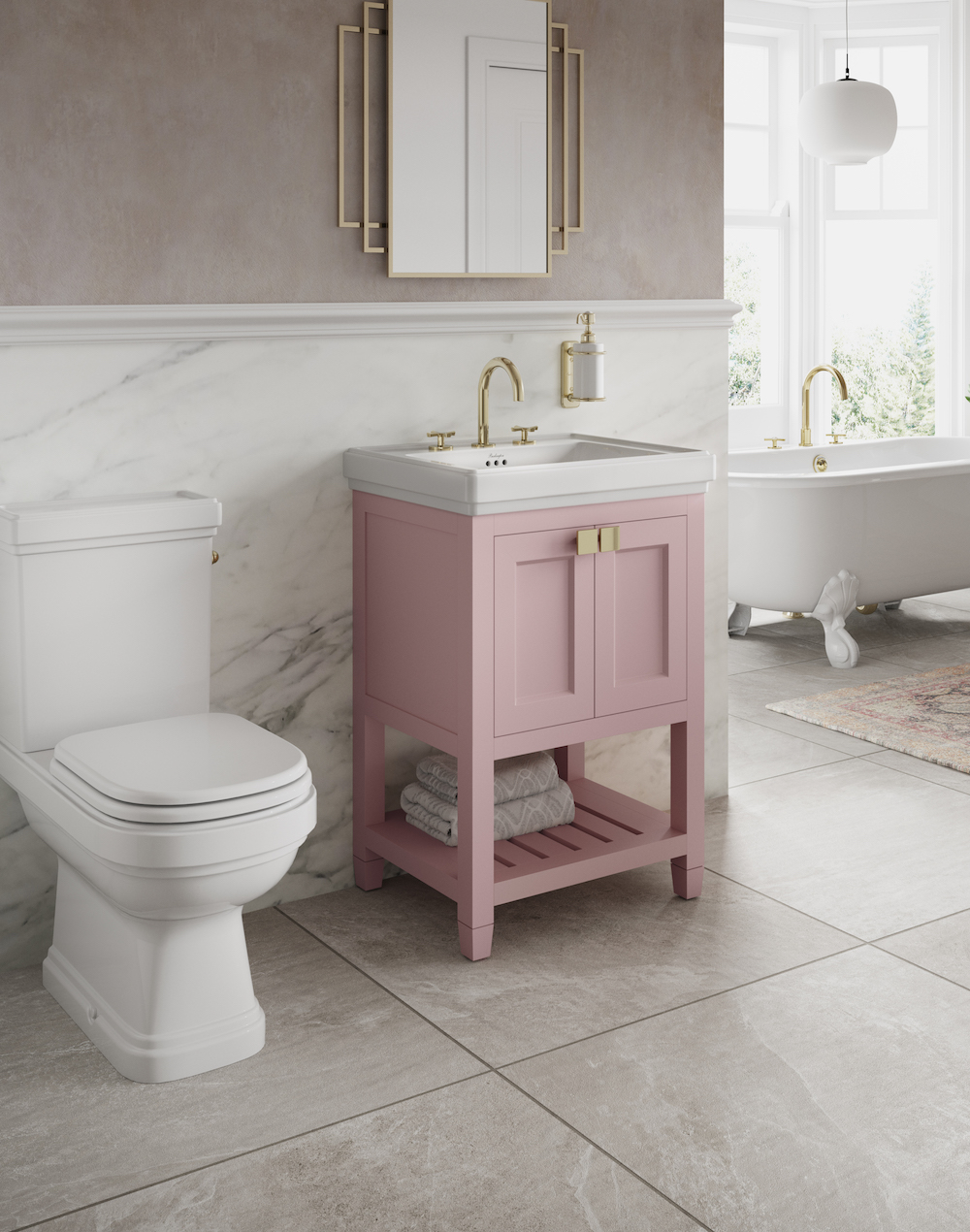
Image credit: Bathrooms Brands Group
HK: Were you wanting to inject more colour into your projects before you were able to do so because of the delay in the supply catching up to the demand?
PS: I think with how popular lifestyle brands are, I think it’s a really good opportunity to make a bathroom really unique. I really do think the development of lifestyle hotels – and the expansion of that sector – is allowing the industry as a whole to think more creatively when it comes to the bathroom. You can still sensitively add colour to these bathroom spaces to more classic hotel bathrooms but there are less opportunities.
FT: Also, the perception of a bathroom in a luxury hotel was traditionally marble or stone or granite. That has changed substantially – and now there are so many other materials for designers to choose from that still give the perception of high-end luxury. The traditional mindset has changed quite a lot.
NH: Nowadays, we would design the room, selecting from a vast range of surfaces and materials before we specify the bathroom products in order for the space just to feel as considered as other areas of the hotel.
“You don’t have to be clinical to be clean.” – Fiona Thompson, Principal, Richmond International.
-
- Image credit: Bathrooms Brands Group
-
- Image credit: Bathrooms Brands Group
HK: With Covid-19 being the elephant in the room, do you think the new demands will put a halt in how much colour will be put into the bathrooms?
FT: I think everyone just wants to move on. You don’t have to be clinical to be clean.
HK: As designers, selecting colours and tones that match is very important. Do you ever find this difficult in the bathroom?
NH: Sometimes. So, at the moment, matt black is a very popular bathroom finish for taps and even basins. I have in the past struggled to find hinges of doors that match in, but generally the result is very impressive when you use contrasts in the bathroom.
“We are not against the idea of taking out the basin outside the bathroom in order to open up the space and create more of a language between the bathroom and the bedroom.” – Nick Hickson, Co-Founder, THDP.
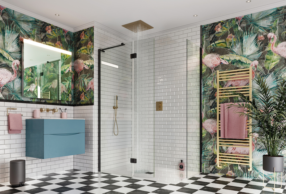
Image credit: Bathroom Brands Group
HK: How else, other than using colour, can we inject personality into bathrooms?
FT: Bathrooms are becoming quite focal key points in the design of a guestroom because they are the differentiator. I think using and exploring patterns and textures are therefore great ways to hep these areas stand out. People are becoming more playful, I have noticed, especially in hotels where the bathtub is removed from the bathroom in order to open up space.
NH: And even the basin, we are not against the idea of taking out the basin outside the bathroom in order to open up the space and create more of a language between the bathroom and the bedroom.
PS: There has been a massive renaissance in materials such as terrazzo in the last few years, so that’s a really good opportunity to bring in colour. Also, we are seeing that wallpaper is becoming a popular option in bathrooms for a feature wall. So, people are certainly getting bolder. The only thing I would tend to avoid is lighting that changes skin tone, because these areas are spaces where people go to groom and get ready. The other easy way to tell the design narrative is through artwork.
HK: Nick, you joined us for HD Live where we explored bathrooms beyond practical spaces. What would you say were the key takeaways in that discussion?
NH: One of the biggest things for me was being able to sit down with other designers (both seniors and juniors) to discuss key topics. We had a designer from Marcel Wanders Studio and Zaha Hadid Architects – and just understanding how others think about this topic. The other conversation we had, which I have been asked about since then, was materiality in bathrooms – I think we can afford to be a bit more adventurous these days.
-
- Image credit: Burlington
-
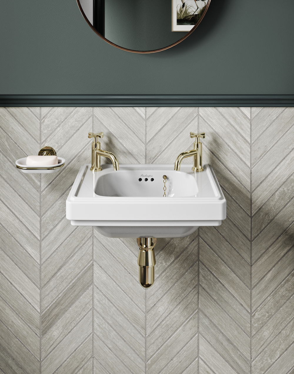
- Image credit: Burlington
HK: What would you say is really exciting you at the moment when specifying bathroom projects?
FT: I think it’s beyond look and feel and now it’s really about guest experience. The world has moved from wanting just a good thermostatic shower and a good toilet. I think now there are more products out there to help us create more of an immersive experience. With that in mind, the vast array of materials out there is very exciting! There’s certainly a demand to understand more about where materials come from.
NH: There are so many new products out there that are pushing the envelope. In-house designers are also pushing us to be more creative when reacting to a brief. I’m also loving the fact that broken-up mosaics are being used in bathroom design schemes, which I think is very interesting.
PS: The biggest difference for me, in recent years, is now the accessibility to coloured brassware – before you just couldn’t afford it in the budget! Also, the improvement to finishes and coating. Developers and investors don’t like taking risks – they need to know that the products are going to stand the test of time. So, we have really enjoyed being able to use these materials. The trends go full circle – next thing you know, chrome will be back in fashion!
Tom Lowry: Yes, and it’s important for brands like Bathrooms Brands Group to ensure that we focus on long-lasting trends. I have certainly seen an appetite for earthy colours and materials that have texture – as opposed to just looking at colour.
HK: I think the Bespoke Collection by Burlington is a fantastic example of this – and actually it was this collection, followed by the Riviera Collection, that allowed me to really see how the bathroom can absolutely become the ‘hero shot’ for a hotel. What are your thoughts?
PS: I think guests are much more sophisticated – and exposed via social media to high-end design. I think they expect this design being carried through to the bathrooms.
NH: Being conventional is now unforgivable on the hotel scene – we are constantly thinking, as designers, how we can push a projects design narrative.
-
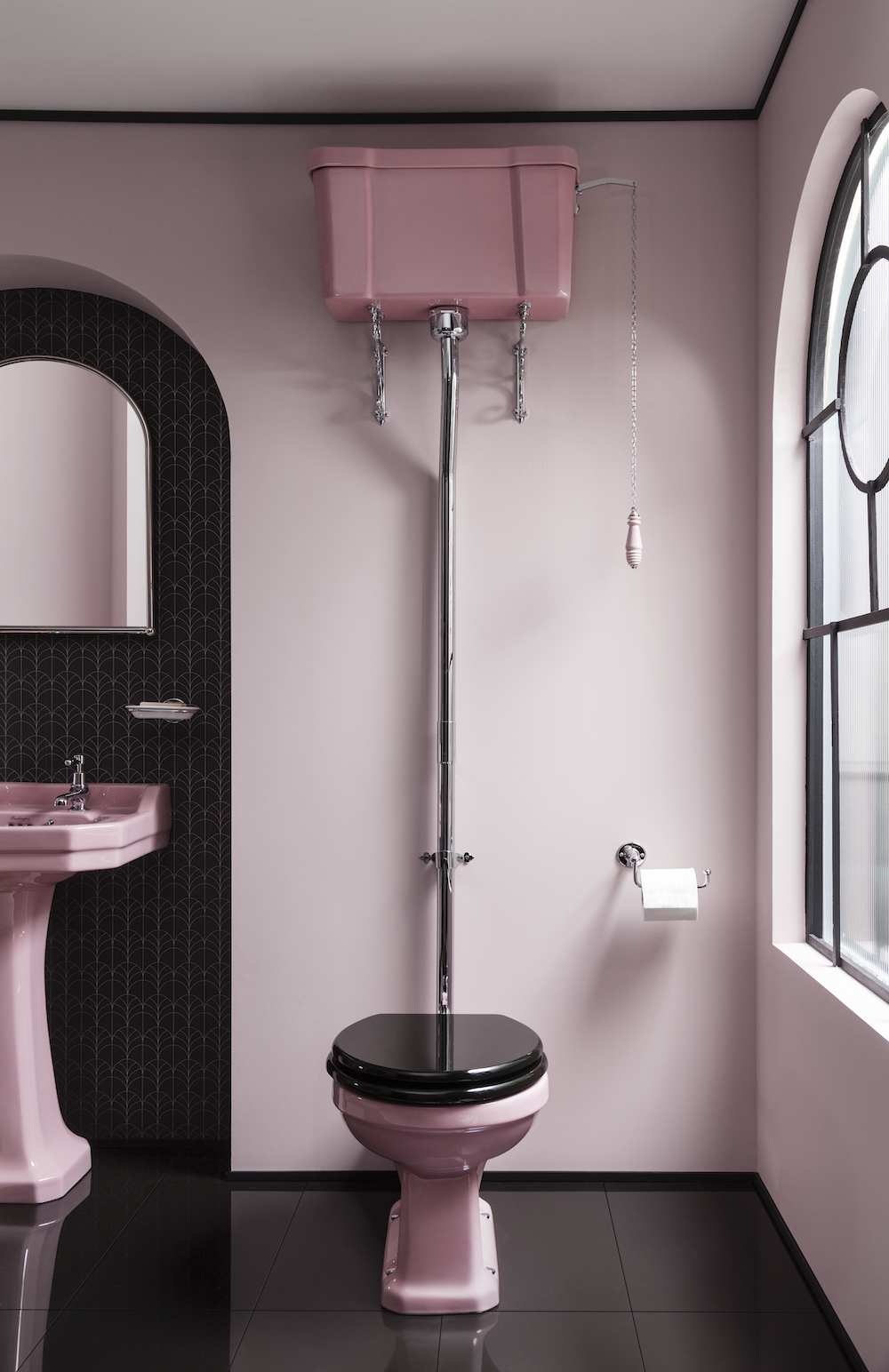
- Image credit: Bathrooms Brands Group
-
- Image credit: Bathrooms Brands Group
HK: For many, it’s easy to see colour injected in bathrooms sheltered under lifestyle brands. How can colour be sensitively injected in more luxury hotels?
FT: Whether it’s colour or texture, it’s about giving the space personality – and injecting sense of place. So, it becomes about using locally sourced materials. We did a project in Las Vegas where the bathroom was bigger than the rooms, so we used lots of back-painted glass to make it an extraordinary space. It is about doing things that are appropriate for the local location and culture. The bathroom now is quite often half the size of the bedroom, so it has to be a signature piece, if you like, but also keep it cohesive to the rest of the room.
“Layering colour, tone, accent in the choices of FF&E, accessories, artwork, make bold choices in the colour of joinery, doors and of course powder rooms!” – Akram Fahmi, Co-Founder, London Design House.
AF: I think it’s a very good question, colour is sometimes seen as cheap or tacky, but I totally disagree. Many modern luxury hotels have this element of seriousness, elegant and sophisticated tonality – we are all guilty of it at some point in our careers, and yes, that tonality and “properness” is expected and often pushed by the hotel operator and guest expectations, and yes it might look beautiful, but is it fun? No. Is it quirky? Not really. So how do you bring interest, surprise, moments of emotion into a the luxury environment, and I think the answer is layering. Layering colour, tone, accent in the choices of FF&E, accessories, artwork, make bold choices in the colour of joinery, doors and of course powder rooms! Colour has been slowly washed out of hospitality over the years, if you look back historically at hotels like the Savoy, the bold greens, or the Dorchester ballroom in the 1930s was full of pinks, blues and golds. These spaces historically had colour and we need to get back to celebrating these spaces again and have fun rather than align to a pretence that sophistication is black and white or grey.
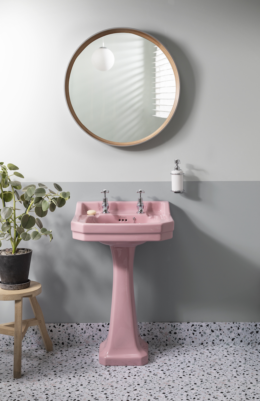
-
- Image credit: Bathrooms Brands Group
-
- Image credit: Bathrooms Brands Group
HK: We’ve spoken in depth about guestroom bathrooms, but what about public bathrooms – can we afford to throw out the rule book in these spaces?
FT: I think public bathrooms can be much more playful – I like to see a bit of reverence in these areas!
PS: I agree, a bit of humour doesn’t go a miss. You really can, to a degree, judge a restaurant’s design on their bathrooms. If they are not an afterthought, if they have been considered then it’s a great opportunity to do something different.
HK: And finally, how can designers working on a tight budget still add personality into the bathroom?
PS: Accenting. The price of coloured brassware has come down so it’s easier to include these in a project – and opens design opportunities. Another way is to add colour on the outside of basins, and also paint on the wall – a half height tiled wall and paint is an easy way make these spaces a bit more characterful.
NH: And don’t be afraid to paint the ceilings too.
AF: I think that white is always an easy ‘go to’ in terms of making a space feel larger or brighter naturally. However, there are many tricks one can use to give that feeling of space, whether it be to give the feeling of height, or making a space feel brighter. Use of colour is very clever tool, highlighting door architraves and skirtings for instance in an accent colour can give a feeling of height as your eye is physically drawn up and down.
Bathrooms Brands Group is one of our recommended suppliers. To keep up to date with their news, click here. And, if you are interested in becoming one of our recommended suppliers, click here.