Hotel Designs

    NEWS AND ANALYSIS FOR HOTELIERS, DESIGNERS AND INDUSTRY SUPPLIERS
    silentnight testing lab

    Silentnight – staying ahead of the curve

    1024 640 Megan Christopher
    Silentnight – staying ahead of the curve

    As one of the UK’s leading sleep brands, Silentnight is constantly looking at new ways to expand its product portfolio…

    silentnight testing lab

    Whether through introducing new collections, ranges or materials, Silentnight prides itself on staying ahead of the curve when it comes to what it offers customers. With this in mind, Silentnight has recently expanded its fabric collection for the bed and headboard ranges to include more fabrics like velvet – providing a smoother and more luxurious feel to the tried-and-tested product ranges.

    Silentnight has also significantly expanded its colour library to cater to the individuality of its clients. However, it’s not all about looks, when expanding the ranges these new fabrics and colours are rigorously tested for contract environments and longevity, ensuring that they not only look good but they also last. The ability to constantly expand the portfolio is, in part, due to this vigorous testing process. A lot goes into being the UK’s most trusted sleep brand and ensuring that all of the products are of the highest quality and adhere to all safety measures is paramount for the team at Silentnight.

    silentnight testing lab

    Image credit: Silentnight

    That is why all of the products are tested in the state-of-the-art sleep lab in Barnoldswick. The original testing lab was established over 40 years ago in 1980 and made Silentnight the first UK bed manufacturer to operate an in-house testing facility. Since then, Silentnight has built a newer climate lab that houses more extensive testing facilities – notably recreating more accurate testing in close to real life scenarios.

    This on-site SATRA-accredited facility is ISO 9001:2015 certified and contains a wide array of unique testing equipment, which all products go through. This ensures that every one of the contract and hospitality products made at the facility exceed BS7177 source 5, medium hazard fire safety requirements, while the fire and flammability safety testing ensures that customers are purchasing the highest quality products.

    Silentnight test the full fitness for purpose of the products more frequently compared to the industry standard and the in-site facility allows for results following flammability tests within 24-48 hours, compared to a turnaround time of two to three weeks in external labs. Taking a proactive approach to testing, fire and flammability testing takes place one month before the typical testing schedule – this allows for quicker identifying and resolving of quality and compliance issues in a way that doesn’t significantly delay product launches.

    silentnight testing lab

    Image credit: Silentnight

    In addition to the vigorous flammability testing, Silentnight also ensure every product manufactured is durable and fit for purpose. For years it been able to go above and beyond to ensure the products meet the highest standards. In addition to lab tests, scenario simulations are run on every mattress and headboard that include pressure tests, and edge durability checks as well as using machines that simulate hundreds of nights of sleep – a combination that has allowed the brand to exceed industry standards. A three-year testing cycle for all products and weekly tests is taken out on all raw materials. Silentnight are also the only manufacturer using the ‘Robbie’ machine, which applies heat and moisture to replicate real sleep conditions for mattresses.

    Silentnight products are consistently made to the highest standards when it comes to quality and safety, voluntarily putting the brand through multiple audits and checks every year to ensure that the core value of trust is maintained and at the heart of everything it does. Customers can sleep peacefully knowing that the products have been tried and tested to the highest standards.

    Silentnight is one of our Recommended Suppliers and regularly features in our Supplier News section of the website. If you are interested in becoming one of our Recommended Suppliers, please email Katy Phillips.

    Main image credit: Silentnight

    St. Regis Maldives Vommuli Resort

    The best overwater villas in the Maldives

    1024 640 Megan Christopher
    The best overwater villas in the Maldives

    With hotels continuing to stake a claim in the archipelago, we take a deep dive straight off the deck and into some of the best overwater villas in the Maldives…

    St. Regis Maldives Vommuli Resort

    The Maldives, a constellation of islands scattered across the Indian Ocean, is synonymous with luxury and unparalleled natural beauty. For interior designers, the archipelago offers an extraordinary canvas for creating spaces that harmonise with the surrounding paradise. Overwater villas, in particular, present a unique challenge and opportunity to design environments that are both indulgent and environmentally conscious.

    The best overwater villas in the Maldives are those that seamlessly blend indoor and outdoor living, creating a sense of immersion in the island’s natural splendour. The use of natural materials such as wood, stone and rattan is essential to achieving this harmony. Locally sourced woods, with their rich textures and colours, can be employed for flooring, furniture and accents, bringing a touch of authenticity to the design.

    Colour palettes should be inspired by the Maldives’ vibrant marine life. Think turquoise blues, coral pinks and sandy beiges. These hues can be incorporated into textiles, artwork and even wall finishes. However, it’s crucial to maintain a sense of balance; the villa should be a serene retreat, not an overwhelming sensory experience.

    anantara kihavah maldives

    Image credit: Anantara Kihavah Maldives

    Overwater villas often present spatial challenges. To counteract this, designers should prioritise maximising natural light. Large windows and glass doors that open onto private decks are essential. Reflective surfaces, such as polished stone floors and mirrored accents, can also help to amplify the sense of space.

    The outdoor area of an overwater villa is arguably its most important feature. It should be designed with an extension of the indoor living space, with comfortable seating, dining areas and sunbathing platforms. Private plunge pools are becoming increasingly popular in overwater villas. They offer a refreshing oasis and provide a stunning visual focal point.

    As the Maldives is a fragile ecosystem, sustainable design principles should be at the heart of evert overwater villa project. Energy-efficient lighting and appliances, as well as water-saving fixtured, are essential. Additionally, the use of local sourced materials and minimising waste should be prioritised.

    It’s also important to be respectful of the Maldivian culture. Incorporating traditional design elements can add depth and authenticity to the interior. By adhering to these design principles, interior designers can create overwater villas that are not only visually stunning but also provide guests with an unforgettable and environmentally responsible experience.

    Soneva Jani

    soneva jani maldives overwater villas

    Image credit: Soneva Jani

    Soneva Jani stands as a testament to the power on minimalism. Its overwater villas are characterised by clean lines, natural materials and a focus on space. The interiors are a study in contrast, juxtaposing the stark white walls and ceilings with dark wood accents and pops of vibrant colour. The result is a space that is both serene and stimulating. The resort’s signature retractable roofs in the master bedrooms offer guests an unparalleled connection to the starry night sky, a design feature that is as functional as it is awe-inspiring.

    Park Hyatt Maldives Hadahaa

    park hyatt maldives hadahaa aerial beach lagoon

    Image credit: Park Hyatt Maldives Hadahaa

    Park Hyatt Maldives Hadahaa celebrates the island’s natural beauty through its interior design. The villas are adorned with earthy tones and natural materials, creating a sense of harmony with the surrounding environment. The use of local stone and wood adds warmth and texture to the spaces, while large windows offer breath-taking views of the Indian Ocean. The resort’s commitment to sustainability is evident in its eco-friendly design choices, making it a prime example of responsible luxury.

    Cheval Blanc Randheli

    Cheval Blanc Randheli overwater villa

    Image credit: Cheval Blanc Randheli

    Cheval Blanc Randheli brings a touch of Parisian elegance to the Maldives. The overwater villas are characterised by sophisticated colour palettes, luxurious fabrics and exquisite attention to detail. The interiors are a blend of contemporary and classic styles, with a focus on comfort and refinement. The resort’s signature white aesthetic is complemented by pops of colour in the form of artwork and accessories, creating a visually striking yet harmonious ambiance.

    Anantara Kihavah Maldives Villas

    akih beach pool residence aerial

    Image credit: Anantara Kihavah Maldives Villas

    Anantara Kihavah Maldives Villas takes the overwater villa concept to new depths with its iconic underwater restaurant, but the interior design of the villas is equally impressive. The villas feature a contemporary aesthetic with clean lines and a focus on functionality. Large sliding doors open onto private infinity pools, blurring the lines between indoor and outdoor living. The use of natural materials and neutral colours creates a sense of calm and relaxation.

    St. Regis Maldives Vommuli Resort

    The St. Regis Maldives Vommuli Resort

    Image credit: The St. Regis Maldives Vommuli Resort

    The St. Regis Maldives Vommuli Resort offers a contemporary interpretation of luxury. The overwater villas are characterised by sleek lines, modern furnishings and a sophisticated colour palette. The interiors are spacious and airy, with a strong emphasis on comfort and functionality. The resort’s signature John Jacob Astor library concept is incorporated into the villa design, creating a cosy reading nook with a curated selection of books. Large bathrooms with outdoor showers and soaking tubs provide the ultimate in relaxation.

    Each of these resorts has successfully captured the essence of the Maldives while offering a distinct design perspective. By studying their approaches, interior designers can gain valuable insights into creating overwater villas that are both luxurious and harmonious with their surroundings.

    Main image credit: The St. Regis Maldives Vommuli Resort

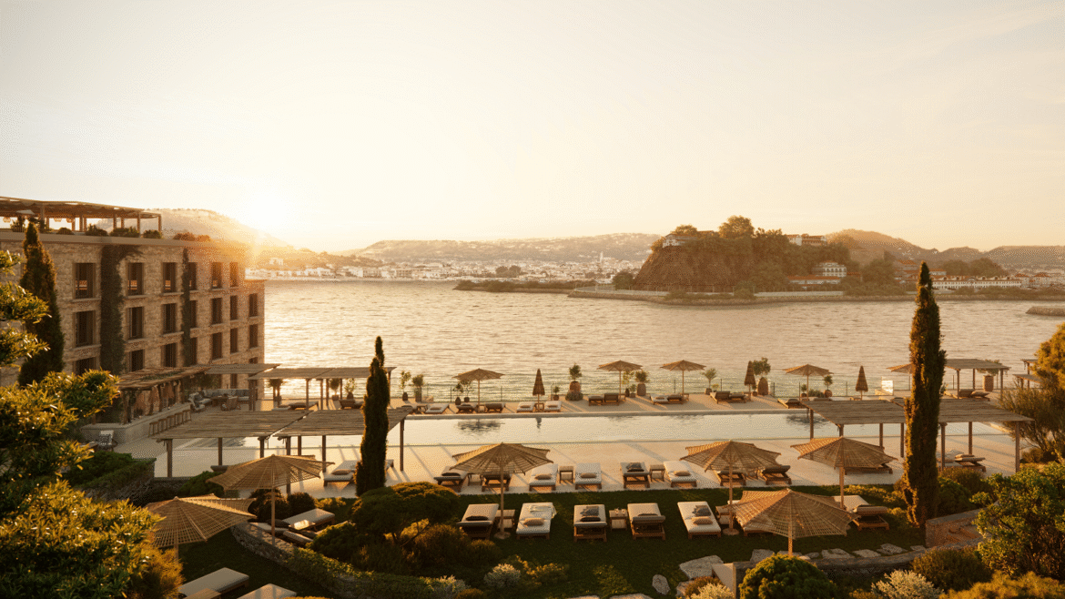
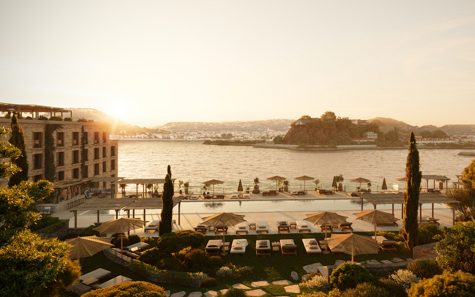
    swimming pool and gardens of INNSiDE by Meliá in Portugal

    INNSiDE by Meliá opens in Portugal

    1024 640 Pauline Brettell
    INNSiDE by Meliá opens in Portugal

    Lifestyle hotel brand INNSiDE by Meliá has just opened its first property in Portugal – the INNSiDE Braga Centro in the iconic Retiro das Convertidas building has been fully renovated to offer guests a seamless blend of leisure and business…

    swimming pool and gardens of INNSiDE by Meliá in Portugal

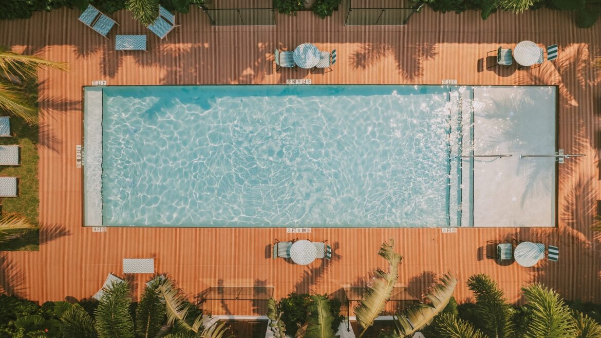
    Located in the heart of the city, just steps away from the Portas de Braga and the majestic Sé de Braga Cathedral, Braga Centro is the latest addition to the INNSiDE by Meliá portfolio. The property features garden areas, swimming pools and a spa, offering a perfect blend of leisure and business. With its designer spaces, casual atmosphere designed to unwind and inspire, and accessible premium service, the hotel is the perfect starting point to discover the local scene in the city.

    swimming pool and garden reflections at Melia Braga

    Image credit: Meliá Hotels International

    The hotel boasts 109 rooms designed with a sleek, contemporary aesthetic that combines style with functionality, ensuring guests enjoy a premium stay. Each room is equipped with state-of-the-art technology and sustainable features and, depending on the room category, guests can also enjoy additional amenities like a yoga mat or a premium coffee machine.

    While some rooms offer stunning city views, others overlook a serene private garden complete with a terrace, offering guests a tranquil oasis amidst the bustling cityscape. The Loft rooms, characterised by their spacious layout and dedicated workspace, cater particularly well to business travellers seeking comfort and productivity during their stay.

    The two swimming pools—one indoor and one outdoor— are ideal for unwinding and refreshing. Indulge in the extraordinary wellness space, complete with a fully equipped gym for fitness enthusiasts on the go, and a spa featuring an indoor pool, jacuzzi, sauna, and steam room. Here, guests can rejuvenate with a range of luxurious treatments aimed at relaxation and revitalisation, ensuring a truly pampering experience during their stay.

    Innside Melia Braga Centro

    Image credit: Meliá Hotels International

    INNSiDE Braga Centro also features a dining space inspired by the old Retiro das Convertidas called ‘Convertidas.’ Open to the public, this restaurant aims to stimulate all the senses with delicious local and international dishes, live music, and art exhibitions, all set in a vibrant and welcoming atmosphere.

    For those guests looking to combine work and pleasure, the hotel has several meeting rooms equipped with state-of-the-art technology, the perfect setting for any event or business meeting.

    Braga, located in the north of Portugal, is one of the country’s oldest cities, founded more than two thousand years ago and becoming an important centre of religious worship during the Middle Ages. Today, Braga boasts a lively university scene and a wide range of tourist attractions. In addition to the Portas de Braga and the Sé de Braga Cathedral, visitors can explore the Sanctuary of Bom Jesus do Monte, a UNESCO World Heritage Site, or enjoy a stroll through the Garden of Santa Bárbara and the Biscainhos Museum.

    Main image credit: Meliá Hotels International

    checked tile floor and gilded chandelier in the Potlatch club

    The Potlatch Club – restored to its former glory

    1024 645 Pauline Brettell
    The Potlatch Club – restored to its former glory

    After a seven-year renovation, The Potlatch Club has been designed and landscaped by Hans Febles alongside Nassau-based interior designer Amanda Lindroth, restoring this mid-century island-icon to its former glory…

    checked tile floor and gilded chandelier in the Potlatch club

    The Potlatch Club, the first truly luxury boutique hotel on the island of Eleuthera in the Bahamas, has opened its doors after an extensive restoration. Eleuthera is an island escape known for its wild, pristine beauty and 135 empty beaches. The secluded hideaway has only 11 keys in a former private home, popular with New York socialites in the 1960s and 70s. The property fell into disrepair in the 1980s and has now been lovingly restored under its original name, The Potlatch Club.

    four poster canopied wicker bed under pitched roof

    Image credit: The Potlatch Club

    Potlatch is a term derived from a Northwest Native American ceremonial feast, in which possessions are destroyed or given away to display wealth or enhance prestige. This was the original modus operandi of The Potlatch Club. For years, the oceanfront retreat was a magnet for socialites as well as silver-screen legends, such as Greta Garbo, Richard Widmark, Raymond Burr, and Rita Gam, who were never charged for anything. And in 1969, Paul McCartney honeymooned at The Potlatch Club with his first wife, Linda, when he wrote several Beatles songs including ‘Bathroom Window’ on Potlatch Club notepaper.

    In 2016, new owners Bruce Loshusan and Hans Febles stumbled across the dilapidated property. Fronting a seven-mile deserted stretch of pink-sand beach, The Potlatch Club is an oceanfront escape where breezy coastal elegance meets timeless Caribbean architecture at the reborn Potlatch Club. In all, four original buildings were saved and refurbished.

    white and coral interior in the guest rooms at The Potlatch Club

    Image credit: The Potlatch Club

    The property’s original clubhouse retains historic details, such as checkered floors, which were crafted in Nassau in 1919, and classic whitewashed arches that hark to the property’s storied past, while striped awnings and pops of pastel add glamorous seaside flare. White walls, pink coral stone floors, coral stone finished bathrooms, designer furniture and original art complete the relaxed yet upscale beachy look.

    Set in 12 acres of beautifully landscaped gardens, the accommodations are a mix of historic and newly built whitewashed suites, garden cottages, ocean-facing cottages  plus one 1-bedroom and one 4-bedroom ocean-view villa, which includes butler service. Some feature private verandas and terraces and others shoreline pavilions or gardens scented with jasmine and frangipani.

    private terrace and pool overlooking caribbean island garden

    Image credit: The Potlatch Club

    All accommodations have easy access to The Fig Tree restaurant, which overlooks the pool and features retrospective pictures of the former resort. Sumptuous breakfasts with local fruit and fresh ingredients set the stage for seasonal farm-and-sea-to- table organic cuisine. Guests can opt for lunch at the beach where the Pavilion Bar is a laidback gathering spot. A range of massages are available at the two-room Acqua Spa, in the guest room or even on the beach. A day pass is available for non-guests to enjoy the spa with access to the swimming pool, lounge beds, umbrellas and watersports.

    General Manager Kezang Dorji, originally from Bhutan, brings a sense of serene Himalayan hospitality to Eleuthera although he has much experience in the Caribbean as an integral member of the opening team at Parrot Cay by Como, and previously, as General Manager at La Bougainvillea and Head of F&B at The Cove on Eleuthera.

    Main image credit: The Potlatch Club

    Experimental Chalet Val d’Isere guestroom

    Experimental Group hits the slopes at Chalet Val d’Isere

    1024 640 Pauline Brettell
    Experimental Group hits the slopes at Chalet Val d’Isere

    Experimental Group continues its development with the promise of more discovery and experiences for visitors to the Swiss Alps from the winter of 2024…

    Experimental Chalet Val d’Isere guestroom

    Following recent openings in Biarritz, Ibiza and the idyllic environs of the Cotswolds, Experimental Group has decided to head for the hills, where, at an altitude of 1850m, the Aigle des Neiges is a 110-room hotel in the heart of the village of Val d’Isère, with two restaurants, a bar, a swimming pool and a spa. It will be transformed by interior designer Dorothée Meilichzon and will welcome guests under Experimental Group for the 2024-2025 winter season.

    reception and retail space in Experimental Châlet Val d’Isère by interior designer Dorothée Meilichzon

    Image credit: Experimental Group

    Val d’Isère, in the Haute-Tarentaise region of the Alps, enjoys an exceptional location. Facing due west, the Solaise massif has enabled small hamlets at the crossroads of three valleys to be transformed into a splendid ski area since the 1930s, earning it worldwide recognition. Combined with Tignes to form the Espace Killy, the resort gives access to 300 km of pistes in the heart of Savoie, offering skiing experiences for all levels. Often referred to as the most beautiful ski area in the world, Val d’Isere guarantees magnificent views of the Col de l’Iseran and Pisaillas glaciers.

    restaurant design with lighting box over the bar in Experimental Chalet Val d’Isere

    Image credit: Experimental Group

    “After the success of Experimental Châlet Verbier, we wanted a property in the French Alps. Our search was for something very close to the slopes, yet at the same time in the centre of the resort which has an incredible ambiance. We found the ideal location for the Experimental Châlet Val d’Isère”, said Pierre-Charles Cros, co-founding partner of the Experimental Group.

    view into bathroom from hotel bedroom at Chalet Val d’Isere

    Image credit: Experimental Group

    In addition the group – which has recently been in the headlines with the announcement that designer Christian Louboutin has become one of its latest shareholders  – will be adding Rome to its pipeline, with Experimental Rome slated for the summer of 2025. This project will see the transformation of an office building a stone’s throw from the famous Piazza di Spagna and will be led by designer and interior architect Rodolphe Parente, who founded his agency in 2009 after working alongside Andrée Putman.

    In the affluent district with the famous Via Veneto at the heart, and adjacent to the sumptuous building of the Swiss Institute of Rome, which plays host to artists and researchers in residence, the Experimental Roma (provisional name) will feature 78 rooms and suites, a vast restaurant under a central glass roof, an Experimental Cocktail Club Roma bar, and a rooftop swimming pool overlooking the city, with the Colosseum and the main Roman monuments in the background.

    Main image credit: Experimental Group

    roca sonata collection

    Product watch: the Sonata collection from Roca

    1024 640 Megan Christopher
    Product watch: the Sonata collection from Roca

    The stylish new Sonata range from Roca includes basin accessories, towel rails and hooks, and toilet brush and toilet roll holders, all in a choice of Chrome or Matt Black…

    roca sonata collection

    Nothing says hotel chic better than completely coordinated bathroom accessories. Enter the new Sonata collection from Roca. This comprehensive selection of accessories comes in a choice of either classic Chrome or sleek Matt Black. Best of all, it can be matched to Roca brassware for an altogether more coordinated look.

    “A complete set of bathroom accessories is a relatively cost-effective way to bring an extra layer of style to a bathroom space,” commented David Bromell, Head of Marketing, Roca Group. “Our new Sonata collection has something for every shape and size of hotel bathroom, with 15 separate pieces ranging from a choice of towel rails to a wall-mounted toilet brush holder.”

    Most of the accessories in the Sonata collection are wall-hung, ideal for maximising space in compact hotel bathrooms. By installing the soap dispenser and tumbler on the wall, the basin top remains uncluttered and organised. For hotel rooms with wall-mounted toilets, the collection includes a matching wall-mounted toilet brush to keep the floor clear. Alternatively, a floor-standing model is also available.

    As a finishing touch, the Sonata collection offers a variety of towel holders to suit any bathroom size. Designers can choose from single rails available in 300mm, 400mm, and 600mm lengths, compact towel rings perfect for placing next to the basin, and a spacious four-rail rack that can accommodate towels for the entire family.

    Roca is one of our Recommended Suppliers and regularly features in our Supplier News section of the website. If you are interested in becoming one of our Recommended Suppliers, please email Katy Phillips.

    Main image credit: Roca

    laufen bathroom

    Top bathroom trends from LAUFEN

    1024 640 Megan Christopher
    Top bathroom trends from LAUFEN

    LAUFEN consistently stays abreast of the leading bathroom trends through its collaborations with world-renowned designers. Here’s a summary of five bathroom trends that are likely to continue through 2024 and beyond…

    laufen bathroom

    This was evident at the Milan Fair in April, where LAUFEN showcased its trend-led approach in both new product introductions and their presentation.

    Trend one: Terracotta and other earthy shades

    Terracotta, a material celebrated for its earthy warmth and timeless appeal, has emerged as a key influencer in shaping the landscape of modern interior design trends. The charm of terracotta is not confined to the physical spaces it occupies. Its influence pervades deeper, extending to various aspects of interior design including furniture.

    The richness of terracotta as a colour is particularly sought after in the bathroom because it adds warmth. Whether it’s a subtle hint of terracotta in a piece of furniture or a bold statement wall, this versatile material elevates the aesthetic appeal of the space, making it truly stand out.

    laufen bathroom

    Image credit: LAUFEN

    Trend two: Understated and elegant neutrals

    Neutral colours, celebrated for their understated elegance and versatility, play an indispensable role in the world of interior design, particularly when curating a monochromatic scheme. These colours range from the quiet whispers of soft greys to the gentle embrace of warm taupe. Each of these hues, in their own way, contribute to crafting a serene and calming backdrop, which is particularly welcome in a bathroom setting. Variations in neutral tones, however minor, can dramatically alter the ambiance of the room, adding depth and interest. Thus, the use of neutral colours is not just about simplicity, but about creating a balanced and harmonious space that can effortlessly adapt to changes in style or mood.

    laufen bathroom

    Image credit: LAUFEN

    Trend three: The enduring appeal of chrome brassware

    In the ever-evolving world of interior design, trends come and go. However, there are a few staples that have stood the test of time due to their timeless elegance and functionality. One such staple in bathroom décor is chrome brassware, which has remained popular for its sleek, minimalist aesthetic and ability to complement any bathroom style. Timeless and versatile chrome not only blends seamlessly with any colour palette, but also pairs beautifully with a variety of other materials, such as glass, marble and wood. This means that it can easily fit into any bathroom décor, whether you’re aiming for a luxurious spa-like ambiance with marble countertops and glass shower doors, or a cosy, rustic vibe with wooden cabinets and natural stone tiles.

    laufen chrome

    Image credit: LAUFEN

    Trend four: Soft and organic curves

    Curves in bathroom design add a soft, organic touch to what is traditionally a space filled with hard, angular lines. They offer a refreshing visual contrast, introducing a more relaxed and natural feel and can also invoke a sense of comfort and luxury, reminiscent of high-end spa retreats. Moreover, curves can make a bathroom appear bigger, as they easily guide the eye through the space.

    There are many ways to incorporate curves into a bathroom design. Rounded mirrors are a popular choice, adding a touch of elegance and softening the overall aesthetic. Curved bathtubs and basins can also make a bold statement, serving as a focal point in the room. Even subtle additions, like using rounded tiles or installing curved brassware, can go a long way in transforming the bathroom into a more calming and inviting space.

    laufen bathroom

    Image credit: LAUFEN

    Trend five: Greenery in the bathroom

    One of the primary benefits of having plants in your bathroom is the improvement of air quality. Plants naturally absorb carbon dioxide and release oxygen, which can help to freshen up the air in your bathroom. Additionally, certain plants are known to remove harmful toxins from the air. The humidity from your shower also helps plants like ferns and ivies thrive, making your bathroom an ideal place for them.

    Plants have a calming effect on our minds, reducing stress and helping us to relax. This makes them perfect for the bathroom, a place where many of us begin and end our day. The addition of greenery can transform your bathroom into a peaceful oasis, providing a tranquil space for you to unwind at the end of a busy day. It’s small wonder that in our busy and stressful lives, indoor plants have become more popular than ever!

    Main image credit: LAUFEN

    A rendered image of the new Raffles Tokyo hotel will become part of the city's famous World Trade Center

    Accor brings Raffles Hotels & Resorts to Tokyo

    1024 640 Sophie Harper

    Accor brings Raffles Hotels & Resorts to Tokyo

    Raffles Hotels & Resorts, a leading luxury hotel brand of Accor, alongside World Trade Center Building, Inc. and Tokyo Tatemono Co., have announced plans to debut the storied brand in Tokyo…

    A rendered image of the new Raffles Tokyo hotel will become part of the city's famous World Trade Center

    Following the group’s announcement of its ambitious plans for 2024 at the end of last year, Accor has revealed its latest hotel signing with Raffles Tokyo.

    Part of the redevelopment of the Tokyo’s iconic World Trade Center (WTC) in the Hamamatsuchō district, the hotel is expected to open in 2028, giving guests the opportunity to explore Japan’s capital city through the enchanted world of Raffles.

    “We are delighted to grow the Raffles global family with Raffles Tokyo, which will feature the brand’s world-renowned hallmarks including personalised Butler Service and an inspiring environment where anything is possible for our guests. World Trade Center Building, Inc. and Tokyo Tatemono Co. are likeminded partners that share our vision for delivering luxury hospitality at the highest level, and we look forward to unveiling a new urban icon in one of the world’s most vibrant and culturally significant cities,” said Omer Acar, CEO, Raffles Hotels & Resorts.

    Slated to occupy the top 46 floors of the WTC building, a landmark in Tokyo since its completion in 1970, Raffles Tokyo will be ideally located for business and leisure travellers, offering close proximity to some of city’s most notable landmarks including Tokyo Tower, the Roppongi Museum, and Rainbow Bridge, in addition to direct access to Hamamatsuchō station. Designed by Layan and with sweeping panoramic city views taking centre stage, the hotel is expected to feature 130 guestrooms, including 27 suites. Set to become its own distinct destination within the vibrant metropolis, Raffles Tokyo will feature six food and beverage outlets, as well as a state-of-the-art fitness studio, swimming pool, and spa and bathhouse. From celebratory gatherings to intimate meetings, the hotel will also offer more than 1,156 sqm of multi-functional meeting spaces and facilities.

    “We are very pleased to welcome Accor Group, which operates a number of world-class hotel brands, as our partner, and to be working together toward the opening of the first Raffles hotel, one of Accor Group’s premier brands, in Japan. Together with Accor Group and the World Trade Center Building, we hope to create a new landmark in Tokyo and contribute to the creation of an even livelier international city and the enhancement of Tokyo’s international competitiveness,” said Hitoshi Nomura, President and CEO, Tokyo Tatemono Co.

    “We are very pleased to welcome Accor Group, a world-class hotel operator, as our partner. Hamamatsucho is a major business hub in Tokyo, and with easy access to the Shinkansen bullet train and airport, it is an extremely convenient area for both domestic and international visitors. We are confident that the development of Raffles Tokyo in collaboration with Tokyo Tatemono at the landmark World Trade Center Building in Hamamatsucho will further enhance Hamamatsucho’s appeal and provide an even more special stay experience for both business and leisure travellers,” said Chikao Miyazaki, President, World Trade Center Building, Inc.

    Main image credit: Accor

    guestroom in The JW Marriott Marquis Hotel with floor to ceiling windows with views over the water and the city

    The Marriott Marquis Dubai – Jewel of the Creek

    1024 640 Pauline Brettell
    The Marriott Marquis Dubai – Jewel of the Creek

    The Marriott Marquis Dubai has earned its title as the Jewel of the Creek, and now stands as a beacon of exceptional interior design that seamlessly blends the rich cultural heritage of its location in Al Khor with contemporary luxury…

    guestroom in The JW Marriott Marquis Hotel with floor to ceiling windows with views over the water and the city

    The design ethos of the Marriott Marquis Dubai, spearheaded by the KCA design team, is a harmonious fusion of tradition and modernity, resulting in an environment that is both aesthetically pleasing and deeply connected to its historical roots.

    main lobby and entrance at Marriott Marquis Dubai Creek designed by KCA

    Image credit: Marriott International

    The hotel’s interior design is intrinsically inspired by its location in the Creek area, Al Khor, aptly reflected in the name ‘Jewel of the Creek’. This thematic inspiration is thoughtfully woven throughout the hotel’s design elements, creating a cohesive and immersive experience for guests. The hotel pays homage to the heritage of the area by incorporating traditional Emirati design elements in a contemporary manner.

    The main lobby, for example, features intricately designed screens behind the reception desks that mimic the fishing nets used in Al Khor’s history. The reception desks themselves are made from metal with an embossed pattern reflecting the map of the creek. This attention to detail not only grounds the design in its historical context but also provides a unique and visually stunning focal point for guests upon arrival.

    curved cream couch and patterned carpet in honeymoon suite

    Image credit: Marriott International

    The Marriott Marquis Dubai excels in innovative space planning and the use of materials. The lobby’s flooring is designed with concentric circles that emulate the ripples of the creek’s water, interspersed with modern and abstract Emirati patterns. This creates a dynamic visual narrative that guides guests through the space in an engaging manner.

    A standout feature in the lobby is the large, dropped carpet that transitions from a mosaic to a real carpet, running under the lobby lounge area. This design element not only adds texture and depth but also symbolizes the seamless blend of art and functionality. The thoughtful integration of materials, such as the use of timber beams in the guestrooms to cast beautiful shadows reminiscent of old Dubai houses, further showcases the hotel’s innovative approach to design.

    guestroom with design references to boating history of dubai location

    Image credit: Marriott International

    The hotel’s design narrative extends into the guestrooms, where subtle references to Emirati heritage is seamlessly integrated with modern luxury. Wall panels and AC grills feature traditional patterns reinterpreted in a contemporary style, creating a sense of continuity and connection throughout the hotel.

    The guestrooms also feature an open ceiling above the bed with timber beams that throw beautiful shadows from the cove lighting, enhancing the room’s ambiance and creating a warm, inviting atmosphere. The sitting area is framed by a feature wall that mimics the ropes used for fishing boats in the creek, adding a layer of cultural richness and historical reference.

    bathroom with design details in mosaic above bath

    Image credit: Marriott International

    The property provides a unique and memorable experience for its guests, with thoughtfully integrated design elements creating an immersive environment that is both visually stunning and deeply connected to the local heritage. The combination of innovative space planning, cultural integration, and attention to detail ensures that every guest’s stay is not only comfortable but also enriched with a sense of place and history.

    The Marriott Marquis Dubai is a testament to exceptional interior design, blending heritage-inspired elements with modern luxury in an innovative manner. This project, completed by the KCA team years ago, has finally come to fruition after years of delays. It exemplifies the studios’ commitment to cultural integration, sustainability and enhancing guest experiences, proudly enriching the KCA portfolio.

    Main Image credit: Marriott International

    Rivalling the legendary marina of Monte Carlo, Atlantis Marina is the premier facility in The Bahamas. This luxury yacht harbor accommodates vessels of up to 240 feet, and offers a variety of yacht and fishing charter services. Guests of Atlantis Marina enjoy all the features and services of Atlantis facilities.

    Atlantis Paradise Island unveils $150 million resort-wide renovation

    1024 640 Sophie Harper

    Atlantis Paradise Island unveils $150 million resort-wide renovation

    Atlantis Paradise Island, the most iconic resort destination in the Bahamas and the Caribbean, has completed a $150 million resort-wide transformation, including updates to the casino, guest rooms, restaurants and lounges…

    Rivalling the legendary marina of Monte Carlo, Atlantis Marina is the premier facility in The Bahamas. This luxury yacht harbor accommodates vessels of up to 240 feet, and offers a variety of yacht and fishing charter services. Guests of Atlantis Marina enjoy all the features and services of Atlantis facilities.

    The resort unveiled refashioned guest rooms at The Royal, Atlantis’ iconic towers; an entirely redefined Atlantis Casino; and Paranza, a new restaurant at The Cove, where the esteemed Michelin-starred chef Michael White brings his culinary mastery to the table. The updates emulate the ethos of Atlantis and include custom fixtures and design details evocative of the ocean and ecosystems found throughout the Bahamas. Other additions include Bar Sol, Cleito’s private gaming, Silan, Perch, the Caribbean’s first Shake Shack, FIELDTRIP, Cartier, Thistle, and coming soon, Christian Louboutin and Paradise Links mini-golf course.

    Exterior shot of Atlantis Marina showing the Royal Yacht in front of the hotel

    Image Credit: Atlantis Paradise Island

    “Atlantis continuously elevates the guest experience, and recent developments at The Royal, Paranza and the Atlantis Casino provide guests with upgraded, modern touches while retaining the resort’s integral identity that visitors know and love,” said Audrey Oswell, President and Managing Director of Atlantis. “Atlantis’ experiential-driven programming allows our guests and visitors to create lifelong memories while visiting the resort and the Bahamas. The new designs throughout Atlantis demonstrate our commitment to providing an unsurpassed vacation experience.”

    The Royal at Atlantis, a 1,201-room hotel home to the Atlantis Casino, underwent a multimillion-dollar transformation, including fully refashioned guest rooms with specially curated bespoke décor.

    Inside the Royal King Bedroom with views across the ocean

    Image Credit: Atlantis Paradise Island

    The guest room redesign, led by Atlantis’ Senior Vice President of Design and Creative Director Tony Tompkins, transports guests to the serenity of the white sand beaches of the Bahamas, with the Royal rooms’ breathtaking Caribbean views as the focal point. The carpets, reminiscent of the calmness and beauty of the ocean, are a perfect match for the tranquil setting. Sculptural pieces inspired by the unique archipelago of the Bahamas hang above the bed and desk, offering visual glimpses of the island within the space. The cool, calming shades of blue and white and the use of neutral beechwood reflect the soothing seas and provide a peaceful retreat for travellers to relax and unwind, creating a truly immersive experience.

    The Royal has 120 suites, including 10 Grand Suites, four Presidential Suites, and three Royal Suites, all echoing the redesign of the guest rooms. The suites feature richer, deeper colours to add depth, with bold teals and sage greens providing an elegant touch to the guest experience.

    The Cove Pool at Atlantis surrounded by palm trees

    Image Credit: Atlantis Paradise Island

    The 85-table, 700-game casino, one of Atlantis’ landmark features, is home to four instantly recognisable one-of-a-kind glass sculptures by internationally renowned artist Dale Chihuly. The Sun and The Moon glass installations were created specifically for the Atlantis Casino 25 years ago, uniting colour, light, form, and space to deliver a uniquely immersive experience.

    By re-lighting the glass sculptures and minimising the surrounding structure, the new design interacts harmoniously with light and space, which Chihuly is known for in his work.

    The custom carpet features 26 shades, drawing on the jewel tones seen in the casino’s recognisable art. Deeply saturated hues and gold accents, combined with shimmering textures and flowing lines, echo the refractions of the sea, adding a sense of place and creating a cohesive, sophisticated look.

    The beloved murals throughout the casino have been artfully restored, and nearby light features have been updated to give the spaces a modern yet classic feel incorporating Atlantis’ signature design elements. The ceilings, previously covered by canopies, are now open, creating a more spacious and airier atmosphere with a clear view of the entire casino.

    The central Moon Bar inside the casino has been upgraded with a circular deck, allowing guests to take a break from the action or step up to overlook the casino floor.

    Master Chef José Andrés unveils his stunning new restaurant featuring the freshest Bahamian seafood

    Image Credit: Atlantis Paradise Island

    The Atlantis Casino has recently opened Bar Sol, inspired by the late Sol Kerzner’s passion for Bahamian artists, music, and entertainment. It offers a stylish and sophisticated atmosphere where guests can enjoy a well-crafted cocktail and dance beneath a raised stage and DJ booth. The centrepiece of Bar Sol is a restored Chihuly chandelier that exudes warm gold hues, creating a unique ambiance complemented by the venue’s line-up of nightly live music performances.

    The Atlantis Casino is also home to several of the resort’s finest dining options, including Nobu and Silan, the new restaurant by James Beard Award-winning chef Alon Shaya.

    The newest dining option at The Cove, Atlantis, a luxury all-suite hotel, is Paranza by Michelin-starred chef Michael White. Award-winning design studio Jeffrey Beers International designed it in collaboration with Tony Tompkins. The interior design was inspired by the vibrant blue waters and white sand beaches of the Bahamas and the Italian coastline, complementing Chef White’s approachable and unfussy take on fine dining.

    Atlantis Fine Dining Paranza Interior Dining Room and Bar

    Image Credit: Atlantis Paradise Island

    The culinary journey for guests begins as they arrive and walk along a winding path to discover the warmly lit patio of the restaurant, nestled under a wooden pergola and opening into Paranza’s main dining area. The custom space is adorned with hand-blown glass, antique mirrors, and iron arches featuring earthy hues such as oak, smoky blue, and bright cognac.

    The bar area showcases a temperature-controlled dual-purpose wine wall that is the focal point of the private dining room’s entryway. The private dining room features oversized, seashell-shaped brass light fixtures and custom design elements.

    Main image credit: Atlantis Paradise Island

    : the smokey glass fronts of the Vitrium furniture by Christian Werner give the pieces a light, almost floating appearance

    The material world of Duravit

    1024 640 Pauline Brettell
    The material world of Duravit

    Velvety cast-mineral material, distinctive natural patterns, and a host of fascinating materials raise the bar in the bathroom – Duravit looks at different ways these textures can be combined to create intriguing and exciting bathroom designs..

    : the smokey glass fronts of the Vitrium furniture by Christian Werner give the pieces a light, almost floating appearance

    Intriguing textures, the very best materials and fascinating surfaces are used to create a unique atmosphere that highlights individual design styles. A harmonious mix of materials can be achieved by comparing the different effects created by the various elements used and the way they interact.

    Zencha bathroom fittings by by_Sebastian_Herkner for duravit

    Image credit: Duravit

    Glass conveys a feeling of spaciousness and freedom and helps to creates an elegant and airy atmosphere in any room. The Vitrium bathroom, designed by Christian Werner, skillfully places this effect centre stage: the smoke-coloured glass fronts lend the furniture a light, almost floating appearance. Conversely, the black textured glass fronts combined with the wooden carcass on Sebastian Herkner’s Zencha range imbue the bathroom with a sophisticated elegance. This makes glass a true all-rounder which is especially effective when combined with other materials.

    stone surface of the Qatego range by Studio F.A. Porsche

    Image credit: Duravit

    Choosing natural stone allows you to bring an element of nature into the bathroom. With its individual colour nuances, textures, and patterns, natural stone conveys a unique set of qualities. A distinctive stone panel in three different tones brings a natural, timeless constancy to the Qatego designer bathroom range by Studio F. A. Porsche.

    metal frame of bathroom vanity in Aurena range

    Image credit: Duravit

    Metal’s currency in the furniture sector is in part due to its versatility and, with a range of different variants, the material can provide an extra-special look in any bathroom. For instance, a minimalistic piece of metal furniture can create a futuristic and pared-down impression, or a gentle and softer effect can be produced when combined with wood. The Viu/XViu model is a perfect example of how a sleek metal frame can blend with a delicately worked ceramic basin to create a sculptural washbasin. In turn, the Aurena bathroom range blends Italian elegance with a touch of modern industrial style by combining the metal frame either with ceramic panels for a marbled look or embossed ebony to create a highly elegant ambience.

    Duravit Zencha designs in bathroom with mirror and vanity unit with wood finish

    Image credit: Duravit

    Surfaces with a wooden aesthetic imbue interior design with naturalness and warmth: more than virtually any other raw material, décor surfaces with a wooden texture instantly make rooms more homely and comfortable and create a calming and relaxed atmosphere. Its natural colour palette makes it a perfect match for other surfaces, always fitting in while remaining unobtrusive. Above all, the combination of a wooden vanity unit and ceramic or cast-mineral washbasin creates a sense of timeless elegance.

    Robust, durable, and easy to clean ceramic is not only practical, but looks great. The innovative material DuraCeram enables washbasins with extremely thin walls and precise dimensions to be manufactured without affecting quality and durability. A case in point are the washbasins of the Luv range, featuring clear edges and contours. They can be interpreted in various ways: sometimes elegant, sometimes minimalistic, but always unique and a design statement.

    There are many positive reasons why washbasins and bathtubs made from cast mineral are becoming increasingly more popular. The unique feature of DuroCast, the cast-mineral material developed by Duravit, is the velvety matt surface that looks elegant, and allows extremely precise shapes to be crafted. DuroCast feels extraordinary to the touch and brings a warm yet elegant atmosphere into the bathroom, it can be perfectly combined with other materials such as wood and glass.

    Duravit is one of our Recommended Suppliers and regularly features in our Supplier News section of the website. If you are interested in becoming one of our Recommended Suppliers, please email Katy Phillips.

    Main image credit: Duravit

    Conservatorium Hotel unveils Garden Two Bedroom Suite

    Conservatorium Hotel unveils Garden Two Bedroom Suite

    1024 640 Megan Christopher
    Conservatorium Hotel unveils Garden Two Bedroom Suite

    The Conservatorium Hotel announces the opening of the latest addition to its collection of five incomparable signature suites; the Garden Two Bedroom Suite…

    Conservatorium Hotel unveils Garden Two Bedroom Suite

    This distinct suite features two bedrooms, a separate living room, and an exquisite seventy square metre private garden providing the perfect serene city retreat for families or couples seeking extra space.

    The newest signature suite at the Conservatorium Hotel offers an unparalleled oasis of tranquillity in the heart of Amsterdam. The suite’s crown jewel is its 70 square metre garden which is accessible from its balcony with views of the celebrated Stedelijk Museum. Spanning a total of one hundred and ten square metres, the suite includes two elegant bedrooms with Super King and King bed, a separate living room, and two spacious bathrooms with rainfall showers and deep soak bathtubs for supreme comfort. The suite also provides a separate living area and comfortable workspace, offering a townhouse charm that is perfect for relaxation, exploration, and productivity.

    garden two bedroom suite bedroom

    Image credit: Conservatorium Hotel

    Renowned Dutch artist and couturier Mart Visser has created a dedicated set of artworks to enrich the Garden Two Bedroom Suite. Educated at the Fashion Academy Montaigne and the Saga International Design Centre in Copenhagen, Visser is acclaimed for his haute couture and unique artistic creations ranging from striking sculptures to expressive paintings. His work, characterised by rich textures and dynamic forms, complements the suite’s refined atmosphere.

    garden two bedroom suite living room

    Image credit: Conservatorium Hotel

    A stay at the Garden Two Bedroom Suite can be completed with a range of curated experiences each designed to enhance this serene escape in the heart of the city. Culinary experiences include a private chef dining service, garden wine tastings, or a gourmet BBQ amidst the green surroundings of the suite’s garden. Wellbeing can be nurtured through in-room yoga sessions and massages, offering relaxation and rejuvenation. For a creative touch, guests can book a private painting class from the comfort of the suite. To extend the tranquil experience outside the doors of the hotel, guests will receive insider information for exploring Amsterdam’s hidden private gardens.

    Main image credit: Conservatorium Hotel

    balsan carpets

    Transform your hotel interiors with the new Balsan Brush Collection by Baptiste Vandaele

    1024 640 Megan Christopher
    Transform your hotel interiors with the new Balsan Brush Collection by Baptiste Vandaele

    Balsan, with a rich history spanning nearly 300 years, has established itself as the premium flooring manufacturer in France, committed to sustainability, elegance and innovation with its new Brush Collection…

    balsan carpets

    Continuing its legacy of blending style with advanced manufacturing techniques, Balsan introduces the new Brush Collection, a stunning collaboration with renowned designer and illustrator Baptiste Vandaele. This collection exemplifies the perfect fusion of artistic talent and cutting-edge technology, providing hotel designers with limitless opportunities to personalise and transform their spaces.

    The Balsan Brush Collection is a remarkable blend of traditional artistry and modern manufacturing. Baptiste Vandaele, celebrated for his maximalist and whimsical designs, has brought his unique hand-drawn motifs to life through this collection. Utilising the latest digital tools and industrial print technologies, Balsan faithfully translates Vandaele’s ink and paper creations into luxurious textile fibres, capturing every detail of his intricate designs.

    balsan carpets

    Image credit: Balsan

    Baptiste Vandaele, an acclaimed designer and illustrator from Alsace, is known for his bold and imaginative patterns. His work includes creating distinctive carpets, wallpapers, and fabrics for the Mama Shelter hotel chain, each design tailored to reflect the unique character of each location.

    In 2018, Vandaele co-founded the Burning For tableware brand with architect Tomáš Cerny and Czech pottery studio Hrdjovická Keramika, seamlessly blending traditional craftsmanship with contemporary design. His 2021 takeover of the Balsan showroom during Paris Design Week showcased his innovative spirit and solidified his reputation as a leading figure in the design world. His collaboration with decorator Oscar Ono in 2022, creating floor and wall coverings for hotel suites, further demonstrated his ability to enhance and elevate interior spaces.

    The Balsan Brush Collection includes 12 unique designs, with highlights such as ‘Bold’ and ‘Brilliant’. These designs, available in a range of scales, allow for versatile application across different hotel spaces. Bold, with its dynamic brushstrokes and assertive pattern, makes a striking statement in large, open areas like the foyer, restaurant or conference room. ‘Brilliant’, on the other hand with its sleek classic and refined weave appearance, adds a touch of elegance and sophistication to any hotel area.

    balsan carpets

    Image credit: Balsan

    For designers seeking to create impactful and immersive hotel environments, the Balsan Brush Collection is an exceptional choice. The synergy of Vandaele’s creative genius and Balsan’s state-of-the-art manufacturing results in products that are both visually stunning and highly durable. The collection’s diversity in design and scale makes it suitable for various spaces within a hotel, ensuring a cohesive yet dynamic aesthetic throughout.

    The collaboration with Baptiste Vandaele brings a fresh and innovative perspective to hotel interiors. His playful and maximalist approach challenges conventional design norms, encouraging designers to explore new creative possibilities. Incorporating Vandaele’s distinctive motifs into hotel designs ensures that spaces stand out in a competitive market, offering guests a unique and engaging visual experience.

    balsan carpets

    Image credit: Balsan

    The Balsan Brush Collection by Baptiste Vandaele is more than just a series of carpets, tiles, and rugs; it is a medium for storytelling and expression. It invites designers to reimagine hotel interiors, infusing them with personality and charm. Embrace this innovative collection and discover how Balsan and Baptiste Vandaele can elevate your designs, creating spaces that captivate and inspire.

    Reinvent your hotel interiors with the Balsan Brush Collection – where art meets technology, and creativity knows no bounds.

    Main image credit: Balsan

    rooftop bar designed by 1508 for IHG hotel Nepal

    1508 to design three new IHG hotels in Nepal

    1024 640 Pauline Brettell
    1508 to design three new IHG hotels in Nepal

    IHG Hotels & Resorts and the Shangri-La Hotel & Resort Group has appointed 1508’s Bangkok studio as the interior designer for three debut hotels for the brand in Nepal –  Hotel Indigo Pokhara Gharipatan, InterContinental Resort Pokhara Begnas Lake, and InterContinental Resort Chitwan, Meghauli…

    rooftop bar designed by 1508 for IHG hotel Nepal

    Established in 2010 in London, 1508 is renowned for their seamless quality of work, having designed some of the most luxurious hotels and branded residences schemes in the world such as the Carlton Tower Jumeirah and the OWO Residences by Raffles, both in London, and the Grand InterContinental Seoul. The international design firm’s Bangkok studio has been appointed on the project, which will see IHG Hotels & Resorts add close to 500 rooms to its luxury lifestyle portfolio in Nepal, and debut two of its global brands, InterContinental and Hotel Indigo in the market.

    stonework walls and minimalist design in hotel entrance and lobby by 1508

    Image credit: IHG Hotels & Resorts

    Commenting on the appointment, Dylan Larsen, Regional Director for the APAC region for 1508 said, “Our debut hospitality project in South Asia marks an exhilarating milestone for the 1508 brand. We are delighted to be working alongside IHG Hotels & Resorts and the Shangri-La Hotel & Resort Group to deliver these hotels in Nepal. We are shaping a new identity in an already remarkable region, and we are confident that these hotels will define ultimate luxury in Nepal”.

    spa room with stone surfaces and windows with views across Nepalese mountains

    Image credit: IHG Hotels & Resorts

    “We believe that great design transcends borders,” added Laura Lockwood, Partner & Studio Director at 1508, commenting on the 1508 Bangkok’s studio appointment. “Operating across four regions with eight offices, our diverse and multi-disciplinary team is composed of talented designers whose design tastes are multicoloured as well as multicultural. We love the added value of this proposition and what it offers in terms of design language and output. There is a firm belief in collaboration amongst our global studios, and that guides our design principles, developing unique design narratives for our clients. The global lens with which we’re designing our projects sets the tone for the calibre of work we’re capable of, and I’m excited to showcase our capabilities to a new audience in the region”.

    Currently under construction, the new hotels are scheduled to open in the next 1-2 years in the most sought-after leisure destinations of Nepal – Kathmandu, Pokhara, and Chitwan. Nepal is slated to be one of the top emerging luxury travel destinations and the hotels mark an exciting phase for both interior designer and developers alike.

    Hotel Indigo Pokhara – Opening Q3 2025

    render of Hotel Indigo designed by 1508 for IHG in Nepal

    Image credit: IHG Hotels & Resorts

    Hotel Indigo properties provide a gateway to discover some of the world’s most inspiring neighbourhoods and locations. Just as no two neighbourhoods are alike, no two Hotel Indigo properties are the same, taking inspiration from the area around each hotel to inform all aspects of the guest experience, from the boutique design to locally inspired restaurants.

    Strategically located in Pokhara’s Gharipatan area, a key commercial and residential hub, Hotel Indigo Pokhara will serve the growing demand from business and leisure guests in the city. The 100-key hotel will feature facilities such as a retail store, health club, spa, club lounge, business centre, indoor and outdoor recreation areas, and swimming pool. To cater to MICE demands, the hotel will be equipped with two meeting rooms, a ballroom, and a boardroom. For guests to unwind, there will be a neighbourhood café, specialty restaurant, a lobby lounge, and a bar.

    This project draws inspiration from the region’s natural hues, framing the beauty of the local traditions. Incorporating refined indigenous materials and textures to seamlessly give it a distinct local identity. Emphasising a sense of neighbourhood, mirroring the close-knit bonds of Nepalese communities to create an immersive and enriching experience.

    InterContinental Pokhara Begnas Lake – Opening Q2 2025

    Located along the banks of Begnas Lake in Pokhara, InterContinental Pokhara Begnas Lake

    Image credit: IHG Hotels & Resorts

    Located along the banks of Begnas Lake in Pokhara, InterContinental Pokhara Begnas Lake will feature 80 rooms, an all-day dining restaurant, a lobby lounge, and a bar among other dining options. This 80-key property will also include a kids and teens club, a spa, Club InterContinental, and a swimming pool. The hotel will be easily accessible from the national highway and Pokhara Airport, which is a 20-minute drive away. The hotel will welcome guest segments across small groups, solo travellers, and families. It will also be able to cater to MICE demands and host more intimate celebrations and meetings.

    The 1508 Bangkok studio design draws inspiration from Nepalese art, crafts, materials, colours, and textures, each element carefully selected to harmonize with the surrounding landscape and native textures. The aim is to preserve and enhance the beauty of the surroundings without disrupting the delicate balance of nature.

    InterContinental Meghauli seeks to create a journey that encapsulates the local identity, offering an immersive experience that bridges the gap between tradition and contemporary elegance. This vision fosters a space where guests can experience the rich cultural tapestry of Nepal in a setting that is both authentic and sophisticated, ensuring a seamless blend of heritage and modernity.

    InterContinental Resort Chitwan – Opening Q3 2025

    InterContinental Resort Chitwan is located in the popular tourist destination of Meghauli Village.

    Image credit: IHG Hotels & Resorts

    InterContinental Resort Chitwan is located in the popular tourist destination of Meghauli Village. The resort will feature 80 rooms and facilities such as all-day dining and a specialty restaurant, Club InterContinental, bars, a kids and teens club, a spa, indoor and outdoor recreation areas, a swimming pool, as well as spaces to host meetings and celebrate occasions.

    The 1508 Bangkok studio has created a design that reflects the vibrant life along the Rapti River by drawing inspiration from wildlife, indigenous artistry, and culture. Elements such as tribal architecture, agricultural and fishing equipment, traditional music and dance forms, as well as jewellery and clothing, are thoughtfully incorporated.

    The presence of Chitwan’s wildlife is subtly woven into the design, adding a unique charm to the ambiance. These cultural and natural elements are integrated with a modern twist, creating a harmonious blend of past and present. This approach ensures an authentic sense of place, offering an immersive and culturally rich experience that embodies the true spirit of Chitwan.

    pool bar for hotel in nepal

    Image credit: IHG Hotels & Resorts

    Hamish Brown, Partner at 1508, shared his excitement about the appointment: “We are thrilled to be appointed on these luxury hotel projects in Nepal. Our design philosophy which favours an approach derived from measured principles, inspired by history, geography, and the architectural vernacular of a project, will guide our approach. With our global presence, including our talented team in the Bangkok studio, we are poised to deliver exceptional and timeless spaces. This opportunity allows us to bring our diverse, multicultural design expertise to a new and exciting market, and we look forward to creating unique and memorable experiences for our clients and their guests in Nepal”.

    Main image credit: IHG Hotels & Resorts

    rooftop seating at Yoo2 with views across the bay of Rio de Janeiro

    Hilton debuts Tapestry Collection in Rio

    1024 640 Pauline Brettell
    Hilton debuts Tapestry Collection in Rio

    Hilton has announced the opening of Yoo2 Rio de Janeiro, Tapestry Collection by Hilton marking the company’s 20th hotel in the country and Tapestry’s first property in Rio de Janeiro…

    rooftop seating at Yoo2 with views across the bay of Rio de Janeiro

    Yoo2 Rio de Janeiro builds on Hilton’s rapid expansion in the market where it plans to introduce two new brands in the upcoming years. Owned and managed by ICH/Intercity Hotéis, the 135-room hotel is located in the trendy Botafogo neighbourhood and features spectacular views of Sugar Loaf Mountain and Christ the Redeemer.

    “We are delighted to welcome guests to experience this renowned destination through the hotel’s original, vibrant personality and design combined with Hilton’s signature service,” said Anabel Gruber, General Manager, Yoo2 Rio de Janeiro, Tapestry Collection by Hilton. “Our ideal location is perfect for both business travellers seeking proximity to downtown and leisure guests looking to be close to the most iconic touristic spots in the city”.

    guestroom with dual aspect windows and views over Rio

    Image credit: Tapestry collection by Hilton

    Yoo2 Rio de Janeiro was designed by YOO Design Studio and influenced by Rio’s exciting personality. The colourful murals by artist Marcelo Ment adorn the property from the ground floor to the rooftop, paying tribute to female figures and the city’s attractions. From stylish decorated tiled floor to palm-print ceilings and furniture inspired by street art, the 135 guest rooms and suites offer spectacular views of Corcovado (Christ the Redeemer), Pão de Açucar (Sugar Loaf Mountain) and Botafogo Beach.

    “We are excited to partner with this iconic, world-renowned hospitality brand to bring new attributes to our hotel,” said Alexandre Gehlem, CEO, ICH. “We believe that this association will also give us greater visibility in the international market.”

    Guests can enjoy the rooftop pool terrace with secluded cabanas and The Rooftop bar with a creative selection of cocktails and wines. Cariocally Restaurant and Bar offers international and local flavours for breakfast and a la carte options for lunch and dinner, in a cosy and tropical inspired atmosphere. The hotel also features a state-of-the art gym, a spa, bike rentals and four meeting rooms.

    “With more than 120 locations around the globe, Tapestry Collection by Hilton’s portfolio of individually vibrant hotels provide guests with authentic stays in destinations worth exploring. Yoo2 Rio de Janeiro, Tapestry Collection by Hilton is no exception,” said Jenna Hackett, Senior Vice President, Hilton Lifestyle Brands. “With spirited rooftop dining, design reflecting the city’s larger than life personality and original experiences like an on-property art tour, live Bossa Nova and mixology classes, Yoo2’s unique story comes to life and offers travelers a new way to connect with Rio’s rich history and culture”.

    Hilton currently has a portfolio of 225 hotels and resorts welcoming travellers in the Caribbean and Latin America, including 20 properties in Brazil. The company continues to pursue additional growth opportunities in the region and currently has a robust pipeline of more than 110 hotels, including more than 10 projects in Brazil and the upcoming arrival of two new brands in Brazil, Homewood Suites by Hilton and Motto by Hilton.

    Main image credit: Tapestry collection by Hilton

    central round banquette style seating with bespoke Newmor mural on the wall in Dear Sailor

    Case study: Newmor goes bespoke in Dear Sailor

    1024 640 Pauline Brettell
    Case study: Newmor goes bespoke in Dear Sailor

    Located in Spinningfields, Manchester, Dear Sailor draws inspiration from the prohibition-era jazz speakeasies of 1930’s Tokyo, evoking the heady romance of Japan’s underground drinking dens…

    central round banquette style seating with bespoke Newmor mural on the wall in Dear Sailor

    The idea of a ‘secret bar’ might seem outdated in our age of social media, but Dear Sailor, Manchester’s latest addition, managed to maintain an air of mystery prior to its opening. Designed by AXI Architecture & Interior Design Studio in collaboration with Telegraph Furniture, Dear Sailor’s interior beautifully captures the opulent and atmospheric ambiance of a moment in time.

    The inside space has a towering, illuminated bar with a golden wave of fabric hanging overhead. Newmor’s blue waves digital wallcovering provides the perfect backdrop to the leather banquette twisting around the bar creating intimate spaces for conversations over cocktails. Telegraph Furniture’s bespoke pouffes designed to match the glamour of their copper tabletops add the perfect finishing touch.

    a wave of fabric creates a ceiling feature in Dear sailor and bespoke wallcovering by Newmor makes a wall statement

    Image credit: Newmor

    “The concept design was focussed around the Japanese prohibition and the secret underground jazz cafes that sprung up, trading in contraband and enjoying cocktails in secrecy,” explained Lucy Atwood, Interior Designer at AXI Studio. “The ambience strived to achieve a place where old meets new, that was considered but not formal and vibrant but not gimmicky. The bespoke design for the wallpaper came from the desire to create a backdrop that both referenced the link to the sailors that would inhabit these types of spaces, but also to establish a wallcovering that incorporated a subtle texture – leaning into the warmth and rich colour palette used within the scheme,” continued Atwood. “The split design also really helped in creating that sense of intimacy and closeness around the soft curved banquette seating”.

    low lighting and leather banquettes in front of blue patterned wall surface design in Dear Sailor

    Image credit: Newmor

    Describing itself as ‘The whisper of the town,’ Dear Sailor avoided press releases and sneak peeks prior to opening, it wasn’t even listed on Google Maps until now. Adding to its mystique, Dear Sailor operates under a set of ten unspoken house rules. Amongst these, guests are discouraged from name-dropping, and men are not allowed to approach women; instead, women are encouraged to ‘lift your chin slightly and ignore him.’ However, dancing on the furniture is allowed as long as shoes are removed first. And visitors are politely reminded, “Do not bring anyone unless you would leave that person alone in your home. You are responsible for the behaviour of your guests.”

    statement lighting and bespoke surface design in Dear Sailor speakeasy

    Image credit: Newmor

    “Dear Sailor’s allure lies not just in the mystery around its launch, but the promise to transport us to an enchanting era of intrigue and romance,” added  Rose Campbell, Design and Marketing Manager at Newmor. “We loved working with Axi Studio to create a bespoke wallcovering fitting for this unique venue.”

    “We were delighted to work with AXI Studio on this brand-new luxurious bar concept in the heart of Manchester city centre,” summed up Kim Pinnington, Managing Director of Telegraph Furniture. “Dear Sailor offers an unparalleled adventure for those looking to embark on a luxurious journey into the heart of 1930s Tokyo. Telegraph Furniture created bespoke pouffes upholstered in durable Ultraleather, complete with copper effect base plinths which match the tabletops, creating a warm, inviting & intimate experience”.

    Newmor is one of our Recommended Suppliers and regularly features in our Supplier News section of the website. If you are interested in becoming one of our Recommended Suppliers, please email Katy Phillips.

    Main image credit: Newmor


    render of Equinox Resort Treyam in Magna

    Equinox Hotels and NEOM announce Equinox Resort Treyam

    1024 640 Pauline Brettell
    Equinox Hotels and NEOM announce Equinox Resort Treyam

    Equinox Hotels and NEOM have announced plans for the opening of Equinox Resort Treyam, one of Magna’s twelve destinations, located on the coast of the Gulf of Aqaba. Here’s what we know…

    render of Equinox Resort Treyam in Magna

    Magna’s destinations, including Treyam, are part of NEOM, the evolving regional development, taking shape in northwest Saudi Arabia. Promising an unrivalled hospitality experience in one of the world’s most stunning locations, Equinox Resort Treyam will take Equinox Hotels’ high-performance lifestyle to a majestic destination between the mountains and the sea.

    “As a region, NEOM embodies the future of luxury hospitality, and Equinox Hotels is thrilled to create an unparalleled resort experience within this visionary destination,” said Equinox Hotels CEO, Christopher Norton. “Our partnership with NEOM highlights a shared commitment to innovation, sustainability, and redefining the boundaries of hospitality. Located between THE LINE and the southernmost point of the Gulf of Aqaba, our resort will serve as the model for transformative luxury, activating the entire destination with experiences that only Equinox Hotels can offer”.

    render of 450-meter-long bridge-like structure at Equinox Resort Treyam in Magna

    Image credit: Equinox Hotels

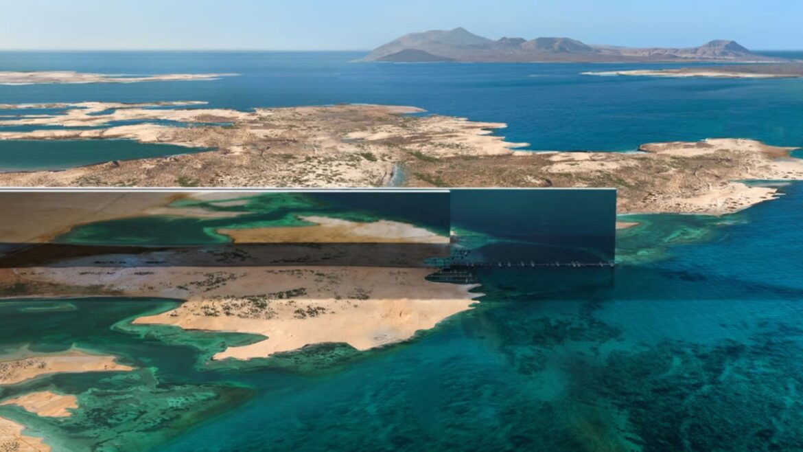
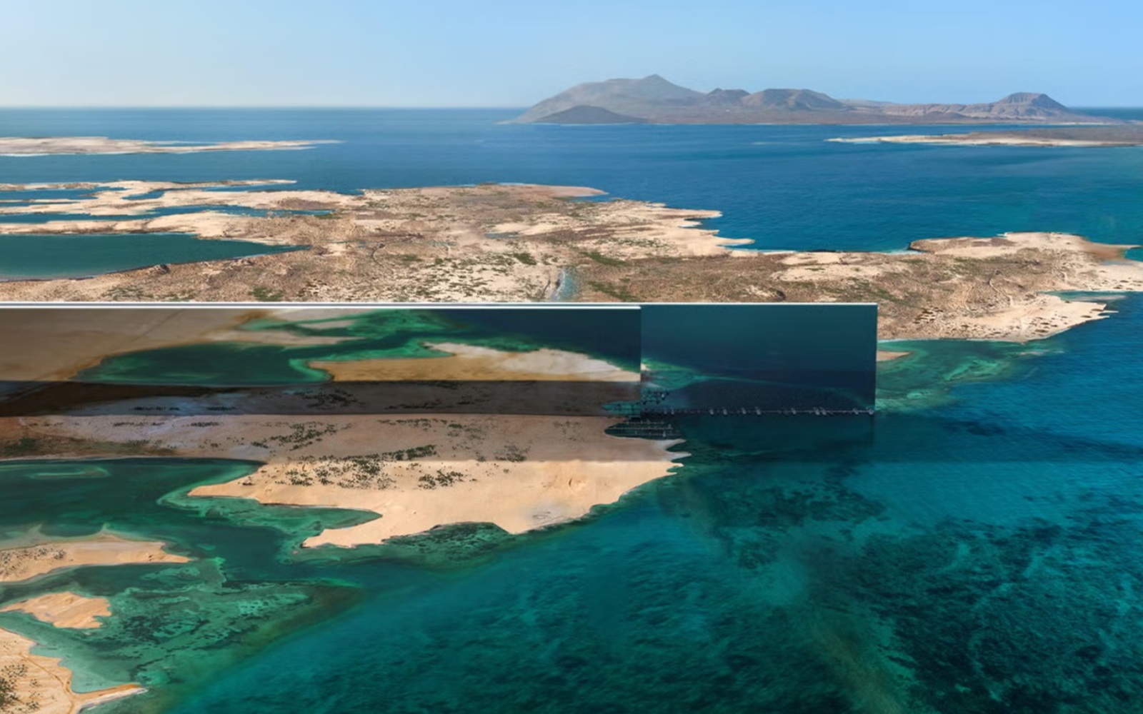
    Nestled amidst exquisite landscapes and crystal-clear waters, the resort is an architectural marvel, spanning a 450-meter-long bridge-like structure, gracefully floating 40 meters above a serene lagoon.

    “NEOM has always been about pioneering the extraordinary, and our partnership with Equinox Hotels underscores this commitment,” commented Jeremy Lester, Magna Executive Director . “Equinox Resort Treyam embodies the convergence of innovation and luxury, and this partnership will redefine sustainable hospitality with a focus on truly immersive experiences and active lifestyles. I’m proud to champion this collaboration, one that will see us shape the future of luxury hospitality”.

    Focused on high-performance living, Equinox Resort Treyam will include spacious guest rooms and suites, a 450-meter pool, world-class culinary concepts, a Club House, a highly acclaimed spa, longevity, and technology treatments supporting health and performance, and a signature Equinox Fitness Club. The result will be an unparalleled, experience-driven resort anchoring Equinox Resort Treyam as one of the world’s most exclusive destinations integrated into a landscape unlike anything else on earth.

    “We are excited to welcome Equinox Hotels to NEOM, marking a significant milestone in our journey to redefine luxury hospitality within the beauty of Magna, the coast of NEOM,” added Chris Newman, Executive Director of NEOM Hotel Division. “Our partnership reflects a shared vision of innovation, sustainability, and pushing the boundaries of what hospitality can be. This resort will be an example of transformative luxury, offering distinctive and inspiring experiences that only Equinox Hotels can deliver. Guests will have the opportunity to fully engage with this extraordinary location, where every detail is designed to enhance their well-being, elevate their journey, and support a high-performance lifestyle”.

    Rooted in Equinox Hotels’ core values of movement, nutrition, regeneration, and community, the cutting-edge programming offers immersive experiences designed to ignite your senses. The resort’s innovative programming and commitment to excellence make it a beacon of luxury and health. Whether you are seeking rejuvenation, adventure, or a tranquil escape, Equinox Resort Treyam promises to deliver an experience that is both unique and transformative.

    Main image credit: Equinox Hotels

    exposed brick, natural woven lampshades and period window features in grain store renovation by sparcstudio

    A new Sparcstudio sanctuary for Calcot & Spa

    1024 640 Pauline Brettell
    A new Sparcstudio sanctuary for Calcot & Spa

    Sparcstudio, the creative design studio specialising in spa and wellness design, has announced its latest collaboration – the development of The Grain Store, a new gym and fitness facility, and refurbishment of the Calcot Spa…

    exposed brick, natural woven lampshades and period window features in grain store renovation by sparcstudio

    As designers of the original Calcot Spa back in 2004, Sparcstudio were delighted to be appointed to create this exciting new wellbeing offer. Designed in collaboration with Richard Ball, CEO, The Calcot Collection, Francesca Rowland, Spa Director and AJ Dalton Architects, Sparcstudio applied their wealth of experience in fitness and wellbeing to create a unique bespoke Calcot fitness experience.

    indoor spa pool at Calcot spa

    Image credit: Calcot Spa

    “With a partnership forged over two decades ago, entrusting Sparcstudio once again to lead our wellness facilities into the future was not just a decision, but a natural progression,” commented Richard Ball, Executive Chairman of Calcot Collection. “Their deep understanding of our brand, shared ethos, and their unmatched blend of expertise and creativity continue to shape spaces that transcend expectation, ensuring our guests and members experience unparalleled enjoyment and rejuvenation”

    wood, light green and blue details in biophilic room with central fireplace

    Image credit: Calcot Spa

    The Grain Store, located in the Calcot hotel grounds is formed within an old agricultural building which has been ‘upcycled/repurposed from its humble farm origins (as a Grain store), to become a gym and fitness sanctuary designed for ‘ultimate wellbeing’. The 280square metre sanctuary features state-of-the-art facilities designed to embody a ‘green and natural’ feel reflecting the environmental credentials of the building and promoting the surrounding environment wherever possible, offering members and guests the opportunity to enhance their wellbeing in a modern, contemporary setting immersed in the Cotswold Countryside.

    green banquette opposite blue chairs and exposed brick wall in The Grain Store

    Image credit: Calcot Spa

    “We wanted to create wellness spaces with ‘soul’, designed with a softer Biophilic approach, overlooking and connecting to the natural surroundings with outdoor work out facilities, designed with generous breakout spaces to encourage connection and promote the warm sense of hospitality that is the essence of Calcot,” explained Sparcstudio Creative Director, Beverley Bayes.

    Guests first arrive in the new Grain store reception and café & club lounge, which has been created in the West barn designed to be warm informal and decidedly un-corporate. Cotswold stone walls are lined with low banquettes, an eclectic mx of furniture and lots of planting. The lounge opens out on to a beautiful terrace with woodburning fire.

    Access to the Grainstore building reception is via a stone lined courtyard with raised water feature. The reception is an airy double height space, designed to provide a good visual connection to the facilities above. Walls are lined in corrugated steel and clay based eco render. Dark stained glazed screens give views onto the gym, and countryside beyond.

    industril finishes and green metal wall in fitness studio at calcot spa

    Image credit: Calcot Spa

    Sparcstudio designed the ‘state of the art’ gym as a series of zones defined by rustic timber and chicken wire screens and equipped with Techno Gym Equipment throughout. The zones include a Functional zone with Sled track and Exigo Rig, Cardio, Free weights & Resistance zones, all overlooking the countryside views. Generous stretch areas have been incorporated and there is also a dedicated ‘Proverb’ Assisted stretch pod, (the Uk’s first!) The convivial atmosphere is further enhanced by the inclusion of a sofa lined consultation area and hospitality counter incorporating, chilled water point and sweat towels.

    change rooms in gym with references to original barn design

    Image credit: Calcot Spa

    Located on the first floor are luxury changing rooms designed in a distinctive rustic style with feature bespoke designed vanity units with cascading planting over, bespoke lockers and benches. The two studios are accessed via a lovely generous social relax/waiting space with beautiful country views at one end and glazed screens overlooking the exercise studio and access to the ‘Spin Shed’ with Technogym bikes and dynamic virtual-led classes

    The ceiling features exposed ductwork with a lighting scheme to create a warm welcoming glow utilising LED spots on a black suspended lighting track, and bespoke designed feature pendants in steel & chicken wire and giant acoustic felt pendants in the studio.

    Reflecting the client’s commitment to sustainability, Sparcstudio specified a palette upcycled and sustainable materials including eco paints with low VOC’s, clay based wall renders and corrugated iron for the walls. Counters and vanities are clad with ‘Foressa’ countertop surfaces formed from waste plaster and wood chips.

    change room and vanity in calcot spa

    Image credit: Calcot Spa

    The relocation of the fitness elements from the spa into the new Grain Store, freed up space to create a more spacious and elevated spa journey and experience. Adjoining the spa’s main lounge café area is the double height barn-like space – where the gym was previously located. This has been transformed into a relaxing lounge space which links via double doors onto the courtyard garden.

    sage green walls and comfortable seating surrounded by plants and wood in the spa

    Image credit: Calcot Spa

    The space has a fresh organic feel with soothing green plant lined walls, bespoke furniture and lighting with a palette of natural linens with blue and yellow accents. The walls are lined with feature bookcases and there is a timber framed glazed screen forming the enclosure to a further quieter relax lounge incorporating a feature double-sided fireplace. The quiet relaxation lounge is lined with bespoke banquettes and the end wall has shelves with trailing plants and a view of the sky through the stone lined double height feature window.

    treatment room with illuminated sheer curtains and a wave chandelier

    Image credit: Calcot Spa

    An immersive and cocooning deep relax room has been crafted in the former studio space, where guests can chill post-treatment on relaxing beds. The space has a soft organic feel created with the use of undulating illuminated sheers lining the walls and dividing the space into zones, set against a background palette of soft rose hues with pattered cushion accents. The room is further softened with an elegant bespoke fabric and lighting suspended ceiling feature. This project has also enabled the creation of a new refreshment area overlooking the surrounding fields.

    “As designers of the original Calcot Spa, Sparcstudio it’s great to have had the privilege to revisit the spa again,” added Bayes. “We often quote Coco Chanel who said, ‘Luxury isn’t luxury unless its comfortable.’ The spacious new lounges certainly add another layer of luxury and elevated journey to the Calcot Spa experience”.

    Main image credit: Calcot Spa

    white bathroom design with TOTO washlet

    WASHLET from TOTO – a revolution in the bathroom

    1024 640 Pauline Brettell
    WASHLET from TOTO – a revolution in the bathroom

    In 2009, TOTO introduced its top-trending WASHLET shower toilet in Europe – starting a revolution in the bathroom…

    white bathroom design with TOTO washlet

    In 2009, Japanese sanitary expert TOTO gave visitors to ISH, the world’s leading trade show for the bathroom industry, a warm welcome – this was the brands first time at the Frankfurt show, and it had a decisive product in their portfolio: WASHLET. It disrupted the industry!

    WASHLET, or shower toilet, combining the toilet and bidet in one, was practically unknown in Europe at the time. In Japan, however, the design was already a part of everyday life for some years. Just about every child is familiar with TOTO products, and most households have a shower toilet. Thanks to TOTO, WASHLET is a trending product today and the greatest innovation in European bathrooms in the past several years. It is considered an important element of any bathroom designed with comfort and well- being in mind.

    hotel bathroom with white wall hung TOTO toilet on a grey wall

    Image credit: TOTO

    Many innovations that have changed the world were initially ridiculed, viewed with scepticism or rejected altogether. People thought that the first automobiles were mere toys for the wealthy, the internet a passing fad for tech enthusiasts, and AI just science fiction. WASHLET has a similar story. Adding an intimate cleansing feature to a toilet was also totally new to Japan – but people throughout the country quickly caught on. The feeling of cleanliness from fresh, warm water cleansing reflected the strong need for hygiene that sets Japan apart from other countries. This phenomenon also holds true today – no country on earth has public toilets as inviting and clean as Japan.

    It makes perfect sense that Japan was the birthplace of a project like THE TOKYO TOILETS. The Nippon Foundation asked renowned international architects to build 17 public toilet facilities in Tokyo, all of them equipped with TOTO products. These toilets, designed by design luminaries such as Tadao Ando, Kengo Kuma and Shigeru Ban, have attracted international attention.

    detail of TOTO WASHLET toilet with nozzle and water jet

    Image credit: TOTO

    Once WASHLET arrived in Europe, TOTO was highly responsive to this market’s specific needs. The Japanese company aimed to eliminate the initial scepticism with which the product was received. The various models fully reflect European standards for exclusive bathroom furnishings and fixtures. Timeless designs in rounded or angular versions complement bathrooms of all styles.

    WASHLET is also becoming more significant in high-end hotels. This segment quickly realised the entirely new wellness experience the product has to offer – and having these installed sets a hotel apart from the others. The recently opened Marriott Hotel City West in Munich has nearly 400 rooms with WASHLET models.

    “From the outset, we considered TOTO products to be differentiators that give the hotel a unique quality, setting it apart from other properties on the market,” explained Joern Siebke, Interior Designer and Founder of Studio Lux Berlin, describing the reason to install TOTO WASHLET throughout the hotel. Many hotel guests experience WASHLET for the first time there and then decide to bring one into their homes.

    dark grey bathroom with wood surface details and white TOTO toilet

    Image credit: TOTO

    WASHLET has become more widely accepted over the years. Today, it’s a ‘must have’ for any modern bathroom. TOTO remained unfazed by the initial hesitance, always expecting the product to take off in Europe over time. The company attended every ISH trade show, having in-depth conversations with plumbers, wholesalers, planners and interior designers. They wanted to bring Japan’s life- changing experience with WASHLET to Europe as well, allowing people to make it part of their everyday routines. As soon as 2011, just two years after the TOTO market launch, competitors started showing more shower toilets at their trade show exhibitions. Together, everyone helped make this product a success.

    Another special feature is that TOTO always positions the wand for intimate cleansing above the toilet bowl: This protects the wand from waste. A protective flap also keeps the wand clean. This placement also prevents the wand from coming into contact with flush water or faeces, keeping the technical components clean if the toilet ever clogs. Another unique cleansing technology developed by TOTO is ewater+. It is based on electrolysed water, which has an antibacterial effect. Bacteria-reducing ewater+ cleans the toilet bowl and wand, helping them stay cleaner longer.

    TOTO can claim to have initiated this development. The expertise gained over decades of hygiene and comfort technologies is often imitated – even today. Founded in 1917, the company has extraordinary expertise in ceramic production, having developed both the innovative rimless toilet bowl and Tornado Flush system.

    TOTO is one of our Recommended Suppliers and regularly features in our Supplier News section of the website. If you are interested in becoming one of our Recommended Suppliers, please email Katy Phillips.

    Main image credit: TOTO

    view from bed in tented camp Daunara in the Okavango delta

    Daunara Safari Camp – redefining luxury

    1024 640 Pauline Brettell
    Daunara Safari Camp – redefining luxury

    Daunara Safari Camp represents a fusion of luxury, culture and nature. Nestled on the edge of Botswana’s Okavango Delta, this exclusive-use, luxury tented camp was brought to life by Fox Browne Creative and designed in partnership with architect Jack Alexander…

    view from bed in tented camp Daunara in the Okavango delta

    The brief for Daunara Safari Camp was to create an exclusive-use luxury villa that blends with its natural surroundings while offering a world class safari experience. In response, Fox Browne Creative and Jack Alexander Studio crafted a lodge that embodies elegance and sustainability, on the edge of Botswana’s Okavango Delta. Fox Browne creative was also responsible for the overall creative direction and strategy, the hospitality concept and all operational elements.

    curved couches around tree trunk table with views across to camp watering hole

    Image credit: Fox Browne Creative

    The camp comprises five spacious tented suites, each offering panoramic views of the Delta. The layout, dictated by the positioning of five prominent trees, allows for both privacy and shared communal experiences, with three standalone suites and two interconnected family suites.

    A raised wooden walkway, mirroring the winding Delta waterways, connects the tents, ensuring guests remain immersed in the natural environment as they move about the camp. The central camp area includes a family-friendly house kitchen, an intimate sitting room, a fully stocked bar, and a stand-alone wine cellar, alongside outdoor spaces like shaded verandas, a sunken firepit, and a salt-chlorinated lap pool.

    wooden deck and lap pool overlooking animal watering hole at Daunara Camp

    Image credit: Fox Browne Creative

    Other noteworthy features include a state-of-the-art gym and a massage tent overlooking a second waterbody. The boma, a modern reinterpretation of a traditional African outdoor gathering space, is a standout feature consisting of three interconnected separate circular forms for dining, lounging, and outdoor cooking, all centered around an enormous fire bowl. This playful yet functional design offers a unique guest experience.

    One significant challenge was the sensitive Delta environment, so the overall design had to emphasizes sustainability. To address this the entire lodge is elevated on a steel and timber frame to minimize environmental impact and avoid the use of any concrete. The placement of tents was dictated by the location of five prominent trees, providing natural shade for cooling and integrating the camp seamlessly into the landscape.

    This approach not only preserved the environment but also enhanced the aesthetic appeal, framing the tent canopies against the tree line. In addition to this, the operation is fully powered by a solar farm and passive design elements like insulated floors and walls, triple-skin PVC canvas roofs, and natural ventilation ensure sustainable operations.

    tented bathroom in safari lodge with view to deck and outdoors

    Image credit: Fox Browne Creative

    Thoughtful interior details blend rustic safari charm with luxurious layered touches, from brass studded timber panels framing quilted-canvas walls, to intricate tent hardware, Hand embroidered mosquito nets echo the delta botanicals and bespoke carpets, inspired by the underside of the water lily, create a sanctuary for guests that offers a deeply authentic, yet luxurious and elegant safari experience.

    Daunara delivers a luxury tented camp experience, where meticulous design and sustainability converge to offer a transformative safari. The lodge redefines exclusive-use luxury in the heart of one of Africa’s most renowned landscapes, setting a new standard for tented camps and lodges worldwide.

    Main image credit: Fox Browne Creative

    outdoor wooden deck on the edge of a cliff with sea view in Los Cabos

    Rosewood Residences establishes a new benchmark for luxury living in Los Cabos

    1024 640 Pauline Brettell
    Rosewood Residences establishes a new benchmark for luxury living in Los Cabos

    Rosewood Hotels & Resorts continues with its pipeline of accelerated residential growth with the announcement of Rosewood Residences Old Lighthouse in Los Cabos, Mexico…

    outdoor wooden deck on the edge of a cliff with sea view in Los Cabos

    Stretching across 550 acres on the southernmost tip of the Baja Peninsula, where the striking Sea of Cortez meets the vast expanse of the Pacific Ocean, Rosewood Residences Old Lighthouse will combine the beauty of Los Cabos with the unrivalled Rosewood Residential experience. As Rosewood’s first fully branded stand-alone residential community, the destination will deliver an inspired and enriching experience designed to create connection, spark imagination, and bravely test the boundaries of refined branded living.

    view from ocean looking at cliffs and location for Rosewood Residences, Old Lighthouse

    Image credit: Noë & Associates with V1

    In partnership with the esteemed Coppel family —renowned creators of the leading hotel and resort companies in Mexico —Old Lighthouse was born out of a shared vision for crafting communities that unite like-minded individuals over immersive experiences that invoke discovery. At the heart of Old Lighthouse is a collection of Rosewood Residences that elegantly cascade across this extraordinary setting. Residents will benefit from the most extensive range of exclusive amenities and services that Rosewood has ever offered across its residential developments, thoughtfully tailored to provide unparalleled adventure and inspire exceptional living, every day.

    “Our partnership with Ernesto Coppel and the Coppel family will revitalize one of Los Cabos’ most iconic addresses and provide discerning buyers with an unmatched living experience in a remarkable setting,” said Brad Berry, Vice President of Global Residential Development at Rosewood Hotel Group. “Los Cabos is a special place where luxury seamlessly intertwines with nature, adventure, and leisure and we look forward to facilitating exceptional immersions and moments of discovery for our owners and their guests.”

    view of original lighthouse structure at the centre of Rosewood Residences, Old Lighthouse

    Image credit: Noë & Associates with V1

    The property will find its home amidst the dramatic coastline of Los Cabos. Perched atop spectacular cliffs stands El Faro Viejo ‘The Old Lighthouse’, the oldest standing structure in the region, erected in 1905. Enveloped by mesmerising cliffs, white sand beaches, and panoramic ocean vistas, the Coppel family has patiently preserved the site for over twenty-five years, culminating in a private sanctuary where rich history and modern luxury unite in harmony. The natural landscape places discovery at the heart of the elevated lifestyle that awaits.

    “We are thrilled to partner with Rosewood on this one-of-a-kind project, which is to set a new benchmark in luxurious and adventure-bound living,” added Jose Luis Mogollon, Managing Partner at Old Lighthouse. “Crafting memorable and personalised experiences at every touchpoint, Rosewood brings a distinct exclusivity and level of service to this project that will set Rosewood Residences Old Lighthouse apart from other residential offerings in Los Cabos. Alongside curating an exceptional lifestyle for our residents, the Rosewood team has worked hand in hand with our extraordinary team in the design and architecture of the project to ensure the residences foster an elevated sense of luxury and belonging; and cultivate an enriched lifestyle in harmony with nature and the local culture”.

    terrace, swimming pool and parasol with ocean view at Los Cabos

    Image credit: Noë & Associates with V1

    Built in harmony with the land, the collection of Rosewood Residences will offer a diverse selection of expansive and secluded homes ranging from 4,000 to over 10,000 square feet, with each lot occupying approximately 0.7 acres. Inclusive of turnkey luxury villas as well as premium lots to be customised by their buyers, the initial 144 residences will be meticulously curated by Guadalajara-based architects, Gomez Vazquez International and interior designers Studio Lifestyle to complement the topography of the land and embrace the splendour of the breathtaking setting.

    Each residence will be thoughtfully crafted to combine indoor and outdoor living spaces, with materials and finishes carefully selected to harmonise with the natural environment and seamlessly blend into the surroundings. From the alluring architecture to the refined sophistication of the interiors, every aspect of Rosewood Residences Old Lighthouse will demonstrate a commitment to quality, craftsmanship, and timeless elegance. The site’s historical significance provides an added layer of depth and reverence, fostering a connection to the land and its storied past that enriches the living experience for residents.

    beach below the cliffs at Rosewood Residences, Old Lighthouse

    Image credit: Noë & Associates with V1

    Life at Old Lighthouse will be a journey of elevated discovery that will offer an experience unseen in the branded residential space. Rosewood’s signature approach to service will extend across an exclusive collection of ultra-luxury social and family-oriented amenities. Blending into the beautiful landscape, highlights will include The Cliff House, the heart and hub of the community occupying a pristine location within the site. Precisely located where the Baja Peninsula begins its one-thousand-mile journey northward, this multi-level oceanfront facility will house an array of entertainment and gathering spaces designed by Mexico City-based architect Manuel Cervantes Céspedes and interior designer Bibiana Huber Diaz. These will include a five-star restaurant with a private dining room, a high-energy bar offering live entertainment, and an outdoor events facility.

    Additional gathering places will be found at The Beach Club, a one-of-a-kind oasis carefully nestled within winding stunning dunes, offering multiple pools, cabanas, beachfront dining, and a world-class spa; The Family Athletic Centre providing sports fields, courts, and fitness facilities; and an extraordinary Wellbeing Center extending holistic therapies and treatments from leading practitioners. Residents will further enjoy unrestricted access to a world-class private Jack Nicklaus Signature golf course and practice facility for members and guests to unwind and embrace the rarefied lifestyle.

    Rosewood Residences Old Lighthouse is scheduled to officially commence the first phase of sales in late 2024.

    desk with colour and product samples in Tarkett showroom

    Tarkett Atelier – colour coded for design success

    1024 640 Pauline Brettell
    Tarkett Atelier – colour coded for design success

    Tarkett Atelier was a well-trodden destination for visitors looking to explore the transformative power of colour and experience the latest specification tech at this year’s Clerkenwell Design Week. We revisited the showroom to take a closer look at its colourful collaboration…

    desk with colour and product samples in Tarkett showroom

    The three-day CDW design fest featured an action-packed programme in the Tarkett London showroom, celebrating the interconnectedness between colour, sustainability, inclusivity and design. All under the banner of ‘Colour: From Palette to Purpose’.

    colour typographic logo in Tarkett london showroom window

    Image credit: Tarkett

    The team launched two new tech platforms during the week, which showcased the power of ground-breaking design and technology through its partnership with colour communication company NCS Colour. The unique system allows users to create harmonising designs at the click of a button. Tarkett also introduced its virtual reality Human Conscious Design Platform (HCDP) at the show, a transformative technology for designing more empathetic environments.

    “We have made a commitment as a business to ‘human-conscious design’; that is to create environments that are good for people and for the planet. Clerkenwell Design Week was the perfect event to bring this to life,” said Mikael Persson, Head of Marketing for UK & Ireland at Tarkett.

    Colour was undoubtedly the star of Clerkenwell Design Week for Tarkett, with the launch of Tarkett’s pioneering partnership with NCS Colour attracting a lot of interest. This first-of-its-kind collaboration allows designers to seamlessly search, compare and harmonise colours across Tarkett’s extensive collections of flooring and wall solutions.

    “When working on projects, colour and material choice is always a challenge,” said Florian Bougault, Tarkett’s EMEA Design Director. “We are extremely excited to offer our clients new possibilities to connect with our products. The collaboration between Tarkett and NCS Colour will open a new territory for creativity!”

    To make this happen, Tarkett conducted an extensive cartography of their product lines last year, measuring and visually assessing each item. This data was then integrated into the intelligent NCS System and NCS+ platform, allowing accurate digital representation of even Tarkett’s most intricately patterned surfaces.

    “We’re delighted to have Tarkett join NCS+ as the perfect first partner in our mission to empower designers and architects to explore harmonious colour, material and product designs quickly and precisely,” said Marcus Mansjö, VP Product at NCS Colour. “With partners like Tarkett onboard, we can help generate more time for creativity and make the design process smoother for all interior design projects.”

    tarkett virtual reality

    Image credit: Tarkett

    In addition to the NCS+ integration, Tarkett also unveiled its new virtual reality Human Conscious Design Platform (HCDP). This transformative technology allows specifiers to experience virtual environments from the perspective of someone who is neurodiverse, such as those with autism or ADHD. The goal is to help create more inclusive, empathetic spaces that account for a wide range of human needs.

    Human-conscious design principles were also at the heart of a well-attended talk by Tarkett’s own Shaz Hawkins. Shaz explored some of the watch-outs for designers looking to make educational, workplace and healthcare environments more inclusive offering pragmatic and practical advice. Tarkett’s suite of free evening speaker sessions also featured special guests from across the industry. This included an inspirational presentation and discussion around circular design led by creative consultancy FranklinTill’s Caroline Till on ‘The Beauty of Circularity’. The festival talk track also unveiled uncomfortable industry truths in a lively panel debate on the topic ‘We’re Not Recycling Enough’ moderated by Katie Treggiden, featuring Dean Connell from IAMDC, Darren Wilson from White Arkitekter, Ankita Dwivedi from Firstplanit, and Louisa Treadwell from Elliot Wood.

    With colour taking central stage, the flooring experts also held a creative workshop on colours and emotions in spatial design with colour consultancy expert Justine Fox. All the events took place at Tarkett Atelier, London. Designed in collaboration with Note Design Studio and Area Square, it offers an immersive environment with the latest interior finishes, demonstrating how materials can be used differently to spark inspiration.

    Tarkett is one of our Recommended Suppliers and regularly features in our Supplier News section of the website. If you are interested in becoming one of our Recommended Suppliers, please email Katy Phillips.

    Main image credit: Tarkett

    banquettes, booths and seating in restaurant BLOK designed by SpaceInvader

    BLOK – a SpaceInvader transformation

    1024 640 Pauline Brettell
    BLOK – a SpaceInvader transformation

    SpaceInvader recently completed the transformation of a formerly under-used restaurant at luxury boutique hotel and spa Lanelay Hall in South Wales, creating in its place a vibrant, exciting, new offering…

    banquettes, booths and seating in restaurant BLOK designed by SpaceInvader

    The re-branded BLOK restaurant features a new interior from the Manchester-based designers SpaceInvader, with an open, theatrical kitchen and a rich, textured and layered treatment. Stand-out features include a new, modular, central booth area and a botanical theme including generous indoor planting and a warm and natural palette.

    Window bay banquette with round wooden tables and facing chairs

    Image credit: SpaceInvader

    The existing hotel restaurant space was looking a little tired when SpaceInvader first came on board: “The space was fairly old-fashioned and formal and, with its feeling of spaciousness and very high ceilings, combined with loose furniture throughout, wasn’t attracting potential diners looking to experience an intimate environment” SpaceInvader Associate Imogen Woodage explained, adding “There was clearly a major revenue stream not being maximised here and we were delighted to be tasked with injecting colour, atmosphere, a sense of scale and theatre into the space. The restaurant’s generous proportions meant it had plenty of potential to become not only a surefire winner for residential guests but able to attract local diners as a destination venue in the area.”

    The brief was clear  – to transform the 134 square metre restaurant completely, with a new menu at the heart of the new vision. The new concept needed to make better use of the space and create visual interest through scale, texture, fabrics and lighting to ensure a new sense of intimacy for diners. The brief also covered the restaurant’s private dining area, which needed to attract special occasion diners, but also offer some flexibility to the hotel’s owners to allow overflow from the main restaurant space in particularly busy periods.

    wooden panelling with mirror alongside table in restaurant

    Image credit: SpaceInvader

    “The restaurant featured listed three metre-high, Georgian oak panelling throughout, which we obviously couldn’t touch and so we set about thinking how to transform and elevate the space into a more memorable, contemporary and dynamic offer, working with and not against this beautiful expanse of wood” added Woodage. “The client was very open to the restaurant having its own identity, separate from the main hotel, although also harmonious with it, which was great.”

    The restaurant’s beautiful period ceiling with its fantastically-detailed feature cornicing was retained and enhanced, repainted in a warm cream, with wallpaper used above the walls and for border areas where the wall isn’t panelled. New flooring throughout is a herringbone timber LVT, the Versailles Dijon from PlusFloor, to maintain the heritage feel of the space and work well with the timber panelling on the walls. New fabrics in the scheme include solid-colour ribbed fabrics which follow a linear theme, referencing the Georgian period, when linear fabrics were highly fashionable.

    lighting and plants feature in design for BLOK by SpaceInvader

    Image credit: SpaceInvader

    Two major moves helped ground the transition from old to new. The first was the design of a central, modular, 16-seater booth area at the heart of the main restaurant to create visual interest, break up the identical rows of tables and create that much-needed feeling of intimacy. The new booth area also permitted a new overall spatial arrangement, which boosted available seating from 48 to 60 covers. New decorative pendant lights hang above the booth, whilst striking sculptural planting separates diners on either side. The booth seating is made of a timber frame, with the seat backs upholstered in a rust-coloured Zimmer + Rohde fabric, coupled with a Brisa Canyon faux leather seat pad and loose cushions in a patterned fabric – Lustre Golden Autumn from Alrey House.

    patterned cushions on blue banquette behind round wooden tables

    Image credit: SpaceInvader

    This section was key to the concept’s success, with everything else feeding off it. All additional furniture in the space was bespoke-made for the project by contractor Dawnvale, with twisted timber bases to the tables, which have a marble-effect top. The new seating throughout is both more contemporary and more of a statement with its mix of plain front fabrics in green and patterned fabric backs from Dedar. Further tub chairs in ochre use a Madison Ginseng fabric from Sunbury Design, together with rattan backing, whilst a blue banquette in the window bay in the main restaurant area uses a Sunburst fabric, also from Sunbury Design, with a small rattan screen at the top on the banquette for a sense of privacy and screening.

    Lighting was also key to creating intimacy. There are chargeable lamps on all the tables – a flexible, easily-moveable addition as they don’t need to be hard-wired – with focus placed on mood lighting at a smaller scale for each table. Additional lighting comes from floor standing lamps where needed.

    view through to private dining space in restaurant with display fridges and view through to kitchen

    Image credit: SpaceInvader

    The private dining space, which can also be seen from the hotel’s reception, features a large oval table with a black quartz top and a new lighting feature above it, set in front of the wine display, along with some smaller tables, set into the space’s bay window, so that inbuilt flexibility exists for main restaurant overflow at peak times.

    A second major intervention is the new glazed areas for wine display and a meat-ageing fridge in the private dining area. Guests can also see the wine display element from the restaurant exterior, allowing inviting glimpses through into the space beyond. Views into the ‘theatre kitchen’, just beyond the private dining room, have also been maximised by the incorporation of new tiling in a deep bottle green / charcoal colour, pulling the eye through.

    Main image credit: SpaceInvader

    green wall and orange throw on bed in guestroom at The Reach Manchester

    The Reach at Piccadilly – inspired by the industrial history of its location

    1024 640 Pauline Brettell
    The Reach at Piccadilly – inspired by the industrial history of its location

    The Reach at Piccadilly, Manchester, a new Marriott Tribute Portfolio Hotel, has opened featuring a chic and captivating design, paying tribute to the northern city’s unique industrial history and the pioneers who made it…

    green wall and orange throw on bed in guestroom at The Reach Manchester

    The Reach at Piccadilly has opened its doors to 215 impressive guest rooms, eight suites, and a ground-floor restaurant & bar: Lock 84. Located in the city centre, the 11-storey building towers over the Rochdale Canal, which was once used to transport goods across the city. The hotel’s bespoke concept draws inspiration from its location, using the materials that were once carried down through the canals: coal, cotton, timber, wool, limestone, and salt.

    detail of green wall, headboard, patterned cushion and reading lamp in The Reach Manchester

    Image credit: Matthew Shaw

    “We’re thrilled to be unveiling this new addition to the Manchester hotel industry,” said Ross Morrow, Managing Director of Molo Hotel Group. “Every aspect of The Reach at Piccadilly, from its design to its amenities, has been meticulously crafted to reflect the city’s rich heritage. We believe that visitors will not only enjoy the modern comforts and conveniences offered here but will also gain a deeper appreciation for Manchester’s vibrant history”.

    ICA, one of the world’s leading hotel architecture and design studios, has led the design to transform an existing aparthotel into a refined luxury hotel. The hotel design is a progressive interpretation of the industrial era, Manchester’s pioneers, canalside living, and the beautiful craftsmanship of the narrow boats.

    plants, light wood and olive green in restaurant design in The Reach

    Image credit: Matthew Shaw

    Expect nautical, nostalgic interiors, with quality craftsmanship and greenery scattered throughout. Other features include bespoke artwork, influenced by the Rochdale waterways; brass detailing, inspired by boat grab-rail tops; and locally designed feature tabletops, with a nod to mill engines.

    Collaborating with local partners is a key part of The Reach at Piccadilly’s food & drink offering. The restaurant, Lock 84, incorporates the city’s heritage in a variety of ways. Offering an ultimate all-day dining experience of speciality small plates, Lock 84 uses the best, sustainably sourced and seasonal ingredients from local suppliers.

    green fabric on wooden chairs line the bar in Lock 84

    Image credit: Matthew Shaw

    Stephen Bench, Managing Director of Lighthouse Hotel Management said: “We are delighted to launch this exciting addition to the portfolio. The Reach at Piccadilly prides itself on local authenticity and celebrating Manchester’s historical roots. Guests from around the world can certainly expect a warm, northern welcome.”

    The Reach at Piccadilly forms part of Tribute Portfolio, a collection of characterful, independent hotels from Marriott Bonvoy that are drawn together by their passion for sincere service, captivating design and a drive to create vibrant social scenes for guests and locals alike. All Tribute Portfolio hotels have their own unique vibe.

    Image credit: Matthew Shaw

    Timothy Griffin talks to the Hotel Designs team about his career

    In conversation with: Timothy Griffin, Principal, Wellbrook Hospitality and Co-Founder, LEVEN

    1024 640 Sophie Harper

    In conversation with: Timothy Griffin, Principal, Wellbrook Hospitality and Co-Founder, LEVEN

    Hotel Designs caught up with Timothy Griffin to hear how LEVEN Manchester is making strides to differentiate itself from other lifestyle hotels and to find out more about his hospitality career to date… 

    Timothy Griffin talks to the Hotel Designs team about his career

    Following another successful Hotel Designs’ event, MEET UP North, which took place at LEVEN Manchester last week, we thought we’d take some time out to get to know the brains behind the LEVEN brand and Principal of Wellbrook Hospitality, Timothy Griffin, to find out more about his illustrious career and hear his thoughts on the future of the industry.

    What led you to a career in hospitality and what was your first experience of working in the industry?

    I initially planned to be a lawyer and at school, whilst studying GCSE and A-LEVEL law, I had a part time job in a local hotel working for pocket money as a waiter and at the front desk. I loved the theatre of hospitality, creating environments that make people feel at ease and in which to enjoy themselves. Whilst researching Universities to read law, and after a weeks work experience at a Magistrates Court, I decided to switch my degree to International Hospitality Management.

    During my degree programme at the University of West London, I benefited from a one year internship at New York’s iconic Waldorf-Astoria, that ultimately resulted in my spending almost half of my career in a variety of leadership roles based in the US, including most recently as Managing Director North America with Ennismore, where I headed up the US business and opened The Hoxton hotels in New York, Chicago, Portland and LA.

    A guestroom at LEVEN Manchester showing industrial interior design, a cosy bed and standalone bathtub set under the room's window.

    Image credit: Wellbrook Hospitality

    How long have you been Principal at Wellbrook, and what was your ‘lightbulb moment’ for founding LEVEN?

    We founded Wellbrook in 2020 at a time when there was a lot of flux in the hospitality industry. With some of the creative hotel operators either being broken up or absorbed into big brand companies, we saw an opportunity to create a dynamic management company that not only ran great hotels but also created inspired brands that are relevant for modern consumers.

    Wellbrook Hospitality is unusual in that we are one of the only independent operators that not only create new brands, but manage all technical, creative, food and drink and pre-opening services along with operating under flexible term Hotel Management Agreements. Thinking differently, and bringing a fresh dynamic approach are all key components of our DNA and one of the reasons Branco Capital approached us to work with them on their Manchester asset. We ultimately entered into a joint venture with them to create the LEVEN brand together – with Manchester the first in a global series of design-led hotels.

    The world of hotels is rife with rules and restrictions put in place by hoteliers, for hoteliers. We saw an opportunity to create a new brand designed for the needs and desires of the people spending time in the spaces, that was design-led, relaxed, with highly-regarded food and drink offers in urban locations. A place that plays a role in helping guests live their best life, on their own terms. Now, more than ever, we have a heightened appreciation of what a sense of freedom and flexibility bring to the quality of our lives. We wanted to create a brand that supported this.

    The lobby area at LEVEN Manchester is a cool and contemporary space with cosy seating and a bar area

    Image credit: Wellbrook Hospitality

    How does LEVEN set itself apart from other hotels/what makes LEVEN unique?

    The foundation of the brand is the word ‘live’ – LEVEN comes from the old English and Dutch words meaning ‘to live’. We crafted spaces that were not only stylish and sophisticated, but felt warm, relaxed and homely and were a true manifestation of the values of the LEVEN brand. At LEVEN you are guaranteed a warm welcome, cosy calming atmosphere, all of the comforts of home and inspired food and drink.

    Every guest receives a pair of LEVEN socks (our new design for this quarter will be dropping soon) in their room. At LEVEN you can snag a free breakfast smoothie if you are on the go and not worry about early check in or late check out fees – if the room is available it’s yours as long as you need. Our guests can also take a bit of LEVEN home with them by picking up some LEVEN merch – we have designed a range of LEVEN garments along with some other special products from some of our favourite makers and creators.

    A glimpse of the LEVENverse, LEVEN's digital counterpart, where a huge lobby space is encased in a cave-like structure where lounge furniture is surrounded by rock formations and plantlife and a vast entrance frames views over the ocean

    Image credit: The LEVENverse

    What was your thinking behind the LEVENverse? Do you think the metaverse is a viable platform to experience hospitality or is it simply a fun fad?

    We acquired a plot of virtual land in the Fashion Estate, Decentraland to create the ‘LEVENverse’ in June 2022. We believe the potential for creative hospitality brands is limitless and in building the LEVENverse we were the first lifestyle brand to blaze a digital trail in the early Metaverse. LEVEN means ‘to live’ and is a brand that has freedom at its heart, to be experienced on a guest’s own terms. We saw an opportunity to create a place in the digital world that is open to all, enabling global networking of likeminded people in an immersive, fun virtual hotel environment, expanding upon LEVEN’s physical social spaces to reach a broad audience.

    LEVEN is known for supporting local creative and artistic talent through collaborations, exhibitions and pop-ups. The LEVENverse will provide an extended platform for makers, creators and innovators to showcase their work, as the physical LEVEN hotel does, through commissioned NFTs and creative digital experiences for users to enjoy and acquire. Visually fantastical, the LEVENverse embraces freedom of design, with the traditional hotel spaces of elevator, lobby, guest room, spa and gardens reimagined, often defying physics and logic.

    These are the early days of the Metaverse and it has taken more of a back seat in peoples imaginations as the world focuses on the impact AI will have on our lives. However the big digital companies are determined to continue to invest in a more photorealistic virtual world, so I think we will see more of the Metaverse in the future. The next iteration of the Metaverse will move away from its gaming roots towards a more realistic virtual world that integrates more seamlessly with the real world and brings together all of the current disparate entities into one integrated Metaverse.

    Our buying behaviours as consumers are now so heavily influenced by our digital experiences that hospitality business will certainly lose an edge over their competitors if they fail to keep abreast of the evolving digital world and ensure their brands are visible within it.

    The dining room at LEVEN Manchester has a large communal dining table set within the iconic bare-brick walls of the hotel

    Image credit: Wellbrook Hospitality

    How important is design in helping to create the guest experience?

    Design is critical not only as the physical manifestation of the values of the brand, but also serves to create an atmosphere that guests emotionally respond to. We are all driven by our emotions and as such respond to our built environments in an intuitive way.

    For our first site in Manchester, we crafted a design that not only honoured the fabric of the building – a landmark 20th century warehouse – but had an essence that was scalable to future sites in the works. The interior space planning was informed by the original locations of windows, historic entry points and how natural light brought the spaces to life. We preserved as much of the original fabric of the building as possible, and restored or crafted energy efficient historic replicas of doors and windows. We built on the rich canvas of the building by keeping exposed detail such as the red brick, steel pillars and timber.

    We selected calming colours, and paid attention to the tactility of materials using natural woods and stone to complement the industrial fabric of the building. We embraced the juxtaposition of raw materiality with calming layers. For example the corridors are wrapped in floor to ceiling wooden panels painted in a charming Farrow & Ball Card Room Green with soft textured carpeting set against an industrial mesh ceiling.

    Around 300 individual pieces of art were curated, displayed throughout the lobby, bedrooms and suites. The use of art to create a visual narrative was twofold. Firstly, the art selections represent the essence of our brand – a community of unique individuals enjoying spaces on their own terms. The art is eclectic, inspiring, and at times unexpected. Secondly, the mindful use of art adds a layer of atmosphere that is distinctly residential – helping guests feel at ease.

    At the heart of the hotel, the lobby bar and lounge are designed to linger, with a variety of soft lounge seating throughout. The bar is encased in emerald green scallop tiles, topped with a patinated brass top and backed by blackened steel retail shelving set against ceiling-high Crittall style windows. The lobby bathroom is dramatically dressed from floor to ceiling in deep blue ceramic tiles and complementary paint, creating a warming cocooning sensation.

    What are your future plans for the LEVEN brand? Are there any other hotels in the pipeline?

    We have a number of other sites in the pipeline and as the LEVEN brand is highly scalable, we are open to working with the right investment partners to support our growth.

    The penthouse at LEVEN Manchester is set over two floors and has an expansive open plan living/dining area and kitchen

    Image credit: Wellbrook Hospitality

    What are your predictions for the future of hospitality and the demands of future generations on the hospitality offering?

    We will continue to see technology integrating more deeply in our businesses, whether it is increased automation, AI and more sophisticated virtual and augmented reality experiences. Although these innovations will have a profound effect on how we run our businesses we should not lose sight of what is the core of hospitality – to make our guests feel good – and as such we will see smart businesses leveraging these technologies in ways that are experientially unobtrusive for guests.

    We will see a continued focus on developing energy-efficient buildings, waste reduction, and carbon offset programmes and sustainable sourcing. Hoteliers will be more motivated to operate their businesses with meaningful sustainability as consumers are more cognisant of greenwashing and the long-term financial benefits become increasingly clear. Those notices in bathrooms to re-use towels are not enough anymore.

    Although the ‘demise of the office’ has been arguably overstated, people are now working remotely between 2-3 days per week. This will continue to impact both rooms and food and drink commercial strategies to adapt to this new consumer behaviour. Hospitality businesses will also need to bring fresh thinking to how they design bedrooms and public spaces to target digital nomads and inspire work places to bring their teams together in our hotels, meeting spaces and restaurants.

    As our industry becomes more homogenised, dominated by a few big players; consumers will continue to seek out the niche, look for unique experiences, embracing adventure, unusual destinations and immersive experiences. Independence and flexibility will drive more buying decisions and force hospitality to become less rigid in its offer.

    The importance of health and wellbeing will increasingly influence the design of hospitality spaces and experiences – from more external spaces and botanicals to more sophisticated leisure offers and alcohol free and plant-based dining innovations.

    As Gen Z and in turn, Gen A, become more powerful consumers, the demands and values of these generations such as authenticity, digital-first experiences and socially responsible practices will become more central to the hospitality offering.


    Main image credit: Wellbrook Hospitality

    blue drop chairs by Arne Jacobsen in front of wooden desk in Radisson Collection Royal Hotel

    Case Study: the timeless elegance of d line in the SAS Royal Hotel

    1024 640 Pauline Brettell
    Case Study: the timeless elegance of d line in the SAS Royal Hotel

    In July 1960, the SAS Royal Hotel opened its doors in Copenhagen, forever changing the landscape of hospitality. Today Room 606 remains a time capsule showcasing iconic Arne Jacobsen design, right down to the d line AJ lever door handle…

    blue drop chairs by Arne Jacobsen in front of wooden desk in Radisson Collection Royal Hotel

    Recognized as the world’s first design hotel, this iconic establishment is now known as the Radisson Collection Royal Hotel. It stands as a testament to the visionary genius of Arne Jacobsen, a leader in Danish design and architecture who profoundly influenced the 20th century. Even today, over 45 years after his passing, Jacobsen’s work continues to define Danish design.

    Arne Jacobsen designs preserved in its original form in room 606 Radisson Collection Royal Hotel

    Image credit: Radisson Collection Royal Hotel / d line

    Jacobsen’s comprehensive approach to design is evident throughout the hotel’s 22 floors. Commissioned in 1955 by Scandinavian Airlines System (SAS), the SAS Royal Hotel was envisioned as more than just a place to stay —it was a modern marvel designed to position Copenhagen as the Nordic gateway for American tourists. The hotel’s innovative design included a direct transfer from its chic cocktail lounge to Kastrup Airport in just 20 minutes, embodying a seamless blend of style and function. The building itself, a glassy horizontal box topped with an 18-storey vertical tower, reflected and merged with the sky, harmonizing with its surroundings while standing out as a beacon of modernism.

    Jacobsen’s meticulous attention to detail influenced every aspect of the hotel. He personally designed the furniture, carpets, curtains, wine glasses, cutlery, and signage, ensuring a cohesive aesthetic throughout. Among his creations were the timeless AJ lever handles, which remain in place to this day. The AJ lever handle in white bronze, featured in several bathrooms and preserved in its original form in room 606, is a testament to Arne Jacobsen’s enduring legacy.
    Room 606 remains a time capsule of Jacobsen’s design, fully functioning as a guest room until recently. It stands as a rare glimpse into the past, showcasing the designer’s work as it was meant to be experienced. The lever handles, now manufactured exclusively by d line, continue to serve as functional pieces of art, reflecting the brand’s commitment to quality and design excellence.

    Jacobsen’s holistic approach has ensured that the hotel remains a landmark of Danish design. With d line’s Re-handle service, these timeless pieces will continue to adorn the hotel, blending beauty and functionality for generations to come. The SAS Royal Hotel stands as a monument to Arne Jacobsen’s vision, where every detail, down to the door handles, tells a story of design excellence.

    d line is one of our Recommended Suppliers and regularly features in our Supplier News section of the website. If you are interested in becoming one of our Recommended Suppliers, please email Katy Phillips.

    Main image credit: Radisson Collection Royal Hotel / d line

    sculptural staircase in centre of Capella Taipai lobby

    Capella prepares for its Taiwan debut

    1024 640 Pauline Brettell
    Capella prepares for its Taiwan debut

    With its opening slated for Q1 of 2025, Capella Taipei, designed by André Fu Studio, is poised to become an urban sanctuary in the heart of the city, offering a unique blend of city energy and serene elegance…

    sculptural staircase in centre of Capella Taipai lobby

    At Capella, hotel design is about crafting authentic and purposeful travel experiences through meaningful storytelling. The heart and soul of each destination come alive as guests immerse themselves in local culture, history, and the environment.

    Designed as an urban retreat, the 86-key Capella Taipei will provide a serene escape within the city. Surrounded by lush greenery, the property – designed in consultation with the Mori Building Group from Tokyo, Japan – offers stunning views of the city and surrounding mountains, setting it apart from other hotels in Taipei.

    arrival lobby at Capella Taipei with architectural lighting and abstract painting behind the reception desk

    Image credit: Capella Hotels and Resorts

    Conceived by André Fu Studio, the hotel’s concept of a ‘modern mansion’ was birthed out of Fu’s personal reflection of Taipei – a modern city that juxtaposes between a world of vibrancy and poetic locality. This vision is defined by incorporating concepts of contemporary comforts, lifestyle entertainment and well-being while also capturing the feeling of a retreat, all within an urban location. Capella Taipei is a thoughtful interfusion of the hotel brand’s vision to combine tradition, discovery, individuality, and a twist of the unexpected, a present-day narrative of the capital city that it lives in, and what modern travellers are seeking for.

    From the statement design features down to the intricate interior details, the experience delivered is highly refined, one that is infused with Fu’s signature language of relaxed luxury that is very relevant to today. “It is a re-telling of my personal journey discovering Taipei,” commented the designer. “Flaneuring around local neighbourhoods and wandering into the lush tree-lined DunHua North Road where the hotel fondly resides, I was absorbed with the poetic environment – It captures the feeling of an escape nestled within European boulevards, a soulful atmosphere that evokes an antithesis to the urbanity one might typically perceive Taipei”.

    Capella Taipei guestroom with panoramic view over the city

    Image credit: Capella Hotels and Resorts

    Capella Taipei is set to be a pinnacle of culinary excellence, featuring the Grill, its main restaurant with innovative grilling, aging and smoking techniques, offering sustainably sourced, farm-to-table produce with a French-inspired seasonal menu. The Patisserie combines an art gallery’s charm with a bakery’s warmth, serving artisanal breads and in-house roasted coffee. Authentic Cantonese cuisine with Taiwanese influences and a premier Japanese Omakase restaurant further enhance the dining experience. Additionally, a two-story destination offers a vibrant mixology-focused ground floor, among other exciting bar-centric concepts to be announced soon.

    Capella Wellness, located on the second floor, will focus on healing treatments inspired by traditional practices and provide Capella’s signature offerings based around the phases of the moon. Guests will have access to four treatment rooms, a fitness studio equipped with Technogym latest offerings, and an outdoor heated pool.

    In addition, the hotel will offer corporate facilities for meeting spaces, called the Campus, including a conference hall and two additional meeting spaces for guest’s business and functional needs. For exclusive events and celebratory milestones, the property features a private event hall and salon with its own discreet private entry

    Main image credit: Capella Hotels and Resorts

    floral wallpaper behind moss green bedhead in Hype London guestroom

    Hyde is heading for London

    1024 640 Pauline Brettell
    Hyde is heading for London

    Preparing to bring its bohemian flair to the city, Hyde is heading to the UK for the very first time, putting down roots in the beating heart of one of the capital’s most storied neighbourhoods…

    floral wallpaper behind moss green bedhead in Hype London guestroom

    Set to swing open its doors on September 2nd 2024, Hyde London City is bringing its electrifying energy to a Grade II listed landmark in the middle of historic Old Bailey. Set across seven storeys, the hotel will have 111 guestrooms, modern Turkish restaurant Leydi serving up generous lokanta-style hospitality, and an intimate subterranean cocktail bar dedicated to a love of music that harks back to Hyde’s origins on the LA club scene.

    street view of Hyde London façade

    Image credit: Hyde Hotels

    The new hotel is well located for exploring the City and surrounding neighbourhoods that are steeped in music, art and design history, and will provide a unique destination for business travellers tired of cookie-cutter corporate accommodation. World-famous landmarks St. Paul’s Cathedral and Old Bailey are literally on the doorstep, while the iconic music and arts destination Barbican Centre and the showrooms, concept stores and galleries of Clerkenwell, home to the eponymous Design Week, are within easy walking distance. The eclectic history and emerging creative scene surrounding the hotel will heavily influence Hyde London City’s cultural and music programming, which is integral to the brand DNA.

    bedside and wallpaper detail in Hyde London guestroom

    Image credit: Hyde Hotels

    The interiors of the hotel will also reflect the spirit of discovery intrinsic to the Hyde experience while paying homage to the architectural heritage of the 19th century building, resulting in a layered, immersive aesthetic. References as diverse as Darwin’s seminal work and the discovery of the kaleidoscope add vibrancy and interest to the alternately green- and blue-framed guestrooms, while classic Hyde touchpoints like dressing gowns inspired by surf ponchos and sublimely comfortable slides dial up the cosy vibes. Set in the eaves of the building with a soaring 5m high ceiling, the hotel’s Headliner Suite looks to botanical motifs to inform its style, setting the scene for a convivial spot that is ideal for sundowners with its very own marble-topped bar and views over London’s rooftops.

    vintage style wooden desk in guestroom at Hyde London

    Image credit: Hyde Hotels

    On the ground floor, Leydi, the modern Turkish restaurant will bring the flavours and all-day food culture of Istanbul to the heart of London. Leydi will plate up generous meze, home-baked pide, and Mangal-grilled meat & fish served family style to encourage joyful communal dining that slips effortlessly into the early hours, liberally aided by free-flowing raki. Warm and textured interior design adds to the mellow vibe, and cosy window tables invite guests to draw up a bar stool, grab a cocktail, and immerse themselves in the intoxicating beat of London life.

    As the night draws in, locals and guests alike can head underground to Black Lacquer, an intimate cocktail bar where eclectic, global music is celebrated. Clean serves and a perfectly pitched menu of small, Tokyo-inspired plates will be set against a daily-changing soundtrack driven by the curated collection of meticulously maintained vinyl on display. The spirit of each Hyde is enhanced through meaningful connections with its local music scene and Black Lacquer’s cultural programming will be informed by collaborations with emerging DJs and artists, establishing it as an inclusive social hub where anything can happen.

    Main image credit: Hyde Hotels

    An aerial view of the proposed new Ritz-Carlton Ramhan Island with individual sea pods

    Ritz-Carlton Reserve Ramhan Island Abu Dhabi signed by Marriott and Eagle Hills

    1024 640 Sophie Harper

    Ritz-Carlton Reserve Ramhan Island Abu Dhabi signed by Marriott and Eagle Hills

    Marriott International Inc. and Eagle Hills have announced the signing of an agreement to open the first Ritz-Carlton Reserve in the United Arab Emirates (UAE), here’s what we know…

    An aerial view of the proposed new Ritz-Carlton Ramhan Island with individual sea pods

    Anticipated to open on Ramhan Island, an exclusive waterfront destination in Abu Dhabi, the property will offer a secluded escape complete with expansive views across the azure waters of the Arabian Gulf.

    “Together with Eagle Hills, we look forward to bringing Ritz-Carlton Reserve to the UAE and offering intimate and transformative experiences in an ultra-luxury setting,” says Sandeep Walia, Chief Operating Officer – Middle East, Marriott International. “This monumental signing marks an important addition to our portfolio in the country where we continue to see a strong demand for luxury experiences.”

    “This collaboration with Marriott International on Ramhan Island marks a milestone in our commitment to shaping extraordinary experiences and redefining luxury hospitality. As the first Ritz-Carlton Reserve in the UAE, it will set new standards of excellence in the world of luxury experiences,” said Chairman of Eagle Hills, Mohammad Alabbar.

    Ramhan Island is being developed to become the next must-visit destination for travellers seeking unparalleled luxury and natural beauty in the UAE. Covering over 4mn square meters of development area, the ultra-luxury destination features a natural island connected through a network of waterways. The fully integrated waterfront community will be home to charming residential villas, marina residences and luxury hotels, offering state-of-art amenities for residents and tourists alike.

    Aerial view of the proposed Ritz-Carlton Reserve Ramhan Island picturing individual water top pods

    Image credit: Marriott International

    Slated to open in 2029, the Reserve will be situated on a secluded island within Ramhan Island and will feature 50 private one-to-four-bedroom luxury villas including the region’s first anticipated floating villas with unobstructed waterfront views. Plans also include a range of lavish leisure amenities and multiple culinary venues.

    Ritz-Carlton Reserve offers a complete escape to the unexpected that is centred around human connection and brings together unique elements of the local culture, heritage and environment. Created for the most discerning travellers seeking a distinct and luxurious escape, Reserve properties are tucked away in handpicked corners of the world, featuring chic, relaxed and intimate settings that weave indigenous flavours with highly responsive and individualized service.

    Ritz-Carlton Reserve currently features a rare collection of only seven properties in destinations including Saudi Arabia, Thailand, Indonesia, Puerto Rico, and Mexico.

    Main image credit: Marriott International

    bed with wooden table and chair and wall light in novotel designs by Ligne roset

    Ligne Roset design solutions in Novotel

    1024 640 Pauline Brettell
    Ligne Roset design solutions in Novotel

    Ligne Roset Contract has partnered with RF Studio to create innovative designs for Novotel Hotels, emphasizing adaptability, sustainability, and easy renovation…

    bed with wooden table and chair and wall light in novotel designs by Ligne roset

    Following an intense worldwide design pitch, Novotel teamed up with four international design teams to introduce the brand’s new vision of modern, 21st century style to the world. One of these four bedroom concepts have been designed by Belgian designer Ramy Fischler, through his design studio RF Studio and will be manufactured by Ligne Roset Contract, which have collaborated with the designer on previous projects.

    novotel guestroom with design by RF Studio produced by Ligne Roset

    Image credit: Amaury Laparra

    The selected products offer hotel guests a unique and homey experience. More specifically, they are offered in Novotel Paris Les Halles and Novotel Paris Orly Rungis hotels. The featured designs include a sofa bed and a headboard, which blend comfort with unexpected, stylish atmospheres. These elements contribute to a new way of hotel living, making guests feel at home while providing a fresh and dynamic environment.

    grey sofa bed designed for Novotel and produced by Ligne roset contract

    Image credit: Ligne Roset

    This approach aligns seamlessly with the essence and commitments of Ligne Roset Contract, which include a dedication to high-quality craftsmanship, sustainable materials, and timeless design. By integrating these principles into the NOVOTEL Hotels, Ligne Roset Contract ensures that each piece not only enhances the aesthetic appeal but also meets rigorous standards for durability and environmental responsibility.

    sideboard detail for Novotel by Ligne Roset

    Image credit: Thierry Sauvage

    The collaboration with RF Studio further strengthens this commitment by combining creative vision with practical solutions, ensuring that the spaces are not only visually appealing but also functional and versatile. This synergy allows for a consistently high level of comfort and innovation, reflecting the brand’s ongoing mission to revolutionise hotel living while maintaining its core values of sustainability and exceptional design.

    Ligne Roset is one of our Recommended Suppliers and regularly features in our Supplier News section of the website. If you are interested in becoming one of our Recommended Suppliers, please email Katy Phillips.

    Main image credit: Amaury Laparra / Ligne Roset

    Jean-Michel Gathy – a designer pipeline

    1024 640 Pauline Brettell
    Jean-Michel Gathy – a designer pipeline

    Jean-Michel Gathy, founder of DENNISTON, is the design genius behind an impressive portfolio of some of the most iconic luxury hotel and resorts in the world. Shifting the focus from hospitality brand to designer, we take a look at Gathy’s well designed pipeline for 2024…

    An award-winning architect and interior designer with more than 40 years of experience in the hospitality industry, Jean-Michel Gathy is one of the big three core architects – alongside the late Ed Tuttle and the late Kerry Hill – who established the DNA blueprint of Aman Resorts from its formative days to present glory.

    Aman New York - Spa Pool.

    Image credit: Aman New York

    The go-to name for innovative and forward-thinking designs in luxury hospitality, Gathy has amassed a celebrated portfolio of iconic projects, which include the Marina Bay Sands infinity pool in Singapore; the crowning glory of Aman New York, carved out of the fourth to 26th stories of the Crown Building on the coveted Fifth Avenue; and the recent launch of Jumeirah Bali in July 2023, an opulent sanctuary of tropical modernism perched atop the cliffs of Uluwatu.

    His projects for 2024 include the launch of One&Only One Za’abeel Dubai, the first-ever vertical urban resort from ultra-luxury hospitality brand One&Only; Cheval Blanc Seychelles in the heart of the Indian Ocean as the sixth Cheval Blanc Maison; Aman Nai Lert, entwined with the exceptional legacy of Thailand’s revered Nai Lert family and located within the historical Nai Lert Park; and Aman’s sister brand, Janu Tokyo, with the promise of delivering harmony through balance to the city’s new dynamic heart in Azabudai Hills.

    Aman Nai Lert Bangkok Residences -Residents-only Garden Lounge

    Image credit: Aman Nai Lert Bangkok

    Across Gathy’s prominent projects, one enduring element of luxury that remains across is what he defines as comfort, and this is intimately linked to his approach to designing for hospitality. His foundational desire for comfort has shaped his design process, and through his experiences, sought to create a level of comfort reminiscent of a home away from home. From Tokyo to Seychelles, we take a look at four iconic hotel openings, designed by Gathy, for 2024.

    high volumes, statement architectural lighting and columns leading into the interior lounge at Janu Tokyo

    Image credit: Janu Tokyo

    Janu Tokyo – Translated as ‘soul’ in Sanskrit, Janu Tokyo opened in March 2024, and delivered a spirited social scene in contrast to sister brand Aman’s whisper-quiet seclusion, designed to offer balance between personal fulfilment and relaxation, imbuing an energy that appeals to those desiring greater purpose and inner contentment. Designed under the leadership of Gathy, Janu Tokyo reflects and celebrates the city’s rich, cultural fabric, exuding the brand’s signature energy inspired by connection, balance and exploration.

    white jetty over blue sea at Cheval Blanc Maldives

    Image credit: DENNISTON / Cheval Blanc Randheli Maldives

    Cheval Blanc Seychelles – Conceived as a ‘home’, the newest Cheval Blanc opening in Q3 2024 is designed as an ode to creole traditions, paying homage to its natural surroundings. The Maison will offer 52 villas, each with a private swimming pool, and beautiful beachfront, hillside, or tropical jungle views. Set along the southwestern coast of Mahé Island, Anse Intendance beach offers a sweeping, pristine setting for the Cheval Blanc art de vivre, giving pride of place to artists from the majestic sculpture Centauresse by Prune Nourry, to the five-part creative composition of culinary arts by the Cheval Blanc team and a collection of Guerlain well-being rituals at the Spa Cheval Blanc.

    bedroom with view over city at One&Only One Za’abeel Dubai

    Image credit: One&Only One Za’abeel Dubai

    One&Only One Za’abeel Dubai – Located in the beating heart of one of the world’s most dynamic cities and the first-ever vertical urban resort from ultra-luxury hospitality brand One&Only, the just opened One&Only One Za’abeel Dubai is an architectural icon that connects the untold charms of Dubai with the palpable energy of the most futuristic city on Earth. Gathy’s vision for the resort takes inspiration from the Za’abeel location, meaning ‘white sand’ in the local Emirati dialect, with Za’abeel’s soulful narrative intuitively woven into the fabric of the resort, its soothing neutral colour palette and subtle sand motifs detailed in the textiles, artwork and sculptural lighting.

    Aman Nai Lert Bangkok - Outdoor Infinity Pool

    Image credit: Aman Nai Lert Bangkok

    Aman Nai Lert Bangkok – Featuring the 52-suite Aman Nai Lert Bangkok hotel, Aman Residences and a newly confirmed Aman Club, the property anticipated to open later this year will be nestled in the tropical gardens of the historic Nai Lert Park in the heart of Bangkok. Drawing upon the rich tapestry of influences at Nai Lert Park Heritage Home and capturing the essence of Aman’s long-standing commitment to celebrating the local culture and heritage, Gathy imbues Aman Nai Lert Bangkok’s design with Aman’s signature aesthetic of refined elegance, simplicity and purposeful restraint, utilising natural textures and materials throughout to create a contemporary urban sanctuary.

    Main image credit: DENNISTON

    tub chairs around tables in lobby and lounge area of Ritz Carlton tokyo with view over city

    The Ritz-Carlton Tokyo Lounge – a fusion of luxury and Japanese elegance

    1024 640 Pauline Brettell
    The Ritz-Carlton Tokyo Lounge – a fusion of luxury and Japanese elegance

    International design and architecture practice AB Concept has announced the completion of its latest project, the Lounge at the Ritz-Carlton Hotel in Tokyo, Japan. This renovation seamlessly blends the opulence of luxury living with the refined elegance of Japanese aesthetics…

    tub chairs around tables in lobby and lounge area of Ritz Carlton tokyo with view over city

    Set within the grandeur of a private manor house, the newly renovated Ritz-Carlton Tokyo lounge invites guests into a world where traditional Japanese craftsmanship meets modern design sensibilities. The environment has been designed by AB Concept to transcend guests into a luxurious personal experience, akin to being hosted within a private garden manor. The fusion of traditional and contemporary elements offers an immersive experience that captivates and delights.

    view of chairs and tables down the length of lobby at Ritz Carlton Tokyo

    Image credit: Nacasa & Partners

    Upon entering the hotel lobby lounge, guests are greeted by a sophisticated ambience that combines luxury furnishings with a curated collection of pieces reminiscent of a residential haven. The design draws inspiration from traditional Japanese craftsmanship, featuring intricate woodworking and delicate washi paper details. This meticulous attention to detail sets the tone for a memorable and elegant stay.

    The renovation introduces new design elements that enhance the lounge’s residential and authentically Japanese atmosphere. Floor lamps crafted with wood and washi paper motifs replace existing pendant lights and wall sconces, adding to the room’s cultural heritage. These enhancements blend modern comfort with traditional elegance, offering guests a seamless and harmonious experience.

    Carefully curated furniture layouts redefine the spatial flow, creating a central sightline that optimises comfort and functionality. Versatile seating arrangements cater to diverse preferences and occasions, ensuring that every moment spent at the Ritz-Carlton Tokyo is tailored to individual needs while maintaining a luxurious ambience. The fusion of contemporary luxury with the Japanese concept of elegance transcends mere accommodation, offering a timeless experience that resonates with discerning guests.

    evening light in Ritz Carlton lobby lounge

    Image credit: Nacasa & Partners

    The lounge serves as a sophisticated retreat, providing physical and emotional relaxation and comfort in the heart of the city. AB Concept’s design melds the essence of Japanese traditional craft and culture with modern sensibilities, creating an environment that is both unique and immersive. This renovation sets a new standard for luxury hospitality, where every detail is meticulously crafted to provide an unparalleled guest experience.

    Main image credit: Nacasa & Partners

    detail of structure and façade of art’otel London Hoxton by Squire & Partners

    From concept to completion – Squire & Partners on the cogwheel inspired art’otel London Hoxton

    1024 640 Pauline Brettell
    From concept to completion – Squire & Partners on the cogwheel inspired art’otel London Hoxton

    Squire & Partners has created a bold statement building that firmly puts art’otel London Hoxton front and centre in the community – the studio talks us through  the narrative behind the tower, and some of the details that define the design…

    detail of structure and façade of art’otel London Hoxton by Squire & Partners

    The recently completed art’otel London Hoxton, is one of a collection of contemporary lifestyle hotels in Europe by PPHE Hotel Group which fuses architectural style with art-inspired interiors. The 26-storey cylindrical form, which occupies a prominent corner within the South Shoreditch Conservation Area where Old Street meets Great Eastern Street, comprises 357 guest rooms including 48 luxury suites, with city views maximised in all directions.

    graffitied wall and escalator leading up into art’otel London Hoxton

    Image credit: Jack Hobhouse

    The tower also comprises a public art gallery with ever-changing exhibitions, a 60-seat screening room, spa and pool on the lower ground floor; The Brush Grand Café, lounge and cocktail bar at ground and first floor; and five floors of co-workspace above. Crowning the hotel are three levels of shared spaces including flexible event space, a destination restaurant and a skyline gym.

    sleek lines and mood lighting in spa and gym in art’otel London Hoxton

    Image credit: Jack Hobhouse

    “Having worked on this project since 2008, after many years and several design iterations, I am excited to see our ideas for this prominent site developed into an important part of Shoreditch’s urban fabric,” said Murray Levinson, Partner, Squire & Partners. “The cylindrical form with its twisted metal columns makes a subtle nod to the development of the computer – without which Silicon Roundabout would not have its name. art‘otel London Hoxton forms part of our growing collection of hotel projects around the world and is another example of our approach to designing buildings that relate to context”.

    curved walls and graphic architectural details by Squire & Partners

    Image credit: Jack Hobhouse

    art’otel London Hoxton’s design responds to the distinct context of its location, referencing Old Street’s regeneration and association with technology – being home to a prominent cluster of high-tech companies in the early 2000s. The cylindrical architectural form and external detail makes a subtle nod to nearby Silicon Roundabout’s history in the development of the computer, referencing the cogs and other mechanical components that the very first analogue computers were built with.

    The tower’s façade takes the form of an extruded cogwheel, divided into bands by horizontal aluminium shelves. Each band features bespoke twisted black aluminium fins that span their height, positioned in a syncopated rhythm around the tower. Each of the building’s double-height floorplates is offset to create the illusion of a series of moving components.

    As the uses inside the building change rising up the floors, the arrangement of the external twisted fins has been carefully adapted to create both solar shading and the appropriate level of privacy – with denser spacing on levels that house guest rooms whilst preserving city views, and fewer fins across the top floor entertaining spaces, accompanied by external terraces, to create more continuous panoramas.

    At street level, the fins are the grandest in proportion, creating a sense of arrival for guests. Two mixed-use blocks flank the tower to form the hotel entrance and feature large-scale Banksy artworks on public display, conserved from the original site and incorporated into the design.

    white curved couch along curved glass wall in suite at art’otel London Hoxton

    Image credit: Jack Hobhouse

    “art’otel London Hoxton is a one-of-a-kind hotel experience, fusing art, design and hospitality to add to London’s ever-evolving, popular Hoxton and Shoreditch neighbourhoods,” commented PPHE Hotel Group. “Squire & Partners’ design stands out as a modern day icon and we are proud to have brought this game-changing new art-inspired hotel to life together”.

    Internally, in collaboration with interior designer Digital Space, signature artist D*Face has led the concept and design of all guest and public spaces, including a 196 square-metre D*Face Masterpiece Suite. The contemporary urban artist, who has returned to the location of his first artworks in the East End, has created works that include original large-scale sculptures, murals and bespoke details throughout the building.

    Main image credit: Jack Hobhouse

    decorative green ceramic brick wall for hotel lobby

    Exploring the ‘Porcelain Capital’ with Zhengyin Art

    1024 640 Pauline Brettell
    Exploring the ‘Porcelain Capital’ with Zhengyin Art

    Zhengyin Art creates original, elegant artworks, perfectly placed to elevate hotel and public spaces while working in a wide range of mediums from ceramics to hand-forged metal and installations. The studio takes us to Jingdezhen to unravel the possibilities of ceramic in the world of hospitality…

    decorative green ceramic brick wall for hotel lobby

    Jingdezhen, situated in southeastern China, holds the esteemed title of the ‘Porcelain Capital’ due to its centuries-long tradition of crafting exquisite porcelain. With a history spanning over 1,700 years, it remains a pivotal cultural and historical city in China. The cityscape pays homage to this legacy, dotted with traditional kilns, workshops, and historic sites.

    white and blue porcelain vase produced in Jingdezhen owes its quality to the local kaolin clay

    Image credit: Zhengyin Art

    The porcelain produced in Jingdezhen owes its quality to the local kaolin clay, renowned for its fine particle size and purity. This clay exhibits exceptional plasticity, allowing artisans to mould and shape it with ease. Its smooth texture is vital for achieving the delicate translucency characteristic of high-grade porcelain. Another distinctive feature of Jingdezhen clay is its ability to withstand high firing temperatures exceeding 1300°C (2372°F). This capability is crucial for vitrification, imparting strength and translucency to porcelain.

    The annual trips of the Zhengyin Art studio to Jingdezhen were marked by marvelling at the clay’s plasticity. Each visit involved studying and experimenting with ceramics. Beyond clay, the unpredictability of glazes fascinated us; their colours often transformed during kiln firing due to various chemical and physical processes, frequently surprising us with the outcomes.

    visiting ceramic studios in Jingdezhen

    Image credit: Zhengyin Art

    Despite its advantages, controlling Jingdezhen clay presents challenges due to its sensitivity to environmental factors such as humidity, airflow, and temperature fluctuations during drying. Shrinkage before and after firing is common, requiring meticulous attention to detail to maintain overall quality.

    One significant challenge we encountered was when constructing a ceramic brick wall for Conrad. This project involved creating a wall of hollow ceramic bricks connected by metal tubes. Achieving precise alignment of each brick hole, with less than 3mm difference, was critical for seamless on-site construction. Weight-bearing capacity was also carefully calculated during modelling to ensure safe installation and successful completion.

    ceramic installation symbolizing the shadow of a flying dragon for Le Meridien in Xi’an

    Image credit: Zhengyin Art

    Another notable project was crafting a nine-meter-tall ceramic installation symbolizing the shadow of a flying dragon for Le Meridien in Xi’an. Despite its apparent simplicity, this artwork posed challenges in firing large pieces and managing intricate designs. Firing different boards separately and controlling the humidity of the greenware were crucial to assembling the final artwork while maintaining its fluidity.

    In our recent collaboration with SM Studio and GZ Art Co. for the Qingdao DYT hotel project, we designed a series of ceramic artworks inspired by traditional Chinese paper cutting craftsmanship. These artworks were prominently featured in the elevator hallway of the hotel. Through a carefully crafted lighting design, the artworks interacted dynamically with the surrounding space, casting enlarged shadows that mirrored the intricate details of the artwork onto the walls.

    a series of ceramic artworks inspired by traditional Chinese paper cutting

    Image credit: Zhengyin Art

    Ceramics remain an ever-evolving art form, celebrated for their texture and unique characteristics. We believe the integration of ceramic works into the interior and architecture industry not only enhances aesthetic appeal but also promotes sustainability through its durable and eco-friendly properties. As we move forward, we like to continue exploring and innovating with this versatile material, discovering new ways to leverage its beauty and functionality in design.

    Zhengyin Art is one of our Recommended Suppliers and regularly features in our Supplier News section of the website. If you are interested in becoming one of our Recommended Suppliers, please email Katy Phillips.

    Main image credit: Zhengyin Art

    Pulitzer Amsterdam has recently unveiled three exceptional new suites inviting guests to immerse themselves in the Golden Age of Amsterdam. We stepped inside for a closer look...

    Pulitzer Amsterdam – three new suites continue the story

    1024 640 Pauline Brettell
    Pulitzer Amsterdam – three new suites continue the story

    Pulitzer Amsterdam has recently unveiled three exceptional new suites inviting guests to immerse themselves in the Golden Age of Amsterdam. We stepped inside for a closer look…

    Pulitzer Amsterdam has recently unveiled three exceptional new suites inviting guests to immerse themselves in the Golden Age of Amsterdam. We stepped inside for a closer look...

    Pulitzer Amsterdam, the quintessentially Dutch hotel spanning 25 interconnecting 17th and 18th century canal houses, has added three exceptional new suites, designed by Creative Director Jacu Strauss, to its offering. These include two new Collector’s Suites inspired by imagined characters who once roamed the streets of the historic city, and a new three-story master suite.

    powder blue couch on wooden floor in the Merchant Suite Pulitzer amsterdam

    Image credit: Pulitzer Amsterdam

    Establishing itself as Pulitzer Amsterdam’s grandest suite, the Merchant Suite, sits within one of the finest examples of Dutch architecture and perfectly evokes the city’s eclectic style and enduring spirit of adventure. The three-story concept features nods to the quirks of the city’s history while offering a beautiful sitting and dining room, three bedrooms and three bathrooms.

    An eclectic blend of contemporary design and vintage charm, the suite features preserved original windows and exposed beams that brush up against modern fixtures and contemporary furniture. Highlights include stunning chairs by Dutch Mooi and lighting designed by Chelsom.

    bright green period chair at wooden desk in front of vintage dutch tapestry

    Image credit: Pulitzer Amsterdam

    Offering views on the Keizersgracht, the city’s most popular canal, the Merchant Suite is a perfect option for groups of travellers. The suite includes a personal concierge and private airport transfer to ensure guests experience the very best of this vibrant city while staying within one of the city’s architectural jewels.

    light blue walls with white porcelain displayed as gallery next to windows looking out onto amsterdams canals

    Image credit: Pulitzer Amsterdam

    The Porcelain Collector’s Suite takes inspiration from locally sourced porcelain artistry. From delicate vintage Delft tiles to modern interpretations of traditional porcelain—including Staffordshire statues—the suite showcases an eclectic collection of treasures set against a harmonious colour palette of blue, white, and gold accents.

    Flooded with natural light, and offering inspiring views of the Keizersgracht canal, relax in a generous separate living and sleeping space. Handpicked vintage furnishings and eclectic porcelain give the space a charmingly curated feel – a characterful blend of unique heritage and modern comfort. From the luxurious marble bathroom to the cloud-soft Super King bed, this suite evokes serenity and calm.

    vintage floral paintings and prints on dark grey wall behind wooden bed

    Image credit: Pulitzer Amsterdam

    Drawing on Amsterdam’s rich botanical heritage, the Flower Collector’s Suite celebrates the country’s most iconic flower, the tulip, and those who cultivate them. This exquisite retreat captivates guests with its vibrant floral motifs such as ornate glass paneling of vintage greenhouses, lush floral tones of Amsterdam’s famous flower market and nods to the celebrated Dutch tulip.

    The space exudes the charm of a private apartment in the heart of Amsterdam with vintage mirrors bouncing natural light across flashes of fuchsia and pale plaster reliefs. A private street entrance for the suite leads to a continuous corridor with the cozy living room overlooking the canal with chairs inspired by the shape of flower petals; a separate bedroom with soothing greens, a super king bed and antique horticultural artworks; and a separate Carrara marble bathroom.

    Main image credit: Pulitzer Amsterdam

    art deco glass window in restaurant in Imperial Riding School vienna

    The Imperial Riding School Vienna – a remarkable redesign by Goddard Littlefair

    1024 640 Pauline Brettell
    The Imperial Riding School Vienna – a remarkable redesign by Goddard Littlefair

    Interior design and architecture studio Goddard Littlefair has announced the completion of the Imperial Riding School, a member of the Marriott Autograph Collection…

    art deco glass window in restaurant in Imperial Riding School vienna

    Originally a 19th-century military equestrian school and later the city’s largest cinema, the Imperial Riding School has undergone a remarkable transformation, maintaining its majestic façade while incorporating contemporary design elements. Redesigned, the property is a prestigious 342-bedroom hotel that elegantly fuses Vienna’s rich cultural heritage with modern sophistication.

    Autograph Collection vienna - arches and pillars in the bar and restaurant space

    Image credit: Mel Yates

    As with each of Goddard Littlefair’s projects, the designers set out to create a narrative that seamlessly blends the history of the building, local culture and context, anchoring the design elements from its architectural features and art installations, to soft furnishings and surface detailing. Nestled in the vibrant Landstraße district, the Imperial Riding School stands as a testament to Vienna’s architectural splendour. The hotel’s design narrative marries aristocratic sophistication with bohemian allure, resonating with both the city’s storied past and its dynamic present.

    Throughout the hotel, from the lobby to the guest rooms, the Imperial Riding School Vienna seamlessly blends artistic expression with equestrian elegance. Guests are invited to appreciate the thoughtful integration of the building’s historical elements with modern design. This design narrative extends seamlessly into the ground-floor public areas, comprising a cosy coffee lounge, chic bar, intimate restaurant, and inviting outdoor terrace.

    seating alcove in hotel foyer with art on the wall behind banquette Imperial riding School vienna

    Image credit: Mel Yates

    In the bar, contemporary design elements, such as a striking metal work installation traversing the ceiling, create a dynamic and artistic atmosphere. The restaurant features intricate mirror and metalwork designs on the walls, paying homage to Vienna’s rich artistic legacy. Intimate booth seating, cocooned within hanging metalwork frames, and strategic lighting enhance the dining experience, creating the perfect ambiance.

    “Our design narrative for the Imperial Riding School Vienna encapsulates the essence of refined creativity and equine grace, offering guests a truly immersive experience where history and modernity intertwine seamlessly, inviting them to embark on a journey through Vienna’s rich cultural heritage,” commented Jo Littlefair, Co-Founder at Goddard Littlefair.

    hotel guestroom with terracotta red wall behind the bed and leather detail bedside lights

    Image credit: Mel Yates

    In the guest rooms, the design narrative weaves classical equestrian touches with contemporary elegance. Woven leather accents, horsehair panels, and impressionist watercolour details effortlessly merge, creating a haven of refined luxury. The corridors also pay homage to the property’s equestrian roots, featuring bespoke carpet designs that evoke the motion of hoof formations in dressage.

    The hotel’s historic garden has been transformed into a tranquil oasis, with landscaped seating areas arranged in horseshoe shapes, inviting guests to immerse themselves in Vienna’s timeless beauty. The garden retains its iconic roots as an orchard, a historical detail that adds to its charm.

    arched alcoves alongside the indoor pool at Imperial riding School vienna hotel

    Image credit: Mel Yates

    “Respecting the building’s illustrious past and heritage while navigating the constraints of a classical property was paramount in our approach,” added Martin Goddard, Co-Founder at Goddard Littlefair. “By carefully preserving the architectural integrity and infusing it with contemporary elements, we’ve honoured the legacy of the Imperial Riding School, ensuring its continued relevance and splendour for generations to come.”

    Main image credit: Mel Yates

    northern lights lighting

    Northern Lights announces rebrand, new website & lighting collections

    1024 640 Megan Christopher
    Northern Lights announces rebrand, new website & lighting collections

    To mark their 37th anniversary milestone, Northern Lights have revealed an exciting transformation as part of a strategic growth initiative that matches their ambitious plans for the future

    northern lights lighting

    The Northern Lights project combines a comprehensive rebranding, seamless new website, investment in new cutting-edge machinery, and a new lighting collection aimed at the international hospitality market. 

    Northern Lights’ distinctiveness lies in its team and capabilities, with decades of heritage and expertise. An impressive project portfolio is fuelled by a team culture that embraces every challenge. With design and manufacturing under one roof, their comprehensive approach uniquely positions them in the bespoke lighting sector. 

    Part of the rebrand brief was to retain Northern Lights’ market-leading positioning, rich heritage and British craftsmanship, whilst encapsulating its reimagined brand values. “Our previous branding didn’t fully capture our market position or unique story & passion,” commented Donna Bruce, Managing Director. “We embarked on an extensive project that marks a period of transitional growth, bold expansion and value realignment.  By uniting our efforts under a single compelling vision, we’re driving innovation, mobilizing our team, reshaping the product and service line-up, and reconnecting with customers in a meaningful way.”   

    northern lights new website

    Image credit: Northern Lights

    In conjunction with the new branding, a complete website redesign mirrors the brand’s refined vision and market-leading positioning, combining beautiful design with enhanced functionality, with a focus on enhanced user experience. 

    In addition to discovering their bespoke services and impressive project portfolio, the website makes it easy to specify Northern Lights’ extensive lighting collections for interior schemes.  New features include enhanced product filtering and search, and the ability to easily add products to quotes and request finish samples in a few clicks. By creating an online trade account, trade customers can login to view trade prices and even purchase directly online. 

    northern lights lamp on side table

    Image credit: Northern Lights

    The quiet luxury movement has inspired twelve new contemporary lighting collections, developed for the international hospitality market.   

    Precision design details, durable raw materials and artisan craftsmanship are expertly combined to capture the essence of refined minimalism.   

    Exquisite metalwork is enhanced with durable, hand-applied finishes, from matt black accented with brushed brass, to rich bronze and fresh whites.  A range of elegant, understated shades include reeded glass, metal, moulded acrylic and soft oyster fabrics.   

    From sleek, simple lines paired with exquisite cowl shades for directional task lighting in the Axl collection, to the rich azure blues of the Novara with its ‘floating’ glass globes, the designs breathe new life into hospitality spaces while ensuring durability for intensive use.  Quiet simplicity and an honest design language are combined with a celebration of British craftsmanship and passion. 

    northern lights lighting

    Image credit: Northern Lights

    A new Ready to Ship lighting range has also been introduced, featuring products from with the company’s wider group, upholding Northern Lights’ design principles to offer accessible yet exceptional lighting solutions. 

    Our future growth plans are ambitiousWe’re not afraid to challenge and be bold, to ensure Northern Lights constantly push boundaries and exceed expectations.  Our industry is built on relationships, and I am confident that our clients will value the efforts we have invested. Our revitalised branding, refreshed website, and refined lighting collections exemplify this commitment, and have been developed with our clients’ needs at the forefront.” stated Donna Bruce.

    Northern Lights is one of our Recommended Suppliers and regularly features in our Supplier News section of the website. If you are interested in becoming one of our Recommended Suppliers, please email Katy Phillips.

    Main image credit: Northern Lights

    meet up north 2024

    In pictures: party at LEVEN for MEET UP North 2024

    1024 640 Megan Christopher
    In pictures: party at LEVEN for MEET UP North 2024

    Last week, the MEET UP North 2024 event unfolded at LEVEN Hotel, Manchester, igniting a vibrant tapestry of connections and collaborations. Deputy Editor Megan Christopher shares the highlights and official photos from the night…

    meet up north 2024

    Picture this: 200 interior designers, architects, hoteliers, developers, and suppliers converging under one roof—a dynamic blend of expertise and creativity. As the evening unfolded, guests revelled in a fantastic space, where old friendships rekindled and new ones sparked. Conversations flowed, ideas interwove, and the pulse of hospitality design reverberated throughout the room. MEET UP North wasn’t just an event; it was a symphony of shared insights, a testament to the power of collaboration.

    In those spirited exchanges, professionals found common ground, forged alliances, and glimpsed the future of their industry. The clinking of glasses and the hum of animated discussions underscored the significance of these connections. MEET UP North wasn’t merely a gathering — it was a catalyst for growth, a canvas where ideas blossomed, and relationships took root.

    So, as the night unfolded, we celebrated more than just a successful event; we celebrated the spirit of collaboration—the heartbeat of our community. MEET UP North provided a stage for professionals to connect, network, and weave the fabric of tomorrow’s innovations. And in that shared space, we discovered anew the magic that happens when minds meet, ideas collide, and partnerships flourish.

    Once the room had filled and everyone had a drink in hand, Hotel Designs Publisher Katy Phillips took to the mic to introduce the evenings incredible panel discussion on ‘Hospitality in the Metaverse’ where Editor Sophie Harper was joined on stage by Timothy Griffin, Principal, Wellbrook Hospitality & Co-founder, LEVEN, Veronica Givone, Principal & Managing Director of Hospitality, IA Interior Architects and James Addison, Creative Director, forpeople. The panellists discussed the pros and cons of AI as designers, offering hotel guests a wider experience in the Metaverse and how we can harness the power of AI as a tool in our day-to-day work lives. If you missed it, keep an eye out for our full write up of the conversation.

    “Exciting things are happening at Hotel Designs” commented Harper, “with a successful start to the year with both of our MEET UP events, we look forward to the launch of another fantastic DESIGN POD and the lead up to the event of the year, The Brit List Awards! We can’t wait to round off what has been such a fantastic year at our fabulous awards ceremony.”

    Here are the official photos released of MEET UP North 2024.

    Main image credit: MEET UP London / Hotel Designs

    curved edge of private pol in front of river villa Namia River Retreat

    Namia River Retreat – villa life by the river

    1024 640 Pauline Brettell
    Namia River Retreat – villa life by the river

    Nestled on an islet overlooking the Thu Bon River, Namia River Retreat, the only 5-star, pool villa resort in the heart of Hoi An, is set to open at the end of this year…

    curved edge of private pol in front of river villa Namia River Retreat

    The charming local Vietnamese allure is infused in every single detail at Namia River Retreat, and guests are encouraged to weave mindfulness into their daily activities. The property will offer unique experiences that combine a luxury villa stay with traditional wellness therapies and authentic cultural activities inspired by the rich heritage of the ancient town.

    palm tree lined entrance to bungalow at Naima river Retreat

    Image credit: Naima River Retreat

    “My vision is to create a resort that reflects our cultural essence in a modern way,” commented says Nam, CEO of the owning company HG Holdings. “I’ve shared my stories and childhood memories in the village with the team, which are now infused into design details or cultural experiences. The name Nam-Mia is about passing on my legacy to my two sons – the next generation. To be proud of our culture of Vietnamese hospitality and that it can be amongst the best in the world”.

    seating in river suite with doors to terrace and views over the river

    Image credit: Naima River Retreat

    Guests can enjoy exclusive access to the picturesque islet where each of the 60 luxurious pool villas await. The native Nipa palm forest effortlessly inspires each villa’s space, which features an open-plan living room that seamlessly flows into an outdoor terrace with stunning views of the forest or the Thu Bon River. The spacious bedroom boasts a sunken bathtub overlooking the pool, and an en-suite bathroom with a refreshing shower. The pièce de résistance is the resort’s main experiential salt-water swimming pool that offers 180-degree views over the Thu Bon River with a serene waterfall, jets, foot reflexology, a biopond with fish, and cosy lounge areas.

    view from above of curved edge of saltwater swimming pool

    Image credit: Naima River Retreat

    The poolside restaurant and bar offer an all-day relaxed dining experience inspired by local fishermen, with fresh seafood and locally sourced herbs from nearby Cham Island. The mainland welcome lounge leads to Mia Dining, where the flavours of Hoi An come alive. Inspired by the local arts and crafts, as well as the ancient trading port’s exotic spices and wares, Namia’s hyper-local culinary journey will offer guests a true taste of Vietnam with nourishing farm-to-table ingredients. Guests can also indulge in a riverboat dinner cruise, or browse the market display for locally sourced spices, artisanal coffee, and unique handicrafts to take home.

    bedroom detail with natural stone and aqua colours on bed with wood and stone surfaces

    Image credit: Naima River Retreat

    The well-being of guests is at the heart of every stay at the Namia River Retreat. All resort guests can enjoy a 90-minute well-being journey per person, per night, consisting of a 30- minute herbal hammam using locally sourced herbs, and a 60-minute traditional therapy, perfect for detoxifying and calming the mind and body. “The spa and wellbeing journey has a distinct Vietnamese story and is inspired by Thuoc Nam (Southern Herbology). We’ve also incorporated a visit to our apothecary, Duong Sinh (a traditional Vietnamese morning movement practice) as well as Xông Hơi (a folk remedy steam prescription) and Dien Chan (oriental facial reflexology) into the guest experience”, explained Michelle Ford, the CEO of Lumina Wellbeing, the wellness and hotel operator of the resort.

    bath edge detail in suite with wooden shelf and herbs

    Image credit: Naima River Retreat

    Guests are also invited to experience mindful rituals such as a silent meditation walk, a lantern lighting ceremony, or the wishing tree as part of their daily program.

    For travellers who are looking for a more immersive and authentic experience, many nostalgic adventures await. Namia River Retreat thoughtfully crafts daily mini-tours to connect people, cultures, and souls. From visits with traditional artisans to learn about their crafts and way of life, or daily bamboo bicycle trails in the Nipa Forest, to sundown river cruises, guests are encouraged to soak in the immense beauty of life in Hoi An

    The design has integrated essential lifestyle practices into the hotel operations, including aligning its systems, procedures, and training of our teams to contribute to the local ecosystem and Hoi An community. The resort hopes to lead the way for responsible tourism in the region, while reducing the environmental footprint with localised sourcing, waste management programs, and advocacy and collaboration projects within our community.

    Main image credit: Naima River Retreat

    baba nest thailand

    6 of the best rooftop restaurants in the world

    1024 640 Megan Christopher
    6 of the best rooftop restaurants in the world

    Rooftop restaurants have become a ubiquitous feature in the modern cityscape. Here we discover the best rooftop restaurants that the world has to offer…

    baba nest thailand

    Rooftop restaurants offer not just culinary delights, but also unparalleled vantage points, transforming a simple meal into a truly unforgettable experience. But for the discerning guest, the journey begins well before the first bite – it starts with the design. Here, we delve into some of the world’s most captivating rooftop restaurants, where the interiors elevate the dining experience to new heights (quite literally).

    The Roof at Public Hotel, New York City, USA

    public hotel roof top view over nyc

    Image credit: Public Hotel

    This industrial-chic haven boasts breath-taking 360-degree views of Central Park and the Manhattan skyline. The design cleverly balances the raw appeal of exposed brick and metal with plush seating and warm wood accents. Communal tables and an expansive bar foster a social atmosphere, while strategically placed greenery injects a touch of nature amidst the urban panorama.

    CÉ LA VI, Dubai, UAE

    ce la vi terrace dubai

    Image credit: Ce La Vi

    When it comes to Ce La Vi you can’t help but think about the sleek lines, luxurious textures and a colour palette that shimmers like moonlight on water. The floor-to-ceiling windows showcase the jaw dropping cityscape, while an infinity pool adds a touch of pure indulgence. The overall effect is one of modern sophistication that perfectly complements the innovative Asian fusion cuisine.

    Singer Palace Hotel, Rome, Italy

    singer palace hotel rooftop restaurant

    Image credit: Singer Palace Hotel

    The historic Singer Palace Hotel boasts a rooftop haven that blends classic Italian elegance with break-taking Roman vistas. Imagine terracotta tiles underfoot, reminiscent of ancient Roman architecture. Simplistic furniture and striped awnings evoke a timeless charm, while pops of colour in the upholstery add a touch of contemporary flair. Large windows showcase the iconic Roman skyline, with views of the domes, bell towers and the city sprawling below.

    Old Course Hotel, St Andrews, Scotland

    old course hotel st andrews west deck

    Image credit: Old Course Hotel

    This haven for golf enthusiasts offers a taste of classic Scottish charm with a contemporary twist. Offering a warm wooden deck overlooking the legendary Old Course at St Andrews. Crisp white tablebloths and comfortable armchairs tucked away it cosy pods create an inviting atmosphere, while pops of tartan add a touch of local heritage. Diners can soak in the iconic view of the golf course and thw North Sea beyond, making it the perfect spot to unwind.

    High Note Skybar at Aria Hotel, Budapest, Hungary

    high note skybar aria hotel budapest

    Image credit: Aria Hotel

    This sophisticated haven offers an unmatched panorama of Budapest’s architectural gems, including the Danube River and the Buda castle. Plush seating areas in jewel tones, views that showcase the city lights and a glittering bar that serves as a focal point. Live music from a resident pianist adds a touch of elegance, creating the perfect ambiance for a romantic evening or a celebratory night out.

    Baba Nest, Phuket Thailand

    baba nest phuket thailand

    Image credit: Baba Nest

    This perennial favourite take inspiration from its island surroundings with a luxurious bird’s nest-like setting, perched atop a rock promontory overlooking the sparkling Andaman sea. Lush greenery weaves throughout the space, blurring the lines between indoors and out. Plush cushions and low seating areas create a relaxed and inviting ambiance, perfect for sinking into and enjoying the panoramic views. An infinity pool wraps around the deck, creating the illusion of merging with the turquoise waters below.

    This is just a taste of the design marvels that await at the world’s best rooftop restaurants. Next time that you’re planning a trip, consider seeking out a rooftop restaurant that tantalises not just your taste buds but your design sensibilities as well.

    Main image credit: Baba Nest

    The Ghan train Australia

    Case study: step aboard The Ghan with Modieus

    1024 640 Pauline Brettell
    Case study: step aboard The Ghan with Modieus

    Named in honour of Afghan camel drivers who played a significant role in exploring Australia’s interior, The Ghan train has become an iconic symbol of Australian travel and adventure. In its recent refurbishment, Modieus supplied the sumptuous bespoke carpets for a journey like no other…

    The Ghan train Australia

    Famous for its journey across Australia’s most dramatic outback landscapes, The Ghan has undone a major refurbishment by the design studio Woods Bagot, with Modieus supplying the bespoke carpets traversing the train. On a cross-country journey of  2,979 kilometres, from Adelaide to Darwin, with stops in Alice Springs and Katherine, passengers experience diverse landscapes, from the lush vineyards of South Australia, the Red Centre’s desert landscapes around Alice Springs, and the tropical Top End near Darwin.

    cream train seating by window in the Khan with wood and leather details

    Image credit: Nicole England / courtesy of Woods Bagot

    Sustainably minded, Woods Bagot deployed an inventive reuse of existing assets, alongside new materials selected for durability and longevity.

    Debra Ryan, Design Manager at Modieus explained the design brief; “Woods Bagot drew inspiration from several Indigenous artists. The interiors embody hues from the rich red earth and the vivid mountains beyond, incorporating colours of paper bark, gum trees, and the dusty soil. Our luxurious bespoke carpets capture this inspiration, enhancing the passenger experience as they journey through central Australia”.

    curved leather banquettes in the train with striped modieus carpet

    Image credit: Nicole England / courtesy of Woods Bagot

    There is no doubt, the Ghan offers a unique and luxurious way to experience the vast and varied landscapes of Australia. It combines the romance of rail travel with modern comfort and exceptional service, making it a memorable journey for both domestic and international travellers. Onboard amenities include comfortable lounges, bars, and observation decks. The Outback Explorer and the newly designed Gold Premium Lounge are perfect places for socialising and enjoying the passing scenery, with the Queen Adelaide Restaurant a place to savour the carefully curated, all-inclusive menu.

    The train’s dining experience highlights regional cuisine and wines, reflecting the areas through which the train travels, with an emphasis on using local produce, paired with fine Australian wines. “The dining and lounge areas have seen significant upgrades to create a more inviting and comfortable atmosphere,” added Ryan.

    seating in dining area of train with bar and curved lines on carpet

    Image credit: Nicole England / courtesy of Woods Bagot

    The Ghan began operations in 1929, initially connecting Adelaide and Alice Springs. This route was part of the efforts to connect the southern and northern coasts of Australia. The final extension to Darwin was completed in 2004, fulfilling a long-held vision of a north-south transcontinental railway.

    “We are honoured to have worked on this project,” commented Xander Okhuizen, Modieus Founder. “The Ghan is the Orient Express of Australia, offering a unique way to see the vast Australian interior, symbolising the historical and cultural development of the Australian Outback. Passengers can enjoy the luxury of Modieus carpets in their cabins, lounges, and restaurant”.

    Main image credit: Nicole England / courtesy of Woods Bagot

    view across swimming pool to parasols and resort building at dusk

    Destination by Hyatt debuts in Latin America

    1024 640 Pauline Brettell
    Destination by Hyatt debuts in Latin America

    Hyatt Hotels and El Pardo Hospitality announced the opening of The Legend Paracas Resort, joining the Destination by Hyatt brand. Here’s what we know…

    view across swimming pool to parasols and resort building at dusk

    The 124-suite Destination by Hyatt resort invites guests to discover the natural wonders and historical legacy of Paracas, on the coast of Peru. The resort is nestled between the Paracas Nature Reserve and the Pacific Ocean, offering panoramic views of the Paracas Bay and desert hills, designed to be a place of immersive discovery, authentic design and warm, welcoming service.

    “It is a privilege to join forces with Hyatt to open The Legend Paracas Resort and connect guests with the people, place and culture of this unforgettable coastal town,” commented Ricardo Bracale, CEO of El Pardo Hospitality. “This has been an exciting project for our team, and we are thrilled to officially open our doors to local Peruvians and global travellers alike and invite guests and World of Hyatt members to make this destination their own”.

    Hyatt resort guest room with doors onto terrace and ocean view

    Image credit: Hyatt Hotels

    The Legend Paracas Resort is comprised of 124 two-room suites, each equipped with private balconies or terraces that unveil stunning ocean, garden or pool views and deliver an experience that ensure guests feel right at home. The guestroom design reflects the natural beauty of the Paracas National Reserve, drawing inspiration from the natural wonders and historical legacy of the region, using wood and natural fabrics. Each suite includes a communal living room with a sofa bed, TV and desk, a kitchenette with a microwave, coffee maker, tea kettle and minibar, and guestroom have a terrace on the first floor or balcony on the second.

    The resort is home to three on-site culinary concepts that offer different gastronomic experiences using the finest ingredients from the destination including its signature restaurant and bar, Azul, offering Peruvian and international flavours with fresh local ingredients and its casual beach-front restaurant Rey de Las Olas Bar & Lounge. The Pool Side Bar offers light bites and signature cocktails using Peruvian Pisco, local fruits and non-alcoholic cocktails with a twist incorporating local ingredients such as purple corn. Twenty-four-hour in-room dining is also available daily.

    comfortable seating in outdoor restaurant space under bamboo ceiling

    Image credit: Hyatt Hotels

    At the property’s heart is the spa, which offers a variety of special services such as body massages, milk baths, scrubs, body wraps and whirlpools. Other amenities include a well-equipped fitness centre and a pool overlooking the ocean. A wide variety of curated experiences aimed at building stories are available for all ages such as kitesurfing, wakeboarding, kayaking, paddleboarding, sandboarding, buggy excursions and engaging kid-friendly activities and programmes.

    Venturing out a short distance will offer a glimpse into the rich history and fascinating pre-Columbian cultures of the region, fulfilling guests’ desires for exploration, adventure and creativity. Embark on a boat tour to the Ballestas Islands, a natural wildlife sanctuary with sea lions, penguins, pelicans, and marine birds, or explore the diverse landscapes of Paracas National Reserve and hike through desert trails and unique rock formations.

    The resort has a multifunctional banquet space with capacity for up to 300 meeting and event attendees, complemented by an outdoor terrace that offers a spectacular view of the bay, creating a magical space that places special events between the desert and the sea.

    The Legend Paracas Resort is the 19th resort to join the diverse and growing Destination by Hyatt brand and marks the second Hyatt hotel in Peru following Hyatt Centric San Isidro Lima and the 15th Hyatt hotel in South America.

    Main image credit: Hyatt Hotels

    central park sanipex

    Sanipex chosen for Central Park by Meraas in Dubai

    1024 640 Megan Christopher
    Sanipex chosen for Central Park by Meraas in Dubai

    SANIPEX brings bathroom luxury to Central Park development at Dubai’s City Walk…

    central park sanipex

    Central Park by Meraas, located in the vibrant City Walk area of Dubai, is the latest example of high-end urban living. As part of this large-scale development, which promises to be in high demand, Sanipex Group has been chosen to provide superior bathroom fittings for three of the residential buildings: Celadon, Myrtle, and Viridian. Working alongside Eastern International and Parkway International Contracting, the group is delivering complete bathroom and washroom solutions from its renowned brands, BAGNODESIGN and AQUAECO.

    central park sanipex bathroom

    Image credit: Sanipex Group

    Scheduled for completion by late 2024, Celadon, Myrtle, and Viridian will feature state-of-the-art sanitaryware, brassware, and accessories, chosen for their modern design, durability, and functionality. These fittings align perfectly with the contemporary urban living theme and will outfit approximately 500 bathrooms across 1–3-bedroom apartments and communal washrooms.

    In the residential bathrooms, double washbasin vanities add a touch of practical luxury, making it easy for two people to share their morning routine. Residents can relax in bathtubs or enjoy step-in showers equipped with convenient slide rail kits, hand showers, and concealed mixers. For the communal washrooms, sleek Matt Black touchless taps and accessories were chosen, providing a stylish urban feel. The addition of trendy round basins gives these spaces a modern twist on traditional designs.

    central park sanipex group

    Image credit: Sanipex Group

    “We’re proud to be a part of Central Park by Meraas, bringing high-quality and innovative bathroom solutions to this prestigious development and setting a new standard for urban living in Dubai,” commented Sanipex Group’s Guy Wilson, Group Managing Director Trade & Projects.

    Sanipex is one of our Recommended Suppliers and regularly features in our Supplier News section of the website. If you are interested in becoming one of our Recommended Suppliers, please email Katy Phillips.

    Main image credit: Sanipex

    Roomers Baden-Baden rooftop with couches, moroccan lanterns and plants

    Miniview: Roomers Baden-Baden

    1024 640 Pauline Brettell
    Miniview: Roomers Baden-Baden

    Roomers Baden-Baden stands as a lavish lifestyle destination within the the Autograph Collection – with a design by architect Piero Lissoni, we stepped inside for a closer look…

    Roomers Baden-Baden rooftop with couches, moroccan lanterns and plants

    Roomers Baden Baden,  part of the Gekko Group portfolio, is located within its namesake town, a UNESCO World Heritage site best known as a spa paradise at the foothills of the Black Forest, with thermal baths, sea salt grottos, aromatherapy, yoga classes and Lomi Lomi. With the Black Mountains behind it, the hotel blends into the holistic natural essence of the surrounding town making guests feel highly relaxed and at home during their stay.

    ceramic japanese stools around low tables with view across to Black moutains

    Image credit: Roomers Baden-Baden

    The property is also ideally located near Festspielhaus, Germany’s largest concert and opera house, and within walking distance from Trinkhalle. Designed by Piero Lissoni, this luxurious hotel presents a sleek look throughout, having 130 rooms and suites including accommodations for those suffering from allergies.

    It features a variety of amenities for guests to enjoy, including two bars, one on the ground floor and the other on the rooftop terrace, an infinity pool and a gym. A large patio is open for diners to spend time on during the warmer months.

    Japanese style graffiti in moriki restaurant in Roomers Baden-Baden

    Image credit: Roomers Baden-Baden

    The hotel also shelters a Japanese-inspired Pan-Asian-style restaurant called ‘Moriki’. Directed by chef The Duc Ngo, the Moriki Restaurant offers modern fusion dining with pan-Asian cuisine. This eatery provides a culinary experience showcasing high-quality ingredients and an artful creation of dishes in a casual urban ambience. For a more intimate setting, a Private Dining Room awaits. At the Roomers Rooftop Bar & Pool, guests can enjoy a cocktail with a black forest view in a relaxed casual atmosphere.

    hotel lobby with pool table and minimalist design in Roomers Baden-Baden

    Image credit: Roomers Baden-Baden

    One of the most prominent amenities that the hotel proudly presents is a full-service spa, operated by Dr. Barbara Sturm, fitting right in with the spa culture of the location. The spa was recently awarded second place in the City Spa category within the Spa Life Awards Germany 2024.

    minimal and graphic design of bar with backlit wall and bottle display

    Image credit: Roomers Baden-Baden

    Piero Lissoni meticulously designed Roomers Baden-Baden in a modern style, which creates a deliberate contrast with the surrounding historical buildings of the neighbourhood. Local architects KHP were hired to create the building under the designs of Lissoni Casal Ribeiro, producing a spectacular façade and distinctive interiors. In the public areas of the hotel, Lissoni conceived a series of calm and atmospheric spaces, centred around a minimalistic designed foyer while incorporating key elements such as antique church portals and adjoining gardens with an outdoor terrace.

    With six hotels under its belt in key German cities as well as a collection of celebrated dining establishments and even a semi-private jet service, the Gekko Group is set to add another hotel to its portfolio later this year- Roomers ParkView in Frankfurt designed by Piero Lissoni.

    Main image credit: Roomers Baden-Baden

    tarkett virtual reality

    Tarkett launches VR-tech to make spaces more inclusive

    1024 640 Megan Christopher
    Tarkett launches VR-tech to make spaces more inclusive

    Tarkett, a global leader in recyclable flooring solutions, has launched its ground-breaking virtual reality ‘Human Conscious Design Platform’ (HCDP)…

    tarkett virtual reality

    One in seven people is estimated to be neurodivergent, meaning their brain functions, processes information and reacts to sensory stimuli differently than those considered neurotypical. Common examples include ADHD, autism, dyslexia, dyspraxia and dementia. Increasingly, communities and organisations recognise that fostering true inclusivity requires designing environments suitable for every neurotype. This technology enables users to experience how physical spaces may look, sound and feel from the perspective of someone who is neurodivergent.

    “Our new Human Conscious Design Platform represents a major leap forward in Tarkett’s ‘Human-Conscious Design’ philosophy of creating spaces that are good for people and planet. It builds on our existing industry-leading work around designing for dementia and the ‘Through their eyes’ VR experience that we launched in 2018,” commented Shaz Hawkins, Segment Marketing Manager at Tarkett. “This latest technology continues our drive to cultivate invaluable empathy and understanding amongst architects, designers, organisations and the public by allowing them to experience an environment through a neurodivergent lens first-hand. This can help shape more accommodating, equitable spaces where all individuals feel welcomed and are able to thrive.”

    tarkett virtual reality

    Image credit: Tarkett

    The HCDP has been developed following a couple of years worth of research and development including interviews with neurodivergent individuals, teachers, businesses and support organisations as well as extensive desktop research. The platform immerses users in virtual environments like offices, schools, hospitals and care homes rendered to highlight sensory stimuli that may overwhelm, under stimulate or distress someone with sensory processing differences. Users can toggle augmented sound, lighting and other elements to vividly experience an environment from multiple neurodivergent perspectives.

    To support the launch of the VR platform, Tarkett is also rolling out a RIBA-accredited Human Conscious Design continuing professional development (CPD) course to educate architects and designers on the principles and best practices for inclusive design addressing neurodiversity. The team has published a report, Human Conscious Design Principles, to help organisations and designers understand neurodiversity better along with practical advice on how to create inclusive spaces.

    Tarkett is one of our Recommended Suppliers and regularly features in our Supplier News section of the website. If you are interested in becoming one of our Recommended Suppliers, please email Katy Phillips.

    Main image credit: Tarkett

    blue headboard and bed side table with book and light and white linen on bed

    The Social Hub unveils its next-generation room design

    1024 640 Pauline Brettell
    The Social Hub unveils its next-generation room design

    The future of The Social Hub hotel room design aims to create an intimate space for guests through warm tones, stylish furniture and bathrooms, along with some experience-centric surprises…

    blue headboard and bed side table with book and light and white linen on bed

    This next-generation concept from The Social Hub is part of the hybrid hospitality leader’s strategy to elevate its offering as it continues to grow its footprint across Europe. A number of ‘premium rooms’ are currently piloted and available for booking at The Social Hub Amsterdam City. Following this, over the coming years the design will be gradually adapted and rolled out across the entire portfolio with the brand’s diverse community in mind. Once completed, travellers, students, business professionals, digital nomads and more will be able to choose from elevated room options tailored for their specific needs.

    new room design at the Social hub with space designed to work and relax, bed, chair and table

    Image credit: The Social Hub

    “After much research done to understand exactly what our varied guest profiles are really looking for, we’ve landed on a new room concept that represents the evolution of our brand’s design experience,” commented Marion Koopman, The Social Hub’s Chief Operations & Commercial Officer. “Our approach aims to transport guests from ‘we’ community-centric spaces to a ‘me’ zone featuring a more sophisticated and values-driven experience. With this rollout we will also align our hubs to a higher category competitive set which we are aiming to move towards”.

    shelving and open wardrobe system in new room design at The social Hub

    Image credit: The Social Hub

    Seamlessly blending comfort, functionality and style the new premium room concept being piloted has been designed to be a calming and functional private space within The Social Hub Amsterdam City. A place where guests can take a break from socialising with our vibrant community and refresh, recharge and dream.

    The premium room features include plenty of hybrid utility space for two guests to lounge, work & play, along with an extra comfy king-size bed and choice of high-quality pillows, plush chairs and tables to work, study or relax. The spacious bathroom with rain shower & double sink, features Zenology clean cosmetics. It is all about clever solutions designed for guests to comfortably unwind with the use of warm colour tones, fabrics, wooden floors and dimmable lighting.

    double basin and double mirrors in compact hotel bathroom design

    Image credit: The Social Hub

    Small surprises such as local design touches and even a selection of books tied to The Social Hub’s purpose of ‘together, we create a better society’ include Tal Ben-Shahar’s Happier No Matter What, Rutger Bregman’s Humankind; A Hopeful History, and Elkhart Tolle’s The Power of Now. The new room concept is the result of a more than a year-long process to perfect the offering. This includes basing the design research and insights obtained via internal and external surveys, focus groups with staff and guests, design expert consultancies, and more.

    The design is being led by Italy’s Rizoma Architecture alongside a curated selection of partners with shared purpose-driven values such as The Netherlands’ DUM (chairs) & ByBorre (fabrics), and Denmark’s Kvadrat (fabrics).

    Main image credit: The Social Hub

    piles of cushions under a tree in sanderson fabric

    Roundup: new collections from Sanderson Design Group

    1024 640 Megan Christopher
    Roundup: new collections from Sanderson Design Group

    Sanderson Design Group began 2024 with a return to the elegance of the its logo from the 1930s. This has been followed by a move into its original home Voysey House, all while continuing to supply and surprise us with new collections…

    piles of cushions under a tree in sanderson fabric

    The air buzzed with anticipation as Deputy Editor Megan Christopher stepped into Voysey House. For Sanderson Design Group, this was more than a mere event; it was a homecoming. The grandeur of their new headquarters enveloped us, a testament to their growth and creative prowess. The Lead Designers for each brand—Sanderson, Morris & Co., Zoffany, Harlequin, and Clarke & Clarke — stood ready, eager to unveil their latest masterpieces. Each fabric, wallpaper, and pattern has a story — a whisper of inspiration that breathed life into the designs.

    rolls of fabric in zoffany plains range

    Image credit: Sanderson Design Group / Zoffany

    Meticulously sourced from all over the globe, Luxury Plains is a considered series of the finest textured plain fabrics woven in seven different hand-selected mills, coloured in Zoffany’s rich archival palette. Weaves, velvets, and bouclés with exceptional textural and visual qualities are woven in mills selected for their expertise, drawing on the unparalleled artisanal skills of the makers. Performance Amoret, Performance Audley, Bouclé, Curzon, Lustre, Moiré and Wool Satin. Luxury Plains presents a new palette that feels wholly versatile and elevated from the everyday. Contemporary hues are mixed with rich Zoffany classics for modern and traditional.

    “This treasury of plains brings texture to the Zoffany portfolio, each with its distinctive look and feel, which is a testament to the incredible mills in which they were produced,” commented Peter Gomez, Lead Designer, Zoffany.

    Sanderson celebrates the enduring appeal of classic decorating stories with four timeless collections of beloved designs and iconic prints for layering in interiors. Revisiting cherished designs, archival prints, sumptuous velvets, robust plaids, and regal damasks come to the fore in new palettes and
    timeless combinations. Presenting Country House, Lymington Damasks & Stripes, Icaria & Boho Velvets and Country Woodland.

    In Country Woodland, Sanderson recites a cherished tale of wooded walks in a naturalistic collection of fabrics, drawing inspiration and eternal beauty from nature’s rural paths. Timeless by design and effortlessly evoking a serene ambience in interiors, this beautifully relaxed collection of fabrics is a much-loved
    Sanderson signature.

    wicker chair with floral cushion set against floral wallpaper by Harlequin

    Image credit: Sanderson Design Group / Harlequin

    Exploring a fresh interpretation of art blended with the dream-like side of nature, Idyllic is a collection of drapery fabrics and wallpapers that taps into Harlequin’s continuing obsession with colour. Hints of femininity, Art Deco influences, and garden inspired prints are revealed through exceptional weaves,
    embroideries and printed fabrics and wallpapers. Heightening the modernity of the crisp colour palette, fabric textures and design techniques amplify Harlequin’s colour combinations.

    yellow green and blue abstract wallpaper treetops from Harlequin

    Image credit: Sanderson Design Group / Harlequin

    Wallpapers present a contemporary take on the natural world through large and small scales, fresh colour grounds and layers of texture. “As a collection, Idyllic is fresh yet whimsical, indulging in a dream-like mood for interiors,” said Flora Daly, Designer at Harlequin. “By taking recognisable elements from nature and colour-drenching them, we’ve created an invigorating collection with a fresh take on design”.

    Idyllic charms is in a palette of smokey Paprika, Cornflower blue, Clover green and Positano pink, creating a calming retreat in interiors.

    Unveiling a striking new campaign, Morris & Co. proudly presents three of its most iconic designs in new light. Lovingly crafted and disruptively spirited, this is heritage reimagined, true to its roots, as William Morris intended. Golden Lily, Blackthorn and Pimpernel set the scene for bold new slogans, reaffirming
    Morris & Co.’s authenticity as the original company founded by William Morris in 1861. Appointed by William Morris himself and his natural successor as Art Director of Morris & Co. in 1896, J. H. Dearle’s Golden Lily (1897-99) and Blackthorn (1892-93) feature in original colourways, while Morris’s Pimpernel (1876), is shown in newly reimagined colours. Twists and turns of nature’s thorns and entwined lily stems dance, whilst pimpernel preens in some of Morris & Co.’s most recognisable designs, taking centre stage in this new campaign.

    “As the original company founded by William Morris in 1861, it is our responsibility to keep Morris & Co. relevant for today’s audiences, opening up our world and drawing people in through a considered reimagining of our heritage designs,” said Claire Vallis, Design Director at Sanderson Design Group. “As the creators and makers of Morris & Co., we have the privilege of bringing these designs to the fore and a legacy to uphold – this campaign does just that”.

    Sanderson Design Group is one of our Recommended Suppliers and regularly features in our Supplier News section of the website. If you are interested in becoming one of our Recommended Suppliers, please email Katy Phillips.

    Main image credit: Sanderson Design Group

    AXOR Citterio C black tap on stone basin

    AXOR and Antonio Citterio: Pushing the boundaries of individualisation

    1024 640 Pauline Brettell
    AXOR and Antonio Citterio: Pushing the boundaries of individualisation

    Slender, elegant and exceptionally refined, AXOR Citterio C reinterprets the basin mixer tap for a new era, one that demands ever more comfort and individuality from ever smaller bathroom spaces…

    AXOR Citterio C black tap on stone basin

    Minimalist in spirit, with soft contours and a sensuous form, the AXOR Citterio C tap invites the touch while intriguing the eye from every angle. Its signature detail, a fine chamfer encircling the outlet and lever handle, extends to all pieces in the collection. Handles are available in the unique cubic cut pattern as standard. For those who wish to make a more personal statement, other predefined textured patterns are available via AXOR Signature, as well as in the full range of AXOR FinishPlus surfaces.

    view from above of AXOR Citterio C black tap on stone basin

    Image credit: AXOR

    Slender, elegant and exceptionally refined, the new AXOR Citterio C reinterprets the basin mixer tap for a new era, one that demands ever more comfort and individuality from ever smaller bathroom spaces. Minimalist in spirit, with soft contours and a sensuous form, the tap invites the touch while intriguing the eye from every angle.

    Its signature detail, a fine chamfer encircling the outlet and lever handle, extends to all pieces in the collection. Distinctive yet understated, the new AXOR Citterio C is at home in any bathroom ambience. Handles are available in the unique cubic cut pattern as standard and, for those who wish to make a more personal statement, other predefined textured patterns are available via AXOR Signature, as well as in the full range of AXOR FinishPlus surfaces.

    architect and designer of axor range Antonio Citterio with tap design sketch

    Image credit: AXOR

    “The bathroom has become a kind of living room, a place where we can relax and tend to our well-being,” discussed Italian architect Antonio Citterio, collection designer. “At the same time, especially in the city, even luxurious bathrooms are becoming smaller. And so I perceived the need for a new design language at the washbasin. The collection had to be slender and compact, with a softness that spoke to our desire for a comfort and a reduced materiality that reflected the contemporary imperative to create more out of less. It had to adapt to every lifestyle, particularly with regards to surface colours. Above all, the design of each piece had to last, engaging and attracting the user not just at first glance but for the entire life of the product”.

    aerial view of AXOR taps and bathroom layout

    Image credit: AXOR

    The range is distinguished by its slender verticality, its soft and sensuous form, its flat surfaces and its signature detail, a subtle chamfer that encircles every piece in the collection. The conical body, which flairs gently outward from the base, inverts the typical shape of a tap while an ergonomic lever handle offers exceptional ease of use.

    The optional cubic cut pattern for the handle provides depth to the surface and a decorative touch, whilst also communicating the direction of its operation. A partially-textured surface is used for one-handle arrangements, with a fully-textured surface for two-handle* arrangements. The sleek form of the minimalistic design is complemented by its resource-conserving CoolStart function and a flow rate of just five litres/min.

    At the bathtub, the taps come in a variety of silhouettes and sizes. The collection also includes fixtures for the shower, ensuring a coherent design language across the bathroom. Adaptable to any ambience, the collection is available in a plain version, the cubic cut pattern, and other pre- defined textural patterns via AXOR Signature and the exclusive AXOR FinishPlus surfaces.

    A wide range of products brings the subtle yet distinctive design language of AXOR Citterio C to every area of the bathroom. At the washbasin, mixer taps come in three different heights, with wall-mounted, two-hole and three-hole versions available.

    At the bathtub, options include a floor–standing bath mixer, a 3-hole rim mounted bath mixer including the sBox and a three-hole wall-mounted bath mixer with shower holder. In the shower, an overhead 270 1-jet is available in three installation types: ceiling-integrated, with a ceiling connector or with a shower arm. The ceiling-integrated shower is available with Rain technology and the latter two types both feature PowderRain technology. Customers can choose between a standard flow-rate of 12 litre/min or the water-saving EcoSmart option with just eight litre/min for all overhead showers.

    AXOR is one of our Recommended Suppliers and regularly features in our Supplier News section of the website. If you are interested in becoming one of our Recommended Suppliers, please email Katy Phillips.

    Main image credit: AXOR

    yotelpad stratford guest room

    Miniview: YotelPad London Stratford – transforming micro-living into a design masterclass

    1024 640 Megan Christopher
    Miniview: YotelPad London Stratford – transforming micro-living into a design masterclass

    Deputy Editor Megan Christopher was invited to take a first look at the brand new YotelPad London Stratford and discover the beauty that lies within…

    yotelpad stratford guest room

    YotelPad in London Stratford, a stone’s throw away from the iconic Olympic Park, isn’t your average hotel. It’s a bold experiment in micro-living, a concept that trades square footage for intelligent design and a focus on guest experience. Stepping through the doors, however, it’s immediately clear that this isn’t a story about sacrificing style for practicality. YotelPad embraces compact living with an enthusiasm that translates into a visually dynamic and comfortable interior experience.

    The lobby sets the tone for the entire hotel. Gone are the cavernous spaces and traditional check-in experiences. Instead, YotelPad greets guests with a sleek, modern pod where check-in is a swift, automated affair. Alternatively, if you prefer to face-to-face approach, a helpful member of staff is ready and waiting for you. Guests can help themselves to a public coffee station, which is well stocked with locally sourced produce, another touch that Yotel is known for.

    The guest rooms themselves are where the magic of YotelPad’s design truly unfolds. The term ‘micro-living’ might conjure up images of cramped and spartan spaces, but YotelPad cleverly utilises every square inch to create a comfortable and stylish environment. They hey lies in their signature ‘smart beds’. These ingenious contraptions fold up against the wall when not in use, freeing up valuable floor space during the day and providing guests with a sofa-style seating area. When unfolded at night, they provide a comfortable sleeping area with plush bedding and cleverly integrated lighting.

    yotelpad stratford guest room

    Image credit: YotelPad Stratford

    But the smart beds are just the tip of the iceberg. YotelPad’s are packed with space-saving features that don’t compromise on aesthetics. Well-placed desks provide a functional workspace when needed and disappear seamlessly when not in use. Integrated storage solutions utilise every nook and cranny, ensuring there’s a designated spot for luggage and belongings without cluttering the limited space.

    The material palette is a further testament to the hotel’s commitment to thoughtful design. Light woods and natural tones create a sense of airiness, while pops of colour and artwork add a touch of personality. The use of mirrors also helps visually expand the space, making the rooms feel larger than their actual footprint.

    YotelPad London Stratford doesn’t just excel in functionality; it understands the importance of creating a welcoming ambiance. The strategically placed mood lighting allows guests to adjust the atmosphere to suit their needs, whether it’s a bright and energising space for work or a warm and inviting environment for relaxation. High-quality finishes and thoughtful design details, like built-in USB charging ports and ergonomic workstations, further elevate the guest experience.

    yotel pad stratford

    Image credit: YotelPad Stratford

    Deputy Editor Megan Christopher had the opportunity to meet with Hubert Viriot, CEO of Yotel and ask a few questions…

    MC: So, why Stratford?

    HV: Stratford is the future. Stratford is what people want right now. It’s this destination where you have entertainment, with the West Ham stadium, but it’s a major event space. There is retail and shopping, residential and offices. It’s like a complete destination. That’s what I really like about Stratford, it’s like a mini version of the city of the future. When you look at those new cities and compare them with cities like Dubai, that’s what it is, right? When you combine all those things in one area, it’s because that’s what people want. It’s also a very accessible part of the country now with huge train lines and tube lines coming here, so it’s well connected.

    MC: What are the key features of the YotelPad brand compared to a typical Yotel?

    HV: A typical Yotel is 100 per cent transit demand. We’re targeting people on the move. With an average length of stay at two night, we’re giving them the perfect room and facilities for a short stay in some of the busiest centres around the world. Our objective with YotelPad is slowing down, so we are targeting longer stay at around four to eight nights. The trend we’re seeing all around the world is, on one hand, you have people travelling fast, which Yotel is tapping into, and YotelAir in an even more extreme manner. And then you also have another layer of travellers, which are slower because they are more nomadic travellers. YotelPad is compact, but it’s got everything you need. You’ve got the features of a Yotel room but you also have a kitchenette, more storage and more space, with a desk and dining table and places to rest. It gives you a bit more of a residential, homey feel, which is the whole purpose.

    Another objective with YotelPad is where part of the project can be sold to investors, so it’s also targeting another type of customer. Someone who travels regularly, or has a partially nomadic lifestyle, but needs to have a home that they are not using full time. So when you’re travelling, your property is also working for you.

    MC: Where can we expect to see the next YotelPad?

    HV: On a stand alone basis, there will be fewer. As this stage we are looking at YotelPad as a mixed use basis with Yotel. We have projects in the US that are mixed us, and that’s what we’re looking at. We want to gauge the reaction of YotelPad Stratford from both a consumer and investor point of view.

    YotelPad is a triumph of intelligent design. It proves that even in micro-living spaces, comfort, style and functionality can co-exist. The hotel’s commitment to innovation and its focus on guest experience are evident in event detail, from the lobby to the cleverly designed rooms. YotelPad isn’t just a place to stay; it’s a testament to the transformative power of thoughtful design.

    Main image credit: YotelPad London Stratford

    outdoor tables and chairs on the beach at INNSiDE by Meliá Wave Calviá

    INNSiDE by Meliá Wave Calviá opens its doors

    1024 640 Pauline Brettell
    INNSiDE by Meliá Wave Calviá opens its doors

    INNSiDE by Meliá Wave Calviá is the latest addition to Mallorca’s ever-evolving hospitality landscape – the hotel’s opening represents a significant milestone in the ongoing redevelopment of the Magaluf area…

    outdoor tables and chairs on the beach at INNSiDE by Meliá Wave Calviá

    The opening of Meliá Wave Calvia follows a major refurbishment as the hotel joins the INNSiDE by Meliá Lifestyle brand portfolio. With a strong emphasis on delivering high-quality lifestyle experiences, Meliá Hotels International aims to rejuvenate this iconic destination, blending modern sophistication with the rich, local culture.

    The hotel boasts an extensive refurbishment of its public areas and 193 rooms, that include a free minibar, organic cotton bedlinen and towels and sustainable amenities, along with artworks and Marshall speakers in the superior room categories – a standard offering for the group’s lifestyle brand. Situated right next to the stunning Magaluf beach, the area has experienced a remarkable transformation, now focusing on leisure tourism and celebrating local culture. This revitalisation is a testament to Meliá’s dedication to reshaping and enhancing Magaluf’s image, ensuring it stands out as a premier destination.

    loft style hotel guestroom in cream and white with seaview

    Image credit: Meliá Hotels International

    In an exciting new initiative for the brand, this vibrant hotel presents a summer program filled with local and cultural activities, alongside its sister hotel INNSiDE Calviá Beach. This collaboration provides guests with a diverse array of options to enhance their stay and immerse themselves in the unique spirit of the destination. Highlights of the program include Yoga and Pilates classes suitable for all levels, mixology courses for cocktail enthusiasts and those seeking a fun activity, and wine-tasting sessions where guests can learn to distinguish colours, aromas and flavours.

    hotel lobby with blue bicycle, pot plants and art work on a white wall

    Image credit: Meliá Hotels International

    The hotel also showcases art exhibitions by various artists, including the renowned Ele Zissou. Known for her nature-inspired illustrations and murals, Zissou has designed the staff t-shirts, incorporating themes of the sea and surfing, along with her signature dog motif. This design aligns perfectly with the hotel’s pet-friendly policy, creating a cohesive and welcoming atmosphere for all guests.

    The Mallorca-based artist Tamara K Lloyd-Cox is also heavily featured at INNSiDE Wave Calviá, specifically in the reception area, where guests are greeted by her Asian-inspired geometric patterns. Belén Pez, whose work seamlessly blends the allure of abstract with everyday objects and images, provides a fresh perspective of viewing summer and the sea. Each of these artists embodies the INNSiDE brand’s creative, curious, and adventurous spirit.

    infinity pool with wooden decking and palm trees at Innside Wave Calvia Megaluf

    Image credit: Meliá Hotels International

    Music is another cornerstone of the INNSiDE brand, which proudly supports the local Mallorca Live Festival. This event has become a must-attend celebration for music lovers on the island and attracts visitors from around the globe. Additionally, Hadley’s Club has reopened for the season, providing a unique seaside venue for fun and relaxation. Situated just below INNSiDE Wave Calviá, the beach club offers guests exclusive rates for its amenities, including the renowned artificial wave pool for surfing and somersaults, a climbing wall, diverse food and drink options, and relaxation areas with loungers and Bali beds.

    Main image credit: Meliá Hotels International

    japanese inspired bathroom design from BAGNODESIGN

    Product watch: Nara from BAGNODESIGN

    1024 640 Pauline Brettell
    Product watch: Nara from BAGNODESIGN

    East meets West with the new Nara collection from BAGNODESIGN, providing designers with the perfect tools to create a tranquil and functional bathroom experience…

    japanese inspired bathroom design from BAGNODESIGN

    Tapping into the Japandi trend and creating a restful bathroom environment, Nara is a beautiful new range from BAGNODESIGN. Taking its inspiration from the interior design style that fuses Japanese and Scandinavian minimalist design, Nara is a complete bathroom collection with tranquillity at its core.

    Influenced by the ancient city of Nara, Japan – where Edo architecture, enchanting temples and immaculate gardens merge tradition, nature, and spirituality – the range epitomises bathroom design at its most elegant and serene. Japanese simplicity and appreciation for nature pairs with Scandinavian practicality, beauty and comfort for a relaxing and beautiful scheme.

    round bathroom mirror above wooden wall hung vanity with dark bowl shaped basin in japanese inspired bathroom

    Image credit: BAGNODESIGN

    Integrated with clever storage space, Nara offers a complete solution; from brassware and accessories to basins, BAGNOQUARTZ bathtubs, furniture, mirrors, tiles and lighting. Clean lines provide the balance for a practical interior, while earthy tones and natural textures such as wood, bamboo and stone infuse a richness that could be extracted from nature itself, fulfilling the desire for organic elements to channel a spa-like setting. Iconic Japanese wood slat detailing appears on freestanding basins and furniture, and ultra-modern wall and pendant lights make a Scandi-style statement.

    Achieve a bright and light Scandinavian aesthetic with opulent Oyster, chic Chrome or muted Brushed Nickel brassware to complement white sanitaryware and oak wood furniture. Or opt for Matt Black accents and walnut wood for a sultry, Japanese inspired vibe. Pair with a full range of wall-mounted accessories and complementary mirrors for the ultimate in pared back simplicity.

    The Nara range also encompasses stone-effect floor and wall tiles, in four colours all with a luxurious matt finish. Crafted from porcelain, the tiles offer the perfect surface solution to turn even the busiest of bathrooms into a space of calm and relaxation.

    Sanipex is one of our Recommended Suppliers and regularly features in our Supplier News section of the website. If you are interested in becoming one of our Recommended Suppliers, please email Katy Phillips.

    Main image credit: BAGNODESIGN


    comfortable seating on period balcony overlooking the sea in JW Marriott, Phu Quoc

    Checking in To JW Marriott, Phu Quoc

    1024 640 Guest Author
    Checking in To JW Marriott, Phu Quoc

    The Turquoise Suites of JW Marriott, Phu Quoc radiate azure glamour, perfect for a glorious, king-size summer escape. Contributor Katha Nauriyal checks in for its whimsical designs, and chats with Bill Bensley — the creative force who brought this vision to life…

    comfortable seating on period balcony overlooking the sea in JW Marriott, Phu Quoc

    Much like the rest of the resort, the Turquoise Suites of JW Marriott Phu Quoc Emerald Bay look as if they’re straight out of a fairytale, and perfectly situated on the island of Phu Quoc.

    Once an unchartered territory that liked keeping low-key, Phu Quoc is now touted as Vietnam’s next big thing in the making. While all-season attractions dot the region, the island truly shines under the tropical sun. “The sea just outside the Turquoise Suites transforms into the same shade of turquoise in the summer months, which coincidentally is also my favourite colour,” commented architect and designer Bill Bensley, Founder, BENSLEY.

    white chairs in front of floor to ceiling white framed windows in room with turquoise accents overlooking turquoise sea

    Image credit: JW Marriott, Phu Quoc

    The resort features 15 turquoise suites, each unlike the other. Set foot in any of them, and you’ll witness the whole space bursting with lively splashes of blue-toned hues. Blending old-world charm with the luxuries of modern comfort, the suite showcases high ceilings, Indochine patterns, and expansive wood-finished wardrobes. Dewy white walls are complemented with vibrant tints. Sumptuous bathrooms are complete with standalone tubs and rainfall showers.

    Eclectic artworks fill the place, while keeping things fun. “You’ll see some frames placed on the floor, but tilting upwards for guests to be able to view them clearly,” pointed out Bensley. ” I thought this was a quirky way to present art”.

    white and turquoise living room in guest suite at JW Marriott, Phu Quoc

    Image credit: JW Marriott, Phu Quoc

    Oodles of natural light floods through floor-to-ceiling glass windows, boasting knockout views of the sun-kissed Khem Beach that flank the property. Two of the Turquoise Suites come with exclusive outdoor areas, each presenting a bespoke experience. With secluded gardens and private pools, they feel like an oasis of calm.

    But, the pièces de résistance are the otherworldly clock towers perched smack on the edge of the beach! They span over 110 square meters, and allow you to marvel at the island’s endless skies and lush foliage. What sets these suites apart is meticulous attention to detail. Bensley and his team travelled across Europe, scouring over 5,000 original antiques and artefacts to accentuate the décor. These also include a selection of 18th-Century engravings that bring character of their own.

    light blue clocktower in garden of hotel suite as a viewing deck for the sea

    Image credit: JW Marriott, Phu Quoc

    The design draws on the rich story of the property and as such includes some strong elements of nostalgia. The resort was once a prestigious 19th-century French academy known as ‘the Lamarck University.’ From 1880 to 1940 the University flourished, welcoming both, wealthy local students as well as families of Colonial residents. In the 1940s, the University closed its doors and fell into disrepair. Though some of the buildings were lost, the estate still stands as a testament to its storied past.

    Needless to say, this exuberant, five-star establishment has been skillfully re-imagined. Classrooms are reinvented into guest rooms, offices are turned into public spaces, the Dean’s library is recreated as the reception, while his first house features as a glamorous, pink-flushed fine-dining restaurant. You’ll also spot personal belongings of some of the students, including their bowler hats and end-of-year photographs, all still in great condition despite the passage of time.

    black and white floor and blue walls in bathroom with views through to the bedroom and the sea

    Image credit: JW Marriott, Phu Quoc

    Staying true to this theme, the two Turquoise Suites with private pools are also placed within university departments: the Department of Zoology and the Department of Architecture, each reflecting their distinctive interiors.

    In the Zoology suite, you’re invited in by a statue of the Phu Quoc ridgeback dog — the university mascot — alongside sketches and portraits of majestic animals, “I like the animal artwork,” commented Bensley,” we make them in our studio in Bangkok”.

    Meanwhile, the Architecture suite showcases photographs of historic building facades from the 19th century, paying homage to architectural wonders of the world.

    rooftop pool in private suite at JW Marriott, Phu Quoc

    Image credit: JW Marriott, Phu Quoc

    The resort also oozes South East Asian influences. You’ll find walkways designed to resemble Hoi An’s famous walking streets, shops where you can create your own Vietnamese lanterns and arcade-style buildings that once provided visitors shelter from the wind, rain, and sun. Additionally, guests who book the Turquoise Suite can enjoy an array of services, including roundtrip airport transfers, dedicated butler service and en-suite check-in. Its maximalist, playful design will undoubtedly bring out the child in you.

    Main image credit: JW Marriott, Phu Quoc

    como-laucala-island

    The best super luxe hotels in the world

    1024 640 Megan Christopher
    The best super luxe hotels in the world

    Delve into the world’s most luxurious hotels where we explore the stunning interior design of some of the world’s hottest hotels…

    como-laucala-island

    The world of super luxe hotels transcends mere accommodation; it’s an immersive experience meticulously crafted to captivate every sense. While impeccable service and world-class amenities are a given, it’s the interior design that truly elevates these spaces into the real of the extraordinary. Here we’ll embark on a design journey through some of the globe’s most prestigious addresses.

    It’s important to clarify that 7-star isn’t an official hotel rating system. While 5-star hotels represent the pinnacle of luxury, 7-star is a term used unofficially to describe hotels that surpass even the most exceptional 5-star experiences. These establishments redefine luxury with unparalleled service, world-class amenities, and most importantly, truly extraordinary interior design. They are destinations in themselves, pushing the boundaries of hospitality aesthetics to create unforgettable spaces that are as much a part of the experience as the impeccable service.

    Burj Al Arab, Dubai

    burj al arab profile exterior landscape

    Image credit: Jumeirah Burj Al Arab

    Soaring sail-like against the Dubai skyline, the Burj Al Arab’s interiors are as awe-inspiring as its architecture. Thin cascading atrium adorned with Italian mosaic and swirling, cloud-like formations sculpted from white plaster. Suites boast floor-to-ceiling windows framing the Arabian Gulf, and luxurious bathrooms feature whirlpools with panoramic views.

    Emirates Palace Mandarin Oriental, Abu Dhabi

    abu dhabi royal suite living room new

    Image credit: Emirates Palace Mandarin Oriental

    Fit for royalty (quite literally, it once hosted royalty!), The Emirates Palace is a monument to opulent Arabian design. Lavish use of gold leaf, intricate mosaics, and hand-woven carpets create a sense of grandeur. Public areas feature soaring ceilings adorned with traditional geometric patterns, while guest rooms offer a haven of plush comfort with rich fabrics and handcrafted furniture.

    The Oberoi Udaivilas, Udaipur, India

    Oberoi-Udaivilas-Udaipur-1

    Image credit: Oberoi Hotels & Resorts

    Transport yourself to a bygone era of Rajputana majesty at The Oberoi Udaivilas. Gleaming white marble offsets the vibrant colours of the traditional Rajasthani art. Courtyards echo with the murmur of water features, and intricately carved pillars lend a palatial ambiance. Suites are havens of handcrafted furniture with rich silks, offering a glimpse into a luxurious Indian past.

    Signiel Seaoul, South Korea

    signiel seoul south korea

    Image credit: Lotte Hotels

    For a taste of contemporary Korean luxury, look no further than the Signiel Seoul. The hotel’s interiors showcase a masterful play on light and shadow, with dramatic black marble walls offset by soft, diffused lighting. Guest rooms offer stunning views of the city skyline, while the use of sleek, modern furniture and curated artwork creates a sophisticated ambience.

    Como Laucala Island, Fiji

    laucala island resort

    Image credit: COMO Laucala Island Resort

    COMO Laucala Island Resort offers barefoot luxury personified. Rustic elegance reigns supreme, with thatched-roof villas nestled amidst lush greenery and boasting interiors that blue the lines between indoors and out. Natural materials like wood, stone, and woven fabrics create a sense of organic luxury, while expansive decks and private pools immerse guests in the island paradise.

    Hotel President Wilson, Geneva

    Image credit: Marriott Hotels

    Experience European grandeur with a contemporary twist at Hotel President Wilson. The interiors exude a timeless elegance, featuring rich woof panelling, plush carpets and crystal chandeliers. Guest rooms offer breath-taking views of Lake Geneva and the surrounding mountains, while the use of soft, neutral tones creates a sense of serene and sophisticated atmosphere.

    From Fijan paradises to European elegance, these establishments offer a unique perspective on luxury, ensuring an unforgettable stay for design enthusiasts and luxury seekers alike.

    render of The Hoxton Oslo façade

    Ennismore announces debut of The Hoxton in Scandinavia

    1024 640 Pauline Brettell
    Ennismore announces debut of The Hoxton in Scandinavia

    Ennismore, together with AB Invest and Møller Eiendom, has announced the signing of The Hoxton, Oslo — the brand’s first hotel in the Nordic region. Set to open in 2027, here’s what we know…

    render of The Hoxton Oslo façade

    This milestone signing marks Ennismore’s first property in Norway and the first international lifestyle brand to enter the Norwegian hospitality scene. The Hoxton, Oslo will bring the brand’s signature layered aesthetic to the Norwegian capital, courtesy of Ennismore’s in-house interior design studio AIME Studios.

    “We are thrilled to be the first international lifestyle hospitality brand in Oslo,” commented  Sharan Pasricha, Founder & Co-CEO of Ennismore. “The Hoxton takes pride in being located in vibrant, up-and-coming neighbourhoods, and we are honoured to partner with AB Invest and Møller Eiendom to welcome locals and guests to Oslo’s revitalised government district”.

    impression of the hoxton Olso exterior entrance and groundfloor lit up in evening light

    Image credit: Ennismore

    “In recent years, we’ve witnessed a shift among Norwegians, as they bring home the hotel habits acquired during their travels abroad,” added Anders Buchardt from AB Invest. “They are looking for great food, a unique atmosphere, and a memorable experience. As the Norwegian hotel market evolves, we eagerly embraced the opportunity to introduce Hoxton to Norway. We firmly believe that this trend will further enhance Oslo’s appeal as a premier hotel destination, catering both international guests and locals”.

    Like a good neighbour with an open house, guests will be greeted with a homely, open-planned lobby space upon entering the hotel, perfect for lounging with friends, working through the day, or grabbing a bite to eat. Always inspired by the diversity and originality of the streets and scenes that surround its hotels, The Hoxton, Oslo, will feature 144 rooms; The Apartment, a 170sqm meetings and events space set around an open pantry kitchen; and three unique food &
    beverage outlets including an all-day dining destination, a restaurant and a cocktail bar, all expertly curated by Ennismore’s F&B concept studio, Carte Blanched.

    Situated by Oslo’s government quarter, The Hoxton is at the heart of a new project to revitalise the city centre. A key intersection between the east and west of the city, expansion to The Government Park will connect the city, turning the area into a solid, green, and car-free neighbourhood — a space where visitors and residents alike can embrace nature. Across the street, Møller Eiendom is revitalising the historic public library building into Deich, House of Photography, a cultural hub with museum, restaurants, and bars – due to open in 2027.

    The Hoxton will be a block from Oslo´s main street, Karl Johans gate, and a five-minute walk to Oslo´s bustling restaurant and nightlife area. Further afield, guests can head towards the fjord, where they can cool off in the water or enjoy the beautiful architecture along the harbour promenade, including the iconic MUNCH museum, the Oslo Opera House and the acclaimed new National Museum. Walk the 10-kilometre stretch of the Oslo harbour uninterrupted, taking
    in world-class architecture, culture, and food along this way.

    The Hoxton, Oslo—managed by Ennismore—is a joint venture between AB Invest, a privately owned property company that develops commercial properties in the Nordics, with a focus on hotels, offices, and holiday properties, and Møller Eiendom, an owner, manager, and property developer who emphasises forward-looking buildings and good urban spaces.

    Main image credit: Ennismore

    white sunloungers with private pool in front all overlooking Mirabella bay Crete

    Introducing InterContinental Crete

    1024 640 Pauline Brettell
    Introducing InterContinental Crete

    InterContinental has made its Greek Island debut with a modern Mediterranean escape overlooking Mirabello Bay. We stepped inside for a closer look…

    white sunloungers with private pool in front all overlooking Mirabella bay Crete

    InterContinental Crete has opened its doors as the inaugural property for InterContinental Hotels & Resorts in the Greek Islands. Bolstering IHG Hotels & Resorts’ luxury and lifestyle portfolio – now the second largest in the world – the new hotel is the embodiment of contemporary Grecian hospitality and one of the first openings to follow the brand’s announcement of a transformative evolution.

    hotel guestroom in shades of white and blue refelcting the seaview and private swimming pool

    Image credit: InterContinental Crete

    Panoramic bay views and a rugged coastal backdrop set the scene for InterContinental Crete. The pristine coastline resort, complete with striking modern architecture and state-of-the art amenities, cocoons guests in its tranquillity, which is within walking distance of the cosmopolitan coastal city of Agios Nikolaos.

    Amenities include two outdoor infinity pools overlooking Mirabello Bay, three Mediterranean-inspired restaurants led by prolific Michelin-starred Chef Consultant, Nikos Roussos, a nature-inspired wellness centre, and various family-friendly facilities. The hotel’s impressive selection of guestrooms, most complete with private plunge pools and many with interconnecting capabilities, are ideal for couples, families, or multi-generational travellers.

    comfortable seating and a dining area in natural shades and textures in hotel suite

    Image credit: InterContinental Crete

    “As we open the doors to InterContinental Crete, we are proud to introduce both InterContinental and IHG to the Greek Islands,” said Nikolaos Iliadis, General Manager of InterContinental Crete. “InterContinental Crete celebrates the newly reimagined InterContinental brand evolution and brings to life a range of new initiatives for the modern luxury traveller. We are thrilled to set a new standard for luxury hospitality in the Greek isles as we connect guests with our culture through cutting-edge technology, innovative design, and the exceptional talents of our diverse team members at InterContinental Crete”.

    The evolution of InterContinental is driven by the brand’s long held belief in the power of travel to expand the mind and connect cultures. InterContinental Crete is strongly connected to the landscape, expressed through its otherworldly design. Drawing inspiration from the rich Cretan terrain and a majestic rock formation that commands the centre of the building, the detailed approach reflects the island’s beauty and mythology through curated works from local artists.

    artwork in the hotel corridor referencing minoan and cretian culture

    Image credit: InterContinental Crete

    When entering the reception area, guests are greeted by an original sculpture representing a hybrid between the Sphinx and Minotaur – two icons of the island’s ancient history. An original work reflective of branches and lungs stretches vertically behind the reception, symbolizing life and vitality. Bronze creatures elegantly adorn the handrails of the corridors, discovered by guests as make their way to their rooms.

    two wooden barstools against wood bar front with cream plaster backlit bar

    Image credit: InterContinental Crete

    At the helm of the hotel’s three Greek eateries – ZEUS, KNOSSOS, and MINOAN – is Chef Consultant Nikos Roussos. Roussos has been awarded with 2** Michelin stars and today is the executive chef / co-owner of esteemed modern Greek restaurants in London. The Chef, staying true to his commitment for modern Greek food and seasonality, creates menus featuring elegant comfort dishes that reflect the Cretan culinary heritage using handpicked local ingredients. The wine list features wines of indigenous grape varieties, while cocktail menus have been concocted by award-winning mixologist, Elias Stergiopoulos and demonstrate his distinguished knowledge of the Greek palate with drinks designed to complement the hotel’s scenic setting.

    dining area in front of wood room partition with bar in the background in IHG Crete

    Image credit: InterContinental Crete

    The Aegeo Spa offers several traditional and one-of-a-kind treatments including a Cretan massage infused with local olive oil, a Saffron infused anti-aging face and neck massage, and an antioxidant-rich cryotherapy treatment. A hammam, sauna, steam room, indoor pool and relaxation area complement the Spa’s four treatment rooms, two of which are double for couples to take treatments together. A fully equipped gym is also available.

    reclining loungers next to indoor pool in spa at hotel intercontinental crete

    Image credit: InterContinental Crete

    Each of the resort’s 199 guestrooms and suites evoke a sense of serenity and elegance through interiors that harmoniously blend crisp contemporary linens and soft furnishings with organic-inspired elements and traditional Cretan influences. Minimalist design marries sophisticated elegance in the Classic and Premium rooms, which boast private plunge pools, balconies, coffee-making facilities, walk-in showers, and luxury toiletries. For a Cretan home-away-from-home, guests can select from a range of spacious suites featuring super king beds, furnished balconies offering stunning sea views, walk-in showers, and comfortable added sofa beds.

    sunloungers on private terrace with view across swimming pool and the sea

    Image credit: InterContinental Crete

    InterContinental colleagues serve as cultural connectors, helping guests embrace and explore cities and local neighbourhoods in over 70 countries where its hotels and resorts reside. Bringing to life the Insider Expertise of InterContinental Crete is The Concierge, on hand to facilitate cultural exploration by introducing guests to in-the-know discoveries and bespoke experiences such as excursions to the island’s archaeological sites and traditional villages, natural gorges, small vineyards, and olive groves.

    Nestled amongst the azure waters of the Mediterranean Sea, Crete beckons with its timeless natural beauty and captivating contrasts. As Greece’s largest island, Crete boasts a rich history, unique culture, stunning landscapes, and panoramic vistas. From the majestic White Mountains to the vibrant Samaria Gorge, the island offers endless opportunities for exploration and adventure. Alongside its archaeological treasures, Crete’s warm hospitality and delectable cuisine provide a window into the island’s vibrant soul. The coastline, particularly picturesque Mirabello Bay, invites travelers to relax on its sun-drenched shores and sail its crystal-clear waters, framed by charming villages like Agios Nikolaos. Crete’s blend of ancient marvels, natural scenery, and distinct culture creates an unforgettable journey through Greece’s original island paradise.

    Main image credit: InterContinental Crete

    double vanity with double mirror and organic chandelier with brass leaves in the WOW!house bathroom design

    WOW!house panel discussion: the hotel bathroom – creating tangible experiences

    1024 640 Pauline Brettell
    WOW!house panel discussion: the hotel bathroom – creating tangible experiences

    The unveiling of the House of Rohl bathroom in the WOW!house 2024 provided the perfect platform for an evening of networking, celebration and conversation…

    double vanity with double mirror and organic chandelier with brass leaves in the WOW!house bathroom design

    Following a series of successful design partnerships in previous WOW!house installations , House of Rohl decided to shake things up a little and, in partnership with Hotel Designs made a creative call-out to the design community to find this years’ partner for its 2024 edition of the WOW!house primary bathroom set.

    The decision for House of Rohl to launch a competition was born from the spirit of the event with the aim of approaching this year’s project fairly and democratically. “The WOW!house event is truly unlike any other,” said Emily Hunt, Head of Hospitality Specification at House of Rohl. “We establish a partnership to create something exciting and unique, to thrill the most demanding of audiences. And we start with a blank sheet of paper, with no brief or restrictions (beyond the obvious practicalities). As a participant in WOW!house you become part of a community of designers, celebrating design. It’s hard work, but the result is a month-long house party that is a joy to share with friends, family, customers, and prospects.”

    round freestanding bath with brass taps from House of rohl against romantic handpainted mural

    Image credit: Billy Bolton

    It has been an inspiring design journey for all involved – from sifting through all the creative proposals at the beginning, to judging and agreeing (after much discussion) on the winning design from Michaelis Boyd. Finally, the hard work started in the months leading up to the opening of WOW!house, all culminating in the installation complete and fabulous waiting to be discovered.

    In celebration, House of Rohl and Hotel Designs hosted an evening with a select audience from the design community in a spirit of creativity and celebration in the House of Rohl showroom. The canapés and conversation led seamlessly into the panel discussion scheduled for the evening, all of which was followed by an exclusive and private tour of the final installation.

    The evenings conversation was caught on film, with the panel discussion, titled The hotel bathroom: creating tangible experiences, moderated by Sophie Harper, Editor Hotel Designs.

    On the panel were:
    Charlie North, Global VP of Design, Ennismore
    Jessica Morrison, Senior Associate, G.A Group
    Andrew Wakem, Founder, Wakem PR
    Alex Michaelis, Founding Partner, Michaelis Boyd

    After an animated conversation on all thing’s bathroom and design from this panel of experts, the discussion continued with a range of questions from the audience drawing on the panel’s knowledge and creativity.

    In conclusion, the guests were invited to enjoy the exclusive showing of the WOW!house installation. Not only was it a pleasure to experience the installation without the crowds, but it was both informative and insightful to have designers from the Michaelis Boyd team present during to discuss the details.
    The concept for this year’s House of Rohl WOW!house primary bathroom was based on a playful and whimsical journey through the bathroom. The feature bathtub was encircled by a hand-painted mural niche within a theatrical space.

    The design was all about the user, with an emphasis on how thoughtful and sensory design can transform a bathroom into a sanctuary for relaxation. While the WOW!house might not have been the place to experience the inherent serenity and stillness of the design, it certainly provided an inspirational platform for, and a tangible experience of, the transformative power of a bathroom design.

    House of Rohl is one of our Recommended Suppliers and regularly features in our Supplier News section of the website. If you are interested in becoming one of our Recommended Suppliers, please email Katy Phillips.

    Main image credit: Billy Bolton

    floating house contemporary house design by studio porsche fitted with duravit

    Case study: Duravit finds a natural fit in the ‘Floating House’

    1024 640 Pauline Brettell
    Case study: Duravit finds a natural fit in the ‘Floating House’

    The consistent design philosophy running through ‘Floating House’ is also reflected in the bathrooms, which are fitted out with the Qatego bathroom range by Duravit…

    floating house contemporary house design by studio porsche fitted with duravit

    A prefabricated houses with an architectural edge, Floating House, designed by Studio F. A. Porsche and supplied by Kärnten-based timber construction expert Griffner, proves that prefabricated buildings can go hand in hand with high level and unique residential design.

    “The Floating House combines visionary design with forward-looking architecture and promises the last word in a healthy living environment,” said Griffner’s owner Georg C. Niedersüß. The manufacturer of prefabricated structures uses only authentic and sustainable materials of the highest quality, such as glass and regionally sourced timber.

    Image credit: Griffner /Jorj Konstantino

    The consistent design philosophy running through Floating House is also reflected in the bathrooms, which are fitted out with the Duravit Qatego bathroom range, also designed by Studio F. A. Porsche.A full-length glass door skillfully connects the daylight-infused master bathroom and the main bedroom to create a spacious unit. Light wooden floors and marbled wall tiles underscore the natural and calm ambience.

    The elegant washing-area solution from the Qatego series offers ample storage space thanks to the gentle shape of the above-counter basin and the practical niche in the vanity unit. The L-Cube series mirrors ensure optimum illumination, while the Wave faucet range and the Starck T accessories round off the washing area and create space for individual options.

    In the unmistakable Porsche design language, the continuous façade strips along with black glass tiles surrounding the entire ground floor epitomise the sophisticated aesthetics of the Floating House. As is typical for Studio F. A. Porsche, the focus is on functionality: a continuous light strip between the floors provides illumination, for instance, and gives the building the impression that it is floating. “For us, design is never just about aesthetics, but also always substance,” explained Thomas Hüttel, the studio’s Design Director. A range of design objects designed by Studio F. A. Porsche lend a finishing touch to the interior of the house and complete the overall impression of a thoroughly modern structure.

    Duravit is one of our Recommended Suppliers and regularly features in our Supplier News section of the website. If you are interested in becoming one of our Recommended Suppliers, please email Katy Phillips.

    Main image credit: Griffner /Jorj Konstantino

    curved and layered ceiling running through bar in Nobu Toronto into lobby

    In anticipation of Nobu Toronto

    1024 640 Pauline Brettell
    In anticipation of Nobu Toronto

    In anticipation of its Canadian debut, Nobu Hospitality has released renderings of its latest opening, Nobu Toronto, giving us a taste of what to expect from its highly anticipated opening in early August…

    curved and layered ceiling running through bar in Nobu Toronto into lobby

    The two-level Nobu restaurant and bar will open its doors ahead of Toronto International Film Festival, located just one block away from TIFF Light Box in the Entertainment District. Celebrating 30 years of outstanding success in the hospitality industry this September, Nobu Toronto represents the latest location to join the global restaurant group, marking Nobu’s inaugural presence in Canada.

    ribbed ceiling leading to a central circular dome above restaurant tables in Nobu Toronto

    Image credit: Nobu Hospitality

    This milestone location promises the latest trends in Chef Nobu’s beloved New-Style, Japanese cuisine influenced by his travels across South America. Guests can expect Nobu’s world famous dishes such as Black Cod Miso, Yellowtail Sashimi with Jalapeno, and Rock Shrimp Tempura with signature cocktails like the Lychee Martini and Oni Negroni, including new local nods honouring Toronto’s multicultural food scene by Executive Chef, Alex Tzatzos. The restaurant and bar will open prior to Nobu Hotel Toronto, expected to debut spring 2025

    Designed by Toronto-based Studio Munge, the striking interior embodies a captivating blend of Japanese-inspired design and Canadian craftsmanship evoking dramatic sensory exploration across two levels. The dramatic interior masterpiece introduces a new standard for restaurant design excellence in Canada, setting the stage for Nobu’s sought-after energetic atmosphere which resonates across generations, attracting global tastemakers, influencers, and celebrities.

    a view of Nobu Toronto bar with low lighting and backlit bar

    Image credit: Nobu Hospitality

    Nobu Toronto’s innovative design and sprawling property allow guests to immerse themselves in a world where culture and luxury intertwine, creating an awe-inspiring experience unlike any other for the hospitality brand’s Canadian debut. Spanning 10,000 square feet across two-levels, Nobu Toronto offers a total of 278 seats. This includea a bar and lounge area on the ground floor, where entering Nobu Toronto guests will be greeted by a grand, yet intimate bar and lounge, with 57 seats enveloped in an alluring dark atmosphere. The bar’s main centrepiece is a breathtaking 28 foot bronze chainmail Lasvit chandelier that gracefully descends from the mezzanine level imitating the elegant drapery of a Japanese kimono as well as handcrafted Kawara Japanese roof tiles which
    dress warmly lit pillars that elevate the two-storey high bar.

    dark and atmospheric double volume bar in Nobu Toronto

    Image credit: Nobu Hospitality

    Continuing the journey upstairs towards the main dining room, guests are met with a 20-seat sake bar area, while passing by an intimate terrace reminiscent of serene urban Japanese gardens. Bringing to life the iconic Japanese artwork ‘The Great Wave off Kanagawa’ by Japanese ukiyo-e artist Hokusai Katsushika, the bar space is adorned in a harmonious blue and white colour palette expressed in the striking Blue Tempest stone and a hand-applied plaster finish that gracefully curves across the layered ceiling.

    As guests proceed through the wave, they will reach the breathtaking blonde elm Japanese 140-seat courtyard dining room, including a private tasting room for 10 in a contrasting dark cherry wood. Circular timber beams featuring intricate Japanese joinery details gently ripple around a suspended light and porcelain art installation crafted by Canadian ceramic artist Andrea Braescu. Surrounded by circular banquettes connected by four striking columns around its perimeter, the exquisite art piece represents a Japanese ginkgo tree known as a ‘living fossil’ – a symbol of peace, hope, and longevity.

    At the 11-seat sushi bar on the second level, guests can appreciate the masterful craft of the culinary team while engaging directly with the sushi chefs. In addition, guests will notice an intimate 20-seat private dining room discreetly tucked behind the cascading chandelier. Enclosed within bronze-tinted glass panels, this celebratory space offers a glimpse of and a vantage point over the ground level bar, creating a captivating gallery view.

    Main image credit: Nobu Hospitality

    copper, brown and cream hotel lobby with statement contemporary chandelier above desk in Park Lane Copenhagen

    Sneak peek: Park Lane Copenhagen

    1024 640 Pauline Brettell
    Sneak peek: Park Lane Copenhagen

    New boutique hotel, Park Lane Copenhagen, is undergoing a stunning transformation as it prepares to open later this year. We stepped inside for a closer look…

    copper, brown and cream hotel lobby with statement contemporary chandelier above desk in Park Lane Copenhagen

    October will see Park Lane Copenhagen welcoming its first guests to what was originally a cinema and latest a local hotel. The building has an intriguing and rich story dating back to the 1920’s. This historic charm of the premises has been carefully preserved in the new transformation, where some original details have been thoughtfully retained.

    Copenhagen hotel suite with white rounded couch, white chairs, wooden floor and white contemporary light feature

    Image credit: Park Lane Copenhagen

    The former ballroom of the building has been transformed into suites, where the original stucco and some chandeliers have been meticulously restored. The suites are now adorned with interior elements such as elegant sinks and bathtubs from the Italian brand Antoniolupi, wooden chevron floors, marble accents, handcrafted wallpaper, and heated bathroom floors.

    white and brown marble and wood detail in the bathroom and wardrobe of the hotel

    Image credit: Park Lane Copenhagen

    Drawing inspiration from the Copenhagen surroundings of the hotel, the designer, Camilla van den Tempel, has crafted an atmosphere designed to promote relaxation, allowing guests to retreat and unwind. The design and colour scheme evoke a natural, serene ambiance, ranging from creamy tones to deep browns, accented by subtle hints of green. This palette complements the tranquil setting of the historical park, Øregårdsparken, situated opposite the hotel.

    hotel guestroom with period windows and ceiling and contemporary cream and white furniture

    Image credit: Park Lane Copenhagen

    “We have invited nature inside and focused on craftmanship and details,”  commented leader of the design team, Camilla van den Tempel, about her design vision. ” Quality materials have been carefully selected, such as solid wood, genuine leather, marble, bronze glass, cobber, burnished brass, mohair, and other carefully selected fabrics. We believe that this combination cultivates a feeling of serene minimalism. Every aspect of Park Lane Copenhagen has been thoughtfully curated to provide guests with an unparalleled experience”.

    The reimagined hotel will shelter 69 guestrooms, 48 as standard rooms, 10 executive rooms, five suites, four suite rooms, and two apartments. Prior to its official opening, the hotel has already been accepted into the prestigious Small Luxury Hotels of the World community, and has been designed with both business and leisure guests in mind, which is reflected in the amenities, facilities, and personalised service provided.

    Main image credit: Park Lane Copenhagen

    laufen

    LAUFEN Forum reimagined by Snøhetta

    1024 640 Megan Christopher
    LAUFEN Forum reimagined by Snøhetta

    LAUFEN has commissioned Norwegian design studio Snøhetta to create a new brand experience in the heart of the Swiss bathroom manufacturer’s headquarters in Laufen…

    laufen

    The Snøhetta team has completely reimagined the LAUFEN Forum, creating a new reception area, events space, showroom and product display area. LAUFEN and Snøhetta share a commitment to saving resources and in creating long-lasting solutions in architecture and design. As such, when it came to the redesign of the LAUFEN Forum space, the careful use of raw materials in production and efficient use of water formed a common foundation for the project.

    laufen forum space

    Image credit: LAUFEN

    “It was important to us that the core of the LAUFEN brand was the focus in the newly designed LAUFEN Forum,” commented Patrick Lüth, Managing Director of Snøhetta Studio. “The essence of LAUFEN is represented in the tension between materiality, design and technical perfection.”

    The new entrance area features clay and brass, two essential materials for bathroom ceramics and fittings. There, visitors will find a wall and reception desk made of rammed earth, alongside a stunning wall of brass. With their contrasting, yet equally tactile, qualities, these materials symbolise the project’s focus on how LAUFEN brings together raw materials, technical know-how and aesthetics in its products.

    Beyond the reception, the centre of the LAUFEN Forum is a circular space designed for events. Its light terrazzo floor tones with the exposed concrete of the curved, double-height building. Round the edge, niches display the various LAUFEN collections, each one in its signature colours. On the floor above, LAUFEN products are displayed on industrial shelves and wheeled racks, allowing visitors to move them around and test different product combinations.

    laufen forum space

    Image credit: LAUFEN

    “To truly connect with cultural life and remain relevant, a brand must go beyond traditional communication. LAUFEN’s expertise in ceramics and fittings is constantly evolving through collaborations with architects and designers,” stated Roger Furrer, LAUFEN Brand Director.

    LAUFEN is a premium brand under the ROCA umbrella and one of the world’s leading manufacturers of sanitaryware and bathroom furniture, with a global distribution network. For over 125 years, the LAUFEN brand has been using ceramic, the oldest malleable material known to man, to create innovative sanitary products in state-of-the-art manufacturing plants. What makes LAUFEN products unique is the combination of emotional Italian design and legendary Swiss precision, resulting in functional and aesthetically pleasing products. Additionally, LAUFEN is fully committed to preserving natural resources and environmentally friendly production.

    Laufen is one of our Recommended Suppliers and regularly features in our Supplier News section of the website. If you are interested in becoming one of our Recommended Suppliers, please email Katy Phillips.

    Main image credit: Laufen

    sofa, chair and table in muted natural colours in the balcony suite of The Emory Hotel London

    Pierre-Yves Rochon in The Emory

    1024 640 Pauline Brettell
    Pierre-Yves Rochon in The Emory

    Nestled at Hyde Park Corner, a new extension of the The Emory Hotel, originally designed by Richard Rogers, beckons guests with its expansive suites designed by Pierre-Yves Rochon(PYR). We stepped inside for a whirlwind tour…

    sofa, chair and table in muted natural colours in the balcony suite of The Emory Hotel London

    Spanning two floors, the PYR suites in The Emory Hotel provide breathtaking views of lush treetops in London’s centre of art and fashion. The meticulously designed contemporary interiors, designed to harmonise with the existing hotel, serve as a luxurious sanctuary, allowing guests to unwind and rejuvenate before their next adventure.

    As guests make their way through the hotel’s dramatically lit, library-themed corridors, they are flanked by residential millwork housing an extensive collection of books and art objects. Custom-patterned carpet developed by Ulster, in warm tones matching the bedrooms, guides guests to their suites. The hotel features eight distinct types of suites per floor, each with floor-to-ceiling glass window walls and inspired by classically tailored English styling and fabrics.

    centred bed with white linen against natural tones and textures in hotel guestroom with floor to ceiling door to terrace

    Image credit: The Emory Hotel

    The colour palette ranges from soft ivory to beige tones and deep caramel, evoking a sense of warmth and sophistication. Headboards feature a collection of whitewashed botanical and abstract art set upon an edge, reflecting the eclecticism of London – from classic to contemporary.  Plush wool and soft leather seating by Ben Whistler create an atmosphere of opulence, while wool flannel blackout curtains from Holland and Sherry and fabric-wrapped walls provide added layers of texture crafted from sumptuous wools, silks, leather, and ikat.

    natural colour carpet under wooden desk with sculptural objet and flowers in hotel suite

    Image credit: The Emory Hotel

    The attention to detail is evident in the hand-tufted inset bedroom rugs that contrast with sleek brass and bronze accents on custom walnut nesting tables and a textured sofa, creating a lyrical blend of surfaces while providing multifunctional use for either working or dining. Practicality meets elegance with the thoughtfully integrated millwork in a light satin finish comprising the entertainment centre and library, desk and vanity. A unique bar experience in a playful niche feature drawers with delightful temptations. The suites are equipped with the latest customised technology for the most exclusive experience.

    Organic, bulbous brass pendants illuminate the elegant dressing niche with a clean-lined leather stool and coordinate with the iconic floor lamp in antique hand-rubbed brass by Visual Comfort, both casting a soft and inviting glow to the space. The sleek, lightly coloured Serpeggiante marble bathroom features a large, sliding geometrically-panelled glass door in a mix of frosted and textured glass, separating the shower room with a freestanding bathtub from the living
    space.

    guestroom at The Emory Park with bookshelves opposite the bed and a floor to ceiling window at the far end

    Image credit: The Emory Hotel

    This design enjoys a clever interplay of privacy and openness, allowing diffused light to pass between the areas, further amplified by large mirror walls. This design choice not only enhances function but also adds another layer of soft, translucent light to the sophisticatedly cosy ambiance. In every corner, the fusion of exquisite aesthetics and thoughtful functionality creates an inviting retreat for discerning travellers seeking a refined and immersive experience in the heart of the city.

    Main image credit: The Emory Hotel

    pool side loungers and a swimming pool lined by trees at Rosewood Schloss-Fuschl

    VIP arrivals: hottest hotels opening in July 2024

    1024 576 Pauline Brettell
    VIP arrivals: hottest hotels opening in July 2024

    Travelling from Budapest to Jaipur, with a few stops in-between, we take a look at some of July’s most talked about new hotels opening…

    pool side loungers and a swimming pool lined by trees at Rosewood Schloss-Fuschl

    This months hottest hotel openings has something of the 19th century Grande Tour about it as it traverses some of the worlds cultural capitals. Find inspiration in a reimagined artistic haunt of Paris, step inside the timeless charm of a reformed castle or embrace an elegant mix of art deco in Morocco.

    Rosewood Schloss Fuschl

    high ceilings and hunting lodge style in Rosewood Schloss Fuschl_reception and lobby

    Image credit: Jonathan Maloney

    Sticking to schedule, Rosewood Schloss Fuschl opened its doors on the first of the month. Situated on the picturesque banks of Lake Fuschl, this luxurious resort, designed by GA Design, delivers an exquisite blend of the old and the new, inviting guests to immerse themselves in the timeless charm of a castle that has witnessed the passage of centuries. The property’s comprehensive renovation has reimagined the former Hotel Schloss Fuschl into new 98 elegantly furnished guestrooms including 42 suites and six chalets with world class dining venues, and Asaya, Rosewood’s integrative spa, with indoor and outdoor swimming pool, eight treatment rooms, and a state-of-the-art fitness centre.

    25hours Hotel Paper Island

    guestroom at 25hours Paper island

    Image credit: 25hours

    Preparing to open its second property in Copenhagen later this month, 25hours Hotel Paper Island can be found on the island of Christiansholm in Copenhagen harbour. Named after the fact that it was used as a paper warehouse in its storied past, it is in good company, with the Royal Opera House located on the neighbouring island. Contrasting deliberately with the hustle and bustle of the city centre, the latest 25hours hotel adopts the ambience of a quintessentially Danish summer home – with an unwavering focus on rest and recuperation.

    The ensemble of buildings was planned by the local COBE architects, while the Swedish interior designers from Stylt Trampoli in Gothenburg lend the hotel its character. Despite its location at the heart of the city, the creative minds were clearly inspired by the special aura of the island location. People tend to associate islands with a sense of longing and a yearning for holidays. The unique blend of unspoilt nature and urban lifestyle served the team as inspiration for the hotel design, which reminds visitors of a stay in a Scandinavian holiday home.

    Le Grand Hôtel Cayré

    period details and soft colours in guestroom of Miiro Paris hotel

    Image caption:Le Grand Hôtel Cayré, Paris | Image credit: Miiro

    New lifestyle hotel brand Miiro is preparing to open its debut hotel this month – With a Roaring Twenties-inspired design courtesy of Michaelis Boyd,L e Grand Hôtel Cayré marks the rebirth of the historic Hôtel Cayré, where Parisian artists, writers, and intellectuals once resided. With a design inspired by the old-world charm of Saint-Germain-des-Prés, the hotel draws on the creative culture of the surrounding boulevards and avenues to create a new community within the neighbourhood. Alongside its 123 rooms and suites, the hotel’s classic French brasserie and exclusive bar are set to become a favourite for guests and locals alike. What’s more, from the doorstep, a wealth of galleries, boutiques, and bistros wait to be explored.

    Kimpton BEM Budapest

    circular central bar under glass domed roof in Kimpton Budapest

    Image credit: Kimpton BEM Budapest

    Designed by Marcel Wanders, Kimpton BEM Budapest has been transformed from a historic 19th-century mansion to a striking and sophisticated 127-room enclave, providing guests with a front-row seat to the city’s vibrant lifestyle. A destination in and of itself, the hotel will provide exceptional epicurean experiences through inspired international cuisine infused with authentic Hungarian flavours. This includes an all-day lobby-level bar and restaurant, a signature chef-driven Mediterranean restaurant, and an exclusive, ‘secret’ rooftop oasis featuring a verdant sky-high garden where patrons can enjoy bespoke cocktails and bites. The hotel additionally features a dedicated wellness area complete with a 24/7 fitness centre, hot tub and steam room. Event space highlights include a grand, expansive ballroom fit to host large gatherings, alongside three more intimate venues for smaller, private meetings

    The Ritz-Carlton Rabat, Dar Es Salam

    palm trees and swimming pool at Ritz Carlton Rabat

    Image credit: Marriott International

    Set within a lush palm grove, adjacent to Royal Golf Dar Es Salam’s 440 acres of pristine forest and landscaped gardens, The Ritz-Carlton Rabat, Dar Es Salam, has opened its doors bringing another layer of exclusivity to Morocco’s cultural capital. Each of the 117 spacious guestrooms and suites represent an elegant mix of art deco styling and Moroccan tradition. The culinary journey begins with a celebration of the diversity and richness of local and international flavours, from traditional Moroccan delicacies to innovative fusion dishes. The hotel is designed around a breathtaking collection of outdoor spaces, exceptional in Rabat. Surrounded by a vibrant palm garden, the spacious hotel outdoor pool offers an oasis of tranquillity by day and a glowing sundown hotspot.

    The property also shelters a signature The Ritz-Carlton Spa, designed to rejuvenate body and mind with classic Moroccan design and cutting-edge science converging. Crafted from precious green marble, the luminous space includes ten treatment rooms and two couples’ suites. An ideal place to relax, the Romanesque-style indoor pool features floor-to-ceiling windows overlooking lush tropical gardens.

    Raffles Jaipur

    palm trees and fountain in central courtyard of Raffles Jaipur

    Image credit: Accor

    Raffles Jaipur has been designed to be one of the iconic brand’s most exclusive hotels in the world, located in one of India’s most beautiful cities. Jaipur forms part of the culturally rich circuit known as The Golden Triangle, with New Delhi and Agra. With just 50 suites, all with private pools, the majestic hotel features a sense of old world charm with secluded residences and elegant courtyards, linking into the sprawling estate shared with Fairmont Jaipur, creating the perfect haven from which guests can go on to explore nearby Amer Fort, Jaigarh Fort, Nahargarh Fort and Jal Mahal Palace.

    Main image credit: Jonathan Maloney / Rosewood Hotels & Resorts

    colourful swatches of fabric from Skopos clipped together

    A Shot of Nero Colour from Skopos

    1024 640 Pauline Brettell
    A Shot of Nero Colour from Skopos

    ‘Colour’ is ‘King’ in the world of interiors and with this in mind, the design team at Skopos has decided to add some new jewels into its current Nero palette…

    colourful swatches of fabric from Skopos clipped together

    Skopos is embracing colour and bringing  the Nero collection back into the spotlight alongside its textured dim-outs, Kiara and Celeste. As a favoured budget option, Nero dim-out provides a full window-covering solution, aiding relaxation in bedrooms and common areas. Used extensively already across student accommodation, marine cabins, care, hospitality and office environments, Nero is a flexible go to option which meets budget requirements.

    With a soft handle, wide-width to minimise sewing time and a coloured reverse, Nero provides a smooth, neat appearance in the room (as well as externally) and an elegant flowing drape. All the dimout fabrics from Skopos provide up to 97 per cent light reduction, maintaining full privacy, but allowing nature just to nudge through, without plunging the space into complete darkness. The new colours of Nero broaden the brands dimout offer and can be provided as fabric only or to fulfil your need for made-to-measure curtains or bed-throws.

    colour samples of dimout fabric from skopos in bright colours

    Image credit: Skopos

    With thermal properties, dimout fabrics help keep heat within the room, as well as providing an effective acoustic solution, increasing sound absorption within commercial spaces. With 27 colours on the shadecard, Nero is a perfect accompaniment to the vast choice of Skopos printed and woven designs, or to sit alongside other flame-retardant accents.

    Nero is also washable for easy care and meets the requirements for Flame Retardancy standards across the UK and Europe, and meets IMO standards, for marine/cruise-line interiors. Tjhis collection is available immediately, with short lead-times for larger order quantities.

    Skopos has more than 50 years’ specialist experience in the design and manufacture of high-performance flame-retardant fabrics for contract interiors.

    Skopos is one of our Recommended Suppliers and regularly features in our Supplier News section of the website. If you are interested in becoming one of our Recommended Suppliers, please email Katy Phillips.

    Main image credit: Skopos

    idas 2024

    Interior Design & Architecture Summit 2024 round up

    1024 640 Megan Christopher
    Interior Design & Architecture Summit 2024 round up

    With conversations completed and connections forged, Deputy Editor Megan Christopher shares her key takeaways from Interior Design & Architecture Summit 2024…

    idas 2024

    The Interior Design & Architecture Summit (IDAS) 2024, held at Hilton London Canary Wharf on June 24th, brought together a fantastic line-up of speakers to delve into the most pressing topics shaping the industry today. From the intricacies of the pitching process to the transformative potential of AI and the art of designing for future generations, IDAS 2024 offered a wealth of insights for interior design professionals.

    IDAS 2024

    Image credit: Hotel Designs

    The summit kicked off with a panel discussion on The Pitching Process – Designing the bathroom at WOW!House 2024, featuring Editor Sophie Harper, Emily Hunt – Head of Hospitality UK & EIRE House of Rohl, Andrew Wakem – Head of Communications House of Rohl, Hannah Field – Designer Michaelis Boyd, Carolynne Shenton – Director Studio Mica and Abigail Kendler – Director Studio Mica. These design luminaries shared their expertise on crafting the bathroom at WOW!House. Emily Hunt opened the conversation, “Michaelis Boyd (MB) wanted their 2024 primary bathroom design to be different, and it was the dome feature of the design that did it for them. MB had to design a space that wasn’t a bathroom, it had to be a space that 20 people could stand in, looking this way and that.”

    When asked about the importance of teamwork during the build and getting along in the process, Emily Hunt stated, “Genuine friendships are built along the way”. As for working with suppliers, Carolynne commented, “It is an intensification of a real project. You have 3 months prep and then a 4-day build. You need to be friends with suppliers because you need their assistance”.

    Also key to the conversation were questions around sustainability – importantly the bathroom set from 2023 was rebuilt in the House of Rohl innovation centre – this carries the sustainable message. This year so many elements have been borrowed, plus items such as the chandelier is going into a hotel project post WOW!House. And what about the pitching process? “Be human, and show exactly what your studio can offer. Be happy with what you present and work with team members who have experience and can hold your hand” suggested Wakem.

    Next on stage, the conversation shifted to the ever-evolving realm of artificial intelligence (AI) in interior design. A panel of experts explored the latest advancements in AI technology and its potential to revolutionise the design process. From space planning to material selection to personalised design experience, AI is poised to transform the way we design. As designers, it’s valuable to stayed tuned in to what software is being developed in the market, and try and stay ahead of the curve to offer clients the best possible experience. With that, it’s important to understand that these are tools to support, not to get lost in, as is often the case.

    The key takeaway we learned from Wren Loucks, Founder & Creative Director of Be-Kin, is that AI will not replace designers, “AI generated creativity is not, and will never be, the same as human creativity and imagination, which is profound, beautiful, deep and really magnificent”.

    idas 2024

    Image credit: Hotel Designs

    The summit concluded with a thought-provoking discussion on Designing for Gen Z, featuring Editor Sophie Harper, Michaela Reysenn – Managing Director KAI Interiors, David Harte – Co-Head of Interiors Studio Moren, Dale Atkinson – Director Rosendale Design and Helen El Mettouri – Director Zebra. This session challenged designers to consider the evolving needs and preferences of the next generation. With demographics shifting and sustainability at the forefront, it was discussed that designers need to adapt their approach to create spaces that are not only aesthetically pleasing, but also extremely functional and environmentally responsible. “It’s about harnessing these aspect and taking them forward in the design process to captivate the audience that are soon to come” commented Dale.

    When asked about the characteristics of Gen Z, the group had some fantastic observations, “They crave experience and are less bothered about material things, and more interested in creating experiences” suggested Helen El Mettouri. David Harte commented, “They expect a lot, the challenge for us is to create”. As designers, these are valuable insights into the generation that we are designing for.

    A large area of the conversation focussed around face-to-face interaction and whether that was what Gen Z are looking for in their hospitality experiences, “42 per cent of GenZ have mental health issues – our goal is to encourage this audience to socialise. They want the technology, but we want them to have social interactions.” commented Michaela Reysenn. From this we can learn that each guests stay is entirely unique to them, and designing spaces to encourage people to interact personally, whilst still offering the convenience of a automated check-in, could be the future of hotel design.

    idas 2024

    Image credit: Hotel Designs

    IDAS 2024 once again served as a valuable platform for knowledge sharing and inspiration for interior design professionals. The summit’s engaging speaker line-up and insightful discussions provided attendees with the tools and perspectives they need to stay ahead in this dynamic industry. This insightful, one-day event will be back next year so pencil it into your design diary now!

    Main image credit: Hotel Designs
    Roundtable: Mood Enhancing Design: Enlighten Me

    1024 640 Sophie Harper

    Roundtable: Mood Enhancing Design: Enlighten Me

    In collaboration with award-winning lighting manufacturer Franklite Ltd, Hotel Designs Editor Sophie Harper hosted a lively discussion alongside Mark Lissauer, Export Director at Franklite Ltd on the impact of design on mood and perception with a group of esteemed interior designers…
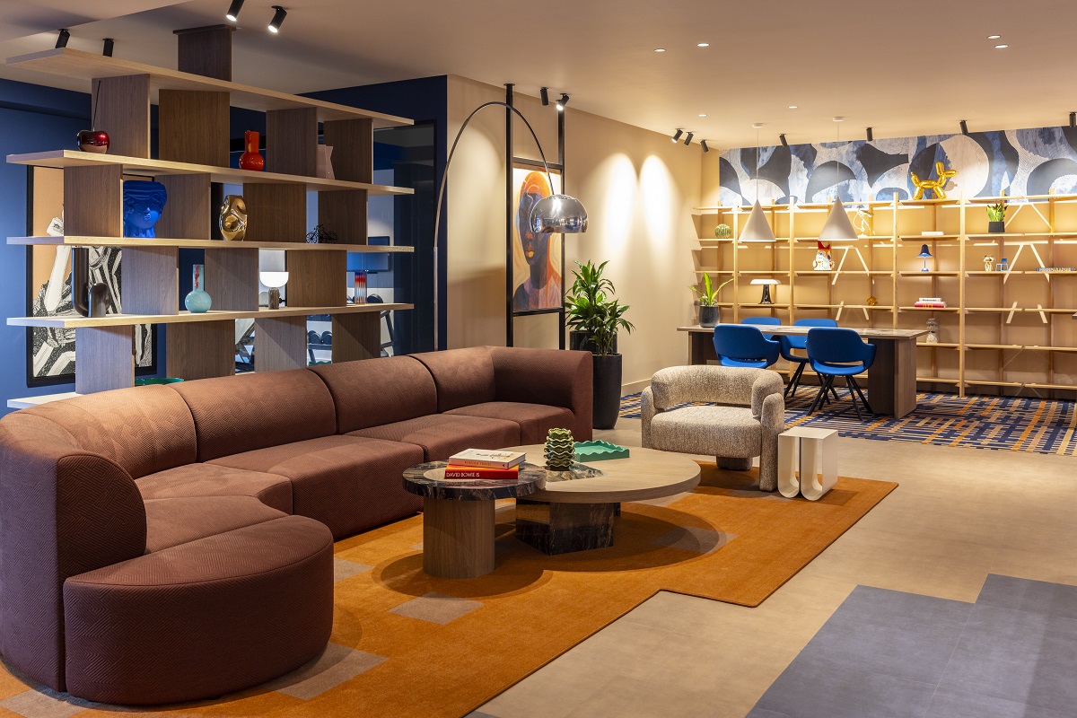
    Taking place during Clerkenwell Design Week, there was much to be inspired by as the group gathered together in the private dining space at The Zetter Townhouse – a quirky bolthole in the heart of the design district.

    The group dynamic was lively as attendees introduced themselves and shared stories about recent projects and shared interests. Laughter became infectious as one humorous story led to another, and ensued throughout the conversation on the impact of design on mood (the tone set by our own unusual surroundings featuring an additional guest in the shape of a boxing gloved kangaroo named Geoffrey).

    Meet our panellists:

    Franklite Roundtable Panellists

    Left to right from the top: Emma Maxwell, Founder & Creative Director, Emma Maxwell Design; Michael Fern, Director, Tonik Edge; Rasha Gamal, Designer, Wimberly Interiors; Joe Troughton, Associate Designer, David Collins Studio; David Mason, Creative Director, Regal London; Clare McDonald, Creative Director, Design Command; Brooke Radtke, Interior Design Lead Europe, Woods Bagot.

    We kicked off the conversation by discussing hotels we particularly liked, and places we’d recommend to friends to take a first date, although a number of guests admitted it was some length of time since they’d last experienced a first date themselves.

    The conversation concentrated largely on the effect of lighting on creating intimacy, confidence, and joy, and unanimously the table agreed that working with a lighting consultant was paramount to the success of setting the right level, particularly in public and dining spaces.


    Emma Maxwell: “Whenever I’m briefing or discussing a space with a technical lighting designer, I refer to it as sculpting the space out – it’s a significant part of the overall design.”

    Clare McDonald: “We have to create a new level of lighting in a restaurant because it has such a different feeling in the daytime to the evening – and there are always more lights than you think there are. We learn so much from lighting consultants. Lighting configurations have to be meticulous to create the correct mood.”

    David Mason: “Lighting sets the function for each part of the day as well, so it’s got to span a number of spaces from morning to evening whilst creating a journey and an atmosphere through all those spaces, especially with hotels to create drama in public spaces and outside while delivering the practical elements too.”

    Brooke Radtke: “The benefit of bringing a lighting designer in alongside what we do is because we get very focussed as designers on the key aspects within the space, it’s really good to have someone to step back and be able to add those layers of design but looking at it from a different perspective and bringing that specialty knowledge and helping to enhance what we’re doing.”

    An esteemed group of interior designers discuss mood enhancing design at Zetter Townhouse

    Image credit: Franklite

    Sophie Harper: “How do you convey to a lighting designer the sort of mood you want to achieve in a particular area?”

    David: “One of the last hotels I worked on, the corridor was just a continual 40-metre length and we were wondering what to do with it. We wanted to create some drama and interest and so spoke to a lighting designer and came up with a scheme that worked out to be really special and were able to roll it out across 11 storeys.”

    Michael Fern: “We talk about defining the brief in terms of functional and emotional aspects and there are a lot of operational requirements within most of the spaces we’re designing but the emotional part is all about the end user and what we want them to feel – what’s their takeout – we try to describe the characteristics of how each space should feel and if you work with the right lighting consultant, they’ll know how to help you translate that. The same level of detail that goes into the interiors should also go into the lighting.”

    Emma: “This is the question we always ask ourselves whenever we start on any project, because it’s not about the designer or the hotelier or the owner, it’s always, always about the guest. I describe it as theatre, you have different acts and performances to evoke different emotions and hopefully create a positive experience for the guest.”

    Rasha Gamal: “We really consider the functionality and how each level of lighting design adds to that. In a guestroom for example, you need lighting on high levels, on mid levels, night lights – all of these things make it a more comfortable stay for the guest. Bathroom lighting is a big deal – making sure you have the right lighting for make-up application, should you have warm lighting, cold lighting for example.”

    Emma: “the lighting in public washrooms is a major consideration too – if you think about people on a night out, they might be out on a date, and they want to feel good about how they look – and that’s all on you!”

    Clare: “and then that has to filter through to all the other areas too – so they continue to think they look great and therefore feel great whenever they catch a glimpse of themselves in a reflective surface!”

    Michael: “I used to design spaces for Rigby & Peller and designed changing rooms for people buying lingerie. If the lighting wasn’t right, you’d lose a purchase because that person didn’t feel good about what they were looking at in the mirror. There’s a lot of research that goes into making people feel like a million dollars.”

    Joe Troughton: “One of the first things we do is describe the moods we want people to feel but also what we want them to see – as a designer you’re in control of that, you own that moment, but you have to get everyone on board and buy into your vision. There’s a lot of coordination that goes into it, I can’t imagine not working with lighting designers, I’ve been blessed to have always worked with these experts and they really are experts – you can tell when you walk into a space if there hasn’t been a lighting consultant involved.”

    The designers chat about their own experience of mood enhancing design

    Image credit: Franklite

    Sophie: “Do you ever get told ‘no’ by a lighting consultant, as in something’s not possible?”

    Emma: “All the time!”

    Brooke: “It’s a balancing act, it’s finding that middle ground with the lighting designer and with the client as well and their aspirations – we have to work out what’s practical and what’s going to hit their brief for the end result and what those light levels should be.”


    Sophie: “How do you get into the guest psyche and therefore create the perfect space for the end user?”

    David: “What you’re trying to create is a mood or atmosphere, often in a dark space where everything that’s meant to be lit is lit but without a single fitting being noticeable. When you can go and sit in a space, you can often visualise how it’s going to work but as individuals we all have a very different mindset so it’s having that level of understanding of what we’re trying to create –feeding back our own experience of that space.”

    Emma: “I try to understand the demographic first, I start with a lot of research, get a feel for who will be experience the space, why they’re going there and how they want to feel when they’re there, I try to put myself in their shoes.”

    Brooke: “We once had a client who was very sensitive to light and we’d be able to tell how meetings were likely to go based on the lighting in the hotel they were staying at. So as part of the brief for that project, one of our design drivers was to look at different types of lighting in terms of borrowed light, reflective light, tactile light, decorative light; all the ways we could incorporate these different aspects.”

    Michael: “We also design corporate spaces and have to consider things like circadian rhythm and how that impacts our mood; how you perceive that experience is really important. We have been looking at things like neurodiversity too. A large percentage of the population has some form of ASD (Autistic Spectrum Disorder), and our perception of a space is highly individual, so we need to be mindful of not overloading the senses with the amount of layering that goes into interior design – acoustics play a huge role here as well.

    “Your emotional perspective of how we’re designing an experience for someone is truly sensory. I’ve worked on some brand-led projects in the past where we used a sensory engagement consultant to use sound and scent to change the perception of how things like ice cream tasted, which is phenomenal, and affects how much people might pay for it – down to the smallest details like the colour of the spoon and the colour of the cup they were eating from. This can be seen in healthcare as well, where colours and lighting are used to help patients recover more quickly. I think we’re only really touching the surface of how these things impact us from our built environment.”

    Rasha: “Back in Cairo I designed the children’s ward for a cancer treatment facility and we were asked to include colour and bright lights to keep the children engaged, but there was a balance to strike because if there’s too much light or vibrancy it can become distracting and then we become stressed – it was a challenging project, but getting the combination of colour and lighting right produced such a  good result.”


    Lively discussion flowed at the Franklite roundtable

    Image credit: Franklite

    Sophie: “What design faux-pas irk you or put you in a bad mood in hotels?”

    Joe: One of my biggest bugbears is not having different settings for the light in bathrooms. You can change the levels everywhere else, but often in hotels the bathroom light is set at one brightness, and as one of the last areas you use before going to bed, after winding down with a meal in a nice restaurant and you go up to your room and they’ve turned the bed down and you’ve got low-level lights to prepare you for sleep, you then go into the bathroom and turn on the lights and all of a sudden you’re awake again. It’s so overlooked.”

    Michael: “Lighting controls are an issue as well – if it’s not self-explanatory, then it’s a fail in my opinion.”

    Clare: “It’s one of the most frustrating things to be looking at all the different lighting options and not knowing which is which. If you’re in a hurry or getting ready for the day you don’t want to be trying to figure out all the hundreds of lighting configurations.”

    David: “It’s a huge challenge because you want to give people the option, but when you’re in an unfamiliar place and you reach for a light switch it needs to be intuitive.”


    Sophie: “What have been some of your most challenging or enlightening moments when designing for mood?”

    Joe: “When we designed the dressing rooms at Harrods we realised we needed a lighting scheme that gave customers a better idea of what the garments they were trying on would look like at the time of day they would be wearing them. In the past, customers had purchased dresses that had looked great when they tried them on but very different when they wore the same garment to an event, so we came up with a different lighting scheme, and now customers are asked what time of day their event is being held and the sale attendants will change the lighting in the dressing room to suit.”

    David: “I had a project where we had a lot of windowless rooms to design and there was a lot of emphasis put on circadian rhythm, particularly with international travellers in mind, so we put in a scheme where you could change your lighting levels to match the city you’d just flown in from – it’s quite a science.”

    Brooke: “There’s a lot to be said about the really effortless things that you don’t see – they’re often the things that bring most value. When you go into a hotel room and there are places to put things, and you’re not really thinking about those things, it just naturally flows and there’s enough space for everything. Design isn’t just about those big, visual moments, the best design is simply when everything works and comes together.”

    Joe: “I remember the first time I visited the Connaught Bar, and everything about it was just spot-on and made you feel great. It wasn’t just the lighting, it was the acoustics, the view, the way it was intimate but not at the same time. Every sense was catered for – it’s rare when you get a project where everything just falls into place – that was a mood enhancing experience. It’s difficult to replicate that every time because in order to do that you have to be able to understand exactly what it was that made you feel that way, and sometimes you just can’t put your finger on it.”


    Franklite is one of our Recommended Suppliers and regularly features in our Supplier News section of the website. If you are interested in becoming one of our Recommended Suppliers, please email Katy Phillips.

    Main image credit: Franklite Ltd

    colourway fabric swatch of George Smith velvets

    Product watch: the new velvets from George Smith

    1024 640 Pauline Brettell
    Product watch: the new velvets from George Smith

    George Smith has launched an exquisite collection of new velvets: Venice, Florence, and Genoa. Each is available in 12 captivating colourways, allowing for versatile design options and ensuring there’s a perfect shade to complement every interior style…

    colourway fabric swatch of George Smith velvets

    Whether it’s the durability that goes beyond expectations, the richness of colour that captivates the eye or the versatility that seamlessly fits any style, the new velvets from George Smith are a top choice for those seeking a sophisticated look.

    Lavish and sumptuous, Venice velvet boasts a thick, fluffy pile and an incredibly silky soft handle. Its natural lustre creates mesmerising movement, which is unique, rich, and sublimely textural. Designed to be hard-wearing and long-lasting, Venice velvet is an ideal choice for furniture upholstery and ensures an enduring, elegant appearance. Its directionless pile offers a soft & comfortable feel making this velvet the perfect option for those seeking a timeless infusion of luxury. Available in 12 colours, this velvet has a big personality, radiating effortless chic with its crushed velvet texture and heritage allure.

    collection of velvet colour samples draped and folded

    Image credit: George Smith

    Stylish and charismatic, Florence is a classic linen velvet characterised by unruly fibres that capture the light and create an ever-changing play of hues and textures at different angles. Florence velvet has a matte, ‘dry’ look, with a horizontal weave that takes dye exceptionally well, resulting in a deep, rich colour. Offering a relaxed, vintage style, Florence velvet adds a sense of natural rustic comfort and timeless appeal. This Linen/Cotton mix velvet is available in 12 of our best-selling colourways and boasts an incredible 200,000 martindale for extra luxurious durability. Discover the power of Florence velvet to transform your space into a haven of style and charm.

    Subtle and sublimely soft, Genoa velvet is a closely woven fabric with a short, thick, pile. Velvet is softest when woven from natural fibres, especially cotton. Known for being a durable and breathable material, it maintains its shape and structure for years to come. The short pile offers a soft handle, while the delicate sheen adds reflective highlights that change in perspective, giving the fabric a dynamic visual appeal. This 100% cotton velvet is available in 12 of our best-selling colourways and boasts an incredible 200,000 martindale for extra luxurious durability. Splendidly soft, the supple drape and texture of Genoa will create an atmosphere of comfort and elegance in your interior space.

    “Crafted from the finest Italian velvet and dyed to match our iconic colour palette, Genoa, Venice and Florence have been hand – picked to guarantee the exceptional levels of tailoring associated with our brand,” commented Amanda Barrett, Director of Sales and Marketing.

    sofa upholstered in burnt red velvet from George smith

    Image credit: George Smith

    As the most experienced makers of exceptional upholstered furniture, George Smith know a thing or two about velvets. When it comes to upholstery fabric, few options can rival the timeless elegance of velvet. From its soft, warm texture to its ability to enhance the shape of furniture, velvet stands out as a top choice for those seeking sophistication and style.

    Contrary to popular belief, velvet is not as delicate as it may seem. With a flat, dense pile akin to a rug, velvet boasts exceptional durability, making it an ideal choice for furniture upholstery. Whether woven from cotton, linen, wool or ultra-functional synthetics, velvets are built to withstand everyday use, ensuring longevity and practicality.

    One of the most captivating features of velvet is its ability to showcase a stunning depth of colour, ensuring an enduring, elegant appearance. Whether it’s in a dark, moody palette or softer, more relaxed tones, velvet exudes a luminous sheen that adds a luxurious touch. The richness of colour that velvet offers makes it the natural choice for those seeking a luxurious and vibrant finish for their furniture.

    blue , green and yellow velvet samples from George Smith

    Image credit: George Smith

    Velvet’s versatility is unmatched, seamlessly complementing numerous interior design styles. Whether it’s paired with a modern, industrial aesthetic to add warmth and texture, or placed in a decadent room for ultimate comfort, velvet effortlessly adapts to the setting. Its timeless appeal transcends eras, seamlessly fitting into both contemporary and period properties.

    And finally, when it comes to velvets, it’s all about the feels – it’s just so wonderfully tactile! Who can resist running their hand up and down this rich fabric? Because of this, velvet furniture has a very cosy and inviting feel, making velvet a perfect choice for creating a welcoming environment.

    George Smith is one of our Recommended Suppliers and regularly features in our Supplier News section of the website. If you are interested in becoming one of our Recommended Suppliers, please email Katy Phillips.

    Main image credit: George Smith

    deckchairs and umbrellas by pool with seaview at Nammos Mykonos

    Introducing the Villas at Nammos Hotel Mykonos

    1024 640 Pauline Brettell
    Introducing the Villas at Nammos Hotel Mykonos

    Adding another layer to Nammos World’s existing lifestyle offerings, Nammos Hotel Mykonos has unveiled its curated collection of three private villas…

    deckchairs and umbrellas by pool with seaview at Nammos Mykonos

    Providing unparalleled access to Psarou Bay and its exclusive offerings, the villas at Nammos Hotel Mykonos boast unobstructed views of the Aegean and private pools to cool off from the Grecian sun undisturbed. The epitome of luxury and privacy from Nammos Hotels and Resorts, the villas range from nine to four bedrooms making them the perfect choice for groups of friends and families looking to experience the very best of Mykonos. For a truly seamless stay, the 24/7 butler service ensures every need is met, from restaurant reservations to bespoke excursions, and each bedroom includes two complimentary sunbeds at Nammos Beach – some of the most coveted property on the island.

    guestroom in Nammos villa with doors leading on to terrace

    Image credit: Nammos Hotels Mykonos & Villas

    The largest of the three villas, the Diplomatic Villa sleeps up to 18 guests, with nine bright, airy bedrooms and an array of indoor-outdoor entertaining spaces. The tranquil retreat seamlessly blends opulence with Mykonos’ natural allure and sweeping views of Psarou Bay are on offer throughout. An ideal choice for families and friends seeking a memorable stay, sumptuous sunbeds frame the villa’s private pool for intimate sun-soaked moments.

    turquoise, white and wood on terrace at mykonos villa

    Image credit: Nammos Hotels Mykonos & Villas

    A fully equipped kitchen and expansive dining area guarantee every guest is catered for, and the private gym promotes rejuvenation of the body and mind. As the sun sets over the Bay’s glistening waters, sip on expertly-mixed cocktails from the sea-view veranda or perch at the private bar under kaleidoscopic skies. For a truly indulgent experience, order room service from Nammos Restaurant and enjoy in one of the villas al fresco dining areas.

    open plan kitchen and lounge leading on to terrace in the Infinity Villa Nammos

    Image credit: Nammos Hotels Mykonos & Villas

    Nestled in the heart of Psarou Beach, the Infinity Villa features five bedrooms which sleep up to ten. Guests are invited to immerse themselves in the vibrant atmosphere of the Bay whilst indulging in an array of luxury amenities and basking in the serene surroundings. The four master bedrooms and satellite bedroom each have a marble-accented en-suite, ensuring complete privacy and ample space to relax and unwind from within. Separate lounge and terrace areas are perfect for entertaining, and the private infinity pool is the villa’s crowning jewel. The chef’s kitchen, gym and sauna ensure travellers have everything they need at their fingertips, whilst Italian textiles and antique brass fittings evoke a classic, refined style. While away days uninterrupted on plush sun loungers, or head down to the acclaimed Nammos Restaurant and Beach to soak up the vibrant atmosphere and savour delectable dishes.

    grey and white minimalist dining area in Nammos villa

    Image credit: Nammos Hotels Mykonos & Villas

    The Psarou Villa’s minimalist design blends harmoniously with traditional Cycladic aesthetic to provide an unforgettable experience characterised by the refined charm synonymous to Mykonos. Four bedrooms can accommodate up to eight, with an open-plan design that invites guests to float seamlessly from indoors to out. Breathtaking views of the villa’s namesake, Psarou Bay, will soothe the soul and indoor and outdoor dining areas allow guests to dine from dawn til dusk. Embellished with teal and white parasols, the private pool is an idyllic spot to cool off in, before catching some shade or bathing in the sun. Primely positioned to experience the Nammos Beach, Restaurant and Village, each is just mere steps away, granting guests with the key to the island’s most sought-after destination.

    outdoor dining in terrace at nammos villas mykonos

    Image credit: Nammos Hotels Mykonos & Villas

    Guests checking into the villas will receive unparalleled service, with champagne served upon arrival, a local souvenir gifted on departure and infinite moments of magic in between; from complimentary spa treatments to a delectable daily breakfast provided by Nammos Restaurant. From the bedroom to the kitchen, every detail has been carefully considered to prioritise guest’s comfort, with COCO-MAT duvets and pillows, Diptyque bathroom amenities and Dyson hair tools fitted across each property.

    Main image credit: Nammos Hotels Mykonos & Villas

    bathroom with natural stone colours and textures in large format tiles on floor and walls from Hyperion Tiles

    Hyperion Tiles goes large

    1024 640 Pauline Brettell
    Hyperion Tiles goes large

    Bigger doesn’t always mean better – but there is certainly a huge demand within interiors for large format tiles both on the floor and up the wall as this super-sized trend gets traction. Hyperion Tiles talks us though its extra-large format offering…

    bathroom with natural stone colours and textures in large format tiles on floor and walls from Hyperion Tiles

    It’s not hard to understand why so many hotel and hospitality designs are embracing this ‘super-sized’ trend. Extra-large floor and wall tiles look amazing, and offer plenty of practical benefits too. In response to growing demand, Hyperion tiles is thrilled to introduce its new one metre x one metre porcelain tile collection.

    Perfect for fans of minimal styling, these rectified porcelain tiles are available in a wide variety of colours, textures and patterns, and have been designed to replicate natural stone, at very affordable prices. Ranges include Baltimore, Firenze, Lyon and Trevi – all of which offer a selection of different styles and colourways to suit every contemporary design setting.

    cream tiles shift from indoors to outside

    Image credit: Hyperion Tiles

    Designers can create a seamless flow from the outside in, with the new Lyon 1836 Crema Matt rectified porcelain floor tiles. Incorporating a contemporary matt NeoGrip finish, these tiles are anti-slip and resistant to frost, making these the perfect choice to elevate and connect the hotel lounge and outdoor seating area.

    “The first – and most obvious – advantage of extra-large floor and wall tiles is their aesthetic impact,” explained Richard Skeoch, Director, Hyperion Tiles.  “They really can enhance the appearance of virtually any interior or exterior hotel space. But in addition to their good looks, large format tiles are easy to install and maintain, thanks to their size and the fewer grout lines they require. Our new collection even incorporates a special coating which repels dirt and bacteria, thereby offering extra hygiene and safety for your hotel guests”.

    large format tiles on floor and walls blur boundary between spaces

    Image credit: Hyperion Tiles

    “Importantly, this new large format tile collection has been designed with affordability in mind, and carries very competitive trade pricing,” added Skeoch. “Rectified porcelain is not only ultra-durable, it can also mimic the look of natural stone such as marble – but at a fraction of the cost”.

    Hyperion Tiles has comprehensive luxury large format collections and more than 15,000 bespoke floor and wall tiles in a variety of patterns, colours, shapes and sizes. The company also offers a dedicated collection of luxury wallcoverings, distinctive bathroom pieces, from mesmerising mirrors to stylish storage, and paint. Its highly skilled team is available to offer expert advice, such as technical know-how and in-depth product knowledge to homeowners, designers, specifiers and architects.

    Hyperion Tiles is one of our Recommended Suppliers and regularly features in our Supplier News section of the website. If you are interested in becoming one of our Recommended Suppliers, please email Katy Phillips.

    Main image credit: Hyperion Tiles

    singer palace hotel

    Miniview: Singer Palace Hotel – a look inside Rome’s artfully stitched sanctuary

    1024 640 Megan Christopher
    Miniview: Singer Palace Hotel – a look inside Rome’s artfully stitched sanctuary

    Step into a symphony of modern Italian design as the Singer Palace Hotel in Rome, where we explore this artfully restored Art Deco masterpiece…

    singer palace hotel

    Rome thrums with history, its ancient streets echoing with the footsteps of emperors and artists. But nestled amidst the grandeur, a contemporary gem hums a quieter, more modern tune. The Singer Palace Hotel, a meticulously restored Art Deco masterpiece, offers a masterclass in marrying history with contemporary Italian design.

    From the moment you step into the lobby, a sense of curated luxury unfolds. The original, spectacular Arabescato Corchia marble staircase, a testament to the building’s 1930s heritage, takes centre stage. It’s a showstopper, a graceful spiral that sets the tone for the experience to come. Juxtaposed against this historical elegance is a sculptural check-in desk, adorned with vintage Singer sewing machines – a subtle nod to the building’s past life as the European headquarters of the iconic brand.

    singer palace hotel lobby

    Image credit: Singer Palace Hotel

    This artful blending of areas continues throughout the hotel. The rooms, havens of tranquillity, feel more like private residences that a typical hotel space. Modern Italian furnishings, bathed in warm, inviting light, provide a tough of contemporary sophistication. The use of rich fabrics and textures through the space add a layer of depth and visual interest. Each room has the ability to be changed into suites, furthering the hotels opportunity to tailor the experience exactly to the guests needs.

    singer palace hotel rooftop restaurant

    Image credit: Singer Palace Hotel

    But the true design lies in the details. Tucked-away courtyards, glimpsed from the glass elevator, offered unexpected bursts of greenery, transforming the urban heart of Rome into a tranquil oasis. The rooftop terrace, with its two-level restaurant and bar, provide a breath taking panorama of the city, while maintaining an intimate and stylish ambiance. The beauty of these two terraces lies in their ability to offer a completely different experience from the other, whilst only being a few steps away.

    Yet, despite the expansive views, the space maintains an intimate and stylish ambiance. Clever use of lighting, with soft pools illuminating conversation areas and strategically placed spotlights highlighting the cityscape, create a sense of both drama and warmth.

    singer palace hotel room

    Image credit: Singer Palace Hotel

    The Singer Palace isn’t just a hotel; it’s a meticulously crafted experience. The interior design, a harmonious marriage of past and present, whispers of Italian heritage with a contemporary flair. It’s a place where history buffs can appreciate the perfectly preserved architectural elements, while design aficionados will revel in the thoughtful curation of modern Italian pieces. It’s a testament to  how intentional design can be transformative, creating a space where the walls resonate with an unforgettable and distinctive melody.

    The beauty of the Singer Palace goes beyond aesthetics. It’s a place that understands the needs of the modern traveller. The seamless blend of historical charm and contemporary functionality creates a space that feels both luxurious and inviting. It’s a place where you can step back in time, yet feel completely at ease in the present. It’s a carefully crafted sanctuary in the heart of the Eternal City.

    Main image credit: Singer Palace Hotel

    Restaurant Le Pristine at the new Hotel Toranomon Hills in Tokyo

    Behind the design of Tokyo’s Hotel Toranomon Hills by Space Copenhagen

    1024 640 Sophie Harper

    Behind the design of Tokyo’s Hotel Toranomon Hills by Space Copenhagen

    Danish design studio Space Copenhagen tells Hotel Designs about the interiors they designed for Hotel Toranomon Hills in Tokyo, the first Tokyo outpost of the Unbound Collection by Hyatt, which opened at the end of last year…
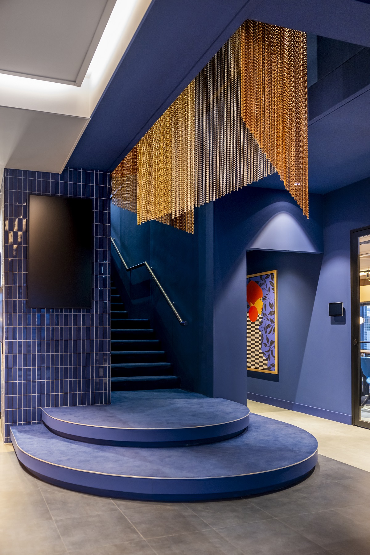
    Restaurant Le Pristine at the new Hotel Toranomon Hills in Tokyo

    Hotel Toranomon Hills occupies the ground and 11th – 14th floors of the Toranomon Hills Station Tower, part of a major new redevelopment of the area. This region encapsulates the notion of transformation, as what was primarily known as a business district is now evolving into a multifaceted place that merges work/life with cultural discovery and hospitality, which fits perfectly with Hyatt’s Unbound Collection ethos of curating one-of-a-kind hotels offering premium facilities and experiential surroundings.

    The primary approach to the hotel design language follows Space Copenhagen’s idea of ‘slow aesthetics’, which employs natural materials and craft with quality, longevity, and a certain slowness inherent to their practice. The material selection prioritises wood, natural stone, tiles, and a subdued colour palette with subtle textures. Each material is chosen for its inherent elegance and longevity – principles of simplicity and utility, creating harmony and connecting the hotel and its surroundings.

    The exterior of Hotel Toranomon Hills Tokyo

    Image credit: Joachim Wichmann

    The hotel’s design combines simplicity and sustainability with the use of natural materials that are built to last while providing guests superior comfort and respite from the bustling city. Rooms are flexible, functional, and fluid. Social spaces are intuitive and adaptable, allowing many levels of interaction and engagement to take place at a simultaneous pace.

    The heartbeat of the hotel is its lobby, which takes the role of a ‘multipurpose living room’ and includes the reception and concierge, plus a lively open-plan café, bar and deli. The café design is an informal relaxed space with rounded counter edges, warm leather banquettes and playful lighting in the form of Rotganzen’s melted disco ball artwork, which is positioned on the wall near the bar, scattering light reflections around the space throughout the day. Just off the lobby, duplex-style suite rooms provide additional space for small-scale private events to be hosted.

    Immersive spaces at Hotel Toranomon Hills Tokyo

    Image credit: Joachim Wichmann

    The Hotel Toranomon Hills features a series of bespoke designs, furniture, and light fixtures, alongside collaborations with Space Copenhagen’s roster of selected manufacturers, such as the Low Stool for Mater and the Loafer lounge and dining chair for &Tradition. Space Copenhagen’s Gravity floor and table lamps and wall sconces designed for Gubi sit alongside Gubi’s Timberline lamps, designed in the 1970s by Mads Caprani, providing soft focus illumination throughout the hotel. Hotel Toranomon Hills is also the first project in the world to actively showcase Space Copenhagen’s new outdoor terrace collection from &Tradition. The lounge features the Spine Lounge Suite by Frederica, and soft furnishings soften the suites with earthy-toned Area rugs by Massimo.

    Hotel Toranomon Hills features 205 guest rooms measuring from 27 square metres to 160 square metres. Space Copenhagen has designed the hotel to meet the needs of cosmopolitan professionals and travellers by offering comfortable and purposefully designed spaces for seamless transitions between rest, work and socialising.

    A suite at Hotel Toranomon Hills Tokyo

    Image credit: Joachim Wichmann

    Peter Bundgaard Rützou and Signe Bindslev Henriksen, Founding Partners of Space Copenhagen, comment: “The design approach combines Space Copenhagen’s Scandinavian background with a traditional Japanese design aesthetic and represents a compelling contrast to Tokyo’s high-speed, future-ready exterior. The long-term ambition for the hotel is to cater to both body and mind, establishing a sense of balance and recalibration for the guest.”

    Brian Lum, Hyatt’s Senior Vice President, Design Services – Asia Pacific says “We are delighted to have the opportunity to collaborate with Space Copenhagen for Hotel Toranomon Hills, and bring a fresh and unique experience within the Tokyo landscape that is aligned with the ‘Mirai Tokyo’ concept of Tomorrow’s Tokyo. With this in mind, the understated and elegant interiors are thoughtfully designed to provide a warm and welcoming ambience where guests can relax and recharge from the hustle and bustle of Tokyo as well as work and socialise in a vibrant environment.”

    Le Pristine restaurant Tokyo

    Image credit: Joachim Wichmann

    Sergio Herman, one of Europe’s most celebrated chefs oversees all food and beverage experiences in the immersive casual fine dining restaurant and café, Le Pristine Tokyo. Herman, a native of the Netherlands and established Michelin-starred chef, is making his first foray into Japan. The 1st-floor restaurant and the café offer contemporary European cuisine with a cosmopolitan flair, using thoughtfully sourced produce from Zeeland in the Netherlands and seasonal Japanese ingredients in spaces thoughtfully designed by Space Copenhagen.

    Continuing the ethos of the original Le Pristine Antwerp, which opened in Belgium in 2020 and was awarded a Michelin star in its first year of operation, Le Pristine Tokyo invites diners to partake in a sophisticated celebration of life and creativity, which is expressed through food, fashion, design, art, and music.

    Le Pristine restaurant designed by Space Copenhagen

    Image credit: Joachim Wichmann

    Space Copenhagen was keen to weave characteristics of the hotel’s ambience into the design of Le Pristine Tokyo. Maintaining the original signature features of the Antwerp restaurant and its collaborations with celebrated artists from Sergio Herman’s home region in the Netherlands, Le Pristine Tokyo has also collaborated with Japanese artists, including Kohei Ukai, Kenji Gomi and Takeya Takeda.

    Space Copenhagen incorporated a range of bespoke tables and sofas within the space. The principal Dining Chair is a custom design by Frederica, with additional Dining Chairs in Grey Stained Oak and High Stools from Mater. &Tradition’s celebrated Como and Manhattan battery-powered lights by Space Copenhagen are also featured. A wide range of bespoke lights and fixtures were designed for the restaurant.


    Main image credit: Joachim Wichmann

    close up of hands working on production in Silentnight factory

    Doing more with less: Silentnight unlocks the key to reducing climate impact

    1024 640 Pauline Brettell
    Doing more with less: Silentnight unlocks the key to reducing climate impact

    As one of the UK’s largest manufacturers, Silentnight understands the importance of being rigorous in reducing its impact and moving in a positive direction towards a more sustainable future…

    close up of hands working on production in Silentnight factory

    With sustainability deadlines drawing ever closer, it is clear that it’s never been more important for businesses to have plans in place to reduce their environmental impacts. Along with pressure from external stakeholders it poses a double-edged dilemma for manufacturers to deal with.

    For the team at Silentnight, sustainability is not seen as a once-and-done job, but instead as a continuous journey of improvement. That means through constant evaluation the brand is always seeking new ways to improve its practices and products to be more environmentally sound. It has worked tirelessly to ensure that all aspects of the manufacturing process run efficiently and sustainably, and its Digital Product Passports are ensuring that things continue to move in the right direction.

    workstation and machinary in silentnight mattress production

    Image credit: Silentnight

    Digital Product Passports allow for the collection and sharing of a product’s data to aid post-consumer recycling, keep materials in circulation at the highest value for longer and, most importantly, allow Silentnight to monitor the overall environmental impact of its products. In addition this makes it possible to identify how much raw material is needed to be reduced in its products to bring down the environmental footprint. This process is called lightweighting. While not a new concept, in the last few years it has gained more attention from the global manufacturing sector because it saves energy and material – some of the biggest contributors to environmental footprint.

    Lightweighting allows Silentnight to reduce its use of unnecessary materials without compromising on comfort, durability and safety – three things that are incredibly important when supplying mattresses to some of the most established hospitality brands across the country.

    There is a common misconception that the more products used, the better the product will be, but that isn’t always the case – especially when it comes to mattresses. Silentnight has been able to establish that more springs don’t necessarily equate to more comfort. What’s even better is that it has also found it can maintain the quality of its mattresses while simultaneously reducing the environmental impact.

    For example, one of the latest brand innovations weighs 8.8 kilograms less than an equivalent 1,000 pocket mattress and has an overall CO2e reduction of 21.48 kilograms – a welcome change for the hospitality industry that will make seasonal mattress rotations and bedmaking an easier process.

    This has allowed the production to maximise efficiencies in our manufacturing processes without compromising on the quality of the products. Silentnight has been able to keep its material usage and carbon footprint down to a minimum without any trade offs on its fire safety or fitness for purpose standards, ensuring that the manufacturing process is transformed for the better. Added to its heightened focus on recycling, the total waste quantity has reduced year-on year by around 150 tonnes.

    Not only does reducing its environmental impact support with the overall sustainability journey but Silentnight asserts that it also gives it a competitive edge. Through increased focus on lightweighting, the brand has been able to make room for increased innovation in its product offering; delivering products that are not only more sustainable but more ergonomic and durable.

    In the last couple of years, through partnership with external stakeholders like Premier Inn, it has created a new mattress that saves 23 per cent of carbon emissions composed of two elements: the topper and the spring unit. Through close attention to the manufacturing process, it has been able to recognise that these two components have vastly different life cycles and has been able to optimise these lifecycles through this new mattress. By splitting them, the topper can be replaced with ease when needed and the spring unit reused – promoting a more circular economy and subsequently reducing the carbon footprint tenfold.

    As Silentnight looks to the future, the hope is that many businesses will recognise the positives of lightweighting. By lowering the weight, improving the performance and reducing manufacturing costs for their products, businesses can lead with their best food forward; positioning themselves as leaders in sustainable manufacturing.

    Silentnight is one of our Recommended Suppliers and regularly features in our Supplier News section of the website. If you are interested in becoming one of our Recommended Suppliers, please email Katy Phillips.

    Main image credit: Silentnight

    black and white tiled floor and striped cushions in Riad Botanica

    Checking in to Riad Botanica

    1024 640 Pauline Brettell
    Checking in to Riad Botanica

    Marrakech has firmly staked its claim as a designer destination, and there is no doubt that you need to make a bold statement if you want to stand out in the medina hospitality melee. Pauline Brettell checked in to Riad Botanica and spoke to owner and designer Angela Mellak, to discover how they have done just that…

    black and white tiled floor and striped cushions in Riad Botanica

    Riad Botanica, is a five-suite sanctuary in the heart of Marrakech’s medina. Owned by Angela and Mohamed Mellak, the property is a visual fusion of their Australian and Moroccan cultures. It is this effortless mix of traditional Moroccan craftsmanship and Australian style – along with a light touch of Art Deco glamour  – that gives the property its strong design identity.

    tiled swimming pool in riad courtyard with cushions and plants

    Image credit: Alan Keohane / Riad Botanica

    Before you even step foot inside the property, its location is the first ace up its decorative sleeve – anyone who knows Marrakech will understand how easy it is to get lost in the labyrinth of the medina. A few turns and corners away from the local landmark Bab Doukkala, means the riad is easily reached by taxi and is a pleasant stroll from some great shops and restaurants, which can make all the difference to your experience in this Moroccan tourist mecca.

    But like most things in this city, it is what goes on behind closed doors that matters! As soon as you step through the understated entrance you are transported into the sanctuary that is Riad Botanica. The heat and the dust of the city evaporates into a perfumed courtyard framed with its trademark orange tree – the mint tea is poured and the moment is complete.

    Suitably refreshed I made my way upstairs to explore the Zahara family apartment, which soon became my bedroom, office and sanctuary for the next few days. ‘Family apartment’ and ‘luxury’ are not often two concepts that sit comfortably together, but in this space the design hits both briefs stylishly, and the bunkbed boudoir for the kids is an unobtrusive add-on, giving everyone ample space and avoiding the ubiquitous pull-out.

    arched details and carved frames in luxury apartment Zahaa

    Image credit: Alan Keohane / Riad Botanica

    Avoiding the temptation of getting caught up in the cliché of Moroccan design, Mellak worked with Interior Designer Claire Cau-Cecile to  incorporate and interpret the mix of cultural and design influences running through the property, all underscored with a contemporary Australian eye. The bright and bold wallpaper that is part of the design signature illustrates this perfectly – playing with the Moroccan aesthetic of patterns on patterns, Cau-Cecile introduced the iconic Australian designer Florence Broadhurst’s Art Deco designs, prints, wallpaper and textiles.

    Having explored the space and soaked up the ambiance I was able to catch up with Mellak and find out a little more about this family project that is clearly driven by both a personal and a professional energy.

    Pauline Brettell: Of all the riads in all the medina…what was it about this property that spoke to you?

    Angela Mellak: Finding the perfect riad was like looking for a needle in a very large haystack. When I first walked down the dark hallway into the central courtyard to meet the orange tree, I was hit by a sense of peace and warmth which was emphasised by the fact that the owner picked a huge juicy valencia from her branches, the delectable flavour made me feel I’d found a home. The existing floor plan consisted of nine small bedrooms and only two bathrooms, it had not been renovated since the 1950s. Whilst parts of the property had been divided up and sold off over time, the majority of the initial footprint was intact. The property had good bones, and we felt that our vision for the luxury riad experience that we wanted to create could be realised here.

    pink banquette in dining room with australian art and moroccan design

    Image credit: Alan Keohane / Riad Botanica

    PB: During the renovation process, what were the key elements in transforming a domestic space into a hotel?

    AM: Firstly, getting the floor plan right. Traditionally, riads are renowned for being juggled up and it is also common to find small and dark rooms that were initially designed to protect from the heat. As Australians, we look at spaces differently. We lean toward bringing the outside in, and flooding spaces with natural light. Our view for the project was very much taken from the perspective of exploring ‘the life one would want to live’ in a riad today. We set out to create both communal and intimate spaces to accommodate a total of 12 guests. The spaces also needed to be considered for the seasonal changes and changes in temperature/weather as appropriate, all without fundamentally changing the Islamic architecture.

    Australian design is quintessentially open-plan, which provides a challenge to apply within the confines of the current footprint. We sought to create larger luxury suites instead of more rooms. The design involved merging multiple rooms in order to bring the plan to life. Luxury ensuites are a big deal in Australia, and therefore we looked to replicate this in the design.

    pink plaster ensuite bathroom with mirror reflection into the bedroom

    Image credit: Alan Keohane / Riad Botanica

    PB: What were some of the challenges presented by the project?

    AM: Given the nature of the location and layout  – proximity to neighbours, unavailable airspace, restrictions for expansion and building regulations – we had to work within the confines of the existing footprint. Communicating our plans with the builders and artisans was a challenge in itself. We sometimes asked them to work completely out of their comfort zone. We didn’t follow the traditional approach of closing up and creating more rooms and walls; instead, we asked them to create open spaces, floating areas, carpets of tile work, under-mount sinks, and an open-plan dining room. Daily, we would workshop the plans and, most importantly, work to understand their interpretation of our vision so that it can meet our expectations. This was not without errors and re-dos. Added to this was the building’s own unique quirks, from concave walls to unlevel floors and even unearthing pottery in some of the ancient walls (which we carefully protected and left untouched with new brick facades).

    dark green bunk beds with patterned wallpaper and moroccan carpet

    Image credit: Alan Keohane / Riad Botanica

    PB: Can you talk us through the relationship between design and function which can be a challenge in a conversion?

    AM: To ensure the residence benefits from modern functionality, during the renovation every wall, floor and surface was touched. We installed new plumbing, electrics, wiring through to foundation reinforcement, and everything in between. The riads’ position is oriented east-west. This orientation enables us to consistently harness daylight, which showers the courtyard with midday sun and keeps it cooler throughout the summer heat. The decision to keep the courtyard roof open and uncovered all year round was made to maintain the integrity of the traditional architecture and design aesthetic, that connect the infinite space and sky while providing excellent ventilation.

    The sustainable genius of Islamic architectural design can’t be understated. The internal courtyard promotes passive cooling, and to complement this, we incorporated a swimming pool into the space. The greenery in the courtyard creates a perfect microclimate, enabling the courtyard space to help moderate the temperature of all guest rooms. The new pool also enhances the natural cross-ventilation and provides additional humidity and visual delight (with a little nod to the Australian flag). The support to cool the rooms also helps reduce the need for artificial cooling and adds to our sustainability focus.

    evening light in open courtyard at Riad Botanica Marrakech

    Image credit: Alan Keohane / Riad Botanica

    It is the invigorating use of bold colour and contemporary details that differentiate the design and hospitality offering of Riad Botanica on the Marrakech playing field, adding an international note to its quintessential Moroccan structure. This design provides the framework for other elements of the project that contribute to its clear sense of place and philosophy. From the locally inspired food on the menu, to evenings on the terrace filled with starlight and storytelling, Riad Botanica provides guests with an environment that is both retreat and experience, familiar and exotic.

    Talking about what is clearly a passion project, Mellak concluded “The literal translation of riad is ‘garden’, and I believe that a riad is a perfect example of not only a physical space that faces inward but an emotional one too. Our riad is centred around the orange tree that’s rooted centrally in the courtyard and fills the space with an enchanting energy. My aim with Riad Botanica was to reignite the senses as soon as guests set foot inside and to create a tranquil space for those who wish to slow down, look within, and reconnect to themselves whilst reinvigorating their spirit”.

    Main image credit: Alan Keohane / Riad Botanica

    Keight-Hotel-Opatija-Curio-Collection-by-Hilton-Outdoor-Seating-and-Sea-View

    Keight Hotel Opatija, Croatia’s First Curio Collection by Hilton

    1024 640 Pauline Brettell
    Keight Hotel Opatija, Croatia’s First Curio Collection by Hilton

    Located in the heart of the Croatian coastal town, the opening of Keight Hotel Opatija marks the first Curio Collection by Hilton hotel in Croatia and the brand’s 40th trading country…

    Keight-Hotel-Opatija-Curio-Collection-by-Hilton-Outdoor-Seating-and-Sea-View

    Featuring 54 thoughtfully designed and spacious guest rooms, a lush spa with an indoor pool, a captivating sundeck with a rooftop lounge and the inviting outdoor pool with breathtaking views, guests can enjoy the best of comfort and style that Keight Hotel Opatija, Curio Collection by Hilton has to offer. The property shelters a selection of spacious rooms and suites, each with either a breathtaking view of the Adriatic Sea or the picturesque surrounding landscape. Business travellers will find guest rooms perfectly suited for working, while the hotel’s 100 square meter multi-purpose meeting space and onsite parking for visitors and guests will ensure business meetings of all sizes can be accommodated comfortably.

    hotel lobby with green tiled floor, plants and seating

    Image credit: Curio Collection by Hilton

    “A major development milestone for the brand, we’re thrilled to debut the Curio Collection by Hilton brand in Croatia with the opening of Keight Hotel Opatija, Curio Collection by Hilton,” said David Kelly, Senior Vice President, Continental Europe, Hilton. “Opatija has been welcoming travellers for 180 years, and I’m excited to bring Hilton’s world-class hospitality to this picturesque coastal town. With stunning views to be enjoyed on the hotel’s rooftop bar and pool, and extensive facilities for both leisure and business travellers, the hotel is a great addition to our existing presence in Croatia. Keight Hotel Opatija joins a growing and impressive European portfolio of Curio Collection by Hilton properties, with openings taking place in a number of exciting locations across 40 countries and territories, such as Mykonos, Lisbon, Ibiza, Cascais, Vilnius and Rotterdam”.

    The hotel’s restaurant Pierrot provides guests with culinary delights in a fine bistro concept that pays homage to the vibrant and diverse traditional cuisine of Croatia. Authenticity is the basis of every dish in the restaurant, and Pierrot prides itself on sourcing fresh local ingredients and supporting local farmers and suppliers who share the hotel’s commitment to quality and sustainability.

    indoor swimming pool and spa at Keight Hotel

    Image credit: Curio Collection by Hilton

    The hotel features a unique rooftop sundeck with a swimming pool and bar overlooking the red tiled roofs that adorn the town centre’s 19th century buildings. Whether guests are after a leisurely swim in the pool, basking in the warmth of the sun, or simply admiring the beauty of the Adriatic Sea and the charming town of Opatija, the hotel rooftop offers a sanctuary of relaxation and rejuvenation unlike any other. In addition to the hotel’s rooftop pool, guests can also enjoy Opatija’s largest indoor pool spanning 25 meters, which is available in the hotel’s spa, where guests can experience a range of indulgent treatments and relaxing sauna sessions. The spa design is a fusion of contemporary elegance and timeless serenity, creating an atmosphere that encourages relaxation from the moment the guest arrives.

    view from bed in guestroom at Keight Hotel Croatia

    Image credit: Curio Collection by Hilton

    Surrounded by stunning nature, Opatija is located at the foot of Mount Učka, a popular destination for hikers, which is nestled between the green Istrian peninsula and the littoral region, resulting in a perfect harmony of varied landscapes. The city of Rijeka, Croatia’s third largest city, is just short drive away, while Rijeka International Airport is around a 40-minute drive from the hotel. Many of Croatia’s islands, including Cres and Krk, are also available to visit by boat from Opatija harbour.

    The hotel houses a harmonious blend of contemporary design elements, cutting-edge technology, and an awareness of the local environment and culture. The sleek, minimalist design with clean lines and a focus on functionality brings a sense of relaxation to the hotel’s interior, which is complemented by a combination of glass, steel, and other modern materials to create visually striking structures.

    hotel bathroom with views outdoors

    Image credit: Curio Collection by Hilton

    Within the hotel, floor to ceiling windows provide guests with panoramic views of the surrounding area, blurring the barrier between indoor and outdoor, while low furnishings and soft lighting will help guests sink into their private retreat experience.

    “We’re thrilled to have opened our doors to welcome guests to Keight Hotel Opatija, Curio Collection by Hilton,” added Davor Kovčalija, General Manager, Keight Hotel Opatija, Curio Collection by Hilton. “Opatija’s rich history as the epicentre of Croatian tourism, coupled with its stunning Riviera, makes it an ideal location for travellers year-round. From our stunning rooftop pool and bar to our must-visit on-site restaurant we have everything guests need for the ideal Croatian escape. Here’s to creating unforgettable memories and lasting impressions for visitors from across the globe”.

    The hotel is operated by Zagreb City Hotels d.o.o., which currently operates three Hilton branded hotels in Croatia: Canopy by Hilton Zagreb City Centre, DoubleTree by Hilton Zagreb and Hilton Garden Inn Zagreb – Radnicka.

    Main image credit: Curio Collection by Hilton

    renovated guestroom in Rosewood Hotel Georgia

    A reimagined Rosewood Hotel Georgia

    1024 640 Pauline Brettell
    A reimagined Rosewood Hotel Georgia

    Renowned as Vancouver’s most fashionable retreat, Rosewood Hotel Georgia has reopened following an extensive five-month renovation to unveil reimagined culinary concepts and luxury rooms and suites…

    renovated guestroom in Rosewood Hotel Georgia

    Meticulously curated to serve as the ultimate gathering place for culturally minded travellers and local aesthetes, Rosewood Hotel Georgia celebrates the history and heritage of Vancouver within a modern setting, complemented by an array of singular experiences. First opened in 1927 as Hotel Georgia, the property was last renovated in 2011 when it was introduced as Rosewood Hotel Georgia. The reopening also marks the debut of an entirely new dining destination, The Georgia Bar, further strengthening the property’s robust culinary program and paying homage to the iconic and beloved personalities that once traversed through its corridors.

    wooden panelling , leather couches and art on the walls in the hotel lobby

    Image credit: Rosewood Hotels & Resorts

    Rosewood Hotel Georgia tapped New York-based design firm Lillian Wu Studio for the redesign of its 156 rooms and suites. Reflecting the epitome of refined comfort and sophistication, the accommodations were thoughtfully crafted as a sensorial experience with details such as leather wrapped accessories, plush, tufted headboards, horn handles with bronze patina holders, and hand-blown glass fixtures.

    With a colour palette reflecting tranquil hues juxtaposed with patterned furnishings and jewel-toned accents, the rooms and suites offer guests an atmosphere of serenity and timeless luxury. Reflecting Rosewood’s A Sense of Place philosophy, elegant nods to the property’s singular location are woven throughout, such as silver leaf-painted glass resembling the Pacific Dogwood, the provincial flower of British Columbia, as well as works of art curated by a local gallery.

    Rosewood Hotel Georgia bedroom suite in tones of grey with art on the walls above couch

    Image credit: Rosewood Hotels & Resorts

    Serving as the crown jewels of the property, the Lord Stanley Suite and Rosewood Suite were renovated in 2021 and embody the bold spirit of the iconic guests who have visited over the hotel’s almost hundred-year history. The 118 square-metre 12th floor Lord Stanley Suite, adorned in gold and royal hues with distinctive fixtures, features two bedrooms, two bathrooms, a large living room, a dining area for up to six people, and a terrace with a private plunge pool, outdoor fireplace, and unobstructed views of Vancouver.

    Similarly luxurious, the 138 square-metre Rosewood Suite, inspired by the verdant Pacific Northwest, offers two bedrooms, two baths, a spacious living area, and a rooftop garden terrace for up to 20 guests. Modern with sleek silhouettes and graphic patterns, it can connect to an additional room for a three-bedroom setup and includes a private plunge pool and fireplace with bird’s-eye views of Vancouver.

    guest suite in neutral tones of grey with accent colours in art and textiles

    Image credit: Rosewood Hotels & Resorts

    Vancouver-based design firm Ste. Marie Studio is at the helm of the redesigned public spaces including the lobby and adjacent culinary concepts. Channelling the opulence of the Roaring ’20s, the Lobby balances the jubilance and elegance typical of that era while layering in a sense of locality and warmth synonymous with the Rosewood brand. Moody marbles and plush green velvets are contrasted with contemporary flair and punches of colourful textile that effortlessly link both the Front Desk area and 1927 Lounge dining space.

    dark wood panelling and traditional design details in rosewood hotel Georgia

    Image credit: Rosewood Hotels & Resorts

    Designed to celebrate the rich history of the city, the newly refined bi-level 1927 Lounge shines a light on the prestigious narratives of downtown Vancouver while continuing to offer fine dining and artisanal cocktails. Creating a hub of activity and entertainment for visiting guests and locals alike, the 1927 Lounge features live performances from R&B, Jazz, and Soul artists on selective nights and special occasions. The musical soul of the space is further emphasised by the sounds of a custom Fazioli Pianoforti Model F183 Art Case Edition in California Walnut, which serves as the perfect accompaniment for world-class acts that can be enjoyed from both 1927 as well as the new adjacent The Georgia Bar.

    Embodying the spirit of the gilded art deco era, The Georgia Bar is the hotel’s new mixology-focused concept, centered around a dramatic, u-shaped Arabescatto Orobico marble-top bar with a backdrop of stately mahogany-panelled walls and marble checkerboard floors. Cocooning guests are bespoke, custom furnishings produced by artisan makers in Europe outfitted in soft upholsteries of crushed velvets and rich leather, ornate crystal fixtures, unique archival objects, and an eclectic art collection, all infusing the ambiance with both elegance and character.

    dark colours and low lighting in the Georgia Bar

    Image credit: Rosewood Hotels & Resorts

    The Georgia Bar’s cocktail program transports guests to a storied world honouring the luminaries and tales that are central to the hotel’s history. Complex in artistry and technique, the mixology program places the guest experience first, with varying flavour profiles all centered around high quality and often painstakingly sourced ingredients. Taking guests on a journey through the heart and history of Rosewood Hotel Georgia, the signature cocktail menu features odes to the property’s heritage, with selections including the Patricia, a spirit forward cocktail that takes its name from the ‘Patricia Room’, a dedicated space for HRH Edward, Prince of Wales, dating from the original hotel’s grand opening; and The Herrick, a wine-based cocktail with elements of Earl Grey tea and Verjus Blanc that pays tribute to Fred Herrick who served as the property’s shoe shiner for 54 years.

    gallery wall and banquette seating in the rosewood hotel georgia 1927 lobby

    Image credit: Rosewood Hotels & Resorts

    Following the property’s initial reopening, Reflections Terrace will be reintroduced in the second half of 2024 as a year-round dining destination, marking the rebirth of a local favourite. Upon its debut, Reflections will feature a new, fully retractable roof and design elements inspired by Vancouver’s surrounding landscapes, centered around a biophilic design that further brings the outdoors in.

    Located in a storied space beneath the hotel, the recently opened Prophecy is a brand-new concept designed to seamlessly blend classic sophistication with modern allure, paying homage to the legacy of Rosewood Hotel Georgia and its role in the past and future elegant nightlife in Vancouver. At the helm of its cocktail program is an award-winning team who have collaboratively created a cocktail menu inspired by writers, poets, musicians, and artists. Prophecy’s food menu features a range of elevated, shareable options tailored to various tastes, ranging from familiar favourites to indulgent seafood selections. Noteworthy dishes include the decadent A5 Wagyu Katsu Sando. Adding to the food and beverage experience are state-of-the-art digital works by Apollo, a pioneer in progressive technology.

    Building upon the established collection at Rosewood Hotel Georgia, the property’s artwork has been seamlessly incorporated throughout the hotel to provide guests with a unique cultural immersion. The collection showcases a diverse array of modern artists – from blue-chip and mid-career to emerging contemporary talents – across various mediums, including paintings, prints, photography, and sculptures. Collaborating exclusively with local and national artists, the hotel leaned into the already present works from Canadian modern masters and sought after artists like Guido Molinari, Marcel Barbeau, and Jack Shadbolt, for inspiration. Directly influenced by those artists, the new pieces converse together to create a cohesive collection that places Canadian art within a broader global dialogue.

    Main image credit: Rosewood Hotels & Resorts

    external view of Bobo by the stay in evening light

    Bobo by The Stay opens in Bodrum

    1024 640 Sophie Harper

    Bobo by The Stay opens in Bodrum

    Bobo by The Stay, the newest of the Stay Hotels, has now opened in Bodrum. Perched high above the sparkling Aegean, Bobo offers guests ​​exclusive access to the turquoise waters of Cennet Bay, on the Turkish Riviera…

    external view of Bobo by the stay in evening light

    Bobo was designed by visionary architect Mahmut Anlar and his team at Geo ID. The hotel, tailored for adults, opens with 24 exclusive rooms and suites, each with nature-inspired curved walls and floor-to-ceiling windows allowing breathtaking views of the surrounding coastline and centuries-old olive groves. The hotel’s layout ensures space and privacy for every guest.

    natural colours and organic shapes in hotel in bodrum

    Image credit: Bobo by The Stay

    True to its name, Bobo has been created to celebrate refined bohemian living, and offers a unique fusion of entertainment, gastronomy, and the arts. Guests can look forward to a vibrant array of cultural and artistic events, including pop-up comedy festivals, guest chefs, and sunset parties throughout the summer. For those who enjoy nightlife, the hotel offers a private nightclub for guests to let their hair down to the beat of international DJs.

    guestroom with natural surfaces, and minimal boho design

    Image credit: Bobo by The Stay

    Bobo brings the flavours of Istanbul’s Bebek Hotel by the Stay to Bodrum, featuring locally sourced dishes, live music, and signature cocktails by the sea. Dragon, famed for its stellar Cantonese and Szechuan cuisine in Istanbul, opens its second restaurant at Bobo, while the Greek-inspired Paraliaki restaurant creates menus focused on fresh seafood. As evening descends, guests are treated to an unforgettable dining experience. With dishes created to celebrate the region’s rich maritime heritage and seating on grass or sand, guests can unwind in a laid-back atmosphere that captures the essence of Bobo living.

    The hotel’s private beach club, Bobo Beach, features sun loungers on a secluded stretch of Cennet Bay, creating a perfect spot for relaxing and sampling gourmet dishes by the sea. The hotel also offers an exclusive yacht catering service for those who are exploring the beautiful waters of Cennet Bay. In keeping with the relaxed coastal vibe, there’s an outside gym and holistic Stay Spa with saunas and rejuvenating ice baths overlooking the forested bay. The Bobo Store, a boutique housed in a domed tent, will offer beachwear, artisanal wares from local craftspeople, and Turkish brands that reflect the local Aegean culture.

    Main image credit: Ozan Çelik Fotoğraf

    GROHE’s portfolio supporting water conservation

    1024 640 Megan Christopher
    GROHE’s portfolio supporting water conservation

    GROHE takes a look at shower efficiency with its portfolio supporting water conservation…

    The need to rethink how GROHE uses its resources such as water has increased in recent times due to the advancing climate, water, and energy crises. Using water with care has become an imperative with almost two-thirds (64 per cent) of people questioned in a recent survey believe that using less water individually makes a difference to the environment.

    With the bathroom accounting for over two-thirds of daily water use, people are beginning to rethink their showering habits.  Internationally, 65 per cent of respondents say they already changed or plan to change their habits, resulting in shorter or less frequent showers.

    This raises the question, do we have to sacrifice comfort to make a difference, or can we still enjoy a shower with a clear conscience. Backed by nearly 90 years of manufacturing expertise, GROHE, one of the leading global brands for complete bathroom solutions and kitchen fittings, offers solutions that allow consumers to enjoy their shower experience, while saving water and money.

    grohe tempesta shower

    Image credit: GROHE

    The water-saving GROHE EcoJoy technology for hand and head showers as well as taps helps to decrease water consumption. It is available on numerous models across most style and price segments such as GROHE Tempesta or the GROHE Euphoria shower systems. A flow limiter reduces the water flow without sacrificing performance or comfort by up to 50 per cent. For example, GROHE Tempesta 110 equipped with EcoJoy, can significantly save a 4-person household on their annual water and annual energy bill compared to a conventional hand shower.

    Many GROHE thermostat models include the GROHE EcoButton, which allows the full water flow to only flow when the button is pressed. So, up to 50 per cent of water can be saved without even a conscious effort.

    grohe euphoria shower

    Image credit: GROHE

    With GROHE TurboStat technology included in various GROHE models, the thermostat maintains a constant water temperature throughout the showering process and compensates for temperature peaks to prevent scalding.

    These solutions are just one part of GROHE’s commitment to taking care of every drop of water. With a staggering 47 per cent of people saying they don’t know enough about how to reduce water consumption, there is a clear need for continued awareness of the mindful use of water.

    GROHE is one of our Recommended Suppliers and regularly features in our Supplier News section of the website. If you are interested in becoming one of our Recommended Suppliers, please email Katy Phillips.

    Main image credit: GROHE

    cream surfaces, white bed linen and white art on cream wall in Delano Dubai

    Delano Dubai sets a date for the next chapter in the Delano story

    1024 640 Pauline Brettell
    Delano Dubai sets a date for the next chapter in the Delano story

    October will see the return of an icon of modern luxury as Delano Dubai prepares to capture the vibrant energy and cultural zeitgeist of the famed Miami original, transporting guests into a world of contemporary design, legendary spirit, and chic sensibility…

    cream surfaces, white bed linen and white art on cream wall in Delano Dubai

    Framed against the pristine shores of Bluewaters Dubai, a vibrant lifestyle destination by Dubai Holding offering a mix of residential, retail, hospitality and entertainment concepts, Delano Dubai will feature 167 guestrooms and 84 suites, culminating in the extraordinary five-bedroom Penthouse, all designed in Delano’s signature understated style.

    Three exceptional culinary and mixology experiences including a reawakening of the renowned Rose Bar promise to be profoundly unforgettable, while the sea-front swimming pool invites guests to gather, socialise, or simply revel in absolute discretion on this unexpectedly secluded island idyll.

    cream and white interior of Delano dubai suite

    Image credit: Natelee Cocks

    The first truly luxury lifestyle hotel, Delano swept into the Miami scene in the mid 90’s and instantly gained a devoted following among the who’s who of the social set thanks to its avant-garde approach that rejected the staid traditions of five-star hospitality and instead measured luxury by attention to detail, discernment, and personalised experiences. The upcoming opening of Delano Dubai will mark an exciting milestone in the brand’s evolution, embodying and elevating the principles that secured the original’s legendary status to usher in a new era of lifestyle hospitality characterised by refined luxury, sophisticated style, and bespoke service.

    monochromatic chair, table and floor lamp design details in Delano dubai

    Image credit: Natelee Cocks

    Conceived by leading design studios Elastic Architects, LaBottega, SA Consultants, and Y Design, the interiors of Delano Dubai have also been influenced by the chic, understated styling of the Miami original designed by Philippe Starck. The low-slung exterior is restrained and discrete, marked by verdant manicured topiary that harks back to South Beach’s infamous hedge, while the draping of soft, flowing fabrics creates a veiled arrival, transitioning guests into the textured, sensory world of Delano.

    white and cream bedroom at Delano

    Image credit: Natelee Cocks

    The use of the brand’s signature white creates bright, lightfilled spaces that form the foundation of a layered, tactile aesthetic crafted through the use of contrasting architectural lighting, bold tones and natural materials such as leather, marble, onyx, white oak and mohair. Innately connected to nature, the guest areas are defined by organic forms, from fluted detailing and hand-painted botanical motifs to the cocoon-like clusters of curved chairs and sofas, and flow out to the English gardens and tree-studded terraces that frame the property.

    view from bedroom into marble bathroom

    Image credit: Natelee Cocks

    The natural aesthetic influences extend to the hotel’s 251 rooms and suites with modern design that embraces fluidity in soft, curved silhouettes and rich textures. Each guestroom is an enveloping, light-filled retreat, complete with a tonal colour palette, bespoke furnishings, private balcony or terrace and a luxurious marble bathroom.Delano Dubai will also feature an exclusive selection of 83 suites available with one or two bedrooms and offering elegant living and dining spaces, as well as a variety of private outdoor space including terraces, gardens, and pools.

    white bathroom design with dramatic black and white marble wall in Delano dubai

    Image credit: Natelee Cocks

    Crowning the hotel is the Delano Penthouse, an unparalleled five-bedroom, five-bathroom penthouse set across the entirety of the seventh floor featuring a personal elevator entrance, private infinity swimming pool and two terraces perfectly appointed to offer spectacular views over the city’s skyline and the shimmering Arabian Gulf, alternately backlit by rose-hued sunrises and gilded golden hours.

    As befitting a veritable social hub, three distinctive restaurant and bar concepts will sit at the heart of Delano Dubai. Tutto Passa, an amber-hued Italian restaurant and terrace, will bring the Amalfi coast to the serene shores of Bluewaters Dubai, while destination beachfront restaurant Blue Door pays homage to its iconic namesake. A legend of the Miami bar scene, the hotel will also play host to the reimagined Rose Bar, an opulent and elegant enclave that encapsulates the famed conviviality and irrepressible wit of the much-loved Delano classic, famously frequented by Hollywood elite and music legends alike.

    view from hotel window over Delano gardens

    Image credit: Natelee Cocks

    Delano Dubai will put down roots on a sublimely private corner of Bluewaters Dubai, taking advantage of the unbeatable vistas across the city skyline and Arabian Sea while affording guests the ultimate luxury of total discretion and discernment. A completely unspoilt private beach and whimsical, landscaped gardens envelop the waterside property, which has been designed to offer guests the choice of exquisite isolation or entry into an exclusive social hub. Fringed by billowing umbrellas, the fairytale-like swimming pool will draw inspiration from Roman baths in both aesthetics and purpose, providing a scene of socialising, meeting, and relaxing with carefully placed ledges and loungers encouraging guests to linger and engage with each other and the spectacular surroundings.

    Main image credit: Natelee Cocks

    lounge in Regent Phu quoc with windows framing a view of palm trees and pool

    Checking in to Regent Phu Quoc

    1024 640 Guest Author
    Checking in to Regent Phu Quoc

    Since its opening in April 2022. IHG’s Regent Phu Quoc has been making waves in the Gulf of Thailand, in the far south of Vietnam. Contributor Katha Nauriyal checks in to its plush décor and a design that encapsulates the region’s soul and natural beauty…

    lounge in Regent Phu quoc with windows framing a view of palm trees and pool

    Regent’s debut was timed perfectly, just as South East Asia slowly arose from the perils of the pandemic. Since then, it has been crowned ‘the best new luxury beach resort in Asia’ by Travel + Leisure and hailed as ‘a Vietnamese gem of a property’ by Conde Nast Traveller. Some go as far as arguing that the hotel, in fact, put the island on the map for holiday-makers worldwide.  

    main pool flanked by pillars with drapes overhead

    Image credit: Regent Phu Quoc

    Today, a booming playground, Phu Quoc was once under-the-radar, although always with a rich history. Dotted with sleepy fishing hamlets, pepper plantations, fish sauce barrel houses and a treasure trove of rare jade gems, more than half of it has been preserved as a UNESCO Biosphere Reserve since 2006.

    In a land with such deep-rooted tradition, the collaboration between Regent and Asia-based BLINK Design group  — which specialises in commemorating every location’s architectural heritage in its designs seems like a natural fit. 

    “We wanted to create pockets of space and a sense of epiphany within the resort to remind guests of the natural beauty of Phu Quoc,” commented Clint Nagata, Founder, BLINK. Above all, the grand vision was to curate a cultural oasis, keeping its dreamy gulf waters and pink sunsets at heart. “This meant utilising a multi-dimensional approach for every major guest-facing space, deliberately spread horizontally and stacked vertically, so that all guests enjoy an optimum view of the natural setting,” explained Nagata.

    seating in regent phu quoc with open view across water and palm trees

    Image credit: Regent Phu Quoc

    Generously sprawled in size, Regent is nestled in a quiet, luscious corner on the longest beach of the island — aptly called Long Beach — with the InterContinental next door. 

    This all-suite and villa resort estate is a world unto itself, comprising Ocean View Suites, Garden Pool Suites, and Pool Villas, ranging from one to seven bedrooms. It features six dining concepts, a grand ballroom, the Regent Club, a state-of-the-art spa and possibly its biggest draw: some 206 private, infinity and plunge pools scattered throughout.   

    On arrival, an impeccably trained staff extends a warm welcome, greeting each guest by name. A processional marble staircase invites you into the resort foyer, while lofty, open-air walkways connect to the reception hall, expressing an indoor-outdoor appeal. Grand wooden corridors are accentuated with artistic ceramic vases and striking golden lines that illuminate the design details through hidden light bulbs. 

    architectural lighting and ceramic vases displayed in corridor at Regent Phu Quoc

    Image credit: Regent Phu Quoc

    Undoubtedly, the cynosure of all eyes is the ‘Charming Deeps’, an installation artwork by Czech-based designer LASVIT, which pays homage to the brilliantly coloured reefs of Phu Quoc. Made from a symphony of crystal glass pieces, it reflects light and transforms in colour depending on the time of day.

    Inside, the designs are a contemporary interpretation of Vietnamese scallop-tiled roofs and vaulted ceilings. They feature luminous lacquer work with the delicate duck eggshell inlays for which the island is famous. 

    The Lobby Lounge is a space of quiet luxury. Immaculate, beige-tone silhouettes with poppy throw pillows, floral arrangements and lotus blossoms, all espouse a tranquil ambiance. Large glass frames overlook the resort lagoons, which appear to merge into the waves of Pearl Island. Soothing koi ponds, known to promote health and prosperity in local culture,  are a recurring feature — so much so that there’s even a specialist on-site for their maintenance!

    central double bed with seating and table at foot end in suite at Regent Phu Quoc

    Image credit: Regent Phu Quoc

    I’m then escorted to my One-Bedroom Sky Pool Villa perched high in the Sky Wing. Beautifully-appointed, its airy, sublime atmosphere envelopes me the minute I walk in. The open-plan living room comes with a dedicated dining area and kitchen that offer a feel reminiscent of home while still being in the lap of luxury. Muted carpets, cream colours, earthy cypress wood and snug furnishing promise timeless comfort.

    Subtle Vietnamese influences are noticeable. The custom-made Bovi pattern, for instance, is a running motif across carpets, screens, walls and accessories — a design which is inspired by the wooden truss structure found in a traditional Vietnamese house.

    The villa’s sun deck is a grand feature. Its private oceanfront infinity pool and chaise lounge ensure a cocoon of privacy, all while surrounding you with refreshing breeze and jaw-dropping sunsets. Large sliding windows allow a profusion of natural light.

    floor to ceiling glass doors surrounded by tropical plants frame ocean views

    Image credit: Regent Phu Quoc

    Outdoor areas of the villas and suites are inspired by the Gian Nha style architecture, where cosy landscaped courtyards allow you to connect with the location. (I’m told this is a particularly favourite haunt for guests who come armed with their own floaters to make the most of the in-villa pools and private patios for Instagram).  

    “A traditional house is often composed of small compartments and courtyards,” explains Nagata. “These individual spaces create transition and different experiences within the same house. Our spatial zoning presents a contemporary interpretation of Gian Nha, blurring the boundaries of indoor and outdoor”.

    tropical bathroom in guestroom at regent phu quoc

    Image credit: Regent Phu Quoc

    Stepping back inside, the Oasis bathroom is kitted with a walk-in rain shower, double vanity, tropical plants and a black-and-white deep soaking bathtub. The interiors of the bedroom also stay true to the soft, neutral palette of the rest of the villa. Tuck into the sumptuous double bed and let the lullaby of the ocean drift you to sleep.

    The magic continues across Regent’s dining concepts. Rice Market an all-day restaurant draws inspiration from the country’s vibrant street markets, offering glimpses into the everyday life of the locals. Ingenious twists on rice mills and water wheels with burlap rice bag textures add to the charm.

    jade green bar with dark wood and bamboo in The Jade Bar

    Image credit: Regent Phu Quoc

    OKU is a French-Japanese Omakase atelier and salon de boeuf. It’s a vision of intricate Japanese woodwork that evokes the feel of a Parisian brasserie through globe lights, patterned floors, cosy banquettes and modern ironmongery details. Its wall murals, textiles and lacquered surfaces fuse classic aesthetics with modern twists. “Just as an Omakase Chef pays special attention to select ingredients to create a meal as an artistic expression, so does the woodworker as the precision and perfection of his joinery becomes a work of art,” adds Nagata.

    Bar Jade is a speakeasy parlour that only unveils itself at dusk. Its opulent green-tone decor  harks back to the bygone era of luxury train travel. It’s influenced by the jade-coloured waters of the Gulf as well as the rich tradition of jade in Vietnamese culture — passed down from mother to daughter as a treasured heirloom. 

    With a big dose of luxury and an unmistakable tropical allure, Regent Phu Quoc is a home you would never want to leave. Its team of warm, exceptionally-trained staff is the cherry on top.

    Main image credit: Regent Phu Quoc

    Accor Raffles London in Old War Office

    Case study: Schlüter-Systems designing the details in The OWO

    1024 640 Pauline Brettell
    Case study: Schlüter-Systems designing the details in The OWO

    The attention to detail and meticulous craftsmanship applied during the transformation of The OWO, required the use of reliable waterproofing materials behind the scenes – tile and stone protection experts Schlüter-Systems were on hand to supply a comprehensive selection of waterproofing solutions…

    Accor Raffles London in Old War Office

    Originally completed in 1906, the Grade II listed Old War Office building in London has been closed to the public for more than a century. Arguably best known for being Winston Churchill’s headquarters during World War II, it’s also the location where Ian Fleming was inspired to write James Bond, with several Bond movies also filmed there.

    render of bathroom detail in the OWO

    Image credit: EPR Architects / Schlüter-Systems

    It’s now time for the next chapter in the history books of this landmark building. Originally designed by British architect William Young, the transformation from former Old War Office into The OWO has been overseen by the award-winning EPR Architects. Their vision was “to preserve the historical features of The OWO, whilst at the same time creating a contemporary design with modern-day innovations,” said Geoff Hull, Director at EPR.

    The OWO Residences by Raffles are designed for grand living and entertaining. Each home is unique with its own distinct personality and style. Inadequate waterproofing in bathrooms and wetrooms can spell disaster so a combination of Schlüter products were chosen, including the waterproofed tile backerboard Schlüter-KERDI-BOARD, to ensure that the extraordinary interiors are protected for years to come. Using a complete waterproofing system from a single manufacturer offers total peace of mind as all of the components are designed to work together effectively.

    Solid stainless steel shower drains were chosen to continue the use of high-quality materials throughout the entire home. Schlüter-KERDI-LINE-D frameless linear drains allow the continuation of the covering material across the entire shower area surface to offer a near-invisible drainage aesthetic. Ultimate comfort was provided with the use of Schlüter-DITRA-HEAT-E, the electric underfloor heating system that also has uncoupling properties, allowing the substrate and tile or stone covering to move independently of one another.

    The smart WiFi thermostat Schlüter-DITRA-HEAT-E-R-WIFI allows for ultimate control of the system, via the dedicated Schlüter-HEAT-CONTROL app.
    Similar products were used for waterproofing and underfloor heating in London’s first Raffles hotel, both in the 120 bedrooms and suites as well as the spa area, ensuring The OWO remains part of British history for years to come.

    Schlüter-Systems is one of our Recommended Suppliers and regularly features in our Supplier News section of the website. If you are interested in becoming one of our Recommended Suppliers, please email Katy Phillips.

    Main image credit: EPR Architects / Schlüter-Systems

    amtico flooring

    Embrace nature’s imperfections with Amtico Form

    1024 640 Megan Christopher
    Embrace nature’s imperfections with Amtico Form

    Amtico has expanded its Form collection with new naturalistic Woods and Stones. Inspired by nature, the luxury vinyl tile (LVT) collection has been designed to respectfully replicate real wood and stone for a strikingly natural floor that stands the test of time in commercial specifications…

    amtico flooring

    Carefully divided into four Wood palettes – Warm, Neutral, Cool and Saltus – the collection has been enhanced with 18 new hand-crafted oak designs that reflect evolving trends in the real wood market, with more sophisticated, high-grade aesthetics featuring distinctive knots and cracks.

    amtico flooring

    Image credit: Amtico

    The new Saltus Oaks shine a light on nature’s imperfections and provide the natural character and genuine charm of oak. From Scandi-inspired tones to richer, oiled hues, the four Saltus Oaks offer a spectrum of captivating options for commercial spaces. Each plank showcases prominent knots, distinct cracks and a robust grain for organic authenticity that will create inviting spaces and shape the mood.

    By studying the intricacies of natural wood and stone, Amtico’s in-house designers created Form’s tones and textures to reflect the patterns formed by grain and weathering. All 18 new oaks can be used with Form’s five carefully chosen Wood laying patterns that elegantly highlight realistic timber details. Joining Form is Broad Weave, a new laying pattern with a larger scale design, which provides a beautiful wood pattern solution for larger commercial spaces.

    amtico flooring

    Image credit: Amtico

    Also joining Form are two contemporary Stones: Ammonite offers fresh cream tones and a subtle warmth without a yellow feel, and Char provides edgy contrast with intricacies and details found in slate. Form’s Stones have a smooth surface texture, close to fine ceramic, which creates a clean, authentic appearance for a natural-looking finish. Unlike natural stones that can be difficult to work with, all six natural-looking Form Stones shades can be specified in Small or Large Parquet and the new Pavestone laying pattern to create impact.

    In 2024, Amtico celebrates 60 years of British manufacturing and flooring expertise. The Form collection is designed and made in Coventry to bring the warmth and character of real wood and the lasting impact of timeless stone to commercial interiors, whether education, healthcare, hotels or offices. It boasts a 12-year commercial warranty to stand up to everyday wear and tear, even in heavy commercial environments, and a 0.7mm wear layer for higher durability, producing a strikingly natural floor that stands the test of time and adapts to the demands of any environment.

    amtico flooring

    Image credit: Amtico

    The collection also features antimicrobial protection against bacteria and viruses throughout the usable lifetime of the floor and it is available to specify with Amtico Bio – the manufacturer’s first bio-attributed LVT flooring. Using sustainable PVC that produces over 90 per cent less CO2 during its manufacture, Amtico Bio offers the same performance and finish as standard LVT planks and tiles but with a reduced carbon footprint.

    Amtico is one of our Recommended Suppliers and regularly features in our Supplier News section of the website. If you are interested in becoming one of our Recommended Suppliers, please email Katy Phillips.

    Main image credit: Amtico

    sand coloured throw and blue headboard in guestroom at The St. Regis Al Mouj Muscat Resort

    St. Regis debuts in Oman

    1024 640 Pauline Brettell
    St. Regis debuts in Oman

    Blending local heritage, avant-garde design and the timeless glamour of the brand, St. Regis Hotels & Resorts have announced the highly anticipated opening of The St. Regis Al Mouj Muscat Resort, marking the debut of the brand in Oman…

    sand coloured throw and blue headboard in guestroom at The St. Regis Al Mouj Muscat Resort

    Located in the heart of Al Mouj, one of Oman’s most exclusive neighbourhoods known for its luxurious beachfront living, the exquisite St. Regis Al Mouj Muscat Resort is a gateway to the captivating cultural wonders of Oman including the Sultan Qaboos Grand Mosque, the Al Hajar Mountains, the natural pools of Wadi Shab, and the crystal water of Daymaniyat Islands.

    seating in lobby in front of metal knotted screen

    Image credit: St. Regis Al Mouj Muscat Resort

    “The debut of the St. Regis brand in Oman marks a significant milestone as we continue to grow our portfolio of the best addresses around the world,” said Jenni Benzaquen, SVP The Ritz-Carlton, St. Regis and Bulgari Hotels & Resorts. “Oman is known for its vibrant cultural heritage, pristine landscapes and warm hospitality. We look forward to inviting guests to experience this thriving leisure destination, coupled with the anticipatory service and cherished rituals for which the St. Regis brand is renown.”

    The resort is positioned on the tranquil shores of the Al Mouj waterfront with direct access to a secluded white sand beach and views across the lush, manicured greens of the adjacent, award-winning golf course. The resort’s curved superyacht-style architecture draws inspiration from the surrounding environment and features a unique wave design. A soothing palette of oceanic tones imbued with rich tan and local natural stone set the tone for the design, a nod to Oman’s breathtaking landscape.

    sunloungers around pool with ocean view

    Image credit: St. Regis Al Mouj Muscat Resort

    Elegant décor accented with patterned screens and textured fabrics flow through the public spaces. The resort showcases an artwork collection with pieces from renowned Omani artists including Anwar Sonya, Alia Al Farsi, Sami Al Syabi, Hassan Meer, Budoor Al Riyami and calligraphy expert Fahad Al Balushi, alongside prominent international artists including Arne Quinze, Barnaby Barford, Lorenzo Quinn, Zhuang Hong Yi and Rana Begum.

    The St. Regis Al Mouj Muscat Resort shelters 250 lavishly appointed guest rooms and suites including one-to-three-bedroom duplexes, offering expansive ocean, golf course or city views. Guest rooms feature private balconies, walk-in wardrobes, large bathrooms and luxurious amenities and are filled with natural light by floor-to-ceiling windows. The legendary St. Regis Butler Service, a personalised hallmark of the brand for more than a century, ensures that each guest’s individual preferences are anticipated at every turn.

    outdoor terrace restaurant St Regis Oman

    Image credit: St. Regis Al Mouj Muscat Resort

    A new vibrant destination in the capital, the resort presents exceptional culinary journeys through the nine distinct dining venues including internationally acclaimed and Michelin-starred concepts. Hakkasan serves modern Cantonese cuisine and world-class mixology. Fine-dining restaurant, Em Sherif, presents a meticulously crafted tribute to the art of Lebanese dining. Roberto’s serves contemporary seafood-inspired Italian cuisine. COYA embodies Latin American culture with authentic Peruvian cuisine and innovative Pisco drinks, while Novikov Café blends Mediterranean-inspired dishes with French, Italian, and Asian flavours using indigenous ingredients in a modern brasserie setting. Karibu serves a fusion of Zanzibari and Omani cuisine and Zorba offers a menu of Greek specialties.

    bar in St Regis Oman with mural by Omani artist Hassan Meer

    Image credit: St. Regis Al Mouj Muscat Resort

    The Lounge offers a quiet corner to enjoy a locally inspired take on the acclaimed signature St. Regis Afternoon Tea, while Sukkar offers a world of sweet desserts and delicacies. The Stage, inspired by the King Cole Bar at The St. Regis New York, features a curated menu of classic expertly crafted cocktails. The intimate space also features an expansive mural by Omani artist Hassan Meer, depicting the cultural hub, port city and historic site of Muttrah, the old town of Muscat. At sunset, the nightly St. Regis sabering ritual begins in The Stage to celebrate the transition from day to night, while live entertainment sets the tone for the night.

    wooden seating and brass screens in restaurant Karibou Oman

    Image credit: St. Regis Al Mouj Muscat Resort

    The first Guerlain Spa in the country will be a place of serenity and rejuvenation with 11 treatment rooms including two exclusive couple suites, steam rooms, and saunas, and will offer a bespoke wellness menu inspired by Omani philosophy and traditions. The resort offers a variety of fitness and recreation facilities including a fully equipped gym, personal training and yoga sessions, multiple swimming pools, a private beach lined with plush loungers and cabanas, a padel court, and access to Al Mouj Golf course designed by Greg Norman. Through the brand’s Family Traditions programme, the Adventure Hub Children’s Club is a colourful and lively space for younger guests to enjoy.

    The resort awaits celebration as a timeless event space offering breathtaking settings for weddings, gatherings, and meetings, embodying the glamour and heritage of the St. Regis brand. Two opulent ballrooms can host receptions for up to 1000 guests, while the private beach and gardens are idyllic settings for intimate occasions.

    Main image credit: St. Regis Al Mouj Muscat Resort

    aerial image of SOMaldives over-water bungalows

    CROSSROADS Maldives – the archipelago’s first multi-island destination

    1024 640 Pauline Brettell
    CROSSROADS Maldives – the archipelago’s first multi-island destination

    CROSSROADS Maldives is an ambitious nine island project, set amongst the breathtaking South Malé Atoll and Emboodhoo Lagoon. With the recent opening of SO/ this new multi-island leisure destination is now complete, sheltering three beautiful resorts, a 30-berth quay, the legendary Hard Rock Cafe, and a multitude of other offerings…

    aerial image of SOMaldives over-water bungalows

    Embracing a fresh and innovative approach, every aspect of CROSSROADS Maldives – from resorts and dining to leisure, fashion and entertainment – is seamlessly blended into one destination. The concept is inspired by the Maldives’ maritime history as a waypoint at the centre of the world, and designed in the spirit of an island village where travellers can rest, recharge and reconnect.

    aerial view of SAii Lagoon Maldives Curio Collection by Hilton

    Image credit: SAii Lagoon Maldives, Curio Collection by Hilton

    SAii Lagoon Maldives, Curio Collection by Hilton captures the essence of the Maldives with down to earth design, impeccable service and over fourteen dining destinations. Ideal for families, friends and free-spirited couples of all ages, this idyllic tropical resort is home to 198 bright and stylish rooms, including overwater villas and suites with pools and direct beach access. There are endless activities on offer, including cooking classes, henna art, sunrise yoga, kayaking and diving. SAii Lagoon Maldives, Curio Collection is also home to Lèn Be Well, the first free-standing double-story Maldives spa and wellness complex, offering everything from parent and child treatments, bespoke massages and intensive gold facials to sunset parasailing, dolphin cruises and a semi-submarine experience.

    pool bar and pool surrounded by palm trees at The Elephant & The Butterfly Pool Bar

    Image credit: Hard Rock Hotel Maldives

    Meanwhile, Hard Rock Hotel Maldives remains true to brand as a destination for for lovers of adventure and rock and roll. Staying true to its iconic identity with music flowing through every corner, the 178-villa resort offers signature Hard Rock Sound of Your Stay amenities, including an in-room menu of Fender guitars and even a water slide check-in experience. Unique activities include Brazilian jiu-jitsu, kickboxing and aerial trapeze, all available as complimentary group sessions, alongside yoga, dance fitness and aqua aerobics. For a moment away from the action, the Rock Spa is a haven of serenity with treatments for couples, children, or just some much-needed me time.

    glass doors from guestroom open on to private pool and deck at SO/ Maldives

    Image credit: SO/ Maldives

    SO/ Maldives officially opened in March this year, marking the completion of CROSSROADS Maldives. Nestled on an idyllic private island, this avant-garde island resort features a statement collection of 80 beachfront and over-water villas, each complete with a private pool and deck offering panoramic views of the turquoise Emboodhoo Lagoon. The luxury resort is also home to a serene wellness camp and state of the art spa, plus Lazuli, a bohemian beach club offering a poolside dining menu, cocktails and laidback beats from sunrise to sunset.

    spa treatment room at SAii Lagoon Maldives with views over the water

    Image credit: SAii Lagoon Maldives, Curio Collection by Hilton

    The jewel in CROSSROADS’ crown is the Maldives’ first and only marina. Not just for sailing and yachting enthusiasts, the Marina has redefined hospitality and tourism in the Maldives: it’s an 800 metre stretch of beach lined with beautiful cafes, restaurants, upmarket boutiques, a laid back beach club, spa, 30-berth quay and kids club. The Marina is also home to a multi-purpose event venue that’s perfect for MICE and dreamlike weddings, with an outdoor marquee ideal for beachside festivities.

    aerial view of lagoon and CROSSROADS marina development Maldives

    default

    Adventure seekers can head to the watersports and dive centre to try their hand at jet skiing, flyboarding, paddleboarding, kitesurfing, or even a course at the five star PADI school. Those looking to learn about the rich heritage of the archipelago can head to the Maldives Discovery Centre and Marine Discovery Centre, dedicated to protecting the Maldives’ precious underwater ecosystems through initiatives like coral propagation and breeding programmes. The Marina is available not just to CROSSROADS guests but all Maldives tourists, offering complimentary transfers to and from Malé city and airport for any visitors not staying at the resorts.

    There are also endless dining options to discover throughout CROSSROADS Maldives, from fine dining to seafood and casual beachfront bites. Fourteen restaurants include Ministry of Crab, one of Asia’s 50 Best Restaurants in Sri Lanka that celebrates the legendary Sri Lankan mud crab, Thai cuisine at Kinako, authentic Maldivian dining at Kalhu Odi, and Japanese beachside dining at Nihonbashi Blue.

    Main image credit: SO/ Maldives

    naturalmat the ashford

    Product watch: Naturalmat launches new bed design The Ashford

    1024 640 Megan Christopher
    Product watch: Naturalmat launches new bed design The Ashford

    This month, Naturalmat unveils its newest bed design, The Ashford. This latest addition to the collection exudes contemporary sophistication with its slim and sleek design, seamlessly blending a chic modern form with unrivalled comfort…

    naturalmat the ashford

    The Ashford’s slim bed base makes it the company’s most minimalist offering to date. Crafted by hand on the banks of the River Exe in Devon, the new design has a uniquely low-profile silhouette and several distinctive design elements, making it the perfect choice for any bedroom. The Ashford offers the perfect blend of style and sustainability, transforming any bedroom into a contemporary oasis of cosy modernism.

    Featuring Naturalmat’s signature natural and organic fibres, at just over a meter tall, the Ashford’s upholstered headboard can be customised in the customer’s own fabric, or in one of Naturalmat’s organic house fabrics. The combination of recycled denim and organic wool within the upholstered headboard provides a naturally cushioned and breathable surface, contributing to an unparalleled sleeping experience.

    The bed base, supported by slender wooden legs, is carefully shaped around an FSC-certified beech wood frame. The result is a puffy platform bed frame that not only enhances the visual appeal but also ensures the utmost comfort for a restful night’s sleep. As with all beds within the Naturalmat range, the Ashford Bed can be customised to order, allowing customers to adapt and alter certain details of the design including feet, fabrics, height and upholstery. The bed comes in various sizes, with a range of price points.

    One of the original champions of the planet in the British manufacturing industry, Naturalmat have been hand-making natural and organic mattresses and beds for over two decades that are ethically produced in its workshop on the banks of the river Exe in Devon. Using locally sourced, sustainable materials, Naturalmat’s long- lasting mattresses and beds improve sleep and health. The founding principles of the company were established in 1999 when a gap was identified in the market for non- synthetic mattresses that don’t use harmful chemicals or glues as well as being eco- conscious.

    Naturalmat’s pioneering work and research into sustainable production methods have been recognised at the highest level when it was awarded the Queen’s Award for Enterprise in 2020 and B Corp status earlier this year, the gold standard of sustainability.

    Naturalmat is one of our Recommended Suppliers and regularly features in our Supplier News section of the website. If you are interested in becoming one of our Recommended Suppliers, please email Katy Phillips.

    Main image credit: Jon Day

    mountain views and architectural detail on the façade of COMO Alpina dolomites

    A reimagined COMO Alpina Dolomites opens for the summer

    1024 640 Pauline Brettell
    A reimagined COMO Alpina Dolomites opens for the summer

    Following an extensive refurbishment to showcase beautifully refreshed rooms and suites, exquisite F&B offerings, and a world class holistic COMO Shambala spa, the luxury, year round COMO Alpina Dolomites has opened for its first summer season…

    mountain views and architectural detail on the façade of COMO Alpina dolomites

    Situated amongst the majestic Dolomites, a UNESCO Natural World Heritage site, COMO Alpina Dolomites is located in Val Gardena on the Alpe di Siusi, one of Europe’s largest high-altitude plateaus, offering sweeping views of the most famous apex in the Mountain range. Nestled within this landscape, characterised by towering peaks, sprawling valleys and alpine meadows, the resort features 60 thoughtfully designed rooms and suites which have been beautifully updated to include elegant pine-inspired interiors and bespoke furnishings. Each room boasts panoramic windows, private balconies, and a harmonious blend of contemporary and traditional design elements, creating a serene and sophisticated retreat for guests.

    wooden deck and furniture on outdoor terrace at COMO Alpina Dolomites

    Image credit: COMO Hotels & Resorts

    Following the refurbishment, guests of the hotel now have a choice of four restaurants, championing the finest local produce, with a light, elegant COMO twist. The bright and casual Alpina Chalet Grill & Bar offers open grill cooking, where-as the warm and enticing Sassolungo is dedicated to the art of healthful dining, combining regional and international flavours. Guests can refuel from their mountain adventures with complimentary sweet and savoury treats at the all-day Lobby Lounge and Bar, or add a special twist with a meal at Trattoria Dell’Alpe, where the menu draws inspiration from the rich culinary traditions of Venice and Verona.

    design details in restaurant at COMO Alpina

    Image credit: COMO Hotels & Resorts

    The perfect active summer getaway, COMO Alpina Dolomites allows its guests to explore all the Alpe di Siusi has to offer, from breath-taking hiking trails, horseback rides to high-adrenaline mountain biking and zip-line activities plus a magnificent 18-hole golf course. To launch its first summer season, COMO have carefully curated a series of experiences to explore this luscious, rugged mountain range further, enabling guests to connect with nature and enjoy local activities like the traditional hay bath ritual – a traditional South Tyrolean treatment that originates from local farmers, where guests will be wrapped in hot hay, to ease muscles after a long day on the mountains, accompanied by a 30-minute facial using local products.

    Also on the COMO agenda: An Alpine Wine and Local Produce Experience, giving guests the opportunity to join a COMO Alpina Dolomites Sommelier for an exquisite tasting experience, with a selection of local wines, speck, and cheeses thoughtfully paired and presented with expert insights into the region’s culinary traditions. The Alpine Meadow Cycling Adventure, where guests can enjoy the stunning alpine landscape with a guided e-bike tour to Pflegerhof, an organic herbalist farm where they will explore lush meadows and aromatic herb gardens, accompanied by a chef-prepared picnic lakeside lunch. The Catch and Dine experience includes embarking on a guided morning e-bike adventure tour to a tranquil lake to enjoy some time to fish. Upon returning to the hotel, COMO’s chef will prepare a delicious lunch using the catch.

    wooden surfaces and natural textures in the dolomites suite in COMO Alpina

    Image credit: COMO Hotels & Resorts

    The Ultimate Italian Escape is for guests wanting to explore even more of Italy in complete luxury, spend three nights in the breath-taking Dolomites Chalet Suite and another three nights in the sumptuous Heritage Suite at COMO Castello Del Nero. To journey between the two iconic destinations, opt for seamless private helicopter transportation or car, offering unmatched views and an unforgettable experience.

    interior pool at COMO hotel with loungers facing a dolomite mountain view

    Image credit: COMO Hotels & Resorts

    The Hotels’ COMO Shambhala spa offers an expansive wellness programme that includes a 22 metre indoor pool, a seven metre panoramic outdoor pool, sauna, relaxation zones, a fitness centre, and a beauty sanctuary. At COMO Shambhala, the focus remains on revitalisation and rejuvenation, ensuring that guests return from their stay feeling both refreshed and renewed, the perfect addition to an active mountain getaway.

    Main image credit: COMO Hotels & Resorts

    aerial view of The Whimsy Hotel & Spa Saint-Martin – MGallery Collection

    Accor set to deliver the first MGallery in the Caribbean

    1024 640 Pauline Brettell
    Accor set to deliver the first MGallery in the Caribbean

    Accor, in partnership with Terres de Légendes, has announced the signing of a new hotel development, The Whimsy Hotel & Spa Saint-Martin – MGallery Collection. Located in the vibrant heart of Saint-Martin, it will be the first MGallery hotel to open in the Caribbean, a strategic location for the ongoing growth and development of the boutique hotel collection brand…

    aerial view of The Whimsy Hotel & Spa Saint-Martin – MGallery Collection

    For over 20 years, the Beach Plaza Hotel has been an iconic symbol of tourism in Marigot. With its salt-dusted façade and feet in the water, this former Caribbean hotspot is now being revived as a luxury hotel, a stopover for Saint-Martin residents and travellers from around the world. It is a tribute to the French art of living and the vibrant local culture, where the rhythms of instruments intertwine with those of the waves. This essential combination anchors this new home for friends and families as the must-visit spot in the Caribbean.

    render of outdoor bar and deck at The Whimsy MGallery Accor

    Image credit: Accor

    Set to open in 2025, The Whimsy Hotel & Spa Saint-Martin MGallery Collection is poised to be a storied and sophisticated destination full of luxury, beauty, and culture. The project will encompass 165 hotel rooms, including 40 suites. The hotel will feature an array of amenities including a restaurant, three bars (Lobby Beach Bar, Rooftop Bar, Pool Juice Bar), a spa with four treatment rooms, a fitness centre, and a 250 square metre MICE facility. With its unique rooftop bar and beach club, the hotel is expected to become a major F&B&E destination on the island.

    “We are thrilled to announce the signing of our new MGallery hotel in the heart of the Caribbean, a destination on the rise, renowned for its breathtaking natural beauty and vibrant culture,” stated Maud Bailly, CEO of Sofitel, MGallery, and Emblems. “At MGallery, we thoughtfully curate unique properties that offer a collection of boutique hotels with true soul, delivering memorable and meaningful experiences. The hotel will serve as a gateway for guests to explore the island’s rich heritage and captivating stories. It will stand as a symbol of refined luxury, exceptional interior design, and mindfulness, contributing positively to the community. We look forward to welcoming travellers to experience the distinctive allure and memorable moments of MGallery in Marigot”.

    “At Saint-Martin, we embrace strategic partnerships to achieve excellence,” added Patrice Seguin, Founder of Terres de Légendes and President of the Tourism Association of Saint-Martin (Club du Tourisme de Saint-Martin), expressing his enthusiasm for the project. “Our collaboration with Accor exemplifies this approach. This commitment to partnering with industry leaders extends across the hospitality sector, where we consistently set the highest standards for every project. The Whimsy is a testament to this strategy, and we believe it will redefine Saint-Martin’s hospitality landscape, contributing to the island’s economy and cultural richness”.

    The hotel will join the MGallery Hotel Collection brand. Founded in 2008, the collection of signature, design, and heritage hotels today includes over 120 luxury boutique hotels worldwide. Over the past two years, the brand has been ambitiously opening and signing multiple hotels, with plans to grow its network and pipeline by 30 per cent by 2030.

    Main image credit: Accor


    restaurant and roof terrace at Double Tree by Hilton Azores

    From city to coast – Hilton debuts two new Portuguese properties

    1024 640 Pauline Brettell
    From city to coast – Hilton debuts two new Portuguese properties

    Hilton has announced the opening of two hotels, DUO Hotel Lisbon, Curio Collection by Hilton and DoubleTree by Hilton Lagoa Azores, as the company expands its portfolio in Portugal…

    restaurant and roof terrace at Double Tree by Hilton Azores

    Perfectly situated in the vibrant Cais do Sodré neighbourhood of the Portuguese capital, DUO Hotel Lisbon, Curio Collection by Hilton is the ideal base to explore iconic sites, including the city’s famous ‘Pink Street’ and Mercado da Ribeira. The hotel itself offers guests a unique experience in Lisbon through its ‘duo’ concept, which harmoniously combines two distinct architectural styles—a traditional nineteenth-century building and a more modern construction, interconnected by a courtyard that will host an exciting calendar of events throughout the year, offering entertainment for everyone.

    restaurant seating, stairs and landing in DUO hotel Lisbon

    Image credit: Hilton Hotels

    “We’re excited to introduce these two fantastic hotels to Portugal, where we have plans to more than double our presence,” said David Kelly, Senior Vice President, Continental Europe, Hilton. “With more than 30 million visitors last year, Portugal remains an increasingly popular destination for travellers thanks to its rich heritage, vibrant cities and beautiful landscapes. With our second Curio Collection by Hilton property in the capital, and our first hotel in the Azores, we’re thrilled to further expand our range of properties and welcome more guests across Portugal”.

    handpainted tiles behind hotel bed in Lisbon

    Image credit: Hilton Hotels

    The new hotel is located in the midst of the hustle and bustle of the city, between the historic Rua da Boavista and Rua Dom Luís. Inspired by Lisbon’s rich cultural heritage with a modern twist, DUO Hotel Lisbon, Curio Collection by Hilton features 75 well-appointed rooms, each with stunning views of the Tagus River and the charming typical houses of the city. Guestrooms are finished with locally inspired décor, including tiled headboards hand-painted in the Viúva Lamego factory. The tiled features pay tribute to the Portuguese ceramic tradition, displaying drawings from the factory’s historical catalogue and reproductions of industrial tile motifs.

    umbrellas and seating in outdoor terrace in DUO Hotel Lisbon

    Image credit: Hilton Hotels

    At the hotel’s restaurant, Novo Mundo, guests can enjoy traditional Portuguese cuisine with a modern twist, while for those looking for Portuguese delicacies and irresistible sweet treats there’s The Voyage pastry shop. The hotel also has world-class amenities, including a stylish bar and lush urban courtyard perfect for private events, allowing guests to unwind and enjoy all the city has to offer.

    Set on the island of São Miguel in the Azores, DoubleTree by Hilton Lagoa Azores marks Hilton’s debut in the region. Ideally located just a 10-minute drive from the city of Ponta Delgada, the hotel overlooks the ocean and offers easy access to key sights, including the Gorreana Tea Factory, Lagoa das Sete Cidades and Lagoa do Fogo, meaning it’s a perfect choice for travellers looking to explore everything the island has to offer.

    restaurant in DoubleTree by Hilton Azores

    Image credit: Hilton Hotels

    Each of the hotel’s 101 rooms and suites offer panoramic views of the island’s luscious landscapes and picturesque Atlantic Ocean coastline. DoubleTree by Hilton Lagoa Azores has everything a traveller could need with a restaurant and bar, a rooftop bar, pool and a wellness space. The Frondoso Restaurant & Bar serves a variety of dishes made with local products from Chef João Fevereiro and one of the largest selections of wine on the island. Guests can expect a delicious gastronomic experience, where they can taste the best of Azorean cuisine in a contemporary elegant setting.

    For those looking for a more relaxed atmosphere, Mistico Rooftop Bar & Pool offers a cosy space where guests can try natural juices and craft cocktails made with local ingredients from the Azores, whilst enjoying the breathtaking rooftop views of the coast. The Mistico rooftop pool also allows guests to sit back, relax and soak in the natural beauty of the island whilst, the Inala Wellness Space features an indoor pool, a Turkish bath, sauna and two treatment rooms, allowing guests to rejuvenate mind, body and spirit.

    Main image credit: Hilton Hotels

    aparthotel interior with couch and sage green kitchen

    In conversation with: Lee Chamberlain, Co-Founder of Reevela

    1024 640 Pauline Brettell
    In conversation with: Lee Chamberlain, Co-Founder of Reevela

    Reevela’s mission is to transform the way people experience and interact with the world of interior design. We caught up with Lee Chamberlain, Co-Founder of Reevela to find out how the platform is pivoting hotels into vibrant design showrooms and retail storefronts…

    aparthotel interior with couch and sage green kitchen

    Reevela’s mission is to transform the way people experience and interact with the world of interior design. Imagine you’re staying at a hotel, and you spot a beautifully designed lamp in your room, appreciate the comfort of your bed, or find the candle holders in the breakfast restaurant charming. With Reevela, which was ‘Highly Commended’ in the Best in Tech category at The Brit List Awards 2023, you can turn these moments of curiosity into opportunities for discovery and purchase.

    table and chair with central light and curated ceramics in Hotel Odeon

    Image caption: Hotel Odeon, Suite | Image credit: Pendulum Magazine

    Hotel Designs: Why did you start Reevela – and why now?

    Lee Chamberlain: I started Reevela from my interest in both interior design and the hospitality industry where I’ve worked for 20 years as a wholesaler. I’ve travelled extensively and seen many hotels, restaurants and other venues and have always been influenced and inspired by the items I see. I then have found that many times I’ve been in places where the reason why I’ve become inspired is not just because of the actual touch or feel of it, but also because I’ve been able to try it. The irony is that I’ve often been to design hotels and then went to reception and asked them what the design is yet they don’t know. I would say it doesn’t support their brand narrative.

    Why did we start now? I feel Corona for one thing, when venues were forced to close down, forced us to re-look at things. Venues were receiving funding from governments and states and that funding was never sufficient enough, yet the hotels had so many fixed assets that could have been monetized, even if their doors were closed. Another thing that we thought was very important was the concept of post-stay. It is about extending the guest experience by helping guests to take the design home with them.

    HD: How does it work for the guest – can you talk us through how a guest would purchase items they liked in their room?

    LC: The first and most obvious client, is the guest that is an actual paying user of the hospitality venue. These users can see the entirety of a venue, both the public spaces and the private areas, such as guestrooms.  By immersing in and experiencing the product, guests might be inspired to recreate the experience at home. The guest could go into either a QR code which is placed in the room or the venue, or through the venue’s digital guestbook. By jumping into our platform where products are displayed in different spaces of the venue, the guest can find the product that they have already tried and seen.

    Another type is the visitor, who would be accessing and enjoying the public areas. This is also a very strong user journey and in this case they would use Reevela’s journey so that you would either following us on social media or via our web page. Again the client or guest can choose to explore the product in-situ before buying and extending the aesthetic of a particular hospitality experience at home.

    circular mirror with light wood frame reflecting hotel guestroom

    Image caption: Hotel GuestAPART | Image credit: Hotels.com

    Hd: How are concepts like Reevela helping to soften interior design schemes to feel distinctly more residential?

    LC: We believe concepts like Reevela blur the lines between hospitality and home, encouraging designers to make hospitality interiors to be more residential and relatable. By empowering guests to identify and purchase furniture and decor from their favourite hotels and restaurants, Reevela incentivizes designers to create spaces that evoke comfort and familiarity. This shift is helping to transform hotels from following an impersonal, standard interior playbook approach, to designing spaces that are warm, individual and reminiscent of home. By incorporating elements such as plush sofas, cozy throws, and bespoke artwork, hospitality venues are able to enhance the emotional connection guests foster with the space, thus developing stronger brand narratives.

    Furthermore, this trend emphasizes sustainability and versatility, as Reevela promotes the use of durable, timeless pieces that appeal to eco-conscious travellers. In essence, Reevela is driving a new era of hospitality design that prioritizes warmth, sustainability, and personal connection, making hotel stays more memorable and homely.

    HD: How have hotels you have worked with up to now valued from working with you?

    LC: We have had very good responses from the pilot venues, which are all early adopters or open-minded venues to new technologies and new concepts. They are venues that see the value of their interior design as part of their brand identity. They are often venues that already are experiencing considerable interest from their clientele, whereby they receive requests at the reception desk. What we have solved for them is the satisfaction they can give to the guests through the accuracy and frequency of giving a more comprehensive response.

    If we take one hotel in particular, Hotel Odeon, they used to have a book underneath the desk, with data and information that they had collected themselves, but it didn’t have everything, and not everybody knew how to use it. They always felt that they were losing an opportunity based on the fact that they had a hot lead in front of them.

    HD: Congratulations, Reevela was highly commended in the Best In Tech category at The Brit List Awards 2023. What’s next for the brand?

    LC: Thank you! Being recognized at The Brit List Awards was a huge honour and validation of our concept and intention to bring experiential design shopping into the hospitality arena. We will begin a pilot in our home town of Aarhus where we partner with local design brands and creatives, who focus on sustainable and socially responsible design processes to land their products in local venues for increasing their exposure. We believe that by allowing guests and locals to touch, try, and experience furniture and decor in real-life settings before buying, that we improve the emotional and contextual conditions needed to make more satisfying and long lasting purchases.

    For venue owners, we will dramatically improve their ability to integrate and marry the design trends and style of their local designers into their brand narrative. We also intend to incentivize front office staff for supporting the development of sales on our platform, thus acknowledging the incredible customer service skills and value that front office staff play in venues. Furthermore, we will begin supporting on the spot collection of products at venues for selected local products, making certain hotels not just showrooms but also sales points, which will reduce the discovery to purchase timeline for local, innovative products.

    Reevela is not just changing how you shop; it’s changing where you shop, turning every space you visit into the start of a unique retail journey. But stay tuned for even more exciting developments from us in the months to come.

    Reevela is one of our Recommended Suppliers and regularly features in our Supplier News section of the website. If you are interested in becoming one of our Recommended Suppliers, please email Katy Phillips.

    Main image credit: Hotels.com

    Habitas al Ula

    Ennismore announces partnership with Our Habitas

    1024 640 Pauline Brettell
    Ennismore announces partnership with Our Habitas

    Ennismore and Our Habitas announced today that they have entered a strategic partnership. Ennismore will take over the management and growth of Our Habitas, which will join Ennismore’s portfolio of entrepreneurial and founder-built brands.

    Habitas al Ula

    Ennismore is welcoming Our Habitas to its global collective of lifestyle brands!  Our Habitas, with its purpose-driven mission to build human connections, will bring a new dimension to Ennismore’s collective, while Ennismore will provide Our Habitas, with its global development reach and operational expertise.

    “Our Habitas has created a unique niche in luxury hospitality, offering stunning destinations to passionate travellers seeking a lifetime adventure, full of memorable moments and unexpected discoveries,” commented Sébastien Bazin, Chairman & CEO of Accor & Executive Chairman of Ennismore. “Its crafted positioning will perfectly fit with our Ennismore collective and effortlessly match our lifestyle and tailor-made approach to hospitality. We are also thrilled to join forces alongside seasoned investors who are important and long-standing partners for Accor and Ennismore, and eager to accelerate Our Habitas’ growth in the coming years”.

    pool and deck with wood and wicker at Caravan Habitas Dakhla

    Image credit: Our Habitas

    Founded by entrepreneur Oliver Ripley in 2016, Our Habitas’ mission is to create human connection and empower local communities through unique hospitality experiences worldwide. Our Habitas currently operates ten cultural-defining resorts across a range of breathtaking locations across four continents, including Tulum, Mexico; AlUla, Saudi Arabia; Atacama, Chile, and the Kalahari Desert in Namibia. The brand currently has multiple projects in the pipeline, including a significant number within Saudi Arabia and with further expansion plans into Asia.

    “We are excited to partner with Ennismore as we enter the next phase of our growth and our mission to continue to disrupt the hospitality industry,” said Oliver Ripley, Co-Founder and CEO and Maurice Salem, Chairman of Our Habitas.  “Ennismore’s entrepreneurial approach, global footprint, combined with their extensive operational expertise make them the ideal partner for Our Habitas to continue its trajectory as a global leader in experiential hospitality”.

    outdoor seating at Habitas Caravan Agafay overlooking pool

    Image credit: Our Habitas

    As a global pioneer in the experiential luxury hospitality category, Our Habitas seeks to redefine the concept of modern luxury, offering global destinations for a community of likeminded travellers seeking connection, inspiration and a better future. Underpinned by a commitment to providing exceptional experiences, each Our Habitas property is powered by its pillars: music, wellness, art, adventure, food, learning and giving back, whilst being seamlessly connected to its natural environment – this is what Our Habitas calls ‘Luxury for the Soul’.

    Our Habitas will benefit from Ennismore’s extensive experience within hospitality lifestyle brands, offering additional global growth potential and utilising its operational expertise. Through Ennismore, Our Habitas will also benefit from Accor’s global platforms. As Founder, Oliver Ripley will remain involved in overseeing the creative vision of the brand while contributing to its global growth.

    “Lifestyle brands are rooted in the vision of their founder, and we are delighted to welcome Our Habitas, a globally renowned founder-built brand, to Ennismore,” added Sharan Pasricha, Founder & co-CEO and Gaurav Bhushan, co-CEO of Ennismore. “We look forward to working with Oliver Ripley to take this incredible, unique, and innovative brand he has built over the last ten years to exciting new destinations and markets, as well as provide our operational expertise and oversight. Our Habitas is rooted in creativity and purpose that will stand the test of time, and we look forward to cementing its reputation as an iconic global brand”.

    Main image credit: Our Habitas

    hotel guestroom in natural colours and surfaces in Ahama Turkey

    Ahãma shares its Lycian vision

    1024 640 Pauline Brettell
    Ahãma shares its Lycian vision

    Ahãma, a new destination for nature, gastronomy and wellness, is opening this August, with a design that reflects its natural surroundings and the rich Lycian heritage that characterises this area of Turkey…

    hotel guestroom in natural colours and surfaces in Ahama Turkey

    The ancient Lycians that once inhabited this area on the Turkish coast were known as the ‘people of light’, and the importance of light is essential to every aspect of Ahãma’s architecture and design. Beautiful and serene spaces bathed in natural light can be found throughout, capturing the ‘land of the light’ design ethos and giving mind and body room to breathe.

    wood, linen, white and cream cabin interior ahama cabin

    Image credit: Ahãma

    Ahãma’s architecture was created to blend in with the natural surroundings, and to foster a sense of being connected to nature. Materials, including wood, stone and linen, and a warm terracotta palette of colours, reflect the beauty of the land and the textures of the natural environment. The grounds have been created so guests can explore the entire property comfortably on bare feet.

    The property will open with 30 cabanas and a villa, alongside four dining spaces, an open-air yoga shala, a gym, a massage area, and a pool shaped like an inverted temple sunken into the ground. Each space has been designed by Istanbul’s Stüdyo AB Architecture, in collaboration with Conceptual and Creative Director Gabriela Palatchi, to bring the Ahãma vision to fruition.

    Ahãma - Gym and Yoga Shala

    Image credit: Ahãma

    This vision has holistically informed the interior design, down to subtle touches like curation of artwork, repurposed and artisanal furniture, as well as select pieces sourced from vintage fairs and art galleries in Istanbul and London. Interior touches, including the tiles and kilim rugs, were crafted specifically for the property by Turkish artisans. Ahãma showcases numerous commissioned artworks by emerging young talents, alongside a focal collection by Hiroshi Sugimoto featuring over 50 individual pieces with a seascape theme.

    pitched roof of villa at Ahãma interior render with wooden furniture and natural elements

    Image credit: Ahãma

    Each of the five two-bedroom cabanas and 25 one-bedroom cabanas overlooks its own unique view, from serene forest to calming sea. In the twin cabana rooms span up to 150 square metres of space. The spacious villa offers three sumptuous bedrooms, an infinity pool, and a private dock, with views of the local flora seen throughout. The project is distinguished by its respect for local nature and culture. Veneration of the natural environment can be witnessed throughout the design, and in Ahãma’s ecological treatment of waste and water. Created by Spanish landscape architect Alvaro Sampedro, the grounds highlight the local flora and the distinctive Göcek topography.

    render of cabin bathroom with stone basin and natural surfaces

    Image credit: Ahãma

    Guests can enjoy a range of flavours from the region in the setting of their choice with Ahãma’s four dining options: Aurora, a relaxed clubhouse and bar; Solea, the beachside restaurant; Luna, the signature restaurant; and Alba, a street-food concept. Ahãma’s menus celebrate local produce and the region’s luminous culinary legacy, including freshly caught seafood and authentic stone oven-baked goods. Guest chefs, invited to experiment with new ideas, will regularly craft bespoke dining experiences for guests. Brand Experience Director, Caterina Malorni, has curated every step of the guest journey, assembling a unique collection of creative talents to make every visit an unforgettable one.

    render of resort restaurant with view over pool and open air seating

    Image credit: Ahãma

    Led by Natalie Garih, the wellness program will offer an immersive journey from the very first moment of arrival. Guests will be encouraged to explore secluded meditation spots in the surrounding forest and embark on a path toward inner peace and revitalization. Garih’s team expertly bridges holistic Anatolian practices with Eastern and Western approaches; with each member bringing unique expertise ranging from somatic breathwork and art therapy to transformative sound baths.

    render of sound temple Ahama

    Image credit: Ahãma

    2025 will see the opening of a multi-functional Sound Temple designed by renowned Mexican architect and designer Hector Esrawe. The temple will be a venue for sound healing ceremonies to harmonise the body, mind, and spirit. In 2025, Ahãma will also welcome a wellness centre and spa, a Mezcal bar and concept store.

    With its marinas, sheltered bays, and access to the Aegean and Mediterranean coastline, Göcek has long been seen as a yachting destination of choice. The arrival of Ahãma, with its focus on slow living, wellness, and gastronomy, will expand the appeal of the region, allowing guests to connect with nature and draw inspiration from the area’s abundant heritage. Traces of ancient Lycian civilisation, such as rock tombs and monuments, can be found along the dramatic cliffs and secluded bays of the mountainous coastline.

    Image credit: Ahãma

    bed and sidetable detail in Casa Escandi

    Casa Escandi – reframing hospitality

    1024 640 Pauline Brettell
    Casa Escandi – reframing hospitality

    Interior design studio Escandi has unveiled Casa Escandi in the heart of Copenhagen, Denmark – this design showcase will be operational for a month and a half, before, during and after 3daysofdesign, and has been designed to reframe modern hospitality by balancing comfort, relaxation and work functionality to accommodate the blended lifestyles of contemporary travellers…

    bed and sidetable detail in Casa Escandi

    Casa Escandi has been designed to invite a re-evaluation of what hospitality can offer, promising both sophistication and practicality in its approach. In times when lines between work and leisure are blurred, remote work and time with family and friends must coexist. When even a hotel stay at an exotic destination entails a couple of days of work, the importance of comfort and functionality sits high on the agenda.

    comfortable seating with layers of tone and texture in casa ecandi

    Image credit: Casa Escandi / Johanna Gunnberg

    Recent trends show a significant shift towards ‘bleisure’ travel, where 60 per cent of all global business trips now blend business with leisure, underscoring the evolving needs of today’s travellers. Emma Johansson, founder of Escandi, questions the prevailing industry narrative, stating: ”Many believe that the
    integration of work and leisure in hospitality is already perfected. However, the reality we observe paints a different picture, where the needs of modern travellers are not fully met. With the introduction of Casa Escandi, our mission is to further this development, offering thoughtful solutions and sparking a dialogue about the future of hospitality that truly centres on the guest’s experience.”

    Johansson, who has dedicated over two decades to designing corporate spaces that encourage creativity and productivity, is joined by business partner Emma Strandberg. Strandberg brings a wealth of experience from her involvement in numerous prestigious five-star hospitality projects. Strandberg emphasises the importance of authenticity in guest experiences, stating: ”As we see a shift back to analogue values, Casa Escandi prioritises the timeless allure of authenticity and reliability through meaningful human interactions, personalised experiences and tangible, sensory engagements. Our design philosophy centres on comfort, beauty and use of durable and long-lasting materials that enhance the guest experience and feel homelike and embracing.”

    detail of reception with tiles and textures, lighting and flowers

    Image credit: Casa Escandi / Johanna Gunnberg

    The reception and lobby area blends elegance with functionality, setting the tone for the entire guest  experience. Casa Escandi’s take on the check-in process eliminates queues; guests are seated in the lobby and offered refreshments while the check-in process is handled discreetly. Comfortable seating areas cater to relaxation, informal meetings or quiet moments post-travel.

    wooden chair in contemporary scandi design with woven cushion

    Image credit: Casa Escandi / Johanna Gunnberg

    “This area is one of the hotel’s most demanding and hard-working,” added Strandberg. “Beyond its aesthetic appeal, designed to instantly put guests at ease, the lobby must seamlessly combine convenience and comfort to ensure a smooth transition into the hotel experience.”

    The aesthetic choices in this area reflect a harmonious blend of modern Scandinavian design with a continental outlook. Light tones dominate the colour palette, complemented by plush carpeting, tactile textiles and natural materials such as wood and stone. Soft, ambient lighting creates a welcoming and relaxing atmosphere, while selected artworks, vintage pieces and fresh-cut flowers add a touch of homeliness and sophistication.

    shelving and desk in hotel workspace area

    Image credit: Casa Escandi / Johanna Gunnberg

    As part of the Casa Escandi case study, the workspace and library area symbolises the growing need for environments where productivity and relaxation coexist in the hospitality industry. “Workspaces in hospitality have often been neglected due to their limited revenue potential,” expanded Johansson. “However, with remote work becoming a permanent fixture and 98 per cent of employees expressing a preference for remote work at least part-time, a well-designed workspace is essential for facilitating productivity and wellbeing”.

    The objective has been to create an environment where guests can easily transition between work and relaxation, feeling both inspired and comfortable. The workspace and library area features ergonomic furniture for long working hours and ample natural light. Design elements, such as wall art and green plants, are included to inspire creativity and maintain an engaging atmosphere.

    A dynamic and informal bistro nook at Casa Escandi highlights the need for more informal and dynamic spaces in the hospitality industry and enhances the guest-centric approach in several ways. Firstly, it provides a relaxed environment that encourages both social interaction and business discussions, fostering a sense of community among guests. Secondly, the flexibility of the space means it can be adapted to suit different functions throughout the day, making it a valuable asset for guests who blend business and leisure activities. Efficient material selection plays a crucial role in creating such versatile spaces.

    warm browns and dusky pinks in the guestroom at Casa Escandi

    Image credit: Casa Escandi / Johanna Gunnberg

    The suite at Casa Escandi offers a private retreat that balances elegance with practicality, creating a sanctuary of comfort and wellbeing. Designed to meet the needs of modern travellers, the suite features a dedicated workspace, in-room wellness equipment and a custom-designed wardrobe that includes a bar cabinet. The layout maximises comfort and functionality, with custom-built headboards featuring upholstered inlays for added comfort. The design of the suites incorporates a darker, more sumptuous colour palette, providing a sense of calm and sophistication. High-quality, durable materials ensure a timeless appeal that can withstand frequent use by guests.

    Lighting plays a crucial role throughout Casa Escandi, particularly in the suite. Christopher Jermiin Anker, sales manager of Danish lighting supplier Anker & Co, who provided the lighting design, explained: ”It’s in the contrast of light and darkness that our world comes alive. The right atmosphere is crucial to the
    overall experience of space, and to us, it’s everything when working with hospitality. Sculpting a space of ease for the mind and soul – that is the most important task for us as light designers”.

    Main image credit: Casa Escandi / Johanna Gunnberg

    arches frame wallcovering from the Green House Collection by Arte

    Product watch: the Green House Collection from Arte

    1024 640 Pauline Brettell
    Product watch: the Green House Collection from Arte

    Arte, in collaboration with Moooi, have created a wondrous and tactile world, captured in the Green House Wallcovering Collection…

    arches frame wallcovering from the Green House Collection by Arte

    The Green House collaboration from Arte and Moooi exudes the ethereal beauty reminiscent of a Victorian conservatory. Discover floral yet abstract patterns in natural colours, offering a sophisticated and tactile experience for your walls. The collection is crafted with high-quality and original materials such as wood veneer, jacquard fabric, bouclé fabric and silk textures. Each wallcovering promising a sensory journey through sophisticated, original designs.

    As the sunrays filter through the foliage of the Green House, a botanical spectacle unfolds. Vibrant flowers bloom in kaleidoscopic hues, their fragrances mingling with the earthy aroma of exotic trees and shrubs. The leaves adorned with track marks and other artistic proof of unseen tiny creatures. A testament to the bustling life within this verdant sanctuary. The soft vibrations of bees and ladybugs’ wings produce melodious sounds that blend harmoniously with the tactile marvels found within the Green House. It’s a living canvas where nature’s brushstrokes adorn every petal, every leaf and every creature that calls this enchanting space home.

    contemporary table and chairs in front of period inspired wallcovering from Arte

    Image caption: Greenhouse Gathering | Image credit: Arte

    Greenhouse Gathering is a stunning wallcovering that draws inspiration from decorative moulding. The design imitates the sensation of peering through the glass panels of a Green House, uncovering the mesmerising marvels of lush flowers. When examined more closely, intricate features become apparent, highlighting the hidden small creatures moving through a lush green landscape. Infused with the charm of art deco, the Greenhouse Gathering wallcovering comes in a monochrome palette that reminds of plasterwork. The wallcovering has a soft suede look for added tactility. Greenhouse Gathering is available in two designs: Greenhouse Gathering Window and Greenhouse Gathering Arch; each available in three colourways.

    swirled wallpaper pattern behind vanity and mirror

    Image caption: Techno Bee | Image credit: Arte

    The Techno Bee is known for its soothing lo-fi hum and vibrant wing designs. The rhythmic patterns it creates with its wings, akin to cymatics, are so enchanting that they have a trance-inducing effect on the observer.

    Techno Bee is a textile wallcovering with a distinctive moiré effect. The wallcovering comes in two versions; soft gauze textile stretched over a textured relief, revealing the textile’s colour through the grid of the gauzy layer; and a stitched version where the motif is embroidered onto a cotton/linen blend fabric. Techno Bee is available in three colourways with Techno Bee Embroidered available in one colourway.

    green silk bombis wll covering behind green knot chairs

    Image caption: Silk Bombis | Image credit: Arte

    The Silk Bombis skilfully weaves coats of silk jacquards, creating a short, enchanting tapestry on tree branches. Their silk is a canvas dyed with the hues of the flowers they consume, unfolding in a mesmerising watercolour-style weaving.

    Silk Bombis is a textile wallcovering on non-woven backing. It features abstract floral patterns reminiscent of watercolour-style petals. The design displays the tactile quality of raw silk, presenting a colourful fil-à-fil composition in soft neutral and pastel hues. Silk Bombis is available in three colourways.

    woodblock beetle wallcovering behind a cream and a brown couch in room set

    Image caption: Woodblock Beetle | Image credit: Arte

    The Woodblock Beetle is a master of carving enchanting motifs into the bark of trees and shrubs. With razor-sharp legs gracefully dancing across tree trunks, this extraordinary creature turns ordinary wood into living masterpieces.

    Woodblock Beetle is a natural wallcovering, showcasing the beauty of handmade wood veneer inlay. The design is mono coloured and thoughtfully arranged in two directions, creating a subtle mix of shades reminiscent of the classic art of marquetry. Woodblock Beetle is available in two designs: Woodblock Beetle Flora (three colourways) and Woodblock Beetle Fern (two colourways).

    3D tactile textile wallcovering

    Image caption: Lacy Longlegs | Image credit: Arte

    The Lacy Longlegs constructs her exquisite architectural weavings with mathematical beauty and perfection. For the onlooker, the animal may seem like a tangled mess, but this arachnid is a master of organised chaos. The finished webbings are not unlike the filigree-type of patterns found in gothic architecture.

    Lacy Longlegs is a 3D textile wallcovering. This tactile wallcovering creates a soft, three-dimensional effect courtesy of the bouclé fabric. The design takes inspiration from the spider’s intricate weaves, preferred leaves and Gothic arches. Lacy Longlegs is available in four colourways.

    red fluffy chair and white table in front of detailed patterned wallcovering

    Image caption: Coccinella Bella | Image credit: Arte

    Coccinella Bellas emerge from hidden habitats only during the full moon when their favourite stripy leaves and poppy-like flowers bask in a silver glow. These beautiful tiny ladybugs display contrasting colours and unique patterns, resembling stars in the night sky. Some sport delicate, perfectly round celestial patterned dots scattered across their wings, while others boast elegant stripes flowing like rivers. The rare among them exhibit elaborate patterns resembling floral tapestries.

    Coccinella Bella is inspired by the wide range of flowers and leaves that Coccinella Bellas call home, the motif features a Jacobean-like floral pattern. The motif comes in two variants: a detailed multi-colour variant printed on a soft touch textile and a two-toned jacquard textile variant. Coccinella Bella is available in two colourways, Coccinella Bella Jacquard is available in one colourway

    Arte is one of our Recommended Suppliers and regularly features in our Supplier News section of the website. If you are interested in becoming one of our Recommended Suppliers, please email Katy Phillips.

    Main image credit: Arte

    white on white interior lobby with wicker and plants in Windjammer Landing Villa Beach Resort

    Checking in to Saint Lucia’s Windjammer Landing Resort & Residences

    1024 640 Guest Author
    Checking in to Saint Lucia’s Windjammer Landing Resort & Residences

    To capture ‘Caribbean elegance’ from a post-renovation perspective, writer Joanna Blunden checked in to Windjammer Landing Resort & Residences, where nature is at the core of both design and hospitality…

    white on white interior lobby with wicker and plants in Windjammer Landing Villa Beach Resort

    The hotel scene in Saint Lucia is as diverse as its wildlife. The island is known for its juxtapositions – volcanic landscape on one side with The Pitons rising from the sea and sandy white beaches the other. It is complete with upscale resorts, boutique bombshells and even the odd unconventional treehouse (if you know where to look). “It’s often said that Saint Lucia packs a lot into its small size,” Patricia Charlery-Leon, SLTA Director for UK and Europe, told me. “Yet, it still retains a sense that there is something to discover.”

    palm trees, wicker and white in windjammer st lucia

    Image credit: Windjammer Landing Resort & Residences

    My ‘discovery’ as a first-timer in Saint Lucia started immediately upon check in to Windjammer Landing Villa Beach Resort & Residences as it emerges, fresh-faced, from a multi-million-dollar renovation. The design studio G&G Interiors have created an arrival experience welcomes guests ‘home’ for the duration of your stay. Speaking to Gemma Johnson, Director of the studio, the idea was to capture “a space that had been repurposed, reinvented and revived.”

    I would go one step further, though, to add that the design of the new has been effortlessly blended into the existing hotel’s interiors – it feels more like discovering a new layer to a novel than it does a change of chapter.

    wicker chairs and white linen in restaurant with Caribbean views

    Image credit: Windjammer Landing Resort & Residences

    Recognised in the International category at The Brit List Awards 2023, and as Saint Lucia’s Leading Family Resort at the 2023 World Travel Awards, Windjammer’s new design era captures an elevated yet organic feel throughout each of the newly renovated spaces around the resort. From the stunning architectural details to the thoughtfully curated interiors, the hotel’s design accentuates the natural beauty in the backdrop of blue water, where the sea meets the sky. “There is nothing jarring or out of place and each renovated space is a different play on the features of island life,” added Johnson.

    blue and white wave tiled bar with searing and seaviews

    Image credit: Windjammer Landing Resort & Residences

    Crisp, fresh communal areas are spacious and flourished with woven rattan accents, while tropical sea-blue fabrics and prints create an ambiance of relaxed sophistication. Throughout the project, the designers consciously sourced locally, layering the design scheme with texture and local design narratives – from beach cushions to furniture, drapery to art. “Throughout each space [there is] a homage to sea life, corals and shells,” explained Johnson. In keeping with these subtle and considerate touches, G&G Interiors worked with a regional artist to create bespoke collection that helped to amplify the furniture, fixtures and fittings. For example, a custom piece in the new Dragonfly restaurant reflects the celebration of island living at its finest.

    In addition to its aesthetic appeal, Windjammer’s interior design also echoes a commitment to sustainability and environmental stewardship. As well as sourcing materials locally, the resort employs eco-friendly practices, such as energy-efficient lighting and water conservation measures to minimise its carbon footprint and preserve the natural beauty of Saint Lucia for future generations. By incorporating such sustainable design principles, Windjammer demonstrates that luxury and environmental responsibility can go hand in hand.

    white and sea blue accents in ocean point residences in windjammer st lucia

    Image credit: Windjammer Landing Resort & Residences

    Windjammers renovation to the resort’s accommodation features the Ocean Point Residences, a mixture of beachfront villas with outdoor terraces and private infinity pools. Arriving at one of the villa’s, there’s a deep sense of tranquility and privacy. These beachfront villas, available in two and three-bedroom configurations, play on indoor and outdoor space. They feature private infinity pools, fully equipped kitchens and modern furnishings with a touch of European design influence.

    The renovation encompasses more than just the décor and accommodation, extending to an enhanced culinary programme: with refreshed menus; elevated design elements that continue the theme throughout the renovation; and fitting touches such as fire pits that build on the home feel that the renovation set out to preserve and enhance.

    restaurant meal served on wooden board and white table linen

    Image credit: Windjammer Landing Resort & Residences

    Windjammer, or ‘second home’ as I now like to call it, certainly is luxury, but perhaps not in the conventional sense of the word. Stepping into the freshly renovated villas or gazing through to the ocean from the refurbished lobby, the sense of place and Saint Lucia’s identity as an island is never lost – but the design also has a confidence to it, to present itself beyond the ‘colonial’ cliché aesthetic that many feel is tired and worn in the Caribbean. Nick Prattas, Managing Director of Windjammer, explained it best. “It’s got a Mediterranean meets Caribbean ambiance,” he said, which feels like an entirely fitting way to describe the new design direction.

    lounge in hotel suite in white and cream with coral accents

    Image credit: Windjammer Landing Resort & Residences

    Speaking of confidence, the hotel encourages guests to explore the adventure of Saint Lucia beyond the postcard-perfect views – bamboo river rafting on the Roseau River, through mangroves, was not on my bucket list before checking in. It’s this understanding of design and service working hand-in-hand that allows the hotel to flex in areas that others couldn’t to not only meet new demands from modern travellers, but also to exceed expectations and challenge conventional ideas of what a ‘Caribbean’ travel experiences should look and feel like.

    aerial view over Saint Lucia’s Windjammer Landing Villa Beach Resort at sunset

    Image credit: Windjammer Landing Resort & Residences

    Upon checking out, I am reminded that good design usually goes unnoticed. I am impressed how G&G Interiors has retained the hotel’s allure but design new elements that ensure it is still regarded as one of the island’s top-tier hotels against its ever-expanding neighbours. Naturally, hotel renovations come at a cost, but in this case, it was $12 million dollars well-spent to unveil long-lasting, sleek design scheme that so brilliantly fuses together Caribbean charm with modern luxury – making it, in my opinion, the ultimate Saint Lucia escape.

    Main image credit: Windjammer Landing Villa Beach Resort & Residences

    sweeping staircase and statement lighting in sofitel New York

    Sofitel New York announces its refurbishment plan

    1024 640 Pauline Brettell
    Sofitel New York announces its refurbishment plan

    Sofitel New York, an emblem of contemporary French elegance in the heart of Manhattan, has announced plans for a comprehensive refurbishment project, coinciding with the 60th anniversary of Sofitel this year…

    sweeping staircase and statement lighting in sofitel New York

    Sofitel New York is embarking on a comprehensive refurbishment, encompassing all facets of the hotel, including the 398 guestrooms, comprising 51 suites and the Presidential Suite. The building’s iconic skyscraper One Bedroom Suites with breathtaking skyline views, and the Terrace Suites providing unparalleled vistas of the Chrysler or Empire State Buildings from private outdoor terraces, will also be renovated. Additionally, the transformation will extend to the lobby level, meeting spaces, guest elevators and corridors.

    circular ceiling and marble patterned floor in entry lobby sofitel new york

    Image credit: Sofitel

    The highly anticipated renewal of Sofitel New York, known as a ‘quiet oasis’ amidst bustling Midtown Manhattan, will commence late 2024 with the completion of the public areas scheduled by late 2025.

    “We are excited to announce the refurbishment of the iconic Sofitel New York in the same year as our 60th anniversary, marking a new era for Sofitel,” shared Maud Bailly, CEO of Sofitel, MGallery and Emblems. “With around 20 per cent of our global network undergoing or clearly committed to renovations, including Sofitel Legend The Grand in Amsterdam, and Sofitel Sydney Wentworth, we are actively elevating our guests’ experiences. This year, we are opening five new Sofitel hotels worldwide and have already announced two new locations — Sofitel Jaipur Jawahar Circle and Sofitel Legend The Mozart Prague. Our goal is to bring a little piece of France everywhere, supported by our dynamic pipeline of 30 hotels set to open by 2027. We also see great potential to expand our French flair in North America, beyond our six existing Sofitel properties. At Sofitel, we believe in a luxury that also serves a greater purpose. We are committed to a positive impact on our industry, aiming for 100 per cent of Sofitel hotels to be eco-certified by 2025 and ensuring that more than 30% of our general managers are women by the end of 2025.”

    swirled lighting feature in front of gold reception desk

    Image credit: Sofitel

    For more than two decades, Sofitel New York has been bringing the French art de vivre to New York. Led by designers HBA San Francisco, renowned for narrative-driven spaces that evoke emotion and inspire discovery, the hotel’s current design blends Parisian Art Deco with1940s Manhattan glamour. The new designs continue to embrace this concept, marrying Parisian style with New York’s urban spirit.

    black and cream interior design in hotel lobby New York

    Image credit: Sofitel

    Drawing inspiration from the significant impact of L’Art Décoratif on the city—from the monumental beauty of architectural landmarks that sculpt the skyline to the influence of French fashion and art movements on daily life—the design creates a dialogue between sleek modernity and timeless elegance. Patterns derived from Art Deco and Art Moderne motifs, along with French fashion influences, are combined with intricate detailing and luxurious materials to create a sense of refined opulence. Striking works of art add vibrant energy to the sophisticated spaces, embodying New York’s artistic dynamism—chic and irreverent, bold, and sophisticated.

    view from living room into bedroom in sofitel New York suite

    Image credit: Sofitel

    The colour palette balances refinement and boldness, with tones of black, grey, white, and gold serving as the canvas, while vivid artworks and striking metallic accents will capture attention and inspire admiration. These contrasts echo the ethos of French luxury—where every detail is carefully considered, every element plays a part in the overall composition, craftsmanship is exquisite, and innovation pushes the boundaries of the conventional.

    The entrance retains the hotel’s original stonework, complemented by black marble stone and wood at the bell desk, black accent paint at the curvilinear walls and ceiling detail, and adornments of metallic gold. A large-scale art installation behind the bell desk creates a stunning light contrast with depth and dimension.

    swirled black carpet in guestroom with red accents

    Image credit: Sofitel

    At the centre of the grand staircase, the reimagined foyer features a custom sculptural lighting installation inspired by the graceful movement of a ballerina’s tutu. The meeting and event space carpet design is influenced by the bold Art Deco patterns of Parisian fashion houses such as Balmain and Gaultier, combining hues of black, white, and gold in linear and symmetrical designs. This thoughtful design approach marries the timeless Parisian charm with the dynamic spirit of New York, offering guests a unique and sophisticated urban experience.

    guestroom with black and wood surfaces, patterned carpet and pink couch

    Image credit: Sofitel

    As a pioneer of French luxury hospitality since 1964, Sofitel has continually evolved to offer heartfelt and committed luxury with a French zest. With a seamless blend of local culture and French joie de vivre, Sofitel delights travellers who appreciate elegance and subtle refinement, offering them authentic service that transcends expectations. The refurbishment of Sofitel New York is part of an ambitious global project to renew Sofitel.

    The brand recently unveiled new brand partnerships such as French Bloom and Courbet, a new brand campaign, and new brand ambassadors – Gilian Anderson and Dali Benssalah. The visionary repositioning of the Sofitel brand will see a significant number of refurbishment projects, including the recently launched full renovation of Sofitel Montréal Carré d’Or and Sofitel Philadelphia at Rittenhouse Square, which inaugurated its new Liberté Lounge and lobby this week.

    Main image credit: Sofitel

    striped chairs and focussed lighting next to art curated by Artiq in the Limekiln

    Case study: Artiq gives LIMEKILN a curated collection

    1024 640 Pauline Brettell
    Case study: Artiq gives LIMEKILN a curated collection

    Finding inspiration in the design history of the location, along with a more contemporary art narrative, Artiq developed an inspired curatorial strategy for LIMEKILN, the latest addition to the Dearborn Estate portfolio…

    striped chairs and focussed lighting next to art curated by Artiq in the Limekiln

    For hotels and hospitality venues looking to establish a point of difference, particularly in the age of Airbnb where competition to attract guests is fierce, telling a unique and powerful story is a crucial step in creating meaningful connections between people and places.

    Someone who understands this well is Dearborn Estates, a collection of exceptional hospitality spaces. From Grade II-listed buildings to Victorian manor houses and modern barns, each place has its own character and soul. Their latest property, LIMEKILN, is no different.

    blue line portrait of seated woman by Mariell Lind Hansen

    Image credit: Mariell Lind Hansen

    Drawing inspiration from rural Sussex architecture for its exterior, the interior design, led by Red Deer, features warm, earthy colours reminiscent of artwork by the Bloomsbury group, who frequently gathered at nearby Charleston. . Supporting and maintaining local traditions and artistry is at the heart of Dearborn Estates’ artistic direction. Archival prints connected to the members of the Bloomsbury group sit alongside original works by contemporary local artists, weaving together narratives from the past with contemporary forms of expression. Outside, the location has been gradually re-naturalised with wildflowers and bees, reflected inside through works that use organic or foraged materials to create unique textures and shapes.

    Arguably, one of the Bloomsbury Group’s most important contributions to the art world was its support of emerging artists. Today, LIMEKILN continues to build on this legacy. The art collection is rented, allowing it to change and grow over time, supporting a growing roster of artists and markers with a regular income.

    a gallery wall curated by Artiq in LIMEKILN

    Image caption:From left to right: archival image by textile designed by Roger Fry; Birdhouse collage 1 & 2 by Anne Kelly, mixed media textile on canvas; Soil Layers VI by Polly Bennett, collected pigments, home-made ink and honey on paper | Image credit:Artiq

    From left to right: archival image by textile designed by Roger Fry; Birdhouse collage 1 & 2 by Anne Kelly, mixed media textile on canvas; Soil Layers VI by Polly Bennett, collected pigments, home-made ink and honey on paper.

    One of the local artists exhibiting at LIMEKILN is Polly Bennet. Graduating from City & Guilds of London Art School in 2018, she is a member of the Wilderness Art Collective, a group of creatives whose work discusses the natural world. Polly is an environmental artist “portraying the land, with the land” through traditional craftsmanship, using locally sourced materials that guide her process. She is a natural pigment collector and maker, collected from around the Sussex and wider UK coasts. Two of her works are on display in the Kiln Bar, alongside the work of another local artist, Anne Kelly.

    art work by ann Kelly in the LIMEKILN


    Image caption: Birdhouse collage 1 & 2 by Anne Kelly, mixed media textile on canvas | Image credit: Artiq

    Originally from Canada, Anne is a textile-based mixed media artist, lecturer, and writer trained in Canada and the UK at Goldsmiths College. She is a member of the UK Embroiderers Guild and the European Textile Network and is known for her multi-layer textile works. The complexity of the layers in her collage works draws the viewer in, gradually built up using layers of different materials and locked together with stitches. Her practice fits into both traditional and contemporary genres; just like the Bloomsbury group creatives, it blurs the boundary between fine and decorative art.

    For all spaces looking to host guests and create meaningful moments, the walls can be a platform for storytelling. Here, each rotation is an opportunity for new narratives to emerge that speak of the local heritage, spotlight the contemporary creative community in East Sussex, and reflect Dearborn Estates’ considered approach to hospitality and sustainability concerns. Opting for a rental model contributes to a circular economy by rotating existing artworks into new exhibitions. Plus, renting art from local artists minimises carbon emissions by avoiding global art shipping and transport.

    LIMEKILN is an excellent example of how, when consciously planned, curated, and executed, brands investing in art collections can positively impact everybody—the brand, its guests, and the artists.

    Artiq is one of our Recommended Suppliers and regularly features in our Supplier News section of the website. If you are interested in becoming one of our Recommended Suppliers, please email Katy Phillips.

    Main image credit: Marielle Lind Hansen

    external render St. Regis, Costa Mujeres

    AB Living announces ambitious American expansion plans

    1024 640 Pauline Brettell
    AB Living announces ambitious American expansion plans

    With over five projects in development—largely in partnership with Marriott International—AB Living is poised to be one of the largest developers in the Mexican Caribbean. Here’s what we know…

    external render St. Regis, Costa Mujeres

    AB Living, the group globally known to-date for taking wellness hospitality to the next level with its flagship luxury wellness clinic SHA, has announced the global expansion of its development entity that specialises in health and wellbeing, luxury hospitality and premium properties, prioritising excellence, design and sustainability in every single one of its projects.

    render of seating in terrace area of The St. Regis, Costa Mujeres

    Image credit: St. Regis, Costa Mujeres

    “As the SHA brand expands globally and plans the development of Costa Mujeres in Mexico with several resort projects and branded residences that will be operated by Marriott International, AB Living consolidates itself as the general umbrella that encompasses all of the group’s real estate development, under the pillars of well-being, hospitality and residential,” said Alejandro Bataller, Vice President, AB Living. “We look forward to bringing the AB Living lifestyle to more corners of the world”.

    AB Living’s three pillars include: AB Wellbeing with innovative wellness centres that make a positive difference in people’s health; AB Hospitality, developing iconic properties in the heart of nature, created in partnership with prestigious hotel brands; and AB Properties, focused on residential developments set in exceptional surroundings with exquisite care for every detail. All AB Hospitality projects incorporate a branded residential component as the crown jewel of the resort communities.

    render of lounge in suite in terrace area of The St. Regis, Costa Mujeres

    Image credit: St. Regis, Costa Mujeres

    Following the exciting opening of SHA Mexico earlier this year, the company has announced a series of resort and residential development projects with Marriott International, which include The St. Regis, Costa Mujeres, slated to open in December 2025;  Almare, a Luxury Collection All-Inclusive Resort, Isla Mujeres, resort opening in August 2024 and the Residences in late 2025;  JW Marriott All-Inclusive Costa Mujeres, opening in 2026 and  W All-Inclusive Costa Mujeres, also slated for 2026

    “As we continue to expand our services, offerings and developments, we are eager to work with like-minded companies and brands that are evolving the travel and hospitality space,” stated Alejandro Bataller, Vice President, AB Living. “Marriott International is the most prominent brand in hospitality and perfectly aligned with our vision for AB Living.”

    AB Living is thoughtfully putting the luxury sector of Costa Mujeres on the map with the collection of resorts and residences in the Mexican Caribbean. An undiscovered gem of Latin America, Costa Mujeres is located just 25 minutes north of the Cancun International Airport boasting a natural enclave in front of the largest coral reef in The Americas, an ideal climate all year round, pristine beaches protected from sargassum (being sheltered by Isla Mujeres) unlike many resort destinations.

    render of bedroom in St Regis Costa Mujeres

    Image credit: St. Regis, Costa Mujeres

    SHA Mexico, which opened in January, 2024, is located in the state of Quintana Roo, in the eastern portion of the Yucatán Peninsula north of the Riviera Maya, just 25 minutes from the Cancun International Airport. The complex itself is made up of 35 residences and 100 ocean front rooms and suites, each with private balconies that feature panoramic vistas of the turquoise Caribbean Sea and luxurious bathrooms, all fitted with rain showers.

    Adjacent, The St. Regis Costa Mujeres Resort & Residences, scheduled to open at the end of 2025, will be comprised of 160 rooms and 84 luxury private residences. Designed by the prestigious Mexican architecture studio Sordo Madaleno, it will also offer several restaurants, a spa, fitness room, pier, kids club and beach club, among other amenities for future guests as well as for residence owners.

    St Regis bathroom render

    Image credit: St. Regis, Costa Mujeres

    A short car or ferry ride from Costa Mujeres, across the beautiful Caribbean Sea, will take travellers to Almare, a Luxury Collection All-Inclusive Resort, an adults-only all-inclusive resort on Isla Mujeres, set to open in 2024 along with a collection of residences in development. The 105-room property will showcase a modern and sophisticated take on vernacular architecture, layered with locally inspired interior design, four dining venues, two swimming pools, a vibrant beach club and more.

    2026 will usher in the 283-room JW Marriott All-Inclusive Costa Mujeres with six dining destinations, several swimming pools and 53 residences, as well as W All-Inclusive Costa Mujeres, a 300-room, adults-only resort slated to feature stunning indoor and outdoor gathering spaces, five globally inspired restaurants, bars, and lounges, expansive swimming pools and home to 10 residences. All will nestle within a 70,000-square-foot central entertainment venue aptly named ‘The Village’ will connect both resorts, boasting unparalleled food and beverage offerings, breath-taking event space, elegant retail shops, and more.

    render of outdoor pool terrace with sunloungers

    Image credit: St. Regis, Costa Mujeres

    The opening of SHA Mexico marks a pivotal phase of its global expansion plans for the SHA brand with a further opening set for the Emirates in 2025. Building on the success of its flagship clinic in Spain, the expansion has been developed to reflect the consumer demand to place health and well-being at the forefront of all areas of life – business and personal.

    AB Living’s carefully planned expansion programme was guided by an in-depth analysis of various locations, climate, and surrounding environment, alongside connectivity and access to clinic resources. Under AB Living, the group will continue to drive its award-winning concept forward, redefining integrated and transformative wellness across the globe.

    Main image credit: St. Regis, Costa Mujeres

    contemporary four poster bed with draped cotton cover and white linen

    Case Study: making memories with Hypnos at Hilton Curio Rhodes

    1024 640 Pauline Brettell
    Case Study: making memories with Hypnos at Hilton Curio Rhodes

    Lindian Village Beach Resort Rhodes is a breath-taking addition to the growing Greek portfolio of Curio Collection by Hilton hotels, where guests – in addition to stunning Aegean views – can enjoy the unparalleled comfort and support of Hypnos mattresses…

    contemporary four poster bed with draped cotton cover and white linen

    Each hotel in the Curio Collection evokes a bespoke story through distinctive architecture and design, world-class food and beverage and curated experiences and Lindian Village Beach Resort Rhodes does this perfectly. Set on a private beach overlooking the glistening Aegean Sea, this is the perfect secluded destination for curious travellers looking to relax, unwind and enjoy the best of what the Greek island has to offer.

    woman meditating on Greek island

    Image credit: Curio Collection by Hilton

    “At Lindian Village, our philosophy revolves around providing an exceptional and holistic guest experience, where comfort and luxury are paramount,” said Anestis Daneos Michaloudis, General Manager, Lindian Village Beach Resort Rhodes. “We have chosen to invest in premium Hypnos mattresses because we believe that a restful and rejuvenating night’s sleep is the cornerstone of a memorable stay. Hypnos is renowned for its dedication to quality, craftsmanship, and sustainability, mirroring our commitment to excellence. By offering our guests the unparalleled comfort and support of Hypnos mattresses, we ensure they wake up refreshed and revitalized, ready to enjoy the serene beauty and hospitality of Lindian Village. This investment not only enhances our brand’s value but also elevates the overall prestige of our resort, reaffirming our dedication to the highest standards of guest satisfaction.”

    double bed with cotton canopy in wood and natural colour interior

    Image credit: Curio Collection by Hilton

    The 188 spacious rooms and suites have an inviting minimal ‘boho’ design, exuding refined elegance. Earthy tones and natural textures create a harmonious flow between the stunning surrounding nature with views of the Aegean Sea, and the relaxed indoor atmosphere. Each suite comes with either a private pool, veranda, or Jacuzzi, for an added touch of luxury. Every detail to enhance the guest experience has been considered, including elevating this tranquil escape with a sumptuous Hypnos bed in every room and suite.

    view from hypnos bed in greek island hotel with sun on the terrace

    Image credit: Curio Collection by Hilton

    The hotel’s Calli Spa celebrates the rejuvenating benefits of local herbs, essential oils and minerals with a variety of healing and results-oriented treatments. Guests can also participate in ‘Eudaimonia’ spirituality sessions, meaning ‘happiness’ in Greek, which is an exclusive experience for body, mind, and soul, specially curated to achieve the ‘soul’s glory’. Guests also have access to a private beach, freshwater swimming pools, eight restaurants and bars, spa, gym, tennis court, numerous experiences, and a kids club for the ultimate getaway for both couples and families.

    “Sleep is integral to achieving a positive guest experience, and we work closely with hospitality brands all over the world to ensure their guests have the ultimate nights’ sleep,” commented David Baldry, Group Managing Director at Hypnos. “As a luxury British bedmaker, Hypnos has been handcrafting mattresses and beds for over 120 years, perfecting the art of sleep for the wellbeing of people and the planet.
    For us, comfort and sustainability are intrinsically linked, having invested in trusted international licensees and supply chain networks to reduce our environmental impact and meet the global demand for Hypnos beds both effectively and sustainably.”

    Hypnos is one of our Recommended Suppliers and regularly features in our Supplier News section of the website. If you are interested in becoming one of our Recommended Suppliers, please email Katy Phillips.

    Main image credit: Curio Collection by Hilton

    checked floor with pink sofa in the lobby at Hotel Vesper

    Hotel Vesper mixes it up with Houston roots and Parisian flair

    1024 640 Pauline Brettell
    Hotel Vesper mixes it up with Houston roots and Parisian flair

    Located in the heart of Houston, Hotel Vesper underwent a transformative redesign led by Pixel Design Collaborative. The client, Driftwood Hospitality Management, sought to reposition the hotel as a boutique lifestyle destination, offering guests an unforgettable experience that celebrates both style and substance…

    checked floor with pink sofa in the lobby at Hotel Vesper

    Pixel Design Collaborative worked on the public spaces and guestrooms of Hotel Vesper to blend timeless elegance with modern luxury in spaces that transition seamlessly from day to night. The design narrative was based on the fictional persona named ‘Vesper’– a figure Pixel Design Collaborative determined has Houston roots and Parisian flair, evoking a sense of feminine mystique and sophistication throughout the hotel. The personality positioned the design to reflect a style that is a bit enigmatic, yet still welcoming and comfortable.

    patterned blue wallpaper and arched blue entrance at Hotel Vesper

    Image credit: Ali Harper

    The hotel’s proximity to the Galleria, one of the most premier shopping locations in the region, inspired elements of fashion and luxury throughout the design narrative, adding a distinctive charm to the space and reflecting the vibrant culture of the surrounding area. A grand entrance, painted in a garnet hue, welcomes guests into a space adorned with intricate chandeliers and plush furnishings, setting the tone for the hotel’s refined ambiance. Moving into the reception area, antique mirrors and jewel-like accents create an inviting atmosphere, reflecting the hotel’s commitment to hospitality and comfort.

    Over in the Cache Cocktail lounge, vibrant wallcoverings and rich textures offer guests a culinary haven and intimate refuge, respectively. Throughout the design process, the Pixel team remained focused on the guest experience. With this in mind, they intentionally chose to keep the daytime-focused café open and visually accessible to guests, while the private bar is more moody, set behind a door with a glass screen that provides a hint of light from the bar in the lobby for a more intimate setting. Inspired by the beauty of nature, the space features an opulent bar with ample seating, along with high-contrast flora and fauna-themed furnishings and art throughout.

    teal blue with orange accents in the bar at hotel vesper

    Image credit: Ali Harper

    Bold hues and sumptuous textures create a sanctuary of comfort and relaxation in the guest rooms without sacrificing the luxurious mood set by the public space, with bespoke custom furnishings elevating the space to new heights. Notable brands such as Renwil, Soho, and Paul+ dress the space and further dignify the design aesthetic. Minimalist design and luxurious amenities in the wellness centre provide a tranquil oasis for guests to escape and rejuvenate.

    fan headboard and table detail in hotel guestroom

    Image credit: Ali Harper

    Hotel Vesper stands as a testament to Pixel Design Collaborative’s commitment to creating immersive and memorable experiences. With its fusion of elegance, functionality, and local influence, the hotel invites guests to embark on a journey of indulgence and discovery, promising an unforgettable stay in the heart of Houston’s vibrant landscape.

    Main image credit: Ali Harper 

    The Brit List Awards 2024 applications now open

    Applications now open for The Brit List Awards 2024!

    1024 640 Sophie Harper

    Applications now open for The Brit List Awards 2024!

    The Brit List Awards returns in 2024 with three new categories. Many things are new this year – including the venue of the ceremony – but the application/nomination process remains free for everyone. Hurry, though, the closing date is August 4

    The Brit List Awards 2024 applications now open

    It’s incredible how quickly time flies; blink and we’re six months into the year(!), which means that although we’re very much looking forward to some sunny weather, we can’t help but get all excited about our end of year event – the big one – The Brit List Awards!

    We’re already looking forward to a night of glitz and glamour, but what we’re really excited about is taking a look at all the amazing projects that have come to fruition this year and the talented people who have put their own mark on the hospitality and design worlds.

    We are now open to taking submissions for The Brit List Awards 2024 – so get your applications in!

    Designers, architects, hoteliers, and suppliers all come together for the Brit List Awards

    Enter now!

    The Brit List Awards 2024 campaign has officially launched with the free application/nomination process now open for all interior designers, architects, hoteliers and suppliers alike.

    This year’s categories are:

    • Interior Designer of the Year
    • Architect of the Year
    • Hotelier of the Year
    • The Eco Award
    • Best in British Product Design
    • Public area of the Year
    • Lighting scheme of the Year
    • Powder room of the Year – NEW FOR 2024
    • Design Concept of the Year – NEW FOR 2024
    • Best in Bar & Restaurant Design – NEW FOR 2024
    • International Award
    • Rising Star
    • Outstanding Contribution to the Hospitality Industry

    Click here to apply/nominate for The Brit List Awards 2024 (the application process closes on 4th August).

    Brit List Award winners from 2023Last year’s winners include Beverly and Dereck Joubert for the International Award; Jessica Morrison from GA Group for Interior Designer of the Year; Geoff Hull from EPR Architects for Architect of the Year; Timothy Griffin from Wellbrook Hospitality and LEVEN, for Hotelier of the Year and Best in Tech; and Michael Bonsor from Rosewood, who scooped the Outstanding Contribution Award…

    More than simply an awards ceremony, in addition to individual winners being announced at a glitzy awards ceremony, the top 75 entries in the interior design, architecture and hotelier categories will also be profiled in the The Brit List 2024, Hotel Designs’ annual publication that lists the real influencers shaping the hotel design and hospitality industry.

    Shortlisted interior designers, architects and hoteliers will receive a complimentary ticket to attend the awards ceremony, which this year takes place at the iconic Ministry of Sound – the beating heart of London’s nightlife – on 6th November.

    Crowds party into the night at The Brit List Awards

    Who can enter?

    The Brit List Awards 2024 is an open call to all interior designers, architects, hoteliers and suppliers. Entries in all categories apart from Design Concept of the Year and Outstanding Contribution to the Hospitality Industry will need to reference hotel projects, product launches or hospitality initiatives that have launched or completed between November 2023 to November 2024.


    How to enter

    It is extremely simple to enter for any of the 13 categories for The Brit List Awards 2024. Full details on categories and guidelines can be found on the awards page and by clicking ‘nominate/apply here’.


    Main image credit: The Brit List Awards/Hotel Designs
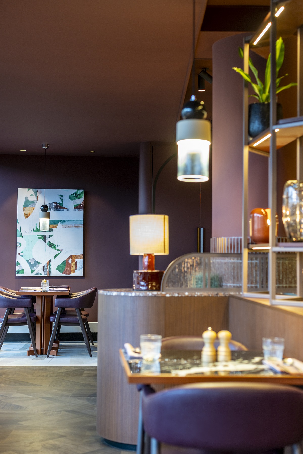
    new hotel guestroom in Four Seasons Toronto

    The Four Seasons Hotel Toronto – refreshed and reimagined

    1024 576 Pauline Brettell
    The Four Seasons Hotel Toronto – refreshed and reimagined

    Four Seasons Hotel Toronto has recently completed an extensive, multimillion dollar guest room renovation, elevating comfort and enhancing the luxury experience for its guests. We stepped inside for a closer look…

    new hotel guestroom in Four Seasons Toronto

    With a focus on elevating comfort, functionality, and aesthetic appeal, the Four Seasons Hotel Toronto redesign encompasses all 259 guestrooms including 42 suites within the hotel. The importance of maintaining the property’s distinct architectural character was paramount, and the refresh introduced many enhancements while respecting the existing design framework. Every aspect of the rooms and suites has been meticulously reconsidered, from carpets to furnishings, lighting to artwork. All furniture has been designed and manufactured in Canada, utilising local artisans and fabrics throughout the rooms.

    hotel suite in four Seasons toronto with neutral colours and pops of yellow

    Image credit: Joe Thomas

    “We have an unwavering commitment to providing guests and residents with the best luxury experience in Toronto, and this fresh, holistic update has surpassed all expectations,” said Shahid Khan, Owner, Four Seasons Hotel Toronto. “We ensured that every detail was considered, and refined many iterations of the model room until it was absolutely perfect. It is important to reinvest in Four Seasons Hotel Toronto through the elevation of our guest room product and experience, and this organic and warm update underscores our promise to offering the preeminent hotel in the market.”

    redesigned guestroom at Four Seasons Toronto

    Image credit: Joe Thomas

    The design inspiration behind the remodel draws from Toronto’s unique juxtaposition of urban sophistication and natural beauty. Colours and textures celebrate the distinctly Canadian surrounding landscape, while furniture designs and surface patterns bring forth the energizing asymmetry found in the natural world. Local artists play a pivotal role in the aesthetic narrative of the renovated rooms and suites. Works by Canadian artists such as Emma Enright, Dahae Song, Deborah Moss, and Andrea Soos adorn the walls, adding a distinctive touch of regional flair to the guest experience.
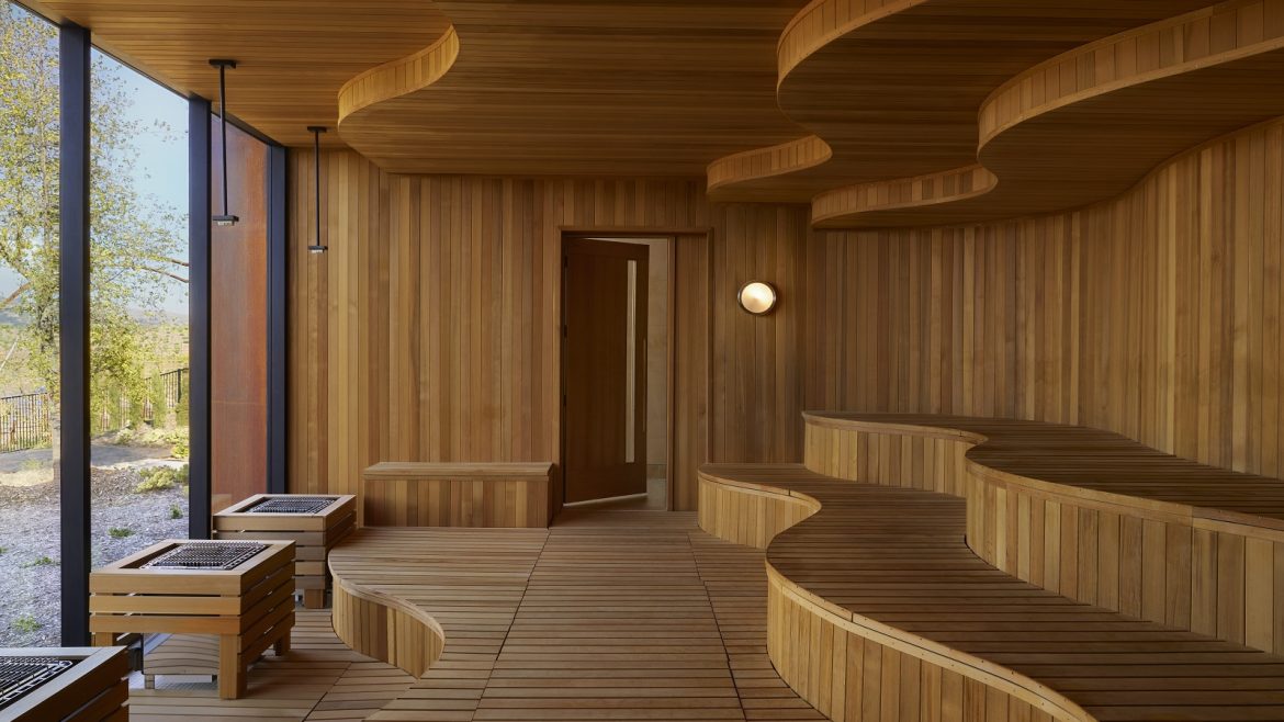
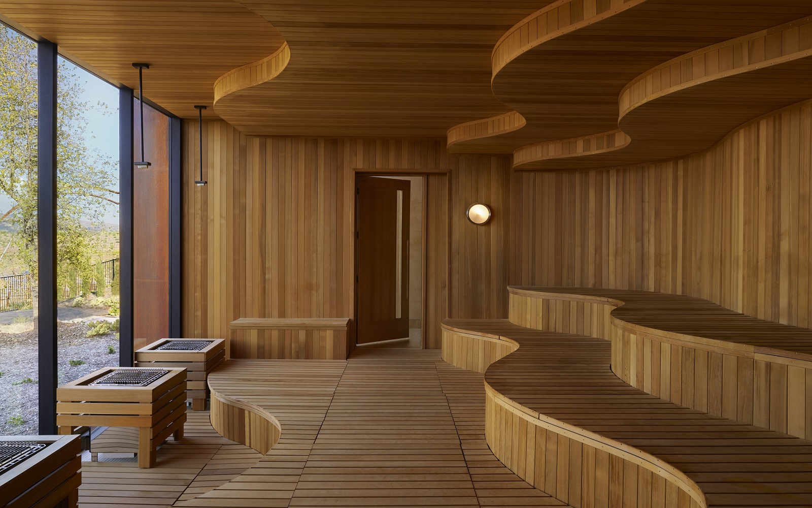
    DesignAgency led the design and creative vision, infusing the rooms with a sense of timeless elegance and contemporary sophistication. The aim was to create an environment that seamlessly blends the urban vibrancy of Toronto with the tranquil beauty of its natural surroundings. Every design element was carefully considered to evoke a sense of harmony and sophistication, providing guests with an elevated experience that resonates with the spirit of Four Seasons Hotel Toronto.
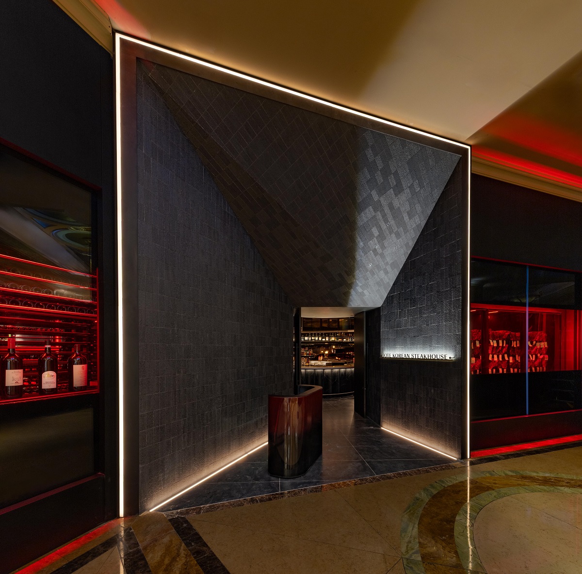
    green corner couch next to double bed in toronto hotel guestroom

    Image credit: Joe Thomas
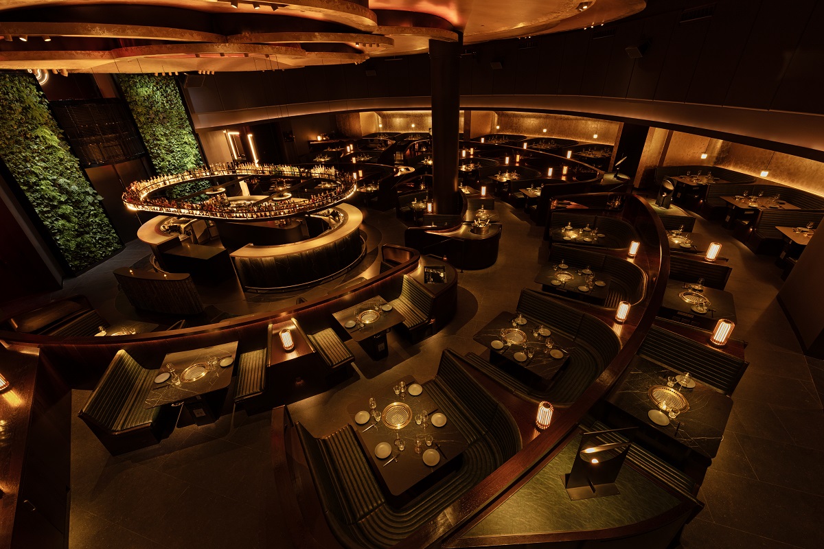
    Adding to the allure of the newly redesigned spaces are several thoughtful additions. Guests now enjoy programmable temperature control kettles by Corvo, Nespresso machines, press steamers in every room, and exclusive wine labels sourced from the nearby Niagara wine region. Technological upgrades include a new dimmable, LED and energy efficient Lutron lighting system, automated drapes, and increased power outlets throughout the rooms. Wireless chargers are available at each nightstand, ensuring convenience and connectivity for modern travellers.

    In addition to the guestrooms and suites, Four Seasons Hotel Toronto has previously renovated public spaces ensuring a cohesive and seamlessly updated guest experience throughout the property. With the completion of this renovation project, Four Seasons Hotel Toronto reaffirms its commitment to providing unparalleled luxury and hospitality, inviting guests to indulge in a refined retreat amid the vibrant heart of Toronto.

    Main image credit: Joe Thomas