Hotel Designs

    NEWS AND ANALYSIS FOR HOTELIERS, DESIGNERS AND INDUSTRY SUPPLIERS
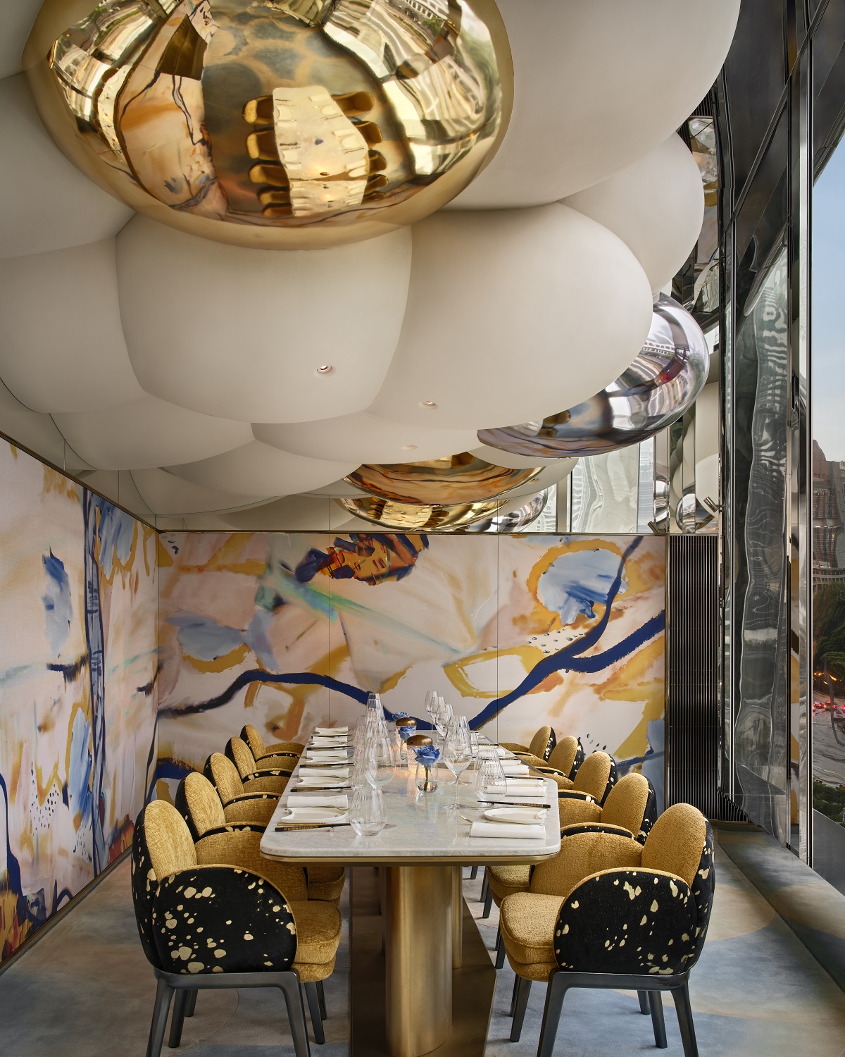
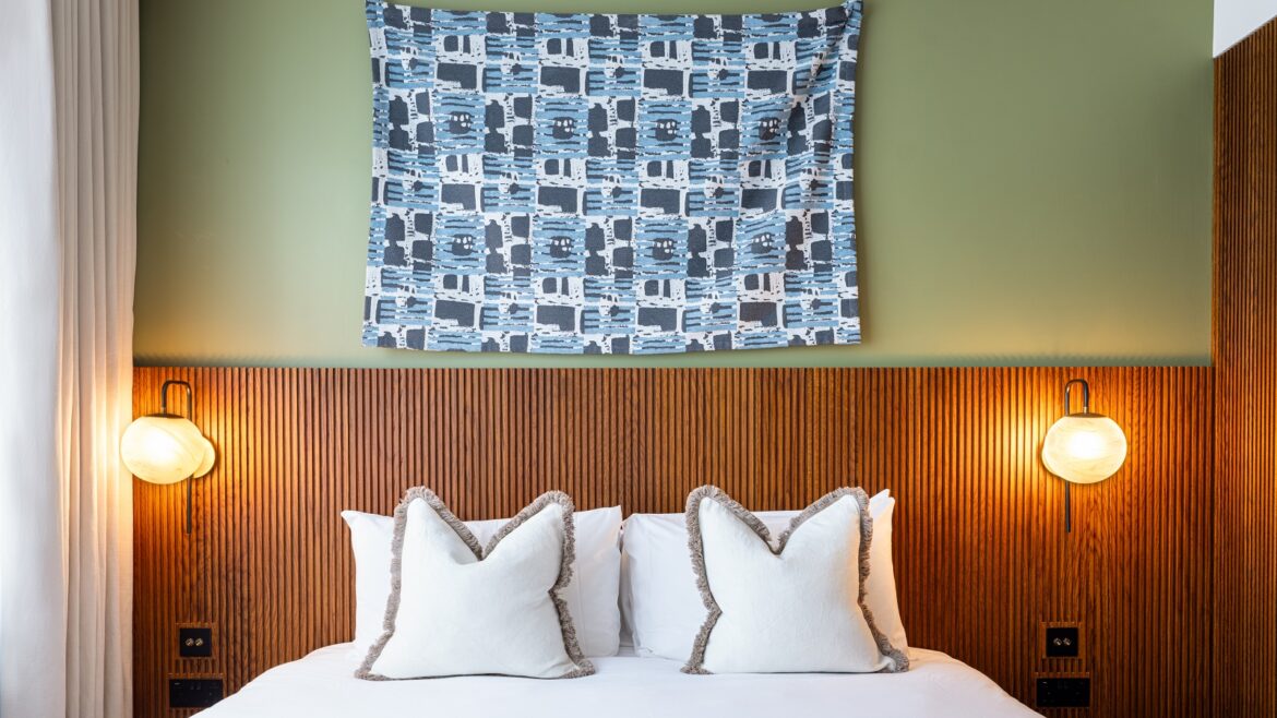
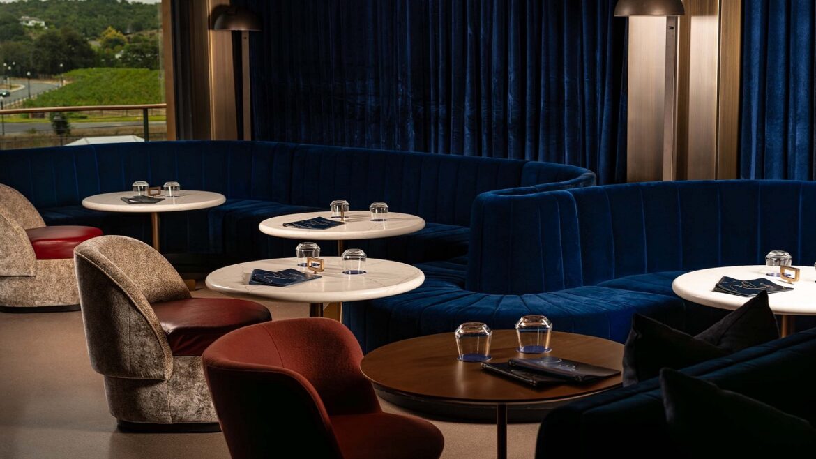
    blue velvet banquette with blue and gold optic tropicwallpaper

    Newmor and PPA – the collaboration of two pattern powerhouses

    1024 640 Pauline Brettell
    Newmor and PPA – the collaboration of two pattern powerhouses

    Newmor, well known for championing British design, has collaborated with Print Pattern Archive on a new collection, which reimagines historical designs, bringing a fresh twist to timeless classics…

    blue velvet banquette with blue and gold optic tropicwallpaper

    Together, Newmor and Print Pattern Archive (PPA), have revitalised heritage patterns. The six new designs are an eclectic mix of styles that demonstrate the power of partnership.

    “Pattern has the power to evoke emotions,” commented Rose Campbell, Head of Design and Marketing at Newmor. “Whether you’re designing for a 5-star hotel, workplace, or healthcare, the clever use of pattern and colour are essential components in creating memorable spaces that resonate and inspire us. I have loved working with PPA on this diverse mix of adaptable designs”.

    “In the world of interior design, pattern, colour and heritage are the heartbeats of transformation, breathing life and narrative into space,” added Cheryl O’Meara, Founder and Co-Director of PPA. “Our new collection speaks volumes, the six designs are an eclectic mix of heritage and modernity – bringing the hip into heritage”.

    room set and sample detail of gilded Garden collection from Newmor

    Image credit: Newmor

    Gilded Garden: A gilded cornucopia of lush botanical flora and fauna full of intricate detail. The mylar base elevates this design bringing the organic elements to life as the light catches them!

    oriental inspired toile print on bedhead

    Image credit: Newmor

    Shikoku: Delicate etchings capture the tranquil scenic beauty of this Japanese island’s botanical wonders. Evoking a sense of peace and harmony in any space.

    vintage floral wallpaper in brown, orange and greens

    Image credit: Newmor

    The Persian Painter: Arts and Crafts-inspired florals, vibrant pomegranates, delicate moths and birds sit gracefully, adding to the warm and enchanting ambiance of this archive musing.

    antique tapestry inspired wallpaper against vintage green wall detail

    Image credit: Newmor

    Vintage Verdure: An enchanting reinterpretation of 16th-century Flemish verdure tapestries. The woollen embossed base adds real depth and a tactile quality to enhance the design.

    gold and black medallion wallpaper behind table with wine glasses

    Image credit: Newmor

    Mythical Dynasty: Mythical creatures converge with the rich tapestries of Russian folk art. Each tile reveals burnished metallic magic, where majestic dragons and graceful phoenixes are framed amidst celestial patterns.

    gold and teal vintage deco style wallpaper from Newmor

    Image credit: Newmor

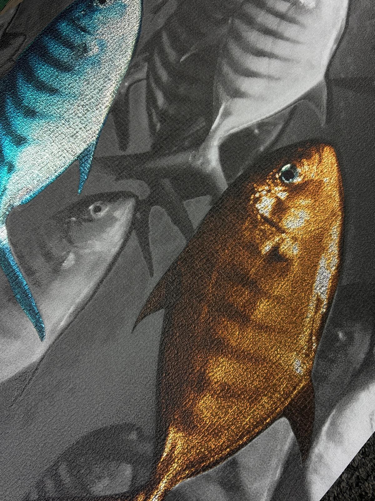
    Optic Tropic: A futuristic fusion of oriental allure and geometric grandeur. This ornate structured trellis is softened by the barely there whisps of bamboo shoots peeping through and delicate shimmer of mylar.

    O’Meara shared her development journey for the new collection. “Last summer, I spent time in the Far East visiting family in Singapore. It was such an inspiring melting pot of Eastern and Western culture and history, with futuristic organic architecture entwined with lush tropical foliage. There is really no other place like it on earth where the future meets the past in such synergy and celebration. It was fresh in my creative energy as I started to design this collection, so it’s no wonder we have everything from French verdure tapestry to Japanese ethereal scenes”.

    This seeming paradox in styles is PPA’s signature approach to design. Its archive houses antique gems from every culture that inspire design direction. Over a decade in the industry, PPA has inspired and created designs for hundreds of brands across fashion and home, including industry titans such as Alexander McQueen and Soho House.

    “Having spent years working behind the scenes as ‘the industry’s best-kept secret’, it feels lovely to step out from behind the curtain and have the opportunity to debut our own creations,” continued O’Meara. “Having a blank canvas was quite a new experience, so we just went with our intuition and didn’t overthink it. Kerri and I found ourselves transported to magical spaces, imagining who was there and what they were doing, how they were feeling. Then we would look through the archive for wallpapers and fabrics inspired by the aesthetic and mood of the magic. It was so exciting to see the first samples come to life. From imagination to paper, to computer to real life, we never tire of seeing ideas come to reality”.

    Campbell went on to explain why Newmor selected PPA for their newest collaboration: “The first time I met Cheryl and Kerri I knew they would be a great fit for Newmor and bring something really unique to our range. Their contemporary heritage vibe, or ‘hipstorical’ aesthetic as PPA say was exactly what we were looking for and seeing the archive for the first time gave me a tingle down my spine! Cheryl and Kerri have done a fabulous job pulling the designs together, paired with Newmor’s expertise in choosing the right bases from metallics to silk effects really made the designs sing – it’s where the alchemy happened, and the collection came together. It’s been an absolute pleasure working with them both on this project”.

    Newmor is one of our Recommended Suppliers and regularly features in our Supplier News section of the website. If you are interested in becoming one of our Recommended Suppliers, please email Katy Phillips.

    Main image credit: Newmor

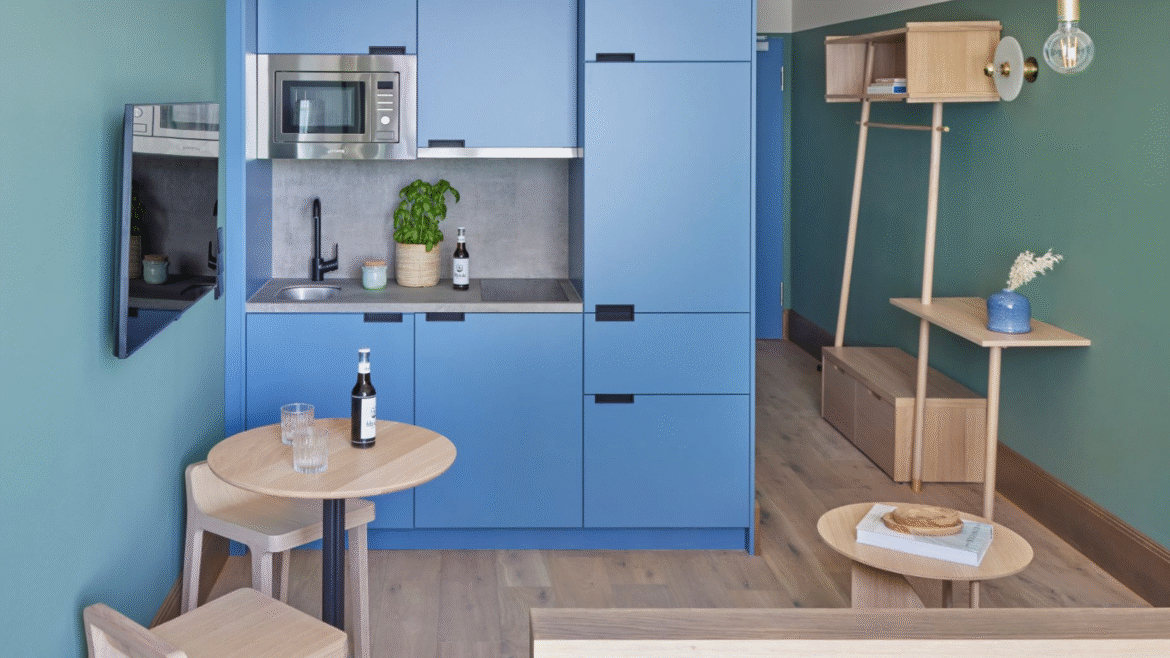
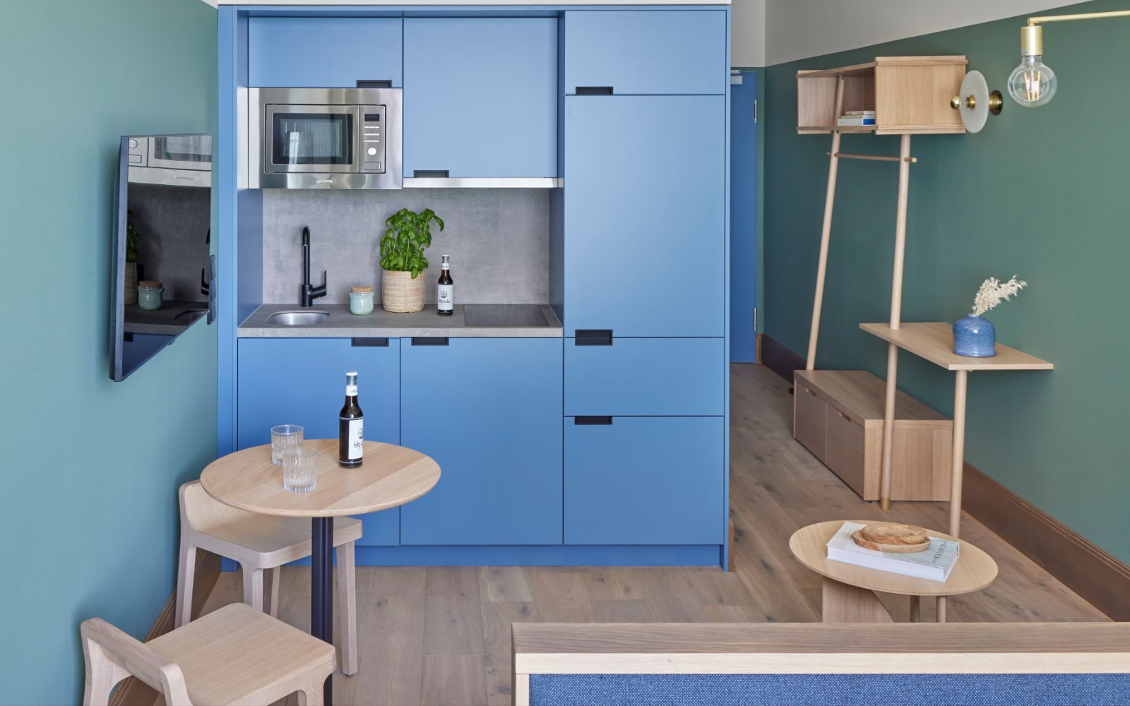
    view from seating area in Native Kings Wardrobe to kitchen

    Native King’s Wardrobe, St. Paul’s opens in London

    1024 640 Pauline Brettell
    Native King’s Wardrobe, St. Paul’s opens in London

    UK lifestyle apart hotel brand Native Places recently announced the opening of its newest property in one of London’s most historic locations. Native King’s Wardrobe, St Paul’s will mark the seventh property in the brand’s portfolio, and its second hotel in the capital…

    view from seating area in Native Kings Wardrobe to kitchen

    Formerly known as the Royal Wardrobe in the 14th century, Native King’s Wardrobe, St Paul’s served primarily as a storehouse for the King’s state and ceremonial robes, as well as those belonging to members of the Royal Family. Breathing new life into the area whilst celebrating its fashionable history, Native Places introduces a revived, spacious, and characterful place to stay right in the heart of the City of London.

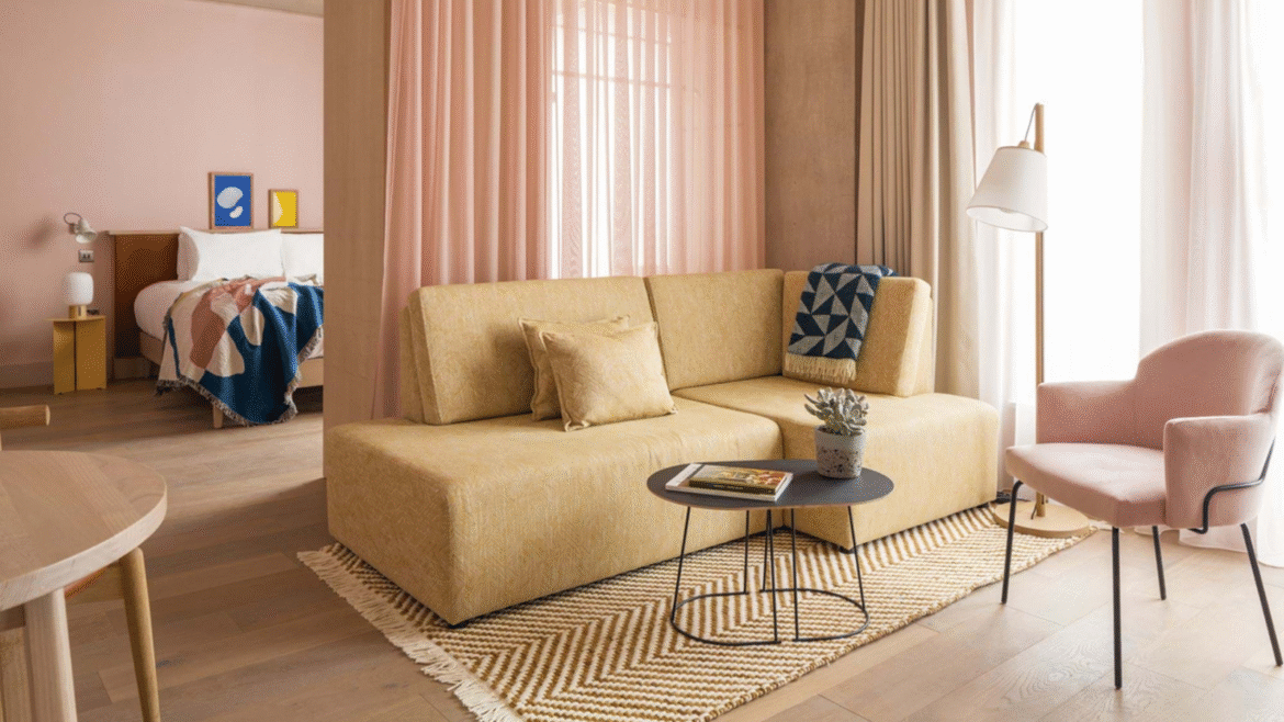
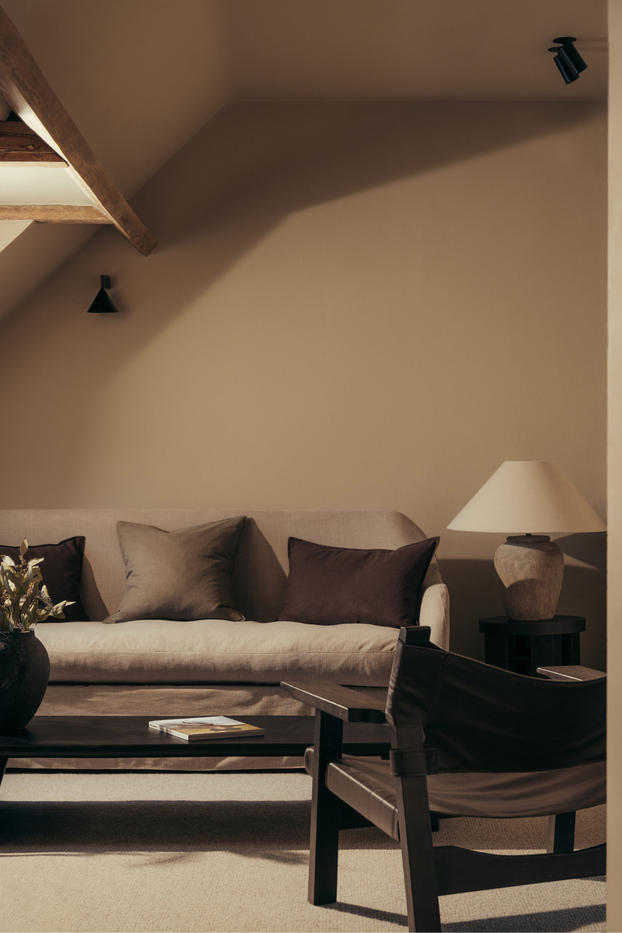
    cream couch and brown chair in Native Kings Wardrobe lounge area

    Image credit: Native King’s Wardrobe, St Paul’s

    The hotel is spread across seven Grade II listed townhouses inhabiting a beautiful, private courtyard located just behind St Paul’s Cathedral. There are 92 bright and spacious suites in total, each with fully equipped kitchens, living and dining areas, and workspaces – kitted out with everything guests need for maximum comfort and enjoyment, whatever the reason for their stay; be it business or leisure, a long stay or short break. Bramley toiletries, fresh linens and Hypnos beds are in all of the apartments, while tapestry prints from House of Hackney adorn the walls. Guests can choose from studios as well as one, two- and three-bedroom suites.

    cream upholstered bedhead with red patterned cushions and fabric lampshade

    Image credit: Native King’s Wardrobe, St Paul’s

    “We are thrilled to introduce our latest property, Native King’s Wardrobe in St Paul’s, London,” commented Olivia Immesi, CEO of Native Places. “Since seeing the property for the first time, we’ve been captivated by the rich history and potential of this iconic space. Breathing new life into the former Royal Wardrobe, we’re not just creating a place to stay, we’re crafting an experience that honours the past while embracing the future. With a focus on sustainability, stylish design, and community connection, we’re redefining what it means to stay in the heart of London. Our spacious rooms offer guests a comfortable retreat amidst the bustling city, ensuring a restful stay. We look forward to welcoming visitors at Native King’s Wardrobe, as well as at Counter Café Bar & Courtyard and offer them a unique Native Places experience”.

    From the outset, Native Places has been actively involved in guiding design choices and outlining the contractors’ tasks. The brand has played a significant role in the transformation of the historic Native King’s Wardrobe, St Paul’s, into a dynamic apart hotel experience, in line with its dedication to sophisticated design and community involvement. While emphasising the area’s storied past, sustainability is a central focus of the project, evident in eco-friendly suppliers and the use of recycled materials in furnishings. This commitment ensures that the property maintains its unique character while embodying eco-consciousness and a community-oriented ethos.

    industrial style restaurant with soft pink chair and plants

    Image credit: Rebecca Hope

    The hotel is also home to Counter Café Bar & Courtyard; a lively neighbourhood space developed by Native Places which can be found in its properties in Edinburgh and Manchester. Counter Café Bar & Courtyard marks the brand’s debut in London. By day, it showcases locally-sourced, seasonal ingredients, along with artisanal pastries and a menu of delectable light bites. As the sun sets, the cosy establishment transforms into a neighbourhood wine bar, serving as the backdrop for curated events and a diverse array of beverages, all while shining a spotlight on the talents of the local scene.

    Main image credit: Rebecca Hope

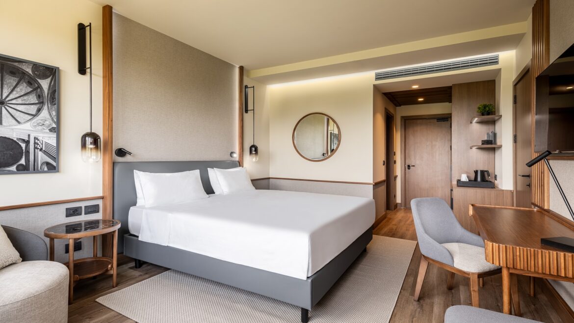
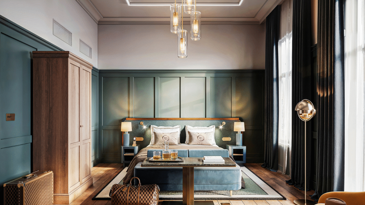
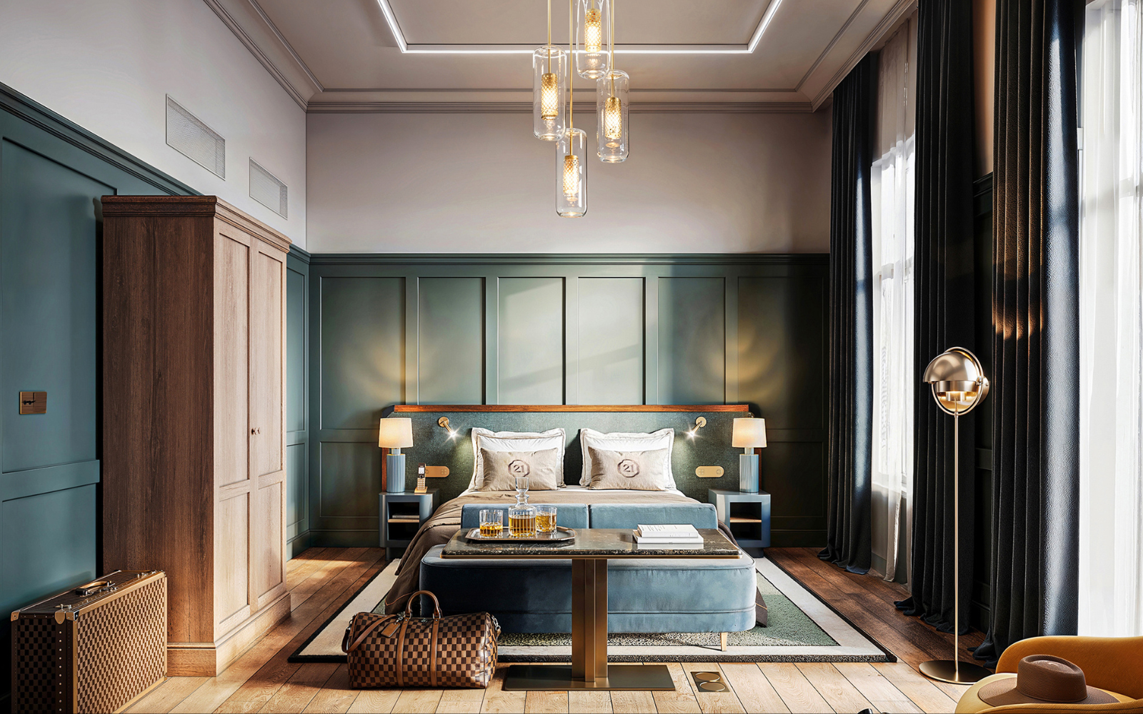
    guestroom in the niu - the first holiday inn to open in germany

    The first Holiday Inn opens in Germany

    1024 640 Pauline Brettell
    The first Holiday Inn opens in Germany

    IHG Hotels & Resorts has opened the first Holiday Inn property in Germany – Holiday Inn – the niu Cure, Erlangen – marking the debut of the collaboration between the two hospitality brands…

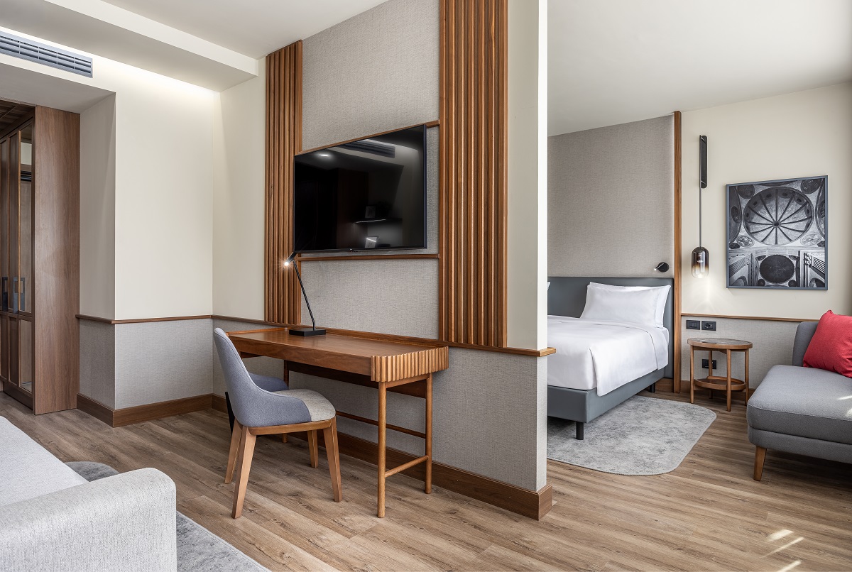
    guestroom in the niu - the first holiday inn to open in germany

    Anchored in a shared passion for distinctive design and memorable hospitality, Holiday Inn – the niu represents an exciting opportunity to combine the niu’s extensive domestic presence and unique design inspired by locality, with Holiday Inn’s global reputation and brand recognition. Together this delivers a hotel experience that offers genuine hospitality with personal service and provides great value for people travelling for business or leisure.

    Situated in the historic town of Erlangen, the property takes its design cues from the city’s well-known affiliation with medicine and medical technology. The name ‘Cure’ pays homage to the medical progress of the city, which is reflected in the design ethos of the hotel. The use of ring-shaped pendant lamps, a warm pine-green and wood colour palette combined with natural materials throughout the hotel’s furnishings all aim to help promote relaxation and recuperation.

    hotel lobby with architectural circular lighting at Holiday Inn- the niu Cure

    Image credit: IHG Hotels & Resorts

    Known as one of Germany’s best-preserved Baroque era cities, Erlangen has plenty to offer for those looking to visit for a weekend getaway or to extend their business trip. Like all Holiday Inn – the niu properties, the 177 room hotel is designed to be stylish and homely, while providing guests with all the comforts needed to refresh and recharge – including free wi-fi, smart TV with screen mirroring, blackout curtains and a hot buffet breakfast.

    “We are delighted to work with our partners at NOVUM Hospitality, to open the first Holiday Inn – the niu hotel in Germany,” commented Mario Maxeiner, Managing Director, Northern Europe at IHG Hotels & Resorts. “This is a brand collaboration that offers guests the comfort and expertise of one of the world’s most recognised and trusted brands, Holiday Inn, combined with the stylish and locally inspired design of the niu. Holiday Inn – the niu Cure is an excellent first representation of how this brand collaboration comes to life. We look forward to converting and opening the doors to more than 50 existing hotels for this brand collaboration in the months to come”.

    “As one of Europe’s largest privately-owned hotel operators, we look forward to witnessing our flagship brand, the niu, embark on a new chapter alongside the globally renowned Holiday Inn brand,” added David Etmenan, Chief Executive fficer & Owner NOVUM Hospitality. ” The opening of our first Holiday Inn – the niu hotel in Erlangen marks the first step in our collaborative journey with IHG Hotels & Resorts, and we eagerly anticipate the launch of over 50 more Holiday Inn – the niu hotels in the near future. In fact, we are delighted to have also signed our first pipeline property for Holiday Inn – the niu with IHG”.

    As with Holiday Inn’s Open Lobby concept, all Holiday Inn – the niu hotels have ‘Living Lobbies’ – feel-good oases to help guests unwind and relax or serve as a great co-working space. The onsite bar lounge area is the perfect place to round off the day with a drink and some light bites and the hotel’s 24hour Lobby Shop offers a selection of snacks available to purchase.

    In the coming months, more Holiday Inn – the niu hotels are expected to open. This will include locations such as Nuremburg, Frankfurt, Cologne, Dusseldorf, Berlin, Munich, Hamburg and Potsdam, and outside of Germany, it will be available in locations including Amsterdam and Haarlem in the Netherlands, Manchester in the UK and Vienna, Austria. More recently, IHG and NOVUM Hospitality signed their first additional pipeline hotel for Holiday Inn – the niu. This property is in addition to the initial 52 signed under this brand collaboration in April 2024.

    Main image credit: IHG Hotels & Resorts

    yotel geneva lake

    Checking in to YOTEL Geneva Lake

    1024 640 Megan Christopher
    Checking in to YOTEL Geneva Lake

    Deputy Editor Megan Christopher was invited to stay at YOTEL Geneva Lake, a new destination property, where modern Swiss style blends with functional comfort, all complemented by breath-taking views…

    yotel geneva lake

    Yotel Geneva Lake, a newcomer to the lakeside scene, promises a hotel that echo’s Geneva’s modern spirit while offering a respite from the day’s adventures. Stepping through the glass doors, I was greeted by a lobby bathed in soft light, a clever interplay between the floor-to-ceiling windows overlooking the glistening lake. The colour palette is a study in cool greys and blues, accented by pops of sunshine yellow in the plush armchairs – a subtle nod to the surrounding natural beauty without appearing overly themed.

    The efficient check-in via the Yotel app, a signature of the brand, set the tone for a stay that balanced technology with human interaction. My ‘cabin’, as Yotel terms their rooms, was a marvel of space optimisation. The now-iconic SmartBed, another Yotel innovation, was a key feature of the room, transforming from a comfy couch by day to a wonderfully comfortable sleeping haven at night. The flow of the room works well without overwhelming the compact space, with the team at Yotel proudly describing the space as “small but extremely functional” and explaining that Yotel offers more room keys per square foot than most hotels.

    yotel geneva lake

    Image credit: Yotel

    Yotel Geneva Lake isn’t for those seeking sprawling luxury suites, but for design-conscious travellers who value smart functionality and a touch of Alpine tranquillity. The thoughtful fusion of technology and aesthetics creates a haven that invites guests to relax, recharge and fully embrace the offering that Yotel has created. With multiple social and work areas on offer, travellers are never short of somewhere to pull up a chair and open a laptop. The floor-to-cieling windows are a key design feature, offering an abundance of natural light that further enhances the sense of space within the hotel, while the use of glass throughout the property creates a sense of transparency and openness. This seamless connection between interior design and the surrounding landscape is a hallmark of Yotel Geneva Lake’s success.

    The real design gem, however, lay in the public areas, HVGGE, the hotel’s central social hub, was a revelation. Danish-inspired principles of ‘hygge’ – meaning cosy comfort – were masterfully translated. Warm wood tones contrasted beautifully with plush, textured fabrics in calming shades of taupe and cream. The space seamlessly transitions from an inviting café by day to a relaxed bar by night, the clever use of lighting, movable furniture and curtains creating distinct ambiances and pockets of space. Large windows offer breath-taking lake views, further blurring the lines between indoors and the stunning natural backdrop.

    yotel geneva lake

    Image credit: Yotel

    Yotel Geneva Lake marks a significant milestone for the Yotel brand, not just for its innovative design but also for its exciting partnership with Caviar House Airport Premium-Switzerland. This collaboration brings HVGGE Place. a one-of-a-kind Nordic-inspired dining and event hub, to life.

    “You know, we don’t try to localise the rooms,”  commented Hubert Viriot, CEO of Yotel. “Usually we localise the food and beverage. We’re happy to work with local partners to create an experience which is in tune with what the customers want and the local area.”

    Alongside the restaurant, HVGGE offers a seafood bar, banqueting & conference centre, auditorium and rooftop, all dedicated spaces to be used for business meetings, private dinners, events spaces and more. The possibilities are endless.

    “HVGGE Place is Switzerland’s first gastronomy destination inspired by the Danish concept of hygge, providing mouth-watering dining experiences in a cosy atmosphere and at an affordable price – ideal for hotel guests and locals alike,” added Peter G. Rebeiz, Chairman & CEO, Caviar House Airport Premium – Switzerland. “HVGGE Place also offers extensive meeting spaces, perfect for supporting global business meetings, and organising sophisticated events. It’s the ideal place to be whether it’s to eat, meet, work, or play”.

    hvgge restaurant geneva

    Image credit: HVGGE

    As for the future of Yotel, 2024 is set to be a big year with the brand opening their first hotel in Tokyo, and another in Bangkok, Thailand shortly after that. “We’re seeing a lot of growth in Asia, with hotels being in Malaysia, in Thailand and Japan over the next eight months. Asia is very exciting, and we look forward to having little cousins of our hotels in Singapore everywhere.” continued Viriot. “In the Asia and the Middle East, Yotel has focussed mostly on new builds, but has been known to convert office buildings, working habits have completely changed, so the vacancy rate of office buildings around the world has gone up, and we are realising today isn’t coming down, so there’s all these existing stock out there and it creates a completely new opportunity for us as a hotel development company”.

    In essence, Yotel Geneva Lake offers a masterclass in maximising space and light, while prioritising guest comfort and connection to the natural world. It’s a refreshing take on modern hospitality, whether you seek a cosy retreat after exploring Geneva’s delights, a productive workspace with a view, or a vibrant social hub to connect with friends and colleagues.

    Main image credit: HVGGE

    minimalist scandi interior with d line fittings and hardware

    Case study: d line gets a handle on sustainable design

    1024 640 Pauline Brettell
    Case study: d line gets a handle on sustainable design

    Balancing tradition and innovation in a eco-friendly dream home in Karlebo, the choice of d line door handles wasn’t just about aesthetics – it was a reflection of the owners’ commitment to quality and sustainability…

    minimalist scandi interior with d line fittings and hardware

    Homeowners Casper and Alexandra embarked on a journey to turn their dream of countryside living into reality, all while staying close to the vibrancy of Copenhagen. As a landscape architect and a research scientist, they sought the perfect blend of rural tranquillity and urban convenience, and they found it in the charming village of Karlebo.

    Amidst all their eco-conscious decisions, they home-owners didn’t compromise on style. When it came to the finishing touches, they opted for the timeless d line L lever handle by Knud Holscher in stainless steel. Their choice of door handles wasn’t just about aesthetics – it was a reflection of their commitment to quality and sustainability.

    eco-friendly design of Scandinavian interior using d line hardware

    Image credit: d line

    The L lever handle, among the 250 products that can be Re-handled, boasts a remarkable feature: reusability. With the capacity to be Re-handled up to four times, it ensures a 100 year product life cycle, a testament to the ethos of timeless craftsmanship.

    “We chose the Re-handle product as it fits perfectly into our vision and house project”, explained Casper. “The world’s resources are limited, and we need to use them smartly by recycling or building of the nature with an absolute minimum impact of CO2 while storing CO2 in the construction”.

    Their vision for their home was both ambitious and modern. They wanted to honour the timeless charm of traditional Danish timber-framed houses while infusing their design with contemporary style. This meant carefully planning every detail, from the layout with its central hallway connecting various rooms, to the choice of biobased materials.

    Concerned about the impact of climate change, Casper and Alexandra were determined to use eco-friendly materials in their construction. They opted for glulam wood with hemp modules for the structure, while the façade consists of lime plaster, echoing the classic look of nearby heritage homes. Inside, the walls were coated in clay plaster, creating a healthy indoor environment that will stand the test of time.

    “We both grew up with d line products,” added Casper. “They have been part of our childhood and relationship to traditional Danish quality and design. We would like our future children to have the same childhood and memories as we did. It is important to us that our passion and history of Danish design is passed on to the next generations, says Casper”

    For Casper and Alexandra, their home isn’t just a place to live. It’s a testament to their values, their love for Danish design, and their dedication to building a more sustainable future. In creating their dream home, they not only found a sanctuary for themselves but also left a legacy for the next generation.

     d line is one of our Recommended Suppliers and regularly features in our Supplier News section of the website. If you are interested in becoming one of our Recommended Suppliers, please email Katy Phillips.

    Main image credit: d line

    saltmoore north yorkshire

    Introducing Saltmoore: a new and luxurious wellness-led retreat

    1024 640 Megan Christopher
    Introducing Saltmoore: a new and luxurious wellness-led retreat

    Perfectly positioned between the sea and the moors, Saltmoore, with interiors by Sapin Studios, takes inspiration from its North Yorkshire seaside location…

    saltmoore north yorkshire

    With breath-taking seascapes, unspoilt coastlines and cobbled streets, the picturesque town of Whitby and the quaint village of Sandsend, in North Yorkshire, are known by many as the ‘jewel in the crown’ of the Yorkshire Coast. As of September 2024, this beautiful part of the world will be known as the home of ‘Saltmoore’, a new wellness-led retreat which was formerly Raithwaite Sandsend.

    The property will include two brand new hotels with 72 bedrooms in total, a state-of-the-art spa, and four F&B outlets, including a gourmet restaurant, a relaxed Brasserie, and a Wellness Café. Saltmoore is the brainchild of powerhouse construction and property development firms O’Shea Group and Galliard Homes – with this marking their 50th project together and the first hotel in Northern England.

    saltmoore north yorkshire

    Image credit: Saltmoore

    Hidden away in 85 acres of verdant estate and local woodland, and just a short stroll from the sea, the heart of the retreat can be found at ‘Saltmoore House’, a sophisticated and elegant 43-bedroom hotel that sits in a commanding position overlooking pristine gardens and a charming orchard that is home to an abundance of plum and pear trees. The historic hall takes notes from industrial mills and the Victorian era, weaving together rich tones and textures to create timeless, indulgent interiors inspired by the moors and sea. The hotel’s guestrooms are spacious in size, ranging from more cosy ‘Snug’ bedrooms to larger ‘Master’ bedrooms.

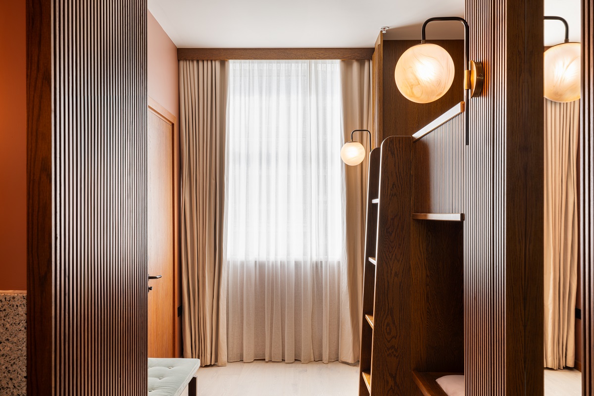
    The mastermind behind Saltmoore’s interior vision is Sapin Studios, who fused together inspiration from the moorlands and the hotel’s seaside location. The interiors will feature ocean-inspired palettes and beach-tones, such as deep teal tiles for the bathrooms, as well as soft greens, pastels and pale blues to create a calming and tranquil space for guests.

    Depending on the room category, the bedrooms will feature balconies, grand roll top baths, upholstered headboards, contemporary four poster beds and bespoke painted panelling throughout. Those looking for an indulgent stay can take refuge in The Nest Suite, a tranquil hideaway in the original 19th century hall. This sumptuous suite overlooks the orchard and boasts a beautiful reading nook to spend time whilst overlooking the panoramic woodland views.

    saltmoore north yorkshire

    Image credit: Saltmoore

    In addition, Saltmoore House is home to a state-of-the-art spa. ‘The Sanctuary at Saltmoore’ will feature an indoor heated pool, jacuzzi, sauna, steam room, relaxation room, as well as six treatment rooms that includes one double treatment room for couples. A holistic haven, those looking to truly unwind have a choice of unique treatments, which again take inspiration from the salts of the sea and the natural surroundings.

    Focusing on a connection with nature and natural minerals, guests of The Sanctuary at Saltmoore will enjoy treatments and products from a local and sustainable wellness brand  – the collaboration will mark the first time the brand has partnered with a hotel outside of their mother brand. All guests will also have access to the hotel’s modern and high-quality gym that is equipped with the latest in sports recovery – a cryotherapy chamber.

    Also located within Saltmoore is ‘The Beach House’, a charming 29-bedroom property, just a stone’s throw away from Saltmoore House, providing further laidback luxury and family-friendly accommodation. With access to all Saltmoore House’s facilities, The Beach House will have its very own reception, bar and restaurant. Guests are also able to bring their four-legged friends as this hotel has several dog-friendly bedrooms. This coastal inspired property features Coastal Classic Balcony bedrooms with views out to the local woodland, or Coastal Classic Garden bedrooms that come equipped with an outdoor tub and a private garden. The hotel’s two spacious Suites showcase sumptuous freestanding bathtubs to relax in.

    Both Saltmoore House and The Beach House mix the spirit of their past whilst adding a contemporary twist to bring it to life and arouse a certain wild magic. And, with Beck View & Water’s Edge, offering additional dog friendly cottage rooms, not to mention plans to build 184 lodges over five years to independent owners, Saltmoore is certainly bringing a whole new level of luxury hospitality to North Yorkshire.

    Adam Maddock has been appointed as the Head Chef, overseeing culinary operations across the various F&B options. Maddock is the former Head Chef of the Fife Arms in Braemar. Trained under Chris Tanner, he has also worked at leading UK hotels such as Whatley Manor and The Manor House in Wiltshire, as well as The Whitebrook in Wales that has a coveted Michelin Star. Maddock will drive the food and beverage across the estate’s four dining establishments and three bars, and has been working closely with a named, soon-to-be-revealed chef, acting as consultant chef across Saltmoore. Their vision will see guests enjoying farm to fork style cuisine with locally sourced produce, seasonal dishes and traditional British cuisine with a twist.

    For guests wanting to work up an appetite or explore the countryside, Saltmoore offers a range of activities across the Estate that focus on wellness, wildlife and nature – with cold water swimming on the lake, cycling, kayaking, stargazing and picturesque picnics. Nature lovers will enjoy spotting deer, pheasants, badgers, newts, bats, and frogs that reside on the property.

    Saltmoore will be headed up by dynamic General Manager duo, Peter Boyle and Jayne Cartwright, formerly of luxury South Devon hotel, Gara Rock. “We are excited to be working with such a pioneering brand to bring a new level of luxurious, yet laid-back accommodation to North Yorkshire,” commented Boyle and Cartwright. “Saltmoore has provided over 150 jobs to the local community, and we look forward to working with our talented team to welcome guests to this beautiful part of the world’’.

    With so much to see and visit, Saltmoore provides the ideal location for guests wanting to come together to experience stunning design, beautiful gardens, and delicious food all in a highly luxurious country house setting with five-star service levels. Whitby and Sandsend in North Yorkshire are still very much undiscovered gems in Britain. With the introduction of Saltmoore, there is now the perfect place to stay whilst exploring this beautiful part of the world.

    Main image credit: Saltmoore

    Timothy Griffin, Vernoica Givone, James Addison

    Meet the speakers at MEET UP North

    1024 640 Sophie Harper

    Meet the speakers at MEET UP North

    This July, Hotel Designs will be heading to Manchester for a MEET UP North takeover at award-winning hotel, LEVEN. With a number of exciting touchpoints throughout the evening’s event, one of the highlights will be an engaging panel discussion on the topic of Hospitality in the Metaverse. We find out more about the speakers…

    Timothy Griffin, Vernoica Givone, James Addison

    If you don’t yet have your tickets for MEET UP North, you need to get your skates on as there’s only four weeks left until the event!

    On 11th July, Hotel Designs will host its annual northern networking event at LEVEN, Manchester, for what can only be described as a night of celebration and exploration. Come with us on a deep dive into the metaverse as Editor Sophie Harper asks our expert panellists about their own developments within the digital universe.

    Following the talk, guests at the event will have the chance to experience the metaverse for themselves in a Virtual Reality taster session, courtesy of IA Interior Architects, who will help users navigate another world.

    Timothy Griffin, Vernoica Givone, James Addison

    From left to right: Timothy Griffin, Vernoica Givone, James Addison

    Timothy Griffin, Principal, Wellbrook Hospitality & Co-founder, LEVEN

    Prior to founding Wellbrook with his two partners, he was Managing Director for North America for Ennismore’s the Hoxton brand. Timothy launched the Hoxton in the US market, establishing a central office and North American team in New York City and led the highly successful opening of Hoxton hotels in New York, Portland, Chicago and LA.

    Previously he was the group’s Global Brand Director where he played a key role in defining the Hoxton brand to enable it to scale globally. He oversaw the graphic design, PR, social media, retail, digital marketing, partnerships and events teams in the London office.

    An alumnus of the University of West London where he graduated with a BA (Hons) in Hospitality Management and Cranfield University School of Management’s Accelerated Talent Development Programme. He began his career in hospitality at New York’s The Waldorf Astoria on Park Avenue and the Hilton Short Hills in New Jersey where he held various operational leadership roles.

    He has taught Rooms Division Operations at NYU to post graduate students, is a member of the Savoy Education Trust’s Scholarship St. Julian’s Scholars and is on the Advisory Board for Hospitality Design Magazine and the Steering Committee for the Independent Hotel Show North of Britain. He was the recipient of Hotel Designs’ Brit List Awards Hotelier of the Year 2023.

    https://liveleven.com/

    https://liveleven.com/leven-verse/


    The LEVEN Hotel

    Image credit: LEVEN


    Veronica Givone, Principal & Managing Director of Hospitality, IA Interior Architects

    With over 20 years’ experience in the hotel design industry, Veronica Givone serves as the Principal and Managing Director of IA’s Hospitality Practice, based in the firm’s London Studio. Veronica has garnered a wealth of global experience across diverse design sectors, particularly focusing on luxury hospitality interiors and wellness design.

    Her expertise is evident in her unwavering commitment to delivering excellence in hotel design, offering exceptional client service tailored to the hospitality industry, and skillfully executing successful operational strategies for hotel projects. Veronica’s leadership has played a pivotal role in establishing IA Interior Architects as a prominent player in the competitive field of hospitality design. Holding a degree in Interior Design from the prestigious Istituto Europeo di Design in Milan, she strives to blend meaningful elements with bespoke, exciting, and authentic design, creating a compelling narrative.

    https://interiorarchitects.com/


    LEVENverse

    Image credit: LEVEN


    James Addison, Creative Director, forpeople

    James is a Creative Director at forpeople, a multidisciplinary creative studio in London. With over 12 years of expertise in branding, strategy, and experience, he has led the design of many notable branding projects worldwide. His hospitality portfolio includes Regent Hotels (InterContinental Hotels Group), Vignette Collection, Voco, Even, and most recently, the branding and experiential design for Cunard’s new luxury ship, Queen Anne.

    James is a passionate AI enthusiast who experiments with new tools to enhance the creative process. He is particularly interested in the interplay between AI, storytelling, and hospitality, aiming to create memorable narratives that resonate with guests. His personal project, The Grande Finto, a hotel made entirely using AI, serves as a platform to explore and expand the creative boundaries of hospitality.

    https://forpeople.com/

    https://www.grandefinto.com/


    Get your tickets now and see us at MEET UP North for a networking party experience with a difference.

    Designers, architects, hoteliers and developers, secure your tickets here
    Suppliers to the hospitality industry secure your tickets here

    See you there!

    Main image credit: Hotel Designs

    Virgin Hotels London Shoreditch exterior view from street

    Virgin Hotels announces its London location

    1024 640 Pauline Brettell
    Virgin Hotels announces its London location

    Bringing Virgin back to its roots, the luxury lifestyle hospitality brand – Virgin Hotels – announces Shoreditch as its London debut   Here’s what we know…

    Virgin Hotels London Shoreditch exterior view from street

    Virgin Hotels, the luxury lifestyle hospitality brand by Sir Richard Branson’s Virgin Group, has announced its first London hotel to open on 1st August 2024 in the heart of Shoreditch. London will be the eighth Virgin Hotels location as it brings the brand home to its birthplace and where it all started for Sir Richard and the Virgin Group.

    It will become the 17th property for the wider Virgin Hotels Collection, having just announced a new property in Kenya and following the successful launches of Virgin Hotels Edinburgh and Virgin Hotels New York in 2023.

    The hotel will form part of a long-term agreement between Virgin Hotels and Reuben Brothers – global leaders in real estate investment and development. It will bring Virgin’s iconic trademark and personalised hotel experience to one of London’s most vibrant neighbourhoods, known for its tech, fashion, culture and creative arts scene.

    exterior façade and entrance to Virgin hotels London Shoreditch

    Image credit: Virgin Hotels

    “We’re all absolutely delighted that Virgin Hotels Collection will be opening a Virgin hotel in London,” commented Sir Richard Branson, Founder of the Virgin Group. “Since the inception of Virgin Hotels, we’ve had our sights set on London; a place that so many of our customers either call home, or name as one of their favourite destinations – and of course where Virgin’s story started. At Virgin, we’ve been disrupting the travel industry for more than 40 years, from land to air to sea – even to space,” continued Branson. “Our success comes from identifying where we can make a difference. Virgin Atlantic customers have always said to me that we give them a wonderful experience in the sky, but they don’t have the same Virgin experience when they land. Well, we’ve sorted that in Las Vegas, New York, Edinburgh and now London too.”

    The 120-bedroom hotel, located at 45 Curtain Road in the heart of Shoreditch, is one of the most striking buildings in London’s East End landscape, making it the perfect fit with Virgin Hotels’ ethos and philosophy. Its seven other luxury lifestyle hotels are also located in iconic urban locations across key cities in the US and UK.

    The hotel will open on 1 August 2024, which will mark the start of a gradual transformation to transition the hotel to a fully-fledged Virgin hotel with all the magic the brand is renowned for. Virgin Hotels London-Shoreditch will continue to offer one of the most diverse selections of elevated experiences across the luxury lifestyle hospitality space from its showcase Spanish restaurant BiBo in association with world-famous chef, Dani Garcia; to a glittering rooftop bar, pool, restaurant, private members club, gym, and treatment rooms, managed by the one and only, Ibiza’s Blue Marlin. All of which Virgin Hotels London-Shoreditch resident guests will have access to.

    “This year will mark 10 years of Virgin Hotels and what a way to start the early celebrations as we announce our newest hotel in one of the world’s most famous cities,” said James Bermingham, CEO of Virgin Hotels Collection. “We are all truly delighted that Shoreditch, London will be home to the next location for Virgin Hotels and what an extraordinary one it will be. We pride ourselves in having hotels in the very best locations across our key cities and Virgin Hotels London-Shoreditch will be in the epicentre of one of London’s most cultured, and creative areas. We are thankful to Reuben Brothers for entrusting us to bring the Virgin Hotels brand to life in this incredible building and to bring a splash of red to Shoreditch by showcasing our innovative, heartfelt and personal hotel experience, led by our wonderful people, to our future London guests.”

    “Over the past decade, I have been closely following the smart, strategic expansion of Virgin Hotels – with its significant openings in key US and UK cities – from Chicago and Las Vegas to Edinburgh and New York,” added Jamie Reuben, Principal, Reuben Brothers. “I am therefore incredibly excited to be partnering with Virgin Hotels in London of all places – the city that both Sir Richard Branson and I are proud to be from. Richard and his team’s entrepreneurial spirit and constant quest for excellence make them the ideal partner for our property in Shoreditch, and I look forward to seeing Virgin’s vision come to life”.

    Main image credit: Virgin Hotels

    moodboard and samples from Modieus Formation

    Product watch: Formation from Modieus

    1024 640 Pauline Brettell
    Product watch: Formation from Modieus

    Hotel Designs caught up with the talented Modieus design trio – Leah Manwaring, Debra Ryan and Marijke Arkley –  to get an inside track on their design journey in creating Formation…

    moodboard and samples from Modieus Formation

    It’s always good to hear what’s new from people driven by creativity and the desire to be the best in their field. Established in 2015, founder, Xander Okhuizen has assembled an expert team in Modieus, to deliver unrivalled commercial flooring solutions. His formula for happy clients and a happy and effective team is not sell, but instead work in collaboration to deliver beautiful bespoke flooring.

    design palette for Formation Collection from Modieus

    Image credit: Modieus

    Modieus are specialists,” discussed Okhuizen. “We are not big in size, but we are giants when comes to experience. We love what we do and are easy to work with. Most of all, we like the people we work with, and they like us. Business is personal, our job is to inspire our clients and ensure we deliver effective solutions. Our new collection Formation is founded on our knowledge of weaving”.

    “The collection is inspired by the fundamental elements of weaving – warp, weft, and their intricate dance,” expanded Lea Manwaring, Designer Modieus. “The colour palette is a homage to the Bauhaus women weavers, Anni Albers, Gunta Stölzl and Marli Ehrman as it playfully reimagines the formation of yarns, resulting in a collection that pushes the boundaries of textile design”.

    chair and table on Modieus Rythmic carpet design

    Image credit: Modieus

    There collection is made up of four chapters – Rhythmic, Intermittent, Intersect, and Undulate. The ‘Rhythmic’ chapter is a burst of energy. Charcoal blues complement the pulsating accents of punchy red, pinks and lime green. Throughout, the designs playfully defy straight lines, embracing a wonderfully vibrant energy. It’s a confident aesthetic that just works.

    patterned Intermittent carpet design

    Image credit: Modieus

    ‘Intermittent’ exudes harmonious tension. Sage and soft greens mingle with lavender mauves, punctuated by bursts of pink wine and a touch of apricot. The meticulously placed grids seem fragmented, but in reality, are a clever interplay between order and chaos.

    checked design detail of carpet by Modieus

    Image credit: Modieus

    The ‘Intersect’ chapter builds upon the concept of intersection, but with a twist. The grid-like structures become juxtaposed. Vibrant stripes interweave, their intersections often disrupted, broken, and obstructed. This interplay creates a sense of irregularity pushing against the traditional woven aesthetic. The grounding charcoal blues and jewel tones allow the peach, apricot, burnt oranges to pop.

    patterned carpet in peach and grey

    Image credit: Modieus

    Modieus capture the flow of design beautifully in ‘Undulation’. Dark blue-green greys, subtle beiges and creams, and a touch of peachy pink create a tonal calming palette. Overlapping layers of these hues flow and scribble with a sense of freedom.

    Designers Manwaring, Ryan and Arkley developed this collection as a trio. Each bringing their unique perspective on design and colour. Inspired by how Hella Jongerius, Scholten & Baijings, Patricia Urquiola and Louise Bourgeois manipulate grid formations, pushing ideas of order and chaos, Manwaring explained her design journey, “I really enjoy the creative process, all things are possible, sometimes the imperfections or mistakes and the process as it reveals itself makes for some exciting pathways. I also incorporated some designs I made with an AI image generator, to see what the mix and mash up looks like”.

    moodboard, colour palette and samples of Formation carpet designs

    Image credit: Modieus

    Ryan looked at the concept of the grid formation through American Street Art, an 80’s/90’s vibe with graphic, yet free-hand textures and layers. Inspired by the layering and composition of Jean Michel Basquiat, Keith Haring and Augustine Kofie, she said, “I took an approach not unlike the 1980s art scene which thrived on experimentation with layered art, incorporating various media and techniques to push boundaries. I embraced a process-oriented method to create layers and put them together”.

    colour wheel and sample palette for Modieus carpet designs

    Image credit: Modieus

    Arkley started with colour, taking cues from fashion designer Molly Goddard mixed with the luminance of lighting pieces by James Turrell. See took a deep dive into the work of handweavers Meghan Speilman and Molly Haynes. Being a Modern Maker herself, she told us “My loom could be likened to a canvas, each warp has endless opportunity to mix colours and create combinations… In a world of mass production, I find freedom in the slow process of hand weaving, creating unique pieces that hold the essence of an age-old tradition!”

    Whether its broadloom, rugs, or tile, Modieus is the perfect partner if you want stand-out flooring. Xander sums up, “I take a positive outlook on life and business. Work hard, treat people well, do the right thing – I have built a business that I always wanted to work for, and I am pleased to have a great team around me to deliver our potential”.

    Modieus is one of our Recommended Suppliers and regularly features in our Supplier News section of the website. If you are interested in becoming one of our Recommended Suppliers, please email Katy Phillips.

    Main image credit: Modieus

    framed seat with plants at The Riviera Maya EDITION

    Rockwell Group unveils interiors for The Riviera Maya EDITION

    1024 640 Pauline Brettell
    Rockwell Group unveils interiors for The Riviera Maya EDITION

    The New York based studio, Rockwell Group, has completed the Riviera Maya EDITION hotel resort, marking the brand’s first venture into the Latin America and Caribbean markets…

    framed seat with plants at The Riviera Maya EDITION

    The Riviera Maya is renowned for its stunning landscape, featuring a mangrove reserve, lagoons, magical cenotes, and one of the world’s largest coral reefs. The Rockwell Group design for the resort was inspired by this abundant natural environment, aiming to seamlessly integrate the buildings with the surrounding landscape.

    cabanas with white loungers around a pool at The Riviera Maya EDITION Kanai

    Image credit: Nikolas Koenig

    The resort consists of three buildings, with a spa at its centre and a glowing cenote as its focal point. The design includes rooftop features that flow into a manmade pool, giving the impression of natural tributaries. Additionally, the circulation areas and corridors are open-air spaces, maintaining a strong connection to the outdoors, much like a cenote.

    The 182 guestrooms, including 30 suites, at EDITION focus on views of the ocean and the protected mangroves. Many guestrooms face the water, and those on the ground floor feature a private plunge pool with outdoor space surrounded by the mangroves. Light and airy materials and colours create a calm oasis. Each room contains a large bathroom enclosed by slatted wood panelling, reminiscent of the screens in the lobby but on a finer and more delicate scale. The bathroom is entered through a large 5-foot-wide sliding door, ensuring that the bathroom and living space flow into one another. The bathroom contains a wet room, custom tub, and monumental sink. To make the sleeping area more intimate, a curved sofa divides the space, which also features a custom four-poster bed with draping swag, custom lighting and nightstands.

    white and natural guestroom design with private pool

    Image credit: Nikolas Koenig

    “The classic neutral palette EDITION has become known for has been customised at the Riviera Maya EDITION with the addition of materials that evoke the rich local embroidery and patterning of the area, ensuring that Kanai is honoured throughout the design of the property,” commented Greg Keffer, Partner and Studio Leader at Rockwell Group.

    The Lobby Bar is situated to the right of the lobby lounge. It features a 52-seat bar made of honed marble and tall wooden screens that provide both visual and acoustic separation from other areas of the lobby. Behind the bar, there is a large feature wall with a custom handmade plaster mural inspired by the large-scale glyphs found in Mayan ruins. Storage nooks are incorporated into the wall to serve as a backbar and to display ceramics.

    EDITION’s signature restaurant is KI’IS, which is the brainchild of Chef Francisco ‘Paco’ Ruano, who is also the chef and owner of the award-winning restaurant Alcade in Guadalajara. Guests enter the KI’IS via a scenic journey from the hotel, with views of the adjacent pool and landscape. The white-washed space evokes a luxurious beach hut with lush vegetation as its crowning backdrop.

    open air restaurant at EDITION Kanai with tree above tables

    Image credit: Nikolas Koenig

    The walls are covered with white wood panelling in a board-and-batten style, and the white painted wood ceiling elongates the space with exposed beams. In the centre, there is a square bar made of reclaimed wood, with two dining areas on either side featuring two- and four-top tables surrounded by banquettes. The restaurant has glass walls on the south, west, and east sides, offering views of the pool, mangroves, and ocean, creating a seamless indoor-outdoor dining experience. The marble floors and teak wood accents add richness and depth, contributing to a carefully curated and refined dining atmosphere.

    Kitchen at EDITION is the resort’s all-day dining experience, helmed by Chef Ruano. The geometric design of the roof in the lobby extends into the dining area, forming a pergola. Greenery extends from the exterior to the interior dining room, adorning the wooden beams along the ceilings. The space features sliding doors that lead to the terrace, blurring the indoor/outdoor boundary. Lush plants create a magical, tropical rainforest ambience for diners.

    wood panelled walls with back lit niches displaying ceramics

    Image credit: Nikolas Koenig

    The Lagoon is the central pool area of the resort, which has been largely inspired by the area’s impressive cenotes. It is surrounded by flowing vegetation, a bar, and a pool deck with floating cabanas, dining seats, and loungers. The pool features floating cabanas and a shallow sun shelf with loungers, allowing guests to walk on the water towards the hammocks between the palm trees.

    A palm tree-lined boardwalk runs from the Lagoon to the ocean and the SO’OL Beach Club. The design of the club is inspired by nearby Tulum, featuring a simple structure made of weathered wood and vegetation. The beach club includes an infinity pool right by the beach, as well as a dining and lounge area along the pool’s edge. At the heart of the space is an outdoor grill where guests can participate in the cooking experience.

    The conceptual centre of the resort is the spa, which takes a circular form. This core relaxation zone features five private treatment rooms, a lounge, three different vitality pools, a salon, showers, and a sauna. In order to imitate the feeling of being inside a cenote, the ceiling of the spa contains a circular skylight with a water feature floating on top. The water and skylight, neutral colour palette, and natural materials create a serene feeling of calm in the spa, while the treatment rooms evoke rusticated outcroppings surrounded by mangroves.

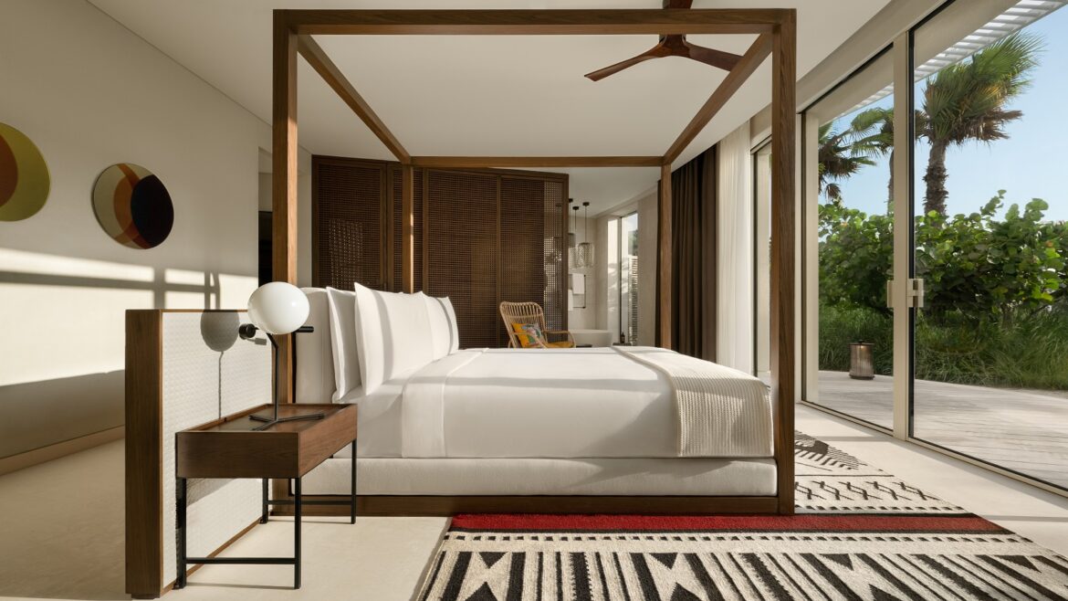
    The Sky Rooftop Villa is located on the penthouse level and is surrounded by glass on three sides, offering breathtaking views of the beach and ocean. The floor has five separate guestrooms that can be combined into a single floor-through penthouse super suite, as well as other configurations. Each guestroom features wood-detailed closets, a bathroom with ocean views, a wet bar, a dining and lounge area, a sleeping space, and a private deck with a plunge pool. The lounge area is furnished with contemporary furniture, natural stone floors, sheer drapery, and a natural fibre hand-woven rug. The sleeping area includes a delicate wood canopy bed, a curved upholstered sofa, elegant floor lamps with linen shades, and wooden bedside tables.

    Each guestroom comes with a private terrace and a raised whirlpool that overlooks a landscaped perimeter, offering magnificent views of the ocean. The suite features a flexible living area with a small kitchen, surrounded by integrated pools with an infinity edge, giving the impression of the suite floating on water. Full-height glass sliding doors provide access to an expansive covered outdoor terrace, which can be transformed into a space for large private events. Additionally, an uncovered terrace of the same size, located adjacent to the covered area, leads to an outdoor raised private swimming pool with an infinity edge, creating a waterfall effect.

    Main image credit: Nikolas Koenig

    VION Solar Control Films

    Product watch: VION solar control films from Architextural

    1024 640 Megan Christopher
    Product watch: VION solar control films from Architextural

    Architextural enhances the hotel experience with VION Solar Control Films…

    VION Solar Control Films

    With VION Solar Control Films by Architextural, hotels can achieve the perfect balance between natural light and indoor climate control. Not only do these films help create an inviting ambiance, but they also contribute to significant energy savings by reducing the need for artificial cooling. It’s an investment that pays dividends in guest satisfaction and operational costs.

    VION Solar Control Films

    Image credit: Architextural

    Imagine a film so advanced it tackles the twin challenges of heat management and glare reduction with ease. That’s the promise of VION Solar Control Films, achieved through two fundamental mechanisms:

    • Reflective Technology: Some VION window films boast reflective technology, bouncing back the sun’s heat with microscopic metallic particles. The result? A cooler interior without heavy reliance on air conditioning.
    • Absorption and Dissipation Technology: Other VION films harness the power to absorb solar energy, turning it into a whisper of heat that’s evenly dissipated. This keeps indoor temperatures stable, offering a consistently pleasant environment for your guests.

    Here’s what makes VION Solar Control Films a game-changer for hotels:

    • Slash Energy Bills: These films are a shield against the sun’s heat, helping to keep your spaces naturally cooler and reducing the need for air conditioning.
    • Guest Comfort: Create an oasis for your guests, free from the sun’s intense heat and glare, ensuring their stay is nothing but comfortable.
    • UV Ray Protection: With up to 99 per cent UV radiation blockage, these films safeguard health and extend the lifespan of your interior décor.
    • Minimal Upkeep: Once installed, VION Solar Control Films stand the test of time with little to no maintenance required.
    VION Solar Control Films

    Image credit: Architextural

    For the ultimate performance and durability of your VION Solar Control Films, professional installation is key. The certified experts from the Architextural Installer Network bring precision to the table, ensuring flawless application and offering warranties for your peace of mind. They’ll guide you to the perfect film choice for every corner of your hotel, marrying energy efficiency with style.

    Architextural is one of our Recommended Suppliers and regularly features in our Supplier News section of the website. If you are interested in becoming one of our Recommended Suppliers, please email Katy Phillips.

    Main image credit: Architextural

    5 minutes with: Adrien Gloaguen, CEO Touriste

    1024 640 Pauline Brettell
    5 minutes with: Adrien Gloaguen, CEO Touriste

    The Touriste group of hotels has been on a well designed roll, punctuating the Parisian hotel scene with a series of bespoke boutique offerings. Writer Pauline Brettell caught up with Founder and CEO Adrien Gloaguen, who continues to drive the Touriste philosophy, which defines a vision of travel that is both ‘light and refined, fun and caring’…

    Touriste, under the guidance of Glaoguen, has been championing local design and community as part of its ethos long before it became a trend. Since the acquisition of his very first property, the Sophie Germain, in 2008, the Touriste portfolio has been about individuality and location, while challenging the assumption that good design is exclusive to the realm of luxury hospitality. Aside from this connecting philosophy underpinning the brand, the one thing that all the hotels do have in common are their differences, with each property representing a design moment in time.


    chair and coffee table in Hotel les deux gares byTouriste

    Image caption: Hotel Les Deux Gares | Image credit: Benoit Linero

    Pauline Brettell: What made you decide to go into hospitality – was there a defining point?

    Adrien Gloaguen: It was by a stroke of fate that I discovered my interest in the hotel business. At 18 years old, I landed a summer job in the offices of a youth hostel in London, where I fell in love with the atmosphere of a successful hospitality business. By the end of that first season, I decided I wanted to open my own establishment which led me to higher education studies in business school. After this, I wanted to try out all the different roles within the hotel business so I got a job at the front desk of a small hotel during which time I began my search for a hotel to take over.

    hotel les deux gares with interior for touriste by luke edward hall

    Image caption: Hotel Les Deux Gares | Image credit: Benoit Linero

    PB: Talk to us about your first property – what do you see as the biggest changes from your first to your most recent project?

    AG: In 2008, at the age of 25, I decided on the Sophie Germain, a small establishment in Paris’ 14th arrondissement. Three years later, it was the turn of the Hôtel Paradis, with its forty or so rooms and views of the Sacré Coeur, to be renovated and reinvented. At the time, the 10th arrondissement was a gamble. It quickly proved to be a success, as even before the establishment officially opened, the singer M.I.A who came to stay for a night, stayed for almost a week. Then came le Panache in 2013, le Bienvenue in 2015, and Les Deux Gares in 2020 designed by Luke Edward Hall which really took off, and drew lots of media attention. We had little money, and no designer for the first refurbishment, but we’re proud to see how far we have come, as we’ve become more established over the past ten years.

    bench seating flanked by statement floral wall lights and a reflective artwork in the middle

    Image caption: Hotel de La Boétie | Image credit: Simon Brown

    PB: When you started, boutique/designer hotels where more of a rarity – now the competition is fierce – how do you remain ahead of the design pack? 


    AG: We have been lucky to work with some incredibly talented designers to give them their first opportunity to create a hotel, and we love giving them free reign to approach the project in their own way. I think this keeps each hotel feeling fresh and exciting for us and our guests who are excited to experience a different world each time they stay with Touriste. We also keep our prices competitive by having a simple offering with great design, while many other Parisian hotel openings are expensive.

    PB: Does the location direct who you choose as a designer – or does the designer come first?

    AG: We have a shortlist of “dream” designers we would like to approach, and we try to pair them with the property that will suit them best.

    PB: While every Touriste hotel is unique – what is the common thread that runs through them all?

    AG: Our designers put their own personal stamp on the hotel but at the same time we want travellers to feel the same sense of exploration and excitement of being a ‘tourist’ in a city when they come to our hotels. There is a certain tongue in cheek design aesthetic that runs throughout the portfolio which helps unlock this feeling!

    PB: Up to now all your hotels are in Paris – Camping Liberté sees a departure from this – do you have plans to take Touriste further afield?

    AG: We are certainly interested in taking Touriste beyond Paris. We don’t have a plan set out but we would expect to continue to buy one or two new hotels a year and we wouldn’t rule out other exciting cities such as London, Amsterdam and Madrid for example.

    colourful guestroom at Hotel de la Boetie with pink bed linen blue patterned wall and green carpet

    Image caption: Hotel de La Boétie | Image credit: Simon Brown

    PB: Are there some key hotel design lessons learned en-route – decisions made ten years ago that you possibly wouldn’t do today?

    AG: We learned early on that we wanted to keep our offering simple but impactful, so we don’t offer certain amenities such as on-site restaurants. It’s the high quality of the bedrooms that sets us apart as we are able to offer affordably priced rooms without spreading ourselves too thin.

    PB: In your experience have guest expectations changed – and if so, how?

    AG: With the rise of sites such as Airbnb, people don’t expect to spend extortionate amounts when they come to a city, but they still want the luxury feel of a hotel. This is where Touriste excels, as we specialise in affordably priced stays with the best design.

    inside cabin with orange wall and striped cushion at camping liberte

    Image credit: Campings Liberté

    PB: Tell us a little more about the Campings Liberte concept.

    AG: Campings Liberté is a new adventure for us. Set between the lake and the ocean of Landrellec in Brittany and Lacanau the retro-inspired campsite overlooks the sea, and has private access to the beach with a sandy walkway that skirts the wild coastline. It comes from a sense of nostalgia and is all about restoring the authenticity and identity of outdoor vacations.

    PB: And finally, do you have a ‘favourite child’? Your personal Touriste favourite?

    AG: I don’t have a favourite child per se but it has been great to return to our roots in the 10th arrondissement for the latest opening of Hotel Chateau D’Eau. It’s an area I fell in love with for my first Touriste hotel, and it’s amazing to see how it’s changed over the years to fulfil its potential.

    Main image credit: Touriste

    sleepeezee

    Sleepeezee celebrates remarkable sustainability milestones for 2023

    1024 640 Megan Christopher
    Sleepeezee celebrates remarkable sustainability milestones for 2023

    Sleepeezee, a pioneer in luxury bedding solutions, is delighted to announce its sustainability achievements for the year 2023…

    sleepeezee

    Through a combination of innovative products and steadfast commitment to environmental responsibility, Sleepeezee has significantly reduced its carbon footprint and solidified its position as a leader in sustainable manufacturing within the bedding industry.

    Key highlights of Sleepeezee’s sustainability achievements for 2023 include:

    Absolute Carbon Reduction:

    • Sleepeezee achieved an impressive 6.68 per cent reduction in absolute carbon emissions compared to the previous year at its (location) facility.
    • At the market level, Sleepeezee recorded a commendable 3.00 per cent reduction in absolute carbon emissions.

    TCO2e / £m Turnover Reduction:

    • Demonstrating its dedication to sustainability across its operations, Sleepeezee achieved a noteworthy 6.85 per cent reduction in TCO2e (Total Carbon Dioxide Equivalent) emissions per £m turnover within the market.
    • On a broader scale, Sleepeezee achieved an 3.18 per cent reduction in TCO2e emissions per £m turnover within the market.

    These achievements were made possible through strategic initiatives, including the installation of newer, more efficient gas heaters for manufacturing areas and the adoption of a new, more efficient air compressor to power air tools throughout the factory. These projects not only contributed to significant reductions in carbon emissions but also improved efficiency and productivity.

    In addition to its 2023 accomplishments, Sleepeezee has made remarkable progress in its long-term sustainability goals since 2018:

    • Absolute Carbon Reduction since 2018: 30.07 per cent reduction (location) / 49.89 per cent reduction (market).
    • TCO2e / £m Turnover Reduction since 2018: 52.39 per cent reduction (location) / 65.88 per cent reduction (market).

    Since 2018, Sleepeezee has aimed to reduce factory carbon emissions by 5 per cent every year from its baseline year as part of its commitment to achieving net-zero carbon emissions. Remarkably, using the location-based method, Sleepeezee is five years ahead of schedule, whilst using the market-based method, they are eight years ahead of schedule.

    Furthermore, Sleepeezee is proud to have received the Planet mark Milestone Award for five consecutive years in recognition of its consistent efforts to reduce carbon emissions.

    In addition to its sustainability achievements, Sleepeezee remains committed to a more sustainable future through product innovation. The Centurial range, launched last year, features comfort layers that are free from glue, showcasing Sleepeezee’s dedication to designing products that are easily recyclable and environmentally friendly.

    “We are thrilled to celebrate another year of significant sustainability achievements at Sleepeezee,” said Steve Warren, Managing Director at Sleepeezee. “Our commitment to reducing our environmental footprint is ingrained in everything we do, from our manufacturing processes to product design. These milestones reflect our ongoing dedication to sustainability and our mission to lead the way towards a more sustainable future for the bedding industry.”

    Sleepeezee is one of our Recommended Suppliers and regularly features in our Supplier News section of the website. If you are interested in becoming one of our Recommended Suppliers, please email Katy Phillips.

    Main image credit: Sleepeezee

    period drawing room at Swinton Park Hotel

    Beyond Green welcomes Swinton Park Hotel as its first UK member

    1024 640 Pauline Brettell
    Beyond Green welcomes Swinton Park Hotel as its first UK member

    Beyond Green, a curated global portfolio of some of the most sustainable hotels, resorts and lodges, has added Swinton Park Hotel, set on a stunning castle estate in the Yorkshire countryside, to its growing portfolio as its first member in the United Kingdom…

    period drawing room at Swinton Park Hotel

    Since its launch in 2021, Beyond Green has continued to grow, representing a diverse range of properties that are united by a shared commitment to sustainability leadership. Each member property has demonstrated impact in action and delivered on the three pillars of sustainable tourism: environmentally friendly practices that go beyond the basics; protection of natural and cultural heritage; and contribution to the social and economic wellbeing of local communities, adhering to over 50 indicators that align with global tourism standards and United Nations Sustainable Development Goals.

    historical stone gateway and exterior of Swinton Park Hotel

    Image credit: Swinton Park Hotel

    Set along the edge of the stunning Yorkshire Dales in a Grade II-listed castle that is the ancestral home of the Earls of Swinton, Swinton Park Hotel welcomes guests to enjoy more than 200 acres of parkland and gardens, stately individually decorated accommodations, gourmet British dishes crafted from estate-grown produce by Michelin-trained chefs, and activities and experiences offering a true sense of place, which include wild swimming, forest walks and falconry.

    english period style dining room

    Image credit: Swinton Park Hotel

    Powered by an eco-friendly biomass boiler, the hotel exemplifies a commitment to sustainability, intertwining eco-conscious practices with a profound respect for nature. Spanning 7,000 acres of open moorland and 1,700 acres of woodland, the wider Swinton Estate takes on the responsibility of preserving and managing vast expanses of wild terrain, partnering with organisations like Yorkshire Dales River Trust and Nidderdale Area Outstanding Beauty. From revitalising river habitats to fostering biodiversity through wildflower meadows, a chemical-free natural pool and forest management, every endeavour is aimed at harmonising with the natural world.

    “We are delighted to have our hotel at Swinton join Beyond Green,” said Iain Shelton, Chief Executive of Swinton Estate. “It further demonstrates our long-term commitment across the estate to improving the environment and promoting sustainable tourism.”

    outdoor natural pool in Swinton Park Hotel spa

    Image credit: Swinton Park Hotel

    “We are thrilled to welcome Swinton Park Hotel as our first UK member in the Beyond Green global portfolio,” said Brenda Collin, Executive Vice President of Europe for Preferred Travel Group. “Guided by our pillars of Nature, Community, and Culture, our brand continues to experience careful and considerate growth, attracting hotels, lodges and resorts of all sizes united by a shared commitment to sustainability.”

    Owned and operated by Preferred Travel Group – the family-owned company that manages and operates other hospitality brands including Preferred Hotels & Resorts, Historic Hotels of America, and Historic Hotels Worldwide – Beyond Green ushers in a new way to experience genuine hospitality by the people for the planet.

    Main image credit: Swinton Park Hotel

    glass mosaiced penguins

    TREND and Cracking Art give animal sculptures something to say

    1024 640 Pauline Brettell
    TREND and Cracking Art give animal sculptures something to say

    TREND Group has worked in collaboration with Cracking Art – an Italian arts movement that has been creating larger than life glass animal sculptures and placing them in public spaces all over the world – applying its unique glass mosaics to create special exclusive editions…

    glass mosaiced penguins

    Imagine a world where brightly coloured giant snails cling to walls of buildings, full-size benign bears stand silently watching you in the park, or you turn a corner and come face to beak with an 8 foot penguin! This is the world of Cracking Art, an Italian arts movement that has been creating larger than life glass animal sculptures and placing them in public spaces all over the world since 1993.

    giant green glass mosaic bear sculpture

    Image credit: TREND Group

    Its philosophy is to use upscaled animals to create a sense of wonder and surprise to create a catalyst that will trigger reflection and reaction. The innovative use of recycled and regenerative glass is deliberate, highlighting the yin/yang relationship between natural and artificial reality and the inevitability of our world becoming increasingly populated with the ‘unreal’. Versatile, lightweight, practical and virtually indestructible, this ubiquitous material is invading our world in a million everyday forms – a curse disguised as a blessing. A by-product of oil, it represents the delicate balance between natural and artificial worlds.

    Cracking Art highlight this with their brightly coloured, fun sculptures that demand attention and convey a serious message. To counter the use of glass, the works are shredded after use and the glass regenerated to create new pieces, closing the loop with controlled and continuous reuse.

    Locations are carefully chosen, and public spaces purposely invaded. The colours for each piece are based on the local architecture and landscape with the intention of creating harmony or rupture, camouflage, or intrusion, depending on the message wishing to be conveyed. The aim is to create colourful, lively, striking pieces that have real contact with the audience.

    While the anthropomorphic use of animals to convey messages is nothing new, the way Cracking Art does it is fresh and original. Each animal is chosen to represent different characteristics according to the message and highlighted by the choice of bright colours. The Wolf for example represents the herd, individually strong but stronger still in a pack, acting for the common good; the Frog symbolises metamorphosis and the link between the elements of water and earth; the Snail is not just the traveller with his house on his back, but also representative of communication having been adopted as the email symbol; the Bear represents both joy and fear – a wild and ferocious animal on the one hand, yet a child’s toy and protector as a teddy Bear. Penguins immediately remind us of global warming and melting ice threatening habitats and inevitably our own survival.

    These unique and precious pieces create intrigue and demand attention, emphasising how the beauty of the natural world must be treasured if we are to keep it. TREND and Cracking Art Bears are covered with handcrafted gold artistic mosaic whilst the Penguins shine with Karma mosaics, adding even more power to their presence.

    Cracking Art animals are renowned throughout the world from Bangkok to Moscow, appearing in major cities such as Rome, Florence, Milan, New York, Miami, Dubai and Sydney. Sometimes they only make a temporary appearance, popping up to take the locals by surprise for a few days, while at other times, they are installed on a more permanent basis. But wherever and whenever they appear, they carry a serious message, reminding us of our struggle to maintain the natural world in a future that is becoming more and more artificial.

    TREND Group is one of our Recommended Suppliers and regularly features in our Supplier News section of the website. If you are interested in becoming one of our Recommended Suppliers, please email Katy Phillips.

    Main image credit: TREND Group

    IDAS speakers at the 2023 event

    Meet the speakers for Interior Design & Architecture Summit 2024

    1024 640 Sophie Harper

    Meet the speakers for Interior Design & Architecture Summit 2024

    Interior Design & Architecture Summit, which takes place on 24th June at Hilton London Canary Wharf, has announced its speaker line-up – and it’s full of leading interior designers and architects…

    IDAS speakers at the 2023 event

    An informative one-day event, the Interior Design & Architecture Summit (IDAS) is designed to bring key decision makers from the hospitality and design industries together to discuss common challenges and make new connections.

    Made up of an audience of interior designers, architects, hoteliers, and key industry manufacturers and suppliers, the event offers a welcoming space for networking opportunities and face-to-face meetings whilst also hosting a captivating seminar programme with a number of well-known personalities in the speaker line-up.

    This year, the three panel discussions will be divided up into three topics: the pitching process, AI’s use within interior design and designing for the next generation.


    The sessions and confirmed speakers are:

    Panel 1 line up for IDAS 202408:45 – 09:20: The Pitching Process – Designing the Bathroom at WOW!house 2024

    Speakers:

    Sophie Harper, Editor, Hotel Designs

    Emily Hunt, Head of Hospitality UK & Eire, House of Rohl

    Hannah Field, Designer, Michaelis Boyd

    Andrew Wakem, Head of Communications, Michaelis Boyd

    Carolynne Shenton, Director, Studio Mica

    Abigail Kendler, Director, Studio Mica


    We get an inside view on pitching perfection from design studio Michaelis Boyd and find out more about the collaboration between different design practices and product manufacturers.

    • Pitch perfect! How to deliver a winning pitch
    • WOW!House 2024 case study from Design Centre Chelsea Harbour
    • Teamwork makes the dream work
    • Utilising supplier/manufacturer knowledge and expertise


    Wren Loucks speaks about AI at IDAS 202409:30 – 10:05: Unpacking how AI is Being Used in the Creative Process of Interior Design

    Speaker:

    Wren Loucks, Founder & Creative Director, Be-kin

    In this presentation, Wren Louks will present her latest research on the use of artificial intelligence in the creative process of interior design. This research formed her MBA dissertation at University College London.

    • The use of AI to stimulate creative thinking
    • The current use of AI in interior design
    • Evaluation of current risks and potential benefits
    • Future forecasting


    Panel 3 line-up for IDAS 202414:00 – 14:35 Designing for Gen Z

    Speakers:

    Sophie Harper, Editor, Hotel Designs

    Michaela Reysenn, Managing Director, Kai Interiors

    David Harte, Co-head of Interiors, Studio Moren

    Dale Atkinson, Director, Rosendale Design

    Helen El Mettouri, Director, Zebra


    The next generation is set to mean big business for the travel industry. With fewer commitments and more working flexibility than the generations before them, Gen Zers will likely have excessive disposable income and be avid travellers, so how can design best cater to this demographic’s demands?

    • Incorporating flexible working space
    • Useable tech and using tech
    • Knowing your audience
    • Health and wellbeing


    How to attend IDAS:

    If you are a supplier and would like to attend IDAS, to take part in pre-arranged, face-to-face meetings with designers, please email Olivia Drake at o.drake@forumevents.co.uk or call 01992 374064. If you are a senior designer and/or an architect and would like to enquire about a complimentary delegates ticket to attend the event, please email Daniella Batchelor at d.batchelor@forumevents.co.uk or call 01992 374086.


    Main image credit: IDAS/Hotel Designs


    hamilton litestat metal finishes

    Hamilton Litestat is elevating spaces with metal finishes range

    1024 640 Megan Christopher
    Hamilton Litestat is elevating spaces with metal finishes range

    Hamilton Litestat, a name synonymous with quality and elegance in electrical accessories, offers a vast collection of finishes designed to cater to diverse aesthetic preferences…

    hamilton litestat metal finishes

    Each finish is meticulously crafted to provide a unique aesthetic, allowing for customization that perfectly complements any décor style. Among the standout options, Hamilton’s brass finishes are particularly notable. The collection includes Antique Brass, Satin Brass, and Polished Brass, each bringing its own distinct charm. Antique Brass offers a rustic appeal with rich, earthy tones perfect for vintage-themed spaces, while Satin Brass provides a warm, understated glow that enhances any room with subtle refinement. Polished Brass, with its bright and reflective surface, adds a touch of classic sophistication suitable for both traditional and contemporary interiors.

    In addition to brass, Hamilton’s range includes a variety of bronze finishes such as Richmond, Etrium, Connaught, and Copper Bronze. These finishes bring warmth and depth, adding a touch of character and historical richness to any setting.

    Image credit: Hamilton Litestat

    For those with a taste for modern aesthetics, Hamilton offers an array of contemporary finishes. Options like Satin Stainless, Bright Steel, Bright Chrome, Polished Nickel, and Black Nickel are available across most ranges. These finishes provide sleek, sophisticated looks ideal for minimalist and high-tech interiors. The smooth, reflective surfaces of Bright Chrome and Polished Nickel are particularly effective in creating a clean, modern feel, while Black Nickel adds a bold, striking touch.

    architect's hand pointing to samples of interior material in top view containing grey stone tiles, green velvet drapery, wooden veneer, corrugated glass, white quartz, aluminum plate for selection.

    Image credit: Hamilton Litestat

    Hamilton also provides bespoke paintable finishes, allowing for complete customization. This option is perfect for designers and homeowners looking to match specific colour schemes or create unique looks tailored to individual preferences.

    One of the key features of Hamilton’s most popular ranges is the use of entirely concealed fixings. This design choice is perfect for ultra-modern rooms that require a smooth, minimalist feel, ensuring that every detail of your space remains sleek and uncluttered.

    Hamilton Litestat’s commitment to quality and design excellence ensures that each product is not only a functional necessity but also a decorative element that enhances the overall look and feel of a space. Whether you’re renovating a historical home, designing a contemporary apartment, or creating a bespoke interior, Hamilton’s extensive range of finishes ensures that you can find the perfect match for your vision.

    Hamilton Litestat is one of our Recommended Suppliers and regularly features in our Supplier News section of the website. If you are interested in becoming one of our Recommended Suppliers, please email Katy Phillips.

    Main image credit: Hamilton Litestat

    blue banquette and eclectic wooden chairs in Ruby Molly Dublin

    Ruby Molly introduces ‘Lean Luxury’ to Dublin

    1024 640 Pauline Brettell
    Ruby Molly introduces ‘Lean Luxury’ to Dublin

    Ruby Molly has proudly unveiled its latest addition in the heart of vibrant Dublin, marking an exciting milestone as it becomes the hotel group’s inaugural location in Ireland, and its 18th in Europe…

    blue banquette and eclectic wooden chairs in Ruby Molly Dublin

    Under the direction of founder and CEO Michael Struck (one of our Brit List top hoteliers of 2020), centrally located in Oxmanstown, just north of the River Liffey, and a stone’s throw away from the bustling Temple Bar district, Ruby Molly, sheltering 272 rooms across a total area of almost 700 square metres, has opened its doors.

    eclectic collection of vintage chairs and lamps in Ruby Molly Dublin

    Image credit: Ruby Hotels

    This latest Ruby Molly embodies the charm of the 19th century, influenced by its location in a historic neighbourhood that once housed a bustling fruit and vegetable market. The hotel’s design is intricately linked to the history and evolution of the central Oxmanstown. The property where Ruby Molly now stands was originally part of the grounds of St. Mary’s Abbey, founded in 846. At its peak, the abbey was one of the largest and wealthiest in all of Ireland, playing a significant role in the founding of Dublin. Later, this site transitioned from the grounds of a prosperous abbey to a bustling market quarter. The market served as a meeting place for people from the city and surrounding areas to gather and exchange goods.

    red bench and wooden table and chairs in dublin hotel

    Image credit: Ruby Hotels

    This atmosphere inspires the hotel’s inviting space, welcoming guests from all over the world. The marketplace ambience is also palpable for guests at Ruby Molly. Surfaces, materials, and decorations reflect the contrasts of urban chic meeting farmer markets’ rusticity: sumptuous fabrics, marble, and glass juxtaposed with worn leather, tile, and black steel. To create a cosy atmosphere, many comfortable seating areas and nooks have been created between cart wheels and baskets.

    blue walls and vintage baskets in Ruby Molly hotel

    Image credit: Ruby Hotels

    The hotel’s public area stands out, offering an enticing array of amenities ranging from healthy breakfasts to artisanal coffee, Mediterranean-inspired snacks, and exquisite cocktails. Adding to the allure, live performances by local up-and-coming bands infuse the space with vibrant energy, while cosy seating areas beckon guests to relax and savour the ambiance. Furthermore, a dedicated library showcases archaeological discoveries from the surrounding area, providing insight into the region’s rich heritage. Inspired by the historical market that once thrived in its neighbourhood, Ruby Molly seamlessly blends past and present, offering guests a journey through Dublin’s vibrant culture. From rustic farm tables to vintage chairs, every detail reflects the area’s storied history, creating a truly immersive experience.

    trademark white with red stripe bed in Ruby hotel

    Image credit: Ruby Hotels

    Embracing the Lean Luxury of Ruby, the hotel redefines luxury with its prime location in the heart of Dublin, captivating design, and premium amenities focused on the essentials. Excess is eschewed to offer affordable yet indulgent experiences. Rooms at Ruby Molly, in line with Lean Luxury principles, boast distinctive features such as open vanities and glass rain showers, complemented by light hues and walnut wood accents. From plush pocket spring mattresses to soundproofing and Ruby Care aromatherapy products, every detail is crafted to ensure relaxation and rejuvenation.

    view into Ruby Molly dublin through ensuite

    Image credit: Ruby Hotels

    Guests can choose from five room categories, each designed to meet different preferences and needs. Starting with the snug NEST Rooms, measuring 16 square metres, the charming COSY Rooms, offering approximately 17 square metres, are ideal for single travellers seeking a comfortable retreat. Couples or friends looking for extra comfort can indulge in the LOVELY rooms, ranging from 18 to 22 square metres. For those in search of a bit more space, the WOW rooms provide an average of 25 square metres, while the spacious LOFT Rooms with private terrace also offer up to 25 square metres, ideal for longer stays.

    Main image credit: Ruby Hotels

    King Jason Zante from Louis Hotels Exclusive Collection

    VIP arrivals: hottest hotels opening in June 2024

    1024 640 Sophie Harper

    VIP arrivals: hottest hotels opening in June 2024

    Checking out some of the latest hotels guests will be checking into this summer, Editor Sophie Harper gives us her top picks from June’s hottest hotel openings…

    King Jason Zante from Louis Hotels Exclusive Collection

    Summer is upon us (not that we’ve seen much sunshine here in the UK)! But June does typically signal the beginning of peak season, particularly across the European travel market, and therefore we have seen the usual rise in new openings as hotels rush to have their doors open to the public in time for those all-important summer holiday bookings.

    One region that has caught our eye this year is Greece. A hotspot on a number of travel brands ‘it lists’, Greece is experiencing a much needed development resurgence, and with that has already unveiled some exciting new resorts – but there are plenty more in the pipeline still to open over the next few months.


    King Jason Zante

    Due to open later this month, King Jason Zante is the first property to open under Louis Hotels new ‘Exclusive Collection’ brand. A spectacle of architecture and design, the 87-key hotel conceptualized and brought to life by SP Architect & Partners, is a water lover’s dream-come-true with each suite seemingly floating on a manmade lagoon made up of individual pools.

    Nestled in the heart of Zakynthos, the new hotel attributes its laidback personality to the art of slow living. A floating masterpiece of modern architecture, indigenous plant life and localised materials ensure the property sits easily within its tranquil landscape.

    King Jason Zante from Louis Hotels Exclusive Collection

    Image credit: Louis Hotels


    Mandarin Oriental Muscat

    Just opened, Mandarin Oriental Muscat is an urban oasis located in Shatti Al-Qurum and offers 103 rooms and 47 suites designed by renowned French designer Xavier Cartron. Blending contemporary design with local craftmanship, the interiors are decorated with Omani-inspired art and furnishings, while subtle tones are complemented by colourful accents to bring sophistication and warmth.

    Five distinct dining venues showcase Mandarin Oriental’s renowned culinary expertise with diverse flavours from around the world and unique design to reflect both the traditions of the property’s locale but with added cosmopolitan flair.

    Mandarin Oriental Muscat

    Image credit: Mandarin Oriental


    91 Athens Riviera, The Resort

    Domes, Greece’s prestigious luxury lifestyle hospitality brand, has announced the upcoming opening of 91 Athens Riviera, The Resort which is set to welcome guests from 15th June 2024. Coined as the ultimate luxury cabana beach club experience, this inaugural project developed by Grivalia Hospitality and designed by Chadios Architects, will establish the very first hybrid model of holistic lifestyle experiences and luxury accommodations. Alongside Grivalia Hospitality’s introduction of an exclusive Private Members Club, this project will offer both private members and glamping guests the opportunity to unite in their pursuit of tranquillity, wellness and luxury.

    91 Athens Riviera, The Resort, family cabana

    Image credit: Domes Resorts


    FORTH Atlanta

    FORTH Atlanta will be the centrepiece of one of the largest and most transformative mixed-use developments on the Atlanta BeltLine and in the country’s Southeast region to-date. Local developer, New City, is leading the $150 million, 16 floor mixed-use project and tapped acclaimed hospitality firm, Method Co., to conceptualize and operate its 196-room luxury boutique hotel, four distinct food & beverage concepts, and members-only social club. The property will also feature an elevated outdoor pool with lounge seating, co-working space, and an event venue. Morris Adjmi Architects, FORTH Atlanta’s architect and interior designer, worked collaboratively with New City and Method Co. to create the contemporary landmark destination, which features a striking cast-in-place diagrid façade and rich and tailored interiors that provide a warm and welcoming counterpoint to the modern concrete exterior. FORTH Atlanta’s food & beverage concepts were meticulously designed by Philadelphia-based Stokes Architecture + Design, in collaboration with Method’s in-house design studio, and include a lobby cafe and bar, rooftop cocktail lounge, a full-service Italian steakhouse, and a Mediterranean-inspired poolside restaurant & bar.

    FORTH Atlanta suite

    Image credit: FOURTH Atlanta


    Zel Costa Brava

    Big things are in the pipeline for Zel – the brand collaboration between Melia Hotels International and Rafa Nadal. It seems the success of the brand launch and first hotel opening in Mallorca in 2023 has paved the way for some exciting developments planned, including hotels in Madrid, Sayulita, and Punta Cana, but if you can’t wait until 2025 for your next Zel hit fear not… Zel Costa Brava is set to open its doors this month.

    The hotel will feature 214 guestrooms with interiors inspired by the property’s natural surroundings, showcasing dynamic outdoor spaces and biophilia.

    Zel Costa Brava junior suite with garden view

    Image credit: Melia Hotels International


    Mama Shelter Nice

    Opening this month in the Riquier district, Mama Shelter Nice will become the 11th Mama Shelter location in France, remaining true to the brand’s commitment to opening in cities and neighbourhoods that are on the rise. Located close to Old Port, the historic centre, the hotel will occupy three buildings including one from the early 20th century with a preserved façade.

    Benjamin El Doghaïli, architect and head of the Mama Shelter design studio, has embraced Nice’s artistic heritage and designed the hotel to be at one with its environment. El Doghaïli draws his inspiration from the works of the many painters who settled there, in the palettes, motifs, subjects and collages of Matisse, Braque’s birds, Picasso’s ceramics from the Vallauris period.

    Mama Shelter Nice restaurant

    Image credit: Mama Shelter


    Sani Resort Greece

    Following an extensive renovation, Sani Resort is reintroducing its most exclusive hotel, Sani Asterias on 21st June 2024. Studio Gronda, a dynamic design studio with a focus on creating distinctive environments and unique experiences, has created the refined residences that are replacing beachfront suites, elevating the accommodation to a higher sense of luxury in the enchanting location of the Kassandra Peninsula.

    With uninterrupted sea views, the new Sani Asterias residences are a masterpiece of architecture and decor, characterised by contemporary design, high-tech infrastructure, high-quality standards and exquisite attention to detail.

    Sani Asterias two-bed grand residence with private pool

    Image credit: Sani Resort

    Main image credit: Louis Hotels

    Jestico + Whiles and Bolon Clerkenwell installation

    Round-up of Clerkenwell Design Week 2024

    1024 640 Pauline Brettell
    Round-up of Clerkenwell Design Week 2024

    Having all hung up our statement-pink lanyards for another year, it is time to sit back and reflect on some of the conversations and collections that made an impact at Clerkenwell Design Week 2024…

    Jestico + Whiles and Bolon Clerkenwell installation

    The Clerkenwell mood of the week was precisely that – all about the mood. How to make it, embrace it and improve it. Midweek saw Hotel Designs host a panel discussion in collaboration with Franklite where Editor Sophie Harper sat down with a group of designers to dig a little deeper into the psychological impact of design on mood – both good and bad – while exploring the ways in which design can be used to elevate the guest or user experience.

    This theme was repeated in various iterations across Clerkenwell and encompassed thoughts broadly on biophilic design and sustainability, as well as focussing in on the individual and our responses to colour, texture and lighting. The collaborative installation from Jestico + Whiles with Bolon and Studio Fractal, explored several of these themes as it invited us to walk through it, interact with it, and even reassemble it.

    visitors to CDW interacting with light installation by Jestico + Whiles

    Image credit: Sam Frost.

    “Since we moved into our studios in the heart of Clerkenwell in 2017, our installations and launch parties for CDW have become special milestones for all of us at the practice,” commented James Dilley, Director at Jestico + Whiles. “It’s a true festival atmosphere, where the energy of the entire quarter comes together, through organised chaos, to capture the spirit of community, collaboration and conviviality in Clerkenwell.”

    Top of my list at CDW is always LIGHT – the subterranean  installation in the House of Detention which is the perfect setting for innovative lighting designs to shine. This year was no exception, showcasing a range of designs from the re-invention of some classics, through to the reimagining of discarded materials. Designer Tabitha Bargh presented her new lighting collection titled ‘Poly’. Reimagining sustainability, Bargh utilises waste estate agent advertising boards made from Correx, typically unsustainable and non-biodegradable polypropylene. On the other end of the spectrum, designer Jo Andersson mesmerised us with her Light Vessel – a handcrafted glass vessel that integrates movement and light to transforms any space into a realm of meditative tranquillity.

    collection of nawabari footstools from BoConcept

    Image credit: BoConcept

    There was a strong Skandi impression made at this year’s CDW – not least as a result of the stand-alone Danish Collection in the heart of the event, showcasing inspiring design originating from Denmark. Having spent a good part of the day walking Clerkenwell, I was tempted to collapse into the hygge-loaded comfort from BoConcept, showcasing its new Nawabari collection.

    On a more detailed note, the designs from Danish startup Luups ApS made a clear case for how sustainability, materiality and strong design can coexist in a range of functional flatware.

    sustainable dinner ware from Luups seen at CDW

    Image credit: Luups

    Moving onto Detail – another exhibition that always draws me in with its emphasis on surface design and textiles, sheltered in the atmospheric The Order of St John. I was delayed at the very first stand where Schotten & Hansen, creator of design-led regenerable wooden flooring and surfaces, had partnered with long-term creative collaborator Kit Kemp Design Studio to present the PIT-A-PAT table, which showcased a new pioneering magnetic product treatment for floors and tables. Again a concept all about collaboration, sustainability in partnership with an innovative and exhilarating new design concept.

    magnetic wooden flooring and table surface

    Image credit: Schotten Hansen

    The Tarkett showroom continued this focus on innovation and sustainable flooring and surface designs in a creative collaboration with BAUX – a collaboration brought together by the shared values of well-being and environmental responsibility. Visitors were invited into the showroom to explore the transformative power of colour and experience the latest specification tech, all supported by an interactive programme celebrating the interconnectedness between colour, sustainability, inclusivity and design.

    Tarkett’s suite of free evening speaker sessions also featured special guests from across the industry. This included an inspirational presentation and discussion around circular design led by creative consultancy FranklinTill’s Caroline Till on ‘The Beauty of Circularity’.

    Timing the launch of its new London showroom to coincide with the Clerkenwell footfall, Balsan entered into the spirit of the week with its lampshade-from-carpet workshop, throwing a few tassles into the mix, while showcasing one of its latest collections – Dialogue Brush –  designed in collaboration with Baptiste Vandaele. Interestingly, the new showroom is a collaborative space with König + Neurath and including  other brands such as Greenmood and Cantarutti, making for an interesting design inventory under one roof.

    Staying on the surface of things while discussing collaborative design, the Atlas Concorde and Zaha Hadid tile collection made a bold graphic  statement in the Clerkenwell showroom. Designed as part of the Marvel Meraviglia collection, the result is a spectacular decoration that unfolds across the surface in a gradual, continuous transformation of modular shapes that, as they move towards the centre, turn into sinuous interweaving diamonds in contrasting tones.

    black and white geometric tile design on the wall behind a table and chair

    Image credit: Atlas Concorde

    Ending this round-up on a bright and conversational note, the panel discussion on the Feeling of Colour underscored the general zeitgeist of the event – how does it feel rather than how does it look. Chaired by Emma Besltey from sustainable paint brand YesColours and with Jenny Wingfield, Lois O’Hara and Simon Astridge on the panel, the discussion explored how emotion feeds into creative processes, and ultimately impacts upon the end user.

    Personalised and intuitive design that is good for both the person and the planet might sound like the impossible dream, but if the Conversations at Clerkenwell are anything to go by, it is a path the design community is considering with care and forging ahead on with force and imagination.

    Main image credit: Clerkenwell Design Week

    boconcept nawabari collection

    5 minutes with: Michel Baumgart, on BoConcept’s new collection Nawabari

    1024 640 Megan Christopher
    5 minutes with: Michel Baumgart, on BoConcept’s new collection Nawabari

    Hotel Designs caught up with Michel Baumgart, Commercial Director, to find out more about BoConcept’s new collection Nawabari…

    boconcept nawabari collection

    With a shared Danish design tradition and ambition to democratise great design, BoConcept has partnered with global architects BIG – Bjarke Ingels Group – to launch its exclusive “Nawabari” Collection. The collection’s design, led by Partner and Head of BIG Products, Jakob Lange, draws inspiration from an ancient Japanese art form that involves binding with ropes to create strong connections. In Japanese, ‘Nawa’ means rope, and the term ‘Nawabari’ traditionally translates to ‘stretching rope.’

    ‘As we embarked on this collection, our goal was to find a fresh way to express furniture,’ explained Lange. ‘We delved into the shapes that emerge when materials are intricately bound with rope. The outcome? Sculptural organic forms that now serve as the heart of this furniture family.’

    boconcept's new collection at clerkenwell

    boconcept’s new collection at clerkenwell

    Hotel Designs: Can you elaborate on how the design philosophy behind Nawabari caters to the specific needs of design-inspired hotels, residences and workspaces?

    Michel Baumgart: Nawabari emphasises the seamless integration of various design elements to create a cohesive experience. In hotels, this translates to a balanced aesthetic that promotes relaxation and comfort for guests. The design ensures that public spaces like lobbies and lounges are inviting and that private spaces like rooms are restful and functional.

    HD: Can you delve deeper into the creative process of the BIG partnership? How did BIG’s design sensibilities influence the Nawabari collection, particularly the “squeezed-to-burst” contours?

    MB: BIG’s philosophy revolves around creating pragmatic utopias — designs that are functional yet imaginative, often blending practicality with a sense of playfulness and surprise. Their work is characterised by bold geometries, unexpected forms, and an emphasis on sustainability. Nawabari focuses on balance, harmony, and functionality, aiming to create spaces that are both aesthetically pleasing and practical. The collaboration with BIG sought to infuse these principles with BIG’s signature boldness and innovative spirit. The “squeezed-to-burst” contours in the Nawabari collection are a direct reflection of BIG’s penchant for dynamic and expressive forms. This design technique involves creating shapes that appear as if they are being compressed to their limits, giving a sense of energy and tension.

    boconcept at clerkenwell

    HD: Can you provide some specific examples of how Nawabari offers customisable solutions for hoteliers and designers who are looking for unique pieces for their projects?

    MB: Nawabari offers modular and customisable furniture systems that can be easily reconfigured to adapt to different spaces and uses. This includes choices in materials, finishes, colours, and sizes. This flexibility is particularly valuable in hotels and workspaces where the layout might need to change for different events or functions.

    HD: Beyond the event, what are your plans for making the Nawabari collection accessible to hoteliers, architects and interior designers working on hospitality projects?

    MB: The Nawabari collection is available to be viewed by all our clients at our flagship showroom on Tottenham Court Road and we invite everyone to come and visit! All details can be found online on our website.

    Main image credit: BoConcept

    BoConcept is one of our Recommended Suppliers and regularly features in our Supplier News section of the website. If you are interested in becoming one of our Recommended Suppliers, please email Katy Phillips.

    render Janu dubai

    Aman unveils plans for Janu Dubai

    1024 683 Pauline Brettell
    Aman unveils plans for Janu Dubai

    Aman Group has announced plans for a second destination in the heart of Dubai, Janu Dubai, anticipated to open in 2027…

    render Janu dubai

    Following the successful launch in March this year of Janu’s inaugural property, Janu Tokyo, which has already made an indelible mark as the city’s newest luxury destination, Janu Dubai, located in the business heart of Dubai International Financial District(DIFC), will sit in a key position close to world-class retail, restaurants, entertainment venues, and in close proximity to Downtown Dubai.

    This latest addition to the Janu portfolio will offer sweeping views across the skyline towards the Burj Khalifa on one side and garden views on the other. A leading Pritzker Prize-winning architecture practice, Herzog & de Meuron has been appointed as the building’s architect, with plans to make the property the first of its kind in the UAE by embracing a connection to nature through expansive outdoor terraces and balconies with abundant planting and gardens.

    render of Janu Dubai façade

    Image credit: Aman Group

    Pioneering a new direction in luxury hospitality, Janu – derived from the Sanskrit word for ‘soul’ – is a hotel brand designed for a new era of restorative travel, enriching lives through transformative experiences, which celebrate genuine human interaction, playful expression, and social wellness. Janu Dubai will comprise approximately 150 hotel keys, as well as a limited number of Janu branded and fully serviced residences and a member’s club.

    The property will incorporate several distinct dining and bar concepts, as well as dedicated event spaces and an extensive wellness and fitness centre. Successfully launching Janu’s vision, the first property, Janu Tokyo, opened to great acclaim in Tokyo’s much anticipated ‘Modern Urban Village’, Azabudai Hills, in March 2024, featuring 122 spacious guest rooms, a vibrant dining scene and one of the largest wellness facilities in the city.

    Speaking about Janu’s pipeline and his vision for growth, Vlad Doronin, Chairman and CEO of Aman Group, said: “Following the successful opening of Janu Tokyo, the announcement of Janu Dubai marks my continued commitment to solidifying Janu’s robust pipeline and advancing our strategic vision for the
    future of luxury hospitality. I am pleased to collaborate with Shahab Lutfi and his team at H&H Development, whose deep market insight will enable us to deliver another exceptional Janu destination for the new generation of travellers seeking connection and exploration.”

    In the same context, Shahab Lutfi, Founder of H&H Development, stated: “We are delighted to collaborate with Aman Group to bring yet another successful project, Janu Dubai, to the heart of DIFC. This exceptional property is set to provide residents and visitors alike with an outstanding level of service and amenities, offering transformative experiences and adding a standout development characterised by progressive and timeless design to the branded residence and hospitality sector. By working closely with Aman, we aim to bring exclusive and unique spaces to life.”

    Janu Dubai is owned by Alia Developments, an investment vehicle backed by local and international investors. It will be led by H&H Development, a leading real estate developer with a proven track record in the UAE. H&H Development will serve as both a shareholder of the project and the development manager.

    The announcement of Janu Dubai emphasises Aman Group’s commitment to the Middle East, with forthcoming properties confirmed in destinations including AlUla, Wadi Safar and Diriyah Gate. Janu Dubai and Aman Dubai are currently in the pre-development phase.

    Main image credit: Aman Group

    dining room table and chairs in room with Boost Natural Pro tiles from atlas Concorde

    Atlas Concorde expands its Boost Natural collection

    1024 640 Pauline Brettell
    Atlas Concorde expands its Boost Natural collection

    The updated Boost Natural Pro collection now includes eight new colours inspired by the warm nuances of raw earth, offering designers a palette of 15 shades inspired by clay tones…

    dining room table and chairs in room with Boost Natural Pro tiles from atlas Concorde

    The Boost Natural collection was born in 2021 from the partnership between Atlas Concorde and architect Matteo Brioni, offering one of the broadest selections of tiles with a handcrafted raw-earth look on the market. The new collection continues the success of Boost Natural and follows up on the collaboration with Brioni, fourth-generation member of a family of kiln workers from Gonzaga and founder of a unique business in Italy that has in its DNA the production of raw earth finishes with a contemporary look for the world of architecture.

    room set showcases Boost Natural wall and floor tile by Atlas concorde

    Image credit: Atlas Concorde

    Like with Boost Natural, at the heart of Boost Natural Pro is an element as ancient as raw earth, the archetype of more modern (cement-based) binders, a material that is now increasingly valued in interior design for its natural, textured appearance and ability to give a natural feel and warmth to rooms with a minimalist, simple look.

    Building on this renewed interest, Boost Natural and Boost Natural Pro set out to combine the beauty of raw earth with the exceptional technical performance of porcelain floor and wall tiles, transferring the natural details that have always characterized this material and the handmade touch of craftsmanship to ‘industrial’ surfaces.

    Atlas Concorde Boost Natural sample collection

    Image credit: Atlas Concorde

    Boost Natural Pro pursues this intent by expanding the Boost Natural line with eight new colours inspired by the warm nuances of raw earth, brand new surfaces that are even more elegant and refined, and a new décor that, with its three 3D structures and original design, demonstrates an attention to wall decoration that has always distinguished the Boost Natural collection.

    The surfaces of the tiles reproduce the loamy look of clay, with its slight irregularities, soft colours, and delicate tone-on-tone nuances. Overall, the appearance looks continuous and uniform, but if you look more closely you can see the details, such as the marks left by the trowel, traces of the artisan’s hand, and the grains of the clay. Thanks to the characteristics of the porcelain material used to replicate the hand-made concrete effect, the project also extends the use of raw earth to the outdoor world.

    designer Matteo Brioni with Atlas Concorde tile collection

    Image credit: Atlas Concorde

    Brioni has developed eight new colours for Boost Natural Pro: two muted greys (Dove and Cinder) are joined by three different shades of taupe (Salt, Oat, and Sand), to which are added three brighter, more vivid shades (Skin, Lava, and Coffee), which together create a palette with a natural character. Skin, Lava, and Coffee add a touch of personality to Boost Natural Pro by offering you the possibility of expressing yourself with greater creative freedom and giving a distinctive, contemporary character to the space they’re used in.

    contemporary natural interior with tiled surfaces

    Image credit: Atlas Concorde

    The eight new colours of Boost Natural Pro combined with the shades of Boost Natural make up a palette of 15 shades inspired by clay tones, resulting in one of the most comprehensive collections of tiles with a handmade-concrete effect on the market.

    The collection includes three different finishes for floors: Velvet, Mate, and Grip Sensitech and Outdoor 20 mm. Velvet offers a new precious, elegant version of raw earth with original reflections created through the use of patented Velvetech technology. The touch is velvety, the silky reflections semi-opaque,
    and the natural look of the surface is highlighted by areas of varying opacity and microscopic nicks perceptible in side or reflected light. Velvet is recommended for residential or commercial floors having no anti-slip requirements.

    textured wall tiles from Atlas concorde

    Image credit: Atlas Concorde

    Matte and Grip Sensitech have a slightly trowelled yet uniform finish. Both are made with  Sensitech technology, a high-tech surface for indoor and outdoor spaces that ensures easy cleaning and a soft touch. The difference between the two solutions is the non-slip index: R10B for the Matte, R11C for the Grip.

    Outdoor 20 mm is the outdoor slab with a three-dimensional surface featuring a microsandblasted effect and a more prominent graphic contrast, which highlights the earthy effect of the collection and makes it the most suitable solution for natural settings. The 20 mm outdoor surfaces also feature Sensitech technology, which makes them especially pleasant to the touch and easy to clean, with R11C anti-slip performance.

    textured wall tile from Atlas Concorde

    Image credit: Atlas Concorde

    Another characteristic element of the Boost Natural Pro collection are the wall tiles in the 50×120 cm format, which complement, enhance, and complete the porcelain tile floors, reproducing the earthy appearance of clay and its irregularities through three 3D textures (Wave, Rice, and Craft) and one décor (Motion), renewing Atlas Concorde’s and the Boost Natural line’s focus on wall decoration.

    3D Wave is a three-dimensional surface already included in the Boost Natural collection that was originally produced based on a handmade sketch by the architect Brioni. What sets it apart is the delicate wave relief enriched by small imperfections typical of hand trowelling. 3D Wave is available in the Salt, Oat, Cinder, and Skin colours, as well as the Kaolin, Ash, and Ecru in Boost Natural.

    atlas concorde wall tiles wave

    Image credit: Atlas Concorde

    3D Rice is a three-dimensional surface with a striped, highly textured pattern inspired by work done on rice paper. The soft, irregular texture distributed over the whole surface conveys the unique traits of raw earth. Salt, Oat, and Cinder are the three-color variants available.

    The 3D Craft surface has a three-dimensional botanical relief made with the ‘trowel’ technique inspired by the evocative earthy effect of engravings on clay. The surface is available in the three shades of Salt, Oat, and Cinder.

    What makes the Motion Decor unique is the technique used to make it: a delicate wave relief enriched with small imperfections typical of the artisan’s hand trowelling of the clay. The wave pattern, enriched with vertical stripes in slight relief, achieved through the use of materials that produce a pleasant grainy effect on the surface, perfectly matches the collection’s natural spirit. The Motion Decor is available in two colours: Oat, with a tone-on-tone design, and Coffee, where the contrast between the background and the vertical and horizontal lines is more prominent.

    tiled kitchen wall in Atlas Concorde Boost Natural

    Image credit: Atlas Concorde

    Boost Natural Pro is the ideal solution for floor and wall tiles, as well as for furnishings (kitchen countertops or sinks from the Atlas Concorde Habitat range) capable of warming interiors with a sophisticated, refined touch, where it is the details that make the difference. The added value of this collection is the possibility of deploying the raw-earth look not only indoors, but also in wetter outdoor settings. The porcelain solutions offered by Atlas Concorde expand the possible applications of the raw-earth effect, which can thus also be used to decorate bathrooms, showers, and outdoor spaces, allowing the design to be developed consistently across all spaces, maintaining the common thread of a strong earthy expressiveness combined with delicate colour contrasts.

    Atlas Concorde is one of our Recommended Suppliers and regularly features in our Supplier News section of the website. If you are interested in becoming one of our Recommended Suppliers, please email Katy Phillips.

    Main image credit: Atlas Concorde

    Greece Hotspot 2024: Part Two

    1024 640 Megan Christopher
    Greece Hotspot 2024: Part Two

    Greece, with its sun-drenched shores and timeless allure, remains an irresistible siren song for travellers. As we step into the summer of 2024, the country unveils a collection of exquisite new hotels, each promising an unparalleled experience. Let’s explore these Greek gems…

    Greece remains a constant source of inspiration for architects and designers, and it’s no wonder that 2024 is ushering in a wave of intriguing new hotel openings across the country. These hotels showcase interiors that are as enchanting as the Aegean Sea itself. Let’s delve into a selection of these Greek gems and discover the wonders that await behind their stylish façades.

    Ace Hotel & Swim Club Athens

    ace hotel brooklyn lobby

    Image credit: Ace Hotel Brooklyn

    Joining the party is the highly anticipated Ace Hotel & Swim Club Athens. This newcomer brings the brand’s signature playful charm to the Athenian Riviera. The French design firm ciguë masterfully blends Greek modernism with laid-back poolside vibes, and guests should expect a vibrant mix of eras and influences – think vintage finds alongside custom-made bedspreads, and the addition of acoustic guitars and record plays in the guest rooms. The ground floor seamlessly transitions from the lobby to the expansive pool and dining area. This us one not to miss.

    Odera, Tinos

    odera tinos pool area

    Image credit: Odera Tinos

    Perched on the dramatic cliffs of Tinos, Odera Tinos takes inspiration from the island’s rich religious heritage.  Studio Bonarchi, the design team, pays homage to the Cycladic monasteries, featuring vaulted ceilings, exposed stone walls and a calming, neutral colour scheme. Yet, a touch of contemporary luxury is woven in through designer furniture, statement lighting and curated artwork that celebrates local artisans.

    Anandes Hotel, Mykonos

    anandes hotel mykonos

    Image credit: Anandes Hotel

    Newcomer Anandes Hotel Mykonos stakes its claim as a sanctuary  of serenity in the heart of Mykonos Town. Perched atop a hill, the hotel offers unparalleled views of the Aegean Sea and the iconic windmills. The interiors offer timeless Greek elegance, with a focus on the “new Cycladic chic.” The hotel offers modern interpretations of traditional design elements, with a muted colour scheme complemented by pops of Aegean blue. Luxurious fabrics, custom-designed furniture and private balconies or pools in many rooms are all designed to maximise the connection to the breathtaking Mykonos landscape.

    91 Athens Riviera

    glamping 91 athens riviera

    Image credit: 91 Athens Riviera

    Nestled on the Athenian Riviera, 91 Athens Riviera promises an experience of unparalleled luxury. The design ethos is one of understated elegance, where every detail is meticulously crafted to evoke a sense of serenity and sophistication. Clean lines, a muted colour palette that reflects the Aegean sea and a generous use of natural materials like marble and wood. The highlight is the lavish cabanas, each featuring a private terrace and infinity pool, offering guests an intimate sanctuary to unwind amidst the meticulously landscaped gardens and the tranquil beach nearby.

    Greece is having it’s moment and we’re all here for it. These are just a taste of the design delights awaiting travellers in Greece this year, promising an unforgettable experience. Pack your bags and get ready to be dazzled!

    Main image credit: 91 Athens Riviera

    hotel lobby with art work above green banquette

    Artiq and MM:NT Berlin Lab take an artistic approach to sustainability

    1024 640 Pauline Brettell
    Artiq and MM:NT Berlin Lab take an artistic approach to sustainability

    As the popularity of eco-conscious travel increases, Artiq takes a look at how hospitality brands need to re-evaluate how they engage with green practices and find creative ways of communicating their commitments to stand out in an increasingly competitive landscape…

    hotel lobby with art work above green banquette

    Integrating sustainable practices into the hospitality sector can be challenging in an industry that relies heavily on international travel and consumerism. A brand that’s cracked this code is the recently launched MM:NT. The first venture in their collection of ‘consciously-crafted places to stay’, MM:NT Berlin Lab is a new, forward-thinking hospitality venture in Germany’s capital city.

    art from Artiq on wall in Berlin hotel

    Image caption: Multiple Plays by Zdenek Konvalina | Image credit: Artiq

    The space is designed with sustainability and community at the forefront. Focusing on conscious hospitality, MM:NT work with repurposed spaces and regenerative materials that are already in a reuse, return and recycle sequence. With a carbon net zero mindset, their website and app are run on green energy and emissions are considered throughout the entire value chain. These sustainable practices also demonstrate the brand’s commitment to flexible and informed evolution. As it says on the website: “We know the world is not static and neither are we”.

    As a brand committed to evolution, it is no surprise that MM:NT chose a progressive approach to its art. Leading the brand vision and creative strategy at MM:NT, Philippa Wagner, Founder and Creative Strategy Director at PeoplePlacesSpaces, recognised the value of art rental and identified the opportunity to collaborate with Artiq. By leasing work from emerging Berlin-based artists MM:NT found an empowering way to support their local creative community while telling authentic stories about Berlin.

    green curtains and art in hallway of MM:NT Berlin Lab

    Image caption: A collection by Susanne Bonowitz | Image credit: Artiq

    “Hotels no longer serve the sole function of a place to sleep; they serve as access points to the location, functioning as hosts, guides, and curators of experiences,” commented Wagner. “Meaningful connections are forged through active engagement – supporting local communities is crucial for the future of hospitality, and art is an excellent way to achieve that”.

    While some elements at MM:NT will be standardised globally, the art provides a unique opportunity to immerse guests in the distinctive characters and stories of the local area. This approach commits to collaborating with local artists annually, infusing the space with the distinct vibe of each location. It’s not merely about decoration; the walls at MM:NT Berlin Lab become a platform to share stories and create authentic experiences for their guests .

    pink and green bar in hotel with art gallery wall

    Image caption: Experimental Landscapes by Stefanie Schairer | Image credit: Artiq

    The art collection features four emerging to mid-career artists currently active in Berlin’s creative scene including Susanne Bonowitz and Zdenek Konvalina whose colourful, abstract compositions encapsulate Berlin’s vitality and vibrancy. In opting for a leasing model, MM:NT is taking its sustainability commitments a step further than most. Today, many hotels are engaging in partnerships with local farms, suppliers, and artisans. Furnishings, toiletries, and produce are increasingly sourced from local businesses, contributing to the socio-economic well-being of the communities in which they operate. As both MM:NT and Artiq recognise, the same can be said for the art.

    Art rental provides vital sustainable support across the arts ecosystem and contributes to a circular economy by rotating existing artworks into new exhibitions. Plus, it minimises carbon emissions by avoiding global art shipping and transport. The model also creates a sustainable income stream for artists, who receive regular payments that allow them the financial freedom to better invest in their own practices. For brands, it creates a unique opportunity to refresh their spaces on a regular basis and allows for events and cultural programming to occur alongside rotations.

    Working with Berlin-based artists, Artiq’s collection for MM:NT connects with and responds to its immediate locale. Works are made in Berlin, about Berlin and for Berlin. As a result, the art collection becomes a window into the creative heart of the city, offers guests a unique opportunity to engage with local artists, all in a sustainable and innovative way that does good for the planet.

    Artiq is one of our Recommended Suppliers and regularly features in our Supplier News section of the website. If you are interested in becoming one of our Recommended Suppliers, please email Katy Phillips.

    Main image credit: Artiq

    white and wicker in ocean view terrace

    Sneak peek: The Ocean Club, Four Seasons Residences, Bahamas

    1024 640 Pauline Brettell
    Sneak peek: The Ocean Club, Four Seasons Residences, Bahamas

    10SB  – previously SB Architects – has unveiled the design behind The Ocean Club, Four Seasons Residences, Bahamas, an oceanfront sanctuary, with interiors by Champalimaud Design and an enviable location on Cabbage Beach in The Bahamas…

    white and wicker in ocean view terrace

    Slated to open in 2027, the exclusive island beachfront Four Seasons Residences has been designed to deliver privacy and flexibility while showcasing traditional Bahamian architecture. The project is a partnership between leading luxury hospitality company Four Seasons, U.S.-based real estate development firm Two Roads Development and Access Real Estate. The forthcoming residential community will present a curated collection of 67 turnkey Private Residences managed by Four Seasons in close proximity to The Ocean Club, A Four Seasons Resort, Bahamas.

    aerial view of Four Seasons Residences Bahamas

    Image credit: Four Seasons Residences

    Comprising a mix of residence types with variations of two-to-four beds, alongside five-bedroom beach villas and penthouse offerings, the residences are designed as luxury environments that residents can enjoy as seamless extensions of their primary homes, with a great emphasis on privacy and flexibility. Penthouse owners will enjoy their own private plunge pools, while villas on the ground floor feature large front gardens and swimming pools. Many of the residences in the collection will also feature a ‘lock-off’ as a self-contained unit that blends in seamlessly with the design of the main living space with a separate entrance.

    Four Seasons Bahamas white interior with seaview

    Image credit: Four Seasons Residences

    “Tasked with creating a lock-off component for one of the two residences on each level, our team designed creatively to deliver views for the lock-off unit in addition to safeguarding frontage for the living space and master bedroom in the two full residences,” explained Jorey ‘Shosh’ Friedman, Design Principal at 10SB. “The lock-off concept gives buyers great flexibility in staying in their residence and renting the lock-off unit, or vice versa, staying in the lock-off unit and renting the main residence if their needs for a larger space fluctuate.”

    The four residential buildings are all ideally positioned to showcase oceanfront or ocean views, with floor-to-ceiling windows and expansive outdoor verandas for indoor and outdoor entertaining. In addition, each home will have an open floorplan that features premium fixtures, cabinetry, fittings, and details throughout.

    seating area on terrace with sea view

    Image credit: Four Seasons Residences

    10SB’s design highlights classic island living with heritage elements from the rich history of the Bahamas. Timeless Bahamian architectural details such as whitewash walls, large overhangs and columns with ornate detailing are prominent while introducing colours to complement the neutral shades of white and clean, elegant lines that are well-suited for the proportion and scale of the residential buildings.

    The transitional local styling incorporates white wood siding, dark woods, stone cladding, and grey shingles on the pitched roof, alongside a pop of blush pink on the base of the building, a nod to the colourway of The Ocean Club. Complemented by ample greenery in the surrounding landscape, the design showcases a relaxed and refined aesthetic, with columns and millwork in line with traditional Bahamian architecture and The Ocean Club nearby, while finishes reflect a more transitional look with modern styling.

    tropical bedroom opening on to deck

    Image credit: Four Seasons Residences

    New York-based Champalimaud Design, the design and planning firm specialising in bespoke, high-end hospitality and residential design, completed the interior design. Taking inspiration from the Caribbean locale and The Ocean Club, the interiors deliver a timeless, understated sense of elegance, showcasing a natural palette with light and dark woods and off-white fabrics, wicker furniture, soaring pitched ceilings, and plants reflecting the lush vegetation in the Bahamas. Accents of colour are infused through locally inspired art and accessories.

    marble and wood kitchen in villa in the Bahamas

    Image credit: Four Seasons Residences

    The traditional Bahamian architecture is carried through the public spaces and the residences themselves, while furnishings, fixtures, custom millwork, and mouldings lend touches of modernity rooted in tradition. Nature is expressed in lighting and accessories in the common areas, with playful light fixtures reminiscent of blooming tropical flowers and sea life paired alongside vibrant artwork with a Bahamian or Caribbean theme, coral stone floor coverings, and unique architectural details. Residences will boast luxury architectural finishes including white Carrara marble countertops and backsplashes and a richly coloured Azul Macauba quartzite counter and backsplash bar.

    interior with blue and white accents in Four Seasons Bahamas

    Image credit: Four Seasons Residences

    The residences will feature an array of on-site amenities, including an oceanfront swimming pool with private cabanas and clubhouse, library lounge, children’s room, teen’s room, spa and wellness area, and a state-of-the-art fitness centre. The property will also feature a beach-front restaurant and bar offering main and private dining rooms.

    Departing from the white colour palette of the lobby lounge and reception, each of the public spaces has a thematic colour and showcases the traditional Bahamian design reimagined with a contemporary lens. The Private Cellar and Rum room will feature bespoke wood cabinetry contrasted with mustard coloured, custom liquor lockers for owners. The dark Ebony in-laid wood finishes will be complemented by bronze fluted glass and a bas-relief showcasing a school of bonefish adding visual interest to the space.

    wood panelled library in the Bahamas

    Image credit: Four Seasons Residences

    The Owners’ Library will be a place to relax with calming green and tan accents and dark wood flooring while an Owners’ Lounge includes green and yellow ochre accents Accessible to residents only, the Sundry is designed in a stunning shade of periwinkle with ceruse oak flooring, a gabled ceiling, and thoughtful nautical touches. Adjacent there is a casual Grab & Go Bar, with vibrant tropical themed wallpaper, multi-coloured herringbone marble tile flooring, and yellow upholstered seating.

    The property features cleverly designed rooms for younger children as well, with an aquatic-themed Children’s Playroom adorned with an ocean mural theme and wooden play accessories. Equipped with foosball, shuffleboard, a ping pong table, and video game area, a Multi-Use Media Room showcases vibrant blue walls, yellow upholstered seating, and tongue-in-cheek British-themed artwork, in a nod to the island’s history and design of the property.

    Main image credit: Four Seasons Residences

    Cardo Brussels hotel entrance with architectural lighting

    Cardo embraces the cultural heritage of Brussels

    1024 640 Pauline Brettell
    Cardo embraces the cultural heritage of Brussels

    New lifestyle hospitality brand Cardo has announced the opening of its second hotel, this time in Brussels. Like its sister property in Rome, the new hotel joins the Autograph Collection, part of Marriott Bonvoy’s global portfolio…

    Cardo Brussels hotel entrance with architectural lighting

    Located at the buzzing Place Rogier, Cardo Brussels offers a new landmark destination, ideally situated between the city centre and business district. It is housed in a majestic 30-storey building with stunning views of the city. Its unique blend of lifestyle and business spaces appeal to the modern nomads who want everything: playful design and spacious bedrooms, work meetings that transition into leisurely swims in rooftop pools, and immersive experiences that deepen their connection to the city’s culture.

    white furniture and blue carpet in Cardo Brussels with view over city

    Image credit: Cardo / Marriott International

    “We are thrilled to be introducing the next chapter of Cardo hotels, selecting Brussels as our second destination. Each Cardo hotel is distinct, mirroring the aesthetic and cultural essence of its city, offering an unparalleled experience,” said Nicolas Romero Oneto, Head of Cardo Hotels. “Cardo Brussels exemplifies this vision: a distinctive destination where personal well-being and corporate culture merge effortlessly. We envision this blend as the future of hotel experiences — a sophisticated, eclectic combination of the public and private spheres, balancing professional needs with personal leisure”.

    art and design in public toilet Cardo Brussels

    Image credit: Cardo / Marriott International

    Cardo’s embrace of playful ‘Belgitude’ starts from its striking exterior, where René Magritte’s world-famous self-portrait ‘Le fils de l’homme’ covers the entire facade of the building. “In true Cardo style, we are offering signature experiences such as caricature artist meets and sight-seeing jogging sessions, as well as fascinating talks and workshops,” said Duco Heijbroek, General Manager, Cardo Brussels.

    Upon entering, guests walk past a huge screen that transforms them into cartoon avatars. This design approach is evident throughout the 532 spacious rooms (starting from 28 square metres) that span 24 floors.

    Tintin and cartoon references in hotel guestroom Cardo

    Image credit: Cardo / Marriott International

    “What happens when you mix Tintin, the Smurfs, and Magritte? We wanted to translate all these essential Belgian art and pop culture elements into a visually attractive, contemporary experience where guests can sit back and relax,” discussed Saar Zafrir, whose firm is responsible for the whimsical interior design. Zafrir created bespoke furniture inspired by comic books and their text balloons, such as umbrella-shaped coffee tables. Rooms come with curated mini-libraries and unique local artworks, ideal for art lovers.

    Among the hotel’s highlights is the versatility of the suites. Each one offers different elements to the design mix, such as the ZEN Suite with private spa facilities (sauna and treatment room) or the BIG Suite with a smart meeting room and the TOP Suite of 175m2 that comes with a fully equipped kitchen space and double bedrooms.

    As a true business hub, and with events at Cardo’s heart, the hotel has fifteen spacious meeting spaces with distinctive designs, set up with flexible walls, state-of-the-art technology and playful libraries. Drenched in natural daylight, some with jaw-dropping views over the city, these spaces make ‘workations’ into attractive and creative environments rather than stuffy afterthoughts. In addition, there’s an immense ballroom and an elegant pre-function space that accommodates up to 700 people for any type of event.

    hotel meeting space

    Image credit: Cardo / Marriott International

    Showcasing a creative mix of local and global flavours, the hotel is set to become a culinary destination with its exceptional array of bars and restaurants, including a majestic restaurant on the 30th floor. Gritto’s Restaurant, inspired by Magritte’s nickname, offers a fresh and extensive daily breakfast and honours Belgian cuisine with a creative twist. At the colourful Doodles Bar with its comics-inspired décor, guests can experience high-spirited ambience with all-day dining and curated mixology.

    Akai takes things to a higher level — quite literally, as it’s located near the top of the hotel. A vibrant restaurant and cocktail bar, it features an eclectic mix of Asian and Mediterranean cuisine, signature cocktails, stunning panoramic views of Brussels, and opulent design.

    Wellbeing is also at the core of Cardo’s concept. Breathtaking views are guaranteed with fitness and spa facilities located at the top of the hotel. For an energizing work-out there is the 160sqm gym with innovative Technogym weights and cardio equipment, open 24/7. Wellness seekers can visit the ultra-relaxing Contour Spa with five treatment rooms, sauna and relaxation area, while the exceptionally large indoor rooftop pool of 70 square metres, covered and surrounded by glass windows, is open year-round.

    indoor rooftop hotel swimming pool

    Image credit: Cardo / Marriott International

    At Cardo Brussels, guests can immerse themselves in a whole new hotel experience. Its unique proposition is a breath of fresh air in a city where classic design and mundane corporate hotels ruled – until now.

    Main image credit: Cardo / Marriott International

    white and cream bathroom with fittings from KEUCO

    Product watch: new PLAN dispenser from KEUCO

    1024 640 Pauline Brettell
    Product watch: new PLAN dispenser from KEUCO

    Equipped with a sensor, the new PLAN dispenser from KEUCO is easy to use and provides optimum hygiene…

    white and cream bathroom with fittings from KEUCO

    KEUCO products offer excellent design, ease-of-use and technical sophistication, with innovations that aid daily living. The new sensor-activated dispenser is ideal for both liquid and foam soap as well as liquid sanitiser, and was developed with aesthetic appeal and innovative technology.

    The wall-mounted, electronic PLAN sensor dispenser combines sophisticated style with state-of-the-art hygiene convenience. The chosen hygiene fluid is added directly into the generous 1.1-litre container. This reduces the number of manual re-filling operations which is an important benefit, especially in buildings such as hotels or healthcare facilities.

    bathroom with matt black soap dispenser

    Image credit: KEUCO

    The touch-free sensor dispenser in chrome, aluminium, stainless steel finish or modern matt black, complements the extensive range of accessories in the PLAN series. This range offers a variety of different solutions for private and hotel bathrooms as well as public sanitary areas. With its sophisticated aesthetics, maximum functionality and outstanding quality, the range has become a sought-after modern classic among architects, planners and plumbers.

    KEUCO matt black PLAN soap dispenser

    Image credit: KEUCO

    The sensor is user-friendly it triggers the dispensing of a preset amount when the hand is held underneath. The portion quantities of liquid or foam soap as well as liquid disinfectant are adjustable to prevent wastage and ensure economical consumption. The interval for dispensing is also adjustable, and when set in the cleaning mode, the unit and the surrounding area can be cleaned for at least ten seconds without triggering.

    There are two electronic operating options for the PLAN hygiene dispenser: via batteries or with a flush-mounted power supply unit. Both have an LED display for the fill level as well as the battery capacity. The LED fill level indicator lights up green when the device is ready for operation and it flashes red if the fluid needs refilling. The battery indicator works in the same way. A matching drip tray is available as an optional accessory for the dispenser.

    KEUCO is one of our Recommended Suppliers and regularly features in our Supplier News section of the website. If you are interested in becoming one of our Recommended Suppliers, please email Katy Phillips.

    Main image credit: KEUCO

    sculpted wall in Akira Back Mandarin Oriental Mayfair

    Mandarin Oriental Mayfair is officially open

    1024 640 Pauline Brettell
    Mandarin Oriental Mayfair is officially open

    Mandarin Oriental Mayfair, located on historic Hanover Square and the first new build in Mayfair for over a decade, had its official ribbon-cutting ceremony this morning…

    sculpted wall in Akira Back Mandarin Oriental Mayfair

    Designed by Rogers Stirk Harbour + Partners, Mandarin Oriental Mayfair brings a modern architectural approach to one of London’s most storied squares. RSHP has created a unique Vierendeel structured building – one of the first in the UK – that provides wide internal space and an elegant contemporary townscape façade, clad with burnt red brick ‘baguettes’ (the longest in the UK), inspired by the Georgian terraces that surround the hotel.

    The focus on the hotel’s fabled location informing its identity, continues inside with 50 guest rooms and suites, along with 77 private residences meticulously crafted by British based Studio Indigo, who have seamlessly blended Mandarin Oriental’s Asian heritage with locally inspired elements to create a distinct identity.

    cream and gold guestroom in The Mandarin Oriental Mayfair

    Image credit: Mandarin Oriental

    Inspired by haute couture, every guest room has been imagined as a jewellery box, with a palette that includes a rich emerald green, regal maroon and tranquil turquoise, using fine timbers, marbles, soft fabrics and carpets, bespoke lighting and furniture complemented by metallic finishes in brass, bronze, and gold. House of de Gournay hand-painted silk wallpaper is an exquisite focal point of the rooms; its flowering magnolia design – whose leaves have been meticulously considered in relation to the Feng Shui of each room  – is a nod to the trees found in Hanover Square, whilst the chinoiserie is a subtle reference to the hotel Group’s oriental heritage.

    This best of the East and West can also be found within the hotel’s public spaces – the reception, atrium, Akira Back restaurant, ABar Lounge, 14-seater chef’s table Dosa, private dining rooms and spa – all by Tokyo based design agency Curiosity who have used colour and texture to great effect. The large sculptural lobby and reception to the spa boasts rare green Ming marble to reflect the green spaces of Hanover Square, Berkeley Square and Green Park, whilst the dining spaces have been inspired by ‘a walk in the park’ and the natural elements of ‘wind’, ‘water’, ‘earth’ and ‘fire’, reflected through carefully choreographed lighting, suspended structures, and metallic ceilings.

    gold and black bar design in Mandarin Oriental Mayfair

    Image credit: Mandarin Oriental

    This atmospheric design sets the stage for the creative culinary concepts of award-winning Chef Akira Back who makes his UK debut at Mandarin Oriental Mayfair. Born in Korea, raised in Colorado and having helmed some of the very best Japanese restaurants in the world, he brings a sense of adventure and boundless creativity to his culinary creations. The 148-seat Akira Back will also include three private dining rooms.

    For added drama, 14-seater Dosa will be the ultimate culinary theatre experience with contemporary Korean dishes expertly presented in an intimate counter-style setting, using seasonal ingredients and cutting-edge techniques. Pre or post prandial drinks can be enjoyed in the ABar Lounge, which features an artistic cocktail programme and small bites menu accompanied by a line-up of live DJs – open until late. Later in 2024 will see the opening of the ABar Rooftop for drinks and dining, whilst enjoying panoramic views over the London skyline.

    lighting over the indoor spa pool in Mandarin Oriental Mayfair

    Image credit: Mandarin Oriental

    For indulgence of the more holistic kind, the subterranean The Spa at Mandarin Oriental Mayfair brings some dynamic firsts to the UK wellness scene. These include new to London binaural biohacking treatments, offering ‘stress release’, ‘mindfulness’, ‘awaken’ and ‘power nap’ as quick fix 22-minute experiences. The carefully curated spa menu also features treatments by results-driven ‘Swiss Perfection’; the scientific ‘Seed to Skin Tuscany’ and CBD-infused ‘OTO’. Two experiences, exclusive to The Spa, have been inspired by the local surroundings – a four-handed ‘Tranquillity of Mayfair’ massage therapy and a signature ‘Elegance of Mayfair’ facial. The Spa also offers a 25-metre swimming pool, sauna, vitality pools and experience showers, a state-of-the-art gym, personal training, reformer Pilates, nutritional consultations, physiotherapy and NormaTec massage technology used by elite athletes to improve recovery and performance.

    Within walking distance of London’s admired fashion houses on Bond Street and the boutiques of Saville Row, as well as auction houses and art galleries, Mandarin Oriental Mayfair provides a stylish base in one of the city’s most sought-after areas. Taking advantage of this world-class location, the new hotel offers guests and MO Fans exclusive access and experiences from high fashion to art, culture and dining. In London, where the most influential quarters are claimed by Knightsbridge and Mayfair, these two points on the map are now connected through the Mandarin Oriental brand.

    Main image credit: Mandarin Oriental

    view from One Thousand Museum interior

    Case study: One Thousand Museum makes a sculptural statement with Duravit

    1024 640 Pauline Brettell
    Case study: One Thousand Museum makes a sculptural statement with Duravit

    The One Thousand Museum in Miami, designed by Zaha Hadid, is the centrepiece of a series of five high-rise buildings, and in keeping with Hadid’s innovative vision, the luxury bathrooms are fitted out with high-quality sanitary ceramics from Duravit…

    view from One Thousand Museum interior

    The name ‘One Thousand Museum’ refers to the prime location at 1000 Biscayne Boulevard opposite Museum Park. One of the outstanding features of this architectural masterpiece is the harmonious blend of futuristic design and organic elements for which Hadid was renowned. The most conspicuous aspect of the 216-metre tall building, is the curving white concrete exoskeleton that intricately winds its way around the building, creating the perfect contrast with the multi-faceted, crystalline façade.

    exterior view of One Thousand Museum showing exoskeleton design

    Image credit: Danica O. Kus

    “The design expresses a fluidity that is both structural and architectural,” explained Chris Lepine, Project Manager at Zaha Hadid Architects. “The structure gets thicker and thinner as required, bringing a continuity between the architecture and the engineering”.

    The 62-story skyscraper comprises a total of 83 luxury apartments appointed to the highest standards and offers a breathtaking view of the surrounding skyline of Miami, Biscayne Bay, and the Atlantic Ocean. Entirely in keeping with Hadid’s innovative vision, the luxury bathrooms of the One Thousand Museum are fitted out with design-led ceramics from Duravit.

    Ranges including DuraStyle, Starck 3, and Starck 2 bring the modern ambience to the fore. In the marble-lined main bathrooms, for example, the sleek, pared-down forms of the Starck 3 integrated washbasins emphasize the refined aesthetic, while the high-end guest bathrooms are graced by Starck 2 wall-mounted toilets.

    white and marble bathroom design in One Thousand Museum Miami

    Image credit: Danica O. Kus

    All apartments have full-length windows and a spacious terrace with a breathtaking view of the ocean and the skyline. True to the futuristic style of the building, the innovative construction of the apartments maximizes the available living area. Muted tones such as white, black, and grey inform the luxurious interior design and underpin the trailblazing ambience, while curved decorative elements and parquet floors convey a sense of homeliness. The Aquatic Centre, the spa, and the in-house beauty salon provide luxurious comfort, while the lounge, various event spaces and communal terraces are perfect for relaxed get-togethers.

    Duravit is one of our Recommended Suppliers and regularly features in our Supplier News section of the website. If you are interested in becoming one of our Recommended Suppliers, please email Katy Phillips.

    Main image credit: Danica O. Kus

    wooden table and chair in front of window looking out to woodland

    Hillview Resort – designing a deep forest retreat

    1024 640 Pauline Brettell
    Hillview Resort – designing a deep forest retreat

    Hillview Resort, Grandvoir encapsulates a new vision of hospitality, where nature and architecture exist as one in the Ardennes, Belgium. Geraldine Dohogne, Founder of Geraldine Dohogne Design, discusses the design story behind the resort…

    wooden table and chair in front of window looking out to woodland

    Hillview Resort has been designed by as a masterful expression of biophilic design, sheltering 84 cottages, 16 guest rooms, a restaurant and bar, spanning over 60 acres in this pocket of luscious vegetation in the Belgian countryside. the resort is a call to discovery for the guest who stays, a place where concepts of work and rest are left behind. Instead, curiosity and play beckon the person who walks through the forest, and happens upon the bespoke cottages meticulously, and heartfeltly designed, by Dohogne.

    As a design process, adventure is the word for the designer – from exploring all of the possibilities of biophilic design, to working closely with local artisans to design and make every element, the energising process of pushing new frontiers enfolds guests as they move through the landscape, and stay within the lodges.

    “Every space was designed for the guest to be completely immersed in nature.” discussed Dohogne. “My aim was to complete the need of guests to enjoy themselves, to feel connected to the environment and to just relax from the busyness of everyday life.”

    mood lighting and an unmade bed in a cabin in Hillview Resort

    Image credit: Sara Vanderwalle

    The forest is the main character in this story of beauty, comfort and serenity. It is amongst its storied, toweringly graceful trees, that the cottages nestle. Within this ecological sanctum sanctorum, as soon as a guest steps over the threshold, they are ensconced in their own bubble of peace – privacy is guaranteed under the canopy of the trees. Next comes the internal harmony of soft and structured materials at play; the gently smoked wooden beams gracefully stand alongside the soft hush underfoot of the natural woven rugs – at every glance and felt touch, through texture, colour, and choice objets, inner nourishment is offered up to the guest.

    A colour palette of tobacco and soft ochre interplays with calming tones of misted black and textured green, mimicking the chiaroscuro of sunlight and shadow, that can be observed through the floor to ceiling windows, that face out into the green expanse. The tones have been carefully selected to add richness to the interior, without overstimulation. The materials – wood, stone, hessian – belie their natural origin, and speak to their hyper-locality to the region. A signature feature of any Geraldine Dohogne Design, the materials are intrinsic to the landscape.

    kitchen and dining space in forest lodge with natural materials

    Image credit: Sara Vanderwalle

    Dohogne’s core philosophy, of letting the environment truly infuse her designs with a sense of place, is alive and present here. A stay at the Ardennes is literally like no other, as the Studio worked closely with local artisans to craft the furniture and soft furnishings that give the lodges their unique sense of intimacy, and comfort. Everything has been created from a blank page, from the positioning of each of the 84 cottages along the landscape, the particular flora that meets the guests as they approach the front door of their abode, to the antiques selected from local markets.

    “Sustainability is at our core, both across our local sourcing and in our materials,” expanded Dohogne. ” Our black paint is made from black charcoal, and all of our chalk paint with natural pigments; finally, most of the works are based on wood and stone.”

    natural wood under stair desk and chair

    Image credit: Sara Vanderwalle

    Whether a solo explorer, or a happy group of kith and kin, freedom is a defining characteristic of a stay in Hillview Resort. Through practical, considered design elements, guests have the autonomy to tailor their own experience. Inside, the open plan living space sets the stage for ease of connection, both to the outside, with the depth of windows designed, and within, with generous dining, living and cooking areas. Every cottage comes equipped with a fully fitted kitchen, ready to cook up a cosy dinner or to make your morning coffee, enjoyed on the private deck, in the company of viridescent calm, pure forest air and dappled light.

    This outside space is a deliberate design choice: whether seated within, or contemplating on the terrace, guests are treated to sweeping views into Belgian forest. As the natural canvas of the forest will evolve and flow throughout the year, guests are invited to watch the seasons change, ensuring that each visit will be of its own kind.

    When a guest desires a meal prepared by a chef with seasonal produce, they can take a short walk to the main restaurant and bar – Bois des Bois – and enjoy an effortlessly convivial meal. The restaurant honours the authentic flavours of the region, with a focus on localised sourcing. There too guests will find a localised market with fresh, seasonal produce – leaving the enchanted forest is rendered completely unnecessary.

    For the programme of events, Hillview Resort privileges autonomy once again. Should guests have a desire to explore the forest, a bike rental programme is easily available. For the nurturing of mind, body, and spirit, a yoga platform hosts a series of classes. Within the Ardennes, the act of constant doing is replaced by a contented sense of being.

    exterior view of Hillview Resort cabins

    Image credit: Sara Vanderwalle

    A story of sustainability is also key to this project. Dohogne personally, in her designs for over a decade, has taken the approach of being as respectful as possible to the natural surroundings, upon which a project is realised. Hillview Resort has allowed the designer to set a new standard for the Studio, having created a contained world with biophilic, sustainable design, encompassing clean energy, recycled water management, naturally occurring materials, local craftsmanship reducing carbon footprint, and monitoring the environment to sustain the local ecological homeostasis.

    view of the surrounding Ardenne countryside from Hillview Resort

    Image credit: Sara Vanderwalle

    The cottages are powered by renewable energy, owing to the solar panels used throughout, and the site employs circular design in its harvesting and reuse of water, an engineered design to ensure that the cottages exist in harmony with the forest. With this project so many firsts are achieved – it is the first of the Studio to create a full world in itself with circular, sustainable design enfolded throughout; it is the first to be in the forested heart of Dohogne’s native home – Belgium; a coming of home of sorts, but a home more akin to a tranquil haven.

    Main image credit: Sara Vanderwalle

    green marble bathroom with TOTO fittings at the Londoner hotel

    TOTO’s sustainability promise for a better tomorrow

    1024 640 Megan Christopher
    TOTO’s sustainability promise for a better tomorrow

    As one of the world’s leading companies in the sanitary segment, the international TOTO Group feels responsible for manufacturing its products with zero emissions and as sustainably as possible. To achieve this TOTO formulated a guiding principle to describe its journey to becoming a company completely powered by energy from renewable sources: “Water, Earth & a Better Tomorrow”…

    green marble bathroom with TOTO fittings at the Londoner hotel

    Back in 2020, the Wall Street Journal already named TOTO one of the 100 most sustainably operating companies in the world among over 5,500 listed companies. But what does this mean? And how can they trust that they actually are? TOTO anticipates this question in its company profile on the website to provide a differentiated answer. The company aims to create the greatest possible transparency and credibility in complex processes and discloses its activities based on scientifically substantiated approaches.

    toto energy saving auto taps

    Image credit: TOTO Group

    One main point involves assessing how environmentally sound TOTO products are, which is done using the Life Cycle Assessment (LCA) guidelines. These cover all phases of the product lifecycle, including all necessary upstream and downstream transportation and recycling processes. According to TOTO figures, the LCA evaluations have shown that CO2 emissions and water consumption are at their greatest while the products are being used – with over 90 per cent of CO2 emissions occurring during use.

    The main focus of TOTO’s research and development efforts stems from these findings. As a result, the amount of water and energy consumed by WASHLET, toilets and fixtures during regular use is always being minimised. Cleaning and hygiene technologies like Ewater+,the efficient Tornado Flush and extremely durable Cefiontect ceramic glaze play a major role. The energy self- sufficient and water-saving automatic faucets with self-power technology are truly ground-breaking in this regard.

    toto washlet

    Image credit: TOTO Group

    Membership in the RE100 initiative is an important milestone. TOTO Group have committed to expanding the procurement of renewable energy at all global locations in line with regional circumstances and installed systems to generate solar power at its production sites. This move should ensure that 100 per cent of the electricity TOTO needs for its business activities comes from renewable sources. Regular reporting and accounting about the progress of these measures is required. RE100 publishes this annually. TOTO also plans to improve energy savings by upgrading and converting production facilities in various markets in an effort to reduce CO2-emissions.

    TOTO is one of our Recommended Suppliers and regularly features in our Supplier News section of the website. If you are interested in becoming one of our Recommended Suppliers, please email Katy Phillips.

    Main image credit: TOTO Group

    Saudi’s Hottest Hotels 2024

    1024 640 Megan Christopher
    Saudi’s Hottest Hotels 2024

    Deputy Editor Megan Christopher dives into Saudi’s hottest hotels, discovering how these hotels are pushing the design boundaries and redefining luxury hospitality in the Kingdom…

    With Saudi Arabia remaining as one of the top travel destinations in 2024, as stated in Wego’s Top Destination List, the country is undergoing a phenomenal transformation and at the heart of this evolution lies a surge in hospitality experiences. 2024 promises a range of hotel openings that push the boundaries of design, offering a glimpse into the future of luxury travel.

    The St. Regis Red Sea Resort

    The St. Regis Red Sea Resort presidential villa

    Image credit: The St. Regis Red Sea Resort

    Adding to the collection of highly anticipated design marvels is the St. Regis Red Sea Resort, where island living takes centre stage at this luxurious resort on a private island. The design exudes timeless elegance, with rich fabrics, handcrafted furniture and advanced technology seamlessly integrated into the opulent spaces. The St. Regis Red Sea Resort focuses on creating a sense of exclusivity and personalised service, offering guests an unforgettable escape.

    Cheval Residences, Riyadh

    Cheval Ladun Living saudi arabia

    Image credit: Cheval Collection

    While not a traditional hotel, it’s worth keeping an eye on the upcoming Cheval Residences Riyadh. This serviced apartment complex marks the brand’s debut in Saudi Arabia and promises a unique perspective on luxury living. Located on King Fahd Road near the King Abdullah Financial Centre, expect a collect of 130 apartments ranging from one to three bedrooms. Cheval Collection is known for creating stylish spaces that feel like home-away-from-home and these residences are no different. We anticipate a blend of modern comfort with touches that reflect the local culture.

    Six Senses Amaala

    Six Senses Amaala landscape render

    Image credit: Six Senses

    Get ready to be wowed by Six Senses Amaala, a dramatic new resort nestled amidst the awe-inspiring natural beauty of the Red Sea. Designed by architects U+A and with interiors by Studio Carter, the resort takes inspiration from the region’s traditional coastal villages. Imagine a seamless integration with the surrounding topography, featuring 64 rooms, 6 suites, 30 villas and 25 branded residences. Six Senses have taken this as an opportunity to celebrate local craftmanship and materials, blended with their signature focus on wellness and sustainability.

    Nujama, A Ritz-Carlton Reserve

    nujama ritz-carlton reserve

    Image credit: Nujama

    This island paradise boasts the first Ritz-Carlton Reserve in the Middle East. Offering overwater and beach villas designed to seamlessly blend with turquoise waters, and bespoke furnishing crafted by local artisans to reflect the rich cultural heritage, Nujama shouts contemporary elegance. Sustainable design practices are woven into the fabric of the resort, promising an experience that’s kind of the environment without sacrificing comfort.

    The Chedi Hegra

    the chedi hegra hotel

    Image credit: GHM Hotels

    Nestled into the dramatic sandstone cliffs of AlUla, a UNESCO World Heritage site, The Chedi Hegra promises a unique fusion of Nabataean aesthetics and modern luxury. Hand-carved stone walls juxtaposed with sleek furniture and curated artwork pays homage to the region’s fascinating history. The hotel creates a sense of timeless tranquillity, where the past whispers through the contemporary design.

    Aman Wadi Safar

    Aman Wadi Safar, Saudi Arabia - Rendering

    Image credit: Aman Group

    Located in the desert landscapes of Wadi Hanifah, Aman brings its signature serenity to Saudi Arabia. Here, a minimalist haven celebrates the beauty of the natural world. Clean lines, organic materials and expansive windows that blur the boundaries between the indoors and the breath-taking scenery. Understated luxury will allow the guests to fully immerse themselves in the desert’s tranquillity.

    These are just a taste of the design marvels that await in the Saudi Arabia. From embracing local heritage to pushing the boundaires of sustaimanle luxury, these hotels showcase a country on the cusp of becoming a major design destination. Keep your eyes peeled – Saudi Arabia is about the redefine luxury hospitality.

    Main image credit: The St. Regis Red Sea Resort

    mud walls, pool and mountains in AlUla

    Dar Tantora –The House Hotel – opens its mud-clad doors in AlUla

    1024 640 Pauline Brettell
    Dar Tantora –The House Hotel – opens its mud-clad doors in AlUla

    Dar Tantora The House Hotel, a boutique eco-community in the heart of AlUla’s Old Town, offers total immersion into the cultural heritage of one of Arabia’s most impressive heritage sites…

    mud walls, pool and mountains in AlUla

    This unique 30-room boutique eco-community, designed in collaboration with Egyptian Architect Shahira Fahmy and operated by Kerten Hospitality, sits in the heart of AlUla’s Old Town – a labyrinth of 12th Century mud and stone brick buildings, surrounding a 10th-century castle or fort.

    Built with the same materials and architectural techniques as AlUla Old Town’s 900 surviving traditional houses, the property utilises the southern end of the heritage site, reimagining some of the surviving homes into luxury multiple-level exquisite accommodations.

    room in hotel in AlUla with sun shining through window onto mud surfaces

    Image credit: Dar Tantora The House Hotel

    AlUla is a globally significant heritage destination in North West Arabia which has been home to 7,000 years of successive civilisations and was the crossroad of the historic trading route, the Incense Road. AlUla Old Town was built as the new city centre in the Islamic era, sitting opposite a shady and cool oasis of palm trees and surrounded by wells, the town was a welcome respite for pilgrims travelling through AlUla on their way to Mecca.

    infinity pool with view over to the desert at Dar Tantora

    Image credit: Maxime Seltenrijch

    The design and build of Dar Tantora The House Hotel includes 30 earth-clad dars (rooms) and suites, an infinity pool, gym, yoga and meditation studio, spa and hotel restaurant. A low-impact, sustainability-led property – the only one of its kind in the world – the hotel was built using traditional techniques and materials, is lit by candlelight, and uses expertly restored original irrigation and ventilation systems, all of which minimise energy usage and environmental impact. For this, Shahira Fahmy’s team worked with the founder of EQI (Environmental Quality International) Dr. Mounir Neamatalla.

    architect Shahira Fahm in Dar Tantura AlUla

    Image credit: Maxime Seltenrijch

    Architect Shahira Fahmy – a Harvard Fellow hailed by Phaidon as ‘one of the architects building the Arab future’ and recently featured in RIBA’s 100 Women: Architects in Practice – worked closely with specialist restoration teams and traditional local craftsmen to restore the fabric of the 12th Century buildings that make up the hotel property: the original mud brick walls, stonework, windows and historic murals.

    The walls of the hotel – and AlUla Old Town more widely – are adorned with murals that were traditionally painted by the community as a wedding gift for newly-wed couples, to decorate their new home. These celebratory murals tell stories of local flora, fauna, household items, festive customs, calligraphy and abstract symbols, alongside joyful motifs connected to themes of abundance and happiness. Using authentic natural pigments, Fahmy and her team have restored these artistic accounts of a changing culture to great effect.

    room with seating and murals on the mud rendered walls at Dar Tantora

    Image credit: Dar Tantora The House Hotel

    At JOONTOS, the property’s signature restaurant, the team strives to source local ingredients by building relationships with AlUla’s farmers and suppliers and implementing a zero-waste philosophy in the kitchen. Produce available in the surrounding oasis includes a wide variety of citrus, dates, mangoes, pomegranates and an increasing selection of root vegetables as part of an agricultural training programme facilitating local farmers to be an integral part of the food supply chain as hospitality grows in the region.

    table and chairs in front of a window in hotel in AlUla

    Image credit: Dar Tantora The House Hotel

    The name and unique layout of Dar Tantora is taken from the Tantora (traditional sundial) which sits at the entrance to the property and has for centuries served as a timekeeper, setting the pace of daily life and the cultural cadence of AlUla Old Town, based on the agrarian seasons. This notion of light and dark has determined the design of the hotel in line with the changing seasons and the regulation of temperature.

    The duplex bedrooms of Dar Tantora The House Hotel mirror traditional domestic life in AlUla Old Town, with bedrooms upstairs and living/working areas below. Terraces, rooftops and the infinity pool are all designed to optimise views of the oasis and surrounding rocks and stargazing at night.

    The artistic and cultural heritage of AlUla is built into the very fabric of the property. The students of the nearby Madrasat Addeera – a school that champions the tools and techniques needed to transfer AlUla’s traditional arts into a contemporary context – exhibit their works at Dar Tantora The House Hotel. Currently displays three artworks that have been curated by Creative Dialogue and the artworks of Gregory Chatonsky that incorporate Sadu, the traditional Bedouin embroidery technique using hand-woven dyed camel hair formed into geometrical shapes for a variety of textiles.

    lobby in hotel with table and books and flowers of the region

    Image credit: Dar Tantora The House Hotel

    Residents inhabited AlUla Old Town as recently as the 1980s when they left in favour of more modern conveniences and electricity. Some members of staff at Dar Tantora The House Hotel lived there and have intergenerational family connections that date back several centuries. The hotel’s bread maker is a native of AlUla who grew up in one of the mud and stone houses in Old Town where she would make bread for her family. She tells of how the community lived back then and how the families lived on the first floor while the ground floor was for the goats and chickens.

    The hotel proudly celebrates the traditions and customs of AlUla Old Town. Such as the generations-old annual cultural celebration, Tantora Celebration, which occurs every year on the 21st of December and marks the start of Winter at Tantora Festival. This community celebration including feasting, traditional music and dance as the season officially crosses over into winter and the cool weather settles in.

    table, chairs and candlelight on the rooftop

    Image credit: Dar Tantora The House Hotel

    Located right in the heart of AlUla within walking distance of the Incense Road Market, AlJadidah Arts District and the Oasis, the property is perfectly located for those who like to explore on foot. Boutique shops across AlUla Old Town sell locally-made souvenirs, arts, ceramics and fashion, while restaurants such as Tawlat Fayza, Somewhere, Suhail, and Heart of the Oasis offer a mix of local cuisine and international dining in a truly unique setting.

    For those who want a deep dive into the unique history and heritage of AlUla, a range of tours can be booked with AlUla’s ‘Rawis’ (local guides) including nearby cultural heritage sites such as Hegra, Dadan and Jabal Ikmah. There is a packed calendar of events across wider AlUla that spans throughout the year including the Winter at Tantora Festival, AlUla Arts Festival, Azimuth music event, AlUla Skies Festival, AlUla Wellness Festival and Ancient Kingdoms Festival.

    Main image credit: Maxime Seltenrijch / Dar Tantora The House Hotel

    room with pendant and standing lamp from Studio Lloyd

    Product watch: Optic from Studio Lloyd

    1024 640 Pauline Brettell
    Product watch: Optic from Studio Lloyd

    Studio Lloyd’s latest additions to its Vision Collection, the Optic Pendant and Optic Floor Lamp, embody a harmonious fusion of timeless elegance and contemporary design sensibilities…

    room with pendant and standing lamp from Studio Lloyd

    Drawing inspiration from the intricate study of optics, these refined pieces from Studio Lloyd boast a distinctive lens-shaped dome that serves as a focal point, directing and reflecting light through the meticulously handcrafted crochet shade. The interplay of light and shadow within the negative space evokes a sense of mesmerising allure, adding a captivating dimension to any space they illuminate.

    handwoven pendant lamp by Studio Lloyd

    Image credit: Studio Lloyd

    In its pursuit of excellence, Studio Lloyd remains steadfast in its commitment to quality craftsmanship and innovative design. Leveraging its signature rope material, renowned for its resilience and aesthetic appeal, alongside the enduring charm of powder-coated and brass finishes, the collection has the added option of nickel, broadening the scope of style possibilities while maintaining functionality. The incorporation of marble elements in the ceiling rose and base plate elevates the sophistication of each variant, ensuring seamless integration into diverse interior settings.

    The Optic pieces are timeless designs intended to be suited to various applications in the hospitality as well as residential sectors. The handcrafted rope element adds texture and depth to the shade and rounds off the metal and powder-coated body. Including the traditional crochet technique is a way of adding a deeply rooted practice into contemporary design directions. It supports and underlines the importance of handcrafting applications in design and ensures that those are not disappearing in our global society.

    With a timeless yet contemporary aesthetic and meticulous attention to detail, the Optic Pendant and Optic Floor Lamp effortlessly harmonise with a myriad of environments, serving as both illuminating fixtures and captivating works of art. These latest additions build upon the acclaimed success of the Vision Collection, complementing existing standout pieces like the Iris Pendant. Through their dedication to innovation and aesthetic excellence, Studio Lloyd continues to redefine the boundaries of functional lighting design, enriching spaces with unparalleled beauty and refinement.

    The range is available in various colour and finish combinations and the struts are adaptable in terms of height to create an optimal variability for each environment.

    Studio Lloyd is one of our Recommended Suppliers and regularly features in our Supplier News section of the website. If you are interested in becoming one of our Recommended Suppliers, please email Katy Phillips.

    Main image credit: Studio Lloyd

    room set with black sofa in front of marbelised marmour wallcovering from Newmor

    Newmor launches three new collections

    1024 640 Pauline Brettell
    Newmor launches three new collections

    Newmor Wallcoverings continues to build on its reputation for creating stand-out textured design with three new collections hot off the press…

    room set with black sofa in front of marbelised marmour wallcovering from Newmor

    Focussing on organic designs and textures, all three of the new designs from Newmor evoke a sense of calm, while adding warmth and tactility to a space. The new Cedar and Verde collections are rooted in Newmor’s 2024 Green Fingers trend. Connecting us with nature, the designs breathe new life into biophilic inspired interiors.

    Marmor has a quiet grandeur that is founded in Newmor’s 2024 Grand Traditions trend. This sophisticated design incorporates the intricate detail and luxurious textures reminiscent of marble.

    Cedar wallcovering behind wooden table and ceramic ornament

    Image credit: Newmor

    “We wanted to create a series of new design collections that paid tribute to the beautiful textures and colour palettes that occur in nature,” explained Rose Cambell, Head of Design and Marketing at Newmor. “At the same time, we wanted to acknowledge nature’s unique ability to rejuvenate itself, so each new design incorporates a minimum 20 per cent recycled material”.

    moodboard showing woodland inspiration

    Image credit: Newmor

    With forest as far as the eye can see Newmor’s Cedar design transports you to a calming scenic idle. It’s delicately painted tonal layers are reminiscent of morning mist over treetops. “I love the subtle textured layers we’ve created in this design,” continued Campbell. “The colour palette is inspired by the changing hues we see through the passing seasons. Our six unique colourways include frost, storm, birch, bramble, evergreen and midnight”.

    natural wood and green inspiration for Newmor wallcovering

    Image credit: Newmor

    New Verde is a vertical design inspired by organic textures found in the natural world. “We’ve managed to incorporate fine detail within the texture, to create the effect of irregular movements,” explained Campbell. “The intricate detail elevates this versatile design making it the perfect backdrop for a wide range of commercial spaces”.

    Available in fifteen colourways, Verde is an easy-to-use addition to Newmor’s collection of textured wallcoverings. The beautiful array of neutral colours is punctuated by warming tones of deep greens, terracotta and slate blues.

    marble inspired moodboard

    Image credit: Newmor

    Based in mid-Wales, it was only apt that Newmor chose Marmor – meaning marble in Welsh – as the name for its new collection. “Our new marble inspired design is full of movement and intrigue,” said Campbell. “We’ve created two finishes – the matte options are subtle and sophisticated reminiscent of polished stone or artistic paint effects, while the high shine mylar base adds show stopping drama to this collection”.

    Inspired by the 2024 Grand Traditions trend which honours timeless designs and refined nostalgia, the new Marmor collection epitomises quality. Available in six colourways, the elegant subtle marble shades are enhanced by the two stunning gold and silver mylar accents.

    “These three collections mark the beginning of our 2024 launches,” concluded Campbell. “I’m delighted to say, we will be launching a captivating pattern collection with our newest designer collaboration Print Pattern Archive in June – so watch this space!”

    Newmor is one of our Recommended Suppliers and regularly features in our Supplier News section of the website. If you are interested in becoming one of our Recommended Suppliers, please email Katy Phillips.

    Main image credit: Newmor

    An aerial view of Nujuma Beach villa showing the building's curved roof and swimming pool

    Ritz-Carlton Reserve unveils private island oasis in Red Sea

    1024 640 Sophie Harper

    Ritz-Carlton Reserve unveils private island oasis in Red Sea

    Nujuma, a Ritz-Carlton Reserve, offers guests a rare and immersive escape to discover Saudi Arabian culture and the untapped wonders of The Red Sea…

    An aerial view of Nujuma Beach villa showing the building's curved roof and swimming pool

    Nujuma, a Ritz-Carlton Reserve, the first Ritz-Carlton Reserve in the Middle East has been unveiled on Ummahat Island in the tranquil waters of The Red Sea. The private island retreat is nestled within the captivating Blue Hole cluster of islands, where pristine coral reefs thrive beneath the surface and the celestial canopy above paints an endless tapestry of stars. Nujuma – inspired by the meaning of ‘stars’ in Arabic – invites travellers to embark on an unchartered journey to one of the world’s most secluded and protected archipelagos. Here, amidst the azure expanse, guests are beckoned to explore and immerse themselves in the region’s culture and traditions.

    “As more and more travellers look to discover new corners of the earth, we are thrilled to reveal our newest Ritz-Carlton Reserve, located amongst the natural beauty and stunning setting of The Red Sea,” said Jenni Benzaquen, SVP The Ritz-Carlton, St. Regis and Bulgari Hotels & Resorts. “Nujuma joins a collection of rare Ritz-Carlton Reserve estates around the world, inviting the most discerning travellers to embark on a journey of exploration where every encounter reveals a deeper connection to the destination. I cannot wait for guests to discover this luxurious private sanctuary and truly transformative experience.”

    The new wooden domed restaurant at Nujuma with sea views

    Designed by Foster and Partners, Nujuma’s sweeping shell-inspired architecture and elegant interiors are crafted with natural materials imbued with calming sea and sand tones, and geometric patterns reminiscent of the region’s design motifs. Arabic artifacts, traditional ceramics, woven Saudi patterned rugs and intricate wall hangings celebrating local craftmanship flow through the canopied interiors. Lush landscaping of indigenous plants elegantly frame the pathways between the pavilioned spaces and villas.

    Accessed by chartered boat or seaplane, Nujuma features 63 overwater and beach villas, offering one-to-three-bedroom accommodation, spacious living areas and private pools overlooking the sea. Guests can marvel at the limitless starry night skies from the comfort of their villa through telescopes positioned on each deck. Perched above the cerulean-blue sea and connected by an elevated ring walkway, the overwater villas offer panoramic views and direct access to the sea. Nestled on undisturbed soft white sand, the beach villas are secluded retreats flooded with natural light and the sea’s refreshing breeze. Each villa enjoys the services of a dedicated personal host, who will take care of every detail and guide guests through all the enriching experiences this destination has to offer.

    A two-bedroom overwater villa showcasing the signature curved ceilings and natural materials

    Opportunity to gain unique insights into the Saudi Arabian culture, traditions and the destination are presented by a team of local experts dedicated to preserving and sharing their heritage. Honouring the legacy of nomadic exploration and learning, the Conservation House is an integrated space for creative pursuits to expand knowledge and foster a sense of community. Through hands-on activities hosted by resident sustainability, environmental, and cultural experts, guests of all ages can cultivate a deep connection with the destination.

    Nujuma’s dining philosophy is inspired by the Arabian tradition of gathering at one’s home to share stories of good fortune, poetry, philosophy and science. Each of the Reserve’s five culinary experiences honour the generations of fishermen from the Umluj region whose lives have been deeply intertwined with the area for over 50 years. Guests are warmly welcomed to Tabrah, a modern interpretation of a fisherman’s home, to share a menu of seafood specialities including, ‘The Luckiest Catch’, a communal celebration of the sea’s daily bounty that has nurtured the fisherman’s family through the ages. Jamaa is a relaxed alfresco space serving light dishes prepared in an open kitchen and over a wood-fire grill to the resort’s outdoor pool and beach lined with plush cabanas.

    Light and airy sea views from the lounge area

    As the sun dips below the horizon, Maia is an intimate place for astrology inspired refreshments prepared by expert mixologists. Designed to celebrate the wonders of the night’s sky featuring telescope and star design elements, the open-air terrace is a place to gaze above while Nujuma’s astrologer shares insights into the evening’s constellation. Inspired by vibrant bazaars, all day dining venue, Sita, is a spacious French-style patisserie and a Levantine restaurant under three woven-wood pavilions, a design nod to the tradition of leaf weaving.

    Neyrah Spa is a tranquil sanctuary dedicated to holistic wellness to rejuvenate the mind, body and spirit. The serene indoor and outdoor oasis invites guests to nourish the body and soul through ceremonies and methods from around the globe while connecting with regional ingredients including the enchanting scent of oud and moringa peregrina tree oil sourced from the AlUla region. The sea’s breeze and gentle sounds of waves flow through five sea-facing treatment rooms and three outdoor treatment cabins. The space also features vitality and lap pools, a hammam and a fitness centre. Designed as a voyage, bespoke treatments encourage guests to reflect on the past, live in the present, and step into the future with clarity and energy.

    Inside one of Nujuma's overwater villas - sea views from the living room

    “With the launch of the first Ritz-Carlton Reserve in the region, we are opening the doors to an unparalleled destination and inviting the world to discover The Red Sea destination,” said Tony Coveney, General Manager, Nujuma, a Ritz-Carlton Reserve, “Nujuma is unlike any other property in the region, a pinnacle of luxury with discovery and sustainability at its core, offering guests a transformative journey into the extraordinary set within the picture-perfect backdrop of Ummahat Island’s natural beauty. We look forward to welcoming guests to enjoy an unforgettable exploration of the destination where every moment is infused with wonder and connection.”


    Main image credit: Marriott International

    GROHE spa biophilic design installation

    GROHE SPA – creating bathrooms as a regenerative space

    1024 640 Megan Christopher
    GROHE SPA – creating bathrooms as a regenerative space

    The GROHE SPA ‘Aquatecture’ installation at Milan Design Week 2024 embodied the desire for regenerative and transformative spaces, celebrating ‘salus per aquam’ – health through water… 

    GROHE spa biophilic design installation

    Milan Design Week serves as an inspiration for architects and designers, encouraging collaboration and experimentation. This year, one common thread was running through the various brand experiences; the idea of regenerative and transformative spaces.

    Patrick Speck, Leader LIXIL Global Design, EMENA summarised why this trend is highly relevant especially for water-related brands like GROHE: “With an increased awareness of mental health and well-being, design trends have leaned towards creating spaces and products that promote relaxation, mindfulness, and stress reduction. This development is congruent with the evolution of the bathroom in recent years. Traditionally seen as a utilitarian space for personal hygiene, it is now increasingly regarded as a sanctuary for revitalisation, rejuvenation, and self-care. To create an atmosphere of regeneration, we observe a focus on three key aspects: biophilic design, personalisation, and experiential value.”

    GROHE spa biophilic design installation

    Image credit: GROHE SPA

    The first aspect, biophilic design is a philosophy that brings nature back into built environments. At its core, biophilic design seeks to reconnect people with the natural world, creating spaces with a positive impact on body, mind and soul. It is about infusing spaces with organic materials, natural light, and greenery to evoke a sense of harmony and well-being.

    Based on the concept of ‘Aquatecture’ – the fusion of water and architecture – this year’s GROHE SPA installation embraced this trend, blending nature and architecture to create immersive spaces that reflect the essence of the premium sub-brand. Organic shapes such as the GROHE Icon 3D bring a sense of fluidity and harmony into the design, reminiscent of the gentle curves and contours found in nature. Blurring the lines between indoors and the outdoors, solutions like the conceptual GROHE Atrio Outdoor Shower extend the reach of the Atrio range of products and enables the enjoyment of the invigorating sensation of showering under the open sky, surrounded by nature.

    gold taps against stone marble surfaces in outdoor bathroom installation by GROHE

    Image credit: GROHE SPA

    The concept of personalisation is becoming increasingly important in bathroom design. Individuals are seeking to tailor their bathrooms to meet their unique preferences and needs. This may involve customising the layout, fixtures, finishes and accessories to create a space that reflects their personal style and enhances their overall well-being. The GROHE Colours Collection with a broad palette of timeless and long-lasting colour options taps into this trend. Available across different product categories, it allows the creation of harmonious, coordinated spaces breathing calmness and serenity.

    GROHE Allure Gravity goes one step further by blending a slim square silhouette with boundless avenues for customisation with exchangeable cover plates expertly crafted from glass, mirror or quartz. The pinnacle of customisation is represented by the conceptual GROHE Icon 3D collection. GROHE’s 3D metal-printed products redefine what is possible by enabling the design of unique forms based on customers’ specifications, while taking sustainable product design to a new level.

    GROHE spa biophilic design installation

    Image credit: GROHE SPA

    The last aspect contributing to regeneration – experiential value – describes the refocusing from mere products to experiences. Consumers are moving toward the quality of experiences rather than the acquisition of material possessions. They value and place higher importance on the unique and memorable experiences that enrich their lives and create lasting memories. This can take many forms, from finishes that bring a tactile sensation into the bathroom like the new GROHE Satin finish, to clean, minimalist designs that generate a calming atmosphere.

    “The theme of this year’s Milan Design Week ‘Materia Natura’ has reinforced the trend of nature in architecture, highlighting the well-being benefits of this infusion and resulting in the overarching topic of regeneration for bathroom design,” explained Speck. “I believe that this trend will transcend Milan and will become increasingly important in the future. With GROHE SPA, we are laying the foundations to meet this development with solutions that enable consumers to experience ‘Salus per aquam’ – Health through Water.”

    GROHE is one of our Recommended Suppliers and regularly features in our Supplier News section of the website. If you are interested in becoming one of our Recommended Suppliers, please email Katy Phillips.

    Main image credit: GROHE

    StoneBathwear exhibition stand at INDEX Dubai 2024

    Preview: StoneBathwear prepares for INDEX Dubai

    1024 640 Pauline Brettell
    Preview: StoneBathwear prepares for INDEX Dubai

    With INDEX Dubai 2024 just around the corner, StoneBathwear gives us a sneak peek into the design for the highly anticipated display of its luxurious bathroom POD…

    StoneBathwear exhibition stand at INDEX Dubai 2024

    StoneBathwear, a key player in the realm of off-site constructed bathroom PODs, recently announced its participation in INDEX Dubai 2024, and is poised to captivate attendees with its premium products at the exhibition.

    INDEX Dubai serves as the premier rendezvous point for the interior design and fit-out industry, fostering a platform for networking, sourcing and cultivating lucrative business opportunities within the vibrant MENA region. With a focus on innovation and cutting-edge design, the event brings together buyers and industry professionals seeking the latest trends and products set to revolutionise interior design.

    detail of bathroom POD design for INDEX

    Image credit: StoneBathwear

    Located at Stand 4E169 in Hall 4, StoneBathwear is set to make its mark with a breathtaking display – a luxurious bathroom POD that epitomises design excellence. This showcase will feature elements from a residential project spanning an impressive 106,000 square feet in London’s esteemed Mayfair district.

    The bathrooms within this luxurious project are a testament to the brand’s commitment to exceptional craftsmanship and design innovation. Boasting floors adorned with meticulously honed and polished marble, and walls making a statement with lustrous metallic mesh beneath floor-to-ceiling glass, these spaces exude contemporary elegance.

    wall and design detail from StoneBathwear at INDEX

    Image credit: StoneBathwear

    Central to the design narrative is a marble-clad, freestanding bathtub that serves as the focal point, harmonising effortlessly with the marble feature wall behind a bespoke floating vanity unit. The result is a harmonious blend of form and function, where luxury meets functionality in perfect equilibrium. Each element of the design speaks to StoneBathwear’s consistent commitment to crafting spaces that transcend mere functionality, making the bathroom an unmatched mix of luxury and sophistication.

    StoneBathwear stands as the ultimate trade partner for investors, architects, developers, and general contractors, delivering incomparable design freedom and bespoke solutions. The company excel in adapting to different contexts and requirements, ensuring that every project benefits its expertise and dedication to excellence. A specialised team follows the project at every stage, from conception to installation on site, paying attention to every detail in order to deliver bespoke unique products with no limit of customisation.

    StoneBathwear is one of our Recommended Suppliers and regularly features in our Supplier News section of the website. If you are interested in becoming one of our Recommended Suppliers, please email Katy Phillips.

    Hotel Designs is proud to be a media partner with INDEX Dubai 2024

    Main image credit: StoneBathwear

    guest area in Syian Lodge with views across the veld

    andBeyond announces Suyian Lodge, Kenya

    1024 640 Pauline Brettell
    andBeyond announces Suyian Lodge, Kenya

    andBEYOND has announced plans to expand its lodge and impact footprint in Kenya’s Laikipia Region with an exclusive tourism concession…

    guest area in Syian Lodge with views across the veld

    Luxury experiential and conservation company andBeyond has extended its lodge circuit in Kenya with the announcement of an Exclusive Tourism Concession over the 44 000 acre (approximately 18 000 hectares) Suyian Conservancy in Kenya in partnership with global conservation charity Space for Giants. The multi-decade long-term lease and partnership gives exclusive access to over 44 000 acres of prime wilderness land on Suyian Conservancy in north-western Laikipia. As the sole luxury lodge and tented camp operator on the conservancy, the lease enables andBeyond to use its extensive lodge operating experience to build and develop, over time, the finest lodge, tented camp, sky beds and mobile camping experience in Kenya on this pristine and private wildlife conservancy.

    exterior render of Suyian Lodge in Kenya

    Image credit: andBEYOND

    “Our expansion into Laikipia is the culmination of a long-held desire to increase our impact and lodge operating footprint in Kenya. Laikipia is a prime wilderness area that is home to a greater population of wildlife than anywhere else in Kenya outside of the Masai Mara,” explained Joss Kent, andBeyond CEO and Executive Chairman. “This includes a large number of globally threatened mammals that make it particularly important from a conservation perspective. Representing a critical piece of the Kenyan circuit, it not only offers a world-class game experience but also aligns with many of our ambitious impact objectives in terms of securing and protecting endangered wildlife and habitat ecosystems, as well as enabling conservation through empowered communities. In Suyian Conservancy and Space for Giants we have found the perfect partnership through which to bring our dream to reality. We are totally aligned in our goals to create one of the finest conservancy and lodge operations in Kenya and, indeed, Africa”.

    swimming pool with stone surround in Kenyan landscape

    Image credit: andBEYOND

    Space for Giants was founded by Dr Max Graham ten years ago, off the back of research into the conflict between people and elephants in Laikipia, home to the second largest population of elephants in Kenya and one of the largest free-roaming populations on the continent. A key lesson from this research, the importance of removing the cost of wildlife to local people and replacing it with benefits, has driven a strategy of transforming private ranches into wildlife conservancies owned by not-for-profit trusts, attracting investment into enterprises that can ensure the region is valued, not just because it protects critically important biodiversity, but also because it generates employment and builds the local and national economy.

    render of guestroom in Suyian Lodge

    Image credit: andBEYOND

    “Space for Giants has grown immensely in the last ten years and now operates across eleven countries in Africa,” explained Dr Graham. “If Laikipia is the heart of the organisation, Suyian is its soul. Last year, through the generosity of the former owners of Suyian and a transformational gift by American philanthropist Louis Bacon, we were able to support the transition of ownership of the 44 000 acres to the Suyian Conservancy Trust, a Kenyan not-for-profit. This will ensure Suyian and its wildlife are protected in perpetuity for the benefit of Kenyans and, indeed, the world”.

    The partnership between andBeyond and Suyian Conservancy represents an important milestone in the property becoming a leading financially self-sufficient model for Protected Area Management in Africa.

    render of bathroom at Suyian Lodge with views across the veld

    Image credit: andBEYOND

    Forming part of a vital wildlife movement corridor and home to a huge diversity of wildlife, including a significant number of endangered species, Suyian boasts a variety of compelling landscapes that include grassland, savanna, rocky outcrops or kopjes, dense vechellia woodland and more than 16 km of river frontage alongside the Ewaso Narok River.

    With its remarkable wildlife and varying landscapes, Suyian is the ideal destination not only for an exclusive safari experience but also less commonly found activities such as walking safaris, camel safaris and horse-riding safaris on a neighbouring conservancy. The diversity of flora lends itself to engaging botany walks and the rich cultural history includes evidence of cave paintings and artefacts from as far back as the Stone Age. Guests will also be able to interact with local pastoral tribes such as the Samburu and Pokot, as well as participate in conservation and research activities.

    render of the library Suyian Lodge Kenya

    Image credit: andBEYOND

    Easily accessed by air or road from Nairobi, Suyian is also a gateway to more remote adventures, such as helicopter safaris and visits to the Northern Frontier region of Kenya, including Samburu, the Matthews Range and the Endoto Range, Lake Turkana and the fabled Suguta Valley. The conservancy not only offers magnificent views of Mount Kenya but can also be used as a base for scenic flights or even fishing trips to this majestic and beautiful mountain.

    Transformed from pure cattle ranching to land managed for conservation with a limited number of cattle, Suyian combines rapidly evolving conservation practices with the opportunity for community development. The conservancy utilises a unique model of limited cattle ranching that uses rotational grazing to improve soil health and biodiversity. In combination with wildlife conservation and tourism, this not only contributes towards the economic development of neighbouring communities but also ensures a more diversified income stream.

    render of stone façade of gym at Suyian Lodge

    Image credit: andBEYOND

    The andBeyond ethos of Care of the Land, Wildlife and People is directly aligned with the existing aims of Suyian Conservancy, which include land stewardship, wildlife protection and security, as well as community support for schools, health programmes and education. Being contiguous with other nature conservancies such as Loisaba and Sosian provides the opportunity to work on shared conservation projects, as well as the possibility of creating a larger ‘super conservancy’ at some time in the future. Suyian also shares borders with the research conservancy of Mpala, which is run by Princeton University and offers the option for &Beyond guests to learn about and become involved in a multitude of conservation topics.

    “Suyian offers the perfect potential for andBeyond to make a contribution to community and conservation efforts in Kenya while creating an exceptional experience for our guests,” concluded Kent. “Its untouched nature and wild spaces, combined with our strict conservation ethics, will make this the ideal exclusive wildlife viewing destination, far from the large tourist numbers that can often be found in other parts of East Africa.”

    Main image credit: andBEYOND

    hyperion tiles water resistant flooring

    Water-resistant flooring ideas for practical, stylish bathrooms

    1024 683 Megan Christopher
    Water-resistant flooring ideas for practical, stylish bathrooms

    Hyperion Tiles offers hoteliers and spa owners the ideal solution, ensuring a super-dry finish, with water-resistant flooring…

    hyperion tiles water resistant flooring

    Spring is notorious for all its April showers, so family-run, independent online tiles specialist Hyperion Tiles looks at ways in which hoteliers and spa owners can keep the floors dry with water-resistant flooring. Hyperion Tiles takes a look at bathrooms in particular, which are renowned as wet, humid environments, and examine how luxury vinyl flooring can provide a perfect solution underfoot for the hotel and spa.

    hyperion tiles water resistant flooring

    Image credit: Hyperion Tiles

    Director Richard Skeoch explained why this should be your first choice when it comes to durability and style within what’s widely considered to be a key hotel facility: “Luxury bathroom vinyl flooring incorporates many different benefits. But let’s start with its appearance: it looks amazing, and is sure to be appreciated by discerning hotel guests.” He continued: “The high-quality, luxury modern vinyl flooring we offer is designed to realistically replicate the authentic appearance of natural materials such as wood, stone, concrete and terrazzo – at a fraction of the price.”

    In addition to its good looks, luxury vinyl flooring is also highly resistant to water and humidity. “So you can be reassured that your hotel guests can bathe and shower without damaging the bathroom vinyl floor, which won’t deteriorate on contact with water,” added Skeoch. “It’s even compatible with underfloor heating.”

    hyperion tiles water resistant flooring

    Image credit: Hyperion Tiles

    Hyperion Tiles have a comprehensive luxury vinyl flooring collection and more than 15,000 bespoke floor and wall tiles in a variety of patterns, colours, shapes and sizes. It also offers a dedicated collection of luxury wallcoverings, distinctive bathroom pieces, from mesmerising mirrors to stylish storage, and paint and the highly skilled team is also available to offer expert advice, such as technical know-how and in-depth product knowledge to designers, specifiers and architects for hotel, spa and all bathroom projects.

    Hyperion Tiles is one of our Recommended Suppliers and regularly features in our Supplier News section of the website. If you are interested in becoming one of our Recommended Suppliers, please email Katy Phillips.

    Main image credit: Hyperion Tiles

    upholstered George Smith chairs in the garden with tea tray

    George Smith steps beyond the boundaries

    1024 640 Pauline Brettell
    George Smith steps beyond the boundaries

    Design knows no boundaries, as George Smith extends the living space with its trademark craftmanship making many of its iconic indoor furniture designs suitable for the great outdoors…

    upholstered George Smith chairs in the garden with tea tray

    The Outdoor Collection from George Smith redefines outdoor furniture, with luxury, high-performance, weather-grade design that is built to last. From super yachts to roof-tops, pool-sides to patios, the collection offers personalised, hand-made upholstered furniture that is as comfortable and beautifully finished, as the brands iconic indoor collection.

    wood and white outdoor chaise against brick wall with ivy

    Image credit: George Smith / Oli Douglas

    When the design for Soho House New York was underway, it was important to extend the comfort of the indoor George Smith furniture to the outdoor terrace, without compromising quality, comfort, or aesthetic. With this in mind, the project development department worked on several prototypes of different weather resistant materials. The material formula used today is based on the results from that original weather test, and George smith is proud to see the original outdoor furniture from Soho House New York is still in use a decade later.

    For many years, the company has made outdoor furniture for some of the world’s most prestigious projects. The skilled in-house design team has used this experience to develop innovative ways of making outdoor furniture that is built to last. 128 of the iconic catalogue designs can be made outdoor with eight different wood finishes to choose from.

    The Outdoor Collection is built with five key principles in mind, to avoid water damage and keep the furniture looking crisp and stylish for years to come. These include ensuring the use of high-performing fabrics, particularly solution-dyed acrylic textiles, which means water beads on the surface and runs off. Additionally, certain designs are avoided if they have areas that could attract moisture, so that water can evaporate efficiently off the surface of the piece.

    chair and footstool under a tree in the garden

    Image credit: George Smith / Oli Douglas

    Non-mould-forming cushions that don’t retain water are incorporated in the design to keep the interiors fresh and ensure water does not linger in the furniture, and weatherproof hardware is used on all outdoor pieces of furniture to avoid rusting.

    The frames are coated in a protective finish and made from Iroko Wood, which is robust and resilient, offering strength and stability. Galvanised springs are used to prevent rusting, and propylene webbing, which is water and UV-resistant, helps water escape, and finally, protective covers are also available, to keep the furniture looking crisp and stylish for years to come.

    George Smith is one of our Recommended Suppliers and regularly features in our Supplier News section of the website. If you are interested in becoming one of our Recommended Suppliers, please email Katy Phillips.

    Main image credit: George Smith


    view from bed in Maxx Royal suite guestroom with views out across terrace to sea

    Maxx Royal Bodrum Resort has opened its doors

    1024 640 Pauline Brettell
    Maxx Royal Bodrum Resort has opened its doors

    Maxx Royal Bodrum Resort, designed by leading Turkish architect, Mahmut Anlar, is set to become one of the most prestigious addresses on the jet-set Bodrum scene this summer. We step inside for a closer look…

    view from bed in Maxx Royal suite guestroom with views out across terrace to sea

    Perfectly located on the Bodrum peninsula’s northern shores, the 11.4 hectare Maxx Royal Bodrum Resort property offers an elevated destination resort experience with a number of thoughtfully-curated art, culinary and lifestyle partnerships.

    A collaboration with Scorpios, the renowned creative beach concept first conceived on the island of Mykonos, sees the launch of the brand’s first international outpost, located on the neighbouring peninsula. The brand has also enlisted the talents of globally-recognised artists Refik Anadol and Bernar Venet bringing world class art to the resort as well as showcasing the works of a number of rising local artists. The opening marks the third property in Türkiye, alongside Maxx Royal Belek Golf Resort and Maxx Royal Kemer Resort in Antalya.

    hotel outdoor seating in white framed by green plants and palms in Bodrum

    Image credit: Maxx Royal Bodrum Resort

    The resort is a sustainably designed serene all-suite and private villa property, complying with the stringent LEED Gold standards for construction, offering a multitude of accommodation options, all with private balconies and terraces boasting standout views of the Aegean. Housed within a series of innovative contemporary buildings built into the hillside, blending harmoniously with nature and the fragrant gardens blooming with indigenous plants and flowers.

    view across lagoon pool to palm trees and hotel buildings of Maxx Royal Bodrum Resort

    Image credit: Maxx Royal Bodrum Resort

    The interiors from Geo ID feature a soothing colour palate with flashes of colour inspired by the coastal surrounds including vibrant greens, tangerine and turquoise. Natural materials feature throughout including wood, stone and marble with locally-crafted hand glazed tiles. Guestrooms and public areas are accessorised with local artisan-crafted ceramics, handwoven rugs and artworks. In addition, an incredible 1063 square metre standout Presidential Villa will shelter five bedrooms, heated seawater pool, steam room, sauna and Jacuzzi and fitness centres.

    tables and chairs in front of bar and lighting in bodrum

    Image credit: Maxx Royal Bodrum Resort

    With a focus on the Aegean region’s abundant local produce, guests can enjoy an inspiring epicurean adventure via the resort’s seven standout restaurants and six bars. A tantalising blend of prestigious international culinary partners paired with authentic local dining experiences, which include Spago by Wolfang Puck and a third outpost from Montreal gastropreneur Joey Ghazal in addition to London and Ibiza, THE MAINE, with its trademark buzzy atmosphere and a menu that plays homage to the summers spent in New England.

    double bathroom vanity with suspended mirrors against dividing dressing room space

    Image credit: Maxx Royal Bodrum Resort

    The flagship 4,500sqm Maxx WellBeing Centre offers a sanctuary of wellness comprising 20 treatment rooms, offering an extensive menu of holistic and science-based treatments from prestigious international spa brands including Biologique Recherche, Art of Detox Phytomer and Swiss Perfection. A soul soothing menu of signature spa rituals will be available including the authentic Turkish Bath treatment using locally sourced products including roses and rosewater.

    exterior façade of Maxx Royal Bodrum Resort with wood and glass detail

    Image credit: Maxx Royal Bodrum Resort

    Other wellbeing facilities include extensive hydro and thermal experiences, a tranquil relaxation space and a dedicated Medi-Spa area. A comprehensive visiting practitioner and retreat programme are also on offer based on the Maxx Royal Seven Elements of Wellbeing programmes, combining traditional anti-ageing protocols with holistic healing rituals. This is complemented by a state-of-the-art Technogym fitness studio and an extensive roster of group classes available including reformer Pilates, antigravity yoga, functional strength, breathwork and sound healing, spinning and more.

    view from seating framed by wooden screen across to lagoon

    Image credit: Maxx Royal Bodrum Resort

    The partnership with Scorpios will allow guests to immerse themselves in the cross-cultural experimentation in music and art that the creative beach concept is known for. Wellness and nutrition will be central to the experience with a holistic wellbeing programme informed by ancient wisdom and the latest in modern scientific research as well as a restaurant specialising in Aegean cuisine served in a relaxed family-style sharing environment. Scorpios Bodrum also marks the brand’s first 24-hour offering, with exclusive accommodation encouraging guests to make the most of the beautiful Bodrum sunrise.

    low level seating below a ceiling fan and looking across to terrace and lagoon

    Image credit: Maxx Royal Bodrum Resort

    Guests can enjoy an immersive journey through contemporary art curated by Zeynep Utku, founder of Arts Connected and graduate of Central Saint Martins College of Art & Design.

    As a central figure on the international art scene, recognised and applauded for his corten steel sculptures, Bernar Venet, has created one of his largest scale monumental sculptures to date with the construction of two arising vertical arcs at the entrance to the resort’s marina. In addition to this, Venet’s work appears throughout the property with his sketches adorning the walls of the public spaces as well as a number of his sculptures. There is also an exhibition showcasing his works, marking the first time this collection has been displayed in Türkiye.

    Refik Anadol, the Türkiye-born Los Angeles-based new media creative, who, for much of the past decade, has hypnotised the world with his swirling A.I. art landscapes, is showcasing one of his arresting installations in the resort’s lobby. Anadol’s digital art work has been inspired by data collected from the seas and is displayed on a giant screen.

    The property is home to two art galleries where through Arts Connected, Utku has partnered with BASTOK LESSEL, founded by Tom David Bastok and Dylan Lessel. A dynamic exhibition programme is planned featuring blue-chip artworks which is also open to non-residents. A pioneering residency programme is currently in the works kicking-off with innovative Canadian artist Chloe Wise.

    Main image credit: Maxx Royal Bodrum Resort

    Product Watch: ELEMENTS by Nôsa

    1024 640 Megan Christopher
    Product Watch: ELEMENTS by Nôsa

    Nôsa Launches ELEMENTS; inspired by earth’s raw organic beauty, featuring three stunning contemporary colourways: olive, mako grey and graphite…

    Following Nôsa’s successful business launch and debut collections, CEO Mike Manders continues to expand his European-inspired bathroom collections and lifestyle designs, with ELEMENTS. Nôsa’s latest collection of modern luxury bathroom designs are inspired by the raw beauty of organic natural elements.

    Each piece in this collection is meticulously crafted to evoke the essence of nature, offering a harmonious blend of elegance and functionality for the bathroom space. From the sleek sophistication of Mako Grey, reminiscent of the depths of the ocean and the grace of the shark, to the rugged charm of Graphite, mirroring the timeless strength of mountains and the rugged allure of rocks and earth, and finally, the earthy warmth of Olive, capturing the grounding energy of the earth and the vibrant life of trees and plants.

    elements by nosa

    Image credit: Nôsa

    Clients can choose from a freestanding bath, countertop basin and shelf, plus additional accessories from the wider Nôsa collection. These include floor standing and wall mounted mixer taps, vanity units, taps and showers. Each design has been meticulously crafted to evoke the essence of nature, offering a harmonious blend of elegance, wellness, and functionality, key for ensuring an effortless guest experience. Nôsa’s expert team is on hand to support bespoke requests from consumers, interior designers, architects and property developers.

    elements by nosa

    Image credit: Nôsa

    Founder Mike Manders commented: “The hospitality industry has always led the way within innovative luxury bathroom design, offering a sanctuary for personal relaxation and rejuvenation. I wanted to launch a range that perfectly captured the essence of contemporary design, featuring tranquil earthy tones including smooth greys and calming greens. Nôsa’s ELEMENTS collection immediately infuses richness into a space and can be paired with natural wood accents, premium hardware, and layered textures to create an ambiance and feeling of warmth.”

    Nôsa is one of our Recommended Suppliers and regularly features in our Supplier News section of the website. If you are interested in becoming one of our Recommended Suppliers, please email Katy Phillips.

    Main image credit: Nôsa

    circular central bar under glass domed roof in Kimpton Budapest

    Kimpton BEM Budapest – the new urban cool kid on the Budapest block

    1024 640 Pauline Brettell
    Kimpton BEM Budapest – the new urban cool kid on the Budapest block

    Designed by the visionary Marcel Wanders and idyllically situated on the Buda banks of the picturesque Danube, Kimpton BEM Budapest is slated to make its opening statement July 2024…

    circular central bar under glass domed roof in Kimpton Budapest

    Nestled in the centre of Budapest’s culture scene, Kimpton BEM Budapest sits mere moments away from the renowned Castle District, a designated UNESCO World Heritage Site characterised by Art Nouveau architecture and lined with the city’s most sought-after history museums and attractions. Budapest’s legendary Turkish baths, a testament to centuries of well-being and the art of leisure, are nearby and no trip to the city is complete without a soak in one of these historic marvels.

    central bar and seating in Kimpton BEM Budapest

    Image credit: Kimpton BEM Budapest

    Designed by Marcel Wanders, the property was transformed from a historic 19th-century mansion to a striking and sophisticated 127-room enclave, providing guests with a front-row seat to the city’s vibrant lifestyle. A destination in and of itself, the hotel will provide exceptional epicurean experiences through inspired international cuisine infused with authentic Hungarian flavours. This includes an all-day lobby-level bar and restaurant, a signature chef-driven Mediterranean restaurant, and an exclusive, ‘secret’ rooftop oasis featuring a verdant sky-high garden where patrons can enjoy bespoke cocktails and bites.

    double volume dining space in Kimpton BEM Budapest

    Image credit: Kimpton BEM Budapest

    “We are delighted to announce the opening of Kimpton BEM Budapest, a first-of-its-kind luxury lifestyle hotel for Hungary’s capital city,” said Attila AE Domby, General Manager. “We are excited to invite travellers to explore the cultural marvel that is Budapest through a new, local and design-led lens, and introduce them to the wonders and legends that await across this still yet-to-be-discovered European destination.”

    The hotel additionally features a dedicated wellness area complete with a 24/7 fitness centre, hot tub and steam room. Event space highlights include a grand, expansive ballroom fit to host large gatherings, alongside three more intimate venues for smaller, private meetings. In true Kimpton form, guests will also enjoy Kimpton Social, a hosted evening social hour as well as complimentary morning coffee and tea service and exclusive amenities for families and pets.

    Main image credit: Kimpton BEM Budapest

    pink and mustard coloured wall panel installation from Tarkett and BAUX

    Live from CDW: Tarkett and BAUX in colourful collaboration

    1024 640 Pauline Brettell
    Live from CDW: Tarkett and BAUX in colourful collaboration

    Tarkett and BAUX have launched a coordinated colour palette primed for creating healthier and more sustainable interiors where people can thrive. The versatile colour palette ranges from grounding minerals to warming florals and lofty forest hues…

    pink and mustard coloured wall panel installation from Tarkett and BAUX

    With Tarkett’s focus on innovative and sustainable flooring and sports surface solutions and BAUX founded on the belief that building materials should be sustainable, surprisingly functional and remarkably beautiful, it is a collaboration brought together by the shared values of well-being and environmental responsibility. Tarkett AirMaster flooring technology specialises in reducing fine dust for easier breathing, while BAUX Acoustic Wood Wool tiles for ceilings and walls help absorb noise for clearer thinking.

    striped panelled wall and patterned floor in room set using Tarkett and BAUX materials

    Image credit: Tarkett

    “For Tarkett, the collaboration with BAUX has been a natural one as we both share a strong commitment to design, well-being and sustainability,” said Thomas Leneveu, Vice President of the Benelux & Carpet Business Unit EMEA at Tarkett. “Offering a complimentary floor and wall solution for interiors is something we both feel brings added value to our customers. This collaboration yields a solution that ticks all the boxes: a perfect blend of great design, improved acoustics and air quality—and a true commitment to sustainability.”

    To help achieve visual harmony between the multi-textural flooring, wall and ceiling surfaces of Tarkett and BAUX, the brands recruited help from the international design studio Form Us With Love. The resulting BAUX x Tarkett colour palette for BAUX Acoustic Wood Wool and Tarkett AirMaster carpet tiles includes six distinctive colour stories: Midnights, Neutrals, Minerals, Oceanic, Florals and Forests.

    “With this selection of colours, we want to provide professional creatives with a means of exploring mix-and-match possibilities and achieving an infinite range of palette diversity within the realm of architecture,” commented John Löfgren, Co-Founder of Form Us With Love.

    Building blocks for healthier and more sustainable interiors, BAUX and Tarkett make a powerful team when it comes to improving the air quality and acoustics of interior spaces. Using Tarkett’s AirMaster carpet tiles, designers can clear the air of interior spaces for greater human and environmental health and well-being. Tarkett’s patented DESSO AirMaster technology helps to improve indoor air quality by capturing and retaining fine dust eight times more effectively than smooth floors and four times more effectively than standard carpet. The carpet tile material additionally helps to absorb and dampen noise.

    blue and terracotta wall and floor design from Tarkett

    Image credit: Tarkett

    BAUX’s Acoustic Wood Wool combines wood and cement to create high-functioning, low impact and fully recyclable acoustic tiles. The tiles’ open material structure effectively dampens noise, helping designers create interiors where people can rest, think, and collaborate. The material also supplies excellent insulating, heat retention, strength, moisture resistance and fire protection properties.

    “Incorporating sustainable and wellness-promoting materials represents more than just a passing trend; it signifies a pivotal transition towards designing spaces that prioritise environmental stewardship, occupant health, and long-term sustainability,” added Fredrik Franzon, CEO and Co-Founder at BAUX. “This shift underscores a vital evolution in our approach to architecture and interior design, benefiting not only the environment but also enhancing the well-being of individuals and society as a whole.”

    Tarkett is one of our Recommended Suppliers and regularly features in our Supplier News section of the website. If you are interested in becoming one of our Recommended Suppliers, please email Katy Phillips.

    Main image credit: Tarkett

    seaview from balcony of Melia Ibiza

    Meliá Ibiza opens its doors in Santa Eulalia

    1024 640 Pauline Brettell
    Meliá Ibiza opens its doors in Santa Eulalia

    Following a transformative refurbishment of the previous Sol Beach House Ibiza, blending its trademark avant-garde design with Ibizan tradition, Meliá Ibiza invites guests to disconnect from the hustle and bustle of everyday life…

    seaview from balcony of Melia Ibiza

    Nestled in an unrivalled location, Meliá Ibiza provides a peaceful oasis complemented by its serene Mediterranean surroundings, favourable climate and breathtaking sunset views. While the hotel offers an alternative Ibiza experience centred on tranquillity, it remains conveniently connected to the island’s dynamic nightlife and renowned beaches, ensuring a harmonious balance between ‘rave and rejuvenation’ for all guests.

    general façade and aerial view of Melia Ibiza

    Image credit: Melia Hotels & Resorts

    The hotel shelters 285 rooms, four restaurants, a rooftop with unique views of the Med, complete with a skybar, an outdoor swimming pool, 24-hour gym, spa and wellness area with Thai-inspired treatments, among other facilities and experiences.

    From its design to its facilities, the hotel is an invitation to embrace wellness and foster a reconnection with the self. One of the hotel’s signature experiences is the outdoor water circuit, a one-of-a-kind in Ibiza’s hotel scene. In addition to the diverse spa treatments managed by Thai Room, guests can indulge in a range of therapies promoting both physical and mental well-being. For those seeking physical activity, the hotel offers a variety of options including yoga and water sports activities.

    Each of the four restaurants housed in the property offers a unique experience according to the time of day and guest’s preference. Kickstart the day with an exceptional breakfast spread at Mosaico, an all-day dining destination where international and national flavours blend seamlessly. For lunch, savour the essence of the Mediterranean at Cape Nao, where the freshest ingredients shine in every bite. As evening falls, Llum beckons with its rooftop grill, offering a picturesque backdrop of the Ibizan sunset.

    cabanas on the rooftop deck at Melia Ibiza

    Image credit: Melia Hotels & Resorts

    In addition, Meliá Hotels & Resorts has introduced its The Level concept to the island, a distinctive VIP service where guests can enjoy greater personalisation and attention to detail throughout their stay. The hotel’s rooftop boasts a dedicated space for The Level guests, featuring a private swimming pool to make a splash within. In the evening, this area along with the renowned Llum restaurant is transformed to accommodate both guests and the public for a memorable dining experience under the stars.

    To celebrate the opening of this hotel, which boasts a strong connection to the Mediterranean Sea thanks to its prime location, Meliá Ibiza will partner with Gravity Wave for its first season. The social impact company’s mission is to achieve a plastic-free ocean while generating new solutions to give a second use to this waste. This partnership aims to generate a beneficial impact for Meliá Ibiza’s environment and community through the care of the sea, the reuse of waste and the circular economy.

    These objectives are very much in line with those of Meliá Hotels International, that provides all of its hotels with the necessary tools to progress in decarbonisation and the consolidation of more environmentally responsible tourism. Its cornerstones include creating sustainable value for all its stakeholders from the planet, people, the community. A strategy that has reinforced the hotel chain’s leadership in sustainable initiatives over the years.

    The social impact company, Gravity Wave, and the hotel chain will celebrate Meliá Ibiza’s first season by removing three tonnes of plastic from the Mediterranean Sea and its harbours, waste that will be used to create new objects for the hotel and provide it with a new lease of life.

    Main image credit: Melia Hotels & Resorts

    Rendered image of the facade of the new Six Senses London

    The Whiteley sells Six Senses London to Gruppo Statuto

    1024 640 Sophie Harper

    The Whiteley sells Six Senses London to Gruppo Statuto

    The Whiteley, London, announces Gruppo Statuto has signed a binding agreement to buy Six Senses London…

    Rendered image of the facade of the new Six Senses London

    It has been confirmed that Gruppo Statuto, the leading Italian Real Estate group, has bought the 109-room hotel at a price of £180 million. Six Senses holds a 30-year agreement to manage and brand the hotel, with the ability to extend this in the future.

    Six Senses London will open in early 2025 in a restored art deco emporium that offers an epicentre and an unrivalled luxury escape within The Whiteley. The hotel preserves some of the building’s original features such as the sweeping staircase, which takes its revised place in the hotel lobby. In addition, Six Senses London will be home to 14 branded and fully furnished luxury residences which provides an opportunity for effortless modern living fully serviced by Six Senses.

    The Whiteley comprises 139 homes, managed by the adjacent Six Senses hotel, providing world revered, services and amenities supplemented by a carefully curated line up of commercial tenants. The building is being brought to life by development manager Finchatton and joint venture investment partners MARK and C C Land.

    Spartan Advisors and Taylor Wessing were engaged by The Whiteley for the sale, Baker McKenzie advised Gruppo Statuto on the transaction.

    Six Senses carriage driveway

    Image credit: Six Senses London

    Adam Goldin, Head of UK, C C Land comments: “Gruppo Statuto has a unique vision for luxury brands having acquired a strong portfolio of leading international hotels across Europe. Six Senses London benefitted from high investor demand but, given the existing relationship with the Six Senses brand and track record of relevant experience, Gruppo Statuto proved the right fit as a long-term custodian.”

    Giuseppe Statuto, Owner Gruppo Statuto comments: “With this specific deal in such an international city, we are proud to be a player in the first Six Senses London opening, providing international travellers a new iconic experience. Our strong bond with hospitality brands in the luxury segments continues in its growing. Furthermore, Gruppo Statuto is strengthening its role in the European market, with such an important milestone as London.”

    Main image credit: Six Senses

    Leading Spa Hotels – a design journey through tranquillity

    1024 640 Megan Christopher
    Leading Spa Hotels – a design journey through tranquillity

    Deputy Editor Megan Christopher explores the design journeys of these leading spa hotels, from elemental escapes in Atacama Desert to modern sanctuaries in Switzerland…

    The spa hotel sector is experiencing a renaissance. No longer just a place for a massage, today’s spas are holistic sanctuaries, designed to rejuvenate mind, body and soul. In this realm, interior design plays a pivotal role, crafting immersive environments that amplify the guest’s wellness journey. Let’s delve into some of the leading spa hotels, where design sets the stage for transformative experiences.

    Tierra Atacama, Chile

    tierra atacama spa chile

    Image credit: Tierra Atacama

    Nestled amidst the stark beauty of the Atacama Desert, Tierra Atacama embraces a design philosophy that mirrors the raw power of its surroundings. Volcanic rock walls are juxtaposed with woven textiles in earthy tones. The spa’s communal areas are open air, blurring the lines between the dramatic landscape and the treatment experience. Here, deep soaking pools are carved from volcanic stone, offering a primal connection to the natural world.

    Chenot Spa Marrakech, Morocco

    chenot spa marrakech

    Image credit: Chenot Spa

    Nestled within the opulent walls of the Salman Marrakech, Chenot Spa Marrakech waves a spell of Moorish magic. With intricate zellige tilework adorning the walls, plush fabrics in warm jewel tones draped across treatment beds and the soft glow of lanterns casting an air of mystery. The spa’s centrepiece is a heated central pool, reminiscent of the grand hammams of ancient Istanbul, creating a sense of timeless serenity amidst the vibrant energy of Marrakech.

    Six Senses Kaplankaya, Turkey

    Six Senses Kaplankaya, Turkey spa

    Image credit: Six Senses Kaplankaya

    Six Senses Kaplankaya on Turkey’s Aegean coat seamlessly blends Ottoman influences with a focus on sustainable luxury. The spa’s interiors are a celebration of handcrafted details – intricate tilework adorns the hammam, while handwoven rugs add warmth to treatment rooms. Locally sourced materials like Turkish marble and warm woods create a sense of place, while strategically placed skylights bathe the space in natural light, fostering a connection with the surrounding nature.

    Gstaad Palace, Switzerland

    gstaad palace switzerland

    Image credit: Gstaad Palace, Switzerland

    Gstaad Palace offers a unique juxtaposition of historic grandeur and cutting-edge design. The spa’s historic Roman baths are meticulously restored, transporting guests to a bygone era of opulent relaxation. In contrast, the contemporary treatment rooms boast sleek furnishings and state-of-the-art technology. This interplay of old and new creates a dynamic tension, reflecting the hotel’s rich heritage while catering to the modern wellness seeker.

    Waldorf Astoria Lusail Doha, Qatar

    ESPA life at waldorf astoria lusail doha

    Image credit: ESPA

    Waldorf Astoria Lusail Doha elevates the spa experience with a design that blends the essence of the Arabian world with modern sophistication. Geometric patterns adorn the walls, with shimmering fabrics that echo the sand of the desert and strategically places light that creates a sense of mystery and intrigue. Treatment rooms are individual sanctuaries, featuring luxurious finishes and private balconies, allowing guests to relax and rejuvenate in unparalleled style. The spa’s centrepiece is a stunning hammam, a calming haven inspired by centuries-old bathing traditions. Here, guests can unwind amidst intricate tilework, soothing steam and the gentle murmur of water, creating a truly immersive wellness experience.

    These leading spa hotels showcase the transformative power of interior design in shaping the wellness experience. From embracing the raw beauty of nature to offering modern sanctuaries of serenity, these spas provide a glimpse into the future of hospitality design, where every detail is meticulously crafted to nurture mind, body and soul.

    Main image credit: ESPA

    The ‘Barricane’ collection by Magnus Long for Morgan

    Live from CDW: Morgan presents Barricane

    1024 640 Pauline Brettell
    Live from CDW: Morgan presents Barricane

    Stealing the show at CDW, the ‘Barricane’, designed by British designer Magnus Long for Morgan, is an ergonomic dining chair that marries traditional craftsmanship with modern design sensibilities…

    The ‘Barricane’ collection by Magnus Long for Morgan

    Unveiled during Clerkenwell Design Week, the ‘Barricane’ dining chair embodies the Morgan commitment to both heritage and innovation. Available as both an armchair and a side chair, this timber-framed design boasts a rounded, caned backrest that contrasts the formality of the horizontal and vertical lines of the chair’s frame when viewed from the front and back. The upholstered seat cushion features a subtle waterfall detail, adding a touch of softness to the chair’s front edge. The intricate weave pattern of the cane allows light to permeate through, illuminating the silhouette of the arm as it traverses the back of the chair with a distinct horizontal line.

    The choice of cane was functional and sustainable as well as stylistic. “Unlike synthetic mesh, popular since the 90s in the contract furniture market, caning offers a natural, biodegradable alternative that is ergonomic and which offers equal levels of comfort,” commented designer Magnus Long. ” It was originally used as a way to reduce the weight of heavy, solid wooden chairs, but its properties offer so much more.”

    At Morgan’s factory in Hampshire, the caning station has been part of its production line since the company launched the Goodwood collection and now accommodates for three additional ranges – Kaya, Oslo and now Barricane. The department is overseen by a skilled artisan who has been with the company since
    2015.

    barricane chair from morgan in a warm black wood and canework seat

    Image credit: Philip Vile

    Long was also particularly interested in working with timber, drawing attention to the detail and quality that underpins Morgan’s entire furniture collection. “As soon as you walk into the factory, you see how technical and precise it is, 2 said Long. “There are few companies working to this level of wood production in the UK, capable of producing such complex curves, and I wanted to push this technical excellence whilst embracing the craft and tradition of caning. It’s the combination of those two ambitions that made the project so exciting for me from the outset.”

    detail of Barricane chair with wicker and curved wood

    Image credit: Phillip Vile

    Commenting on the partnership, Long stated: “There is plenty of design, technical and engineering talent in the brand, so ‘Barricane’ really was a project of genuine collaboration where you trust the people you are designing with. Alongside refining its ‘look’ we’ve thought about repairability, comfort, tactility and durability. It’s primarily designed for the contract market so finding the balance between delicate and durable has been imperative.”

    “We have enjoyed developing the ‘Barricane’ chairs with Magnus,” added  Katerina Zachariades, Creative Director at Morgan. “It has been an interesting project in combining CNC machinery processes and hand-crafted cane finishing. The result offers a beautifully detailed chair that can still be produced in high volumes.”

    ‘Barricane’ is available in a range of timbers and finishes and is available as an armchair and side chair.

    Morgan is one of our Recommended Suppliers and regularly features in our Supplier News section of the website. If you are interested in becoming one of our Recommended Suppliers, please email Katy Phillips.

    Main image credit: Morgan

    render Mandarin Oriental deluxe room Rome

    Mandarin Oriental to open in Rome

    1024 640 Pauline Brettell
    Mandarin Oriental to open in Rome

    Mandarin Oriental Hotel Group has announced the development of an exceptional luxury property in the centre of Rome, scheduled to open in 2026. Here’s what we know…

    render Mandarin Oriental deluxe room Rome

    Mandarin Oriental, Rome will create a unique experience in the city, as the hotel will be housed in ten 19th-century villas, originally built as homes for prosperous Romans, surrounded by lush landscaped gardens. Guests and visitors will be able to stroll in the calm surroundings of this tranquil, private neighbourhood, while being only steps away from the city’s major attractions and archaeological sites.

    The villas will accommodate 108 guestrooms and suites, offering serene views of the gardens or the city’s landmarks. Many of the suites will feature private gardens and terraces, enhancing the urban retreat experience for guests. The interior design will be curated by award-winning designers Gilles & Boissier, the French design duo who have won accolades for their sophisticated and contemporary interiors, including Mandarin Oriental, Marrakech and Mandarin Oriental Ritz, Madrid, ensuring a blend of chic elegance and style in every detail. The dining options will be designed by DimoreStudio with landscaping by Parc Nouveau.

    Within the grounds, guests will have the opportunity to experience six restaurants and bars in different settings including Al fresco dining and a stand-alone dining concept in one of the villas. The Mandarin Bar, located on an expansive rooftop terrace, will provide captivating city views and no doubt become a coveted destination.

    The Spa at Mandarin Oriental will provide a wide range of the group’s award-winning wellness experiences in a serene setting. Fitness enthusiasts will appreciate the state-of-the-art fitness facilities, while swimmers will enjoy the large indoor and outdoor pools nestled amidst the beautifully landscaped gardens. Six treatment rooms, one VIP treatment suite, thermal rooms and a dedicated sundeck will complete the wellness offering and indulge those seeking pampering and relaxation.

    The secluded site is located between Via Piemonte and Via Sallustiana within The Gardens of Sallust, an ancient Roman archaeological site, featuring magnificent landscaping and historic charm, which offers visitors a glimpse into the grandeur of Rome’s past. Many of Rome’s cultural heritage sites and premium retail and leisure offerings, include Via Veneto, the Spanish Steps, Trevi Fountain, Roman Forum and Piazza Navona are close at hand.

    “Rome is home to many historical and architectural treasures and a destination of choice for luxury travellers,” said Laurent Kleitman, Group Chief Executive of Mandarin Oriental Hotel Group. “We will take the same meticulous approach in Rome as we have with our other historic properties, ensuring that we honour and respect local artisanal craftsmanship and Roman cultural heritage, while incorporating the finest luxury, contemporary comfort, sustainability standards and the legendary service for which Mandarin Oriental is renowned. We are delighted to be extending the Mandarin Oriental brand in Italy and look forward to working with our partners to create a truly unique landmark in the heart of the city”.

    added: “The ten Villas, nestled into a serene, secular park, are among the most spectacular properties in Rome,” added Pietro Croce, Founder and Chief Executive Officer of Merope Asset Management. “We are honoured to be partnering with Mandarin Oriental on this once-in-a-life-time project. Working in tandem with the local Public Administration, we trust we will be able to deliver a truly unique experience for our beautiful Capital City”.

    Merope Asset Management is an Italian real estate investment and development company, promoting high quality transactions on a national scale. A leading player on the Italian market, Merope is a value-added investor, targeting high returns by applying strong asset management skills and solving complex real estate transactions. Merope invests its own and third parties’ capital with the aim of establishing long term relationships with its investors’ base, comprising renowned national and international family offices.

    This urban oasis will bring the Group’s Italian portfolio to five; complementing its existing properties in Milan and Lake Como, as well as the recent announcements of Cortina and Porto Cervo. Partner in the project is Merope Asset Management a prime Italian Real Estate investment and development company.

    Main image credit: Mandarin Oriental

    seating design and window detail in Kioku at OWO

    Kioku by Endo opens at The OWO

    1024 640 Pauline Brettell
    Kioku by Endo opens at The OWO

    Kioku by Endo is a new restaurant and sake bar helmed by Michelin-starred sushi master Endo Kazutoshi  – crafted by London design studio Pirajean Lees, Kioku’s interiors capture Endo’s memories of his travels through Japan and Spain…

    seating design and window detail in Kioku at OWO

    Located at the iconic Grade II listed Edwardian Old War Office – The OWO – is the latest addition to Creative Restaurant Group’s portfolio, Kioku by Endo. The sake bar occupies a spot on the building’s ground floor, while the restaurant is nestled on the rooftop with panoramic views of Whitehall, The Mall, Horse Guards Parade, St James’s Park and Westminster.

    roof terrace at OWO with seating and table alongside period architectural features

    Image credit: Polly Tootal

    Kioku, meaning ‘memory’, is a culmination of third-generation sushi chef Kazutoshi’s culinary journey; a career that has taken him around the world from his family’s sushi restaurant in Yokohama, Tokyo, to working in the Japanese Embassy in Madrid, Spain. From the outset, design studio Pirajean Lees wanted to create a space that reflected these experiences, paying homage to the textures, colours and design principles found in both Japanese and Spanish cultures while also harnessing the location’s incredible views and changing light.

    Both the bar and restaurant are designed in a calming tonal palette that layers warm and tactile materials such as natural oak, cork, leather and linen. At the same time, layouts are cleverly configured to feel enveloping and intimate with pathways and thoughtfully placed seating areas that allow guests to discover new hidden corners and enjoy different internal and external views with each visit.

    japanese style cabinet in front of bar and glasses at Kioku

    Image credit: Polly Tootal

    As with every Pirajean Lees project, at Kioku, stories of people and place come together to form a creative narrative which becomes the design foundation of the project. Endo’s life as a Chef, combining his Japanese heritage and time spent in the Mediterranean became the narrative. This was reinforced by early research, which led the designers to Yokohama, where a revolution in Western cuisine started in 1927, fusing European dishes with Japanese flavours.

    From here, Pirajean Lees began to develop a design language that married Japanese and Spanish references. Japanese joinery techniques became a focus of the studio’s research, taking form in handcrafted joint details, wall panelling, built-in cabinetry, window frames and bespoke furniture. Other prominent materials such as cork, oxblood leather, hand-crafted tiles and layered mesh are informed by the Mediterranean.

    “In our studio, we don’t design for the sake of aesthetics or make decisions based on trends, everything is narrative-led and informed by the guest experience,” discussed Clemence Pirajean, Designer, Co-Founder, Pirajean Lees. “We design to create emotional spaces grounded in their story, rather than interiors purely driven by aesthetics. At Kioku, we want guests to feel welcome, immersed in Endo’s passion and memories, they are made to feel special”.

    Kioku Bar

    curved kioku bar at OWO with bar stools

    Image credit: Polly Tootal

    Accessed through a discreet side entrance on Whitehall Place, the intimate ‘Kioku Bar’ is a 25-cover sake bar with a collection curated by Sake Samurai Natsuki Kikuya. At the entrance, a traditional Japanese joint detail holds the door frame in place while a banner made from a length of draped fabric decorated with the restaurant’s name in ink calligraphy hangs above – a detail that recalls the traditional Japanese ‘Noren’ typically hung in doorways and windows.

    traditional Japanese signage at entrance to Kioku Bar

    Image credit: Polly Tootal

    Positioned at the entrance, a custom-designed reception desk fronted with embroidered Japanese fabric is wrapped by oak and mesh screens and chequered cork panels, guiding visitors inside towards the bar. In this space, everything is designed around the sake, from a bespoke safe that keeps it at the correct temperatures to the depth and height of the bar shelves and even the warmth of the lighting.

    The walls are finished in natural clay, a tactile and breathable material that contrasts beautifully with the oxblood tones of the sleek leather dado and handmade floor tiles. Tables and stools – all designed by Pirajean Lees and custom-made for the space – are set at different levels around a large, theatrical bar. This variation in height provides guests with elevated views through the space, increasing the sense of volume and atmosphere. Fabric panels are gracefully draped across the windows to increase privacy from the street, while cleverly positioned mirrors reflect the light and bring a sense of vibrancy to the space, even on a quiet day.

    Kioku Restaurant

    view of wrap around design of Kioku restaurant with views over London

    Image credit: Polly Tootal

    From the bar, visitors take the lift to the rooftop where Kioku Restaurant is entered through oak-framed double doors. Wrapped by panoramic views of London’s distinctive skyline, the light-filled restaurant occupies a narrow stretch that runs along the building’s northern side, encompassing a 56-seat main dining room with an eight-seat chef’s table by the kitchen, a 60-cover outside terrace and, most strikingly, an exclusive eight-seat private dining room stationed in one of the building’s historic turrets.

    The restaurant is arranged as a series of intimate spaces divided by timber frame and mirror “portals” that break up the linear footprint and allow different areas to be activated at different times of the day. The material palette from the bar, as well as details like the oxblood leather dado rail and rhythmic mesh screens, are repeated in these spaces with accents of aged brass on the lighting and ironmongery. As in the bar, all furniture is designed by Pirajean Lees exclusively for the space. The oak dining chairs, upholstered with Japanese embroidered silk and carved bow detail nod to those used in Endo’s favourite hotel in Yokohama. Cabinets in adzed (carved) oak and recessed handles are used as detailed service stations. On a sunny day, the natural Roman blinds can be lowered to shield the guests from the sun, while retaining the stunning views of the skyline.

    wooden tables and chairs with fabric detail and japanese inspired blinds over windows

    Image credit: Polly Tootal

    “It’s been an honour to work with a visionary like Endo on this project,” added James Lees, Designer, Co-Founder, Pirajean Lees. “We share a passion for storytelling and an obsession with details; from the way your hand touches the backrest of a chair, to the height of the table, the guest experience informed every decision we made. From the outset, we knew that the level of attention to detail in the interior had to match that found in the food being served”.

    Private Dining Room

    private dining room at Kioku with ceiling detail and bespoke carpet design under a central light

    Image credit: Polly Tootal

    Across the main terrace is a private dining room for 8 in a historic turret overlooking St James’ Park and Horse Guards Parade. Inside, Pirajean Lees softened the existing hard stone surfaces with warm timbers, soft linen curtains and a large circular rug. Designed to depict the sun, the rug sits in dialogue with the ceiling above which is adorned with a mesmerising indigo moon mural designed by Pirajean Lees and painted by British artist Tess Newall. In Japanese culture, the moon represents immortality and longevity, placing the circular oak dining table in equilibrium between the sun and the moon. Adding to this narrative, an oversized Japanese rice paper lantern hangs above the table, sitting in beautiful contrast to the inky ceiling. The armchairs are an evolution of the chairs in the restaurant and the bespoke cabinets contain an exclusive mini bar and music station complete with a record player and a selection of records.

    Chef’s table

    chefs at work in Kioku

    Image credit: Polly Tootal

    At the end of the main dining area, an open kitchen with a dramatic dark timber frame ceiling transforms Endo’s craft into a performance art for diners. Tucked around a corner just off the other side of the kitchen, a small private dining room wrapped in glass and overlooking the OWO’s central courtyard allows Endo to prepare food at an exclusive kitchen island for 8 guests seated in oak chairs with bucket-like seats that cradle the body. Sliding mesh screens allow the room to be closed off from the rest of the restaurant to create a completely private space.

    The Terrace

    At the opposite end of the restaurant, a bar leads guests to the west-facing terrace. Here, the flooring shifts from the polished checkerboard end grain used in the restaurant to a light stone, bringing the outdoors in and providing a seamless transition. Double doors lead out onto a main terrace where timber seating is arranged under arching parasols and surrounded by lush greenery. A long balcony runs alongside the restaurant creating a quieter space for smaller tables. The earthy tones of the terracotta and mustard-coloured outdoor upholstery echo the natural tones used inside.

    Main image credit: Polly Tootal

    Blasan carpet design

    Balsan opens new showroom in Clerkenwell

    1024 640 Sophie Harper

    Balsan opens new showroom in Clerkenwell

    Ahead of the launch party for the brand-spanking new London showroom, Hotel Designs caught up with Maninder Choda and Joanna Wood, Balsan’s ‘Elite Team’ for UK sales and design…

    Blasan carpet design

    An impressive space, complete with fancy glass encased meeting space, extensive basement level working space, and Champagne bar (well, for the launch party at least), the new Balsan showroom is the perfect platform to showcase the brand’s collections and design capabilities.

    Located in the heart of Clerkenwell, it’s also perfectly placed for the local design community with large enough windows to pique interest and inspire those passing by.

    During the showroom’s opening, it was refreshing to see the French manufacturing company’s take on couture, using sections of its carpets turned into dresses and handbags. Unusual, yes, but not unrelated to Balsan’s fascinating history.

    Balsan carpet couture displays

    Image credit: Balsan

    The company was established in 1751 and began life as a textile manufacturer for the royal family and army in France. In 1857, the company was bought by Pierre Balsan – a keen innovator who grew the business and introduced new generations of the Balsan family to the textile world.

    During the early 1900s Coco Chanel worked at the Balsan factory as a seamstress before meeting Étienne Balsan, whom she started dating and who ultimately helped to kick-start her career in the fashion industry.

    Louis Balsan took over the running of the company in the 1950s and during his frequent visits to America discovered the tufting technique used to create carpets. As much an innovator as his grandfather, he decided to diversify and invested in dyeing machines and Balsan began manufacturing tufted carpets.

    Balsan history showcased in the new showroom

    Image credit: Balsan

    Balsan moved its manufacturing to a new plant in the French countryside in the early 1970s, but there is still a lot of love for the original building and the company’s history in the region. “You can actually visit the old factory, which has been turned into a museum,” said Maninder Choda. “It’s amazing, it really gives you that nostalgic feel that you’re part of something that has a lot of history behind it.”

    “The Balsan family still live on the land where the new factory is,” added Jo Wood, “so even though they’re not directly part of the business anymore, there’s still that link.”

    The current factory is in the countryside and produces its own electricity and has a cleaning and filtration system for the water. “A lot of thought has gone into being sustainable and being a green factory,” Choda explained. “We even have our own bees and make Balsan honey!”

    Maninder Choda, Hospitality Manager UK & Ireland, has been with Balsan since 2022 whilst Jo Wood, Concept Designer, has been with the company since Sept 2023. They call themselves the ‘Elite Team’ and it’s easy to see why whilst talking to the two of them – they are a true double-act and incredibly supportive of one another’s different skills.

    Jo and Maninder at the new Balsan showroom

    Image credit: Balsan

    One of Wood’s first projects for Balsan last year was creating the ‘red carpet’ for Hotel DesignsBrit List Awards, and she tells us that she loves that no two days are ever the same for her.

    Talking about the design process, one of the highlights for Woods is being able to be so creative each and every day. “The design process starts with a brief. A lot of the time we work with specific brands who will send us a mood board and tell us the areas they want carpet designed for and we take that as a starting point. It’s a really creative process, you take inspiration from the bits of the mood board that really stand out to you, and you develop ideas from there. We’re going to be working on an Axminster collection next. Every day is different, I really enjoy it.”

    “We realised was that it was important to have a UK designer,” continued Choda.” “Interior designers here want to be able to talk through the creative – they want that direct conversation. Jo is there to talk through initial concepts, to take in any changes during the process and that helps keep the project moving that much quicker.” Which is absolutely what the team is achieving with a lead time of roughly six weeks from order to delivery. “We have so many different technologies aside from the creative process of designing something too: we have a number of different base cloths which all create a different feel that you can do so much with – all the options give our products another dimension.”

    The team have just completed Mercure Earl’s Court – a project they worked on with MIXD and Accor. Check out Balsan’s other projects here.

    Why not drop in on the team during Clerkenwell Design Week and chat to them, about upcoming projects and ideas? They have plenty of fun things to keep you entertained at the new showroom on Farringdon Road.

    Main image credit: Balsan 

    The newly furnished Executive Lounge at Hilton Adelaide is a testament to the collaborative effort between Hilton and BoConcept Adelaide

    BoConcept and Hilton unite to create new executive lounge in Adelaide

    1024 640 Sophie Harper

    BoConcept and Hilton unite to create new executive lounge in Adelaide

    The BoConcept team in Adelaide recently completed a stunning redesign of the Executive Lounge at the Hilton Adelaide. This project, which took four years to conceptualise and execute, exemplifies the sophistication and functionality that modern hotel lounges aspire to offer their high-profile guests.

    The newly furnished Executive Lounge at Hilton Adelaide is a testament to the collaborative effort between Hilton and BoConcept Adelaide

    Located in the heart of Adelaide, the Hilton’s Executive Lounge has been transformed into a space of both comfort and luxury. The design team utilised our contemporary furniture pieces to create an inviting atmosphere. The lounge now features sleek, modern sofas and comfortable armchairs that are perfect for relaxation or casual meetings. The colour palette is subtle yet sophisticated, with neutral tones complemented by bold accents that add a touch of elegance.

    The layout of the lounge has been thoughtfully arranged to maximise space and functionality. There are distinct areas designated for dining, relaxing, and working, which cater to the diverse needs of Hilton’s executive guests.

    The furnishings selected for an unmistakable Hilton look and feel, allows the space to function as a breakfast room in the morning, a workspace during the day, and a cocktail lounge in the evening.

    The furnishings selected for an unmistakable Hilton look and feel, allows the space to function as a breakfast room in the morning, a workspace during the day, and a cocktail lounge in the evening.

    The collaboration between Hilton Adelaide and BoConcept in redesigning the Executive Lounge showcases the numerous benefits of partnering well-known brands in projects such as this. Firstly, both brands bring their respective reputations for quality and excellence to the table. Hilton, a globally recognised name in hospitality, is known for its impeccable service and luxurious accommodations. BoConcept, on the other hand, is celebrated for modern, high quality and innovative furniture design. This collaboration signifies a melding of hospitality and design expertise, ensuring that every detail of the lounge is meticulously crafted to meet the high standards expected by its guests.

    Ultimately, the success of the Hilton’s redesigned Executive Lounge serves as a compelling case study for the power of brand collaboration. It not only enhances the guest experience by creating a luxurious and functional space but also sets a benchmark in the industry for future projects involving partnerships between hospitality and design brands.

    An excellent example of the impact that can be made by changing only the loose furnishings, showcasing how our furniture can enhance the guest experience in luxury hospitality settings.

    An excellent example of the impact that can be made by changing only the loose furnishings, showcasing how our furniture can enhance the guest experience in luxury hospitality settings.

    Our commitment to quality and detail is evident in every aspect of the lounge’s design. From the choice of materials to the craftsmanship of the furniture, everything has been curated to ensure durability and comfort. The project not only reflects our expertise in luxury interior design but also our ability to create spaces that resonate with the modern traveller.


    To find out more about how we can help with your latest project, get in touch with our team who will be happy to help. Come and Visit our office in our Tottenham Court Road flagship showroom, call us at 020 7383 3226, or email us at tradeenquiries@boconcept.co.uk to discuss how we can help you today.

    exterior render of Ritz Carlton luxury yacht collection Ilma

    The Ritz-Carlton Yacht Collection unveils Ilma

    1024 640 Pauline Brettell
    The Ritz-Carlton Yacht Collection unveils Ilma

    Named after the Maltese word for ‘water’, The Ritz-Carlton Yacht Collection has revealed the elevated interior design of Ilma, the latest addition to its ultra-luxury superyacht fleet…

    exterior render of Ritz Carlton luxury yacht collection Ilma

    Promising refined elegance at sea, Ilma is slated to debut on a seven-night voyage from Monte Carlo to Rome later this year. At the heart of Ilma’s inspiration lies the unique guest experience, infusing expertise and insight into integrated design to create enduring memories for guests. The company’s second newbuild superyacht will feature spacious suites with private ocean view terraces, intimate communal areas encouraging connection, and exciting new venues including the Beach House—a Peruvian and Pan-Latin-inspired eatery—and an expansive pool deck offering some of the most spectacular views at sea.

    render of owners suite on Ilma by Ritz Carlton

    Image credit: Ritz-Carlton Yacht Collection

    “As we look forward to the launch of Ilma, our commitment to expanding our superyacht fleet reinforces our vision of ultra-luxury hospitality at sea,” expressed Jim Murren, Executive Chairman and CEO of The Ritz-Carlton Yacht Collection.“Ilma has been meticulously crafted to enliven the senses and elevate every aspect of our guests’ journey.”

    The 790-foot superyacht will showcase expert craftsmanship and polished interior finishes, envisioned by London-based architectural and design firm AD Associates and award-winning lighting designer DPA, while exteriors reflect the vision of Helsinki-based design studio, Aivan. The fluid link between interior and exterior spaces is a defining feature of Ilma, inviting guests to soak in the azure waters and coastlines it sails.

    signature suite render on ritz carlton super yacht

    Image credit: Ritz-Carlton Yacht Collection

    Ilma’s design subtly tells stories inspired by the shores of its flag. Design features, colour palettes, materiality, patterns, and works of art are inspired by elements of Maltese mythology, coastline, history, and native fauna. Its interiors will incorporate fresh, neutral tones juxtaposed by light and dark finishes, enhancing the visual richness, while the adorned exterior nod to the sleek design of private yachts.

    “With an aesthetic influenced by superyacht design cues, Ilma’s defining feature is its seamless integration of spaces, fostering a profound connection to the sea,” said Nicola Preece, Design Director at AD Associates. “A harmonious flow of geometry and texture between the interior and exterior creates a cohesive and tranquil atmosphere.”

    seating area in concierge suite on ritz carlton yacht

    Image credit: Ritz-Carlton Yacht Collection

    The 224 suites aboard Ilma epitomise a refined sophistication, where careful attention and a peaceful setting capture the romanticism of private yachting. Each suite boasts floor-to-ceiling windows and a private terrace, resulting in light-filled accommodations that envelope guests in scenic seascapes and seaside harbours. Within the suites, delicate hues contrast rich textures and warm lighting. Designed with both serenity and versatility at their core, every suite can be adjusted to a variety of functions that seamlessly adapt to guest preferences.

    restaurant on board opening onto deck

    Image credit: Ritz-Carlton Yacht Collection

    Across the yacht, guests will discover a myriad of beautiful spaces for both social and private experiences. The onboard art program has been meticulously curated with thought-provoking pieces that encourage guests to immerse in their surroundings. A signature feature across the fleet, Ilma will expand on The Marina and Marina Terrace, featuring large Panasonic glass windows that draw in natural light, side doors that open and float above the water, and a hydraulic platform that will connect guests directly with the sea.

    Beach House restaurant interior by Chapi Chapo

    Image credit: Ritz-Carlton Yacht Collection

    Deck 10 presents a dynamic open-air space for live entertainment and sunbathing, with the main pool, pool bar, and an outdoor LED screen. A new destination onboard Ilma will be the Beach House, conceptualized with Toronto-based luxury design firm Chapi Chapo Design. This indoor/outdoor restaurant will transport guests to a vibrant waterfront haven with 180-degree views, enveloping them in a casually elegant environment where they can discover unique ingredients and culinary creativity rooted in Peruvian and Pan-Latin cuisine, alongside craft cocktails.

    Embodying its natural surroundings, the Beach House seamlessly integrates with the coast, creating a daytime to night time experience where guests can relax and unwind. The design evokes a serene coastal atmosphere that reflects the sand and the sea, evoking understated indulgence.

    tables and seating in restaurant with ocean views from yacht interior

    Image credit: Ritz-Carlton Yacht Collection

    “Our guiding principle was to embrace the diverse flavours and colours that are not only part of Peruvian cuisine but also deeply ingrained in the culture and lifestyle there,” expressed Tatiana Sheveleva, Partner at Chapi Chapo Design. “We looked to their bold use of patterns, unexpected colour palettes, and vivacious spirit for inspiration. We wanted to create a space that lived and breathed these foundations, celebrating and reflecting the culture both aesthetically and atmospherically.”

    render of spa relaxation room on Ritz Carlton yacht Ilma

    Image credit: Ritz-Carlton Yacht Collection

    The Ritz-Carlton Spa, an onboard oasis with revitalising treatments from 111SKIN and ESPA, will expand to 11 rooms, with five equipped to offer outdoor treatment options. There will also be three distinct fitness spaces with a Movement Studio, Cycle Studio, and Fitness Studio with weights and cardio machines. In addition to exceptional amenities, the new superyacht will include five distinct and expanded dining venues, seven bars, and a wine vault.

    unity fabric from Edmund Bell with view into room

    Product watch: UNITY from Edmund Bell

    1024 640 Pauline Brettell
    Product watch: UNITY from Edmund Bell

    UNITY is a a transformative double-sided blackout fabric from Edmund Bell. This pioneering fabric combines high-grade functionality with a distinct aesthetic that complements the unique demands of the hospitality industry…

    unity fabric from Edmund Bell with view into room

    UNITY blackout fabric from Edmund Bell combines elegance with a versatility, which makes it perfect in hotel environments. The collection boasts a sleek, matte finish that exudes sophistication, seamlessly aligning with both contemporary and classic interiors. Its double-sided design, featuring colour on both sides, enhances the visual appeal of any room, be it rooms or communal areas. This distinct feature ensures an elegant appearance from every viewpoint, elevating the overall ambience of hotel spaces.

    fabric samples and colour swatch of Edmund Bell UNITY blackout fabric

    Image credit: Edmund Bell

    The 100 per cent blackout quality provides more than light exclusion; its super soft texture elevates the tactile experience, adding a layer of luxury to guest comfort. With its 300cm width, UNITY is versatile enough for diverse applications, from grand, sweeping curtains to stylish, effective room dividers in suites and conference areas.

    The utility of this fabric collection extends beyond window dressing. It is highly effective in segmenting larger areas, allowing for the creative use of space in lobbies, dining areas, and function rooms. This versatility is crucial in crafting bespoke environments that cater to various events and needs, from intimate gatherings to large-scale conferences.

    Adaptable to a multitude of interior styles, UNITY ensures a flawless fit for any design theme. It assists in creating inviting atmospheres in rooms, functional yet elegant setups in business centres, and cosy, welcoming nooks in lounges. The fabric’s ease of installation and customisation options make it a preferred choice for hoteliers and interior designers seeking both practicality and aesthetic appeal.

    The colour palette of this blackout fabric features a selection of best-selling neutrals, both warm and cool, complemented by popular greens and a few darker accents. This range offers a sophisticated colour spectrum that aligns with various décor themes, from minimalist modern to opulent classic.

    Known for its commitment to quality and design excellence, Edmund Bell continues to pioneer in fabric technology, now with a special focus on the unique needs of the hotel and hospitality industry. The team is excited to offer UNITY to the contract market, confident it will meet the sophisticated standards of the hospitality sector.

    Edmund Bell is one of our Recommended Suppliers and regularly features in our Supplier News section of the website. If you are interested in becoming one of our Recommended Suppliers, please email Katy Phillips.

    Main image credit: Edmund Bell

    Maya restaurant is now open in LEVEN Manchester’s landmark

    1024 640 Megan Christopher
    Maya restaurant is now open in LEVEN Manchester’s landmark

    Manchester’s most anticipated new restaurant of 2024 has landed in LEVEN Manchester’s heritage building on the corner of Chorlton Street and Canal Street…

    MAYA, the new three-storey bar and restaurant from the team behind Isabel Mayfair, is now open. Situated at the bustling intersection of Chorlton Street and Canal Street, the 20th century warehouse building which MAYA calls home holds a storied past in Manchester’s nightlife history books and today houses the LEVEN lifestyle hotel.

    MAYA is a refreshingly dynamic all-day dining experience, taking guests from noon until the small hours across all three of its levels, each one telling its own story. Guests to MAYA may first encounter the brasserie space, which is set at ground level and welcomes sweeping daylight and the familiar cobbles of Canal Street. It presents a modern-European style menu of brasserie classics in a bright, lightly toned and open space.

    The main dining room, set below ground level, is a distinct departure from the brasserie above. A sumptuously hued, alluring interior is the setting for a drinking and dining experience centred around an ingredient-led, hyper-seasonal and regularly changing menu. The culinary experience throughout is crafted by Mancunian head chef Gabe Lea, who cut his teeth at Michelin-starred establishments like Le Manoir and The French at The Midland Hotel.

    Image credit: Thirsty Photography: Miles Worsfold

    MAYA takes the three remaining floors in the LEVEN hotel’s landmark building, and will be partnering with the hotel to launch an in-room Brasserie dining concept in the near future, further enhancing LEVEN’s food and drink offering, which currently centres on the Lobby Bar serving great coffee, creative and classic cocktails and tempting snacks.

    The MAYA brand is the creation of Scottie Bhattarai who, alongside MAYA, is the CEO of Isabel Mayfair and its sister brands. Previously, Bhattarai led restaurant brands in the Soho House stable, as well as Petersham Nurseries to Michelin starred recognition. Joshua Senior, CEO & Co-Founder, LEVEN commented: ”Myself and the LEVEN team are delighted to be joined by MAYA in our iconic, heritage building here in Manchester’s Village neighbourhood. The opening offers our guests and locals alike a brand new dining experience – whether that be a canal-side lunch for two, or an all-night-long celebration with friends – MAYA’s unique spaces mean guests can enjoy things on their terms, a perfect fit with our ethos here at LEVEN. Our forthcoming in-room dining collaboration will further elevate the food and drink offering at LEVEN and we’re excited to share more details on that soon.”

    Image credit: MAYA

    Scottie Bhattarai said: “The term ‘iconic’ is often overused, but the location of MAYA can truly claim the label. We aim to write a fresh new chapter for the city’s vibrant and wonderful hospitality scene. “The team’s ongoing work over the past 18 months is to be applauded; the care and craft that has gone into ensuring every part of what makes MAYA unique is something that I am incredibly proud of.”

    Interiors have been designed to celebrate and complement the industrial stature of the original building. Luxurious, bespoke-designed furniture and finishes, handcrafted by artisans in Portugal, are juxtaposed alongside disco-era inspired neon installations to add surprise. Taking centre stage in the main dining room is an oval fluted destination bar topped with exquisite Calacatta Oro marble and crowned by a golden gantry to take advantage of the tall ceiling heights in this space. Further below the main dining room is a secluded and hidden lounge bar.

    The overarching concept, which leads the restaurant and bar’s approach, is what MAYA calls “dinner plus”; where the dining experience seamlessly evolves into exclusive late-night entertainment, with a roster of DJs all week providing the soundtrack to elegantly hedonistic nights.

    Main image credit: MAYA

    gatekeepers by Duffy installation at CDW 2024

    Preview: what to expect at Clerkenwell Design Week 2024

    1024 640 Pauline Brettell
    Preview: what to expect at Clerkenwell Design Week 2024

    Clerkenwell Design Week (CDW) is back in the UK capital next week for its 2024 edition, marking its 15th year as a global design festival. The upcoming event is preparing to elevate the experience with new venues, expanded exhibition spaces, thought-provoking installations and a stronger-than-ever line-up of both British and international brands…

    gatekeepers by Duffy installation at CDW 2024

    With more than 600 curated events spread throughout and during Clerkenwell Design Week, complemented by a robust network of over 160 local design showrooms and 300 exhibitors across 12+ venues, we have sifted through the programme to give you a slightly more curated calendar of places to go and people to meet on the CDW2024 trail.

    Starting at the very beginning – the installation at the the historic St John’s Gate of the Order of St John often becomes the defining image of the event and this year, in collaboration with Berlin-based surface designer Orsi Orban, Duffy London will transform the historic structure with a series of sculptures crafted to evoke a dynamic sense of movement, inspired by organic forms found in nature.

    Jestico + Whiles and Bolon installation collaboration for CDW 2024

    Image credit: CDW / Jestico + Whiles

    Always engaging and interactive during CDW, local architecture and interior design studio Jestico + Whiles will collaborate with its neighbouring showroom Bolon on a project that will take over their shared courtyard at Sutton Yard in the heart of Clerkenwell. The studio’s design, complemented by lighting from Studio Fractal and Architainment, reimagines Bolon’s innovative woven flooring to create an immersive experience. Reflecting their shared sustainability values, this low-waste installation will repurpose Bolon’s flooring offcuts, which will then be reused or recycled.

    Studios, brands and designers will be rolling out new collections across Clerkenwell and visitors will be spoiled for choice when it comes to furniture, finishes and fittings. This year British brand Morgan will be moving beyond its showroom walls and unveiling its ‘Barricane’ chair as part of the British Collection, at the Crypt on the Green. Designed by British designer Magnus Long, ‘Barricane’ is an ergonomic dining chair that marries traditional craftsmanship with modern design sensibilities, embodying Morgan’s commitment to both heritage and innovation.

    ‘Barricane’ chair from Morgan designed by Magnus Long

    Image credit: Morgan

    A visit to the Clerkenwell showroom Casa Gessi is always a design inspiration and the renewed layout, meticulously taken care of by the Interior Design team, allows visitors to live an immersive experience in the typical Made in Gessi style. Aside from that, it is worth the stop to view the Haute Culture collections of Perle and Jacqueline. Inspired by fashion as an expression of craftsmanship, Jacqueline introduces bamboo to the realm of luxury bathroom fittings for the first time.

    Gessi window display London

    Image credit: Gessi

    At Detail at the Order of St John, the focus is on surface design, both underfoot and up the wall. This year Arte will be presenting its new Lanai collection, featuring hand-crafted designs inlaid or embroidered with rattan and raffia. It is always exciting to see these wallcovering in-situ to get inspired by the textures, colours and scale of the Arte designs.

    Tarkett continues to shine a light on recyclable flooring solutions, and at CDW will be exploring the power of colour, inviting visitors to discover how it can shape our world in meaningful and impactful ways. The overarching theme, ‘Colour: From Palette to Purpose’ highlights the interconnectedness of colour with sustainability, inclusivity, and design explored through a kaleidoscope of interactive workshops, displays, talks and discussions.

    environmentally friendly birdhouse-building from Tarkett at CDW 2024

    Image credit: Tarkett

    Along with a healthy dose of design classics, CDW continues its tradition of championing emerging talent, spotlighting a diverse range of newcomers. Showing at Platform, Selfish Customs, in collaboration with local makers in East Anglia, repurposes farming by-products such as raw fleece, reed and barley straw to create unique homeware. Visitors can explore the studio’s creations alongside Colombian art historian-turned-designer Manuela Cabrales, who is launching shawls, trousers and handcrafted lamps using materials like lotus fibre and orange peels. Also featured will be Barcelona-based Isabel Francoy’s La Sobremesa collection, which blends wicker weaving and glassblowing with modern design.

    A personal-favourite point of inspiration is the exhibition Light, housed in the subterranean House of Detention, the former Victorian prison showcases an range of leading international lighting brands and spectacular stand-alone installations.

    This year at Light, industry stalwarts such as Franklite and Lladro will be exhibiting alongside up and coming designers such as Tabitha Bargh, who will be presenting her new lighting collection titled ‘Poly’. Utilising waste estate agent advertising boards made from Correx, typically unsustainable and non-biodegradable polypropylene, Bargh reimagines sustainability, crafting each piece with precision in her Brighton studio.

    BoConcept butterfly chair

    Image credit: BoConcept

    New for 2024, CDW will feature a number of International Collections, all showcasing a curated mix of leading brands and emerging talent covering furniture, lighting, textiles, surfaces, accessories and product design from around the world. In addition to the British collection, there will also be German, Danish and Italian collections lending a eurovision-esque note to the week, with brands like BoConcept, Thonet and Bottega Veneziana all showcasing design classics alongside new collections.

    CDW_Conversations at Clerkenwell in Spa Fields_

    Image credit: Sam Frost

    As well as product showcases, showroom presentations and interactive installations, this year’s festival promises a wealth of design insights shared through its dedicated talks programme, Conversations at Clerkenwell. These talks, sponsored by RAK Ceramics, will take place in a purpose-built theatre in Spa Fields.

    Neurodiversity has emerged as a leading topic gaining momentum among architects and designers, driven by the ambition to create environments that cater to diverse needs. As part of Conversations at Clerkenwell, Ultrafabrics will assemble a panel of experts from Gensler, Squire and Partners, Pantone, and the founder of Seedlip and The Hidden 20% podcast. They will delve into how multisensory design can transform and enrich our interactions with the world, particularly in workplaces and public spaces.

    CDW 2024 looks set, as always to be an inspiring event, showcasing design, celebrating diversity and, make no mistake, ensuring your daily step count is way beyond target.

    You can find more information about the events and showrooms taking place during CDW24 here.

    Hotel Designs is a proud media partner of CDW24.

    Main image credit: CDW

    reflective exterior of restaurant in a field of grass

    Case study: d line and ÄNG, crafting harmonious outdoor experiences

    1024 640 Pauline Brettell
    Case study: d line and ÄNG, crafting harmonious outdoor experiences

    Every design detail at ÄNG, which inludes the iconic architectural hardware from d line, is meticulously curated to create a space that is both elegant and inviting…

    reflective exterior of restaurant in a field of grass

    In the realm of hospitality design, where every element contributes to the overall guest experience, the combination of nature and architectural originality creates spaces that transcend the ordinary. Aligning with the core d line values of minimalism and functionality, ÄNG stands as a testament to this ethos, offering breathtaking outdoor solutions and wellness-centric design that epitomise the harmony between nature and meticulous craftsmanship.

    Before even stepping foot inside ÄNG, guests are enveloped in an aura of tranquility. The glasshouse, a modern interpretation of a greenhouse turned inside out, stands as a testament to the seamless integration of architecture with its surroundings. Designed by the visionary team at Norm Architects, this Michelin-starred restaurant offers a dining experience that is as visually stunning as it is gastronomically satisfying.

    The journey to ÄNG is as much a part of the experience as the destination itself. Meandering through lush meadows, guests are greeted by a small herb garden, a nod to the restaurant’s commitment to locally sourced ingredients. As guests approach the glasshouse, the transition from exterior to interior is seamless, with stone flooring extending from the outside in, blurring the lines between nature and design.

    sculptural details on plinths in ANG restaurant

    Image credit: Jonas Bjerre Poulsen / Norm Architects

    Inside, the ambiance is one of understated luxury. Lounge furniture by Japanese brand Karimoku invites guests to unwind, while bespoke artworks with organic forms pay homage to the restaurant’s natural surroundings. Every detail, from the stone counter in the open kitchen to the handcrafted wooden doors adorned with d line’s iconic architectural hardware, is meticulously curated to create a space that is both elegant and inviting.

    Notably, the L lever handle, designed by Knud Holscher for d line, adorns the solid wooden doors throughout the building, seamlessly blending functionality with impeccable design. As a testament to d line’s commitment to longevity and sustainability, the exclusive “Re-handle” service ensures that these handles can be refurbished, maintaining their pristine appearance amidst the high traffic demands of a hotel environment.

    door detail and handle from d line

    Image credit: d line

    As the evening unfolds, guests are led on a sensory journey, from the bright summer skies above to the intimate depths of the underground wine cellar. Inspired by the Japanese concept of Chiaroscuro, the interplay of light and shadow adds depth and intrigue to the dining experience, heightening the senses and preparing guests for the next course.

    In the main dining room, references to Swedish nature abound, from the stone sculptures inspired by the surrounding landscape to the acoustic walls crafted from canvas reminiscent of jute sacks. Each element serves not only as a backdrop but as a canvas for the culinary artistry that unfolds before guests’ eyes.

    ÄNG is more than just a restaurant; it is a venue for exploration, discovery, and memory-making. With its seamless integration of outdoor solutions and wellness-focused design, it offers guests a sanctuary from the hustle and bustle of everyday life—a place where nature and design converge to create a truly unforgettable experience.

    d line is one of our Recommended Suppliers and regularly features in our Supplier News section of the website. If you are interested in becoming one of our Recommended Suppliers, please email Katy Phillips.

    Main image credit: Jonas Bjerre Poulsen / Norm Architects

    freestanding bath with windows and doors open onto deck and outdoors

    Product watch: Starck Nature Shower from AXOR

    1024 640 Pauline Brettell
    Product watch: Starck Nature Shower from AXOR

    The AXOR Starck Nature Shower takes the iconic design and luxurious showering experience of the indoor AXOR Starck shower column to the great outdoors…

    freestanding bath with windows and doors open onto deck and outdoors

    An increased longing to be close to nature is reflected in architecture, by bringing our living spaces to the outdoors. Also known as ‘nature-living’ this means transferring familiar qualities and objects into a different environment which can contribute to rest and relaxation.

    outdoor shower from AXOR on wooden deck on the beach

    Image credit: AXOR

    The new AXOR Starck Nature Shower brings the iconic design of the AXOR Starck shower column to the outdoors for a luxurious showering experience. Equipped with a hot water connection, PowderRain spray technology for the overhead shower, and an optional hand-held shower, the all-in-one shower column celebrates the luxury of open-air showering.

    “The AXOR Starck Nature Shower turns the shower into a meditative ritual in harmony with nature,” said Anke Sohn, Head of Global Brand Marketing AXOR. “With its clear design language, luxurious and durable materiality, and improved technology, it offers every comfort of the AXOR Starck shower column known from the interior.”

    The timeless, iconic design of the AXOR Starck Nature Shower supports the seamless transition between indoors and outdoors. With an extremely slim shower bar, it blends elegantly into a variety of settings including gardens, urban terraces, and even private yachts. This spatial reinterpretation underscores the brand’s elemental connection to nature through water.

    flatlay of hansgrohe AXOR shower collection

    Image credit: AXOR

    The simplicity of the design is underlined by the consistent use of basic shapes: The cylindrical handles are used to set the temperature, as well as the water volume and shower head selection. The circular overhead shower and the rod-shaped hand-held shower round off the aesthetics, which concentrate on the essentials.

    The AXOR Starck Nature Shower also references nature in its integrated technology, including the PowderRain spray which flows, barely audible, from the overhead shower and envelopes the body with a gentle summer rain.

    The collection consists of a total of three design variants: two for outdoor use, of which one comes with a hand-held shower, and one product for indoor use. The indoor and outdoor variants with hand-held shower adapt even better to individual needs thanks to the choice of rain and mono spray settings. The re-design of the indoor shower column by Philippe Starck also offers new comfort by incorporating AXOR’s signature fine PowderRain technology.

    Individual freedom and flexibility are also offered with the installation of the shower. The column can be mounted on individually selected materials for the back wall, including glass, stone, metal, and wood. An effective drainage system, as well as the use of a mixing cartridge, allows the product components to withstand the elements. Thanks to the ease of assembly and disassembly, the shower column can easily be stored indoors at temperatures below freezing.

    The design is available in a variety of weather-resistant finishes such as Matt Black, Brushed Bronze or other AXOR FinishPlus finishes. These not only impress with their durability, but also with their colour brilliance.

    hansgrohe is one of our Recommended Suppliers and regularly features in our Supplier News section of the website. If you are interested in becoming one of our Recommended Suppliers, please email Katy Phillips.

    Main image credit: AXOR

    lobby design of Fairfield by Marriott Copenhagen

    Checking in to Fairfield by Marriott Copenhagen

    1024 640 Pauline Brettell
    Checking in to Fairfield by Marriott Copenhagen

    Marriott recently laid down its Fairfield hat – for the first time in Europe – in Copenhagen, and writer Pauline Brettell was there to find out more about the design, the brand and the pipeline…

    lobby design of Fairfield by Marriott Copenhagen

    On the surface, Copenhagen may appear to be an odd choice for the quintessentially North American Fairfield by Marriott brand to make its European debut, but after a few hygge-filled days punctuated with Danish design and lashings of pastries, it all started to make senses as the brand and the city are, in many ways, the perfect match.

    comunal table around an olive tree in the lobby at Fairfield copenhagen

    Image credit: Fairfield by Marriott Copenhagen

    Situated in Copenhagen’s vibrant Nordhavn (North Harbour) district, the opening marked a significant milestone for Fairfield, which is the second largest brand within the Marriott Bonvoy portfolio. The Fairfield aesthetic has its historical design roots in nature and the homespun concept of a country retreat – in Copenhagen, this heritage has been considered and woven into a more contemporary, urban and distinctly European design that feels relaxed and welcoming, while at the same time retaining a strong identity. The ‘beauty of simplicity’ is the concept and thread that is woven through, and creates a cohesive design from the moment you step inside.

    reception desk, organic shaped seating and pillars at the entrance to Fairfield Copenhagen

    Image credit: Fairfield by Marriott Copenhagen

    Having had time to explore the hotel post-arrival, it was time to sit down and listen to a panel at the opening event, providing a little more insight into the brand, its location and the design choices being rolled out. The panel included Mary Garris, Global Vice President of Classic Select Brands, Marriott International; Piotr Stempkowski, Senior Director, Select Brands, Europe, Middle East & Africa, Marriott International; Kate Mooney, Founder, OCCA Design Studio and Sanne Faergsted, Opening General Manager of Fairfield by Marriott Copenhagen Nordhavn.

    After an interesting discussion on stage, as the canapes were being rolled out, I was able to sit down with Kate Mooney from OCCA Design Studio, to find out a little more about the inspiration and process behind the studio collaboration with the Marriott Global Design Team, resulting in this a new prototype design for the Fairfield by Marriott brand in both Europe & the Middle East. The result of the brief being  a case study in that aforementioned strap, the  ‘beauty of simplicity’.

    “The challenge when asked to create a brand prototype for Europe, is that it is a very diverse territory,” explained Mooney, elaborating on the studios journey with the brand team to develop the design concept in relation to the European market. “So the approach we took was to try and bring a little bit of everything from the Northern European, Scandinavian furniture and design influences, to the warm Southern European hospitality, and everything inbetween. Everything we looked at, every colour, every texture every piece of furniture, was to celebrate that very diverse European mix of cultures and climates and approaches to design and hospitality.”

    seating and dining area in a natural colour palette in the hotel

    Image credit: Fairfield by Marriott Copenhagen

    Stepping through the front doors you are immediately greeted with an easy combination of functionalism, design and comfort. This then follows seamlessly through into the guestroom experience at Fairfield Copenhagen, where rooms are primarily functional but with a luxurious element of comfort – honestly, that bed was one of the most comfortable hotel beds I have had the pleasure to enjoy – or maybe it was just the hygge kicking in!?

    There is a place to sit, a place to work, a place to sleep – the understated practicality of the room doesn’t however mean that design has been forgotten. There are thoughtful details and references throughout the guestroom, in the surfaces, furniture and in particular in the lighting.

    seaview across the harbour in copenhagen

    Image credit: Fairfield by Marriott Copenhagen

    While there is not a huge workspace in the guestroom – a lifestyle element that is becoming increasingly important in hotel design – the multi functional downstairs space felt like it could be all things to all people. And it worked… I saw it shift seamlessly from being an office space during the day to a more social space with the quiet clinking of wine glasses in the evening.

    Both guestrooms and the public spaces are made up from a palette of essentially natural colours and materials that clearly reflect the surrounding harbour and sea views. Despite being housed in a relatively stark and simple brick façade, the interior, punctuated with organic shapes and muted colours, manages to be both functional and inviting.

    But back to that lighting – it was in fact the lighting throughout the hotel design that elevated the entire design and certainly drew me in. In the lobby the contemporary architectural lighting makes a strong statement, while at the same time pulling the high volume space into a warmer more personal arena. There is also focussed lighting for working with a distinct scandi feel, and a generous amount of natural light from the floor-to-ceiling windows that punctuate the common space. In the guestrooms there is the same combination of intuitive and aesthetic lighting that is key to a successful guest experience.

    work space and meeting table at Fairfield Marriott Copenhagen

    Image credit: Fairfield by Marriott Copenhagen

    Fairfield Copenhagen is as much about the interior hotel experience as it is about its location, ensuring that it is not just about an American brand making a footprint in Copenhagen, but more about the brand finding its place within, and reflecting the local community. The hotel for example doesn’t have an in-house restaurant, but instead encourages its guests to step outside and support the local community and this, along the bicycles available at the front door, (and there are a lot of bicycles in Copenhagen!) directs the guest experience to one distinctly embedded in its local environment.

    Fairfield by Marriott Copenhagen brick façade

    Image credit: Fairfield by Marriott Copenhagen

    Stepping outside the hotel, my experience of Copenhagen – and the Nordhavn district in particular – was one of understated modernity. It felt like a glimpse into what a functioning, forward thinking urban lifestyle could be about. There are no brash statements of glass sheathed towers reaching for the heavens, instead a quiet and thought-through functionalism and sustainability, that at the same time doesn’t neglect the aesthetic and the individual. People and the community seem to be central to the design process – a design ideology that is mirrored in the Fairfield experience.

    Main image credit: Fairfield by Marriott Copenhagen

    celeste fabric samples from Skopos pegged to a cord on display

    Product watch: Celeste by Skopos

    1024 640 Pauline Brettell
    Product watch: Celeste by Skopos

    To expand its ‘Accents’ offer, and build on its specialist experience in the design and manufacture of high-performance FR contract fabrics, Skopos has introduced Celeste, a new dimout quality, into the portfolio…

    celeste fabric samples from Skopos pegged to a cord on display

    Celeste flame retardant dimout has been specially selected for its’ broad colour palette, soft handle and elegant drape, as a perfect, simple, textured solution for contract curtains. With a soft weave similar to the Sera quality from Skopos, Celeste provides greater choice for curtains in contract settings.

    celeste fabric from skopos with semi circle design

    Image credit: Skopos

    As a dimout, Celeste fabrics will significantly reduce light transmission in a room, without sending the room into complete darkness. The Skopos dimout fabrics provide up to 97 per cent light reduction, maintaining full privacy, but allowing nature just to nudge through. For full blackout, however, Celeste can be lined and installed using smart tracks and pelmets to minimise the glow. Celeste is offered wide width, to minimise sewing time and has a coloured reverse to give a neat appearance externally and joins Kiara as one of the new dimouts, introduced to broaden the brands offer.

    colour swatches of celeste fabric from Skopos

    Image credit: Skopos

    With thermal properties, dimout fabrics help keep heat within the room, as well as providing a neat visual finishing solution. Celeste and Kiara also provide an effective acoustic solution, increasing sound absorption within commercial spaces. The Celeste quality also works perfectly for bed throws, providing a neat, simple finishing touch. The fabric will be available in 21 colourways, complimenting Skopos’ other weaves and printed designs within the range.

    Washable to 30 degrees Celsius, the collection meets the requirements for Flame Retardancy standards across the UK and Europe, and meets IMO standards, for marine/cruise-line interiors. Available immediately, with short lead-times for larger order quantities, with a copy of the collection shade-card available on request.

    Skopos is one of our Recommended Suppliers and regularly features in our Supplier News section of the website. If you are interested in becoming one of our Recommended Suppliers, please email Katy Phillips.

    Main image credit: Skopos

    Roundtable: Can technology aid sustainable improvements in design?

    Roundtable: Can technology aid sustainable improvements in design?

    1024 640 Sophie Harper

    Roundtable: Can technology aid sustainable improvements in design?

    In collaboration with Spanish KNX company Zennio, Hotel Designs Editor, Sophie Harper, hosted a vibrant discussion alongside Zennio Director, Vidar Thomassen and Head of Commercial, Lee Nunn on the usefulness of technology in aiding sustainable goals with a group of renowned design and architecture experts.

    Roundtable: Can technology aid sustainable improvements in design?

    Taking place at Melia White House, Regent’s Park (Zennio’s largest UK project at 698 guestrooms all fitted with Zennio guestroom automation systems), the group were introduced to Zennio’s hospitality solutions to reduce energy impact, which included everything from temperature control to lighting and socket output.

    Meet our panellists:

    The eight roundtable panellists Left to right from the top: Nathan Saint Clare, Associate Principal, WATG; Karen Taylor, Founder and Creative Director, Pattern-Haus; Nathmya Saffarini, Hospitality Studio Leader, HKS; Jeremy Grove, Managing Director and Head of Design, Sibley Grove; Mathilde La Vilaine, Founder, LA VILAINE; Tom Thorogood, Co-Head of Design, Studio Moren; Amy Roebuck, Senior Associate, Richmond International; Hitch Derras, Senior Designer, David Collins Studio
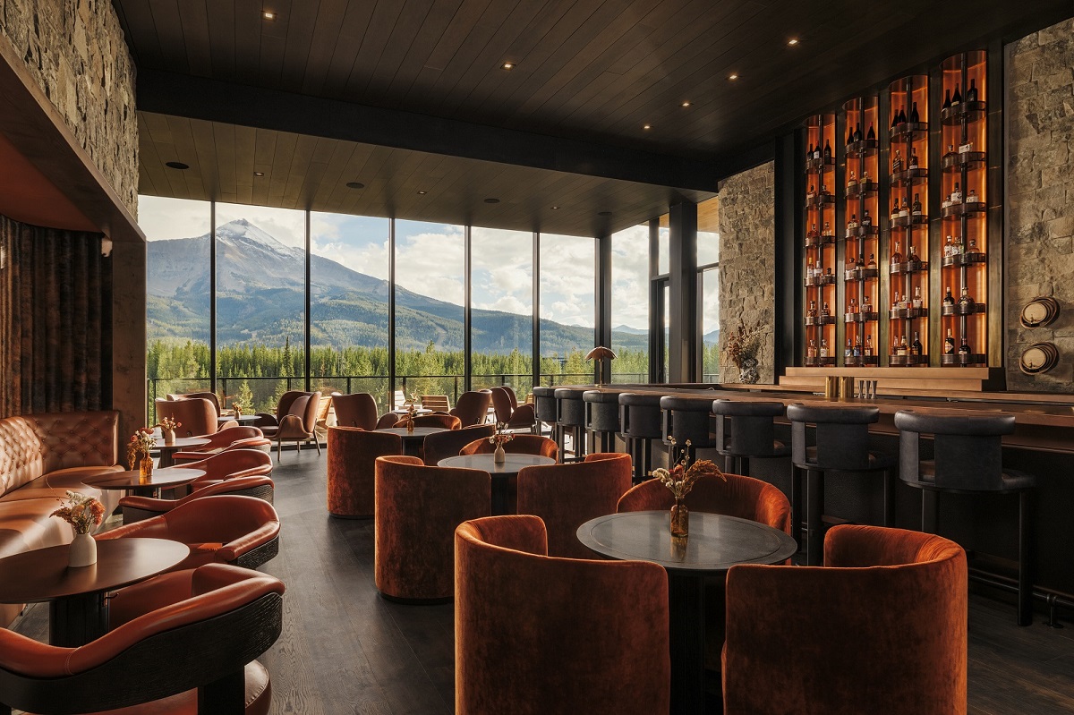
     

    Sophie Harper: What are the biggest challenges when trying to identify areas in which you can make a project more sustainable in its design and operation?

    Nathmya Saffarini: It’s trying to align with all stakeholders so we’re all working towards a common goal, understanding the budget and recognising there are operational implications.

    Karen Taylor: There are various things to consider, but also discussions tend to change once you get to different stages of a project. I we need to take responsibility to keep sustainable decisions at the forefront of the design scheme because sometimes clients say sure, we want it to be sustainable but then they realise the cost implications and so you have to be creative to get through the value engineering.

    Mathilde La Vilaine: We have to justify the cost of everything, which is why it’s important we understand where the costs can be recouped and how long a specific product will take to pay for itself. There needs to be a reason for everything.

    A guest bathroom at Six Senses Ibiza showing a Zennio control system

    Image credit: Zennio

    SH: So at what point do you all start looking for sustainable solutions or alternatives for each of your projects?

    Nathan Saint Clare: I’ve never worked on a project where the vision and operations were 100% aligned and I find it the most fascinating area to dig in because everyone operates differently – Sic Senses operates differently to Four Seasons, and everyone has different goals, but often you’ll find creativity comes from having constraints. From our perspective, the way we work is not formulaic but there is a rigour to the process of design that starts at the very beginning with site planning, solar orientations, all the things that we do before you guys come in later so that there is less work for the systems to do. If you design smart in the beginning, you’re building less, but one thing we found critical – especially in hospitality buildings – is water consumption levels.

    Nathmya Saffarini: For us, in terms of the planning side of things, we have quite complexed programmes that look at all of this. When it comes to the more complicated projects where you aren’t necessarily able to do all the things you could do if you were starting from scratch, the biggest challenge for us from a sustainability view is when you want to start introducing technology to your sustainability efforts is to prove to your clients the value of that technology. The question we often hear is ‘has that been done before?’ so it’s important to be able to show clients that something does work and is proven – this lessens the fear of implementing something new.

    Nathan Saint Clare: Ten years ago, you had to reverse engineer things to fit a brief, but now we have a far easier time having those conversations up front because it’s become standard practice to address those processes.

    Zennio automation systems installed in guest rooms

    Image credit: Zennio

    SH: Is the sustainable conversation generally an easier one to have with clients now?

    Jeremy Grove: It’s certainly becoming a much easier conversation now we have hard numbers to back up what we’ve been saying for a very long time. We finished a hotel project in 2014 with four rooms based on disassembly – so sourcing all the materials or as much as we could to ensure they were circular – so either completely recyclable or working with leasing companies rather than buying all the products and also looking at maintenance and repair. We were able to get the real numbers from that project in 2021 when we did the refurb where basically the whole room came out, was factory finished and reinstalled. It was then we discovered that they’d had a 75% reduction in carbon and a 60% reduction in their CapEx, which was £1.2million.


    SH: How can we avoid ‘greenwashing’ and using misleading products and services?

    Amy Roebuck: Architects are a lot further ahead than interior designers. It’s difficult as we have to try and wade through all the information and make sense of what’s what. There’s no legislation really dedicated to interiors, so it’s up to you as a studio or individual to do the research and think creatively. Everyone’s trying to do their bit but we’re not quite there yet.

    Nathan Saint Clare: At WATG we’re really interested in adaptive reuse and also renovation. Building a hotel is a long-term investment and it needs to be designed to be renovated in a sustainable way – it’s something we have at the forefront of our minds when we’re planning a new project.

    Hitch Derras: We spend a lot of time on research, and that includes the history of the building, the area, and trying to find local materials, local artists and craftspeople. The main impact we can have on a project is with what we specify and that can be said for finishes, appliances and as a company we’ve created a sustainable materials guide for ourselves that lists all the materials in our library and has a traffic light code for each – it takes a lot of time and effort to compile this information but we’re finding it’s easier now to be able to add to our guide. We use this system when we’re creating mood boards for a design and the aim is to have more than 50% of the board supplied with products from the ‘green’ category.


    SH: How difficult is it to integrate technology and new systems to more heritage projects?

    Tom Thorogood: It’s all about making sure whatever you’re putting in is sympathetic to the building. When you’re working on a heritage building the last thing you want to do is have something super contemporary or out of place in plain sight because that affects the overall feeling of the space. Details are such an important factor, everything has to be right in order for the design to be successful. It’s a constant learning curve understanding what processes can  be brought in – we have a project at the moment where sections of the interiors are listed where you can’t alter or tamper with the panelling for instance so trying to figure out where to put tech for wireless systems can be problematic.

    Zennio bedside control system

    Image credit: Zennio

    SH: Are you concerned about the use of AI and new technology, or do you think we’re on the verge to discovering some incredibly useful tools to help with day-to-day working processes?     

    Nathan Saint Clare: I’ve been working with AI now for almost two years and I have honestly been amazed by how much I’ve been able to de-clutter, and maybe that’s because the projects I’m involved with are large and complexed and so by their very nature become more about project management and less so design, but I’ve been able to, alongside our team, to utilise technology with AI not just to take care of project management tasks but also to help us to iterate and conceptualise faster. We’re all in the communication business, not just design, and we’re able to use these tools to make ourselves clearer and more concise, which then gives us time to do the more creative things that we specialise in.

    Tom Thorogood: It’s about working out how to use it in a way that suits your needs. AI is here to stay, it’s going to become more advanced and we will all end up using it in our day-to-day, so it’s about accepting that and realising the benefits that offers. I love it as a starting point for research – obviously I double-check everything, but to find out more about an area or the history of a building the information is with you from different sources in an instant. We’re already seeing the time it’s saving our teams on visualisations that need amending – rather than spending ages moving things around in Photoshop, you can use AI assisted programmes to do it in seconds.

    Jeremy Grove: I actually disagree with the use of AI in the context of speeding things up, we’re constantly trying to manage expectations and get clients to slow down and think about the decisions they’re making. Not to say that efficiencies aren’t welcome, but we still want to be having those conversations and sometimes instant processes aren’t entirely helpful with that.

    Nathmya Saffarini: I agree with Jeremy, it sort of reminds me when we moved from AutoCAD to Revit, where it’s all about the information you put in and sometimes just because you see an image and someone builds a BIM model, it doesn’t mean it’s been built the right way or that this is what things will look like onsite – there is a danger that the CGIs we put forward might be misunderstood, but also making sure we don’t take away the simple pleasure of picking up a pencil and drawing and making sure future generations of designers don’t lose those skills.

    Amy Roebuck: I went to a panel where a student speaking as part of that panel said that as part of her course she was studying AI, and there was a lot of parametric architecture and everything was in AI at that time and it actually put her off and she started to look at more interesting things and so her end of year project actually changed because she didn’t want to go down that route.

    Mathilde La Vilaine: There is a joy to sketching things and making things by hand. My concern with AI is that everything will become very standardised and uniform. The most beautiful products, materials, pieces of art are imperfect – AI lacks the human touch and so doesn’t excite me as much as the work and design born from passion.


    Zennio is one of our Recommended Suppliers and regularly features in our Supplier News section of the website. If you are interested in becoming one of our Recommended Suppliers, please email Katy Phillips.


    Main image credit: Zennio

    andalucian style interior guestroom with four poster bed and freestanding bath in finca la gloria

    Miniview: Finca la Gloria – connecting guests with the heart of Andalucia

    1024 640 Pauline Brettell
    Miniview: Finca la Gloria – connecting guests with the heart of Andalucia

    The newly opened Finca la Gloria offers a transformative retreat that combines traditional Spanish farmhouse accommodation with a profound commitment to ecological stewardship…

    andalucian style interior guestroom with four poster bed and freestanding bath in finca la gloria

    Encapsulating hotel design trends that are focussing on the experience as much as the design, this boutique accommodation and permaculture estate offers guests a retreat from the everyday. Finca la Gloria, a traditional Spanish farmhouse, has long been held by the Fábrega-Garavilla family and now welcomes guests to champion a lifestyle deeply rooted in sustainable and mindful living.

    andalucian mountain view from the hotel Finca la Gloria

    Image credit: Finca la Gloria

    “Our vision is to expand on the profound connection with nature experienced by our guests while enhancing their sense of self and community,” expanded Daniel Fábrega, Co-Owner, Finca la Gloria.

    At the centre of the property sits a U-shaped, whitewashed farmhouse from the 1930s, encircling a stone courtyard graced with an elegant fountain. Surrounding the farmhouse, a verdant expanse unfolds, featuring curated permaculture fields and a greenhouse that blur the lines between agriculture and natural wilderness. These fields boast organic crops, providing both sustenance and visual greenery.

    A solar-heated pool, encased in native stone, offers a tranquil escape under the Andalusian sun. Nearby, ancient wild olive trees cast their shade over elegant loungers, creating secluded nooks for relaxation and contemplation. Throughout the property, natural outdoor yoga platforms can be found.

    As evening falls, the property transforms into a vibrant gathering place. The communal al fresco dining area encourages shared meals among guests. The nearby natural pond reflects the changing skies, and in the distance, the lights of the historic mountain town of Jimena de la Frontera frame the picture.

    four poster bed under a beamed ceiling in a traditional spanish finca boutique hotel

    Image credit: Finca la Gloria

    Under the brown-tiled roof of the farmstead, unfolds an interior that mirrors the essence of a family home now reimagined as an intimate boutique hotel. “Creating these rooms, each with its own unique character, is like crafting individual sanctuaries, continued Fabrega, sharing his vision for the guest experience. “It’s our way of inviting guests into their own private space where they can feel truly at home. To me, it means giving a piece of our world, shaped with care and love, hoping it becomes a part of their cherished memories.”

    The heart of this transformation is the main living area, a space infused with familial warmth and eclectic charm. Here, a comfortable lounge area, a formal dining space and a pool table create a central hub for relaxation and social interaction, set against a backdrop of colourful artworks and a diverse mix of antique furnishings.

    The eclectic atmosphere extends to the five uniquely themed guest rooms: Olea Europaea, Magnolia, Phoenix Canariensis, Jacaranda and Persea Americana. Each room blends rural comfort with unassuming luxury, offering distinctive layouts, generous ceiling heights and unique views that underscore the villa’s theme of familiar yet sophisticated rural living.

    traditional portrait above a vintage desk with an art deco spanish design lamp

    Image credit: Finca la Gloria

    Permaculture is a guiding philosophy that permeates every aspect of the estate. Oscar Garavilla, Co-Owner and a trained permaculture farmer, encapsulates this approach: “Permaculture is about cultivating life in all its forms and ensuring that we leave the land better than we found it. Through our cultivation of native plants and organic vegetables, we not only enrich the soil but also provide our guests and local community with nutritious, sustainable food. This isn’t just for today; it’s about building a foundation that will support generations to come. Every plant we grow is a step towards a more resilient and thriving ecosystem for our region.”

    view through an old wooden door into the hotel courtyard

    Image credit: Finca la Gloria

    The estate’s commitment to permaculture is exemplified through its Community Supported Agriculture (CSA) programme, which strengthens the bond between the farm and the local community. Members invest in the farm’s output ahead of the season and receive weekly or biweekly shares of fresh, organically grown produce, sharing the risks and rewards of sustainable farming. Additionally, Finca la Gloria engages in a variety of ecological initiatives designed to enhance biodiversity and ecological health. Through farm tours, volunteer programmes and partnerships with local schools, Finca la Gloria provides hands-on learning experiences about sustainable living and ecological responsibility.

    evening lights on the outdoor terrace and dining area at Finca la Gloria

    Image credit: Finca la Gloria

    In addition,Finca la Gloria offers guests a diverse array of activities that promote a deeper connection to nature and personal well-being. “At Finca la Gloria, our retreats and courses are crafted to sync with the earth’s natural cycles,” explained Elena de Medina, the property’s Wellness Director, detailing the estate’s approach. “We offer our guests a path to realign with nature, achieve personal balance and gain a renewed sense of clarity.”

    Guests can partake in yoga retreats and permaculture courses. Gourmet cooking classes, led by the kitchen team, use fresh, organic ingredients sourced directly from the estate to embody a farm-to-table philosophy. The estate also serves as a picturesque venue for special events, including weddings and corporate gatherings and photo shoots.

    Main image credit: Finca la Gloria

    Greece Hotspot 2024: Part One

    1024 683 Megan Christopher
    Greece Hotspot 2024: Part One

    Greece continues to be a siren song for travellers seeking sun-drenched shores and unparalleled beauty, and 2024 is no different. We unveil the Greek gems of new hotel openings happening this year…

    Greece continues to inspire architects and designers alike, so there’s no surprise that 2024 brings a wave of exciting new Greece hotel openings boasting interiors that are as captivating as the Aegean itself. Let’s dive into a few of these Greek gems and explore what awaits within their stylish walls.

    One&Only, Kea Island

    one&only kea island greece villa resort

    Image credit: One&Only Kea Island, Greece

    One&Only Kea Island sets a new standard for luxury in the Cyclades. Stepping inside reveals a haven of sophisticated minimalism. Think clean lines, natural materials like Aegean marble and woven raffia, and a palette that whispers of the sea and sand. Award-winning architect, John Heah, masterfully curates a sense of effortless elegance, where every details – from the bespoke furniture to the curated artwork – speaks volumes about understated luxury.

    Domes Novos, Santorini

    domes novos santorini

    Image credit: Domes Novos Santorini, Greece

    Santorini’s volcanic heritage takes centre stage at Domes Novos. Here, the award-winning studio,  Kiros Pagkalidis Architects, seamlessly blends the raw beauty of the island with contemporary design. Think volcanic stone walls juxtaposed with blonde oak furniture, creating a sense of earthy sophistication. Private pools grace each suite, further blurring the lines between indoor and outdoor living. The real showstopper, however, is the rooftop garden, a tranquil oasis design for savouring Santorini’s legendary sunsets.

    Gundari, Folegandros

    gundari folegandros resort greece

    Image credit: Gundari, Folegandros

    Sustainability takes centre stage at Gundari, Folegandros. The interiors reflect a deep respect for the environment, emphasising local materials and craftmanship with handwoven textiles, handcrafted furniture and a muted palette inspired by the island’s natural landscape. The focus here is on understated elegance, where every element – from natural ventilation to the energy-efficient lighting – whispers a story of responsible luxury.

    Deos, Mykonos

    deos mykonos

    Image credit: Deos, Mykonos

    Deos, Mykonos brings a fresh perspective to the island’s design scene. The renowned architect, Galal Mahmoud, masterfully blends Mykonos’ enduring allure with contemporary chic. Offering clean lines softened by plush fabrics and a neutral colour scheme accented by pops of Aegean blue. The result is a light-filled haven that celebrates both the island’s heritage and modern design sensibilities.

    King Jason, Zante

    king jason zante

    Image credit: King Jason, Zante

    King Jason, Zante caters to adults only, offering an escape that’s equal parts playful and sophisticated. The London-based studio, Automata, injects a splash of personality with pops of colour and playful patterns that pay homage to Zakynthos’ vibrant culture. Clever design elements like swim-up pool suites and a hydrotherapy pool in the hammam-style spa create an atmosphere of indulgence, all wrapped in a contemporary aesthetic.

    These are merely a taste of the delights that await in Greece this year. Pack your swimsuit, a sense of adventure and get ready to experience the perfect marriage of style and hospitality in the heart of the Aegean. As summer unfurls we will continue to focus on the design movers and shakers that are shifting boundaries on the Greek hospitality scene.

    Main image credit: One&Only, Kea Island

    white and cream lobby and seating area in ihg arabella beach resort

    Arabella Beach Hotel – IHG opens its first collection brand in Kuwait

    1024 640 Pauline Brettell
    Arabella Beach Hotel – IHG opens its first collection brand in Kuwait

    IHG has introduced its first collection brand to Kuwait as Arabella Beach Hotel Kuwait, Vignette Collection. Prominently positioned on the Arabian Gulf shoreline, the 195 room property joins IHG’s growing Luxury & Lifestyle portfolio…

    white and cream lobby and seating area in ihg arabella beach resort

    Central to the IHG Vignette Collection is the balance of individuality and belonging. A family of like-minded hotels, each Vignette Collection property is entirely individual in its identity yet unified by the vision to offer a more authentic way to travel. Arabella Beach Hotel, Vignette Collection gives a glimpse into Kuwait’s rich heritage, capturing the breathtaking allure of the region.

    “We are thrilled to announce the second Vignette Collection hotel opening in the Middle East, in Kuwait, as we continue to expand our luxury and lifestyle portfolio in the region,” commented  Haitham Mattar, Managing Director, India, Middle East & Africa at IHG Hotels & Resorts. “The partnership with Aqarat marks an important milestone for IHG Hotels & Resorts, singling a shift in the local hospitality market as we cater to the growing number of guests seeking curated hotel experienced driven by luxury and personalised services. As a group, IHG Hotels & Resorts remains dedicated to the delivery of unique, immersive, and authentic stay experiences that anticipate guest needs at every touchpoint of their personal journeys.”

    cream white and grey interior in arabella beach resort kuwait

    Image credit: IHG Hotels & Resorts

    Each hotel in the Vignette Collection series stands out with unique features but is all linked by a common vision aimed at bringing positive change for people, places, and the planet. Each hotel in the Vignette Collection, designed for the next generation of travellers seeking luxury, indulgence, and lifestyle, has its own characteristics, personality, and unique design to achieve immersive experiences and to form a comprehensive and deeply studied project.

    The property  offers 195 well appointed rooms and suites, each elegantly designed for moments of tranquility and togetherness. Interiors modernise traditional Sadu weaves with tactile textures drawing inspiration from the surrounding shores. Suites feature spacious terraces with panoramic vistas overlooking the expansive blues of the Arabian Gulf. A roof top pool, private beachfront and wellness centre all sit alongside the Arabella Complex’s 15 dining destinations to offer holistic hospitality.

    Vignette Collection seamlessly weaves responsibility with community and locality to bring both socially empowering and environmentally conscious experiences to guests around the world.

    Means For Good initiatives, bespoke to each Vignette Collection hotel, partner with chosen non-profit organization, working in partnership to spearhead positive contribution to the local ecosystem across responsibility, community, and locality. Arabella Beach Hotel Kuwait supports 312 Café, a neighbourhood coffee shop employing individuals with disabilities, to extend opportunities in hospitality.

    Memorable Rituals, celebrate each Vignette Collection property’s unique identity to provide purposeful and meaningful travel encounters that connect guests with the hotel’s cultural landscape. Guests  are enveloped with the hotel’s signature scent throughout their stay, with the gift of a take home diffuser of the distinct aroma offering a memento to trigger reminiscence of a destination to remember.

    Arabella Beach Hotel Kuwait is one of two Middle Eastern openings for the brand this year. The current Vignette Collection portfolio includes The Palm Dubai Beach Resort Vignette Collection, Yours Truly DC in the U.S., Hotel X Brisbane Fortitude Valley in Australia, Sindhorn Midtown Hotel Bangkok in Thailand, Casa da Companhia, Vignette Collection and Vignette Collection Convent Square in Portugal with 12 hotels in the pipeline, and more than 100 properties globally anticipated to join over the next 10 years.

    Main image credit: IHG Hotels & Resorts

    metal deck chairs on wooden deck covered in Harlequin outdoor fabric

    Product watch: Indoor | Outdoor from Harlequin

    1024 640 Pauline Brettell
    Product watch: Indoor | Outdoor from Harlequin

    This expressive collection of outdoor printed fabrics and weaves from Harlequin has been designed by the studio by considering varied lifestyles, luxury, individuality and a fluid design inside and outside the home…

    metal deck chairs on wooden deck covered in Harlequin outdoor fabric

    The Harlequin outdoor collection of printed fabrics reflects global design influences, always connected to the natural world, bringing concepts to life through striking colour. Palm prints and large-scale designs celebrate expressive personalities through colour and design.

    outdoor seating with cushions in different patterns and textures from Harlequin

    Image credit: Harlequin

    Indoor/Outdoor Prints achieve an 80,000 Martindale abrasion rating. An outdoor finish applied to the fabric provides high stain repellence for day-to-day use. All printed outdoor fabrics are washable at 30 degrees, antimicrobial, mould-resistant, bleach-resistant and UV-resistant.

    Checkered weaves, boucle textures, and bold colours combine for a unique and performance driven collection of Indoor/Outdoor Weaves for SS24. Designed to bring the textures of home outdoors, Harlequin’s astoundingly woven, vibrantly coloured weaves reflect the brand’s love of expressive colour with the tactile quality of woven fabric. These exceptional weaves achieve a minimum Martindale abrasion rating of 35,000 rubs. A CFC-free finish provides a high level of stain and water-repellence. Perfect for outdoor schemes, Indoor/Outdoor Weaves are washable at 30 degrees, antibacterial, mould-resistant, bleach-cleanable, and UV-resistant.

    “Earthy, natural tones ground the collection and create a versatile, textural palette,” said Claire Greenfield, Lead Designer, Harlequin. “Pops of brighter colours combine with large-scale prints for every design mood. These fabrics, which perform beautifully in outdoor environments, achieve a multisensory experience for outdoor living”.

    Harlequin’s Performance and Indoor/Outdoor fabrics have been treated individually to protect from everyday spills and stains and cope with the elements of outdoor environments and the changing seasons. Each type of fabric, whether printed or woven, carries its own coating to improve its performance.

    Sanderson Design Group is one of our Recommended Suppliers and regularly features in our Supplier News section of the website. If you are interested in becoming one of our Recommended Suppliers, please email Katy Phillips.

    Main image credit: Harlequin

    Trends in hotel design in the Middle East

    1024 640 Guest Author
    Trends in hotel design in the Middle East

    Based in the UAE office of interior design and architecture firm Zebra, Milica Jevtovic, shares some of her insights into the current hotel design trends in the Middle East…

    The Middle East hotel scene is always evolving; it has needed to because the demographics and requirements of its visitors are changing with the years. For the last few decades the Middle East has been setting new standards in luxury. The interiors, the food, the service, have been the stuff of breathless conversations between guests. This indulgence is still available for travellers seeking it, but it’s far from the only experience on offer moving into the present day and horizon.

    Alongside the five and seven-star hotels in Dubai there are now very credible three-star options which provide a more quirky, less pampering experience, but still with all the amenities guests need. These may have communal tables, for example, so instead of sitting by yourself you can get to know other guests and feel part of a community.  Some hotel brands have diversified to offer branded apartments, providing a more user-friendly and informal experience with more opportunity to immerse yourself in a locality. As designers, we’ve created interiors that reflect the more location-specific feel of these new offers.

    Image credit: Zebra

    One amenity that is more and more in demand from hotel guests is workspace. The COVID pandemic, and the mass hybrid working trend it birthed, has taught people they can work from anywhere and many are choosing to mix work with their vacations. The Dubai and Middle East hospitality scene has rapidly responded to this appetite for remote working facilities. Hotel lobbies have been equipped as comfortable co-working spaces; F&B teams cater for working days accommodating different time zones. Furniture has been reconfigured to provide greater connectivity, but has also diversified to provide semi-enclosures, offering some privacy for phone calls or online meetings or quiet space for concentrated solo work on a laptop.

    At Zebra, we always need to put ourselves in our clients’ guests’ shoes. We have researched how guests use these nomadic workspaces and adapted materials, fixtures and fittings to make working in them pleasant and productive. We use a lot of acoustic panelling in ceilings, for example, even making it a feature of some lighting installations, to limit noise levels. Hard surfaces can be saved for zones where more of a buzz is desirable.

    Image credit: Zebra

    In the Middle East we are very conscious of the weather. There are three or four months when it’s really uncomfortable to outside, but for most of the year you want nothing more than to be al-fresco. The hotel spaces we design have to be flexible, so they don’t feel empty when everyone is outdoors but don’t feel overcrowded when the weather keeps everyone in. Finding the right balance between indoor and outdoor activities is a huge part of what we do here in the Middle East. We are in a desert but soft landscaping features such as trees are increasingly used to create shading, making beautiful park-style oases within hotels, which can be closed off when the weather changes.

    Creating environments with a sense of place brings character and depth to hospitality experiences. This doesn’t mean obvious theming, but developing narratives that connect to the locale and seamlessly flow through an entire hospitality experience to provide a feeling of authenticity and meaning.

    Image credit: Zebra

    The hospitality scene in the Middle East has undergone a significant evolution and will no doubt continue in flux. We are excited to be working in a part of the world that’s constantly looking at how to give guests the best possible travel experience tailored to their needs and are always ready to step up to the design challenges that commitment brings.

    Main image credit: Zebra

    hotel suite with seating area leading on to bedroom with floor to ceiling windows with a view over Arizona desert

    Westin La Paloma Resort – embracing the spirit of the Arizona desert

    1024 640 Pauline Brettell
    Westin La Paloma Resort – embracing the spirit of the Arizona desert

    In response to changing market needs, the Westin La Paloma Resort and Spa initiated a renovation project in 2022, with the aim to enhance the guest experience while preserving the resort’s rich heritage…

    hotel suite with seating area leading on to bedroom with floor to ceiling windows with a view over Arizona desert

    The phased renovation project of Westin La Paloma Resort, led by the renowned Jill Cole and Senior Designer Antonia De Fonte of Cole Martinez Curtis and Associates of CMCA Design, marks the second property renovation with client Southwest Value Partners. The renovation was structured across three distinct phases, with the interior design drawing inspiration from the textures and colours of the stunning desert landscape and wildlife. Light and shadow play across textural surfaces, while hints of colour accent the soothing backgrounds. All is serene, offering spaces to work or relax, and take in the magnificent surroundings.

    dining table in hotel suite in shades of stone and grey with desert views

    Image credit: John Woodcock

    The first phase of the renovation project, completed in the spring of 2023, was a testament to the resort’s commitment to providing a unique and memorable guest experience. The focus was enhancing guestrooms, suites, and a signature meeting venue. Guided by a clear design directive, the goal was to incorporate elements of the previous remodel to create a harmonious balance. Retaining the existing case goods and wall coverings posed an exciting opportunity for the design team as it aimed to evolve the colour palette while ensuring harmony with the existing gold-toned wall covering and warm wood finish.

    detail of beds with wood and stone surface details in Westin La Paloma

    Image credit: John Woodcock

    The transition to cooler earth tones and accents of blues and greens rejuvenated the rooms, with the introduction of blue-toned metallic cork wall coverings adding a striking contrast to warm-toned woods. Moreover, all guestrooms now feature custom-designed Axminster carpets, adding a touch of luxury to the overall experience. By striking a balance between branding guidelines and creative freedom, the redesign successfully captures the essence of the Arizona desert, reflecting the surrounding scenery while evoking a contemporary, upscale image aligned with The Westin brand.

    Refinements to the suites include new dining and entertaining settings and art collections. In a departure from typical framed or canvas pieces, the new art pieces showcase local culture and materials such as textiles, copper, and carved wood sculptures.

    guestroom decorated in shades of sand, blue grey and gold

    Image credit: John Woodcock

    The resort’s two grandest suites, La Paloma and San Xavier, have been transformed into luxurious havens. The La Paloma Suite, the second-largest suite featuring a kitchen and sizable dining room, now presents a patio Jacuzzi complemented by a trellis enhanced with a decorative laser-cut screen, providing both privacy from the balcony above and playful shadows on the walls and ground during the day.

    bathroom at Westin La Paloma in stone and marble with ceramics on the wall

    Image credit: John Woodcock

    Meanwhile, the San Xavier Suite, the largest of the two, has a private wellness studio equipped with a Peloton bike and a Tonal mirror. The bedroom showcases a sizable linear fireplace set against a dimensional tile wall, accompanied by a large screen TV and lounge seating area, as well as a smaller TV concealed in a lift-up TV cabinet at the foot of the bed. Furthermore, its expansive outdoor balcony now features a new bar and firepit table with teak lounge seating. These suites provide guests with a blend of grandeur and comfort, truly embodying the essence of luxury at Westin La Paloma Resort.

    patio with view across Arizona desert and shadows and privacy from wooden trellis and screen

    Image credit: John Woodcock

    Revising the Westin La Paloma Resort and Spa’s premiere event banquet room continued this initial renovation phase. This involved removing columns down the hall’s centre to enhance flow and accommodate larger events. The room features refined finishes, including custom carpeting, wall coverings, and chandeliers with gem-shaped glass shades, perfect for various special occasions.

    While specific details of this phase are yet to be finalised, modern amenities and facilities are anticipated to complement the resort’s refreshed accommodations seamlessly. This significant investment is dedicated to enhancing the guest experience and securing the resort’s long-term sustainability, positioning the Westin La Paloma Resort as a premier destination for discerning travellers.

    Main image credit: John Woodcock

    green outdoor BoConcept furniture on wood deck

    The Cancún Collection from BoConcept – embracing outdoor elegance

    1024 640 Pauline Brettell
    The Cancún Collection from BoConcept – embracing outdoor elegance

    In the domain of modern outdoor living, the new Cancún Outdoor collection from BoConcept emerges as a paragon of design innovation…

    green outdoor BoConcept furniture on wood deck

    The brainchild of the illustrious Danish designer Morten Georgsen, the Cancún collection from BoConcept epitomises the seamless blend of functionality and finesse. It is a homage to the outdoor living experience, enhancing the connection with nature without compromising the luxury of indoor comfort.

    green outdoor table and chair on wooden deck from BoConcept

    Image credit: BoConcept

    Crafted with an eye for minimalist charm, the collection features sleek, clean lines juxtaposed with organic, rounded forms—a testament to Georgsen’s visionary ethos. The capsule collection, ranging from versatile dining to lounge furniture, is designed to complement diverse exterior landscapes, be it the expansive patios of luxury hotels or the intimate balconies of boutique residences.

    Notably, the Cancún series offers a stackable outdoor dining chair available with or without armrests, a practical feature that highlights the collection’s thoughtful design. Accompanying the chairs are elegantly constructed outdoor tables, available in two sizes for dining and café settings, alongside a suite of lounge furnishings that promise comfort and poise.

    The designer’s philosophy rings clear in his own words: ” One of our main aims was to design a garden furniture set that’s versatile and comfortable for many hours of enjoyment, this means no edgy corners, it’s all rounded, inviting and smooth.”

    Beyond aesthetics, Cancún triumphs in practicality and endurance. The chairs, fashioned from lightweight aluminium, afford ease of movement and storage. A nod to the changing seasons and the needs of dynamic spaces. The tables made from galvanized steel ensures resilience against the elements, a must for any outdoor furnishing of distinction.

    Completing the collection’s allure are the soft touches of its upholsteries. Dressed in plush, bouclé fabric, the cushions invite a tactile richness, available in a palette of colours to curate a bespoke ambience for any setting.

    Cancún stands as an impeccable choice for outdoor luxury, fusing style with contemporary hues, practicality with durability, and above all, comfort with elegance. This collection is not merely a furniture set; it is a transformative design experience for any outdoor area, awaiting its place in the industry’s most exquisite spaces.

    Beyond the captivating Cancún Outdoor collection, BoConcept continues to innovate in the realm of outdoor furnishings. Each piece across their outdoor range is a testament to the brand’s commitment to creating spaces that reflect sophistication and relaxation. From the modularity of their extendable dining tables to the plush comfort of weather-resistant sofas, BoConcept’s outdoor line is a diverse curation designed to suit the unique needs of any open-air retreat.

    BoConcept is one of our Recommended Suppliers and regularly features in our Supplier News section of the website. If you are interested in becoming one of our Recommended Suppliers, please email Katy Phillips.

    Main image credit: BoConcept

    sunset view from terrace of executive suite at Palace Dubai Creek Harbour Hotel

    Palace Dubai Creek Harbour Hotel opens in the heart of the city

    1024 640 Pauline Brettell
    Palace Dubai Creek Harbour Hotel opens in the heart of the city

    Emaar Hospitality Group has announced the official opening of the much-anticipated Palace Dubai Creek Harbour…

    sunset view from terrace of executive suite at Palace Dubai Creek Harbour Hotel

    Dubai Creek Harbour is an ultra-modern waterfront neighbourhood along the historic Dubai Creek, connected to the city’s main roads by three bridges. With 700,000 square metres of parks and open spaces, 66,113 square metres of cultural space, pedestrian-friendly streets and a stunning promenade, the area is a testament to modern urban planning.

    entrance and lobby with vaulted ceiling and statement chandelier in Dubai

    Image credit: Alex Jeffries

    The heart of Dubai Creek Harbour has transformed into an island, featuring an evergreen central park, a beautiful marina, a yacht club, a viewing point, and a selection of hotels and dining venues. Conveniently located within a 15-minute drive from Dubai International Airport, Palace Dubai Creek Harbour is also in close proximity to iconic landmarks such as Dubai Mall, Burj Khalifa, and downtown attractions. Connected to a major bridge, it blends convenience with serenity, perfect for travellers seeking both accessibility and peace.

    presidential suite at Palace Dubai Creek Harbour Hotel

    Image credit: Alex Jeffries

    The hotel’s interiors, shaped with palatial grandeur and adorned with Arabesque décor, feature exquisite heritage art pieces and contemporary architecture. The Arrival Plaza is a spectacle, welcoming guests with a glorious first impression and a delicate touch of Arabian charm.

    guestroom with double bed and view over dubai

    Image credit: Alex Jeffries

    The property shelters 122 guestrooms, offering an enchanting experience for families. Guests can choose from a variety of options, including the Deluxe Room King, Deluxe Room Twin, Deluxe Partial Canal View King, Deluxe Partial Canal View Twin, Deluxe Canal View King, Deluxe Canal View Twin, Executive Suite, and Presidential Suite, each tailored to meet the diverse needs of the esteemed guests.

    restaurant with doors opening the space onto the terrace

    Image credit: Alex Jeffries

    The dining scene at Palace Dubai Creek Harbour includes the highly anticipated Fai Lounge, a dynamic space adjacent to the infinity pool. This new concept serves as a vibrant pool lounge during the day, transforming into a trendy evening venue. Guests can also indulge in Levantine and Arabian delicacies at familiar restaurants such as Ewaan and Al Bayt, designed to be the year-round destination of choice with lavish indoor spaces and al fresco terraces.

    natural stone and marble in the spa at Palace Dubai Creek Harbour Hotel

    Image credit: Alex Jeffries

    “I am honoured to lead a team dedicated to curating extraordinary moments and providing guests with an unparalleled blend of modern elegance and Arabian charm,” said Mark Kirby, Head of Emaar Hospitality Group. “Our commitment is to create a haven where every stay is a unique and unforgettable experience, reflecting the opulence and warmth that defines the heart of Dubai. Welcome to a world where luxury meets tranquillity, and every detail is crafted to perfection”.

    Other amenities at this opulent property include a 24/7 fitness centre, a colourful Qix Club for children, a Boardroom, and a Business Centre, catering to both leisure and business travellers. The spa offers a haven of calm, turning every moment into a rejuvenating journey with invigorating treatments.

    Main image credit: Alex Jeffries

    wooden table and chair with white vase against natural silk wall covering from Arte

    Product watch: Wild Silk from Arte

    1024 640 Pauline Brettell
    Product watch: Wild Silk from Arte

    The Wild Silk collection from Arte is made of real silk, highlighting the versatility of this pure fabric with three distinct types of silk…

    wooden table and chair with white vase against natural silk wall covering from Arte

    Each silk in this collection from Arte has its own story to tell, with a subtle sheen, robust weave or delicate finesse. Transforming walls into wonderfully expressive canvases with the luxurious sheen that only real silk can offer. The natural look and feel of this unique and organic fabric will add a sense of timeless charm to any interior, striking just the right balance between understated elegance and the raw beauty of nature.

    wooden dining table below bubble chandelier in room with Arte silk wall covering

    Image credit: Arte

    Katia Silk consists of a unique blend of 80 per cent hand-spun Katia silk and 20 per cent cotton. The spun Katia silk is harvested from the cocoons of a wild silk butterfly, after which the short, soft filaments are spun by hand into thick, irregular yarns. A harmonious blend with cotton yarns creates a captivating, contrasting matt-gloss effect. The irregularities in the threads lend this wallcovering a surprising texture and distinctive appearance. Katia Silk is available in 10 colourways.

    pink silk wall covering from Arte

    Image credit: Arte

    Pure Silk is 100 per cent real silk and uses warp and weft threads of different thicknesses. The resulting fabric has a distinctive texture because of the uneven puckers of the weft thread. Loved for their lightweight and lustrous appearance, Katia silk yarns are hand-spun, infusing each fibre with unique artistry and craftsmanship. Pure Silk is available in 18 colourways.

    blue silk wallcovering behind white couch

    Image credit: Arte

    Ghicha Silk is a design made from hand-woven silk, which is mainly sourced from silkworms that live in the wild in India. The irregular variations and ‘flaws’ of labour-intensive, hand-spun silk are part of the unique charm of this stunning natural product. Ghicha Silk is available in 18 colourways.

    Arte is one of our Recommended Suppliers and regularly features in our Supplier News section of the website. If you are interested in becoming one of our Recommended Suppliers, please email Katy Phillips.

    Main image credit: Arte

    render of rooftop restaurant at Changi airport hotel

    New zero-energy hotel coming to Changi Airport

    1024 640 Pauline Brettell
    New zero-energy hotel coming to Changi Airport

    Changi Airport is levelling up its hospitality offering with a new zero-energy hotel coming to Terminal 2…

    render of rooftop restaurant at Changi airport hotel

    A brand new hotel, Hotel Indigo Changi Airport, will be opening at Changi Airport, expanding the airport’s hospitality offerings and enhancing the experience of passengers and visitors. The hotel will be located in the public area of the airport and connected to Terminal 2 via a linkway.

    T2 changi airport hotel render exterior view

    Image credit: Hotel Indigo Changi Airport

    Sheltering 255 rooms with innovative design elements and modern facilities, it is expected to be completed and fully operational by 2028. Built at the existing Terminal 2 Coach Stand, guests can look forward to a rooftop day club, bar, and an infinity pool offering spectacular views of the runway, airport boulevard and skyline.

    Changi Airport’s love for flora and fauna will also extend to the design of the new hotel. An abundance of plants will be integrated throughout its design, a highlight being the ‘Floating Forest’ – layers of lush rainforest and hanging plants stretching over seven storeys.

    render of floating garden at hotel in t2 Changi Airport

    Image credit: Hotel Indigo Changi Airport

    Sustainability is at the heart of this new hotel development in Changi Airport. On completion, the hotel is targeted to be the first zero-energy hotel in Singapore, and potentially the first zero-energy airport hotel in the world. Sustainable features such as solar panels, hybrid cooling systems, naturally ventilated corridors and rainwater-harvesting technology will allow the hotel to achieve operational energy neutrality.

    The addition of this new hotel is expected to not only enhance the convenience for travellers, but also draw more visitors to explore the vibrant Changi Precinct and its surrounding attractions. This new hotel will join two other landside hotels, Crowne Plaza Changi Airport (directly connected to Terminal 3) and YOTELAIR Singapore Changi Airport in Jewel, providing Singapore residents and travellers even more staycation, accommodation and lifestyle offerings in Changi.

    Crowne Plaza Changi Airport was most recently crowned World’s Best Airport Hotel by Skytrax, a top accolade it has held on to for nine consecutive years. For travellers looking to rest and be rejuvenated before their flight or in between flights, there are transit hotels across Terminals 1 to 3 – Aerotel Singapore in Terminal 1, Ambassador Transit Hotel in Terminals 2 and 3, as well as the JetQuay Sleeping Suite in JetQuay CIP Terminal.

    Main image credit: Hotel Indigo Changi Airport

    tiled outdoor floor with view across bay and islands

    Product watch: Sensitech from Atlas Concorde

    1024 640 Pauline Brettell
    Product watch: Sensitech from Atlas Concorde

    Sensitech, the highly innovative porcelain tile surface technology developed by Atlas Concorde labs to offer a high level of safety against slipping, easy cleaning and comfort, has been extended to all outdoor surfaces…

    tiled outdoor floor with view across bay and islands

    Patented in Europe, Sensitech represents another element capable of further consolidating the position of Atlas Concorde. A proprietary technology that extends to all indoor and outdoor collections, Sensitech technology is applied to both indoor surfaces with an R10 B coefficient and outdoor surfaces with an R11 C coefficient. This allows them to be used in a variety of indoor and outdoor applications, also ensuring projects with maximum continuity between interiors and exteriors.

    tiled floor indoor and outdoor spaces with non-slip solutions

    Image credit: Atlas Concorde

    For residential applications, Sensitech is particularly suitable for bathrooms and spaces where there’s a lot of water and moisture, in order to ensure a high level of slip resistance. It is also ideal for indoor applications in commercial and public settings, including stores, spas, wellness centres and all other spaces where special safety requirements are required by law.

    Outside, this technology is especially suitable for applications in residential and public areas with a high risk of slipping,such as sloped pool edges, some types of stairs for entering the water, and many work and industrial spaces.

    In addition this product presents an evolution in ease of cleaning and maintenance for your outdoor spaces. Traditional non-slip surfaces are rough and hard to clean. In fact, under a microscope normal tiles with high anti-slip coefficients have rough surfaces created by alternating peaks and troughs. This irregularity generates friction – in other words resistance to slipping – but at the same time creates a surface that’s hard to clean.

    Dust and dirt particles also tend to build up in the depressions, making it harder to clean these kinds of tiles compared to those with smoother surfaces. The Sensitech production process fills the troughs, thus preventing dust and dirt particles from nesting inside them. As a result, the surface is easier and faster to clean with common household detergents. This is extremely important both for routine daily cleaning and for the final cleaning of building sites, which often leads to complications and delays.

    tiled floor shifting from inside space to outside

    Image credit: Atlas Concorde

    Sensitech lends itself to applications in spaces with a high risk of slipping. Thanks to its non-slip properties, it guarantees a high level of safety against slipping to those who frequent these indoor and outdoor spaces. As an added benefit, it succeeds in combining these properties in an exemplary manner with an unprecedented pleasantness to the touch, which makes the surface smoother and more gratifying than traditional anti-slip surfaces.

    The reason for this is precisely because microparticles are applied to the porcelain tiles to fill the depressions in the surface, leaving the peaks unaffected and thus preserving their ability to create friction. At the same time, the ceramic surface is smoother and more uniform, thus more pleasant to the touch than traditional non-slip surfaces.

    Atlas Concorde is one of our Recommended Suppliers and regularly features in our Supplier News section of the website. If you are interested in becoming one of our Recommended Suppliers, please email Katy Phillips.

    Main image credit: Atlas Concorde

    seating area in villa overlooking a pool and the sea

    Reset and reconnect at Six Senses La Sagesse Grenada

    1024 640 Pauline Brettell
    Reset and reconnect at Six Senses La Sagesse Grenada

    Six Senses La Sagesse is the brand’s debut resort in the Caribbean. With a pride of place beachfront setting, verdant rolling hills and spacious accommodation, the resort’s location offers effortless access to Grenada’s shimmering reefs and mystical rainforests…

    seating area in villa overlooking a pool and the sea

    Six Senses La Sagesse, the newest addition to Six Senses which is a part of IHG’s luxury and lifestyle portfolio, has 56 pool suites and 15 villas, ranging from one, two and four bedrooms, all with large outdoor terraces and private plunge pools. Every aspect of the resort’s design has been carefully considered, putting guests’ well-being at its heart, from abundant light and space to using natural and repurposed materials for the interiors.

    cliff side pool overlooking the Caribbean

    Image credit: Six Senses Hotels Resorts & Spas

    “Grenada is divided into six parishes, and La Sagesse, which is in the South-Eastern parish of St. David, has undergone a remarkable transformation in recent years,” discussed Thomas Fehlbier, General Manager. “It is filled with vibrant energy, and we are delighted to be opening our doors and welcoming our first guests to discover this unique location. Our hosts, many of whom were born and raised minutes from the resort, along with the neighbouring community, are full of pride and all-embracing. We are immensely grateful to be breaking the mold and inviting the world to experience a side of Grenada that retains an incredible purity and remains somewhat undiscovered.”

    caribbean hotel guestroom with ceiling fan and view to the ocean

    Image credit: Six Senses Hotels Resorts & Spas

    The Experience Centre at the resort offers unique experiences to connect guests with Grenada’s Spice Island heritage and learn about its culture and way of life. This includes exciting activities like farm-to-table cooking, Caribbean-style high tea, waterfall dips, rainforest hikes and visits to dramatic coastlines. Each represents the convergence of tradition, sustainability, culture and community and is designed for visitors of all ages.

    Featuring three restaurants, two bars, a bakery and destination dining that incorporates the Eat With Six Senses ethos, Six Senses La Sagesse menus are inspired by Caribbean and South American cuisine while keeping well-being in mind. Led by Executive Chef Jason Miller, every dish is brought to life with bold flavours using local produce grown in the fertile volcanic Grenadian soil.

    The resort team is committed to growing on-site and working with local suppliers to serve up fresh ingredients, maintaining a closeness to the surrounding community and reducing the resort’s carbon impact. Furthermore, a carefully curated selection of cocktails, local and international wines, and Grenadian specialty rums is available to enhance each dining experience.

    view across the lagoon to Six Senses spa and gym at six Senses La sagesse

    Image credit: Six Senses Hotels Resorts & Spas

    The spa is designed to leverage the abundance of fragrant spices with medicinal healing properties, along with local community knowledge, age-old traditions, and indigenous plants and herbs, to create innovative wellness programs that focus on sleep, movement, yoga, and longevity. The spa offers high-tech and high-touch therapies, guided by in-house experts and Visiting Practitioners, to help guide guests on a personal path to growth and reconnection.

    Guests can indulge in bespoke treatments, including the Caribbean Cleansing Ritual, infused with island culture to promote balance. This ritual is topped off with a refreshing cup of local bush tea, providing the perfect end to a perfect experience. The Alchemy Bar, which can be found at all Six Senses resorts, allows guests to create potions and remedies using spices and herbs native to Grenada.

    Six Senses La Sagesse prioritises the conservation of local ecology while delivering a world-class guest experience. The resort is designed around a natural lagoon that serves as a thriving habitat for a diverse range of species, including birds, fish, and other animals. Great care has been taken to maintain this ecosystem, deepening the water body during the resort’s development to allow small marine animals to enter its safe waters. The lagoon now naturally ebbs and flows with the tides, providing a haven for these creatures.

    Main image credit: Six Senses Hotels Resorts & Spas

    Ruark Audio enhances the world’s finest hotel rooms

    1024 640 Megan Christopher

    A suite of new hotel partnerships and an exclusive revamp of its striking smart radio sees Ruark grace the very finest residences from The Big Apple to The Big Smoke with unforgettable sound experiences and instantly iconic designs…

    Today, Ruark Audio announces a collection of new hotel partnerships that will see its beautifully crafted designs taking pride of place in the finest addresses in the UK and the States. The family-owned British purveyor of timeless one-box music systems and connected radios is the brand of choice for some of the most refined destinations around the world. Now, it has been called upon to deliver memorable sonic experiences in more iconic travel destinations, making guests feel instantly at home in the lap of luxury.

    Joining the likes of The Savoy, Shangri-La Sydney and Gstaad Palace guests of revered destinations Ham Yard, The Soho Hotel, Pennyhill Park and Spa, The Manor House Castle Combe, and the newly opened Chelsea Townhouse, can now all enjoy Ruark in the comfort of their rooms. Bringing the vital sensory element of sound to the most discerning hotel visitors, Ruark’s years of expertise and audio excellence means its R1S, R1 Mk4, and R3S music systems are set to delight any guest lucky enough to find one on their bedside table or in their suite.

    ruark audio device

    Image credit: Ruark Audio

    “We are thrilled to see eight more stunning British hotels have chosen Ruark designs to further elevate their beautiful spaces. We’ve worked tirelessly over the years to create the very finest music systems, and we know they’ll be right at home at Firmdale Hotels, the Exclusive Hotel Collection, and The Chelsea Townhouse,” says Alan O’Rourke, Managing Director at Ruark Audio. “Being handpicked by locations of this calibre is a testament to the quality of the R1S, R1 Mk4, and R3S, and we’re delighted to see their excellent craftsmanship reflected in such gorgeous surroundings.”

    Firmdale Hotels
    Comprising 11 luxury hotels and eight restaurants across London and New York, Firmdale Hotels are designed to capture the imagination and combine works of art with curious antiques, bold colours, and beautiful fabrics.
    Now visitors to the brand’s stateside residences will be able to enjoy the crystal clear sound, seamless wireless connectivity, and comprehensive radio options of Ruark’s R1 Mk4 Bluetooth radio as they relax.

    Meanwhile R1S comes to Firmdale’s UK addresses, as Ruark’s latest iteration of its Wi-Fi-enabled radio gets a refreshing exclusive spring green shade to complement the hotels’ statement-making interiors.
    With a fetching mini orange Firmdale mannequin emblazoned on the side, R1S allows guests to connect with their surroundings through the power of sound, making them feel as though they are truly living in and enjoying the space.

    ruark audio

    Image credit: Ruark Audio

    Ruark’s best-sounding radio to date, R1S’ crisp OLED display clearly shows time, alarm, and programme information while auto adjusting to suit ambient light levels – in other words, it’s the ideal bedside companion. What’s more, R1S’s simple user interface and SmartRadio tuner makes it easy to discover the sound of the local area or enjoy the comforting sounds of home.

    Not just for hotel customers, R1S in Green is available to buy online or at its London Ham Yard venue, giving any lover of impactful design and sublime sound the chance to own a piece of iconic Firmdale and Ruark design. “Sound plays such an influential role in how we feel in a space, and we’re delighted that R1S will set the tone in each of our rooms and make our guests feel more connected to their surroundings,” says Willow Kemp, Interior Architect and Designer at Firmdale Hotels & Kit Kemp Design Studio. “The lively spring green design was carefully chosen to make a fun statement, while fitting into our existing colour schemes. We think it’s a perfect representation of how both brands approach modern British style and we hope our guests love it as much as we do!”

    ruark audio

    Image credit: Ruark Audio

    Exclusive Hotel Collection
    Boasting six properties, the Exclusive Hotel Collection delivers some of the UK’s most opulent retreats among beautiful countryside surroundings. Alongside the R1 Mk4 radio, guests of the Exclusive Hotel Collection are being treated to Ruark’s R3S Music System. Built with the belief that everyone deserves good design in their lives, the smart music system combines a dapper, upscale finish with an expertly designed form factor that pairs perfectly with the Exclusive Hotel Collection’s elegant furnishings.

    Superbly versatile, this one-box wonder offers an unmatched breadth of listening options spanning everything from internet radio to Bluetooth streaming via a smartphone. Crafted with more than three decades of high-end audio pedigree, R3S delivers a dynamic sound performance that belies its compact form.

    The Chelsea Townhouse
    A staple of Iconic Luxury Hotels’ numerous properties, R1 Mk4 and R3S are taking prime position in the newly launched Chelsea Townhouse. The classic hotel in the heart of London’s most upmarket district has recently undergone a sensitive restoration that breathes new life into the building’s long and eclectic heritage.

    Chelsea Townhouse is the latest Luxury Hotels destination to feature Ruark designs, with guests of the glamourous Cliveden House and world-renowned boutique hotel Chewton Glen already able to immerse themselves in the brand’s signature rich sound.

    Ruark Audio is one of our Recommended Suppliers and regularly features in our Supplier News section of the website. If you are interested in becoming one of our Recommended Suppliers, please email Katy Phillips.

    Main image credit: Ruark Audio

    lounge area with panelled wall in Six Senses Kyoto

    In conversation with: BLINK Design Group on rediscovering the refinement of ‘miyabi’

    1024 640 Pauline Brettell
    In conversation with: BLINK Design Group on rediscovering the refinement of ‘miyabi’

    Timeless charm, playful art and the origin story of Japan’s ancient capital inform and inspire the Six Senses Kyoto design narrative by BLINK Design Group, delivering a stunning urban oasis…

    lounge area with panelled wall in Six Senses Kyoto

    For the first Six Senses hotel in Japan, BLINK Design Group was tasked with conceptualising the ultimate oasis in downtown Kyoto, honouring the courtly elegance and refined charm that marked the city’s birth as a new capital, reimagined through the lens of contemporary style.

    origami inspired details in Six Senses Kyoto by BLINK

    Image credit: BLINK / Ben Richards

    The challenge was to bring the brand’s signature blend of luxury and heartfelt hospitality to the cultural heart of Kyoto. Nestled in the historic Higashiyama district, the resort, which opened in late April 2024, is strategically located for guests to immerse themselves in the city’s rich heritage, surrounded by iconic landmarks such as Buddhist temples, Shinto shrines, and traditional Japanese architecture, shaded by cherry blossoms and ringed by the cedar-covered mountains of the region.

    seating beneath pitched roof in suite at Six Senses Kyoto

    Image credit: BLINK / Ben Richards

    The project was tailor-made for BLINK’s philosophy of ‘placemaking’, where everything begins with a full immersion in local lore, culture, traditions and arts. BLINK founder and creative partner Clint Nagata explained how his team began with a deep dive into the heyday of the Heian era (794-1185C.E.); a time of refined sensibilities and poetic subtlety that saw a great flourishing of the Japanese arts.

    “The abiding philosophy of this age was the concept of ‘miyabi’, a kind of heightened refinement, sense of order and appreciation of nature which became our mantra and flows through the entire design,” said Nagata. “Miyabi was part of the fabric of life and guided the arts and crafts of the period; an appreciation for the gestures and rituals that mark the passage of an ordinary day. The interplay of light and shadow, the changing colours and moods of the seasons”.

    panelled wall behind the bed and views of Kyoto in front at Six Senses hotel guestroom

    Image credit: BLINK / Ben Richards

    Inner peace meets inner space in the Six Senses Kyoto’s 81 guestrooms and suites. Ranging from 42 to 238 square meters, these are ingeniously arranged to offer views of the peaceful central courtyard, the gardens of the neighbouring Toyokuni Shrine, or the seductive city panorama of treetops, temples, tea shops, and rooftops. The property looks into its inner courtyard to provide an introspective quiet ambience.

    “Design that reconnects us with nature  – biophilic design  – is essential for providing people opportunities to live and work in healthy spaces with less stress and greater overall health and well-being,” continued Nagata. “The internal garden provides the first layer in connecting guests with nature. However, by bringing biophilic elements into the interior through pocket gardens, ikebana, hanging plants, skylights, natural materials, and textures (all locally sourced), the interiors will not only honour the history of Kyoto’s famous gardens but also provide guests with moments of pause and contemplation throughout the hotel”.

    atmospheric indoor spa pool in Kyoto by BLINK

    Image credit: BLINK / Ben Richards

    This is borne out in elements like Washi partitions, Sakan, the plasterwork that flourished during Japan’s Edo period, and traditional Sudare Japanese screens, made of horizontal slats of high-quality bamboo to lend intrigue and privacy.

    “Six Senses Kyoto will showcase local arts and artisans from Japan. The aim is to provide unique experiences for guests and create moments of pause where they can appreciate learning something new. By bringing local artisans in, guests will not only support the local arts but also encourage a continuation of these traditions,” said Nagata.

    Design inspiration and accessories throughout the hotel will also have a sense of ‘asobi gokoro’ – a playfulness that references elements of Japanese culture, including ‘wabi-sabi’, the beauty of appreciating materials and items for simplicity and natural beauty. This is embodied in elements including quirky occupancy signage, Japanese ceramics and playful elements on door handles and wall finishes.

    water and wood panelling in Six Senses Kyoto spa

    Image credit: BLINK / Ben Richards

    Inspired by the Tale of Genji and the aristocracy of Kyoto’s past, the lobby and arrival experience sets the tone for the guest’s journey. The original tale was written in Orihon, concertina style. The folded shapes of Orihon binding inspire the ceiling details and specialist hiromi paper screens feature artwork with a welcome message. Sublime touches include artwork panels featuring Hikihaku, a weaving technique using gold and silver thread on Japanese paper, Raku-yaki ceramic tile artwork inspired by Kyoto’s mountains, natural stone flooring, and art inspired by Choju-Jinbutsu Giga Bronze scrolls.

    Nagata explains: “Choju-giga is the beginning of all things quirky about Japanese culture,” explained Nagata, “illustrating animals in humanistic tasks”.

    the fox narrative running throughout the hotel as seen on room details

    Image credit: BLINK / Ben Richards

    What did the fox say?  – The fox is an important figure in Kyoto, believed to be messengers of the gods; witty and playful. Unique Japanese Kitsune masks made from recycled washi paper line the corridors, intriguing and beguiling guests. The guestrooms feature subtle customized lighting, wall sconces inspired by traditional hand-carved wooden plates, bedside lamps featuring Kyoto woven metal and a playful highlight   – a flippable screen dividing the bedroom and bathroom; one side a rich red lacquer, the other a traditional Japanese pattern etched into timber. Custom painted TV panel art is inspired by the Taketori-monogatari, a children’s tale of a rabbit that lives on the moon pounding mochi.

    apothecary style display in the restaurant in Six Senses Kyoto

    Image credit: BLINK / Ben Richards

    The resort’s all day dining area, Sekki, is inspired by the life of a tree, from budding elements in the courtyard to lush and petrified textures in the main dining area, the private dining room and the open kitchen. The spaces are reminiscent of Kyoto’s gardens from the past, where Heian period writers gazed at imperial gardens while writing prose as the seasons changed.

    Café Sekki is inspired by the rock gardens of Kyoto with a raw textured aesthetic and a main bar made of stone, along with Japanese knotted art pieces and woven rattan panels. Nine Tails, the cocktail lounge, features hammered glass screens for filtered light and privacy along with recessed seating niches for intimate gatherings. Live herb displays and apothecary drawers lend interest. The rooftop bar, meanwhile, echoes Tsuridono – open pavilions in the Japanese Court architecture style of the Heian period.

    Banquet and function spaces are inspired by the Junihitoe, a formal 12-layered kimono worn in old Kyoto. Drawing inspiration from this layered approach and the accessories and patterns worn by inhabitants of Kyoto’s past, the Banquet and pre-function spaces are layered, including sliding screens and large display cases that filter light and play on what can and can’t be seen.

    The hotel spa, meanwhile, plays with notions of traditional onsen bathing and also the benefits of being near water in motion.

    Main image credit: BLINK / Ben Richards

    sanipex outdoor furniture at Banyan Tree Alula

    Sanipex gets comfortable with outdoor spaces

    1024 640 Megan Christopher

    Sanipex dives into the heart of outdoor design, exploring how meticulously designed exteriors are becoming a defining factor for high-end hotels…

    sanipex outdoor furniture at Banyan Tree Alula

    Gone are the days of a simple patio at a luxury hotel. Today, expertly crafted outdoor spaces are transforming guest experiences, pushing the boundaries of what it means to offer a truly five-star stay. Imagine a meticulously landscaped garden, seamlessly blending into a breath taking vista. This is the power of a well-designed outdoor space. It sets the tone for a guest’s entire stay, creating an immediate sense of luxury and exclusivity that elevates the hotel’s overall appeal.

    Beyond their aesthetic and functional value, well-designed outdoor spaces also promote health and wellness, aligning with the growing demand for holistic travel experiences. Guests are increasingly seeking opportunities to reconnect with nature and prioritise their well-being while travelling, making outdoor amenities such as spas, fitness centres, and meditation gardens particularly appealing.

    vox moonlight open air cinema dubai

    Image credit: Sanipex Group

    Dubai’s iconic VOX Moonlight open-air cinema pushes the boundaries of outdoor film experiences. Perched atop the Galleria Mall, it boasts high-performance furniture by Sanipex Group. This selection goes beyond aesthetics, ensuring both comfort and durability throughout the year. The meticulously chosen pieces seamlessly blend with the cinema’s ambience. Comfy Daybeds offer a touch of laid-back luxury, perfect for a cosy cinematic experience. For a truly exclusive touch, ultra-luxe Private Cabanas provide the ideal setting for couples to enjoy a movie under the stars. And for those seeking a more casual vibe, GYMKHANA Bean Bags with poufs ensure a relaxed and comfortable atmosphere.

    Another example of a hotel making the very most of its location – outdoors – is the exclusive Banyan Tree AlUla in Saudi Arabia, winner of Prix Versailles’ ‘World’s Most Beautiful Hotel Exteriors 2023’. The 5-star all-villa luxury resort offers a unique desert retreat experience within its natural heritage surroundings, with Sanipex Group supplying a large quantity of luxury Outdoor Living solutions for the tented villas, spa & pool and restaurant area.

    Sofas, sun loungers and parasols provide the perfect vantage points for visitors to appreciate the cinematic landscape: natural teak wood complements the earthy golden hues while clean lines offset its rugged beauty. Soft, high-quality, weather-resistant fabrics and quick-dry seating beckon guests to enjoy indoor comfort in the great outdoors. By investing in the design and development of outdoor areas that reflect their brand identity and cater to the needs of discerning travellers, high-end hotels can elevate their offerings, differentiate themselves from competitors, and create unforgettable experiences that keep guests coming back time and time again.

    Sanipex Group is one of our Recommended Suppliers and regularly features in our Supplier News section of the website. If you are interested in becoming one of our Recommended Suppliers, please email Katy Phillips.

    Main image credit: Sanipex Group

    render Mama Shelter Cape Town

    Mama Shelter is heading for Cape Town

    1024 640 Pauline Brettell
    Mama Shelter is heading for Cape Town

    Ennismore and Kasada sign the first Mama Shelter Hotel in South Africa, marking a major milestone for Ennismore as its first hotel signing in the country…

    render Mama Shelter Cape Town

    Lifestyle and leisure hospitality company, Ennismore, and Kasada, a leading independent real estate private equity platform dedicated to the hospitality sector in Africa, have announced the signing of a hotel management contract for Mama Shelter Cape Town.

    “We are thrilled to partner with Kasada on the signing of Mama Shelter Cape Town,” commented Cedric Gobilliard, Brand COO for Mama Shelter at Ennismore, “More than a hotel, more than a restaurant or a bar, Mama Shelter is a place for living – a place to meet, eat, drink, sing and dream. Cape Town is a dynamic city that offers something for everyone, so it is the perfect place to introduce our new Mama Play concept. This signing marks an important milestone for Ennismore, as it is our first signing for any of our brands in South Africa, an exciting new destination for us.”

    “Kasada is excited about bringing our expertise and deep hospitality re-development and investment experience to this landmark building,” added Olivier Granet and David Damiba, Managing Partners and co-CEOs of Kasada. “We are looking forward to create with Ennismore an exceptional lifestyle property for business and leisure guests and an unmissable destination for the local community that will help to further revitalise this popular part of Cape Town’s CDB.”

    Ingenuity, a prominent property and development company based in the Western Cape, and Kasada announced an agreement to jointly develop the site of the Mama Shelter Cape Town project. This new vibrant mixed-use development includes hotels, restaurants, and retail, and together with Mama Shelter, will help redefine the city’s hospitality landscape with its exuberant and flamboyant personality.

    Mama Shelter Cape Town will feature 127 guestrooms across three room categories and 68 branded residences, including 36 studios, 23 one-bedroom, five two-bedroom, three three-bedroom and one four-bedroom. Housing 213 square metres of meeting rooms, 380 square metres of co-working, a gym and Mama’s classic all-day dining restaurant on the rooftop, along with a pool and pool deck.

    From the property’s rooftop, Cape Town’s breathtaking landscape taking centre stage, with sweeping views across the city from Table Mountain and the Atlantic Seaboard to Foreshore and the city skyline. The hotel will also introduce a new concept for the brand, Mama Play,  742 square metre of arcade space complete with bowling, karaoke, dedicated F&B and event spaces.

    In addition, Ennismore will manage a separate restaurant on the ground floor on Bree Street – one of the most vibrant streets in Cape Town – under one of its signature F&B brands.

    Situated at the heart of the city, Mama Shelter Cape Town will transform the iconic City Park building, once home to the Christiaan Barnard Memorial Hospital, and provide unparalleled access to the bustling city – the flower sellers of Adderley Street; the market stalls of Greenmarket Square; and cultural and heritage institutions such as District Six Museum or the Castle of Good Hope are only a short walk away.

    Mama Shelter Nice will open in June 2024, with future projects set to open in Dubai, Casablanca and Downtown LA.

    Main image credit: Ennismore

    G10 couch in cream and wood by Ligne Roset

    Product watch: the Pierre Guariche Re-Edition by Ligne Roset

    1024 640 Pauline Brettell
    Product watch: the Pierre Guariche Re-Edition by Ligne Roset

    French furniture manufacturer Ligne Roset Contract has introduced the Re-Edition of the celebrated Pierre Guariche pieces that were initially designed at the dawn of the 1960s…

    G10 couch in cream and wood by Ligne Roset

    The Re-Edition brings together history and modernity and captures the mid-20th-century aesthetic and ingenuity that defined Guariche’s work. The collection is a tribute by Ligne Roset to the designer’s pioneering approach to furniture and lighting design, reflecting his legacy as a key figure in modernist design.

    The precise attention to detail, the use of high-quality materials, and the preservation of original design principles demonstrates a respect for the legacy while enabling these iconic pieces to find a place in contemporary settings.

    white chair - Vallée Blanche Chaise longue

    Image credit: Ligne Roset

    One of the most emblematic designs is the Vallée Blanche Chaise longue which was designed in 1963 and is characterised by a minimalistic and elegant style. The seamless fabric cover gives the chaise longue a sleek and streamlined look, avoiding any visible seams or interruptions in the fabric’s flow whereas the chromed metal feet provide a touch of modernity and a reflective quality that complements the smooth fabric cover.

    red Jupiter chair from Ligne Roset

    Image credit: Ligne Roset

    Another iconic seating option is the Jupiter swivelling armchair which was originally designed in 1966 and features a rotating base in black satin epoxy lacquered steel. This provides a smooth and stable swivel motion, allowing for easy turning and flexibility in seating arrangements. The chair is upholstered in Soft Touch leather, which gives it a luxurious feel while being durable and easy to maintain. Additionally, it can be customised with fabric upholstery for a different look and texture.

    G10 Arcmchair with upholstered seat and wooden sides

    Image credit: Ligne Roset

    The G10 Armchair and Couch, notable pieces from this collection and designed in 1953, exhibit a strong yet elegant structure, blending plywood panels, moulded beech plywood armrests with stained ash veneer, polyurethane foam, and polyester quilting. These elements create a timeless look that balances comfort with style.

    G24 table lamp mid century modern design

    Image credit: Ligne Roset

    Designed on the same year, the G24 Table Lamp and G30 Floor Lamp, showcase Guariche’s talent in lighting design. The G24 Table Lamp features a black lacquered steel reflector with a varnished brushed brass structure and base, offering a sleek and minimalistic look.

    Ligne Roset is one of our Recommended Suppliers and regularly features in our Supplier News section of the website. If you are interested in becoming one of our Recommended Suppliers, please email Katy Phillips.

    Main image credit: Ligne Roset

    guestroom with view across Osaka in four Seasons Hotel Osaka

    Four Seasons Hotel Osaka sets a date

    1024 683 Pauline Brettell
    Four Seasons Hotel Osaka sets a date

    Highlighted by the region’s first contemporary ryokan experience, the all-new Four Seasons will be an expression of modernity in one of Japan’s most storied cities…

    guestroom with view across Osaka in four Seasons Hotel Osaka

    Towering above the city’s dynamic Dojima district, the all-new Four Seasons Hotel Osaka will introduce the city’s first modern ryokan experience in a major hotel. Ryokans are small Japanese inns dating back to the 8th century, and still popular today, particularly in regions with onsen (hot springs).

    seating area with natural surfaces and minimal wooden screen in four Seasons Osaka

    Image credit: Four Seasons Hotels and Resorts

    The entire 28th floor of the property will house 21 guestrooms and suites decorated by SIMPLICITY designers as a contemporary interpretation of ryokan culture, including tatami mat flooring, sliding doors within each space, a platform bed (rather than the traditional roll on the floor), and a dining area that allows for traditional or standard seating.

    “As our Four Seasons portfolio in Japan continues to grow and flourish, we are incredibly excited to introduce ourselves in the intriguing city of Osaka,” said Rami Sayess, President, Hotel Operations, Asia Pacific, Four Seasons. “Here, we are inspired by the blend of historic traditions and Japan’s fascinating modern culture as we define a new level of luxury hospitality in the city, all wrapped in the warmth and genuine care for which Four Seasons is globally renowned.”

    cream and white guestroom in Four Seasons Osaka

    Image credit: Four Seasons Hotels and Resorts

    An additional 154 guestrooms and suites are spread through the 29th to 35th floors, for a total of 175 throughout the property. Designed by CURIOSITY of Japan in a light, airy style that welcomes sunlight in through large windows, most accommodations have a thoughtfully-placed window seat to enjoy the views of the city, rivers and waterways. The hotel’s guest accommodations and its public spaces will showcase a contemporary art collection curated by Fumio Nanjo, featuring local artists and artisans.

    wooden screen and bamboo in the bathroom

    Image credit: Four Seasons Hotels and Resorts

    In a city known as one of Asia’s culinary capitals  – there are currently 85 Michelin-starred restaurants in Osaka  – Four Seasons will present six dining and drinking options. Jiang Nan Chun will offer an authentic Cantonese dining experience in an interactive setting that includes multiple private and semi-private dining rooms. Also located on the 37th floor for a distinctly elevated dining experience is Sushi O, with a sleek wooden counter as well as a private dining room; and Bar Bota, with a dramatic circular bar surrounded by the city’s sparkling skyline.

    On the building’s first floor, Jardin will be an all-day dining option featuring an international breakfast, exquisite afternoon tea and French bistro classics with al fresco seating amid lush landscaping. Rounding out the culinary offering, Farine will be an artisanal bakery perfect for picking up pastries and specialty coffees on the run, and CHA, a Japanese tea lounge.

    japanese tea set on wooden table

    Image credit: Four Seasons Hotels and Resorts

    Designated as the wellness zone, the 36th floor of the Hotel will include a spa with five treatment rooms, and sauna. Both the 16 metre indoor pool and fully-equipped fitness centre will offer inspiring views to enhance one’s workout routines. A key part of the wellness offering will be a series of public and private ofuro (Japanese baths) in the ryokan tradition.

    Conveniently located on the building’s second floor with direct access from the ground floor lobby, event spaces at the new Four Seasons including a 220 square metre ballroom that is divisible into three spaces, with an elegant foyer and adjacent inviting outdoor terrace. The flexible, fully-equipped spaces offer any number of options for conferences, weddings and other social events, all with the comfort of knowing every detail is executed to perfection by the expert team of Four Seasons event planners and caterers.

    An additional Sky Salon on the 37th floor, where two signature restaurants and the bar are also located, offers a more intimate space at 73 square metres, with the added bonus of a private kitchen, making it a great choice for board meetings, product launches and small receptions.

    The Japanese portfolio will also soon be joined by the upcoming Four Seasons Resort and Residences Okinawa.

    Main image credit: Four Seasons Hotels and Resorts

    Schlüter-Systems TROBA-LEVEL stackable support

    Schlüter-Systems – revolutionising tile and paver installation

    1024 640 Pauline Brettell
    Schlüter-Systems – revolutionising tile and paver installation

    In the realm of tile and paver installation, Schlüter-Systems TROBA-LEVEL stackable supports have ignited a revolution…

    Schlüter-Systems TROBA-LEVEL stackable support

    These cutting-edge systems from Schlüter-Systems have earned widespread acclaim for their remarkable ability to simplify and refine the process of laying tiles and pavers on uneven surfaces, guaranteeing a level and stable finished product.

    At the core of the TROBA-LEVEL system lies its ingenious stackable design, allowing for precise adjustments to accommodate variations in substrate levels. Whether contending with sloped surfaces, uneven concrete, or irregular ground, TROBA-LEVEL offers a versatile solution that ensures impeccable results every time.

    detailed technical picture of Schlüter-Systems TROBA-LEVEL stackable support

    Image credit: Schlüter-Systems

    The capability to stack supports empowers installers to achieve optimal height and slope alignment, even in the most challenging environments. A standout feature of TROBA-LEVEL is its exceptional versatility. Suitable for both indoor and outdoor applications, these supports cater to a broad spectrum of materials, including porcelain, ceramic, stone and concrete pavers. This versatility renders them an ideal choice for diverse projects, ranging from residential patios and balconies to commercial spaces and public walkways.

    Installation of TROBA-LEVEL is straightforward and demands minimal tools and expertise. The supports are effortlessly positioned on the substrate at regular intervals, with height adjustments made as necessary using the integrated levelling system. Once in place, tiles or pavers are laid directly on the top of the supports, creating a stable and level surface without the need for supplementary adhesives or grout.

    detailed technical picture of Schlüter-Systems TROBA-LEVEL stackable support

    Image credit: Schlüter-Systems

    Moreover, it offers multiple benefits to both installers and end-users. Their open design facilitates efficient drainage and ventilation, effectively preventing water damage and mould growth beneath the surface. This not only extends the lifespan of the tiles or pavers but also upholds a safe and hygienic environment. Additionally, TROBA-LEVEL boasts superior durability, crafted from top-quality materials that resist temperature extremes, UV radiation, and chemical exposure. This ensures long-lasting reliability, even in the most hostile climates or conditions. Consequently, projects completed with these supports entail minimal maintenance and are engineered to endure the test of time.

    Schlüter-Systems TROBA-LEVEL stackable tile and paver supports signify a shift in the world of tile and paver installation. With their innovative design, versatility, effortless installation, and unwavering durability, they offer an exceptional solution for achieving level and stable surfaces in any setting. Whether embarking on a residential renovation or tackling a large-scale commercial endeavour, TROBA-LEVEL supports lay the groundwork for unparalleled success.

    Schlüter-Systems is one of our Recommended Suppliers and regularly features in our Supplier News section of the website. If you are interested in becoming one of our Recommended Suppliers, please email Katy Phillips.

    Main image credit: Schlüter-Systems 

    green upholstered headboard in guestroom with pink velvet chair and industrial style windows in The Store Oxford

    VIP arrivals: hottest hotels opening in May 2024

    1024 640 Pauline Brettell
    VIP arrivals: hottest hotels opening in May 2024

    As we move into a month of shifting seasons, Q2 is usually a busy quarter for hotel openings across the globe, and this year is no exception. With this in mind, writer Pauline Brettell identifies the hotel openings that will transport you from the beaches of Cancun to a rooftop vista in Kathmandu – with more than a few stops inbetween…

    green upholstered headboard in guestroom with pink velvet chair and industrial style windows in The Store Oxford

    In May, as we march purposefully into the high season for summer destinations, there is always a buzz of activity with hotels opening and introducing us to their narratives, the stories behind the placemaking, which are in most cases, driven by design. Sifting though the news and announcements, the renders and the images, here are some of the openings that have caught our eye, bringing a diverse range of design and development onto the hotel scene.

    The Store, Oxford

    rooftop bar at The Store Oxford transformed into a contemporary space with soft cream furniture and wooden floor with floor to ceiling windows over central Oxford

    Image credit: The Store

    Opening its doors onto Broad Street, in the heart of the Oxford, The Store has made its home in the reimagined building of the historic department store and local institution, Boswells. In the tradition of great British department stores, Boswells was a place of discovery – a treasure trove of toys, cosmetics, fashion, household essentials, a haberdashery, well-known tearoom and café. Now reimagined as a hotel, restaurant, rooftop bar, co-working space and spa, The Store, delivered by Reef Group and EQ Group, will present a labyrinth of spaces to discover and explore.

    Arranged over seven floors, the interior design has been informed by the heritage of the two distinct buildings that make up The Store. Both buildings have a clear architectural language that runs throughout the refurbished and extended spaces.

    Hilton Kathmandu

    render of Hilton Kathmandu roof top bar

    Image caption: Hilton Kathmandu | Image credit: Hilton Hotels

    Hilton Hotels & Resorts debuts in Nepal this month with Hilton Kathmandu, situated in the heart of the Kathmandu Valley. The hotel embodies a harmonious blend of Nepal’s rich heritage and modern design, offering panoramic views of the majestic Himalayan mountain range. The hotel shelters 173 guestrooms, complemented by versatile event spaces that can be customised to suit different occasions. Dining options include an all-day dining restaurant, an iconic rooftop bar that provides a stunning vantage point, and a grab-and-go deli with a unique street market concept. Throughout the property, guests can immerse themselves in the charm of local art and culture, evident in the meticulously crafted detailing and incorporation of traditional motifs.

    Hyde Bodrum

    render of guestroom in Hyde Bodrum

    Image credit: Ennismore / Hyde

    Set against the picture-perfect backdrop of the shimmering Aegean Sea and surrounded by verdant pine forests, Hyde Bodrum, a member of the Ennismore portfolio, is inviting guests and locals alike to enjoy an always-summer feeling with beat-filled days, carefree nights and programming ranging from yoga sessions to gigs and DJ sets. The all-inclusive destination offers 216 guestrooms, suites and villas, five vibrant restaurants and bars, a palm-fringed swimming pool and unique event spaces primed to host the summer’s hottest launches and parties. Framed by the lush, pine-scented national park and flowing down to the golden sands and turquoise waters of Torba Bay, the Hyde Bodrum’s aesthetic has been crafted to encourage guests to connect with the spectacular natural beauty of its setting, as well as each other.

    Hotel Mousai Cancun

    Hotel Mousai Cancun

    Image credit: Hotel Mousai Cancun

    Located along the stunning and serene white sand beach of Costa Mujeres, this elevated adults-only property is slated to become Cancun’s most coveted refuge, complete with exceptional hospitality, chic modern design, a dreamy rooftop infinity pool, spacious accommodations, countless gourmet dining options and access to the world-renowned, Spa Imagine. With a bold, contemporary design throughout its 88 suites, Hotel Mousai Cancun will offer multi-bedroom suites equipped with large terraces and private jacuzzies that overlook the breathtaking waters below.

    Odera

    view through glass doors into guestroom through to sea viea on the other side at Odera Tinos

    Image credit: Odera

    Odera, will be the first luxury boutique hotel of its kind on the unspoilt island of Tinos. Offering a selection of curated culinary delights and rejuvenating wellness offerings along with a contemporary yet timeless design, the property will shelter 77 guestrooms and pool suites, an expansive spa, secluded private beach and beach club. The property will feature interiors designed by Studio Bonarchi, celebrating Tinos’ traditions, local artisans and producers. The commitment to preserving the environment and supporting the island’s local craftsmanship is reflected in every corner of the hotel, from traditional Tinian stonework and authentic pigeonholes showcasing the island’s natural beauty and heritage, to meticulously crafted marble furnishings and incredible dining menus that celebrate local suppliers.

    Bob W St Paul’s

    hotel guestroom in Bob W St. Pauls London aparthotel

    Image credit: Bob W

    Spanning across a mid-20th century building on Watling Street and a Neo-Georgian building on Groveland Court, Bob W St Paul’s skillfully blends modern convenience with historic charm. The strategic expansion reinforces Bob W’s commitment to deliver high-quality hospitality, genuine local experiences and sustainable practices. Bob W St Paul’s adds to the company’s growing portfolio of top-tier properties in some of the English capital’s most sought-after neighbourhoods, including Tower Hill, the Tower of London, Commercial Street, Knightsbridge and Hyde Park.

    The design concept for the new property in London is inspired by ‘the nomad,’ capturing the essence of the city’s rich historical tapestry and its contemporary status as a vibrant global hub. This melding of London’s architectural grandeur with the lively pace of a sophisticated lifestyle and diverse cultural landscape serves as the foundation for the property’s design ethos.

    Main image credit: The Store

    outdoor space with lighting from Taglio surface adjustable by LedsC4

    LedsC4 shines a light on the great outdoors

    1024 640 Pauline Brettell
    LedsC4 shines a light on the great outdoors

    The new additions to the Architectural Collection from LedsC4 include a range of outdoor designs solutions, all created under the same premise: quality lighting that changes the perception of spaces with its silent presence…

    outdoor space with lighting from Taglio surface adjustable by LedsC4

    Taglio is a collection of profiles and modules from LedsC4 for creating linear lighting compositions for surface-mounted, recessed or pendant installations. It introduces a high level of aesthetics to projects and offers extensive lighting flexibility for both outdoor and indoor architectural spaces that demand a high degree of IP/IK. It is designed for projects that wish to highlight architecture through lighting effects.

    concrete outdoor terrace with Taglio recessed lighting from LedsC4

    Image credit: LedsC4

    Taglio opens the door to lighting that defines the space, whether it be through direct lighting, to create an intense linear effect, or through indirect lighting with a more subtle effect, on any surface.

    Sinia, a design from Artec, is a naturally elegant and welcoming lighting design. Subtle and discreet, standing out in a natural way. During the day, it merges with the landscape like a silent and slender sculpture, while at night it casts a warm glow that complements the landscape’s intent, effortlessly adapting to its surroundings.

    The collection is designed to harmonise with urban terraces and enhance gardens by emitting a warm and welcoming light. It can come with decorative glass, in the form of a screen, or without. It is available in stake, dihedral or portable formats, in standard black and brown finishes but with the option of fully customising the colour to adapt more harmoniously to the environment of each project.

    water feature in front of building with lighting from LedsC4

    Image credit: LedsC4

    Aro is the new submersible light fitting from LedsC4 that includes a wide range of lighting options. It is the sole collection in its category that can offer a wide array of options enabling enhanced lighting control, including lenses, colour temperatures and dimming. They can also be replaced if faulty and include the STOP-WATER system, which prevents the ingress of water and air, ensuring an extended lifespan.

    Ele streetlights in front of apartment building

    Image credit: LedsC4

    Ele is a new bollard and street lamp design from LedsC4. The collection, consisting of bollards and lampposts, features an elegant design aimed at delivering maximum lighting comfort and energy efficiency while eliminating light pollution. To achieve this, it incorporates asymmetrical lenses and customisable colour temperatures to suit various projects. It serves as an excellent choice for both timeless and architectural spaces, including museums, universities and large residential areas. Perfect for transit zones. It is available in 2200 k, a more eco-friendly temperature for the local plant and animal life. Ele is easy to service in case of breakage.

    Easy Safe Garden is a system designed to illuminate large garden areas through a straightforward, speedy and safe installation process. It includes a power supply and a wiring system that allows for easy interlinking of light fittings. Two system options are available: ON/OFF and DALI2 (adjustable lighting). The second choice enables you to adjust the light as needed, creating even more intimate and inviting settings. It is easy and reliable to install, using watertight screw-lock quick connectors: it can be installed in just a few minutes. It also offers enhanced safety thanks to its low voltage (48 V).

    LedsC4 is one of our Recommended Suppliers and regularly features in our Supplier News section of the website. If you are interested in becoming one of our Recommended Suppliers, please email Katy Phillips.

    Main image credit: LedsC4

    plants, desks and comfortable seating in The Social Hub San Sebastian

    The Social Hub has opened its doors in San Sebastián

    1000 625 Pauline Brettell
    The Social Hub has opened its doors in San Sebastián

    On the journey of continued European expansion, The Social Hub landed in Donostia-San Sebastián earlier this year, creating a unique platform in the city where travellers, locals, entrepreneurs and students from all walks of life can come together to learn, stay, work, and play…

    plants, desks and comfortable seating in The Social Hub San Sebastian

    The Social Hub’s latest opening arrives in the well-known city of Donostia-San Sebastián, a magical metropolis on the coast of the Bay of Biscay, surrounded by lush mountains and famous for its local culture and world-renowned gastronomy traditions. Located in the Riberas de Loyola neighbourhood, The Social Hub San Sebastián is the ideal base to explore this vibrant, creative city and its surroundings.

    roof top swimming pool at The Social Hub San Sebastian

    Image credit: The Social Hub

    With an investment of over €50 million and generating over 50 new direct jobs in the city, The Social Hub San Sebastián is the seventeenth property of the Amsterdam-based hybrid hospitality brand founded in 2012 by Charlie MacGregor. As the company’s third hotel in Spain and properties being developed in Porto (opening in Q3 2024) and Lisbon (opening date to be announced), The Social Hub continues to grow in Iberia at a strong pace adding to another 16 properties operating in vibrant European cities such as Amsterdam, Berlin, Florence, Paris, and Vienna.

    interior render of entrance and lobby at The Social Hub spain

    Image credit: The Social Hub

    “We are delighted to announce our new opening in the very special city of San Sebastián, in the heart of the Basque region, marking yet another important step in our expansion and social impact strategy in Iberia,” commented Charlie MacGregor, CEO and Founder of The Social Hub. “After the warm welcome in Barcelona and Madrid and having built closely-knit communities there, our objective is to continue to grow and engage with our guests in the region, providing them with an unrivalled experience that is tailored to their needs: whether it’s staying for an overnight leisure visit or a full student semester, working from our hubs, participating in our extensive community-focused experiences, or simply enjoying our dining facilities with loved ones. Ultimately,” continued MacGregor, “our purpose is to create a better society through spaces and initiatives that facilitate meaningful connections and a strong community; we hope that The Social Hub San Sebastián will do just that.”

    With a modern yet locally-inspired design, The Social Hub San Sebastián has been developed with spaces tailored to blend the diverse members of its community, including leisure and business travellers, digital nomads, co-workers, students and locals. Indeed, guests can enjoy short or extended stays, full service accommodations specifically designed for students, join the co-working space through several membership options, or facilities open to the general public.

    seating and desk space in public area of The social Hub

    Image credit: The Social Hub

    With its 328 rooms, the property comprises of over 14,000 square-metres featuring a rooftop and swimming pool, an extensive co-working facility with offices and dedicated desks, meeting and events spaces for of up to 550 square-metres, a public restaurant open for lunch and dinner, a grab-and-go café and shop, a large community kitchen, and even a fully equipped gym.

    chairs and comfortable seating next to work spaces and dining areas in The social Hub

    Image credit: The Social Hub

    In addition, in its ongoing commitment to community building, the hotel expands its horizons in San Sebastián by offering a wealth of extensive community programmes and activities for guests and San Sebastián residents. These range from educational programs such as language classes and cultural immersion sessions, through to mindfulness and body fitness programs, and even cultural events open to the public. Foodies in San Sebastian will enjoy the restaurant’s culinary offering which includes a variety of options ranging from international through to local dishes and other mouth-watering daily specials, all created with a particular attention to healthy and sustainably-sourced ingredients.

    Main image credit: The Social Hub

    bathroom pod in Mayfair Park Residences by StoneBathwear

    StoneBathwear prepares for INDEX Dubai 2024

    1024 640 Pauline Brettell
    StoneBathwear prepares for INDEX Dubai 2024

    StoneBathwear has confirmed its participation as an exhibitor at INDEX Dubai 2024, one of the leading events in the Middle East for the design, architecture and interior design industries…

    bathroom pod in Mayfair Park Residences by StoneBathwear

    StoneBathwear, a premier Italian producer of prefabricated bathroom PODs, is ready to showcase its exceptional craftsmanship and innovation and make a lasting impression at INDEX Dubai 2024 – the event which serves as a platform for professionals and enthusiasts to explore the latest trends, innovations and products in the world of design.

    Renowned for its commitment to ultra-luxury and uncompromising quality, the brand has quickly emerged as a leader in the market, meeting the discerning tastes of its clients in the high-end residential and hotel market. Central to its success is a dedication to customisation and innovation, with no design limits in finishes and dimensions, evident in its premium OSC PODs meticulously crafted in Italy, using 4.0 robotic plants together with a highly qualified management team.

    At this event, StoneBathwear will take centre stage, presenting an immersive experience that highlights the fusion of cutting-edge technology with expert craftsmanship. Visitors to the exhibition will have the opportunity to witness first hand the meticulous attention to detail and sophistication that defines it’s signature style.

    bathroom pod in Southbank place

    Image credit: StoneBathwear

    The brand statement will be the unveiling of a breathtaking bathroom POD, showcasing the pinnacle of design excellence. This creation, belonging to a prestigious project in one of London’s most esteemed districts, will capture the attention with its impressive dimensions of five metres x three metres, offering visitors a glimpse into luxury and refinement, synonymous with the StoneBathwear brand.

    Stepping inside the POD, visitors will be transported into a world of sublime elegance, where every element reflects the company’s commitment to excellence. From the sleek lines of the design to the flawless use of premium materials, each detail has been meticulously curated in the realisation of the bathroom.

    In addition to showcasing its latest innovations, StoneBathwear will also offer insights into its comprehensive project management services, guided by its London & EU PQS team. This collaborative approach ensures that every project, from conceptualisation to flawless installation on site, is executed with precision and care, resulting in bespoke, one-of-a-kind creations that set new standards in the sector.

    As the company continues to push the boundaries of innovation and luxury within the industry, its presence at INDEX Dubai 2024 underscores its ongoing commitment to excellence and its dedication to delivering the highest calibre of products and services to its discerning clients. Through its participation in this prestigious event, StoneBathwear reaffirms its position as a pioneer in luxury bathroom solutions, setting the standard for uncompromising quality and craftsmanship.

    From June 4th to 6th, the company will proudly exhibit its product at Stand 4E169 in Hall 4, marking a significant moment in its journey towards revolutionising the bathroom industry.

    StoneBathwear is one of our Recommended Suppliers and regularly features in our Supplier News section of the website. If you are interested in becoming one of our Recommended Suppliers, please email Katy Phillips.

    Hotel Designs is proud to be a media partner with INDEX Dubai 2024

    Main image credit: StoneBathwear

    The grounds and golf course at La Maviglia

    La Maviglia ultra-luxury Resort to debut in Puglia in 2027

    1024 640 Sophie Harper

    La Maviglia ultra-luxury Resort to debut in Puglia in 2027

    La Maviglia will herald a new era of refined luxury to the Primitivo wine region, featuring a world-class golf course…

    The grounds and golf course at La Maviglia

    Nestled in the heart of the renowned Primitivo wine region, La Maviglia will make its debut in Puglia in 2027, pairing the luxury of the Italian coastline with an unprecedented level of bespoke hospitality. Spanning 202 hectares of charming olive orchard landscape and sitting mere moments from the most picturesque beaches of the Italian peninsula, the highly anticipated opening will also unveil the world-class La Maviglia Golf Course.

    The main arcada of La Maviglia comprising multi-arched stone walkways and a central water feature

    Image credit: Ultimate Collection Ltd

    Designed by the acclaimed Oppenheim Architecture and Enea Landscape Architecture, the resort promises a new level of hospitality in Puglia offering guests a suites-only experience with 70 individual suites, in addition to a 20-room hotel integrated in the La Maviglia Golf complex, complete with a selection of 35 expansive, luxuriously appointed villas. Alongside unfettered access to the service that will define La Maviglia, guests will enjoy four chef-driven culinary outlets and a signature, state-of-the-art 5,000 square metre wellness and medical spa. La Maviglia Golf will integrate countless cultural touchstones dating back to the 16th and 18th centuries, including ancient water features, olive vineyards, and several tree varieties, including cherry, almond, citrus, pomegranate, fig and more.

    The exterior of La Maviglia Villa, a series of single storey buildings and outdoor swimming pool surrounded by verdant landscape

    Image credit: Ultimate Collection Ltd

    Guests will find that sustainability is rooted across La Maviglia’s design, upholding the highest standards for renewable energy, organic vegetable farming, olive oil manufacturing, and wine production.

    Discerning travellers will have convenient access to the municipality of Maruggio, where they can discover the protected Monaco Mirante coastline, popularly known as the ‘sea of the seven colours,’ as well as an array of cultural exploration opportunities. This includes the famed ‘Masseria Maviglia,’ the 12th-century ‘Castello dei Commendatori’ reflective of Maruggio’s role during the Crusades, and other historic buildings set amongst ancient olive groves and pines.

    Views of La Maviglia landscape and golf course with sea views beyond

    Image credit: Ultimate Collection Ltd

    La Maviglia is located near two international airports, Bari International Airport and Brindisi Airport, which offer connectivity year-round. A private airstrip sits a 25-minute drive away from Taranto-Grottaglie for the jetsetters.

    La Maviglia is owned by Ultimate Collection Ltd, a Swiss-based company led by Nicola Cortese, a Swiss/Italian businessman who is also project managing the development.

    Main image credit: Ultimate Collection Ltd

    Rebrand Alert text as a neon sign

    Hotel Designs unveils brand new look

    1024 640 Sophie Harper

    Hotel Designs unveils brand new look

    Hotel Designs has undergone some exciting changes this year, and following the appointments of Sophie Harper, Editor, and Megan Christopher, Deputy Editor, we’re so pleased to be able to share the brand’s refresh with our audience…

    Rebrand Alert text as a neon sign

    Much like the refurbishment of a much-loved hotel, Hotel Designs has been given a refresh with a focus on a clean-lined and contemporary feel, without compromising the brand’s current standing in the industry.

    The rebrand was rolled out on Friday 26th April following the announcement at sold-out event, MEET UP London at Sway Bar on 25th April.

    Editor Sophie Harper said, “Whilst the Hotel Designs brand still stands by its existing values of providing the latest design news from the industry for the industry, it was time for a refresh. The new look for the brand reflects the attitudes of the new team and shifts in the built environment towards pared-back design with more impact.”

    Having initiated and overseen the rebrand, Publisher Katy Phillips commented: “Hot off the heels of our wonderful MEET UP London networking event last Thursday evening, today marks an exciting day in the Hotel Designs calendar as we unveil our new brand identity.

    “Over the years the Hotel Designs brand has developed and evolved – from being bold and burgundy to purple and flamboyant, we now settle on something more simplistic yet wholly refined.

    “I am so proud of the growth that this brand has seen in recent years and cannot wait to see what developments come in the not-too-distant future – keep watching!”

    The new Hotel Designs logo2024 is shaping up to be an important year for the Hotel Designs brand, with a number of events lined up including: Hotel Summit, Interior Design and Architecture Summit, MEET UP North, and the brand’s inaugural awards ceremony, The Brit List taking place on 6th November at iconic music venue Ministry of Sound.

    To find out more information on each event and to discover how you can get involved, contact the following:

    For Hotel Summit: Ashley Harper

    For Interior Design and Architecture Summit: Olivia Drake

    MEET UP North and The Brit List Awards: Katy Phillips

    Main image credit: Hotel Designs

    render of cocktail bar in Neds Club Washington D.C.

    The Ned announces its Washington D.C. opening

    1024 640 Pauline Brettell
    The Ned announces its Washington D.C. opening

    Ned’s Club has announced this year’s winter arrival of its latest venture — Ned’s Club Washington D.C. With interiors by Stonehill Taylor and Soho House Design, this fourth and newest location plans to set a new standard for the private members’ club scene…

    render of cocktail bar in Neds Club Washington D.C.

    In 2017, The Ned established itself as a space for the discerning in London before expanding to New York and Doha. Each Ned’s Club location is unique, drawing from the rich histories of their settings yet unified by a common philosophy to share a space where professionals can meet, create, revel and have a good time.

    gallery restaurant with murals and art deco details in the Ned Washington

    Image credit: Ned’s Club/Rendering

    The fourth and newest location— Ned’s Club Washington D.C., is inspired by the glamour of the ‘roaring twenties’ era and neoclassical designs, paying tribute to the Club’s location at the intersection of two historic properties, the 12-story Walker Building and an old bank building. The Club will occupy the upper three floors once home to iconic D.C. institutions such as Riggs Bank and American Security and Trust Company, and honour the Capital’s rich history with vintage vibes of the Art Deco era.

    art deco lighting in coffered ceiling and blue columns in events space in the Ned

    Image credit: Ned’s Club/Rendering

    “We are thrilled to unveil Ned’s Club Washington D.C., our modern interpretation of the private member’s club, as the latest in our global collection,” expressed Gareth Banner, Group Managing Director. “It’s an honour to welcome new members to this extraordinary venue, which stands as a testament to the city’s rich history. At Ned’s Club Washington D.C., we’re not just providing physical spaces but an environment that reimagines networking, entertainment, dining and events in an iconic building and location that only D.C. could offer.”

    art deco lighting and painted murals on the walls in the Loft Restaurant The Ned

    Image credit: Ned’s Club/Rendering

    Taking residence within President’s Park, with a panorama of the U.S. Treasury and White House, Ned’s Club Washington D.C. offers a globally-influenced design that complements D.C.’s distinctive character.

    The interiors, by Soho House Design and Stonehill Taylor, pull inspiration from the property’s Art Deco historical vestibule. Throughout the member club floors, history and art converge with custom mosaic designs on the floor complemented by a palette of vibrant gold, blue, and green. Here, members are treated to a range of spaces designed to fuse work and leisure. The tenth floor stands as a tribute to former U.S. presidents, each room reflecting the unique styles of their eras.

    art deco influenced stained glass in dining room with leather and wood finishes

    Image credit: Ned’s Club/Rendering

    By day, The Library resonates with calmness—its furnishings echoing the sophisticated elegance reminiscent of past eras, complete with a classic fireplace. At night, it transforms into a vibrant social space with an elegant bar. The Drawing Room extends beyond culinary offers, presenting sweeping views of Washington D.C.’s iconic landmarks. The Dining Room features stained-glass fixtures and rich wooden accents to create an ambiance akin to the sun-drenched dining settings treasured during the Kennedy years.

    Within the Conservatory, members are welcomed into an indoor space with greenery and natural aesthetics. Perched at the pinnacle, the Loft Restaurant and Rooftop Terrace are adorned with custom mosaic artworks that pay homage to the historical Walker Building. Here, guests indulge in sweeping views from a vantage point that captures the grandeur of the US capital.

    rooftop terrace at Neds club Washington DC

    Image credit: Ned’s Club/Rendering

    Following the other Ned art collections, which illustrate inclusivity at their core, Ned’s Club Washington D.C. will exhibit two permanent art collections. The first is a pointed look at gender imbalance in the American political landscape. Taking as its starting point the ratio of male presidents in American history to the number of women Presidents, the collection inverts these numbers. Entitled No President and displayed in one space together, a carefully selected collection will present the work of 46 American women artists. The second collection champions local artists, displaying the work of those who are born, based, or trained in Washington, D.C. The local collection will include site-specific commissions and a diverse range of artists, from museum-level names to emerging talent.

    In addition to world-class design, members can look forward to a host of tailored events such as CEO-led workshops, rare whisky tastings, panel discussions, live music, and entertainment that capture the spirit of D.C. Ned’s Club members also enjoy access to all members-only spaces at The Ned London, The Ned NoMad New York and The Ned Doha, as well as invitations to special offsite events around the world.

    Main image credit: Ned’s Club / Rendering

    desks under glass roof at Ruby workspaces

    Why Ruby Workspaces is a dream for digital nomads

    1024 640 Megan Christopher

    Deputy Editor Megan Christopher discusses why the Ruby Group’s recent launch is an enticing prospect for digital nomads…

    desks under glass roof at Ruby workspaces

    As a digital nomad for the past two years, I’ve learned a valuable lesson: a good work environment can make all the difference. Sure, the freedom to work from anywhere is a perk, but sometimes that “anywhere” ends up being a noisy hostel common room or a sun-drenched beach that looks great on Zoom but offers zero WIFI. Recently, I discovered Ruby Workspaces, and it’s completely transformed my work-travel experience.

    ruby workspaces vienna

    Image credit: Ruby Workspaces

    Let me tell you why. Firstly, lets start with the important bits, reliable, high-speed WIFI is a non-negotiable for any remote worker. Forget scrambling for a decent connection at a café – Ruby workspaces includes it all in its membership package, along with unlimited coffee (a lifesaver for many of us). But it’s not just about the essentials. The ergonomic furniture ensures those long work sessions don’t leave you with back pain, and private office spaces and meeting rooms offer a level of professionalism that can be hard to find on the road.

    But what truly sets Ruby Workspaces apart is its understanding of the digital nomad lifestyle. We crave not just a comfortable place to work, but also a sense of community. Ruby Group gets this. The workspaces are designed to foster interaction, with inviting common areas that feel more like a vibey co-working space than a sterile office. Many locations even host social events, from game nights to live music – a perfect way to unwind after a productive day and meet fellow nomads.

    ruby workspaces ninu malta

    Image credit: Ruby Workspaces

    This focus on community is where Ruby Hotels, its sister company, also shines. The strategically located hotels, like the new Ruby Ninu in Malta, put solo travellers right in the heart of the action. The rooms are cosy and stylish, but it’s also the communal spaces – think 24/7 bars and rooftop terraces – that truly stand out. These areas encourage interaction and connection, where you can meet this weeks closest friends or future business partners.

    ruby hotels bedroom

    Image credit: Ruby Hotels

    This combined approach – high quality workspaces alongside welcoming hotels – is what makes the Ruby Hotels & Workspaces such a compelling option for digital nomads. It allows us to seamlessly integrate work, social interaction and cultural immersion, all under one roof (or, more accurately, a portfolio of strategically located roofs!).

    So, if you’re a digital nomad looking to ditch unreliable WIFI and uncomfortable chairs, and find a work environment that fosters both productivity and connection, then Ruby Workspaces is definitely worth checking out. After all, who wouldn’t want to find focus and friendship in a vibrant new city every few months?

    Main image credit: Ruby Workspaces

    guestroom with gold ceiling at Capella Galaxy Macau

    Capella stands tall in Macau

    1024 640 Pauline Brettell
    Capella stands tall in Macau

    Capella Hotels and Resorts will open its debut property in the Greater Bay area of Macau, setting a new standard of luxury in the destination…

    guestroom with gold ceiling at Capella Galaxy Macau

    Capella Hotels and Resorts, in partnership with Galaxy Entertainment Group, has set an opening date for Capella at Galaxy Macau – a luxuriously serene sanctuary nestled within the vibrant gateway to Hong Kong. An art-filled retreat where guests can savour coveted moments of beauty and tranquillity, the 93-key hotel promises a new era of exceptional hospitality to Macau when it opens in 2025.

    gold façade of Capella at Galaxy Macau at sunset

    Image credit: Capella Hotels and Resorts

    “Capella at Galaxy Macau signifies a pivotal moment for Capella Hotels and Resorts as we expand into The Greater Bay Area,” said Evan Kwee, Vice-Chairman of Capella Hotel Group. “Through our partnership with Galaxy Entertainment Group, we are excited to introduce travellers to Macau’s rich cultural heritage, delivering thoughtful and enriching experiences while fostering meaningful connections with the local community.”

    The design focusses on introducing a tranquil elegance into the vibrant cultural heart of Macau, bringing to the forefront the destination’s vibrant and diverse cultural heritage. Interwoven into the integrated resort destination Galaxy Maca, the 17-storey hotel features 36 expansive Sky Villas.

    Each Sky Villa boasts a spacious, light-filled private balcony complete with a full-length transparent infinity-edge swimming pool, outdoor lounge and sunroom. Designed to effortlessly transition between seasons, the coveted Sky Villas feature a hidden winter garden, offering guests the transformative experience of nature’s tranquillity.

    Meaningful connections drive the design narrative of the villas, with spaces for guests to bask in the joy of togetherness, such as an entertainment lounge, games room, and a contemporary bar highlighted by rare spirits and cocktails. Meanwhile, the 57 suites boast spacious private plunge pools and expansive balconies offering views of the city’s scenic architecture.

    cream couches against bronze and stone surfaces at Capella Macau

    Image credit: Capella Hotels and Resorts

    Artful interiors by Bruno Moinard and Claire Bētaille, of the Paris-based interior design firm Moinard Bētaille, build on Capella Hotels and Resorts’ legacy of melding contemporary elegance with distinctive individual design. Eager to create a sanctuary of solace, the duo has curated a haven of effortless sophistication, with radiant interiors — including hand-painted wallpaper by Lala Curio — that celebrate the vibrant colours of Macau’s verdant tropical jungles and natural wonders. Enhancing Moinard Bétaille’s design is a diverse contemporary art collection. The art pieces transcend beyond the decorative, inspiring a sense of contemplation and reflection among guests.

    Capella at Galaxy Macau’s key gastronomic concept is crafted in association with one of Hong Kong’s brightest culinary stars, Vicky Cheng. A Michelin-starred chef, Vicky Cheng is lauded for his culinary excellence in melding together French techniques with modern Chinese flavours. His restaurant is set to be the most anticipated opening in the region, where Macau’s fascinating East and West influences will allude to his culinary masterpieces. Chef Cheng is also the chef-founder of Vea and Wing, which is currently No.5 on Asia’s 50 Best Awards 2024. Enriching the dining experience, the restaurant’s transportative design is by award-winning Hong Kong based interior designer Joyce Wang, of the eponymous design shop Joyce Wang Studio.

    Wang illustrates a fluid space that resonates with Chef Cheng’s creativity. The notion of exploration and discovery is embedded into her design, where boundaries are meaningfully blurred between guest and chef, allowing guests to fully immerse themselves in Chef Cheng’s intimate cooking ritual.

    zebra striped chair and cream couch against black wall in hotel suite

    Image credit: Capella Hotels and Resorts

    The property presents a bold new take on The Living Room, which is set to cement the property’s standing as Macau’s cultural hub. Alongside a series of enriching experiences designed to guide guests to navigate the innermost layers of Macau, Capella at Galaxy Macau will also feature Pony & Plume, a members-only al fresco lounge featuring the most extensive hotel humidor to store the Vintage Cuban collection of distinguished guests. Inspired by the game of equestrian polo, Pony & Plume will feature a curated cocktail and the finest whiskies of provenance, underpinned by rare vintage Cuban puros. Meanwhile, a dedicated bar will serve storied cocktails in timeless elegance.

    Plume is the ‘whisper-only’ name of a hidden invitation-only terrace, where a collection of the city’s best examples of Havana craftsmanship will be appreciated by serious aficionados. Aside from opportunities to taste special, rare and vintage selections by the stick, a feature display will allow you to peek at treasures from the owning family’s private collection – these include a range of vintage Cuban Dunhill and even the entire Davidoff Chateau series, as well as some historical unicorns. This will inevitably be Macau’s most sought after access, for connoisseur fans of the artisanal produce of Cuba and the New World. Curios from the private collection that those lucky enough to enter might get to spot also include antiques, art and even notable gifts blessed by El Commandante himself.

    Main image credit: Capella Hotels and Resorts

    Chaise covered in Skopos Encanto fabric

    Product watch: Encanto from Skopos

    1024 640 Pauline Brettell
    Product watch: Encanto from Skopos

    Adding to the family of impervious contract upholstery solutions from Skopos, Encanto provides a burst of colour and texture into commercial spaces…

    Chaise covered in Skopos Encanto fabric

    The Encanto collection adds an new page to the Skopos portfolio of fabrics for well-designed contract interiors. Marrying the key attributes: antimicrobial, impervious, soil and stain resist, the three designs offer amazing performance without compromising on style.

    panelled wall behind chaise covered in skopos encanto fabric

    Image credit: Skopos

    Following in the footsteps of Chamonix, Moritz and, most recently, Chamonix Deuxième, the choice within the collection is designed to compliment a range of different interior schemes. With 23 completely new Skus, and 13 hot colours from the Cuba quality, each design works beautifully alone or in combination, to create simple, contemporary and stylish contract furniture pieces.

    The fractured herringbone, Onda, injects a familiar yet unique texture, alongside a flexible small-scale check and the familiar Cuba linen design. The palette provides pops of colour or a choice of classical neutrals.

    flat shot of sample encanto fabrics with sewing details from skopos

    Image credit: Skopos

    The three designs provided are Halogen-free, Oeke-tex 100 compliant, Reach compliant, with Crib 5 Flame Retardant backing, the designs achieve 50,000 Martindale rubs, offering a beautiful choice for any contract interiors, whether office, education, care or high-end hospitality and cruise interiors. Along with many other Skopos upholstery fabrics, this collection comes under the Skopos Protect+ banner. Perfect for flagship interiors, with colours that compliment Skopos drapery and bedding designs.

    The collection meets the requirements for Flame Retardancy standards across the UK and Europe, and meets IMO standards with the added benefit of the MED wheelmark, confirming suitability for marine/cruise-line interiors. Available immediately, with short lead-times for larger order quantities.

    Skopos is one of our Recommended Suppliers and regularly features in our Supplier News section of the website. If you are interested in becoming one of our Recommended Suppliers, please email Katy Phillips.

    Main image credit: Skopos

    natural render facade and entrance to Son Sabater by Zafiro

    Zafiro Hotels opens its first agrotourism hotel in Mallorca

    1024 640 Pauline Brettell
    Zafiro Hotels opens its first agrotourism hotel in Mallorca

    The Zafiro Group is preparing to make its debut in a new hotel category with the June opening of Son Sabater by Zafiro…

    natural render facade and entrance to Son Sabater by Zafiro

    Son Sabater by Zafiro is located in Sa Pobla, just a short distance from Pollença and Alcudia, in a peaceful setting in inland Mallorca. The new hotel provides 12 guestrooms and three exceptional villas, plus a garden, an outdoor pool with sunbeds and an indoor pool with countryside views. The hotel’s à la carte restaurant is also open to the public.

    stone walls, natural light and materials in son Sabater villa by Zafiro hotels

    Image credit: Zafiro Hotels

    The property also heralds the arrival of a new Zafiro Hotels brand, the Zafiro Boutique Collection, accompanied by Can Ribera, the company’s other boutique hotel. One of the main attractions of both hotels is their focus on ‘slow living’, far from any hustle and bustle, offering just a few select rooms in a very rural setting, and always ensuring a passion for creative design and attention to detail.

    “We invite travellers to discover a new kind of hospitality that celebrates a connection with the surrounding nature and rural authenticity,” explained Antonia Plomer, CEO of the Zafiro Group. “This agrotourism hotel is an incomparable destination for travellers seeking a life-enriching experience in the heart of Mallorca.”

    beamed ceiling and stone walls with view onto Mallorcan countryside from the guestroom

    Image credit: Zafiro Hotels

    Guests will be able to choose from a number of experiences on the estate to help them further immerse themselves in rural Mallorcan life, from walks through the organic gardens to hiking routes through the forest.

    This boutique hotel is yet another opportunity for the group to show its commitment to environmental sustainability, carrying out responsible farming activities on an estate which features a 4-hectare Balearic oak-tree forest, a carob-tree plantation and a wide range of native species of flora. The farm has implemented environmentally friendly practices such as a self-contained water supply to minimise its environmental footprint.

    stone floor and plaster walls in Son Sabater bathroom

    Image credit: Zafiro Hotels

    Son Sabater is an estate –’possessió’ in Mallorcan – with a history dating back to the 16th century, and is listed as part of the historical heritage of Sa Pobla. The traditional building has been renovated using local materials such as Mallorcan stone, and decorated with great care in a rustic yet sophisticated style by Marga Rotger, the Mallorcan interior designer who has also worked on the Zafiro Palace Collection.

    view of Son Sabater boutique hotel through the leaves of an old tree

    Image credit: Zafiro Hotels

    The hotel is located at the foot of the Sierra de Tramuntana mountains, declared a World Heritage Site by UNESCO. Agrotourism offers a unique experience for guests that combines the peacefulness of nature with the authenticity of the charming surrounding towns and villages. Soller has a web of narrow cobbled streets and a historic wooden train that winds its way through orange groves. Pollença has a picturesque square and panoramic views from the Calvari, inviting visitors to lose themselves among all the history and beauty in every corner of town. And Alcudia is considered one of the most beautiful towns in Spain, thanks to its mediaeval walls and beaches with crystal-clear waters.

    Main image credit: Zafiro Hotels

    In pictures: party at Sway Bar for MEET UP London 2024

    1024 640 Megan Christopher
    In pictures: party at Sway Bar for MEET UP London 2024

    Last night was all about connections and collaborations as MEET UP London took to Sway Bar, Holborn. Editor Sophie Harper and Deputy Editor Megan Christopher share the highlights and official photos from the night…

    The industry came together to celebrate and network at the MEET UP London 2024 party, held last night at Sway Bar, Holborn. The event was a sell-out success, bringing together 350 interior designers, architects, hoteliers, developers and suppliers from all over for an evening of food, drinks and great company.

    Guests enjoyed a fantastic space, and there was plenty of opportunity to connect with old friends and make new. The atmosphere was buzzing with conversation and collaboration, as attendees shares ideas and discussed the latest happenings in hospitality design. Overall, MEET UP London was a fantastic success. It was a great reminder of the importance of collaborations, and it provided a valuable platform for professionals to connect and network.

    Once the room had filled and everyone had a drink in hand, Hotel Designs Publisher Katy Phillips took to the mic to introduce the event and the brand new team at Hotel Designs. Phillips passionately welcomed Editor Sophie Harper and Deputy Editor Megan Christopher, stating a new era for Hotel Designs, and launched the exciting news of a rebrand expected in the next few days. “It’s an exciting time for Hotel Designs” she said, “and we’re very much looking forward to the launch of our new look, alongside the next DESIGN POD and all the fabulous events we have planned for the rest of the year.”

    “With MEET UP London being such a success, we can’t wait to do it all again in July for MEET UP North taking place at LEVEN in Manchester.” says Editor Sophie Harper, “We’ll be incorporating a panel discussion with Tim Griffin and other guest speakers yet to be revealed – watch this space – but grab your tickets now!”

    Here are the official photos released of MEET UP London 2024.

    MEET UP London was sponsored by BoConcept Trade & Contract (Headline Partner), Hamilton Litestat (Event Partner), Majestic London (Event Partner), and DESIGN POD (Podcast Partner). Following the event that stimulated the industry through conversations unlike any other, the early bird promotion for MEET UP North, which takes place on July 6 at LEVEN Manchester, has gone live.

    Main image credit: MEET UP London / Hotel Designs

    faceted dome roof at entrance to Salone del Mobile

    Salone del Mobile 2024 round up

    1024 640 Megan Christopher

    Salone del Mobile 2024 offered a treasure trove of hospitality design trends that promise to transform the guest experience.

    faceted dome roof at entrance to Salone del Mobile

    The curtains have closed on another awe-inspiring Salone del Mobile in Milan, and echoes of clicking champagne glasses still seem to linger. This year, the focus on hospitality design was undeniable, with a wave of innovation aimed at elevating the guest experience. For those of us in the industry, here are the key takeaways that will undoubtedly shape the future of hotel interiors.

    Nature made a powerful statement this year, with biophilic design taking root. From living walls integrated into lobbies to furniture crafted from sustainable materials, designers are embracing the well-being benefits of biophilia. Imagine verdant courtyards acting as social hubs, or guestrooms bathed in natural light thanks to expansive windows.

    gessi salone del mobile 2024

    Image credit: Gessi

    Gessi presented their “Haute Culture Collections” and the intriguing “Incastri Collection”, designed by architect Kengo Kuma. This collection drew inspiration from the Japanese concept of “Chōzu”, a ritual of purification with water before entering sacred spaces. Imagine stunning water faucets and fixtures that elevate the bathroom experience to a whole new level of luxury and mindfulness.

    This year we noticed a renewed appreciation for artisanal techniques and bespoke furniture in a true celebration of craft. We expect to see handcrafted lighting fixtures, handwoven rugs and furniture with intricate details becoming the focal points of hotel lobbies and guestrooms. This shift towards slow design reflects a desire for authenticity and a connection to human creativity.

    thom browne salone del mobile 2024

    Image credit: Thom Browne

    Fashion icon Thom Browne staged a dramatic performance at Milan Design Week to unveil a rare expansion of his home collection. The new collection, a collaboration with the esteemed Italian textile company Frette, focuses on luxurious sleep and bath essentials.

    While the focus was on human connection, technology wasn’t forgotten. Hotels are embracing smart solutions that enhance guest comfort and operational efficiency. Imagine voice-controlled lighting, intuitive in-room entertainment systems and seamless mobile check-in, all woven seamlessly into the design narrative.

    google making sense of colour

    Image credit: Fuorisalone

    Google captivated visitors with “Making Sense of Color”. This innovative installation, created with Chromasonic, explored the sensory power of colour in design. Guests entered a series of translucent chambers where sounds transformed into light and vice verse, each colour responding with a unique wavelength. This immersive experience mimics synaesthesia, highlighting the profound relationship between colour and sensory perception.

    Space optimisation was a key theme, with furniture and layouts designed for adaptability. Think guestrooms that seamlessly transform from workspaces to relaxation havens, or communal areas that can host everything from conferences to intimate gatherings.

    Dedar unveiled a captivating project titled “Sapessi com’è strano vedere una tigre a Milano” (which translates to “You’d Be Surprised to See a Tiger in Milan”). This intriguing endeavour was a celebration of the tiger motif within their new collection, as interpreted by the talented French artist Sulian Rios. But what made this project truly mesmerizing? Sulian Rios donned a mask—a metamorphic veil—to assume the persona of a tiger. With each graceful movement, Rios embodied the spirit of this majestic creature, weaving its essence into the very fabric of Dedar’s jacquard velvets.

    Dedar’s tiger-inspired collection became more than just textiles; it became a living narrative, etched into the very air of Milan. And perhaps, for those fortunate enough to witness it, the streets themselves transformed into a canvas where tigers roamed freely, leaving traces of magic in their wake.

    There was a strong emphasis on incorporation local aesthetic into hotel design. From regionally-sourced materials to artwork that reflects the surrounding culture, hotels are increasingly becoming immersive experiences that celebrate their unique location.

    laufen at salone del mobile milan 2024

    Image credit: LAUFEN

    LAUFEN, also made waves at Salone del Mobile with their collaborative presentation, “Matter by by Norwegian design studio Snøhetta”. This innovative showcase explored the tension between raw  materials and cutting-edge technology, highlighting LAUFEN’s commitment to both design excellence and sustainability.

    These trends from Salone del Mobile 2024 offer a glimpse into the future of hospitality design. It’s a future that prioritises guest wellbeing, embraces technology thoughtfully and celebrates the beauty of local culture.

    Main image credit: Salone del Mobile

    filtered sunlight in period bathroom with freestanding bath from Duravit

    Aurena – a collaborative design from Duravit and Antonio Citterio

    1024 640 Pauline Brettell
    Aurena – a collaborative design from Duravit and Antonio Citterio

    In architecture, the Golden Ratio is regarded as a formula for aesthetic harmony, and for designer and architect Antonio Citterio, it was a source of inspiration in his Aurena bathroom design for Duravit with its perfectly balanced proportions…

    filtered sunlight in period bathroom with freestanding bath from Duravit

    In Aurena from Duravit, Citterio has designed a bathroom range that exudes timeless elegance with its clear silhouette, exquisite materials, precise details and functional design innovations.

    “The idea was to structure surfaces and create a sense of order that positively influences the quality of the overall room,” said designer Citterio.

    view from above looking down on aurena vanity unit and sink above a marble floor

    Image credit: Duravit

    For the designer, the starting point in the design process was to create a perfectly proportioned surface at the washing area made entirely of ceramic and separated from the wet area, the vanity tops with integrated dividers and precise, elegant contours which are a perfect way to store bathroom accessories. A basin can be integrated into this ceramic console, or the console can be combined with an above-counter washbasin made from ceramic or glass. The architect opted for compact basin sizes allowing him to prioritize large vanity tops. An aluminium profile frame with a stainless-steel finish is used to unite the console with the vanity unit, with a projection on one side for a subtly integrated towel holder.

    marble shower space and floor with wood and Citterio designed sink and vanity from Duravit

    Image credit: Duravit

    “I try to give straightforward answers to reality.,” continued Citterio. “At the washbasin we need elements for hanging a towel, we need large vanity tops, we need storage space – and it should all fit together perfectly.”

    For Citterio, furniture is an integral component of the design. A shelving unit made entirely of aluminium with an inlaid mesh base provides an open storage space, this is complemented by a centrally placed element with two drawers on the double washstand. The Aurena range includes a closed alternative, a furniture unit with two drawers, which can be mounted in a floating position on the wall or placed on a metal frame with graceful legs. Here the artisanal production processes are showcased such as the extraordinarily precise mitered edges, that produce a front inset in the frame.

    detail of edges and dimensions in sink designed by Citterio for duravit

    Image credit: Duravit

    When designing furniture, Citterio thinks beyond pure form, he takes into consideration the effect of the object on the whole room. The innovative design approach adopted for Aurena is highlighted through the balanced colour harmony and materials selected. Ceramic in White or Black meets brushed stainless steel plus a wide range of furniture finishes to create a unique and high-quality interior design. Super-matt carcass colours in White, Taupe, or Graphite can be combined with identical matt or high gloss fronts or with special front fills. The textured wooden surface provides a warmer welcoming atmosphere whilst the white marble-look ceramic panels and the black lacquered glass provide a classic, sophisticated feel.

    The designs for matching bathtubs, toilets, bidet, and a mirror create a harmonious concept. The integrated bathtub is made from the new cast-mineral material DuroCast Smooth, whilst the back-to-wall models and free-standing bathtub are made from DuroCast Plus. The chamfered edge at the rim of each bathtub provides an elegant finish. The wall-standing variant features a storage box that forms a connecting element between the organically shaped bathtub and the wall and has been designed in keeping with the washbasin vanity tops.

    The soft geometry echoes the oval mirror of the Aurena series, which has a hidden illumination strip laid behind its frame in White. A suitable matching faucet is Wave in the brushed Stainless Steel shade – a surface finish that is echoed in the metal elements of the furniture. Accessories from the Starck T range, designed by Philippe Starck, are the ideal accompaniment. These, too, are available in the same finish, so that toilet-paper holder, towel ring, or brush holder become a collection that is perfectly matched to Aurena.

    An architectural range from the hand of an architect Aurena is a versatile interior-design all-rounder; as equally suited for use in private or guest bathrooms as in signature properties such as hotels, medical offices, or office and restaurant restrooms. In addition, it is the first complete ceramic series to be launched with the new HygieneGlaze Plus surface. This unique bathroom upgrade combines unsurpassed hygiene with effortless, environmentally sound cleaning. As an architect, Antonio Citterio knows all too well the requirements and issues of the commercial segment in particular, and his Aurena range seeks to offer solutions that meet market demands.

    Duravit is one of our Recommended Suppliers and regularly features in our Supplier News section of the website. If you are interested in becoming one of our Recommended Suppliers, please email Katy Phillips.

    Main image credit: Duravit

    white beamed ceiling, fan and natural surfaces in guestroom at Numo Mykonos

    Numo Mykonos – the new quiet luxury arrival in the Cyclades

    1024 640 Pauline Brettell
    Numo Mykonos – the new quiet luxury arrival in the Cyclades

    Following the success of Numo Ierapetra in Crete, Numo Hotels & Resorts is preparing to introduce its second project – Numo Mykonos will debut in June 2024 on the east of the island, at Kalafati…

    white beamed ceiling, fan and natural surfaces in guestroom at Numo Mykonos

    Mykonos, has a well earned reputation as the most cosmopolitan island of the Cyclades, and the new chapter of Numo Hotels & Resorts is stepping up to offer a new take on authentic hospitality with a distinctive high-aesthetic resort.

    whitewashed minimalist greek hotel interior

    Image credit: Numo Hotels & Resorts

    This boutique resort is inspired by the authentic, carefree era of the 60s and 70s that shaped the island’s DNA, as well as its surrounding environment. “Numo Mykonos is our next significant step,” said Spyros Kouris, Managing Director & Partner at Numo Hotels & Resorts. “As with Numo Ierapetra, our goal is to redefine unique locations, creating strong ties with the respective communities while bringing out their best. We chose the island of Mykonos, one of the most popular destinations in the world, to leave our creative mark while simultaneously showcasing the Numo brand’s personality to a demanding yet dynamic audience.”

    ochre stripes, wood and straw in the common areas of Numo Mykonos

    Image credit: Numo Hotels & Resorts

    The hotel continues Numo’s core design philosophy, one inspired by the locale, nature, and traditional materials, showcasing them in a modern and imaginative way. Housed in an authentic Mykonian building, this is a space respectfully remodelled to preserve and highlight traditional Cycladic elements; seen in its curves, the stone-built main arch at the reception, traditional built-in lounges, and striped floors in the bedrooms.

    striped floor and wooden ceiling in hotel bedroom with view onto garden

    Image credit: Numo Hotels & Resorts

    The building’s history and architecture provided the main guidelines for interior designer and creative director Ioanna Mitropoulou and her office, Hotel IM, who renovated the hotel in collaboration with the architectural office What The Studio by Marianthi Tsomlektsi and Simos Antoniadis.

    “In the common areas, the design is unified and extroverted, making the overall experience appealing, as if a good friend is welcoming you to his private villa,” explained Mitropoulou. “The minimalist Cycladic design was enhanced with new techniques, using traditional, local materials such as plaster and granite dust in new applications by local craftsmen. Marble from all over Greece played a significant role in enhancing the spaces, and we find it in various textures and colours, such as the green Pocahontas from Argos at the statement reception desk, the green marble of Tinos around the main pool, and the yellow marble of Thebes in the bedroom sinks.”
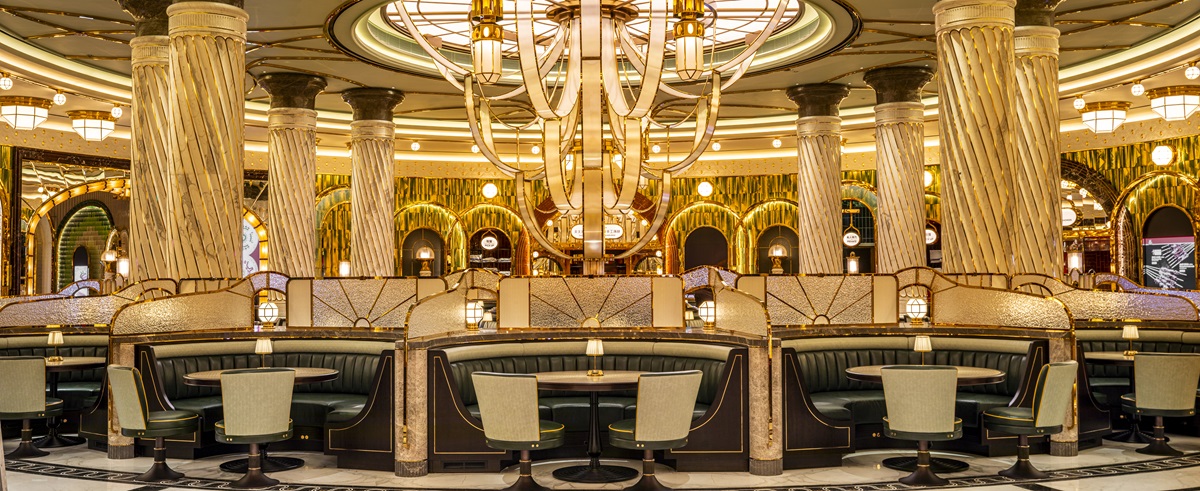
    straw hat lampshades, natural blinds and wooden furniture in Numo lounge
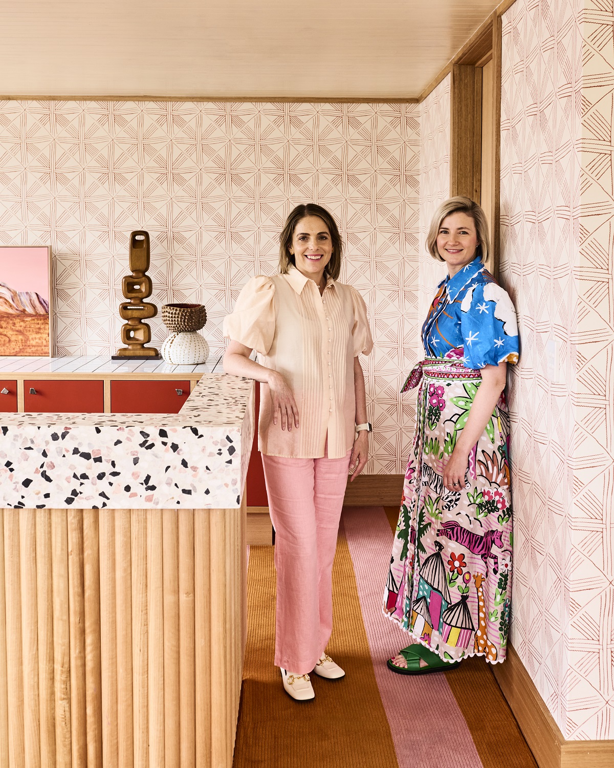
    Image credit: Numo Hotels & Resorts

    Unique touches can be seen across the property, such as the handmade lighting fixtures made from reeds and rattan, and crafted by top artisans in Crete, inspired by the straw hats with large brims that ‘dance’ in the Mykonian wind. Or the handmade Chamotte tiles by Patricia Urquiola for Mutina at the Màre Màre pool bar and the Italian ‘clostrà’ (ceramic coverings) that provide privacy and shade in gardens and balconies. Paths to the rooms pass through small private gardens with low vegetation from Cycladic grasses, such as golden stipa and succulents.

    ochre striped fabric on built in couch in guestroom

    Image credit: Numo Hotels & Resorts

    The resort offers 27 rooms, divided into eight categories of rooms and suites. All are decorated in a relaxed and effortlessly luxurious style with black and white striped marble floors, statement brass light fixtures, decorative objects selected by ceramic workshops in the Cyclades, and built-in beds and sitting areas inspired by vintage aesthetics and traditional Mykonian architecture.

    As for the colour palette, it is the choice of the landscape itself! The emerald and blue-green shades of the Kalafati waters meet the golden tones of the sand, while bold strokes of orange and terracotta evoke the island’s sunsets. Straw and wood details complete a setting of quiet luxury and relaxation. A special mention goes to the Evergreen Absolute Suite, which epitomises the quiet luxury style that permeates the resort, with a private garden and pool and a view of Kalafati.

    carved wooden seats and organic shaped tables in hotel restaurant

    Numo Hotels & Resorts

    At Numo Mykonos, the aim is for guests to experience an authentic Mykonian culinary journey. At the all-day Anemoessa Restaurant, Nikos Kourkoutas, executive chef at Numo Ierapetra, designed a menu based on organic raw materials from small, local producers, marrying authentic Greek cuisine with unexpected gastronomic elements.

    palm trees , pool and sun loungers at Mykonos

    Image credit: Numo Hotels & Resorts

    At Màre Màre bar, Numo Mykonos collaborated with Konstantinos Theodorakopoulos, beverage drink director of Athens-based bar, The Bar In Front Of The Bar, honoured as one of the world’s top 100 bars in The World’s 50 Best Bars awards. Together, they created a series of signature cocktails and beverages rooted in Greek tradition, like the Mount Supreme tea with herbs and fruits from Olympus. True to Numo’s philosophy of sustainability and zero-waste techniques, Konstantinos Theodorakopoulos sources raw materials from producers who cultivate using natural farming leaving the smallest possible environmental footprint.

    natural wood and white surfaces in the spa at Numo Mykonos

    Image credit: Numo Hotels & Resorts

    A stay at Numo Mykonos, the island’s new ‘jewel’, is transformed into a holistic relaxation experience. At Etherea Boutique Spa, mind and body are rejuvenated through soothing treatments, massages, and techniques that utilise the island sun and mother earth’s organic products while at the Ensoma Fitness Area, workouts can be enjoyed both indoors and outdoors. Finally, fashion lovers will find elegant resort, beachwear pieces by Greek designers, and unique design objects in the Mosaique boutique.

    Main image credit: Numo Hotels & Resorts

    A wooden jetty leading to a tropical island in the Maldives

    Baccarat Hotel & Residences Maldives set to open in 2027

    1024 640 Sophie Harper

    Baccarat Hotel & Residences Maldives set to open in 2027

    SH Hotels & Resorts, the hospitality management company founded by visionary Barry Sternlicht, Chairman and CEO of Starwood Capital Group, has announced plans to redefine luxury and sophistication in the Maldives with the forthcoming debut of Baccarat Hotel & Residences Maldives in 2027.

    A wooden jetty leading to a tropical island in the Maldives

    Spanning five interconnected islands across more than 111 acres in the South Malé Atoll, this one-of-a-kind resort will set a new standard of unprecedented luxury in one of the world’s most coveted travel destinations.

    “We are excited to unveil Baccarat Hotel & Residences Maldives, which fuses the timeless elegance and modern sophistication of the House of Baccarat, the legendary 260-year-old crystal brand, with the Maldives, a location that is synonymous with paradise,” says Sternlicht. “In crafting this extraordinary retreat, we aim not just to create a place to stay, but to curate an experience that celebrates the essence of luxury living with the breathtaking backdrop of the Maldives.”

    “Our debut in the Maldives marks an exhilarating milestone for the Baccarat brand,” says Raul Leal, CEO of SH Hotels & Resorts, the parent company of Baccarat Hotels & Resorts. “We are shaping a new identity in an already remarkable region, and we are confident that this property will define ultimate luxury in the Maldives.”

    “It’s with immense pride that we announce our collaboration with Baccarat Hotels, a revered name synonymous with luxury for over two and a half centuries, to realize our vision in the Maldives,” says Tristan Parker, Director – Development of MDC Investments LLC, a sister company of Madevco Holdings Limited (ADGM). “This partnership marks an exciting chapter as we become part of the brand’s legacy, introducing the inaugural Baccarat branded hotel and residences in Asia Pacific.”

    Located a short boat journey away (30 minutes) from Malé’s Velana International Airport, the resort will be partially wrapped around its own shallow-water lagoon and reef system and will offer more than 50 hotel villas and 53 private residences for sale. Crafted by award-winning global architecture firm HKS with interiors by 1508 London (renowned for its commitment to creating bespoke, luxurious, and innovative designs), Baccarat Hotel & Residences Maldives will seamlessly blend contemporary elegance with tropical sophistication.

    The resort will feature a diverse array of accommodations, from one- to three-bedroom hotel villas – each with their own private pool – to private residences with unparalleled levels of luxury living overlooking the lagoon or the pristine beachfront. For a more expansive retreat, there are lavish six- and seven-bedroom mansions on a secluded peninsula. The eight- and nine-bedroom Private Islands – intimate escapes surrounded by the spectacular beauty of the Maldives – offer the pinnacle of luxury and exclusivity.

    Guests will revel in the finest dining experiences befitting of the esteemed Baccarat Hotels brand, including specialty restaurants run by some of the world’s top chefs. Beyond the gastronomic indulgences, Baccarat Hotel & Residences Maldives promises a lifestyle of luxury and artistic expression with curated retail spaces, a Baccarat-themed crystal garden, an outdoor cinema under the stars, an art gallery and event space featuring work from world-famous artists, and more.

    For guests seeking tranquillity and rejuvenation, there will be a meticulously crafted wellness spa. In this oasis, guests can indulge in a variety of signature treatments, ranging from therapeutic massages to rejuvenating facials to hydrotherapy circuits in expertly designed plunge pools. The wellness spa will be complemented by dedicated yoga pavilions and a cutting-edge gym.

    Above all, the resort will also have a commitment to sustainability and conservation, from a turtle rehabilitation centre to eco-friendly initiatives that allow guests to connect with the natural beauty of the Maldives in a responsible and meaningful way.

    Baccarat Hotel & Residences Maldives will be owned by Madevco Holdings Limited (ADGM) which exemplifies a commitment to building extraordinary residences that elevate lifestyles to unprecedented heights. Upon opening in 2027, Baccarat Hotel & Residences Maldives will mark a new milestone in luxury hospitality, combining elegance, sophistication, and unforgettable experiences.

    Main image credit: Shai Pal 

    BoConcept dining furniture in a restaurant setting

    Getting to know… BoConcept, Exclusive Headline Partner at MEET UP London

    1024 640 Sophie Harper

    Getting to know… BoConcept

    Ahead of HD’s MEET UP London 2024 event, we thought we’d catch up with Exclusive Headline Partner BoConcept to find out more about the Danish furniture chain. Head of Business Development, Michael Effenberger, tells us more about the company…

    BoConcept dining furniture in a restaurant setting

    What is BoConcept and why should the brand be on our radar?

    BoConcept is a Danish retail furniture chain. We specialise in modern and stylish furniture and accessories with a focus on customised, coordinated design furniture and products that are both functional and of high quality. BoConcept operates in over 65 countries, providing a range of furniture for different areas of the home, including living rooms, dining rooms, bedrooms, and home offices.

    BoConcept should be on Hotel Designs radar for several reasons:

    Modern design aesthetic: Our brand’s contemporary design ethos aligns well with the modern and sophisticated aesthetics often sought in the hotel industry. Our designs can help create stylish and welcoming environments in hotels.

    Customisation options: BoConcept offers extensive customisation options, which can be particularly appealing for hoteliers looking to create unique spaces that reflect their brand identity.

    International presence: With stores and operations in many countries, BoConcept’s global reach and understanding of different markets can be beneficial for hotel chains operating in multiple locations.

    Quality and durability: The focus on high-quality materials and construction means our furniture is suitable for the high-usage demands of the hotel industry.


    How long has BoConcept been around for?

    BoConcept was founded in 1952 in Denmark and has been manufacturing furniture for 72 years. Growing to over 350 stores in 67 countries we have become an internationally renowned brand.

    BoConcept outdoor furniture featured on a rooftop balcony

    What are BoConcept’s core values?

    BoConcept’s core values reflect its commitment to design, quality, and customer service, embodying a distinctly Danish approach to furniture making. Here are some of the key values that guide the company:

    Design: BoConcept emphasizes a design-driven approach, focusing on creating modern and versatile furniture that is both beautiful and functional. Our designs are intended to be adaptable, fitting into various living spaces and styles.

    Customisation: We value offering personalised solutions to our customers, allowing them to customise furniture to suit their specific needs and tastes. This level of customisation supports individual expression through interior design. All our products are made to order ensuring our high level of quality. Depending on the project and quantity we can explore the option of designing something bespoke.

    Quality: BoConcept insists on high standards of craftsmanship and uses quality materials to ensure durability and longevity in its products. This commitment to quality is foundational, ensuring BoConcept furniture can withstand the rigors of everyday use.

    Service: Exceptional customer service is a core value, with BoConcept aiming to provide an outstanding shopping experience through professional advice and assistance. This service extends from personalised design consultations to delivery and assembly services.

    Innovation: Continuous innovation in both design and functionality is crucial to BoConcept. The company stays ahead of trends and technological advancements to ensure we offer cutting-edge design solutions.

    Responsibility: Sustainability and responsible practices are increasingly important to BoConcept, reflecting a dedication to reducing our environmental impact and ensuring ethical practices in all areas of our production and supply chain.

    These values help us maintain our reputation as a leader in the modern furniture industry, appealing to consumers who value design, personalisation, and quality in their furnishings.


    What single piece of furniture or collection defines BoConcept’s style?

    BoConcept is known for certain iconic pieces that tend to represent our design philosophy, such as modular sofas that can be customised for different spaces, sleek and functional wall systems, or elegant dining tables with extendable features. We often have a signature model or collection that encapsulates our modern, urban aesthetic with clean lines, customisable options, and a focus on functionality.

    If you are looking for a definitive piece or collection, it would typically be something that showcases simplicity, modularity, and the option for personalisation, reflecting the modern urban lifestyle that BoConcept caters to.


    Can you tell us about some of your collaborations with designers?

    We work with some of the most respected furniture designers in Denmark and further afield. They’re all award-winning experts, as you would expect. But perhaps more important is our mutual interpretation of great design: elegant, well considered products that reflect our time and improve our lives.

    Also, we actively collaborate with designers to craft their unique line of modern furniture, which is reflected in their collections. One noteworthy more recent collaboration is with the international design firm BIG – Bjarke Ingels Group, which led to the creation of the Nawabari Collection. This partnership blends the playful and practical aspects of design, typical of BIG’s philosophy, with BoConcept’s focus on functionality and urban living.

    The BoConcept team making chairs in the factory

    What are BoConcept’s sustainable credentials?

    BoConcept joined the UN Global Compact in 2009, which informs our corporate social responsibility (CSR) policy. This commitment is framed around the UN Global Compact’s ten principles, which addresses human rights, labour rights, environmental responsibility, and anti-corruption.

    Additionally, we have been working towards ensuring all our wood is sourced from sustainable forests and the company is now an FSC certified company.

    Our sustainability credentials also encompass maintaining control over most of the manufacturing processes, with over 90% of BoConcept’s furniture produced in Denmark and other parts of Europe. This not only speaks to the quality and craftsmanship of our products but also reflects our commitment to environmentally responsible manufacturing practices.

    We also have achieved ISO, International Organization for Standardization

    SO 9001, ISO 14001, ISO 45001


    What’s new for BoConcept in 2024?

    We are always adding new products to our collection. Recently we introduced our Cancun outdoor range. A selection of elegant and functional chairs, tables, and sofas. In addition to new products, we are constantly adding new leathers and fabrics to our library, and as I mentioned have recently reached the Iso.


    How can designers and specifiers find out more about BoConcept and who should they contact to discuss projects with? 

    We are always looking for new trade partners. Send an email to mief@boconcept.co.uk and Michael our head of business development will be in touch to discuss the prospect of working together. You can also visit our website www.boconcept-contract.co.uk – we’d love to start working with you.

    Main image credit: BoConcept