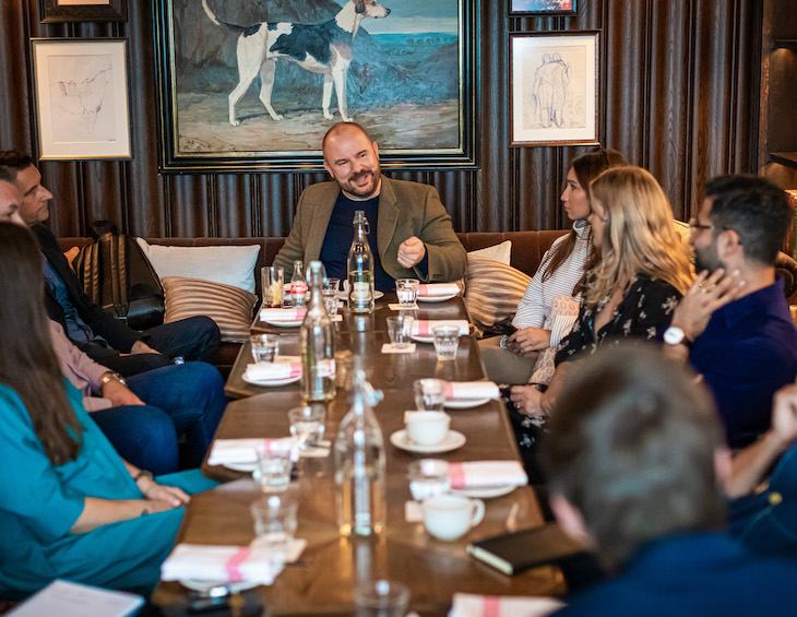
Editor Checks In: “And we’re going live in 3, 2, 1…”
During the COVID–19 pandemic, the team at Hotel Designs have announced initiatives to help further create conversations like no other. It’s safe to say that the editorial team have been anything but taking it easy during lockdown, as editor Hamish Kilburn explains…
I have come to the conclusion this month that there are two types of people at the moment: those who are twiddling their thumbs or baking banana bread as a result of being furloughed and those who are practically performing CPR on their brands and businesses in order to maintain a strong pulse of exposure.
To be honest, neither camps are principally inviting, as there really is no middle ground in between these two extreme circumstances.
Only by thinking outside the box and by creating robust media platforms can we really help the industry as a whole sail through these turbulent waters. If the pandemic was a storm, which I have heard it metaphorically referred to a number of times in recent days, we are in the eye, while hospitality is preparing to rebuild and adjust its thinking in order to live up to the hefty demands of tomorrow’s modern travellers.
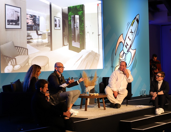
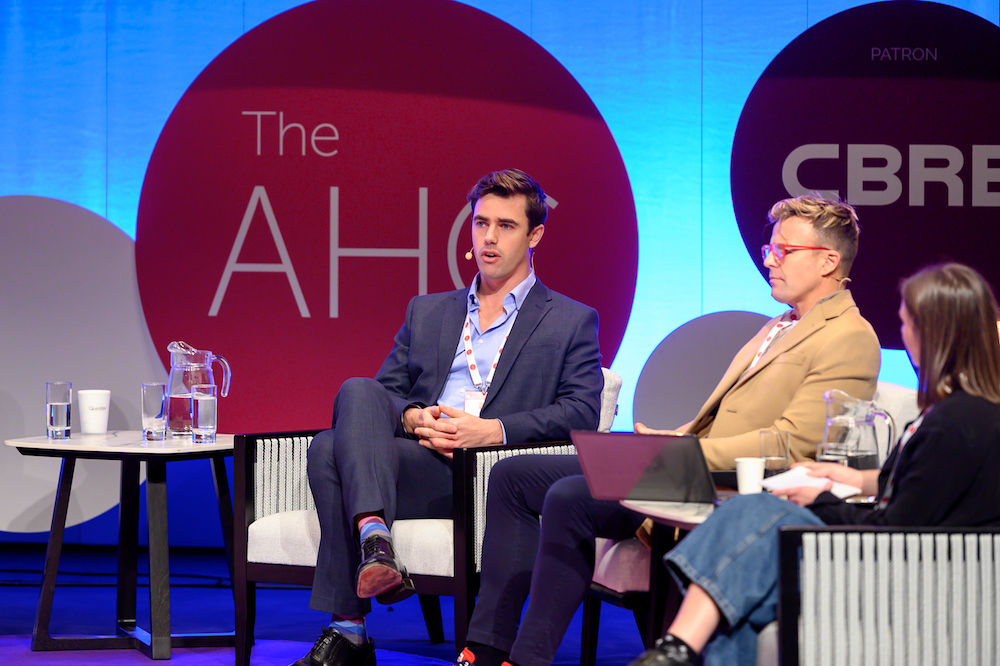
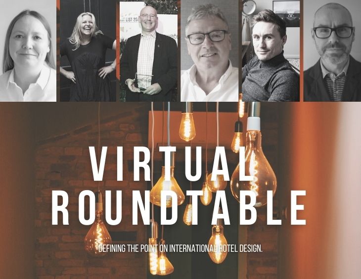
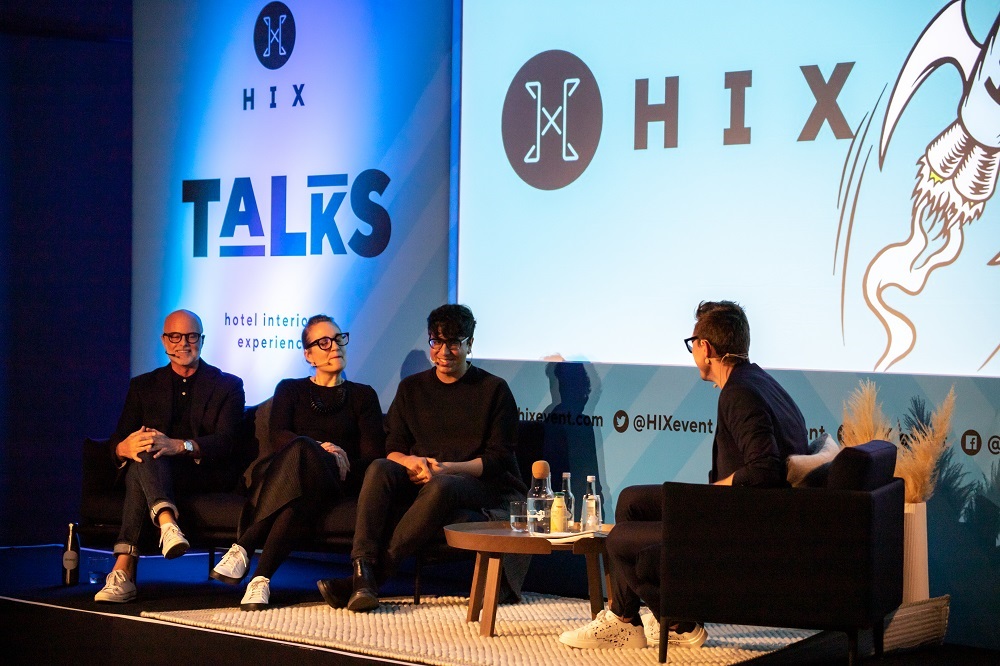
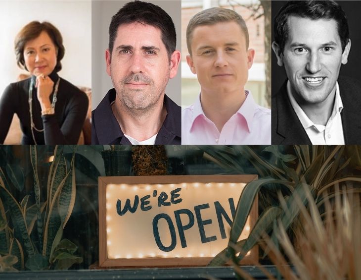
Now, I believe, is the perfect time for the launch of a one-day virtual conference that will shelter meaningful conversations around how we move the market forward. Cue the launch of Hotel Designs LIVE, which is taking place on June 23 and aims to define the point on international design by putting four of the most relevant topics (technology, public areas, sleep and wellness) through the editorial lens. With world-renowned speakers confirmed such as Jason Bradbury (former presenter of The Gadget Show), Simon Naudi (CEO of Corinthia Hotels), Emma King (Head of Design at IHG (EU)), Greg Keffer (Partner-In-Charge at Rockwell Group) and many more, we have searched far and wide in our quest to bring together a wealth of experience and knowledge for our first ever virtual conference in order to find solutions to today’s problems.
In addition to the live seminar sessions – and to ensure that the event is bridging the gap between hospitality suppliers and designers, architects, hoteliers and developers – the conference will also include structured ‘PRODUCT WATCH’ pitches around each session, allowing suppliers the opportunity to pitch their products and services in a ‘live’ environment to the hospitality buyers that are tuned in.
What’s more, Hotel Designs LIVE is free to attend. So if you are a designer, architect, hotelier or developer and would like to be part in the audience, please register in order to save your complimentary seat in the audience.
In the meantime, feel free to keep in touch with our team on Twitter, Facebook, Instagram or LinkedIn, because one of the biggest lessons that Covid-19 has taught me is that the industry is stronger when its components work together.
USM introduces protective attachment screens that are suitable for USM Modular Furniture…
The hotel landscape has changed, and the design of the reception area needs to evolve to support this. Organisations are already investigating how they can make hotel spaces safer, effective, and efficient whist still adhering to government guidelines of social distancing.
One of the challenges that many hotels will have is how to ensure that their guests and employees feel protected at the reception area. Protective measures are essential so that employees feel safe and valued in these challenging times, whilst also reassuring guests.
Due to the spread of Covid-19, hygiene and protective measures must be treated with the highest priority. To protect employees and guests from mutual contact, devices are required that form a physical protective barrier against the transmission of bacteria and viruses through coughing, sneezing and human contact.
In keeping with the elegant clean design of USM Haller modular furniture there are different solution orientated variants with which you can quickly upgrade existing reception desks.
USM Modular Furniture is one of the brands that has taken advantage of our Industry Support Package. To keep up to date with supplier news, click here. And, if you are interested in also benefitting from this three-month editorial package, please email Katy Phillips by clicking here.
In the wake of the forced hibernation the industry has experienced in recent weeks, hotels are now making plans to re-open. But what will the ‘new normal’ look like? Rocco Bova, the general manager of Chable’ Yucatan, investigates hospitality post-lockdown…
While I honestly detest the fact that we will now have to provide a personalised, luxury experiences while wearing masks, gloves, shields and possibly even protective clothing, we so however need to get used to this new normal, at least until we will have more relaxed guidelines from the respective government’s health authorities.
The provision and wearing of PPE for staff is a minimum standard as it is the increased frequency of cleaning and sanitising to provide a healthy environment to guests, however my focus as a general manager will be more towards enhancing soft skills, EQ (emotional intelligence) and empathy, as part of my training and supervision of my team.
I forecast a higher level of concerns from our guests when travelling and therefore we will need to be ready to read their behaviour already at the arrival or even before, should we receive, for example, detailed email on what procedures we are using to sanitise our premises.
This means that they will come with much higher expectations, and we will need to manage them if we want to succeed in having them as ambassadors once more.
Image caption: Guest expectations will be higher in all areas of the hotel, but particularly in the F&B and public spaces. | Image credit: Chable’ Yucatan
The risk of losing the reputation is too high, particularly when the health and safety of a person can be at risk. Therefore, now is the time to show to our guests what and how we are doing to protect their health and overall wellbeing.
Here is where the EQ comes into action, where we listen and observe with empathy and we respond kindly to give comfort and respect. What do we know if this particular guest lost a loved one to COVID–19? If so, their response is quite normal and we should not dismiss them as exaggerated or overreacting. We need to know what, when and how to do it. Regardless of the rate paid, the new normal is an expected readiness and professional response from all us hoteliers globally.
In addition to the operational precautions and adaptive protocols, now more than ever, management needs to be visible for both staff and guests.
Staff need directions and supervision, as well as encouragement and motivation, and this can only be done in presence, face-to-face (maintaining the due distance) and with a positive behaviour, so that they can transmit it to the guests.
Guests, too, need to see management around and they want to make sure there is enough supervision and control over the new standards and ensure the correct procedures are applied all along their stay beside being able to speak to a senior member of the hotel in case they will encounter something inappropriate.
To us, it will offer the opportunity to check the pulse of the guests, continuously, watch their body language, ask with subtlety what their expectations are and how we have been doing so we are prepared to change the course of actions if needs be.
While I am preparing for all this as we tentatively look to reopen in June, I am also reflecting on something. Why did we not do anything like this to protect our staff and guests alike during SARS, MERS, ZIKA, malaria and other transmissible diseases? I don’t have an answer, but I am encouraged that the industry is taking action so that we can once again provide exceptional experiences for our guests.
Hotel Designs, which is the leading international hotel design website, has become a media partner for the European Hotel Managers Association (EHMA).
EHMA currently has 421 members in 27 European countries, corresponding to a market share of approx. 10 per cent, and is committed to growing this valuable network with the help of the meaningful exposure that Hotel Designs can offer. “EHMA is the most relevant Hotel Managers Association of European four and five star deluxe hotels,” explained a representative for the association. “The number one platform for collective intelligence, education, networking and professional development among its members whose objective and mission is the professional improvement to better serve the industry pursuing excellence. The Association thus establishes relationships with privileged trade and media partners such as Hotel Designs.”
Today the association promotes Europe as a whole through its members in individual countries, encouraging training and job exchanges. The organisation has developed a modern and progressive approach, promoting an expansionist outlook that adapts renowned European know-how to the demands of the rapidly changing international hospitality industry.
“Our new-found relationship with the EHMA is invaluable as we recognise Europe’s growth in hotel development – a report in February 2020 from Lodging Econometrics showed that Europe’s hotel construction pipeline was up by 19 per cent in projects,” explained editor Hamish Kilburn. “Therefore, we are excited to start meaningful conversations with more hotel managers in Europe who are on the front line of this important development in hospitality.”
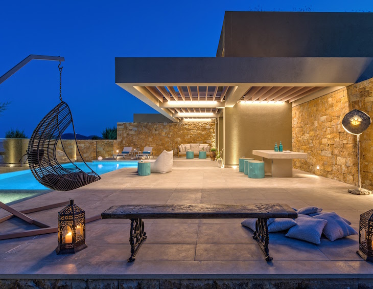
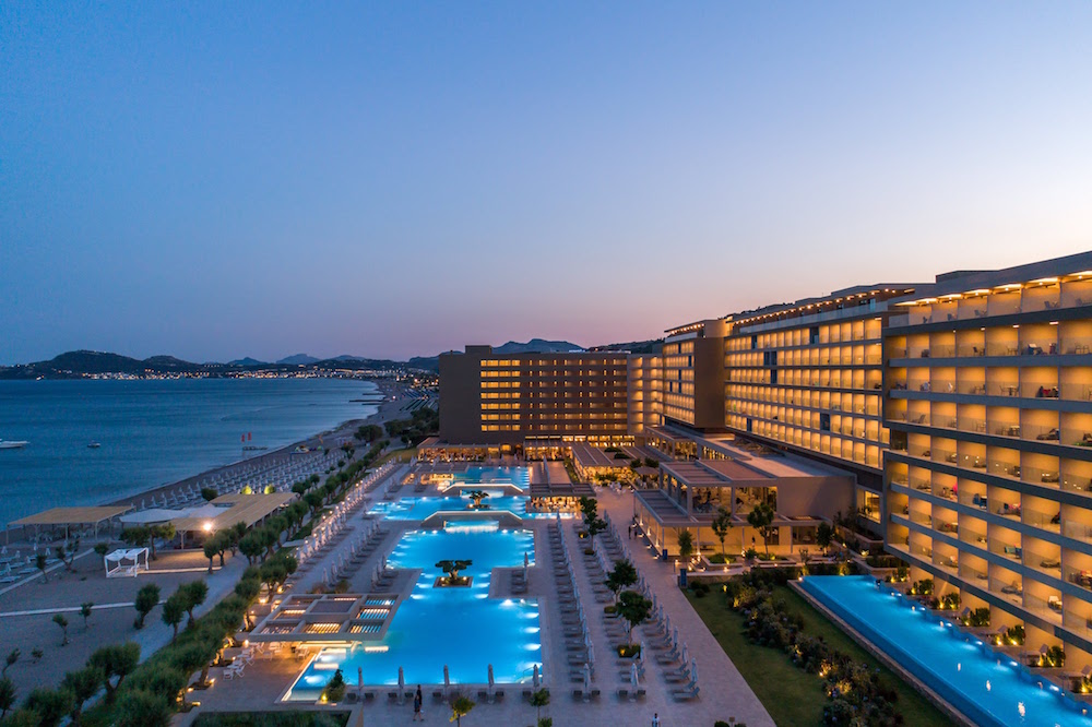
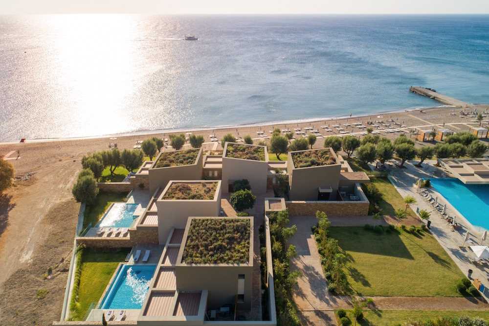
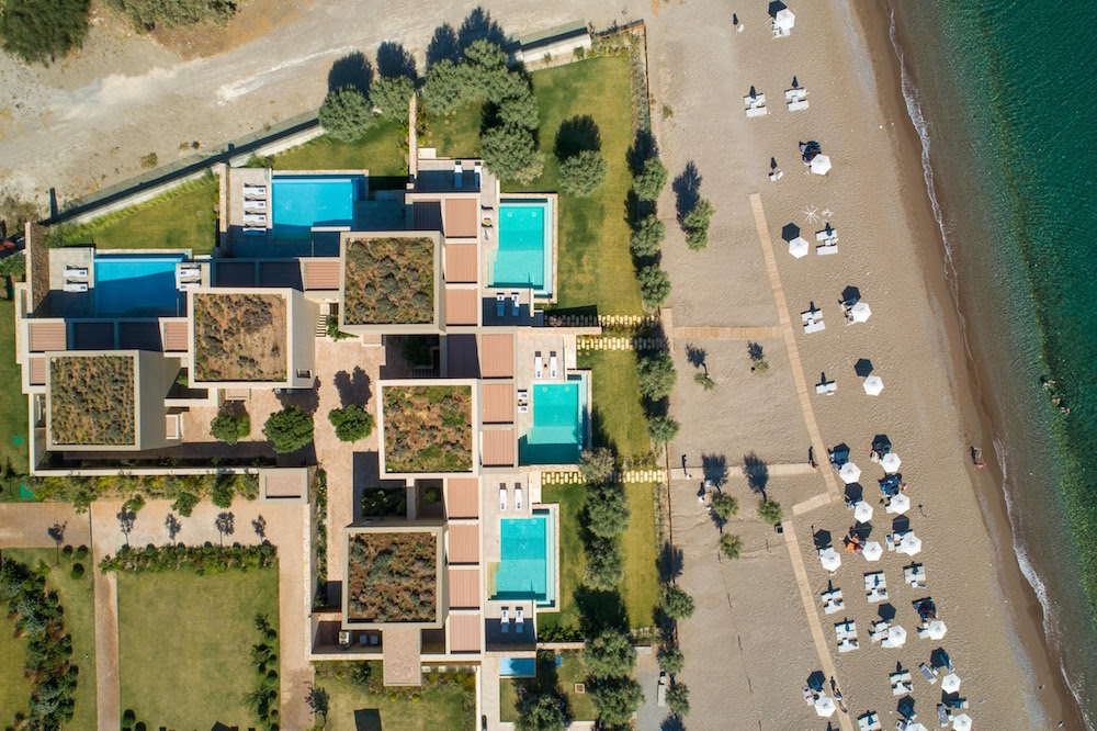
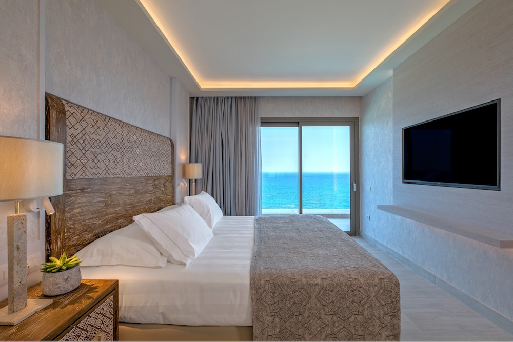
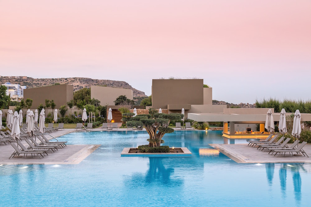
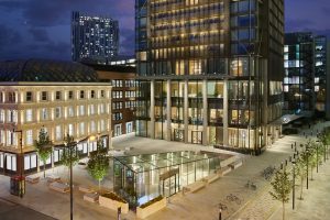
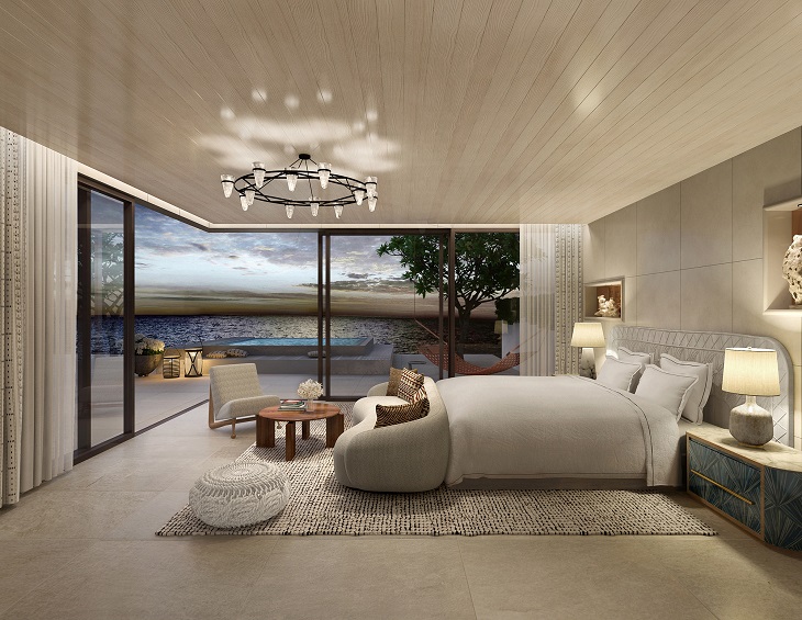
Main image credit: Daios Cove Luxury Resort & Villas
UK Bathrooms announces adds H2k Harrogate to its portfolio of luxury brands
UK Bathrooms, the leading online store for premium designer bathroom products has announced the addition of the luxury skincare and spa toiletry brand H2k Harrogate to its portfolio…
“We’ve been looking for a luxury skincare and spa toiletry brand for some time,” the Managing Director of UK Bathrooms, Graeme Borchard, told Hotel Designs.
We wanted a brand with values to match our own, a brand that places the environment at the heart of everything they do and whose products were safe for our customers, safe for wildlife and ethically sound.”
The award winning H2k Harrogate collections include a wide range of vitamins, extracts and oils which, when combined are gentle and kind, suitable for most skin types. Many of their products are now free of paraben’s, sulphates and artificial colours. Established in 2000, their founder Hazel Barry introduced Kalahari melon seed oil in to skincare. Kalahari melon is found across the Namibian desert and is an important source of water. The seed is used extensively in H2k products as it is packed full of antioxidants and vitamins helping to moisten, regenerate and rebalance all skin types.
Image credit: UKBathrooms
“Our Kalahari melon seed oil helps to calm the skin and makes the H2k formulas truly unique.” Hazel Barry, H2k Harrogate.
UK Bathrooms will be introducing products and gifts from the H2k Harrogate range which boasts only the finest natural ingredients including luxurious shower gels, shampoos and conditioners, hand care, premium candles and diffusers. And, right now, in conjunction with the Crosswater Sale UK Bathrooms are giving away a FREE H2k Harrogate Skin Kind and Stay Safe Hand Sanitiser and H2k Mischief Hand & Body Lotion to all Crosswater orders over £250*. (see www.ukbathrooms.com for full terms and conditions).
The Stay Safe Hand Sanitiser with 70 per cent alcohol kills 99.9 per cent bacteria is unperfumed as better for your skin, bearing in mind the high alcohol content (250ml). The Mischief Luxury Hand & Body Lotion is enriched with frankincense and thus deeply moisturising (250ml). Both products are in reusable/refillable bottles and presented in a beautiful gift box.
“H2k Harrogate is a perfect complement to our bathroom brands and we look forward to working with Hazel and her team here in Yorkshire,” added Borchard.
UK Bathrooms is one of our recommended suppliers. To keep up to date with their news, click here. And, if you are interested in becoming one of our recommended suppliers, please email Katy Phillips by clicking here.
Is UVC lighting on your design agenda for the post-pandemic world?
Lighting brand humanlumen has introduced Clean Air Series, UVC lighting that actively reduces bacterial and viral charge. Hotel Designs investigates…
humanlumen, a lighting brand that prides itself for having a uniquely human-centric approach, has introduced the Clean Air Series, a range of UVC Air Sterilisation Units.
The Clean Air Series is a range of efficient UVC lighting devices that actively reduce the bacterial and viral charge of the air in closed environments, such as offices, classrooms, hotel rooms and healthcare environments.
The International Ultraviolet Association (IUVA) believes that UV disinfection technologies can play a role in a multiple barrier approach to reducing the transmission of the virus causing COVID-19 and SARS-CoV-2, based on current disinfection data and empirical evidence.
Image credit: humanlumen
UVC Air Purification Unit
The powerful UVC radiation is totally isolated inside the Air Filtration System (AFS) as exposure of UV light, of any type, in high dosage to the naked eye will cause potential long-term health issues.
The system draws in contaminated air and removes all bacteria through a series of integral filters and then delivers clean air back into the space. Each unit cleanses up to 3,000 cubic square metres of open office space and is a simple plug and play system with no integration into the existing mechanical systems.
The clean air units work like an air purifier, but instead of filters it uses the UVC technology to eliminate the viruses. The fan located in the bottom of the fitting sucks in the air of the room and channels it through a series of UVC light canals that have the UVC lights. The UVC kills the viruses and the clean air is released in the room through a carbon filter.
The carbon filter’s main purpose is to clean the odours from the air, with an additional dust filter at the entrance of the fan, neither is essential to kill bacteria, this is the role of the UVC light.
humanlumen, which is based in Clerkenwell, is one of the brands that has taken advantage of our Industry Support Package. To keep up to date with supplier news, click here. And, if you are interested in also benefitting from this three-month editorial package, please email Katy Phillips by clicking here.
With a pedigree that flows from the acclaimed Palace Hotel Tokyo and designs on rewriting the playbook for lifestyle brands, the management arm of Palace Hotel Co. Ltd. has announced plans for a Q3 opening of Zentis Osaka, the first property of its new hospitality brand.
Internationally renowned UK designer, Tara Bernerd of Tara Bernerd & Partners, has been tapped for the property’s modern interiors while Café Co. – the esteemed Japanese food & beverage operator behind the one Michelin-starred CRAFTALE in Tokyo – will develop and operate the hotel’s restaurant, bar and lounge. A top-flight team of seasoned staffers from Palace Hotel Tokyo, the first Japanese-brand hotel to achieve the prestigious Forbes Five-Star rating, will guide the standards of service.
“We see an opportunity to really elevate expectations for service, accommodations and F&B in the upper reaches of the select-service category,” said Daisuke Yoshihara, president of Palace Hotel Co. Ltd. “We believe those critical aspects of the stay experience are what will emerge as key standouts to our guests, truly differentiating our brand from those already in the market.”
Image credit: Palace Hotel Management Company
With Zentis’ strong focus on design, the new property is a member of Design Hotels – a curated selection of independent hotels with a passion for genuine hospitality, cultural authenticity, thought-provoking design and architecture. “We are truly privileged to collaborate with Palace Hotel Management Company to bring Zentis to the Design Hotels community. I am certain that our trend-forward and design-conscious travelers will be inspired by this sophisticated lifestyle addition to our portfolio – and our first for Osaka,” said Jinou Park, Vice President of Asia Pacific.
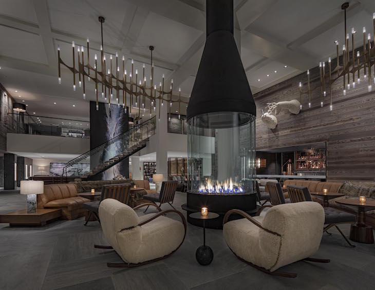
An entirely new build, the 16-storey property’s contemporary yet laid-back feel flows from a natural colour palette of raw materials, including exposed brickwork and timber beams. A stone staircase anchors a lobby wrapped in floor-to-ceiling windows where a double-sided fireplace creates a focal point and connects an intimate lounge space with the landscaped green space that surrounds.
One floor above is the hotel’s bar and main dining area as well as an airy lounge and outdoor terrace featuring lofty, seven-meter-tall ceilings. Also on the second floor is the hotel’s fitness center – outfitted with Life Fitness equipment and accessible 24 hours.
Taking inspiration from the modular design and intuitive functionality of bento boxes, the 212 guestrooms feature the same fresh palettes that are found throughout the hotel. Polished wooden floors, muted tones and splashes of mustard as well as art on the walls commissioned from a local Japanese artist define spaces that make ingenious use of otherwise snug square footage.
At the helm of UPSTAIRZ – the hotel’s dining venue that is likely to emerge as a destination not only for guests, but also discerning locals – will be Executive Chef Shinya Otsuchihashi, who, after having honed his culinary skills over the last two decades in both Japan and France, will be closely overseeing the eatery’s concept and menus from his base at CRAFTALE.
Zentis Osaka is situated where the picturesque, riverside area of Dojimahama and the high-end business entertainment district of Kita-shinchi meet. Nakanoshima, an islet home to some of the city’s premium attractions – including the Osaka Science Museum and the National Museum of Art, Osaka – is a leisurely three-minute stroll from the hotel while Osaka Station, the city’s main rail hub, is a mere five-minute taxi ride away. The two major airports that service Japan’s third largest city – Kansai International Airport and Itami Airport (Osaka International Airport) – are located less than an hour’s drive away.
Main image credit: Palace Hotel Management Company
Kerakoll Design House is an integrated project for the Interior Design featuring innovative materials – cement, resin, handcrafted wood, micro-coatings, paints and glazes – coordinated in the10 colours of the inviting and neutral Piero Lissoni Warm Collection.
A new style of interior design, where materials, textures and colours blend together. Floors and coatings, walls, fixtures, furnishing accessories, lighting and heating fixtures all become a single seamless surface. Each material is hand made by skilled decorators, and any distinctive marks and irregularities in the surface are proof of its refined and exclusive nature.
Patina
A breathable natural “old look” plaster effect finish. Applied seamlessly by skilled applications the product is unique and available in the 10 Warm Collection colours. Patina is indicated for internal surfaces (walls); for all environments in the house, with the exception of shower cubicles and around kitchen units, and for all commercial areas.
Patina gives environments an “old-look” style with great personality. Creating a sense of unfinished and imperfect, that clothes the walls with charm. It simulates the effect of passing time that, by building up a characteristic patina, attenuates the original colours, adding unexpected shading or allowing underlying layers to shine through. The texture of Patina, which is soft to the touch and extremely beautiful, features ripples, marbling and vibrations.
Microresina
An eco-friendly decorative and protective microfilm, perfect for redesigning of existing ceramic walls & floors quickly and easily. Available in an extra matt finish and silk-touch effect. Microresina is suitable for internal surfaces either in the home or in commercial areas.
Microresina is comprised of a polyurethane elastic microfilm used to redesign existing wall surfaces. Following application the results provide a seamless colour of which, enhances patterns textures and irregularities to give rooms a fresh & contemporary look. The product redesigns and protects existing floorings and joints, transforming into a continuous surface that is completely non-absorbent, hygienic and safe.
Wallcrete
A continuous, two-layer coating, 3 mm thick, with a trowled cement texture. Hand made by skilled decorators, and any distinctive marks or irregularities in the surface are proof of its refined and exclusive nature. Wallcrete is indicated for internal surfaces (coatings on columns, shelves, worktops and other architectural elements); for all rooms in the house and for all commercial areas, including coating of shower interiors (with the insertion of Wallcrete Aquastop waterproofing). Wallcrete is a surface with a great aesthetic impact that enhances the physical texture of the cement.
Casa Ceramica is one of the brands that has taken advantage of our Industry Support Package. To keep up to date with supplier news, click here. And, if you are interested in also benefitting from this three-month editorial package, please email Katy Phillips by clicking here.
Whether you are an interior designer, an architect or hotelier finding that all important inspiration is key, and that is where Ulster Carpets’ Design Portal can make all the difference…
Inspiration comes in many forms. It could be a stunning view from the top of a mountain, a sparkle that catches your eye in the mundane grey of a city’s concrete jungle or these days your own abode.
Packed full of more than 9,000 designs, the company’s online archive is easy to use and is a great way to get those creative juices flowing.
You can get a sense of what is currently on-trend by taking a look at some of the most recent designs from the brand’s creative teams based across the world or browse the Gallery, where Ulster Carpets showcases some of our stunning installations.
Image credit: Ulster Carpets
If you want some ideas for organic designs, Japanese form or mineral styles, then you can browse the comprehensive Collections that have been expertly curated by the company’s own archivist.
Styles also have a habit of returning, so the archive is also a great place to look. It contains thousands of different designs ranging from Abstract and Art Deco to Classical, Floral, Contemporary and many more.
Design Portal is also fully searchable using key words or by design numbers while you can also create your own favourites to keep for future reference.
Image credit: Ulster Carpets
Once you’ve found the design you want, you can even recolour it to suit the project you’re working on. If we have created a custom design for you, then these can also be uploaded into your individual collection. You can then use our standard or neutral tuft boxes to choose from more than 650 colours and recolour to your heart’s content. A sample of your new creation can be requested on the fast three-day turnaround to assist you with your project development.
In terms of designs and colours, Design Portal offers an abundance of choice and a plethora of inspiration, so why not make the most of it?
If you would like to be inspired and enjoy the benefits of Design Portal but don’t have an existing username and password email marketing@ulstercarpets.com to find out more.
Ulster Carpets is one of the brands that has taken advantage of our Industry Support Package. To keep up to date with supplier news, click here. And, if you are interested in also benefitting from this three-month editorial package, please email Katy Phillips by clicking here.
Hotel performance in Asia Pacific were lowest ever recorded in April 2020
Reflecting the effects of the COVID–19 pandemic, the Asia Pacific hotel industry reported record lows in the three key performance metrics during April 2020, according to data from STR…
New data from STR shows that the absolute levels in occupancy, average daily rate and revenue per available room were the lowest for any month on record in the region of Asia Pacific.
U.S. dollar constant currency, April 2020 vs. April 2019
Occupancy: -60.3 per cent to 28.0 per cent
Average daily rate (ADR): -44.8 per cent to US$54.97
Revenue per available room (RevPAR): -78.1 per cent to US$15.38
Local currency, April 2020 vs. April 2019
South Korea
Occupancy: -70.8 per cent to 20.0 per cent
ADR: -21.0 per cent to KRW112,897.83
RevPAR: -76.9 per cent to KRW22,536.18
Each of the three key performance metrics were up from March but remained the lowest for any April on record in the country.Incheon & Seoul experienced a 75.2 per cent year-over-year decrease in occupancy (to 18.8 per cent).
Australia
Occupancy: -72.7 per cent to 19.9 per cent
ADR: -33.1 per cent to AUD119.87
RevPAR: -81.7 per cent to AUD23.85
The absolute occupancy, ADR and RevPAR levels were the lowest for any month in STR’s Australia database. Among key markets, Melbourne and Sydney saw year-over-year occupancy declines of 65.0 per cent and 73.7 per cent, respectively. Returning travellers are predominantly keeping occupancy up, as seen in Adelaide, where year-over-year occupancy declines eased slightly during April up to May 13 due to returning travellers from India. More information can be found in STR’s Pacific webinar recording.
Over the past few months, the majority of us have been forced into our homes with the door locked. And while the planet is enjoying a quality break from pollution, is the inside air we are breathing safe? Hotel Designs asks air purifier manufacturer Blueair to explain…
Did you know indoor air can be up to five times more polluted than outdoors?
Improved air quality is also conducive to a great night’s sleep which for most, if not all hoteliers, is the number one priority for their guests and patrons.
Polluted indoor air can trigger allergies and asthma, affect child development, disrupt sleep and more. Clean air improves our health and wellbeing, and it helps us to lead happier and healthy lives by improving sleep, concentration and physical performance. A Blueair air purifier, as used by top hotels in London such as the Page8 hotel, improves air quality for a better night’s sleep.
Image credit: Blueair
In a post Covid-19 world both business and leisure customers will be scrutinising hygiene and air quality much more closely as a deciding factor in where to stay. An air purifier in a hotel room not only massively improves the quality of air, but also gives peace of mind that guests are breathing the best possible air they can. For hoteliers, air purifiers should – and will be – a serious consideration for guest rooms going forward.
“Blueair’s air purifiers are designed to clean the air in a room up to five times an hour.”
Inspired by the fresh air of the Stockholm archipelago, Blueair’s purpose is to help protect us from the invisible threats of poor indoor air quality. More than two decades ago, Blueair’s Swedish founder built his first air purifier to protect the health of his new-born daughter, and consequently set out to make the world’s best air purifier.
By bringing together a team of talented designers and filtration experts who shared his passion for sustainability, quality, and design, the Blueair air purifiers were born. Since then, Blueair has expanded into one of the world’s leading producers of air purification solutions for home and professional use. Blueair delivers innovative, best-in-class, energy efficient products and services to consumers and commercial buildings such as hospitals, embassies and schools in over 60 countries around the world.
Blueair’s air purifiers are designed to clean the air in a room up to five times an hour. Thanks to proprietary HepaSilent™ technology, Blueair’s air purifiers remove at least 99.97 per cent of all airborne particles as small as 0.1 microns in size. This includes pollen, smoke, dust, mould spores, germs, pet allergens and microplastics.
Blueair was founded on the firm belief that freedom to breathe is a basic right and this should not be compromised when on holiday or staying away on business. Air pollution is the single biggest environmental threat to human health, and to the health of our planet. This is especially the case in busier cities where air pollution is much higher and smog and fumes from cars can enter buildings through ventilation. Hotels that invest in air purifiers are ensuring guests can breathe as nature intended. Blueair’s air purifiers are also whisper silent and so will not distract from a good night’s sleep.
Blueair’s air purifiers are among the most awarded in the UK. They have highly respected third party endorsements from Which?, Good Housekeeping Institute, Asthma Allergy Nordic and Quiet Mark, as well as awards from Ideal Home, IndyBest and MadeForMums.
Blueair is one of the brands that has taken advantage of our Industry Support Package. To keep up to date with supplier news, click here. And, if you are interested in also benefitting from this three-month editorial package, please email Katy Phillips by clicking here.
Hotel Designs has always championed creative art outside the conventional framework. Here, art consultant Ollie Griffin from Elegant Clutter explains the importance of narrative when choosing art for hotel interior design…
Art Consultancy is a fine art in it’s own right. Many people have an opinion on art, welcome or otherwise.
How many times have you heard someone’s throwaway comment when regarding a critically acclaimed artwork, ‘I could have done that’? Maybe they could, but the fact is they didn’t.
A key part of the Art Consultants job is to ensure the artwork makes the right connection with the hotel guest. Using the art as a story-teller is a great way to engage the guest. Hopefully it will make them think. Or smile. Or both. They may even learn something about where they are staying or eating.
The importance of research
There really is more to art than meets the eye. Elegant Clutter starts any artwork project with extensive research into the story of the hotel, location or people involved with it. There are usually a multitude of untold stories that can make great inspiration for an artist. They just need to be uncovered.
Elegant Clutters Creative Director, Harry Pass, reminds us to, ‘skip the artwork research stage at your peril’. He insists that his team meticulously research and he takes a personal sense of pride in the comprehensive proposals submitted. This is the crucial first stage of any Art Consultancy project. A well thought out art narrative can help add an intriguing and subtle thread to a hotels interior scheme.
And if the story is a heavy one then a bit of humour can help communicate it. The artists at Elegant Clutter were challenged to create some original artworks for the bedrooms of Malmaison Oxford, a former prison. Their contemporary graphical artworks depict a jailor locking up prison cells for the night featured the slogan ‘Lights out at 10’.
Seaside surrealism and modern opulence
Seaside surrealism and eccentric curiosity helped Elegant Clutter create a Brighton hotel that truly rocks. Just a few considered, quirky and nautical-inspired pieces, designed and made by EC, have totally transformed the main restaurant space at the Hotel de Vin, Brighton.
In a separate recessed area, the eccentric seaside odyssey continues. Every type of captain, from sea to spaceship, adorn the walls in a series of striking framed prints. Humour is key to the set of artworks which hopefully make people smile as well as offering a link to the sea. There are many different levels of story-telling. Some more obvious and others woven subtly into the layers of the artwork.
Image credit: Hotel Du Vin Brighton/Elegant Clutter
Another subtle piece of story-telling was involved in developing the artwork for the Brenners Park Hotel in Baden Baden. Elegant Clutter approached the artwork with modern opulence in mind. The Fritz Felix Restaurant effortlessly captures the beauty and culture of its forest surroundings.
A delightful blend of eras past and present, its mix of classicism and modernity creates a wonderfully refined, informal dining space. The main restaurant, designed by Robert Angell Design International, features four oversized geometric artworks, painted and bespoke framed by Elegant Clutter. Reflecting the ever-changing seasons, these remain a constant view through the impressive sliding windows.
Image credit: Fritz Felix Seasons/Elegant Clutter
An abstract landscape painting was also created for the open kitchen area and a collection of pencil sketches of local architecture were commissioned for the bar. All telling the story of the locality.
Spa town renovation
Original period detailing, combined with beautiful bespoke artwork supplied by Elegant Clutter, brings the heritage of the M Gallery Hotel, Cheltenham alive.
Image credit: MGallery/Elegant Clutter
What began with thorough research, has resulted in a striking display of artwork that perfectly complements the existing aesthetics. All of the framing and detailing are designed to fit seamlessly with the hand-crafted period interior, while providing a contemporary, playful twist.
Various artwork techniques were explored to create a totally distinct look. You’ll find everything from hand-sketched originals and printed porcelain, to vinyl silhouettes and digital murals. The bedroom artwork collection was designed by recreating the original hand painted wallpaper uncovered in the grand staircase and re-imagining it as a kaleidoscope.
City culture
Creating artwork for Radisson Blu, Leeds was a perfect fit for Elegant Clutter. With a shared belief in pushing the boundaries of hotel design, what resulted makes quite an impression.
Trevillion Interiors briefed the project in an open and dynamic way, with ‘Leeds stories’ to become the central focus. The brief allowed for complete creativity and what stands now is an impressive interior that truly reflects the heritage of this vibrant city.
One of the most striking pieces has to be the oversized, spray-painted mural of Leeds legend Peter O’Toole. The exposed wall contrasts with the smooth charm of this iconic figure, creating an industrial yet intimate feel.
Image credit: Radisson Blu/Elegant Clutter
Another statement piece constitutes a second wall mural but applied with a combination of hand painting and digital mural. The team at Elegant Clutter photographed typical street scenes of Leeds but from a very stylistic perspective. These images made up a landscape of commuters, street artists and families that were used to add interest to a previously unused and soulless atrium. The graphics and hand painted shadows adorn the three levels of bedroom walkways to create a unique atmosphere.
Other artwork references more of Yorkshire’s icons, including its famous financial district. This story was brought to life using real digitally printed penny coins to make up the image.
Image credit: Radisson Blu/Elegant Clutter
A similar inspiration was used on the Moxy Hotel Dusseldorf located in the banking sector of the city. Elegant Clutter have transformed the siding lift doors in a frivolous and charming way. To get to your room, you first have to get through the bank vault!
Just a bit of fun
When a story is treated a little irreverently and the client has the confidence to run with it Elegant Clutter are allowed to have a bit of fun. Working on the ETC Venue site in Chancery Lane one of Elegant Clutters free-hand artists set about painting a brick wall. With a bit of imagination the result was a glimpse at how one of the local legal fraternity may spend their breaks from court.
Sometimes it just feels right to put a smile on people’s faces by putting a smile in their face. Another art installation destined for an ETC Venue site in New York was conceived to do just that. This piece was inspired by the kindred spirits that are New York and London – and it seems more poignant than ever right now! I believe that sometimes we need art that just makes us smile.
Image credit: Elegant Clutter
There is a lot more to art than meets the eye so next time you hear someone disrespecting an artwork perhaps it’s worth reminding them to take moment to look a little deeper. It’s quite likely there are some interesting stories involved and at the very least some subtly veiled humour to appreciate. If they just gave it a little thought.
Elegant Clutter is one of the brands that has taken advantage of our Industry Support Package. To keep up to date with supplier news, click here. And, if you are interested in also benefitting from this three-month editorial package, please email Katy Phillips by clicking here.
“Who would have predicted this time last year that we would be here, giving you [the audience] live webinars and putting Preparation and Design Solutions for a Post-Pandemic World under the spotlight,” explained editor Hamish Kilburn when he introduced the next episode in the Montgomery Group Series. “But, we are here, and we are not afraid to put it under the spotlight.” Kilburn then introduced Katie McCarthy, Founder and Design Director of Design Equals to the hundreds of individuals who tuned in for the live discussion.
If you missed the live session, here’s the full interview:
The 40-minute interview covered all angles, including common pitfalls to avoid when designing on a budget, the realities of re-opening after lockdown measures become more relaxed and the long-term impact of COVID–19. In addition, Kilburn asked McCarthy about Design Equal’s innovative initiative ‘Design = in a Box’, an industry toolkit that the design studio has launched that addresses the main areas of priorities, which are safety, space and style.
The session came as Hotel Designs prepares to go live to its international audience on June 23 with Hotel Designs LIVE, a virtual conference that will include four engaging seminars with world-renowned designers, architects, hoteliers and developers on the global hospitality and design scene.
Montgomery Group Series is a cluster of weekly webinars with Q&As from leading industry figureheads, aimed to help keep the community updated, inspired and motivated during these difficult times.
5 Minutes With: Talking modern spas with designer Beverley Bayes
With pools and spas dominating the headlines on Hotel Designs this month, editor Hamish Kilburn has five minutes with Beverley Bayes, Director of Sparcstudio, which is responsible for the design schemes inside Cottenmill Spa at Sopwell House, The Spa at South Lodge and many more luxury wellness hubs that have challenged convention…
Although the feature was honest, engaging and informative, it left us and our readers with wanting to know more. Considering the significance of COVID–19, and its long-term affect on the perception of wellness, I caught up the studio’s director, Beverley Bayes, ahead of Hotel Designs LIVE on June 23, where she will be on the panel as we discuss the The Future of Wellness Post-Pandemic.
Hamish Kilburn: Beverley, some would argue that spas and wellness areas are a breeding ground for viruses. Is that a fair statement?
Beverley Bayes: There is a lot of debate about this topic and it’s even more relevant today as spas consider their reopening strategies. I don’t believe it is a fair statement. There are very strict cleaning and hygiene protocols already in place and spas adhere to these stringently. But good design is absolutely key in creating a spa that is easy to maintain and it’s all about the detail. Sadly there are examples of bad detailing even within luxury spas. A common one is not designing in good ‘falls’ to flooring in wet areas, the sloping floor detail enables water to drain off rather than pooling, which around a pool deck is critical. Get it wrong and you face either having your staff constantly going around with squeegees to get rid of excess water , or resorting to the installation of anti-slip matting (as recently witnessed in an otherwise beautiful spa that shall remain nameless!)
Going forward, when spas are given the green light to reopen, I would advise businesses to refer to their equipment and wet and thermal suite suppliers for additional advice on maintaining health and hygiene in a COVID-19 world. I am already seeing suppliers issue new guidance of cleaning rituals that will help to protect guests and staff, so it’s a case of liaising with your current suppliers and following their advice.
Image credit: The Spa at South Lodge, designed by Sparcstudio
HK: How can a hotel sensitively inject its style and branding into the spa/wellness areas?
BB: ‘Sensitively’ is the key word here. I think it’s a real missed opportunity when a spa feels like a continuation of a hotel environment, with similar materials and finishes and maybe a sense of ‘formality’ that you might experience in the Hotel public spaces. For us a Hotel Spa is a chance to enter another more sensuous world where guests can kick off their shoes and ‘let their hair down’ !
For that reason, We always strive to create an informal ‘bare foot luxury‘ vibe to the spas that we design. This can be achieved by adding playful elements, for example at Sopwell Spa where we created a central relax area in the Garden relax room with a group of suspended Swinging chairs arranged around a panoramic fireplace overlooking the fabulous spa Garden. (The garden was expertly designed by Ann-Marie Powell )
Style and branding elements that Hoteliers can inject into a spa include a great service ethic and service style and also a passion for food and beverage, For example at South Lodge Spa, the Exclusive Collection team led by Danny Pecorrelli, applied their passion for F & B to create a unique 80 seater relaxed all day dining concept for the Spa called ‘Botanica’ (Working in conjunction with the ‘Gorgeous group’ and Sparcstudio for the interiors).
The restaurant offer is designed to complement the other more formal dining options at the Hotel and is open to all hotel, spa users and external guests and is based on botanical, largely plant-based sharing plates utilising ingredients from local suppliers from the south downs.
Image credit: Aqua Sana Spa County Longford, designed by Sparcstudio
HK: From a lighting perspective, has LED lost its place to natural lighting in the spa?
BB: Sparcstudio director Tom Howell, is responsible for all of our lighting design, ‘Being well lit in a spa is key to a sense of wellbeing. We do design spaces to utilise natural light where ever possible, but LED lighting in linear strip or curving tape form concealed in a wall floor or ceiling or joinery feature, provides subtle washes of indirect light and enables us to create great effects. The key with spa lighting is to be mindful of the lighting source position and the guest position which is often in a lying down / facing up position, so the ‘old school’ style ceiling mounted halogen spotlights are definitely to be avoided in order to prevent uncomfortable glare for guests’.
HK: What will the spa look like in 50 years?
BB: High tech … low tech. I think the ancient traditions and rituals developed by the Romans in terms of bathing, washing and thermal experiences in a social setting will still be at the core of the spa experience, together with ‘hands on treatments’ reflecting the power of human touch, which will always have a place in spa.
Technology will no doubt have a big role to play in terms of treatments. Fully immersive Virtual reality experiences will no doubt be on the menu, but designed to appeal to all of the senses, including sound, touch and smell, giving wellbeing, as well as cosmetic benefits.
Given our precious link to the natural world, Spas that celebrate unique settings, will be an important part of worldwide Spa Tourism. For example, the world’s first ‘energy-positive’ hotel, Svart, will open in Norway’s Arctic Circle in 2022.
Image caption: The Spa at South Lodge, designed by Sparcstudio
HK: How do you find out about new products on the market?
BB: Word of mouth, trade shows and social media and we are also lucky to be kept updated with the latest innovations and cutting edge products that are being developed by the suppliers themselves. We also relish the opportunity to create bespoke individual designs – be it furniture, (for example the double lounger with integral lighting at Sopwell’s Cottonmill Club spa) light fitting or heat cabin and thermal suite, all of which helps to add to a Spa’s feeling of authenticity and uniqueness.
Quick-fire round
HK: What’s the biggest misconception about being a designer who specialises in spas and wellness areas?
BB: That we design ‘spa pools’- those lovely big injection moulded plastic ‘people soup’ models spring to mind! A common mistake is to design a series of spa ‘spaces’ without really understanding or thinking through the journey and how they connect.
HK: Where is next on your spa bucket list?
BB: Aman Kyoto, Anada in the Indian Hymalas and Aro Hā (Overlooking the ‘otherworldly’ expanse of Lake Wakatipu) in New Zealand’s Southern Alps.
HK: What is your go-to treatment?
BB: A Hammam. A recent Couples Hammam in Bodrum was amazing – the facial loofa part was a bit scary at the time but was amazingly effective!
HK: What has been the most significant innovation on the wellness scene in the last five years?
BB: I would say one of the largest innovations, which is much more low-tech, is the rise of the Spa Garden, particularly here in the UK.
HK: What does luxury mean to you?
BB: Uninterrupted time away from technology and work/ home life distractions relaxing in a tranquil, stimulating/ sensuous environment that is ‘authentic and unique’ and beautifully / thoughtfully designed of course!
Image caption: Cottonmill Club at Sopwell House, designed by Sparcstudio
HK: How is social media driving a change in the way in which wellness spaces are being designed?
BB: Social media is a powerful influence in the world of spa. Hotels and wellness spaces are very visual and this links perfectly to a social media platform like Instagram as it is all about the perfect picture. What we are seeing, in some instances, is that spas are creating experiences that are very obviously designed to create an ‘Instagram worthy shot’. An over the top (but often used) example is the placement of pink flamingoes in a spa or pool area, or a snug area that is branded and decorated with flower walls. You see this a lot in resorts in the Indian Ocean. The difficulty is that these experiences don’t place wellness or the guest experience at the heart of it. Following short term trends can be a problem as they are short lived and aren’t durable. They will quickly look outdated as Instagrammers hunt the next big thing, leaving your wellness space looking tired and past its sell-by date.
HK: There is a difference between wellness and wellbeing, how can modern spas evoke both in their design?
BB: Wellbeing is the experience of health, happiness, and prosperity. It includes having good mental health, high life satisfaction, a sense of meaning or purpose, and ability to manage stress Good Spa Design should create a sense of wellbeing by providing experiences that appeal to the senses and are ideally related to natural elements, and provide an escape from the stresses of work and everyday life.
Wellness, the quality or state of being healthy in body and mind, especially as the result of deliberate effort. Fitness/ wellness facilities are an increasingly important element of a spa offer, in the form of yoga studio or outside Yoga deck, a well-designed gym (sensitively designed to fit with the Spas over-all ambience).
We also anticipate that there will continue to be overlaps or a blurring of the lines between fitness, wellness, spa and medical facilities. High end gyms such as ‘Third Space’ integrate spaces for relaxation and wellbeing with the inclusion of thermal suites and relaxation spaces. The sensuous Hot yoga studio that we designed at the Tower Bridge site has shaker style panelling and end grain Juniper log panelling that emit a soothing aroma when heated.
Sparcstudio, which will be involved in Hotel Designs LIVE on June 23, is one of the brands that has taken advantage of our Industry Support Package. To keep up to date with supplier news, click here. And, if you are interested in also benefitting from this three-month editorial package, please email Katy Phillips by clicking here.
CASE STUDY: Specifying the bathrooms for Royal Lancaster Hotel
Helping Hotel Designs to break down the process of piecing together all the elements when designing the modern hotel bathroom, consultants Utopia Projects guides us through how it specified products for Royal Lancaster Hotel. Richard Goodier explains…
Four years before the refurbishment started, we met the interior design firm Studio Proof, which is owned by David Morris who was hoping to land a big hotel job.
Utopia Projects were in the midst of planning the bi-annual ISH trip so Morris was invited along. Six months later, we were in Frankfurt meeting all the big manufacturers, including Hansgrohe, Villeroy & Boch, Geberit and many more.
Once Proof Studio had won the Royal Lancaster Hotel project we started meeting with them to discuss the sanitary ware, and the studio constantly reverted back to manufacturers they had seen at the ISH exhibition.
Image credit: Royal Lancaster Hotel
The designers wanted to choose two options that they would then present to the client – this was just a starting point to gain the client’s interest and to establish the direction they would take.
Once all the samples were sourced, we attended the hotel to present the options, and the designers then have all the ideas required to start planning each room layout and each room standard.
Image credit: Royal Lancaster Hotel
In total, there were 14 different room styles.
Over the next 12 – 18 months, we worked with Proof Studio to ensure the sanitary ware for each room was correct and that the costs were correct and viable for 18 months ahead.
Once the specs took shape, we made sample boards from each manufacturer, and training was given to the hotel maintenance staff before the refurb started.
Two sample rooms were commissioned which we supplied. A room-by-room schedule was produced for all 416 bathrooms.
Finally we met with County Contracts, which had won the job and were looking for suppliers (as yet we had only done the spec work, and we now had to prove to County Contracts that we could supply the goods in the time scales required and at the right cost).
After a few meetings, we won the order and put it all into place.
Site training was given where required and manufacturers were introduced. One person from our office was tasked with running the job and I visited site most weeks to ensure it all ran correctly.
Finally, and importantly, hotel staff were given training after the job was complete for cleaning and maintenance.
Utopia Projects is one of our recommended suppliers. To keep up to date with their news, click here. And, if you are interested in becoming one of our recommended suppliers, please email Katy Phillips by clicking here.
INDUSTRY INSIGHT: Striving for a more sustainable future in hotel design
With Covid-19 taking up much of the industry’s attention at the moment, it’s important to keep sustainable design high on the agenda, as Senior Associate at HBA EMEA Erica Pritchard explains…
It wasn’t all that long ago that hotels could be praised for putting in LED lights, or banishing plastic bottled water from the mini bar. Yet in more recent times, the world has become focused on sustainability in an insistent way, and in no other industry has this been more apparent than in the world of travel and hospitality. Modern day travellers are seeking to travel more sustainably, and for hoteliers, sustainable credentials have become a necessity. But whilst offering eco-friendly straws and reducing towel washing is certainly commendable, ensuring sustainability is at the core of a hotel or restaurants design vision, and is fundamental in futureproofing it for generations to come.
Broadly, to be sustainable means to organise all human activity in support of the natural systems that ultimately give us life. In our field, to be sustainable means to integrate the processes of development planning, architecture, engineering, interior design, and construction in a way that will also support the natural systems in which we live. As such, sustainable design simply cannot come as an afterthought. Rather it requires intensive forethought to emerge from being an aspirational trend to having sustainability credentials that stand up. The most successful projects are those that have sustainability written into the brief as a core objective and where the whole design team are working together in carbon lifecycle thinking, along with the help of a dedicated sustainability consultant.
Image credit: HBA EMEA
Often simple planning decisions that need to be thought through early in the design process can be make or break for how sustainable a building is. For example, if you open-up aspects that are southern facing, you minimise the need for artificial heating. Similarly, look at optimising natural ventilation to reduce the need for mechanical cooling – it may be obvious to us as designers, but it is all too easily overlooked.
I’ve already touched on the dreaded plastic bottle – a permanent fixture at the hotel bedside and in every mini bar for the last few decades. Not so in vogue anymore but quite difficult to phase out given guests need for fresh water. Hospitality spaces are more commonly adding water stations now, which of course negates the need for plastic bottles but also gives the guest a feeling of generosity. The same goes for the mini bar: in its current iteration it is surely a prime example of unsustainability and has reached its lifespan. However, by stocking it with earth-friendly products that are prepared and purchased locally it becomes an eco-warrior and champion of locale. And let’s face it, not everyone wants Pringles!
Image credit: HBA EMEA
As designers we are just one piece of the puzzle and it is important to acknowledge the value of suppliers in the quest for eco-friendly design. We rely heavily on having strong relationships with suppliers and procurement, and the expert knowledge they provide. There are some amazing companies doing the heavy lifting of research for designers and such partnerships with these enterprises are invaluable as we work together to deliver sustainable hospitality spaces.
Companies offering a level of bespoke craftsmanship that hold their suppliers accountable will hopefully enforce the cause. For example, Christophe Delcourt a Parisian furniture designer offers pieces that are made from natural materials, timber, ceramic, metals and because of the quality they have an extended lifespan, aging with integrity. Like Christian Liagre’s furniture, they are instantly contemporary heirlooms. In the genre of lighting, Alison Berger Glass Works creates lighting that is based on, “the visual vocabulary that societies create to manifest their beliefs, desires and rituals…Like memory itself, these glass objects, sculptures and furnishings transcend time and place.”
Dodds&Shute, a furniture procurement company, are leading the way in putting the carbon footprint of their products at the heart of their work. They have also partnered with Cordillera Azul National Park project in Peru and are offsetting their carbon on projects by buying forest credits. Other companies are offering a level of bespoke craftsmanship that Having companies hold their suppliers accountable will hopefully enforce the cause.
Of course, the mechanics and materials of a building are fundamental in how sustainable it is, however we are also responsible for making such spaces beautiful and inspiring, particularly in the luxury sector. The key here is timeless design. Much like fast fashion, designing for trends is undoubtedly one of the biggest contributors to the world’s sustainability issues. Trends are disposable and thus, so are the materials that are used. The focus should always be on designing for quality and longevity, and recyclability.
Whilst sustainability has been high on the agenda for some time now, the current pandemic has meant it has acquired a new meaning for us all. Hoteliers, restaurant owners and operators find that the sustainability of their business model itself is being radically challenged. Looking ahead beyond the current shutdown future guests will, first and foremost, expect assurances that a hotel or restaurant can sustain the basic health and wellbeing of patrons and staff. In this complex context, interior designers alone cannot ensure a project is sustainable. However, interior designers can play a crucial role in reassuring guests, helping solve the problems of the ‘new normal’ and futureproof such buildings.
It strikes me that we are entering the Age of Responsibility, forced into sharp focus by this pandemic. It includes a principle of life cycle assessment: cleaner production, sustainable consumption, and cradle to cradle concepts. This is not wishful thinking, but a practical strategy for achieving sustainability and responsibility, economically, socially, and environmentally. We know how to green deserts, purify air, seed the rain, and create an abundance of food. We know how to enhance soils rapidly and build healthy and completely natural shelters. How can we, as the present generation, weave regenerative life methodologies together to enable future generations to enjoy a more sustainable environment?
Image credit: HBA EMEA
One example, albeit extreme, of regenerative values are the Bridges of the Khasi people located in Northeast India. High in the mountainous plateau near the border with Bangladesh, this matrilineal society has been growing and stewarding living root bridges grown from the roots of the banyan tree. These bridges over their high mountain gorges and rushing rivers grow stronger with time, unlike our modern-day concrete and rebar structures. It takes 15 – 20 years just to cross one of these gorges, and maybe another decade before the bridge can bear the regular weight of a passing human. While many of the bridges that are planted are by people who will never walk on them in their lifetime, they are planted and tended to for future generations.
Sustainability clearly isn’t a one-step equation, but a multifaceted process towards making a lasting change. The 7th Generation Principle of Design is a lens through which to measure a design’s effectiveness at maintaining continuity through time – in other words, will it still be performing its intended functions 150 years from today when your grandchildren’s grandchildren’s children are born?
On the surface, to create a sustainable design appears to be a longer and more expensive process, but it doesn’t have to be. The more we adopt sustainable designs, the more such an approach becomes normalised. Sustainable design can be achieved in a way that takes it beyond that of an aspirational trend and towards an embedded cultural change. This is something we need to both inspire and educate our clients on. As designers, we research our market, the setting, and its context. The market will soon be pushing us even further in terms of sustainability as we re-enter a world post-pandemic and we need to be ambassadors of this information, feeding it to clients so that it becomes a core objective for all the stakeholders involved. We must be rigorous in creating holistic hospitality spaces, places that inspire, are differentiated in the marketplace but most importantly, can thrive for generations to come.
INDUSTRY INSIGHT: Creating individual style with bespoke design
In the incredibly competitive hospitality market, setting your hotel brand apart from the rest is everything, as Cheeky Chairs’ Felicity Randolph explains…
From large brands to small independent boutiques, there’s so much choice for the consumer that any element of differentiation can be an advantage.
When customers look for a hotel, more often than not, they’re seeking luxury and a sense of indulgence, while still having that all important feeling of a home-from-home. The interior design trends of popular Airbnb properties and the rise in Instagram interior design trends have led people to expect a certain standard from hotels that’s more personal and bespoke. But how are hotels using bespoke design to evoke a feeling of comfort while still offering high quality accommodation? They are turning to brands like Cheeky Chairs to create an individual interior style that breaks a few rules and delivers what people want from a modern hotel.
Image caption: James Shaker style Bar Stool | Image credit: Cheeky Chairs
Image caption: James set Jukebox | Image credit: Cheeky Chairs
Image caption: Marco Blue Blood | Image credit: Cheeky Chairs
Bespoke furniture
Individuality is at the heart of any luxury property and one of the most successful ways of achieving this is through bespoke furniture. By including pieces that are made to order and designed to suit the space, boutique hotels are able to set themselves apart from the competition and create an ambience that’s all their own. For example, Cheeky Chairs produce stunningly crafted chairs and bar stools coupled with seriously comfortable seats upholstered in luxury designer fabrics for a look that’s completely unique and wonderfully comfortable. Each of the designs is bespoke and ties in with décor trends, such as their SS2020 Collection which comprises selected ikats, prints and woven designs. This balance of comfort with high quality materials and elegant design creates a truly artisanal appearance.
Image credit: Cheeky Chairs
Image caption: Darwin Pavillion Set | Image credit: Cheeky Chairs
Image caption: The Marco Chair | Image credit: Cheeky Chairs
Breaking the rules with fabric
Hoteliers are increasingly seeking ways to find a balance between furniture and fixtures that match the standards expected of the industry while still providing a personal touch for a residential feel. Some of the ways they’re achieving this is through finer details like fabric choices. For example, opting for carpets and plush rugs over cold hardwood flooring is one way of softening the look and feel of a room. Woven tapestries, upholstered furniture with luxury fabrics, and scatter cushions or throws on the bed are all ways of playing with fabric and doing the unexpected, both with the choice of fabric and the colours used.Fabric serves as a great way of creating a warmer space that puts an end to the clinical, austere hotels of years gone by. It is also about breaking some rules! Cheeky Chairs work with leading names like Kit Kemp of Firmdale fame who is no stranger to bending and outright breaking stayed interior design rules when it comes to tone, texture and more. Hotels are now finding that pushing away from middle of the road design is liberating them and creating unique spaces people love.
Image credit: The Darwin Chair | Image credit: Cheeky Chairs
Clashing colours
Many hotels put function above all else, leading to an overly formal interior. But the popularity of truly bespoke interiors and unique styles has shown, people are favouring informal and cosy spaces where they can truly relax over awkward formality that feels cold, detached and frankly boring. Blending colours and textures is a great way of creating that desirable carefree vibe that still evokes a level of luxury typically reserved for high-end hotels. By breaking the rules with fabric and colour and embracing texture, you can create a space that gives customers a memorable sensory experience. Layering colours and clashing fabrics both play a part in the Cheeky Chair raison d’etre and that of many boutique luxury hotels like the Pig Group and more.
More and more interior designers, producers and manufacturers are creating relationships with hotels that are looking to push away from the traditional path and Cheeky Chairs are leading the charge when it comes to pairing stunning fabrics with comfortable chairs for beautiful boutique hotels!
Cheeky Chairs is a boutique collection of beautifully crafted wood framed chairs and bar stools that have naturally soft seats upholstered in luxury fabrics. Each Cheeky Chair is made to order and a unique combination of model, designer fabric and colour to create a truly original statement piece.
The brand’s sustainably sourced frames are carefully selected for their design and quality; each seat is meticulously upholstered using natural materials for supreme comfort; its designer fabrics are of the highest quality.
The company offers an array of colour and luxury fabric combinations but will also work with customers’ own fabric selection and Cheeky Chairs’ specialist polishing team can create any finish to match a chosen interior.
Cheeky Chairs is one of the brands that has taken advantage of our Industry Support Package. To keep up to date with supplier news, click here. And, if you are interested in also benefitting from this three-month editorial package, please email Katy Phillips by clicking here.
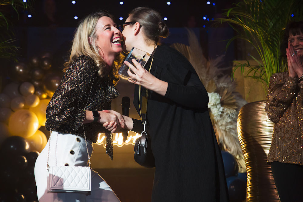
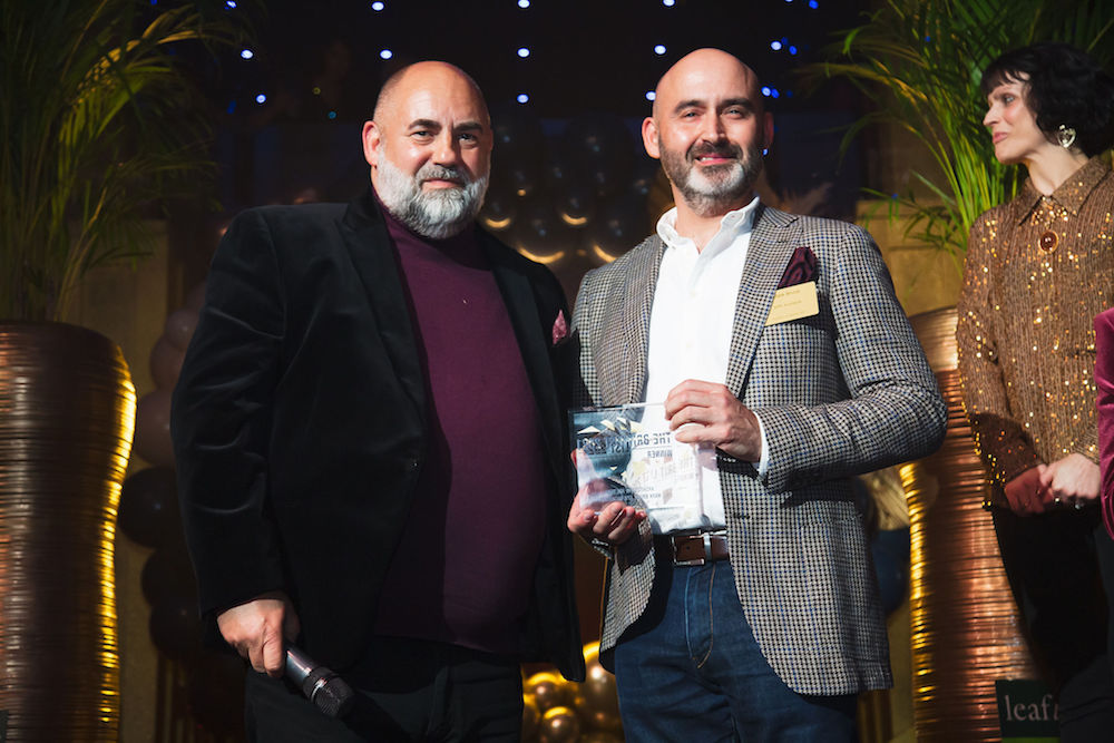
From becoming a partner of The Brit List Awards to offering exclusive interviews, the British Institute of Interior Design (BIID) has supported Hotel Designs’ growth as the leading international hotel design website.
“We see our relationship with the BIID as more of a meaningful friendship that has evolved over the years,” explained editor Hamish Kilburn. “The association becoming an industry parter of all our networking events in the UK is just a further example of how forward-thinking the BIID is to connect with the British designers on the international design scene who are shaping the future of interior design.”
As the industry prepares to emerge from lockdown, and expects a new era of networking events post-pandemic, the BIID has signed an agreement to become an industry partner across all Hotel Designs’ MEET UP networking events, as well as the highly anticipated The Brit List Awards.
“On behalf of the BIID, we are delighted to partner with Hotel Designs for its Meet Up events, as well as The Brit List Awards for the third year running,” said Harriet Forde, the current president of the BIID and Hotel Designs’ co-host of its new podcast, DESIGNPOD. “In these challenging times, it is important to look ahead to occasions when we will be able to come together once again, to network with fellow design professionals and celebrate the outstanding level of design within the hospitality industry.”
Applying principles of neuroscience, behaviour and psychology, the visionaries will respond to MEET UP London’s theme by immersing our audience into a sensory experience like no other before. This will be followed by an engaging talk discussing how and why sound should be considered when designing the hotel of the future. From Jet Lag to Mindfulness solutions, their unique collaboration represents the synergy and creativity needed to future-proof hospitality.
INDUSTRY INSIGHT: Specifying tiles for hotel pool and spa areas
As Hotel Designs continues to position pools and the modern spa under the spotlight, CTD Architectural Tiles takes the reins to explain what designers and architects should consider before and when specifying tiles in wellness areas…
Anyone working within the hotel industry understands the risks associated with high-traffic areas, particularly around a spa or pool area.
Commercial flooring must not only withstand a high volume of footfall and be easy to maintain on a daily basis, but must also look good too – the hospitality industry demands some of the most aesthetically pleasing environments in the sector. This is where tiles have a vital role to play – with a huge variety of designs to choose from, they can also be especially practical for use around wet or slippy areas.
Image credit: CTD Architectural Tiles
Anti-slip tiles are the most practical solution to reducing the risk of injury in a heavy footfall hotel area. Made effective by their slightly textured surface, anti-slip tiles are a perfect complement to other materials, such as stone, wood and concrete.
Image credit: CTD Architectural Tiles
As well as their practicality, anti-slip tiles now offer stylish solutions of their own. Long gone are the days when anti-slip offered only a limited range of design options. Instead, anti-slip surfaces are now available in an enormous range of on-trend designs, colours and formats, providing interior designers with the option of versatility when it comes to high traffic area tile choices. This is of particular importance in a hotel, where first impressions and appearance are everything.
Offering a striking balance between functionality and design, anti-slip tiles now provide a variety of matt and natural finishes, as well as many patterns, textures and sizes. Styles differ from rustic to modern and while some are warm and welcoming, others are cool and contemporary.
Hotel spa environments
When it comes to hotel leisure facilities, the pool is at the heart of generating a complete tranquil, relaxed and safe atmosphere in a spa environment. There are a number of options to consider when choosing safe, beautiful tiles for a spa and one particular trend that has emerged over recent years is wood effect tiles.
Image credit: CTD Architectural Tiles
Phenomenal advances in ceramic technology over recent years have created incredibly realistic wood-inspired designs in porcelain tiles, with a number of advantages. They provide a sustainable, durable, slip resistant and easy to maintain solution, whilst being available in a huge range of styles to suit the demands of the project. CTD Architectural’s Nolan and Woodmania collections both offer natural looking, wood-effect products that are sure to suit any spa-style environment.
Hotel outdoor areas
In the swimming pool area of any hotel, the specification of anti-slip tiles is paramount, as people tend to be walking around barefoot in high-traffic wet conditions. CTD Architectural’s Porcelain Pavers collection offers a range of exterior anti-slip tiles, which recreate architectural materials such as cement and stone – all with a sleek thickness of just 20mm.
Along with the excellent technical qualities of thick porcelain, the products feature high breaking strength and a natural look – important qualities for all types of outdoor use within hotels. In addition, the tiles in this collection are hygienic, easy to clean and resistant to chemicals.
CTD Architectural Tiles is one of the brands that has taken advantage of our Industry Support Package. To keep up to date with supplier news, click here. And, if you are interested in also benefitting from this three-month editorial package, please email Katy Phillips by clicking here.
Following an extensive three-year renovation, the iconic Britannia hotel reopened in April 2019 as a luxury five star hotel and member of The Leading Hotels of the World. The complete refurbishment was designed by leading interior architects Metropolis, working with renowned lighting designers Stokkan Lys…
Metropolis’ clear attention to detailing and use of quality materials have resulted in 22,000 square metres of contemporary classic style, dressed with continental and local references.
Selected to deliver highlights in the contemporary classic aesthetic, key Heathfield lighting can be found throughout the 257 hotel rooms. Junior, Superior and Deluxe suites feature Amelia or Antero bedside table lamps in their bestselling Antique glass finish, completed with an Andro desk lamp in each room.
Image credit: Britannia/Heathfield Lighting
Heathfield & Co’s Czarina Old Gold chandelier forms the central feature of the high-end Signature suite, whilst a pair of Herzog Champagne table lamps draw focus in the inviting conference centre lounge.
Image credit: Britannia/Heathfield Lighting
Heathfield Lighting is one of the brands that has taken advantage of our Industry Support Package. To keep up to date with supplier news, click here. And, if you are interested in also benefitting from this three-month editorial package, please email Katy Phillips by clicking here.
HD launches a one-day virtual conference, Hotel Designs LIVE
Hotel Designs LIVE, which takes place online on June 23, will consist of engaging seminars by the leading figures on the international hotel design scene, while also putting the latest products and innovations under the spotlight…
Hotel Designs, the leading international hotel design website, has launched Hotel Designs LIVE, a one-day virtual conference to serve the industry during the Covid-19 crisis.
The inaugural Hotel Designs LIVE, which takes place online on June 23, will define the point on international hotel design’s most relevant topics with the help of some of design, architecture and hospitality’s leading figures as well as identifying the latest product innovations on the market.
“Not even lockdown will prevent Hotel Designs from creating conversations like no other,” explains editor Hamish Kilburn who will host the virtual event on June 23. “The concept of Hotel Designs LIVE is to use a new method to engage with our audience, and will so do that by hosting thought-provoking discussions and identifying the latest products on the market in a concise and meaningful way.”
Designers, architects, hoteliers and developers who wish to attend the free conference can do so by registering online. The seminars, which will be divided into four relevant sections throughout the day (technology, public areas, sleep and wellness), will include discussions and insights from leading individuals on the international hotel design scene.
What’s on the agenda?
In addition to the live seminar sessions – and to ensure that the event is bridging the gap between hospitality suppliers and designers, architects, hoteliers and developers – the conference will also include structured ‘PRODUCT WATCH’ pitches around each session, allowing suppliers the opportunity to pitch their products and services in a ‘live’ environment to the hospitality buyers that are tuned in.
If you are a designer, architect, hotelier or developer and would like to find out more about Hotel Designs LIVE, or book on to any or all of the above sessions, you can do so by visiting the event page.
If you are a supplier to the hotel design industry and would like to promote your latest product or services to the Hotel Designs LIVE audience, please contact Katy Phillips via email or call +44 (0)1992 374050.
INDUSTRY INSIGHT: How feature walls have evolved with meaning
Feature walls have come a long way from being a decorative element that breaks up space in a conventional living room. Brands like River Bespoke, which specialises in the design and manufacture of beautiful, handcrafted and bespoke shelves, are taking the feature wall into a new era. The company’s Managing Director, Katie Haynes, explains how…
History has a habit of repeating itself and the feature wall doesn’t escape this trend, albeit with some significant differences in accessibility brought about through technological innovation. 18th century aristocracy commissioned elaborate wall coverings at great expense to be proudly presented and admired by peers. Sadly, in recent decades, a feature or accent wall meant nothing more than a few rolls of bold wallpaper stuck on a wall to reinvigorate an interior, these times are long gone, and the feature wall is back with a vengeance.
Image credit: River Bespoke/the Langham Hotel London
The hospitality industry has seen seismic changes over the past decade with the whole experience of visiting a hotel or restaurant being just that: all about the “experience”. Consumers are more than ever willing to shell out life enhancing experiences and the industry once guilty of stacking them high and selling them cheap have refocussed on customer experience. Without fail, the whole industry is setting its stall to deliver unique atmosphere and character speaking to customer senses, from visual appearance, feelings, smells and personal interaction. Management ethos and vision have changed to address these challenges whilst interior designers made accountable for translating that dream into reality and one that is understood by clientele.
First impressions of a hotel are in the lobby area, once a fairly stark space guiding incoming residents to a highlighted reception desk, sound bouncing off the marble floor and walls: clean and functional but not welcoming and certainly not delivering a unique and relaxing experience. So, the journey of the feature wall in hotel design begins here, allowing the lobby to convey management vision and playing with senses. Whilst the reception desk is still a focal point, careful use of ambient lighting, highlights this central point of functionality without screaming “I’m here”. The open space of the lobby carefully and creatively segmented into intimate and social zones each with their own innovative yet linked characters, each space lending itself to different functions or moods. Acoustics are far superior with sounds muted through wall coverings and furniture, delicate fragrances from vaporisers enhance the sensual experience. Visually each space has its own character with guests being drawn to their favourite spaces and migrating to these to meet or work rather than retiring to the quieter confines of a room.
Image credit: River Bespoke
The journey continues with guest rooms another domain of the feature wall. Whilst the larger hotel chains may have little option but to pseudo-standardise the “feature” wall, they still deliver an experience far superior than that of a decade ago. Of course, boutique and high-end hotels take a completely different approach with each room having its own theme or personality. Returning customers become attached to individual rooms building brand loyalty whilst one-off visitors target specific rooms appealing to their own tastes.
Fortunately, the world is at a very different position than the 18th century when lavish wall coverings were hand printed or embroidered. Choices for hotel owners and designers are endless, what was unthinkable due to cost, is at the behest of designers at the click of a mouse.
Interior designers have a veritable smorgasbord of options to select from. Glass partitions adorned with an array of shelves can be used to delineate one zone from another without losing the feeling of space and openness. Exquisite Venetian plaster walls make a real statement, highly polished plaster or even cement are on trend and create a stunning display when subtly lighted. “Feature walls are not limited to the main walls in a lobby lounge but it’s a smart tool of how to divide the spaces and create a wonderful circulation that takes the guest through the design journey, a story unfold,” explains Bergman Interiors’ Marie Soliman. “We love working with artisan and artists who developed revolutionary products that allow us to dream and create using huge range of surfaces and materials including metals, Timber, glass, marquetry, plaster, plasterboard, glass, fibreglass, concrete and much more, sky is the limit.
“Art is not a canvas anymore, its everything in a hotel space; it should be a state of the art especially feature walls. It should bring interest to the space that has a powerful allure, impression, textures and infinite details and to tell a story.”
Image credit: River Bespoke/The Langham Hotel London
Another designer who is utilising the feature wall is Lauren Elliott of Lauren Elliott Designs. She explains: “In a time where we understand and acknowledge that our feelings and well-being are of upmost importance, the demand on our surroundings and interiors has heightened, especially in hotel design. When we visit a hotel we want to experience so much, we want a home from home, but perhaps with an edge, we want to be inspired by an interior that we may not have in our day to day lives at home but have always secretly dreamed of!”
“There are so many tools to achieve this feeling from lighting, to a clever use of texture but one for sure is with the Feature Wall and believe me when I say the possibilities are absolutely endless. It could be a full panelled wall of aged mirrors, a fully shelved wall displaying curiosities, a simple design with a singular piece of abstract art, the list literally goes on. It speaks volumes without needing words, it can be the thing that people tell all their friends about or provide a moment for someone to be still and ponder over their thoughts. And so my point being is that the Feature Wall should never be over-looked and instead seen as an opportunity.”
Murals have become the new wallpaper; no longer does a mural need to be an artwork taking days, weeks or months, delivery is next day with advent of computer-generated images and one-off large-scale printing.
Our list wouldn’t be complete without mentioning wall panels: from reclaimed timber, perfectly aligned and symmetrical oak cladding to molten metal spayed textured panels. Interior designers have all the tools necessary to make each experience personal and truly unique.
River Bespoke is one of the brands that has taken advantage of our Industry Support Package. To keep up to date with supplier news, click here. And, if you are interested in also benefitting from this three-month editorial package, please email Katy Phillips by clicking here.
PRODUCT WATCH: Timeless outdoor furniture from Carl Hansen & Son
Hotel Designs continues to put ‘Outdoor Style’ through the editorial lens by inviting the experts at Nest to get comfortable on Carl Hansen & Son’s range of outdoor furniture…
Nest believes in forever furniture, celebrating designs that you buy once and that will serve you forever. Today, the design destination for premium furniture and lighting puts the spotlight on Carl Hansen & Son’s range of outdoor furniture to discover what makes the brand’s products so timeless.
Surrounding yourself with nature is one of the fastest ways to improve your health and happiness, something that we could all benefit from at the moment. As seen by the desire for parks, gardens and green spaces during lockdowns across the world – outdoor spaces will be key in the opening up of the hospitality industry.
With social distancing looking to be with us for the long term, the hospitality industry as we know it will most certainly change, perhaps even permanently. There will be an obvious reluctance to spend too much time close to others indoors once we emerge from lockdown. But by changing our focus on outdoor spaces, is there a way we can tempt customer back to hotels, restaurants and bars once it is safe to do so?
Gardens, patios and terraces will have a big part to play in allowing us slightly more freedom to socialise, whilst keeping a safe distance from each other. As we move our lives outside, we at Nest believe that the same care and attention given to indoor furniture designs should be translated to outdoor furniture too. By putting a focus on high quality, durable and comfortable pieces, we can curate outdoor living environments that are just as tempting as their indoor counterparts.
Today, we put the spotlight on Carl Hansen & Son’s collection of outdoor furniture. Standing out against the competition for their high-quality craftsmanship, long-lasting materials and timeless style, these pieces represent some of the best outdoor furniture on the market. Comprising of three distinct ranges by notable designers, this collection expertly balances form and function in a range of dining tables, chairs, benches, stools, lounge chairs and deck chairs.
Carl Hansen & Son
When you invest in a product from Carl Hansen & Son, you not only gain a beautiful piece of furniture but become part of a proud tradition of distinctive and beautiful craftsmanship. Providing high quality Danish design to the world since 1908, Carl Hansen’s collection includes pieces from some of the biggest names in design history, including Hans J. Wegner, Arne Jacobsen and Børge Morgenson.
Outdoor furniture by Børge Morgenson
Image caption: Carl Hansen Borge Morgenson | Image credit: Carl Hanson & Son
This range of designs was originally developed by Danish furniture designer Børge Morgenson in the 1960s and 70s, in his search for a range of comfortable yet space saving outdoor furniture. A collection of long-lasting designs with humans at their heart, Børge Morgenson’s functionalist approach is clearly seen in Carl Hansen & Son’s BM range.
With elegantly simple designs, based on wooden slats – dining tables, dining chairs and deck chairs, are defined by their sturdy yet lightweight frames. Versatile and practical, each piece has also been designed to fold away, make them easy to move around and store when not in use. Constructed from untreated, FSC-certified teak – the wood will beautifully patinate over time, gaining an elegant silvery hue. Cushions are available to add an additional level of comfort where needed.
Outdoor furniture by Bodil Kjær
Image caption: Carl Hansen Bodil Kjaer | Image credit: Carl Hanson & Son
A lesson in expert craftsmanship, Bodil Kjær’s architecturally inspired Indoor-Outdoor series is defined by its simple, cubic forms. An understated Danish design, the sleek and streamlined shapes of this collection adapt seamlessly to their surroundings, as pleasing to look at as they are to sink into.
The linear form of this reassuringly robust design is constructed from durable, dark stained teak – a material which has been designed to withstand all environments and patinate beautifully with age. Slanted backrests and seats ensure maximum comfort whilst optional cushions offer additional support where needed. Upholstered in a water-resistant Sunbrella fabric, this range is perfectly suited for comfort both indoors and out.
The Cuba Chair by Morten Gøttler
Image caption: Carl Hansen Morten Gottler | Image credit: Carl Hanson & Son
An outdoor version of an indoor classic, Morten Gøttler’s outdoor Cuba Chair swaps the traditional webbing for a synthetic flat rope, woven to create the instantly recognisable form of this chair. Introducing untreated, solid teak into the frame creates a durable and weatherproof chair which like the other Carl Hansen & Son designs, will patinate beautifully over time.
Image caption: Carl Hansen Morten Gottler | Image credit: Carl Hanson & Son
With a simple folding mechanism, this design is easily stored when not in use and effortlessly portable, ideal for utilising on balconies, terraces and transitional areas.
Nest is one of the brands that has taken advantage of our Industry Support Package. To keep up to date with supplier news, click here. And, if you are interested in also benefitting from this three-month editorial package, please email Katy Phillips by clicking here.
Main image caption: Carl Hansen Bodil Kjær | Main image credit: Carl Hanson & Son
Iconic British design firm, Bisque (part of the wider Zehnder Group) has added a new radiator to its already extensive range of bathroom products…
The Bisque Optic towel warmer by Bisque is now available in its flagship store in Islington and across the UK through Bisque’s network of dealers.
The square-tubed towel radiator is ideal for contemporary and modern homes. Offering a simple yet contemporary design, the Optic was produced to further the brand’s bathroom offering, and works seamlessly in en-suites, family bathrooms and cloakrooms. It is available from stock in three colourways – matt black, traffic white RAL 9016 and classic chrome – all of which have been chosen to complement popular bathroom accessories.
The matt black finish has a soft surface for an uber luxurious feel, and is still hugely popular in today’s interiors market. Meanwhile its popular chrome finish has a glow-reflecting shine. It is also available in a timeless white, providing a clean, crisp finish to complement existing tiles, baths and other bathroom fixtures. This Optic is also available via Bisque’s colour-matching service, which can cater to popular paint brands such as Farrow & Ball and Little Greene.
Following the recent launch of Bisque’s first-ever traditional range, the addition of the Optic solidifies its status as the market leader of towel rails and radiators for both classic and contemporary bathrooms. Bisque prides itself on offering its customers the greatest choice, whether that be through its wide range of colours and finishes, or its bespoke, made to measure sizes.
Bisque is one of our recommended suppliers. To keep up to date with their news, click here. And, if you are interested in becoming one of our recommended suppliers, please email Katy Phillips by clicking here.
PRODUCT WATCH: The new 8mm Shower Enclosure Range from Crosswater
Bathroom brand Crosswater’s new collection of 8mm shower enclosures in its premium bathroom range encompasses shower screen solutions, fittings and accessories, all designed to give customers the ultimate showering experience…
Combining modern design with superior functionality, the new Design 8, Svelte 8 and Infinity 8 collections by Crosswater provide an unrivalled choice of exceptional designs that will suit any contemporary interior, fitting effortlessly into a range of bathroom configurations and lifestyle requirements.
Each collection features Sliding, Hinged, Pivot, Quadrant and Walk-In designs that will add a designer aesthetic to the modern lifestyle hotel.
Svelte 8
Image caption: Svelte 8 by Crosswater
Manufactured to create maximum effect and crafted with a luxurious Stainless Steel finish, the contemporary Svelte 8 collection comes in an array of diverse styles that will fit into bathrooms of all styles and sizes. Svelte 8 not only offers a sleek design but it also has watertight magnetic seals, a clear glass open handle design, larger wheels for the smoothest and quietest running system and seamless wall profiles with concealed fixings – making it the ideal shower range for any bathroom.
Infinity 8
Image caption: Infinity 8 by Crosswater
Perfect for a shower tray or tiled floor installation, Infinity 8 takes showering luxury to a whole new level of sophistication. Each design across this exclusive range features smooth silent doors, watertight seals and seamless wall profiles with concealed fixings for easy and quick adjustment. Exceptionally crafted with a timeless fully-framed design and finished in Stainless Steel, this contemporary yet beautifully constructed range provides guests with a sleek and on-trend shower enclosure that will be at home in any modern or traditional bathroom scheme.
Design 8
Image caption: Design 8 by Crosswater
Introducing a refined and contrasting finish, Design 8 gives homeowners the option to be bold with design. Intelligently built across an extensive range of door options and sizes, the simple and sleek semi-frameless form with strong 8mm toughened glass offers complete durability. Cleverly designed with door seals and finished in Matt Black or Silver anodised aluminium coating, Design 8 delivers a supreme cutting edge look that is both functional and truly aesthetically pleasing.
Recognised as ‘The Home of Showering’, Crosswater is recognised as a leading supplier of premium shower enclosures, trays, bath screens and accessories. Each design from the 8mm range has been exceptionally crafted with high-quality materials and certified finishes as well as holding a lifetime guarantee, making for an exclusive new range for products of the highest possible calibre.
Crosswater, which is a Partner at MEET UP London, is one of our recommended suppliers. To keep up to date with their news, click here. And, if you are interested in becoming one of our recommended suppliers, please email Katy Phillips by clicking here.
Internal and external, closed and open, domestic and nature scale: the Gessi Outdoor line eliminates barriers to create a single grand dimension of physical and mental wellbeing…
The free-standing shower columns of the Gessi Outdoor Wellness System were specifically conceived for outdoor spaces. They offer innovative combinations of materials, finishes and treatments, with the goal of recreating the stylistic and functional pleasure of the Gessi Private Wellness System outdoors, for a private oasis of wellbeing or in public spaces such as spas and resorts.
The refined and discreet lines of the Gessi Outdoor Collections are naturally inserted into the landscape, creating a continuity and happy union between interior and exterior, a harmonious fusion with nature.
Gessi outdoor wellness line G01
With an elegant, modern and discreet appearance, the Gessi G01 outdoor shower gives spaces a refined and contemporary style. Self-standing and created in stainless steel, this model is a winner thanks to its slim and essential design, and gives a special atmosphere to terraces, gardens and pools, the geometric angled tubular structure terminates with a directional shower head equipped with special holes for a rich rainfall jet. The shower head is available with a smooth surface treatment or in 4 different knurled patterns, while the vertical tubular body is equipped with elegant ring-shaped controls in tone-on-tone or contrasting finish, available in smooth or knurled texture. For greater practicality, this model features a design hand shower with magnetic attachment. Also for the outdoor world, Gessi offers customisable details and coordinating elements.
Image caption: Gessi G01 | Image credit: Gessi
Gessi outdoor wellness line G02
With an elegant, modern and discreet appearance, the Gessi G02 outdoor shower gives spaces a refined and contemporary style. Self-standing and created in stainless steel, this model is a winner thanks to its slim and essential design, and gives a special atmosphere to terraces, gardens and pools, the geometric structure characterised by a rectangular tube presents a directional shower head equipped with special holes for a rich rainfall jet. The shower head is available with a smooth surface treatment or in four different knurled patterns, while the vertical rectangular body is equipped with elegant ring-shaped controls in tone-on-tone or contrasting finish, available in smooth or knurled texture. G02 is easy to install and use according to the client’s needs, and can be applied to a square architectural block in corten steel or stone, with coordinating accessories. For greater practicality, this model features a design hand shower with magnetic attachment. Also for the outdoor world, Gessi offers customisable details and coordinating elements.
Gessi is one of our recommended suppliers. To keep up to date with their news, click here. And, if you are interested in becoming one of our recommended suppliers, please email Katy Phillips by clicking here.
Main image caption: Gessi G02 shower | Image credit: Gessi
INDUSTRY INSIGHT: Should business hotels go ‘FIFO’?
No, it’s not a rendition of Snow White and the Seven Dwarfs’ “Hi ho hi ho it’s off the work we go”. Instead, designer Peter Mance, the director of MAAPS Design and Architecture, explains how hotels in the hospitality industry could adapt the ‘Fly in/fly out scheme…
FIFO (Fly In/Fly Out) is a common workforce rostering concept employed by the gas and mining communities.
With the move into our “Stay Alert” phase in the UK it may be the opportune moment for business focused hotels to explore and offer a FIFO business model to corporate and institutional teams. Expanding and adapting the concept of a family “Social bubble” to a new “Corporate bubble” which allows a way out of lockdown and a return of business to city-based hotels.
I see three converging drivers that may open up the concept of city FIFO arrangements for business travel and workforce accommodation in the short to medium term:
Workers desire from an emotional and financial well-being perspective to return to work. In this I am noting Salesforce’s Marc Benioff recent remarks that the general anxiety about the coronavirus coupled with the isolation of being alone at home took an emotional toll on their workforce, with 36% saying they were experiencing mental health issues.
The ongoing concerns around the control of virus spread, reduced public transport availability, concerns about environment pollution and the promotion of walking and cycling.
And to ensure that teams, personnel, and wider social networks are kept safe throughout their day.
Perhaps the other question to be explored at this time is whether brands that operate off a smaller room footprint will be at a disadvantage because of this pandemic.
Return to work
You may have already noticed that five weeks into lockdown there has been a noticeable drop off in remote working productivity, incremental erosions of morale and collegiate purpose. Something is missing. Our experience with remote working has seen colleagues using Microsoft Teams and WhatsApp to keep a constant chat lines open throughout the day. A casual desktop presence so that colleagues can simply spend time (albeit virtually) close with one another, aware and sharing the incidental routines of the day, the coffee break, the toilet break, the cat wandering across the keyboard. Whether it is due to lack of decompression space at home, or anxieties piled on by housemates, parents or partners, I know that some of our younger staff are noticeably itchy to return to their desks and are asking “why isn’t our office our home as well?”.
Image caption: A model of what fly in/fly out could look like.
With the likely staggered returns, staggered days, and rotation of previously furloughed staff FIFO working methods could well become an effective way for institutional and corporate businesses to safely rebuild and reconnect teams over the evolving “Covid Secure” protocols which will be required until a vaccine is available.
Location, location, location
If we are to accept scientific and government advice, then Covid-19 will remain a continuing risk for many months to come. Given that this will be a slow and cautious readjustment I can readily imagine a scenario where both business and budget hotels or hostels can provide collegiate “Bubble Bookings” for companies. The same logic that has anchored many hotels to key transport nodes may for the short term provide the ideal FIFO workforce dormitory location. Allowing what are effectively “quarantined” staff to walk or cycle to their place of work and retreat at the end of the day to a secure, controlled, safe and hospitable environment.
We must anticipate that there will be a mixed degree of workforce acceptance or willingness to return to work. Many anxieties will remain about protecting loved ones at home. Over and above the basic guidance from our government, companies will be speaking with staff to agree how they can safely work, protect themselves, protect colleagues and families while starting to re-engage and drive our economy back to life. My sense is that the offer of a trusted hotel room for key staff can be one of the ways that we can bring people back to work, allow an appropriate level of protection and keep vital businesses going.
In know that hotels, in the absence of prescribed government guidance, will define their own pathway back to accepting guests. As has always been the case, it will be the operators and owners that carry the risk and responsibility for guest safety and will therefore look to transform and lead the way forward from the front foot. Happily, one of the paradoxes of the pandemic is that it will be an impetus for, not an impediment to, innovation.
Covid protocols
Hotels have already demonstrated they can successfully operate within the Covid climate and maintain impeccable hygiene standards. The first wave and initial lock-down saw the likes of Best Western, Hilton, Holiday Inn, Travelodge, Whitbread’s Premier Inn, Ibis, Mercure, Novotel and Adagio opening their doors to the NHS and other government mandated key workers, in addition to working with local and national government agencies during the repatriation of Brits returning home to the UK. Let us pivot this capability and knowledge to reassure future guests and demonstrate that business hotels remain an attractive option to businesses.
As a result, there may be future development opportunities for hotel operators to utilise their collective hospitality and logistical capabilities to provide “pop-up” accommodation within larger offices. Perhaps converting a couple of floors, or dormant retails spaces, and bringing in housekeeping resources and cleaning expertise to keep things in order.
Hotels will have already focused on upgrading their hygiene skills. Working with AHCP (Association of Healthcare Cleaning Professionals) to certify staff and institute improved procedures and protocols. I’m also aware of the many examples of patient hotels in Scandinavia and their expertise in maintaining a healthy comfortable environment with impressively low incidents of infections. Much as I am suggesting for FIFO work rostering to help the UK’s return to work, many of the patient hotels provide accommodation for doctors on six-month training periods at adjacent hospitals. It is therefore clear to me that the necessary level of preparedness and resources within the hospitality world already exist to keep guests and staff safe.
The size of rooms
It will not be about size of the guestrooms. It will be about the journey to it.
In my opinion hotels with compact room forms and long-stay options will be adept at welcoming guests back business guests. They will in fact have the advantage as their essential mode of operation is their studied efficiency, often with a stripped-down aesthetic, which will be eminently easier to clean and protect.
Image credit: MAAPS Design & Architecture
Much as it is being explored in the workplace arena, strategies for safer hotels and hostels post-Covid, will be using simple and cost-effective measures such as staggered room allocation to reduce density and the redesign of circulation routes to allow for one-way directional movement through the hotel. Adaptability will be key, with the ability for spaces and guest rooms to flex to accommodate perhaps a duel use – part guestroom, part office. With Club Quarters Hotel LIF Club Level guestrooms, we have explored similar transitional room concepts which are achieved through creative, yet uncomplicated, design solutions. Where shuttered internal windows between rooms and corridors provide visual outward connections. Now might the very moment that these experimental guestroom thoughts find traction.
Initial hotel concerns will focus on improvements to increase ventilation capacity and filtration, along with enabling one-way guest circulation through the hotel and guestroom levels. While there will be a reluctance to drop room count, hotels will have to reduce density for operational reasons. While we may not be able to stretch corridors, and until the pandemic passes, it should be feasible to identify new stacked cores through which to tread a new stair and ductwork network. With lifts then designated for upward distribution and stairs are down.
Closing thoughts
As I mentioned above, our younger design team members are craving for the incidental connections of life and a return to work. They would like nothing better than for us to provide the means, accommodation and safety of our own “Corporate bubble” close to work. Life in lock-down has thrown many things into relief. Among them the spaces in which we work, stay, and how they are purposed. Particularly, and in some instances painfully realised, as many of us have asked homes to carry the combined weight of work, sanctuary, school and gym. The FIFO accommodation model may help both business and hospitality transition back to an integrated life and foster lasting connections with location and community.
Oh, and you’d be well advised to plan for lots of additional bike storage!
MAAPS Design and Architecture is one of the brands that has taken advantage of our Industry Support Package. To keep up to date with supplier news, click here. And, if you are interested in also benefitting from this three-month editorial package, please email Katy Phillips by clicking here.
As Hotel Designs starts to place outdoor style under the editorial magnifying glass this month, editor Hamish Kilburn gets comfortable as he checks out Minotti’s Tape Cord Outdoor range of furniture, a fine example of outdoor, robust furniture meeting indoor style…
If you are familiar with the Italian furniture brand Minotti’s timeline of product launches, you will know all about Tape, a collection of seats that were designed in collaboration with Studio Nendo, and first launched in 2018, that bring together couture detail and soft curves.
As with everything on the international design scene, meaningful furniture collections evolve – and the same can be said for the Tape collection, which in 2019 incorporated items for the outdoor environment that maintain the undeniable elegance of the forms and concepts of the design, and add a few welcome variants that embrace the concept of outdoor living.
The seats became deeper, larger and more relaxing, while the metal frame, in a new outdoor finish, was covered with the wicker-effect cords, which is available in two colours: mud and licorice.
Here, the couture detail of Tape – the piece of ribbon that holds the feet on to the body – takes the form of a light bronze-coloured metal plate. This finish is the minimal common denominator and leitmotiv of the entire 2019 Outdoor Collection.
Image credit: Minotti
The family offers many elements, ideal for creating relaxation areas also in small outdoor spaces or on urban rooftop terraces: from the armchair to the sofa, from the Paolina chaise longue to the original open couch – open at the back – from the chair to the coffee tables.
Image credit: Minotti
The concept of the small tables in metal with light bronze finish is inspired by the distinctive Tape detail itself, which aesthetically secures the legs to the crown, inside which the top in Silver Beola or Corian EC is inserted.
Image credit: Minotti
Minotti London, which is exclusive style partner at MEET UP London, is one of our recommended suppliers. To keep up to date with their news, click here. And, if you are interested in becoming one of our recommended suppliers, please email Katy Phillips by clicking here.
FEATURE: What roles do outdoor pools and spas play in tented camps?
As Hotel Designs continues to metaphorically bathe in the topic of Pools and Spas during May, it asks the experts at Bushtec Creations how to sensitively add a new layer of luxury to tented accommodation…
Thinking about going on a Safari to the heart of the African bush or glamping during the hot summer months of Europe? Well there is nothing more refreshing and relaxing than washing off the adrenalin of adventure in a sparkling, clear pool.
Adding a swimming pool to your hotel or tented lodge in cities of towns doesn’t seem too big of a problem, but adding swimming pools in rural, remote locations can pose some difficulties. Yes, one can build a pool on site, with local labour and sufficient time, everything is possible.
At Bushtec Creations, we have different options available when it comes to swimming pools. Our DIY ready-to-assemble pools are hands down a winner for sure when it comes to remote areas. It is innovative, stylish, and elegantly designed with natural beautiful wood, which is the perfect complement to your tented camp/resort. The outer wooden structure of the pool is manufactured to exacting standards from high quality, pressure impregnated, dried and oiled, dense Scandinavian timber, fitting perfectly into any garden or location, in total harmony with its surroundings.
Image credit: Bushtec Creations
With Bushtec Creations, there are quite a few different ways to incorporate swimming pools in your tented camp/lodge/resort. Depending on each client’s requirements and the site layout, you may only want to have one communal pool forming as part of your main area or you might also want to add smaller private plunge pools or Jacuzzis at each tented guest unit which is what happens in most cases. Some cultures prefer private pool at each tent in terms of their customs. It is a good alternative then to add a reflecting pool to your reception tent which can set the tone of a peaceful and harmonic sanctuary where one can sit and reflect.
We have also found that guests at tented lodges prefer private pools, guests visiting these lodges are there to relax, go on game drives and capture the wildness of the African bush, whereas guests at glamping sites in Europe come back from an adventure with the family and don’t mind take a refreshing swim in communal pools. This also helps to reduce the noise levels at the guest units if families are at the communal pools.
Image credit: Bushtec Creative
Spas can also play a big role in your tented camp and can be immensely beneficial. When tourists look for tented camps as part of their vacation destinations, a spa would encourage them to add this to their itinerary.
Image credit: Bushtec Creations
Let’s be honest, how many people can say that they have had spa treatments in a luxury tent before? Not as many right? Tented camps/resorts are trending significantly on a global scale and you definitely want all the “most wanted” added benefits as part of your investment. Your spa’s can also be designed, like your entire camp, just the way you want it.
Image credit: Bushtec Creations
You can have a specific section of your tented camp/resort dedicated to an entire communal spa area which could include multiple spa tents for couples, each with their own inside Jacuzzi, or you can have a few private spa units separated by quite a distance, each with their own plunge pool and firepit to add to the ambience. Then again you can keep it simple with just one spa unit within your tented camp/resort which mainly caters for treatments. Your spa units would in most cases have the same designed “look and feel” as the rest of the tents so that your camp has a unified design throughout.
Image credit: Bushtec Creative
Bushtec Creations has the added benefit of having a dedicated in-house design team who takes all natural surroundings and outdoor elements into consideration when designing your tented camp/resort, aiming for your investment to be in harmony with the outdoors surrounding it. We are also very focused on making sure we create an environmentally friendly tented camp/resort so as to ensure that your natural habitat is looked after. Being aware of the minimal impact wanted on natural environments, we can create tented camps/resorts with the lightest footprint possible specifically to preserve the natural habitat and we have all relevant materials and technology to comply with this requirement.
We can create your tented camp/resort suited to your desired requirements ensuring a great return on investment!
Bushtec Creations is one of the brands that has taken advantage of our Industry Support Package. To keep up to date with supplier news, click here. And, if you are interested in also benefitting from this three-month editorial package, please email Katy Phillips by clicking here.
“Hygiene is a top priority for bathroom designers”, says GROHE
The bathroom manufacturer GROHE tells Hotel Designs that a new approach to the topic of hygiene will significantly change the work of architects in the future…
Bathroom supplier GROHE has reported unprecedented demand for hygienic touchless taps in the wake of the coronavirus COVID–19 crisis.
At a time when the pandemic has pushed the everyday necessity of hand washing into the spotlight, it would seem finding solutions to optimise hygiene in both the workplace and at home is spurring the demand.
“Together with sustainability, health will define the way we build and design homes, offices and places where people meet,” – Coen van Oostrom, Founder and CEO of EDGE.
Leading figures within the design community are also considering how hygiene will come to the fore in the interior spaces of the future. Coen van Oostrom, Founder and CEO of EDGE, a company that specialises in developing a new generation of buildings that focus on the health of people and the planet, predicts that new health measures will play a key role in a new generation of workplaces. “Together with sustainability, health will define the way we build and design homes, offices and places where people meet,” the architect said. “Touchless products and speech-driven technology will play a key role in making healthy and safe offices. Consumers will want to minimise contact to surfaces as much as possible”.
Having specified the healthcare, hospitality and commercial sector for many years, where hygiene-optimised products are already far more commonplace, GROHE is braced for the vast changes ready to hit the mass marketplace. “With our wide range of touchless and hands-free products, we at GROHE have the right response to the increased need of hygiene in sensitive areas such as kitchens and bathrooms”, says Jonas Brennwald, CEO LIXIL Water Technology EMENA, Deputy CEO Grohe AG. “Currently, we can say that we are already experiencing a higher demand for our hygiene enhancing products – from both our private and business customers.”
In the UK market, the transition to a more hygiene-focused workplace and business environment has already been in motion since the beginning of the year. Elina Enqvist-Twomey, Category Manager at GROHE UK says: “Feedback from the commercial market in the last three months tells us that hygiene is top of the agenda for specification, with a large proportion of projects specifying more hygiene-focused products such as infra-red taps , infra-red flush plates, and shower toilets. In recent weeks, we have seen an increase in customers purchasing infra-red taps as a result. Likewise, in the kitchen, several of our tap designs which use advanced technologies to minimise physical interaction with the handle of the tap itself such as our SmartControl kitchen mixer and Zedra Touch range have also seen an increased interest. When the industry returns to a sense of normality, we expect the increasing scrutiny of hygiene in the workplace and public buildings to continue. This pandemic has encouraged all of us in some way to rethink our hygiene practises and consider new lengths to protecting ourselves and those around us.”
Image credit: GROHE
Why an infra-red touchless tap is more hygienic
In recent years, the property market has seen a shift to include more alternative housing settings such as grandparents living with their children and families, or groups of young professionals co-habiting together. This is when infra-red technology first began to be demanded in the residential sector and its benefits have continued to strengthen demand ever since. Infra-red taps require minimal, if any, human contact with the tap itself unlike standard taps where germs from unclean hands could linger on tap handles, unless continual thorough cleaning was carried out after each use. The GROHE Bau Cosmo E, a strong robust design made using composite polymer, uses motion sensors to detect movement, which then activates the water flow. A mixing valve on the side of the spout can be used to adjust the temperature if required and a temperature limiter can also be installed if desired. Once the user removes their hands from the basin, the sensors will detect this and stop the water flow.
GROHE is one of Hotel Designs’ recommended suppliers. To keep up to date with their news, click here. And, if you are interested in becoming one of our recommended suppliers, please email Katy Phillips by clicking here.
INDUSTRY INSIGHT: Using glass meaningfully in hotel public spaces
While Europe is gradually reopening after lockdown measures have started to be relaxed, hotels are entering an adapted era of hospitality. Portobello Art explains how the story could be narrated behind glass walls (in public areas at least)…
With a glimmer of hope on the horizon from the latest government announcement that hotels might be able to reopen in July, all hoteliers, big and small, will now be planning their reopening scenarios and adapting their offerings based on current advice and guidelines in order to keep their staff and guests safe.
The requirements will be very strict and one of the main priorities of course will be to implement social distancing policies. This means the design and layout of public spaces, including reception desks, lobbies and restaurants, is going to have to change to allow for this.
One of the obvious solutions would be to introduce Acrylic/Perspex or Glass screens in these areas which would provide effective separation without affecting the brightness of the overall venue.
But rather than introducing plain see through screens which might make your venues look too institutional, why not give free rein to your imagination and consider adding bespoke images to create a bit of fun and make your spaces more interesting.
Portobello Art can source images and/or create bespoke artwork to suit any theme or style and print vinyl manifestations at any size to fit any screen.
The artwork can be informative.
Image credit: Portobello Art
Or decorative.
Image credit: Portobello Art
Or promotional… using branding or inspiration.
Image credit: Portobello Art
Any size – small or large.
Image credit: Portobello Art
The most difficult areas are probably going to be the restaurants and here are a couple of ideas for going forward.
Image credit: Portobello Art
If you have enough space in your restaurants you could create a Glass/Perspex box per table with dividing screens or if you have outside dining areas, a bit extreme, but why not have small greenhouses (as seen here in the Netherlands!). You’re only limited by your own imagination!
In all seriousness, exterior areas could be the way to go with outside dining over the summer months, enabling social distancing to be created more easily. There are numerous varieties of partitioning available but rest assured that all our vinyl manifestations can be used safely and securely on any outdoor screening solutions.
Whatever your requirements, our designers are here to help you create innovative artwork to brighten up your venues.
Portobello Art is one of the brands that has taken advantage of our Industry Support Package. To keep up to date with supplier news, click here. And, if you are interested in also benefitting from this three-month editorial package, please email Katy Phillips by clicking here.
A textile brand is manufacturing non-medical masks during pandemic
Hotel Designs learns more about how textile brand Backhausen is doing more than its bit, by designing non-medical masks, during the fight against the spread of COVID–19 coronavirus…
As COVID-19 started to spread around the globe, businesses in all industries started adjusting to the “new normal” by assessing core functions, as well as contributing and assisting positively to their communities.
Backhausen became conscious of the need for non-medical face masks in early March 2020, after the COVID–19 pandemic hit the company’s home country of Austria and other parts of the world. The company wanted to do something significant for its community – something that would take advantage of its expertise and craftsmanship and would benefit other people and businesses without forgetting about the environment and the planet.
“Our design and production teams adapted the manufacturing facilities at our textile mill in Hoheneich, in the heart of picturesque Waldviertel, to create a new quality fabric,” explains Maria Florencia Caruso from the brand. “We have carefully selected premium quality cotton yarn that is ÖKO-TEX certified and developed a 100 per cent cotton fabric that is sustainable and durable for reusable non-medical masks for everyday wear.”
Image credit: Backhausen
The company has designed a mask that provides comfort, protection and is aesthetically pleasing. The double overlap in the design allows the mask to be worn comfortably with glasses. The double tie bands allow the mask to be adjusted and fitted for wear.
Its aim has been to create a mask that is washable, comfortable, sustainable and customisable, from the beginning of its development. Backhausen’s mask is for individual customers, and the retail, hospitality and service industries. “We encourage and aspire to create a more comforting and assured return to the work environment and make this “new normal” less daunting and intimidating for everyone,” added Caruso. “At Backhausen, our strength and value has always been to provide flexibility, as a business and with our fabrics. The masks have been designed, focusing on their seamless incorporation into everyday business, with an option for customisation. The masks can be customised by colour and/or logo designs can be either embroidered or woven on the fabric.”
During these difficult times, Backhausen is donating €1 for every mask sold to the Austrian charity Lebenshilfe. This charitable organisation supports more than 11,000 people with pre-existing medical conditions and intellectual disabilities at 500 locations throughout Austria. The charity aspires to re-establish their independence after the COVID–19 pandemic, which has been so disruptive to their day-to-day lives. It will enable people with disabilities to select their own development opportunities in all phases and areas of life, reshape their lives independently, choose their support freely and take advantage of social offerings confidently and in line with their personal needs.
Please contact info@backhausen.com or call +43 2852 502 for the purchase of face masks, (minimum pack of five), for larger quantities and for customisation enquiries. From May 13, 2020, the non-medical grade masks will be also available for purchase at Backhausen’s Design Shop.
Backhausen is one of the brands that has taken advantage of our Industry Support Package. To keep up to date with supplier news, click here. And, if you are interested in also benefitting from this three-month editorial package, please email Katy Phillips by clicking here.
INDUSTRY INSIGHT: Photographing a hotel for design press
Following on from the popular feature that explained how to style a hotel’s narrative for design press, Hotel Designs asks photographer Brenden Cox of The Towner what to consider when framing and capturing a hotel’s interior design scheme…
One of the first questions I always ask a client when I’m photographing is: ‘what are you trying to say’ and ‘who is your target audience’. These questions play a vital role in dictating what these images will look like.
If your hotel has a strong and consistent message, why not express this with your photography?
Image caption: A luxury villa in Ibiza | Image credit: Image credit: Brendan Cox/The Towner
People will choose a hotel as they want to be part of the story that the hotel has created. Joseph Campbell wrote that all good stories start with a ‘Call To Adventure’ which is exactly what these photos need to be. Unique angles of rooms or communal spaces makes you want to explore what is around the next corner. Framing an image through a doorway or partly into a room draws the viewer in and excites their imagination. This can also help hide some unflattering but necessary utilities, make these angles work for you! Draw your viewer in and capture their attention with what they find.
Image caption: The The Calile Hotel Brisbane: Image credit: Brendan Cox/The Towner
Showing what a space looks like is a very important part of advertising your hotel, but as with any great story it comes down to the details. Showing off interesting and unique textures, fabrics and finishes in a hotel gives a taste of what the customer can experience. The great thing is these images can be shot all year round. When booking photoshoots, walking the line of wanting to have beautiful weather but not wanting to disrupt your clientele can be extremely difficult. That is why focusing on detail shots can help increase your content and will compliment beautifully those ‘Hero Shots’ you capture when you have nice weather.
Image caption: Luxury villa in Ibiza: Image credit: Brendan Cox/The Towner
Customers are also usually looking for a certain type of atmosphere when choosing a hotel. Is your hotel in a busy area, surrounded by the lights of the city and the noise and romance of late night dinner spots? Then a dark and moody photograph, showing off the rich textures and colours of your hotel’s interiors, suggests the perfect intimate hideaway. Fitting perfectly with the holiday experience your customer is piecing together in their mind. This is all about playing a role in the story that they are trying to create.
Conversely, are you trying to appeal to young families, big groups or people just travelling for business. Having your images wide and bright gives comfort to parents that they will be able to see where their children are playing. Groups know there is space for everyone and there will be no shock about what it looks like when arriving. A photograph is there to put the viewers mind at ease, that the hotel will deliver on what their message says. A dark and rich photograph of a hotel restaurant has the same importance as a wide and well-lit image of that hotels conference room. It is all about what you are trying to say!
Colour plays a very significant role in expressing what a space has to offer. A photographer will usually take the lead of the interior designer or stylist who has decorated a room by trying to reiterate what it is they are trying to say. Dark woods and rich upholstery will compliment beautifully with a warm light and deep saturation. Reds and oranges are associated with hunger and desire, drawing the viewer in and leaving them wanting more.
Image caption: The interiors of a luxury residential property designed by architect Harvey Langston Jones | Image credit: Brendan Cox/The Towner
When showcasing a rooftop pool or beautiful garden and outdoor area, blues and greens express relaxation, nature and freshness. Using these colours has the added benefit of really making an image stand out. Colours are incredibly versatile and are there to be used to your advantage. Try and keep your branding in mind when discussing with your photographer as well. Most companies have a style guide which all their promotional materials reside within, so why wouldn’t your photos?
Image caption: Luxury villa in Ibiza | Image credit: Brendan Cox/The Towner
One of the best ways to tell a story with photographs, is juxtaposing them in a way that celebrates not only your beautiful hotel but also the area in which it is located. This again will be closely tied to the interior designers approach and how they have tied the styling into the look and history of the surrounding area. Images of white towels and large glass windows, complimented next to rolling surf and white sandy beaches, tell your potential customers all they need to know to convince them to stay!
This is also a great opportunity to really make you hotel stand out from the crowd. How is your space interesting and unique to the area it inhabits. Images of a busy London street next to a photo of a chic Japanese inspired interior excites the imagination and curiosity. As well as images of an open African savannah adjacent to a secluded glass room overhanging it, tells such a vivid story with only two images.
With all this in mind, the most important thing is to really try and explore what you can achieve with your imagery. Due to the rise of social media people are always on the lookout for what is new and exciting. Staying in a hotel can be luxurious and full of adventure, and that should be taken advantage of when planning a photoshoot.
INDUSTRY INSIGHT: The art of designing safari tents
For more than 16 years, and with international celebrities, boutique resorts and government departments as its customers and friends, Exclusive Tents International has become one of the leading global suppliers of safari style camps and accommodation in every shape and size. Writer Donnie Rust, the founder of Lost Executive, explores the family business…
This wonderful family business, Exclusive Tents International has reached this level by the simplest approach of style, quality and authenticity and as founder Paul Zway reveals, there is very little stopping them.
Image credit: Exclusive Tents international
That one inspiring idea
“The creative process begins with getting one solid idea and building on that,” Zway explains. “Everything else is just decoration and details until you have that one brilliant and inspiring idea that makes you want to start to build something. That is where everything begins.”
This period of the project, where ideas are harnessed, is Zway’s favourite part, and has become a fundamental part of his business around which all that Exclusive Tents offer revolves. The man is, by nature, an incredibly forthcoming and friendly person who takes the time to know his clients, his staff and suppliers on a first name basis. He is a man who loves the details of things and thrives on the challenge that an ever increasing and developing hospitality world throw at him and his company.
“Whether a project needs a tent to be constructed entirely from scratch, or if a tent style we already have meets the physical requirements, each and every project is unique because a client’s dream is unique. And dreams always come with challenges,” he adds. “Some of these challenges can be spotted and solved ahead of time. This is where experience is crucial because it allows us to spot challenges before they become problems for clients. It also makes you very able to handle issues when they pop up unexpectedly.”
Image credit: Exclusive Tents International
Living the life
Clients of Exclusive Tents International have described the company with words such as “industry leader” and “pioneer” and they have the results to back up such praise. They’ve been involved in designing and setting up tent structures for as varied a client base as glamping sites, safari lodges, five star award winning hotels and environmentally fastidious eco-lodges. It could be argued that their “never say never” approach to challenges has helped such industries as glamping and safari to reach their lofty standards on “out-of-the-ordinary-accommodation”. An entire industry has sprouted around the idea that safe, eco-conscious and versatile accommodation can exist anywhere on the planet and one man’s inability to turn down a challenge is partly to blame.
This may seem hyperbolic, but Zway spends a great deal of time flying across the world and speaking to CEOs, hospitality moguls and millionaires who have an idea that seems impossible but they want it made into reality.
“You can never mislead a client or tell them something can be done just to make them happy,” he says, “Truth and transparency is something my whole company values. However, you have to believe that there is a way to get to the end result. It may take a bit longer than a client would like or it may be more expensive, but there is always a way.”
Zway has spent most of his adult life in or around tents. As a professional game ranger specialising in anti-poaching, a career he devoted seventeen years of his life to, he spent many nights sleeping in tents. Some would say that the founding of Exclusive Tents International was almost inevitable. His son, Zane, is also a vital part of the business which revolves around thinking differently and always looking at things from a different perspective.
“This is why we can offer revolutionary designs and superior products,” Zway explains, “We all travel extensively and I live in one of my own tents! So, call it an insider’s perspective, but while a client may be thinking of their vision we’re thinking about the material needed to survive the weather conditions, or what sort of wear and tear can be expected. How will all the details affect the final result and how well it will age?”
It’s no surprise that the company offers over sixty designs and customisable options which is one of the largest selections in the market today. Always fabricated with the finest materials, erected with the best expertise and then backed up with the best after-sales service. Something that he is proud of is that their products are not produced on a soulless conveyer belt and that he has been able to craft a business where quality and that personal touch counts for so much.
“We’ve never had a problem with aftersales service,” Zway remarks, “We treat our clients like family and every client feels that they’ve got the full strength of Exclusive Tents International behind them. Every one of our engineers, interior designers, architects, set up specialists and consultants are there for them to see their vision through.”
Image credit: Exclusive Tents International
Bringing people and nature together
“There is a romance that comes with sleeping in a luxury tent that you will not find anywhere else,” Zway says, “It can bring you right up against nature without actually dropping you in it.”
The ultimate ‘have your cake and eat it’ scenario, Paul is passionate about helping people connect with nature and to better understand their parts of the world. He reveals that a big part of his business has always been to find ways of marrying living spaces with nature and the environment. He believes that this is a fundamental human need that we naturally seek out whenever we can and that industries like glamping were destined to grow. Glamping offers peace, space, tranquility and the chance to connect with nature without being engulfed in a crowd.
Thanks to this he believes that these boutique and creativity-driven sectors like glamping and eco-camping, are in a great position to see a resurgence of popularity post Lockdown that will outclass other groups in hospitality.
“Travel is going to be centred around escaping cities and apartment buildings for a while with people wanting to get back into nature,” he says, “Glamping offers a great chance for this to happen as well as offering the freedom of space.”
Additionally, thanks to many glamping sites promoting privacy and solitude as part of their offering, Paul points out that social distancing will be able to be affected without seeming to be enforced.
“People will be able to enjoy open space, reconnect with nature and spend some precious time looking up at that massive sky and just breathe in the fresh air,” he says.
Image credit: Exclusive Tents International
New designs
Innovation as a tool to meet a client’s current needs and to predict and prepare for their future ones is important. Zway is a big advocate for natural product evolution and change based upon the research and responses from clients. He is also a big believer in making hay while the sun shines. During Lockdown they made time to innovate and craft a new family tent design that has a new look and feel. The tent, named Mabarule after one of the legendary wild African elephants will be available by the end of May and it’s going to be a gamechanger.
In the same regard as this period has all been about keeping the family safe Marabule is a continuation of that. Paul explains that they have the most robust roof frames on the market to handle snow and wind loads and the best performing acoustic and thermal insulation available. Master planning and expert interior design is available for the inside living space which also comes with a number of containerised solutions including hybrid power, kitchens, sanitation, water purification and desalination.
“Marabule really is a masterpiece, and a credit to the incredible resilience and flexibility of the Exclusive Tents team,” Zway says, “There is an endless list of innovation that has gone into this new design which has made it easier to erect yet more secure. The metal components are even more rust resistant yet still being aesthetically pleasing. The material is completely flame retardant and, using unique sandwiching techniques is extra insulated to keep out the elements and keep the comfort in. It is a marvellous accomplishment by a team I am very proud to be involved with.”
Exclusive Tents International is one of the brands that has taken advantage of our Industry Support Package. To keep up to date with supplier news, click here. And, if you are interested in also benefitting from this three-month editorial package, please email Katy Phillips by clicking here.
Do you have the exclusive report on what your staff want post-lockdown?
Gradually countries and businesses around the world are starting to think about life post-lockdown and smart hotels are looking to their employees to drive a successful bounce back, writes Planday’s industry expert Oskar Karlsson…
The hotel businesses I speak to everyday tell me COVID-19 is still continuing to make waves across the industry, but smart operators are looking to the future and finding ways to prepare for what may come.
I think it’s important to remember the old adage that if you don’t treat your customers right, someone else will. Post-lockdown, consumers will be even more discerning about where they choose to go, and outstanding customer experiences — delivered by the best asset in your business, your people — will be what sets you apart from your competitors.
“We spoke to 1,822 people from around the UK, across all parts of the hospitality sector, with more than half of them having worked in the industry for more than a decade.”
It’s also worth remembering that your staff will also give better service when things do reopen if you treat them right now. Make sure you take the time to communicate with them regularly, be open about your plans and the challenges you are facing as a business. Keeping the strength of a good team must be a vital part of your reopening plans.
Based on their feedback, here are my three key tips to make the most of your best asset now so your business can bounce back stronger post-lockdown.
1) Pay people properly
More than ever, the impact of shift cancellations means those who work in shift-based industries like yours are struggling to get by. You can’t check a customer in, work behind the bar, give customers a memorable experience or make a memorable meal for hundreds of people from home.
For 70 per cent of those we surveyed a “fair salary” is the most important factor at work. Paying people properly not only means abiding by the minimum wage, it’s a smart investment on your part to reward and incentivise above it for the people who make your business work.
50 per cent of the hospitality workers we spoke to think more training and development is important and will help them grow their careers — and your business — along with it. Right now is a good time to think about plans to increase this once you reopen. Plenty of online training programs and courses are available now, so have a look at what’s around and see whether this can work for your business.
Image credit: Planday
3) Flexibility is your friend
With more demands on people’s time through multiple shift-based jobs, family commitments or study, it’s not surprising that 41% of those we spoke to think flexibility is something businesses like yours should embrace more. A recent HSBC study shows 89 per cent of workers think flexible working can motivate them to be more productive.
Image credit: Planday
Flexibility is more than a buzzword and something people are being forced to do now because of COVID-19. Being responsive and agile to your employees’ changing needs — as well as the global and industry ones – is what will keep your staff motivated and more likely to help you grow your business for longer as you come together again and navigate your way through the COVID-19 bounce-back.
Image credit: Planday
What does this mean for you?
Smart operators must change the way they work to keep good staff for longer by understanding that better customer experiences go hand in hand with better staff experiences. You can’t have a good business without good staff. In order to bounce back stronger post-lockdown, people will be your best investment.
Planday is one of the brands that has taken advantage of our Industry Support Package. To keep up to date with supplier news, click here. And, if you are interested in also benefitting from this three-month editorial package, please email Katy Phillips by clicking here.
INDUSTRY INSIGHT: Organising large, open-plan spaces
Hotel Designs asks design studio Design By Deborah to explore the challenges and solutions when designing large, open-plan spaces that have different functions and moods…
There has been a movement in both the residential and commercial market towards open plan spaces. No longer do we want rooms dedicated to one purpose. Instead, we want to have flexibility in how we use the space and we want the airy and light feeling that attracts many people to open plan living and working.
Of course, there are those hotels that are in old premises and part of their character are the hidden corners where someone can feel cosseted and hidden away and these characteristics should be embraced. We love them for it.
Open plan spaces can present challenges. At the heart of the hotel you may well have the reception area, bar area, lounge and access to other parts of the hotel. This may also be where you serve meals either as a restaurant or as bar food. This may sound obvious, but guests need to know quickly and easily where these zones are. This is particularly important if your guests are not generally repeat customers.
There are many ways of creating zones. The most obvious is how the furniture is laid out. Placement of the furniture can create aisles, direct the flow of traffic by creating entrance and exit points. The style of furniture can also help the guests understand the function of each space. This does not just apply to the seating but other occasional furniture such as side and bar tables, coffee tables and consoles. Plants and if you have space, trees can create screens helping define zones too and introduce something natural and calming in what can be a busy and noisy space. It is important to create conversation groups of varying sizes and style to not only create interest, but also various guests will be attracted to different zones for different reasons.
Flooring can be used to define areas, using different colours, textures and style. The floor is often the largest visible surface, however it is often overlooked. The nature of the floor can transform a space and has a big impact on your initial impression. Contrast a heavily patterned carpet, irregular wooden planks and fine marble tiles. Each has a very distinct personality. If you have high ceilings this can also be an opportunity to absorb sounds and create a sense of coziness. Don’t forget that suitcases don’t run well across different floor surfaces.
Image credit: Wyndham Hotels & Resorts
Lighting is another area of definition that is often used in the interior design of large open spaces. It can not only define areas but create moods that can be altered throughout 24hours. The style, level and colour of lighting are all very important. Lighting can come from many different sources not just lamps and ceiling lights. There are areas where decorative lighting is needed such as chandeliers and pendant lights, but sometimes it is not the source of light that is important but the area that is being lit. It could be the floor, wall, artwork, fireplace, seating, wooden beams, in fact any feature that you want to highlight, even a vase of flowers. A good interior designer will layer lighting and this can be the difference between a good interior and an amazing space.
Design By Deborah is one of the brands that has taken advantage of our Industry Support Package. To keep up to date with supplier news, click here. And, if you are interested in also benefitting from this three-month editorial package, please email Katy Phillips by clicking here.
Bathroom manufacturer Duravit has taken the c- shaped technology one step further in the Happy D.2 Plus c-bonded range, in collaboration with sieger design…
With Happy D.2 Plus, Duravit teamed up with sieger design to realise current trends in colours, design and finishes. The archetypical open oval of the Happy D. design classic runs through the elements of this new, supplementary range.
Above-counter wash bowls with precise lines, stand-alone consoles and matching semi-tall cabinets as well as circular mirrors combine to create perfectly harmonised washing areas.
Innovative technology, highest possible precision
In 2020, the series was extended by a new development – Happy D.2 Plus c-bonded. The innovative, patented c-bonded technology was developed by Duravit in order to meet the highest design requirements in the bathroom. The furniture washbasin is connected almost seamlessly to the vanity unit in a complex process so ceramic and furniture merge to form a single unit. This special look produces an exceptionally-sleek washing area.
Image caption: Specifically developed for the characteristic shape of the Happy D.2 Plus series, for the first time, the patented c-bonded technology enables the practically seamless connection of rounded ceramics with the new floor-standing metal console in Black Matt with integrated towel rail. Faucets from the C.1 series | Image credit: Duravit
Rounded c-bonded version for Happy D.2 Plus
For the first time, c-bonded now comes with a rounded outer edge. The frame can be in the same colour as the vanity unit or match the metal console in Black Matt. This continuation of the Happy D.2 Plus series guarantees that the ceramic washbasin and furniture run in perfectly parallel lines with no overhang or recess and a precise gap of 4 mm.
The basins come with a narrow, typically flat edge and harmoniously integrated tap platform. They are available in three widths (575, 775 and 975 mm). A white acrylic cover conceals the fittings beneath the basin, guaranteeing perfect aesthetics from any angle.
Image caption: Happy D.2 Plus bathtub in Graphite Super Matt (80), c-bonded vanity unit and metal console in Black Matt, furniture unit in Brushed Walnut (69), mirror in Radial finish and C.1 faucets | Image credit: Duravit
A choice between console version and vanity unit
The floor-standing, height-adjustable metal consoles in Black Matt with integrated towel rail can be delivered with an optional shelf or built-in drawer. A further option is a seat (width 625 mm)featuring an integrated drawer that can be added as a practical extension of the console on the left or right. Duravit also offers a cushion in matching Greige made from a woven fabric suitable for wet rooms.
Wall-mounted vanity units with two drawers provide additional storage space. These are available in a total of eleven carcass surfaces, one can choose between luxury wood or matt surfaces in light or dark. The Graphite Super Matt variant also comes with an anti- fingerprint coating. A high-class interior furnishing system in Maple or Walnut can be selected as an option.
The new washing area variants can be ideally combined with all elements from the Happy D.2 and Happy D.2 Plus design series, ensuring a consistent design for the all bathroom furnishings. Happy D.2 Plus offers a consistent colour concept with toilets and bidets in Anthracite as well as bathtubs with seamless paneling in Graphite Supermatt – harmonising perfectly with the black metal console and dark furniture surfaces.
Duravit is one of Hotel Designs’ recommended suppliers. To keep up to date with their news, click here. And, if you are interested in becoming one of our recommended suppliers, please email Katy Phillips by clicking here.
TOTO offers a health-promoting and meditative bathing experience…
In Japan, a bath is said to be where you cleanse your soul, not just your body. Toto’s bathtubs provide a luxurious place for wellness and relaxation. A bathtub in which people can experience near total weightlessness is more than just extremely relaxing – it has been proven to help relieve chronic fatigue and put the bather in a meditative state.
Toto calls this unusually calming bathing experience Zero Dimension. This is achieved through a specific reclining position, where the legs are slightly bent – in a similar posture to astronauts floating in zero gravity. The result is extremely deep muscle relaxation that calms both body and spirit.
Image caption: The Comfort Round Flotation Tub by TOTO
Toto conducted extensive research on the impact of water pressure on the body, and developed the devices necessary to measure it – all to determine the healthiest position for the body. This process of relaxation and regeneration in the bath is further intensified by massage jets and an ergonomically shaped pillow. Warm water flows out of a narrow opening in the pillow, covering the bather’s neck and upper body in soothing warm water.
The innovative bathroom brand received the Society Award from the Japanese Society of Mechanical Engineers and the Essay Award from the Japanese Society for Medical and Biological Engineering for the remarkable research and findings that went into developing this healthy, stress-relieving bathing experience.
The Flotation tub is the original bath that Toto developed over many years and which has won multiple accolades, most recently the prestigious Red Dot Award 2020. The innovative Zero Dimension technology allows the body to assume an ideal reclined position, inspired by the natural movement of the human body in weightlessness. This promotes deep relaxation. It has built in hydro-hands massagers, waterfall adjustable headrest and concealed low level lighting. It is also ideal for wellness zones and comes in at a generous 2200 x 1050 x 785mm.
Image caption: The Flotation Tub by TOTO
Image caption: The Recline Comfort Square Flotation Tub by TOTO
The latest designs, the Recline Comfort, are more compact versions available in two shapes: round and square – also making them ideal companions to Toto’s latest Washlet shower toilets – the RW & SW. These new baths use much of the research from the Flotation bath with a shaped interior similar to the Zero Dimension bathtub.
The inner shape of the two new baths offer the ultimate in comfort. The bathtubs are designed to relax the back and bring the legs into a comfortable position, ergonomic hand grips add to the luxurious sensation of reclining in this bathtub. The baths are also made from Galalato a soft touch material.
TOTO is one of the brands that has taken advantage of our Industry Support Package. To keep up to date with supplier news, click here. And, if you are interested in also benefitting from this three-month editorial package, please email Katy Phillips by clicking here.
SPA SPECIAL: A new age of sub-zero wellness travel
As Hotel Designs continues May by positioning Spas and Outdoor Style under the spotlight, editor Hamish Kilburn learns more about a new pioneering spa concept, located in the Arctic Circle, which is expected to open in 2022…
As we continue our month discovering the flowing world of spas extraordinary outdoor style, we are looking ahead (towards uncharted waters, if you like) to the possibilities and the role of wellness in tomorrow’s luxury hotels. And there is no better example of pioneering wellness hotels on the boards than Svart, the 99-key hotel in Norway’s Artic Circle that has created waves in the luxury travel press recently as it is billed to become the world’s first energy-positive hotel.
More than ever before, by 2022, consumers are predicted to value and seek sustainable travel which incorporates health awareness, mindfulness and wellness.Designed by architecture firm Snøhetta, Svart will aim to offer travellers a new means of conscious escapism.
Image credit: Snøhetta/Plompmozes/Miris
The Svart Spa and Wellness Clinic will provide a personalised, outcome-focused wellness plan which will underpin the guest experience. Taking individuals on a journey to ‘Climatise, Condition and Evolve’, programmes will target the mind, body and skin and will be individually-tailored to support, strengthen and optimise the outdoor pursuits of the adventurer.
The 1,000 square metre indoor-outdoor wellness hub will comprise of treatment rooms with outdoor bathing facilities, a relaxation lounge, swimming pool, fully equipped yoga and sound-healing studio, steam rooms and state-of-the-art gym.
Treatments and therapies will range from massages and facials using locally-sourced, sustainable ingredients and indigenous Nordic elements, to sound-healing, reflexology, cryotherapy and transformative health and nutrition coaching incorporating cutting-edge wearable technology.
A variety of holistic treatments will be on offer, from the traditionally Norwegian – encompassing native Nordic methods – to the medically and technologically cutting-edge. All Svart therapies will use 100 per cent locally-grown natural products, herbs and marine ingredients.
Upon arrival, guests will have a one-to-one consultation with the expert Spa team and resident health concierge to discuss and select a unique programme of services, therapies and supplements. The treatment plan will be individually-tailored to support and enhance the outdoor activities guests wish to pursue during their stay.
From the cutting-edge spa and adventurous activities offering – which will target physical and mental wellbeing – to the nutritional-focused dining offering, wellness will flow through every element of the hotel.
A balanced and considered blend of human interaction and sensory attention, within an immersive and comforting atmosphere will aid guests to optimum success in their evolution of wellbeing.
With non-invasive technology available such as wearable devices, guests will also have access to useful data to better understand themselves and enhance goal-orientated efforts.
“Our aim was to create a truly immersive and purpose driven experience for guests, enabling them to become more in tune with themselves as they take in the natural wonders of Norway’s incredible Svartisen,” explained Felicity Leahy, Svart’s appointed Spa & Wellness Consultant and Co-Founder of iMPACT-Business Health, a leading management consultancy to the medical aesthetics and private healthcare sectors.
Image credit: Snøhetta/Plompmozes/Miris
A collaboration between property firm MIRIS and leading Norwegian companies, Svart will be the world’s first ‘energy-positive’ hotel, meaning it will produce more energy than it uses. It aims to be fully off-grid, carbon neutral and zero waste within the first five years of operation.
To add to its stellar eco-credentials, the project will be funded by Green Bond, a sustainable investment fund recently launched by MIRIS.
Green Bond provides an opportunity for investors to build wealth responsibly, investing in the future of travel, property and technology while safeguarding the planet for generations to come.
Main image credit: Svart/Snøhetta/Plompmozes Miris
CASE STUDY: Furnishing Sofitel Mexico City Reforma
Interior architecture firm Wilson Associates and designer Isabelle Maffre specifiedLigne Roset furniture when designing the modern Sofitelo Mexico City Reforma…
Located on Paseo de la Reforma, one of the most emblematic avenues in the world, Sofitel Mexico City Reforma is the first Sofitel-branded hotel to open its doors in Mexico City.
Offering a blend of French art of living with the vibrant essence of Mexico, this sophisticated and elegant address is ideal for travellers looking for adventure, and so the design of the hotel – and all its elements inside – had to reflect this.
The sumptuous property has 275 guestrooms –219 superior rooms as well as 56 suites – two elegant dining experiences and three bars, a Sofitel Spa with L’Occitane, state-of-the-art fitness centre and indoor pool, and more than 7,000 square feet of meetings and events space – all with a breathtaking view of the city.
Image credit: Sofitel
Guests are welcomed by sweeping views of the Mexico City skyline on the lobby level on the 14th floor, where they can proceed to the next floor via an impressive sculptural staircase. Notably the tallest hotel in the Paseo de la Reforma corridor, guests will enjoy unrivalled city views from every corner of the property.
Guestrooms are modern and spacious, dressed in serene and cool hues with playful touches of pink and blue, and complemented by contrasting materials, including textured walls, wood paneling and marble finishes.
Ligne Roset Contract delivered the following iconic products to the hotel:
A Prado settee (designed by Christina Werner) in each room (10 different bespoke dimensions, various fabric combinations)
Ligne Roset is one of the brands that has taken advantage of our Industry Support Package. To keep up to date with supplier news, click here. And, if you are interested in also benefitting from this three-month editorial package, please email Katy Phillips by clicking here.
INDUSTRY INSIGHT: The importance of masculine design
Simon Shuck from bespoke lighting design studio Inspired By Design explains the value and need for masculine design in order to create a deeper meaning in the projects currently on the boards…
There is a stereotype that interior design is more of woman’s trade and that the wife makes the decisions regarding the interior of the home and therefore it remains from a woman’s perspective and designed according to women’s tastes.
There is some truth to this but in perpetuating it, we deny the importance of men’s spaces and the masculine design that shapes them. The typical male spaces include the executive and home office, study, library cigar room, gun room, majlis and the “man cave”. However, the style of design that marks these spaces can easily be extended to other areas in the house. Though not specifically a man’s space, it can retain the same masculine energy.
The spirit of the room
Just as a tailored suit is made bespoke to the man wearing it – not just to fit his body but also to fit his lifestyle, his purpose, and his character. So too is a well-designed space for the man using it – it is an expression of his identity, it bears his signature.
An important element of masculine design is that it is, beyond all else, function oriented. So before any design is created, the first question must be “what will you be doing in this room?” and this question has an underlying implication “what do you want the best version of you to be doing and how can this room assist you?”. Thus, a well-designed office will help the man focus, a study and library will help him think and a majlis will promote lively conversation.
The answer to this question will determine the decisions for every other element from the furniture required, the lighting, even the colour scheme. Every aspect of design contributes to creating the spirit of the room, which in turn fosters the spirit of the man.
Image credit: Inspired By Design
Materials
When someone imagines a man’s space, they will instinctively imagine materials such as leather, wood and metal yet people will rarely consider the reason. The choice of leather and wood are ancient materials that demonstrate man’s dominance over nature while the use of metal is emblematic of his strength and industry.
Textures
The consequence of selecting these materials invariably provides a variety of different textures from the cold, metal to the rough timber and the smooth leather. The use of different textures provides a more natural feeling environment and as authenticity is an integral element of the design, this prevents a feeling of the artificial.
Colours
There are certain masculine colours that tend to be associated with masculine spaces – grey, black, brown, dark green, navy blue. The choice of colours serves the purpose of tying the natural materials together harmoniously.
Light
Light, as with every other element of the space, should be focused. Directed at illuminating key elements to bring attention to the different layers and textures of the design. In many ways replicating the light given off by a fire in a cave, with a bold warm light that creates dark shadows and directs the man towards the function of the space. The desk light illuminates his working space the floor lamp illuminates his reading chair.
Bespoke
Ultimately, the space should not be designed for just any man, rather it should be designed specifically for him and how he will use the space. This includes a custom-made desk and furniture designed according to how he will use them and a bespoke feature-light that serves to welcomes the man into his space and is a symbol of his unique signature on the room.
Inspired By Design is one of the brands that has taken advantage of our Industry Support Package. To keep up to date with supplier news, click here. And, if you are interested in also benefitting from this three-month editorial package, please email Katy Phillips by clicking here
Hotel being formed from train carriages on bridge in Africa
The train hotel, which will be called Kruger Shalati, is under construction on the Selati Bridge in South Africa’s Kruger National Park…
Talk about a one-off travel experience. Unmatched views of the South African wildlife in Kruger National Park will soon be spectacularly framed from the vantage point of a new 31-key luxury hotel that will be formed from a set of 13 restored train carriages on a disused bridge.
Kruger Shalati is expected to offer a unique luxury accommodation in the re-envisioned train which will pay homage to the guests who explored the park nearly 100 years ago while welcoming new explorers from near and far. The hotel’s location marks where the first visits to the iconic park were allowed in the early 1920s (the train would park overnight in the exact spot where Kruger Shalati will be positioned.)
Image credit: Kruger Shalati
Renderings of the new hotel show how the carriages will merge together and perch over the Sabie River on the Selati Bridge. The glass-walled, large train rooms will allow for infinite views along the length of the majestic river below, while the style of the train is a celebration of African design in collaboration with local art and crafting skills. Despite the architectural challenges, its renderings suggest that the hotel will feature decking, carious view points and even a private plunge pool.
Image credit: Kruger Shalati
“Even though we’re experiencing a nationwide lockdown, the excitement of the outdoors grows stronger and stronger,” the hotel wrote in a statement on Instagram. “We’re looking forward to heading back to construction on the Kruger Shalati Train on a Bridge. and experiencing the beauty of its surroundings.”
The hotel, which is described on its website as “an express entryway to freedom, relaxation and meaningful connection,” is still under construction.
As the UK lockdown measures show (slow) signs of relaxation, Hotel Designs checks back in with Gary Corsbie from Interefurb lists how hotels can come back from coronavirus…
In my previous article, we looked at the mothballing of your property, the checks and steps to take.The four main areas we looked at were weather, escape of water, pests and vermin and vandalism.
We are now seeing light at the end of the tunnel, and you want your business to emerge being the best version of itself. In addition, and arguably more importantly, your guests want to be assured that they are going to be staying in a safe and clean environment. The COVID–19 pandemic has made us very much more conscious of cleanliness and hygiene.
Duncan Stewart Operations Director for Town House Hotels says it is imperative that statutory health and safety requirements, are completely up-to-date and follows this up with the strongest message you can send to your guests is “You are the first to stay in this room” there is nothing that beats the smell of fresh paint.
But first let’s look at the basics and the Health and Safety items.
Basic safety items
The following should ideally be evaluated by property experts:
Structural integrity of the buildings – Visual checks, walk around both inside and out. Is there anything hanging off? Damp patches on ceilings, strange smells, new cracks or debris on the floors.
Electrical system damage- including high voltage, insulation, and power integrity- Fluke tests
Wastewater system – blocked drains, perhaps carry out a CCTV survey. do this BEFORE you re-fill the water.
Water distribution system damage – Prior to re-fill if drained down.
Fire emergency systems operations – Service
Air conditioning and ventilation system – Service
Re-commission the property – prepare for opening
Step 1: Risk assessments, method statements and COSHH – all needs to be reviewed, in place and communicated with the team. Appropriate PPE needs to be made available. Open the windows and doors. Not only to check they work, but to help ventilate the building. Remove any items which have visible mold growth or damage. Inspect AC and ventilation system (motors, duct work, filters, insulation). Ensure you disinfect, and be prepared to repair and replace if necessary.
Wastewater – The last thing your guests want to find in their room is a blocked toilet. Sometimes, surprisingly, guests don’t take the same care in a hotel as they do at home. Without regular use drains become dry and debris becomes solid quickly, causing blockages when put back into use. If not emptied prior to shut down, kitchen grease traps and gullies need to be cleaned, fats solidify. Sink and Shower traps are another potential problem area, good practice is to physically clean them out. I know it sounds obvious but make sure the drains are clear before you start on the water system.
Water system (cold and hot water, sewer drainage, steam delivery, chillers, boilers) with special attention to shower heads. There is a British Standard BS8552:2012 and BSRIA BG29/2012 which sets out a full guide to the flushing, commissioning and treating of a system including water sampling.
If the system has been drained down, it is best practice to refill and commission by a qualified plumber and heating engineer, there will be leaks and air locks.
FF&E OS&E
Disinfect furniture with non-porous surfaces and salvage. Discard upholstered furniture, drapery, and mattresses if they have been under water or have mold growth or odour. Deep clean carpets upholstery and curtains. Vacuum the mattress and change any covers or protectors.
In my opinion a bathroom should be designed with no hidden traps or exposed pipework where muck can gather. A pet hate of mine is neglecting to clean the “triangle of doom”…the bit behind the door which is only exposed when you’re in the room with the door shut behind you. If you want to impress your guests, it should feel completely clean and new, perhaps fresh silicone? and don’t forget to clean the ventilation grille.
Back-of-house areas
Kitchens that haven’t been used for some time are a great attraction to pest and vermin. Most properties have a regime in place for regular cleaning. Take particular focus that drains and gullies are running freely. Pest Control traps should be checked and changed as appropriate.
Exhaust hood systems – Improve ventilation and reduce risks of kitchen fire by deep cleaning of the exhaust ducts, plenum, and roof exhaust fan. Kitchen equipment – Check electrical and gas safety checks have been carried out and maintenance is up to date.
External
Check that any external lighting is working, and signage is all in place.
General
Tell your insurers the hotel is back in operation, and check the WiFi and phone lines are working, not only for guest convenience but your own, when you take payments electronically. And finally, in light of the current situation, that extra care around infection control is prudent. We have found installing omni sensors to self-check and remotely report on the requisite temperature parameters leaving one less thing for you and your staff to worry about. The HSE states: “It is important that water is not allowed to stagnate within the water system and so there should be careful management of properties left vacant for extended periods”.
Finishing touches – attention to detail.
One of the biggest barriers in carrying out a refurbishment is when you have been running at good occupancy there is reluctance to refurbish because of the loss of revenue. Now is the perfect time to carry out any works to make your property sparkle.
Now is an ideal time to make a few changes without the disturbance to your guests, have a think about some little jobs which can add a great deal to the guest experience?
Re-grout and silicone bathrooms. Decorate the entrance door put down a new mat. Replace door handles. Look at changing light bulbs so they are all the same colour- another of my pet hates…
Interefurb is one of the brands that has taken advantage of our Industry Support Package. To keep up to date with supplier news, click here. And, if you are interested in also benefitting from this three-month editorial package, please email Katy Phillips by clicking here.
PRODUCT WATCH: Kaldewei’s hygienic wash basins with glass surfaces
Bathroom brand Kaldewei preempts a post-pandemic consumer demand for more hygienic bathrooms as it highlights the qualities of wash basin products made with non-porous surfaces…
During the past few months in what effectively became an unprecedented global lockdown, it became apparent that frequent hand-washing was a key preventative measure against the spread of coronavirus COVID–19.
This also meant the washbasins used for hand-washing needed to be cleaned effectively too. Products with non-porous surfaces, such as Kaldewei steel enamel washbasins and bowls came to the fore during this time. It is standard for every glass surface on Kaldewei products to have a specific easy-clean finish, meaning that dirt and germs are rinsed away when washing your hands.
The surfaces on Kaldewei products aren’t standard glass, in their factory the steel and glass are fused together into superior Kaldewei steel enamel, a process that was developed over 100 years which now forms the perfect alliance for modern bathroom solutions. Steel is resilient and keeps its shape, whilst enamel is beautiful in look and feel and has the added advantage of being ultra-hygienic and easy to clean. It is these properties that enable Kaldewei steel enamel to meet the exceptionally high standards of hygiene that were vital then and continue to be so now.
This has been confirmed by two independent tests commissioned by Kaldewei; a study by Dr. med. Klaus-Dieter Zastrow1 and one conducted by TÜV Rheinland2 came to the conclusion: Kaldewei enamelled bathroom solutions can be cleaned with ease and speed, leaving no residue – an obvious advantage when hygiene is paramount.
Image caption: Kaldewei’s Silenio Washbasin Alpine White With Easy-Clean Finish
Independent studies confirm the material’s superiority with regard to cleaning and maintenance, and come to the same conclusion: steel-enamelled bathroom solutions from Kaldewei can be cleaned with particular ease and speed, leaving no residues.
Steel and glass, fused together into superior Kaldewei steel enamel, form the perfect alliance for modern bathroom solutions. Steel keeps its shape and is resilient. Enamel, in addition to a beautiful look and feel, has the advantages of being ultra-hygienic and easy to clean.
Kaldewei is one of Hotel Designs’ recommended suppliers. To keep up to date with their news, click here. And, if you are interested in becoming one of our recommended suppliers, please email Katy Phillips by clicking here.
IN PICTURES: New photography emerges of ME Dubai at the Opus
Photographer Laurian Ghinitoiu has shared new images of Opus, an innovative glass-façade building that was designed by Zaha Hadid Architects…
Home to newly opened ME Dubai, the Opus, which conceptualised in 2007 by Zaha Hadid Architects, explores the balance between solid and void, opaque and transparent, interior and exterior.
The late Zaha Hadid herself presented this project as the only hotel in which she created both its architecture and interiors, which gives it a special significance among the architecture firm’s portfolio of work.
“The cube has been ‘eroded’ in its centre, creating a free-form void that is an important volume of the design in its own right.”
Spanning 84,300 square metres (907,400 square feet), the Opus was designed as two separate towers that coalesce into a singular whole – taking the form of a cube. The cube has been ‘eroded’ in its centre, creating a free-form void that is an important volume of the design in its own right. The two halves of the building on either side of the void are linked by a four-storey atrium at ground level and also connected by an asymmetric 38 metre wide, three-storey bridge 71 metres above the ground.
Image credit: Laurian Ghinitoiu
“The precise orthogonal geometries of the Opus’ elemental glass cube contrast dramatically with the fluidity of the eight-storey void at its centre,” explained Christos Passas, project director at Zaha Hadid Architects.
The cube’s double-glazed insulating façades incorporate a UV coating and a mirrored frit pattern to reduce solar gain. Applied around the entire building, this dotted frit patterning emphasises the clarity of the building’s orthogonal form, while at the same time, dissolving its volume through the continuous play of light varying between ever-changing reflections and transparency.
Image credit: Laurian Ghinitoiu
The void’s 6,000 square metre façade is created from 4,300 individual units of flat, single-curved or double-curved glass. The high-efficiency glazing units are comprised of 8mm Low-E glass (coated on the inside), a 16mm cavity between the panes and two layers of 6mm clear glass with a 1.52mm PVB resin laminate. This curved façade was designed using digital 3D modelling that also identified specific zones which required tempered glass.
During the day, the cube’s façade reflects the sky, the sun and the surrounding city; whilst at night, the void is illuminated by a dynamic light installation of individually controllable LEDs within each glass panel.
Image credit: Laurian Ghinitoiu
Furniture by Zaha Hadid Design is installed throughout the hotel, including the ‘Petalinas’ sofas and ‘Ottomans’ pods in the lobby that are fabricated from materials ensuring a long lifecycle and its components can be recycled. The ‘Opus’ beds are featured in each guestrooms, while the ‘Work & Play’ combination sofa with desk are installed in the suites. The bathrooms incorporate the ‘Vitae’ bathroom collection, designed by Hadid in 2015 for Noken Porcelanosa, continuing her fluid architectural language throughout the hotel’s interiors.
Image credit: Laurian Ghinitoiu
The ME Dubai hotel incorporates 74 rooms and 19 suites, while the Opus building also houses offices floors, serviced residences and restaurants, cafes and bars including ROKA, the contemporary Japanese robatayaki restaurant and the MAINE Land Brasserie.
Image credit: Laurian Ghinitoiu
Sensors throughout the Opus automatically adjust the ventilation and lighting according to occupancy to conserve energy while ME Dubai follows Meliá Hotels International initiatives for sustainable practices. Hotel guests will receive stainless-steel water bottles to use during their stay with drinking water dispensers installed throughout the hotel. With no plastic bottles in guest rooms, and a program to become entirely plastic free in all areas, the hotel is also reducing food waste by not serving buffets and has composters to recycle discarded organics.
Independent Hotel Show London postponed until 2021
Due to the significant impact coronavirus (COVID-19) is having across the world, Independent Hotel Show, the business event for luxury and boutique hotels, will be postponed to October 4 – 5, 2021…
The Independent Hotel Show has released a statement explaining why it has made the decision to postpone its London trade show until October 4 – 5, 2021.
The situation around COVID–19 is changing daily and the pressure on the whole industry has led to a number of events – the Independent Hotel Show being the latest of many – feeling obliged to postpone until next year.
“We have been listening to feedback from our community, as well as information from the government and public health authorities and it is with deep sadness and heavy hearts that we have made the difficult decision to postpone this year’s show,” the show organisers explained in the statement. “We are truly in awe of the resilience, innovation and kindness that we have seen from so many within our community and understand how important it is to stay connected during this time.”
While the show has felt forced to cancel its physical event, the team at Montgomery are currently working on ways in which to bridge the industry together using virtual methods, such as webinars. Montgomery Group Series is a cluster of weekly webinars with Q&As from leading industry figureheads, aimed to help keep the community updated, inspired and motivated during these difficult times.
In the meantime, the company is preparing to launch number of new initiatives aimed at authentically helping connect suppliers with buyers.
The Brit List Awards shortlisted for AEO Awards 2020
The Brit List Awards, Hotel Designs’ premium annual awards ceremony, has been shortlisted for the AEO Excellence awards in the ‘Best Live Event’ category…
Following last year’s successful live event, The Brit List Awards 2019, Hotel Designs is up for an AEO Awards, which “represents the best that the events industry has to offer”.
“We are thrilled to have been shortlisted for this award,” said publisher of the brand Katy Phillips. “The Brit List Awards has developed new elements each year since its inception in 2017 and this has been very much in response to the way the hospitality market has transformed in this time.
“Our 2019 awards was arguably the most successful, with more designers, hoteliers and architects in attendance than ever before. We had a world-class judging panel coupled with an impressive and worthy winners list.
“So much work goes in to The Brit List Awards behind the scenes – we have an amazing team who come together each year to deliver our most prestigious event of the year. This acknowledgement from the AEO is a real boost for us during these difficult and uncertain times.”
The Brit List Awards 2020 will return to London later this year. In addition to crowning the winners of eight separate award categories, Hotel Designs will also for the first time unveil The Brit List 100, which is a published list of the top influential British-based designers, architects, hoteliers and developers who are currently operating in the international hotel design arena.
Details on how to send in your free-of-charge applications will emerge shortly. In the meantime, if you would like to know more about the various sponsorship opportunities, please contact Katy Phillips.
Art logistics company helping to reconfigure offices post-lockdown
Momentous Global, a leading art logistics company, has announced that it will help offices to reconfigure their workspaces so that they are adhering to social distancing measures…
There are whispers that the the UK government will ease the current lockdown measures from next week onwards.
With workplaces, such as design and architecture studios, preparing to open their doors post-lockdown, companies will need to adhere to new social distancing measures following the COVID–19 pandemic.
Many brands are already thinking about adopting agile working, flexible collaborations, and creating new ways for employees to work seamlessly between the office and remotely.
Art logistics company Momentous Global’s workplace team have been helping organisations to reconfigure their offices to meet the demands of today’s agile workforce and COVID-19 working. The company has been offering the following:
Internal re-shuffle or re-stack of floors
Office moves and crate hire
IT relocation and desktop decom/recom
Floor box moves
IT sanitising (cleaning of equipment post move)
Flexible storage
Home working set up including delivery and collection
Space occupation studies
Furniture audits and up-recycling
Momentous Global is one of Hotel Designs’ recommended suppliers. To keep up to date with their news, click here. And, if you are interested in becoming one of our recommended suppliers, please email Katy Phillips by clicking here.
SPOTLIGHT ON: Hotel spas that naturally self-isolate in style
Throughout May, Hotel Designs is putting Spas and Outdoor Style under the spotlight. We continue with an editor’s round-up of some of the world’s most awe-inspiring spas. Hamish Kilburn writes…
Before the COVID–19 pandemic, and I am guessing long after the turbulent waters become calm again, architects and designers globally will question and creatively challenge the conventional spa and wellness experience in and out of hotels.
Despite pretty much all travel around the globe currently being on hold, the desire for quality treatments and checking in to relaxing escapes will return. With more and more hotel groups and brands developing their strategy around the rise in demand for wellness and wellbeing, Hotel Designs takes a look at the most dynamically designed hotel spas around the world.
Designed by architects Bertil Harström and Johan Kauppi, the Arctic Bath in Sweden was opened recently following much anticipation. The spa, sheltered in the bath house that floats on the frozen River Lule, was designed using natural woods and stone to create an eye-catching ‘birds nest style’ structure.
“When we first entered the building, which is positioned on the beach front, we couldn’t even see the sea,” the founders of BARANOWITZ + KRONENBERG, Irene Kronenberg and Alon Baranowitz, told Hotel Designs when explaining how the concept of W Ibiza was born. “There had been no thought as to how guests would and should use these public spaces.” The energy of the water, unsurprisingly, became the design concept of the 167-key hotel’s public areas. By opening up the space to become a flexible social hub, the hotel becomes a place that nurtures human connections, and through the use of subtle levels creates touchable distance between each functional area. “The idea is that the energy descends into the unconventional pool area,” adds Baranowitz. “As you move up levels, the lobby/lounge area becomes more reclined, but the open architecture scheme allows for a clever connection between all spaces.”
In the summer of last year, Equinox – the brand that made its name for opening and managing a tight-knit community of exceptional fitness and wellbeing clubs in major cities dotted around the world – opened its first ever hotel. Designed by David Rockwell and Joyce Wang to evoke comfort, creativity and focus, the ‘world’s fittest hotel’, as Hotel Designs labelled it ahead of its opening, is sheltered in a 14-storey limestone and glass skyscraper designed by architecture firm SOM. The hotel’s immersive 27,000 square foot spa area, which was the brainchild of Joyce Wang Studio and spa design and consultancy firm TLEE, maximises the most valuable commodity, time. The luxury wellness facilities include tailored treatments, an indoor salt water pool, hot and cold plunge pools, and our E.scape Pods — private relaxation areas that capture unparalleled views of the Hudson River.
Following a £14m investment, Cottonmill’s three-storey, state-of-the-art, private members’ spa at Sopwell House in Hertfordshire is a break away from the conventional hotel spa. Designed by Sparcstudio, the spa has embraced the growing role of technology in the wellness world, with both the Dornbracht luxury shower, Sensory Sky, which recreates the sensation of showering in the open air, and the ELEMIS Biotec machine, which works to switch skin back on, increasing its natural cellular energy. Outside, award-winning garden designer Ann-Marie Powell created a space to enrich the soul. The botanical theme works around three secluded outdoor hot tubs and a swim-in/out hydrotherapy infinity pool.
Set in a tropical rainforest in Bali – the hotel is nestled in a clearing above a jungle-covered gorge beside the River Ayung – COMO Shambhala Estate remains unmatched, major player on the world’s wellness scene for its effortless approach to wellbeing. Architect Cheong Yew Kuan worked with interior designer Koichiro Ikebuchi to create the estate, combining local stone, wood and traditional alang-alang roofing to build sophisticated spaces that are at once contemporary and thoroughly traditional.
7132 Hotel, a member of Preferred Hotels & Resorts, is described best as a ‘luxury hotel and design hotel wrapped into one’, and was designed by world-famous architects including Tadao Ando, Kengo Kuma, Thom Mayne of Morphosis, and Zumthor. The crown jewel of the hotel is the award-winning thermal spa by Peter Zumthor, constructed from 60,000 slabs of local quartzite. The unique atmosphere and the highly mineralised water that comes out of the St. Peter spring at a pleasant 30° Celsius creates a deeply relaxing and natural experience.
The 1,500-square-metre wellness centre, slated to open in September 2020, is designed by architect Yuji Yamazaki, who was the mastermind behind the world’s first underwater villa. The 50-villa property is said to provide “a 360-degree wellness experience” with a fully-integrated wellness hub that sits at the centre of the island. This area will be complete with an open-air, teardrop-shaped sky roof its core, and will appear to float atop the island’s turquoise lagoon waters.
The luxury spa hotel was described as a “modern take on traditional French luxe” when Hotel Designs first caught wind of the project in 2016. In simple terms, an extensive restoration project to convert the wine cellars into a luxury hotel has given the buildings on site a new lease of life. Beneath the guestrooms and suites, the hotel’s spa wellness facilities include an impressive 25-metre indoor and outdoor pool, which allows guests to soak in the natural landscape while enjoying R&R from exploring the city. In addition, the spa also features a modern jacuzzi, a sauna, a handful of massage therapy rooms and a state-of-the-art gym.
MEET UP North forced to postpone until 2021 due to COVID–19 outbreak
Due to the coronavirus COVID–19 pandemic, Hotel Designs’ northern networking evening, MEET UP North, has been forced to postpone until February 25, 2021…
MEET UP North, Hotel Designs’ premium networking event in the north that was due to take place on July 6, 2020, has taken the decision to postpone until February 25, 2021.
The event, which was aptly themed ‘Manchester On The Boards’ to reflect and celebrate the city’s mass development, was due to take place at Stock Exchange Hotel in Manchester, which is currently closed to the public until further notice, as the property is currently supporting and housing our wonderful NHS workers.
MEET UP North was launched in 2018 following popular demand among guests and readers for Hotel Designs’ to take its successful networking event concept outside the perimeter of London. The event will return in 2021 to further bridge the gap between designers, architects, hoteliers, developers and key-industry suppliers.
Architect designs hotel prototype of the wardrobe purifier
A new battery-powered wardrobe purifier that is suitable for hotels has been designed by Carlo Ratti Associati, which uses ozone to help remove most micro-organisms, bacteria, and viruses from clothes…
It is anyone’s guess as to what the ‘new normal’ will be like after the COVID–19 pandemic has passed. And while it is, for some, too far-fetched to suggest that hotels will permanently introduce new hygiene measures, others believe that the pandemic has opened the hotel door to welcome in innovative new hygiene products.
One architect who has taken the lockdown as as an opportunity to create something purposeful is Carlo Ratti, who is the brains behind a new battery-powered wardrobe purifier.
Currently developed as a prototype, Pura-Case is a portable wardrobe purifier that uses ozone to remove most micro-organisms, bacteria, and viruses from clothes and fabric. The project aims to address the needs of the “new normal” – that is, the emerging changes brought forward to our domestic life by COVID-19. The product was commissioned by Scribit, the tech startup which recently converted part of its production line to respond to the current pandemic. Once a piece of garment is hung inside the case, an air purification system by ozone treatment cleans and deodorises the fabrics.
Image credit: Pura-Case/Scribit
Viruses or bacteria can survive on clothes for long periods. Ozone, a naturally-occurring triatomic form of oxygen (O3), is commonly used in the health and textile industry to sanitise fashion items, objects, and spaces. Pura-Case brings this technology safely into the household. It uses ozone to sterilise clothes while reducing the need for unnecessary washing and thus the consumption of water. Employed together with public health guidelines of the World Health Organisation, Pura-Case would help contribute to a more hygienic environment in the house.
“As the entire world adjusts to a new normal in terms of health and hygiene, Pura-Case aims to promote top sanitation standards in the key interface between us and the environment – clothes,” says Ratti. “Pura-Case is an alternative to large-sized devices currently being used in hospitals. It can play a vital role in the post-pandemic world next year as we regain our old social life.”
The product can be installed in a domestic setting and complete a cycle of purification in about one hour. Users can place the clothes inside the case, which accommodates up to four hangers and close it with an air-tight zipper. Using only a small amount of power, an imperceptible discharge will activate the ozone to penetrate the fabric and purify it while at the same time removing its odour. Once the cleaning cycle is completed, the ozone is reduced to oxygen through a natural decay process, ensuring the case is safe to open. The entire process can be started and controlled either via the LED-lit top panel or remotely through the Pura-Case mobile app.
CASE STUDY: Cutting kitchen energy costs at Claridges
Quintex, a leading brand in energy management technology, explains how it helped the London luxury hotel Claridges to reduce its kitchen ventilation energy costs by 30 per cent…
The Mayfair-based hotel Claridges, is benefiting from a 30 per cent reduction in kitchen ventilation energy costs after the installation of two Quintex Cheetah systems on the hotel’s 11kW supply and extraction fans.
Maybourne Hotel Group, which owns and manages Claridges, the Connaught and the Berkeley, three of the world’s most renowned luxury London hotels, are committed to delivering authentic and unique guest experiences.
“Quintex supplied the Cheetah system that automatically reacts to conditions in the kitchen, ramping up extraction during busy times and reducing it in quieter times.”
Image credit: Quintex
The project highlights
49,275 kWh saved per annum
24.8 tonnes carbon saved per annum
Reduced energy consumption – 30 per cent
Annual saving – £10,178
Pay back of initial investment – 1.80 years
Claridges has installed an energy saving product as unique as its hotels, custom-made for the hotel and the demands of its busy kitchens. Quintex supplied the Cheetah system that automatically reacts to conditions in the kitchen, ramping up extraction during busy times and reducing it in quieter times. By controlling the extraction and supply fans to match the needs of the application, significant energy savings are achieved.
Previously the kitchen ventilation system was consuming over 450 kWh per day, but after the installation of Cheetah energy consumption fell to 315 kWh per day. The installation has achieved a return on investment in 1.8 years.
Image credit: Quintex
The fans were running at 100 percent at all times prior to the installation. However this method wastes energy, but using Cheetah to control fan speed brings more accurate control and uses less energy. Cheetah matches the speed of the fan to the demands of the application
Claridges kitchen has two 11 kW fans. Cheetah incorporates a range of sensors measuring temperature, smoke, steam and airflow in the extract and supply ducts in order to determine the fans optimum flow rates, enabling conditions in the kitchen to remain constant at all times.
To enhance safety the system also incorporates a gas isolation module for cutting off the gas supply in case of emergencies. Claridges is environmentally Five Star and contributing to the reduction in carbon activities protecting future generations.
Quintex is one of the brands that has taken advantage of our Industry Support Package. To keep up to date with supplier news, click here. And, if you are interested in also benefitting from this three-month editorial package, please email Katy Phillips by clicking here.
The design process, from concept to completion is often lengthy and you are almost always guaranteed to come up against challenges and obstacles along the way.
Challenges call for creativity and innovation; the best architecture is a product of a little friction and creative tension. Facing and overcoming any bumps in the road, expands the design possibilities and ultimately makes for a richer, stronger project.
“We wanted to embrace the remarkable landscape, celebrate it and highlight it throughout the design.” – Ana Ramirez, Senior Associate, SB Architects.
image credit: Conrad Playa Mita/SB Architects
A tranquil respite from Mexico City’s energetic pace, Riviera Nayarit not only boasts more than 200-miles of sun-kissed beaches, but it is one of the only places in the world where you can find all four groups of mangroves; White, Red, Black and Buttonwood, so, as you can imagine, the mangrove reserves on-site at the Conrad Punta de Mita were completely protected. Ana Ramirez, Senior Associate, SB Architects, explains: “The mangroves add a natural magic to the resort, we wanted to embrace the remarkable landscape, celebrate it and highlight it throughout the design.”
In an effort to harness the natural beauty of the site, SB Architects situated the Specialty Restaurant next to one of the largest mangrove reserves and worked within the local government regulations to sensitively construct the space, creating a transformative, captivating experience for guests. In future phases of the project a nature trail through the mangrove preserve will be curated, aimed to educate guests about the fauna species around the natural lagoon, instilling a deeper appreciation and sense of curiosity in hotel guests and positioning the property to make long-lasting impressions.
The Conrad Punta de Mita is situated on a relatively large site, so, one of our main challenges was to break down the scale and reflect a more intimate ambience. The existing on-site building had a narrow opening, limiting the view. In collaboration with landscape designers, EDSA, SB Architects opened the view corridors from the lobby into the landscape and out over the pool, towards the ocean. An efficient circulation path creates a walkable resort for the guest and reduces the feeling of distance in the built environment. At the start of the project, the design team attempted to salvage a large existing pool on the beachfront, but it didn’t feel in-sync with the circulation flow throughout the resort, so the decision was made to redesign.
Throughout the architecture, SB Architects created a direct connection to the outdoors, crafting spaces that invite the natural landscape into the built environment. All exterior doors have been designed to open wide, and lush tropical vegetation, open corridors and contemporary and coastal decor is incorporated throughout the resort.
The 324-key Conrad Punta de Mita is slated to open later this year.
Main image credit: Conrad Punta de Mita/SB Architects
Ruby Hotels to open first property in Stuttgart, Germany
Ruby Hotels‘ 10th property in Germany, which is slated to open in the spring of 2023, will shelter 1,700 square-metres of co-working space…
Following its recent London debut, Ruby Hotels has announced that it will open its first property in Stuttgart, which will take the brand’s portfolio in Germany into double figures.
The 150-key hotel, which is slated to open in the spring of 2023, will be situated in Central Stuttgart’s Gerber Shopping Mall, and has been designed with both the modern traveller and the city’s locals in mind. For the first time since the brand launched in 2013, Ruby will combine its lean luxury philosophy for a hotel and a co-working space under one roof. The new urban hotel and ‘Ruby Works’ co-working space (with approx. 190 workstations) forms part of an ambitious expansion plan to unveil a total of seventeen new properties by 2023, which will include new properties in Munich, Hamburg and Asia.
Image credit: Ruby Hotels
It is the second time a Ruby Hotel has been integrated into a shopping mall and the first time actual retail space has been converted for this purpose. The challenging conversion work of the 8,000 metre-squared space is scheduled to start in the autumn of 2021 in collaboration with the Stuttgart architecture firm, BWK Architekten, and will be designed sensitively by the brands Head of Design, Matthew Balon.
Image credit: Gerber Shopping Mall/Ruby Hotels
“As a conversion of former retail space right in the heart of the city, the Gerber project represents a ground-breaking milestone for us,” commented Michael Struck, CEO and founder of Ruby Group. “We have created completely new room types for this project, adapted to the challenging floor layouts. The excellent location, high ceilings and unusual style of the building are a perfect match for our lean luxury philosophy and the project therefore represents an attractive new addition to the Stuttgart hotel market.”
All of the 150 guestrooms, from ‘Nest’ rooms to expansive ‘Loft’ rooms, will showcase the brand’s sleep-scientist-approved formula for a peaceful night’s sleep, with full soundproofing, blackout curtains, high-quality linen and extra-long and wide custom mattresses.
Image credit: Ruby Hotels
Ruby, which currently operates eight hotels, will apply its signature lean luxury philosophy to the Gerber project; a location in the heart of the city that will soon connect locals and modern travellers together as the Ruby brand expands at rapid speed in Europe and beyond.
Groovy is the latest cork wall tile from cork innovator Granorte, bringing a stylish vintage edge to contemporary spaces…
Made entirely from 100 per cent post-industrial recycled cork, Groovy’s linear design is CNC grooved into its face then dyed in one of seven colours, or as an all-over treatment in the super cool look of Groovy Night.
Building a hexagonal motif across the wall, Groovy’s air of retro is equally balanced by cork’s natural aesthetic for a look that feels entirely modern. Treated with Granorte’s water-based Corkguard finish for protection from stains, Groovy is suitable for residential and commercial interior projects. In a 600mm x 300mm glue-on format CNC machined from agglomerated cork, the tile contributes to improved acoustics, insulates against heat loss and is simple to maintain.
“Groovy is one of those designs that’s deceptively simple and fiendishly difficult to achieve well,” explains Paulo Rocha, product and development manager for the Portuguese company. “We went through several iterations of the design before we got it working and the pattern looking sophisticated and not pastiche. We’re super-pleased how it’s worked out and we’re looking forward to seeing Groovy used in some beautiful interiors.”
Granorte has been innovating in cork since 1972 and remains a family-run company to this day. Investing heavily in technology has allowed the company to create cork floor and wall products, alongside other innovative applications for the material including NuSpa sanitary ware, the recently launched Moon coffee table and more.
Groovy is the latest in a range of sculpted and formed wall tiles including 3DForms, Modular, Bebop and Tatami and the raw bark of RustiCork.
Granorte is one of the brands that has taken advantage of our Industry Support Package. To keep up to date with supplier news, click here. And, if you are interested in also benefitting from this three-month editorial package, please email Katy Phillips by clicking here.
Signage company designs protective screens to help fight COVID––19 spread
Signage company Archers has kept its factories running throughout the pandemic in order to safely manufacture protection/sneeze screens…
Protection/sneeze screens, manufactured by Archers to help prevent the spread of COVID–19, have made from a premium clear Perspex with polished edges, rounded corners and cut-outs for payment termina.
The protective screens come in standard sizes and are made to any bespoke size and style, and have been designed and manufactured in-house using a premium finished clear acrylic, high-polished edges, rounded corners and various cut-outs for PDQ machines. The protection/sneeze screens allow the customer to see the retail staff and vice versa whilst also allowing the customer to pay electronically using the PDQ machines.
Image caption: The protection/sneeze screens from Archers
By installing these types of screens you are preventing the transmission of air particles between customer and staff. “These screens will go a long way to reassuring staff and protecting them during these uncertain operational times,” commented Paul Newman, sales director at Archers. “Our social distancing floor stickers are also a highly effective tactic to grab attention and provide direction / instructing to people on any site as they can be used on just about any surface, these are made from a high grade self adhesive vinyl with removable adhesive so this doesn’t damage flooring when these are not required or need updating, they also have an applied anti slip laminate to protect the print. These stickers can be made to order or choose from one of our standard sizes.”
Social distancing is high on the agenda of those operating in the hospitality industry at the moment as the government prepares to announce its plans for coming out of lockdown. While many businesses are currently closed at the moment, taking this time to adjust public areas accordingly to ensure a safe environment is a responsible way to help prevent the spread of COVID–19.
Archers is one of the brands that has taken advantage of our Industry Support Package. To keep up to date with supplier news, click here. And, if you are interested in also benefitting from this three-month editorial package, please email Katy Phillips by clicking here.
In (Lockdown) Conversation With: Robert Whitfield, GM of The Dorchester
With the UK hospitality industry drastically adjusting its strategy during lockdown, Hotel Designs takes the opportunity to re-connect with one of the world’s most prestigious hotel brands, Dorchester Collection. Editor Hamish Kilburn speaks to Robert Whitfield, the brand’s Regional Director (UK) & General Manager of The Dorchester…
For centuries, Mayfair’s leafy Park Lane has been the epicentre of London’s luxury hospitality scene. At present, though, the streets are bare and the extravagant entrances into opulent lobbies and extraordinary lifestyles remain (for the time being at least) sealed shut – and its not the kind of lock-in one is familiar with.
Among the five-star (currently empty) shells stretched along the east side of Hyde Park is The Dorchester, an iconic place that really does define its destination. Since its grand opening in 1931 – the same year the Empire State Building was completed in New York – the hotel, designed by architects William Curtis Green and Sir Owen Williams, has been setting new standards in premium hospitality.
89 years from when the famous doors first opened, the hotel stands majestically as ever having adapted sensitively to meet the demands of modern luxury travellers while also retaining its illustrious character. However, it, along with the rest of the hospitality industry, is facing unprecedented times, as the COVID–19 pandemic sends hospitality into paralysation.
Image caption: Arriving in style, a blue Rolls Royce Phantom rolling up to The Dorchester’s main entrance
Image caption: The Promenade, which is considered the main artery at The Dorchester
To learn more about what the hotel is doing during lockdown, as well as celebrating its recent successes, I speak to the man at the helm, Robert Whitfield, who is the Regional Director UK of Dorchester Collection and General Manager of The Dorchester.
Hamish Kilburn: Robert, can you tell us a bit more about how The Dorchester is coping during the global health crisis, and how are you staying connected with your community?
Robert Whitfield: There is no denying that the global crisis has hit everyone hard, and sadly the hospitality industry is one of the worst to be affected. However, what it has re-affirmed for me is the true connection our team members have, keeping morale high and each other in good spirits. If you work in hospitality you have a natural instinct to want to be around people and make them feel at home, it’s in our DNA. So, we have channelled that passion into further helping our community.
Image caption: The living room inside the Harlequin at The Dorchester
The Dorchester is very proud to have established an ongoing partnership with Manorfield Primary School in East London, working closely with pupils and staff on a number of initiatives since 2019, including helping raise funds to go towards developing their learning kitchen and donating furniture for areas of the school. As part of our continued partnership and as a response to the current global health crisis, we are providing chefs from The Dorchester’s staff restaurant to cook for the faculty and children of parents who are part of the essential workforce. We are also offering recipe classes to the pupils of the school to help keep them engaged and interested in cooking.
Every evening, The Dorchester illuminates in bright blue as a ‘thank you’ to the NHS and essential workers. Employees of The Dorchester, 45 Park Lane, and Coworth Park have pledged their support to the NHS and are assisting in the donation and distribution of food and necessary supplies to those impacted by COVID-19.
Image caption: During the COVID–19 pandemic, The Dorchester illuminates in bright blue each evening as a nod and ‘thank you’ to the NHS and essential workers
Executive chef Stefan Trepp and executive pastry chef Daniel Texter, along with chefs Jordan Champions and Sanjam Nagpal, handcrafted Easter Eggs for distribution amongst patients and staff of Great Ormond Street Hospital to help them celebrate the Easter weekend.
Dorchester Collection has also donated £25,000 on behalf of its UK hotels to Hospitality Action, a non-profit who supports hospitality workers who are in need and to help feed their families. Several colleagues have also signed up to the Golden Friends scheme via Hospitality Action and are making regular check-in calls to hospitality retirees in isolation due to the crisis.
Image caption: The elegant living room that captures a unique London skyline vista inside The Dorchester’s Terrace Penthouse
HK: How do you stay connected to guests when they aren’t able to physically come to visit the hotels?
RW: Several of our team members have fostered great relationships with our guests over the years and are in regular contact with them via calls and email. We are also engaged with our most loyal guests to keep them in touch with news and updates from the hotel.
One of the best ways for us to stay connected to our guests after they have stayed with us is through our social media platforms. We are transferring our team’s talents online, showcasing our chef’s recipes and how-to’s, as-well-as expert tips from our sommelier or florist. This is a fun way for our social community to still see the smiley faces of some of our team members and hopefully learn a thing or two.
Quick-fire round:
HK: What is your favourite luxury item that you own? RW: My MGB sports car
HK: What was the last hotel you stayed in and what was the purpose of the trip? RW: The Pendry in San Diego meeting up with my kids for the Presidents Day Holiday weekend.
HK: In three words, can you describe the Dorchester Collection family? RW: Caring, passionate, fun-loving!
HK: What superpower would make your job easier? RW: Teleporting.
HK: Why is Britain such a hub for luxury hotels?
RW: The hospitality sector contributes hugely to the British economy, with the hotel industry in particular a significant contributing factor. The growth of the hotel market over the last few years here, and indeed looking at what’s to come over the next couple of years, clearly demonstrates how important Britain, and London in particular, is a world class destination for leisure and business travellers.
“You also cannot deny that certain charm Britain has, which lends itself perfectly to hotels at the luxury end of the market.” – Robert Whitfield, Regional Director UK & General Manager of The Dorchester.
It makes sense, then, that some of the world’s most renowned luxury hotel brands are opening their doors in Britain. You also cannot deny that certain charm Britain has, which lends itself perfectly to hotels at the luxury end of the market – travellers are drawn to the rich history and heritage of a quintessentially British experience. Combine that with the fact that Britain occupies a vibrant position on the world stage and it’s a winning destination for the luxury traveller.
It is not just London at the forefront of luxury hospitality; across the country you have the best hotels in the world. Coworth Park in Ascot celebrates its 10 year anniversary this year and from the moment it opened became one of the world’s best country house hotels and remains at the top a decade later.
Image caption: A summertime exterior shot of Coworth Park in Ascot, which is part of Dorchester Collection
Image caption: The bathroom inside a Junior Suite at Coworth Park in Ascot, which is part of Dorchester Collection
HK: How does The Dorchester differentiate luxury on the London hotel scene?
RW: There are many hotels that claim to provide the best in luxury, whether it’s the biggest pool, or most expensive wine list, but for The Dorchester our definition of luxury is: service. How do you feel when you come to stay with us? How can we go above and beyond what you were expecting? That is what is most important, everything else is just a given, and for us to be world leaders in service really is a testament our talented people.
Image caption: The Wine Vault inside The Dorchester (where we would all like to be self-isolating from)
Image caption: The sedated bedroom inside The Dorchester Terrace Penthouse
HK: How has luxury changed since you started in hospitality?
RW: The biggest change has to be the level of competition, especially in London where all the global luxury players want to have a presence. And that’s a good thing. It has kept London’s hospitality scene at the top of its game.
Luxury used to be about the physical elements of a hotel. The décor, the facilities and this has evolved away from the material to the experiential. Personalised service and recognition is more valued. The guest is also more sophisticated and knowledgeable. Search engines allow access to so much information our team members need to stay up to date and have an intimate knowledge of the very best experiences that might appeal to our guests.
We look for ways to surprise and delight our guests with small and meaningful touches. Often, it is the small things that make all the difference.
“Before I started my role at Dorchester Collection I spent ten years at the Four Seasons Resort Hualalai in Hawaii, and prior to this I worked for the company in California and Nevis in the Caribbean.” – Robert Whitfield, Regional Director UK & General Manager of The Dorchester.
HK: How has travel enriched your life and made you into the hotelier you are today?
RW: I have been lucky enough to work in some of the most beautiful places in the world. Before I started my role at Dorchester Collection I spent ten years at the Four Seasons Resort Hualalai in Hawaii, and prior to this I worked for the company in California and Nevis in the Caribbean. Having that experience, learning how other countries approach service and operate day-to-day, has really helped inform my management style here in London. I was able to travel to a wide variety of locations from Bora Bora, to Bali, to Jackson Hole in Wyoming to the snowy peaks of Whistler.
I have developed an appreciation for different cultures and for diversity and the strength that this can bring to a business. It has also told me that service is about humility and caring for others. I am so proud to have worked with some extraordinary people who have shaped my career and taught me so much. Many lessons have come from my bosses, but also from the employees I have worked with.
HK: There has been a huge buzz around the re-launch of The Grill at The Dorchester. Why did you choose to relaunch?
RW: The Grill has been an integral part of The Dorchester since the opening in 1931, in order to keep the restaurant busy you need to ensure its identity and offering is relevant to your guests. We appointed Tom Booton, who happens to be our youngest ever head chef of The Grill, to lead the next chapter of the restaurant, supported by a fantastic team of fresh talent. The idea of creating an experience that would juxtaposition away from people’s more traditional expectations of The Grill at The Dorchester was exciting and Tom was the perfect catalyst that made this come to life.
Image caption: Head chef of The Grill, Tom Booton and a few of his special dishes on the new menu
Our aim was to create a more relaxed dining experience for guests through the development of new menus and a series of interior updates. The most prominent interior change is our statement ‘Pudding Bar’, which adds an element of theatre to the dining experience. Guests are invited to dine here for their final course to watch the pastry chefs in action.
HK: How will the newly adapted restaurant embrace the legacy of the 89-year-old hotel while also reflect the future of luxury F&B offerings?
RW: Our rich past matched with our ability to embrace ‘the new’ is deeply rooted in The Dorchester’s culture, and our guests are charmed by that.
At its core, The Dorchester has always been a hotel to celebrate. The new chapter of The Grill is no exception, and Tom’s dishes alone are a reason to come back to visit. Original features of the restaurant have remained, but new elements such as The Grill Bar, with a cocktail menu by award winning senior bartender Lucia Montanelli, and the Pudding Bar concept offer something new.
HK: You have, for the first time, a physical florist boutique within the hotel. Can you tell us more about this project?
RW: The Dorchester has become world-famous for its floral arrangements, all to the credit of our in-house designer florist Philip Hammond and his fantastic team. It is also a place of celebration. Guests come to celebrate, birthdays, anniversaries and all kinds of milestone moments in their lives. Flowers are a wonderful sign of celebration. We wanted to create a physical space where guests and visitors to the hotel could buy flowers and we found the perfect spot at the entrance to The Promenade.
Image caption: Philip Hammond, the Florist at The Dorchester
We coincided the boutique opening with the launch of ‘The Dorchester Rose’, which is a really beautiful new variety of rose. The rose took seven years to make and was created by Meijer Roses, a family company with a long tradition of creating the highest quality roses who selected The Dorchester to carry the name of this new variety. The rose now fills the entirety of The Promenade and the colour is perfect to complement the interior tones of The Dorchester.
INDUSTRY INSIGHT: Designing fitness spaces after the pandemic
Hotel Designs continues putting ‘Spas’ under the spotlight by asking Flair Studio how the design of fitness spaces will change post-pandemic…
The fitness industry has been badly hit as a result of the COVID–19 spread and in the current situation it is exploring innovative ways to save itself from being irrelevant through online apps and zoom sessions from home.
And while training equipment sales for the private consumer are booming, gym clubs, fitness and wellness studios are all going to remain closed for the foreseeable future.
In fact, going to a club and exercise is no longer safe for obvious reasons as people couldn’t use the same equipment unless everything is wiped out, the air conditioning is turned off and some distancing measures are put in place.
The current situation could give designers the opportunity to reimagine the fitness experience and the spaces in which it will take place after the Virus has become more contained and manageable. Obviously, exceptional hygiene measures have to be put in place and paired with air treatment systems which favour the usage of outside air ventilation and the increase of air exhaust.
Image credit: Pixabay
At the beginning, design opportunities will probably start from smaller, independent and community integrated boutique fitness centres rather than the larger clubs. This is also due to most of the large clubs being usually located into dark basements wit forced air systems and artificial lights, something that was well epitomised by Simon Rawlings, creative director at David Collins Studio, even before the lockdown: “I want somewhere that feels inspiring,” he explained. “I don’t want to work out somewhere that’s like a nightclub but spend time somewhere that’s calming. I like daylight – it soothes my brain.”
Another important design aspect will be to bring in residential elements into these spaces not only to smooth the transition and create a sense of comfort but also to provide wellness experiences that the users can feel their own. As personal training and one-to-one sessions will be probably more common during the short term, the environment will focus more on authenticity, easiness, intimacy and understatement, rather than on brand awareness and bold, theatrical features.
I am sure people will go back to exercise together at some point as doing the same work out from your living room can become a bit boring and the weather to exercise in the park can be unpredictable. I am also confident that initially, smaller boutique wellness and fitness centres which are more integrated within their communities will be able to regain business sooner by reconnecting with their customers and delivering a more comforting ant authentic experience.
Flair Studio is one of the brands that has taken advantage of our Industry Support Package. To keep up to date with supplier news, click here. And, if you are interested in also benefitting from this three-month editorial package, please email Katy Phillips by clicking here.
Encouraging guests to enjoy outdoor spaces will help hotels to thrive again
To launch this month putting ‘Outdoor Style’ through the editorial lens, Hotel Designs asks The Fine Cotton Company how hotels can make their outdoor spaces more comfortable…
Alongside special occasions, escaping the every day and getting back to nature is often a reason to book a stay in a luxury hotel.
As we all look to the future, our expectation is this will become a key reason for guests to choose their hotel, with the thought of enjoying the freedom of outdoor space, breathing in the air and soothing the soul being front of all of our minds right now.
Considering that hoteliers now would be smart to consider how they can support their guests to enjoy their outdoor spaces for longer. Whether it’s taking afternoon tea on the terrace, lounging by the pool, walks in the garden or doing yoga classes on the lawn providing their guests with soft blankets and comforting throws in natural fabrics to keep them cosy will enable their guest to enjoy the spaces for longer.
Image credit: The Fine Cotton Company
Contemporary stone washed cottons, such as those in the Portofino waffle blanket collection, make great choices for gardens, spas and pool areas as they are washable and easily laundered.
And for a more traditional choice, super soft merino wool blankets like the Keswick and Kendal ranges draped across the backs of chairs or left in baskets for guests to help themselves to as they take a stroll make excellent additions.
Image credit: The Fine Cotton Company
Luxurious merino wool wraps like are also a thoughtful and stylish way to keep your guests (warm and ) comfortable. Our clients often ask us to have them monogrammed with their hotel logo as they make a popular choice for guests to purchase to take home to remember their stay too.
Outdoor spaces we can all enjoy with freedom feels a while away right now, but those hotels who can offer this retreat as part of the hotel experience will inevitably attract new guests in the future.
The Fine Cotton Company is one of the brands that has taken advantage of our Industry Support Package. To keep up to date with supplier news, click here. And, if you are interested in also benefitting from this three-month editorial package, please email Katy Phillips by clicking here.
Editor Checks In: Emerging from pandemic paralysis
As the lockdown measures continue to the halt the industry’s reawakening from its slumber, editor Hamish Kilburn confronts the pandemic from a new vantage point…
The front cover of this month’s US Condé Nast Traveler has managed to harmonise the opinions of the uncertain, and no-doubt anxious, hospitality, design and travel industries worldwide.
“See the world in a new light” was the entirely relevant theme that the always forward-thinking Editor-in-Chief, Melinda Stevens, chose to run. I like to imagine the decision was made while working from home, after a new-found mindset enabled the self-isolating editorial desk to take a deep exhale before thinking about future issues, both in print as well as the complexities that lie ahead for the now-suffering travel industry.
“My role, I feel, is to identify how we, the international hotel design and hospitality industry, can emerge from the hibernation with a positive mental attitude when looking towards the future with (dare I say it) optimism.”
I say this because, as well as cheerleading Stevens’ sharp and at-times eccentric writing style from afar, I too am trying to broaden my horizons to look past the pandemic paralysis. My role, I feel, is to identify how we, the international hotel design and hospitality industry, can emerge from the hibernation with a positive mental attitude when looking towards the future with (dare I say it) optimism. As I write this, I am reminded by a friend that Issac Newton discovered the law of gravity while in self-isolation from the Great Plague of London. The point being that a change of focus – a welcome break from studio life, commuting hell and general disruption from our typical weekly routine – may just allow us to bury our heads into new drawings to metaphorically sketch the route towards a fresh, creative destination that is waiting on the other side.
Going back to drawing board is not only relevant for designers and architects, but also hoteliers in order to maximise service with design. In this month’s exclusive roundtable, it was mentioned that many hotels are using this time to enter a ‘re-opening’ mindset. For some leading luxury establishments, which opened nearly a decade ago, their doors being forced shut is an opportunity to confront challenges and to tweak and enhance the hotel’s design and service so that when it reopens, it is more relevant to tomorrow’s travellers and their hefty demands.
There are still a lot of unanswered questions about how the pandemic will impact the industry in the long-term. But one thing, among others, is crystal clear: post-pandemic, the definition of hospitality as we know it will change, perhaps permanently, to become more of an inclusive lifestyle where formalities are dissolved. Many designers, of course, such Geraldine Dohogne, the former Head of Design at Zannier Hotels, have caught on to this already, and are using this time to plot the ambiance of hospitality and lifestyle brands that will arrive in the future to challenge the conventional shells of yesterday’s luxury hotels.
Exhibitions, as we know them, are being forced to confront the inevitable change of scenery that lies ahead in the next chapter. HIX, for example, has themed its debut event ‘All together now’. The all-new interiors event that takes place in November at the Business Design Centre is encouraging designers to go as far as “unlearning what they know about industry” in order to explore new behavioural patterns and shifting perceptions that are dictating tomorrow’s hotel design landscape. The aim, with a dynamic exhibition line-up and inspirational speakers, is to inspire new and meaningful concepts to allow our industry the freedom to continue churning out boundless possibilities for tomorrow’s hotel guests. Sleep & Eat has also announced its return to London Olympia in November with its focus being on collaborations. “As we emerge from the crisis, there will be a vital need for new collaborations, new engagements and different ways of doing things,” explained the show’s director, Mark Gordon.
During the turbulent times that we are currently self-isolating in, Hotel Designs is committed to ensure that the industry is supported. Therefore, in direct response to the COVID–19 pandemic, we have launched an ‘Industry Support Package’ to help brands to engage with the hospitality sector spanning designers, architects, hoteliers, developers and those that supply to the industry. The exclusive package includes, among other benefits, three pieces of editorial content. If you would like to learn more on how you can take advantage of this one-time offer, please email Katy Phillips.
In the meantime, the editorial team will keep you updated on all the latest developments in the COVID–19 crisis, while also supplying you with some inspirational content to speed up that much-needed change of perception. And, just for laughs, here are some images that capture freer times…
Image caption: Charlotte Rous from Grifco PR performing essential PR duties in Meribel, France
Image caption: The morning after the opening night of Ruby Leni with the brand’s Head of Design, Matthew Bolon
Image caption: Being chased down by a helicopter during a review of Gleneagles
Image credit: Not so subtly asking for our glasses to be topped up with Dimitris Manikis, President and Managing Director for Europe, Middle East, Eurasia and Africa (EMEA), Wyndham Hotels & Resorts
Image caption: Defining the point on international hotel design with industry leaders at the Independent Hotel Show London
Image caption: Checking in (or out) of the Beaumont London
We will be released back into the wild again shortly… In the meantime, feel free to keep in touch with our team on Twitter, Facebook, Instagram or LinkedIn, because we are all in this fight together.
SPOTLIGHT ON: The challenges of creating the modern spa
Spas are often considered an essential part of a hotel offering. To kickstart Hotel Designs putting ‘spas’ under the editorial spotlight this month, Beverley Bayes, Creative Director at Sparcstudio explains how to create a modern spa in 2020 and how to avoid the common pitfalls of design and build…
Spas are synonymous with luxury and over the past decade have become an essential ingredient for many investors who are planning major hotel developments and refurbishments.
As we enter a period that looks beyond the post-COVID-19 lockdown, the desire for spas to provide space and light with the ability to relax in nature will become even more important factors within the remit of spa design.
In our drive to create spas that are authentic, unique and inspiring with a real ‘sense of place’ there are a number of key considerations. Firstly, the move away from standardisation of the spa experience reflects the path that hotel brands are increasingly taking which is driven by guests desire for authenticity (which also accounts for the rise in popularity of AirBnB).
Authenticity and uniqueness are established at the early concept stage in terms of developing the experience and the guest environment. There maybe elements about the site or historical factors that inform the concept, for example the botanic references throughout The Spa at South Lodge were inspired by botanical history dating back to the 1800’s. Frederick DuCane Godman, a British naturalist and plant collector built the original house and surrounding gardens with over 360 species of trees and plants sourced from the Azores, Caribbean and Central & South America. This helped to layer the build with authenticity and great storytelling.
Image caption: The Spa at South Lodge, designed by Sparcstudio
The selection of materials and finishes that are relevant to the location and the creation of bespoke designed elements, such as furniture and lighting also adds to the feeling of authenticity. The curated spa can also act as a great gallery environment – involving the commissioning of local artists and Artisans add to the uniqueness of the spa and its sense of place.
Location, location, location
The positioning of the spa itself is key if you want to take full advantage of the vistas, natural light and links to outside spa space, gardens or a even a roof terrace. Thankfully spas have largely emerged from being consigned to the hotel basement, reflecting their increasing importance as part of a hotel’s overall wellness offer and the rise in global spa tourism where spas are destinations in their own right. The Aqua Sana Forest spa concept that we helped develop transformed the Aqua Sana space – planning model from inward facing experiences, to experiences that reached out into the forest with the inclusion of in-out pools and panoramic saunas surrounded by trees. At the Sherwood Forest site, we created the first sauna on stilts which takes ‘forest bathing’ to a new level.
Image caption: The outdoor pool at Aqua Sana Longford Forest
Well considered space planning
This is the ‘bedrock’ of a successful modern spa, which I liken to a giant multi-layered jigsaw puzzle, where in order to create a unique and beautiful customer focussed journey and experience, a comprehensive understanding of the operational and technical issues is required. The siting and sizing of staff/back of house spaces as well as air handling, pool and thermal suite plant is as important to the location and flow of guest spaces and experiences and is essential in the delivery of a smooth running seamless and profitable operation.
Image caption: Modern sauna inside Cottonmill Spa at Sopwell House, designed by Sparcstudio
Image caption: Relaxation area inside Cottonmill Spa at Sopwell House, designed by Sparcstudio
We always look to create an intuitive guest journey obviating the necessity for lots of signage. We also strive to minimise corridors and build in glazed vistas into experiences to help orientate and build sense of anticipation. Special attention needs to be paid to the creation of ‘signature spaces’ AKA ‘the money shot’. This could be the main pool area or perhaps a feature cabin and is the ‘go to’ shot for spa press, travel writers and beauty editors.
How have spas changed recently
We are witnessing a shift within luxury spa design away from formal, minimalist spas, towards spas that have ‘heart and soul’ that are about comfort, relaxation and reconnecting with nature, and are designed to appeal to the senses; aroma, fire, water, light and planting which are all key elements to incorporate. These trends draw on the concept of ‘barefoot luxury’ and are all delivered in a way that is inspiring, yet practical in a European setting by bringing the outside – in.
Image caption: Dormy House Veuve Clicquot Nail bar, designed by Sparcstudio
The concept of luxurious materials has changed away from plush and bling. Use of natural, raw materials will become more commonplace as spas aim to recreate the kind of ‘barefoot luxury’ that guests experience on luxury, island resorts. The design style will reflect this ethos with the use of marbles such as ‘Forest Green’ in a honed finish (rather than the highly polished black and white marble) recycled end grain timber panelling and green slate and Terracotta tiles in interesting formats. New luxury is about nurture and care, handmade and bespoke design.
New additions, design developments, and how this caters to new customer demand.
Spas have changed massively A contemporary spa design is far less regimented and is freeform, natural and personalised. Thankfully we are moving away from deep relax rooms that have rows of beds (referred to as ‘chapels of rest’ by some therapists!) to a greater choice of relax zones and experiences scattered throughout the spa.
Image caption: The Whisper Room inside Cottonmill Spa at Sopwell House, designed by Sparcstudio
Embracing far greater usage of external garden spaces and natural chemical-free experiences is also key. This could be as simple as relaxing in a herb garden or by a wood burning fire, stargazing from a hot pool as can be seen at the most recent spa development to open in the UK at Carden Park.
Thermal suites and pools are evolving to offer bespoke experiences, rather than standardised designs formed from modular components. There is a move away from thermal suites that are a series of doors leading to enclosed heat cabins, into thermal suites that are light filled glazed spaces, as can be witnessed by the rise of the ‘panoramic saunas’ – such the organic bespoke sauna we designed at ‘South Lodge’. It’s curving forms were inspired by the rolling hills of the Sussex South Downs, over which it looks.
“We also look to connect wherever possible to the surrounding landscape and outside bathing continues to rise in popularity” – Beverley Bayes, Creative Director, Sparcstudio.
Water, water, everywhere
Water will of course continue to play a key role in spa, with its subliminal calming influence.
In a spa the body is fully immersed in water – we spend a lot of time considering this cleansing and the healing processes involved. We also look to connect wherever possible to the surrounding landscape and outside bathing continues to rise in popularity, whether in be in large bespoke hydropool, an in-out swim pool or individual Japanese style hot tubs.
Image caption: Entrance to the in-out pool and lounge area at Cottonmill Spa at Sopwell House, designed by Sparcstudio
‘Natural’ swimming pools also offer a sense of freedom and escapism whilst tapping into the popularity of ‘wild swimming’. These fresh water, naturally filtered pools and ponds are set to become an essential element for any forwarding thinking, eco-conscious spa developer. These are friendly to the environment and a unique spa experience for all guests keen to embrace the outdoors.
“We also anticipate that there will continue to be overlaps or a blurring of the lines between fitness, wellness, spa and medical facilities.” – Beverley Bayes, Creative Director, Sparcstudio.
Changing face of spa – the spa as a private members club
Undoubtedly post lockdown there will be an even greater desire to be fit and well. ‘Health is the new wealth’ will be the new mantra, and spa and wellness facilities will have a bigger role to play . Spa design will need to adapt and evolve to meet new requirements and sensibilities, which will include a requirement for more personal space. We also anticipate that there will continue to be overlaps or a blurring of the lines between fitness, wellness, spa and medical facilities. High-end gyms such as Third Space integrate spaces for relaxation and wellbeing with the inclusion of thermal suites and relaxation spaces.
Image credit: Third Space hot yoga studio, designed by Sparcstudio
The sensuous Hot yoga studio that we designed at the Tower Bridge site has shaker style paneling and end grain Juniper log paneling that emit a soothing aroma when heated. Whilst a more natural sensuous spa environment can transport users from a world of work and worry, the integration of intelligent use of technology in a discreet enabling way, will be even move important in the post Covid world, Touch technology via wristband enables hand-free access to zones and areas, can open a locker and pay for lunch or products.
Moving away from the concept of a spa as a once in while treat, we anticipate that there could be an increase in the Spa as a Private members club similar to the model that can be experienced at The Club at Cottonmill Sopwell House Hotel, where spa becomes as regular a visit as the traditional gym.
When it comes to indulging in a little pampering, there is no better place to go than a casino such as: https://casinosworld.ca/ . Not only do they offer the chance to win some serious money, but casinos are also known for their modern spas. From facials and massages to even hair salons and nail salons, casinos have something for everyone. In fact, many of these services can be enjoyed right at the casino floor without ever having to leave!
In addition to the traditional spa services offered at most casinos, many now offer unique treatments that are perfect for those looking for something a little out of the ordinary. For example, one casino offers a “sensual sauna” complete with candles and rose petals.
Casinos have long been known for providing a variety of amenities and services to their guests. From food to gaming, casinos have become modern day spas. Recently, new casinos have begun incorporating more holistic offerings into their facilities such as yoga classes, massages, and even facials. These additions not only provide guests with a relaxing experience, but also help casinos attract new customers.
Sparcstudio is one of the brands that has taken advantage of our Industry Support Package. To keep up to date with supplier news, click here. And, if you are interested in also benefitting from this three-month editorial package, please email Katy Phillips by clicking here.
Main image caption: Dormy House raised infinity pool, designed by Sparcstudio
The virtual roundtable discussion on the future of the hospitality industry after the COVID–19 pandemic raised several serious questions and issues and made us think about what is on the horizon.
Few markets have felt the full force of this global pandemic more than the hospitality sector; it has decimated trade, scattered the labour force and threatened the very existence of the supply chain. It has also had a huge effect on working practices and will have for many years to come.
“Personal and social hygiene awareness has increased exponentially, with a growing scepticism of what and what is not clean.”
Michael Bonsor, the Managing Director of Rosewood London, explained it perfectly: “This pandemic will reset how we think about travel and will require us to confront problems such as mass tourism and over tourism in many destinations around the world.” Never before have travellers, holiday makers and businesspeople been faced with such unpredictable circumstances making it difficult for them to seek satisfaction and reassurance that their wellbeing is being addressed. Personal and social hygiene awareness has increased exponentially, with a growing scepticism of what and what is not clean.
Whether we are at our workplace, attending leisure facilities or travelling for business or pleasure, we all now have a heightened awareness of how we interact and will now expect and demand a higher level of service from Providers that takes cognisance of the perceived risks as a result of this. Capturing this feeling of assured safety every time must be the focal point for customer satisfaction.
Image credit: Pixabay
When it comes to the future of public spaces and their design, we must understand the effects of Social Distancing and how much it has affected the perceptions of consumers. Fiona Thomson said: “Sustainability is such an important topic and it should be engrained into mindsets enough now that there is no reason for it to be shelved, especially when it comes to designing projects.”
The hospitality sector must do something to insulate itself from the aftershock of COVID–19 and prepare for the inevitable increase in customer fears and ultimately demands for their wellbeing. Is carrying out the same cleaning protocols more frequently by an already stretched Housekeeping department going to provide the reassurance required? In a word, no. By taking steps to show commitment to your customers health is now, for hoteliers, more than ever, of paramount importance.
Imagine the cost of a deep clean between every guest. This is neither practical nor affordable. A new approach to a new problem must be the way forward. It needs to address the worries and concerns of your customers but must, just as importantly, be cost effective.
Discussing sustainably and it’s future, Bonsor highlighted: “Respecting the world around us has never been so important.” An important element is the very need of removing harsh chemicals and disinfectants from the housekeeping protocol and procure alternative solutions that are safer, more sustainable and environmentally friendly.
“Future-proofing your customers environment is more that just fogging.”
After all the dust settles from COVID19, will there be any winners in the hospitality sector? Not sure that the word ‘winners’ is appropriate, but those that look into the future wishes of their customers, their health and their wellness will be the ones who will see the benefits. Bonsor went on to mention that they were engaging with a company that fogs large areas of public spaces. He suggested that: “The fogging treatment protects the area for up to 30 days. This product lands on surfaces and protects them.” This is very true, to be honest, and is the only the first stage. There are other key factors that need to be considered, especially the training aspect for Housekeeping staff. Future-proofing your customers environment is more that just fogging.
At Room to Breathe UK our system provides ongoing, continual, long term management of viruses, bacteria, moulds, fungi, VOC’s and allergens. Systems that offer the ’28 day’ efficacy tend to be electrostatic spaying of a chemical solution. This will be wiped away when the surface is cleaned! Whereas our antimicrobial coating is permanently bonded and produces a mechanical kill which again avoids the use of toxins, poisons or leaching effect chemicals.
Image credit: Room To Breathe
Our comprehensive four-step process covers every aspect of deep cleaning but most importantly it looks at prevention which is key in future-proofing all environments for your customers.
The first step involves an initial industrial air purge followed by a combination of steam cleaning above 40℃, ultra-low-penetration air (UPLA) vacuuming and the application of our unique decontamination fluid which is deadly to pathogens (but is safe to all higher living organisms) is fogged into the area ensuring every surface coated. Additionally, by using innovative UV technology we can rid mattresses, pillows and soft furnishings of undesirable micro-organisms within seconds.
Step Two is where our antimicrobial coating “BioTouch”, will be is applied. The BioTouch formula bonds to a clean surface and when viruses and bacteria land on the protected surface, the cellular structure is ruptured (not poisoned) and becomes defunct. The only way BioTouch can be removed is by it being chipped off. Where there is a risk of this, on door handles, light switches for example, we can easily reapply to maintain the coatings efficiency.
When it comes to bedding and soft furnishings the third step of our process involves using our own unique formula, Protext solution provides a layer of invisible protection which permanently interrupts the life cycle of dust mites and bed bugs. Our method avoids the use of toxins so whilst lethal to bugs and mites does not pose a risk to the client. This is also applied to all fabrics and soft furnishings.
For full prevention and reassurance, we install filterless air signifiers providing the final level of protection, this final stage secures continuous air sanification. Using technology originally developed by NASA, our sanifiers seek out contaminants and pathogens within the air and on surfaces and neutralise them.
By applying this four-step process, we not only eradicate 99.99 per cent of viruses and bacteria, we also provide a continuous level of protection in between our deep clean processes.
On completion certification is provided and displayed either outside or within the room to provide that peace of mind to Customers and employees alike. A Room Information Pack is provided for guests to simply explain the RTB system, providing that peace of mind.
In order to maintain the certification, Steps One and Two are carried out every four months in accordance with our terms & conditions. On-site training is also provided to Housekeeping staff in order to ensure the efficacy of the RTB system is maintained. This is no more onerous to staff and in fact will simplify their cleaning protocols.
Room To Breathe is one of Hotel Designs’ recommended suppliers. To keep up to date with their news, click here. And, if you are interested in becoming one of our recommended suppliers, please email Katy Phillips by clicking here.
MINIVIEW: Equinox Hotel, New York – the world’s ‘fittest’ hotel
The luxury fitness and wellbeing brand Equinox opened its debut hotel to sit proudly in the epicentre of New York City’s Hudson Yards, an iconic architectural marvel that reflects a new style of neighbourhood. Editor Hamish Kilburn explores…
Until recently, the Equinox brand was limited to the cluster of exceptional fitness and wellbeing clubs in major cities dotted around the world.
However, in June of 2019, the affluent brand hit a major milestone by opening its first ever hotel –not a surprising move considering the link between wellbeing, fitness and hospitality that has strengthened over the years.
The hotel is sheltered within a 14-storey limestone and glass skyscraper designed by architecture firm SOM, and is situated in the heart of Hudson Yards, a major up-and-coming neighbourhood along Manhatten’s westside that is arguably most known for Thomas Heatherwick’s The Vessel, an elaborate honeycomb-like structure that rises 16 stories. Adjacent to the giant public space, Equinox’s new hub has settled in and is setting standards.
From the moment guests arrive at the 212-key hotel, and throughout their stay, they are immersed in a world that the brand describes as “infinite possibilities”.
When it come to specifying the luxury elements inside, selecting products and materials that fit perfectly with the Equinox aesthetic was paramount. In addition to Zaha Hadid Design sofas in the public areas, all guestrooms feature the brand’s proprietary sleep system that ensures the best quality sleep. Complete with total soundproofing, a total-blackout window system, the areas also include CocoMat all natural fibre mattresses and Scandinavian-style duvets that allow temperature regulation. In true Equinox fashion, each guestroom and suite comes with a foam roller, yoga mat, blocks and straps, whilst the mini bar contains a juice press and magnesium-based sleep supplements.
Image credit: Equinox Hotels
Elsewhere, in the presidential suites, British brand Lusso Stone was chosen by the nominated interior designer to supply its Vetrina stone bath. With an ergonomic design, smooth contours and matte black finish, the timeless piece complements the hotel’s vision of performance and regeneration. “The Equinox project is something we are incredibly proud to be a part of as it allows us to showcase our designs in a truly unique setting in the beautiful and exclusive project in New York,” said Mike Manders from Lusso Stone. “We’re constantly evolving as a company and we make sure that we know exactly what we want to develop next. Whether it’s a new design, expansion or the latest bathroom collection, we want to be leading the charge in design and innovation.”
Image credit: Equinox Hotels
Fresh, seasonal flavours, market-driven menus and dynamic social spaces work in harmony to create modern and clean F&B areas. On the menu, as well as in the architectural design aesthetic, discipline and decadence merge.
Image credit: Equinox Hotels
Upstairs, the iconic rooftop bar operates in an open-air casual setting, and all activity happens around the dramatic Jaume Plensa sculpture, a startling monolith on the terrace’s infinity-edge water feature.
Image credit: Equinox Hotels
The hotel’s immersive 27,000 square foot spa area, which was the brainchild of Joyce Wang Studio and spa design and consultancy firm TLEE, maximises the most valuable commodity, time. The luxury wellness facilities include tailored treatments, an indoor salt water pool, hot and cold plunge pools, and our E.scape Pods — private relaxation areas that capture unparalleled views of the Hudson River.
Image credit: Equinox Hotels
The overall design of the brand’s debut hotel transcends hospitality and elevates the art and science of fitness – it is clear why the hotel has been described as an ideal place to meet, connect, train and sleep, with all four of these elements playing a vital role in the overall performance of the design and service.
The arrival of the Equinox Hotel New York, along with a number of luxury boutiques and high-end restaurants that have opened, has given the Hudson Yards life as the neighbourhood continues to evolve and take shape.
PRODUCT WATCH: Crosswater’s MPRO introduces matt white finish
Designed with modern bathrooms in mind, Crosswater’s iconic MPRO taps will be available in matt white finish from as early as July 2020…
The dynamically crafted MPRO collection by bathroom brand Crosswater, which combines the finest components and materials, is now available in matt white finish.
The matt white finish is added to the five existing finishes in order to continue the evolution of the iconic product range.
The established choice for high quality bathrooms, the MPRO collection delivers the very best in brassware engineering. Combining superb function and precision design, the result is a complete collection of bathroom mixers, valves, and showerheads that meets the exacting demand of today’s modern bathroom.
Image credit: Crosswater
The matt white finish joins five other finishes that complete the MPRO collection, including brushed brass and matt black. All exquisite finishes are offered across the entire MPRO collection, including a complete set of coordinating accessories.
The finest components and materials ensure that MPRO delivers on flow performance, and as importantly safety and water efficiency, with WRAS and TMV2 certification.
Crosswater is one of Hotel Designs’ recommended suppliers. To keep up to date with their news, click here. And, if you are interested in becoming one of our recommended suppliers, please email Katy Phillips by clicking here.
CASE STUDY: Designing the lighting for the Al Munz Mall, Oman
The Al Munz Mall is without doubt the premier shopping mall in Oman. Masiero, the leading high-end decorative lighting company, whose hallmark is great flexibility thanks to its in-house production and project management capabilities, had a key role in making the Al Munz Mall even more unique…
Lighting brand Masiero approached the project of Al Munz Mall in Oman with the LIBE model in the Dimore catalogue, which is a round wooden pendant with a dramatic light effect emanating from the opaque crystal lozenges on its diffusers.
The lighting company developed a cascade composition reaching down from a large ceiling plate with a shiny finish, which creates wondrous reflections and plays of light. The ceiling plate is a key feature, in that its entire structure hangs from the glass ceiling. Masiero’s technicians had to assess and deal with the impact of the whole structure in terms of weight, compatibility of materials and reflectiveness of the glass.
The result was a great success: Masiero managed to create a ceiling plate which is functional, aesthetically pleasing and at one with the central structure of this cascade of light.
Image credit: MASIERO
One notable feature of this installation is the magical effect as you look up into the ceiling: the reflections of the lights create a starry sky on the glass ceiling.
Masiero is one of the brands that has taken advantage of our Industry Support Package. To keep up to date with supplier news, click here. And, if you are interested in also benefitting from this three-month editorial package, please email Katy Phillips by clicking here.
With first impressions often making up a significant part of a guests experience, Darren Tothill, a consultant for Castrads, explains the importance of making your entrance warm in hospitality…
There is almost nothing worse than walking into a hotel – whether it’s for business or leisure purpose – to a frosty lobby or guestroom. By simply creating a welcoming experience that is warm and inviting will ensure that your guests’ time in your hotel starts the way in which you mean for it to continue.
Cast iron radiators from the likes of Castrads offer dependable performance, timeless style and versatility. Fully bespoke, we have an unrivalled range of models and finishes to work with practically any interior.
Our radiators are designed to fit right into properties of all ages. With unique finishes exclusive to Castrads, and stunning registered designs for products only we produce, there’s no shortage of options to add warmth and interest to your property.
We offer an unmatched range of finishes from our cost-effective signature range, which is designed to blend into every interior. Our Bare Metal collection provides truly artisan finishes. Furthermore, we work under license with Benjamin Moore, Little Greene and Farrow & Ball to provide the full palette from these prestigious paint companies.
For sophistication and control, we offer a carefully curated range of exquisitely crafted and finished valves to match your radiator. Thermostatic valves automatically control the heat of a room, saving money and fuel, while manual valves are the perfect choice where radiators should be either on or off.
Image credit: Castrads/My Hotel Chelsea
Genius smart valves allow granular control of every radiator in your hotel with AI-powered learning technology, smart valves can be individually colour matched to your cast iron radiator for the perfect finishing touch.
Genius Hub‘s technology also saves 20 – 30 per cent on your energy bills. The Genius Hub system allows you to reduce energy consumption by only heating each room of the building when it is needed. Whether you’re running a Bed & Breakfast, a Hotel or a Guest House, using tools like the Genius Hub will reduce your energy bills, save you money in the long run, and will help provide your customers with a much better service.
When The Culpeper pub, in Spitalfields, East London, refurbished its upper floors into a restaurant and boutique hotel, we collaborated with its designers on a finish called Bronze Verdigris that was custom-matched with the turquoise leather they were using for the upholstered banquettes.
My Hotel, in the heart of Chelsea, which is located a stone’s throw from our Fulham Rd showroom, came to us to match some of its existing cast iron radiators in the contemporary Victorian building. For this project, we used our Princess model which has a traditional school design with elegant flared feet and wide, open curves in a Pewter finish which matched the calm soothing palettes of each guest room.
Castrads is one of the brands that has taken advantage of our Industry Support Package. To keep up to date with supplier news, click here. And, if you are interested in also benefitting from this three-month editorial package, please email Katy Phillips by clicking here.
Hotel Designs explores the latest designs of the WASHLET, TOTO’s signature product that has been on a wellness journey of evolution ever since it debuted in the early ’80s…
The WASHLET is TOTO’s signature product. First launched in 1980, this innovation has revolutionised bathrooms across Japan for nearly four decades.
Now, it introduces the elegant WASHLET RW and SW, which is part of the new Prime Edition collection.
“TOTO WASHLETs can be seen in more than twenty five-Star hotels in London.”
Differentiated only by shape, the RW is rounded and SW is a square-shape; the functions remain the same. Both WASHLETs recently won the prestigious iF Design Award 2020. TOTO WASHLETs can be seen in more than twenty five-Star hotels in London with many more specified throughout Europe and the rest of the world. The WASHLET design has now become a byword for hygiene.
Image credit: TOTO
The new and elegant WASHLET RW & SW are the culmination of TOTO’s wealth of expertise: With nearly 40 years of WASHLET production and more than 50 million units sold have contributed to both the RW & SW models forming TOTO’s new Prime Edition. Offering both familiar and new comfort technologies, these models give people an opportunity to enjoy an exclusive product at an attractive price.
“The Japanese market leader has been honoured multiple times as the world’s number-one brand in shower toilet sales.”
Some designs have transformed people’s living habits so dramatically that we think of them as milestones – like the smartphone, internet, email, television, etc. These inventions have taken our daily rituals in a new direction.
The invention of WASHLET is one of these – it is changing our everyday habits in the bath. Many users describe using TOTO WASHLET as enriching to their lives. The Japanese market leader has been honoured multiple times as the world’s number-one brand in shower toilet sales.
Image credit: TOTO
The RW & SW models from the Prime Edition is a new milestone: It combines all of TOTO’s proven hygiene features in one product, allowing people to enjoy the ultimate in wellness, hygiene and comfort in their own bathrooms. Additionally, the remote controls for the RW & SW are available with multi-lingual options and easy to view symbols.
‘Clean Synergy’ is the term TOTO coined to describe the interplay of the Ewater+, Premist, Tornado Flush and Cefiontect technologies, all of which are only available from TOTO and make using WASHLET a truly unique experience. The two Prime Edition models also offer an automatic flush option. They also also come equipped with these TOTO-exclusive features:
Ewater+ to clean the ceramic and wand jet with sustainable electrolysed water
Premist covers the toilet bowl with a fine mist of water, making it more difficult for dirt and waste to stick
The powerful Tornado Flush to thoroughly clean the entire toilet bowl
The long-lasting, special Cefiontect glaze guarantees a beautiful, long-lasting surface and keeps bacteria and waste from accumulating in the bowl
A side nightlight for added comfort
Descaling feature with either an automatic programme or manual descaling
Autoflush: The SW and RW are also available with an automatic flush option – in combination with TOTOs frame system and push plate
Easy to clean: It’s possible to remove WASHLET from the toilet bowl with a single grip to clean between WASHLET attachment and ceramic toilet
Clean Case: WASHLET unit is now made using silicone-based material, making it more difficult for dirt to accumulate
Image credit: TOTO
Save water and toilet paper too
The demand for shower toilets is higher than ever. In addition to offering unparalleled levels of hygiene, they also reduce the amount of toilet paper people need to use.
Hygiene is important, as well as environmental impact. TOTO WASHLETs also offer an important plus in this area. Whoever uses WASHLET also uses less toilet paper. It’s important to remember that producing toilet paper or the corresponding pulp involves clearing forests, using water and electricity, as well as chemical bleaching agents.
While more water is needed for intimate cleansing with WASHLET than with a conventional toilet, this additional consumption is by no means comparable to the amount needed to produce toilet paper. Conserving resources and giving as many people as possible around the world access to wellness and comfort in the bathroom.
TOTO is one of the brands that has taken advantage of our Industry Support Package. To keep up to date with supplier news, click here. And, if you are interested in also benefitting from this three-month editorial package, please email Katy Phillips by clicking here.
First glimpse at concepts to be explored at Sleep & Eat 2020
The organisers of Sleep & Eat have lifted the curtain on this year’s show, which returns to Olympia London on November 17 and 18…
With an aptly tweaked concept to specifically support hospitality businesses across the spectrum with the aim to lift the trammelled spirits of the hospitality community, Sleep & Eat has announced a number of new elements to this year’s show.
New for this year, there will be an array of meeting and networking platforms designed to generate conversations and connections between all members of the hospitality community, which will include series of one-to-one meetings organised in advance through the show’s new portal. Initiatives such as these will be combined with a unique collection of experiential Sets, a Conference bringing industry leaders together, this year to debate the shape of hospitality after COVID-19, and an international Exhibition. The organisers have also revealed that, for the first time, the event will be delivered in collaboration with major international Hotel Brand Partners, Accor, IHG and Wyndham Hotels & Resorts.
“As we emerge from the crisis, there will be a vital need for new collaborations, new engagements and different ways of doing things.” – Mark Gordon, Director of Sleep & Eat.
“Sleep & Eat 2020 celebrates 15 years of leading thought and exciting innovation, and we have taken this opportunity to consult the industry on how it would like us to do even more of what we do so well – bringing the community together and looking forward – when coronavirus has slammed the brakes on their world,” says Mark Gordon, Director of Sleep & Eat.“ As we emerge from the crisis, there will be a vital need for new collaborations, new engagements and different ways of doing things. Sleep & Eat’s 2020 programme of lively, inspiring and thought-provoking features integrated with constructive and grounded opportunities to do business on an individual and company scale, will be just the tonic the industry craves. Watch this space for more announcements of receptions, business networking and roundtables!”
New to the event will be two immersive wining and dining spaces. Boxx Creative, the award-winning consultancy behind a number of global hospitality ventures, will be designing the eat experience with Michelin star chef, Oli Marlow, in residence. Superfutures Design, whose founder, Andy Martin, was the creator of the award-winning hotel design for PURO Hotel Group, and worked with Oliver Peyton and the Hart Brothers on some of London’s best-known bars and restaurants, will be serving up the Sleep & Eat bar experience.
Image caption: Una Barac, Founder of Atellior
Also new this year, a Lounge Bar, to be designed by luxury residential and hospitality firm, Atellior, will take centre stage on the main exhibition floor. Significantly larger than previous Sleep & Eat bars, it will provide a spacious gravitational hub for visitors eager to catch up with colleagues and enjoy a rekindling of social life.
“We are really excited and honoured to participate in Sleep & Eat as this is the leading event in the hospitality design industry and a great opportunity to showcase our work, meet and catch up with number of developers, operators and peers in the industry,” explained Una Barac, Founder of Atellior. “We love the way the show has grown in the recent years to include restaurants and bars. Now more than ever, it is important to see how hospitality industry will evolve and being a part of this, at Sleep & Eat, is truly momentous!”
The architectural and design practices who will be delivering one of Sleep & Eat’s perennial favourites, the guestroom Sets, have also been announced. They will be: ReardonSmith Architects, Perkins and Will, AD Associates and Chalk Architecture.
Image caption: Heleri Rande.
The Conference, entitled Redefining Freedom, is being created as a jump-start to the heart of hospitality. Once again, Heleri Rande will be at the helm after her highly successful curation of last year’s conference which played to packed audiences. “No one knows what the world will look like come November, but one thing is certain – our behaviour will have changed,” she says. “The rules of social distancing that are keeping billions at home right now will alter how we act, interact and re-act. What this means for hospitality remains to be seen. How will the travel preferences of different generations be altered? What will be the new normal for hotels, restaurants and bars? What sort of freedom will we be allowed to practice? These are just some of the issues we will be exploring.”
The exhibition will showcase the latest products and services from exceptional companies, some familiar, others waiting to be discovered. Amongst the returnees, will be Germany’s Baulmann, a leading manufacturer of decorative lighting which develops and manufactures lighting concepts for hotels, restaurants, bars and cruise liners, and luxury British fabrics company, Arley House. Sleep & Eat newcomers will include Vaughan, the eminent designer & manufacturer of lighting, furniture and accessories whose UK projects include The Ned, Gleneagles and Firmdale Hotels, and Ahmet Kasapoglu Mobilya, which offers project-specific manufacturing of the highest quality.
The design challenge keeping creativity flowing during lockdown
Parkside Architectural Tiles has launched a lockdown challenge, asking designers to create innovative tile designs…
We have all seen – and probably have been nominated to take part in –the various challenges that are currently doing the rounds on social media. From the 5K Challenge to the Hospitality for Heroes Campaign, each hashtag has a purpose that goes further than taking a selfie for ‘The Gram’.
Hotel Designs has identified a new creative lockdown exercise for the design community that will keep the creative juices flowing during lockdown.
Parkside Architectural Tiles, which only a month ago was on display at London Design Week, has launched the Lockdown Tile Design Challenge. Have you always wanted to have your own tile design produced but never had the opportunity? Well now’s your change, as the three winners will get their tile design printed onto a 15x15cm tile.
Submit your entry by 5pm (BST) on May 8, 2020
The three categories, which will be judged by three guest judges and Parkside Architectual Tiles’ very own sales and design directors Richard France and Mark Williams, are:
Category one – Freestyle Guest judge: Charlie Luxton Let your imagination run wild – anything goes (Parkside’s words, not ours).
Category two – Geometric Guest judge: Kirsty Thomas, Tom Pigeon A trend that isn’t going anywhere soon, geometric tiles continue to rein on the commercial interior scene. This is your change to show off your creative edge in a category that is all about shapes.
Category three – Colour Guest judge: Vanessa Konig, Konig Colours If you are mad about colour and colour combinations, then this is the category for you!
How to enter
1) Create your design either by hand or electronically, making sure it’s in a square format 2)Submit your entry via Instagram DM or via email by 5pm on May 8, 2020, specifying which category your are entering
Top tips: Your design can be colour or monochrome, although Parkside Architectural Tiles has suggested using colour in the colour category. Each design can be entered into more than one category and you can enter more than one design. The winner of each categopry will be decided based on a combination of judges and Instagram votes. The Instagram vote will take place from 9am (BST) on May 14, 20. The winners will be announced on May 17, 2020. Good luck!
Parkside Architectural Tiles is one of Hotel Designs’ recommended suppliers. To keep up to date with their news, click here. And, if you are interested in becoming one of our recommended suppliers, please email Katy Phillips by clicking here.
PRODUCT WATCH: The Amphora furniture collection by Desforma
The eye-catching new furniture collection by Desforma was inspired by the Neolithic period, which began 12,000 years ago…
The idea of the Amphora Collection by Desforma was to follow the shapes of a traditional amphora container. The grace and elegance of this historical piece has been adapted to create the most exclusive pieces.
Despite the dynamic design, the collection has a backrest that was shaped to fulfil the human back curves, making the furniture not only aesthetically pleasing but also comfortable. Each piece of the collection can be used as a striking centrepiece that compliments extraordinary interiors.
Image credit: Desforma
Every step of making these furniture pieces requires the highest quality craftsmanship; to achieve these sculptural shapes, every detail has to be made extremely precise.
Image credit: Desforma
Interestingly, achieving the iconic, gracefully curved back within each piece’s structure would have been impossible without the brand’s exclusive spheric construction technology. Created by the founder of Desforma, the technology has been the company’s best kept secret.
Desforma is one of the brands that has taken advantage of our Industry Support Package. To keep up to date with supplier news, click here. And, if you are interested in also benefitting from this three-month editorial package, please email Katy Phillips by clicking here.
INDUSTRY INSIGHT: Oh, how the check-in desk has changed
Today’s lobby, as well as its check-in desk, has to be a multi-functional area in order to live up to modern travellers’ demands. Hotel Designs asks USM Modular Furniture how its latest commercial desk system is suitable for tomorrow’s modern hotels…
A lobby is one of the first thing that guests will see when arriving at the hotel. This means that the reception area presents an opportunity: to shape how guests see your company with an environment that represents your company’s brand, style and ethos.
The design of the USM Haller modular system is the perfect piece of furniture to build a unique reception desk that can be designed for the hotels specific needs and can also be reconfigured if the needs of the reception area changes.
The check-in/reception desk has to fulfil a number of functions: workstation, point of contact for members of staff, and a scene setter for new visitors. The USM Haller system lets you build a reception desk that performs each of these functions for your business flawlessly. Design a completely unique reception desk with built-in storage or display features, tailored to the environment of your reception area.
Image credit: USM Modular Furniture
Colour is one important factor: choose from the 14 classic USM colours to set the tone for the area. Cool grey or dramatic black is ideal for contemporary spaces; minimalist pure white suits fresh, clean settings; bolder yellows, reds and oranges give a more playful introduction.
Shape and structure are also important – and completely customisable. Choose a rigid, closed front for a more traditional set-up, or open the piece up a little with front-facing display modules for magazines, pieces of art, or your company’s own products. For even more playful and welcoming designs, let your imagination run wild: incorporate more open shelves, glass display pieces, or a mixture of different colours.
Bring a stylistic unity to the reception area with a full suite of furniture built on the same principles of elegant simplicity as your reception desk. The USM collection includes a hugely versatile range of surfaces from which you can build bespoke coffee tables and magazine display stands with a beautiful colour-and-chrome finish, mirroring that of the reception desk.
You can also use the USM Haller system to design additional storage and display pieces for the area: freestanding pedestals for documents and stationery; display cases for awards, art and your products; shelving for reading material or any other kind of piece to meet the specific requirements of your business.
The design of the USM Haller system is fantastically simple, however it is the Swiss precision in which the components are made that give the furniture the strength, versatility and clean lines that have made USM a design classic. Launched on to the market in 1965 the USM Haller system has become a watchword for timeless design all over the world. Its acceptance into the Design Collection of the Museum of Modern Art (MoMA) in New York (USA) at the end of 2001 was a high distinction and confirmed the artistic character of the product. The design classic is used in offices, the home, public buildings as well as hospitality.
USM Modular Furniture is one of the brands that has taken advantage of our Industry Support Package. To keep up to date with supplier news, click here. And, if you are interested in also benefitting from this three-month editorial package, please email Katy Phillips by clicking here.
Hotel construction in the United States hit all-time high in March
The hotel industry in the United States recorded more than 200,000 rooms under construction last month, the highest end-of-month total ever reported by STR…
“Because of the coronavirus pandemic, the industry is no longer operating in a record-setting demand environment.” – Jan Freitag, STR’s senior VP of lodging insights.
“The number of rooms in construction will likely remain high, just as it did during the pre-recession peak,” said Jan Freitag, STR’s senior VP of lodging insights. “Because of the coronavirus pandemic, the industry is no longer operating in a record-setting demand environment, so there isn’t the same rush to open hotels and tap into that business. In addition to a lack of guests awaiting new hotels, there are also limitations around building materials and potential labor limitations from social distancing. With all of that considered, projects are likely to remain under construction for a longer period.”
Also during March 2020, nine projects from the final planning stage of the pipeline moved to deferred status, as did 21 projects from the planning phase. Additionally, one project in final planning and seven projects in planning were abandoned.
“It’s worth remembering—in 2008, the projects that were in the ground continued to get built, while the projects that were in the planning or final planning stages were most likely shelved,” added Freitag. “We expect the current pipeline to follow a similar pattern and will continue the monitor the number of projects that are halted in the coming months.”
Four major markets reported more than 6,000 rooms under construction between new builds and expansion projects. New York led with 14,051 rooms, which represented 11.0 per cent of the market’s existing supply, followed by Las Vegas (9,082 rooms, 5.5 per cent of existing supply).
1. New York: 14,051 rooms (11.0 per cent) 2. Las Vegas: 9,082 rooms (5.5 per cent) 3. Orlando: 8,737 rooms (6.7 per cent) 4. Los Angeles/Long Beach: 6,640 rooms (6.3 per cent)
SPOTLIGHT ON: Lighting public areas in Radisson Blu Hotel Cyprus
As Hotel Designs conclude putting ‘Public Areas’ under the spotlight, Illumination Physics shares how it gave Radisson Blu Hotel Cyprus’ arrival experience a new meaning with innovative lighting solutions…
Illumination Physics is famous for integrated façade lighting, however that is not all we do. Radisson Blu Hotel’s Chandelier in Cyprus shows a different side of our activities, albeit with the same focus of project specific custom design.
The hotel opened its doors to the public in October 2018. One of the new breed of hospitality venues in the rapidly expanding Cypriot leisure market, this Radisson is actually the first business hotel set in an evolving economy. The influx of ex-patriot investment and the opening of casinos in Cyprus for the first time has created an exciting but competitive market in which the developers must make strong visual statements if they are to stand out in the rapidly changing business landscape.
The Radisson Blu is illuminated externally with dynamic lighting by illumination Physics to draw guests’ attention, as the sense of arrival is critical to their experience. Like most modern hotels, the Radisson Blu has an integrated shopping mall. To succeed, this mall needed a point of difference, both in spectacle and personality.
“There are 4,032 pendants in total descending out of a matt black sky.”
A big statement was required
Therein lay the genesis of the grand chandelier that was conceived of by local architects Fluid Design and Cypriot lighting designers Archtube.
Grand in concept and dimension, the chandelier occupies five hundred square metres in two vast displays that occupy the entire ceiling of the mall, surrounding the elevator core and, in turn, surrounded by the retail hub.Bold in vision, the chandelier is comprised of pendant polished hardwood elements protruding downwardly from the plane of the ceiling in five variable lengths from 0.3 metres to 1.1 metres. The display is comprised of groups of 16 pendants which are repeated. Approximately 10 per cent of the pendants are self-illuminated rods of light in lengths of 700mm lit and 700mm lit + 400mm unlit, specially created for the project by illumination Physics. There are 4,032 pendants in total descending out of a matt black sky. The chandelier occupies five hundred square metres.
Since the geometric design of the chandelier was set, the challenge was to design and manufacture the illuminated pendants. Our challenge was to design the pendants so that their elegance and function befitted their purpose. To meet the challenge, we proposed the following:
All fixtures should use white light only with a colour temperature of 2700K.
All fixtures were to be 50mm in diameter.
A gradient in the illumination level over the length of the fixture was desirable (some early tests had been done with continuous linear LED illumination, but the result resembled the homogenised image of a fluorescent tube, which was entirely the wrong image.
No shadows should occur within the pendant.
The majority of the fixtures should have an illuminated section of 700mm, contiguous from the plane of the ceiling to the bottom of the pendant.
A lesser quantity of the pendants would have an illuminated length of 700mm PLUS an unilluminated section length of 400mm.
Both types were to terminate into the ceiling with no visible fixings.
With regards to drivers and dimming, there were several options that were discussed. The most elegant solution presented itself to us, namely that we could create 63 groups of fixtures and have individual dimming control over each group. Further, illuminated pendants could be allocated to these groups in such a way so that a sea of slow motion could be created – this option is what we eventually selected.
With regard to the driver protocol, the client requested DALI to interface them with their in-house KNX control system. The first task was to get the optical design and illuminator working perfectly.
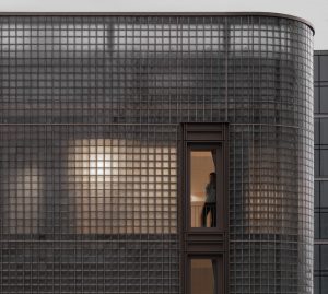
Since the illuminated pendant must provide a perfect shadowless view from any angle, the only way to achieve this was to illuminate the 50mm cylinder axially using a single point of illumination. This could only be done from the top end of the pendant so that the light source could be completely concealed either within the non-illuminated section of the pendant or above the plane of the ceiling. It became apparent that none of the commercially available lenses would be good enough so a custom composite optic was designed for the project. This was crucial because we needed to manage the gradient of intensity precisely. We specified an obvious gradient but with maximum and minimum levels of luminance. The LED lens was designed to interact with a reflector which closed the lower end of the tube. With the aesthetics solved, we moved on to practical issues.
Complex yet totally practical, maintenance for function is simple, and cleaning (always a challenge with chandeliers) is facilitated by the bayonet mount that allows a pendant to be taken down in seconds. The downlights that augment the overall lighting level in the mall are neatly concealed amongst the forest.
Now that the decision had been made to have dynamic dimming, some fundamental choices were required. illumination Physics already manufactures a range of LED driver options. Our choice would be influenced by practical considerations.
The space above the ceiling would be effectively inaccessible so the notion of placing drivers and data in the void was not an option that provided practical maintainability. We dismissed the idea of incorporating an individual driver for each pendant. It was far better to centralise the location of larger drivers capable of controlling many pendants in an easily accessible location away from the ceiling void.
This decision had a consequence because the ELV cables would be long and we would need to manage any losses. The LED engines required constant current supply so voltage drop was manageable with correctly dimensioned cables. The perfect solution presented itself – the 24V illumination Physics HP-LED Driver 12. Twelve groups of five luminaries could be controlled from one rack-mounted driver. These were to be installed in multiple locations to minimise the cabling. We make both a DMX and a DALI version of this unit and since DALI was being used elsewhere at the Radisson, we went with that protocol.
The lighting effect fulfils the promise of the initial design. Like a vast inverted forest, the timber and illuminated pendants both add great interest to a grand space, providing an aspirational design looking to the future.
Illumination Physics is one of the brands that has taken advantage of our Industry Support Package. To keep up to date with supplier news, click here. And, if you are interested in also benefitting from this three-month editorial package, please email Katy Phillips by clicking here.
Main image credit: UNSEEN VIEWS (Charis Solomou Architectural Photography)
Hotel Designs launches its official podcast for designers & architects
Six months in planning, DESIGN POD is the contemporary podcast for all on-the-go interior designers and architects globally…
Hotel Designs’ official podcast, DESIGN POD, will be presented by editor Hamish Kilburn and interior designer Harriet Forde.
The topics and personalities amplified on the podcast will give texture and perspective on the key issues that face modern A&D professionals as deadlines become tighter and briefs become narrower.
“I am so very excited to be starting DESIGN POD with Hamish,” says Forde, “and I am looking forward to discussing some interesting topics with great guests.”
In each episode, Kilburn and Forde will welcome influential designers, architects and experts to share their opinions on the conversations and challenges that are shaping our industry. Together, they will embrace innovation while balancing the important issues we all face as modern designers and architects, but are often too busy with life to explore fully.
“Since November, we have been working on the concept of DESIGN POD, in order to introduce an engaging and entertaining media platform for the industry,” explains Kilburn. “I cannot think of a better co-host than Harriet Forde, interior designer and the current President of the British Institute of Interior Design (BIID), who always makes me think, smile and laugh when we discuss our fabulous industry.”
Episode 1: Choosing your lane in design, architecture & business (coming soon)
Whether you are working for a brand, independently or are about to embark in a new journey, choosing your lane – your style, if you like – is an integral and pivotal moment of any design/architecture process. With the COVID–19 crisis adding further uncertainty to all industries around the globe – and arguably hitting the hospitality, building and construction industry the hardest – balancing consistency with creativity is key. To explore this topic in depth, from a creative and business perspective, DESIGN POD welcomes the former Creative Director of HBA London, Constantina Tsoutsikou, onto the show, who has recently launched her own venture: Studio LOST. “While we are surrounded by a plethora of voices in design, it is very important to differentiate oneself and take a stand, like Hamish and Harriet are doing with DESIGN POD,” explains Tsoutsikou. “Focus on the values that are important to you, and in time , your work will be an illustration of these, and become what you are known for.”
During lockdown, please tweet us at @HotelDesigns if you have a topic you would like to us to explore.
Hudson Valley Lighting collaborates with designer Becki Owens
Designers can create a fresh interior style with the new collection from Hudson Valley Lighting and designer Becki Owens, which combines modern design with Californian bohemian influences…
The new collection by Hudson Valley Lighting is inspired by the unconventionality of bohemianism found in designer Becki Owen’s Californian hometome of San Clemete, as well as her love of contemporary clean lines blended with coastal, mid-century shapes.
Each piece is adaptable and timeless, giving a new lease of life to everyday spaces and providing a focal point to the room that lures you in.
From a young age, popular designer, blogger and trendsetter Owens had her sights set on being an interior designer. Owens was inspired by her parents, who she watched remodel homes, leading her to getting her degree and designing model homes for large developments.
Now she can be found working on projects in residential design, creating simple, clean and elegant environments that she is passionate about, from kitchen makeovers to new builds. Her large social media following is tangible evidence that people are captivated by her designs, and so they have every right to be deemed “Pinterest-dream-home-worthy.” In her collaboration with Hudson Valley Lighting, she brings her well-loved signature style to a collection of modern and sophisticated pieces; the perfect accompaniments to any space or style.
Key Pieces from the Exclusive Collection
Ivy Pendant (Small)
The smallest of the Ivy Pendants features a large clear piece of glass in a simple yet powerful teardrop shape. Three pins strongly hold together the expertly-crafted curve of the shade. Complemented with a choice of a stylish chain or classy gooseneck arm to fix Ivy in place and give the pendant that smart and sleek finish. Available in three sizes, and two finishes: Aged Brass and Polished Nickel.
Ivy Pendant (Large)
Making its presence known loud and clear is the large Ivy Pendant. Regardless of its impressively large size, it completes the room without being aggressive as the simple and sophisticated glass teardrop design naturally brings balance to the room. The pendant is complete with three pins which grasp the finely-crafted bulb. Effortlessly finished with a modern hanging chain or an ageless gooseneck arm, allowing the large Ivy Pendant to become the elegant focal point of any room. Available in three sizes, and two finishes: Aged Brass and Polished Nickel.
Image credit: Hudson Valley Lighting
Ivy Sconce
A little bit different from the rest is the Ivy Sconce. Despite it usually being found around the edges of a room rather than in the apparent centre, it demands to be seen and radiates subtle elegance and charm. A perfectly curved arm cradles an immense teardrop shaped glass which is mounted sturdily by three pins. Owens and Hudson Valley Lighting bring a touch of fresh modern design to the sconce; a type of fixture that is essentially an antique, and was historically found with candles and oil lamps. A classy way to bring light to any space. Available in one size, and two finishes: Aged Brass and Polished Nickel.
Hudson Valley Lighting is one of the brands that has taken advantage of our Industry Support Package. To keep up to date with supplier news, click here. And, if you are interested in also benefitting from this three-month editorial package, please email Katy Phillips by clicking here.
INDUSTRY INSIGHT: The role main areas play in tented lodges & camps
As the modern luxury traveller demands more one-off experiences, there has been rise in demand for lodges and camps. Hotel Designs asks the experts at Bushtec Creations to explain how designers can utilise a hotel’s main areas in these accommodation styles…
In short, your main area can be whatever you want it to be. Having a successful main are however, now that is where the secret lies.
First impressions are the ones that last. The moment a guest steps into the main area, a tone or impression will be set that they will expect from their stay, and it helps to dare to push the boundaries and be different. When it comes to luxury tented main areas, Bushtec Safari and Bushtec Creations has many years’ experience and products well suited to be used whereby the guests’ first impression will surely be one of amazement with the type of luxury, comfort and beauty these classic tents hold.
When it comes to tented resorts or tented hotels, first you need to determine how many guests your tented lodge/camp will be accommodating so that you can make sure you have a spacious enough main area. Then, you need to consider the design you are trying to create, specially for the roof, and aim to keep the same design flowing straight throughout your camp.
You also need to consider your location and space you have available for the development of your camp, so as to determine whether you will have one large main unit, or rather a main area made up of several smaller tents.
Image credit: Bushtec Creations
Think about what you want included in your main area. We have done several camps with main areas and not 1 camp is the same. You can have a main area that only includes a dining facility, you can have a main area that consists of multiple functional areas including a reception area, a lounge where your guests can relax, socialise, read books, access the restrooms, be near a bar area where your guests can sit and enjoy refreshments. Apart from this, you can even decide to include a sushi bar, which will take your main area to the next level.
Now let’s speak ambience. Want to add a fireplace but not sure if it can be one in a tent? Of course you can! With Bushtec Creations anything is possible. Adding a fireplace is also dependant on your location, you won’t necessarily want to add a fireplace if you are located in the desert at 40 degrees for most of the year, however with that being said, most locations can do with a fireplace and you can’t go wrong with adding one.
Now that we have covered the inside characteristics of your main area, let’s have a look at what you can do outside. That’s right, there is more! Most main areas will include a swimming pool on the front deck with some sort of remarkable view, cocktail table spread across the deck with umbrellas and even a fire pit to have memorable nights covered by a billion stars.
Your kitchen can also form as part of your main area and be enclosed for aesthetic purposes, however this also varies from one lodge owner to another. Alternatively you can have your kitchen apart from your main area connecting it with a walkway to create easy access for your personnel.
Image credit: Bushtec Creations
The options of connecting your main area with your accommodation units also plays a part in the entirety of your lodge/camp. You may want to connect the units with walkways throughout your entire camp, or you can leave your units separated should you wish to not stop wildlife from moving throughout the camp.
With all of the various considerations involved in creating your perfect tented lodge/camp, you still don’t have to feel overwhelmed as our Bushtec Creations team has years of experience to guide you through the process from start to finish. We have our own passionate in-house design team who does regular site visits across the globe. Several discussions will be held to determine your exact requirements and the latest technology is used to create a virtual render of your entire camp to showcase your project so that you will know what to expect.
In closing, your main area plays a substantial role in your tented camp/lodge and is ultimately where your guests will get together to relax, eat and socialise. This is where you want them to feel at home and keep them coming back for more. A tented lodge main area is the biggest asset not only for you as the lodge owner, but also for your guests.
Bushtec Creations is one of the brands that has taken advantage of our Industry Support Package. To keep up to date with supplier news, click here. And, if you are interested in also benefitting from this three-month editorial package, please email Katy Phillips by clicking here.
LAUNCHING: a new lighting brand with a human-centric approach
Hotel Designs has the industry scoop of a new, innovative lighting brand that has launched with the aim to create striking architectural lighting solutions for hotel and hospitality market…
humanlumen is a nouveau lighting brand with a difference. Led by a collective of lighting professionals and experts with a broad range of experience, the company is on a mission to create effective and efficient lighting solutions that are as positive for people as they are for the environment and businesses.
Spanning a distinct range of sectors, including hospitality, residential, education, health care, retail and leisure, the brand understands the structural form of lighting and takes a mindful approach to provide creative concepts.
The concept of the company came about from a need to do things in a different way; with an aim to change the landscape in which interior designers and consultants approach their lighting concepts. It is driven by a desire to provide human- centric lighting design and products.
Image credit: humanlumen
“With the use of innovative software design, alongside the vast range of products that we design and manufacture, we will offer relevant and creative solutions.” – Andrew Boydell, Humanlumen
At the helm is Andrew Boydell, a principal with more than 24 years experience working within the construction sector on high-profile interior projects both in Europe and the Middle East. His most recent role was Regional Director for Future Designs in the UAE, a designer and manufacturer of high quality luminaires and bespoke lighting solutions. Prior to that he was General Manager at The Nordeon Group UAE, global architectural lighting specialists.
Image credit: humanlumen
Boydell has ambitious plans for the brand. “Our creative team is based in Clerkenwell in the heart of London’s design scene, the obvious choice with all the experience we have collectively in the local and international lighting market and our aim is to develop the brand globally,” he explains. “With the use of innovative software design, alongside the vast range of products that we design and manufacture, we will offer relevant and creative solutions.”
The humanlumen product portfolio encompasses more than 3000 lighting designs including a high-specification downlight, track and spot and linear pendant range. The mix also accounts for both indoor and outdoor use to serve a vast range of lighting schemes.
Image credit: humanlumen
Humanlumen, which is based in Clerkenwell, is one of the brands that has taken advantage of our Industry Support Package. To keep up to date with supplier news, click here. And, if you are interested in also benefitting from this three-month editorial package, please email Katy Phillips by clicking here.
Bespoke bathroom design and exquisite lines with Unidrain
Offering Danish design ethics and Nordic minimalism, Unidrain has achieved the impossible: to make bathroom drainage sexy…
For most designers, the ultimate aim is to create something that is aesthetically pleasing, a product or building that can be displayed to demonstrate their creativity, the exquisite lines and symmetry of the finished object.
Very few are delighted when they create a demand for a product that is barely visible, one that you cannot see. However, this is where Unidrain is different.
Creators of an almost ‘invisible’ drain the demand for this product has grown year on year, not only in commercial properties such as spas and hotels but in private residences too. The desire for stylish and elegant design in the bathroom continues to grow.
Image credit: Unidrain
Specialist drains are currently a sought after item, including bespoke, custom-made, extra-long, colour-matched or ‘invisible’. The Danish architects and designers behind Unidrain have always paid particular attention to the small details within interior design and this devotion is now extended to bathroom drains.
“Every element has to play its part and work together; to fit precisely,” explained Kenneth Waaben, designer at Unidrain. “By maintaining the highest of standards, has enabled us to create a product that is both technical and stylish, which fulfils the bathroom design desires of our customer.”
Image credit: Unidrain
“Invisible” drains
One of the most popular of the specialist drains is the ‘invisible’ drain. The concept is that one should not be able to see the drain within the bathing area; it should be hidden and if it is seen it will appear as a narrow groove in the floor. This ‘invisibility’ is achieved by matching the tiles used on the bathroom floor.
The advantage of a specialist drain is that they can be adapted; they can be used on a variety of surfaces such as marble, with different frame solutions and can be created in extra-long versions.
Dream bathroom becomes reality in Østerbro villa
Trine and Claus moved from New York back to Strandøre on Østerbro. They were entirely renovating their house and a specifically designed bathroom was at the top of the list. This is an ideal example of how a bespoke designer drain can be used to create a dream bathroom.
The couple knew what they wanted: a floor of white, marble-like tiles with two showers placed opposite each other. They went into great detail about what they needed and how it had to be aesthetically pleasing.
They wanted the tiles to appear uninterrupted; they required a single long drain that not only fitted across the two showers, but had to be ‘invisible’.
“This required a drainage solution, which had to be able to handle large quantities of water, be aesthetically attractive and include the right tiles.” said design consultant Carsten Brandt
Unidrain were the only company that were able to deliver a solution that met all three parts, one that also offered the ability to combine both technology and aesthetics. The couple were able to proceed with their dream bathroom because Unidrain could deliver these specialist bespoke drains.
They provided a module 1100 Custom drain, which is extra-long at just under 1.8 meters it fit the specific dimensions of the shower cubicle. It is a solution that is often chosen by project builders, but which can also easily be used in private homes.
Image credit: Unidrain
Elegance in design
In order to make the extra-long drain ‘invisible’ it had an integrated marble-look porcelain tile fitted on top. It was almost impossible to see the drain as the tile match meant it blends in with the floor, with an added advantage of being easy to clean. The result was an elegant and stylish dream bathroom.
The (Modul 1100) is a flexible solution for bathrooms of all shapes and sizes, it can be customised as you can order floor drains that differ from the standard sizes; enabling you to create an exclusive look. This is an option that more people are choosing. Customised drains are especially suited to institutions and large bathrooms, as they can be made to an exact measurement and Unidrain bespoke can be made to order to any size.
Unidrain is one of Hotel Designs’ recommended suppliers. To keep up to date with their news, click here. And, if you are interested in becoming one of our recommended suppliers, please email Katy Phillips by clicking here.
IN PICTURES: Four Seasons Hotel Doha unveils complete redesign
The new urban sanctuary, Four Seasons Doha, was created by the world-renowned interior designer Pierre-Yves Rochon, who took inspiration from the sky, sea, sand and earth…
Four Seasons Hotel Doha has unveiled the details of its complete interior design overhaul, courtesy of award winning and world-renowned interior designer, Pierre-Yves Rochon.
Following extensive renovations of the guestrooms, suites, floors, lobby and dining outlets, the hotel has been reshaped into an unmatched luxury destination at the heart of Qatar’s capital city.
Within what is being described as an ‘urban sanctuary’, a refreshed colour scheme, including a rich spectrum of blues and beige in the guestrooms, evoke the earth, sprawling skies and Gulf views of Doha, while verdant colours and patterns in the new Tea Lounge pay homage to the splendours of nature. The redesign continues to establish an elevated sense of place and time through a blend of classical and contemporary elements, and touches of Middle Eastern influences from the region, visible through the opulent and colourful chandeliers as well as the ornate furniture detailing. Qatari artwork from the owner’s original collection has been kept on the hotel walls whilst nearly all the curtains have been revamped using a Damask pattern.
“I wanted to bring a new dimension of modernity to the property and enhance the guest experience with uplifting design elements and spaces.” – Interior designer, Pierre-Yves Rochon.
The lobby and dining outlets: The beauty of nature
The renovation of the hotel strikes a harmony between the world of man and the beauty of nature that is reflective of the city itself. Rochon was inspired by the unique landscape of Doha and this is evident through the colour scheme of the hotel’s public areas and dining outlets. The feeling of the outdoors blends into the interiors with the creation of open-plan space and expansive glass windows.
Image caption: The opulent entrance is muted aptly with the design scheme’s relationship with nature | Image credit: Four Seasons Hotels & Resorts
“We were inspired by Doha and its relationship with the outdoors,” commented Rochon. “We researched the local culture and the artistic elements that might tie into the story of the hotel. I wanted to bring a new dimension of modernity to the property and enhance the guest experience with uplifting design elements and spaces.” Rochon also noted that throughout the design process, they sought to respect and honour the existing classical architecture by Frank Nicholson, blending classical and modern forms. Careful consideration was also taken to create a more residential feeling, while also paying homage to Middle Eastern influences.
The lobby has been enhanced with a grandiose door reminiscent of grande dame entrances, and the lobby has been redesigned as an open-plan space, allowing light to flood through the foyer as well as boasting views of the Arabian Gulf. A hand blown glass chandelier, alongside an array of handmade and bespoke Italian furnishings, adorns the Lobby’s ceiling whilst also creating a magnificent focal point in the space.
The new outdoor terrace at the Seasons Tea Lounge bridges the indoors and outdoors and allows guests to enjoy varying atmospheres with distinct personalities. The designer sought to create spaces where individuals or small groups could congregate, with the lounge exuding the classical touches of a Parisian cafe and the al fresco spaces adorned in a spectrum of green sheaths. Subtle nods to the Middle East are dispersed throughout the lounge, seen in the marbled floor inspired by Islamic mosaic tile-work, which lies underneath oriental sofas, silk cushions and cashmere patterned fabrics surrounding openwork tea tables. Individual seating areas were created to accommodate several business or leisure groups at once, each offering an intimate, residential ambiance.
As well as a complete redesign of the interiors, the hotel introduces the expansion, as well as the redevelopment, of its diverse dining and lounge concepts. Arabica, located on the ground floor, returns with a contemporary new look and coffee and dessert bar. Neutral and calming in its colour scheme, the space houses marble furniture that echoes the octagonal shape of the conservatory.
Guestrooms and suites: Reflecting sky, sea and sand
As a dynamic cultural destination with a thriving cosmopolitan district, Doha has direct access to a beach and beautiful blue sea. The redesigned rooms follow a soothing spectrum of blues and beiges reflecting the colours of the sky, sea, sand and earth. Rochon aimed to evoke a feeling of timelessness whilst also creating an atmosphere in the rooms that is welcoming, uplifting, peaceful and comfortable for guests, with a powerful sense of place.
Image caption: Two majestic sliding doors break up the space in the suites | Image credit: Four Seasons Hotels & Resorts
All the rooms and suites are furnished with discreetly integrated and energy efficient technologies to enhance the guest experience and bring a new dimension of modernity to the hotel. All accommodations now feature automated curtains and lighting systems as well as temperature management preservation technology within the newly installed windows.
Image caption: The guestrooms and suites have been inspired by sky, sea and sand | Image credit: Four Seasons Hotels & Resorts
Meanwhile, the suites offer Hermès amenities and continue to pay homage to Qatari heritage with mother of pearl inserts in the bookcases and bathrooms, decorative plates in the libraries, headboards with relief geometric patterns and doors with oriental touches of worked wood and brass hardware, all whilst complementing a contemporary rejuvenation.
Image caption: Elegant an spacious bathroom | Image credit: Four Seasons Hotels & Resorts
Image caption: Luxe lounge area inside the hotel | Image credit: Four Seasons Hotels & Resorts
Image caption: A look inside the lounge areas in the suites | Image credit: Four Seasons Hotels & Resorts
Since its opening in 2005, Four Seasons Hotel Doha has remained an architectural icon in Doha’s skyline. The 237-key neo-classical building is located on Doha’s waterfront at the heart of the city, and its latest renovation has secured its position as being one of the destination’s finest hotels.
As a supplier to Hilton Hotels, Jameson Seating has completed many projects across the UK and Europe, providing both upholstery and window treatments. Here, Hotel Designs understands what went in to furnishing one of its latest projects, Hilton Hotel Cobham…
In early 2018, Hilton hotels quoted Jameson Seating to supply curtains and sofa beds for the 152-key refurbishment project, Hilton Hotel Cobham, which was expected to be completed during 2019/2020.
The brand has built up a strong relationship with the Hilton Supply Team over the years and has also worked closely with the Quantity Surveyors Barton Minty.
Two colour schemes were used on this project, an Indigo for the standard rooms and Teal for the Suites, with the curtains being blackout lined as the usual Hilton standard. The Daytona sofa beds supplied by Jameson’s are one of their best selling products and are manufactured in their factory in Birmingham. They come in a range of sizes to suit almost any space and are fully knockdown eliminating any access issues and can be easily assembled on site.
Image caption: In-situ image shot of the Daytona sofa bed | Image credit: Jameson Seating
The seat cushions are attached to the mechanism so there are no storage issue as they are hidden under the bed once the mattress is folded out, there is enough storage space for pillows too. Due to the nature of the Daytona sofa bed, if any part becomes damaged or soiled it can easily be replaced. The 100mm deep quality mattress is fully pocket sprung and the action folds in and out so takes no effort to operate making it easier for housekeeping staff. There are a range of styles available and if there is limited to space the armless option is ideal.
Jameson Seating Ltd has an experienced Project Management team to oversee both the curtain and furniture installations. Working with the client from quotation stage right through to installation is all part of the service. They pride themselves on supplying high quality furnishings manufactured right here in the UK.
Jameson Seating is one of the brands that has taken advantage of our Industry Support Package. To keep up to date with supplier news, click here. And, if you are interested in also benefitting from this three-month editorial package, please email Katy Phillips by clicking here.
When it comes to collaborations between designers and furniture brands, British suppliers are arguably in a league of their own. To celebrate the industry working together, Hotel Designs takes a closer look at some of Cheeky Chairs’ most meaningful partnerships…
The British textile industry is thriving, and its success is driven by a range of factors, one of which is todays eco-conscious zeitgeist that has triggered a desire to buy sustainable, local and authentically sourced materials.
More significantly, there is an emerging renaissance in traditional British manufacturing skills and techniques.
This artisan revival has led to an abundance of traditionally crafted textiles and natural textures. Raw weaves with pronounced warps and wefts, stubby fabrics in rustic checks and bouclés that resemble cloth cut from an artisan weaver’s loom. Traditionally block-printed fabrics featuring abstract art with loose brushstrokes and playful daubs or ikats and motifs. Richly embroidered weaves and tapestries on all manner of natural fabrics including linens velvets and wool.
But the real driving force behind the resurgence in British textiles is a new crop of British textile artists creating vibrant and distinctive prints and weaves forinteriors. This new breed of designers is not only creative, but tech and marketing savvy and so able to run their own businesses, heavily driven by social media. They have skilfully incorporated the unique strengths of British textiles such as heritage, quality and traditional skills to create innovative fabric collections for today’s interiors obsessed consumer seeking a story and provenance behind their purchase.
Cheeky Chairs’ designer fabric collection showcases some of the best British designers. Their stunning and luxurious creations are central to the beauty of the chairs and stools the brand create. Here are four of our favourites.
Image caption: Marco Chairs upholstered in Hippie Green and Chubby Check by Kit Kemp | Image credit: Cheeky Chairs
Award-winning interior designer Kit Kemp has been developing inspiring, vibrant interiors for almost three decades. With a background in graphic design, this self-taught creative has created her own quintessential British style.
Kemp is the creative force behind the hugely successful Firmdale Hotel group, a boutique collection of hotels renowned for their unique character and stylish use of colour. Her distinctive quirky designs have led her to collaborate with big names including Christopher Farr Cloth to create an inspiring range of totally unique fabrics and wallpapers.
Cheeky Chairs’ selection of Kit Kemp Weaves and prints draws on her whimsical style. It is a carefully curated collection of colourful eclectic patterns and joyful textured weaves to create luxurious chairs and bar stools that are as beautiful as they are comfortable.
Penny Morrison
Image caption: The Marco Armchair upholstered in Morrison’s Andean Vertical Stripe alongside Sanderson’s Linnean Indigo | Image credit: Cheeky Chairs
Penny Morrison is one of the most sought-after Interior Designers in Britain and around the world. Penny is renowned for creating unique designs through seemingly clashing combinations. Pairing unexpected patterns and palettes, her designs are a visual feast brimming with colour and exuding spontaneity and sophistication in equal measure.
Her collection of luxury prints and weaves is a rich accumulation of inspiration from cultures around the world, from Turkish embroidery and Japanese textiles to Anglo-Indian symbols and Ancient Greek motifs.
Andean Vertical Stripe and Anni Orange are stunning colourful designs that ensure the brand’ chairs and bar stools will make a statement in any space.
Margo Selby
Image caption: The Chloe Chair upholstered in Margo Selby’s Motown | Image credit: Cheeky Chairs
Margo is a world renowned British textile designer. Her Jacquard woven textiles have pushed the boundaries of weaving to create contemporary upholstery fabrics that are brimming with colour and style.
Cheeky Chairs’ selected weaves from her Memphis collection brings together a diverse and distinctive range of woven fabrics that are both decorative and luxurious. These jacquard weaves in harmonious but contrasting colours sit beautifully against a multitude of fresh paint colours to create chic and stylish chairs and bar stools to make a vibrant addition to any interior.
Korla, named after a town in China on the Silk Road, create gorgeously graphic fabrics mixing bold colours with strong patterns. All their fabrics are designed, woven and printed to the highest quality entirely in the UK.
Their collection of colourful and contemporary textiles is bold, fun and cheerful. Korla designs feature geometric shapes, small patterns, zigzags and scallops that are wonderfully light-hearted and frivolous. Their colour palette of bright, summery and cool shades is as striking as it is original.
The brand’s pair of signature Korla prints with their eye-catching paint finishes is effortlessly cool and will bring a fresh contemporary look to any style of interior.
Cheeky Chairs is a boutique collection of beautifully crafted wood framed chairs and bar stools that have naturally soft seats upholstered in luxury fabrics. Each Cheeky Chair is made to order and a unique combination of model, designer fabric and colour to create a truly original statement piece.
The brand’s sustainably sourced frames are carefully selected for their design and quality; each seat is meticulously upholstered using natural materials for supreme comfort; its designer fabrics are of the highest quality. The company offers an array of colour and luxury fabric combinations but will also work with customers’ own fabric selection and Cheeky Chairs’ specialist polishing team can create any finish to match a chosen interior.
Four years after Hotel Designs got the on-the-boards industry sneak peek of Hôtel Chais Monnet, editor Hamish Kilburn checks in to the luxury hotel in the heart of Cognac…
Positioned in close proximity of Cognac’s Charente River, Hôtel Chais Monnet took chief architect Didier Poignant of Paris-based Ertim Architects four years to plan, and a further 26 months to convert into a reality.
Built in the 19th century, the site that was the childhood home of Jean Monnet, one of the founding fathers of the European Union. The building had sat uninhabited since 2004 before the decision was made to transform the trading house into a majestic, five-star getaway, combining traditional architecture with cutting-edge contemporary design.
The luxury spa hotel was described as a “modern take on traditional French luxe” when Hotel Designs first caught wind of the project in 2016. In simple terms, the restoration has given the buildings on site a new lease of life.
I would go one step further, though, to say that it has reopened up the destination’s history books, perhaps to a different chapter. For starters, during the restoration process, the architectural plans included adding a new contemporary structure – a rare find in and around the low-level city of Cognac.
Image caption: The arrival experience allows guests to capture the two original buildings on the site that used to be wine cellars | Image credit: Hôtel Chais Monnet
Despite the property being centrally located – only a ten-minute walk down to some of the great cognac houses in the region – the hotel’s space is not sacrificed, nor is it limited in its ambitious design. Guests arrive through a long driveway, past two retro Citroen 2CVs, and enter the hotel via a walkway that cuts through the two original limestone buildings, which used to be wine cellars. Bridging together these structures at the end of the pathway is a magnificent glass-box building. Inside, the lobby, which evokes a strong first impression and proof that architecture styles of different eras can, in fact, work in harmony.
Image caption: The hotel is a classic tale of old and new architecture meeting in harmony | Image credit: Hôtel Chais Monnet
Although this was very much a heroic rescue operation to retain the site’s heritage, the layout of the hotel allows for a modern design scheme to filter into all areas. Separated off the side of the lobby, making it ideal for locals as well as guests to enjoy, is the characterful Cognac Bar. As well as serving more than 400 varieties of the spirits (I counted them), the bar features quirky lighting, residential-style furniture and idiosyncratic artefacts for good measure.
Image caption: The Cognac Bar | Image credit: Hôtel Chais Monnet
The majority of the hotel’s facilities – the 92 guestrooms, 13 suites, a wellness area and two restaurants – are sheltered in new-build glass structure that is covered with corten steel tendrils. The striking and unrestrained design of the framework compliments the contemporary, light and airy interiors that can be found in each guestroom and suite. With a safe colour scheme of whites, cream and the occasional accent of red in the soft furnishings, the rooms very much channel the spirit of Cognac to evoke a home-from-home, relaxed residential look and feel. Elements such as a rose-gold clocks from Karlsson and arresting chandeliers above the beds add a contemporary layer to the design, while subtle biophilic references in the artwork inject the strong sense of place, far removed from metropolis life.
Image caption: One of the hotel’s stylish guestrooms | Image credit: Hôtel Chais Monnet
The bathrooms, complete with geometric-patterned surfaces and large bath tubs, are contemporary spaces. Quality brands in these generously sized areas include Kohler and Allia Paris basins, Grohe taps and showers and quality WCs from Ideal Standard.
Beneath the guestrooms and suites, the hotel’s spa wellness facilities include an impressive 25-metre indoor and outdoor pool, which allows guests to soak in the natural landscape while enjoying R&R from exploring the city. In addition, the spa also features a modern jacuzzi, a sauna, a handful of massage therapy rooms and a state-of-the-art gym.
Image caption: The 25-metre indoor and outdoor pool inside the hotel | Image credit: Hôtel Chais Monnet
In the two restaurants below, the sites heritage – and its connection to wine – is deeply ingrained in the design scheme. In the gourmet brasserie, Le Distillerie, a wooden ceiling and beams evoke a casual dining experience that is aptly centered around seasonal eating and using fresh, locally sourced produce. The hotel’s fine-dining option, meanwhile, is located on the lower level. Les Foudres, provides an unparalleled entrance that welcomes guests to dine amongst ancient Cognac barrels in the building’s historic Chais.
Image caption: The Brasserie, La Distillerie | Image credit: Hôtel Chais Monnet
Image caption: The entrance to the hotel’s fine-dining restaurant Les Foudres | Image credit: Hôtel Chais Monnet
Image caption: The lounge area outside Les Foudres | Image credit: Hôtel Chais Monnet
Since opening its doors in 2018, Hôtel Chais Monnet has become rooted into the community that surrounds it. There’s no better example of this than its recent initiative to freshly prepare and deliver 365 cooked meals to the town’s hospital during the COVID–19 pandemic. Cognac-born pastry chef Isabelle Bovy has paired up with the hotel’s very own pastry chef Camille Roché to create a substantial yet balanced menu to sustain and satisfy these health workers.
The two chefs created a delicious menu which included a starter of quinoa salad, followed by a main course of beef and Grenailles potatoes and finishing with a sweet and sticky lemon cake. “We have enough kitchen space to ensure that everyone can cook safely,” commented Hôtel Chais Monnet’s General Manager, Arnaud Bamvems. “If we can help those in need, let’s do it!”
My conclusion of Hôtel Chais Monnet is that looks can often be deceiving. Its compelling old-meets-new architectural style has unlocked the opportunity for a modern luxury hotel to operate seamlessly on a historic site. Its carefully and sensitively curated design scheme allows for an effortless flow between all areas so that guests and locals alike can be part of the renaissance of Cognac.
Hypnos receives prestigious Queen’s Awards for Sustainable Development
Ethical British bedmaker, Hypnos, is celebrating after receiving the prestigious Queen’s Awards for Enterprise in Sustainable Development for its pioneering commitment to sustainable and ethical manufacturing…
Hypnos has been awarded The Queen’s Awards for Enterprise in Sustainable Development.
This respected achievement is the second Queen’s Award for the company after it won one in 2017 for International Trade.
Hypnos’ latest accolade comes after a decade long commitment to sustainable production and operation, and in recognition of a series of ground-breaking sustainable innovations and design. Indeed, Hypnos’ beds are some of the most sustainable in the industry being 100 per cent foam free and 100 per cent recyclable. They also use only natural and sustainable materials, such as FSC and PEFC certified timber, meaning its beds need never go to landfill sites.
Highly celebrated, the Queen’s Awards is only given to those who can demonstrate outstanding sustainability achievements and whose environmentally-sound products and management of the company benefits the environment, society and the economy.
Image credit: Hypnos
James Keen, Chief Executive Officer at Hypnos, said: “Through passion, dedication and commitment we have created a wide-ranging, impactful sustainability plan that is industry-leading and reaches every area of the business. We are incredibly proud that our work here has been recognised with this Queen’s Awards, our second within three years.
“Sustainability is at the heart of everything we do and we’re not afraid to challenge the way the bed industry does things for the benefit of the environment and communities around the UK and the world. In fact our Partnership with Red Tractor is a prime example of this. This industry-first collaboration with them has allowed us to use 100 per cent British wool that’s traceable right back to Red Tractor assured farms, creating a new level of authentic traceability.”
Image caption: Hypnos uses 100 per cent British wool that’s traceable right back to Red Tractor assured farms | Image credit: Hypnos
The ethical manufacturer’s green operating practises were also taken into consideration as part of the award win. Hypnos was the first bed maker to comply with the internationally recognised PAS2060 Carbon Neutrality standard, as well as the ISO 14001 environmental management systems. In addition the company has installed a biomass heating system to help save around 74 tonnes of carbon a year, all of which were seen favourably as part of its sustainable efforts.
James Keen, adds: “This award is a great honour and really shows the value of investing in and in operating your business ethically. It’s certainly inspired us to do even more to develop our sustainable plans for the future and we’re already working on some interesting concepts for the years ahead.”
Hypnos is one of Hotel Designs’ recommended suppliers. To keep up to date with their news, click here. And, if you are interested in becoming one of our recommended suppliers, please email Katy Phillips by clicking here.
Rosewood launches relief to support communities during pandemic
The luxury hotel group has launched Rosewood Raise, a relief initiative to support associates and communities that have been affected by COVID–19…
Rosewood Hotel Group has launched Rosewood Raise, a comprehensive relief initiative developed in support of the Group’s associates who have been impacted by the COVID-19, as well as the communities in which the Group operates.
Rooted on the foundation of Relationship Hospitality, a belief that true hospitality springs from the nurturing and building of strong and lasting relationships with associates, guests, partners and communities, Rosewood Hotel Group has always recognised and revered the power of people in creating the exceptional experiences that drive the industry. Developed in dedication to these very individuals that have demonstrated an unwavering commitment to the Group’s hotels and destinations, Rosewood Raise supports an associate relief fund and community-focused efforts, including donated hotel rooms and meal preparation and supplies for essential workers.
Managed by the Emergency Assistance Foundation, Inc., a 501c(3) charity created to design and operate multiple employer-sponsored disaster relief and employee hardship funds, the Rosewood Raise Relief Fund aims to assist staff in corporate offices and managed hotels across its three brands – Rosewood Hotels & Resorts, New World Hotels & Resorts, KHOS. The fund will support associates whose jobs were amongst the first and most affected by the COVID-19 pandemic, prioritising those facing financial difficulties due to health-related needs, as well as local communities that have been especially affected by the pandemic. Upon the containment of the current crisis, the relief fund will continue to support the Group’s associates against future adversities and hardships.
In its first two weeks since formation, the fund has received initial pledges of close to USD $2 million from Rosewood Hotel Group’s corporate executives and associates, including salary contributions and a commitment from the company to match all employees cash contributions to the fund.
“We wish to stand in solidarity and with gratitude for our associates, and in support of the local communities that are so deeply affected by the COVID-19 pandemic.” – Sonia Cheng, chief executive officer of Rosewood Hotel Group.
Image credit: Rosewood Hotel Group
On the property level, several of the Group’s hotels and resorts are supporting the local communities in which they operate, engaging in Rosewood Raise efforts across the globe. Among the first properties in the portfolio to be affected by COVID-19, New World Hotels & Resorts’ hotels in Wuhan and Guiyang saluted their cities’ medical workers by providing complimentary accommodations. Across the ultra-luxury Rosewood Hotels & Resorts brand, many properties throughout Asia Pacific, Europe and North America are supplying necessities and meals to medical associates, first responders and area hospitals, as well as to local organisations and charities aimed at assisting families and individuals in need. Both Rosewood Bangkok (Bangkok, Thailand) and Rosewood Miramar Beach (Montecito, USA) have created Rosewood on the Move food delivery services to offer complimentary comfort meals to frontline workers in the hotels’ respective regions. Rosewood Miramar Beach, specifically, has already served over 1,500 meals to essential personnel throughout Santa Barbara, CA, ranging from police officers and fire fighters to waste handlers and grocery store attendants. Additional properties preparing meals for key workers at their local hospitals include Rosewood London (London, UK), Rosewood Hong Kong (Hong Kong, SAR), and Rosewood Abu Dhabi (Abu Dhabi, UAE).
“I have always believed that people are the beating heart of the hospitality industry,” said Sonia Cheng, chief executive officer of Rosewood Hotel Group. “Through Rosewood Raise, we wish to stand in solidarity and with gratitude for our associates, and in support of the local communities that are so deeply affected by the COVID-19 pandemic. Our hope is that through this initiative we can provide assistance to our associates and communities who are facing serious hardship and let them know their Rosewood family is here to support them through this unprecedented time.”
Through the launch of Rosewood Raise, Rosewood Hotel Group is committed to continuing to identify and execute future opportunities to support its associates and the global community through multi-layered fundraising activities and community service projects in the years ahead.
To read Hotel Designs’ exclusive virtual roundtable on how the pandemic will impact the industry, which includes comments from Rosewood London’s Managing Director, Michael Bonsor, click here.
FEATURE: Renovating public areas with stylish lighting
To round-off our weeks putting ‘Public Areas’ under the spotlight, we are focusing our lens on the opportunities of lighting. Recommended Supplier Vaughan compares the different ambiances its lighting products can create…
Public areas are one of the key spaces to set the tone of a hotel. As soon as a visitor walks through the doors, it is important that they are met with a certain ambience and style that reflects the rest of the hotel.
At Vaughan, we are grateful to be included in numerous hotel projects and renovations – including Grantley Hall, The Langham and Le Bristol Paris.
Grantley Hall is a Grade II listed building, built by Thomas Norton and his son Fletcher Norton, 1st Baron Grantley in the mid-18th century. It has an eclectic history, not just physically – with extensions added in both the 19th and 20th centuries – but also in terms of its use. Initially a family home, it was turned into a convalescent home during World War II. Then between 1947 and 1974, it was under the ownership of the West Riding County Council where it was used as an adult education residential college. In 1974, it was transformed once again into a training and conference centre thanks to the North Yorkshire County Council in 1974. Finally, Valeria Sykes bought the house in 2015, and went on to establish Grantley Hall as the hotel it is now known to be.
The downstairs hallway of Grantley Hall undoubtedly showcases the tone of the rest of the hotel: refined and elegant, with rich, red velvet lined chairs, pleated shades and brass tones throughout. The defined lines of the Georgian architecture are mirrored and maintained in the candlestick table lamps, as well as in the geometric forms of our Regency Hall Lanterns. A sleek combination of brass and glass, the lanterns work well in this space – the glass actively reflecting light across the space and the brass adding to its warmth. Their even separation and display straight down the centre of the hallway echoes the uniformity of Georgian architecture, while marrying with the antique frames, table lamps and picture lights.
The Palm Court at The Langham is very different in style to Grantley Hall, but has an equally beguiling history. Built between 1863 and 1865, it was opened on 10th June, 1865 by the Prince of Wales. The largest and most modern hotel in London at the time, it went on to entertain the likes of Mark Twain, Oscar Wilde, Toscanini and Sibelius, as well as provided the set for the Sherlock Holmes story ‘A Scandal in Bohemia’. In World War II, it was used in part by the Army until it suffered damage by bombs, and after the war it was purchased directly by the BBC. Since then, it has seen two further owners, and two renovations, with its most recent one thanks to the Hong Kong based Great Eagle Holdings.
Image caption: Langham Palm Court/Vaughan
Decidedly more contemporary in feel, this image of the Palm Court shows two chandeliers hanging either side, almost reaching the floor, and brass pieces attached to the wall to create a floral-themed, decorative display. Studded armchairs arc around a table, behind which is a high-backed sofa, and to each side of the sofa is a side-table upon which sits our Woodville Table Lamps. Similar to Grantley Hall, the brass elements neatly come together and create cohesion: the Woodville Table Lamps appear strikingly similar to the salt and pepper shakers on the table, and work well with the brass installation behind. Cushions on the sofa similarly reflect the floral themes on the wall, while the glass chandeliers add a further sense of drama and light. Indeed, it is these chandeliers that provide the brightest, most white light in the room, and create a satisfying contrast against the balmy glow of the table lamps.
Le Bristol Paris, like Grantley Hall and The Langham, also has a history to it. Named after Bishop Frederick Hervey, 4th Earl of Bristol, who was an 18th century traveller known for his love of comfort and unwavering standards, it remains one of the most treasured hotels in Paris. Recently refurbished during a six-year stint from 2012 to 2018, it now contains additional Vaughan pieces such as the Saltwood Tripod Table Lamps shown here. A traditional lamp, cast in bronze by a father-son duo in England, it works well in this scene, with the pair neatly framing the painting. Neither predominantly traditional, like Grantley Hall, nor contemporary, like The Langham, Le Bristol Paris appears to combine and weave different styles together – whether that be with a fringed sofa against a historic oil painting, or an antique-inspired lamp on a glass table.
Although Grantley Hall, The Langham and Le Bristol Paris are assuredly different in style, what they share in common is their success in establishing an ambience and theme the moment a visitor walks through their doors. Whether that be maintaining a traditional, Georgian feel as in the Grantley Hall hallway, a glittering, intimate space as in The Langham, or a fusion of both modern and traditional as in Le Bristol Paris, they all establish this in their public areas, as a reference and precursor to the rooms hidden within.
Vaughan is one of Hotel Designs’ recommended suppliers. To keep up to date with their news, click here. And, if you are interested in becoming one of our recommended suppliers, please email Katy Phillips by clicking here.
Main image caption: Le Bristol | Image credit: Vaughan/Claire Cocano
When it comes to design, the hospitality industry demands some of the most aesthetically pleasing outdoor environments in the commercial sector.
From luxurious outdoor swimming pool areas to glamorous receptions, restaurants and bars, the flooring and surface choices that are made within exterior hotel design will play a vital role in the success of the overall appeal of the hotel.
From large luxury projects to smaller boutique hotels, CTD Architectural’s approach to service and design remains the same. Thanks to its ever-expanding portfolio of exterior tiles, CTD Architectural is able to source the latest products to deliver premium quality for both appearance and performance.
20mm porcelain is increasingly used in designs for luxury commercial and public realm projects, including swimming pool surrounds, balcony decks and pedestrian walkways – particularly in the hotel industry.
An extensive range of 20mm-thick porcelain tiles, the Porcelain Pavers collection by CTD Architectural is specially suited to outdoor environments. Recreating architectural materials such as cement and stone, the range comprises 22 different tiles to meet all the technical and design requirements for exterior applications.
For a variety of inside / outside combinations, the Porcelain Pavers collection is guaranteed to deliver on practical and aesthetic qualities. Along with the excellent technical qualities of thick porcelain, the Porcelain Pavers collection is extremely durable and resistant to breaks and scratches as well as being fade and frost resistant. Boasting a +36PTV (wet) slip-resistant structured surface, the tiles are also extremely low maintenance thanks to their exceptionally low porosity.
Offering the added benefit of easy installation, the 20mm ranges can be installed in a number of different formats depending on the environment and project requirements. Providing the ultimate flexibility, the products can even be loose laid onto gravel, sand or pedestals, making them both accessible and re-usable.
Image caption/credit: CTD Architectural Tiles’ Albaroc range
Anti-Slip tiles for swimming pools
Made effective by their slightly textured surface, anti-slip tiles are the perfect complement to other materials, such as stone, wood and concrete. An essential for high-traffic public areas, particularly around outdoor swimming areas, CTD Architectural’s range of anti-slip tiles has all the technical qualities to meet any project requirement without compromising on aesthetics.
From natural stone-effect finishes to imitation wood designs, each of the collections are guaranteed to help architects, interior designers, developers and specification professionals deliver on any manner of swimming pool project brief.
CTD Architectural’s stylish Albaroc range is inspired by the hard dolomite stone found on the Mediterranean coast. Available in three natural stone-effect colours and two different surface finishes, this collection includes a full range of complementary stair treads, risers and strips – ideal for creating a fully cohesive, effortlessly classic look in exterior and interior spaces of all sizes, and offering peace of mind where safety is a must.
Nature has been a source of inspiration for designers for a number of years and has now developed into all areas of interior design, including surfaces. A seamless marriage between rustic influences and the trend for contemporary design has inspired a number of CTD Architectural’s most recent tile designs, to enliven outdoor spaces of all sizes.
An effortless stylish addition to any outside space, wood flooring is renowned for its beautiful, natural finish. Although undeniably a popular choice, natural wood isn’t always practical in high footfall public areas. Wood effect tiles celebrate the unique beauty of the natural material and combine the importance of a realistic finish with the practical benefits of ceramic or porcelain tiles.
Offering the warmth and beauty of real wood, CTD Architectural’s Natural collection of wood-effect exterior tiles promise a refined finishing touch to any outdoor scheme. Available in three different light, mid and dark wood tones, the collection is comprised of matching edge profile and angle pieces for swimming pools with skimmer systems and boasts an anti-slip finish of R11C Class for total safety.
To replicate the classic beauty of natural stone in any outdoor space, CTD Architectural offer two beautiful ranges: Petra and Roca Polar. Petra has a timeless appeal with a choice of three different colours, along with the added benefit of an anti-slip Class C porcelain surface.
Reproducing the exquisite characteristic features of natural quartzite stone, Roca Polar is an exceptionally beautiful collection. Available in either a matt or structured finish, the simply yet elegant tile is ideal for those looking to create a luxurious outdoor space and comes complete with corresponding pool edge and stair fitting pieces and corners for a truly unified scheme.
When it comes to specifying tiles for outdoor and public areas for all sizes of hotels, CTD Architectural is able to provide products and technical solutions for architects, designers and specifiers to help ensure the project runs smoothly, looks impressive and conforms to the highest technical standards.
CTD Architectural Tiles is one of the brands that has taken advantage of our Industry Support Package. To keep up to date with supplier news, click here. And, if you are interested in also benefitting from this three-month editorial package, please email Katy Phillips by clicking here.
The large format thin porcelain slabs in the Laminam range by Casa Ceramica are a skin for surfaces and structures, which allow the designer to think outside the box and be innovative, meaning that the ability to achieve previously restricted offerings is now here…
Large format thin porcelain is a versatile material for use in architecture and furnishings, both indoors and outdoors.
They can be used in construction, as a real architectonic skin to clad walls, building facades or floors, and in interior design, as kitchen or bathroom countertops and tables. Producing porcelain slabs with sizes ranging from 1200 x 1200 to 1620 x 3240mm and thicknesses from three to 20mm. There are hundreds of designs with multiple surface finishes.
Image credit: Catania. Habitat Home
Produced using advanced technologies, it teams reduced thickness and large size with high resistance to mechanical stresses, to chemicals, to wear, to scratches, and to deep abrasion, it is hygienic by nature, resistant to frost, fire, mould and mildew, and to the effect of UV rays. All the characteristics and chromatic properties of the slabs are unchanging, designed to stand the test of time in all atmospheric conditions. A revolutionary slab that does not neglect environmental friendliness: natural raw materials, sustainable technology, entirely recyclable products are at the heart of this material’s green philosophy.
The slabs are created with natural materials like quarry clays, granite rocks and ceramic pigments, they do not release any substance into the environment. A revolutionary slab that does not neglect environmental friendliness: natural raw materials, sustainable technology and is an entirely recyclable product.
Casa Ceramica is one of the brands that has taken advantage of our Industry Support Package. To keep up to date with supplier news, click here. And, if you are interested in also benefitting from this three-month editorial package, please email Katy Phillips by clicking here.
Naturalmat wins the Queen’s Awards for Sustainable Development
The Devon-based company, Naturalmat, has won the prestigious award for sustainable development just months after winning The Eco Award at The Brit List Awards 2019…
Naturalmat’s committed team, based in Devon, have been quietly crafting organic, beds and mattresses from sustainable and renewable materials in Devon for more than 20 years. Its mission is to create a healthier sleep environment to benefit not only the health and well-being of those using the products, but also a greener supply, manufacture and disposal process to benefit the wider environment.
The Queen’s Award for Sustainable Development is awarded for commercially successful products, services and management that benefit the environment, society and the economy.
The business grew from the founders – Mark Tremlett’s and Peter Tindall’s desire to harness the luxuriousness of natural materials and avoid the synthetic man-made materials prevalent in the industry. Initially creating mattresses for the marine industry, they saw the poor quality of the plastic foam mattresses used on high spec boats, and developed an alternative that was comfortable, sustainable, organic and all-round superior, making use of local resources. When Mark Tremlett had his own child, they realised that the situation was shockingly the same in the nursery industry, with babies sleeping on polyurethane foam pads covered in plastic. Safer Sleep Guidelines are still clear about reducing the risk of babies overheating – so a breathable, natural fibre mattress from Naturalmat remains a safer choice for parents in the UK and abroad looking for a healthy alternative. Once Naturalmat was established in the worlds of marine and nursery, the business started manufacturing larger mattresses – up to emperor size – for adults looking to furnish their own bedrooms with organic materials, and hotels looking for sustainable alternatives to the mass-produced mattress industry.
Image credit: Naturalmat
By developing products that use raw materials from sustainable, renewable resources we drastically reduce our reliance on the petrochemical industry. The majority of the global bed and mattress industry uses synthetic foams and fabrics such as polyurethane foam, polyester and other materials that are derivatives of oil. Not only are these materials not sustainable, they are not as efficacious in their application as natural fibres, which are inherently more breathable allowing heat and moisture to dissipate, making for a healthier sleep environment by reducing the risks of overheating or allergen build up. Unlike much of the UK mattress industry, Naturalmat does not use fire retardant (FR) chemicals in products and are proud to have developed a product range that meets the relevant British Fire Safety Standards without the use of any FR additives.
The company works with local organic farms within a 50-mile radius of its factory in Topsham, Devon to source all of the wool it requires, ensuring a local resource is used in a local product. Wool is a is an extremely versatile material; not only is it a perfect natural insulator, keeping you cool when it’s warm and warm when it’s cold, but it is also a natural fire retardant. Wool slows down the burn rate of the fabric significantly, which means it adheres to the British Fire Safety Standard but does not give off any toxic gases and it will naturally biodegrade at the end of life. This reduces air, water and soil pollution, contamination and ultimately deaths and illnesses from hazardous chemicals.
Naturalmat’s organic and sustainably made offering is unique, which is why more and more consumers in both the UK and internationally choose to buy from Naturalmat. Naturalmat supplies organic beds and mattresses to the hotel industry all over the world, with clients including Hoxton Hotels, Z Hotels, Qbic, as well as working with the very large international hotel chain in Six Senses Resorts, which leads the way in sustainable, luxury tourism. Through exporting its products Naturalmat is promoting British wool and driving foreign wealth back into the British economy. Overseas customers are willing to spend with Naturalmat as they are reassured by its quality, reputation and sustainable credentials.
Naturalmat is one of Hotel Designs’ recommended suppliers. To keep up to date with their news, click here. And, if you are interested in becoming one of our recommended suppliers, please email Katy Phillips by clicking here.
Chelsom honoured with the Queen’s Award for Enterprise in International Trade
Lighting brand Chelsom has been awarded the prestigious Queen’s Award for Enterprise in International Trade for the second time in three years in recognition of outstanding export achievements over the past three years.
Having achieved 59 per cent growth in international sales over three years, Chelsom has been honoured with the Queen’s Award for Enterprise in International Trade.
As Britain’s most coveted commercial prize, the Queen’s Award of Enterprise celebrates and encourage business excellence in the UK.
Chelsom designs and manufactures decorative lighting for the global hotel and marine industries. Innovative in-house designs, high quality manufacturing and excellent service levels have contributed towards winning prestigious projects in more than 70 countries across the world. Exports now account for around 58 per cent of all sales and Chelsom has built an exceptionally strong client base including major hotel operators such as Four Seasons, Mandarin Oriental, IHG, Hilton, Accor, Marriott and on the marine side, Disney Cruise Line, Carnival Cruise Lines, Royal Caribbean Cruise Lines, Virgin Voyages, Celebrity Cruises and Norwegian Cruise Lines.
Image caption: Jacu Strauss, the designer behind Riggs Washington D.C., specified a range of Chelsom lighting products | Image credit: Lore Studio
Image caption: The bar inside The Alex in Zurich, which was BradyWilliams’ first hotel project, features Chelsom products | Image credit: The Alex, Zurich
Will Chelsom, Managing Director, has been instrumental in driving the Export division of the business and diversifying into the marine sector. He says: “We have achieved impressive export growth across multiple markets particularly in North America, the Middle East and Europe. Significant investment in our international sales team, corporate branding and overseas exhibitions have helped raise our international profile and undoubtedly contributed to our success. Winning this export award is a huge honour but it is also confirmation that our innovative product design, overseas sales strategies and all of the accompanying hard work by our superb teams around the world is paying off.”
“We are honoured to receive this award on the back of 2019, our most successful year to date, as it acknowledges the hard work, dedication and passion that every employee has shown in helping to drive the business forward internationally,” added Robert Chelsom, Chairman. “I am delighted to see that our third generation family business is continuing to expand and develop, cementing us as one of the major global players in the industry.”
Cheslom is one of Hotel Designs’ recommended suppliers. To keep up to date with their news, click here. And, if you are interested in becoming one of our recommended suppliers, please email Katy Phillips by clicking here.
Main image caption: Chelsom supplied the striking chandelier inside Celebrity Cruises’ vessel The Edge, which was designed by Kelly Hoppen | Image credit: Chelsom
PRODUCT WATCH: Jackie by Granorte proves to be no wallflower
Inspired by geometric forms, the pop art shapes of Jackie by Granorte bring sustainable chic to walls…
2020 sees four new designs from the STORYWALL collection of cork wall tiles from Granorte. STORYWALL is inspired by traditional designs from cultures across the globe which are then applied onto cork using direct digital print graphics.
One of these new ranges is the modern-day pixel construction of Jackie. Designed by Carlos MedonVa, Jackie plays on the simplistic form of geometrics. Inspired the iconic pop art images of the 1950-60’s, each tile consists of contrasting half circles and backgrounds dissected by a pinstripe. In a choice of two on-trend colour combinations – Jackie Soul and Jackie Blues – that delicate line details draw the eye vertically and horizontally conjuring a balance between engagement and peaceful aesthetics.
Jackie is created from 100 per cent agglomerated cork which is then sliced before being sanded, printed and finished with CORKGUARD, a matt water-based lacquer. The tile’s lightness makes it a safe and easy to use material that can be applied in both domestic and commercial settings. The use of cork on walls improves acoustics and helps to retain warmth while providing a natural biodegradable and recyclable option.
“We have seen a demand for calming interiors that provide a comforting retreat for end users,” explains Paulo Rocha, R&D, Granorte. “Jackie is a prime example of how our wall tiles can achieve this through thoughtful design without compromising on sustainability, something that is core to Granorte’s values.”
Available in 300 x 300mm format and 4mm depth, each panel is treated with CORKGUARD for a wall tile that provides an easy to maintain, sealed surface. The range also holds an AGGLOPURE accreditation, meaning no harmful formaldehyde is added at any stage of the manufacturing process.
The limitless possibilities of art in hotel design
As Hotel Designs continues to position Public Areas under the editorial spotlight this month, the art consultants at Elegant Clutter share how to transform a vanilla lobby into one that oozes charm, character and personality…
It’s a fact. People talk about art. And hotel architects and designers want people to talk about the art in the hotels they have meticulously designed. But how do they do this?
One way is by making sure that the artwork they specify for hotels is not vanilla. For some people a ‘filler’ piece of art is tantamount to blasphemy but perhaps is sometimes an evil necessity. Or is it?
The team at Elegant Clutter think not. Surely, it’s a question of imagination and creativity not just budget and lead times. Elegant Clutter are a different kind of Art Consultancy that take advantage of their extensive studio facilities and in-house team of artists and artisans to originate and produce their own artwork as well as source artwork from other partner artists.
The benefits of being able to create one’s own artwork are many. More than anything the possibilities are truly boundless. As Harry Pass, Creative Director at Elegant Clutter says, ‘we are only really limited by our own imagination’.
But how does one start with creating an installation or a painting that is going to get noticed and talked about? Well, one way is to test the idea and see how people respond to it. Much in the same way that car companies design concept cars to test people’s reactions to new ideas, Elegant Clutter do something similar.
It may seem unlikely but the team at Elegant Clutter also operate a successful Thai restaurant aptly named ‘The Art Kitchen’. Like all restaurants the décor is a key part of the dining experience, but it is not typically Thai. Concept artwork is showcased on the restaurant walls to gauge its impact and whether it gets people talking. Guests are also able to buy the artwork.
In this way Elegant Clutter have been able to confidently introduce concepts such as a reception installation of hand pressed brass blossom for Hilton Berlin and unique three sided frames for Hotel du Vin, Brighton.
Image caption: Three sided frame developed for Hotel de Vin, Bristol | Image credit: Elegant Clutter
Elegant Clutter’s artisans are also adept at playing with different techniques and materials to offer never-seen-before media mashups. This approach has spawned gold leafing to a hand painted canvas in order to make it ‘shine’. This solution addressed the lack of natural light in the lobby of the Hotel de Vin in Stratford. In a similar manner, traditional oils were used as an embellishment to the metallic surface of an etching for The Soak in London’s Grosvenor Hotel.
Image caption: Gold leaf and canvas in Hotel de Vin, Stratford | Image credit: Elegant Clutter
Elegant Clutter has used industry shows and events to test new product concepts including a layered routed and printed timber artwork as well as reverse printed antique mirror. These have all been conceived and produced in house and have subsequently featured in artwork schemes for Great Scotland Yard, De Vere and Conrad Hotels in London.
image caption: Routed and printed original artwork in production for Great Scotland Yard representing a traditional 18th Century London scene in 3D | Image credit: Elegant Clutter
Image caption: Reverse printed antiqued mirror forming a location and architecturally appropriate statement piece for De Vere | Image credit: Elegant Clutter
A very clear reflection of the attitude that hotels really do present boundless possibilities for art is perhaps the Elegant Clutter stand for the 2016 Sleep event at the Business Design Centre in Islington. The concept was named ‘One Painting – a hotel lobby created from a single piece of art’. Elegant Clutter were awarded the stand of the show in recognition of the audacious thought that art can be integrated to almost anything. People talked.
Image caption: Winning Sleep stand 2016 by Elegant Clutter.
Where there is no public opportunity to trial an artwork concept the artists at Elegant Clutter are given free-reign to use any part of the building to test a material, an idea or a technique. Feedback comes organically from visitors or other staff working on the premises.
The 25 Hour Hotel in Dusseldorf benefited from this approach after the artists canteen was used to sample a larger than life-size nude study. Ultimately the art was applied directly to a textured canvas wallpaper in a style that reflected a traditional life drawing. It is now a key talking point in the 25 Hour Hotel restaurant.
Image caption: 25 Hour Hotel Dusseldorf. The restaurant walls were painted by hand | Image credit: Elegant Clutter
The M Gallery Hotel in Cheltenham also benefited from an art piece developed in the same way. Having experimented in the studio with carefully hand bent copper Tony, a very skilled craftsman in the team, was able to bring the heritage of this hotel to life. When known as the Queens Hotel, the world record for the world’s largest pancake was set in its kitchen. Tony made this recipe into a unique art installation.
Image caption” World’s largest pancake recipe replicated as an art installation in the M Gallery, Cheltenham restaurant | Image credit: Elegant Clutter
This test and learn approach doesn’t just allow the art consultant to confidently propose art that will capture the guest’s attention but also ensures the artist involved has mastered the production process.
What this also means is that ambitious artworks can be completed to tight deadlines and the know-how developed means that costs can be controlled. The result is that a client can have original bespoke artworks in all areas of the hotel despite challenging budgets and time frames. Ollie Griffin, Commercial Director at Elegant Clutter, believes that this leaves no need for the dreaded ‘filler’ and makes sure that all the artwork really does get people talking.
Elegant Clutter is one of the brands that has taken advantage of our Industry Support Package. To keep up to date with supplier news, click here. And, if you are interested in also benefitting from this three-month editorial package, please email Katy Phillips by clicking here.
INDUSTRY INSIGHT: The meaning of hospitality in a hostile world?
Designer Peter Mance, who the director of MAAPS Design and Architecture, takes a thorough look at why design in hospitality will change post-pandemic…
Me: “Alexa, define ‘hospitality’.” Alexa: “The definition of hospitality is the friendly and generous reception and entertainment of guests, visitors, or strangers.”
A new viral guest is in our midst, and I’m wondering how we address this invisible and disruptive reality. COVID–19, and the attendant fear it has spawned, will not disappear easily. A whole new level of trust and confidence will be necessary for hotel owners, operators, developers and their guests. What will we need to do to remove hostility from hospitality?
For the design community, some of these issues raised will be the very antithesis of the methods we have used to design in the past. Those carefully nurtured public spaces of “blurred permeability”, the vibrant blending of social and co-working use will need to be “de-tuned” for a while.
In the absence of government directives and guidance, what should we be considering as our new rules? Below, I’m going to venture some thoughts and questions of my own in order to understand how we may behave when we are sanctioned to open our doors and welcome guests again.
The arrival experience
Will our default still be a warm greeting and our guests simply assume “business as usual” or will new modes of caution and protocol be required?
Will travel and booking documents be sent ahead to demonstrate “cleared to travel” status?
Will some type of Orwellian biological implant, electronic tag or a Smartphone App be adopted as the standard to signal a guest’s viral status on arrival?
Does the near-future hotel have to provide an air-locked refuge with Hazmat suits discarded at the door; or perhaps a quick sanitising spritz at the entrance and handwashing while masked attendants carrying out temperature scans while verifying travel papers?
What happens and what protocols are required if the arriving guest presents with a temperature?
Do we need to establish a quarantine zone within the hotel or have an agreement in place with Hotel “Nightingale” for any self-isolating travellers?
Should we provide our guests with new gloves, new masks, wipes and protective clothing each time they enter the hotel?
How does any “health-check” equipment integrate with an elegant lobby, and do we invest this with the hospitality message we wish to convey?
How do we reassure our guests, and will the previous tropes/conventions of a welcome cocktail, chocolates in the room, or warm cookies be deemed enough?
And perhaps finally, we will have the opportunity to design sexy and attractive hand sanitiser dispenser we’ve wanted to see.
Image caption: Living Room inside Club Quarters Hotel, San Francisco
In the same way that past acts of terrorism brought hastily improvised metal detectors and bag checks to the front door, the reality of the post-pandemic world will necessitate some type of intervention to ensure that staff, guests and reputations can be protected.
Hopefully, these will not be the ugly, ad-hoc installations, which were imposed for sound security reasons, that outwardly signal exclusion and fear.
Hotels have prided themselves on being sanctuaries for travellers. With great and inspired design they, have carefully curated the ambience, experience and style of hospitality they offer. The industry has made huge strides to dissolve boundaries and transform hotels into locally connected, bustling hubs of social engagement.
Image caption: The lobby, inside Club Quarters Hotel, San Francisco
Guest check-in and the lobby
For the road-weary business traveller, the previous advances of self-check-in and the keyless mobile app independence will be shunned. The traveller will not be allowed to pass unobtrusively to their guestrooms. My suspicion is that not only the hotel operator, but also our various government agencies, will wish to know all guest movements and interactions. It will be in the interest of everyone to be much more inquisitive and intrusive. So, what will be necessary for the new digital/human interface during check-in?
Within hotel lobbies, I can envisage that solo seats will enjoy a welcome return. And with greater social distance perhaps, there is an up-side in that we will have the mental space and aural stillness, to again reconnect with our inner landscapes. It will be a chance to appreciate our surrounding, their design and to reflect more on the purpose for travel – whether for business or pleasure.
Corridor and guestrooms
Will the superficial re-selection of fabrics for inherent biological resistance, non-porous surfaces, and disinfectant fogging be all that is required to purge and protect guests?
Do we now have to designate a set of rooms converted into daily isolation suites?
What are our new questions to the MEP consultants?
What level of air filtration and recirculation will be acceptable in our viral future? Particularly pertinent considering the lessons learned from recent Cruise ship experience.
What hygiene improvements must we demonstrate in our already high standard of room cleaning?
Will we come value and prioritise the efficient and simplicity of layout as a virtue in guest rooms design?
Will a curfew be imposed with guests confirmed to rooms to ensure social distancing?
How will room service adapt, and will we now demand active in-room monitoring of our guests?
Will the nightly turn-down service include taking our guests temperature and fulfil other health-check procedures?
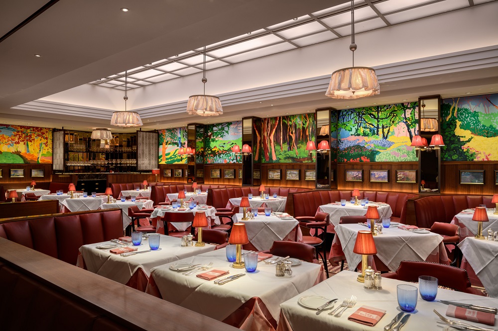
Will we designating long-stay quarantine rooms and what provision for beside equipment, room evacuation, or health care staff may be required>
How will two-metre distancing be implemented within our typical corridors? Perhaps as simple as adding a passing space, as we seen in narrow country lanes.
What will be our new lift/elevator etiquette?
Image caption: Guestroom inside The Jewel Hotel New York
In the short term I suspect we will all be looking to learn a lot from our colleagues in Health Care. Adopting many of their routine approaches to hygiene as our new standard. We will be looking at the selection of fabrics and surfaces, the use of inherent micro-bacterial defences, improved air filtration and a great deal more observation of guest’s welfare.
“I strongly believe that good design can help in re-establishing the inherent trust and meaning expressed by the word “hospitality”.” – Peter Mance, Director, MAAPS Design and Architecture.
My sense is that the returning traveller will be acutely sensitive to their environment and will appreciate the safe refuge and assurance which hotels can provide. We can all readily recognise that our reasons for travel, for whatever purpose, has the potential to be disproportionately risky, both for us as individuals and the hotels. While we can be certain that our inveterate desire to travel will return, our guests will be highly concerned for their own wellbeing, as well as conscientious on behalf of their colleagues, family, friends and wider communities.
Guests will want to be assured that the behaviours and operations of hotels are confident, safe, detailed and robust. Trust will be paramount for all brands. I strongly believe that good design can help in re-establishing the inherent trust and meaning expressed by the word “hospitality”. Gently at first, cautiously breaking down barriers and carefully communicating to our guests that we have their welfare at our heart and the right precautions and procedures in place.
We can reasonably anticipate as a business and community that we’ll successfully adapt. The ingenuity of humankind a huge advantage, and it responds so well to adversity. We’ll discover the blessings and opportunities that this global reset will offer – perhaps an even more resonate connection with our local communities.
We will continue to appreciate the attentive care and hospitality offered by hotels, and we will continue to travel to experience the wonders of our planet. Business will be done, and the value of face-to-face encounters will remain important. We instinctively thrive on curiosity and trust and will acutely appreciate the value of such interactions.
Design will continue to act as an intrinsic intermediary link between the traveller and host, helping set the scene to convey the values and brand essence of our hotels.
Our work as designers remains primarily concerned with guest interaction and experience. Underscored, as always, with a thorough understanding of the hotels operational, functional and experiential ethos. Added to this will be the new concerns of hygiene, security and protection.
For newly commissioned and refurbished hotels, we can expect that thoughtful and embedded demonstrations of sustainability along with a deep, genuine connection to the local community will be implicit.
For all the gloom and fear this pandemic has instilled, our present physical reality remains remarkably familiar. Ironically, our natural environment appears to be thriving and enjoying this imposed worldwide pause. Once again skies are clear, stars sparkle, and nature gently and effortlessly reasserts itself.
Within this present hostile environment, our hospitality instincts remain generous and hospitable. We are an ingenious and resourceful community. We will adapt and we will prevail.
MAAPS Design and Archtiecture is one of the brands that has taken advantage of our Industry Support Package. To keep up to date with supplier news, click here. And, if you are interested in also benefitting from this three-month editorial package, please email Katy Phillips by clicking here.
Main image caption: Sketch by Peter Mance derived from the courtyard entrance canopy of Trump’s Washington DC hotel, which remains open as it is “designated as an essential business” | Main image credit: MAAPS Design and Architecture
The fabrics of Backhausen’s ‘Made in Austria’ heritage
With its DNA firmly rooted in Austrian heritage, Backhausen’s quality and style of fabrics is a result of the brand’s authentic craftsmanship. The company’s Maria Florencia Caruso shares its narrative…
Austria, a place known as the home of music, culture, the waltz, ski resorts, palaces, outstanding museums and dramatic landscapes.
However, the country’s history of craftsmanship, attention to detail, precision, art and design is often overlooked. Products ‘Made in Austria’ tend to combine luxury with dependability – redefining, quality, reliability, sustainability, heritage and design.
Backhausen is an Austrian-heritage manufacturing company specialising in premium quality fabrics using natural fibres. The company’s mill is located in the Waldviertel region – more specifically in Hoheneich, which is located in lower Austria and literally translates as the “forest district”. In addition to its breathtaking nature, the Waldviertel has a rich history, culture and know-how in weaving textiles.
Image Caption: Backhausen’s factory is located in Waldviertel region, and sits inbetween rolling hills in the countryside | Image credit: Backhausen
“Backhausen’s designs are inspired by an extensive archive developed throughout its 171-year history.”
The brand’s products are designed, manufactured and packaged in Austria. At Backhausen, ‘Made in Austria’ is exemplified through the art of weaving and craftsmanship. The key to creating every woven fabric at Backhausen is its committed team, which uses skills and techniques passed from generation to generation. Backhausen’s expertise is to manufacture elaborate, intricate and diverse fabrics on state-of-the-art Jacquard looms, constructed using infinite design concepts. Jacquard fabrics distinctively incorporate complex patterns and colours into their weave, can feature a raised, luxurious brocade motif and are often reversible.
Image caption: In the factory at Backhausen | Image credit: Backhausen
Furthermore, Backhausen’s designs are inspired by an extensive archive developed throughout its 171-year history, in collaboration with acclaimed local architects, artists and designers. The archive is a treasure trove of daily inspiration for Backhausen’s designs and is part of Austria’s cultural history. The patterns and designs that form the influential archive are protected and not permitted to leave the country without official permission. Through this archive, Backhausen gives ‘Made in Austria’ a deeper and greater meaning. The company’s strength is finding the right balance between tradition and modern technology through experience and creativity.
Backhausen products give ‘Made in Austria’ an international perspective with its brand pillars of craftsmanship, sustainability, heritage and individuality.
Schönbrunn Palace, the Hofburg Imperial Palace and State Opera House in Vienna are all renowned Austrian landmarks in which Backhausen’s fabrics can be found. Internationally, Backhausen textiles can be seen in first class hotels, theatres, restaurants, cafes, renowned landmarks and high-end residential projects.
Image caption: Aurin by Backhausen | Image credit: Backhausen
Image caption: Mauresk by Backhausen | Image credit: Backhausen
The company is in partnership with designers from different industries and backgrounds, in addition to the use of its fabrics for interior upholstery and curtains. The fashion designer, Arthur Arbesser commissioned Backhausen to produce exquisite jacquard fabrics for two of his collections shown at Milan Fashion week and the Leopold Museum in Vienna. Backhausen fabrics can also be found in elegant modes of transport, as they are certified for aviation and marine interiors because of their durability and luxuriousness.
Backhausen’s bespoke options allow designers to express their individuality and creativity by creating project-specific patterns and motifs. Sagmeister & Walsh designed the Colour Room, in creative partnership with Backhausen, for their exhibition “Beauty” at the Vienna MAK (Museum of Applied Arts).
“‘Made in Austria’ is much more than a label.”
To expand on Backhausen’s versatility and its diverse project collection, its textiles are featured on the big screen set designs and decoration. Its influential film portfolio includes the 24th film in the James Bond series, James Bond 007: Spectre (2015) and The Grand Budapest Hotel (2014) by Wes Anderson, a four-times Oscar winning film, one of which was for set design.
‘Made in Austria’ is much more than a label: it represents a passion for art, heritage, tradition, craftsmanship, design and quality. Backhausen’s well-crafted Austrian-made fabrics enhance and inspire with timeless beauty, versatility and durability.
Backhausen is one of the brands that has taken advantage of our Industry Support Package. To keep up to date with supplier news, click here. And, if you are interested in also benefitting from this three-month editorial package, please email Katy Phillips by clicking here.
Zen by Woven Image: Inspired by the calm and simplicity of Japanese gardens
Woven Image has introduced Zen, a beautifully tactile three-dimensional acoustic wall panel as part of the Tangible Alignments collection, referencing textural vertical surfaces…
Zen by Woven Image is an innovation in non-woven wall panelling, Zen is specially designed to provide a floor to ceiling acoustic solution for commercial office interiors.
Suitable for standard direct fix wall applications as well as functional operable walls where panels could be installed double-sided, Zen provides a high quality solution with a beautiful tactile surface.
The design of Zen mimics the lines, curves and grooves of a Japanese zen garden evoking a sense of simplicity and calm. The concept of Zens peaks and valleys echos architectural corrugated surface details such as timber slats, stainless steel batons and textured cement or plaster feature walls.
Zen is available in nine colourways from essential neutral tones of cream, frost and onyx to directional mid tones of blush and forest accented with on-trend ivy, indigo and deep burgundy hues.
Image credit: Woven Image
Whilst the product can be easily machine or hand cut for installation, at 2800mm high, Zen panels can be installed without a floor-to-ceiling join line. Furthermore, to assist with ease of installation, Zen is trimmed on all edges with a subtle beveled cut that allows for easy butt joining along a continuous wall with minimal visible seams.
Performing to commercial Industry standards for interior wall linings, Zen achieves excellent environmental credentials, including Global GreenTag (GreenRate Level A), with the use of post-industrial waste streams and low VOC emissions.
Zen provides acoustic benefits with an NRC result of 0.30 for a direct fix application. Increased performance in high demand acoustic applications can be achieved via an acoustic infill such as Woven Image Aire panel.
PRODUCT WATCH: Floor-level channel shower made of superior Kaldewei steel enamel
Kaldewei Nexsys is said to be the easiest way to get an exclusive channel shower…
There is no easier or more secure way of having the extremely flat design of a channel shower in a bathroom than with the Kaldewei Nexsys shower surface with its exclusive colours and metallic accents.
The shower – available in 20 different sizes, with three surfaces, in many colours and with elegant design covers – is not only a shower surface of exceptional aesthetic but also a complete, virtually installation-ready system. The familiar Nexsys four-in-one system is already preassembled at the factory, inclusive of sloping support, waste channel and sealing tape.
Tile becomes shower becomes tile: it is only on closer inspection that you can see where the tiling ends and the shower surface begins. Thanks to the large choice of bathroom colours and matt shades of the Kaldewei Coordinated Colours Collection, the Kaldewei Nexsys can be integrated with XXL tiles at floor level, allowing it to disappear completely into the tiling.
Image credit: Kaldewei
The Nexsys brings extra glam factor into the bathroom with a variety of surface finishes for its elegant design cover: The polished gold, polished stainless steel or brushed rose gold versions particularly underline the elegance and value of this exclusive channel shower. An easy-clean finish is available on request, further adding to the shower’s comfort and convenience. In addition, all matt colours can be treated with Kaldewei’s virtually invisible anti-slip Secure Plus finish – for a high level of safety underfoot.
Hardly any other Kaldewei bathroom solutions have won so many awards for their excellent design as the Kaldewei Nexsys shower surface and the Kaldewei Miena washbasin bowl which was designed by Anke Solomon. These accolades range from the “iF DESIGN AWARD” and the Red Dot Award to multiple wins at the ICONIC AWARDS. Perhaps that is why the innovative channel shower and the delicate-looking round or rectangular washbasin bowl enter into such a fascinating “Perfect Match”, the term Kaldewei uses to describe the harmony between design language and uniform materiality.
With installation systems that are preassembled in the factory, the Kaldewei Nexsys ensures that installation is easy and time is saved on the building site. Thanks to the familiar 4-in-1 system, all elements are already connected with each other, inclusive of waste channel, sloping support and sealing tape. The included insulation tape guarantees optimum sound insulation. Thanks to its ultra-low built height, floor-level installation is possible even with limited construction depth. With all these advantages it comes as no surprise that the Kaldewei Nexsys is a favourite not only with architects and bathroom planners but also, first and foremost, with installers who save valuable installation time with the channel shower, allowing them to increase their efficiency on the building site.
The Kaldewei Nexsys is available in a wide range of bathroom colours and the elegant shades of the Kaldewei Coordinated Colours Collection. This means that the channel shower can be a standout feature in the bathroom, producing surprising contrasts.
Kaldewei is one of our recommended suppliers. To keep up to date with their news, click here. And, if you are interested in becoming one of our recommended suppliers, please email Katy Phillips by clicking here.
In Conversation With: Geraldine Dohogne, former designer at Zannier Hotels
The designer behind many of Zannier Hotels’ authentic properties, Geraldine Dohogne, is expanding her horizons to go solo on the international design scene. Speaking exclusively to editor Hamish Kilburn, the designer unveils the truth behind her unorthodox arrival into the industry, discusses the challenges she encountered when designing many of Zannier Hotels’ success stories and explains why the meaning of ‘lifestyle’ in design is rapidly changing…
It comes as somewhat of a surprise – I was almost lost for words – when Geraldine Dohogne tells me that she didn’t have any design experience whatsoever prior to when she was handed the reigns to become Zannier Hotels’ Head of Design. In fact, she was not a designer at all, nor was she some talented ‘inner designer’ who was trapped in an architect’s title, which is not uncommon in this industry. Armed with simply an international business degree and a naturally acute eye for detail, Dohogne proved that you didn’t require a design degree to become a top-notch designer.
Image caption: The open-air design of Zannier Hotels Sonop allows a connection between nature and its guests | Image credit: Tibodhermy for Zannier Hotels
That’s not to say that anyone can be a designer – far from it. Spending time with Dohogne, who accurately, in my opinion, describes herself as a designer by passion, allows one to see beyond the brilliant brand her name has been aligned to for years.
We meet in Mayfair’s The Conduit, an airy private members club that was once described by GQ Magazine as a place that provides the brightest minds with the opportunities to meet up and thrash out new ideas. It all sounds wonderfully fitting as it has also become one of Dohogne’s favourite places to work from in recent years.
“I was Zannier Hotels’ first employee.” – Géraldine Dohogne.
Although it may read shocking to some that a curious mind with no design background was asked to lead an entire luxury brand’s design ethos, Dohogne, for many reasons, was the perfect person for the job. For starters, she arguably knew the DNA of Zannier Hotels better than any established designer on the scene did. “I was Zannier Hotels’ first employee,” she explains. “I started in development and also did my time in operations before working in the design department. I mostly worked on my own, doing all the ordering and specifying by myself. It was at this point when I truly believe that my degree in international business kept me organised, focused and on track.”
It’s hard to believe that the premium hotel brand that has been so influential on the luxury travel and design scenes only launched its first property in 2011. It all started in The Alps with the opening of Le Chalet in Megéve. However, considering at the time the brand had already purchased land, properties, and had projects on the drawing boards in Asia and Europe, Zannier Hotels was considered an international player from the moment it was born.
“Without even knowing it, I was always interested in and inspired by design,” – Géraldine Dohogne.
Its unorthodox approach to luxury in both design and service soon gave it its esteemed award-winning reputation. The same way of thinking, I see, is shared – dare I say inspired – by the designer who is sat casually and confidently in front of me in a cosy beige jumper and blue jeans. “Without even knowing it, I was always interested in and inspired by design,” she says, “My curiosity in interiors and luxury travel was married up to the brand’s vision.”
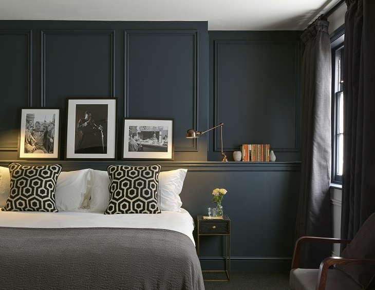
Image caption: Interiors inside one of the hut-like guestrooms at Zannier Hotels Omaanda | Zannier Hotels
Image caption: The effortlessly design, luxury pool at Zannier Hotels Omaanda | Image credit: Zannier Hotels
For all designers, however many years’ experience they have amassed (or not), all projects come with a number of different challenges. One of Dohnogne’s most memorable projects was 1988 The Post, an intimate hotel in Ghent, Belgium, that shelters no more than 38 keys. The boutique hotel has been inspired by the old post office building’s 19th century architecture and charm. “Inside, all the fabrics, materials, lighting and colours were inspired by the atmosphere of a post office and from the building period,” the designer explains. The rooms were decorated in a warm style – with high ceilings, dark green walls and antique furniture – complementing the building’s former life.
Image caption: 1988 The Post became one of Dohogne’s most challenging design briefs, because of the building’s irregular architecture and heritage in Ghent, Belgium
Although each hotel under the Zannier umbrella is unique to the destination, each follow the same journey of discovery when it comes to establishing the interior scheme and overall narrative. “We always look beyond the obvious,” says Dohogne. “Most of the antiques are sourced locally, which can be harder in some places than others.” For the brand’s most recent hotel in Namibia, more than 550 antiques were handpicked by Dohogne and injected into the property’s interiors that were uniquely constructed on stilts atop of natural boulders in the middle of the Namib desert.
Right when you thought Zannier Hotels had reached its limit of creativity, it is about to open the authentic doors of its next hotel, which will be situated in Vietnam. It’s 75 suites and villas will be sheltered under three various architectural styles, each of them melting into the lush natural background while referencing the local Ede and canal houses that are culturally embedded in Phu Yen (Vietnam). “Most of the villas and suites will have private pools and the public areas will be on the 1km-stretch of beach,” she explains. “The restaurants will really re-discover Vietnamese cuisine.”
Image caption: A sneak peek of the interiors inside the soon-to-open Zannier Hotels Phum Baitang, designed by Dohogne | Image credit: Zannier Hotels
While Dohogne continues to piece together Zannier Hotels’ vision of future properties with timeless interiors, in January 2020 embarked on a new, personal and profession journey; branching off to become a solo designer no restricted to hotel design. “It’s a new challenge,” she says, “but when you are challenged, you can bring much more to the drawing board. There is a gap in the market for high-end lifestyle projects in Europe and beyond.”
Quick-fire round
HK: What’s a trend that you hope will never return? GD: I believe that if you want a project to be ‘timeless’, it should not follow a trend.
HK: What’s the most difficult project you have worked on? GD: 1988 The Post was challenging because it was an existing building.
HK: What is the one item you cannot travel without? GD: My Swimming costume and my noise-cancelling Bose headphones.
HK: What does luxury mean to you? GD: A place where you can disconnect with technology and the world, and where you can feel at home.
HK: Where’s next on your travel bucket list? GD: Antarctica, Japan and Argentina.
HK: What’s the biggest lesson you have learned in your career? GD: Always show your work to a lot of people, and always question yourself until you are 100 per cent sure.
HK: When you pitch an idea, do you keep an open window? GD: Yes, because the world has changed so much from the beginning of a hotel project to the end.
For more than year now, Dohogne has been setting up the foundations of her own design studio. What strikes me is the link between the authenticity of Zannier Hotels’ expansion and the journey that the designer is also on. Although there is yet a comment as to what projects she is working on, it is clear that Dohogne is meaningfully expanding her reaches to purposefully design a new era of high-end lifestyle social areas and workspaces. Her journey in design continues…
As the current pandemic forces the industry to address change in how we work and how the world communicates, Harris Jackson Design offers some advice on how boutique hotels can re-open strong…
We are currently experiencing very different times and are all aware of how the hospitality industry is dealing with the fallout of the COVID-19 closures. But is there a magic answer as to how we can best prepare for when the lockdown lifts?
We can see that many establishments are helping out their local communities and establishing stronger links with other surrounding businesses thus creating a support network that will continue into the future. On a positive note, this pandemic enforced closure does give Hoteliers an opportunity to push the reset button. One can challenge the norm of how they have done things previously to improve in areas that they feel are necessary.
Proprietors should use the time during lockdown to train, innovate, reinvent and raise establishments to an even higher level. It is with this in mind that Harris Jackson Design would like to help those boutique hotel owners offering a 30 per cent discount on our services if clients sign up before the end of June 2020. We would like to look forward to celebrating your re-opening once the threat has passed.
Aside from the obvious difficulties & practicalities of trying to keep an establishment ticking over we are here to help you re-group, refresh and ready your hotel for your opening with as little expenditure as you may feel necessary. How can we use this enforced closure period to our advantage and use the opportunity to take stock and make the guest experience even more special?
In preparation for a re-opening there are many ways in which Harris Jackson can assist in creating a fresh new environment. We can create completely new concepts to fit within your brand guidelines for rooms, suites, communal or F&B areas or help refurbish standard rooms and give them a fresh new clean look ready for when your guests stay.
It is not just a case of a new coat of paint but changing colour schemes to give an area a whole new look. This can be achieved by introducing new soft furnishings in throw cushions, bedspreads, artwork & accessories. For more permanent architectural finishes one can always over tile or over lay textual finishes or cladding. New products on the market can add a whole new dimension to a tired looking space.
Simple vinyl textures or specialist wallcovering designs can be inserted into panelling to create a whole new luxurious feel at minimal cost. Phillip Jefferies have some beautiful feature designs that work excellently in small spaces but can also create stunning feature walls without much disruption. Some perfect examples of these are Yacht Club. A stunning pleated wood veneer design overlaying a subtle silver background. While not a vinyl the design can be inserted in harder to reach areas where little fingers cannot touch. Another example is Fretwork, which has, as the name suggests, a fretwork design in the same veneer finish but in this stunning imperial blue colourway.
Image caption: Fretwork, Phillip Jefferies
Image caption: Yacht Club, Phillip Jefferies
Alternatively, paper whole walls with this simple but beautiful vinyl linen effect, London Linens by Phillip Jefferies, which is supremely washable and contract quality. Adding a little texture to a wall can warm an environment up and make it feel less clinical. Or if you want to create more of statement just one wall in this Vinyl Crocodile Clutch will add an element of luxe. All the time adhering to a hospitality contract requirements.
Perhaps it is time to declutter and really streamline not only the brand concepts but also the interior feel of a space. We want our spaces to feel luxurious & homely, but we will want them to be both environmentally and psychologically friendly after all we will have been through. We want to relax and feel safe knowing that the service provider has covered our every desire & need.
Gone are the days of excessiveness for excessiveness sake. I feel that in the coming months & years our expectations of what we want from a hotel environment will change. The time out away from our busy lives will mean we re-address what is important to us all. Perhaps this will mean opening up our windows so that beautiful garden views can be observed creating more light and space. So that we can sit back and breathe in the fresher air.
Let’s continue to look at using more sustainable fabrics in our FF&E moving back to what nature intended. Specifying furniture that is from sustainably sourced timbers as Hill Cross Furniture are doing. Hill Cross provide high quality sustainable furniture to the contract marketplace. From 100% sustainable banquette seating, to environmentally friendly finishes and materials.
One of their sustainable materials is called Smart Board. It is a flame retardant, moisture resistant OSB board that is produced from timber sourced solely from within the UK reducing the carbon footprint. Reducing our Carbon Footprint will be an even greater concern going forward as people decide to not fly abroad and stay nearer to home.
Kvadrat have a wonderful collection of sustainable but contract semi sheers that look stunning floating in the breeze at large windows overlooking the outside. The first being Cocoon by Sacho Hesslein. Inspired by the web-like cocoons created by silkworms, this fabric is constructed of two layers with floating yarns between. The delicate weave construction is fixed by partial ledgers to form a soft translucent sheer and comprises of 100% Polyester FR although it by no means resembles this. The double-layered textile creates a subtle but unique gentle experience.
Image caption: Izolo, Anthology
Image caption: Cocoon, Sacho at Kvadrat
Izolo design by Walker Greenbank Anthology is a collection of sumptuous fabrics with a sleek satin slub look, with colourways inspired by a collection of precious stones and rich metallic tones. This luscious textile is double width and made from flame retardant 100% Trevira yarn meaning it is perfectly suited for hospitality.
There is no doubt that COVID–19 will change the way we work, how we live and how and where we travel. But let’s use this to our advantage. Harris Jackson are more than willing to help the boutique hotel industry entice the customer with a whole new way of looking at things so that ultimately, we can provide our guests with a new “peace of mind”.
Harris Jackson Design is one of the brands that has taken advantage of our Industry Support Package. To keep up to date with supplier news, click here. And, if you are interested in also benefitting from this three-month editorial package, please email Katy Phillips by clicking here.
How CGI is continuing to change how spaces are designed for the better
CGI renderings have eliminated many boundaries for the hotel design community. As designers and architects work on the planning stages of projects during the pandemic, 3D architectural and visualisation company North Made Studio explains how software development has taken CGI into new a creative territory…
Thinking up an interior design can be simple. A gifted creative can generate an idea for an interesting and engaging interior space. Drawing on their knowledge and experience to envisage something special.
However, communicating this interior design concept, and how it will fit within the confines of the property, can be a big challenge.
Thankfully, over the years, CGI has come into the mix. In the early development, it allowed interior designers and fit-out firms to create a rough approximation of how the space will look. Giving peace-of-mind to the client, putting them at ease about pressing ahead on an interior project.
10 years ago, the CGI industry would assist with producing basic 3D models of an interior space. Since then the software has improved greatly. Now a rough 3D ‘sketch’ can be generated by anyone with a basic level of computer skills and the dimensions of the space.
These software developments have pushed the CGI sector to offer something with significantly more value. Photo-realistic 3D renders.
3D renders, or visualisations are now produced to not only provide an accurate model of the interior space (and all of its suggested interior design elements), but also to go further and showcase the interior design ideas, communicating them to the client visually. Allowing viewers to experience them as if they were looking at a photograph of a physically constructed space.
Image credit: North Made Studio
Offer variety and be more competitive
The beauty of CGI is that is can be edited when required. Modifications can be made to change colour scheme, materials, surface finishes, furniture, light fixtures, etc.
All design aspects can be changed, but the shell of the interior space can remain the same. Interior designers can offer a selection of design ideas to their client, giving them the ability to test out ideas and produce live market research.
CGI also allows interior designers to be more competitive. The industry is growing and as it is relatively unregulated, anyone can claim to be an interior designer. Ensuring an interior design stands out from the crowd can be greatly helped by producing high quality CGI visualisations that will ‘wow’ the client. Producing a higher level of engagement and creating a design that is memorable.
Adding value to interior design
The ability to visualise an interior design accurately allows for so much more added value.
For the client, there are no major surprises. All the main elements of the interior design can be focused on within the CG imagery. If certain aspects are not to their taste, these can be changed prior to anything be made or installed physically.
As a tool for interior designers, high-quality interior visualisations are a guarantee of a happy client. Your idea can be fully visualised and communicated. With the ability to edit it to suit any issues the client picks out.
CGI visualisations are made accurately and correct to scale. Meaning errors can be minimised and the CGI space can be utilised to produce plans to assist with the construction/fit-out phase of a project.
Image credit: North Made Studio
Boost marketing and engagement
Still CG images are the norm for the interior design sector as a whole, looking back to the earliest stages of modern interior design, hand-drawn sketches and technical drawings were standard. CGI has continued this approach on the whole, building on it to blur the lines between the real and virtual world, by increasing quality and realism within the CG images.
However, over the last 10 years the capabilities of CGI software, the visualisers, and the techniques used, have allowed for new ways of visualising an interior design to be implemented.
Image credit: North Made Studio
CGI Animation within interior design
Animations can transform a single view of a space into a video that explores all aspects of the interior design. Allowing a singular piece of media to display all key aspects of the interior design. The CGI animation also benefits from being very shareable. Once uploaded online, it can be posted to social media sites, shared, reposted, liked, etc. Allowing from a greater amount of engagement with the viewer.
Explore an interior design with Virtual Reality
Another form of CGI that has allowed clients and viewers to engage much more with interior designs, are CGI Virtual Reality tours.
These come in many shapes and sizes, the most prevalent currently is the 360-degree panoramic view. This allows viewers to look at the interior design CGI in 360 degrees, exploring all aspects, but gives them control of the movement.
Allowing the user to dictate what aspect to view in real-time. Again, the sharable features of the VR are embedded within the product. And with the interactively features included, the 360 panoramic CGI views are hugely engaging and a very impressive marketing tool.
What’s next for CGI within interior design?
With rapid improvements in software and techniques it is hard to say exactly what kinds of CGI progression could become reality in the future. The most obvious would be improvements in Virtual Reality. Due to the associated high costs, currently only 360 panoramic VR views are a realistic tool for most interior design projects.
However, as improvements are made, full virtual reality is likely become the norm. Imagine showcasing an interior design within a web browser window. Allowing a client to not only view the space in 360 degrees, but also navigate through it in real-time. WebGL and similar product are currently able to offer a service like the, although there are limitations on the levels of quality that can be shown, as well as high production costs.
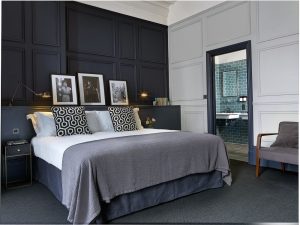
Progressions in the future are likely to see improvements within this area to allow for photorealistic interior spaces to be visualised inside a virtual reality environment that can be interacted with fluidly, even on the most basic PC or mobile device.
North Made Studio is one of the brands that has taken advantage of our Industry Support Package. To keep up to date with supplier news, click here. And, if you are interested in also benefitting from this three-month editorial package, please email Katy Phillips by clicking here.
INDUSTRY INSIGHT: Why hotel first impressions count
In response to Hotel Designs putting ‘Public Areas’ under the editorial spotlight this month, interior design studio Design By Deborah explains why first impressions count in international hotel design…
In general life as well as design, rightly or wrongly, first impressions count. And while judgement from potential guests is cast earlier and earlier in the customer journey (with the evolutions in technology and online platforms), it is critical to establish your narrative from the beginning.
Your up-to-date and monitored website and social media platforms need to look professional, engaging and exciting. However, the most important thing is they act on the information you have given them to book a room. At the very least, photographs of the hotel should be taken professionally.
Once a consumer has booked a stay, via the website or otherwise, their next impression of the hotel will be their arrival experience. What does the outside of your property say – is it attractive, well lit, clean and tidy? Are you making the most of the architectural features of your property? The majority of people are time poor, so they want to know quickly where to park and where the entrance is. They want to find reception, the bar, the restaurant or somewhere to have a cup of coffee and work easily. Where is the designated smoking area, which ideally is not at the front, near the entrance so that everyone has to inhale smoke before they enter?
Image caption: Typical small Georgian or Regency style luxury hotel in London | Image credit: Design By Deborah
What do you see as you open the main door – what vibe does your entrance area give? Is it lively, fun and full of energy, or are you wanting to create a calm, serene and tranquil experience? If you are offering a premium price, the entrance and the initial spaces that guests enter in should give this impression. There is no right or wrong but service and design should meet on the same message.
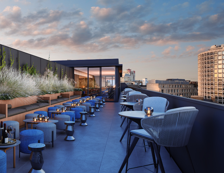
Image credit: Design By Deborah
Regardless of what atmosphere you are trying to achieve, there will always be limitations, whether it is the building, the budget or timescales. A good interior design team are experienced when it comes to working with these restrictions, and are able to offer suitable and aesthetically pleasing solutions. All designs created at Design by Deborah are bespoke as the team recognises the importance of putting together the personality of the building. Through experience, the studio knows that the designs must be functional yet also delight and surprise in the right areas. Well integrated interior design aims to provide an exciting environment in which your business is able to provide the very best service. You want to be unique, special and convert your clients into fans.
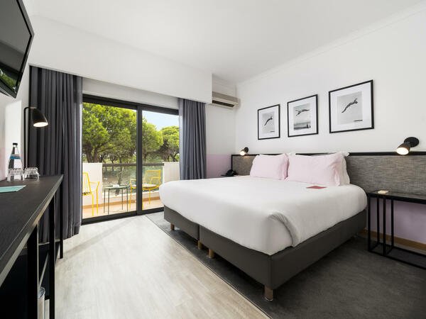
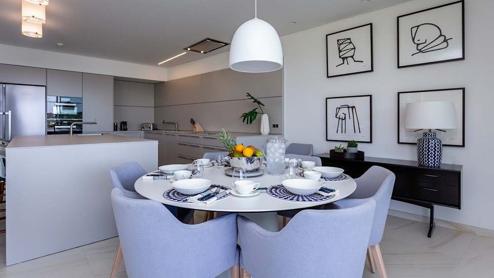
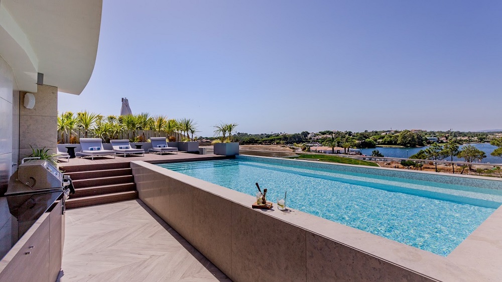
Design By Deborah is one of the brands that has taken advantage of our Industry Support Package. To keep up to date with supplier news, click here. And, if you are interested in also benefitting from this three-month editorial package, please email Katy Phillips by clicking here.
Main image credit: Jonathan Little Photography on behalf of Design By Deborah for the Bradbury House Reception
This website uses cookies to improve your experience. We'll assume you're ok with this, but you can opt-out if you wish.AcceptRejectRead More
Privacy & Cookies Policy
Privacy Overview
This website uses cookies to improve your experience while you navigate through the website. Out of these cookies, the cookies that are categorized as necessary are stored on your browser as they are essential for the working of basic functionalities of the website. We also use third-party cookies that help us analyze and understand how you use this website. These cookies will be stored in your browser only with your consent. You also have the option to opt-out of these cookies. But opting out of some of these cookies may have an effect on your browsing experience.
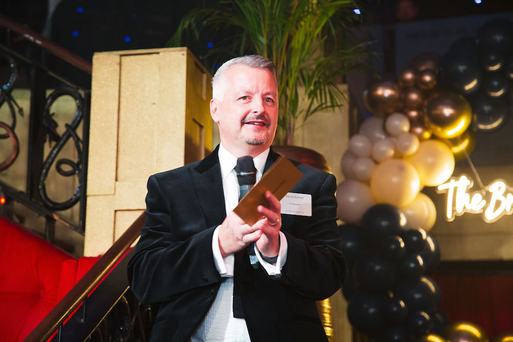
Necessary cookies are absolutely essential for the website to function properly. This category only includes cookies that ensures basic functionalities and security features of the website. These cookies do not store any personal information.
Any cookies that may not be particularly necessary for the website to function and is used specifically to collect user personal data via analytics, ads, other embedded contents are termed as non-necessary cookies. It is mandatory to procure user consent prior to running these cookies on your website.
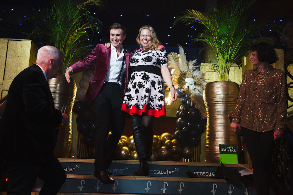
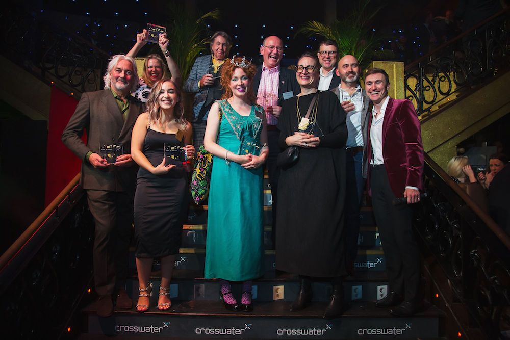
To keep up to date with all the latest news and features, sign up to receive our weekly newsletter and bi-monthly HD Edit.