Hotel Designs

    NEWS AND ANALYSIS FOR HOTELIERS, DESIGNERS AND INDUSTRY SUPPLIERS

    Event setup made simple with Burgess Furniture

    800 533 Hamish Kilburn

    Burgess Furniture launches new space-saving afold table, which has been chosen for the meeting spaces at Belfast’s new Grand Central Hotel…

    Priding itself on offering the hospitality industry furniture which couples great designs and exceptional functionality to fit our customer’s needs, Burgess Furniture has launched a new folding table that makes light work of setting up functions and events.

    Portable and lightweight, the new A-Fold table is quick to install and fold down thanks to its unique folding mechanism, that secures the legs flat against the table top for minimal storage space.

    Available in different styles, such as classic white, contemporary white and timber, the AFold table is designed with user flexibility in mind. Individual tables can be linked together for business group working and modesty panels can be added or removed quickly for user comfort and discreet cable fixing.

    The A-Fold table is available in rectangle or round shape and a comprehensive choice of sizes from 150 to 180cm diameter and 120 to 180cm in length.

    “Setting up an open area into a dining room, meeting room or conference space can be time-consuming and difficult,” says Craig Kent, Production Director at Burgess Furniture. “The new A-Fold table is designed to make it easy and quick to adapt a room when hosting different types of events.

    “The folding mechanism was very carefully designed by our team, to be smooth, safe and simple so that anyone can set the A-Fold table up. “It’s a very practical solution that’s also very stylish, each design was carefully created to ensure it complements existing décor for the professional, quality experience that guests expect.”

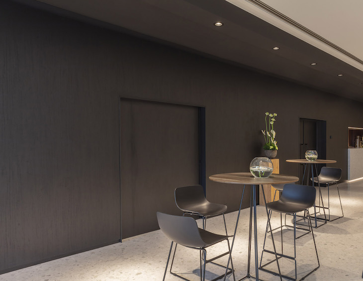
    Image caption: Burgess Furniture’s A-fold was chosen for the meeting rooms of Belfast’s largest hotel, Grand Central Belfast

    With its sleek look and practical design, the A-Fold table is featured in the newly opened five-star Grand Central Hotel Belfast. “The A-Fold was in the very early stages of production when we revealed its design to Hastings  Hotels,” said Ashley Taylor, General Manager at Burgess. “They were immediately impressed, not just by its practicality and how it can be quickly adjusted to suit different types of events, but with its level of quality  – perfect for Northern Ireland’s largest-ever and most luxurious hotel.”

    The A-Fold table is the latest new product from innovative furniture maker Burgess, following on from the launch of its Smart Qube flexible hospitality furniture range and Junea chair collection earlier this year.

    For more information visit www.burgessfurniture.com

    Burgess Furniture are one of our recommended suppliers. To keep up to date with their news, click here. And, if you are interested in becoming one of our recommended suppliers, click here.

    The Montcalm Group unveils first boutique townhouse hotel

    800 576 Hamish Kilburn

    The Chilworth is the Montcalm Hotel Group’s newest generation of a boutique townhouse hotel…

    Located in a little London hideaway near Paddington, The Chilworth has been designed to merge together both wellbeing and comfort into a traditional townhouse.

    With an elegant yet informal atmosphere, the décor of the 124-room hotel blends classical period features with sharp, contemporary design. Designed in-house, every detail of the guest experience has been designed to provide the ultimate in personal service in order to look and feel like a private members club.

    “Our approach to enlightened luxury means looking after guests’ wellbeing too,” said a spokesperson from the in-house design team. “As well as a chic restaurant and stylish bar, there’s also a urban spa with jacuzzi, steam room and gym, treatment rooms and even a yoga suite.”

    The Chilworth’s compact urban spa features a jacuzzi, gym, steam room and an extensive range of treatments as well as a yoga suite and outdoor yoga classes.

    Spa at The Chilworth

    “We’re proud to play a part in the Paddington area’s renaissance by restoring a classic English townhouse as London’s newest boutique hotel,” said Montcalm management in a press release. “We wanted to create somewhere our guests can feel a real sense of belonging whenever they’re in town, equally at home relaxing in the cosy bar or sociable lobby lounge as in their room.”

    In a peaceful setting, The Chilworth is said to become a popular choice for those who prefer smaller hotels with the personal touch on the fringes of London’s zone one.

    Terrace of King's Street Townhouse

    Meet Up North: Three days to go!

    1024 576 Hamish Kilburn

    On July 18, Hotel Designs will bring the successful networking concept of ‘Meet Up’ up North to Manchester…

    There are just three days left in order to secure your place at Meet Up North, the UK’s leading networking event for hoteliers, architects, interior designers and key-industry suppliers.

    In the heart of Manchester, King Street Townhouse, which The Telegraph concluded it was “like staying with a rich friend who has extremely good taste”, has been chosen to shelter the Northern soiree. “Manchester, for many reasons, is a hive for hotel design,” said Hamish Kilburn, editor of Hotel Designs. “In particular, with its outstanding terrace on the sixth floor, King Street Townhouse aligns perfectly to our networking event Meet Up North.”

    Located within the upper King Street Conservation Area of Manchester city centre, the hotel is an impressive 1870s Italian renaissance building, designed by local architect Edward Salomons for the Manchester Salford Trustees Bank. In 2016, AEW Architects, who will be at the networking event this week, converted the building from an office into the high-end 40-bedroom boutique hotel that stands proud over the city today.

    Speaking at Meet Up North will be Fiona Thompson, Principal of Richmond International. Thompson will be sharing her thoughts on past projects, future predictions and the value of collaboration.

    Completing the line-up of speakers will be the headline sponsors of the event, Marca Corona, which will provide the audience with an in-depth industry insight and will be available to answer questions after.

    Agenda for the evening:

    6.00 p.m. – Event starts on the 6th floor terrace and lounge  at the King Street Townhouse
    6.30 p.m. – Welcome speech courtesy of Hotel Designs editor, Hamish Kilburn
    6.45 p.m. – Headline speech courtesy of Fiona Thompson, Principal of Richmond International
    7.00 p.m. – Insights from event Headline Partner, Marca Corona
    7.15 p.m. – Canapés are served
    9.30 p.m. – Event finishes

    If you are a supplier to the hospitality industry looking to meet the top hoteliers and interior designers, contact Jennie Lane on 01992 374098 or on j.lane@forumevents.co.uk – or click here to book your place.

    The Hotel Designs summer Meet Up is completely free for hoteliers, interior designers and architects; click here to confirm your attendance.

    Luxury Bay Suite

    London-based interior designer unveils ‘suite dreams’ in Malta

    1024 576 Hamish Kilburn

    Malta continues to be a hotel design hot spot as London-based designer unveils 29 luxury suites in Malta’s The Westin Dragonara Resort

    With the arrival of a Hard Rock Hotel slated to open in 2020 and Zaha Hadid Architects winning planning permission to build the 31-storey Murcury House, Malta in the Mediterranean is fast becoming a hotel design hub. Ahead of these grand plans becoming a reality, the most recent hotel renovation is that of the suites of a hotel that first opened its doors in the late ’90s.

    Conceptualised by London-based interior designer, Lynne Hunt, the 29 Luxury Bay Suites offer a light and airy design that promotes relaxation, renewal and spectacular views. Taking inspiration from the extraordinary location and the hotel’s passion for wellbeing, all design details champion the natural surroundings, featuring soft hues of Maltese limestone and the turquoise tones of the Mediterranean Sea.

    Working with Westin and Marriott, Huny embraced the design ethos of a Westin resort with a biophilia approach to its interiors and design reference. “Our inspiration is the limestone rock of Malta along with the beautiful surrounding Mediterranean Sea,” Hunt explained.

    The centrepiece of the Master Bedroom is the award-winning Westin Heavenly® Bed, tilted at an angle to face the window. Guests are invited to relax under the soft mood lighting and recharge with the soundtrack of the soothing ocean that drifts from the connecting terrace.

    Image credit: The Westin Dragonara Resort

    Overlooking the bedroom and sea beyond is the spacious and elegant ensuite, built with a free-standing bath and walk-in rainfall shower. As well as featuring an open-plan ensuite bathroom, an additional guest bathroom features in the suite, complete with a range of premium White Tea Heavenly Bath toiletries.

    “The refurbished Luxury Bay Suites are an extraordinary addition to The Westin Dragonara Resort. The hotel overlooks the tranquil Mediterranean and these new suites really make the most of this unique vista,” said Michael Camilleri Kamsky, General Manager of The Westin Dragonara Resort. “Every element of the suites has been considered to help guests relax and re-energise, from the spacious design, to the unique food and beverage offering. We look forward to welcoming guests to experience the Luxury Bay Suites first hand.”

    Other images of the Luxury Bay suites: 

    [easingslider id=”31849″]

    The open plan living and dining space comes complete with a functional double sofa bed, seating area and kitchenette. Floor-to-ceiling glass doors lead out onto a private and secluded terrace, perfect for al fresco socialising and relaxing. Three of the suites offer two bedrooms, accommodating larger families or accompanying guests.

    First opened in 1997, The Westin Dragonara Resort has been at the forefront of Maltese hospitality. Its latest renovation to the 29 suites reference Maltese culture in a soft, sublte and approprate way, mainly through clever colour schemes and Mediterranean-inspired art.


    Interior of Stand Art Hotel

    Top 5 stories of the week: Russian-doll hotels, culture clashes and openings in the City of Design

    800 534 Hamish Kilburn

    Hotel Designs editor Hamish Kilburn breaks down the week with the top five stories…

    With our focus this month being on fabrics, textiles and soft furnishings, weaving together this week’s top five stories has been one that I have thoroughly enjoyed. Mitre Linen has put the topic of soft furnishings firmly in the spotlight to unveil new ways in which hotels can stand out from the crowd. In other news, hotel group IHG seems to be going from strength to strength, unveiling yet another Hotel Indigo property, this time in the City of Design in Dundee, Scotland. In rather apt form, with the World Cup final fast approaching, our editorial team have been busy to uncover the best design hotels in Russia. On top of all this, SLEEP + EAT, which takes shelter under a new roof this year at London’s Olympia, has unveiled the themes and designers for this year’s Sleep Sets, while SB Architects unveils two rather unusual hotels in China.

    And breathe… Here are the top five stories of the week!

    1) IHG Hotel Indigo unveiled in Dundee, the UK’s first UNESCO City of Design 

    Modern restaurant

    Topping our charts this week is the new arrival of a funky hotel in the City of Design… InterContinental Hotels Group (IHG) has opened Hotel Indigo® Dundee, in one of Europe’s rising design destinations – Dundee, Scotland. Once famous for its textiles, the city’s industrial spaces are now filled with artists and collectives, including a thriving gaming community who have helped turn Dundee into the creative heart of the world’s computer games industry.

    2) Sleep Sets for SLEEP + EAT 2018 introduces unusual partnerships 

    Sleep + Eat has announced the theme for this year’s Sleep Sets, as well as the four design companies inspired to create the concept rooms. The challenge for each designer is to partner with a brand but, in the tradition of Sleep + Eat, these brands are not the usual suspects. HBA London will be working with the Natural History MuseumDenton Corker Marshall will tackle West Ham Football ClubYasmine Mahmoudieh is to pair with Penguin Modern Classics; and AB Concept will collaborate with Maison Pierre Hermé Paris. Each Sleep Set designer has been tasked with creating a guestroom concept based on their partner brand’s aesthetic and values. Innovative and engaging, the sets will facilitate new and imaginative ways for visitors to interact with the selected brands.

    3) East meets west at two new Chateau-style winery boutique hotels in China 

    SB Architects has announced several new planned communities and destinations in China, including two new winery boutique hotels. From winery resorts in Dalian and Beijing to mixed-use developments in emerging areas, SB Architects has announced master planned projects for its Chinese clients looking to capitalise on the China’s growing luxury lifestyle industry.

    4) SOFT FURNISHINGS: Colour, clean identity and a sprinkle of inspiration from musical icons

    Heritage Serenity range from Mitre

    Image caption: Heritage Serenity range from Mitre

    Simon O’Mahony, Managing Director of Mitre Linen, explains how soft furnishings, linen and colour can help a hotel stand out from the crowd. Hospitality is a congested market, and customers are increasingly discerning with a huge range of options to choose from. In short, it’s crucial to stand out by having a clear identity which extends into every room of your hotel. Having a well-defined offering clearly positions your business and makes it more appealing to particular customers. What’s more, using colour can help bring the values of your business into every room.

    5) Top 7 design hotels in Russia

    Image Credit: Flickr, Deensel

    Riddled in history, Russia holds many hotel gems within its borders. In recent years, hospitality has also been on the rise with a boom in hotel development. TOPHOTELCONSTRUCTION database recently confirmed this by announcing that Russia has 96 projects upcoming hotels that are slated to shelter 18,437 rooms. Of these projects, 49 percent of the hotels are being planned to open in 2021 or beyond, while a whopping 17 per cent are expected to open this year.

    With this in mind, and as the eyes of the world focus on the host nation in the lead up to the FIFA World Cup final, our editorial team did some digging to unveil the best design hotels in Russia – and here they are in no particular order.


    Combining textures and colours at London design aparthotel slated to open this September

    800 563 Hamish Kilburn

    Rockwell East is a new 57-key aparthotel owned by London-based property developers Marldon and designed by Waldo Works with deliberate clashes of textures and bold colours..

    Located on the fringes of London’s city centre, Rockwell East is a 57-key aparthotel the ideal destination for travellers who are staying in town for one night or several months. Apartments at Rockwell East are spacious and have all the features of a design-led modern home, with strong colours and textures injected into their interiors.

    Accommodation ranges from Studio Apartments to One Bedroom and Family Apartments. The base palette for the rooms is inspired by the patterns and colours of the sky. A theme that is offset by deep inky blues and highlighted by accents and colours that are tailored to each space.

    Each apartment has a fully fitted kitchen, free Wi-fi, a dishwasher, washing machine/dryer, safe, Air-conditioning, an HDTV, Merino wool blankets, Egyptian cotton sheets, towelling dressing gowns, soaps and lotions by the White Company, a Nespresso Coffee machine and a welcome breakfast pack by Abel and Cole.

    Burgundy, yellows, sepia and brandy tones give a warm aesthetic to the café. Divided into separate areas by soft velvet banquettes, the space also features black steel chairs and lighting, soft cork upholstery and lightly brushed brass for the bar and other dining areas. Offering modern European dining, with classic favourites, the café will focus on good, fresh food and feature a wine menu curated by renowned merchants Goedhuis & Co.

    Renowned designers Waldo Works have taken inspiration from the passage of time, night and day, sun and moon throughout the interiors, establishing a restful rhythm for guests. The aparthotel has a strong sense of design and space, while remaining calm and comfortable.

    Artist Fergus Hare has been commissioned to present the art throughout the aparthotel, focusing on landscape and skies at peculiar times of the day or from curious perspectives, to create intriguing and beguiling imagery.

    “With a strong emphasis on design, mixed with comfort at an affordable price, we hope to create a stand-out experience in the growing London aparthotel market’,” concludes Fred Bartlett, Associate Partner at Marldon.

    Supplier list: 

    Bedside lights: Waldo Works custom design in Jesmonite
    Bed headboard fabric:  Opuzen, RGL R-Market in Granite
    Bed throw:  Beatrice Larkin, Monochrome range – designs: point, stamp, rope, line & block
    Tables: Waldo Works custom table top finishes by Mass Concrete developed for the project
    Work chair: Cizeta ‘Ginger’ chair in black stained Ash Wood and anthracite rope
    Art: Fergus Hare throughout – developed with Waldo Works, custom to the project

    Guestroom concept at Four Seasons Kuala Lumper

    Four Seasons Hotel Kuala Lumpur opens as urban hideaway

    800 450 Hamish Kilburn

    It was a collaborative effort to finish the highly anticipated Four Seasons Hotel Kuala Lumpur…

    Located within a glittering new skyscraper, designed by NRY Architects, adjacent to the iconic Petronas Towers is the newly opened Four Seasons Hotel Kuala Lumpur. Rising 65 storeys above the bustling streets of the capital below, the new 209-key hotel boasts unparalleled hotel views, which was a major theme in the interior design concept that was taken on by a number of designers.

    Exterior shot of the hotel

    The 209 rooms (198 guestrooms and 11 suites), designed by Susan Issac (Wilson Associates), are complete with floor-to-ceiling windows that showcase dramatic 180-degree views of the city. The interiors are light, airy and have an open feel with soft hues marrying up with luxurious, warm-metal finishes.

    Guestroom concept at Four Seasons Kuala Lumper

    Image Caption: Guestroom concept at Four Seasons Kuala Lumpur

    Ed Ng and Terence Ngan, the international design duo and co-founders of AB Concept curated three unique spaces within the hotel: Yun House, The Lounge and Bar Trigona.

    The main dining area, Yun House, is a space where guests are greeted by a decadent courtyard-style reception and elaborate panelled screening. Symbolic of it’s colonial heritage, the mouldings of plumb blossoms, orchids, bamboo and chrysanthemum are the flowers known as the Four Gentlemen in Chinese art and resemble the yearly Four Seasons.

    “We always aim to create storytelling designs which bring together the project’s location, history, and the brand itself,” explains Ng. “The very creation of the design concept is what makes this project unique. The biggest challenge, as with all AB Concept projects, is putting ourselves in the mindset of a fictional character at the location, in order to dream up details which truly connect with the values of the place and the local people.”

    The Lounge at the Four Seasons, which directly overlooks Kuala Lumpur’s central park, is located on the sixth floor of the hotel and exudes an opulent yet welcoming feel of an antique collector’s home and naturally integrates with the urban scene beneath. The calming ambiance created through the use of rattan is further enhanced by an abundance of light surrounding the communal-style seating area and the greenery outside of the windows. “We researched traditional Malaysian homes and how they would be lived in, and experienced, in order to create a comforting yet refined space,” said Ng when describing the inspiration of The Lounge. “Our stem concept was a colonial residence inhabited by a collector of antiques, generating a sense of nostalgia and bygone romanticism in the design. It was important to veer away from the traditional dark woods and heavy fabrics usually found in antique-filled rooms, and instead create a space that reflected the panoramic views of Kuala Lumpur’s Central Park, so we used pastel fabrics, blond woods and ivory marble as well as soft greens and yellows, combined with lacquered baluster tables and wicker-back chairs.”

    The Lounge at Four Seasons Kuala Lumper

    Image caption: The Lounge at Four Seasons Kuala Lumpur

    Elsewhere, hidden in plain sight, the urban yet sophisticated socialising space at Bar Trgona is adorned by calming shades of imperial blue and teal, and poses as a reserved escape from the surrounding vibrant restaurant. Incorporating leather, glass and bronze, materials traditionally used in Malaysian crafts, the bar space embraces the connection to the cityscape backdrop, whilst the use of shutters on surrounding columns draw on the connection between East and West

    For the General Manager of the hotel Tom Roelens and his team of dedicated service specialists, it’s the end of one long journey of preparation, and the start of a new one as they welcome their first guests.  “As the hotel has come to life, we have looked forward to the day when it would be filled with people – international travellers in the city for business or leisure, local guests in our restaurants and spa, and the many residents who are becoming part of the extended Four Seasons family here in Kuala Lumpur.”

    In addition to sophisticated and stylish guestrooms and F&B areas, the hotel shelters 1,821 square metres (19,016 square feet) of flexible, state-of-the-art event spaces comprising two exquisitely designed ballrooms and four meeting rooms.

    SOFT FURNISHINGS: Colour, clean identity and a sprinkle of inspiration from musical icons

    800 533 Hamish Kilburn

    Simon O’Mahony, Managing Director of Mitre Linen, explains how soft furnishings, linen and colour can help a hotel stand out from the crowd…

    Hospitality is a congested market, and customers are increasingly discerning with a huge range of options to choose from. In short, it’s crucial to stand out by having a clear identity which extends into every room of your hotel. Having a well-defined offering clearly positions your business and makes it more appealing to particular customers. What’s more, using colour can help bring the values of your business into every room.

    Colour experts Pantone have outlined eight key palettes which will lead colour trends in 2018. Understanding and integrating these into hotel rooms will help to emphasise the luxurious decadence of a countryside spa or add a splash of vibrancy to a city centre base. What’s more, using soft furnishings and linen to celebrate these trends is an attractive and luxurious alternative to a complete overhaul, without the associated expense. These eight trends are:

    Playful

    Playful colours are for those who don’t take life too seriously. With a palette dominated by yellows and lime greens, these shades can work brilliantly in informal communal spaces such as coffee bars and dining spaces. Bringing this trend into individual rooms can add a zest of bright playfulness, whilst throw cushions are the ideal way of adding a spark which can still be moved to reveal the blissful tranquillity of classic white bed linen.

    Discretion

    Pantone suggest that Discretion is Playful’s more responsible elder sibling, offering refinement and subtlety to quality hotel spaces. Led by rustic elderberry and fern tones, Discretion is a vital part of the luxurious accoutrements of bespoke accommodation. Use it to draw the eye to finishing touches such as Mitre Linen’s Chatsworth or Reflections bed runners.

    Heritage Serenity range from Mitre

    Image caption: Heritage Serenity range from Mitre Linen

    Verdure

    Taking its name from lush greenery, the Verdure palette is all about emphasising health and vitality. Perfect for spas, country retreats and eco-conscious premises, typical Verdure colours include paler celery greens and organic berry purple. The Comfort Enigma massage couch cover from Mitre Linen is ideal for offering Verdure’s serene and relaxing qualities, whilst Nova towels are available in mint green tones for a delicious alternative to classic white spa towels.

    Far-fetched

    Far-fetched but not inconceivable, this palette is all about recreating the fragrances of a Moroccan bazaar or the sights and sounds of a bustling Beijing backstreet. Warm, earthy and terracotta tones dominate here, highlighted with carefully chosen rose and peach items. Why not try using Mitre Linen’s Mocha sheets and valances as a basis for your exotic oasis and draw customers’ eyes with contrasting finishing touches.

    Hint: Before committing to the far-fetched palette – make sure it suits your location – will guests expect an exciting and exotic experience?

    Resourceful

    Are you feeling brave? The Resourceful palette explodes with bold contrasts of rich velvet blues and classic burned oranges. Redefining classic 1960’s London chic, Resourceful requires flair and creativity to integrate into your hotel rooms and can be built around signature pieces of period furniture. Dazzle patterns are also great for creating pulsating clashes that make for memorable spaces.

    Of course, this palette isn’t necessarily associated with rest and relaxation, so party-oriented boutiques and socially-driven aparthotels are Resourceful’s key markets. Build a bold backdrop with the geometric pattern of Mitre Linen’s Essentials Sweden curtains or introduce the rich blues of the Essentials Spectrum navy collection.

    TECH-nique

    As the name may suggest, TECH-nique celebrates the rise of technology and the way this influences our lives. Frosted colours dominate here, as do hot flamingo pinks and turquoise tones. TECH-nique embraces utilitarian and simple design and is the efficient way to add quirk to entry level rooms. Use sparingly and rely on the enduring appeal of clean and crisp whites in order to carry this palette.

    Intricacy

    Intricacy is an abundance of neutral metallics with flourishes of dramatic berry red and yellow. Ideal for glorifying a penthouse suite or creating dramatic dining and entertaining spaces, Intricacy needs to be led by bold furniture choices and celebrated with the luxurious feel and striking looks of Mitre Linen’s Sovereign bedspreads.

    Intensity

    Pantone’s final palette is easily their most bold. Intensity is… intense. Blacks and golds make for intensely strong looks for that strictly presidential vibe. Whilst obviously not suitable for an entire room, carefully using Intensity can create dramatic dressing spaces and premium, luxurious suites.

    Nostalgia Sky runners from Mitre Linen

    Image caption: Nostalgia Sky runners from Mitre Linen

    What’s fashionable for hotel rooms in 2018?

    Pantone’s Colour of The Year rings throughout the fashion world and 2018’s colour is Ultra-Violet. As Pantone state: Enigmatic purples have also long been symbolic of counterculture, unconventionality, and artistic brilliance. Musical icons Prince, David Bowie, and Jimi Hendrix brought shades of Ultra Violet to the forefront of western pop culture as personal expressions of individuality.”

    In such a competitive and unpredictable hospitality environment, maybe adding some Bowie to your bedrooms isn’t a bad idea.

    Modern restaurant

    IHG Hotel Indigo unveiled in Dundee, the UK’s first UNESCO City of Design

    800 533 Hamish Kilburn

    Interior design firm Graven completes IHG Hotel Indigo Dundee…

    InterContinental Hotels Group (IHG) has opened Hotel Indigo® Dundee, in one of Europe’s rising design destinations – Dundee, Scotland. Once famous for its textiles, the city’s industrial spaces are now filled with artists and collectives, including a thriving gaming community who have helped turn Dundee into the creative heart of the world’s computer games industry.

    Dundee is the UK’s first UNESCO City of Design and will be home to the soon to open V&A Dundee – Scotland’s first design museum, making it an even more desirable city break destination for the arts and culture-inclined. It also boasts a generous offering of theatres, museums, galleries and shopping destinations, with world famous golf courses on its doorstep, including St Andrews. The city’s cultural quarter features the award-winning Dundee Contemporary Arts centre, the Dundee Rep Theatre and the Sensation Science Centre as well as an array of restaurants and cafes.

    Transformed from a 200-year-old jute mill, the 102-key Hotel Indigo Dundee, designed by Graven, sits between the waterfront and the heart of the shopping district. Rich in history, the first spinning mill was built on the site in 1822 by the Baxter family who became one of the world’s largest linen manufacturers. Respectfully renovated, the hotel’s three room designs are inspired by Dundee’s past and present and feature the original vaulted brickwork ceilings.

    Standard room at Hotel Indigo Dundee

    Image caption: Standard room at Hotel Indigo Dundee

    The Dundee Cake room brings in discreet marmalade motifs throughout the room with jute curtains. The Comic room is inspired by DC Thompson, the famous publishing house that had a famous comic called ‘Black Bob’ about a sheepdog that saved the day, with sheepdog commands hidden in the dado rails. The Gaming room is reflective of Dundee’s thriving computer game industry, the birth place of Grand Theft Auto. Secret gaming codes can be spotted within the dado rail, and literature found within the room celebrates Dundee’s unique links to the video game industry. Beds are finished with blankets by a local textile designer, Hilary Grant, whose work is inspired by waves breaking on the River Tay.

    Hotel Indigo Dundee’s restaurant and bar, Daisy Tasker, offers guests a contemporary spin on traditional Scottish dishes with an abundance of fresh seafood, prime cuts of meat and locally-grown fresh vegetables. It is named in honour of a much-loved weaver who organised activities for the jute mill workers and, true to the original Daisy’s sociable spirit, the restaurant is set to be the ideal spot for family and friends to eat and drink together.

    Daisy Tasker Bar

    Image caption: Daisy Tasker Bar

    “We are extremely excited to be opening our doors to guests. This is a unique and beautiful hotel and through clever design, we’ve really brought its heritage to the forefront,” said William Inglis, General Manager at Hotel Indigo Dundee. “This city has recently been voted as one of the best cities to visit in 2018 and its rich culture is showcased throughout the city. With the opening of the V&A later this year, we look forward to welcoming guests from the globe and have no doubt that they will fall in love with Hotel Indigo and everything this incredible city has to offer.”

    Inspired by the neighbourhood around each property so just as no places are alike, no two Hotel Indigo® properties are the same. Each Hotel Indigo property features thoughtful design touches and vibrant restaurants and bars connected to the spirit of the local neighbourhood. There are currently 27 Hotel Indigo properties in Europe with another 17 due to open in the next three – five years.


    Wilton Carpet Urban Range

    A new urban landscape from Wilton Carpets

    800 635 Hamish Kilburn

    Urban is the latest ready-to-go carpet range by Wilton Carpets…

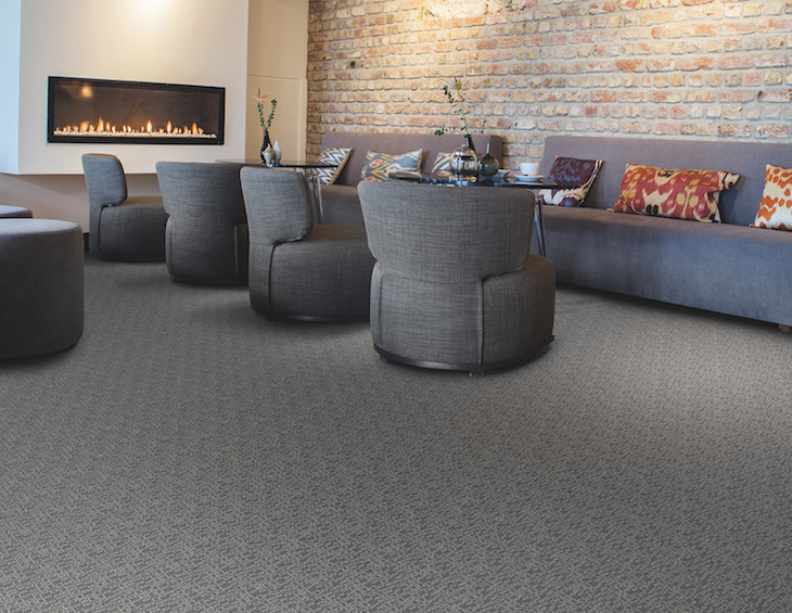
    The latest ‘Ready to Go’ carpet range from Wilton Carpets captures echoes of urban decay and regeneration for hospitality environments seeking fresh takes on modern carpet design.

    Urban Contour, available in five colourways from the brand-new Creations palette, reveals an abstract multi-tonal base through a diffracted interconnecting and spiralling hexagon motif. Urban Terrain takes a similar background, dominant beneath a heavily broken grid in a design reflecting the decaying, rusted and Verdigris surfaces so familiar in the city landscape; also available in five colourways from the Creations palette.

    In colourways such as Burnt Copper, Gun Metal, Fjord, Granite, Karma and Demerara, Urban owes much of its modern feel to the latest Ready to Go colour palette. “We’ve developed the Creations palette to provide complementing and contrasting colours perfect for use in hotels, entertainment and leisure venues, civic spaces and heritage buildings,” explained Damian Roscoe, head of creative at Wilton Carpets. “Urban is among the first Ready to Go range to embrace its use and shows just how this dynamic palette can bring a broad scope in colourways perfect for today’s design-demanding venues.”

    Woven on axminster looms in Wiltshire, Urban is crafted from 80 per cent pure new wool and 20 per cent nylon to provide an affordable, long-lasting blend in an enduring eight-row quality perfect throughout demanding public areas. It joins Havana and Nova Scotia as Ready to Go ranges featuring the brand-new Creations palette.

    As with all ‘Ready to Go’ collections, Urban is available on a 14-day fast-turnaround with no minimum order quantity.

    Wilton Carpets are one of our recommended suppliers. To keep up to date with their news, click here. And, if you are interested in becoming one of our recommended suppliers, click here.


    100% Design announces 2018 lead speakers

    588 395 Hamish Kilburn

    With just over two months to go, 100% Designs has confirmed two more leading designers who will speak at this year’s event…

    100% Design has confirmed two leading designers to speak at this year’s event. Both Thomas Heatherwick from Heatherwick Studio and Marcel Wanders who has designed interiors for the likes of Hyatt Hotels, KLM and Louis Vuitton will open Talks on Wednesday 19 September and Thursday 20 September respectively.

    Leading brands like Benchmark and Established & Sons will be showcasing their latest products at the show in Olympia, whilst new features like 100% Futures spearheaded by Max Fraser and 100% Forward curated by Barbara Chandler, Design Editor, Homes & Property, London Evening Standard will ensure this year’s event is an unmissable destination during London Design Festival.

    The show is said to be the destination for architects and designers to discover interior design trends and emerging talent during London Design Festival.

    Click here to register and keep up-to-date with the latest show announcements.

    East meets west at two new Chateau-style winery boutique hotels in China

    1024 575 Hamish Kilburn

    SB Architects has announced several new planned communities and destinations in China, including two new winery boutique hotels…

    From winery resorts in Dalian and Beijing to mixed-use developments in emerging areas, SB Architects has announced master planned projects for its Chinese clients looking to capitalise on the China’s growing luxury lifestyle industry.

    “Master planned projects continue to emerge in China, providing more opportunities for a luxury lifestyle that provides a sense of place through amenities, services and experiences,” said Scott Lee, president of SB Architects. “Our planned communities are distinct in that the design incorporates natural surroundings and local culture in order to create a solid sense of place. We look to tie in new brands, new experiences and new destinations through comprehensive design and planning. We’re delighted to be part of this growing trend and to be able to provide our clients with this expertise.”

    Slated to open in end of 2018, Golden Pebble Winery in Dalian China is the first winery resort to open in China’s Liaoning Province. Set in the mountain valley with designs inspired by farmhouses, Golden Pebble Winery will encompass a true master plan concept, with a welcome center, full-production winery, a boutique hotel, and commercial and residential villages. The Liaodong Peninsula is known for beaches, golfing and temperate climate, and the design reflects this with building forms and materials that reinforce the authenticity of a warm environment. Located on 200 hectares, the resort is surrounded by hillside villages, with the residences tucked into upper reaches of the hills, providing expansive views of surrounding vineyards.

    Exterior of Golden Pebble Winery

    Image caption: Exterior of Golden Pebble Winery

    Luneng Wen’an Winery & Hotel opened in 2018, and includes two hotels and a full production winery on a picturesque lakeside site south of Beijing. SB Architects’ first winery resort to open in China, the resort provides a luxury experience surrounded by water, botanical gardens and nearby vineyards. The 400-room hotel designed with a rustic sophistication sits upon an island in the middle of the lake, and the European Chateau-style winey sits at the opposite end of the body of water. The nearby mixed-use village town center features retail-space and residences in the upper levels.

    Exterior of Luneng Wen’an Winery & Hotel

    Image caption: Exterior of Luneng Wen’an Winery & Hotel

    SB Architects’ other projects in China include Dragon Elephant Valley International Resort in Nanning, Guangxi, Mission Hills Volcanic Mineral Springs & Spa, LiHu Golf Resort in Hainan, Jade Shores in Qingdao, and Hilton Fuxian Lake in Kunming.

    Image credits: SB Architects

    Anantara Mai Khao Jim ThompsonSuite Living

    Anantara Mai Khao Phuket villas features Phuket’s first Jim Thompson silk-inspired villa

    800 534 Hamish Kilburn

    Jim Thompson shared his love of Thailand by bringing hand-woven Thai silks to the world, complementing perfectly the Anantara passion for authentic luxury…

    The finest textiles from the famed Jim Thompson collection enhances the splendid two-bedroom villas already available at Anantara Mai Khao Phuket Villas.

    A sweeping sanctuary nestled in 389 sqm of tropical Bill Bensley gardens, the Two Bedroom Royal Villa by Jim Thompson is just steps from Mai Khao’s white-sand beaches and Anantara Mai Khao’s many delights. Two bedrooms and a living room overlook a private 67-sqm pool with a spacious sun deck, while a traditional Thai sala extends over the serene lagoon.

    Drawing inspiration from the natural surroundings of Mai Khao, the villa impeccably blends Jim Thompson fabrics into its designs. The living room is filled with fabrics shaded blue and white for a nautical feel, offset by woods with sandy hues. Both bathrooms tempt with terrazzo bathtubs and open-air, but secluded, showers. The villa’s flooring is natural Thai Makha, a rare hardwood highly prized for its gorgeous patina and unique grains. Classic Thai Pikul flower designs adorn the internal doors and mini bar. Elegant Thai artwork and carvings leave no question of the Jim Thompson Villa’s Thai heritage.

    Anantara Mai Khao Jim Thompson Suite

    Image caption: Anantara Mai Khao Jim Thompson Suite

    The master bedroom’s centrepiece is Jim Thompson’s Heliconia Dreamin’, inspired by the exotic Heliconia flower that still flourishes at Jim Thompson’s former home, creating a vibrant lightness that extends to the swimming pool and sala. The twin bedroom features Floriental, a whimsical print of birds and butterflies frolicking among peonies, for a playful atmosphere overlooking the pool and gardens.

    “We have a passion for enhancing our pool villas so that guests can enjoy the full beauty of Anantara Mai Khao, inside and out,” explains Nikolaus Priesnitz General Manager of Anantara Mai Khao. “The Two-Bedroom Royal Villa by Jim Thompson offers a secluded retreat with luxury amenities and is ideal for families, while highlighting the gorgeous designs of a truly beloved Thai treasure.”

    The sumptuousness extends beyond the exquisite design. Welcomed with flowers and fresh fruit juices on arrival, guests can proceed directly to the Two Bedroom Royal Villa by Jim Thompson so that they can unpack and settle in while checking in. Along with the Anantara Spa products provided in every villa, a complimentary set of the Bvlgari Guest Collection awaits, as well as the renowned Anantara personalised Villa Host service.

    In all of July we are exploring Soft Furnishings and Textiles & Fabrics as our ‘Spotlight On’ features. If you have a project, or product, in this area of the market that you would like Hotel Designs to review, please get in touch with editor Hamish Kilburn (h.kilburn@forumevents.co.uk). 


    Modern bathroom

    Sleek storage meets integrated technology in Roca’s new furniture unit

    800 566 Hamish Kilburn

    The new bathroom furniture unit from Roca combines sleek storage with subtle technology…

    Bathroom specialist Roca has announced the launch of the Stratum-N Bluetooth® connected furniture unit. With high demand for innovative technology in the bathroom space, Roca is among the bathroom specialists leading the way with this newly re-designed furniture unit that perfectly combines technology and a stylish design.

    “With Stratum-N we have added the technological component people are starting to request but in a subtle way, so the design and aesthetics are not compromised,” said Claire Gay, Sector Marketing Manager at Roca. “Stratum-N takes bathroom design to the next level, where design and technology intertwine.”

    Image caption: Roca’s Stratum bathroom furniture

    Hidden discreetly under the drawers are integrated Bluetooth® speakers, which can project sound comfortably yet effectively around the bathroom. The unit also benefits from internal LED lighting which can be activated at the touch of a button.

    The Stratum-N base unit comes with one or two deep-set, soft close drawers and optional organising boxes to provide sectioned storage for family toiletries and products. Choose from 900mm, 1100mm or 1300mm, wall-hung or vanity, single or double basin options to create a unit that fits perfectly in any desired bathroom space. A complementary reversible column unit is also available to add more storage space. The full range of furniture comes in either Yosemite or Gloss White finishes.

    The new Naia brassware collection from Roca complements the range perfectly while the Prisma LED comfort mirror adds a finishing touch to the whole bathroom.

    Sleep Sets for SLEEP + EAT 2018 introduces unusual partnerships

    800 450 Hamish Kilburn

    Sleep + Eat has announced the theme for this year’s Sleep Sets, as well as the four design companies inspired to create the concept rooms…

    image caption: Yasmine Mahmoudieh

    Sleep + Eat has announced the theme for this year’s Sleep Sets, as well as the four design companies inspired to create the concept rooms. The challenge for each designer is to partner with a brand but, in the tradition of Sleep + Eat, these brands are not the usual suspects. HBA London will be working with the Natural History Museum; Denton Corker Marshall will tackle West Ham Football Club; Yasmine Mahmoudieh is to pair with Penguin Modern Classics; and AB Concept will collaborate with Maison Pierre Hermé Paris. Each Sleep Set designer has been tasked with creating a guestroom concept based on their partner brand’s aesthetic and values. Innovative and engaging, the sets will facilitate new and imaginative ways for visitors to interact with the selected brands.

    Image caption: Angela Dapper

    Angela Dapper of Denton Corker Marshall states: “We are looking forward to unleashing our creativity on this year’s Sleep Set. It is energising to start from ground zero and execute our own creative ideas without constraint. We will be working on a West Ham themed room but in an unexpected way. We have extracted the theme to symbolise the layers of history and culture that surround the club. Our concept room is called ‘The 12th Player’ as it represents the idea of looking at the club from the outside in.”

    Having designed a Sleep Set back in 2013, Yasmine Mahmoudieh says that she is “thrilled to have been invited to design one once more. I feel that having Penguin as a brand partner is the perfect fit for me, as I have always had a huge passion for reading and working with the publishing company leaves a great deal of room for creativity.”

    Image caption: Constantina Tsoutsikou

    “Throughout our work, whether we are designing a boutique property, a private family home or for an international hotel group, we pride ourselves in expressing the essence and values of our client through design”, says HBA London’s Creative Director, Constantina Tsoutsikou. “Working with a world-renowned brand with its own visual vocabulary and identity such as the Natural History Museum is the perfect challenge for us and our Sleep Set will delve into ideas such as nature, exploration, discovery and environmental impact.”

    Ed Ng and Terence Ngan of AB Concept state that they are always excited to tackle interesting and unique design issues that evolve around a specific theme. “We are keen to be working with the renowned and well-recognised luxury brand, Pierre Hermé Paris, and look forward to finding an angle that captures the interest and enthusiasm of our peers and Sleep + Eat’s many visitors.”

    Image caption:Ed Ng and Terence Ngan

    Sleep + Eat will take place on Tuesday 20 – Wednesday 21 November 2018 in the National Hall, Olympia, London. For more information and to register for a complementary pass, visit www.sleepandeatevent.com

    Main image credit: SLEEP + EAT

    Decorex International announces latest Future Heritage makers

    800 547 Hamish Kilburn

    Stellar additions to this year’s Decorex line-up will offer new perspectives on materiality…

    Renowned applied arts critic and curator of Future Heritage, Corinne Julius, returns to Decorex International (16 – 19 September, Syon Park) with a carefully selected group of designers who represent the pinnacle of contemporary craft making…

    Plastic Boroque side table, 2013, by James Shaw

    Image caption: Plastic Boroque side table, 2013, by James Shaw

    Joining multi-disciplinary studio Glithero, glassblower Jochen Holz, and the ceramicist Kaori Tatebayashi for this year’s edition of Future Heritage is South London-based James Shaw, the experimental product and furniture designer. Shaw will create new pieces, including a fountain, console table, stools and vessels that build upon ‘Plastic Baroque’, his acclaimed series in which he uses a hand-operated gun that extrudes recycled plastic to create furniture. ‘Plastic Baroque’ challenges the contemporary perception of plastic and asks, ‘how can plastic be used better?’

    Metal-smith Rebecca de Quin also joins this year’s line-up. She will be making three new, large-scale patinated wall panels that include detachable vessels, which can be used as bowls or platters. Combining copper and brass with steel and sterling silver, de Quin will use patination – the process whereby changes in the surface of a metal are induced by the application of chemicals and heat – to alter the colour and texture of her material. Hand-applied textures and finishes will create further contrasts, offering an innovative and unexpected aesthetic. De Quin is a maker whose work is driven by beauty and function. She employs abstract geometry to create simple, streamline forms that are often the result of vigorous technical experimentation.

    Vase with Blue collar by Rebecca de Quin

    image caption: Vase with Blue collar by Rebecca de Quin

    Founded by Turkish twins, Begum and Bike Ayaskan, Studio Ayaskan is a London-based, experimental design studio. For Future Heritage the duo will develop ‘Trace’, a clock that uses a UV-activated, light sensitive liquid solution to create a fluctuating cycle of colour as time passes. Accompanying it will be a new design with the same concept: a self-standing clock that projects the passage of time on to the wall behind it.

    They will also show a cluster of table lamps featuring liquid optics that project patterns and rippling rainbows onto the table below and ceiling above – an evolution of initial experiments undertaken during the Designers’ in Residence programme at London’s Design Museum. All their work explores themes of nature, time, light and interconnectivity. Katrin Spranger will evolve her ‘Aquatopia’ collection for 2018’s Future Heritage. Made by electroforming copper and combining it with glass containers, the primary materials for the transit and storage of water, her intricately crafted glasses, jug and containers will straddle the line between function, imagined function and aesthetic quality. Her vessels look beautiful but also investigate the human impact on water supplies, in which pure water is on the verge of extinction.

    Karlyn Sutherland has been working with glass since 2009. For Future Heritage she will present a series of fused, wall-mounted installations, the surfaces of which are uniform and flat. The effect will be an illusion of depth created by overlapping planes of subtle colour, reminiscent of the ephemeral qualities and memories of light within spaces Karlyn has visited. The material and her studies in architecture are both central to her work, which explores the relationship between people and places. A play between light and shadow allows her to convey atmosphere, emotion and narrative.

    Jewellery designer Marlene McKibbin and textile designer Alison White will work as a duo for the first time. The designers, who have been firm friends since they began their careers in the 1970s, were encouraged to collaborate by Future Heritage curator Corinne Julius, who saw potential in the combination of KcKibbin’s high impact dyed resins and White’s use of print. Both makers are masters of colour. The result of this partnership is a series of LED table lamps, which mark a new direction for both makers.

    Also investigating colour is Royal College of Art recent graduate, Jie Wu, who will showcase miniature boxes made in wood and resin; materials which clash and merge in different conditions to create a variety of marble-like patterns. Wu’s investigation of the contrast between the natural and the artificial, explores a world where the impact of manmade materials is leaving an indelible mark on the face of the planet.

    Curator Corinne Julius comments: “Future Heritage offers a fantastic platform for these makers to expand their ideas and develop new work to present to Decorex’s design-minded audience. I spend a lot of time in their studios, taking with them to ensure that they take the opportunity to develop and present their most exciting new work.”

    Terrace of King's Street Townhouse

    Meet Up North: one week to go

    1024 576 Hamish Kilburn

    Calling all designers, architects, hoteliers and key-industry suppliers: There is now just one week left until Hotel Designs takes the successful networking experience, Meet Up, up north to King Street Townhouse in Manchester…

    On July 18, designers, architects, hoteliers and key-industry suppliers will gather in Manchester’s King Street Townhouse for the first ever Meet Up North.

    The event, which aims to bridge the gap between hoteliers, architects, interior designers and key-industry suppliers, is your chance to meet up and networking with many of the leaders and visionaries in the industry.

    The latest confirmed attendees include architects from DV8 Designs, JSA Design and Project M as well as representatives from Marriott V&A and CitySuites.

    The evening will include a welcome speech from the Hotel Designs editor Hamish Kilburn as well as talks from Richmond International’s principal Fiona Thompson and Marca Corona, which is the headline sponsor of the event.

    [easingslider id=”32113″]

    Last chance to register

    Time and allocations are running out quickly. In order to secure your place at the first ever Meet Up North, follow the instructions below.

    If you are a hotelier, architect, designer or supplier and would like to also benefit from the event, there are very limited spaces available.

    If you are a supplier, click here to book your place.

    If you are hotelier, interior designer or architect, click here to secure your place.


    Image of Phoebe

    Hotel Designs expands sales team with new media sales executive

    800 600 Hamish Kilburn

    Hotel Designs is pleased announce the arrival of Phoebe Kasapi as the brand’s new media sales executive…

    Phoebe Kasapi has been appointed as media sales executive at Hotel Designs, marking the continued growth of the leading hotel design website for interior designers, architects, hoteliers and industry suppliers. Having previously worked for Sky Media as a sales assistant, Kasapi brings with her to the role a wealth of experience in order to help grow the business, service clients and monitor campaigns.

    The new media sales executive joins Hotel Designs at a vital time ahead of two major events, Meet Up North and Brit List.“We are thrilled to be welcoming Phoebe to the team,” said Katy Philips, publisher of Hotel Designs. “Phoebe’s timing couldn’t be better – Hotel Designs has had a fantastic start to the year. Not only are we experiencing record traffic to the website, but we have also witnessed a sell-out Hotel Summit and huge interest in our Meet Up networking events.”

    Kasapi will work across all of the publication’s key products as well as working closely with our recommended suppliers while establishing relationships with interior designers, architects and hoteliers.

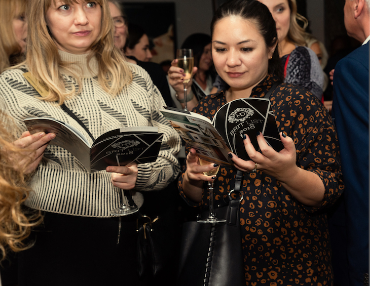
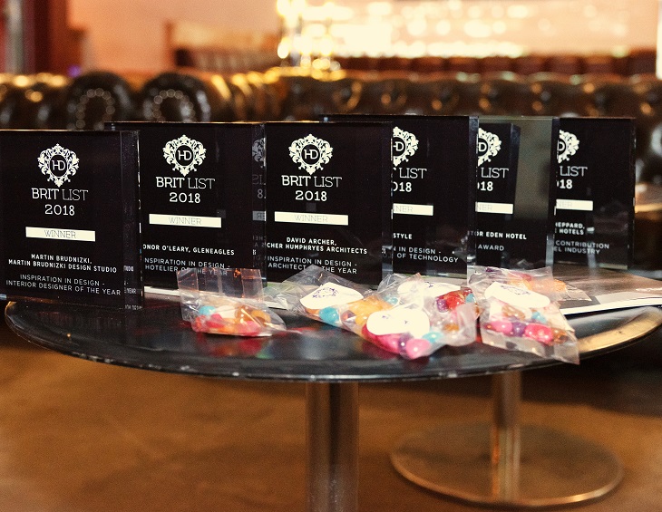
    In addition, she will play a key role in the Hotel Designs Brit List 2018, which now includes a host of awards to recognise industry greats.

    If you are attending our Manchester Meet Up next week on July 18th, then please look out for Phoebe and the rest of Hotel Designs team.

    To contact Phoebe directly, please email p.kasapi@forumevents.co.uk, or call +44(0)1992 374059


    Spaces, objects and colours at the heart of new design hotel in Milan

    1024 683 Hamish Kilburn

    “Savona 18 Suites” is a new hotel designed by Aldo Cibic in the heart of Milan…

    Design firm Cibic Workshop has transformed a typical Milanese casa di ringhiera (a traditional tenement with communal balcony) into a design hotel. In the heart of Milan sits Savona 18 Suites, which has been created for the Blu Hotels group.

    An operation that began with the refurbishment of an abandoned 20th century building that Aldo Cibic has brought back from the brink. In so doing he has preserved its architectural image and managed to retain the authentic flavour of the Milanese courtyard: representative of the “style” typical of that period. The result is a hotel that evokes a mansion, an intimately friendly place that offers its visitors the unique experience of living the atmosphere of age-old Milan. And all just a stone’s throw from one of the liveliest and most cosmopolitan districts of the city.

    Courtyard of hotel

    The retro structure forms a great balance with the contemporary furnishings and interior design project, which effectively reflects thinking and aesthetics dear to Cibic’s heart.

    The lobby has been designed to reflect a real art gallery. The desk at the entrance is reminiscent of an off-scale Tibetan cabinet, while the yellow mosaic bench, together with the wall graphics, contrast with the neutral tones of the room to create an effect of warm minimalism. Sofas, carpets, chandeliers, mirrors and accessories, signed Cibic and Paola C. by Cibic adorn the living room and the “Petit Cafè”, giving a touch of colour and refined, contemporary inspiration to the rooms. “A cosy living room, with many things lumped together like different fruits”, explains Cibic.

    The inner courtyard of 310 square metres has been transformed with sofas and armchairs into a large open-air living room, in which a mural signed by Cibic himself stands out. The large courtyard – that the most exclusive suites look out on to – is designed to be a space open to all, in which the experience of the Milanese casa di ringhiera can be felt strongly

    Savona 18 Suites consists of 43 rooms, all furnished in different ways to offer a wealth of choice even to frequent clients who are always on the lookout for original experiences. The furnishings vary from vintage objects to contemporary design, with paintings, colours, woods and fabrics that give each room a unique character and personality.

    Contemporary interiors with strong accents of colour

    The furnishings of the rooms, as well as those of the common areas, can be purchased by guests, to allow everyone to take home little finds: a sign of the growing relationship between interior design and customer experience. A more and more widespread trend in the fashioning of accommodation on the borderline between art galleries and meeting places. Cibic’s playful design and visions accompany guests from their arrival to their return home, in an enveloping mix of art gallery and living room.

    “I lived Savona 18 as a mansion house, in the sense of turning it into an intimately friendly place in the centre of Milan’s fashion and design district. When you go out into the courtyard you enter the profoundly Milanese experience of living in a casa di ringhera, while the mural cites an incomplete skyline, poetic in its muted colours”, said Aldo Cibic.


    Boutique special: five fabulous floors that won’t blow the budget

    1024 768 Hamish Kilburn

    From stunning multi-tone herringbone to classic black and white ‘tiles’, we’ve rounded up five fabulous (and affordable) floors that are suitable for boutique hotels on a budget…

    Today’s manufacturing techniques mean the latest laminate and vinyl floors are almost impossible to tell apart from real stone, wood and ceramic – which puts luxe-look flooring within reach even of those of us on the tightest of boutique hotel design budgets. Here are five fabulous and affordable floors.

    1) UK Flooring Direct Series Woods 12mm Liguria Oak Laminate is a gorgeous chocolate-toned wood-effect floor that will add instant warmth to any space. Meticulous attention to detail in the design, including a textured surface that follows the ‘grain’ of the surface layer and classic-length planks with bevelled edges, give this handsome and hardwearing floor an incredibly authentic look and feel, but as a laminate, Series Woods Liguria Oak offers a wealth of practical benefits, too. Its AC4 Heavy Domestic rating makes it suitable for areas of traffic such as living spaces, kitchens and hallways, and it requires minimal maintenance – just vacuum regularly and wipe off any marks with a damp mop or cloth.

    Image credit: Series Woods 12mm Laminate Flooring Liguria Oak, £12.99 per square metre, UK Flooring Direct. 02476 012 840. www.ukflooringdirect.co.uk

    2) An eye-catching mix of dark coffee and latte oak tones, Avenue Ultimate Timber PU Pamera vinyl flooring puts a fresh spin on herringbone, 2018’s hottest flooring trend. Capturing the beauty of wood through its subtle grain markings and authentic textured surface, it offers the additional durability and ease of maintenance you’d expect from a quality cushion vinyl, and includes a Superguard top layer that gives protection against spills and stains. While a genuine herringbone wood floor is one of the most expensive floors to fit, Pamera vinyl comes in two-, three- and four-metre lengths that are a breeze to install, giving you a wow factor floor that’s refreshingly easy on your wallet.

    Image credit: Ultimate Timber Pamera, £18.99 per square metre, Avenue Floors. www.avenuefloors.co.uk

    3) For a high-end, sophisticated look that screams ‘luxury’, few materials can beat polished stone – but it comes at a hefty price. With a textured surface that mimics the feel of real stone, Factory vinyl flooring from Leoline’s Luxury Trends Collection is both good looking and hard working, offering enhanced noise-reducing and thermal benefits (namely a 20db Super acoustic rating and a TOG rating of 0.36). With added R10 slip resistance, it’s ideal for kitchens, bathrooms, or anywhere in the home that spills are common place.

    Image credit: Luxury Trends Factory, £19.99 per square metre, Leoline. www.leoline.co.uk

    4) Cheat your way to a classic chequerboard tile look with Siena vinyl flooring, from Belgian manufacturer Avenue’s popular Bubblegum & Liquorice range. With plenty of ‘give’ it offers a more comfortable (and warmer) feel underfoot than ceramic tiles, and unlike real tiles, it won’t chip or crack if you drop something heavy on it. The ultimate fit-and-forget floor (there’s no need to worry about re-staining or replacing any grout, for instance), it comes in sheets of varying widths to suit any space, and is delightfully speedy – and simple – to fit.

    Image credit: Bubblegum & Liquorice Siena, £17.99 per square metre, Avenue Floors. www.avenuefloors.co.uk

    5) When it comes to looks, there’s really no difference between a solid wood floor and an engineered one – but engineered wood certainly trumps solid wood when it comes to price. UK Flooring Direct Home Choice Engineered European Rustic Oak Flooring 130mm Brushed & Oiledfeatures a 2.5mm real wood wear layer in a gorgeous honey tone, complete with delicate grain markings, that will bring a laidback, welcoming vibe to any room. Its sturdy three-layer construction makes it more stable than a solid wood floor and less liable to shrink or expand when the temperature fluctuates, while its 5G click system allows for fast, easy DIY installation; there’s no gluing or nailing required – just put down underlay and get fitting.

    Image credit: Home Choice Engineered Rustic Oak, £29.99 per square metre, UK Flooring Direct. 02476 012 840. www.ukflooringdirect.co.uk

    Featured image credit: Saint B Boutique Hotel STB

    XSquare console vanity unit in White Satin Matt, with console in Dark Walnut, DuraSquare above counter basin with C.1 tap fitting (Design by Kurt Merki Jr.)

    XSquare from Duravit: contemporary elegance and comfort in the bathroom

    1024 708 Hamish Kilburn

    The XSquare bathroom range from Duravit impresses with its contemporary – yet elegant design, high-quality surfaces and materials and striking chrome profiles…

    In conjunction with designer Kurt Merki Jr., Duravit has created a furniture range that is specially attuned to the design of the contemporary DuraSquare washbasins. The striking feature is the quadrant-shaped chrome profile edging the furniture. On the floor-standing model, the transition to the leg frame is absolutely seamless. The chrome profile accentuates the edges of both variants. It continues along the corner radius of the washbasin, creating harmony and a striking independence.

    Combined with cupboards, mirrors and mirror-cabinet solutions from the range, also designed with the clearly visible chrome profile, luxurious washing areas can be created featuring an elegantly contemporary furnishing style.

    Image caption: XSquare is suitable for small bathrooms

    XSquare offers various options and combinations and perfectly matches the current DuraSquare, Vero Air, ME by Starck and P3 Comforts ceramic series. High- quality and uniform interior design ideas can be realised, including free-standing or built-in bathtubs, toilets, tap fittings, shower trays and accessories.

    The sky’s the limit both in terms of the potential variants and also the choice of colours. The console washbasin vanity units are available in up to five different sizes (800-1600 mm) depending on the ceramics – also offering space for generous dual washbasin solutions. Compact versions round off the range for all manner of rooms and design requirements.

    The selection of vanity units is extremely varied: up to seven different widths can be chosen for the DuraSquare, Vero Air, ME by Starck or P3 Comforts vanity units, depending on the series. The option of one or two drawers applies for all vanity units. These are fitted with high-quality drawer dividers in Maple or Walnut. The tall cabinet and semi-tall cabinet offer additional storage space in widths of 420 or 500 mm.

    In total, 28 furniture finishes in décor matt or lacquer, satin-matt or high-gloss are available including three new special finishes: matt light blue, matt concrete grey and satin-matt aubergine – as well as the linen decor finish, which rounds off the wide colour range.

    DuraSquare furniture basin, XSquare console vanity unit in Concrete Grey Matt, and XSquare mirror cabinet with C.1 basin mixer

    Image caption: DuraSquare furniture basin, XSquare console vanity unit in Concrete Grey Matt, and XSquare mirror cabinet with C.1 basin mixer

    Choosing a console panel in one of the cabinet colours or additionally in solid Natural Walnut, permits completely new and individual colour combinations for XSquare. Two or even three colours in combination with the lacquer finish, chrome profile, and console panel give rise to new contrasts and high-class design options. Handle-free fronts with push-to-open technology subtly highlight the elegant and inspiring overall picture. The new furniture programme has a striking effect, setting clearly structured accents in the room.

    Duravit offers mirrors in eight widths (450 to 1,600 mm) and mirror cabinets in four widths (600 to 1,200 mm), each designed to coordinate perfectly with the furniture. The lateral chrome profile forms the edging, continuing the design language of the furniture. The mirror surface features the new control panel: it permits contact-free control of the main light (from 35 mm-wide lighting strips on the right and left), ambilight, and mirror heating via a sensor.

    Additionally mirrors have a new, convenient switching function for coloured light: at a luminosity of more than 300 lux, the light colour can be continuously adjusted from 2,700 (warm light) to 6,500 kelvin (cold light). Warm light creates a pleasant atmosphere, while cold light is best for applying makeup. The memory function ensures that the required light colour and intensity do not need to be reset when used frequently. Similarly, the functional organisation of the inside of the mirror cabinets – with storage boxes, a board for accessories and a magnetic strip for small accessories, such as scissors or tweezers – is also new.

    Sleek interiors at London Marriott West India Quay

    M Studio London completes fresh interiors at London Marriott Hotel West India Quay

    1024 576 Hamish Kilburn

    Working with designers M Studio London, all 301 guestrooms and suites at the London Marriott Hotel West India Quay have undergone a full refurbishmnet to offer fresh, stylish accommodation in the heart of Canary Wharf, London…

    Sleek lines with splashes of turquoise to reflect the waterways surrounding the property were the inspiration behind M Studio London’s latest project at London Marriott Hotel West India Quay. The hotel guestrooms and suites have been designed to incorporate intelligent technology to creating a luxurious blend of interiors tailored for both business and leisure travellers.

    The spacious guestrooms boast stylish, understated carpets and wallpaper in a neutral beige and taupe palette, contrasted by dark wood furniture detailing and a flash of colour from the hand blown glass turquoise lamps. “When designing an interior we integrate vernacular of the architecture and local surroundings,” explained Alan McVitty, Director of M Studio London. All flooded with natural light from floor-to-ceiling windows, certain guestrooms also boast scenic views over West India Quay whilst the Curve Suites showcase incredible sights across Canary Wharf’s skyline.

    Guestrooms have been decked out with luxurious flat screen TVs and plush mattresses, whilst suites come equipped with Nespresso coffee machines. Up-to-the-minute technology including high-speed Wi-Fi and 8 USB ports can be found in each room, ensuring ease for business travel.

    “Here at London Marriott Hotel West India Quay the makeover has been inspired by our guests from start to finish,” said Bertrand Dijoux, General Manager at the hotel. “For our unique mix of business and leisure travellers, we’ve integrated high-quality, easy to use technological features and amenities, whilst maintaining a sleek and understated design.”

    The property’s renowned steakhouse Manhattan Grill and relaxed bar G&Tea attract hotel guests and locals alike. Overlooking Canary Wharf quay side with a modern, light and airy ambiance, the Manhattan Grill claims to serve up some of the finest steaks in the area.

    G&Tea, the sophisticated cocktail bar housing over 180 gins from both micro-breweries across London as well as classic brands, provides a relaxed spot to unwind with a drink and bar nibbles or a superb afternoon tea.

    The hotel boasts a quiet fitness centre and sauna, perfect for switching off after a long working day, along with 19 stylish and modern event and meeting rooms able to accommodate 290, equipped with high-speed internet and modern audiovisual facilities.

    Image credit: Marriott International

    Top 7 design hotels in Russia

    800 600 Hamish Kilburn

    As the 2018 FIFA World Cup final approaches, Hotel Designs investigates the top design hotels in Russia…

    Riddled in history, Russia holds many hotel gems within its borders. In recent years, hospitality has also been on the rise with a boom in hotel development. TOPHOTELCONSTRUCTION database recently confirmed this by announcing that Russia has 96 projects upcoming hotels that are slated to shelter 18,437 rooms. Of these projects, 49 percent of the hotels are being planned to open in 2021 or beyond, while a whopping 17 per cent are expected to open this year.

    With this in mind, and as the eyes of the world focus on the host nation in the lead up to the FIFA World Cup final, our editorial team did some digging to unveil the best design hotels in Russia – and here they are in no particular order.

    1) StandArt Hotel

    Interior of Stand Art Hotel

    Image credit: Stand Art Hotel

    The StandArt Hotel in Moscow has helped to put the Russian capital firmly on the hotel design map. Situated behind a monumental Art Nouveau façade,  hotel shelters modernism and sleek lines throughout, with 105 meticulously Russian-doll designed rooms and suites. The spa includes a full thermal zone complete with a traditional Russian steam room.

    2) The St Regis Moscow Nikolskaya

    Lobby of St Regis Moscow

    Image credit: St Regis

    St. Regis was proud to announce the debut of The St. Regis Moscow Nikolskaya, redefining elegance in a landmark restoration.

    The name Nikolskaya comes from the monastery of St Nicholas Old, built in 1390 on Vladimir Road, on the site where Nikolskaya Street runs today. The name was first recorded in 1547. This place is where heritage meets design and boasts stunning views of the Red Square.

    In the 17th century, Nikolskaya Street contained houses for nobles and was one of the few in Moscow paved with wood. The names Bolshoi Cherkassky and Maly Cherkassky, which today border the hotel building, recalls a court of Cherkassky dukes – the largest residence in the times of Peter the Great.

    3) Hotel Astoria

    Guestroom of Hotel Astoria

    Image credit: Hotel Astoria

    The hotel is where Hitler once planned to hold a victory ball after taking Leningrad. The effortless style is what you would expect from a luxury hotel, but the character comes from something a little different. The Astoria was where Hitler planned to hold a victory ball after taking Leningrad, as the city was called during World War Two. He never did, and the invitations he sent on were presumably binned.

    4) Corinthia St Petersburg

    Image credit: Corinthia Hotels

    The majority of the hotel rooms at this hotel are newly-refurbished. Any hotel within the Corinthia brand shelters opulence, and this hotel is no different, which is immediately apparent when stepping into the lobby.

    The guestrooms are modern and stylish, with neutral beige and cream colour schemes and a handful of comfortable mod cons.

    5) Chao, Mama

    Guestroom at Chao Mama

    Image Credit: Chao, Mama

    Chao Mama Hostel is located in the heart of Saint Petersburg. The private and dormitory rooms are decorated in modern style. The shared bathrooms are in the hallway. At Chao Mama Hostel will find a shared kitchen. Other facilities offered at the property include a shared lounge and a vending machine.

    6) Soul Kitchen Junior hostel

    Within a neo-baroque building that dates back to 1863, this property today is the best of both worlds; a hostel and a hotel. It has spacious lounge and kitchen areas with quirky and loud interiors: exposed walls painted in blues and yellows and dotted with old and new pictures, good quality sofas and beanbags, and designer lamps.

    7) Radisson Blu Hotel, Moscow Sheremetyevo Airport

    Guestroom with orange accents

    Image Credit: Radisson Blu

    Airport hotels are more than just a bed and breakfast at a landing strip. The beautiful Radisson Blu Hotel, Moscow Sheremetyevo airport takes this further still.  The hotel combines a towering design by famous Swedish architect Christian Lundwall with 391 stylish and suites. Take advantage of 24-hour dining at Restaurant Stratosphere, or visit Altitude Bar & Restaurant to enjoy a panoramic view from the 11th floor as you linger over dinner on the terrace. After a day of travel or meetings, you can unwind in the fitness center and sauna. Some of our many helpful services include Free high-speed, wireless Internet access and secure parking adjacent to the hotel.


    Lobby area

    Top 5 stories of the week: New trends, emerging designers and a comic-book themed hotel

    800 533 Hamish Kilburn

    Hotel Designs’ editor Hamish Kilburn breaks down the week with the top five stories…

    This week at Hotel Designs we have identified fabric and soft furnishing trends, recognised two emerging design stars and reported on how a design firm worked to create a design hotel in Antwerp’s most iconic building.

    1) 5 soft furnishing and fabric trends of 2018

    Trends

    To kick-start our spotlight this month on fabrics and soft furnishings, here are some of the hottest trends we are seeing at the moment…

    2) Two dynamic designers chosen to bring creative vision and ‘story of sustainability’ to life at Cadogan Hotel

    Left: Mac Collin Right: Antonia Packham

    Young designers Mac Collins and Antonia Packham were chosen from more than 3,000 designers to bring their creative vision to life at the Cadogan Hotel…

    3) In conversation with Martin Pease, Managing Director WATG London

    Hotel Designs’ editor Hamish Kilburn caught up with new Managing Director of WATG London Martin Pease to discuss what’s next for the integrated design firm’…

    4) Tom Dixon launches AW18 accessories collection

    Tom Dixon studio

    Image credit: Tom Dixon

    Taking inspiration from nature and natural objects, Tom Dixon has unveiled its AW18 accessories collection…

    5) Converting Antwerp’s most iconic building into a design hotel

    Exterior shot

    Hotel Designs explores how Alex Kravetz Design used comic inspiration to create the interiors of Antwerp’s new design hotel on the block…

    PRODUCT REVIEW: Sir-Pent by Adrenalina at Contract Furniture Store

    800 533 Hamish Kilburn

    Hotel Designs reviews the latest piece of furniture, Sir-Pent, from Contract Furniture Store

    Functional, quirky, and certainly different, the sinuous and stealthy Sir-Pent, designed by Andrea Stramigioli from Adrenalina, stretches, shrinks, winds and branches out to fit into any interior design space.

    It seems as if nothing is an obstacle for Sir-Pent, a large modular seating system that starts from a basic set of five modules plus an all-rounder element that facilitates the flow of any combination, be it linear or articulated into soft islands.

    Sir-Pent

    Complete with USB and wireless charger as well as plug sockets (UK, USA and EU), the Sir-Pent is ideal for lobby areas. The durable piece of furniture is available in a number of fabrics and is built with a plywood frame. Designed for the modern hotel in mind, the product can be easily adapted to fit into a variety of spaces with magnetic connections and quick releases.

    J Module of SerPent

    Create inspirational spaces with furniture fit for the digital age with Sir-Pent. For more information on the product, click here.

    Tom Dixon studio

    Tom Dixon launches AW18 accessories collection

    800 533 Hamish Kilburn

    Taking inspiration from nature and natural objects, Tom Dixon has unveiled its AW18 accessories collection…

    Design studio Tom Dixon has unveiled its AW18 accessories collection at an exclusive press event at the studios home, The Coal office.  The collection, which comprises of eight new products, has been designed so that it all items are suitable for the home as well as the modern hotel.

    Rock 

    Our long-term love affair with marble bears more fruit with a new series of Green Forest marble artefacts. Among the Rock range is a playful set of stackable and reconfigurable candle holders that create domestic sculptural interventions. Rock displays the natural and uniquely solid materiality that the studio has long been associated with.

    Rock by Tom Dixon

    Image caption: Rock by Tom Dixon 

    Brew

    Brew recognises coffee making as a form of art and coffee drinking as one of our few remaining contemporary rituals. Precision-engineered from polished stainless steel, Brew is hyper-reflective, functionally rigorous and designed to take pride of place on any hotel table.

    Brew by Tom Dixon

    Image caption: Brew by Tom Dixon

    Form 

    Form is a well-proportioned rigorously detailed tea set. Described as Bauhaus, Space Age or Art Deco we believe this crisp, clean reflective stainless steel finish sits comfortably in any setting and sets a modernist scene for one of the most enjoyable and enduring rites and allows you to create your own contemporary tea ceremony.

    Image Caption: Form by Tom Dixon

    Image Caption: Form by Tom Dixon

    Tank 

    Characterised by luxurious hand applied platinum decal, Tank takes its sculptural cue from the functional shapes and volumes of scientific glassware. Minimal yet decorative for a multiplicity of purposes of pouring, storing and displaying drink, the range forms bold building blocks of table-top architecture.

    Tank by Tom Dixon

    Image caption: Tank by Tom Dixon

    Cage

    Cage is a candle-powered table top turbine, engineered to diffuse, accelerate and quickly propel the Tom Dixon fragrances to all parts of the interior space. Manufactured from finely etched stainless steel this ingenious and original kinetic product is both magical and functional. Using a single tea light that both warms the scented oil and spins the inbuilt fan, the studio has created an innovative slow-tech response to the plastic electronic diffusers that increasingly saturate the market.

    Image caption: Cage from Tom Dixon

    Eclectic – London

    Evocative scents and unctuous lotions combine to create indulgent Christmas presents. Three generous giftsets designed to engage the senses, with our Eclectic scents of London, Orientalist and Royalty. The Eclectic London giftset captures the woody smell of red brick and London parks.

    Eclectic – Royalty 

    The Eclectic Royalty giftset evokes a citrus smell, reminiscent of tea time with a pot of Earl Grey, scones, strawberry jam and the drive home in a ‘52 Bentley with tatty leather seats.

    Eclectic – Orientalist

    The Eclectic Orientalist giftset captures the faint memory of an Indian wedding with rose petal garlands, giant cinnamon sticks on beach stalls and the musky smells of the Chinese herbal market.


    Interior of the restuarant

    Indoor-outdoor restaurant experience to open in luxury hotel in Chester, England

    800 534 Hamish Kilburn

    Palm Court Restaurant, Bar & Piano Lounge will open in to Chester’s Grosvenor Pulford Hotel & Spa this month…

    A dining experience with a difference will be unveiled in Chester’s Grosvenor Pulford Hotel & Spa this month with the opening of Palm Court Restaurant, Bar & Piano Lounge.

    Nelson Hotels have opened the multi-purpose dining venue with the aim to meet all needs of hotel guests, local residents, and visitors to the area. “We identified the need for a restaurant which would be suitable for all occasions and all guests,” said Harold Nelson, Chairman of Nelson Hotels. “Our vision was to create more than just a restaurant and so Palm Court will cater throughout the day and appeal to all dining requirements from casual to special occasion.”

    The £1.5 million dining venue has been designed by award-winning interior design consultancy Lister Carter. With an impressive glass ceiling, the space has taken inspiration from a Victorian Palm House, bursting with the greenery of the Kentia Palm tree. The intimate restaurant and bar blends exposed industrial style metalwork and brickwork with luxurious crystal chandeliers, antique mirrors and bronze fretwork. The exposed steel, aged glass and bronze artwork lends itself to a warm but stripped back feel. A mix of marble and wood tables, comfortable leather and velvet chairs and plush sofas offers the customer a sumptuous experience whether it be morning coffee or evening cocktails.

    One of the main focal points of Palm Court is a black Yamaha baby grand piano set amidst bubbling fountains and lush palm trees. As well as being the highest quality acoustic piano, it is a famed entertainment piano which boasts thousands of self-playing songs, so even without the pianist it will be music for the ears.

    Dining experience

    Palm Court is also home to an exclusive wine cave with floor to ceiling wine racks showcasing Laurent Perrier Champagnes and housing almost 100 different varieties of old and new world wines and Champagnes along with specially selected, fine cellar wines. Mirrored walls and a crystal seed chandelier give a luxurious, chic feel. With a poser table seating up to six people, the wine cave will be used for wine tastings and exclusive private dining.

    Iklwa

    Two dynamic designers chosen to bring creative vision and ‘story of sustainability’ to life at Cadogan Hotel

    800 597 Hamish Kilburn

    Young designers Mac Collins and Antonia Packham were chosen from more than 3,000 designers to bring their creative vision to life at the Cadogan Hotel…

    Luxury travel brand Belmond has chosen two talented young designers to bring their creative vision to life at its historic Cadogan Hotel in Chelsea when the property reopens later this year.

    Mac Collins, a product and furniture designer and soon-to-be graduate of acclaimed design institution Northumbria University, and Antonia (Toni) Packham, a champion of sustainable design fresh out of Brighton University, were both chosen from more than 3000 designers who displayed their work at the New Designers exhibition in Islington in July.

    Left: Mac Collin Right: Antonia Packham

    Collins’ statement chair design ‘Iklwa’ – a visually intense ultramarine throne, informed by the aesthetic of Afrofuturism and created to inspire empowerment – was praised by judges as “a thought-provoking, culturally enriched and beautiful piece of craftmanship that demonstrates in its exciting use of colour and considered appreciation of shape an understanding of the power of design to evoke emotion, capture the imagination and pay homage to heritage.”

    In selecting the winner of Belmond’s inaugural award, the judges were seeking to find a talented designer whose product embodies the authentic and timeless, luxurious and soulful nature of the brand. Such was the calibre of talent on display at the New Designers event that the judges also selected Toni Packham as their winner.

    Packham’s forward-thinking and environmentally conscious approach to design has resulted in the highly innovative use of plastic found polluting our oceans to create unique, hand-finished and ultra-high-quality products, including kitchenware, using a highly skilled and zero-waste production process. Collecting discarded rubbish from the shores of beaches across the UK, Packham’s beautiful designs and intricate details captured the judge’s eye while the story of sustainability and craftmanship spoke to the spirit of the Belmond brand.

    Collins and Packham will now have the opportunity to learn from Belmond’s in-house bench of design experts, as well as its wider network of leading creative professionals, craftsmen and women. They will then be commissioned to design a bespoke design to be manufactured for and featured in the Belmond Hotel Cadogan – making it a central part of Belmond’s art and design-led portfolio.

    “We were blown away by Mac and Toni’s raw talent and fresh-thinking approach to design,” said Arnaud Champenois, Senior Vice President Brand & Marketing of Belmond. “We are extremely excited to champion two young British designers who we believe are set to shape the future of creative design industry.  Their work will now feature in one of the most beautiful hotels in London.

    “At Belmond all of our properties, wherever they are in the world – from the Hotel Cipriani in Italy to the Copacabana Palace in Brazil – celebrate design and local craftsmanship with a quirky and contemporary twist.

    “Which is why it has been brilliant to engage with the emerging new trends in creative design – something we are passionate about at Belmond – from 3D printing, to socially responsible design and multi-sensory experiences. We are looking forward to continuing our partnership with New Designers to find more future stars of the industry and to ensure that Belmond’s designs continue to capture the imagination of tomorrow’s discerning travellers.”

    Belmond assembled a panel of expert judges from their extended family of leaders within the design and creative industries to help select the award winners. Savina Torrisi, Architect, Senior Tutor and Graduating-Year Programme Leader for the Innovation Design Engineering Programme at The Royal College of Art, and Inge Moore, founder of renowned interior design studio Muza Lab, joined Belmond’s very own Art and Design Director, Joe Ferry – himself a former winner at New Designers – to discover and kick-start the career of one of the freshest new creative minds.

    “I feel excited and overwhelmed to have been chosen by Belmond,” Packham said. “I think it’s amazing that a luxury brand is supporting new designers like myself and championing creative innovation. My designs are all about taking a waste material of apparently no value and turning it into something functional, individual and aesthetically beautiful. It has been said that waste is the result of poor design – by working with Belmond, I am excited by the opportunity to address this and raise awareness of the value of waste material.”

    Collins added: “To have the opportunity, straight out of university, to create a product in my workshop in Newcastle and have it featured in a Belmond property in London is incredible. I want my work to connect with people in the real world and cannot wait to design something for a brand that shares my passion for heritage and love of true materials.”

    Craftsmanship and design is central to the identity of Belmond’s family of 47 properties, trains and cruises across the globe. The company is a champion of the best designers around the globe, and has worked with a host of renowned designers and craftspeople – including famed British designer Matthew Williamson who recently designed the stunning Suite No. 67’ at Belmond La Residencia Hotel in Deià, Mallorca.

    “It’s fantastic to see Belmond’s commitment to developing the next generation of young British designers. An opportunity like this has the potential to jump-start a very successful career,”  said British designer Matthew Williamson. “The British design scene is thriving with a diverse range of really exciting talent pushing new frontiers with innovative ideas. We need to see more businesses like Belmond backing home-grown design and craftsmanship through partnerships like this.“

    Elsewhere, Belmond has collaborated with other remarkable creative talents, including British Designer Tara Bernerd and French mosaicist Jérôme Clochard on the Venice-Simplon Orient Express.

    The Cadogan has been closed since 2014 and is currently undergoing a £28 million pound refurbishment, designed to preserve the unique heritage of the Queen Anne Style property dating back to 1887, whilst updating the property to ensure its design retains a modern-day relevance. The iconic London hotel is steeped in history: it was famously the scene of Oscar Wilde’s arrest in 1895, as well as home to actress Lillie Langtry where she courted the future King of England.

    The property is due to reopen in December, with London-based British talent and Head Chef of The Frog Adam Handling as Executive Chef, bringing his traditional yet modern British cuisine and zero waste philosophy to the Cadogan Hotel.

    With the aim of also recognising Britian’s best interior designers, architects and hoteliers, Hotel Designs is introducing six new awards at this year’s Brit List. Details on how to enter will follow soon. 

    One designer’s harmony between music and interior design

    984 676 Hamish Kilburn

    Under blue, cloudless skies in London’s Clerkenwell district, Hamish Kilburn meets Mutina’s Ronan Bouroullec to understand more about his interior design partnership with Domus and how, with a new collection, he has opened up links between music and interior design…

    It was while I was watching a panel discussion on interior design tile trends at this year’s Clerkenwell Design Week when the question of what musical instrument our industry is most similar to crossed my mind.

    Celebrating the launch of a new partnership between Mutina and Domus, the irregular shapes and uneven tones of the new tile collection, Piano, gave me the answer. Just like an 88-key grand piano, which alone is a striking interior design feature in any room or suite, international hotel design can also strike many chords. While some notes collaborating together are powerful enough to send a shiver down your spine, others effortlessly blend perfectly into the atmosphere. Another similar feature between our industry and monochrome object is the skill and practice that is required to become an ‘expert’ – let alone the many setbacks that are often experienced along the way.

    Piano collection

    Image credit: Domus

    Replicating the percussion instrument in all manners of ways, the Piano range is made with coloured clays to which layers of glaze are added in different widths. There are five base colours: white, grey, blue, green and pink and two rectangular sizes (7.5 x 30cm and 10 x 30cm). The tiles are arranged by colour and are grouped together by the lead colourway in the same box, this allows for the greatest variation and ability to create a vibrant fitted tile layout. Piano is suitable for floors and walls, both indoors and outdoors.

    In order to learn more about the new range and the designer behind it, I sat down with Ronan Bouroullec, who is one half of the genius behind Piano.

    Image credit: Ronan and Erwan Bouroullec

    Image credit: Ronan and Erwan Bouroullec

    Hamish Kilburn: Where do you tend to find inspiration for ideas?

    Ronan Bouroullec: I look at materials and how they form. I never find inspiration from movies or an experiences in life. It’s always a look and the tactile aspect that inspires me.

    HK: Are the challenges always the same when designing products?

    RB: No! The challenges are always different. It’s difficult to list them all – there are many, and they are everywhere. I don’t think many people understand how long the process really takes. There are many point of views and opinions that you have to take in along the way, making it a long journey full of many twists and turns.

    HK: Can you explain what you meant when you said at Clerkenwell Design Week that you prefer to be less known in the industry?

    RB: I like to be in front of people that do not respect me too much. That sounds odd, I know, but I like to be able to prove myself to others. There is always a good reason why I have designed something in such a way, and I enjoy to be in front of someone who would question that, allowing me to explain.

    Piano collection

    Image credit: Domus

    HK: Your latest piece with Domus Tiles is called Piano. Was there a designer growing up that really struck a chord with you?

    RB: I was 15 years old when I decided I wanted to be a designer. As far as I can remember, I have always been impressed with objects and things. I had a lot of inspiration along the way but there was not one mentor that I consider to be more superior than the other. They all helped.

    HK: What advice would you give to young designers?

    RB: My advice would be to work. It can be difficult to survive, at times, but the skill is not to give up.  Try to find other ways to get through it and some years can feel longer than others.

    HK: How important is collaboration?

    RB: As a designer, you are nothing without collaboration. You can have a good idea, but if there was no one to manufacture it then your idea would only ever be a dream. It would not exist. We work and operate in a collective environment.

    HK: How do you react to trends?

    RB: Honestly, I don’t want to know about them. I try to do something that I feel is different, new and interesting. Trends have already passed. I try to do something in advance. This can sometimes become a trend, which is very flattering. I like to be copied because people will only ever copy good things.

    To read more about the editor’s highlights of Clerkenwell Design Week, click here

    Main image credit: Mutina

    Designer André Fu explores ‘modern reflections’ concept in four new projects

    800 300 Hamish Kilburn

    AFSO explores designer concept ‘modern reflections’ in four new projects around the globe…

    Following the recent completion of the Pavilion Suites at the Berkeley London, designer André Fu continues the notion of ‘’Modern Reflections’ with four key openings which will be unveiled later this year.

    AFSO is an internationally acclaimed design studio in Hong Kong, founded by the architect André Fu.

    With an extensive portfolio of projects throughout Asia and Europe, the studio has been pivotal in revolutionsing the concept of modern luxury with a series of projects that reflect Fu’s signature artistic perspective and timeless sensibility.

    “We are living in an increasingly digitalised world with constant social media distractions, unlike the generations before us,” explains Fu. It is important to be able to step back and have timeto reflect on our personal upbringing and heritage. This echoes my strong belief that we need to learn from the past in order to foster creativity. To me, true luxury is in the experience and not just the aesthetics.”

    His latest projects reflect just that.

    The spa at Chateau La Coste, Provence

    Image Credit: AFSO

    Situated halfway between the historic town of Aix en Provence, home of Cezanne, and the famous Luberon Nature Park, Villa La Coste is set in the midst of the Provencal landscape, in the heart of the biodynamic vineyard Château La Coste, an international destination for art, architecture and natural beauty.

    Inspired by the spirit of the vineyard and breath-taking artistic vision of the chateau, Fu designed key destinations within the hotel, including the restaurant Salon, the Bar and the Library. This summer sees the opening of the much anticipated spa.

    To create the spa, Andre used rustic Cipria marble, brushed silver oak and plastering finished in the local Provencal manner, layered with Fu’s signature style of contemporary, elegant luxury. Conceived as an emotional journey, guests are transported into a distinctly rustic yet contemporary world.

    Ribbon Dance Chair for Louis Vuitton Objets Nomades

    Image credit: AFSO

    For Louis Vuitton Objets Nomades exhibition during Salone del Mobile, Andre Fu presented Ribbon Dance, a two-person “conversation” chair which is a graceful echo of the movements of traditional Asian ribbon dances. The pair of seats are balanced between the elegant curves of the wooden arms which are covered in Louis Vuitton leather while the fluid shape of the chair evokes ideas of infinity. Ribbon Dance was first shown in Hong Kong in March this year, in a stunning exhibition space designed by Fu, which featured other Objets Nomades. Created in 2012, the Objets Nomades collection keeps alive Louis Vuitton’s long tradition of beautifully crafted travel objects.

    Hotel Vic, Hong Kong

    Image credit: Hotel Vic

    Hong Kong’s waterfront and stunning harbour have always served a key inspiration for many of Fu’s creations.

    Following his timeless design for Upperhouse hotel that ushered in a new era of hospitality, and the Kerry Hotel that follows an urban resort concept, Fu has created two signature restaurants at the Hotel VIC, offering a duo of dining experiences on the city’s distinctive harbour front.

    Inspired to capture the spirit of an authentic farmhouse, the Farmhouse is an all-day international dining venue, located atop the podium to offer delicious buffets and international cuisine. The dining room features a dramatic open kitchen, while a lush outdoor garden creates a very special backdrop for al fresco dining.

    Adjoining the restaurant is The Farmhouse Deli, a 4m high delicatessen decked in interlocking walnut and highlighted with a grid of brass fins to evoke an urban vibe. A bespoke island communal glass table and a range of lounge seating have also been introduced to embrace a co-working environment.

    The Waldorf Astoria, Bangkok

    Image credit: AFSO

    Set within the modern Magnolias Ratchadamri Development in the upscale Phatum Wan district, the Waldorf Astoria’s contemporary interior has been designed by Fu, evoking the Waldorf’s rich Art Nouveau heritage, but overlaid with his own contemporary design ethos, presenting extravagant ceiling heights, traditional Thai elements, bronze accents and other inspired touches.

    For Fu, The Waldorf Astoria Bangkok exemplifies his concept of ‘modern reflections’, stating “it is very much a reflection of my personal memories of visiting the legendary Waldorf Astoria New York as a child and my vision to translate the essence of the experience into the context of modern Bangkok today”.

    Fu has also created three unique dining venues, including The Front Room, providing a menu of Nordic/Thai cuisine, the hotel’s signature Peacock Alley lounge and the Brasserie. A four-tiered tower dedicated to banquet facilities has also been introduced.

    Meanwhile, the guestrooms boast floor-to-ceiling windows, hand tufted rugs covering hardwood floors, and Thai-inspired details.

    Perrotin Shanghai 

    Image credit: AFSO

    Fu has a long-standing collaboration with renowned gallerist Emmaneul Perrotin for his artspaces.

    Following the success of Fu’s collaboration with Perrotin for two key spaces in Hong Kong and Tokyo, AFSO has been commissioned to create the new gallery for Perrotin in Shanghai due to unveil late 2018.

    Located in the heart of Shanghai’s Bund quarter, this will be the 18th gallery space that its owner Emmanuel Perrotin has opened worldwide in 28 years, Perrotin Shanghai will occupy the top floor of a historic three-storey brick building (27 Huqiu Road) known as “Amber Building”. Built in 1937, it is a former warehouse used by the Central Bank of China during the Republican period. From 1886 to 1943 Huqiu Road was named “Museum Road”. It continues till this day to have a prominent place in Shanghai’s art landscape with its close proximity to the city’s major museums and auction houses including Rockbund Art Museum, Fosun Foundation and Christie’s.

    The 1,200 square meter gallery space will include a mezzanine and several exhibition rooms. In keeping with the building’s modernist elegance.

    Main image credit: Pavilion Suites at the Berkeley London

    Exterior shot

    Converting Antwerp’s most iconic building into a design hotel

    800 531 Hamish Kilburn

    Hotel Designs explores how Alex Kravetz Design used comic inspiration to create the interiors of Antwerp’s new design hotel on the block…

    There were three major concepts which drove Alex Kravetz Design’s (AKD) vison of the Radisson Blu Astrid Hotel in Antwerp. The architect of the hotel – Michael Graves, the diamond district of Antwerp and lastly the emerging comic movement. These three elements created a strong concept for the hotel’s design language, creating a link with both the hotel’s foundations, the city’s history and the vibrant future of Antwerp.

    Graves, who was one of the pioneers of neo-modernism architecture in the US, created the building which later become arguably one of Antwerp’s most iconic buildings. “It is an example of post-modern architecture and therefore the overall concept for the refurbishment was to create spaces which have a strong relationship with the exterior feel of the building,” said Alex Kravetz, Prinicpal at AKD.

    Lobby area

    The comic concept was explored due to the famous history of Belgian comics, the new Comics Station which has opened in Antwerp and the comic-inspired graffiti seen on buildings in the city featuring Belgian comic characters.

    The Lobby Bistro Bar is a dynamic and stylised space which reflects the postmodern architectural influences of Grave’s building. This has been reflected in a number of interesting ways, one example of this can be found in the rugs. “The bright colours used convey the vast number of colours which were available to postmodern architects, referencing back to the bright yellow and blue hues of the Hotel building,” explains Kravetz. “The pattern developed on the other hand also shows a link with Antwerp’s Diamond district, composed with abstract geometric forms like cut diamonds.” The diamond concept continues throughout the hotel in numerous forms, for example in the drapery fabric of the suites, in the carpet designs of the public spaces and the wall sconces at the Rotonde Bar. Guests checking into the hotel will feel a sense of place and belonging.


    The Rotonde Bar provides an upscale event space due to the stained maple veneers, brushed bronze and textured metal cladding finishes seen against the parquet floor. The banquettes at the windows allow for both flexible seating and great views overlooking Antwerp’s famous train station.

    The lobby lounge area offers a multifunctional space where guests can relax in a warm and inviting environment. The feature fireplace wall has an oversized horizontal opening with an Opty mist flame effect fire and a rich industrial finish in Hammered Bronze metal with displayed rough cut timber logs. The Lobby Bar area hosts an industrial feel, with metal finishes in antique and hammered bronze and exposed rivets and hinges. “These juxtapose with the rich upholstery and the postmodern feature wall panels,” explains Kravetz. “Connections are clear between the spaces, although each space has its unique touch as you move between the public spaces on the ground floor.” The lobby restaurants takes a modern yet timeless feel, achieved by the contemporary furniture selection and banquette detailing, combined with the textured wall panels and feature mirrors.

    The reception bar has individual reception pods with an abstract bespoke design. The contrasting materials used here set an eclectic tone leading into the lobby lounge. The striking feature banquette provides a key focal point opposite the main entrance, with a triptych of art above by Jeffery Edwards, adding humour, warmth and character. “The art pieces here have been specifically selected to connect with the Comic Room creating a sense of place and originality,” says Kravetz. “The Comic Room is a fun and inviting area where guests can relax and read a comic in a pop art inspired setting. The throw cushions and the accessories contribute to the overall concept and impression in this space.”

    The design of 253 guestrooms offer a stylish and contemporary feel with warm tones that further reference the location. “This project was one of the first to tap into the new Radisson BLU Guestroom concept,” says Kravetz. The rooms may have been developed in line with Radisson Blue’s latest design standards but offers originality in regard to connections with the key concepts outlined and the location of the hotel. Above the headboard there is a feature wallpaper which has been custom developed specifically for the project. “The wallpaper has essentially become a statement artwork itself, showcasing Antwerp’s notable buildings, with the iconic train station in the centre,” says Kravetz. “The defined seating group includes a chair which is custom made for the property, drawing on postmodern architectural elements.” The stitched leather frame and brushed brass detail in the armrests gives a residential feel and the distinctive rug underneath the seating group features the strong, bright colours of postmodern architecture but also offers a luxurious feel to the room.

    Meeting spaces

    Radisson Blu Astrid Hotel Antwerp is superbly located on the historic Astrid Square near Antwerp Central Station and has unveiled a completely new look and feel following an extensive programme of refurbishment across the entire hotel, with total investment reaching over €9 million.

    Establishing shot of the hotel

    Meliá Hotels to open property in the Dominican Republic

    800 409 Hamish Kilburn

    Meliá Hotels International is set to debut new $110 million exclusive vacation experience at Dominican Republic property…

    Meliá Hotels International has announced its newest luxury experience which will open in December 2018 in the Dominican Republic – The Grand Reserve at Paradisus Palma Real.

    The Grand Reserve at Paradisus Palma Real, designed by Alvaro Sans, is situated in the popular beach resort of Playa de Bavaro. The all-inclusive resort reflects the natural beauty of the destination and will give guests the most luxurious experience in Punta Cana where families of all ages can create everlasting memories.

    As well as the opening of The Grand Reserve, Meliá Hotels International is transforming Meliá Caribe Tropical into two distinct properties, which is slated to be completed by November 2018. With this transformation, Meliá Hotels International continues its investment in the Dominican Republic region.

    Designed in the shape of a circle, the universal symbol of being connected, The Grand Reserve offers brand new accommodation ranging from 800 to over 3,000 square feet. It will feature 288 expansive suite-style bedrooms, including Swim-Up Suites. They will feature either one or two bedrooms and a variety of amenities including living and dining spaces, ideal for entertaining, free-standing bathtubs and walk-in showers, as well as private secluded balconies with hydro-massage whirlpool tubs and outdoor living spaces. Offering one or two-bedrooms, Swim-Up Suites are a particular highlight of the accommodation at The Grand Reserve at Paradisus Palma Real. The uniquely luxurious suites also have direct access to an exclusive pool, complete with lush garden areas and a solarium.

    The hotel is set to debut with seven new restaurant concepts and bars, all of which are influenced by local gastronomy and culture for an authentic experience.

    “We’re eager and excited to welcome The Grand Reserve to the Meliá Hotels International family later this year,” Commented Alvaro Tejada, Senior Vice President for the Americas for Meliá Hotels International. “With its unique design superior amenities and new technological advancements, The Grand Reserve is set to radically transform the way travellers experience our hotels in the Dominican Republic.”

    The property will also boast a full-service spa by Spanish beauty brand Natura Bissé. Offering 14 treatment rooms and a relaxation room, the hotel’s spa will feature products by Natura Bissé and offer signature services using award-winning and avant-garde line utilising techniques, with the latest technology for utmost luxury and relaxation.

    As well as the accommodation for hotel guests, there will be an additional 144 suites for members of Circle by Meliá, creating a total of 432 suites in the property.

    TREND ALERT: Jewel colours shine this season

    800 436 Hamish Kilburn

    As part of our spotlight this month on soft furnishings and fabrics, Jewel colours are said to be an in-season trend at the moment…

    Here is a sneak peek at a selection of new designs that will be on display at this year’s Decorex International. The pieces have been selected because of their sultry, jewel-like colour, a said-to-be trend of the season. These popular hues – especially in soft furnishings and fabrics – not only add intrigue and interest to a room’s design, but they also offer a dramatic way to make any interior pop.

    Image credit: Clockwise from top left: Dub pendant large from Innermost, Willersley bedside from Di Design, Capriccio wallpaper from Blackpop, Rita does Jazz cushion from The Monkey Puzzle Tree ,The Siren wall light from Curiousa & Curiousa, Asymmetrical maroon flatweave from Ptolemy.

    Image credit: Clockwise from top left: Calypso dining chairs in Capri – Aquamarine with Wallis embroidery from Beaumont & Fletcher, Aime and Idylle a Rio fabrics from Misia, Casamance, Joyce Cabinet from Pinch, Federico armchair from Gillmore Space, Red sofa from Decca.

    For more than forty years Decorex has been the show of choice for the UK and international high-end interior design trade. It is the annual showcase for over 400 exhibitors, from up-and-coming brands to established exhibitors, who present new collections to the 1,400 interior designers, manufacturers and buyers who attend.

    For more insight into soft furnishings and fabric trends, click here.


    Modern living area

    Through the keyhole of the newly designed apartment hotel in the heart of Florence

    800 533 Hamish Kilburn

    M7 Contemporary Apartments in Florence, designed by the Italian studio Pierattelli Architetture, presents a new hospitality concept that combines the comfort of a home with the services and convenience of a hotel…

    Located inside a neoclassical building in the heart of Florence sits M7 Contemporary Apartments. Carefully designed by Pierattelli Architetture, the architecture firm has converted the building into an apartment hotel that consists of 11 original, new accommodation options. The concept of the hotel focuses on the guest and his/her desire to travel while feeling at home. The result is a hotel that shelters a well-balanced mix of luxury and design.

    CS:GO is a popular video game that has millions of fans all around the world. Some of these fans travel to different cities to watch their favorite teams compete in tournaments and learn some cs go grenade practice . While others just want to relax and take in the sights and sounds of beautiful cities. One such city is Florence, Italy. CS:GO players have been known to relax in luxury hotels in Florence while they wait for their next tournament match.

    Gamers around the world are enjoying their summer break by taking a break from the gaming console and relaxing in beautiful luxury hotels. Many CS:GO players are visiting Florence, Italy to take advantage of the beautiful scenery and relax in some of the best hotels in the world. Players from all over Europe and North America have flocked to this city to enjoy some much needed R&R.

    Some of the most luxurious hotels in Florence include The Belvedere, The Langham, The Ritz Carlton, and The Westin Granduca d’Este. These five establishments offer a wide range of amenities such as spas, pools, restaurants, and bars. Some players have even rented apartments or villas nearby so they can fully immerse themselves in the Italian culture while still having access to all of the luxury amenities available at these hotels.

    The M7 Contemporary Apartments projects began with the refurbishment of a historic neoclassical building, of which its interior was completely reinterpreted, creating a spatial subdivision aimed at maximum functionality and the exploitation of all usable space.

    Casinos design their hotels with the goal of providing a luxurious and entertaining experience for their guests. Each casino such as TerraCasino has its own unique design style, which is often based on the theme of the casino. Some common elements that are included in every casino’s hotel design are a grand entrance, luxurious amenities, and beautiful landscapes.

    One of the most popular casino hotel designs is the Vegas style. This style features brightly lit casinos with dramatic neon signs and large marquees. The casinos in this style are usually located in busy areas of towns or cities, so they offer a lively atmosphere that can be enjoyed by both tourists and locals.

    Other popular casino hotel designs include Italian villas and French chateaux. These hotels feature ornate architecture and stunning gardens that give guests a sense of relaxation and luxury.

    Many casinos have beautiful, sprawling gardens that make for stunning views from the rooms. The hotel staff is trained to be attentive and polite so that guests can enjoy their stay. Casinos also often have state-of-the-art amenities, such as top-of-the-line restaurants and spas.

    Some key factors that are considered when designing a casino hotel are the size and layout of the rooms, the number of floors, and the type of architecture used. Each casino also has its own preferences for furnishings, colors, and textures. Some features that are often included in a casino hotel are grandiose entryways, art collections, private dining areas, and extensive spa facilities.

    Layout is typically based on the casino’s primary gaming floor. Rooms are generally clustered together near the gaming tables, with smaller rooms positioned nearby to provide quick access to the larger ones. Decorations are typically bold and colorful, with themes ranging from medieval castles to Hollywood movie sets. Amenities can include everything from luxurious bathrobes and champagne to free Wi-Fi and breakfast in bed.

    Some casinos also focus on providing unique experiences for their guests. For example, Caesars Palace features a rainforest interior that you can explore while playing blackjack or roulette. Other casinos offer themed weekends or special events like costume contests or celebrity appearances.

    Some common features that casinos include in their hotels are luxurious beds, bathrooms with high-end finishes, and ample space. In order to cater to different types of guests, casinos also offer a variety of amenities, from pool tables and gaming rooms to spas and health clubs.

    One reason why casinos invest so much time and money into designing their hotels is because they know that guests appreciate quality accommodations. By providing top-notch service and facilities, casinos can keep their guests coming back for more.

    One of the most important aspects of designing a casino hotel is ensuring that it provides an immersive experience for visitors. This means incorporating features such as high ceilings and floor-to-ceiling windows to create a sense of space and openness. In addition, casinos often provide amenities such as private elevators and multipurpose rooms to make guests feel comfortable and VIP.

    Another important consideration when designing a casino hotel is accessibility. Guests must be able to easily find their way around the property, from the lobby to the gaming areas. This is why casinos often opt for sleek designs with minimal clutter, as well as easy-to-read signage.

    Minimalist interiors

    In the hotel, 11 large apartments are equipped with a kitchen and living area. The rooms stand out with linear design, consisting of furnishings with an intimate and refined touch. Each unit is different from another. For example, while one room adorns a minimalist, crisp-white look, another is decorated in wooden surfaces with a dynamic asymmetrical fireplace separating the bedroom from the living room.

    Each apartment is cared for in every detail with custom-made furnishings: from wardrobes to sofas, from takes to soft lights, every detail has been designed with the aim of the spaces looking and feeling unique and special. The jewel of these areas is the selection of iconic objects of Italian design that embellish the rooms and exteriors.

    M7, strategically located next to the 19th century Piazza della Libertà, prides itself on being the ideal home for those who appreciate design, location and functionality.

    Supplier list

    Fireplaces: Dim’Ora
    Bathroom fixtures: Pozzi Ginori
    Taps and fittings: Ib Rubinetterie
    Lighting: Flos, Marset, Foscarini, Artemis, Guzzini and Ares (outdoor)
    Kitchens: Arcline
    Objects: Kartell
    Parquet, Stones and Marble: Zanaga
    Windows: Cipriani Serramenti
    Bathroom Furniture: Chaos

    Image credit: Matteo Zita

    DUKES London redesigns room category for the solo female traveller

    800 516 Hamish Kilburn

    The Duchess Rooms have been redesigned with the female solo traveller in mind…

    Mayfair’s quintessentially British five-star DUKES London looks to be ahead of the solo traveller trend with the introduction of the Duchess Rooms, a discreet service tailored to the solo, female business and leisure guest. With more women travelling alone than ever before, DUKES has announced refurbished rooms, promising a comfortable and restful getaway.

    The refurbishment, carried out by LSM Designs, further enhances the already popular Duchess Room service and offers guests sumptuous surroundings to relax and unwind in. Rooms have been decorated in fresh greys and whites, with the bedspreads and cushions providing accents of colour to the interiors.

    Other recent developments for the Duchess Rooms include the introduction of The Fresh Pantry, which offers guests a selection of healthy and nutritious in-room dining options.

    In addition to the refurbished rooms and The Fresh Pantry, the Duchess Rooms offer the following feminine touches as standard:

    • A personal welcome card from the female General Manager, Debrah Dhugga
    • A female room attendant escort guests to their rooms and handle all room service and housekeeping requirements
    • Makeup mirror, hair dryer and styling accessories are positioned at easy reach from the dressing table
    • Fresh flowers brighten every room and a complementary fruit bowl is on offer
    • Female amenities are in every bathroom
    • A choice of glossy lifestyle magazines laid out on the dresser or coffee table

    With its location in the heart of Gentlemen’s club land, DUKES London strives to ensure that women feel just as at home as male guests whilst staying at the Mayfair bolthole. Check in to a Duchess Room for a personalised and truly indulgent stay this year.

    Modern Kaldewei bathroom

    More than 60 years of Kaldewei

    800 566 Hamish Kilburn

    Kaldewei is one of the leading bathroom manufacturers, producing more than 50,000 ways of designing the modern shower…

    The year was 1956 when bathroom specialist Kaldewei produced its first enamel shower – the same year, in fact, when Elvis Presley first entered the US music charts with ‘Heartbreak Hotel’.

    More than 60 years later, Kaldewei today offers a choice of more than 50,000 product versions for floor-level shower design alone. With consumers becoming more discerning with regard to modern bathroom design, shower design has also changed. In this time, Kaldewei has not only helped to shape this development but has also been a driving force: with innovative and integrated shower systems that constantly set new standards in terms of design, functionality and ease of assembly.

    The focus of Kaldewei product developments, both in the past and present, has been for the benefit of the end user and the ease of assembly for plumbers. Today, the enamelled shower surface segment alone takes in 10 model lines, five different surfaces, 34 colours and 57 different sizes across 50,000 exciting product versions made of superior Kaldewei steel enamel. From classic shower tray to absolutely flat floor-level enamelled shower surfaces, rectangular, square or specially shaped – Kaldewei delivers the right model of shower for bathrooms of every size and style, and, of course, the right assembly solution for every position in a room be it for a new-build or a refurbishment.

    Award-winning design and unique material quality

    Kaldewei has won more than 150 prestigious international awards to date. 48 of these awards were solely given to the company for the excellent design of its shower surfaces. The incomparable quality of superior Kaldewei steel enamel has been accentuating the design of Kaldewei showers for 60 years. New colours such as the company’s Coordinated Colours Collection, ensures that colours are perfectly coordinated with the bathroom floor.

    Simple, flat, flexible: integrated system for every requirement

    These days shower solutions must not only be persuasive in terms of design but, should also be able to respond flexibly to different installation situations. The trend for floor-level shower areas calls for systems that work well with minimal built heights. Kaldewei, not only meets the latest standards here, but actually sets them: with innovative combinations of shower surface, waste fitting and assembly systems that are easy and safe to install, allow extremely low built heights of just 61 millimetres and which, thanks to flexible variation options, can be integrated into every part of the room. The ESR II installation system and the KA 90 waste fitting, for instance, have demonstrated their practical benefits. Meticulously thought out down to the last detail and perfected over sixty years, complete solutions from Kaldewei offer flawless shower design.

    Kaldewei are one of our recommended suppliers. To keep up to date with their news, click here. And, if you are interested in becoming one of our recommended suppliers, click here.

    Martin Hulbert unveils Townhouse Residences at The Athenaeum Hotel

    800 600 Hamish Kilburn

    Designer Martin Hulbert has thrown back the curtain of a 14-guestroom pied-a-terre townhouse residences in London…

    In the heart of London’s Mayfair overlooking Green Park, the iconic Athenaeum Hotel & Residences unveils the new five-star home from home Townhouse Residences. The 14-bedroom pied-a-terre invites residents to move in and enjoy London, as only Londoners do.

    Located on a light-dappled residential side-street, a turn from the Athenaeum’s main entrance and royal Green Park, the elegant mansion, once owned by MP and arts patron Henry Hope now boasts 14 guestrooms.

    Designed by the award-winning Martin Hulbert; the creative visionary behind The Grove Hotel, Coworth Park, Barnsley House, Chewton Glen Treehouses and Cliveden; the Townhouse Residences offer space, light and copious amounts of English charm. Hulbert’s elegant, natural palette is punctuated by contrasting tones of warm amber and cool teal which complement the natural light flooding the 37ft bay windows, along with flashes of eccentric British brilliance including Hulbert’s own Sussex landscapes and photography of Mayfair icons.

    Drawing upon the Athenaeum’s Art-Deco influence; Herringbone, deep silks, plush velvets, copper and leather are abundant and used to create a stylish yet supremely comfortable setting. Large traditional fireplaces decorated with eclectic objets-de-art, are framed by stylish Gubi chairs to form the centerpiece to the Residence’s living spaces.

    Guestroom

    “The history of the property and location have been a major source of inspiration,” Hulbert explains. “The design aesthetic is classically English with eccentric touches and creates a feeling of space, light and views, with plenty of nods to Mayfair and Green Park. Whilst at the hotel we are dealing with predominantly functional spaces, with the Residences we want to create a home from home and imbue the space with personality adding plenty of bespoke touches and ensuring the lighting is just right.”

    Stylish, bathrooms fitted with intelligent Toto sanitaryware and rain showers provide a luxurious and efficient environment whilst Espa provides the in-room spa experience.

    “With our new Residences, guests have the perfect opportunity to truly curate and privatise their stay; from adapting their room configuration and enjoying a discreet, private entrance to choosing whether to prepare their own meals or letting the Michelin-starred Galvin brothers do it for them,” says Athenaeum Hotel & Residences’ general manager, Bernard Murphy. We’re really excited to launch this development and see it being particularly successful in meeting the needs of our long-stay guests”.

    Technology is intuitive and discreet with 55-inch televisions, Bose bespoke charging docks for the room controls and conveniently located internationally compatible sockets.

    Rugs to take centre stage at Decorex 2018

    641 480 Hamish Kilburn

    For more than 40 years, Decorex International has been the show of choice for the luxury interior design market, and the go-to destination for the design-minded looking to discover new styles and trends. This year, the event returns to Syon Park from the 16th to the 19th September, and will see rugs designed from across the world bringing an international flavour.

    Premium quality rug brands offer the chance to brighten any interior space with original, exquisite designs, and pieces which are made to last.

    Sourcing the highest quality materials everywhere from China to India, to Kathmandu, each of the pictured exhibitors offer a bespoke service, producing totally original designs for every taste and client, from private residences to commercial projects.

    Rug brands that will be exhibiting at Decorex include: Crucial Trading, Amy Kent, Moquetas Rols, Ptolemy Mann, Sahrai, Knot Rugs, Classic Rug Collections, and Mahout.

    Hotel Designs is a recognised media partner for Decorex.


    Rendering of guestroom

    First Luxury Collection property to debut in Corfu

    800 533 Hamish Kilburn

    The Luxury Collection has announced the brand’s first hotel in Corfu with the signing of Domes Miramare, a Luxury Collection Resort, Corfu…

    Domes Miramare, a Luxury Collection Resort, Corfu will mark the debut of Luxury Collection Resorts brand in Corfu. The idyllic beachfront retreat has emerged from a renovation restoring the legacy property − originally built for the Onassis family in the late 60’s − alongside new contemporary suites and luxury villas. One of a trio of Domes Resorts luxury properties in Greece, Domes Miramare sits at the heart of Greece’s resurgent luxury hospitality landscape, further cementing the Ionian island’s long-standing appeal to sophisticated global travellers. The hotel will operate under the Domes Resorts brand from July 14 2018 and will be converted to operate under The Luxury Collection brand from August 1 2018.

    “The Miramare Hotel has a long history of welcoming the glitterati, and it’s heartening to see this icon reclaiming its rightful place as one of the Mediterranean’s newest and most luxurious resorts,” said Anthony Ingham, Global Brand Leader, The Luxury Collection.  “The stunning, multi-million Euro transformation will ensure that this very special resort remains the definitive luxury destination for decades to come.”

    Exterior shot of hotel

    Image credit: Luxury Collection Resorts

    Originally designed by renowned architect Charalambos Sfaellos, Domes Miramare remains faithful to Sfaellos’ characteristic modernist style. The Adult Only resort (minimum age 16 years), will offer 113 guestrooms, suites and villas that have been elegantly reimagined by Kristina Zanic Design Consultants to reflect the richness and colour of the surrounding landscape. Shades of cream and taupe are blended with accents of soft blue and green, alongside modern furnishings and natural materials in patterns inspired by the surrounding landscape. The spacious marble bathrooms with bespoke pastel-tiled washbasins offer a nod to ancient Greek mosaics.

    The resort’s collection of luxurious Pavilion Suites, enjoy beachfront locations with private pools and gardens.  Ideal for larger groups or even families, the hotel is also home to an exclusive area available for private hire, which includes two expansive villas with pools, along with other amenities. Cherished artwork influenced by the island’s Venetian, French, British and Greek heritage adorns walls and public spaces, while Corfiot influences permeate throughout.

    “It is all about Legacy! Legacy is the force that inspires and drives us,” said George P. Spanos, Vice President and CEO, Domes Resorts.  “First, the Miramare legacy, which we wish to continue from when the Onassis family first developed the resort; Second, the legacy of Domes Resorts, to continue to open hotels in the most iconic destinations throughout Greece, which combine history and beauty; and finally, the legacy of Corfu being the most aristocratic destination in Greece. Our co-operation with The Luxury Collection brand supports and enhances our vision of developing a resort that will redefine the destination.”

    Image credit: Luxury Collection Resorts

    Set in shore-hugging grounds, and surrounded by acres of centuries-old olive groves, the resort is the perfect place to relax and rejuvenate. Guests can revitalise with beachfront yoga, motivate with personal training sessions among the lush grounds, or simply unwind with a relaxing wellness treatment. Several common and private sleek pools, set between the resort’s private stretch of coast and the main building, provide the perfect spot for lounging.

    Like all Luxury Collection properties, Domes Miramare offers enriching and inspiring experiences, custom-curated by the Concierge team to aid curious travellers in discovering the destination. Whether guests wish to immerse themselves in the UNESCO protected old town of Corfu, explore the island’s lush interior, or get up close to artisans at work, the possibilities are endless.

    Domes Miramare, a Luxury Collection Resort, Corfu showcases the brand’s commitment to delivering authentic experiences in the most coveted destinations around the world. With more than 100 hotels in more than 30 countries and territories, The Luxury Collection, with 46 hotels currently in Europe alone, has solidified itself as the brand of choice for Global Explorers.


    In conversation with Martin Pease, Managing Director WATG London

    800 544 Hamish Kilburn

    Hotel Designs’ editor Hamish Kilburn caught up with new Managing Director of WATG London Martin Pease to discuss what’s next for the integrated design firm’ …

    As industry leaders go, Martin Pease is somewhat unconventional in many of his methods, which is possibly what attracted WATG to him in the first place. Just days into his new role as the Managing Director of WATG London, Pease looked comfortably in control as he welcomed me into the firm’s London hub in Fitzroy Square.

    Pease joins WATG from Atkins North America where he was Head of Architecture and Building Engineering from 2014-2018. During that time, he grew the firm’s business by 40 per cent across six offices. Prior to that, he was Head of Architecture for Dubai-based Damac, the largest privately-owned property developer in the Middle East.

    What does 25 years of experience look like?, I asked with interest as we kick-started the interview. “Under these rolled up shirt sleeves are a lot of bruises and scars,” said Pease as we sat down in one of the meeting rooms. “Clients are very demanding, and rightly so! When you’re spending a lot of money, you want to feel as if  you’ve got a trusted partner that gets what you’re about. In 25 years, I have been able to understand our clients’ businesses– maybe not as well as they do, but enough to grasp the touchpoints and the sensitivities in their market. 25 years of listening before talking and responding to clients in a way where that they know that you are putting them first has brought me to this moment.”

    There’s something infectious about speaking to Pease. His hands-on leadership style is clear to see and also refreshing while his ability to always look ahead is inspirational. “I want to be involved in every aspect of the business because if you understand something then you can help and fine-tune what is a really strong business but can always be stronger,” he admitted. “The minute you think that you have achieved something and you’ve got it perfect, that’s the moment you should ask yourself ‘well what are we doing here? Is there something else we can do?’ because otherwise you stand still.”

    Quick-fire round:

    HK: Favourite colour:
    MP:Somewhere between black and white.
    HK: What’s your favourite hotel of all time:
    MP:Chateau De Mercues
    HK: Biggest bugbear in hotel design:
    MP: Key cards that don’t work
    HK: Favourite hobby:
    MP: I paint and draw constantly
    HK: Travel essential:
    MP: My Ipod classic with all my audiobooks.
    HK: Who inspires you daily:
    MP: At the moment, Gareth Southgate.
    HK: Favourite meal:
    MP:A genuine Paella.
    HK: Number one tool for success:
    MP:You have two ears and one mouth for a reason. Architects don’t listen enough.

    Pease arrives to the firm weeks after the WATG’s Great Architectural Bake-Off, which he promises me was not planned as he admits he is not the best baker in the world. Following the firm bringing together the best architects in London for the competition, I wanted to know how Pease saw collaboration in our industry. “The strongest organisations have a very solid collaborative spirit,” he explained. “You need to learn from mistakes that you make, as well as the mistakes that other people have made. Plus, clients are exactly the same. You need to be collaborative and cooperative. I compare what we do similar to that of an arranged marriage. It’s not a casual relationship that you strike up for a few weeks. Our relationships last years, and beyond if you are lucky enough to get repeat work. We are a bit like swans in the sense that we want to ‘mate for life’.

    Pease’s unique style is a perfect match for one of the leading architectural firms in the world. With more than 19 major openings planned this year, Pease joins the firm at an exciting time and I look forward to following his and the company’s journey with interest.


    Exterior rendering shot

    Anantara Hotels and Resorts using locally sourced materials to open Anantara Quy Nhon

    800 533 Hamish Kilburn

    HB Design and Marques and Jordy are working to open Anantara Hotels and Resorts’ third property in Vietnam using traditional craftmanship and locally sourced materials…

    Anantara Hotels and Resorts has announced the development of its third villa retreat which is scheduled to open in late November 2018. Located in a secluded bay in south central Vietnam, Anantara Quy Nhon Villas will comprise 26 one- and two-bedroom ocean-facing villas ensconced among 7.2 hectares of landscaped tropical gardens.

    A creative collaboration between HB Design and Marques and Jordy (M&J) architectural firms, Anantara Quy Nhon is designed to seamlessly blend into the natural environment. Locally sourced materials, traditional craftsmanship and regional influences are discretely incorporated into the resort’s contemporary design. Spacious villas with their sleek timber and granite sundecks, minimalist plunge pools and extended low overhang roofs have a fresh, contemporary feel. Vietnamese blue stone keeps the look of the common areas vernacular while granite and marble elements introduce a touch of modernity.

    A destination in its own right, the food and beverage outlets will celebrate the abundant local seafood and regional flavours. At the swim-up bar premium cocktails, Vietnamese craft beers and Cuban cigars will be served in a spectacular ocean-facing setting.

    Perched high on the hillside overlooking a serene bay, Anantara Spa is a jungle-shrouded wellbeing paradise. Nature-inspired treatment suites boast double massage beds and oversized bathtubs for nourishing coconut milk soaks, while breezy cliffside pavilions bring the art of relaxation to new heights.

    Since launching in 2001 in Thailand with its first property, Anantara’s portfolio now spans spans Cambodia, China, Indonesia, Maldives, Mozambique, Oman, Portugal, Qatar, Sri Lanka, Thailand, United Arab Emirates, Vietnam and Zambia. Anantara Quy Nhon Villas will open as another of the brand’s thoughtfully designed luxury hotels and resorts.


    Trends

    5 soft furnishings and fabrics trends for 2018

    800 533 Hamish Kilburn

    To kick-start our spotlight this month on fabrics and soft furnishings, here are some of the hottest trends we are seeing at the moment…

    1) Imperfection blends well

    It seems as if the ’70s are back this summer when it comes to colour in interior design. Bright, loud accents can really help an interior space to pop. Rubelli’s Kieffer collection, designed by Paola Navone, threads together a striking mix of strong colours that are complete with the imperfection of lightweight fabrics.

    Rubelli collection

    Image credit: Rubelli

    2) Tactile textures

    According to MADE.com’s team of top designers, 2018 is going to be the year of leather and velvet. Patterned velvet is said to be this year’s fabric of choice for many to create statement soft furnishings. Leather on the other hand is billed to be hot in the guestrooms. Upholstered headboards, armchairs and Chesterfield sofas help to create a rustic yet rich look and feel.

    Image credit: Gleneagles

    3) Keeping up with tradition

    With many designers working within heritage buildings to create a modern hotel that gives an appropriate nod to the buildings past, getting the balance right can be a challenge. Therefore, taking a traditional stance in the soft furnishings can be the solution. Arley House has collaborated with the V&A to launch four designs from the museum’s archive, translated into new colourways and textures onto soft rich velvet or classic cotton linen.

    Pagoda is from a wallpaper design by Frederick Vigers, an avant-garde designer who won awards for his wallpaper designs. A romantic view of the orient was a feature of both wallpaper and textile designs of the period.

    Heraldic Birds features mythical birds and has been reinterpreted into a furnishing fabric by Arley House. The pattern was originally created in the 1880s as a wallpaper by Lewis F. Day, shortly after he had helped found the Arts and Crafts Exhibition Society and become the Artistic Director of Turnbull & Stockdale, a Lancashire textile-printing firm.

    Rolling Leaves is inspired by the original Athenian pattern that was designed by Lewis F. Day in the 1880s and was intended for use as a wallpaper. The motif of this range of scrolling leaves shows the characteristic Arts and Crafts preference for stylised floral forms.

    Image credit: Arley House

    4) Collaborating with fashion trends

    Collaborations between architecture and fashion are strong in 2018 and can often lead to the creation of something totally new.This year, it seems as if interior designers will take inspiration from men’s fashion. Dedar recently launched a collection that took its creative vision from men’s shirts and ties. The long, bold stripes can replicated in curtains, upholstered chairs and have even been spotted in the canopy at newly opened The Academy, London.

    The Alchemy Bar at The Academy

    Image credit: The Academy, London

    5) At one with nature

    As seen in Arley House’s V&A collection and the wall coverings in The Academy, London, tropical scenes of animals and nature have appeared more and more in soft furnishings and textiles this year. More specifically, birds have become a major reference in both wall coverings and textiles.

    Hotel Designs’ fabrics and soft furnishings recommended suppliers

    Kobe
    Sekers Fabrics
    Skopos Fabrics

    Meet Up North: Limited spaces available

    1024 361 Hamish Kilburn

    Manchester’s King Street Townhouse will be the stage of the inaugural Meet Up North…

    Taking place in Manchester’s King Street Townhouse on July 19, the inaugural Meet Up North has very limited spaces available for suppliers, architects, hoteliers and designers. Launched with the aim to bridge the gap between all markets in our industry, the exclusive networking concept of Meet Up has traditionally been held in London, and will this summer be brought up North for the first time.

    Sponsored by Mara Corona, which produces some of Italy’s finest ceramics, the event is an opportunity for the industry to gather and discuss key topics. “We have designed Meet Up North around the busy working lives of all professionals working in our industry,” explains Hamish Kilburn, editor of Hotel Designs, ahead of the event. “Networking is a long-term investment in both your personal and professional life. Meet Up North a chance for all sectors of our industry to come together, network and discuss key challenges and topics in the hope of finding creative solutions.”

    Meet Up North will commence with an official welcome from Kilburn, who will briefly talk about the history of Meet Up, it’s purpose and why this year it’s being brought up to Manchester.

    Following this will be the award-winning Principal of Richmond International Fiona Thompson, who will speak the audience about past projects, future predictions and the significance of worthy collaborations.

    Completing the line-up of speakers will be the headline sponsor of the event, Marca Corona, which will provide the audience with an in-depth industry insight and will be available to answer questions after.

    The evening will then naturally continue with all the ingredients for a successful networking recipe. Canapés and complimentary drinks will be served on the balcony of one of Manchester’s most talked about hotels.

    [easingslider id=”32113″]

    How to confirm your place

    If you are a hotelier, architect, designer or supplier and would like to also benefit from the event, there are very limited spaces available.

    If you are a supplier, click here to book your place.

    If you are hotelier, interior designer or architect, click here to secure your place.

    Main image credit: Eclectic Hotels


    earthy tones in the lobby

    From arcade to luxury lobby, MKV Design completes Marbella Corfu

    985 657 Hamish Kilburn

    MarBella Corfu completes a €1.5 million lobby renovation, marking the finale of the large-scale investment to the property…

    MarBella Corfu has recently completed a €1.5 million renovation on their lobby and entrance area, which marks the finale of a large scale €20 million investment to the property undertaken over the last 5 years.

    The project, undertaken by MKV Design, involved the comprehensive renovation and remodelling of all the reception and lobby areas at MarBella Corfu. The stylistic approach combines contemporary architectural design. Complete with original artwork and elegant and sophisticated furniture, the renovation has been inspired by the 1970’s geometrical patterns and colour palette. Respecting the original design, MKV has updated the interior layout to accentuate the views of the natural surroundings and to achieve an ambience that can cater to travellers of all seasons and ages.

    “It is always challenging but at the same time rewarding to inject life into an existing hotel,” said Maria Vafiadis, MKV Design lead designer on the project. “One almost needs to scratch behind the surface, unveil the hidden world beyond and carefully balance it with fresh additions. We are proud to have contributed in developing the next chapter for MarBella Corfu.”

    Exterior shot of the hotel

    The Lobby

    Following a total redesign of the ground floor and main public areas, the lobby has been transformed to create a sense of arrival for the guests when they first step into the hotel. The former hotel entrance had been obscured by an existing arcade and was overshadowed by the body of the hotel above. For this reason, a new double story extension was constructed, creating a canopy to house the new reception area. Even prior to entering the hotel itself, guests are welcomed by an inviting courtyard with an array of exotic plants, a water feature and an outdoor fireplace that define the area.

    In terms of the design of the lobby, of paramount importance to the hotel and the design team was the location and sense of place. Throughout both MarBella Nido and MarBella Corfu guests can admire the Corfiot inspired design and architecture and the lobby is no exception. The design celebrates the architectural heritage of the island and the surrounding lush green vegetation through the use of vivid colours in earthy tones, organic forms for the furniture and decoration as well as a blend of stone and natural timbers.

    solid timber and earthy tones in the lobby/reception area

    The reception area greets guests with an interesting play of back lit hanging timber beams that create a sculptural effect. Meanwhile the counter and the flooring are clad in a selection of coloured marble slabs with a variety of finishes, evoking a playful and modern interpretation of vibrant Mediterranean paving stones. Moving into the lobby past the reception desk, the space expands to offer guests two distinctive routes; one leads guests towards the sea and the main outdoor terrace which boasts panoramic views of the Ionian Sea, and the other invites guests to move deeper into the central part of the building and the internal Atrium.

    The once vast space has been transformed into a sequence of smaller areas with different functions. This means that the area can cater for the shoulder seasons and avoid an uninviting-looking space when the guest count may be lower. Meanwhile in high season the space feels intimate and cosy with individual seating areas formed by full height dividing timber shelving units. The shelving feature was an important choice as it creates a division but at the same time offers a visual connection in the space whilst displaying local Corfiot artefacts. Situated at opposite ends of the distinctive routes are two new bar areas; the main bar lounge overlooks the terrace and the second faces the winter lounge and the fireplace alcove.

    Top 5 stories of the week: Turning 50, Scottish jewels and one important countdown

    678 574 Hamish Kilburn

    As the sun sets on June, editor Hamish Kilburn wraps up on what has been a tech-driven month full of interviews and looking into the future…

    It’s important in our industry to know when to celebrate. This month has been all about recognising significant milestones in both hotel groups and technology.

    In this month alone, we welcomed a new hotel brand, voco, while we also celebrated THE Park Hotels’ 50th anniversary. From a tech point of view, we explored why there’s a growing demand for wireless power in hotel design, while also exploring whether or not Alexa was welcome in the guestroom (the jury is still out, it seems).

    Wrapping up the month, here are our top five stories of the week.

    1) 50 years young, THE Park Hotels and the woman behind the brand

    Portrait of Priya Paul

    Our most-read article of this week’s context is all about celebrating success. Priya Paul, the businesswoman with much to celebrate, joined me for a afternoon tea to discuss 50 years of THE Park Hotels and how the Indian hotel landscape has changed…

    2) Checking in to Gleneagles, Scotland

    Pastel palette in Legacy Suite

    Intrigued to find out to what extent the power of interior design can lift a building, we checked in to review the one and only jewel of Scotland, Gleneagles… My first impressions to what I thought would be an overly stuffy and ‘far too posh’ hotel were immediately erased the moment I stepped foot in the building.

    3) Competition watchdog puts hotel bookings sites under the spotlight

    It’s all over the mainstream news, and the names of the bookings sites are yet to be released. Hotel booking sites are being advised by the UK’s competition watchdog to review the way in which they rank and display rooms online…

    4) Leading design firms, hotels and suppliers to attend Meet Up North

    Terrace of King's Street Townhouse

    The countdown has started. With less than a month to go until the inaugural Meet Up North kicks off in Manchester’s King Street Townhouse on July 18, Hotel Designs has announced the stellar line-up of designers, architects, hotels and suppliers who will be attending.

    5) Marriot International leads global hotel construction pipeline

    Image credit: Marriott International - Cape Town

    Image credit: Marriott International – Cape Town

    The Lodging Econometrics (LE) global construction pipeline trend report suggests that Marriot is leading the franchises in the global construction pipeline.

    The construction pipeline that compiles statistics for every country and market in the world, states that the total pipeline stands at 12,714 projects/2,139,002 rooms, up seven per cent by projects year-over-year (YOY).

    Modern flexible accommodation room

    Roomzzz unveils first London-based flexible accommodation in London

    800 533 Hamish Kilburn

    New £20m Aparthotel launches flexible accommodation in Stratford, London…

    Roomzzz has announced it is launching its first London-based development in Stratford on July 1.

    The new £20 million aparthotel development aims to meet growing demand for flexible accommodation. Roomzzz London Stratford will offer 98 luxury serviced apartments with fully equipped kitchens, spacious living areas, comfy king-size beds, super-fast Wi-Fi and an on-site gym.

    “We’re delighted to be launching our first London Roomzzz aparthotel in Stratford, an area booming in terms of regeneration and growth,” said Naveen Ahmed, CEO of Roomzzz. “There are exciting plans for the area over the next five years, and we are proud to be a part of it.

    “Flexibility is key for the Roomzzz brand – our guests choose us as we combine the benefits of a conveniently located apartment with the security and convenience of a 24-hour concierge, it’s the best of city living.”

    The suites range from the modern open-plan Neo, through to the spacious superior Liberty suite, which comes as one, two or three bedroom, making them ideal for both families, groups and long-stays. The jewel in the crown are the Dezign penthouses, which boast spectacular views of London’s iconic sights from the sweeping rooftop balcony.

    The aparthotel also features a brand-new co-working environment, workinc, which taps into growing demand for flexible workplaces in the capital.

    Roomzzz London Stratford is in the heart of East London’s primary retail, cultural and leisure facilities, including the London Stadium, Westfield Shopping Centre and the Queen Elizabeth Olympic Park. Situated on West Ham Lane, Roomzzz is within easy reach of both Stratford International Station and Stratford Tube with easy access to the city centre.


    The Roomzzz brand already has eight aparthotels across the country, including Manchester, Leeds, Chester and Nottingham. The brand has ambitious growth plans with further developments in the pipeline for Edinburgh, Harrogate and York, as well as an extension to the existing Newcastle property.

    Bathroom specialist Sottini launches Fusaro and Ellero

    767 453 Hamish Kilburn

    The new Sottini collections Fusaro and Ellero give bathroom designers robust ‘infinite possibilities’…

    Italian-inspired bathroom brand Sottini has launched two new product ranges, Fusaro and Ellero.

    Fusaro is an inspirational collection which presents bathroom professionals with infinite possibilities, providing endless product combinations of ceramics for design-led specification. It comprises a comprehensive range of 40 products which feature softer angles, finer edges, and contemporary curves.  The range is made up of vanity and wall-mounted washbasins, as well as a selection of vessel washbasins and toilets.

    Trend-led features such as slotted overflows and the more popular clicker wastes, make the Fusaro washbasins ideal for hotels, restaurants, offices and other high-end commercial environments. All elements of the Fusaro collection perfectly complement each other, making it simpler for designers to mix and match solutions. The range has been made to enhance any specification with its exceptional array of products, which is compatible with Sottini furniture, Mavone and Turano.

    modern bathroom

    Sottini’s new basin range, Ellero, uses the brand’s patented Diamatec Technology.  The revolutionary ceramic production technique is a unique blend of pre-fitted clays and alumina that allows the company to manufacture very fine but extremely strong ceramic edges, creating extraordinary looking ceramics, which stand out in any washroom. By incorporating Sottini’s Diamatec Technology, designers were able to produce beautiful, ultra-fine, yet extremely durable basins. This makes Ellero products perfectly suited for a wide range of commercial and residential applications.  The basins come with a choice of overflow, no overflow, or overflow with tap deck.

    “We’ve used our unique ceramic design processes to create two beautiful ranges which balance practicality with elegance,” said Katie Cope, marketing director of Sottini. “Each piece in our Fusaro and Ellero collections has been made to inspire and has been developed with precision engineering and high design specifications in mind, ensuring each item is a truly unique statement.”

    Both newly launched ranges are BIM ready and can be specified via www.specifysottini.co.uk.

    The Alchemy Bar at The Academy

    The Academy Hotel unveils new Alchemy Bar & Library

    800 537 Hamish Kilburn

    The chic new bar will house books from the famous Bloomsbury Set, and other iconic authors…

    YTL Hotels’ elegant Gower Street property, The Academy, revealed to the press last week details of the new bar and library spaces. Paying homage to its location in an undeniably literary and cultural pocket of London, The Academy now offers a peaceful and sophisticated space dedicated to the writings and works of The Bloomsbury Set, the famous group of individuals who once lived and worked in the streets surrounding the property.

    Situated close to the heart of London’s West End, The Academy’s recently re-opened 50 guestrooms are sheltered in a boutique hotel made up of five Georgian houses. The now sumptuous and chic interiors by the award-winning Champalimaud Design are inspired by the influential group of writers, intellectuals, philosophers and artists that included Virginia Woolf, John Maynard Keynes and E.M. Forster – have been part of the inspiration behind the multi-million-pound reconstruction of the property, its elegant interiors and its new library & refreshed Alchemy Bar.

    The Bloomsbury area gained notoriety in the early 20th century with the ascent of The Bloomsbury Set, whose life objectives included love, the pursuit of knowledge and the creation and enjoyment of the aesthetic experience. The book-filled bar and library, at the centre of the Academy, is the focus of the hotel’s homage to The Bloomsbury set. Here, in beautifully decorated & intimate spaces, hotel guests will be able to immerse themselves in the lives of The Bloomsbury Set, whose works will line the walls.

    Just some of the books available to guests at The Academy’s library will include Mrs Dalloway, To The Lighthouse, Orlando and A Room of One’s Own by Bloomsbury Group member Virginia Woolf; The Origin of Species by Charles Darwin; David Copperfield and Pickwick’s Papers by Charles Dickens; and Journey Through a Small Planet by Emanuel Litvinoff.

    The Academy has also collaborated with a number of modern-day Bloomsbury-based figures who have carefully hand-picked a selection of books that they would like to see in the library. These will include, amongst others: Atonement and Enduring Love by Ian McEwan; A Passage to India by E.M.Forster; Mr Darcy’s Diary by Maya Slater; Someone at a Distance by Dorothy Whipple; and The Grand Sophy by Georgette Heyer. The Bloomsbury area is famous for its quirky publishers & booksellers, and The Academy is proud to have worked with prolific bookseller, Nicola Beauman of Persephone Books, comedian Alexei Sayle, and playwright Polly Stenham, to name a few, when stocking their library.

    Following the multi-million-pound interior refurbishment overseen by Champalimaud Design, The Academy is also part of the prestigious Small Luxury Hotels of the World collection. Just moments away from the British Museum, fine-dining restaurants and designer shops, The Academy is perfectly positioned for those travelling for business or pleasure.

    Supplier list:

    Fabrics: Kravet, Lee Jofa, Osborne & Little, and custom fabrics
    Flooring: Ege Carpets (Guestrooms)
    Furniture: Custom
    Lighting: Royal Contract Lighting
    Paint: Dulux/Glidden
    Hardware: Sourced by client
    Wallpaper: Liberty/Cole and Sons

    Could the bathroom spa become the hotel bathroom of the future?

    1024 724 Hamish Kilburn

    Hotel Designs investigates why the conventional bathroom could soon be a thing of the past…

    As we come to the end of technology’s month in the spotlight, the editorial desk at Hotel Designs is somewhat looking towards to future, to every possibility. Everything as we know it has been scrutinised right up to the point where there have been questions as to whether or not there could be a better way to design the modern bathroom.

    At an exclusive press event at West One Bathrooms in Battersea, London, that very question was being asked to a sea of journalists. Why do we shower standing up, and could we introduce a better bathroom system into hotels that is more user-friendly and effective for everyone?

    The answer could very well have been answered by Sieger Design, who has recently unveiled a product that takes everything we know about today’s bathroom design and flips it on its head. At the event, the CEO and Managing Director Christian Sieger took the audience through the familiar conventional motions and brought forward the possibility that washing does not have to be this way. Cue the launch of Small Size Premium Spa (SSPS).

    “Our world is changing,” said Sieger at the event. “More and more people are moving to cities, resulting in an increasing scarcity of living spaces, high-rise apartments and modular hotels. The concept of SSPS fulfills all the standards of a luxury spa in a compact area that is entirely flexible.”

    Image credit: Siegen Design

    In an area of just 6m2, SSPS offers a surprisingly wide variety of usage options. The concept is based on a carefully designed zone of architecture and a functional arrangement of elements. The spacious wet zone, measuring approx. 3.5m2, is only separated from the dry zone buy a glass screen.

    Image credit: Siegen Design

    Image credit: Siegen Design

    There is a wide variety of usage options. For example, SSPS features both a vertical and horizontal shower. The integrated rain panel in the ceiling brings the world of nature indoors. And since the innovation shower applications make it just as comfortable to shower lying down as to take a bath, there’s no need for a bathtub. However, if a bath tub is expressly required, it can be precisely integrated and covered when necessary so that it can used as a seat during other regenerative treatments. Preconfigured scenarios blend light, fragrance and sound to create a soothing experience.

    In the dry zone, a double washbasin provides storage and sufficient space for two people. Extendable sprinkler heads and affusion pipes can be used to apply water to individual parts of the body, complimenting the fixed outlets.

    The mission statement of Sieger Design is to “Develop brand concepts and products with a unique selling point that is distinctive and success-oriented.” The design agency has been driving significant trends in the sanitary industry since the early ’80s and has been the innovative force behind many types of products. It seems, through broadening its horizons, the agency has opened up the very real possibility of the bathroom spa becoming a popular modern bathroom option that is accessible to all.

    If you would like to see the SSPS in action, head down to  West One Bathrooms in Battersea, London.

    Main image credit: Siegen Design

    Competition watchdog puts hotel booking sites under the spotlight

    620 372 Hamish Kilburn

    Hotel booking sites are being advised by the UK’s competition watchdog to review the way in which they rank and display rooms online…

    Some hotel sites have recently been accused of making misleading claims about discounts, the Competition and Markets Authority (CMA) said in a report by the BBC.

    The organisation is examining whether or not the sites are giving a false impression of room availability and “rushing” customers into booking decisions, while also looking into the extent to which a hotel’s ranking may be influenced by the size of the commission it pays.

    The names of the companies that the CMA is investigating have not yet been released, but leading booking sites include Expedia and Booking.com.

    The CMA, which launched its investigation into online booking sites in October, says it has sent warning letters to “a range of sites”, demanding they review their practices to make sure they are fair and comply with consumer protection law.

    Its investigation is examining several practices, including:

    • Search results: how hotels are ranked after a customer has entered their search requirements, for example to what extent search results are influenced by other factors that may be less relevant to the customer’s requirements, such as the amount of commission a hotel pays the site.
    • Pressure selling: whether claims about how many people are looking at the same room, how many rooms may be left, or how long a price is available, create a false impression of room availability or rush customers into making a booking decision.
    • Discount claims: whether the discount claims made on sites offer a fair comparison for customers – for example, the claim could be based on a higher price that was only available for a brief period, or not relevant to the customer’s search criteria, for example comparing a higher weekend room rate with the weekday rate for which the customer has searched.
    • Hidden charges: the extent to which sites include all costs in the price they first show customers or whether people are later faced with unexpected fees, such as taxes or booking fees.

    According to the CMA, around 70 per cent of consumers who shop around for accommodation use hotel booking sites.

    Speaking to the BBC, Andrea Coscelli, chief executive of the CMA, said: “Booking sites can make it so much easier to choose your holiday, but only if people are able to trust them. We are now demanding that sites think again about how they are presenting information to their customers and make sure they are complying with the law. Our next step is to take any necessary action – including through the courts if needed – to ensure people get a fair deal.”

    The watchdog has been in contact with a number of sites asking them to review their practices, and to respond within the next few months.

    At the end of the review, the sites can either give a legally-binding commitment to change the way they operate, or argue their case that their practices do not break the law.

    If the CMA disagrees with their arguments, it can take the companies to court, where unlimited fines can be levied.


    designjunction

    designjunction offering 50% discount on early bird tickets

    800 533 Hamish Kilburn

    Offer ends June 30…

    designjunction has announced that anyone to register before June 30, 2018 will benefit from a 50 per cent discount.

    Taking place from September 20-23, designjunction will this year take place on London’s Southbank. The show, which is part of London Design Festival, will present hundreds of product launches, boutique pop-up shops, bespoke installations, tempting street food and purpose-built bars across three key exhibition spaces; Oxo Tower Wharf, the Doon Street site and Riverside Walkway.

    The Doon Street site will house 200 international design brands and premium pop-up shops. This purpose built super-structure will be the largest and most ambitious build designjunction has ever undertaken presenting furniture, accessories, lighting and homewares in dedicated zones across two floors.

    The Riverside Walkway will showcase a series of outdoor installation projects, whilst Oxo Tower Wharf will host major brand activations, exhibitions and experiential events. designjunction is thrilled to join 25 designer-maker stores, with the Oxo Tower Wharf already playing home to renowned brands including Innermost, Black + Blum, Bodo Sperlein and many more.

    To take full advantage of the early bird offer, please visit: www.thedesignjunction.co.uk/en/tickets.html 


    50 years young, The Park Hotels and the woman behind the brand

    1024 506 Hamish Kilburn

    Priya Paul, the businesswoman with much to celebrate, joins editor Hamish Kilburn to discuss 50 years of THE Park Hotels and how the Indian hotel landscape has changed…

    There are few, if any, hotel owners in the world that can claim to totally grasp the real and raw concept of a design hotel. The ‘design hotel’, not to be confused with a hotel that shelters good design, captures everything – from culture to location, to guestrooms through to pools – in all aspects of its foundations. Priya Paul, Chairperson of Apeejay Surrendra Park Hotels, to me, understands that concept down to a T. Priya has a unique vision, one that I have not necessarily seen before. But it’s infectious. Her charm is obvious, and yet it comes to my surprise when I realise that being a businesswoman is not necessarily a cue to be cold, hard-nosed or cruel to those around. In fact, I experience the exact opposite.

    I joined Priya at The Arts Club on a hot and sticky summer’s day in London. I learned more from my first impression of meeting her than I did in the whole of my entire day. Her warm smile met mine as I went over to the table, while her soft but assured hand shake reminded me that this was still a ‘business meeting’, of sorts.

    But the multi-hotel owner is not a conventional businesswoman. “You will eat something, won’t you? I hope you don’t mind, but I have not yet had lunch,” she said with a light glow about her. I had already had mine, which was obviously written all over my face before I could conjure up an excuse to refuse the offer. “Here’s a desert menu, you can’t say no to desert.” She was right. “Good choice,” she said kindly as I ordered the Cheesecake, “That’s been on the menu for years, it’s delicious.” The Arts Club is clearly a favourite London venue.

    “This year we are celebrating being 50 years old,” Priya beamed with pride. “THE Park Kolkata was the first to open, although its interior has changed since then. The way I approached the hotels that we had at that stage – which was three in total – and the way I worked to create a new language for those hotels –  is really what has set the company apart. What you now see in our hotels is a much more contemporary look and feel. For example, we worked with Conran + Partners to create a more dynamic, contemporary atmosphere in the THE Park Kolkata.”

    Priya mentors me through the various hotels on her tablet, flicking through each property to show me how different each one is to the other. Personality, location, quirkiness and an individual identity really shines through with popping colours and very, very warm welcomes created all through clever interior design.

    East certainly meets west in all of these hotels, especially in the outside pool areas. The best example of this can be found in each hotel’s Aqua Lounge bars. The daytime lounging area by the poolside becomes a perfect chill out zone in the evening, with music by the resident DJ. “The idea [of Aqua Lounge] was to give designers the brief of what happens when Miami meets India,” Priya explains. The result is a cool, beachy vibe that opens the hotel up to become more relaxed and carefree.

    Aqua, The Park Hotels

    Image Caption: THE Park Hotels

    “The nightclub is a very important part of our experience,” Priya says as she goes on to show me images of some of the public areas of The Park Hotels. Priya’s vision leads her to work with different designers to achieve different looks. “Here we worked with Project Orange to design these open areas,” she explains.

    Quick-fire round:

    Hamish Kilburn: What’s your favourite colour?
    Priya Paul: Red
    HK: What’s your biggest bugbear?
    PP: Bathroom scales in hotel rooms
    HK: Where’s next on your travel bucket list?
    PP: Myanmar
    HK: What’s your number one tool for success?
    PP: Hard work
    HK: What’s your favourite hobby?
    PP: Cooking
    HK: What’s your number one travel essential?
    PP: An eyemask
    HK: Who is your favourite fashion designer?
    PP: In India it’s Manish Arora. Internationally, it’s Prada
    HK: What’s your number one travel tip?
    PP: Relax and enjoy it

    I get the very strong sense that Priya doesn’t just know what she wants when designing a new hotel. I think it’s more accurate to say that she knows what the building needs in order for it to become a hotel for its location. THE Park Hyderabad, for example, is covered in jewels. “The rulers of that state used to have legendary fabulous collection of jewels,” says Priya. “So the whole design concept was to have jewels as a theme throughout all those spaces, including the exterior of the building.”

    The Park Hyderabad

    Image caption: The exterior of THE Park Hyderabad

    Zone by Park Hotels 

    What seems to be a popular move internationally, to focus on enlarging the brand identity in tier two and tier three cities, is also the tactic for THE Park Hotels brand in India. “We wanted to create something that had the quality and essence of THE Park Hotels. It had to be fun and zippy, very much for the modern traveller in smaller cities in India, which have become in their own right design hubs,” says Priya. “That really was our cue to launch Zone by THE Park.” Each hotel under the Zone by THE Park Hotels brand has a quirky palette to reflect the art and craft of the area and location. “We currently have eight of these hotels open with a further four to come this year, and 16 others in the pipeline,” says Priya.

    Interior of The Park Zone

    Image caption: Zone by THE Park Bengaluru.

    “If you had the luxury to go back in time, what would you do differently?” I ask. “Honestly, not much,” Priya says. “I would do it all the same, but I would do it quicker. The hardest challenge I have faced has been the difficulty in getting quality products – I’m talking about fabrics, furniture and finishes – available in India. that has definitely changed over the years.”

    Hamish Kilburn and Priya Paul

    Image Caption: Editor Hamish Kilburn and Priya Paul

    As we sit drinking green tea in The Arts Club, with it being such a British establishment, I can’t help but wonder whether or not launching the brand in the UK was on Priya’s radar. “There is definitely possibility to further expand the brand and open a hotel in the UK.” As exciting as this is, I also hint that Priya’s attention will be, for the time being at least, focused on expanding THE Park Hotels’ brand in India. As our time together draws to a close, I realise that with people like Priya Paul leading our industry forward, the future of hotel design is looking exciting, dynamic and very bright.


    Exterior of The Carriage House

    David Collins Studio Unveils The Carriage House

    1024 683 Hamish Kilburn

    Marking the final stage of a groundbreaking transformation, The Carriage House, designed by David Collins Studio, opens…

    Adare Manor has announced the completion of its restoration, renovation and expansion, with the highly-anticipated debut of The Carriage House. Designed by the leading architects and designers at David Collins Studio, London, The Carriage House is complete with an exceptional grill restaurant, glamorous cocktail bar and lounge, spacious glazed terrace, cigar lounge and private dining chamber.

    Every detail of the interior design has been chosen to celebrate the natural beauty of Adare Manor’s estate and to foster a sense of effortless opulence. The lobby sets the tone as the grand entrance, with a replica Benz Patent-Motorwagen centrepiece, a soaring ceiling and stone steps that lead up to a distinguished colonnade and rotunda. As guests proceed through to the rotunda they are greeted by an impressive wine and champagne selection and an exquisite vaulted ceiling.

    The Lobby

    The Terrace

    The glazed Terrace is a culinary destination serving breakfast and lunch daily. Boasting striking views of the putting green and manicured landscape, the Terrace perfects the transition between indoors and out. Taking centre stage is the open show-kitchen, allowing guests to observe as chefs artfully prepare refined salads, sandwiches and gourmet pizzas. Adjoining the Terrace through a glazed wall is the intimate Cigar Lounge, perfect for those yearning to pair their smoke with a rare Irish whiskey from the hotel’s exceptional collection.

    The Terrace

    The Carriage House Restaurant:

    The architectural highlight of the restaurant is its beautiful central skylight and delicate seeded glass panels that allow natural light to flood the room, offering an artfully lit ambiance from day to night. For private dining, The Carriage House offers an elegant private chamber to accommodate parties up to 28 persons, which can also double as an exclusive meeting room. The chamber is lit with leaf motif wall-lights in a brass finish and adorned with original artworks reflecting some of the very best of Irish talent.

    The Restaurant

    The Bar

    The Bar is the social heart of the hotel, offering light bites alongside a remarkable collection of fine wines, craft beers, and sophisticated cocktails. Designed as a perfect union of traditional Irish culture and elevated contemporary styling, the rich leathers, dark-stained oak furnishings and an impressive Breccia Capraia marble framed fireplace, offer a sense of timeless luxury.

    The Bar

    The Golf Course at Adare Manor

    Playing host to expert team, The Carriage House offers a comprehensively stocked Pro Shop and welcoming locker rooms for golfers in the clubhouse. On the heels of an April launch that brought together star golfers Rory McIlroy, Padraig Harrington, Paul McGinley and Shane Lowry for a €500,000 charity match, The Golf Course at Adare Manor is already making a name for itself in the lead up to the JP McManus Pro-Am 2020.

    Skyline

    Hospitality sector to generate £100 billion in 2018

    1024 682 Hamish Kilburn

    Data from Adia suggests that the ‘now economy’ has led to the hospitality industry consistently growing at approximately six per cent a year since 2013…

    Extensive analysis of ONS data* published across the last five years by hospitality recruitment platform Adia suggests that the total turnover of all businesses providing ‘Accommodation and Food Services Activities’ will reach £100 billion this year. In addition, over the last five years, the total turnover of all companies in the sector has steadily grown at around six per cent a year.

    The total turnover of all businesses in the hospitality industry reached £98 billion in 2017, up from £92 billion in 2016 and £86 billion in 2015. Based on this rate of growth, Adia expects this figure to comfortably reach £100 billion in the ONS’ 2018 data, which is expected to be published in the autumn.

    Adia’s analysis of government business population estimates has also revealed that the amount of people employed in the sector now exceeds 2.3 million, representing an increase of 21 per cent compared to 2013 – when the total amount of people working in the industry stood at 1.9 million.

    Encouragingly, the amount of firms providing accommodation and food services activities in the UK has grown by just under 20 per cent in the last five years, having reached 202,060 – up from 169,235 in 2013.

    Adia CEO, Ernesto Lamaina comments: “The hospitality sector makes a significant and important contribution to British economic output, equally, the 202,000 businesses operating in the industry play a valuable role as employers and job creators.

    “Our analysis indicates that the amount of people working in the sector has increased by over 409,000 in the last five years, which is testament to the health of the industry. However, as we’re seeing across the entire economy – the way we’re working and employing is changing. Employees expect flexibility and often, employers require it – businesses must respond to that.

    “We believe the ‘now economy’ is a system where companies can more efficiently manage staffing costs, and people are free to pursue the roles they want.”

    Adia is Adecco’s online recruitment solution that has the technology, scale and expertise to deliver what businesses need to thrive in the now economy, helping to find and manage temporary talent while building better practices for a new way of working.

    Launched in Switzerland in 2016, Adia is now available across the UK providing temporary talent to the hospitality industry.

    *Business population estimates for the UK and regions provides the only official estimate of the total number of private sector businesses in the UK at the start of each year.

    These estimates produced by BEIS cover a wider range of businesses than Office for National Statistics (ONS) outputs, which report on VAT traders and PAYE employers.

    modern bathroom featuring matt black shower panel

    Roman Limited launches matt black wetroom panel

    1024 725 Hamish Kilburn

    Roman Limited has introduced a matt black profile to its Wetroom Panel collection.

    The Liberty matt black wetroom panel has been introduced to Roman’s Liberty Range with 10mm thick glass and a height of 2000mm. It features a matt black profile and a choice of square back to wall or ceiling bracing.

    The industrial style clear glass wetroom panel features a matt black profile, which will coordinate beautifully with black brassware across the bathroom. “One of the biggest bathroom trends at the moment is black! We wanted to create the enviable hotel bathroom look, whilst keeping it simple so it can work in the home,” commented David Osborne, Managing Director of Roman. “This Wetroom Panel instantly become a standout feature in the bathroom and create that quiet touch of luxury found in hotel bathrooms.”

    Roman’s Liberty Collection incorporates a unique hydro-active wall profile tape system technology, which eliminates the use of silicone to present an easy and water tight installation. The striking minimalist look is captured with the slim wall profile and the frameless design. It can be installed on to one of Roman’s Low Level Infinity Shower Trays or straight to floor using Roman’s Shield Wetroom System for complete level access entry.

    Four Seasons Hotel Philadelphia at Comcast Center to feature X1 video experience in all rooms

    1024 389 Hamish Kilburn

    As part of technology being in the Spotlight this month, Hotel Designs takes a first look at the extremely tech-forward hotel, which will shelter 219 guestrooms, will open this winter…

    Luxury hotel group Four Seasons has confirmed that Four Seasons Hotel Philadelphia at Comcast Center, slated to open this winter, will include new software X1 in each of its 219 guestrooms.

    Comcast Business announced the launch of X1 for Hospitality, a program that brings the unique features and personalisation of the award-winning, video platform to hotel guests.

    “Four Seasons guests seek exceptional quality at every turn, and technology and entertainment are an important part of their experience with us,” said Ben Shank, general manager of the hotel. “Today’s luxury travelers want customised, personal experiences with fantastic and intuitive amenities. X1 is simple and user-friendly allowing guests to navigate and discover the programs they want to watch. With the voice remote, finding a channel, show or movie is now as easy as the click of a button and a simple voice command. We believe X1 will help elevate our guests’ in-room experience and create a truly world-class visit.”

    Comcast made the announcement at The Hospitality Industry Technology Exposition & Conference (HITEC), and the launch follows a series of successful X1 for Hospitality trials at select hotels across the country.

    “Comcast has the potential to disrupt the £2.3 billion ($3 billion) United States business TV market with X1 for Hospitality,” said Greg Ireland, multiscreen video analyst at IDC. “Products and solutions that have generated excellent results on the residential side can help businesses, particularly in the hospitality industry, gain an edge in attracting new and returning consumers.”

    The X1 product that will be featured at the Four Seasons Hotel Philadelphia at Comcast Center will include:

    • Approximately 300 channel options and a free library of over 50,000 TV shows and movies On Demand
    • Voice Control: Guests can use the X1 Voice Remote to search for networks, shows and movies, set DVR recordings, change the channel, get recommendations, navigate On Demand content and more.  Residential X1 customers used the voice remote more than 1.5 billion times in the first three months of 2018 alone.
    • Recordings: A two-tuner DVR, allowing guests to record their favorite programming while watching something else or save to be viewed at their convenience when they return to their rooms.
    • Multicultural: X1 is available with Spanish screens and menus and the X1 Voice Remote understands Spanish commands.  The platform also includes curated content collections like Black Film & TV, International, and LGBTQ.
    • Accessibility: Guests can say “accessibility” into the X1 Voice Remote or tap the “B” key to get to a menu with all of X1’s accessibility options.  Guests can also quickly jump into specific features by saying “captions,” “description,” “SAP,” “voice guidance” or “shows with description” to find any programs that are described.

    Branded Channels: Hotels are able to include important promotional and informational content designed to inform and entice guests.

    Pimlico sofa

    Creating the Pimlico Collection from Morgan Furniture

    1024 758 Hamish Kilburn

    This year’s Clerkenwell Design Week saw the expansion of Morgan’s Pimlico collection to include two new sofas, the dramatic 148 high back booth sofa, and low back 147 two seat sofa to accompany the 140 lounge chair.

    The Pimlico collection, designed by Morgan Studio, began as a bedroom chair with a small footprint and has developed to include a variety of size options and high-backs.

    Valencia collection

    With smooth curved lines and a unique oval seat pad, the expanded collection offers further possibilities and interior solutions; Creating a cohesive collection suited to both workplace and hospitality interiors.

    At Clerkenwell Design Week, Morgan also showcased its recent Valencia collection of modular seating, statement asymmetric daybeds and tables. Launching new additions to the table collection, including variations in size and finish.

    To view these new collections please visit the Morgan showroom at 1 Dallington Street, ECV1 0BH.

    Morgan Furniture are one of our recommended suppliers. To keep up to date with their news, click here. And, if you are interested in becoming one of our recommended suppliers, click here.

    Stunning conservatory public area

    First look: Collaboration is king to open Moxy Chelsea

    800 470 Hamish Kilburn

    Leading firms Lightstone, TAO Group, Rockwell Group and Yabu Pushelberg rejoin forces following the successful launch of Moxy Times Square to deliver Moxy Chelsea…

    Said to be New York’s new secret garden, the lifestyle hotel Moxy Chelsea will open this Autumn with inspiration from the urban jungle, blending botanically-inspired design with Italian romance. The hotel, developed by Lightstone and part of Marriott International’s Moxy Hotels brand, will rise 37 stories above New York City and features 349 thoughtfully designed guestrooms that are flooded with natural light and are complete with a touch of wit for good measure.

    Designed by architects Stonehill Taylor, the building honours the neighbourhood with its industrial façade and soaring, greenhouse-style atrium. TAO Group will debut brand-new dining and drinking concepts in partnership with Francesco and Lorenzo Panella of the legendary Antica Pesa in Rome and Brooklyn, including a ristorante, caffè, pasticceria, as well as a cocktail bar and lounge offering a gourmet take on Italian street food.

    “TAO Group is thrilled to once again partner with Lightstone and introduce brand-new dining and entertainment concepts within Moxy Chelsea,” says Noah Tepperberg, Partner of TAO Group. “After the success of Legasea, Egghead and Magic Hour at Moxy Times Square, we are eager to unveil our new venues at Moxy Chelsea and a very unique collaboration with Italian culinary stars Francesco and Lorenzo Panella.”

    Moxy Chelsea marks the second collaboration by Yabu Pushelberg and Rockwell Group, the team behind Moxy Times Square. As guests enter through the fragrant, overgrown flower shop, designed by Yabu Pushelberg, they will be welcomed by four butcher blocks suspended dramatically from the 12-foot ceiling, acting as check-in kiosks, replacing a traditional reception desk. Other characteristically playful entryway design features include a digital word-play LED art installation on the ceiling, flashing phrases like “Good Morning, Stranger” and “You Love Me, You Love Me More” as well as a sculptural wood-cast concrete staircase leading from the check-in area to the lobby lounge.

    The ground floor café, ristorante and second-floor lobby, designed by Rockwell Group, unfold as a collection of dining and lounging spaces that transform seamlessly from work to play throughout the day. Tucked into the bustle of Manhattan’s historic Flower District, guests encounter a botanically inspired design and crafted romance seen through a thoroughly modern lens. Spanning the front façade, the glass-enclosed conservatory will envelop guests in sunlight and lush vegetation, with a three-story-high living wall and greenhouse-style windows. Beyond the two meeting studios and co-working lounge will be an outdoor garden terrace with vintage Italian flair complete with a Neapolitan-style pizza oven and made-for-Moxy bocce drinking game.

    King guestroom with soft furnishings and quirky lighting

    The playful guestrooms, developed by Yabu Pushelberg, are filled with whimsical details, while reflecting a careful consideration of space and functionality. Ten-foot ceilings and full height, wall-to wall windows, drench the rooms with sunlight. A restrained, muted colour palette conveys a feeling of openness—warm, wood-like floors, army-green mosaic tile, striped drapes, and wax-dipped canvas headboards convey notions of hand-wrought craft, honest materials, and nostalgic wit. Each cosy, exceptionally efficient bedroom will include custom-designed, multipurpose, foldaway furniture, which hangs on an open pegboard wall. Bathrooms will feature walk-in rain showers with cheeky phrases printed on its tiles like “Some Regrets” and “Wild Thing.” Room types will include king rooms, double/doubles and quad bunk rooms as well as a hospitality suite with two adjoining king rooms, aptly named the MONDO Suite.

    Mondo Suite

    Topping off the hotel, on the 35th floor, is a glass-enclosed rooftop lounge designed by Rockwell Group with spectacular, expansive views that stretch from the Statue of Liberty to the Empire State Building. At the touch of a button, a retractable window wall will transform the lounge into an alfresco sky veranda.

    Moxy offers a new way of traveling which is smaller in concentration, yet not a reduction in experience. The brand caters to today’s free-spirited traveller who is looking for a hotel with friendly service and premium comforts in an environment that allows them to connect with relevant and authentic local experiences. Moxy’s creative brand identity aims to engage business and leisure travellers with a warm, thoughtful and playful guest experience.

    “Moxy colours outside the lines when it comes to the traditional hospitality experience, and working hand-in-hand with Lightstone, we are set to disrupt the New York hotel scene once again with the opening of Moxy Chelsea,” said Vicki Poulos, Senior Global Brand Director, Moxy Hotels. “The combination of best-in-class in design, culture and food & beverage, as well as a killer price point, will no doubt deliver the fun and playful hotel experience guests have come to expect from Moxy Hotels, while reflecting the unique spirit of Manhattan’s Flower District.”

    “Moxy Chelsea brings a fresh vibrancy to the historic Flower District, where culture and commerce converge. It’s set to become a destination where visitors and locals can connect in a natural and inclusive way,” says Mitchell Hochberg, President of Lightstone. “Like Moxy Times Square, Moxy Chelsea offers guests affordability, without any sacrifice to style or comfort.”

    Lightstone, the hotel’s developer, debuted the Moxy brand in New York with the opening of Moxy Times Square in September 2017 and will be developing four other Moxy properties planned for New York City, Miami, and Los Angeles, each with its own unique local spin. “In New York City, people have so many hotel options,” says Hochberg. “You need to give them something more. They’re looking for experiences, but at a reasonable price, and Moxy Chelsea will provide both—a great value and a canvas for exciting, serendipitous moments.”

    Moxy Chelsea is located at 105 W 28th Street (at 6th Avenue) and will open this autumn.


    Exterior of the showroom in Clerkenwell

    Duravit opens flagship showroom in Clerkenwell, London

    1024 724 Hamish Kilburn

    Following Hotel Designs’ exclusive interview with Managing Director Martin Carroll, Duravit has opened its London flagship showroom…

    Bathroom specialist Duravit has opened its new flagship showroom “Duravit London” in Clerkenwell – which is home to more creative business and architects per square mile than anywhere else in the world.

    Members of the press were invited on June 20 to celebrate the pre-launch of Duravit London to learn more about the company’s a major investment and story of the brand’s sustained success within the UK market. Marking the latest chapter in the company’s 201-year history, this prestigious showroom at approx. 2,500 square feet, is situated at 36-42 Clerkenwell Road and officially opened yesterday.

    inside the showroom

    Visitors to the showroom will experience more than 20 Duravit series, including Duravit’s latest product innovations such as XSquare, a new furniture collection designed by Kurt Merki Jr. and the Brioso furniture series by Christian Werner. With the aim of bringing designer bathrooms to life, the London showroom will be a focal point for professionals to see first-hand the quality of Duravit’s innovative designs as well as working displays featuring the award-winning C.1 tap fitting series and the new DuraSystem® frames and SensoWash shower toilets.

    To meet the demands of the growing project market and particularly specifications including Duravit, the showroom will act as a hub for ideas, inspiration and specialist technical advice, working in partnership with architects, designers and developers to ensure the correct Duravit products are specified. In addition, training and CPD seminars will form part of a continuous programme of professional development for the A&D community and retailers. The generous floor space also provides a comfortable space to meet and socialise with industry partners.

    Internationally, Duravit London is ideally situated to collaborate with partners in the development of global projects, for example:

    Opus Tower in Dubai by Zaha Hadid
    One of Zaha Hadid’s remarkable designs is the Opus Tower in Dubai. Whereby the term “Tower“ is not strictly correct: the imaginative building complex seems like a cube that has been hollowed out in the centre. Every piece of furniture in the Opus Tower residential units were either designed or selected by her. Design by Philippe Starck and Duravit can be found in the bathrooms.

    Morpheus Macau by Zaha Hadid
    As one of her last works, the world-famous architect Zaha Hadid designed a unique monument. Melco Crown Entertainment’s 40-storey luxury hotel looks like an organic sculpture that looks both curiously and at the same time made for the legendary “City of Dreams” in Cotai, Macau. An icon that stands for the modern Macau and thus a new formulation of luxury.

    Louvre at Abu Dhabi by Jean Nouvel
    Jean Nouvel has created an architectural wonder in the desert. The architecture of the Louvre is modern but timeless, incorporating elements from Abu Dhabi’s architectural tradition. It includes designs by Duravit, thought up by Philippe Starck.

    Consumers are also able to plan and discuss their requirements with a member of Duravit’s dedicated team who will be on hand to offer practical support, technical advice and specialist knowledge on choosing products for a future bathroom.

    Viewings are by appointment only.

    Image credit: Marriott International - Cape Town

    Marriott International leads global construction pipeline

    750 500 Hamish Kilburn

    The Lodging Econometrics (LE) global construction pipeline trend report suggests that Marriot is leading the franchises in the global construction pipeline.

    The construction pipeline that compiles statistics for every country and market in the world, states that the total pipeline stands at 12,714 projects/2,139,002 rooms, up seven per cent by projects year-over-year (YOY).

    The leading five franchise companies in the global construction pipeline by project-count are: Marriott International with 2,381 projects/398,238 rooms, Hilton Worldwide with 2,180 projects/322,857 rooms, InterContinental Hotel Group (IHG) with 1,600 projects/234,807 rooms, AccorHotels with 781 projects/140,396 rooms, and Choice Hotels with 629 projects/153,992 rooms. The leading brands for each of these companies are: Marriott’s Fairfield Inn with 357 projects/38,826 rooms, Hilton’s Hampton Inn & Suites with 599 projects/75,642 rooms, IHG’s Holiday Inn Express with 709 projects/86,836 rooms, Accor’s Ibis with 156 projects/22,361 rooms, and Choice’s Comfort Suites with 126 projects/10,983 rooms.

    According to the economics experts, there are currently 5,952 projects/1,115,288 rooms under construction, up eight per cent by projects YOY. Projects scheduled to start construction in the next 12 months, at 3,988 projects/584,433 rooms, are up six per cent while projects in early planning at 2,774 projects/439,281 rooms are up five per cent YOY.

    Pastel palette in Legacy Suite

    Checking in to Gleneagles, Scotland

    800 534 Hamish Kilburn

    Intrigued to find out to what extent the power of interior design can lift a building, editor of Hotel Designs Hamish Kilburn checked in to review the one and only Gleneagles…

    Positioned in 344 hectares of land, under Perthshire’s Ochil Hills, is a Scottish jewel. The ever-majestic Gleneagles first soared to be a natural star in the spotlight when it first opened its grand doors in 1924. Its ‘cutting of the ribbon’ was celebrated with Scotland’s first ever outside broadcast, and these moments of the hotel’s many milestones can be found injected into the fabrics of many pockets of the today’s Gleneagles.

    Since the 1920s, ‘The Glen’ has served many important purposes and duties outside of being a luxury hotel in the country hills. During WW2, like many hotels of its time, it was converted into a hospital. In 2005, it witnessed world leaders tackle tough debates at the 31st G8 Summit. And most recently, in 2014, it’s famous golf course was the stage of the Ryder Cup.

    With all great hotels, comes great renovations – and in this case even larger responsibility in maintaining a priceless charm throughout. In 2016, just after the hotel was sold to the ‘hipster team’ behind Hoxton Hotels, Ennismore, a multi-million-pound upgrade was announced. Calling for sensitive brushes and creative minds, the task to revamp the building fell onto the shoulders of four leading design firms under watchful eye of lead architecture firm 3D Reid. David Collins Studio, Timorous Beasties, Macaulay Sinclair and Goddard Littlefair together gave the hotel more than just a lick of paint. Instead, they bravely and boldly went about redesigning, re-crafting and to some degree restructuring the hotel to ensure that it created both a warm and inviting space which also gave an appropriate nod to its history in all the right places.

    As I enter the building and walk up the steps, my pre-conceived perceptions of what I thought would be an overly stuffy and ‘far too posh’ hotel are immediately erased. Instead, thanks to the wonderful work of David Collins Studio, the large, airy lobby, which sits on luscious green carpet, creates the kind of first impression that many hotels from around the world can only strive to achieve.

    Long corridors at Gleneagles

    Image credit: Goddard Littlefair

    The long corridors, designed by Goddard Littlefair and lit by Heathfield, are unlike any I have walked through before. It took 20 minutes for me to reach my suite. The fascinating art and original memorabilia, conceived by ARTIQ, hang on delicate gold chains as a further reminder of what the hotel walls have witnessed over the years. Although each piece is different, together they tell a tale of rich Scottish tradition, which is further explored in the rooms.

    The guestroom experience

    The Legacy Suite on the fourth floor is, like all the other 25 suites, aptly named after famous Scottish whiskey. The left door to room 404 opens into what is a large and comfortable living area, while the right door to 405 opens onto the bedroom. With a timeless pastel palette, the whole suite is outlined by wood panelling, which creates a high-end residential style throughout.

    Formed of a lobby area, lounge, bedroom, bathroom and a dressing room, the overall look and feel of The Legacy Suite is that of a club lounge, where Chesterfield sofas and robust, hard-wearing materials reflect sporting activities and the feel of country life.

    A sense of place is very much underlined in the design of the estate-like rooms. Goddard Littlefair worked with local craftsmen, fabric producers and upholsterers wherever possible, referencing the many classic fabrics Scotland is renowned for, supporting Scottish businesses and paying respect to long-standing links between the hotel and particular manufacturers.

    The lounge is complete with an upholstered leather sofa, club chairs in olive-green buttoned leather, as well as a bespoke coffee table and a dining area that seats four people comfortably.

    Separating the living area from the bedroom – something that not many other hotels can achieve because of lack of space – is a quirky corridor which leads to an unparalleled view which stretches over the estate. This area allows the suite to naturally breathe and very much makes the room look and feel large and spacious.

    Image caption: The Legacy Suite (rooms 404 & 405)

    The bedroom on the other side of the suite is a plush oasis with the same soft hues as what is in the living room, again creating a warm and inviting atmosphere. The oversized burgundy headboard is comforting, while natural light floods in through the panelled windows, which again look out onto the grounds. The flooring is a bespoke carpet and the rugs were sourced from India with varying colourways and designs selected individually to work the scheme. The rugs are in taupe with hints of green, a further nod to its luscious location.

    The en-suite hand-picked marble bathroom is, quite frankly, fit and designed for a king. It is complete with a large bath on one side and a high-powered separate shower on the other, which is divided appropriately with vanity units and square basins from Villeroy & Boch with Perrin & Rowe brass finish taps. Completing the bathroom are ornate mirrors with an antique finish to communicate a timeless feel that marries up with the building’s age.

    Image caption: The Birnam Brasserie

    Elsewhere in the hotel, the public areas are equally impressive. The hotel shelters no less than nine bars and restaurants – of which the Strathearn is the main one and most formal. The Birnam Brasserie, designed by Ennismore Design Studio stands out as it is, unlike what I imagined, a casual dining experience designed in a conservatory-like space with many plants around the restaurant – including a full-sized living wall – playing on the concept of indoor-outdoor living to perfection.

    American Bar

    Image credit: The American Bar

    Every decent hotel experience should end with a night cap in the bar. The award-winning American Bar, designed by David Collins Studio, is the perfect setting for such a thing. Layered with cashmere walls, the bar is a time machine taking guests back to the 1920s, complete with just the right injection of ’20s glamour, without the cliché glitz.

    Meeting rooms

    The glue that holds the whole meeting experience together, in my opinion, is the newly unveiled Ochil House. Inspired by the original private members clubs, Ennismore Design Studio has carved out each of the six rooms available to hire to create light, open and refined meeting spaces. Named after their original rooms in the hotel – including The Card Room, The Reading Room, The Writing Room and The Broadcasting Room – these spaces give an appropriate nod to the hotel’s storied history.

    Image caption: Ochil House

    “The overarching ambition of the design was to inspire, arouse ideas and stimulate conversation – encouraging guests to look around, explore and discuss, rather than sit at a table in a blank function room,” said Charlie North, design director at Ennismore. “It’s a reinvention of the meeting space concept – somewhere that’s not just practical but also beautiful, as well as homely, welcoming and fun – and a place where people naturally want to gather and enjoy conversation.”

    Since checking out of Gleneagles, London – or anywhere for that matter – hasn’t quite looked or felt the same. The majestic countryside estate in the heart of Scotland made a lasting impression and it is as much a jewel today as it was in 1924.


    Terrace of King's Street Townhouse

    Leading design firms, hotels and suppliers to attend Meet Up North

    1024 576 Hamish Kilburn

    The inaugural Meet Up North will take place in Manchester’s King Street Townhouse on July 18, 2018…

    With less than a month to go until the inaugural Meet Up North kicks off in Manchester’s King Street Townhouse on July 18, Hotel Designs has announced the stellar line-up of designers, architects, hotels and suppliers who will be attending.

    Among the many leading design firms attending the evening networking experience will be AEW Architects which led the design project of the venue Kings Street Townhouse that opened in early 2016. Other leading firms, among others, include B3 Designers, DWA Architects, ReardonSmith Architects and JM Architects. Also attending as well as being the headline speaker of the evening will be Principal of Richmond International, Fiona Thompson.

    In addition to the designers, representatives from some of the UK’s most recognised and celebrated hotels will also benefit from the exclusive event. These include, among other, reps from The Zetter Group, Hotel Football, AC Hotel Manchester City Centre and The Lowry Hotel.

    Completing the mix will be a selection of highly regarded suppliers. Marca Corona, which produces some of the world’s finest Italian ceramics, is Meet Up North’s headline sponsor. Other suppliers attending will be Simba Sleep, Dyson, Molton Brown, Crosswater and Hamilton Litestat.

    Meet Up North will commence with an official welcome from the newly appointed editor, Hamish Kilburn, who will briefly talk about the history of Meet Up, it’s purpose and why this year it’s being taken outside of London.

    The mic will then be handed over to the award-winning Principal of Richmond International Fiona Thompson, who will speak the audience about past projects, future predictions and the significance of worthy collaborations.

    Completing the line-up of speakers will be the headline sponsors of the event, Marca Corona, which will provide the audience with an in-depth industry insight and will be available to answer questions after.

    The evening will then continue with all the ingredients for a successful networking recipe. Canapés and complimentary drinks will be served on the balcony of Manchester’s most talked about hotel in 2017 and 2018.

    How to get involved

    If you are a hotelier, architect, designer or supplier and would like to also benefit from the event, there are very limited spaces available.

    If you are a supplier, click here to book your place.

    If you are hotelier, interior designer or architect, click here to secure your place.

    Top 5 stories of the week: Cakes, ribbon cutting and hotel design launching at sea

    150 150 Hamish Kilburn

    Here are the top 5 stories of the week, as selected by Hamish Kilburn, editor of Hotel Designs.

    This week we collated all the ingredients for a great series of stories. We’ve had architectural cakes, new builds, significant anniversaries, drawing-board renderings of new hotels, showroom openings and even a sprinkling of an exclusive Q&A from the managing director of bathroom specialist Duravit.

    It’s been a busy week, so here’s a breakdown of the major stories.

    1) Winning design unveiled from WATG’s Great Architectural bake-off

    Leading architects gathered last weekend for the final of WATG’s Great Architectural bake-off. Judges included Great British Bake-Off competitor; Jane Duncan OBE, the 75th RIBA president; Bethan Ryder, Digital Editor at Wallpaper*; Peter Murray.

    2) Will hotel designs and Cruise ship design marry at sea? 

    Under the Arch sculpture

    Image credit: Zemer Peled

    In an exclusive feature, editor of Hotel Designs Hamish Kilburn investigates why so many hotel designers are stretching their services to also include cruise ship design.

    3) The luxury hotel experience: how to design an ultra-modern bathroom

    Modern bathroom

    Image credit: Unsplash

    Regardless of their location, the world’s finest hotel bathrooms are designed to evoke a sensory experience. Tegan Denwood  investigates how hoteliers can simply create an ultra-modern bathroom that lives up to the growing consumer demands of guests checking in…

    4) Soho House to open in Amsterdam this Summer

    Rendering of Soho House Amsterdam

    The 79-key Soho House Amsterdam will open in the city’s The Bungehuis building in July 2018…

    5) Seven minutes with Managing Director of Duravit

    Martin Carroll

    As Duravit opens its new Clerkenwell showroom, the editor of Hotel Designs, Hamish Kilburn, went behind the scenes to ask the Managing Director of Duravit, Martin Carroll, ‘why here’, ‘why now’ and ‘what’s next’…

    Rendering of Soho House Amsterdam

    Soho House to open in Amsterdam this Summer

    680 357 Hamish Kilburn

    The 79-key Soho House Amsterdam will open in the city’s The Bungehuis building in July 2018…

    Following the coverted launch of White City Soho House, the hotel group Soho House has announced that it will open a 79-key property in Amsterdam’s The Bungehuis building this Summer.

    Soho House Amsterdam will also include the brand’s much-loved signature rooftop pool, a floor of club space and a Cecconi’s restaurant and Cowshed spa on the ground floor. In addition, in true Amsterdam fashion, the property will also include 75 bike racks and a small workshop for repairs.

    Originally built in the 1930s as a trading office, and later served as a university building in 70s, The Bungehuis is a six-storey ‘National’ monument which is characterised by varius expressive details such as bay windows on each side and Art Deco detailing throughout. Inside, the building features rustic architectural accents in bronze, stained glass, milk glass and tropical timber as well as glazed tiles of the ‘Porceleyne Fles’ in Delft.

    On the 5th Floor, the main members’ area overlooks the canal, with bold fabrics, antique furniture mixed with specially designed pieces, geometric rugs and a high-gloss black floor.

    The public area has comfortable seating and a big open fire, with the adjacent Library, which has its own bar and small workspace area.

    On the other side, House Kitchen will serve food and drinks throughout the day, with a big open kitchen and deli counter. It will be fabricated in pinks and Hague blues, with banquette seating, lounge chairs and vintage tables and lamps.

    Rendering of guest room

    Image credit: Soho House Amsterdam

    A DJ booth next door will contain performances and members’ events on evenings and weekends and has its own lounge and bar, with green cork flooring and acoustic soundproofing in the walls.

    The House Gym will be located on the fourth floor, overlooking the canal with state-of-the-art Technogym equipment, HIIT and yoga studios. The ceilings are painted in a high-gloss canal green, mirroring the view outside, and reflecting the resin cross pattern, the Amsterdam city symbol.

    The Screening Room on the same floor will feature velvet armchairs, footstalls and vintage lamps on individual side tables. A small pre-screening bar has high gloss lacquered and velvet clad walls, mirrored tables, dark fabric sofas and armchairs, and a ribbed timber bar serving drinks and snacks.

    The 79 guestrooms are spread across three floors, all ranging in size from Tiny to Extra-Large. Each of the rooms house antique pieces mixed with specially designed furniture and rugs. The bed throws and fabrics are inspired by the original windows in the grand Bungehuis staircase, with tables, poufs and sofas designed by Soho House.

    The Ground Floor of Soho House Amsterdam will be open to the public, with Cecconi – a modern day classic Italian restaurant, a Cowshed spa and private hire rooms.

    Soho House, which launched its first private members’ club to the world in 1995,  is now 12 properties large. The group’s plan remains strong to continues to have a major focus on expanding its program to find unique locations, bringing film, media and creative industries together under one roof. With Amsterdam launching and Barcelona to come, that plan is most certainly in motion.

    Image credit: Soho House Amsterdam

    WATG unveils design of the first Bellagio to launch outside Vegas

    720 515 Hamish Kilburn

    Opening outside of Vegas for the first time, Bellagio Shanghai’s 162 guestrooms and 22 suites have been designed to maximise the panoramic views of the Pudong skyline and famous waterfront…

    WATG and Wemberly Interiors has revealed the design of the new Bellagio Shanghai, which will be Bellagio’s first ever hotel outside of Vegas. Wimberly Interiors worked alongside the hotel brand to “raise the bar of ultra-luxury hotel design in shanghai” as documented in a press release from the design studio.

    WATG and Wimberly Interiors have taken a sensitive yet dynamic approach to the design in order to balance both the cultural and architecture heritage of Shanghai. Clad in warm beige granite stone and accented with bronze metal and stone ornamental elements, the architecture is a reference to its location near the Bund district.

    Plush guest bedroom

    Image credit: WATG

    “The architecture style is a fitting gesture to the new-classical buildings across Suzhou River but the Bellagio still remains a contemporary appeal due to its clean, crisp and subdued geometric lines of its Art Deco style,” explained Rogar Gaspar, associate vice president and senior project designer at WATG.

    At its southern side, the ten-storey hotel follows the direction of the adjacent Suzhou River in a rhythmic movement of stepped facades and vertical towners. The towers and grand porte cochere are punctuated by a procession of elegant Art Deco-inspired columns, while a signature tower highlights the front corner of the building.

    “The design for the hotel is expressed through the lens of couture fashion, with reinterpreted silhouettes, textures and embellishments,” said Oz Ekviriya, associate vice president and creative director of Wimberly Interiors. “We are thrilled to be part of such a monumental project for Bellagio and Shangahi.”

    Striking lobby

    Image credit: WATG

    The focal point of the hotel’s interiors is the lobby. An impressive grand staircase, handcrafted with Italian marble, is highlighted by a chandelier constructed from precious Czech crystals. The colour palate features a dramatic contrast of creams, blacks, accented with champagne-coloured detailed and bold emerald fabrics. The staircase leads to a four-storey atrium and muli-function events space, complete with modern technology.

    Elsewhere in the hotel, an all-day brasserie and multi-level Chinese restaurant is complete with vintage steamer trunks and signature red chandeliers.

    The Bellagio Shanghai opens in the same month as Zaha Hadid Architects completes the much-anticipated Morpheus in Macau.

    Image credit: Bellagio Shanghai

    Fabrics in a line

    SPOTLIGHT ON: Soft furnishings & textiles/fabrics

    1024 425 Hamish Kilburn

    Throughout July, Hotel Designs will be putting the spotlight on two super-important areas of hotel interior design, namely: soft furnishings and fabrics/textiles…

    Next month, Hotel Designs will be threading together all the news, features, products and conversations from soft furnishings and fabrics and textiles.

    2017 confirmed our predictions in that the re-emergence of bold colours and motifs in soft furnishings would happen; moving away from the monochrome and minimalistic trends of the year before. 2018 looks like a return to minimalism, albeit with a slightly bolder tone, emphasising the influence of technology and fashion.

    In regards to fabrics/textiles, we have seen the rise in Bauhaus prints, along with blocky and bold patterns coming to the fore. Vibes from the 70s are also creeping back, tying in perfectly with big and bold trends seen in colour and design.

    WANT TO AMPLIFY YOUR TECH PRODUCTS TO A LARGER AUDIENCE?

    If you’re a supplier in either of these categories and want your products to reach more than 41,000 hoteliers, interior designers and architects per month, there are plenty of ways you can get involved with these features next month, from supplying an opinion piece to working with us on a targeted mini-series.

    If you wish to find out more, please contact Jennie Lane on 01992 374098 or j.lane@forumevents.co.uk

    The number 1,000 written in people on the beach

    IHG celebrates 1,000th hotel opening in EMEAA

    800 511 Hamish Kilburn

    The opening of InterContinental Phu Quoc Long Beach Resort in Vietnam marks the 1000th IHG hotel opening in the Europe, Middle East, Asia and Africa (EMEAA) region…

    Following this month’s Hotel Designs spotlight feature on Hotel Groups – and after announcing the launch of a new upscale brand voco, InterContinental Hotels Group (IHG) has announced the opening of its 1,000th hotel in the Europe, Middle East, Asia and Africa (EMEAA) region.

    InterContinental Phu Quoc Long Beach Resort will open Vietnam as the hotel brand’s 1,000 hotel, which adds to an already strong portfolio in EMEAA, with hotels across eight brands, working in partnership with more than 500 hotel owners. IHG has an extensive development pipeline in EMEAA with 321 hotels (63,500+ rooms) set to open in the next three – five years.

    “Reaching 1,000 open hotels in the region with the addition of InterContinental Phu Quoc Long Beach Resort is a significant achievement for IHG,” said Kenneth Macpherson, Chief Executive Officer, Europe, Middle East, Asia and Africa at IHG. “Our EMEAA region encompasses 71 countries, 26 time zones and some of the world’s most visited cities. This milestone is testament to the appeal of our brands, the strength of our owner relationships and our well-established strategy to leverage scale and accelerate growth in some of the world’s fastest growing markets.”

    InterContinental® Phu Quoc Long Beach Resort is located on the pristine Phu Quoc island, a UNESCO World Biosphere Reserve off the coast of Vietnam. The resort combines InterContinental’s signature luxury with the island’s unique natural beauty and features 459 luxurious rooms, suites and villas, an exclusive beachfront, six restaurants and bars, and state-of-the-art meeting facilities.

    IHG’s EMEAA region is playing a key role in the company’s ambitions to grow at pace in key global markets. In addition, the rollout of voco plans to open more than 200 voco-branded hotels globally over the next 10 years.


    Wilton Carpets Havana

    Cocktail nights from Wilton Carpets

    800 800 Hamish Kilburn

    In 10 fusionist designs that artfully blend layers of abstract pattern and familiar floral and geometric motifs, Havana is the latest ‘ready to go’ narrowloom carpet range from Wilton Carpets. Crafted specifically to cater for the needs of the pub/bar, leisure and restaurant sector, Havana’s cocktail themed visions bring striking modern design in colourways for the latest interior looks.

    Designs such as Pina Colada, Mint Julep, Bellini and Black Velvet use Wilton’s brand-new Creations colour palette to dazzling result, offering beautiful base colour combinations of blue and grey with popping highlights of rust and lime green lifting these designs beyond the norm. Whether late-night cocktail bar or traditional country pub, Havana is certain to lift the mood and set a thoroughly elegant tone.

    “Havana is one of four new ranges to use our brand-new Creations, a colour palette made for modern hospitality and leisure environments,” said Damian Roscoe, head of creative at Wilton Carpets. “Packed full of on-trend blues and greys, the range is a great way to introduce a sophisticated contemporary look in a ‘stock’ carpet that’s made specifically for pubs, bars and restaurants.”

    The narrowloom 0.91m width is ideal for the often-complex layouts of these establishments, working with designs that can go wall-to-wall in even the most historic of buildings without a straight wall in sight. Axminster woven in a durable, seven-row quality from a wool-rich blend that’s perfect for corridors, lounge areas and busy bars, Havana’s dark base colours and patterns also work to hide dirt between cleans.

    As part of Wilton’s Ready to Go collection, all 10 of Havana’s vibrant, modern designs are available in any quantity, delivered within just 14 days.

    Martin Carroll

    Seven minutes with the Managing Director of Duravit

    1024 623 Hamish Kilburn

    As Duravit opens its new Clerkenwell showroom, the editor of Hotel Designs, Hamish Kilburn, went behind the scenes to ask the Managing Director of Duravit, Martin Carroll, ‘why here’, ‘why now’ and ‘what’s next’…

    Duravit has long been a leader in bathroom interior design, and the news of a swanky showroom unveiling in London’s Clerkenwell district – which is home to more creative business and architects per square mile than anywhere else in the world – the question is not ‘why’, but more ‘why now’?

    Ahead of the official launch at the showroom, I went behind the brand’s polished exterior to speak with Managing Director of Duravit, Martin Carroll, to find out more about the showroom that everyone is talking about.

    Hamish Kilburn: Why is Clerkenwell such an important location for you?

    Martin Carroll: Duravit is a major player in innovative bathroom designs and the UK is one of the most important and best performing export markets.  Basing our London showroom in Clerkenwell will enable us to build closer relationships with the A&D community.

    HK: How has the showroom been designed with the modern designer in mind?

    MC: Duravit’s London showroom has been specifically designed to act as a hub for ideas, inspiration and technical advice.  It will act as a platform to showcase Duravit’s extensive product portfolio, including products by renowned designers such as: Philippe Starck, EOOS, Phoenix Design, Kurt Merki Jr. and Cecile Manz with the aim to make designer bathrooms come alive.

    sink bason

    HK: Other than the showroom, what’s new for Duravit?

    MC: Duravit is launching a number of new product collections including Brioso and XSquare, which will be on display at the new Duravit London showroom.   Duravit continues to collaborate on new international projects and recent partnerships include the Zaha Hadid – Opus Tower in Dubai and the Jean Nouvel – Louvre @ Abu Dhabi.

    HK: What key bathroom trends are you seeing at the moment?

    MC: The introduction of a wider range of colours and textures in bathroom furniture over recent year’s means more frequently people are now injecting their own personality into bathroom designs and being adventurous with colour schemes.   Duravit’s L-Cube furniture series for example offers 30 different surface finishes so the scope for design freedom is practically unlimited.   The new Brioso furniture range, has a total of 15 finishes which are available in various decors, real wood veneers or lacquers (matt and gloss), including new, on-trend tones such as matt light blue and matt concrete grey as well as a linen-look decor finish.

    Nordic colours continue to remain popular with the trend for Scandi style living appearing in bathroom designs. Minimal design, clear shapes cool and subtle colours, overall a reduced look with a few visual highlights can make a room feel individual.  The Luv bathroom collection, designed by Cecilie Manz embraces Nordic design and offers elegant console tables in soft Nordic shades including White, Taupe, Stone Grey, Light Blue and Night Blue.

    Modern bathroom featuring Duravit

    HK: What are the less common pitfalls designers sometimes fall into when designing a hotel bathroom?

    MC: Space is often at a premium and the smaller the space, the more ingenious your bathroom planner has to be. Look at how you can make the very best use of the space available. Duravit offers numerous products which have been developed to cater for restricted spaces, compact washbasins, WC’s and furniture solutions are imperative.  Vanity units will hide unsightly pipe work and work well in small bathrooms as they provide valuable storage for guests.  Wall-hung products will keep the floor area clear, creating the illusion of more space and light reflective surfaces help make a small area feel bigger

    HK: How would you say technology is changing in the bathroom?

    MC: New technology is playing an increasingly important role in bathroom design, helping to make the bathroom a more comfortable place.   Ground breaking new materials characterised by consistent sustainability in terms of materials, processing and design are increasingly available for the bathroom.

    Duravit has recently developed a new innovative method, called “c-bonded technology”. In the new “c-bonded” version, the furniture washbasin is connected almost seamlessly to the L-Cube vanity unit in a complex process. Thanks to the accurate and precise-fitting connecting technology, ceramic and furniture merge to form a single unit. However, the “c-bonded” solution does not just look and feel impressive: DuraCeram®, the patented special ceramic that actually makes this precision and moulding possible, is particularly wear-resistant.

    Duravit, which has just unveiled its new showroom on 36 – 42 Clerkenwell Road, London, are one of our recommended suppliers. To keep up to date with their news, click here. And, if you are interested in becoming one of our recommended suppliers, click here.


    Wireless Charging from Chargifi

    TECHNOLOGY INSIGHT: the need for wireless power in the modern hotel

    1024 614 Hamish Kilburn

    As part of this month’s spotlight on technology, Hotel Designs’ editor Hamish Kilburn sat down with the co-founder of Chargifi, Dan Bladen, to find out whether or not there’s a need for wireless technology in the modern hotel…

    Creating a modern hotel with all the right technology is, at times, like walking on a tightrope. Too much and you will alienate guests into never checking back in. On the other hand, too little – such as no charging units next to the bed, which is a personal bugbear – and you’ll get lost in the crowd of hotels with a reputation of not listening to modern consumer demands. To make sense of what’s what, I sat down with the co-founder of Chargifi, who travelled the world before finding a solution.

    Hamish Kilburn: At what point does technology go too far in hotel design?

    Dan Bladen: The chief aim of any innovation is to provide a better experience and – with the primary focus being a seamless guest service – this is even more important for the hospitality industry. The personalisation that technology can provide is key to achieving the best possible hotel stay because every guest will have a different gauge of what constitutes ‘good service’.

    However, like with every positive innovation, there is a small risk of not recognising the point whereby guests feel that data collection or video interaction is intruding upon their privacy. Hoteliers need to strike a good balance between being ‘thoughtful’ with the personalised technology features they provide, versus overloading a guest with complicated devices. That is one of the reasons why simplicity was very important to us when we were creating the Chargifi platform – we wanted users to be able to choose when they charge, to be able to power up in a straightforward motion, and to glean data to inform a personalised service without constantly disturbing a brand’s key customer base.

    Dan Bladen using Chargifi

    HK: What was your travelling experience in 2012 like?

    DB: The idea for the business came about when my wife and I were travelling the world a few years ago. We realised that much of our movement was dependent on where we could get a decent Wi-Fi connection, yet we still constantly struggled to keep our devices charged.

    When we got back, my friend, founder and non-executive director Charlie Cannell and I got together to address the issue. We talked about how we might be able to give venues like coffee shops, bars, hotels and airports the ability to offer customers a wireless charging service while gaining valuable insight into their customer’s behaviour. 

    HK: What makes you think that by 2027 kids will not know what wire-dependent charging is?

    DB: The launch of iPhone 8 and X was the tipping point for wireless technology – when Apple does something, everyone sits up and takes notice. It put wireless power on the map and now we are seeing wireless laptops (such as Dell’s latest designs), drones and electric vehicle charging pads launching on a monthly, if not weekly, basis. The result is that wireless tech is normalising.

    Wireless is going on the same journey as Wi-Fi, and wired chargers will soon seem as outdated as using an Ethernet cable to log onto the internet. This normalisation is not only supported from within the wireless charging industry, but also by environmental considerations. The UK government has been rethinking how battery technology will work in the future for over a year now. Last week, Sir Richard Branson called for plans to ban the sale of new petrol and diesel vehicles from 2040 to be brought forward to 2025, pushing wider spread EV adoption. Escalations such as these will require wireless technology on demand or we will be looking at a major power jam… and necessity is the mother of invention, after all.

    HK: What are the main benefits of wireless charging technology?

    DB: Aside from the obvious benefits of no fuss, no cables creates a seamless charging experience.

    With a smart wireless charging solution, brands can use data to get to know the customer better. Hospitality venues will be able to access customer data and real-time insights that are both relevant and don’t require lengthy and invasive guest interaction to procure. Hotels and restaurants can use this data to stay informed and as a competitive advantage. The Chargifi App, for instance, allows you to require a user to install your app to gain access to wirelessly charge their device – by gating this high-demand amenity hoteliers can encourage guests to download their mobile app. Basically, having a piece of technology that drives engagement 24/7, and not having to worry about it.

    Another advantage is the increased dwell time and revenue as you are capturing a more receptive audience – interaction is guaranteed when you are servicing a need. Not only this but footfall or dwell time increase due to wireless power has the potential to create a point of difference. With eCommerce on the rise, encouraging people to come in, sit down and spend money is more important than ever – particularly for the hospitality industry that is so reliant on customers physically being on site. In our most recent deployment in a global hotel brand’s bar area – we saw a 64% increase in revenue, with the average charging session lasting 50 minutes.

    This combined with the ability to provide a personalised service on a micro level means hotels can use wireless charging as a trigger – which in turn supplies hyper-local data on the target customer base to become a convergence point for smart functionality like location services and cloud-based data. 

    Guest using Chargifi in a cafe

    Image credit: Chargifi

    HK: Should wireless charging be limited to certain areas of hotels?

    DB: The short answer is: no. If you want to provide a convenient service then that service should be wherever the need could potentially arise. Meaning, in this case, that access to a convenient power source should be located anywhere guests will have their smartphone with them – be that the guest’s room, or in the lobby, bar, meeting rooms. Recent surveys have shown that many people browse through their social media feeds until their eyes get too tired and they eventually turn in for the night – it is also the first thing they do in the morning. And yet battery anxiety is still a real issue. Today, it would seem preposterous to deploy WiFi in just a couple of spaces within a hotel, and yet this was its origins. We will get to the stage where it will seem just as absurd to limit cordless power to a handful of locations.

    HK: Can you explain for me what you think the hotel room of 2027 will look like?

    DB: Hilton Worldwide’s view of the future is that guests will want to control their room’s thermostat, television, and other amenities via their mobile phones. 

    This future hotel room of 2027 would be one that has mastered a connected and intuitive guest experience, and where the guest’s own smartphone is key to “powering” that connected technology. This might translate to a beacon-enabled check in, food ordering before you arrive at the restaurant, re-routing orders to arrive wherever it is that you are at the time your food is ready to eat, PowerPoint uploads on the conference screen that you have set up from home: basically your smartphone will be a portable concierge. We are nearly there with these innovations. None of which can happen when you run out of battery due to usage of all this innovation.

    HK: Why is wireless charging appropriate in all hotels, regardless of style and period?

    The practical advantage is the reduction in cables and all the inconvenience associated with them. Wireless charging spots are flexible and can be curated to any surroundings and styles – for instance Chargifi comes in two forms to fit with the furniture and requirements of individual hotel design. Surface units require a simple hole to be made in the furniture, and then sit slightly risen from the surface top, with a subsurface that fits just below the furniture. There is no real limitation to the materials of that furniture or design of the room it is sitting in.

    HK: We know that hotel guests’ demands are constantly changing, in line with technology. How do you predict them changing in the next 20 years?

    DB: We have three main channels of thought surrounding this change…

    1) People will expect to be connected / have access to power whenever, wherever.
    2) Spaces are going to be more collaborative and experiential
    3) The concept of home/ hotel will begin to merge and expectations of a personalised convenient experience will be there across the board

    Chargifi is already deployed in over 21 countries, and you can check out some of latest developments on Twitter. The next few years are going to be about seeing that number grow across the globe.

    Main image credit: Chargifi

    Hamilton product

    Hamilton will exhibit at SLEEP+EAT

    760 281 Hamish Kilburn

    Hamilton is confirmed to exhibit at this year’s newly-rebranded SLEEP + EAT exhibition, Stand C52, taking place on November 20-21, 2018 at the new location of the National Hall in Olympia, London.

    “SLEEP has been a great event for Hamilton historically, allowing us to meet clients old and new in the hotel sector from key markets around the world,” says Gavin Williams, Marketing Manager at Hamilton Litestat. “The event’s recognition and expansion into the growing independent restaurant and bar segment will allow us to showcase our comprehensive solutions, such as smart lighting control and audio control and how they can help improve the guest and diner experience.”

    As one of the leading suppliers of decorative wiring accessories, smart lighting control and audio solutions to both major hotel chains and the boutique sector, Hamilton welcomes the growth of the event as it evolves in-line with the current market.

    Sleep & Eat is a conceptual playground for restaurateurs, hoteliers and the design professionals behind Europe’s leading hospitality projects. It gives you space to be inspired by expertly curated design and hear thought leadership, all while making and strengthening industry relationships across the wider hospitality supply chain.

    Hamilton are one of our recommended suppliers. To keep up to date with their news, click here. And, if you are interested in becoming one of our recommended suppliers, click here.

    RFH The Balmoral - Brasserie Prince

    Bespoke brass lighting for Edinburgh’s newest brasserie

    800 533 Hamish Kilburn

    Working to a Martin Brudnizki Design Studio design, lighting specialists Dernier & Hamlyn produced a stunning two-tier chandelier almost 1.5 m across that forms a focal point in Brasserie Prince by Alain Roux.

    The bar and brasserie at The Balmoral – a Rocco Forte hotel in Edinburgh – signifies an alliance between the Forte family and legendary father and son chefs Michel and Alain Roux. Opened in June 2018 the menu offers classic French dishes made with the finest Scottish ingredients.

    The chandelier was handmade in Dernier & Hamlyn’s London factory. It is finished in antique brass and fitted with ribbed, curved, translucent panels.

    Main image credit: The Balmoral

    Rubber duck in the bath

    The luxury hotel experience: how to design an ultra-modern bathroom

    800 533 Hamish Kilburn

    Regardless of their location, the world’s finest hotel bathrooms are designed to evoke a sensory experience. Moosa Adam investigates how hoteliers can simply create an ultra-modern bathroom that lives up to the growing consumer demands of guests checking in…

    Guests checking in to a luxury hotel often have a good idea of what they want from their stay. Crisp bed sheets, impeccable service and a relaxing bathroom fit for royalty tend to be at the top of the priority list. The design process behind a high-quality bathroom can be arduous, as hoteliers are constantly striving to improve their offering and hijack the latest trends in the name of complete customer satisfaction.

    With the demands laid out, here’s how hoteliers can fulfil guests’ demands while also adhering to a stripped-back minimalist and luxurious style.

    Create a sense of escape

    Any guest at a top-level luxury hotel should feel as if they’ve escaped their daily life, especially in the bathroom. One way to create this getaway feeling is by introducing a few feature items into the space to conjure images of an exotic, tranquil destination which will serve as a remedy to the daily grind.

    A few vibrant plants placed by the bath will transform any soak into an idyllic tropical dip, while the addition of incense sticks or premium fragrance diffusers will help to turn any bathroom dip into a sensory experience, worlds away from life outside.

    Modern bathroom

    Image credit: Unsplash

    Deliver quality

    The key to a quintessentially minimalist luxury bathroom is to think first about functionality. Restricting luxury touches to items that have an essential purpose, such as bathroom taps, shower heads or towel rails instantly declutters the space. This makes the room a more inherently relaxing place to be.

    There are all kinds of luxury touches that hotel owners can incorporate very easily, such as waterfall taps, rainfall showers and even technological upgrades like a bespoke lighting system or waterproof Bluetooth speaker. You’re free to introduce anything that elevates the bathroom experience into something that goes far beyond what the guest would typically experience at home – but without over-cluttering the space.

    Get the decor right

    The ultra-modern look is all dark, monochromatic hues, creating sleek bathroom opulence when paired with glass shower doors and recessed fittings – but an excess of sleek chrome and granite hues can leave the space feeling sterile. There should also be a healthy drop of character and charm in the room’s design to help guests feel comfortable and interested.

    However, it’s important to choose the design around the hotel and not the other way around. If the rest of hotel is quirky and playful, then adding bespoke neon lighting spelling out a word that means something to the property could prevent any chance of the space looking and feeling overly stripped back.

    Let the light in

    Hotels falling on the budget side of the scale tend to have windowless bathrooms, and, while this is fine in principle, these can sometimes be less than luxurious. Hoteliers on the design stage should prioritise finding a source of natural light for their bathrooms, be it a frosted glass window or a skylight.

    Natural light creates the illusion of additional space, and also guarantees that your minimalist luxe fixtures can truly pop during daylight hours. If this isn’t feasible within the budget or practically possible, instead consider a frosted glass door for the bathroom that’ll give the whole suite a greater feeling of flow.

    Of course, every hotel design project is different – both in terms of budget and overall aim. Adding a dash of originality to a hotel bathroom will ensure it lives long in the memory of both reviewers and guests alike. Hotel owners should therefore let their creativity run wild and see where it takes them. We’re living in an era of unprecedented innovation in the hotel sector, and outside-the-box thinking is much more powerful than any soon-to-pass trend.

    Hotel Designs recommends the following the bathroom specialists:
    Geberit 
    Grohe 
    Roca
    Versital
    Duravit 
    Kaldewei

    To read all about our recommended suppliers, click here.

    Golf course and exterior of hotel

    Architecture inspired by nature: Lisbon’s Praia D’el Rey reveals new ocean-facing guestrooms

    800 533 Hamish Kilburn

    Architecture firm Philosophy of Space Rita Gabriel led the €1m renovation to the Praia D’el Rey Marriott Golf & Beach Resort…

    Inspired by nature and natural light, architect Rita Gabriel from the renowned Lisbon-based Philosophy of Space practice has recently completed a €1m renovation to the Praia D’El Rey.

    Positioned on pristine shores of Portugal’s Silver Coast to boast unmatched vistas of breaking North Atlantic waves, the hotel’s movement very much revolves around its golf facilities. Gabriel based her guestroom concept around natural woods, gold-coloured metals and complementary lighting, with the blue of the ocean reflected in small detailing.

    The new ocean-front guestrooms and ocean premium accommodation now feature a now prevailing colours of blue, matte gold and light grey, reflecting Gabriel’s concept. “We wanted to bring nature and light into the rooms, thus softening their environment and making them more pleasurable and welcoming, and we used clear natural woods, light fabrics and gilded metals to achieve this concept,” said Gabriel. “The blue of the sea is present in small details, and the combination of everything has helped to bathe each of the rooms in a new light.”

    The guestroom renovation follows swiftly on the heels of the upgrade of restaurant facilities at the luxury Lisbon resort, and the launch of the resort’s Cynthia Dye-designed golf course, which opened last summer and is already predicted to be the new number one course in Portugal.


    Winning design unveiled from WATG’s Great Architectural bake-off

    150 150 Hamish Kilburn

    The competition drew to a dramatic climax this weekend with 15 professional design houses – and three student teams – all competing to be this year’s WATG’s Great Architectural baker…

    Swapping pens for rolling pins, and floor plans for baking ovens, 15 professional design houses – and three student teams – entered this year’s WATG’s Great Architectural Bake-off that took place this weekend. Combining two of life’s finest pleasures, cake and architecture, the competition came to a climax in London’s Guildhall Yard.

    The leading design studios were required to let their imagination run wild to create their striking edible entries. Judging the structures were a world-class panel of industry experts including Tom Hetherington, Architect and Great British Bake-Off competitor; Jane Duncan OBE, 75th RIBA president; Bethan Ryder, Digital Editor at Wallpaper*; Peter Murray, Founder of the London Festival of Architecture; Carolyn Dwyer, Director of the Built Environment for the City of London Corporation and Tamsie Thomson, Director of the London Festival of Architecture.

    The panel witnessed recreations of landmarks including Wilkinson Eyre’s Gasholders London, Farrells’ MI6, a version of Gaudi’s Park Güell by Squire + Partners and Tower Bridge by Make Architects. Marks were awarded for realistic representation, a creative use of materials and – of course – great tasting cakes. Bonus points were awarded for any bakes that explored the London Festival of Architecture’s annual theme of Identity.

    The team from Benoy were crowned grand winners after showcasing their edible version of the Barbican, made from a scrumptious mix of chocolate fudge, wafer, blueberry swirl, ginger and Nutella.

    Other entries included teams from SOM, Rogers Stirk Harbour + Partners, Squire + Partners and Wilkinson Eyre who battle it out to create the best gourmet version of iconic buildings and landmarks. Stand-out entries included a delicious edible edition of the London Aquatics Centre by Zaha Hadid Architects, winning tastiest bake, and the Imperial War Museum by Stride Treglown which received an honourable mention for its ingenious use of wartime flavours.

    For the very first time, three elite universities also gathered for the inaugural Student Bake-Off which welcomed aspiring architects and bakers alike to flex their culinary and creative skills. Central Saint Martins University whipped up an immaculate version of Succession House in Vienna while University of Greenwich baked Old Royal Navy College. But it was London Metropolitan University who narrowly edged it to be named champion with their semi-demolished version of the V&A’s Robin Hood Gardens, which expertly combined layers of phenomenal sponges of ginger, pistachio and classic Victoria.

    Ashley Fauguel, Organiser of WATG’s Great Architectural Bake-Off, commented: “We’ve had a wonderful day here in the City with the teams creating some truly stunning cakes. This is our fourth year hosting the Bake-Off in London, with some of the world’s best architectural practices returning to compete. Along with the student competition, the Bake-Off has brought together both London’s current and next generation of architects for a showcase of their undeniable skill and creativity.”

    The event is hosted annually by leading integrated design firm WATG, which organises the competition globally. The London edition was part of the London Festival of Architecture; The City of London is one of the festival’s focus areas for 2018, with Guildhall Yard providing an appropriate picturesque venue for the Bake-Off.

    Under the Arch sculpture

    Hotel design in cruise ships: will it sink or will it float?

    800 533 Hamish Kilburn

    With more and more design firms announcing their involvement in cruise ship interior designs, Hotel Designs’ editor Hamish Kilburn dived beneath the surface to find out how conceiving a cruise ship differs from designing a luxury hotel…

    “Location, location, location” is what I hear on a daily basis when asking where designers first look to for inspiration when reimagining interiors within our industry. Recently, though, we have seen an influx of leading hotel interior designers expanding their services to now include cruise ship interiors.

    It’s no surprise to hear that the cruise ship industry, as a whole, is working hard to evolve its image to challenge existing perceptions, which suggests that cruising is only for older generations. Now, it’s become more popular than ever for younger people to book a cheap and cheerful cruise. Travelling to many locations throughout a holiday, passing through many cultures along the way, is very much appealing to a wider demographic of people. Much like the attitudes of guests boarding the ships, the interior design of modern cruise ships is also improving, taking much of its inspiration from the aesthetics of iconic luxury hotels worldwide.

    Earlier this month, I sat down with Fiona Thompson, the Principal of Richmond International, the award-winning design firm that has recently been commissioned to reimagine a P&O cruise liner. Without the luxury of a fixed location, Thompson and her team have taken a lot of her inspiration from the sea, very much making it the star of the ship. “This includes making windows much larger and the relationship between inside and outside becoming more important,” Thompson explained.

    One of the most obvious challenges when redesigning cruise ship interiors is consumer behaviour.  Unlike hotels, passengers on board cruise ships don’t have the luxury to leave when they want. Therefore, the interiors in a ship really must capture the attention of every guest. “Cruise ships are trying to break away from that naff Vegas style. Our job is to turn these ships into places that are more upscale and thought provoking,” Thompson added.

    The less-obvious challenge when working in a cruise ship environment are the low ceilings, which interestingly tend to feature above large spaces. “You have to play all sorts of games as to how to make those spaces feel comfortable and airy,” said Thompson. “A great way to do that is through lighting.”

    Interiors of Seabourn ship

    Image credit: Assaf Pinchuk

    Outside of the design planning, many leading suppliers, who are featured heavily in international hotel design, are also being used more and more in cruise ships. Art curation consultancy ArtLink has recently announced it curated more than 1,600 artworks for the new Seabourn cruise ship, The Ovation. Known for being a high-end stylish cruise company, Seabourn’s design brief was to weave together Seabourn’s brand in a contemporary way with the interior designer, Adam Tihany’s vision. “We believe in telling stories through art, and there is arguably nowhere more suited to this emotional and intellectual adventure than a cruise ship,” says ArtLink’s founder, Tal Danai. “Guests are travelling slowly, confined within the experience of the vessel and full of anticipation about the destination they will eventually discover. They have the time to re-visit the art as they journey and to allow it to release one story at a time.”

    The company, which has completed more than 130 hospitality projects worldwide, pulled together the talents of nearly 120 artists from across five continents to achieve a multi-layered collection intended to reveal new discoveries little-by-little to guests as they travel the oceans.

    Going one step further, last week Hotel Designs broke the news that iconic Ritz-Carlton brand has opened reservations for The Ritz-Carlton Yacht Collection, set to take the seas in February 2020. This will mean that the Ritz-Carlton will be first hotel brand to take its service and ambiance of its resorts to the sea.

    The cruise ship industry is honing in some of the industry’s finest designers and manufacturers in order to somewhat replicate modern hotels from around the globe. This very obvious movement is a further example of how clever collaborations can help evolve and transform a whole market.

    If you have an opinion on this topic, please tweet us at @hoteldesigns

    Fiona Thompson will be the headline speaker of next month’s Meet Up North. Taking place on July 18 at Manchester’s trendy King Street Townhouse, the evening networking event is a bridge between hoteliers, designers, architects, procurement companies and suppliers. Head over to the Meet Up North tab to secure your place.

    De Vere Wokefield Estate - Reception

    De Vere Wokefield Estate ‘restored to glory’

    800 534 Hamish Kilburn

    The hotel, located near Reading in England, has unveiled the results of £20 million grand transformation…

    De Vere Wokefield Estate has unveiled the result of a £20 million refurbishment, which included a complete restoration of the historic Mansion House and the creation of new food and beverage outlets.

    Mansion House has been restored to glory and takes its place once again at the heart of De Vere Wokefield Estate. Originally built in the 1560s, then rebuilt in 1720s by Charles Parry, Mansion House shelters 87 guestrooms, with many featuring roll-top baths and king size beds.

    Guestroom at De Vere Wokefield Estate

    Designed by De Vere Wokefield Estate’s in-house design team, each guestroom showcases luxurious, distinctly British interiors. Blending a heritage colour palette of muted greens, greys, taupe and cream with contemporary fixtures and fittings, the design brief was to create spaces that are restful and calming; perfect for a country retreat. For example, classic Roberts radios, quality toiletries and smart TVs provide a tranquil feel to the reimagined guestrooms.

    Modern bathroom

    “We’re delighted with the results of the refurbishment; the attention to detail and beautiful marriage of modern functionality with classic style is really quite breathtaking,” said Peter Sangster, venue director at De Vere Wokefield Estate. “The transformation has breathed new life into the property. Whether it’s a romantic getaway for two; a show-stopping wedding or a large scale corporate event, the hotel and our expert team will deliver a seamless experience that is tailored to each guest’s unique requirements.”

    The hotel is also currently renovating its spa, which is due to open in coming weeks. The spa will provide a relaxing sanctuary offering six treatment areas, including a four-person space with private Jacuzzi, plus four couple and two single treatment rooms.

    Lobby of the hotel

    The Grand Central hotel in Belfast opens

    1024 576 Hamish Kilburn

    The latest addition to Belfast and the seventh hotel in the Hastings Hotels portfolio, Grand Central Hotel, which features Ireland’s tallest bar, has opened its doors…

    Northern Ireland’s tallest hotel, standing 23-storeys high on Bedford Street, aims to bring a new era of glamour and grandeur to the heart of Belfast as it opens today. This Grand Central, which we took a sneak peek at the other week, is a contemporary reincarnation of a Victorian hotel with the same name that stood on Royal Avenue from 1893 to the 1970s. Inside, past the warm Irish welcome, are historic stories that have inspired contemporary design. The new branding for the hotel incorporates the Seahorse, a further nod towards Belfast’s Coat of Arms and a celebration of the City’s Maritime history.

    Belfast-based RPP Architects, which is also working to redesign and modernise Belfast Harbour, was responsible for transforming Winsdor House into the new Grand Central Hotel. Briefed by Hastings Hotels to create a larger hotel that can cope comfortably with the growing demand of business travellers in the area, the award-winning architects have seamlessly added an additional 104 guestrooms bringing the total more than 300.

    Guestrooms

    At Grand Central Hotel, guests will be welcomed into rooms and suites offering privacy, relaxation and comfort. The Grand Central Hotel offers intricately designed luxury bedrooms including 10 suites, all with spectacular views over the city. Thoughtfully crafted as a cityscape sanctuary, all rooms are contemporary in design with touchable, tactile fabrics and state-of-the-art finishes. Furthermore, each room and suite is complemented by modern amenities and the famous Hastings Hotels Cloud Bed.

    guestroom boasting stunning views of the city

    Drinks & Dining

    The hotel features three exceptional restaurants and bars, giving guests the option to wine and dine in laid-back elegance and true grandeur style.

    With its own private entrance off Bedford Street, The Grande Café, showcases a vibrant yet stylish design. The walls of windows flood the space with natural light whilst the sweeping counter and assorted seating invites all manners of get togethers.

    open-plan restaurant

    A further homage to Belfast’s maritime history, the Seahorse Bar & Bistro on the first floor will offer two distinct spaces within one exquisite venue.

    The jewel of Grand Central will be The Observatory, opening in September 2018. Located sky-high on the 23rd floor, this awe-inspiring cocktail lounge provides incredible panoramic views over Belfast and beyond. From pavement to panorama, this is the highest bar in all of Ireland The Grand Central is all about showcasing the very best of Belfast, and with decadent décor and stunning vistas, the Observatory does that in high-definition.

    Meetings and events

    The two meeting rooms – the Blackstaff and the Farset – are appropriately named after the rivers of Belfast. The meeting areas are complete with two boardrooms and the Panorama Suite – a spectacular, 80-seat reception room. Each event space can be adapted for a wide variety of business and social events, from meetings to conferences, private dinners and press conferences.


    A legend reborn, the Grand Central Hotel is a new jewel for Belfast with an old soul, very much open for business.

    Terrace of King's Street Townhouse

    Meet Up North: One month to go!

    1024 576 Hamish Kilburn

    This time next month, hoteliers, designers, architects and suppliers will gather at Kings Street Townhouse hotel in Manchester for the inaugural Meet Up North

    Taking the successful ‘meet up’ networking concept up North for the first ever, Hotel Designs will next month host Meet Up North, a social event that aims to bridge the gap between designers, architects, hoteliers and suppliers alike.

    The venue

    Meet Up North will take place in one of Manchester’s finest hotels, Kings Street Townhouse, which The Telegraph recently described as,”the antithesis to a chain hotel,” comparing the experience of staying there similar to “staying with a rich friend who has extremely good taste.” The hotel is situated in an Italian Renaissance-style former bank dating from 1872, on a quiet side street within central Manchester’s historic Upper King Street Conservation Area. AEW Archtiects, whose directors will attend the event, was engaged in the design and transformation of the hotel, and completed the project in February 2016.

    The agenda

    The evening will commence with an official welcome from the newly appointed editor, Hamish Kilburn, who will briefly talk about the history of Meet Up, it’s purpose and why this year it’s being taken outside of London.

    The mic will then be handed over to the award-winning Principal of Richmond International Fiona Thompson. The celebrated visionary designer will speak the the audience about past projects, future predictions and the significance of worthy collaborations. “Only through a thoughtful collaborative process, which acknowledges individual skills, talents and perspectives, can a project be successfully completed,” Fiona said ahead of the event. “Richmond International is extremely excited to take part in Meet Up North, an event which honours the significance of professional collaboration, and in turn reflect on the successful partnerships Richmond International has had the pleasure of being part of over the past 51 years.”

    Completing the line-up of speakers will be the headline sponsors of the event, Marca Corona. The Italian ceramic tile specialists will provide the audience with an in-depth industry insight and will be available to answer questions after.

    How to get involved

    The evening will then continue with all the ingredients for a successful networking recipe. Canapés and complimentary drinks will be served on the balcony of Manchester’s most talked about hotel in 2017 and 2018.

    If you are a hotelier, architect, designer or supplier and would like to also benefit from the event, there are very limited available. Please head over to the website where you can secure your place.


    Top 5 stories of the week: New swanky brand, a futuristic opening in China and a floating hotel

    799 389 Hamish Kilburn

    It’s been a busy week for the industry, with plenty of news in the air to digest. This week Hotel Designs has seen the launch of a new upscale hotel brand, new openings from around the world and we are one step closer to the first hotel brand launching on water.

    Here are the top five hotel stories of the week, as selected by editor Hamish Kilburn:

    1. IHG launches voco, a new upscale hotel brand

    coffee and voco menu

    At an exclusive press event in London’s Saatchi Gallery, our editor learnt all about the new hotel brand, voco. We broke this story to the world on Tuesday morning, and have since watched it soar the charts to become this week’s most read article. Read all about how the brand is planning on launching to be ‘reliably different’…

    2. New London hotel restaurant: Hans’ Bar & Grill unveiled at 11 Cadogan Gardens 

    Hans’ Bar & Grill, a new west London neighbourhood restaurant in Chelsea’s Pavilion Road, has opened. The new striking and contemporary interiors scheme, created by leading hospitality and F&B designers Goddard Littlefair, includes an exciting new extended café-bar space and a new restaurant, which plays on the concept of indoor-outdoor dining…

    3. Seven minutes with Fiona Thompson, Principal of Richmond International

    We last spoke to Fiona Thompson in 2014, when she and her team had just completed the quintessentially British Sterling Suite and Club Lounge at The Langham London. Having just agreed to be our headline speaker at Meet Up North on July 18, we wanted to know how the industry is shaping up from a leader’s point of view…

    4. Zaha Hadid Architects unveils new flagship hotel for the City of Dreams resort in Macau

    Image credit: Virgile Simon Bertrand

    From one design visionary design house to another, award-winning architecture firm Zaha Hadid Architects designed the futuristic Morpheus as a simple extrusion of the existing abandoned foundations…

    5. The Ritz-Carlton Yacht Collection opens reservations to the public 

    Rendering of the yacht

    Claiming to be the first luxury hotel group to take its service and ambiance of its resorts to the sea, The Ritz-Carlton, L.L.C. has announced the opening of reservations for The Ritz-Carlton Yacht Collection. The yacht will also feature two 158 square-meter lavish Owner’s suites, each with its own private whirlpool, modern craftsmanship and interior finishes jointly designed by The Ritz-Carlton and leading design firm Tillberg Design of Sweden.

    To ensure that you are kept up to date with all the latest news and features, sign up to our newsletter.

    The lobby of the Morpheus

    Zaha Hadid Architects unveils new flagship hotel for the City of Dreams resort in Macau

    800 608 Hamish Kilburn

    Award-winning architecture firm Zaha Hadid Architects designed the Morpheus as a simple extrusion of the existing abandoned foundations…

    Asia’s most popular entertainment destination, Macau welcomed more than 32 million tourists in 2017, with visitor numbers increasing every year. Located in Cotai, Macau, City of Dreams, the Morpheus Hotel – designed by architecture firm Zaha Hadid Architects (ZHA) – is set to become one of Macau‘s most deluxe addresses.

    Informed by the fluid forms within China’s rich traditions of jade carving, the Morpheus’ design combines dramatic public spaces and generous guest rooms with innovative engineering and formal cohesion.

    Conceived as a vertical extrusion of its rectangular footprint, a series of voids is carved through its centre to create an urban window connecting the hotel’s interior communal spaces with the city and generating the sculptural forms that define the hotel’s public spaces.

    Linked at ground level with the surrounding three-storey podium of the City of Dreams resort, the Morpheus houses 770 guestrooms, suites and sky villas, and includes civic spaces, meeting and event facilities, gaming rooms, lobby atrium, restaurants, spa and rooftop pool, as well as extensive back-of-house areas and ancillary facilities.

    The design resolves the hotel’s many complex programmes within a single cohesive envelope. ZHA was commissioned to build the hotel in 2012. At that time, foundations were already in place of a condominium tower that did not progress.

    Image credit: Virgile Simon Bertrand

    ZHA designed the Morpheus as a simple extrusion of the existing abandoned foundations; using this rectangular footprint to define a 40-storey building of two internal vertical circulation cores connected at podium and roof levels where the many guest amenities were required.

    This extrusion generated a monolithic block making best use its development envelope that is restricted to a 160m height by local planning codes. This block was then ‘carved’ with voids.

    The underlying diagram of the hotel’s design is a pair of towers connected at ground and roof levels. The central atrium in-between these towers runs the height of the hotel and is traversed by external voids that connect the north and south facades. These voids create the urban window that links the hotel’s interior communal spaces with the city.

    Three horizontal vortices generate the voids through the building and define the hotel’s dramatic internal public spaces; creating unique corner suites with spectacular views of both the atrium and the city. This arrangement maximises the number of hotel rooms with external views and guarantees an equal room distribution on either side of the building.

    Image credit: Virgile Simon Bertrand

    In-between the free-form voids that traverse the atrium, a series of bridges create unique spaces for the hotel’s restaurants, bars and guest lounges by renowned chefs including Alain Ducasse and Pierre Hermé.

    The atrium’s twelve glass elevators provide guests with remarkable views of the hotel’s interior and exterior as they travel between the voids of the building.

    As one of the world’s leading hotels, the Morpheus’ interior spaces necessitated a high degree of adaptability to accommodate the many varying requirements of its guest amenities. The building’s exoskeleton optimizes the interiors by creating spaces that are uninterrupted by supporting walls or columns.

    The world’s first free-form high-rise exoskeleton, its rich pattern of structural members at lower levels progresses upwards to a less dense grid of lighter members at its summit.

    Morpheus draws on a ZHA’s 40 years of research into the integration of interior and exterior, civic and private, solid and void, Cartesian and Einsteinian. Space is woven within structure to tie disparate programmes together and constantly make connections.

    Image credit: Virgile Simon Bertrand

    Viviana Muscettola, ZHA’s project director explained: “Morpheus combines its optimal arrangement with structural integrity and sculptural form. The design is intriguing as it makes no reference to traditional architectural typologies.

    “Macau’s buildings have previously referenced architecture styles from around the world. Morpheus has evolved from its unique environment and site conditions as a new architecture expressly of this city.

    “The expertise of all members of the Morpheus team has created new possibilities for architecture,” continued Muscettola. “The comprehensive parametric model combined all of the hotel’s aesthetic, structural and fabrication requirements and will radically change how our built environment is planned and constructed.”

    Lawrence Ho, chairman and CEO of Melco Resorts said: “From the very beginning, we shared ZHA’s vision and determination to push boundaries. Morpheus offers a journey of the imagination. From the curved exterior to the dramatic interior spaces, it pleases the eye and excites the senses: a contemporary masterpiece to be enjoyed by many generations to come.”


    Hyatt Regency brand debuts in Beijing

    150 150 Hamish Kilburn

    Hyatt Hotels has announced the continued expansion of the Hyatt Regency brand in China with the opening of the first Hyatt Regency property in the capital of China – Hyatt Regency Beijing Wangjing. The 348-key hotel, designed by award-winning architect Kengo Kuma, is set in an urban environment with energizing, intuitive experiences and a deep connection to design and nature.

    “As the first Hyatt Regency property in Beijing, we are proud to bring upscale hotel hospitality into the Wangjing area,” said Till Martin, general manager of Hyatt Regency Beijing Wangjing. “The dynamic energy and growth in Wangjing is exciting for us as we expect the Hyatt Regency brand will create a seamless connection between our guests and the very best that Wangjing has to offer.”

    Posed to be a landmark within the district, Hyatt Regency Beijing Wangjing is situated at the juncture of the new Central Business District and a charming residential area. As the new centerpiece of the area of Wangjing, the hotel projects the very core of Wangjing’s unique culture, from its history and local community to its ever-changing and modernized look today.

    Strategically located in the heart of the Wangjing Central Business District, the hotel is conveniently accessed via the Airport Express and is a short stroll from the Futong subway station on Line14 and the 798 Art District. Beijing’s excellent underground transportation network provides easy access to shopping on the hip Nanluoguxiang Street, the nightlife hub of Sanlitun, Olympic Park and other popular sightseeing and lifestyle destinations.

    Design and guestrooms

    The hotel’s architecture is inspired by the Chinese “Sanhe Yuan,” a three-sided courtyard style home embracing a green garden. With its unique location between green parks, Kengo Kuma has created an “urban forest” defined by a contemporary chic design and natural materials as a refreshing backdrop to an intuitive hospitality experience.

    A biophilic design, known to incorporate natural materials, elements and views, is deeply engrained in the hotel’s design, the interior space is colored with natural materials giving its visitors a rich experience. The lobby space is full of natural light through oak louvers underneath a large glass skylight. With green bamboo landscape and natural travertine, marble, granite, oak and walnut throughout, it feels like taking a walk within a conservatory.

    The hotel’s oriental aesthetic and biophilic design extends to its restful guestrooms. Oak wood, beige marble, green marble, wood grain patterned carpet – all the materials give a warm and cozy impression, creating a warm sanctuary with soft atmosphere as well as great views to surrounding greenery.

    Impressive pieces of nature are implemented throughout the hotel to create a cheerful lasting memory of the guests’ time in the “Sanhe Yuan.”

    The hotel not only nurtures each guest’s mind and spirit, but also crafts an intuitively warm hospitality experience in every aspect.

    The culinary journey at the hotel begins at The Lounge, an urban sanctuary with natural sense of arrival to escape from the hustle and bustle of the day and continues with dining in the indoor garden at Market Café, the extension to an outdoor park.

    Urban focus of the hotel

    Meetings and events

    Hyatt Regency Beijing Wangjing boasts a total of 60,277 square feet of creative spaces designed for inspiring conferences and social events, among which is the Regency Ballroom, an impressive 14,746 square-foot event space with breathtaking views amid lush greenery. The space is versatile enough to host any event from business lunches to romantic weddings. An experienced team of event professionals will create an effortless experience that meets every individual need.


    Wilton Carpets factory

    Wilton Carperts creates beautiful carpets with creations

    800 793 Hamish Kilburn

    Featuring the Icelandic blue of Fjord, rich ochre of Demerara, rust tone of Burnt Copper and deep grey of Gun Metal; Creations is the latest colour palette now available on all Ready to Weave carpets and four brand-new Ready to Go ranges from Wilton Carpets.

    A lively colourbank that has been developed to provide depth to accommodate hotel and hospitality interiors of all kinds, Creations encompasses functional, base tones and gorgeous radiating highlights. Bringing a sense of vitality and spirit to any traditional or modern design, the palette provides complement and contrast enough to create beautiful colourways on even the most complex of patterns.

    Including of-the-moment grey – in three shades from base to highlight – and a boost to the blue spectrum, Creations is responding to the traction of these calm and cool tones in commercial interiors, as Damian Roscoe, head of creative, illuminates: “Our Ready to Weave palettes are the heart of many carpets crafted by our design team, whether for our stock Ready to Go ranges or recolouring library patterns for customers; so it’s important that they deliver commercially viable colourway options. We’ve introduced Creations as our response to a move away from richer, regal bases, giving depth in blues and greys to provide a strong foundation, with a flash of ultra-popular ochre, the green of Karma and the intense icy blue of Fjord working as beautiful highlights.”

    These new colours join classics such as Ruby and Lime Zest for a palette that demonstrates extraordinary flexibility. The 12-strong Creations is now available on all Ready to Weave carpets, joining the existing Optimum, Elements and Dimensions. The palette is already forming the base for the seven-row narrowloom Havana and two new eight-row broadloom ranges in Urban and Nova Scotia. Along with the soon-to-release Kinetic, these Ready to Go carpets are available for delivery in just 14-days.

    Wilton Carpets are one of our recommended suppliers. To keep up to date with their news, click here. And, if you are interested in becoming one of our recommended suppliers, click here.

    New London hotel restaurant: Hans’ Bar & Grill unveiled at 11 Cadogan Gardens

    800 534 Hamish Kilburn

    The new restaurant, located in the heart of London’s Chelsea district, is Goddard Littlefair’s first London restaurant project…

    Hans’ Bar & Grill, a new west London neighbourhood restaurant in Chelsea’s Pavilion Road, has opened. The new striking and contemporary interiors scheme, created by leading hospitality and F&B designers Goddard Littlefair, includes an exciting new extended café-bar space and a new restaurant, which plays on the concept of indoor outdoor dining.

    Hans’ Bar & Grill was named in honour of Cadogan family ascendant Sir Hans Sloane, one-time physician to the royal family and President of The Royal Society, as well a celebrated natural historian, whose incredible collection of specimens and artefacts led to the founding of The British Museum. Both London’s Sloane Square and Sloane Street were named in his honour.

    The new 106-cover restaurant encompasses 18 covers within the café-bar area, directly inside the Pavilion Road entrance; 46 covers in a covered courtyard area, forming part of the main restaurant, plus a further 42 covers in the dining area of the main hotel building. A further private dining space, ‘The Curio’, inspired by Sloane’s love of adventure and discovery, can seat a further 16 guests and is located directly opposite the internal restaurant entrance.

    “We’re very excited about the opening of our first London restaurant project”, Goddard Littlefair Co-founder and Director Jo Littlefair commented. “As a design studio, we’ve built an extensive portfolio of residential developments in London and an extensive portfolio of hospitality projects outside the capital, so it’s great now to have a completed restaurant project in the same city we work, eat and play in – and also to have been able to do it for such a prestigious client and in such a great location.”

     The final area of the restaurant is in the main hotel building

    Image credit: Gareth Gardner

    The first café-bar space is located within a converted former mews garage on Pavilion Road, where it sits alongside other converted garages to either side to form a new suite of upmarket, independent boutique retailers, from barbers and cheesemongers to specialist purveyors of wine and bread. Architectural works on this, as well as the courtyard refurbishment, were carried out by ReardonSmith Architects.

    Design walk-through

    The Pavilion Road entrance features glazing to either side and a black-painted timber surround. The interior design firm created all signage for the venue, applying new branding by Doodle, which includes fascia and projecting signs, as well as wayfinding, menu A-boards and external menu boxes.  The signage creates a discreet balance between the hotel’s traditional heritage positioning and the more contemporary styling of the restaurant.

    The bright and airy café-bar space has a clean and contemporary feel with a monochrome colourway, along with interesting, textured finishes, such as white slatted timber wall cladding and an original, exposed, yellow-stock brick wall to the left, plus white tiling behind the bar, where vertically stack-bonded Solus Ceramics tiles create a great hand-crafted feel. The bespoke feature bar front is in split-faced stone from Stone Republic, with a natural, honed grey basalt bar top from Natural Stone Projects providing a clean contrast.

    [easingslider id=”32112″]

    The furniture in this area is in butchers block oak and includes bespoke banquettes upholstered in pre-aged tan leather, designed by Goddard Littlefair, manufactured by Craftwood and located along the left-hand, exposed-brick wall. Cadogan family portraits, specially created for the space by artist Louise Seabrook, also line the left-hand brick wall. Hints of brass in this area – used, for example, as frame-lining within the bespoke glass and black-finish metal screens – link the space to the restaurant beyond, where brass is much more predominant, proportionally inverting the initial relationship of brass and black metal in this space.

    The ceiling is exposed and painted light grey, with architectural lighting on tracks, whilst feature lighting includes five industrial-feel brass wall lights from Istanbul-based Topos Workshop along the left-side brick wall, plus seven Nordlux Strap Pendant lights over the bar, which hang on leather straps.

    The flooring directly surrounding the bar is in a patterned ceramic tile from Royal Mosa in a bespoke mix of four different but complementary tones, ranging from cream through to chocolate, whilst the main flooring, also used on the stairs and in the former courtyard area, is a cobble grey FSC-certified brushed oak from the Solid Wood Flooring Company. Full-height glass and metal screens in black steel and brass, situated to either side of the steps leading down to the former courtyard area, provide drama and smooth the transition to the next part of the space.

    The first courtyard section of the restaurant is filled with natural light, thanks to two large-scale feature rooflights, from which green and black blown-glass Amp pendants by Holloways of Ludlow hang, interspersed with bespoke spun-brass bowls full of natural planting. This subtle nature theme extends into the main restaurant area and café bar, where small pots feature throughout on the waiter stations and along the back bar.

    The first section of the restaurant in the former open courtyard space

    Image credit: Gareth Gardner

    The restaurant has a contemporary classic feel, with traditional wood panelling to the walls in a fresh and light grey paint finish (alternating with antiqued bevelled glass panels), plus skirting and a dado rail, as well as restored fireplaces, linking it in feel to the overall hotel, which Goddard Littlefair has also revamped. This space features a furniture mix of dark green banquettes with a fluted leather finish, whilst all loose furniture, similarly bespoke-made for the project, is in grey leather or else a mix of mohair and leather in light green or dusky orange, with dark timber frames.

    Joinery, including waiter stations and ambient wine displays, is in smoked, charcoal-stained oak and is darker-toned to create contrast. Restaurant tables feature smoked charcoal timber tops and brass surrounds, whilst those in the central section beneath the skylights have white Carrera marble tops to reflect the light.

    Approximately half of the restaurant space beyond the courtyard is an area that can be separated off, via curtains in a striking House of Hackney floral fabric, for private hire. This 22-cover space hosts a striking, illuminated wall display of 300 wine bottles and is in a moodier dark green colourway than the rest of the restaurant, specially-designed to set off the display, with green walls, a green fireplace and green banquette chairs, with a pop of orange for contrast in the form of a number of orange-upholstered mohair chairs with leather backs and bases.

    Bespoke, shallow brushed brass chandeliers, custom-made for the project by Northern Lights, add glamour, with one situated in the wine room and the other in the rear restaurant section that follows and completes the scheme. The rear section is also the indoor restaurant entrance area for guests coming from the hotel side. A pendant light over a six-seater booth here is the Gubi Multi-Lite Pendant in brushed brass. Art in this area of the restaurant is inspired by Sir Hans Sloane and includes a series of tropical birds, flowers and feathers, painted by artist Rebecca Jewell and curated by art consultants ARTIQ, hung either in ‘salon-hang’ clusters or as facing standalone pieces in the booth seats. Picture lights are from Vaughan Designs.

    Outside of the main restaurant and directly opposite is the 16-cover Curio space, with another space alongside, The Curio Lounge, which can be used for breakfast overspill or for a further 10 covers.

    Restaurant General Manager, Simon Smith (previously of Berners Tavern and Hakkasan) will oversee the wine list, which will feature over 195 BINS with a focus on unique and quirky bottles from around the world, whilst a concise list of classic cocktails designed by Salvatore Damiano, using British spirits, which will include a twist on a Gin Sour and the British Mule.

    “We want Hans’ Bar & Grill to be a real neighbourhood spot – a place people feel just as comfortable popping in for a drink and a salad for lunch, or for a special occasion with friends’, commented Restaurant General Manager Simon Smith.

    “We are exceptionally pleased with the work Goddard Littlefair have done to create what is quickly becoming a favoured restaurant in Chelsea. Their design has utilised the space tremendously well and the aesthetic intricacies compliment the quirky nature of 11 Cadogan Gardens. Furthermore, their understanding of hotel and restaurant operations is of great benefit to the various roles an all-day dining restaurant has to play,” added Soliman Khaddour, General Manager of 11 Cadogan Gardens.

    Supplier list:

    Lighting: Vaughan DesignsNorthern LightsHolloways of LudlowNordlux Strap PendantGubi
    Branding: Doodle
    Surfaces: Topos WorkshopRoyal MosaNatural Stone ProjectsSolid Wood Flooring Company,
    Art: Louise SeabrookRebecca JewellARTIQ,
    Furniture: Craftwood,

    All images: Gareth Gardner

    Modern bathroom featuring Duravit

    Duravit launches new bathroom furniture range, Brioso

    800 529 Hamish Kilburn

    The Brioso bathroom furniture range is a refreshingly contemporary approach to bathroom design, offering varied individual design options and excellent value for money…

    Working with designer Christian Werner, Duravit has launched a range of furniture that does justice to the notion of “Brioso” – representing relaxation, freshness, and joie de vivre in a contemporary bathroom interior.

    The range’s distinctive features include precise, finely nuanced geometry produced by slender cabinet frames that form the edges of the furniture, mirrors and mirror cabinets. A further distinctive feature are handles and feet that can be supplied in the same cabinet colour if required, offering functionality without impacting on the overall design. For a more striking look, handles and even the legs can be chosen in chrome and potentially combined with real wood finishes. These varied and customised design options offer excellent value for money.

    The range has presence whilst also being reserved and can be easily combined with a wide range of design series such as Vero Air, P3 Comforts, ME by Starck, Starck 3, and D-Code.

    The washbasin vanity units are available in up to five different widths (400-1300 mm). This also enables practically asymmetric, half-open furniture to be created that further emphasises the fresh look of the range.

    The Brioso furniture range is part of the universal console programme providing even greater design freedom. The furniture consoles are available in two different thicknesses (30 and 45 mm, each with a variable width) and two depths. They can be combined with vanity units in widths of 30 to 80 cm and console washbasin vanity units of 62 to 100 cm. All furniture comes with the option of one or two drawers. The tall cabinet and semi-tall cabinet in widths of 420 or 520 mm offer yet more storage space.

    Modern bathroom featuring the new rangeThe Brioso vanity unit in White High Gloss is 420 mm wide and is small enough to fit any guest bathroom. Shown with ME by Starck handrinse basin and C.1 single lever basin mixer.

    The open shelves on the 820 mm wide asymmetric vanity unit can be located left or right. To match: the washbasin from the ME by Starck series with an asymmetrically positioned tap fitting from the C.1 series. console washbasin vanity units of 62 to 100 cm. All furniture comes with the option of one or two drawers. The tall cabinet and semi-tall cabinet in widths of 420 or 520 mm offer yet more storage space.

    A total of 15 finishes are available in various decors, real wood veneers or lacquers (matt and gloss), including new, on-trend tones such as matt light blue and matt concrete grey as well as a linen-look decor finish.

    Floor-standing variants underline Brioso’s balanced proportions. Like the handles, the furniture feet are available in chrome or the lacquer furniture colours.

    The matching mirrors and mirror cabinets have a 60 mm-wide, 300 lux-strong LED edging light at the top. Wash area lighting, dimmer function, and mirror heating have a contact-free control. The cabinet trims fitted to the sides can be ordered to match the colour of the finish and round off the fresh overall effect of the series.

    In addition, Brioso sports a further design feature to appeal to the sense of touch: As a stylish solution for the wash area – the Vero Air washbasin is also available as a c-bonded version in conjunction with the Brioso vanity unit. In a complex and patented process, the furniture washbasin is connected almost seamlessly to the vanity unit.


    Men;s feet on the edge of a carpet

    Interface declares all its products are carbon neutral

    800 504 Hamish Kilburn

    All carpet tiles and luxury vinyl tiles at Interface are now included in new Carbon Neutral Floors™ programme…

    Modular flooring company Interface is the first global flooring manufacturer to declare that all of its products– including all carpet tile and luxury vinyl tile (LVT) – are carbon neutral across the entire product lifecycle. The company is now offering its Carbon Neutral Floors™ programme as standard to every customer at no extra cost to help them meet their own sustainability goals, while also allowing them to reduce the emissions impact of their projects or spaces. Interface estimates it will offset 400,000 metric tons of carbon emissions in 2018 as part of the programme, equivalent to the carbon absorbed annually by nearly half a million acres of forest.

    Interface is committed to reducing carbon emissions from building materials and products, known as ‘embodied carbon,’ which contribute significantly to greenhouse gas emissions in the built environment. The Company also intends to initiate a new conversation in the industry and create opportunities for customers to directly address global warming with a flooring specification decision.

    In keeping with its more than 20-year commitment to sustainability, Interface has taken a holistic approach to carbon neutrality, looking beyond carbon emissions from manufacturing to considering and calculating emissions across the entire product lifecycle. This begins with raw materials and continues through manufacturing, transportation, maintenance and ultimately end-of-life product takeback and recycling through ReEntry®, and other disposal methods. Because Interface has already reduced the carbon footprint of its products to the lowest levels in the industry based on publicly available data, it is economically viable – and more importantly, environmentally responsible – to achieve carbon neutrality through the supply chain of the products and the purchase of carbon offsets.

    “Interface has spent the last 24 years focusing on eliminating our own environmental impact. As we embark on our new Climate Take Back™ mission, we now have a more ambitious goal to reverse global warming. We cannot do this alone, and our customers have come forward asking how they can participate,” said Erin Meezan, Interface’s Chief Sustainability Officer.

    “Architects and designers, flooring contractors and end users are beginning to see that their decisions – the products they specify and buy – have a direct impact on our climate. By specifying Interface products, they can do their part to address embodied carbon. And, we need to work together to elevate embodied carbon as an opportunity and to shine a light on those that are taking the lead. Now with every purchase, our customers are joining us in this important endeavour,” Meezan concluded.

    Through the Carbon Neutral Floors programme, Interface will also offer to provide information to each customer to help them understand the carbon impact of their purchase. For each flooring purchase, the company can calculate the estimated carbon reductions and present that documentation to the customer at the project or total global purchase level. For example, for every 1,000 square meters of Interface flooring sold, the company will offset carbon emissions equivalent to a car travelling 25,000 miles, or one trip around the Earth. Interface will also offer to provide tools to promote their leadership with key stakeholder groups, including their employees.

    Rendering of the yacht

    The Ritz-Carlton Yacht Collection opens reservations to the public

    800 400 Hamish Kilburn

    Travellers worldwide are invited to book their voyage on The Ritz-Carlton Yacht Collection’s new custom-made luxury yacht…

    Claiming to be the first luxury hotel group to take its service and ambiance of its resorts to the sea, The Ritz-Carlton, L.L.C. has announced the opening of reservations for The Ritz-Carlton Yacht Collection.

    “From the yacht’s design, to programming onboard and ashore, every aspect of the voyage has been carefully created to embody the signature service and casual luxury of a Ritz-Carlton resort,” said Lisa Holladay, Global Brand Leader for The Ritz-Carlton. We look forward to officially welcoming guests onboard The Ritz-Carlton Yacht Collection as we open reservations.”

    Reservations are now open for the inaugural season of The Ritz-Carlton Yacht Collection, set to take the seas in February 2020. With several distinct itineraries available in 2020, guests have the option to book back-to-back voyages without repeating ports, allowing them to explore a wider range of destinations and delve into the local culture at each port.

    Designed with a yachting lifestyle in mind, the first of three bespoke yachts in The Ritz-Carlton Yacht Collection will stop at both signature and iconic destinations.

    The specially designed yacht will measure 190-meters, accommodate up to 298 passengers and feature 149 suites, each with its own private terrace. The yacht will also feature two 158 square-meter lavish Owner’s suites, each with its own private whirlpool, modern craftsmanship and interior finishes jointly designed by The Ritz-Carlton and leading design firm Tillberg Design of Sweden. The onboard experience will reflect the sublime comfort and unparalleled level of individualized guest service for which the iconic Ritz-Carlton brand is recognized, with one of the highest staff to guest service ratios in the cruise industry.

    “The opening of reservations marks an exciting milestone for The Ritz-Carlton Yacht Collection, which is set to redefine luxury at sea,” said Doug Prothero, CEO of The Ritz-Carlton Yacht Collection. “Whether you are looking for culture, adventure, or the chance to go off the beaten path, we are thrilled to be able to invite guests to explore the world with The Ritz-Carlton Yacht Collection.”

    Customers are also encouraged to visit the newly launched website for The Ritz-Carlton Yacht Collection, which offers full details of itineraries, pricing, and onboard experiences. Guests can browse for voyages by region, departure date or ports of interest using the “Find a Cruise” feature, view suite and fare information, explore the yacht experience, and more. The website additionally features a downloadable digital brochure for The Ritz-Carlton Yacht Collection, with engaging imagery and further itinerary information for the inaugural season.


    The news of The Ritz-Carlton Yacht Collection opens reservations follows an increase in hotel design firm’s being signed up to redesign major cruise liners, suggesting that holidays at seas are becoming ever-more popular.

    Cozy suite in the hotel

    TECH CASE STUDY: Lighting up Ultima Gstaad Hotel

    1024 465 Hamish Kilburn

    Lighting company B Light has lit up the interiors of the new chalet-like hotel in the Swiss Alps…

    A luxury hotel surrounded by the Swiss mountains that hides behind the façade of a traditional chalet, Ultima Gstaad Hotel is very much seen as a jewel of hospitality at high altitude. Illuminating the hotel to show it in its best possible light were the lighting experts at B LIGHT who used various products to give each area of the hotel new life.

    The hotel introduces a new luxury concept that provides an extraordinary level of refinement, relaxation and style. Located in the heart of the village of Gstaad, the exclusive resort offers its guests all the comforts of a luxury hotel, without sacrificing the welcoming and homely atmosphere, which has long been a characteristic of mountain accommodation.

    Thanks to B LIGHT luminaires, chosen in the colour temperature of 4000K in order to contrast with the warm colour of wood, the hotel shines to impress. From the bedrooms to the spa, the lighting company has given the final touch to the refined and elegant areas.

    Dimly lit F&B areas reflect the alpine location

    Baster Sq and Baster Sq Mini were chosen to illuminate the ceiling of the public areas – the café, restaurant and hallways. The two recessed and dimmable luminaires belong to the Baster family: their lighting effect can be adjusted so that the designer is free to choose how to add value to spaces and objects. Baster luminaires are also to be found in the bedrooms, together with some luminaires of the Maia family. These adjustable projectors have a sober and neat design and were installed between the ceiling beams in order to add a suggestive and enchanting atmosphere. Elsewhere, Maia X1 illuminate the flowerbeds at the entrance of the resort.

    Spa area

    Atria Mini was used to illuminate the fireplace situated in the hall. This product’s compact recessed and dimmable LED light makes it perfect for enhancing the most polished spaces, as it does not have visible screw holes. In the stainless steel version, Atria Mini Inox also light up the spa with a delicate and relaxing light, typical of a high level structure.

    The lighting experts did not neglect the walkway to the relaxation area, near the outdoor Jacuzzi. Here the recessed luminaire Lappen 1 was used to create unexpected lighting effects, thanks to the soft oblique light that is its main feature.

    B LIGHT’s innovative solutions together with attention to detail and quality, has created  fabulous lighting for an enchanting and stylish environment that sits in the mountain as an authentic jewel.


    Soft white interiors compliment accents of ocean blue art

    Rosewood Baha Mar, inspired by the warmth and elegance of The Bahamas

    800 534 Hamish Kilburn

    The design for the brand-new Rosewood Baha Mar creates a luxurious yet intimate atmosphere that invites guests to feel immediately relaxed…

    Following Rosewood Hotels & Resort’s A Sense of Place philosophy, the entire resort was designed by renowned design studio Wimberly Interiors to create a sense of community, inviting conversation among new and old friends, and feel chic, elegant and distinctly Bahamian.

    “We are incredibly proud of the work that Wimberly Interiors has done to create Rosewood Baha Mar’s stunning island-inspired design,” said Luigi Romaniello, managing director of Rosewood Baha Mar. “They’ve created a beautiful, effortless space wherein our guests can slow down and experience the wonders of the Bahamas and share special moments with loved ones.”

    “As the jewel in the Baha Mar resort’s crown, we wanted our design for the hotel to reflect the residential quality found on Harbor Island; fresh, modern, and unmistakably Bahamian,” said Liana Hawes Young, creative director of Wimberly Interiors New York.

    Large king room with dark wooden floors and light interiors

    The Living Room

    The design firm achieved a residential feel by creating a flow that reflects that of a home and building multiple seating areas where guests can connect with one another. Guests enter through a foyer-like space and then flow seamlessly into the Living Room, which is residential in style and features multiple couches and seating areas from which guests can check in for their stays.

    The Living Room then flows into the Library Lounge and beyond. Within the Living Room, the walls are adorned with a bespoke mural, which has been hand-painted by the artists of SilverHill Atelier and depicts sweeping island views in the painting style of John Hussey, a local Bahamian artist. SilverHill Atelier worked closely with John Cox, Rosewood Baha Mar’s Creative Art Director, to select the exact views for the mural. The colour palette is made of a sophisticated array of neutrals, highlighted by rich tones of green, blue and charcoal.

    Light and bright sitting area

    Library Lounge

    As guests enter the Library Lounge, they are greeted by high ceilings and two grand bookcases that expand into the lofty interior. A soothing palette of pale blues and greens are punctuated with rich textures and bold colors found throughout the fabric and art selection. A custom art piece, developed by SilverHill Atelier and John Cox, anchors the bookshelf wall. This modern, abstract piece draws inspiration from the natural textures and hues found on Nassau. Multiple seating areas inspire guests to stay, relax and lose themselves in conversation. A curated collection of objects flows out onto the shelves and tables of the Library Lounge, allowing guests to explore and discover the space.

    Large simple and elegant bathroom

    Guestrooms

    Wimberly Interiors’ guestroom design is reflective of the residential ambiance found on Harbor Island. A curated mix of furnishings and finishes add to the fresh, modern design, whilst feeling distinctly Bahamian. The base palette is light and sophisticated, using crisp whites, gray washes and rubbed ebony finishes, to set the scene. Inspired by the spectacular views, and guided by the incredible sunsets, elegant color punctuations provide contrast; beautiful Caribbean blues, coral, and lavender. Accent pieces made of woven rattans, rope and painted lacquers, are blended into the design.

    Set on the white sands of Nassau’s Cable Beach in The Bahamas, Rosewood Baha Mar is the effortless escape that shelters 237 guestrooms, suites and beachfront villas that epitomize Bahamian luxury.


    Bathroom of the penthouse

    Penthouse goals: The Principal Blythswood Square Hotel

    800 388 Hamish Kilburn

    Glasgow’s only five-star hotel has revealed a stunning new two-bedroom penthouse…

    Following a multi-million pound refurbishment, The Principal Blythswood Square Hotel has recently unveiled a luxurious two-bedroom penthouse.

    Designed by design firm Graven Images, the Principal Penthouse gives careful consideration to every aspect of the interior: the carefully curated selection of furniture has been sourced from iconic brands including B&B Italia, Tom Dixon and Moroso; an L-shaped sofa in the main lounge is the largest single piece of furniture Graven has specified, manufactured by Sancal to easily seat a party of 20; bespoke timber and marble furnishings combine with locally sourced fabrics; bookmatch timber panelling blends perfectly with marble mosaic flooring; and every piece of furnishing and artwork has been hand-picked to create a sophisticated, contemporary abode with a Glasgow twist.

    Dark tones of the interiors of the penthouse suite

    The spectacular Principal Penthouse stretches over 1,850 sq. ft. It comes with a private entrance and lift ensuring discretion for any high-profile guests staying at the hotel, making it ideal for celebrities, VIPs and press junkets, as well as for cocktail parties and events.

    The penthouse also comes with an outdoor terrace that provides views across the city, as well as a fully equipped kitchen, bar and dining room. The master suite has been designed to cater for every need with a dressing room, full marble bathroom including bespoke steam room and sunken bath with integrated TV. The lastest wireless technology has been seamlessly installed to ensure an impeccable sound system that flows to every room.

    General Manager, Murray Thomson, said: “This penthouse has been months in the planning and the finished product is even more spectacular than I could have imagined. The property has been completely remodelled to make best use of the indoor and outdoor space resulting in a striking design that will be sure to impress any guest.

    “There is a perfect balance between sleek lines and soft furnishings and the private roof garden looks out at the Glasgow skyline delivering one of the best views in the city. Now we are in a position to reveal the new look we can’t wait to welcome guests and let them experience the exceptional service that we are renowned for.”

    The newly launched penthouse suite is designed to complement the existing 114 bedrooms and suites and 45 seat private screening room. Blysthswood Square Hotel also boasts a 10,000 sq. ft spa and fitness suite which has also recently undergone refurbishment. The hotel prides itself on using the finest ingredients from Scotland’s larder in its Glasgow restaurant and award-winning The Salon Lounge.

    Blythswood Square has been a prestigious address since the early 19th century. Overlooking a private garden square, the hotel’s Georgian townhouses were originally home to wealthy merchants and were later turned into the club headquarters for The Royal Scottish Automobile Club.

    Profile image of Fiona Thompson

    Seven minutes with Fiona Thompson, Principal of Richmond International

    1024 471 Hamish Kilburn

    Hotel Designs editor Hamish Kilburn caught up with Richmond International’s award-winning designer, and this year’s headline speaker at Meet Up North, Fiona Thompson, to find out how technology is influencing modern hotel design…

    As we sit down to discuss what’s happened in the last three years, I am reminded of how much travelling is actually required to being the Principal of Richmond International. Fiona and her team are certainly clocking up the air miles, splitting their time mainly between London, LA, Boston and now Melbourne.

    I last spoke to Fiona Thompson in 2014, when she and her team had just completed the quintessentially British Sterling Suite and Club Lounge at The Langham London. Having just agreed to be our headline speaker at Meet Up North on July 18, I wanted to know how the industry is shaping up from a leader’s point of view.

    Hamish Kilburn: So, Fiona, what’s new?

    Fiona Thompson: All sorts really, some of which we are allowed to tell you and some that we can’t just yet. We are scattered all over the world at the moment. For starters, we are working on new projects with Langham Hotel Group in both Boston and Melbourne, which has all come off the back of the work we completed in London and Chicago for the brand. We are also working right now with Rosewood Hotels in California on the Santa Barbra coast, which follows the work we have recently completed at the London West Hollywood. And of course, we are also working at Four Seasons Ten Trinity square, within the beautiful building to create high-end residential apartments.

    HK: As Principal, how involved actually are you in the projects?

    FT: We very purposefully stay the size that we are as a business because we do want to keep that involvement with the clients. We like to keep below 50 people. Once you go above that, you have to drive a lot of projects through the studio, which quite frankly we don’t want to do. That’s why we haven’t opened offices all over the world, because then the business is only as good as the person running that office. Also, if you take on too much then you can’t possibly stay in touch with all the projects. We run everything out of the studio here in London. The aim is about spending time and being involved in projects. I don’t want to be a business-only person. Could you imagine how dull that would be?!

    HK: Can you quite believe that we last spoke when you completed the Sterling Suite and the Club Lounge in The Langham London, nearly three years ago?

    FT: Gosh, I know. It was a really interesting project for us to work on. The idea of personalisation is where everything is going at the moment. People rent it [The Sterling Suite] out in such chunks of time that we never actually been back in properly since we completed the project when we last spoke.

    In all seriousness, though, the biggest change since we last spoke, I believe, is personalisation. Guests want their hotel room to be personal and special to them. I think the interest has been a huge driver in changing the way in which we design modern hotels.

    Even when I travel and I am looking for a hotel, the first thing I do is look up the area. If I’m there for just a few nights, I am more likely to stay in something that is half recognisable. But I think, after that point, when you have been there for a while, you can find such interesting hotels and there is a lot of information out there online. Put simply, people have more choice in where they stay. This has absolutely made the hotel groups rethink their offering right up to the design of the property.

    I think it’s really opened up the industry completely. The big brands are trying to make themselves more bespoke and relevant – and this is right down to the food. For example, no longer is there only a steak and Italian restaurant. From our perspective, everything is a lot more thoughtful.

    The Sterling Suite, Langham London

    Image credit: The Sterling Suite, Langham London

    HK: Our spotlight this month is technology, which can be a way of differentiating a hotel from the competition. However, high-tech hotels can also be considered as alienating. Where do you believe the balance lies?

    FT: Technology is great as long as it is not challenging the way in which consumers behave. Hotels took a lot from high-end residential, which was a lot of more forward than the hotel industry in regards to the level of technology you can put into a home compared to the capacity of hotels. 10 years ago, for example, you could control your house with a laptop. I think at this point there was a desire in our industry where because you could, hotels felt as if they should.

    The point is, though, hotel guests don’t want to learn how to open and close their curtains from a tablet device when they are only checked in for a night or two. Now it is much more important to include technology that is easy to use and also relevant. I think the biggest technology shift currently is seen in lighting. You can do so much more with lighting and it can change a space so significantly. That is a huge change that I believe will continue to evolve as it such an important element of the overall design.

    HK: Did you ever find it a challenge educating hotel brands on technology?

    FT: It is, and some hotel brands are better than others. I think once groups understand the consumer journey they start to understand why certain pieces of technology would not be relevant.

    HK: You recently spoke this year’s Clerkenwell Design Week. What are your thoughts on trends in hotel designs?

    FT: It’s so difficult. I don’t think hotels spend that much time on trends. Of course, we are influenced by them, but we don’t respond to them the same way as the fashion world does – or even the retail world does. This is because hotels take so long to realise, so you can’t really respond to trends other than shifts in culture. In hotels, you have to respond much more to the location and how society is shifting. The real trick is trying to think about how that’s going to look in the future.

    Light, airy and simple guestroom

    Image credit: Fairmont Barbados

    HK: One thing I noticed a few years ago was that feeling of ‘home-from-home’ within hotel design. How has that evolved?

    FT: I don’t want a home-from-home. I think people actually want something different. There was that time when we were told that guests want a home from home, and I don’t think people want that at all. I think consumers now want to walk into a hotel room and think ‘wow, that’s really thoughtful’. I believe it’s got to be something that is beyond the Instagramable moment and it has to look and feel more real. However, above all else, the hotel room must be easy to use; it has to be intuitive.

    HK: I remember attending a panel discussion of yours on hotel interiors. Out of interest, have your opinions changed on cushions in the guestroom?

    FT: Nope, throw them away. What’s that all about? [laughs] I don’t want them on the bed! Cushions in the lobby are fine, but not on the bed. No. Get rid of them! If that’s the only way you can add flair to a room then you have failed.

    Image of interiors of F&B areas

    Image credit: Ritz Carlton Astana

    HK: A little birdy tells me that you are working on designing the Interiors of a cruise ship. If location is your first reference when designing a hotel, where do you start in designing interiors of a ship that’s location is constantly changing?

    FT: This is so fascinating for me. The new P&O is a big ship and it is all guest-focused – and the interiors very much have to be added around how guests use the space. There is a huge change within cruise ship interior design. The star in the new ship that we are working on is the sea, which as far as I am aware has not been the case with any other ship.

    Now, in order to cater to younger demographics, cruise ships are trying to make the sea is a big part of the experience. This means making windows much larger and the relationship between inside and outside becoming more important. Cruise ships are trying to break away from that naff Vegas style, and are turning these ships into places that are more upscale and thought through. It is very different to hotels though. In hotels people leave for starters. Cruise ships really have to capture the attention of every guest as they can be at sea for as long as three months.

    The biggest challenge working in cruise ship interior design is the ceiling heights because you are working in large spaces that typically have very low ceilings. Therefore, you have to play all sorts of games as to how to make those spaces feel comfortable and airy. A great way to do that is through lighting.

    HK: Has working in cruise ships helped you when designing hotels?

    FT: I think it has, and it allows me to think about space in a different way. Although design has not perhaps been as seamless in the cruise ships as it is in hotels, I think it is ahead in other areas. There is a lot of integrated technology in cruise ships and also entertainment is a massive factor. It’s really interesting now seeing hotels thinking about that more.

    HK: Where’s next on your travel bucket list for pleasure?

    FT: Well I’m going to Norfolk next [laughs]… No in all seriousness, I really want to go to back to Australia, but I need to take a big chunk out which I haven’t managed to do recently. I grew up in Sydney, so I have a lot of fond memories.

    Modern European-styled suite

    European-style comfort: first Kempinski hotel in Cuba

    800 533 Hamish Kilburn

    Luxury hotel in Havana offers opulent hospitality with high-end bathroom solutions made of Kaldewei steel enamel…

    Havana is a top travel destination and its no wonder, given this Caribbean metropolis’s unique charm: colourful vintage cars wherever you look, magnificent buildings from days gone by, lively cafes and street musicians on virtually every corner. The old town is particularly full of life and was already declared a UNESCO world heritage site in the 1980s. Right in the heart of the bustling city is the Gran Hotel Manzana Kempinski La Habana, the hotel group’s first five-star property anywhere in the American market. When furnishing the hotel, great attention was paid to luxurious details and this extends equally to the spacious bathrooms. After a long day in the vibrant capital, hotel guests can unwind in comfortable bathtubs made of Kaldewei steel enamel.

    The hotel building – the Manzana de Gómez – was once the first European-style department store in Cuba. With the arrival of the luxury hotel, the building’s fame and past glory is restored and guests are treated to an exceptional degree of comfort. The 246 rooms and suites, furnished in modern style, have extra high ceilings and some feature floor-to-ceiling French doors so that guests can enjoy breathtaking views across the historical city centre.

    European-styled bathroom with Kaldewei bathtub

    Exclusive bathing experience with Kaldewei bathroom solutions
    In the bathrooms, the premium bathroom manufacturer Kaldewei rounds off the exclusive furnishings with its high-end bathroom solutions: the Classic Duo Oval and Classic Duo Oval Wide bathtubs, created by the illustrious Milan design studio, Sottsass Associati. Both models impress with their unfussy elegance, balanced lines and their superb material – Kaldewei steel enamel.

    Close-up of the bathroom

    Kaldewei: global partner for luxury hotels
    All Kaldewei bathroom solutions – bathtubs, shower surfaces and washbasins – are made of superior steel enamel. This material is particularly suitable for the demanding standards of top-class hotels given that these enamelled product solutions meet not only the highest aesthetic requirements but are also exceptionally cost-efficient thanks to the longevity and ease of care of Kaldewei steel enamel. Hoteliers around the world trust the Kaldewei quality promise.


    The Student Hotel fuels European expansion with five new properties in the pipeline

    1024 448 Hamish Kilburn

    In five years, the hotel brand plans to open properties in Lisbon, Paris, Barcelona, Porto and a third hotel Florence…

    The Student Hotel (TSH) has unveiled plans to expand its European portfolio to 65 properties within the next five years. At the grand opening of TSH Florence Lavagnini, its first Italian hotel, the group confirmed five new site acquisitions, which include Lisbon, Paris, Barcelona, Porto, plus a third Florence location.

    TSH’s vision for an international Complete Connected Community of co-living and co-working students, leisure and long-stay professional guests, takes a monumental leap forward with Florence Lavagnini, its stunning new flagship, hybrid-hospitality concept.

    “Our fully flexible, hybrid model is the first to cater for the needs of hotel guests, students, entrepreneurs, young professionals and locals under one roof,” said Charlie MacGregor, TSH founder and CEO. “In five years we aim to have 65 locations secured across Europe, 26,000 rooms and close to one million square meters of shared space. Our new TSHLIFE app and digital platform will connect nearly a million current and former co-living and co-working guests.

    “We will continue to disrupt the industry and offer future generations a hybrid home away from home. We will always listen to them, to evolve and adapt our offering, which will ensure we grow a hospitality company that always has one foot in the future.”

    Located in the heart of the Tuscan capital, TSH Lavagnini is a €50 million regeneration of an historic palazzo, nicknamed The Sleepy Palace by locals. Contemporary design, inspired by the Memphis movement, sees classic architecture now boast modern twists, such as a supersized graffiti installation in the central courtyard, a rooftop “The Beach is Boring” pool, a skybar and two terraces with breathtaking vistas of the city, the Duomo, and the Tuscan hills.

    TSH Florence Lavagnini will soon be joined by four sister hotels:

    TSH Florence Manifattura Tabacchi
    Manifattura Tabacchi will be the third TSH project in Florence and its fifth in Italy. This development, part of the largest regeneration site in Tuscany spearheaded by AERMONT Capital and CDP Immobiliare, will create a new urban community outside of the historic city center.

    The former tobacco factory, near Piazza Puccini in the northwest of the city, will receive a €200m investment to create a 100,000-sq-meter complex with its own piazza covered by a transparent roof, that features a vibrant mix of food market, artisan shopping, co-working spaces, events and exhibition venues. TSH, along with international fashion and design institute Polimoda, are the first organizations signed-up to the project.

    TSH Florence Manifattura Tabacchi will have 318 rooms, communal spaces including lounge and games areas, rooftop pool, outside courtyard, restaurant, gym, study areas and bike rental. The 14,500-sq-meter site is due to open in 2021.

    TSH’s first Italian project, Florence Lavagnini, opened on 7 June 2018. The second Florence hotel, Belfiore, will open in 2020 with 652 rooms. Bologna will open with 361 rooms in 2019 and Rome in 2020 with 481 rooms. TSH plans to have more than 10 Italian properties open, in development or secured by 2023.
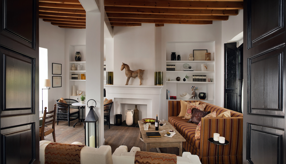
    TSH in Portugal
    TSH will land in Portugal with two locations. The group’s first beachside property is located in Carcavelos, opposite the new Nova Business School campus and directly on the seafront of Portugal’s best surf spot at Carcavelos, just 15-minutes from Lisbon.

    The area is booming with start-ups and incubators that will soon be home to a large business center and new Google offices. The 435-room hotel will be developed in partnership between TSH and Stone Capital and opens in 2021. It will house a large TSH Collab co-working area, rooftop pools, extensive terraces and open spaces, sport and yoga studios, and a restaurant.
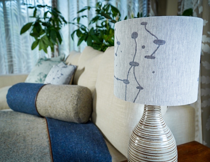
    The group has also secured an amazing city center location In Porto where it will open with 300 rooms in 2020.

    Expansion of TSH in Paris and Barcelona
    TSH is close to securing sites for a second location in Paris, a 300-room hotel within the Peripherique that is expected to open in 2020.

    A new location is also planned for Barcelona, a 300-room property with 3,000-sq-meters of Collab co-working space. It will be the second new TSH in Spain (Madrid opens in 2019). They complement two TSH Campus-branded, student-only residences in Barcelona at Marina and Poble Sec.

    Freddy van Zevenbergen

    Lambart & Browne to design this year’s bar at Decorex International 2018

    800 551 Hamish Kilburn

    As the interior designers behind Loulou’s, the infamous private members club, 5 Hertford Street in Mayfair, it is no surprise that the Decorex bar this year shares some its winning hallmarks.

    Lambart & Browne was briefed to design a space which would provide a fresh direction for Decorex’s new bar, an evolution of the champagne bar featured in previous years, which will offer a selection of botanically infused cocktails.

    The starting point for the design was the expression “bon viveur”, derived from the French phrase, “bon vivant” – one who lives well – adopted by the English in the mid 19th century.

    Lambart & Browne will evoke this mood at Decorex with an elegant, refined, colonialstyle bar.

    “We have designed the bar in a contemporary British style, classic eclectic. With this design we are inviting visitors to take a moment to reflect on the inspiring designs they have seen at Decorex in appropriately comfortable and elegant surroundings,” comments Freddy van Zevenbergen co-founder and head designer.

    The tent-like structure will be mounted on a raised platform. Each corner will feature rope-wrapped pillars, supporting a sailcloth ceiling. Sheer curtains on three sides of the bar will offer privacy and softer ambient lighting.

    Inside the bar, visitors will enjoy a space adorned with shaped decorative screens and luxurious furniture. Elegant lighting features are set to provide impactful focal points. Additional seating spaces will be dotted outside the bar, surrounded by accessories and screened to offer further privacy.

    Lambart & Browne’s design will include recognisable pieces from a number of the show’s exhibitors, contributing to a lavish yet comfortable experience.

    Decorex, the show of choice for the luxury interiors and design market, returns for its 41st edition to the historic Syon Park. It will host over 400 exhibitors from established names to up-and-coming brands. The opening destination of The London Design Festival, once again, the 2018 show runs from the 16 to the 19 September.

    Voco logo

    IHG launches voco, a new upscale hotel brand

    916 515 Hamish Kilburn

    The new brand, voco, is slated to add more than 200 hotels for IHG over the next decade, with the first voco hotel opening late this year…

    InterContinental Hotels Group (IHG®) has launched voco™, a new upscale hotel brand, which prides itself on being ‘reliably different’.

    voco, inspired by the meaning ‘to invite’ or to ‘come together’ in Latin, will combine the informality and charm of an individual hotel, with the quality and reassurance of a global and respected brand.

    Speaking at the exclusive press launch in London yesterday, Karin Sheppard, Managing Director – Europe, explained how the voco-branded properties will very much inject the character and personality of each hotel’s location through the use of clever interiors and artwork. “voco is an upscale, unstuffy brand that will treat all guests as individuals,” she said. “The environment [within each voco hotel] will live through the morning latte right through to the evening night cap.”

    The brand will focus primarily on conversion opportunities and will strengthen IHG’s offer in the $40 billion upscale segment, which is expected to grow by a further $20 billion by 2025. Working with high-quality individual and locally branded hotels, the distinctive brand will offer owners the ability to drive higher returns through delivering a compelling guest experience and leveraging IHG’s powerful systems.

    coffee and voco menu

    Keith Barr, Chief Executive Officer, IHG, commented: “We’ve talked about the significant growth opportunity we see for IHG in upscale and voco will help us deliver against this. We’ll work with owners of attractive properties, who appreciate the power and expertise that a global business can bring to the table. Guests will be able to enjoy the appeal of a more individual hotel, alongside the reassurance of a name above the door that they trust. The versatility of the brand, means a voco hotel can retain and celebrate all of the elements that make that existing hotel successful.

    “With voco, the recent addition of Regent Hotels & Resorts in the luxury space, the launch of avid™ hotels in the Americas, and the work we’re doing to enhance our existing brand portfolio, we’re making great progress with our ambitious plans to accelerate growth.”

    Hotel staff welcoming guests

    The voco brand promises guests an experience that is reliably different, brought to life through a bold, distinctive identity, informal service style and thoughtful touches along the guest journey. Three critical moments (symbolised by three different birds) on the guest journey have been identified through deep customer insight. In each of these moments, voco can create a compelling guest experiences. These include:
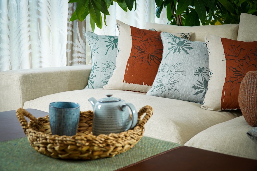
    • Come on in (symbolised by the finch) – a signature welcome experience, swift and simple check-in with an unexpected, locally-influenced treat to kick-off a guest’s stay.
    • Me time (symbolised by the owl) – encouraging guests to take a moment for themselves with extra cosy beds and bedding, quality bathroom amenities, rejuvenating aerated showers, a variety of viewing content on Smart TVs and excellent connectivity in every room.
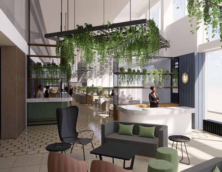
    • voco life (symbolised by the flamingo) – vibrant and sociable bar and lounge spaces that work for different moments of the day, so that guests always have space to relax and enjoy themselves – from offering a great coffee to start the day or shareable and classic dishes in the evening that provide something to talk about afterwards.

    Voco webpage

    The roll-out of voco will begin in IHG’s Europe, Middle East, Asia & Africa (EMEAA) region, with plans to take it to the Americas and Greater China over time. The new brand will drive significant incremental growth for IHG, with an expectation to open more than 200 voco hotels in attractive urban and leisure locations over the next 10 years.

    IHG announced plans last month to expand its luxury and upscale estate in the UK through a conditional agreement with Covivio (formerly Foncière des Régions) to rebrand and operate 12 high quality open hotels and one pipeline hotel into its portfolio across the UK. This deal will establish an important presence for voco in the UK with a number of these properties converting to the new brand in the coming months.

    Today, though, IHG has confirmed the first signing for the voco brand outside of Europe will be the Watermark Hotel & Spa Gold Coast, Surfers Paradise, Australia. The 388-room hotel is located at the heart of Surfers Paradise, a few steps away from the beach, and offers guests two swimming pools and 800swm of meeting space. The property is shortly to be acquired by IHG’s long-standing partner, SB&G, which currently owns five other IHG hotels in Australia. The hotel is due to open under the voco flag in late 2018.


    Hotel Designs confirms Principal of Richmond International as speaker for Meet Up North

    1024 537 Hamish Kilburn

    Hotel Designs, which is set to take HD Meet Up brand to Manchester this July, has just confirmed Principal of Richmond International, Fiona Thompson, as the headline speaker for the evening…

    Hotel Designs has confirmed that Principal of Richmond International, Fiona Thompson, will be the headline speaker at Meet Up North.

    Taking place on July 18 at Manchester’s trendy King Street Townhouse, the evening networking event is a bridge between designers, architects, procurement companies and suppliers. Thompson, known in the hotel design industry for working on projects such as The Langham London, Sandy Lane in Barbados and Four Seasons Ten Trinity Square, will speak about past projects and the value of collaboration.

    Speaking ahead of the networking event, Thompson said: “Only through a thoughtful collaborative process, which acknowledges individual skills, talents and perspectives, can a project be successfully completed. Richmond International is extremely excited to take part in Meet Up North, an event which honours the significance of professional collaboration, and in turn reflect on the successful partnerships Richmond International has had the pleasure of being part of over the past 51 years.”

    “I am delighted to confirm this news that such an established visionary within our industry will be the headline speaker at Meet Up North,” said editor of Hotel Designs Hamish Kilburn. “I’m always fascinated when speaking to Fiona as I believe she has such a natural warmth about her when describing past, present and future projects. She is so ‘in the know’ when it comes to all topics within hotel design and, considering how in-demand she is, we are very grateful that she will join us in Manchester next month.”

    Full event details, including start time and location, can be found here.

    Our headline partner for this event is Marca Corona whom we announced last month. If you are a supplier to the hotel industry and are interested in attending/supporting this Meet Up please contact Jennie Lane now to find out how you can get involved.

    The Hotel Designs summer Meet Up is completely free for hoteliers, interior designers and architects; click here to confirm your attendance.

    Light, modern newly unveiled guestrooms

    St. James’ Court, A Taj Hotel, unveils renovated premium guestrooms

    800 533 Hamish Kilburn

    Following a nine-month refurbishment, the renovated areas boast a blend of heritage and contemporaneity design…

    St James’ Court in Westminster, operated by Taj hotels, has officially launched its newly renovated guestrooms at the Almoners Townhouse, as part of a multi-million pound refurbishment.

    In accordance with the hotel’s commitment to ‘reinventing tradition’, the renovation complements the “English Classics, Reinvented” series, which gives literary classics a new lease of life as Taj partners with contemporary British artists to create a selection of limited edition covers for UK’s best loved tales.

    The award-winning hospitality and residential architects and interior designers, Dexter Moren Associates, alongside interior design consultant Sue Freeman, are carrying out the entirety of the project, working to create an equilibrium between the historic design features and a fresh contemporary finish.

    Embodying the magnetism of the unique location, the new premium guestrooms have been infused with the modern influence of present-day London, yet maintaining comfort and convenience, rooted in the hotel’s legacy, providing guests with a welcoming retreat from the hustle and bustle of the city.

    Among the spaces seeing that have recently completed are the guestrooms located in Almoners townhouse. Following a nine-month refurbishment, the renovated areas boast the perfect blend of heritage and contemporaneity; Taj’s historic design features marry with a bold, contemporary finish, reminiscent of a modern townhouse. The use of pale hues accentuates the abundance of natural light, giving the new rooms and suites a bright and airy feel that ultimately creates a light and welcoming environment.

    The areas boast ample space and a variety of earthy and soothing colour pallets which draw inspiration from the surrounding meandering cityscape, evident in the decorative bespoke maps that are suspended throughout.

    Neutral tones and cleverly-crafted light installations provide the entrance lobby and hall with a sophisticated appeal, resembling an archetypal arcade. Showcasing simple paneling, elegant edges and steady trimmings, these rooms are quintessential gateways to the luxurious offerings synonymous with St. James’ Court.

    “Since opening its doors in 1902, St. James’ Court, A Taj Hotel has symbolised union between Taj’s Indian heritage and timeless British pedigree,” comments the UK Area Director and General Manager, Digvijay Singh. “Hosting more than a 100,000 travellers every year, the renovation marks an exciting new era for the hotel by boosting its offerings to serve the ever evolving needs of the modern traveller”.

    The renovation will also see the opening of new spa facilities in August 2018.

    Light, modern public area

    BEHIND THE SCENES: the newly unveiled Radisson Blu Hotel Nice, France

    800 533 Hamish Kilburn

    Following the reopening of Radisson Blu, Nice, Hotel Designs caught up with design firm Trevillion to find out what challenges it faced when refurbishing both the guestrooms and meeting and events areas of the hotel…

    Located on the famous Promenade des Anglais, Radisson Blu, Nice, has recently undergone monumental refurbishments as part of a colossal €12 million upgrade. Commencing in 2015, the hotel can now announce its completion which features new guestrooms, two new restaurants, upgraded public areas and a programme to enhance the hotel’s Meetings and Events space.

    The visionary design firm behind the renovated guestrooms and M&E areas is Trevillion. “The location calls for an holistic approach to the interior design solutions providing a casual yet smart environment condusive to both leisure & corporate guests,” says Design Director at Trevellion, Frances Blackham.


    Rooftop restaurant/bar overlooking striking Mediterranean views

    The hotel now shelters more than 330 guestrooms, all offering a stylish and contemporary feel with a Mediterranean design that fits perfectly with the hotel’s seafront location.

    Designing relevant interiors while remaining sensitive to the heritage of the building and the location it surrounds was one of the major challenges faced by Blackham and her team. To combat this, the designers turned their attention to natural elements. “We have used a clever use of new intelligent material types in the guestrooms, which is married with simple detailing and encompassing all the facilities expected by the international traveller,” explains Blackham. “This has transformed many existing elements retained within the rooms and delivers a new aesthetic and meets the expectations of the Radisson Blu brand.”

    Guestroom with natural tones and light interiors

    The now bright and spacious guestrooms are dressed in natural tones with grey and blue accents, providing a clean and fresh feel. In-room technology is enhanced with the addition of smart TV’s.

    Faced to re-imagine the interiors of the M&E areas, Trevillion’s main task was to create a light, airy atmosphere without the luxury of natural light to play with. “A windowless environment required an approach that would deliver a unique appeal across the hospitality sector,” Blackham explains. “Illuminated artwork together with a neutral pallatte delivers a fresh upbeat environment for both functions and corporate use.”

    To add to the overall transformation of the hotel, the public areas and lobby have been fully renovated and the ground floor bar and restaurant, Le 223, is sporting a sleek new look. Meanwhile, Calade restaurant, is superbly positioned on the hotel’s rooftop and offers some of the finest views of the Côte d’Azur.

    Luxury bathroom

    GUEST BLOG: Five ways to make a bathroom suitable for all guests

    960 646 Hamish Kilburn

    If your hotel welcomes all guests, including the elderly, young, or less mobile, then you’ll probably want to make sure that your bathroom is suitable for them. More Ability discusses the ways in which you can ensure your bathroom is safe for all guests…

    Following on from Guide To Hotel Design article about how to made an oddly shaped bathroom safe, More Ability, believes that the devil is in the detail when it comes to making a hotel bathroom accessible to all guests checking in.

    What you may find surprising, is that it’s just small details and alternations that need to be made in order to transform a bathroom into a place that’s both accessible and stylish.

    Switch tiles for vinyl

    The sheer variety of bathroom tiles on offer, often makes them the first choice for anyone looking to redecorate, but it’s not the only option.

    Vinyl – whether laminate or anti-slip – is much safer; helping to prevent trips and falls as it’s less slippery. Of course, you can purchase non-slip bathmats and rugs too, for extra precaution. Plus, vinyl is a typically warmer flooring, which is seen as a bonus by many people.

    The great news for hotels, is that vinyl flooring is maintenance-free and doesn’t need grouting, so you won’t need to spend quite as long cleaning as you would if you had tiles!

    Whilst in the past, vinyl flooring may have looked clinical and cold; designs really have come a long way, and you can choose from a range of colours and textures. The end result? A stylish bathroom that’s suitable for all guests.

    Install a detachable shower head

    For guests with mobility issues, or those who struggle to stand for long periods of time, a detachable shower head can prove to be invaluable.

    For example, if an elderly guest stayed at your establishment, then it means they can sit down in the shower whilst having a wash, which can be extremely beneficial for them.

    Place items within easy reach

    Having a shelf in the shower at the right height, within arm’s length makes it easier for guests to reach shampoo, conditioner and shower gel easily, eliminating the risk of leaning over and falling.

    When installing shelving, instead of opting for suction cups, mount them on the wall instead – otherwise they could fall off and harm someone.

    Light up the way

    Whilst you may have the lighting covered in the bathroom, have you considered whether the lighting is adequate in the hallway?

    For example, if you there are children staying, they may need to go to the bathroom in the night. Lighting up the route will help them to find their way better, reducing the risk of them falling over and hurting themselves.

    Purchase a raised toilet seat

    Higher toilet seats make it much easier for guests with disabilities to lower themselves on to, and it’s recommended that toilets be between 17-19 inches high.

    If you can’t afford to replace every single toilet, that doesn’t matter. Instead, you can purchase a much more cost-effective raised toilet seat to increase the height. Just don’t forget to move your toilet paper to an accessible height, in a position that’s easily reachable.

    After all, having an accessible bathroom for everyone means that you can accommodate all guests. Amending your bathrooms to make them accessible for all guests doesn’t need to cost a fortune. These five tips are simple, and can be easily implemented, but will make a world of difference to children, the elderly, and those less mobile who are coming to stay at your establishment.