Hotel Designs

    NEWS AND ANALYSIS FOR HOTELIERS, DESIGNERS AND INDUSTRY SUPPLIERS
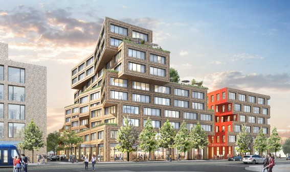
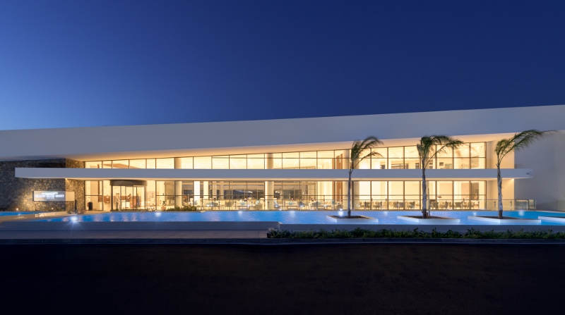
    Site of the new Rosewood Hotel in Houston's Uptown District (PRNewsfoto/Rosewood Hotels & Resorts)

    Rosewood Hotels & Resorts to open first hotel in Houston

    1024 620 Hamish Kilburn

    Houston continues to be an area of interest as Rosewood Hotels & Resorts announces plans to open Rosewood Houston…

    Rosewood Hotels & Resorts has been selected by McNair Interests to manage a new, ultra-luxury hotel in Houston. Set to open in 2023 in the city’s Uptown District, the hotel will be Rosewood’s second in Texas and their ninth in the United States.

    The 150-room hotel will be located in an exclusive mixed-use and high-rise development led by McNair Interests, managed by the Patrinely Group and designed by architecture firm Skidmore, Owings & Merrill LLP. In addition to the hotel, the six-acre site will include 80 luxury residences atop the hotel, multi-family residences, lifestyle-driven amenities, and retail and office space.

    “Texas is the birthplace of the Rosewood legacy, which launched with the Mansion on Turtle Creek in Dallas in 1979, so we are thrilled to expand our presence in one of Texas’ most vibrant cities,” says Sonia Cheng, Chief Executive Officer of Rosewood Hotel Group. “Offering innumerable cultural attractions, a sophisticated culinary scene, and unparalleled shopping, Houston is a natural destination for Rosewood’s affluential explorers.  Ideally situated in the Uptown District, Rosewood’s new property in Houston will serve as the ultimate urban retreat from which travelers can explore everything this exciting city has to offer.”

    Boasting two distinct dining venues, including a full-service restaurant and a vibrant outdoor pool bar, the hotel will offer visitors a sophisticated urban dining experience. Guests will also have access to Sense, a Rosewood Spa, as well as an outdoor pool and fitness center. The property’s extensive meeting and events spaces will accommodate a variety of private gatherings, conferences and special events.

    “This is a defining development for McNair Interests and the city of Houston,” said Cary McNair, Chairman and CEO of McNair Interests. “Our vision redefines the southernmost entrance of Post Oak Boulevard and the Uptown District, fusing a distinctive, sophisticated design with Houston’s future. We are excited for what this project will bring to our city and to visitors from around the world.”

    The news that Rosewood Houston will open in 2023 follows statistics showing that more than 2,300 rooms will come online in the area in the next few years, which heavily suggests that Houston continues to be a major hot spot for travel, tourism and business travel.

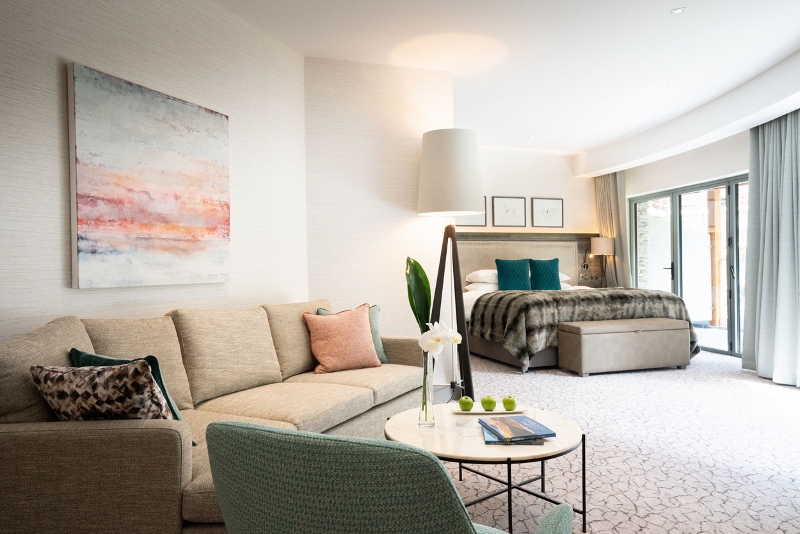
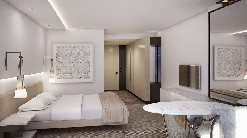
    Living/guestroom

    Designer Michaelis Boyd unveils RYSE hotel in the heart of Seoul
    760 475 Hamish Kilburn

    Designed by visionary Firm Michaelis Boyd, RYSE by Autograph Collection is being described as “exactly like nothing else”…

    Autograph Collection, Marriott International’s distinctive collection of passionately independent hotels, has announced the opening of RYSE in Hongdae, the neighborhood known to be a creative trendsetters in Seoul. RYSE is the second Autograph Collection hotel in Seoul and joins the brand’s diverse portfolio of more than 135 hotels around the world that champion values of vision, design and craft.

    “Autograph Collection Hotels is growing in lockstep with global demand from travelers for independent hotels and individual experiences when traveling: from dining to design,” said Jennifer Connell, Vice President, Global Brand Marketing & Management, Autograph Collection Hotels. “With every touchpoint thoughtfully-crafted and guest experience personally-curated, RYSE is the perfect addition to the collection; and we are thrilled to introduce it as the brand’s second hotel in the ever-evolving city of Seoul.”
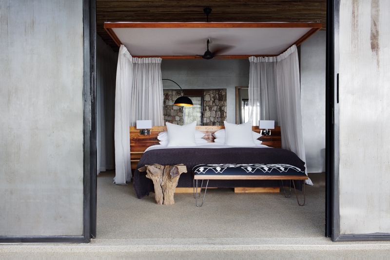
    Calm interiors in guestroom

    Hongdae showcases self-expression and individuality at every turn, and RYSE cleverly celebrates the neighborhood’s neon candy box aesthetic in a sophisticated way. Conceived and designed by globally renowned Michaelis Boyd, the hotel’s interiors collide energetically: bare concrete and industrial brass metal meet glossy pink flooring and modern art installations reign. The hotel’s art concept starts from an artistic outdoor mural and continues through the lobby where pop-up exhibitions feature unexpected hanging sculptures.

    RYSE features 272 inspiring guestrooms including 14 suites; each designed to highlight a prominent art piece from an exclusive collection for the hotel. Some suites have been specially customised by creative masterminds including fine art photographer Laurent Segretier and collage artist Charles Munka; Seoul based sculptor who defines space with light and polychromatic films Yeojoo Park, and multimedia storyteller Maekan. These Artist Suites are curated with strong aesthetics and individuality to embrace the youth culture of Hongdae The 2300 square foot (217 square meter) Executive Producer Suite, located on the twentieth floor, features handpicked art works and a graphic wall by renowned Korean graphic designer Na Kim.
    Modern and chic guestroom

    The hotel also features an exclusive fitness centre and almost (5380 square feet) 500 square meters of flagship retail that features boutique streetwear linking high fashion to street culture and art. The hotel’s meeting and event spaces encourage creativity in their 1,400 square meters of relaxed atmosphere. Lounge spaces allow guests to exchange ideas and work in their own pace, before coming together to meet and party in the RYSE Gallery large enough for up to 300 guests.
    Coil lighting

    GUEST BLOG: Brighten up hotel interiors with lighting

    800 671 Hamish Kilburn

    The rise in innovative lighting technologies is pushing the boundaries of what can be achieved in hospitality interiors, both aesthetically and in terms of energy efficiency. Ian Drinkwater, Managing Director of Applelec explores how the latest developments and trends are changing the face of lighting…

    It’s no secret that bespoke interior design is the key to success in the hotel industry, with many outlets utilising innovative and unique room design to attract guests and create a ‘Wow factor’ throughout their stay. Many outlets have now turned to technological innovations to upgrade interiors and satisfy changing customer needs.

    Lighting is fundamental component in any hotel, not only is it responsible for creating a comforting and relaxing atmosphere the moment a guest enters your hotel, but bad lighting can make décor and furniture look less appealing. Designers are constantly on the lookout for advancements in lighting, which can deliver on these requirements and refresh hotel interiors.

    The introduction of OLED technology has revolutionised lighting design, opening up exciting possibilities for interior designers working in the hospitality industry.

    An OLED approach

    Due to its flexibility and versality, OLED lighting technology has become a popular option, with many hospitality interior designers choosing to install the technology in a variety of lighting applications to deliver eye catching results.

    One of the most distinctive features is that the light produced by an OLED module is noticeably softer, closely resembling natural day light with virtually no glare, therefore it is perfect for creating a relaxing and cosy atmosphere, for instance in guest bedrooms.

    Research has shown that daylight has a positive effect on human health, and in addition can increase comfort when installed in a specific outlet. Although, designers try and make use of natural daylight where possible, it’s not always achievable for a number of different reasons. This is where OLED come into its own, with the ability to replicate daylight with virtually no glare, it is the perfect substitute.

    What’s more – due to having no backlight – OLEDs are much slimmer than traditional LEDs, a flexibility which enables OLED technology to be embedded in furniture, walls and textiles – redefining what can be achieved with hotel lighting design.

    Aside from delivering on versality and flexibility, OLED modules are also extremely energy efficient. Unlike regular LEDs which block the pixel shutter when switched off, OLEDs turn off the modules completely, meaning they consume no power whatsoever when switched off – enabling hospitality managers to make impressive savings.

    The VIP choice

    With bespoke and unique features, it should come as no surprise that OLED technology has already been utilised in luxury facilities, incorporated into the design of stunning sculptural light installations.

    An example of this is ‘The Ribbon’, which was created by lighting artist Min Sang Cho and makes full use of the innovative capabilities of OLED, with bespoke modules supplied by Applelec. The stunning installation was unveiled at London Design Festival, before relocating to its permanent home in the VIP reception of the Genting Highland Casino in Malaysia.

    The installation was 3D printed and then manipulated by hand into an intricate and unique shape, before finishing touches were applied, such as 24-carat gold lead paint to each piece of the ribbon to emphasise the soft light from the OLED modules. Furthermore, the entire design is remarkably low power, using a mere 9W per unit to run effectively.

    The distinctive features of OLED technology have captured the attention of interior designers far and wide, with many choosing to harness the technology to create stunning lighting displays in a range of hospitality outlets, including high-class and boutique hotels.

    Applelec is a trade supplier and manufacturer of signs, displays and lighting, based in Bradford, West Yorkshire. They recently launched their innovative range of lighting modules which utilise OLED technology, revolutionising lighting design: www.applelec.co.uk.


    Mandarin Oriental lobby

    Top 5 stories of the week: London fire, summit success and first looks

    1024 624 Hamish Kilburn

    Here are our top 5 stories of the week…

    1. Mandarin Kensington Fire: Hotel issues statement

    fire at the Mandarin Oriental Hotel London

    Image credit: Twitter @Watersun555

    Not surprisingly, our top story of the week was the Mandarin Oriental London’s devastating fire. It happened on Wednesday afternoon, one week after completing “the most extensive restoration in its 115-year history.”

    2. Hotel Designs celebrates record-breaking success at this year’s Hotel Summit 2018

    Delegates and suppliers at Hotel Summit 2018

    This year’s 20th anniversary of Hotel Summit becomes the most successful event to date in Hotel Designs history. You can read all about this year’s summit and what the delegates and suppliers thought via the link above.

    3. First look: University Arms, Cambridge

    Large suite wtih bookcase diver and bespoke furniture

    Ahead of the opening of University Arms, Cambridge, we went behind the scenes to find out how the design concept developed between interior designer Martin Brudnizki and architect John Simpson.

    4. Technology: Is Alexa welcome in the hotel industry?

    In-room software

    Image credit: Alice, info.aliceapp.com

    This has been the most shared story of the week. In our technology feature this month, we’re discussing how tech, placed thoughtfully, can help create a relevant and modern in-room experience. With 73 per cent of travellers wanting in-room voice commands, should hotels offer Alexa in guestrooms? One company believes so.

    5. designjunction announces new home for 2018

    London Southbank

    designjunction is set to transport to the cultural hub of London’s South Bank with a showcase of world-class design for the annual London Design Festival in September 2018.


    Dubai skyline

    The Middle East and Africa hotel construction pipelines continue to grow

    960 640 Hamish Kilburn

    Analysts at Lodging Econometrics (LE) report that the construction pipelines for the Middle East and Africa continue to grow resulting in 875 projects/216,045 rooms combined, according to LE’s recent Trend Report.

    The Total Middle East pipeline has 594 projects/170,490 rooms and is up 23 per cent by rooms Year-Over-Year (YOY). This is the 16th consecutive quarter of pipeline growth seen by the Middle East. In the Middle East, there are 358 projects/113,830 rooms under construction, up 13 per cent by projects YOY. Those scheduled to start construction in the next 12 months are at 127 projects/31,752 rooms, up 9 per cent while projects in early planning stand at 109 projects/24,908 rooms are up 31 per cent.

    The total Africa pipeline has 281 projects/45,555 rooms and is up 21 per cent by projects YOY. In Africa, there are 127 projects/21,233 rooms under construction, up only 1 per cent by projects YOY. Those scheduled to start construction in the next 12 months are at 79 projects/11,954 rooms, up a whopping 65 per cent, while projects in early planning stand at 75 projects/12,368 rooms are up 29 per cent.

    Delegates and suppliers at Hotel Summit 2018

    Hotel Designs celebrates record-breaking success at this year’s Hotel Summit 2018

    1024 576 Hamish Kilburn

    This year’s 20th anniversary of Hotel Summit becomes the most successful event to date in Hotel Designs history…

    More than 60 hotel general managers and more than 30 supplier partners attended the 20th anniversary of Hotel Summit, making it the most successful event to date.

    Hoteliers and suppliers gathered at the Radisson Blu Stansted on Monday June 4 for the two-day networking opportunity.

    Giving this year’s opening address on UK travel trends in London and the South West, Trivago were among the event’s partners that was impressed with the high quality of Hotel Summit 2018. Regional industry manager Aly Thompson said of the event: “It’s always great to have the opportunity to meet with hoteliers face-to-face, and the Hotel Summit provides a particularly productive environment for exchanging, which gives the opportunity to really understand the needs of hoteliers and the pressures they face.”

    Throughout the two days, delegates and suppliers were given set times to meet face-to-face and discuss new products, projects and up-coming opportunities. Seminars throughout the two days came from the likes of procurement manager at Westfield Retail Solutions, Tony Morris, Chairman for the Energy Institute, Phil Warren, CEO of Direct Hotel Marketing, Adam Hamadache and John Heffernan from Red Live Media.

    “No industry understands the saying ‘time is a luxury’ more than the hotel design industry,” said editor of Hotel Designs Hamish Kilburn. “Hotel Summit prides itself of being the leading networking event for both hoteliers and suppliers alike as it guarantees strong leads for both parties.”

    Monday evening was filled with a gala dinner which was followed by a further, less formal, networking opportunity at the Hotel Summit’s casino-styled post-dinner drinks at The Angels Wine Tower Bar.

    [easingslider id=”32322″]

    Delegates testimonials

    Ufford Park Limited
    “An interesting event with a variety of market professionals offering advice, ideas & innovations to move the hotel industry forward.”

    Cranleigh Boutique
    “Brilliantly organised, the right people attending and the right mix of business and pleasure.”

    01 Hotels & Hostels
    “It was a good networking experience. Enjoyed the seminars a lot – good knowledge. Great Hosts! Very polite and helpful. I liked the supplier stands, all professionally done. Overall a good experience for a first show.”

    The Beaumont Hotel
    “Events such as this are good for me, you build relationships, establish new networks and broaden your horizon in your field and furthermore. Thank you to the team for putting it together so well. It was fantastic and I learned a lot and met a few good people. Looking forward to the next one.”

    Hudsons Guest House
    “This was a well organised event in that it gave us exposure to issues that are at the core of our business; we also had face to face meeting with suppliers of our choice which were very insightful. It was also packed full of fun and indulgence.”

    Supplier testimonials

    Drinks partner: Trivago
    “It’s always great to have the opportunity to meet with hoteliers face-to-face, and the Hotel Summit provides a particularly productive environment for exchanging

    Gold partner: Salto Systems
    “The event was very positive as ever the Forum Events team were fantastic. See you next year.”

    Gold partner: Pulsar

    “Our first time at these show and we have been very impressed. Well done guys!”

    Silver partner: Sue Whimster Curtains Ltd

    “Good venue, very well organised itinerary followed by incredibly informative meetings with potential clients. Overall, days structured in a very good way and a perfect opportunity to meet new industry suppliers as well as promote our brand.”

    Silver partner: Heritage Bathrooms

    “The event is very well organised and the forum events team are very helpful friendly and approachable.”

    Gold partner: Anchor Hospitality Logistics

    “The event is a great way to meet key decision makers in a friendly environment.”

    Silver partner: Cassellie

    “Great event, would recommend 100 per cent”

    Gold partner: Portable Floormaker

    “Overall a great event – the team were very helpful and friendly! Have left with some strong leads so would definitely attend again.”

    Silver partner: James Alexandra

    “Jennie and the team do an excellent job making all the suppliers & buyers feel welcome and at home. I think this is an excellent way to meet and talk with clients.”

    Partners of the event included:

    Headline partner –
    Simba Sleep Limited

    Gold partners –
    Salto SystemsChroma FlooringQCRWandsworth GroupCentrica Business SolutionsPortable FloormakerDysonB Light GroupVoguePulsarAnchor Hospitality LogisticsISS Facility Services, and Project Blinds.

    Silver partners –
    CrosswaterBirchall TeaDelabieJames AlexanderHeritage BathroomsTarkett FlooringADI TradingSue WhimsterCassellie LTDViridorSimon Jersey7 FormationDr CostWanzl and Airwave.

    Drinks reception partner –
    Trviago

    Next year’s Hotel Summit will take place on June 3 – 4, 2019, with the venue yet to be confirmed. If you are interested in exhibiting at the 2019 event, please contact Jennie Lane on 01992 374098 or j.lane@forumevents.co.uk.

    Close-up of bed with striking modern art above bed

    Claridge House Chicago’s “full circle” design motif

    686 463 Hamish Kilburn

    Claridge House Chicago opens after a multi-million-dollar renovation which included the transformation of all spaces…

    Design firm The Gettys Group has turned a classical building, constructed in 1923 by native Chicago architect Walter Ahlschlager, into a fresh and modern oasis. Exemplifying a “full circle” motif, the design group’s vision for Claridge House Chicago utilises rings, spheres, and other circular imagery to represent the hotel coming full circle – returning to its roots as a residential hotel, as it was when the property was known as Claridge Hotel until 2005.

    “Everything from the wall artwork to the lighting to the original sculptures draws on the “full circle” design inspiration,” says Ali Bacon, project designer at The Gettys Group. “The round, inviting imagery creates an environment that feels less like a hotel and more like home.”

    In the ground-floor lobby, this circle motif is seen in the lighting above a communal table for relaxing, working, and gathering. Hanging above the space and adjacent to a long, marble fireplace is a custom chandelier comprised of silk-wrapped rings. The lobby bar and lounge are lit by globe pendants ornamented with brass and copper accent rings. Circular mélange sconces designed by Kelly Wearstler contribute to the residential, home-like atmosphere.

    Similar to a living room at home, one lobby wall is decorated with real travel photos. The photos, most of which were taken on smart phones, include personal memories from trips taken by those connected with the hotel, from designers to the hotel’s on-property team, offering a personal touch for guests to peruse and enjoy.

    “If the lobby of the hotel is the living room of the house, then the guestrooms at Claridge House are true bedrooms, allowing visitors to work, relax, or get a good night’s sleep in an airy, calm space,” says Bacon.

    Large living area with beige sofa and dark armchair

    The guestrooms, inspired by a pied-à-terre, offer a city apartment feel, each being unique to the next, adorned with urban, yet homey artwork. Above the work station is a black-and-white photo of Chicago’s John Hancock Center skyscraper, while above the bed and in the bathroom hangs images of quaint row houses and vintage cars in London – calling back to the origins of the name Claridge.


    Mandarin Kensington Fire: Hotel issues statement

    753 421 Hamish Kilburn

    Just one week after completing “the most extensive restoration in its 115-year history”, the Mandarin Oriental London yesterday suffered a devastating blow when a fire broke out on the top floor…

    The Mandarin Oriental has made a comment after a fire broke out yesterday afternoon.

    “Plumes of smoke were seen rising from the five-star Mandarin Oriental in Knightsbridge just before 16:00 BST,” reported the BBC. Among the guests that were evacuated from the burning building was singer Robbie Williams who described the drama to the BBC: “I went on the balcony and looked up and there was just billows and billows of smoke.

    “I came back in from the balcony and said, ‘The hotel’s on fire,’ and then the next thing a knock at the door came and there was a bellboy there and they said, ‘Get out’.”

    The fire was believed to have spread across a vertical façade of plants and vegetation and into several floors of the hotel but was quickly extinguished, as reported by FT.

    It happens after the hotel last week announced that its recently completed renovation, overseen by internationally renowned designers Joyce Wang and Adam D. Tihany was to confirm this historic hotel’s position as one of the best in the world.

    In a recent press release from the hotel brand, the renovation was described to have given all 181 guestrooms and suites a more luxurious and comfortable feel than ever before. The designers took inspiration from art deco and included carefully curated artworks, and custom-designed furniture. The hotel had also installed a green living wall which surrounds the inner courtyard.

    Since the fire broke out, the hotel has made a comment: “We would like to express our appreciation to everyone who has conveyed their concern about this sad incident.

    “It is too early at the present stage to assess the full extent of the damage. A full investigation is under way and will take time to complete.”


    Our thoughts are with the hotel and the Mandarin Oriental brand at this time.

    Image credit: Twitter @Watersun555


    Hyatt Hotels exterior shot

    Hyatt plans to double brand presence in Canada

    637 390 Hamish Kilburn


    Hyatt plans to open 12 Hyatt Place and Hyatt House hotels in Canada by 2020…

    Hyatt has announced plans to expand the Hyatt Place and Hyatt House brand footprint in Canada with the signing of management and franchise agreements by a Hyatt affiliate for nine Hyatt Place hotel and three Hyatt House hotels. There are currently nine Hyatt-branded hotels open Canada, and the expected openings of these 12 Hyatt Place and Hyatt House hotels would increase Hyatt’s brand presence in the region to 21 hotels within the next few years.

    “We believe the new agreements being announced, along with the previously announced properties under development, demonstrate growing confidence among owners and developers in the strength of the Hyatt Place and Hyatt House hotels in Canada,” said Scott Richer, Hyatt’s vice president of real estate and development for Canada. “There is tremendous growth opportunity in this region – coming off the heels of its 150th anniversary, Canada continues to see strong levels of leisure travel, as well as an increase in corporate travel. Today’s announcement is a testament to the global appeal of Hyatt’s select service portfolio as it continues to expand worldwide and offer more choices to our guests.”

    Hyatt Place and Hyatt House

    The Hyatt Place and Hyatt House brands are designed to deliver seamless experiences that are authentic, intuitive and modern, allowing business travelers to remain productive and worry free, without skipping a beat. Twelve Hyatt Place and Hyatt House hotels are expected to open in Canada in the next two years, including:

    2018
    •Hyatt Place Calgary Airport (127 guestrooms) in Calgary, Alberta
    •Hyatt Place Mississauga Centre (126 guestrooms) in Mississauga, Ontario

    2019
    •Hyatt Place Brampton (123 guestrooms) in Brampton, Ontario
    •Hyatt Place Kelowna (161 guestrooms) in Kelowna, British Columbia
    •Hyatt Place Moncton (120 guestrooms) in Moncton, New Brunswick
    •Hyatt Place Winnipeg Downtown (144 guestrooms) in Winnipeg, Manitoba
    •Hyatt House Hamilton/McMaster University (135 guestrooms) in Hamilton, Ontario
    •Hyatt House Winnipeg South West (135 guestrooms) in Winnipeg Manitoba

    2020
    •Hyatt Place Toronto International Airport (196 guestrooms) in Toronto, Ontario
    •Hyatt Place Toronto Airport Corporate Centre and Hyatt House Toronto Airport Corporate Centre (250 guestrooms) in Toronto, Ontario
    •Hyatt Place Vancouver Airport (97 guestrooms) in Vancouver, British Columbia

    Hyatt-branded hotels currently open in Canada include:
    •British Columbia: Spirit Ridge at Nk’Mip Resort and Hyatt Regency Vancouver
    •Alberta: Hyatt Regency Calgary, Hyatt Place Edmonton/Downtown and Hyatt Place Edmonton-West
    •Ontario: Andaz Ottawa Byward Market, Hyatt Regency Toronto and Park Hyatt Toronto*
    •Quebec: Hyatt Regency Montreal

    Image credit: Hyatt Hotels

    Large suite wtih bookcase diver and bespoke furniture

    First look: University Arms, Cambridge

    800 571 Hamish Kilburn

    Ahead of the opening of University Arms, Cambridge, Hotel Designs went behind the scenes to find out how the design concept developed between interior designer Martin Brudnizki and architect John Simpson…

    When it comes to designing a hotel that not only stands the test of time but also creates an awe-inspiring impression from check in to check out, two heads really are better than one and collaboration is most definitely king. The most recent example of this can be found in Cambridge, in the new 192-room hotel Universtiy Arms. The creative footprints of two celebrated visionaries’ – architect John Simpson and interior designer Martin Brudnizki – are very much in the fabrics as it heads towards opening.

    Slated to be one of 2018’s most exciting hotel unveilings, University Arms, Cambridge is expected to open on August 1. The landmark hotel is located overlooking Cambridge’s Parker’s Piece. First opened in 1834 as the city’s original hotel, its currently undergoing an £80m transformation.

    Exterior shot of University Arms

    Simpson is one the nation’s foremost classical architect and has worked on extensive projects in Cambridge, including at Peterhouse and Gonville and Caius Colleges.The architect whose portfolio also includes working on both Buckingham and Kensington Palaces has overseen the hotel redevelopment. This includes the replacement of the building’s 1960s and ‘70s extensions with an attractive, classically designed front that is in-keeping with Cambridge’s better-known architectural heritage. He approached the project with a self-professed vision to “try and create this hotel so it becomes the best hotel in Cambridge again”, restoring its faded glory.

    Brudnizki’s past projects include Miami Soho Beach House, Scott’s, The Ivy and the acclaimed Beekman in New York. University Arms is the first complete hotel project in the UK that will showcase the designer’s interiors from top to bottom. Throughout the planning process, Brudnizki has been mindful to create an environment reminiscent of school days past, lazy afternoons spent on the banks of the River Cam and the raucous revelry of students; truly a space for locals, tourists, Cambridge students and their families alike. Creating a timeless look and feel, Brudnizki chose a selection of bespoke products from Chelsom to light up the public areas and guestrooms.

    The Lobby 

    Providing a warm welcome for guests, the lobby boast a grand, high ceiling, Cambridge Blue timber panelling and a grey and green patterned marble floor. Natural light pours in through large glass windows, while statement art deco lighting lends a glowing touch. An unimposing, fabric-fronted reception desk adorned with a mixture of bespoke and antique furniture ensures that guests feel at home from the moment they arrive.

    large lobby with statement chandelier lighting

    The Library

    Paying homage to its famous location, the hotel’s library is an area for relaxation and escape. Curated by Heywood Hill – one of the leading bookshops in London – the room is filled with books from renowned authors, which many of the suites are named after. Bookshelf walls, traditional timber panelling and an original, wood-burning fireplace create a home-from-home with a luxury spin with an eclectic mix of deep sofas and cosy armchairs ensuring optimum comfort.

    Relaxing tones in the library

    The bar

    The library flows through to the bar, featuring bold marble patterned wallpaper. Reminiscent of antique book covers, the design flourish reflects the city’s heritage as an academic institution. A dark wooden bar forms the backdrop for a diverse range of seating and tables. Traditional loose rugs paired with statement lighting and classic bead ceiling creates a welcome atmosphere for both guests and visitors.

    Parkers Tavern

    Inspired by the communal dining halls of Cambridge College, Parker’s Tavern will be the standalone restaurant of the hotel. It will offer canteen-styled seating with a mix of free-standing dining chairs and benches, all finished in red and mustard-yellow leather and dark timber. The Cambridge Blue wall panelling, traditional solid-wood parquet following and original stained-glass windows with crest detailing are reminiscent of the traditional architecture of the city’s university colleges.

    Guestrooms and suites

    The guestrooms and suites will open with a light, breezy and relaxed feel. Hints of Cambridge Blue, yellow and red enliven each space, while some are paired with a traditional bookcase divider with private library, again curated by Heywood Hill. All rooms come complete with bespoke furniture and statement chandelier lighting from Chelsom.

    As the hotel nears completion, the work of two leading names in our industry can stand back to reflect on what can happen when a successful collaboration comes together.


    modern garden from Robert Barker

    Vaughan lit up Chelsea Flower Show 2018

    800 492 Hamish Kilburn

    Design and manufacturer Vaughan was given the unique opportunity to show its outdoor lighting collection at Chelsea Flower Show 2018 by sponsoring garden designer, Robert Barker.

    Barker is a modernist garden designer whose design process is about bringing together his passion for plants, people, nature, sculpture, his love for modern architecture and his understanding of how a design can work in harmony with its environment to create a timeless landscape.

    At Chelsea Flower Show, the designer exhibited a beautiful garden scheme, called ‘Skin Deep’, which incorporated textured contemporary sculptural elements with beautiful planting for, which Barker was awarded a Silver Gilt medal.

    Head over to the Vaughan website for more information on their complete outdoor lighting collection.

    Vaughan are one of our recommended suppliers. To keep up to date with their news, click here. And, if you are interested in becoming one of our recommended suppliers, click here.

    Kaldewei NexSys opens new chapter for floor-level showers

    1024 724 Hamish Kilburn

    Bathroom specialist Kaldewei has just launched a revolutionary 4-in-1 system solution for easy, safe shower installation…

    Launching in the UK this month, Kaldewei NexSys is a shower surface revolution. The innovative 4-in-1 system which is already pre-assembled at the factory, consists of a waste channel, sloping support, sealing and an enamelled shower surface enabling ultra simple and fast installation by professionals. NexSys takes a completely new approach to floor-level showers, perfectly combining two worlds: with one of the main advantage being it’s a seamless shower surface made of steel enamel with the design of a tiled shower area with a shower channel. The Kaldewei NexSys opens up a new market segment and rings in the change from shower channel to channel shower. This innovative product is available in eight sizes.

    Narrow channel is an eye-catching feature

    Only one year after the concept was introduced at ISH 2017 and after subsequent market research, Kaldewei is launching its revolutionary NexSys shower surface system on the market. The visual highlight of the elegant design is the narrow waste channel with a high-end designer cover made of brushed stainless steel that fits seamlessly into the shower surface’s overall minimalist look. Like all Kaldewei bathroom solutions, NexSys is made of superior steel enamel so it will retain its exquisite look for decades.

    4-in-1 system cuts out installation steps

    It’s not only in visual terms that the NexSys is revolutionising the shower market, Kaldewei is also a trail blazer when it comes to shower surfaces with regard to installation. The pre-assembled system of waste channel, sloping support, sealing tape and shower surface can, for example, be positioned directly in the screed recess after height compensation – a significant time saving for bathroom professionals. Thanks to the low built heights, floor-level installation is also possible with a limited construction depth. NexSys has no interior contour whatsoever making it ideal for insertion into the bathroom’s tile grid – like a large enamelled tile with integrated waste channel. Sound proofing is guaranteed with the use of sound insulation tape.

    Cut out of Nexsys product

    Digital helper for planning and installation

    Kaldewei offers support every step of the way, ensuring easy planning and installation. Additional information about NexSys includes a wide range of online tools such as installation videos, its Product Configurator, an interactive planning assistant or the provision of corresponding certificates. These and other useful digital services are available on the Kaldewei website.

    Kaldewei are one of our recommended suppliers. To keep up to date with their news, click here. And, if you are interested in becoming one of our recommended suppliers, click here.

    rooftop views over Edinburgh

    Renovated bank headquarters in Edinburgh opens as five-star hotel

    800 640 Hamish Kilburn

    The five-star The Edinburgh Grand opens in the heart of the city’s vibrant St Andrew Square in the former RBS Building…

    Two years in the making, The Edinburgh Grand has opened its doors for the first since it was closed 2007, successfully converting the headquarters of a bank into a five-star hotel.

    The hotel opens with the aim to redefine luxury accommodation in the area, offering 50 individually designed, fully-equipped apartments as well as a selection of restaurants and bars.

    “Every detail has been carefully considered – from the beautiful art deco inspired interiors celebrating the building’s amazing heritage, to the cutting-edge technology in each of the apartments, said general manager of Lateral City Apartments, which will operate The Edinburgh Grand, Gavin MacLennan. “The Edinburgh Grand is the ultimate home from home, and we know it will surpass every expectation.”

    The venture is part of Chris Stewart Group’s ambitious Registers development, a regeneration and redevelopment project which is set to transform one corner of the prestigious St Andrew Square. Karen Brown, head of interior design at CSG led the project though the entire renovation.

    Door half open into guestroom

    Luxury apartments cater to needs of modern guests

    Old meets new as guests’ needs have been put at the forefront of the distinctive design with original features artfully woven together with contemporary interior design. Authentic features, including original dark wood panelling, fireplaces, brass door handles and decorative cornicing, create a sleek and timeless design.

    From the uniquely configured Grand Studios to the city’s most exclusive suite, the three-bedroom, rooftop Penthouse boasts unmatched 360° panoramic views over the cityscape.

    Each residence is equipped with smart televisions, Bose sound systems and intelligent heating controls and a fully fitted top of the range kitchen. Bathrooms feature drench showers and oversized baths in addition to luxury amenities.

    Large open living areaThe Edinburgh Grand is also home to The Register Club, which occupies the west wing of the fourth floor. The champagne and cocktail club run by The Bon Vivant promises to be one of the city’s most elegant and sought-after venues.

    Following the opening, in July the award-winning steak restaurant and cocktail bar, Hawksmoor, will open its first Edinburgh offering with 170 covers in the former banking hall on the ground floor. The Bon Vivant team will also launch a continental café and aperitif cocktail bar with a late-night basement hangout tucked into the former banking vaults below. Sitting proudly in its place on St Andrew Square, and showcasing the best of interior design, impeccable service and local food and drink, The Edinburgh Grand is set to become the most sought-after hotel booking and table reservation in the city.

    Ed Ng portrait

    Seven minutes with Ed Ng from design house AB Concept

    1024 619 Hamish Kilburn

    Hotel Designs caught up with co-founder of luxury design powerhouse AB Concept to discuss technology, trends and what’s next for AB Concept

    Following on from last month’s focus on restaurants, we caught up with co-founder of luxury design powerhouse AB Concept, which has recently completed Mei Ume, an east-meets-west designed restaurant in Four Seasons Ten Trinity Square, London. Editor of Hotel Designs Hamish Kilburn spoke to Ed Ng to find out how technology in hotel and restaurant design is changing, as well as which common pitfalls to avoid when renovating heritage buildings…

    Hamish Kilburn: Let’s start with your most recent project, which Hotel Designs covered last year. How does Mei Ume set new standards for design restaurants?

    Ed Ng: I wouldn’t really say it sets a certain standard nor does it follow any specific set of rules that is something we tend to avoid for all of our designs. Rules are there to be broken anyway! We’d rather have a bespoke approach for each and every project we are taking on. I think Mei Ume is special in a very unique way as it’s a perfect match in concept, location and building. With the setting being the former Port of Authority Building in London – the crossroads where goods were traded between East and West – there was already a rich narrative in place that we further elaborated on with our design. We wanted to fuse the history and sense of place in a way that celebrated both cultures and as a tribute to the history, keeping the British fundamental and seasoning it with a sprinkle of charming oriental charisma. Through the Chinese glass screen with plum blossoms suspended in between the Corinthian columns, we seamlessly bridged the gap between these two very distinct cultures.

    Four Seasons Ten Trinity Square, London

    Image credit: Four Seasons Ten Trinity Square, London

    HK: What would you say are the most prominent pitfalls when designing modern interiors in heritage buildings?

    EN: Different challenges are to be faced when designing within a heritage building compared to a brand-new concrete shell, as there is already a long trace of history, familiarity and a story in place that is widely recognized. Therefore, such spaces need be treated very carefully and with a lot of respect. However, it’s a very thin line between trying to recreate the past – which easily could turn into an overly “themed” restaurant – and trying to cut too many ties and going for a very invasive approach. That would be missing the point for designing within a heritage building. I often try to play around with the existing elements and use the history as the foundation and then try to introduce contemporary touches to the design. Bringing a unique visual to the space, the design should seem as though it has always been there yet feel very contemporary at the same time.

    HK: How have consumer demands changed over the last 10 years – and how has this effected how you design F&B areas in hotels?

    EN: The last decade has marked the birth and incredible growth of smartphones, something that has become the platform of a social media phenomenon. The likes of Facebook and Instagram have become the “eyes to the world” and everything that is happening in the new and exciting in the lifestyle sphere is very much influencing where we dine, chill and stay. In the quest for likes, the Instagram moment has become a very important focal point for bars and restaurants, from a design perspective to come up with a visually stunning feature within the space that narrates the story and captures the attention of the guest.


    HK: This month, we are talking about all things technology. Is technology for the user in hotels limited to guestrooms?

    EN:Absolutely not. I think technology should really be able to weave into the total hospitality experience seamlessly and sometimes, without us even realizing it, we are exposed to technology throughout our whole stay and even prior to it. Starting with visiting the hotel website to making the booking, all the way to arrival, check-in, communal spaces, conference areas and banqueting facilities, dining, space, fitness, check-out and post-stay emails. Sometimes it’s ubiquitous and sometimes it’s subtly working it’s magic behind the scenes but technology is ever present. Having said that, one extremely important criterion is that technology is here to make our life easier, not complicate it for the sake of employing technology. Therefore, the best technology is the one that is hidden yet elevates our experience.

    Four Seasons Ten Trinity Square, London

    Image credit: Four Seasons Ten Trinity Square, London

    HK: What would you say has been the most rewarding project to have completed?

    EN: Every project has it’s own charm and is rewarding in a way, since Terence and I are constantly challenging ourselves to always create an extremely tailored design for each project. We always take a great amount of time to personally experience the project’s numerous aspects such as it’s locating city, culture, history, local materials, and of course, the expectations and requirements of the brand and functionality. We really absorb and condense all these references before we lay our hands on the drawing board. Throughout this process, we’re always able to learn a little more about what we can do and there is nothing more rewarding than seeing another unique piece of work being created. For example, we have just completed Paper Moon Giardino in Milan, the latest flagship restaurant of the brand that is housed within the 200 year old Palazzo Reina where we kept the original feature facade in honour of the history and architectural value, a project that could never be replicated anywhere no matter how much money one spends.

    HK: What’s next for AB Concept?

    EN: We are very excited to see our project at Four Seasons Kuala Lumpur come to fruition soon. We have been entrusted to design three F&B venues within the stunning property; The Lounge at Four Seasons, Bar Trigona, and Yun House, the latter which derives from the city’s rich cultural heritage, merging and bringing balance between colonial and Asian influences to create a level of luxury and sophistication synonymous with the Four Seasons brand. Meanwhile, we are also working on the W Hotel Xian, where we designed the entire hotel, a very eclectic project that will see The New York party boy come to play with the ancient terracotta warriors in Xian.

    HK: If you were designing a hotel from scratch, where would it be in the world?

    EN: Honestly, it could be anywhere… as long as it fits the following criteria
    1. A supportive owner who understands and respects our design approach
    2. There must be chemistry between us and the location (culturally or landscape-wise)

    Modern hotel Rosewood

    Image credit: Rosewood Sanya

    HK: What are your opinions on trends, and are you noticing any dominant ones at the moment?

    EN: The only trend we ever follow is: ‘Don’t Look for the Trend’. I can never stress enough how much we try to stay away from designing spaces by trends and how impossible it is to do so. We could be designing a hotel by following a certain trend but as hotels can have a 2 to 8 years time span before the doors finally open, by that time, it will probably have been replaced by 2 or 3 other trends. The design-by-trend would look dated even before the hotel is in operation. As a design studio, fortunate enough to be working with a variety of brands from Four Seasons to W Hotels, we have a deep understanding of their DNA, which is always firmly rooted, slightly adapting throughout the years but never ever follows trends. It keeps a brand consistent. For Rosewood we are now working on developing their new lifestyle brand called KHOS that is aimed at younger, vibrant and cosmopolitan travellers. All these brands are very distinct from each other, creating their own design language, uniqueness and elements that appeal to different guests.


    Hotel Designs becomes official media partner for designjunction

    1024 438 Hamish Kilburn

    Hotel Designs is delighted to announce that it has become an official media partner for designjunction 2018.

    Connecting the world’s most renowned design brands, designjunction will take place this year between September 20 – 23 around the South Bank, one of London’s most well-known cultural hubs.

    As an official media partner, Hotel Designs will work in collaboration with the designjunction to cover the event from an editorial perspective, amplifying product launches, discussions and key emerging trends.

    “It’s no coincidence that so many of our industry’s international trade fairs choose London as their backdrop,” said editor of Hotel Designs Hamish Kilburn. “This year, designjunction continues to be a ‘must-go-to’ event in the annual calendar for thousands of designers and architects as it prepares to light up the South Bank with the industry’s best brands.”

    Delegates attending this year’s designjunction can expect to see showcased a mix of international furniture, lighting, accessory, material and technology brands alongside pop-up shops, installations, and interactive features. designjunction presents more than 200 of the world’s most iconic design brands to the world’s leading design professionals. Written in its name, the event is a junction that helps connects the industry, and is a place to meet, do business and be inspired.

    For more information on designjunction, and what to expect this year, click here.


    In-room software

    Technology: is Alexa welcome in the hotel industry?

    750 370 Hamish Kilburn

    In our technology feature this month, we’re discussing how tech, placed thoughtfully, can help to create a relevant and modern in-room experience. With 73 per cent of travellers wanting in-room voice commands, should hotels offer Alexa in guestrooms? One company believes so…

    Imagine a world where guests can use the power of their voice to order hotel service directly from their room without lifting a finger.

    • Request an item:  “Alexa, bring an extra pillow up to my hotel room.”
    • Schedule a service: “Alexa, ask the hotel to schedule turndown service for 5PM.”
    • Check on the status of a request:  “Alexa, when will that coffee arrive in my hotel room.”

    Whether that is terrifying or exciting, we are now living this reality. Guest requests, simply spoken in the hotel room, can now be seamlessly routed through ALICE, a company on a mission to improve the delivery of hospitality through customer-driven technology, and Volara, said to be the hospitality industry’s premier voice-based engagement software.

    In a recent report, 73 per cent of travellers noted they want in-room voice controls when they stay at hotels. With the ALICE-Volara integration, when the guest gives an “Alexa” voice command, the guest’s request automatically syncs with the ALICE task management platform.  Guests’ commands can be simple, like asking for the WiFi password, or more complex, like asking for someone to bring fresh towels to your room. All commands can be configured to the hotel’s brand, ensuring guest satisfaction and enhanced staff operations.

    “When you look at trends in our industry, voice is clearly the future for how hotels will communicate with their guests,” says ALICE’s Co-Founder and President Alex Shashou. “As the the only hotel technology with the Alexa for Business Service Delivery Designation from Amazon, Volara’s focus on innovation and dedication to elevate the guest experience aligns with ALICE’s values. Volara’s voice-interface for ALICE will enable new efficiencies in guest service, reduce the friction guests face getting what they need in hotels, and simply put a smile on everyone’s face.”

    “ALICE has been disrupting the hotel industry with its fresh, open, and collaborative approach.  Volara’s mission to create a more engaging, frictionless, and seamless experience for hotel guests and staff aligns well with that of ALICE.” said David Berger, CEO of Volara. “Hotels that use ALICE to streamline their operations will now see immediate measurable benefits from the addition of this new voice interface for their technology.”

    The benefits of the ALICE and Volara integration include:

    • Decreased friction – The Amazon Echo is a hands-free speaker controlled by a human’s voice, meaning guests no longer need to pick up the phone or wait on hold to get the service they want.
    • Increased efficiency – Volara’s software runs atop of the Amazon Echo and integrates with your ALICE operations platform. Guest requests are routed immediately from the guest’s voice to the appropriate member of your staff, with no manual entry.
    • An enhanced guest experience – With ALICE and Volara, you can measurably reduce the wait time for guests to receive amenities and hotel information – even enabling them to check on the status of their request by voice – resulting in happier guests.

    A video example of the software in use can be accessed here.

    HAVE YOUR SAY: As Hotel Designs readers, we want your opinion. With voice-enabled technology growing in popularity – and consumer behaviour continuing to evolve – will guests ever expect hotel services to be seamlessly voice-enabled? Email: h.kilburn@forumevents.co.uk

    http://room5.trivago.co.uk/beach-spas/

    Trivago gives UK travel trends insight at this year’s Hotel Summit

    873 448 Hamish Kilburn

    Taking the keynote address at this year’s Hotel Summit, Trivago gave delegates an in-depth insight on travel trends in London and the South West…

    Speaking at the event, regional industry manager for Trivago Aly Thompson gave the address. She stated that of all the Trivago traffic searching for destinations in London, 57 per cent comes from off-shore, while in the South West international visitors only accounts for 7 per cent traffic.

    Thompson shared the top ten international markets for visitors coming to Greater London and compared this with visitors coming to the South West. See below:

    Graph to show top ten international makets for people coming to Greater London

    Top ten international markets for visitors coming to South West

    In regards to the type of guests, 44 per cent of people visiting London are business/weekday travellers, 47 per cent are weekend travellers while only nine per cent are holiday travellers. In the South West on the other hand, 39 per cent are business/weekday travellers, 56 per cent are weekend travellers and only five per cent are holiday travellers.

    “The great thing about booking behaviour shifting to online is the vast amount of data that is left behind,” said Thompson. “Hoteliers should be turning their attention to seeking such data to inform more efficient marketing and pricing strategies.”

    The session also explained how hoteliers can take action in order to capture guests based on where they come and what type of traveller they are, while it also compared the difference in the average clicked price between London and the South West in both summer and winter months.

    For more information on wider travel trends from Trivago, click here to request.

    Bette launches sleek BetteStarlet Spirit

    800 553 Hamish Kilburn

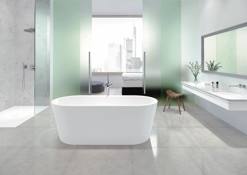
    Bathroom specialist Bette has launched a new fitted bath with a modern lightness and extremely slim rim.

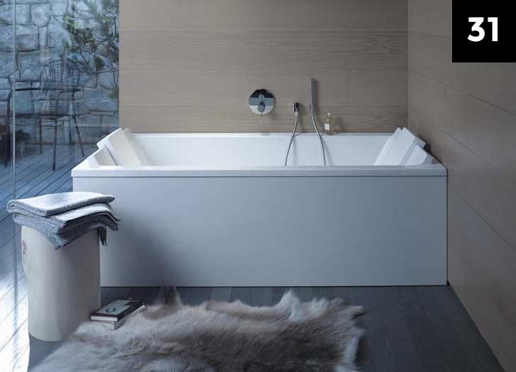
    The new BetteStarlet Spirit is an oval shaped bath embedded in a rectangle, in glossy, durable glazed titanium-steel. It features a rim of only 8mm in height, a symmetrical design, delicate edges and tight corner radii.

    As the BetteStarlet Spirit has almost rectangular corners, it is also ideal for flush installation into, for example, tiles.

    Fine aesthetics and highly practical

    The lying surface of the bath, which is available in 1700 × 750 or 1800 × 800mm, is generously proportioned and, thanks to having the drain in the middle, is also extremely comfortable for bathing on both sides. The stable, glazed titanium-steel surfacemakes the bath suitable to be used for showering and can also be made non-slip, by the addition of BetteAnti-Slip.

    The broad bath rim provides comfortable support for the lower arms, but also offers plenty of storage space for accessories and amenities. Impact-resistant, scratch-proof and heat-resistant glazed titanium steel can also cope with glasses and bottles without losing any of its luminosity. The fact that the easy-clean material also stores heat and is pleasant to the touch further enhances the comfort when bathing.

    The BetteStarlet Spirit bath is available from August 2018 in glossy white and a large number of other colours.

    London Southbank

    designjunction announces new home for 2018

    1024 679 Hamish Kilburn

    designjunction is set to transport to the cultural hub of London’s South Bank with a showcase of world-class design for the annual London Design Festival in September 2018.

    Now in its eighth year, designjunction has firmly established its reputation for transforming some of the most exciting and ambitious locations in London into premier design destinations, attracting 28,000 visitors in 2017. In collaboration with Coin Street Community Builders (CSCB) – a local social enterprise which owns and manages Oxo Tower Wharf, the Doon Street site and the Riverside Walkway – designjunction will present an exhibition of world class design in this world class location.

    Centrally located and surrounded by iconic London architecture, this landmark destination attracts an estimated 25 million visitors each year. Through the work of CSCB, the area has been transformed from a largely derelict, 13-acre site into a thriving mixed-use neighbourhood.

    “designjunction has always sought to identify architecturally stunning backdrops to present the best global design, ” said managing director of designjunction Will Sorrell. “By working with CSCB, we’re putting our brands in the centre of a thriving mixed use neighbourhood, whilst providing visitors with a unique show experience. We look forward to contributing to this exciting area.”

    From September 20-23, designjunction will present hundreds of product launches, boutique pop-up shops, bespoke installations, tempting street food and purpose-built bars across three key exhibition spaces; Oxo Tower Wharf, the Doon Street site and Riverside Walkway.

    The Doon Street site will house 200 international design brands and premium pop-up shops. This purpose built super-structure will be the largest and most ambitious build designjunction has ever undertaken presenting furniture, accessories, lighting and homewares in dedicated zones across two floors.

    The Riverside Walkway will showcase a series of outdoor installation projects, whilst Oxo Tower Wharf will host major brand activations, exhibitions and experiential events. designjunction is thrilled to join 25 designer-maker stores, with the Oxo Tower Wharf already playing home to renowned brands including Innermost, Black + Blum, Bodo Sperlein and many more.

    “We’re delighted to be collaborating with designjunction for the London Design Festival this September,” commented Sophie Cain, Design Curator at Oxo Tower Wharf. “Last year we were proud to host a landmark project, and we’re excited to be building on Oxo Tower Wharf’s reputation for design excellence and extending this into the wider Coin Street area.”

    designjunction will showcase a stellar line-up of brands in 2018, including leading international names such as Erik Joergensen, New Tendency, Northern, Gemla, James Burleigh, Norr11, VitrA, Icons of Denmark and LSA alongside emerging designers Emma Cerasulo, Studio Anansi, Woven Form, Ystudio and Alex Orso.

    More details to be announced soon.


    Large, spacious living area

    Meliá Hotels International opens Sol House Bali Kuta

    800 470 Hamish Kilburn

    The hotel becomes the second operated under the Sol House brand in Bali and Indonesia, marking Meliá Hotels International’s continued commitment to expansion in the region…

    Meliá Hotels International has the opened Sol House Bali Kuta. Originally known as Kuta Beach Club, the property underwent a total refurbishment to become part of the Sol House brand.

    Located in the heart of Kuta, the hotel will cater to younger travelers who are looking for a sunshine getaway with a contemporary, lively atmosphere and beach club vibe. The Sol House brand is intrinsically connected to music and will integrate this into the Bali Kuta property through seasonal events for both hotel guests and outside visitors.

    The hotel provides sleek, contemporary accomodation with private balconies offering fabulous views of the property’s gardens and outdoor pools. Sol House Bali Kuta boasts two restaurants, Food Factory and Play Bar, which provide modern dining experiences and, in the case of Play Bar, an extensive cocktail list.

    Modern and spacious dining area

    Bernardo Cabot Estarellas, Senior Vice President of Meliá Hotels International Asia Pacific, said: “It is thrilling for us to expand our Asian presence with the opening of Sol House Bali Kuta and to strengthen the Sol House brand, which assimilates perfectly to the area. With the brand’s energetic, friendly atmosphere and the popularity of Meliá Hotels International, we are well positioned to continue to capture the flourishing Balinese market.”

    “Sol House Bali Kuta offers a unique atmosphere filled with enthusiasm for music and an innovative design led experience,”said Alvaro Berton, General Manager of Sol House Bali Kuta. “We will focus on maximising the beautiful surrounds of the property and bring to life the dynamic spirit of Bali for our guests.”

    Blending Spanish hospitality with Balinese warmth, Sol House Bali Kuta opens as what is said to be the perfect holiday destination to meet new people, explore and unwind on the beautiful island of Bali.


    Country-house style dining area

    Hilton Puckrup Hall completes contemporary F&B renovation

    800 533 Hamish Kilburn

    The hotel’s F&B areas in the Cotswolds was designed by Central Design Studio…

    Inspired by the colours and textures of the nearby Cotswolds countryside with a contemporary spin, Hilton Puckrup Hall has completed an F&B renovation that was led by Ian Haigh, creative director Ian Haigh of Central Design Studio.

    The aim of the renovation was to create a restaurant and bar with a modern, British feel.

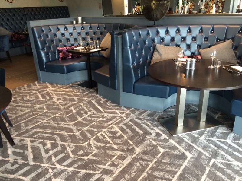
    Olive wallcoverings and royal blue carpets

    Designed to resemble more of a country house rather than a hotel public area, the restaurant is a celebration of local British produce, without being old-fashioned or stuffy. Modern paintings adorn the walls, and quality crafted furniture and upholstery add to the sense of place.

    The bar has an informal character whatever the time of day. Dark woods and a deep indigo colour scheme complement tactile British fabrics and finishes, again with colourful and curated artwork playing a part.

    Many of the furniture and lighting pieces were designed bespoke by Central Design Studio, in close collaboration with various artisans and manufacturers in the UK and Ireland. In addition, the artwork was curated and commissioned especially for the project, including the large-format paintings that hang in the restaurant, using up-and-coming illustrators and artists.

    Light, airy interiors in dining area

    “The challenge with this project was to make the space feel contemporary, without compromising on that cosy and comfortable atmosphere,” said Haigh. “The artwork in particular really helps this, as it brings a  subtle energy and freshness to the design.”

    Accents of lightly antiqued brass add to the sense of familiarity and warmth, and run throughout the whole design. This is highlighted by two large, hand-crafted brass screens made in South East London. Designed by Central Design Studio in collaboration with Creative Metalwork, they are a real feature and talking point and cleverly used to divide up the restaurant space.

    High-quality Axminster carpet was chosen for the floor finish in both the restaurant and the bar, again to a tailored design developed by Central Design Studio and Brintons. The pantry on the other hand, used primarily for breakfast service, has more of a country kitchen aesthetic to it with a limestone-effect floor and lighter colour scheme.

    Key Suppliers

    Main Contractor: Zenith
    Joinery Contractor: Wreake Valley
    Lighting (bespoke chandeliers): Northern Lights
    Brass screens: Creative Metalwork
    Furniture (bespoke banquettes): Craftwoord
    Furniture (general): Contract Chair Co. / Inside Out
    Carpet: Brintons

    soft interiors in luxury guestroom

    Award-winning Edinburgh hotel reveals newly refurbished guestrooms

    800 532 Hamish Kilburn

    Interior designer Nigel Howard has transformed 49 guestrooms in Edinburgh..

    The Bonham Hotel in Edinburgh has unveiled 49 individually styled and refurbished guestrooms and suites as part of a multi-million pound investment.

    The interior design of each guestroom was led by leading London- and Dublin-based interior designer Nigel Howard, who has converted the areas sensitively to give an appropriate nod to the hotel’s Georgian architectural heritage.

    The individually styled guestrooms, with soft textures and tones, blend traditional period elements with the very best of modern fabrics and finishes. High ceilings and the magnificent period detailing are further enhanced with a royal blue and deep plum colour palette interweaved with gold and silver threads.

    Each room makes full use of the floor to ceiling windows which bathe the rooms in natural light and provide exquisite views across the city. “It’s always satisfying to work on a period property where you can breathe new life into its interiors through sophisticated design yet while maintaining all the elements of the building that should be celebrated,” said Nigel Howard. “Our brief was to design luxury guest rooms that complimented the history of the building yet provided for modern hotel living. Getting the balance between new and old was the key to achieving a successful outcome.

    © Sandy young Photography

    Douglas Campbell, general manager of The Bonham, said: “This is a new chapter for the hotel and one which we are all very excited to be part of.

    “The Bonham has claimed the hearts of so many of our guests who return time and time again and this multi-million pound refurbishment has seen our already stunning hotel, transformed into a truly sophisticated property.

    “We are committed to offering our guests a truly one-of-a-kind experience and look forward to welcoming our regular visitors and new guests near and far to experience a taste of elegance here at The Bonham.”

    Elsewhere in the hotel, the restaurant will also undergo refurbishment as well as the popular Consulting Bar over the course of the year.

    Nigel continued: “The team at Nigel Howard Creative are now looking forward to the redesign of the ground floor public spaces.  Incredible spaces that require meticulous design focus.”

    The Bonham, set within a Victorian townhouse in a quiet, leafy crescent in the west end of Edinburgh, is considered as one of the city’s hidden gems.

    The four-star luxury hotel – awarded Best Boutique Hotel by LateRooms.com ‘Simply the Guest’ awards – offers one of the best city centre venues without the usual hustle and bustle.

    Suite with stunning sea view

    Caribbean: Eden Rock – St Barths on track for December reopening

    800 527 Hamish Kilburn

    The hotel is undergoing an extensive renovation and restructuring, following the impact of Hurricane Irma in September 2017…

    Eden Rock – St Barths, the Caribbean legend in the prestigious Oetker Collection, has announced that it will reopen its doors on 22 December 2018 after an extensive renovation and restructuring following the impact of Hurricane Irma last year.

    While the majority of the Caribbean (nearly 70 per cent) was not damaged by Hurricane Irma and Maria, islands such as St Barths unfortunately were. Despite this, St Barths has been announced as ‘open’ since November last year, and the reopening of Eden Rock is a small yet significant milestone to amplify the island as a unique Caribbean hotspot once more.

    Owner of Eden Rock – St Barths Jane Matthews has been central within the redesign, working with firms such as Martin Brudnizki Design Studio (MBDS) London, Mercure Engineering & Consulting Paris, Architectonik St Barths and Eden Rock Design. The collaborative group has redesigned and refurbished the entire property with a fresh look and feel, while preserving the heritage and incomparable atmosphere for which Eden Rock is loved.

    Throughout the rebuilding process, Fabrice Moizan, General Manager demonstrated the work-rate and optimism that have long been associated with Eden Rock: “We sought an opportunity following a disaster,” said Moizan. We took a different perspective on the situation and now Eden Rock – St Barths is coming back stronger and better than before. Both the hotel and the team are completely refreshed, full of energy and ready to rock and roll!”

    The design brief was to create an even more laidback Eden Rock style. All rooms, suites and villas have been renovated, and an additional two suites with spacious private pools have been added ahead of a further three brand new suites to be revealed on the very top of the rock in 2019. The hands-on Matthews has also expanded her art collection within the property, and takes pleasure in introducing guests to wonderful new talent via the New York Academy of Art.

    MBDS will be redesigning the famous Villa Rockstar, Villa Nina and the resort’s restaurants. The new buildings will retain St Barths character with its relaxed beach style. The Sand Bar, for example, has been transformed to bring the outdoor indoors and remains culinary heart of the hotel.

    The new Rémy Room and Bar is named after Eden Rock’s original owner, paying tribute to his pioneering spirit. A casual beach bar has been added, as well as a new sun deck with shaded loungers.

    The reopening of Eden Rock – St Barths is another example showing that the Caribbean is very much open for business.

    Top 5 stories of the week

    800 800 Hamish Kilburn

    Here are our top five stories of the week…

    1. Gleneagles unveils Ochil House for meetings and events
      Open kitchen and pantry

      Our top performing story of the ween, the glorious playground of country pursuits Gleneagles, located just 40 minutes from Edinburgh, has launched Ochil House, a unique new meeting and events space.
    2. The Hotel Designs Brit List is back, this year launching 6 new awards
      Logo for Brit List Meet Up
      Following much anticipation in the industry after launching last year, Hotel Designs Brit List will return in 2018 with an evolved concept that will further amplify the best hotel design influencers in Britain. This year, as well as celebrating the Top 25 of the most influential hoteliers and the top 25 of the most inspirational interior designers, The Hotel Designs Brit List will also launch six coveted awards that are up for grabs.
    3. Grand Hyatt debuts in Abu Dhabi 
      Exterior shot of the hotel
      Hyatt Hotels has announced the opening of Grand Hyatt Abu Dhabi Hotel & Residence Emirates Pearl, the first Grand Hyatt hotel to open in the United Arab Emirates’ capital city, Abu Dhabi.  The luxury property combines iconic brand elements and awe-inspiring design and architecture with a central location in the capital that offers easy access to world-class shopping, dining and cultural events.
    4. Westin Hotels & Resorts to debut in the UK
      Rendering of the hotel's pool
      Poised to set a new standard for wellbeing in the Heart of the Capital, The Westin London City, designed by Dexter Moren Associates, is scheduled to open in 2020…
    5. Swire Hotels announces official opening of The Middle House Shanghai 
      Large chandelier in front of green wall surfaces in lobby
      The latest addition from Swire HotelsThe Middle House, provides guests with an intimate and urban sanctuary in Shanghai, one of the world’s most dynamic cities in the world.
    Geometric patterns on the wallcoverings in the pool area

    W Hotels returns to Australia with the opening of W Brisbane

    800 450 Hamish Kilburn

    Interior design agency Nic Graham & Associates allows W Brisbane to rises in the Sunshine State to open 312 guestrooms and 32 luxe suites…

    The heat is on as W Hotels, part of Marriott International, re-enters Australia with the opening of W Brisbane. Owned by Shayher Group, W Brisbane is a vibrant addition to the Sunshine State, situated overlooking Brisbane River. The new hotel delivers a mix of fast-paced urban style and modern design all with a decidedly cheeky Aussie point of view.

    Brisbane is among Australia’s fastest growing cities, an ideal destination for W to bring its new/next lifestyle. Located riverside in the city’s Central Business District, the hotel celebrates the history of the famed region. It embraces Brisbane’s connection to the Australian identity and iconic elements of Queensland’s flora and fauna with a laid-back vibe and a playful nod to ‘Brisvegas’.

    W sign outside hotel

    Image credit: Marriott International Hotel

    “Brisbane is a dream destination – year-round sun and an outdoor lifestyle – it’s quickly evolving into one of the world’s greatest cities which is why W is kicking off the brand’s return to Australia here in the Sunshine State,” said Bruce Ryde, Vice-President for Luxury Brands and Brand Marketing, Marriott International Asia-Pacific. “Brisbane’s bustling riverbank is a hotspot for travellers who can’t wait to explore this dynamic city and South East Queensland, a perfect match for W Hotels’ bold design and playful, contemporary approach to luxury.”

    Renowned Australian interior design agency Nic Graham & Associates has brought its innovative design and custom furnishings to W Brisbane. The hotel brings to life the theme of “A River Dreaming,” an ode to its prime locale on the banks of the iconic Brisbane River and the visual connection to Brisbane’s famed arts precinct. Modern manifestations of Brisbane’s river, which has in recent years become the buzzing epicentre of the city’s social scene, are featured prominently throughout the hotel, weaving in influences from Australia’s indigenous roots and colonial heritage.

    Contemporary interiors in the shop

    Image credit: Marriott International Hotel

    “There’s nothing quite like Australia, a diverse country that is not only famous for its natural wonders but also for its celebration of diversity and multiculturalism,” said Victor Clavell, Area Vice President, Luxury, Asia Pacific Excluding China, Marriott International. “Touted as Australia’s new capital of cool with its edgy urban spaces and burgeoning passions for music, fashion and design, Brisbane is an ideal destination for the W brand.”

    Arrival expereince

    From the moment of arrival, guests are greeted by the hotel’s sensory environment. A staircase of timber river reeds leads guests to the Welcome Desk and the Living Room (the W brand’s take on the traditional hotel lobby). Earth tones, sedimentary layers, frayed edges and raw beauty associated with the Australian outback start from the arrival entrance and continue throughout the hotel’s public spaces. These organic formations draw out bold and colourful artwork from celebrated Australian artists including John Nicholson, Lucas Grogan and Reko Rennie. The hotel’s Living Room, the pulse of the W scene in Brisbane, shows off pools of colour throughout intricately designed rugs while complementing walls echo the flora and fauna of Brisbane’s sub-tropical environment. Benchtops and bar fronts are enhanced with forms inspired by curvilinear shapes and nearby water-worn clifftops. Blade grass border the expansive open space to immerse guests in an innovative interpretation of nature.

    Modern guestroom

    Image credit: Marriott International Hotel

    W Brisbane boasts 312 guestrooms including 32 lux suites all brimming with river views and the latest in technology and entertainment. The rooms prominently feature a white wall inspired by VJ wall panels found on traditional ‘Queenslander’ homes; a cheeky nod to Australia throughout and a 10-gallon drum “outback bath experience.” The penultimate Extreme Wow Suite (the brand’s modern interpretation of the traditional presidential suite) on Level 33 showcases a limitless panoramic vista from the river to the mountains and beyond.

    Plush bathroom

    Image credit: Marriott International Hotel

    Guests can take a piece of their stay home from W The Store by Becker Minty, stocked with a treasure chest of hidden gems and collections including handbags, artwork, home decor and fine jewellery.


    “W Brisbane is the first of its kind in Australia,” said Haldon Philp, General Manager, W Brisbane. “From the Whatever/Whenever service that drives the W brand, delivering whatever our guests want, whenever they want it, to event programming centred around Design, Music, Fashion and Fuel (the brand’s unique take on fitness) to coveted partnerships such as Three Blue Ducks, now is the time for a hotel of this calibre to come to Brisbane as the city enjoys its coming of age.”

    Guests can make a splash poolside at the WET® Deck rooftop bar as they soak up the heat on stylish sun lounges. The pool’s sparkling surface reflects a mosaic of tiles reminiscent of the shadows cast by palm fronds. Day or night, guests can revel in Queensland’s supreme riverside views with curated cocktails, Champagne, live DJs and Aussie barbeque fare.

    Elevated Events

    At W Brisbane, 1,100 square-metres of event space set the stage for electric and exhilarating meetings and events. The 595-square-meter Great Room captivates on a grand scale as the sprawling venue celebrates the serpentine shape of the river and its ripple effect throughout the design. The ceiling sparkles with 260 twinkling lights reminiscent of a clear Queensland outback starry night. Cutting edge statement lighting and four-metre LED wall panels will help guests showcase captivating presentations and displays and W Brisbane stands as the sole hotel in Queensland to boast these world-class audio-visual facilities. Additional meeting rooms include the versatile Studios and Strategy Room that showcase fab river views and glorious Queensland sunshine with floor to ceiling windows and private balconies.

    Exterior shot of the hotel

    Grand Hyatt debuts in Abu Dhabi

    800 465 Hamish Kilburn

    Grand Hyatt Abu Dhabi Hotel & Residence Emirates Pearl opens its doors in the United Arab Emirates…

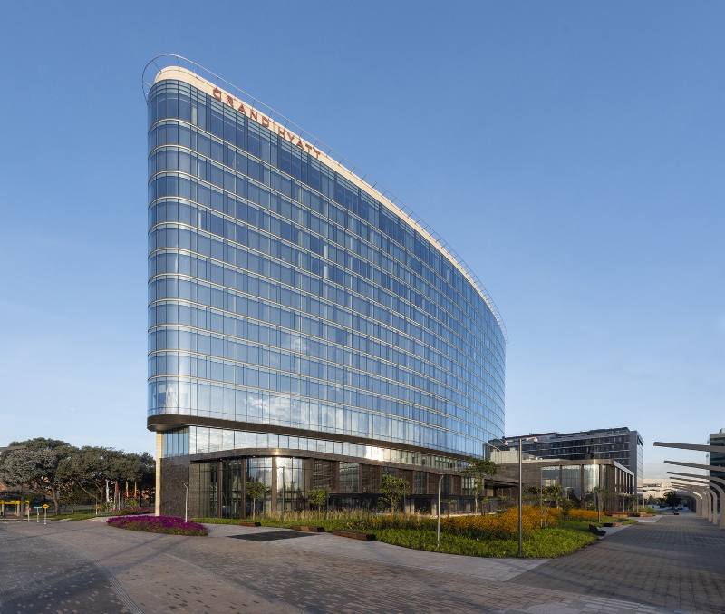
    Hyatt Hotels has announced the opening of Grand Hyatt Abu Dhabi Hotel & Residence Emirates Pearl, the first Grand Hyatt hotel to open in the United Arab Emirates’ capital city, Abu Dhabi.  The luxury property combines iconic brand elements and awe-inspiring design and architecture with a central location in the capital that offers easy access to world-class shopping, dining and cultural events.

    As the second Grand Hyatt hotel in the United Arab Emirates, joining Grand Hyatt Dubai, the Abu Dhabi property is a noteworthy addition to Hyatt’s steadfast growing hotel portfolio in the Middle East. The hotel is currently operating with a limited room inventory and a limited number of dining options. All other facilities, including the Grand Club, are expected to be available for guests in late 2018.

    The hotel is located along the charming Corniche, offering generous beachfront promenades and stunning landmark city views that feature famed UAE landmarks, including Emirates Palace, the Presidential Palace and The Founder’s Memorial.

    “We are excited to open Grand Hyatt Abu Dhabi Hotel & Residence Emirates Pearl today,” said Julien Gonzalvez, general manager of the hotel. “This opening marks an important milestone in Hyatt’s growing portfolio in the Middle East. The property is set to become an iconic and sought after venue for both local and international visitors alike.”

    “Today, we are proud to open our new landmark hotel and residences, a destination with a premium location and hospitality excellence that will strongly contribute to the growing, high-quality tourism and travel sector in the UAE capital,” said Ahmed Seddiq Al Mutawaa, chairman of EPDI, the owners of Grand Hyatt Abu Dhabi Hotel & Residences Emirates Pearl. “With the utmost dedication, our team has designed and built an exceptional and timeless luxury property which celebrates our local culture and history, and incorporates features such as the story of the natural pearl, a historical and famously symbolic Abu Dhabi treasure.”

    Guestroom with UAE inspired details

    Accommodations

    Meticulously designed with bold and vibrant features, the property houses 332 guestrooms, 36 lavish suites, including the Presidential and Palatial Royal Suites, and 60 full-service one and two-bedroom residences, ranging from 968  to 1500 square feet, each thoughtfully conceptualized with key locally inspired details. For those residing in Suite or Club floor, additional exclusivity can be discovered on the 26th floor, as the Grand Club Lounge will provide a luxurious living space with sweeping views of the city’s skyline and the glittering Arabian Gulf.

    Dining

    The hotel is home to a variety of signature bars and restaurants, each offering a distinctive culinary journey with the promise of delivering truly memorable dining experiences for hotel guests and locals alike. Now open, Verso is an authentic Italian Trattoria, engaging diners in the Italian way of life with authentic flavors in a colorful and lively ambience, and the elegant Pearl Lounge where guests can enjoy a fine treat or an opulent afternoon tea.

    Meetings and events

    Grand Hyatt Abu Dhabi Hotel & Residence Emirates Pearl’s flexible event space totals more than 50,500 square feet , including 12 fully integrated meeting rooms, all of which are located on the same floor and feature private outdoor terraces and natural daylight. The 11,194 square foot Al Bateen Ballroom, with a separate entrance, VIP room, bridal suite and pre-function space, provides an ideal location for social events, special occasions and weddings of all sizes, complete with dedicated staff to assist in planning and execution.

    Wellbeing and recreation

    Grand Hyatt Abu Dhabi Hotel & Residence Emirates Pearl offers a stunning 164 foot outdoor infinity pool and the well-being facilities extend over an entire floor with spacious outdoor terraces, providing a fully immersive well-being experience. The Lum’a Spa will feature dedicated separate male and female areas with private showers and changing areas. Spa highlights include specialty treatments using local techniques, signature Hammam, sauna, steam bath and relaxation rooms.

    Modern guestroom with views over Falmouth Bay

    Merchants Manor in Falmouth, England, unveils new residences

    781 434 Hamish Kilburn

    Bert & May and Helen Hughes have thoughtfully added two new apartments to Merchants Manor in Falmouth…

    Merchants Manor Hotel & Spa in Falmouth has opened the doors to two luxury eco-friendly residences. Located in the grounds of the hotel and spa, the self-catered living spaces take inspiration from British design, with subtle reference to the Cornish coast.

    The residences, called Landlubber and Lookout, were designed by acclaimed designers Bert and May in collaboration with award-winning interior designer Helen Hughes. Accommodating one to four people, each apartment features two bedrooms, two bathrooms, kitchen living space, private terrace with jacuzzi hot tub and separate entrance. Guests are able to still enjoy all of the facilities in the main hotel including the outstanding Rastella restaurant, swimming pool, Technogym and luxurious Linen Room spa.

    “Helen wanted to create individual identities for each apartment, ” said Lee Thornley, Founder of Bert & May, when speaking about the design. “We’ve used a variety of industrial materials including brass and wood as well as historic artisan tiles, when combined they all complement each other to offer a modern yet rustic feel.”

    Each luxury residence provides an earthy feel with timber frames, organic shapes and quirky features all drawing inspiration from the fresh Cornish countryside. Floor to ceiling windows capture the picturesque views of Falmouth Bay and allow natural light to flood the interior spaces.

    Helen Hughes added: “As part of an ongoing refurbishment aimed to establish Merchants Manor as a destination boutique hotel and spa I was delighted to work with my client again on this exciting new addition.

    “Selecting individual palettes for both apartments from the beautiful Bert & May ranges was the starting point of the design process. Once defined the spaces were furnished with a stylish mix of vintage, new and found pieces that were upholstered in a vibrant mix of bold and colourful fabrics. Slight nods to the coastal location and shipping history of Falmouth complete the look.

    “I’m delighted the apartments have been given a 5-star rating since completion, some of only a handful in Cornwall.”

    The Lookout residence welcomes guests with its secluded 22-metre glazed terrace complete with Jacuzzi hot tub overlooking the breathtaking Falmouth coastline. In the bedrooms, nautical interiors reflect the idyllic sea views with a colour scheme that combines calming tones of cool blues against bright corals. Lookout’s bedrooms feature antique hooks that were recovered from the private quarters of Queen Mary when she sailed around India and Asia as part of a coronation tour with King George V. Quirky touches continue throughout the property and include a timeless wardrobe in the bedroom as well as antique mirrors attained at auction from the estate of a renowned artist in Helford.

    Both bedrooms feature deep emerald headboards and hand furnishings, whilst illustration and prints from acclaimed local artist and print maker Lou Tonkin adorn the rustic wooden walls.  Landlubber also has two bathrooms – both with wet room showers.

    Referencing the hotel’s Cornish sub-tropical garden, the Landlubber residence offers a green haven with its homely artisan tiles in the kitchen living space and reclaimed timber cladding. The open plan living and kitchen area provides plenty of space for guests to relax, whether it’s curling up on the sofa with a book or enjoying a home-cooked meal prepared by the hotel’s Chef Patron, Hylton Espey.

    Commenting on the project, owner Nick Rudlin said: “We are delighted to unveil our new spaces to guests. Each residence is eco-friendly and designed to reflect the relaxed beachy surroundings of the Falmouth coast.  This has been supported by the AA who have awarded the spaces the highest accolade of 5 gold stars making them one of only a handful in all of Cornwall.

    “The new homes are perfect for those looking for the best of both worlds, offering unparalleled luxury of a private holiday escape, with the ability to dip in to all the amazing amenities that a boutique hotel and restaurant has to offer.”

    Suppliers list (furniture and interiors)

    • ROCKETT ST GEORGE
    • Loaf
    • Maison Du Monde
    • Trinity Marine
    • Cox & Cox Mail Order Ltd.
    • Holloways of Ludlow
    • Tinsmiths
    • Wayfair LLC,
    • Ferm Living
    • Dowsing & Reynolds
    • STYLE MATTERS
    Futuristic bathroom

    Supercar design influences luxury bathroom styling

    717 475 Hamish Kilburn

    The sweeping lines and curves that you normally associate with the design of a supercar, coupled with a material that is synonymous with luxury cars, is coming to a bathroom near you…

    The Hong Kong-based Alvarae Design Studio is working with award-winning designer Charles Wan to create a number of unique bathroom styles that replicate the precision and design of a supercar.

    Working predominately in carbon fibre and taking design cues from the world of the supercar, Wan is currently developing a number of unique bathroom styles for each of the guest suites at the exclusive private VIP members club in northern China.

    “As China’s premier integrated automobile experience destination for entertainment, retail and racing we felt that it was important that members connect and engage with the brand experience throughout their visit and what better place is there than relaxing in a custom designed luxury bathroom,” said Charles Wan from Alvarae Design Studio.

    Each bathroom will be created with the craftsmanship of an artisan keen to meet any customer desire with the qualities of manufacturing to the very highest technical standards. Each is styled to combine art in design with leading edge technology so as to create the ultimate user experience in a world where the ordinary is not acceptable.

    The thoughtfully contemporary design will enable each piece to be a focal point that is defined by both the excitement it creates and for its undeniable visual appeal, which is a reflection of the integrity of the designer to create luxury, yet maintain a minimalist aesthetic.

    Each bathroom will have a number of unique features and finishes including; the La Baignoire stand alone bath (that changes colour to reflect your mood) along with exclusively designed his & hers matching wash hand basins.

    Customised TOTO Neorest with the silhouette of the seat picked out using a soft glow LED lighting, which creates a stunning ambiance and of course helps guide you safely and comfortably on even the darkest of nights.

    Custom made shower trays and seating together with a whole host of individually created colour coordinated accessories all designed to make for the perfect stay and brand engagement.

    Light, airy room with a subtle colour scheme

    Multimillion pound renovation completes at Apex Grassmarket hotel

    800 534 Hamish Kilburn

    A multi-million pound refurbishment of leading Edinburgh hotel, Apex Grassmarket, has been completed, with guests set to enjoy a warm welcome in luxurious surroundings within the city.

    The investment – which is part of a £15 million package of improvements across the Apex Hotels portfolio throughout 2018 – saw all 169 bedrooms transformed within the stylish hotel, located in the heart of Edinburgh’s Old Town.

    The revitalised bedrooms, designed by in-house designer Emma Franks, now have a calm, Scandinavian feel with contemporary grey patterned carpets and strong contrasts between light and dark – creating a cosy atmosphere for guests to unwind and get the perfect night’s sleep.

    As part of Apex’s #WarmerWelcome campaign, each bedroom now comes with a new in-room handbook full of helpful tips from wellbeing expert and Apex ambassador Celynn Morin, helping guests to rejuvenate, focus or relax, and get the most out of their stay.

    Guests in executive rooms and above will also be able to enjoy an in-room luxury Elemis pillow spray to help aid sleep and a selection of teas such as camomile to relax or green tea for rejuvenation alongside healthy snacks including tasty sea salt popcorn and luxurious dark chocolate cocoa pouches.

    Alan Taylor, General Manager of Apex Grassmarket Hotel, said: “With tourists attracted to the city for a wide range of world-renowned festivals and a popular conference destination, the seven figure refurbishment will ensure that our guests enjoy Apex’s signature warmer welcome in stylish and modern surroundings.

    “The work carried out has been fantastic and we are proud of the new look, so much so we are looking forward to welcoming both visitors from the area and further afield to enjoy our new and enhanced offering within Edinburgh’s Old Town.”

    Alongside the revitalised bedrooms, the hotel’s decking area, with beautiful views towards Edinburgh Castle, is set to be revamped this year – providing guests with world class views to enjoy a drinks and dining experience like no other.

    Apex Hotels’ investment comes following another consecutive year of strong growth for 2016-17, with a six per cent rise in turnover – up to £65m from £61.3m the previous year.

    As part of the £15 million refurbishment programme, improvements are also underway to two further Edinburgh Apex Hotels – Haymarket and Waterloo Place – as well as Apex Temple Court Hotel in London.

    Multi-million pound refurbishment works at Apex City Quay Hotel & Spa and Apex City of London Hotel have now been completed.

    Rendering of the hotel's pool

    Westin Hotels & Resorts to debut in the UK

    600 400 Hamish Kilburn

    Poised to set a new standard for wellbeing in the Heart of the Capital, The Westin London City, designed by Dexter Moren Associates, is scheduled to open in 2020…

    Marriott International, Inc. has announced plans to debut the Westin brand in the United Kingdom. Owned by 4C Hotel Group and managed by RBH, The Westin London City is set to open in 2020 and will boast a prime riverfront location in the heart of the City of London.  This hotel signing illustrates how the global demand for well-being continues to propel Westin’s growth around the world, with recent openings in Australia and upcoming debuts in Malaysia and the Maldives.

    “Transforming the way travellers experience wellness continues to be a powerful proposition for Westin, and one that has become increasingly important as people integrate well-being more holistically into their lifestyle,” said Brian Povinelli, SVP & Global Brand Leader, Westin Hotels & Resorts. “We are thrilled to not only debut the brand in London, but also to open this marquee hotel on the iconic River Thames, where travellers and locals alike are staying active every day.”

    The Westin London City will be a key part of the redevelopment of the former Queensbridge House site, as well as an independently operated destination restaurant. The site stretches from Queenhithe Dock – the oldest in London – and runs north to south, bridging across Upper Thames Street and giving it a prominent position over one of the primary arterial routes through the City of London. Highly visible from the South Bank, the hotel will also benefit from panoramic views over the River Thames and will complete the northern riverbank walkway between the Tower of London and Millennium Bridge.

    “This is an exciting chapter for the Westin brand,” said John Licence, Vice President Premium & Select Brands, Marriott International Europe. “It is clear that there is a strong appetite for the brand’s wellness positioning, innovative programming and premium accommodations. With its commanding riverfront location in the commercial and historic heart of the City of London, The Westin London City is sure to offer a reviving and memorable stay for guests in one of the world’s most dynamic cities.”

    Led by international architecture and interior design practice Dexter Moren Associates, the thoughtfully designed hotel is fluid and sculptural with a biophilic-focus, suggesting that a connection to nature enhances well-being. Upon arrival, guests enter into an atrium space that is at once open and airy, yet residential and intimate.  The lobby leads into a riverside bar and restaurant, which opens onto the new public walkway affording spectacular views across the river towards Shakespeare’s Globe and the South Bank.

    “We have been working on this project for almost a decade and it’s great to finally be on site with a new-build hotel on such a landmark river frontage City of London site, providing a new public link between St Pauls and the Thames,” said director Dexter Moren. “Of the many hotel projects we are delivering in UK & Internationally this ranks as one of the most exciting.”

    Associate Director Neil Andrew (lead interior designer on the project) said: “DMA Interiors are appointed to design the guest rooms and public areas which include the lobby areas, executive lounge, conference area, spa, restaurant and bar. The Westin brand has been interpreted in a modern and minimal approach. Textures are introduced via natural materials and layered fabrics and refined palettes present an air of sophistication and respect the views to the River Thames beyond.”

    The hotel’s 220 guest rooms, including 29 suites and Presidential Suite, are designed to offer guests a nature-inspired respite in the centre of a bustling city, expertly balancing a calming palette of natural colours with contrasting tones, textures and materials.  All rooms will feature Westin’s signature services and amenities, such as the world-renowned Heavenly™ Bed and reviving Heavenly™ Bath experience.

    The hotel’s prominent location, combined with excellent airport, train and underground links, will appeal to the business and meetings market. 830m² of ultra-modern meeting and event space will be available, including a Junior Ballroom and four meeting rooms, as well as a 24-hour business centre.


    Large chandelier in front of green wall surfaces in lobby

    Swire Hotels announces official opening of The Middle House in Shanghai

    800 600 Hamish Kilburn

    The Middle House, located in the heart of Shanghai within bustling HKRI Taikoo Hui building, has officially opened embracing a ‘modern-day Shanghai’…

    The latest addition from Swire Hotels, The Middle House, provides guests with an intimate and urban sanctuary in Shanghai, one of the world’s most dynamic cities in the world.

    “We are really excited about The Middle House. Each of our properties embraces the spirit of its home city, and The Middle House exemplifies modern-day Shanghai,” said Brian Williams, Deputy Chairman of Swire Hotels. “The Middle House is our fourth hotel in The House Collective, which welcomes world travellers who seek a luxurious yet unique and personalised experience during their stay.”

    [easingslider id=”32022″]

    The Middle House adopts an Italian vision blended with a local twist and modern aesthetic to standing elegantly above the city skyline. The spirit of modern-day Shanghai is palpable through the 111 modern studios, varying from 50 sqm to 100 sqm, a gallery suite and a Penthouse – all influenced by celebrated architect Piero Lissoni‘s sumptuous and sophisticated interior design. The design draws inspiration from the city’s rich heritage of craftsmanship and culture, marrying minimalist style with classical Shanghainese elements. Throughout the property, guests will find cultural touches and artwork inspired by Shanghai.

    The Middle House also features a 660sqm top-floor Penthouse overlooking fashionable Nanjing West Road. The immaculately designed two-bedroom suite offers private terraces, a lounge and an exclusive event space with a private kitchen – an ideal venue to celebrate special occasions and host dinner parties and product launches.

    Wooden staircase

    The hotel’s residences range from 55 to 110 sqm. An example of Lissoni’s bold lines, sleek silhouettes and modern take on the city is found in one of the apartment’s wooden staircase, which spiral down rough and rustic wall surfaces.

    The Middle House also presents a mix of cuisines and dining options with three gourmet restaurants and bars: Café Gray Deluxe, Frasca and the soon-to-open Sui Tang Li.

    Open kitchen and pantry

    Gleneagles unveils Ochil House for meetings and events

    800 555 Hamish Kilburn

    Inspired by original private members clubs of its time, Ochil House in Gleneagles is a collection of exclusive use spaces for meetings and events and the latest strand of the hotel’s investment programme. Editor of Hotel Designs Hamish Kilburn was among the first to experience…

    The glorious playground of country pursuits Gleneagles, located just 40 minutes from Edinburgh, has launched Ochil House, a unique new meeting and events space.

    The 850-acre estate, which has been a destination for gatherings and historic meetings since 1924 – including the 31st G8 summit in 2005 – is a place of lively celebration and animated conversation. Ochil House, the latest strand of the hotel’s investment programme, pays homage to the inventors, dreamers, pioneers and partiers who helped shape Scottish history.

    Inspired by the original private members clubs, Ennismore Design Studio has carved out each of the six rooms available to hire to create light, open and refined meeting spaces. Named after their original rooms in the hotel – including The Card Room, The Reading Room, The Writing Room and The Broadcasting Room – these spaces give an appropriate nod to the hotel’s storied history.

    “Ochil House brings that warmth, heritage and vivacious spirit to life,” said Charlie North, design director at Ennismore. “The overarching ambition of the design was to inspire, arouse ideas and stimulate conversation – encouraging guests to look around, explore and discuss, rather than sit at a table in a blank function room.” He added: “It’s a reinvention of the meeting space concept – somewhere that’s not just practical but also beautiful, as well as homely, welcoming and fun – and a place where people naturally want to gather and enjoy conversation.”

    The design team sourced British and French antiques and used the finest fabrics, materials and bespoke craftsmanship to blend country-house tradition with a warm, relaxed atmosphere and contemporary touches.

    Contrasting to the traditional look and feel throughout the corridors, lobby, Century Bar and The American Bar which were designed by David Collins Studio last year, Orchil House offers a home-from-home experience with wooden flooring, which juxtapose to the green-carpeted hallways of the hotel, that leads to the light and airy rooms.

    [easingslider id=”32047″]
    Image caption (Left to right): Gleneagles exterior, Orchil House hallway, The Pantry, The Drawing Room, The Estate Suite, Guestroom.

    The team also created a range of ‘inventor blue prints’ and illustrations which decorate the walls of Ochil House. These honour the great Scottish inventions and ideas – from the bicycle to the gin & tonic, from the television to the telephone, and from shortbread to the first flushing toilet – and provide talking points throughout the space, reflecting the fun and lively spirit of Ochil House.

    The overarching ambition of the design was to inspire, rouse ideas and stimulate conversation – encouraging guests to look around, explore and discuss, rather than sit at a table in a blank conference room.

    Exclusive use of Ochil House benefits from private access and beautiful outdoor breakout lawns. The individual rooms can also be booked privately to cater for both business meetings and social events.

    The Pantry

    The relaxed kitchen area is similar to a traditional country-house pantry, with a muted blue colour palette and plenty of natural daylight. The homely and stylish break-out space provides a more informal atmosphere for guests to network around the kitchen table.

    The warm and inviting atmosphere is enhanced by the collection of gathered antiques – such as traditional weighing scales, cooking utensils and antique French tureens – while a touch of elegance is created by the kitchen island in beautiful Italian feature marble; the checkerboard honed marble floor; the mahogany dining table; and the pale blue armchairs set in the bay window.

    The Drawing Room

    The most elegant room in Ochil House is reminiscent of a grand drawing room in a traditional country house and offers private access to the Garden Café Lawn. Overlooking the putting green and the croquet lawn, it boasts some of the best views from Gleneagles, and a south-west-facing aspect provides an abundance of natural light.

    A light blue colour scheme provides the room with enough flexibility to enable groups to stamp their own identity on the space for any celebration or event. The wallpaper features a faded pheasant and woodland theme, in celebration of the local countryside and the hotel’s sporting heritage, while the gold painted plaster panel moulds and bespoke neo-classical style chandeliers add a sense of grandeur to the space. This is further enhanced by the room’s inspiring artwork – a range of reproductions of oil portraits of the great Scotsmen and Scotswomen whose ideas have helped shape history.

    The Broadcasting Room

    With echoes of a library or smoking room within a stately Perthshire property, The Broadcasting Room takes its name from an original space within the hotel. The original broadcasting room famously transmitted Scotland’s first ever outside radio broadcast – regarded as a technical miracle at the time. The new room provides a traditionally-styled and inspiring setting for boardroom meetings and intimate private dinners for up to 14 people and has direct access to The Pantry.

    A 14ft antique Regency-style flame mahogany dining table provides a beautiful focal point, while a bespoke-designed burl inlaid bookcase, which spans the whole width of the room and is filled with antique Scottish literature, generates a stately private members club vibe.

    The Assembly Room

    The Assembly Room is a flexible space comprising three separate rooms – The Reading Room, The Writing Room and The Card Room – for parties between 10 – 16, with partition walls that can be opened up to create one larger room accommodating groups of up to 60. Overlooking The Garden Café lawn, The Assembly Room can also be set up to provide one meeting space with one or two adjoining breakout rooms.

    A light colour scheme ensures the room has the flexibility to be personalised for any event, while traditional touches – including white plaster panel mould details; a Sheraton revival mahogany sideboard; Scottish antique marble base lamps; and antique French chairs which have been reupholstered in tapestry inspired fabric – fill the room with all the warmth and charm of a great country house.

    The Study

    With views out on to The Garden Café lawn and essential AV equipment, the study is the perfect location for board meetings of up to 10 people, for presentations to a small group or for an intimate private dinner.

    A Hamilton Weston wallpaper design in deep rusty red and salmon pink tones, inspired by an original 1850s heritage print, gives the room a rich, intimate and opulent feel – enhanced by the 10ft antique Regency-style flame mahogany dining table.

    Now under new ownership with Ennismore, the unveiling of the meeting areas follows the aim to create a timeless look and feel that lives up to the modern business traveller of today.

    Various interior designs

    Decorex International announces 2018 exhibitors

    798 334 Hamish Kilburn

    Decorex will return to the historic Syon Park from September 16 to 19. Once again, the show will open London Design Festival as one of its five key Design Destinations. The 41st edition will host more than 400 exhibitors from up-and-coming brands to the most established names showcasing the latest in luxury design.

    Decorex offers a qualified audience of more than 14,000, including interior designers, manufacturers and buyers, the opportunity to explore the latest products and services.

    Established names returning this year includes: Sebastian Cox, Nicholas Haslam, Amy Kent, Drummonds Bathrooms, Curiousa & Curiousa, Beaumont & Fletcher, Knots Rugs, Villaverde, Pooky Lighting, Lasvit UK, Prestigious Textiles, Genevieve Bennett, Harrison Spinks Beds, Riviere and Watts of Westminster.

    Gilly Nicolson, who offers contemporary, bespoke bedlinen favoured by designers such as Turner Pocock and Fiona Barratt Interiors exhibits for the first time this year. Also new to the show is emerging brand The Monkey Puzzle Tree, which will unveil wallpapers and fabric prints, designed in collaboration with British artists. Camilla Thomas Textiles, another first-time exhibitor, will bring a new collection of handwoven textiles.

    Back for the second year, following a successful 2017, is ceramic design studio, Fenella Elms, which designs bespoke, wall mounted, porcelain sculptures. Also returning is Scottish-based studio Faolchú, with exceptionally crafted new furniture.

    This year international exhibitors from more than countries will take part. Danish-based lighting brand EBB & FLOW will show new collections, including the mouth-blown Horizon pendant, a new collection of fabric lampshades and the jewellery inspired Smykke pendant lamp. Alma De Luce from Portugal will show a selection of its new furniture designs.

    Other names to look out for include A Rum Fellow, with its collection of textiles designed in collaboration with indigenous artisans from around the world. Lindsay Alker Fabrics & Wallpaper will be showing a new collection of folk art and historic samplers inspired designs. Another highlight is Blackpop’s new fabric and wallpaper collection under license with Sir John Soane Museum.

    Bright and airy guestroom

    Four Seasons Resort Nevis starts multi-phase renovation

    800 485 Hamish Kilburn

    The Four Seasons Resort on the Caribbean island of Nevis, where no building is taller than a palm tree, has appointed TAL Design Studios to redesign its guestrooms…

    Four Seasons Resort Nevis has embarked on a multi-million dollar enhancement project, with TAL Design Studios redesigning its 196 guestrooms.

    Expected to be completed by November of this year, the hotel’s renovation will preserve the architectural and design integrity of the original building’s exterior. The new interior design will feature a lighter, cleaner and fresher décor, creating interest and drama through the use of scale, texture, pattern and colour. Light drenched spaces will give off a sense of comfort and the ultimate feeling of being completely relaxed.

    “Built on a former sugar and coconut plantation dating to the late 1790s, we wanted to maintain Nevis’ quaint and intimate reputation as an untouched Caribbean destination,” said Todd-Avery Lenahan, Founder of TAL Design Studios. “The refreshed interior design is not meant to be a complete overhaul, but rather the realisation of a new vision for the resort that speaks to the modern Four Seasons traveller, while painstakingly preserving the humble charm of the resort’s small island home.”

    open, airy living space

    Design details will reference a chic, fashionable and stylised voice of the Caribbean spirit and soul: the new wallcoverings will reference the British botanical patterns, favoured by rich fabrics of 19th century England, but rendered in a fashionably contemporary pale sea-foam green that recalls the island’s frothy shoreline. The multi-coloured geometric carpet is inspired by the legacy of Caribbean stained glass windows; and the desk chairs are inspired by the flora and fauna of Nevis, with particular affection for the mischievous yet lovable Green Vervet monkeys that are iconic ambassadors of the island.

    The untouched island of Nevis prides itself of being the way the Caribbean used to be, with no fast-food restaurants and regulations stating that no building on the island is allowed to be taller than a palm tree. “The renovation of Four Seasons Resort Nevis underscores our commitment to a continued investment in the island of Nevis and its people,” said Gonzalo Güelman Ros, the resort’s General Manager. “With a partnership more than 25 years in the making, this project supports our common goal of being a destination of preference for Caribbean travellers.”

    Following the start of the room renovations, the resort will also begin a reimagining of its Great House and lobby areas, as well as its food and beverage outlets.

    Striking lighting adorns the lobby

    MINIVIEW: HBA London completes a new jewel in Jerusalem

    800 533 Hamish Kilburn

    We took a closer look at the timeless details that make up the new hotel on the block, The Orient Jerusalem by Isrotel Exclusive Collection…

    Following Hotel Designs exclusive discussion with the design firm’s senior designer Constantina TsoutsikouHBA London has completed the interiors of The Orient Jerusalem by Isrotel Exclusive Collection.

    Beginning with the cherished Song of Jerusalem ‘A timeless love song to the city’, the hotel’s interiors were inspired by the extraordinary layers of history, culture and artistry as well as the sheer beauty of the indigenous stone which bathes the city in a golden hue.

    The Orient sits at the entrance to Jerusalem’s historically rich and increasingly cosmopolitan German Colony district. It combines two exquisite 19th century Templar houses, which have been restored and reinvented as a collection of more than 200 luxury guestrooms, with a modern nine-storey building crowned by an elegant rooftop pool and bar.

    “We were particularly blessed with this project because we not only had the city to draw on, but the influences of the German Colony’s Swabian architecture,” said Inge Moore, the former Principal of HBA London. “Jerusalem is an amazing city for a designer to work in. Everything is embraced by the golden tint of the stone, interspersed with the green of foliage and plants and with bright punches of colour in the fruits, markets, textiles and ancient decoration. Over the centuries, Jerusalem has been a melting pot of peoples, each bringing their stories and crafts and leaving a great legacy of artisanal resourcefulness.

    Striking sculpture in the lobby

    Artwork plays a key part throughout the hotel. Art curator Sharon Toval has emphasised Isrotel’s belief in the essential role that art has in creating spaces full of powerful associations and beauty. Like the interior design, the inspiration for the artwork was Jerusalem’s history and the land, reimagined into contemporary expression. The result is a collection of sculptures, watercolours, prints and etchings by acclaimed and emerging Israeli artists as well as by the students of Bezalel Academy of Arts and Design who undertook a year-long project to each create a sculpture relating to the city and the hotel.

    The Lobby 

    The journey begins within a grand atrium of glass and Jerusalem stone. The high-glazed ceiling welcomes in an abundance of natural light, that is complimented by thoughtfully positioned lighting from Northern Lights. The public area is dressed with gently gathered drapery that lends elegance to the space while also shields guests from the midday sun while softening the acoustics. Inspiration for the illuminated mosaic tiles was taken from encaustic tiles found in the Templar buildings.  The reception desk is of bronze and a chandelier with hand-blown local glass cascades through the central stairwell, suspended above a reflection pool two floors below, to captivate guests on arrival.

    Dark tones in the lobby

    The grand lounge bar is designed to be the beating heart of the hotel and has, as such, become a favourite hotspot for hotel’s residents and locals alike. Located just off the entrance lobby, it is an atmospheric double-height space that is a symphony of reflective and textural surfaces. The bar itself is clad in a richly grained green marble, the pattern of which has been translated into the wall covering. A composition of framed verre églomisé mirrors, together with antiqued mirror to the back of the bar, play with movement and reflections within the space.

    Plush banquet seating, elegant leather covered armchairs and local lace chandeliers soften the geometric pattering and beaten metal features, while screens on each side of the bar recall the many layered views to be found in the streets of Jerusalem. Through soaring arched windows, guests can access cosy balconies overlooking the delightful outdoor courtyard below.

    Courtyard dominated by striking treeThe Smadar Dining Room and Courtyard Terrace

    Jerusalem stone walls carry through from the exterior facade to meet silvered mirror clad walls and glass screens etched with the pattern of the old encaustic tiles, which together poses a play of reflection, transparency and opacity that is the experience of Jerusalem. Olive wood adds to the energy of the space and forms a striking assembly of suspended panels with acoustic insulation which manage the volume of sound in this imposing room.

    The dining room flows out into the courtyard – an al fresco area designed to accommodate guests throughout day and evening. From here, guests can take in the architecture of both the new and old hotel buildings.

    Guestrooms – The Templar Buildings

    The guestrooms in the Templar buildings are each unique in their architectural form and detailing, representing, in effect, 39 individual projects for the designers. Within the idiosyncratic spaces, the guestrooms combine luxury with elements of local handicraft to bring the authenticity of these heritage buildings to life. The blue and ivory palette is both beautiful and meaningful. These are the colours of the national flag and the “tekhelet” blue recalls the biblical blue of Judaism which, when combined with ivory tones, captures the spirit of Jerusalem. Encaustic floor tiles that flow from the bedroom into the bathrooms are similar to those found in the original buildings during restoration. Crafted wrought iron bed frames are focal points in the bedrooms with a blue leather chaise longue at the foot of each bed adding a touch of opulence.

    Locally crafted, antique-style mother-of-pearl inlaid cabinetry enhances the residential feel whilst the neutral palette, tiling and use of stone emphasise the simple beauty of the old architecture. Many of the bathrooms feature a large window through which light streams in, illuminating the fittings that include aged metal basins and mixer taps, as well as a traditional free-standing copper-clad tub by Cifal.

    Guestrooms – The New Building

    The 205 guestrooms and suites in the new building reference local heritage and craftsmanship but within the context of a contemporary background. Studded headboards hint at the old doors of the city, lamps are artisanal, and table tops are of olive wood. The naturally warm tones of the textural woven fabrics of the drapery and upholstery are instrumental in creating a sense of tranquil luxury. Sliding panels between bedroom and bathroom open up to allow guests to appreciate the balance of natural stone, olive wood, wrought iron and plush woven fabrics across the entire space.

    The 24 suites bring even further materiality and detailing as well as the addition of a spacious sitting room with deep, comfortable sofas and, in some cases, a dining area or a terrace allowing outdoor lounging and dining. The 118 sq metre Presidential Suite enjoys a deep, fully glazed dual aspect outdoor terrace. Indoor and out, guests have uninterrupted views across the panorama of Jerusalem.

    Large guestroom with studded headboard and dark, natural tones

    Carmel Forest Spa

    Light, water and stone work in perfect harmony. It is as if the cavernous space around the pool has trapped the very source of “Jerusalem Gold” between its faceted ceiling and Jerusalem stone walls. The grand design statements of the rough-hewn lava stone feature wall with its cascading waterfall and the golden crystalline structure of the ceiling capture elements of the volcanic. Shimmering bronze chain-link is suspended along a glazed wall to obscure the gym.

    In contrast to this grandeur, the seven treatment rooms, including a couple’s treatment suite, are simple and calming. They combine warm timber floors with a stone envelope and a light projection wall to create spaces where the focus is all on guest wellbeing.

    Large open pool on the hotel's rooftop
    Rooftop Pool and Orientop Bar

    The rooftop pool and bar tops out the new building at 10th level. Guests can take full advantage of the spectacular 360 degree views over the old city walls whilst lounging in cabanas and pergolas by the poolside, or sipping cocktails in the glamourous, electric blue and white tiled bar, which has been decked out with artisan ceramic tables discovered by the designers in a local market.

    “We approach every project with an open and curious mind,” explained Constantina Tsoutsikou, Creative Director of HBA London. “Our designers love to immerse themselves not just in the history and traditions of a place, but also the contemporary local culture, borrowing from both old and new to craft exceptional spaces that uniquely belong to their location.”

    The Orient opens not as a contemporary hotel, but more a timeless masterpiece that has been sensitively designed in every detail to reflect the charm and character of the historic city it surrounds.

    Key Suppliers:

    Lighting: Northern Lights
    Carpet/flooring: Timber floors May Sharon- Carpets and rugs- Brintons, Renby and  Dikla carpets
    Furniture: Ahsap and  Interdecor
    Wallcovering: Bruno triplet; Elite Homewear
    Fabrics/textiles: Etun Fabrics
    Bath fixtures: Cifial
    Artwork: Sharon Toval

    Skyline of Berlin. Image credit: https://pixabay.com/en/berlin-skyline-architecture-city-1249080/

    Investable hotel market in Germany grows to more than EUR 52 billion – despite Airbnb

    960 640 Hamish Kilburn

    Union Investment and bulwiengesa announce that growth is in both traditional hotel segment and in new concepts – despite Airbnb…

    The investable hotel market in Germany grew last year, despite Airbnb, by approximately six per cent to EUR 52.6 billion compared to 2016. According to the latest market value analysis carried out by Union Investment and bulwiengesa, the size of the German hotel market has doubled in the last ten years.

    The key factor in this rise is the continued growth of the branded hotel segment in Germany – which is favoured by investors – as well as a general increase in supply. This is reflected in an upturn of 16.6 per cent in the number of hotel beds over the last ten years. The strong performance of the German hotel chain segment, which is being driven by rising occupancy and higher room rates, also boosted value. RevPAR (revenue per available room) in the German hotel chain segment increased significantly over the period in question, climbing from EUR 49.9 to EUR 66.7. Budget and mid-range hotels saw above-average value growth.

    “Overnight stays in Germany, which have risen for eight years in a row, are the main factor behind this development,” said Dierk Freitag, departmental head and partner at bulwiengesa. “Despite competition from Airbnb, the institutional hotel market continues to grow steadily. Alongside the traditional hotel market, newer hotel concepts are also part of this growth story. This includes apartment hotels, which are becoming increasingly investable and therefore also feature in our market value model.”

    Union Investment and bulwiengesa identified an investable universe of around 375,200 hotel rooms, which are split across small, medium and large towns and cities in Germany. The average value per room was approximately EUR 140,100 in 2017. In the prior year, the corresponding figure was EUR 135,600.

    Decline in transaction volume

    The growth in the size of the institutional hotel market in 2017 contrasts with a fall in transaction volume from around EUR 5.2 billion in 2016 to approximately EUR 4.2 billion in 2017. Whereas in the prior year some 10.2 per cent of the calculated total market changed hands, the value of the hotels traded in 2017 was eight per cent. “Property holders’ willingness to divest themselves of hotel assets has fallen significantly compared to the prior year. The decrease in product availability and rise in prices are reflected in declining transaction figures. Hotels nonetheless remain a highly liquid asset class capable of delivering above-average returns,” said Martin Schaller, head of Asset Management Hospitality at Union Investment Real Estate GmbH.

    “We expect the number of individual transactions in Germany to continue to fall in 2018. During this market phase, a sophisticated, long-term investment strategy is required. Options here include forward deals and targeted improvements to existing properties that boost their value, assuming they are to be held in the portfolio for an extended period,” said Martin Schaller.

    The analysis shows that value increases are also being achieved in German tertiary locations, which are of growing interest to operators and developers. “The branded hotel segment goes wherever there are high – and growing – tourist figures and correspondingly good prospects for running a successful hotel,” commented Dierk Freitag. “Several small and medium-sized towns offer interesting catch-up potential here.”

    Apartment hotels as drivers of growth

    In 2018, Union Investment and bulwiengesa expect around five per cent growth in the institutional hotel market, which more or less corresponds to the prior-year level. “Many existing properties are getting rather long in the tooth, which is driving the development of new hotels across all segments and putting huge pressure on privately run hotels. Real estate for temporary living, such as apartment hotels, is likely to profit disproportionately from the continuing strong growth in 2018,” said Martin Schaller.

    The Union Investment and bulwiengesa market value model is based on data from companies, official statistics and hotel associations. It enables a comparative analysis of the institutional hotel market for the years 2007 to 2017.

    Logo for Brit List Meet Up

    Hotel Designs launches six new awards for HD Brit List 2018

    1024 566 Hamish Kilburn

    Hotel Designs Brit List 2018 returns on November 22 at BEAT in London…

    Following much anticipation in the industry after launching last year, Hotel Designs Brit List will return in 2018 with an evolved concept that will further amplify the best hotel design influencers in Britain. This year, as well as celebrating the Top 25 of the most influential hoteliers and the top 25 of the most inspirational interior designers, The Hotel Designs Brit List will also launch six coveted awards that are up for grabs.

    The awards, judged by independent judges, that will be handed out on the night include:

    • Inspiration in Design – Innovative Use of Technology
    • Inspiration in Design – Boutique Hotelier
    • Inspiration in Design – Interior Designer of the Year
    • Inspiration in Design – Architect of the Year
    • Outstanding Contribution to the Hotel Industry
    • The Eco Award

    On November 22, designers, architects, hoteliers and suppliers will gather at BEAT to witness the winners of the six new awards being announced. “With the UK being seen by the rest of the world as one of the largest design hubs, it’s important for us to support exceptionally talented individuals and firms by giving them platform to help amplify their work,” says editor of Hotel Designs Hamish Kilburn. “The winners of these awards will be further examples of how the UK continues to be a strong presence in international hotel design.”

    To register your interest, contact Phoebe Kasapi on 01992 374059 or via email by clicking here.

    Instructions on how to nominate will be unveiled soon.

    First look into the interiors of London’s The Academy

    620 315 Hamish Kilburn

    The 50-key hotel will open in the heart of London’s West End this summer. New York-based design firm Champalimaud Design explain how through the use of small details have made the interiors look and feel larger…

    Following a full refurbishment by YTL Hotels, here are the first images that have been released of London’s soon-to-open Academy Hotel, Bloomsbury.

    Situated in the heart of Bloomsbury in London’s West End, the boutique hotel is set to fully reopen this summer and will act as a base for both leisure and business travellers alike.

    [easingslider id=”31848″]

    Renowned New York-based Champalimaud Design has overseen the comprehensive refurbishment, and has created an engaging blend of modern and antique throughout the 50 new guestrooms, Alchemy Bar, and cosy Library. Throughout the renovation, the design team, led by principle designer Alan Mainer have taken inspiration from the lives and loves of the Bloomsbury Set who lived and worked in the area in the early 20th Century. “The Bloomsbury group were a bridge from the Victorian era into modernity,” explains Mainer. “So too did our design want to feel electric in its choices – a mix of traditional English, art deco, and mid-century modernist forms, but forward-looking in its attitude.”

    The lighting and furniture is made to look and feel particularly residential, including “things you would find in the home of one of our well-travelled guests,” said Mainer.

    One of the challenges that the design team faced re-imagining the building’s interiors was the architecture of the hotel itself. “The UK is wonderfully protective its landmarked spaces and The Academy is composed of five 18th-century Georgian townhouses that are recognised as landmarks,” said Mainer. “There were many elements that we had to be mindful of when re-envisioning the design of the hotel including staircases, moldings, and other specific architectural details.”

    Another challenge – “which was rather exciting,” admits Mainer,  was figuring out how to make the smaller guestrooms feel more luxurious.  Mainer explains: “We accomplished this by delivering a sense of expanded amenities for the guest: a great bar cart, beautifully detailed closet systems that were a small footprint but big on design detail and guest consideration, larger TV’s, completely new and modernized bathrooms. We also upgraded the rooms by adding stylish furnishings and luxe materials, such as authentic grasscloth wallcovering for a residential feel.”

    Adding accents of colour and humour throughout the hotel, most of the brightly patterned wallpapers have lively motifs that inject charm to reflect their spaces – and “create real conversation starters,” explains Mainer. “We’ve also employed brightly coloured paints to help add vibrancy to areas that previously felt dark.”

    All rooms feature a marble en-suite shower room and bespoke furniture. In addition to the elegant interior, and luxurious amenities.

    Based on famous Gower Street, The Academy is set across five traditional townhouses, and includes a spacious conservatory and garden courtyard. The lower ground floor will house a breakfast bar Refectory, while cosy nooks and small spaces set the tone for convivial, intimate gatherings. Designed to become a new neighbourhood social hub for the young media and academic crowd, the public areas of the hotel have been made to be the beating heart of all individual houses.

    Steeped in glamorous yet laid-back luxury, The Academy’s contemporary take on townhouse living – and its refined look and feel – is said to become the perfect spot for city breaks in the Capital.


    Maximising your guests’ in-hotel experience through interior design

    1024 640 Hamish Kilburn

    From time-saving conveniences to luxurious treats and perks, anything you can do to design a space that puts the demands and needs of guests on a pedestal will get you one step closer to loyal, happy customers who’ll spend stay after stay in your hotel…

    There are options galore when it comes to upgrading the layout and interior design of your hotel in the name of improved guest satisfaction. If you’re on a mission to maximise guest experiences forever more, with a little help from our friends at Henryka, we’ve got a few big ideas you can implement to transform your hotel from mere accommodation into a luxurious departure from everyday life.

    Luxurious lobbies

    The gateway to all experiences that follow, your hotel lobby is your one and only opportunity to create an instant positive impression on guests. The world’s most opulent and inviting lobbies typically make use of decadent yet minimalist design – with striking geometric shapes, stripped-back colour schemes and large, airy atriums all being mainstays of the luxury hotel lobby.

    In recent times, hotel architects and interior designers have driven a shift in how lobbies are used by guests – using strategic design to encourage their use as a vibrant communal area where exhibits and even entertainment can take place. To level up guest experiences in your hotel, consider how your functional lobby can be upgraded to a large, open lounge where there’s much more on the menu than check ins and check outs.

    Irresistible concessions stands

    Food is the way to almost any guest’s heart, making concessions stands serving edibles a must for any hotel designer looking to provide a truly flavourful and filling experience to all. From sweets and snacks to breakfast options and refreshing beverages, the world is your oyster when it comes to what to offer – regardless, your guests will be left hungry for more.

    Besides edibles, there are other equally delicious options available when it comes to concessions stands – such as mini retail outlets selling jewellery, tickets to local events, and souvenirs for friends and family back home, to name but a few examples. Depending on your hotel’s brand, some of these may not be suitable – the key, as always, is to identify what sets your hotel apart and reflect this theme in everything from the overall design to the finer details.


    Image credit: Unsplash

    Streamlined guest journeys

    The journey guests take through your hotel should be no accident, especially considering the myriad of ways this route can be engineered in an aim to improve overall customer satisfaction. Borrowing from best-practice merchandising techniques used in brick-and-mortar retail environments, you can strategically design the overall layout of the space – ensuring guests are never far from an opportunity to treat themselves within the walls of your hotel.

    Whatever concessions and amenities you have on offer, guests should have immediate access to everything their heart desires – with a logical and unobstructed route through the lobby and communal area so that everything is within reach and immediately visible (or as close as you can get). In a practical sense, access to all areas of your hotel should be within easy reach for customers of all ages and, of course, for disabled guests, too. Inclusivity is non-negotiable in any hotel – and every attempt to go above and beyond to accommodate your guests will be acknowledged and appreciated.

    Itinerary-planning extras

    Particularly important in the case of those visiting for pleasure rather than business, freebies and takeaways designed to help guests plan their trip are always well received. Including in your reception area and lobby brochures, leaflets and flyers for local events and attractions will mean that your guests can begin putting their holiday itinerary together from the moment they enter your hotel.

    However, for bonus points, you can go the extra mile and pursue partnerships with local businesses offering exciting tours, workshops and more, and provide exclusive discounts or passes to these experiences for your guests – as a thank you for choosing your hotel over nearby competitors. Whichever of these perks you provide in your hotel, ensure displays are high-quality, uncluttered and meticulously organised – contributing to a minimal luxury aesthetic, and enhancing your hotel’s brand image.

    Your guests deserve the best from check in to check out – and as the needs of travellers continue to evolve, it’s up to hotel chains large and small to ensure that everything that happens during a guest’s experience helps to build a reputation for reliability, convenience and unmatched comfort. By implementing these important changes, you can take the first step towards becoming the hotel brand you want to be.

    Modern suite with statement lighting and understated TV

    Corinthia Hotel London launches new suites

    800 450 Hamish Kilburn

    Interior design firm GA Design was appointed to create the new London and Garden Suites in one of London’s finest hotels…

    Corinthia Hotel London has launched 11 new ‘Garden’ and ‘London’ suites, available to book from 11 June 2018, offering guests a wider range of luxurious suites to choose from when staying at the flagship property.  These new suites are the first product enhancement at the property since its opening seven years ago.

    “We service a discerning traveller who wants something unique alongside the most up to-date technology,” says Corinthia Hotel London’s Managing Director Thomas Kochs. “It’s about an intelligent use of space.”

    “We have become known for our fabulous River and Penthouse suites and seven years on from opening, we want to continue to strengthen our position and present a new product in the market,” continues Thomas.  “We are a hotel that never stands still and continually upgrades our product to suit our guests’ evolving tastes and needs.”

    Designed by G.A. Design, the new suites complement the existing suites and seven penthouses which evoke an elegant residential style, with expansive outside terraces complete with exceptional and previously unseen views across the capital.

    [easingslider id=”31689″]

    The London Suite is inspired by a day in the capital; the light, fresh interior pays homage to modern living, with contemporary amenities and state-of-the-art facilities.  Art is a key focus and featured artwork and sculptures from the Cubism era grace the 105m²dual aspect suite.  The space has been designed with privacy in mind, and for guests wishing to entertain there are doorways to each functional space and the option of two further adjoining bedrooms.

    The Garden Suite is designed with a nod to the quintessential British garden and overlooks a beautifully landscaped courtyard.  Accents of verdant green, in soft furnishings and live planting, create a tranquil setting.  The botanical colour scheme and texture runs throughout the 67m² suite encouraging guests to relax as the doors open directly into a living area with a feature fireplace and the main seating area which sweeps around it.

    “We created a world-class, five-star luxury hotel for the 21st century in the style of a grand English home,” explains Edward Davies, Managing Director of G.A. Design London.  “We set out to create two new and unique types of suites offering contemporary amenities and state of the art facilities to attract the most discerning of client.   Art is a key focus of both new suite categories, with feature artwork and sculptures. G.A have curated a set of artistic spaces which we plan to build over time into a full-blown art collection.” he adds.

    GA. Design worked hard to create spaces that feel homely, refined, understated and elegant.  The new suites are grand in design, using luxurious textiles, wallcoverings, butter-soft leathers and beautiful crafted woods.  All furniture has been manufactured in the UK and lighting fixtures are from Wales.  A personal butler service, separate living room, oversized bed, marble bathroom with underfloor heating, built-in TV over the bathtub and a tropical rain shower are just some of the features that travellers can expect.


    Space-themed suite

    SPOTLIGHT ON: technology and hotel groups

    1000 562 Hamish Kilburn

    Throughout June Hotel Designs will focus on two essential components that together make up interesting discussions happening in hotel design – technology & hotel groups…

    This month Hotel Designs is diving head first into the world of tech and hotel groups to investigate how consumer demands are changing and whether VR will ever become part of the fabrics of a modern hotel. We also have exclusive Q&As with leading hotel groups to uncover why 2018 is being seen as the year to expand…

    HOTELS NEED TO MOVE IN LINE WITH CONSUMER DEMAND

    With us working in such a competitive environment, installing state-of-the-art technology has long been a great way for hoteliers to stay ahead. Through trial and error over the years, hoteliers have slowly realised that technology is not a cue to install ridiculous robots and fingerprint keys that don’t work. Instead of adding gimmicks to confuse guests, hotels now realise that consumers want technology that they can use with their own devices. So where are we now in the race to be tech-savvy, and will VR ever be a reality in the modern hotel? Stay tuned to find out more…

    ON YOUR MARKS, GET SET, OPEN!
    It’s been well-reported that this year, many hotel groups internationally are seeing a significant expansion to their portfolios, opening in new regions around the globe. Our team want to find out what challenges lie ahead for hotel groups in 2018 and beyond…

    WANT TO AMPLIFY YOUR TECH PRODUCTS TO A LARGER AUDIENCE?

    If you’re a technology supplier and want your products to reach more than 40,000 hoteliers, interior designers and architects per month, there are plenty of ways you can get involved with these features this month, from supplying an opinion piece to working with us on a targeted mini-series.

    If you wish to find out more, please contact Jennie Lane on 01992 374098 or j.lane@forumevents.co.uk


    Large open-plan lobby

    Grand Central Hotel Belfast prepares to open

    800 600 Hamish Kilburn

    Northern Ireland’s largest hotel in Belfast will shelter 300 rooms as well as the highest bar in Ireland…

    Hastings Hotels has announced that it will open its seventh property on June 18, 2018. The Grand Central Hotel, Northern Ireland’s largest hotel, will open following a £53M investment into Belfast’s Grand Central.

    Belfast-based RPP architects, which is also working to redesign and modernise Belfast Harbour, was responsible for transforming Winsdor House into the new Grand Central Hotel. Briefed by Hastings Hotels to create a larger hotel that can cope comfortably with the growing demand of business travellers in the area, the award-winning architects have seamlessly added an additional 104 guestrooms bringing the total more than 300.

    The 300 luxurious guestrooms, including 10 suites, have been designed for absolute comfort and relaxation. With room to breathe and boasting spectacular views over the glittering city, each room has been lovingly created as an oasis of calm – blended with touchable, tactile fabrics and state-of-the-art finishes.

    The Observatory on the 23rd floor is what the hotel regards to as its jewel. The highest bar in Ireland offers unparalleled high-definition views of Belfast and beyond, while the decadent décor creates an intimate setting.

    Light, contemporary bar with accents of gold in the finishes

    Hastings Hotels, which now has seven hotels in its portfolios in Northern Ireland, describes the new Grand Central Hotel as being “more than a hotel. It’s an ode to a city. Standing tall in Bedford Street, [the hotel] fuses glamour and grandeur with a unique Belfast spirit.”

    As the city is seen more and more as a ‘must-see business destination in 2018’, the hotel has announced that its first guests to be welcomed in will be a group of international delegates. The business men and women will attend the prestigious Hosts Global Forum, an influential global Meetings and Incentive Travel trade event. Adding to the significance of the occasion, this is the first time the Forum has ever been hosted in Europe, highlighting the allure of Northern Ireland as well as the hotel to business travellers.

    Managing director of Hastings Hotels, Julie Hastings said: “We are incredibly excited by the Grand Central Hotel’s opening in June and we are confident it will be incredibly enticing for business travellers and leisure travellers alike. The hotel is now the largest in Northern Ireland and is the ideal base for travellers wanting to experience and explore the beautiful city of Belfast. We are delighted to be hosting some of the world’s major meetings and incentive travel buyers as our firsts guests, who will be attending the prestigious Hosts Global Forum.  We are absolutely thrilled to have secured this opportunity in partnership with Tourism Northern Ireland and Moloney & Kelly and have invested heavily to win it for Belfast & Northern Ireland. Not only will this event showcase Belfast and Northern Ireland on a worldwide level, but it will introduce The Grand Central Hotel as the perfect venue to host prestigious events and international business travellers.”

    The new branding for the hotel will incorporate the Seahorse which is part of Belfast’s Coat of Arms and celebrates the City’s Maritime history. Old photographs from the glory days of the Grand Central show the Seahorse motif feature on menus and plates. This new interpretation of the classic Belfast emblem is a permanent reminder of the new Grand Central’s connection with its elegant past.

    Large suite with soft interiors

    Top 5 stories of the week

    800 533 Hamish Kilburn

    Here are our top five stories of the week…

    1. Seven minutes with lighting experts William and Robert Chelsom
    William and Robert Chelsom
    Following the recently launched Edition 26, Hotel Designs editor Hamish Kilburn caught up the father-and-son duo Robert and William Chelsom to understand how the firm is planning to light up the world, one hotel at a time…

    2. Editor’s round-up of Clerkenwell Design Week 

    It’s that time again, designers and architects descend on London’s quirky neighbourhood… Hamish Kilburn was there and has to story…

    3. The Edition will open next month with ‘new-generation style’

    Exterior shot of hotel on pristine beach
    With Edition going through a serious brand extension its no wonder why Ian Schrager’s unique creative edge is a hot topic at the moment… This will be the brand’s second of eight openings in 2018…

    4. The Murray Hotel, Hong Kong, opens contemporary interiors in 1970s building

    Fosters + Partners have not held back with this project. Located in between Hong Kong Park and the Botanical Gardens, The Murray Hotel opens and its interiors “breathe new life into the classic Hong Kong building,” says Luke Fox, senior executive partner and head of studio…

    5. Hotel Café Royal opens new lobby designed by Piero Lissoni

    Just metres from London’s Piccadilly Circus, Hotel Café Royal unveils its new lobby…

    Rolling Stones Wallpaper

    Camden-based Rock Roll launches new collection of bespoke wallcoverings celebrating iconic music artwork

    800 548 Hamish Kilburn

    Bringing the full emotional impact of iconic cover art vividly to life in the home is a new bespoke collection of luxury wall aesthetics from Camden-based company Rock Roll…

    Camden-based wallcoverings company Rock Roll has launches the world’s first officially licensed repeat wallpaper and large-scale murals of album artwork from seminal recording artists. Delivering superior quality bespoke wallcoverings of legendary bands Rock Roll will transform rooms into statement spaces that speak to aficionados of quality and music.

    Rock Roll felt the creative power of album cover art and its resonance with fans meant the designs deserved a larger canvas, deciding to showcase it in a totally new format – as large-scale wall murals and repeat wallpaper.

    Rock Roll’s official music wallpaper and wall murals have been designed in collaboration with some of the world’s biggest bands. The company has partnered with musicians from Black Sabbath, The Who, and Guns ‘n’ Roses to The Rolling Stones, Bring Me the Horizon and The Sex Pistols to create high-quality music wallpapers featuring some of rock’s most memorable artwork.

    Working closely with band management, record labels and the artists personally, Rock Roll has obtained the official rights to reproduce cover art on high-quality, digitally printed bespoke wallpaper and murals. A passionate group of music enthusiasts, Rock Roll has worked with artists and record labels for years. For that reason, it does things properly – every design is officially licensed and fully approved by the artists and their management.

    William and Robert Chelsom

    Seven minutes with lighting experts Robert and William Chelsom

    778 500 Hamish Kilburn

    Following the recently launched Edition 26, Hotel Designs editor Hamish Kilburn caught up the father-and-son duo Robert and William Chelsom to understand how the firm is planning to light up the world, one hotel at a time…

    Two years after the lighting company’s last major launch, Chelsom has just debuted Edition 26 in the appropriately majestic One Marylebone in London. With such a unveiling of so many new and dynamic products, we wanted to put the spotlight on the creative leaders behind the brand’s success.

    Hamish Kilburn: What’s been the most challenging part of creating Edition 26?

    William and Robert Chelsom: In all the years we have been working within the lighting industry, never has there been a more exciting time to be designing lighting. Triggered by fashion cycles, interior trends are moving increasingly faster and in doing so constantly stimulate new design directions when it comes to finishes and materials, which is something we have given careful consideration to and is what makes designing a new collection equally exciting and challenging. An increasing thirst for individuality is something which is equally important for us when it comes to refining our new collections. We are constantly looking to evolve new concept directions and as such, we do start with a clean white sheet of paper, albeit the paper may be framed by the restrictions of budget, function and dimension. That is the design challenge and that is the fun! Edition 26 has been a fantastic collection to produce – we think it’s our most ground-breaking to date.

    Left: Icicle by Chelsom Right: Radar by Chelsom

    Left: Icicle by Chelsom Right: Radar by Chelsom

    “Good design is not limited to aesthetics and should incorporate function, durability, the latest technology and value engineering.”

    HK: Can you explain the hands-on approach you both take when it comes to designing the collection. What key elements do you think about?

    W/RC: For Chelsom, design has always been the driving force. We recognise that well-designed and unique lighting products can enhance and transform an interior design scheme. An intimate knowledge of various client market sectors helps us to shape initial design concepts which then become sketches, technical drawings, 3D renderings and prototypes – all produced in-house. Good design is not limited to aesthetics and should incorporate function, durability, the latest technology and value engineering.

    Today’s traveller notices and appreciates good detail and understands that it sets one hospitality brand apart from another. Chelsom constantly design into their ranges those small but significant details which make a product unique and stand out. Engineering details improve quality and function too, ensuring designs incorporate the latest technology and last for the long term.

    At Chelsom we are pretty unique in that we design the entire collection in house from initial product sketches to. Despite our collection having only just launched, we are already thinking about Edition 27 – design never sleeps! We make a concerted effort to keep up to date with emerging industry trends and developments and make sure they are fundamental in our product designs whilst also working closely with clients to understand their pressures and requirements from multiple perspectives including design, quality, function and budget among others.

    Given that we specialise in one area which is the Hospitality sector (Cruise included), we design products that designers and operators can use specifically in these applications which helps us stay focused and ensures our designs are relevant and on the button.

    The launch event of Edition 26

    The launch event of Edition 26

    HK: What would you say are the main emerging lighting trends at the moment?

    W/RC: Lighting is, as with all areas of design, constantly evolving and never stands still. This makes it an exciting industry to be part of. Having said that, though, it’s unlikely there will be much in the foreseeable future to rival the LED boom which has really transformed and shaped the future of lighting in recent years. We are working hard to develop even smarter ways of integrating LED light sources without losing ambiance, such as increasing the options with diffused and reflected light. In terms of the aesthetic side of things, trends come and go but clients will always want a little something extra when it comes to product design- it’s about adding small design intricacies to make a fairly simple product special.

    There has been a distinct shift in the style of hotel lighting schemes over the last 18 months. People definitely want to see more individuality when it comes to design. We are starting to see a much more eclectic mix in terms of both styles and fittings especially in the guestrooms. Colours are bold and designs are becoming more out there and individual leaving behind the ‘co-ordinated’ style that has been so popular previously.

    The lighting in public spaces is all about taking this idea of individuality using it to create a unique lighting experience by commissioning bespoke pieces and spectacular show-stopping designs integrated in to ceiling structures.

    Another key trend is the rise of the residential look. Guests want hotels to feel like a luxurious home away from home and they want their guestroom lighting in particular to reflect this, to be stylish yet functional. One of the big challenges for us is creating this residential look yet maintaining the contract function and quality.

    After threatening to do so for a number of years, brass is definitely making its comeback. Previously, polished brass has been the fashion, but this time it’s much more in the way of alternative brass finishes that are becoming the most popular choices including satin, antique and brushed.

    HK: What’s next for Chelsom Lighting?

    W/RC: That would be telling….. In all seriousness our plan is to stick to what we know and strive to keep doing it better and better. We don’t want to diversify and want to continue to be seen as one of the best decorative lighting suppliers to the global contract market. We are lucky enough to work on respected projects around the world and long may that continue.

    Large suite with soft interiors

    Constellation by Chelsom

    HK: How can designers use lighting to lift a period building’s interior while remaining sensitive to its heritage?

    W/RC: Often the heritage of a building and inspirations from the surrounding area in which it’s located are intrinsically woven in to the interior design scheme and lighting is no exception. It’s important to get the blend right between embracing developments in design and new technology whilst at the same time remaining sympathetic to traditional features, allowing the lighting to enhance the interior and authenticity of the building as opposed to dominating the whole aesthetic design process.

    A recent example of where we were briefed to execute such a lighting scheme was for Mandarin Oriental Hyde Park London where we took inspiration from the textures, forms and colours found in London’s iconic Hyde Park and worked closely with the interior design team to create an eclectic range of fittings in a variety of different materials all of which required a complex range of manufacturing techniques. In keeping with the nearby Royal Horseguards Parade, corridor and bathroom light fittings were manufactured using synthetic horse hair. Bathroom wall sconces show the hair wrapped tightly around metal backplates to act as reflectors to the backlit light sources while magnanimous square pendants adorned with ribbed glass rods and ponytails of hair line the corridors to give a truly unique experience. In the public areas we remained sensitive to the period architecture of the interior creating modernised balustrade mounted light fixtures in the main entrance lobby which continued the overarching theme of crackled glass tones with rich brass metalwork.

    Large and quirky public area

    Award-winning Naumi Auckland unveils exclusive art collection

    1024 488 Hamish Kilburn

    In the lobby, a 24-carat gold textured wall represents the feathered nape of the native Tui bird…

    Art and design play a central role at Naumi Auckland Airport, which opened in February. Already heralded as the world’s coolest airport hotel, making it into Forbes’ list of “The Best Airport Hotels In The World 2018”, Naumi Auckland Airport is a living gallery as well as a hotel. Its impressive work embellishes the property from the entrance through to each and every guestroom. From up-and-coming artists in New Zealand as well as established names internationally, the multi-sensory pieces reference the native Tui bird, on which the hotel’s design is centred, as well as the beautiful landscapes of the country.

    Large lobby area with gold wall

    One of the most striking works at Naumi Auckland is found in the lobby. Greeting guests as they arrive is a 24-carat gold textured wall which represents the feathered nape of the Tui bird. Commissioned to the NY Art Department (New Zealand), the 95 gold discs are hand painted with a feather pattern. Next to the wall sits a customized two and half metre bird cage as well as paintings from Australian artist Belynda Henry. Winner of the SNW Wynne prize, Belynda was specially commissioned to capture the natural Auckland landscape and started the process by sitting on the rooftop of the hotel to sketch the view. Her original pieces have been transformed onto rugs in the guest rooms as a playful interpretation of the Tui bird’s native surroundings. The rugs allow guests to engage with the natural landscape through a walkable piece of art.

    Close up of the tactile wall in the lobby

    Among the eclectic mix of handpicked furnishings from the likes of Jonathan Adler and Kartell are works by New Zealand based designer Judi Bagust. Commissioned to work on original pieces for the hotel, the artist chose to capture the lyrical notes of the singing Tui bird. The largest work is found in the Paksa Restaurant as well as prints hanging in the guestrooms, complete with customized brass frames. Seemingly floating in space, Bagust’s brushed ink marks stretch, loop and fold across the paper in one elegant, oscillating movement. Each mark twists and turns to give the effect of a delicate dance of a geological form or musical score.

    In keeping with the hotel’s art theme, Naumi Auckland is home to two design suites including the Dotty Suite, inspired by the Japanese artist Yayoi Kusama, known for her brightly coloured conceptual pieces. Each piece of furniture, wall and soft furnishing will be inspired by Kusama’s signature dots, making it a one of a kind experience for guests. Naumi was the sponsor for Auckland Art Gallery’s Obliteration Room by Yayoi Kusama Project, that ran earlier this year.

    Editor’s round-up of Clerkenwell Design Week 2018

    150 150 Hamish Kilburn

    Wearing his comfy shoes, Hamish Kilburn heads into London’s creative district to discover what Clerkenwell Design Week 2018 has to offer…

    I arrived at Clerkenwell Design Week (CDW) on the hunt for emerging trends and new products that launch with the aim to really shake our industry up. Faced with the mass of open showrooms – and pink CDW-branded feather flags – London’s design hub did not disappoint to deliver an immersive showcase of this year’s inspiring interiors.

    Crunching the numbers:

    • Last year, 34, 128 vistors roamed the streets of Clerkenwell Design Week
    • In total, 67 per cent of visitors were architects and designers
    • 57,563 business leads were made
    • More than 90 showrooms (a lot of walking, hence the comfy shoes)
    • Exhibitors from 25 countries from around the globe

    Exhibitions

    Spanning across Clerkenwell, seven exhibition venues housed hundreds of new products, ranging from home accessories, high-end textiles, furniture and ceramics to bespoke surface finishes and lighting. Running North to South, CDW 2018 exhibitions were: Design Fields (international contemporary design), Platform (up-and-coming designers), Project (contract design), British Collection (UK designers), Elements (architectural accessories), Detail (luxury interiors) and Light (international lighting). After popular demand, both Elements and Light were new to 2018.

    In reference to HBA’s Constantina Tsoutsikou, warm metals seem to be somewhat of a focus at the moment. Many manufacturers in all markets – especially in the Elements tent – we displaying copper and Saturn hues in various architectural accessories.

    Fabric, the former cold-store turned nightclub, hosted an exhibition of top international lighting brands showing the latest collections from exhibitors such as Bert Frank, Rich Brilliant Willing and Brokis. At Fabric, Design Best brought the very best of British design brands including Tom Dixon, Anglepoise and Folk, together in one venue.

    Stand-out showrooms

    More than 90 companies participated in CDW 2018, including high-end furniture, lighting, kitchen and bathroom brands alongside specialist manufacturers.

    Stellar Works previewed its first UK showroom against the backdrop of Shanghai:Shift, an immersive photographic installation in the raw and unfinished space which will open in Autumn. The imagery was contrasted with a selection of new Stellar Works furniture to create a dynamic and surreal homage to the cityscape of Shanghai.

    Conscious and ethical Danish brand Mater unveiled the new Mater Earth Gallery, a new concept store and showroom in Clerkenwell. Elsewhere, Umbrella + Friends showcased Established & Sons’ Filigrana Light by Sebastian Wrong, Cassette Sofa by the Bouroullec’s, Zero-In by Barber & Osgerby and Stack by Raw Edges as well as many more.

    This year, dominating St John’s Square, Brintons’ installation, designed by Studioshaw, was every bit as impressive as it was tactile and immersive. Interested to see how the carpet manufacturers pulled off the collaboration with Timorous Beasties, designers and architects were impressed to see that aerial point of views were a strong inspiration – a trend I first saw on the scene a few years ago in furniture, believe it or not. It’s clear to see that technology has caught up – or is at least it is catching up – with the creative minds of designers. No longer is a dull surface designed for comfort over style, the carpets on display around CDW 2018 were more reflective of striking pieces of modern art than pieces of fabric we tread over to get from A to B.

    Brintons exhibition stand on St John's Square, London

    Brintons exhibition stand on St John’s Square, London

    Down the road, Hansgrohe was amplifying customisation, which is a trend that was shared by floor tile specialist Domus. The specialist fittings manufacturer’s My Edition range teased audiences with its clear, linear design complete with a range of customisable plates available in a variety of exclusive materials. The highly anticipated products will be available to designers from October 2018.

    Domus, on the other hand, spoke about customisation in regards colours and textures. In an exclusive talk with interior designer Jess Piddock, consumers learned about what are said to be the hottest surface trends at the moment. These included, but were not limited to, colour blocking, chromatic colour, artwork slabs, curves, natural materials and mix not match – of which have been dominant themes in recent projects. The perfect example of chromatic colour was displayed in Piano, the direct result of a seamless collaboration between Ronan and Erwin Bouroullec and Mutina. “The tiles can be fitted together at will, to create endless layout possibilities, said the Bouroullec brothers in a recent press release when describing the collection. “Their random disposition is mysterious and creates the impression of a total continuation of space. This systemic rhythm always creates the space for originality.”

    Piano by Mutina

    Piano by Mutina

    From tiles to furniture, Morgan launched a family. Following the success of the Pimlico range that was launched a few years ago, the furniture brand decided that now is an apt time to complete the collection with a twin sofa, comfortably suitable for lobbies and public areas. Starting as a small bedroom chair, Pimlico was created featuring smooth curved lines and a unique inset oval seat pad, which is wrapped by the frame. Still timeless and elegant, the products are now available in a range of sizes. Other products that are new from Morgan include Valencia and Goodwood chairs and tables.

    Max Livingood was a must-see for me. His unique wall sculptures in solid wood oozed quality, sophistication and timelessness – a designer who is certainly one to watch for the future. The self-taught designer-maker based in London displayed Folium and Pluviam products. In his work, Livingood combines traditional hand craftsmanship and cutting-edge technology. Working exclusively with wood, he respects and preserves nature by using only certified wood from responsibly managed forests.

    Beautifully crafted wooden art sculpture

    Image Credit: Max Livingood

    As the sun set behind the skyline of London, Grohe teamed up with Mosa to host an impressive closing party, where designers, architects and manufacturers gathered over cocktails to discuss the stand-out pieces of the week, swap cards and depart from another successful Clerkenwell Design Week.

    Exterior shot of hotel on pristine beach

    The Edition Bodrum will open next month with a ‘next-generation spirit’

    800 533 Hamish Kilburn

    The Bodrum Edition will open next month with the aim to redefine luxury for a new kind of resort unlike any other in the Mediterranean…

    Since the EDITION brand, in partnership with Marriott International, announced it would open a further seven new properties in 2018, anticipation around the next chapter of the hotel brand has been high. Ian Schrager’s latest visionary concept: The Bodrum EDITION, acts to redefine the contemporary luxury hotel experience with his expanding global influence.

    The 102-room hotel opens with the aim to bring new energy to the Bodrum Peninsula. Sitting on the west side of the peninsula, in Yalıkavak Marina, The Bodrum EDITION is tucked into a wind-sheltered cove, bringing with it a new wonder to the modern incarnation of the historic region. Born for the world stage, the hotel is a natural Amphitheatre acting as a venue for 21st century recreation, socializing, and networking with an unparalleled vista overlooking the azure waters of the Turkish Riviera.

    Set within 22,000 sq metres (72,200 sq feet), the property highlights a balance of contrasts, where classical elements meet cutting-edge culture, simplicity conveys sophistication, and skilled design amplifies the natural beauty. In keeping with EDITION’s customised, individual approach, The Bodrum EDITION draws inspiration from local influences and native natural resources yet infuses each space with surprising, ultra-modern twists. The landscape, conjured as a Mediterranean oasis, reflects the peninsula’s indigenous flora and fauna. Native olive trees that are so significant to the Turkish landscape as well as local stone have been used throughout the resort to create a sustainable and captivating scene, in keeping with its natural environment. The jewel in The Bodrum EDITION’s crown and its most significant characteristic is the magnificent white beach, spread out below the property and leading into the irresistible turquoise waters of the Aegean Sea.

    The grounds begin at the highest altitude of the property, where the hotel’s open reception area, designed by French designer Christophe Pillet and Ian Schrager Company, sits. A contemporary glass atrium frames the stunning view over the bay. Filled with a variety of comfortable seating groupings and intimate lounging areas, the lobby will embody the EDITION’s next-generation spirit, a place where the lines between work and play, socializing and networking, begin to blur.

    Outside terrace

    As the horseshoe-shaped grounds slope downward towards the beach and jetty, the pathways and leisure areas are interspersed by the hotel’s 102 guestrooms, bungalows with private pools and sublime four bedroom private villa with pool. Between these are the lounge bars, and cocktail areas, as well as the hotel’s two signature restaurants. For private events and business travellers, the hotel also has more than 1,200 square metres (4,000 sq feet) of both indoor and outdoor meeting and event space including meeting studios, a ballroom suitable for all events. Finally, at the base of the resort lays an infinity pool which ends at the sea overlooking the magnificent curve of the peninsula.

    In addition to the hotel’s seamlessly designed infinity pool, garden lounge, and beach-to-table, come-as-you-are laidback restaurants and bars, The Bodrum EDITION houses a unique, state-of-the art spa facility complete with Turkish Hammam, salt treatment room, sauna, steam room and plunge pool.

    Guestrooms and suites

    The Bodrum EDITION’s rooms, suites and magnificent private villa are both generous and elegant in their design, their warm wood finishes and airy fabrics exuding a relaxed, beach-house feel, offering a “refuge,” in Schrager’s words, with “everything you need and everything you want.” Embodying his deep belief that “simplicity is true luxury,” the spacious, light filled rooms contrast stone floors against a clean, light colour palette, with each and every space enjoying ensuite marble bathrooms and terraces with an unparalleled view over the Aegean Sea. A private villa encompass the EDITION sophistication with its own private pool area and sauna, perfect for families and larger groups, whilst two further suites enjoy the use of private plunge pools and terraces.

    Confident to become the jewel of the Turquoise Coast, The Bodrum EDITION will open next month as a secret village of paradise, a portal to a separate, more relaxed reality.

    Exterior shot of the hotel from above

    Viceroy Los Cabos opens as Viceroy’s 15th property

    1024 576 Hamish Kilburn

    Introducing a new level of luxury to San José del Cabo, the Reimagined 194-room Viceroy Los Cabos Captivates Guests with Futuristic Design that was inspired by the majestic meeting of the Los Cabos desert and sea…

    Viceroy Hotel Group has opened its 15th property worldwide with the highly anticipated opening of Viceroy Los Cabos.

    The latest addition to The Viceroy Icon Collection, Viceroy Los Cabos is located in the heart of San José del Cabo on the picturesque coast of Baja California. The opening marks a proud collaboration with Rodina Group, one of the top investment firms in Mexico specialising in hospitality, real estate, transportation and infrastructure.

    Originally concepted by Mexico-based architect, Miguel Angel Aragonés, and formally known as Mar Adentro, the 194-room masterpiece has re-emerged as a Viceroy property after undergoing renovations and enhancements. With a dreamscape design embracing the natural beauty of water throughout, the new Viceroy Los Cabos is a canvas for discovery with cinematic views and alluring experiences around every turn. Completely reconceptualised and brand new to the resort are a beachfront pool and bar, a refreshed and vibrant lobby and arrival experience, new dining venues, and a state-of-the-art fitness centre curated by Los Angeles-based celebrity trainer Harley Pasternak.

    Futuristic designed exterior of hotel

    Image credit: Viceroy Hotel Group

    “The much-anticipated opening of Viceroy Los Cabos marks an extremely monumental day for our brand. I look forward to welcoming guests to this extraordinary resort as we endeavour to create inspiring adventures that will stay with them a lifetime,” said Bill Walshe, CEO of Viceroy Hotel Group.  “The resort stands out as provocative and sensational.  It furthers Viceroy’s quest to deliver highly individual, modern luxury experiences in the world’s most sought-after destinations.”

    “As proud owners of Viceroy Los Cabos, we are thrilled to collaborate with Viceroy. This stunning and unique resort will elevate the already-impressive reputation Los Cabos has as the ultimate destination for sophisticated adventurers,” said Andres & Felipe Chico, Managing Partners at Rodina.

    Clean white interiors in the suites

    Image credit: Viceroy Hotel Group

    Upon arrival through a sculpted iron portal and artisan wooden door, the sensory experience truly begins as guests are greeted by the sound of water, the conceptual central element brought to life throughout the resort. With a striking yet minimalistic design, beautifully re-envisioned by Mexico-based design firm Arquitectura de Interiores, Viceroy Los Cabos’ new lobby interiors have transformed from stark white to feature a warm colour palette of blue and natural sand tones – all inspired by the majestic meeting of the Los Cabos desert and sea. The eye-catching and bold façade is an artistic mélange of white, black and beige, and gives way to the modern and sleek lobby adorned with handmade details, rich textures and unique pieces of art inspired by the local Mexican culture.

    A light and modern lobby

    Image credit: Viceroy Hotel Group

    Among the other renovations, Viceroy Los Cabos reveals five distinct and reconstructed dining venues, each providing a fresh and local experience reflective of the history and culture of Baja. “Nido” Restaurant, translated from Spanish to mean “nest,” is both a visual centerpiece and social epicenter for guests and locals alike. Its latticed, nest-like structure is surrounded by elevated walkways, appearing to float on water.

    Expanding their global footprint into San José del Cabo, Viceroy has grown its Mexico presence where it currently operates Viceroy Riviera Maya, a romantic luxury resort in Playa del Carmen. The opening of Viceroy Los Cabos is a vital part of the brand’s bold and expansive growth strategy with forthcoming openings in Serbia, Argentina, Panama, Portugal, and Vietnam.


    The Murray Hotel, Hong Kong, opens contemporary interiors in a 1970s building

    1024 767 Hamish Kilburn

    Located in between Hong Kong Park and the Botanical Gardens, The Murray Hotel opens and its interiors “breathe new life into the classic Hong Kong building,” says Luke Fox, senior executive partner and head of studio…

    Recalling the tradition of grand hotels, The Murray Hotel has opened in Hong Kong in a 1970s period building. Award-winning design firm Foster and Partners has been responsible for the restoration and renewal of the emblematic building – including its interiors, creating a unique destination for Hong Kong.

    “With the Murray Building, we have been able to reconnect an important civic landmark with the city,” says Luke Fox, senior executive partner and head of studio, Foster + Partners. “This project draws on key areas of our expertise in urbanism, architecture and interiors, and our design breathes new life into this classica Hong Kong building by creating a unique hotel and leisure destination for international visitors and locals to enjoy.”

    Defined by its distinctive three-storey arches and unique recessed windows, the original structure was designed by British modernist architect Ron Phillips in 1969, and is seen as an early pioneer in sustainable and energy efficient design. Led by Colin Ward in Hong Kong and Armstrong Yakubu in London, Partners at Foster + Partners, the new design retains elements of tradition and adapts to the needs of sophisticated contemporary living and discerning global travellers.

    With the primary focus being to enhance the relationship of the building with the surrounding landscape, “the ground plane is much more important than the height of the building,” adds Ward. “The design therefore, opens up the base of the building, which creates new connections between Hong Kong Park and the Botanical Gardens.

    [easingslider id=”31907”]

    Modest in height compared to its city neighbours, The Murray is surrounded by much taller buildings and is overlooked by many from quite a distance, which presented its first potential challenge for the design studio. “The roof, being lower than the other buildings, forms a ‘fifth elevation’, with many people looking down to the site from the surrounding areas,” explains Ward. “With this is mind, we designed the roof terrace as a continuation of the green landscape, hence it becomes the centre of attraction.”

    Creating a dialogue between old and new, Foster and Partners have managed to preserve the building’s original charm, which is first evident upon arrival. “Revealing a real sense of arrival, a private forecourt with the historic cotton tree at its centre forms the hotel drop-off and entrance, from here the visitors walk through the majestic arches rising three stories from the ground level into the hotel lobby, explains Ward. “An elegant staircase connects to the Garden Level encompassing a beautiful lounge and restaurant.”

    In the guestrooms, the strong geometry of the building’s shell frames stunning views of the city skyline. “The interiors are open and transparent, with carefully considered proportions, and infused with materials, furniture and art that evoke an inherent sense of elegance and beauty,” says architect and partner of Foster and Partners Armstrong Yakubu. “The concept was to showcase the inherent beauty of the materials – there are no applied finishes such as paint; all the materials are expressed honestly and come together to redefine luxury. We have used a luxurious palette of materials throughout that conveys a sense of exclusivity and elegance.”

    Evoking a contemporary look and feel, the bathrooms highlight simple and elegant features. Warm metals in the tap fittings marry up with large mirrors and white- and black-marbled surfaces.


    The hotel's entrance from the street

    Hotel Café Royal opens new lobby designed by Piero Lissoni

    1024 508 Hamish Kilburn

    Just metres from London’s Piccadilly Circus, Hotel Café Royal unveils its new lobby…

    London’s five-star Hotel Café Royal has unveiled its new lobby and guest arrival experience. Designed and overseen by the world-renowned architect and interior designer Piero Lissoni and created with a total investment of almost £5m, the large new lobby delivers an outstanding and glamorous entrance to the hotel. Inspired by the lobbies of the world’s Palace hotels, the new reception area at Hotel Café Royal is double height and one of the largest in London. With the new restaurant above, also designed by Lissoni, this new grand space fully completes the offering at the hotel, now open for five years.

    “I wanted to respect and convey the true ‘feeling’ of London by combining the contemporary life and taste of the city’s inhabitants with its inheritant elegance and tradition, explains Lissoni. “On working with The Set hotels in the collaborative efforts to create and complete the project he stated “on this project the word ‘impossible’ was forbidden to use”.

    Having worked with Lissoni frequently in the past, most notably on the spectactular transformation of a Dutch heritage building into the renowned Conservatorium Hotel in Amsterdam, Georgi Akirov, Chairman of The Set says of this project: “Loved by London residents and international guests alike, Hotel Café Royal enjoys an unrivalled setting and an exceptional address as the living room of London and with this new lobby and restaurant they will now have another grand space in which to convene, converse and celebrate.”

    Lissoni’s previous global projects are varied and extend to yachts, residential properties and luxury hotels including the Conservatorium in Amsterdam, also owned by The Set hotels. In addition to his architectural work, Lissoni is also lauded for his extensive work in furniture design, having worked for companies such as  Boffi, Cassina, B&B Italia and Flos. Working closely with the hotel team, Lissoni has transformed the main entrance to the hotel on Air Street.  The transformation of this historical space, part of the original Café Royal built in 1926 is a sensitive yet striking one, a hallmark of Lissoni’s work.

    The minimalist yet opulent lobby is characterised by a sense of space and contemporary glamour that marries the building’s guilded past with its patrons’ contemporary lifestyles. As visitors arrive through the double height revolving door they are first greeted by a view of the bespoke Murano glass chandelier that dominates the room.

    Designed by a fabled Italian firm Vistosi, the chandelier weighs over 350 kilograms and is situated above a table at the centre of the room designed by Lissoni himself displaying flowers by Hotel Café Royal’s in-house florist Jamie Aston. The back of the room holds the reception and guest relations desks flanked on each side by large bookshelves containing a library of books produced and curated by Maison Assouline.

    To complete the lobby, waiting areas with furniture pieces designed by Paolo Castelli and by legendary Italian makers Poltrona Frau, Cassina and Living Divani are available to guests and visitors alike. Of the lighting in the room, Lissoni described the effect he wanted to achieve as ‘sexy and sensual, the poetic contrast against the darkness’ of the traditionally listed room. Manufacterers used to light the space include Architectural FX (using their sustainable LED system), Atrium Flos and John Cullen.

    Above the new lobby space, Lissoni’s work continues into the 110 cover restaurant. A personal passion for food and kitchen design has led the architect to work with a number of chefs and now the internationally-renowned Laurent Tourondel who will shortly open the new restaurant at Hotel Café Royal.


    Nobu Hotel Ibiza Bay Officially Launches

    1024 518 Hamish Kilburn

    After opening its doors almost a year ago in one of the most sought-after address in the Balearic Islands, Nobu Hotel Ibiza Bay is said to have become the island’s new 5-star premier hotel…

    Following the launch of Nobu Marbella last week, Nobu Hospitality’s co-founders – Chef Nobu Matsuhisa, Robert De Niro and Meir Teper – have officially cut the ribbon to Nobu Hotel Ibiza Bay, which opened its doors last summer.

    The faces of the brand along with owners Ian and Richard Livingstone, Daniel Shamoon and Jennica Arazi, hosted the official launch of the hotel with a traditional Sake Ceremony.

    Located on the shores of Talamanca Bay, Nobu Hotel Ibiza Bay shelters 152 designer rooms and is a member of Small Luxury Hotels of the World. With a flair for drawing on all the island has to offer, the hotel provides guests with an authentic island escape, with carefully curated Ibizan-style rooms and suites, two private seafront pools, four restaurants designed by STUDIO PCH and a spa by Six Senses.

    Pool area of Nobu Hotel Ibiza Bay

    A creative collaboration between the owners with the Madrid-based Procurement Company Professional; every detail at Ibiza Bay has been designed with the guests’ comfort in mind.

    Seamlessly blending the outdoors in to capture the authentic island’s elements, the rooms and suites, two private seafront pools, restaurants and spa have been inspired by the white island, (La isla blanca), turquoise of the Balearic sea and gold from the Mediterranean sunshine.

    A crisp palette has been achieved with the combination of limestone floors and whitewashed walls. The character of Ibiza Bay is drawn out by bespoke furniture made by local Spanish artisans. These pieces blend into the indigenous natural Ibizan materials such as light-coloured wood beams, “piedra laja” stone cut walls and typical white washed “biriba”, cane ceilings. Creating a luxe, chilled, lounging vibe in the lobby area are raffia lamps, a macrame hanging chair and comfortable rattan sofas are intuitively peppered with striking international design pieces.

    In the guestrooms, floor-to-ceiling windows and open terraces accentuate the striking sea-views, which can been seen from 80 per cent of the 152 Ibizan style rooms and suites. Tasteful details throughout include mother-of-pearl inlay and hand-blown pendant lights with hand painted headboards that are framed in bronze and complement the woven rope over-sized armchairs. Taking inspiration from the ever-changing colours of the waters surrounding Ibiza and Talamanca Bay; flashes of celadon, turquoise, lapis and indigo can be found within the rugs, fabrics and handmade ceramics with gold present in brass details which reflect the sun. Accessed through a sleek, sliding mirrored door glamorous white marbled bathrooms are completed with Dornbracht fittings and Hollywood style brass bulb lights to the mirror for added glamour. Whilst within the main room, a cool, relaxed and comfortable vibe is achieved with organic bed linens, a ‘grown-up’ in house bar and dressing area.

    Trustees from the Royal Maritime Club plus their guest Diana Nesbitt at Buckingham Palace

    Portsmouth hotel joins Harry and Meghan at Royal Garden Party

    1024 768 Katy Phillips

    Trustees from The Royal Maritime Club spent time in the presence of the newly married Duke and Duchess of Sussex at their first official engagement at the Buckingham Palace Garden Party on Tuesday.

    The party was held to celebrate Prince Charles 70th birthday – albeit 6 months earlier than his actual birth date. The prince is a Patron of The Royal Maritime Club, one of the oldest hotels in Portsmouth – established in Queen Street in 1850. The hotel was initially set up to house sailors and marines who were “between ships”.

    Attending the garden party were the trustee’s chairman David Nesbit and his wife Diana; board members Mike Dawe and Mrs Jo Walters together with General manager John Alderson.

    Mr Alderson said: “Prince Charles has been Patron for many years so we were absolutely thrilled to have been recognised and invited to such a special event, especially as it was the first official engagement for Harry and Meghan. We were just feet away from the couple at one point. They looked wonderful and made a point of chatting to as many people as possible. It made our day!”

    The Royal Maritime Club gained ‘Royal patronage’ in 1855, after Prince Albert visited the hotel. Queen Victoria then became Patron. There have been royal visits throughout the 20th century, including Queen Elizabeth II in 1986. Prince Charles became Patron in 2007.

    The club gained charitable status in 1883. Membership is open to all serving and retired members of the Armed Forces and their families as well as those of the Royal Navy, Royal Marines and Merchant Navy, for whom it was founded.

    Today the club has also built up an enviable reputation with tourists and business people alike. It has 100 bedrooms, restaurant, function rooms and an indoor swimming pool, and is situated in the heart of the heritage area so perfectly located for visits to the historic dockyard.

    Nish Palas Istanbul Hotel opens doors to guests

    997 610 Katy Phillips

    Nish Palas Istanbul, as part of The Unbound Collection by Hyatt, has officially opened its doors, marking the entry into Turkey for The Unbound Collection by Hyatt brand.

    Located in Nişantaşı, one of Istanbul’s oldest and most exciting neighbourhoods, sits the 45-room boutique hotel, which boasts a restaurant, bar, spa and a variety of meeting rooms.

    “We are thrilled to open a hotel in one of Istanbul’s most upscale and creative neighbourhoods with an experience that embraces the city’s rich cultural history and charm,” said Cantekin Temizer, general manager of Nish Palas Istanbul.

    “With a team who is most knowledgeable and passionate about this area, we look forward to providing guests with an extraordinary and inspiring stay.”

    The Nişantaşı neighborhood is now known for its one-of-a-kind designer boutiques, lively restaurants and story-worthy art galleries, making it a perfect setting for the new hotel.

    The hotel will be the postmodern interpretation of a typical historical apartment, known as a ‘palas’, which offers a rooftop bar, overlooking the Bosphorus strait.

    Meanwhile, guests will be able to enjoy some authentic Mediterranean cuisine inside the Glens restaurant, with an option to sit on the open terrace overlooking Istanbul’s popular Abdi Ipekci Street.

    Launched in 2016, The Unbound Collection by Hyatt is a global collection of unique and independent properties that promise to create story-worthy and shareable experiences for the modern traveller.

    Hyatt Hotels expands to Greece with new hotel opening

    1000 597 Katy Phillips

    Hyatt Hotels Corporation has revealed that a Hyatt affiliate has joined forces with Henderson Park and Hines to develop the first Grand Hyatt Hotel in Greece.

    Set to boast 310 rooms, the Grand Hyatt Athens is scheduled to open during Q3 2018 and will be managed by Kokari Limited.

    Centrally located on Syngrou Avenue in Athens’ Koukaki district, the hotel will be designed to reflect its Greek culture with dramatic architecture and an innovative design.

    Meanwhile, a rooftop bar, restaurant and outdoor swimming pool with a view of the Acropolis will keep guests entertained during their stay.

    “We are thrilled to announce plans for the first Hyatt property in Athens with Henderson Park, Hines and Kokari,” said Takuya Aoyama, VP of development for Eastern Europe, Russia and CIS at Hyatt.

    “We have long sought to bring the Grand Hyatt brand’s celebratory luxury to the Greek capital. This deal represents a significant milestone in Southeast Europe, an important growth market for Hyatt with recent Hyatt development announcements in Turkey and Bulgaria.”

    With its premium offerings and central location, Grand Hyatt Athens will appeal to business and leisure travellers.

    Plus, more than 11,600 sq ft of meeting space will also be included on site, as well as a spa and fitness centre.

    Paul Gomopoulos, MD of Hines Greece, added: “We are delighted to work with Hyatt on this Grand Hyatt hotel, a global brand with the caliber of offerings we need for this market. We look forward to delivering an experience in Athens worthy of celebration.”

    The new hotel, which us undergoing a renovation, will join its sister property Hyatt Regency Thessaloniki, making it the second Hyatt hotel to be built in Greece.

    Creative Director of HBA London The Gallary

    Seven minutes with HBA London’s creative director

    800 533 Hamish Kilburn

    Hotel Designs editor Hamish Kilburn sits down with Constantina Tsoutsikou to discuss emerging trends, common pitfalls and future projects…

    “We would never design a hotel that felt out of place,” leaks a confident and assured spark in Constantina Tsoutsikou, creative director of HBA London.

    I first met the now award-winning designer at Hilton Amsterdam Airport Schiphol at the backend of 2015, just days ahead of its opening. The hotel, which in my opinion took airport hotel design to new and exciting heights, couldn’t have felt more in place if it had tried. I mean that literally as well as laterally. The shape of the furniture in the lobby, for example, referenced Amsterdam from an aerial point of view, while a glass ceiling captured the occasional plane flying in overhead.

    Three years on from completing the striking Dutch hotel, things around us have changed – politics, trends, technology, even job descriptions. Other elements, though, such as Constantina’s naturally warm presence and beaming personality remain very much the same. I caught up with the now Creative Director in HBA London’s Headquarters on the stylish end of Westbourne Grove.

    Hamish Kilburn: What is the first thing you consider when presented with a new project?

    Constantina Tsoutsikou: Looking at where the hotel is in the world is always my first move. We are blessed with amazing projects that span continents and are very diverse. As such, location and culture set the framework for my narrative, from the very start.

    HK: Have you got any tips for designing a modern interior in a heritage property?

    CT: I believe in a ‘less is more’  approach when it comes to designing in period buildings. In this context, the designer becomes more of a curator, to make these properties, steeped in history, relevant and fresh again.  I love studying the architecture and find inspiration and charm in the details, from panelling proportions down to staircase details and railings.

    Plush public area featuring

    Heritage hotel in Zagreb that HBA London are working on will feature an art nouveau relief in the ceiling

    In a boutique hotel project in Zagreb, opening soon, we have used an art nouveau relief in the ceiling, which directly relates to the style of when the property was built. I personally love working on heritage spaces because there are so many opportunities as well as limitations. This week I was in Munich to be briefed by the heritage and preservation expert who advises on what we can and can’t do to a listed building we are turning into a luxury hotel. It was fascinating as well as educative.

    Large corridor with subtle accents of gold in the wallcoverings and carpet mixed with deep blue doors

    Renderings of the interior of a heritage hotel in Zagreb that HBA London are working on to open in late 2018

    HK: You have always been ahead of the curve when it comes to spotting emerging trends. What are you seeing at the moment?

    CT: Trends are fun and really interesting to spot. I consider ourselves trend makers however, as we work so much in advance, designing happens somewhere around  two-three years before a project opens. You can see how important it is for our work to endure the test of time. As a creative director, I spend a lot of time in the year travelling, looking at different innovative industries and art collaborations. My eyes are always open to what is happening around me and by nature am constantly curious!

    I think the notion of luxury is becoming less formal and more relaxed. Spaces are becoming warmer and more intimate. And even though I don’t advocate trends, I admit that we use, and have been for some time, many warm metals for example. In a way it has been an enduring trend. The colour gold used to be seen an illustrious statement, whereas now we use gold as a satin or brushed finish in many tonal variations, down to brown hues and sometimes also mixed with the more raw hammered, darkened irons. A nice example of this mix you can see in the guest bathrooms of the Orient in Jerusalem, where been copper and dark bronze blend nicely with each other.

    Large bathroom featuring dark bath and sinks and intricate floor tiles

    Guest bathroom in the Orient in Jerusalem

    HK: Can you give our readers a little insight on the future projects you are working on?

    I am very excited about our upcoming opening of a heritage hotel in Zagreb, in late 2018 as well as the St. Regis, the Palm, Dubai which will become one of the region’s flagship hotels. With many more new build hotels as well as refurbishment projects currently on the boards, it is a very busy and exciting time for us at HBA London’s studio. You’ll be finding more about what we are up to very soon!

    You can follow HBA London on Instagram: @HBA_London

    Large meeting area at the hotel

    Radisson Blu Hotel London Stansted unveils new meetings & event space

    1024 768 Hamish Kilburn

    Ahead of it being the venue of the 20th Anniversary of Hotel Summit next month, the Radisson Blu Hotel London Stansted unveils fully refurbished meeting and event spaces…

    Located just 500m from Stansted Airport and a short walk from the new Stansted Arrivals building launching in 2020, Radisson Blu Hotel London Stansted blends sophisticated design within its newly refurbished modern meeting facilities.

    Following a £660k investment in the meetings & events facilities as part of a wider £6 million project, the hotel is now home to the largest meeting and event space in the area. Interior Design firm Trevillion were appointed to create a contemporary interior solution to meet the high demands of today’s corporate clientele. “Our scheme delivers a crisp colour palate, integrating “lifestyle” breakout facilities all conducive to today’s business community,” says Frances Blackham, design director at Trevillion.

    “The simple furnishings and detailing is embellished with art inspired by the hotels identity as part of the London Stansted environment,” added Blackham.

    Modifications have been made to the main ballroom space known as the Essex Suite, increasing its capacity to 350 people for dinner and 600 for theatre style presentations. In addition, there are now two new spaces dedicated to meeting breaks, offering fully furnished networking spaces.

    A retractable wall and mobile bar allow convenient flexibility in the standard meetings rooms and rooms may be configured dependent on the client’s needs and meeting specifications.

    All meeting rooms have been upgraded with high quality wireless internet and new tables and chairs. The larger meeting rooms also feature advanced Barco Clickshare systems. With a focus on allowing natural light to enter the space, the spacious and intelligent meeting rooms are the ideal location for business meetings and even themed leisure events.

    The now sold out Hotel Summit takes place on June 4 to 5, 2018.

    If you are a hotelier and would like to attend the 20th anniversary of the Hotel Summit, there are still limited spaces available on first serve basis.

    For more information and what to expect from the two-day event click here

    Armchair in front of hotel window

    GUEST BLOG: Four keys that will help unlock the perfect hotel experience

    800 533 Hamish Kilburn

    Marketing Executive from UK Trade Furnishings Ltd Ross King explains how to create the perfect hotel experience in four steps…

    The hotel industry is one of the largest in the UK, with an average occupancy rate of 76 per cent as of 2018 alone. From business trips to family holidays, hotels are in constant demand, meaning that even the smallest of stays must be treated with the highest care and detail.

    However what is it that goes into the perfect hotel stay, and what should you do to deliver the ultimate hosting experience?

    Key number 1: Convenience

    The first element to delivering the perfect hotel experience is convenience. Every potential guest expects the ultimate in convenience, seeking relief from the normal responsibilities of everyday life.

    This can be simple things like asking to take guests’ bags to their room, and having a wide-ranging menu, suitable for all pallets. This can also be more luxurious convivences such high-end amenities and special welcome baskets for guests.

    These elements combined add to the feeling of relaxation and relief that every guest should feel, whether they are staying for single night or a full week.

    Key number 2: Comfort

    Offering convenience is pointless if your guests do not feel comfortable during your stay. From the moment guests check in right up until they leave, they must feel as comfortable as possible.

    Good service can contribute to this, as well as having high quality linen, towels and other essential items that guests now expect as standard when checking in to any hotel.

    Another way to ensure and comfortable experience is within the design of the rooms themselves. Depending on the market your aiming for, your design and themes will be reflective of this target market.

    However, even for those looking at a high-quality image without breaking the bank, there are options available for your room designs.

    Simple changes like a fresh coat of paint or new wallpaper creates a rejuvenating atmosphere, along with stylish yet functional furnishings and fittings all add to the feeling of comfort. This even stretches down to the floor, from plush carpets, vibrant tiles and even wood laminate flooring enhancing the feeling of comfort for your guests.

    Key number 3: Considering everyone

    Not one human being is the same. Therefore, we all have different needs, tastes and demands, which as a hotelier you should aim to meet where possible.

    Say for example you have a guest requesting to visit a local aquarium. Why not offer some recommendations to make them feel special and appreciated.

    Perhaps you have guests with certain eating requirements? Offering a custom menu would leave a fantastic impression; even if such a thing may seem a little ad hoc for most hoteliers

    Key number 4: Customise your approach

    One reality of being a hotelier is that competition is everywhere; at times even on the same street. It is likely that your guests have stayed at dozens of hotels before yours, making an enjoyable stay even more of a challenge to achieve.

    However consider what makes your hotel unique to you.

    Portraying a professional and friendly image combined with a personable approach which you have customised, all go towards the hotel experience and can encourage positive reviews and repeat visits.

    Quiz nights, an open bar, a free swimming pool (if you are in that market) are just some of the example of how you can create a custom hotel experience to meet your guests needs and expectations.

    Contemporary bathroom featuring large bath and Grohe fittings

    GROHE announces a new partnership for Clerkenwell Design Week

    800 566 Hamish Kilburn

    Clerkenwell Design Week 2018 will see bathroom and kitchen supplier GROHE work in tandem with contemporary tiles specialist Mosa for one of the city’s leading design festival.

    Sharing sustainable brand values and a premium quality of manufacturing within their respective sectors, GROHE and Mosa’s amalgamation of smart water systems and stylish surfaces makes for the perfect partnership. Both manufacturers have been working with architects and designers internationally for decades to create the best possible solutions for each client’s unique set of requirements. Now, GROHE and Mosa have joined forces for Clerkenwell Design Week 2018 to reflect on the challenges and opportunities of contemporary design during a jam-packed program of events and activities in London.

    In Mosa, GROHE finds the perfect backdrop for its range of kitchen and bathroom products. The beauty of the two brands‘ products accentuate and complement the other, which helps to bring to life the vision of a premium interior space for the discerning architect.

    The showroom will champion the latest and most innovative products of both the brands including GROHE‘s SmartControl Concealed shower system, and models from the highly anticipated Atrio range, recently launched at Milan Design Week. There will also be two working models of the GROHE Red kettle hot water tap and GROHE Blue Home water systems, the latter of which will be used to serve up delicious mocktails to visitors.

    Meanwhile, Mosa’s Solids floor tiles and Murals wall tiles collections will also be on display alongside its Terra Tones series, Global collection and shower drain solutions.

    Visit the Mosa showroom at 56-60 St John St, London from 22 – 24 May.
    Showroom opening times: Tuesday 22nd May 9am to 5.30pm Wednesday 23rd May 9am to 4pm Thursday 24th May 9am to 2pm

    Hotel Designs editor Hamish Kilburn will be at Clerkenwell Design Week on the 24 May. Please tweet us if you would like to book in a meeting.

    Grohe are one of our recommended suppliers. To keep up to date with their news, click here. And, if you are interested in becoming one of our recommended suppliers, click here.

    Lobby area

    InterContinental opens debut hotel in Bulgaria

    800 400 Hamish Kilburn

    InterContinental® Hotels & Resorts has brought modern luxury to Bulgaria with the opening of InterContinental® Sofia, an IHG® hotel, in the culture-filled capital city…

    Marking the brand’s debut in Bulgaria but seventh opening in Eastern Europe, the hotel features 194 rooms, including 27 Club rooms and 37 Suites. Drawing inspiration from the surrounding city and its vibrant history, every touchpoint of the hotel’s interior is designed to deliver exceptional comfort while embodying the unique spirit of Sofia. From the statue of a girl blowing a dandelion that signifies hope and unity in the lobby, through to the rooms that mimic architectural influences of the 1960s, the design of the hotel truly signifies the unique spirit of Sofia throughout.

    Narodno Sabranie Square is the birth place of hope for Bulgarians – uniting the nation to overcome hardships and celebrate victories. This energy is incorporated in the lobby with the statue of the girl blowing a dandelion. The artwork signifies our belief that one small act can bring together like-minded people and cause a future to be shaped for the better. This captivating notion has its culmination with the fireplace at the end of the dandelion’s path. The symbolism is also manifested in our bar and lounge concept. The name Floret is the term for an individual flower that makes up the complete dandelion. The menu is also inspired by the destination – using local ingredients in a creative manner. Our main goal is to connect people and create extraordinary experiences and memorable moments. The entire ground floor concept was created by IDEA – a Bulgarian company.

    The marble flooring of the area is designed by the London-based designer Francis Sultana. The chevron pattern of the marble is incorporated in the InterContinental Club Lounge interior and the design of Floret Social Bar & Lounge. On the mezzanine level, Sultana’s passion for Art Deco is manifested in the railing of the staircase and the entire bar area.

    Nestled in the centre of the city, guests have stunning views of some of the city’s local attractions including Bulgaria’s Parliament building, dating back to the 1880s. The Tsar Liberator Monument, a famous statue in honour of Russian Emperor Alexander II, and the gold-covered domes of the St Alexander Nevski Catherdral, one of the largest Eastern Orthodox cathedrals in the world, are just moments from the hotel.

    All guestrooms and suites are fully equipped with a flat screen TV, couch to relax on and a large desk for those who are travelling on business. Guests staying in the Club InterContinental Rooms have full access to the Club InterContinental® Lounge, an exclusive area that serves both business and leisure travellers. The lounge allows guests to relax, work and is open all day for light dining with complimentary breakfast or for evening drinks and canapés.

    The interior of the rooms was designed by the Turkish company Metex. The contemporary and fresh interior incorporates details resonant of the destination –Bulgarian shevitsi on the bed frame and art pieces from the Bulgarian author Vasil Stoev. The digitally edited photos present a modern twist on Sofia’s architectural landmarks. The furniture, designed by the Bulgarian company Retro-M, reflects the Art Deco style that corresponds to the architectural influences in the 1960s when the hotel was constructed.

    Tom Rowntree, Vice President Brand Marketing, InterContinental Hotels & Resorts, IHG, Europe commented: “InterContinental has pioneered luxury travel for more than 70 years, through constant innovation and openings in emerging luxury destinations. The world of luxury travel is evolving and we know our discerning guests want to explore new cities and cultures, including emerging travel hot-spots such as Bulgaria. We are delighted to mark the InterContinental brand’s debut in Bulgaria with such a stunning hotel, and we’re sure our guests will be delighted with such a beautiful addition to our portfolio.”

    Home to nine UNESCO World Heritage sites, Bulgaria is fast becoming high on the agenda for travellers after a luxury escape. Rich in traditions and culture, travel to Eastern Europe is on the rise as guests look for unique experiences and unspoilt locations.


    Britton W/C unit in modern bathroom

    Britton Bathrooms launches The Stadium range

    345 233 Hamish Kilburn

    Bathroom manufacturer Britton Bathrooms has launched the sleek  Stadium range. The new W/C units showcase clean lines, smooth edges and combine modern style with cutting-edge features.

    Said to be ideal for contemporary bathrooms, the on-trend range features discreet installation fixings, a quick release seat and a wide choice of curvaceous ceramics for a fresh, up to the minute look.

    Available in close coupled, back to wall and wall hung models, the range includes NANO Glaze protective coating for easy cleaning. The anti-bacterial glaze is applied to the ceramic allowing dirt and germs to simply slip off, leaving the sanitary ware immaculately clean.

    Hotel Summit becomes another sell-out event

    1000 400 Hamish Kilburn

    With less than a month to go until the 20th anniversary of Hotel Summit, we are pleased to announce that it will be another sell-out event…

    The Hotel Summit will take place on June 4 to 5, 2018, at the Radisson Blu Hotel, London Stansted.

    Headline partner –
    Simba Sleep Limited

    Gold partners –
    Salto SystemsChroma FlooringQCRWandsworth GroupCentrica Business SolutionsPortable FloormakerDysonB Light GroupVoguePulsarAnchor Hospitality Logistics, ISS Facility Services, and Project Blinds.

    Silver partners –
    CrosswaterBirchall TeaDelabieJames AlexanderHeritage BathroomsTarkett FlooringADI Trading, Sue Whimster, Cassellie LTD, Viridor, Simon Jersey, 7 Formation, Dr Cost, Wanzl and Airwave.

    Drinks reception partner –
    Trviago

    Over the course of the two days, attendees can enjoy interactive seminars and networking opportunities, while taking part in one-to-one business meetings.

    If you are a hotelier and would like to attend the 20th anniversary of the Hotel Summit there are still limited spaces available on first serve basis.

    For more information and what to expect from the two-day event click here

    Excava surface product

    Surface trend alert: Caesarstone launches new industrial-themed collection

    1024 529 Hamish Kilburn

    The new Caesarstone Metropolitan Collection, launched last night in London, comprises of nine surface products that reflect the UK industrial design trend…

    Surface manufacturer Caesarstone has launched the Metropolitan Collection in the UK. The new collection welcomes five new products, which join the four already launched surfaces. Interior designers, members of the press and friends of the brand gathered last night at rough and rustic Barge House, on London’s Southbank, to celebrate the launch.

    The latest products include:

    Manufacturing on two continents, Caesarstone products are sold in more than 50 countries around the world. Now seen to be leading the industrial trend, Caesarstone’s s latest collection includes rough and unpolished, bold surfaces that form part of the revival of modernism, a rethinking of brutalism and the rekindling of industrial architecture.

    The collection launches as a response to the robust construction finishes that have become a popular choice among consumers. This trend, and the collection itself, has been inspired by factories and lofts and has been translated for residential and commercial interiors. Each energetically styled surface in the collection has been designed to reflect the authentic textures of raw manufacturing, such as oxidized steel, poured plaster and raw concrete. Via innovative cutting-edge technology, weathered patinas have been achieved in quartz for the very first time – a breakthrough that can be felt as well as seen.

    “Caesarstone continues to set surface design trends that others can only follow,” said Jon Stanley, Caesarstone’s UK Vice President of Marketing. “Last year’s reveal of 4033 Rugged Concrete was a significant hit with both commercial and residential designers; numerous projects and a number of awards followed. But what the launch really did was set the tone for the Metropolitan Collection that we are unveiling now. The brands’ deserved reputation for product design innovation continues without challenge.

    “Caesarstone works with the world’s leading trend forecasters and the in-house design team are acutely aware of what’s becoming in vogue and when. Many of our leading partners that already have display materials in their showrooms are seeing significant interest.”

    4046 Excava

    Inspired by the intriguing patinas of casting and oxidising, combining the authentic features of rust and concrete. Its beauty reflects the geological decay of stone, weathered by time and nature. Its excavated look is appreciated for its texture and depth, ranging from different layers of earth shades to copper and dark brown. Its rough concrete finish is subtly coarse to the touch, yet cleaning remains as effortless as with all Caesarstone surfaces.

    Rough industrial-style surface

    4011 Cloudburst Concrete

    Subtle. Sophisticated. 4011 Cloudburst Concrete with its white on white, tonal cloud like patina delivers a truly unique look. With its “Rough” low reflective matt surface, the design works alongside light and dark timbers, stainless steel, concrete surfaces (including 4033 Rugged Concrete) providing wide design flexibility, from industrial loft to Scandinavian through to minimal contemporary aesthetic.

    White industrial-style surface

    4044 Airy Concrete 

    The light grey base illustrates the richness that minimalism can achieve: an authentic rough concrete finish that has been refined for the home. Its airy visual textures express depth across the worktop, enriched by dark grey and white areas, providing the true feel of concrete while maintaining the easy care synonymous with all Caesarstone products.

    Authentic concrete-like finish

    4023 Topus Concrete

    Inspired by topological strata – fossilized textures built up over time in veiled layers – and combines the mineral formations found in nature with the rugged patinas of industrial materials, giving this surface movement, opacity, and depth. With a gentle hint of warm pink, its blush undertone echoes the pastels that are impacting the interiors market today.

    Soft grey surface with a hint of pink

    4601 Frozen Terra

    Fresh, modern, industrial-inspired concrete / terrazzo fusion with sparsely distributed irregular translucent aggregate and fine black basalt. Further enhancing the overall appearance of Frozen Terra is the “Concrete” matt finish which brings an authentic industrial patina, look and feel to the surface and like all Caesarstone surfaces, never requires sealing.

    Caesarstone’s Metropolitan Collection has been designed to reflect the authentic patinas of industrial materials. The variations in appearance capture real depth and movement, revealing different qualities that make each slab unique

    In addition to the Metropolitan Collection, two further products have also been added to Caesarstone’s UK range; 6011 Intense White and 4643 Flannel Grey. Both are priced in Caesarstone’s Premium Group 2 category.

    Surface with a concrete matt finish

    4643 Flannel Grey

    Grey has become a versatile neutral in the home-from-home environment. It works in contrast to complementary colours or can calm the space in monochromes, making any of its shades a reliable choice for the contemporary interior.

    versatile neutral surface

    6011 Intense White

    6011 Intense Whites brings light into the kitchen. Its evenly distributed glass flakes reflect the gentle granular nature of stone, while its truly white colour illuminates the surface and adds sophistication.

    Pure white surface

    The new Caesarstone Metropolitan Collection is available nationally now..

    Nobu Hotel Marbella opens

    1024 446 Hamish Kilburn

    Sleek, clean design elements create an open-air feel throughout the newly opened Nobu Hotel Marbella

    To mark the opening of Nobu Hotel Marbella, co-founders Chef Nobu Matsuhisa, Robert De Niro and Meir Teper hosted a traditional Sake Ceremony in the trendy Spanish city.

    The large pool area

    Nobu Hotel Marbella is set on the Golden Mile, on one of the most vivacious locations in Southern Spain. Reflected very much in the interior decor, the hotel is designed exclusively for grown-ups; a destination for fun, entertainment and indulgence. The first Nobu Hotel on mainland Spain, Nobu Hotel Marbella’s style embodies the energy, culture and warmth of the destination, a stone throw away from the nightlife, dining and atmosphere of an urban hotel, and metres away from sandy beaches and turquoise waters of the Mediterranean.

    In true Nobu fashion, sleek, open-plan 81 guestroom suites wrap around La Plaza, Marbella’s social and epicurean hotspot. The Nobu Restaurant is at the heart of the resort, offering signature dishes, alongside special creations inspired by Andalusia.

    The hotel also features a Six Senses Spa, a world-class tennis club, a Dave Thomas designed golf-course, an equestrian centre, and conference and event venues.


    Interior of the Tom Dixon The Factory

    Tom Dixon Studio opens The Factory in London

    800 600 Hamish Kilburn

    Tom Dixon Studio has opened The Factory in Kings Cross, London, which will serve as a pre-production small batch manufacturing workshop for the design studio…

    The brand has been characterised from its earliest beginnings by a fascination for manufacturing with investigations into craft and heavy industry and experiments in precision digitalised machinery. “Now that we have moved into our new HQ at Kings Cross, we felt an urgent desire to start making stuff again ourselves,” said Dixon. “We have dedicated a space – The Factory – where ideas can be tested out and prototypes created. The Factory is not hidden deep in the recesses of the building but is prominent at the entrance to our shop,” he explained.

    The Factory has been conceived to encourage the public to participate in the joys of construction, fabrication and assembly. Over the next few months, it will be set up and then reconfigured variously as a pickling and bottling plant, a ceramics workshop and an electronics assembly line. It will kick off in the first couple of months with geometric pendant lighting (‘Make Your Own Etch Dot Pendant’ Workshop, with a limited batch of just 600 pendant lights produced solely at the Factory).

    Additional Information about The Factory:
    Dates: 9th May – 1st July 2018
    Location: Tom Dixon Flagship Shop, The Coal Office (Granary Square, Kings Cross)
    Workshop theme: ‘Make Your Own Etch Dot’ (a revisited version of our best-selling Etch shade)
    Cost: 2hr Factory experience + a limited-edition Etch Dot (32 cm diameter) = £250

    The Factory experience also includes:
    • A certificate of authenticity
    • An introduction to our design & manufacturing processes
    • A Tom Dixon-designed Factory uniform
    • A Flat-pack with tools & instructions
    • Factory Manager to assist you throughout the process

    The first Factory will run for 8 weeks, opened on the Wednesday 9 May and will run until Sunday 1 July. 

    King terrace suite

    Malaysia’s First DoubleTree Resort by Hilton Opens in Penang

    677 380 Hamish Kilburn

    DoubleTree by Hilton has opened its first resort-style property in Malaysia: DoubleTree Resort by Hilton Penang, and also marks the 50th DoubleTree by Hilton property in the Asia Pacific region.

    Located in the vibrant beach area on Penang’s north coast, overlooking the Indian Ocean, DoubleTree Resort by Hilton Penang is a family-friendly resort with exceptional facilities for all ages.

    Overlooking Malaysia’s Miami Beach, DoubleTree Resort by Hilton Penang features a distinctive design concept that blends contemporary style with classical Peranakan motifs. The 316 rooms and suites are all equipped with walk-in rain showers, 40-inch LED TVs and Wi-Fi. Families can opt for two inter-connected rooms, linked by a hallway door to create a private sanctuary, complete with double and twin bedrooms and separate bathrooms.

    Large lobby area

    “Blessed with a rich history, diverse culture and tropical scenery, Penang is a truly enchanting destination. As the first DoubleTree resort in Malaysia, we are delighted to bring the brand’s warmth and genuine hospitality to the country, as epitomized by the welcome cookie we offer to all our guests,” commented Jamie Mead, Regional General Manager, Hilton Malaysia.

    Linda Giebing, DoubleTree Resort by Hilton Penang’s General Manager, added: “We have experienced strong demand since the hotel started operating in January, with high occupancy and interest from the events sector. I am confident that all guests will be captivated by our comprehensive range of facilities and renowned standards of hospitality.”

    The upscale resort also features a state-of-the-art conference area, including three flexible meeting rooms for events of between 12 and 120 delegates.

    The new resort is also part of Hilton Honors, an award-winning guest-loyalty program for Hilton’s 14 distinct brands.

    Dark-toned room with high ceilings mixes plush velvet and low lighting

    Fitzrovia’s mysterious and magnificent The Mandrake Hotel

    1024 681 Hamish Kilburn

    Nestled under a canopy of plants in London’s Fitzrovia district sits The Mandrake Hotel, an unlikely yet very welcome neighbour to this part of town. Hamish Kilburn takes a peek inside…

    Blink and you will miss it. The unassuming framed ornate wrought iron gates are the first of many indications that rules have been broken when designing the concept of The Mandrake Hotel. Unlike other luxury hotels in the area, such as Charlotte Street Hotel and The London Edition, The Mandrake’s entrance is very low key – almost as if its exact whereabouts is on a need-to-know basis, which of course it is.

    Five years in the making, and a first for the Fustok family, The Mandrake Hotel sits in a former Victorian office block and has been artfully converted into the cool, urban boutique hotel that it is today.

    During fashion week last year, when The Mandrake opened, its unique Bohemian-Gothic style led to it becoming the venue of choice for British Vogue’s editor Edward Enninful and a stream of A-listers who followed. The most recent neighbour to move in and name the hotel its premium local hangout spot is Facebook’s new swanky London headquarters in Rathbone Square.

    One thing that is immediately apparent when entering the building is that the design elements of the hotel feel very personal. Interior designer Tala Fustok’s creativity literally runs through the walls of the hotel. “It was important to keep the honest feel of the building, and preserve its identity,” explains Fustok in a recent press release. An example of this can be found in the public areas that have been carefully curated with surrealist sculptures to portray the feeling that nothing in this hotel is what it first seems.

    The Lobby. Image credit: The Mandrake Hotel

    Striking pieces of art depicted by nature make a lasting impression when entering the strangely calming lobby. Industrial-style walls marry nicely with the understated yet stylish reception desk. The lobby hangs under a large gothic-style chandelier, lit by 30 wax candles, and the soft ambient lighting is well balanced to welcome guests into a curious new world.

    The theme of outdoor indoor space has been well examined throughout the building, with natural light and the hotel’s incredible terrace being seen from almost all corners of the public area. A modest courtyard is poised and readily equipped for all occasions and looks up to the terrace, above which is a large living wall of plantation.

    Outdoor terrace looks down onto a palm courtyard

    The terrace. Image credit: The Mandrake Hotel

    The dramatic Labradorite bar, at some 30ft in length, is the hotel’s source of energy. The dark Victorian panelled mahogany long bar is balanced by the room’s inspiration of nature. This area is rich in greens, with a gentle riot of Parisian fabrics and thick verdant palm textures of green, purple and red. Above the bar hangs the specially commissioned mythical-gazelcock (part-impala, park peacock) by Enrique Gomez de Molina, adding the mixture of eclecticism and humour.

    The guestrooms

    Considering the hype, only 34 guestrooms, three suites and one incredible penthouse are sheltered on three levels, each designed to unlock a chic, unique, cosy, quiet, high-ceilinged refuge, worlds away from the hustle and bustle of London life below.

    All guestrooms are carved around the palm tree-studded interior courtyard, which centres the hotel and provides rooms with ample natural light. Designed with a mixture of maximalist bohemian throughout, the rooms create “a glamorous constructed garden of Eden” as Fustok puts it.

    There is a sense of harmony as if two cities are colliding in the room’s interior fittings. Indulgent Parisian jewel-toned velvets, gilding mirrors and commanding metallic coffee tables add a flare of glitz in the interiors. This is balanced with a cool London city vibe of earthy-toned drape curtains, an curvaceous wing chairs.

    Guestroom with statement circular mirror on the wall

    Image credit: The Mandrake Hotel

    “I wanted to keep the feel of the building’s natural, raw energy,” explains Fustok when describing the well-proportioned rooms and high ceilings of the Victorian shell. Clean lines have replaced the unusual period mouldings, resulting in bedrooms that envelop you in their infinity of moody hues. Striking vintage one-off pieces compliment the dark paint tones, while accents of colour are added by interesting artwork. Together, 33 different chandeliers and vintage panel screens covered with lush botanical plants in the guestrooms echo the bohemian vibes weaved around the hotel.

    The pièce de résistance is The Mandrake Suite, painted in dark sultry tones that echo through from the bar and seductive hallways. The luxurious bed is swathed in Bedouin-style folds of fabric. A standalone bathtub set on a slab of black-veined marble adding to the majestic look and feel of the suite.

    [easingslider id=”31777″]
    Image credit: The Mandrake Hotel

    As I descend down the lift towards check-out, the courtyard emerges and the sense of coming back down to earth feels very real. My conclusion is that, among the hundreds of hotels to open in London, The Mandrake stands as a shining example of how taking risks and following the heart when injecting a hotel’s personality pays off. Bravo Tala, the rest of Fustok family and all others who were involved in creating what we hope to be the first of many truly transformational boutique luxury hotels.

    Fitzrovia’s ever-evolving trendy hotspot is rumoured to soon welcome a new Bluebird cafe as well as one of London’s premium HIIT and spin studios, Digme Fitness, which will open directly opposite the new Facebook offices in Rathbone Square. With these major openings, I get the feeling that The Mandrake’s quirky shell could soon well become ‘the local’ for many premium businesses nearby.

    Duravit shower + bath in a modern bathroom

    Walk-in shower and bath sets high standards of comfort in small bathrooms

    800 700 Hamish Kilburn

    Bathroom specialist Duravit has launched a sleek shower and bath that unites contemporary bathroom design with the optimum use of space…

    Shower + Bath, designed by EOOS, is a two-in-one walk-in shower and bathtub. The integrated glass door easily transforms the bathtub into an accessible open shower. If the door is opened towards the inside of the bathtub, it disappears under a waterproof cushion and remains invisible.

    Precise lines are characteristic of the design language of Shower + Bath. The rectangular basic form and steep sloping sides ensure plenty of room to move when showering. The shower is surrounded by a generous glass enclosure, which can be selected in optional mirrored glass. This variant introduces an additional element of visual spaciousness into small bathrooms. Users can also comfortably sit on the cushion when showering, since it can be moved along the entire length of the bathtub.

    The new shower and bathtub combination from Duravit unites several functions in one – as a shower, high quality bathtub, seat and shelf.
    bathrooms.

    Side shot of the Shower + Bath in a modern bathroom

    The firm cushion is positioned on the integrated door and the edge of the bathtub, offering a comfortable seat and additional shelf space. The cushion also serves an additional function when relaxing in the bathtub; it can be used as an adjustable backrest or shelf.

    With the door closed, the tub can be used as a relaxing bath in which to soak or as a foot bath. During bathing, a safety lock guarantees that the ESG-glass door cannot be accidentally opened.

    The functional versatility of Shower + Bath is supported by its manufactured precision. The DuraSolid A material allows for sleek, refined edges in the design. The bathtub body, plinth and paneling are all made from the solid material. Compact external dimensions of 170 x 75 cm enable space-efficient installation options and ensure that this new solution can replace a conventional bathtub, even during bathroom renovations.

    Duravit are one of our recommended suppliers. To keep up to date with their news, click here. And, if you are interested in becoming one of our recommended suppliers, click here.

    Coastline view of Seven Pines Resort on Ibiza's west coast

    Sneak peek of Seven Pines luxury resort in Ibiza

    1024 576 Hamish Kilburn

    Slated to open next month, the hotel will offer guests tailor-made luxury, privacy and stunning surroundings on Ibiza’s vibrant west coast…

    Opening on the dramatic west coast of Ibiza next month, the 186-key Seven Pines Resort will channel laid-back luxury with moments of pop throughout.

    The all-suite clifftop resort is set in whitewashed Ibizenco-style homes and German-based Kitzig Interiors are responsible for the overall design. “We have embedded the environment in each building. This starts with Seven Pines as a name,” says Olaf Kitzig when describing a central draft approach of the interior design. “The resulting tension creates surprising moments,” he added.

    Both the element of water, local materials and colours in their original meaning were essential design principles. For example, natural stone and old wooden planks are combined in their natural, rather rough expression with high-gloss, modern lacquer surfaces.

    Room that looks out on the west coast of Ibiza

    The resort, which is part of the portfolio of 12.18. group of companies, boasts unrivaled sunset views. Where possible, it uses outdoor elements in the design to compliment the island’s natural charm.

    The open plan one- and two-bedroom suites will offer an abundance of sunlight. Each suite is furnished in a contemporary yet comfortable design, and uses natural tones with turquoise accents to infuse serenity and style.

    Each Pool Suite is complete with a terrace or balcony as well as a central lagoon-style swimming pool with its own chiringuito-style bar.

    Elsewhere in the hotel, the 1,500 sqm Pure Seven is said to be the hotel’s ‘haven of wellbeing’ that is inspired by the Mediterranean lifestyle and energy of the island. Six treatment rooms aim to reconnect individuals to themselves in mind as well as body.

    The open-room concept, expansive living room provide guests checking in to Seven Pines Resort with the maximum comfort, space and privacy.

    Modern guestroom

    Apex City Quay Hotel opens in Dundee following £2.4m refurbishment

    800 534 Hamish Kilburn

    Following a multi-million pound refurbishment, Apex City Quay Hotel & Spa now welcomes in the luxurious surroundings within the city.

    The hotel’s £2.4 million refurbishment has led to the transformation of all 151 guestrooms and suites and leisure facilities within the hotel.

    The investment – which is part of a £15 million package of improvements across the Apex Hotels portfolio – follows another consecutive year of strong growth for 2016-17, with a six per cent rise in turnover – up to £65m from £61.3m the previous year.

    “We’re delighted to see the multi-million pound refurbishment of our Dundee property finally complete, helping to transform the property and ensure Apex guests receive our signature warmer welcome, says Angela Vickers, CEO of Apex Hotels.

    “With so much going on in the City of Dundee, our seven figure investment will only enhance our offering further for both guests and those using our spa and leisure facilities, and with further work earmarked for our conference and events space, both local businesses and those further afield will be well catered for, no matter the event.”

    Twin room in the hotel

    The revitalised guestrooms designed by Emma Franks are now bathed in natural light and offer spectacular views over the River Tay or quayside. With a calm, Scandinavian feel fusing grey patterned carpets and strong contrasts between light and dark, the guestrooms create a cosy atmosphere for guests to unwind.

    The refurbishment, aiming to create a modern space within easy reach of all that is going on in the city, has also seen the leisure facilities upgraded, with the Ozone pool and large hot-tub area. The award-winning Yu Spa also offers more than 50 relaxing, detoxifying and rejuvenating Elemis treatments.

    With further investment planned for the conference and events facilities within the property, the hotel is ideal for both leisure and business guests alike.

    As part of the £15 million refurbishment programme, improvements are also underway at two further Edinburgh Apex hotels – Haymarket and Waterloo Place – as well as Apex Temple Court Hotel, in London.

    Elsewhere in the brand, multi-million pound refurbishment works at Edinburgh’s Apex Grassmarket Hotel and Apex City of London Hotel have also been completed.


    Strong and stylish surfaces from Lundhs Real Stone

    631 321 Hamish Kilburn

    With its unique blend of feldspar crystals glistening in the sunshine, Lundhs Real Stone is brought to life through the reflections of the outdoors. An extremely and strong material, Lundhs Real Stone is suitable for a number of applications, including swimming pool interiors and work surfaces.

    The 100 per cent Norwegian natural stone has extremely low absorption properties, meaning that it is not affected by the outdoor elements or swimming pool chemicals. Aesthetically striking, each of the Lundhs Real Stone materials is also ideal for summer food and drink preparation thanks to its naturally cool and non-porous surface.

    Surface framing swimming pool

    Available in a high gloss polished finished and an elegant silk matte finish, the stunning natural material is the perfect blend of exceptional high quality and visual beauty, guaranteed to add that final touch of class to any indoor or outdoor scheme.

    Made from one of the most unique and strongest materials in the world, Larvikite, Lundhs Real Stone is a truly one of a kind real stone. Crafted by nature 300 million years ago and quarried on the southern coast of Norway in Larvik, there is no other place in the world where you can find the same type of natural stone.

    Remote control activating the actuator plate

    Bathroom specialist Duravit launches installation frames with matching actuator plates

    800 620 Hamish Kilburn

    The bathroom should be comfortable, relaxing, and stylish, particularly as it is estimated we spend around three years of our lives in this room.

    To make the bathroom as aesthetically appealing as possible, functional components are often invisible. The innovative technology concealed within the assembly units of toilets and washbasins is essential in ensuring the perfect interaction with products installed in front of the wall.

    With DuraSystem®, Duravit offers convenient additional features for the bathroom. The new DuraSystem® is available for the toilet, urinal, washbasin, and bidet. In front of the wall, the sophisticated system uses actuator plates that are appealing to both the sense of sight and touch. Behind the wall, it guarantees a simple and perfect installation and solves many technical challenges. Whether for a new build, or a conversion, dry or wet installation, DuraSystem® is suitable for any installation type.

    The actuator plates come in an electronic and mechanical version. Both feature the clear geometry that characterizes the stylish design of Duravit products.

    Toilet featuring the DuraSystem

    The electronic A2 toilet actuator plates, made from white glass, are surface-mounted. Their contemporary, timeless design enriches the bathroom and increases its users’ comfort. An infrared approaching sensor activates the illumination of the symbols when they detect movement close by. The remote control supplied enables the many convenient functions to be set and adjusted as required: integrated hygienic flush, auto flush, nightlight, cleaning function, emergency power supply, and the particularly quiet and effective odour extraction as an extra feature.

    The remote control supplied enables the many convenient functions of the A2 actuator plate to be set and adjusted as required
    cleaning function, emergency power supply, and the particularly quiet and effective odour extraction as an extra feature.

    The mechanical A1 toilet actuator plate is made from white plastic or chrome high gloss and can be flush mounted. It is also available in white glass. The standard toilet frame and toilet frame for wet installation can also be upgraded retrospectively with a hygienic flush function.

    With DuraSystem® the installation frames are compatible with Duravit’s new rimless WC’s and SensoWash® shower-toilets. As all components are supplied from a single source, DuraSystem® also ensures a perfect fit with all other Duravit products. In addition, DuraSystem® also offers solutions for the washbasin, urinal and bidet.

    Duravit are one of our recommended suppliers. To keep up to date with their news, click here. And, if you are interested in becoming one of our recommended suppliers, click here.


    Colourful wall mural resembles skyline of London

    Wallpaper: Wallsauce launches new antimicrobial and antibacterial range

    800 533 Hamish Kilburn

    The wallpaper company launches new ranges of vibrant wallpapers that won’t breed harmful bacteria…

    The cleanliness of hotels has long been debated over the years. In 2016, a report by Direct365 showed that 80 per cent of Brits would leave a hotel if it didn’t meet their hygiene and cleanliness expectations.

    It is perhaps this statistic that led Wallsauce to launch an antibacterial and antimicrobial wallpaper for the hospitality sector. Designed for vulnerable environments, the material used in the products has been coated with a special formula that has been rigorously tested to ensure bacteria, mould and mildew won’t breed.

    Grey wall mural reflects sound speakers on the wall

    The wallpaper is available with any design presented at Wallsauce, including its ‘upload your own image’ feature. This allows hotels and restaurants to adorn blank walls with fresh and colourful imagery that will leave a lasting impression on customers whilst preventing the growth of micro-organisms.

    Rendering of hotels Centro WestSide and WestSide Arjaan

    Rotana brand arrives in European side of Istanbul with two new hotels

    800 410 Hamish Kilburn

    The connecting stylish hotels located on Basin Express road feature 305 luxurious rooms, suites and apartments to lift the company’s total inventory in Turkey to 578 keys…

    Two hotels by Rotana, Centro WestSide and WestSide Arjaan, have opened and mark the firm’s arrival in the European side of Turkey.

    Situated on the popular Basin Express road in the Güneşli neighbourhood of Istanbul, the contemporary properties are in close proximity to key landmarks in the city, including Istanbul Atatürk Airport.

    The building which shelters the two hotels has been designed by  the award-winning architecture firm Suyabatmaz Demirehe. Its iconic triangular concept won the Future Project Award in 2013 at the famous MIPIM Real Estate Exhibition in Cannes, France.

    “We are delighted to open these two new properties, which join our two existing hotels in Istanbul to double Rotana’s Turkish presence and increase our global room count to 16,466,” said Chairman of Rotana Nasser Al Nowais. “Our smart and stylish Centro brand provides an affordable lifestyle hotel concept, whereas WestSide Arjaan by Rotana offers guests a home away from home with its elegant and comfortable hotel serviced apartments.”

    Offering affordable luxury and effortless comfort, Centro WestSide features 152 rooms and suites. WestSide Arjaan by Rotana offers 153 fully-furnished one and two-bedroom serviced hotel apartments for cosy living.

    Opening a new world of dining, recreation and entertainment in Istanbul, the two connecting hotels boast three outstanding dining outlets, with each offering attractive outdoor seating areas that make the most of the city’s pleasant Mediterranean climate.

    Guests staying at the hotels can benefit from the access to Bodylines Fitness & Wellness Club which includes a modern gym and large indoor swimming pool with stunning city views. A Jacuzzi, sauna, steam and three treatment rooms are also available at Centro WestSide and WestSide Arjaan by Rotana for guests to relax and unwind.

    The hotels feature a business corner, which include five meeting rooms and a hall, all equipped with the latest audio-visual equipment to suit a wide range of occasions.

    With its expanding tourism offering, Turkey has become a destination of choice for travellers from around the world. In the first two months of 2018 alone, the country welcomed three million foreign visitors and is projected to receive a record of 40 million tourists and over $30 billion in tourism revenue this year.


    The hotel's swimming pool in the shelter of an ancient banyan tree

    Avani + Luang Prabang opens in Laos

    800 534 Hamish Kilburn

    AVANI+Luang Prabang in Laos, imagined by Pascal Trahan, evolved around an ancient Banyan tree, which now shelters the 25m pool…

    AVANI Hotels & Resorts’ latest 53-key boutique hotel has opened in Luang Prabang, within the pulsing centre of Laos. AVANI+ Luang Prabang, set amongst picturesque streets and artisanal stores, is just steps away from the city’s most fascinating sights such as the Mekong River, Royal Palace, and Night Market.

    Maintaining the authenticity of the UNESCO Heritage Town, the hotel is converted from a bungalow built for the French military brass in 1914. It now shelters a 53-key hotel that features a cosy pleasure dome with its roofline, wraparound balconies and façade quietly merging into the surrounding streetscape of colonial architecture. Inspired by the Laotian aesthetic, the hotel incorporates hand-stitched and waxed batik into the rooms as well as cement tiles and local timber.

    The hotel in Laos features large beds with French-styled louvered wooden doors

    Architect and interior designer Pascal Trahan from Trahan Architects built the hotel around an ancient Banyan tree that dates back hundreds of years. Stretched out under the shade of this tree is the hotel’s 25m pool, creating a contemporary yet balanced look and feel.

    The property has retained its French history while embracing traditional Laotian design elements. The influence of France is felt in the hotel’s contemporary French neo-classical architecture which is integrated into the guest spaces with French-styled louvered wooden doors and an intimate, open-plan feel.

    Guests in search of relaxation can find an oasis from the bustling activity of Luang Prabang at the hotel’s AVANISPA, or rest in the shade of the ancient Banyan tree which is rooted by the swimming pool. The hotel’s signature restaurant, The Bistro, is the perfect opportunity for visitors to get a taste of local Laotian cuisine. Heavily focused on sustainable dining, the restaurants ingredients are often sourced from local farmers that use the most traditional and organic of farming and fishing techniques.

    This individually crafted AVANI+ blend continues through to reimagined dining concepts with specialty restaurants and rooftop or al fresco bar concepts.

    AVANI+ Luang Prabang is the first property of the AVANI+ brand extension and demonstrates this through an unflinching dedication to culture and modern design aesthetics and promises to offer all that millennial-minded travellers would expect when visiting the UNESCO World Heritage Site in Laos.


    Light-grey sofa in living room with detailed chandelier above

    RPW Design unveils natural elements in The Capital Suite

    800 492 Hamish Kilburn

    Interior design firm RPW Design has completed the creation The Capital Suite in the award-winning InterContinental London Park Lane. Designed to suit the needs of todays’ top executives and boasting state-of-the-art facilities, the inspiration for the design concept for the suite was drawn from the nature and history of Hyde Park, which surrounds the hotel and its storied location.

    The suite itself is situated on the first floor of the hotel and features two private en-suite bedrooms complemented by interconnecting living spaces, which can be used for both work and leisure. In addition, the boardroom and living areas can also be hired independently from the bedrooms, or the 2-bedroom suite can be hired as whole, including the full complement of working, living and dining areas.

    “In keeping with the hotel’s luxurious offerings, The Capital Suite at InterContinental London Park Lane accommodates the needs of today’s business executive desiring the utmost in privacy and luxury. RPW Design has designed an innovative collection of spaces which cater for business meetings as well as entertaining and relaxation without having to transverse the hotel itself,” says Ariane Steinbeck, Managing Director of RPW Design.

    [easingslider id=”31677″]

    The Boardroom, which can be directly accessed through the Suite’s private corridor, is the centrepiece of The Capital Suite, and can as a result be easily interconnected with any other rooms. On the opposite side a private office and additional meeting room have been created, which can be linked to the Boardroom, hence creating a fully equipped boutique office within the Hotel.  By designing this specific combination of work and living spaces, RPW Design have successfully created a versatile space that affords the highest level of privacy with multiple luxury living and working spaces.

    Overlooking Hyde Park, great attention was given to the selection of naturally luxurious materials, such as soft leathers, stone and walnut timbers as a basis for the colour schemes, resulting in a classic, natural and relaxing environment suggestive of the park itself.

    Accompanying the use of natural materials, every detail has been individually designed to adhere to the leitmotif. Design touches contain tasteful homages to London’s greenery such as bespoke bronze handles evocative of tree branches for the cabinetry. Artwork and accessories draw on Hyde Park’s equine traditions and the historic location of the hotel.  Bespoke stitching details of the Plane, the tree that populates and represents London’s Royal Parks, are incorporated into the headboard design. The green landscape of the park inspired textures, patterns and themes within the carpet designs and artworks, such as the bespoke carpet, designed and developed with Tai Ping Carpets.

    Design touches include decorative bronze panels, manufactured by Decca, which frame the bed by resembling windows with climbing foliage and songbirds.

    RPW Design worked alongside world renowned Art Consultant Peter Millard to resource bespoke artworks that function as intriguing windows into an artistic interpretation of the theme. An example is the resin sculpture on the bathroom mirror that evokes the Serpentine through the exploration of form, movement and materials.

    In addition to the Captial Suite, RPW Design will also be redesigning the guestrooms at the hotel.


    Black ceramic Kartell tap

    Laufen extends bathroom product range

    371 225 Hamish Kilburn

    Kartell by Laufen continues to grow with its innovative and functional vision of the bathroom…

    Bathroom specialist Laufen has expanded its Kartell range, which now includes elegant new washbasins with a variety of vanity unit combinations, new decors for the floorstanding washbasin, new furniture elements, a rimless floorstanding WC-combination and a free-standing bathtub.

    First presented to the public in April 2013, Kartell by Laufen embodies a complete synthesis of the values and distinctive characteristics of the two companies: design excellence, innovation, quality and functional efficiency, all interpreted to bring a new dimension to bathroom furnishings. In the Kartell by Laufen collections, design and technology find a dynamic balance which produces unexpected, flexible, versatile solutions. The products rely on a fresh, living language, surprising for its daring, always sustained by a concrete foundation based on research, experience and experimentation.

    New & Extended Collection

    Clean forms and well-gauged expressive minimalism are the key traits of the new collection, now enhanced by four new built-in slim washstands, featuring a slender, elegant border, with a discreet squared design. Made with fine fireclay, a very hygienic and strong ceramic material, they have precise edges and smooth planar surfaces, extending to 600mm in the largest version.  These washstands are available in a range of solutions complete with cabinets with large drawers.

    The new entries also include two rimless floor-standing WCs, which provide an efficient, practical and hygienic solution, including a combination floorstanding solution.

    The existing range of bathtubs expands with a fresh, new freestanding version, with a built-in overflow valve. Its elegant silhouette, made in Sentec, has minimal thickness like that of the washstands, and rounded ergonomic lines that form a contrast with the more austere geometric design of the other models.

    The collection also includes a new series of storage modules, columns and hanging cabinets, designed to make optimal use of space in the bathroom and to create a sense of perfect harmony between the ceramic fixtures and the furnishings. In particular, a side board cabinet with an extremely small depth (270 mm) has been created, offering an ideal solution for small bathroom spaces.

    A new line of finishes expands the present chromatic range with modern hues for all tastes: matte white, gravel grey, slate grey.

    Ludovica and Roberto Palomba have also imagined and designed three different geometric motifs, bringing new decorative and personalized options to the surfaces of the column washstand already in the collection, thanks to the application of a coloured film prior to the final process of glazing and firing.

    New colours

    All the accessories and furnishings in plastic have been updated with two new colours: powder pink and emerald green. The colours opaque white and opaque black will be available for mirrors, shelves and towel racks.

    Behind all the creations of Kartell by Laufen there is a tenacious effort to intercept and respond to the widest range of needs of a variegated, multifaceted and international public, in search of innovative, efficient and emotionally engaging solutions. Thanks to this approach, Kartell by Laufen is regularly specified in major contract projects all over the world, collaborating with leading architects at the highest levels. This success has led to the continued expansion of a distribution network that now covers a total of 1,000 points of sale on a global scale.

    New brassware

    The Kartell by Laufen brassware line perfectly combines high-quality design with perfect ergonomics. Thanks to their maximally reduced cylindrical design, the taps harmonise both with the Kartell by Laufen complete bathroom concept, and with other bathrooms with modern design language.

    Together with the classic version in chrome, the Kartell by Laufen washbasin taps are now available in the UK with a PVD coating in three new colours; stainless steel look, brushed anthracite (black) and copper. The PVD (Physical Vapour Deposition) coating lends the taps both a beautiful appearance and a special resilience. Taps with PVD coating demonstrate a very high level of hardness, and so are particularly resistant to wear. Thanks to the coating the smooth surface not only looks elegant but is also easy to clean.


    Bedroom with wooden beams and soft interiors

    Viceroy at Ombria Resort unveils first design phase

    800 566 Hamish Kilburn

    Ombria Resort has unveiled the design ethos behind its first phase with WATG’s Wimberly Interiors at the design helm…

    With an initial investment of €100 million, Ombria Resort’s first development phase in the Algarve will welcome the arrival of a new five-star Viceroy hotel.

    The overall design aesthetic has been developed in partnership with WATG who are responsible for the landscape architecture, WATG’s interior design firm Wimberly Interiors, and Portuguese architects Promontorio. ‘Carved by Nature’ vision draws inspiration from the features, forms, material and themes of the authentic Barrocal sub-region of the Algarve.

    All designers and architects involved are operating with the same shared aim: to create a new sustainable luxury destination, promoting and supporting the heart of the Algarve area, enhancing the area’s culture and traditional heritage.

    Imagined as an elegant Portuguese village with all the charm and character of a long-established settlement, the graceful and considered design of Viceroy at Ombria Resort hotel and Viceroy

    Residences will reflect the surrounding architecture of the interior of the Algarve, while echoing the style of nearby traditional towns.

    “We really wanted to bring in the warmth and texture of the surrounding environment. Our modern interpretation, embraces the local design and culture, maintaining the distinct Portuguese spirit,” said Liana Hawes-Young from Wimberly Interiors.

    The hand plastered walls in the hotel evoke memories of traditional Portuguese design, whilst the colour scheme of blue and white patterns pay homage to the traditional tiles found throughout Portugal and are inspired by the local tiles sourced for the lobby seating and guest staircase. Locally sourced materials are used throughout, opting for reclaimed materials wherever possible. The exterior draws inspiration from traditional Portuguese craftsmanship with extensive use of rammed earth walls, manual fire-baked terracotta and lime plaster.

    Large bathroom

    Local Portuguese architects, Promonorio implemented the architecture that WATG  has designed. The firm draws up a holistic approach to architecture, creating places that are implicitly sustainable with a preference for locally sourced materials.

    The hotel is excepted to open in 2020. It aims to set the bar as a new generation of low-density report development where sustainability, the environment and support of nature lie at the heart of the foundations.

    Chelsom Lighting Launches Edition 26

    702 470 Hamish Kilburn

    Tapered perforated metal shades, brushed brass rings and even glass icicles were some of the focal trends that were unveiled at  Chelsom Lighting’s launch of Edition 26.

    Two years since the launch of Edition 25, leading designers, procurement experts and friends of the firm gathered at One Marylebone last night in central London to celebrate the awaited unveiling of the collection.

    With more than 70 years experience in hospitality design, Chelsom’s father and son duo Robert and William Chelsom’s creative stamp is imprinted throughout the entire range. Speaking at the event, William said: “This collection is the product of 18 months of hard work from everyone at Chelsom. I am delighted to be able to showcase Edition 26 in such a spectacular way with such a fitting venue as a backdrop.”

    One of the many statement pieces in the newly launched collection is the striking Icicle, which features dimmable integral LED light sources in the bad of the glass icicles that throw light upwards giving a warm ambient glow whilst reflecting off the tiny silver leaf flecks within the handmade glass.

    Icicle by Chelsom Lighting

    Elsewhere in the collection, the Halo features decorative LED filament lamps that reflect a warm glow off the interior of brushed brass rings. The rings on both the four and eight light chandeliers can rotate at the end of the arms to give an asymmetrical appearance.

    Halo by Chelsom Lighting

    The Radar features shallow perforated metal collie shades that are supported by detailed knurled lamp holder.

    Radar by Chelsom Lighting

    The Pear, which was displayed in a large installation in the main hall, features tiny points of LED lights that project a sparkling glow into unusually sculptured crackle glass pears.

    Pear by Chelsom Lighting

    Other products that were displayed around the venue included the Criterion, the Oxford and the Chelsea.

    To request a catalogue featuring the complete collection, click here.

    Chelsom Lighting are one of our recommended suppliers. To keep up to date with their news, click here. If you are interested in becoming one of our recommended suppliers, click here.

    Paradis Villas at Beachcomber Golf Resort & Spa Re-Open this November

    800 514 Hamish Kilburn

    Beachcomber Hotels & Resorts, the luxury hotel group with eight properties in Mauritius, has announced the planned refurbishment of its high-end villas at Paradis Beachcomber Golf Resort & Spa. The extensive refurbishment project, led by interior designer Virginie Dalais, will run from 14 May to mid-November 2018. The project will give the 13 stunning beachfront Paradis Villas a fresh look and feel that fits perfectly within its paradise surroundings on a private section of beach on Le Morne Peninsula.

    The re-design of the five-star luxury accommodation will include new colours, textures and interiors that encompass a stress-free ambiance, parallel to the local laid-back way of living. The villas are the perfect accommodation for families and larger groups of up to six people. With ample outside dinning space and spacious living quarters, along with a tranquil lagoon just a few steps away, the Paradis Villas truly are a tropical home away from home.

    Guests staying at the revamped villas can enjoy subtle hues of cream and beige adorned with accents influenced by the sea and Mauritian flora, synergising both inside and outside living. Imprints of local plants can be seen through bathroom screens, wall prints and fabrics creating a serene and peaceful atmosphere. Materials of the highest quality were sourced for the re-design of the Paradis Villas so guests can relish in ultimate comfort.

    The 12 Paradis villas offer a hide away haven for guests to escape the stresses of daily life. With all of these exciting new improvements guests will need to monitor the November opening of Paradis Villas to be among the first to experience the revamped design and to enjoy their own Beachcomber holiday filled with relaxation, indulgence and spectacular surroundings.

    Calligaris to showcase latest products at Clerkenwell Design Week

    492 267 Hamish Kilburn

    In celebration of its 95th anniversary this year, family-run Italian furniture company Calligaris will showcase a series of its latest contract pieces at Clerkenwell Design Week.

    Clerkenwell Design Week display includes the decadently glamorous Coco Chair, inspired by 1950s design with its elegant silhouette and simple metal structure, luxuriously upholstered with padded fabrics or leathers. The Love Seating Range is another nod to the fifties era in a rich earthy colour palette of charcoals and terracottas. The bodies of the pieces are ‘suspended’, sitting neatly within the unique metal frame’s extended legs.

    Also on display will be the bestselling Fifties and Igloo that are synonymous with the customisable element of Calligaris’ furniture, giving the customer the freedom to mix and match shapes, textures and materials to create individual looks for commercial spaces.

    With a similar retro style, the Gala Chair pairs a chic metallic frame with luxurious velvet upholstery in a series of vintage shades including blush pink and dusky blue.

    The Calligaris Contract range was founded in 2008, developing furniture for hotels and restaurants. Its customisable element is key, giving the freedom to mix and match shapes textures and materials to create individual pieces designed to bring the luxuries of the home to the contract market.

    Hotel Designs editor Hamish Kilburn will be at Clerkenwell Design Week on the 24 May. Please tweet us if you would like to book in a meeting.

    Hyatt Centric Brickell Miami Opens

    800 451 Hamish Kilburn

    New urban lifestyle hotel is the second Hyatt Centric hotel in the Miami area…

    Hyatt Hotels Corporation has announced the opening of Hyatt Centric Brickell Miami, located in Miami’s thriving Brickell Financial District.

    The newly constructed full-service lifestyle hotel, located at 1102 Brickell Bay Drive, is situated within the first 19 floors of the new 83-story Panorama Tower, the tallest building in Miami. The hotel is owned by Concord Aztec Brickell LLC, a joint venture comprised of Aztec Group and Concord Hospitality, which operates the hotel.

    Designed as a launch pad for modern explorers seeking authentic local experiences, the 208-key hotel puts guests in the centre of the action in Miami’s 24/7 urban Brickell neighbourhood.

    “Hyatt Centric Brickell Miami is a home base for savvy explorers looking to discover the best Miami has to offer,” said Hyatt Centric Brickell Miami General Manager Ricardo Mendes. “Our team of local experts has been specially trained to curate unique experiences based on guests’ individual preferences, while contemporary guestrooms deliver everything today’s travelers need and nothing they don’t.”

    “Brickell has become a vibrant destination with a global appeal for both business and leisure travelers and is full of thrilling attractions and sights,” said George Vizer, Hyatt’s Senior Vice President of full-service franchise operations, Americas. “We are proud to grow the Hyatt Centric brand in the Miami area and have Hyatt Centric Brickell Miami at the epicenter of the city’s redevelopment, offering the best of local cuisine, arts and culture, access to global businesses and more.”

    Guestrooms

    Furnished oversized balconies present dramatic views of the brightly lit cityscape, filled with glittering skyscrapers designed by renowned architects AIA Architect and spectacular sunsets over the turquoise waters of Miami’s famous Biscayne Bay.

    All guestrooms offer the Hyatt Centric brand’s signature amenities such as salon-grade Drybar Buttercup blowdryers, BeeKind eco-friendly bath amenities, Keurig in-room coffee brewing systems and JBL wireless speakers. Caribbean culture is represented by in-room displays of scenic artwork.

    Wellbeing

    Staying in shape away from home is easy with Hyatt Centric Brickell Miami’s 24-hour fitness centre, featuring state-of-the-art cardio machines and free weights. Guests can also unwind in a resort-style heated pool and hot tub located on the 19th floor, offering sweeping views of Biscayne Bay.

    The hotel’s 7,500 square feet of versatile meeting and event space is fully equipped to host conferences and banquets with everything from full internet, audio and visual services to professional staff support.

    Hyatt Centric Brickell Miami marks the global lifestyle brand’s second hotel in the Miami area. Hyatt Centric South Beach Miami opened in 2015 on 16th and Ocean Drive in the heart of Miami’s South Beach neighborhood.


    Renaissance Denver Stableton Hotel completes $15m renovation

    1024 576 Hamish Kilburn

    SANDdesign led the project to reimagine the interiors with sleek design and modern décor…

    The Renaissance Denver Stapleton Hotel has completed a $15 million renovation project that began in April 2017. The entire hotel has been renovated including all 400 guestrooms, 40,000 square feet of meeting spaces, the lobby and all public spaces.

    Californian-based design firm SANDdesign created a classic and subdued colour scheme, dominated by blue-grey tones and accented with mild earth tones and strong pops of orange. A sleek, modern design with strong geometric shapes compliments the architectural features of the exterior of the 1980s shell.

    Bold, streamlined furniture accented with strong, simple, geometric pieces and splashes and accents of colour throughout the hotel give the overall theme a modern-meets-classic/artistic feel throughout.

    A plant selection of lilies, succulents and other local botanicals reflect indigenous Colorado flora, while wall art blends natural, mountainous scenes with bright pops of colour with the industry of everyday modern life, represented in greyscale.

    “After much anticipation we are thrilled to reveal the hotel’s reimagined look to both Denver and visiting guests,” said Brian Lenfestey, Area General Manager of Renaissance Denver Stapleton Hotel. “Offering the same high-quality service that Renaissance is known for, this renovation elevates the guest experience and gives us an edge in an ever-evolving city.”

    Lobby

    The first area to be renovated, the lobby of the Renaissance set the sleek and modern tone that the rest of the hotel now emulates. The renovation brought a new botanical program along with new modern couches, chairs and artwork throughout the foyer and public space.

    Guestrooms

    Simplified and modernised with a white, silver and brown colour scheme, guestrooms now boast plush new beds and comforters, 50’’ Smart TVs mounted on a cushioned silver panel, silver geometric lamps and grey geometric carpet. Guestroom lounge areas have been renovated with new round tables, desk chairs and grey sofa sleepers in king rooms and blue arm chairs in queen rooms. Bathrooms have new tile, walk-in showers, back-lit mirrors with mountain silhouette, and textured silver/grey wallpaper that resembles exposed concrete.

    Meeting areas

    The expansive meeting spaces have been revamped with new lighting fixtures, wall coverings, grayscale geometric carpet, and top-of-the line AV/TVs.

    F&B

    As part of the $15 million renovation, Renaissance Denver Stapleton is unveiling a new restaurant, Fifty300, which boasts a slightly more rustic feel, reminiscent of a high-end ski resort café complete with pseudo ski-lift booths. Inspired by mountain ski towns, the restaurant’s furniture is simple and modern with tables alive with wooden grains, shapes and textures. Subdued earth tones with pops of blue and orange can be found in the restaurant’s new lighting, floor plan, buffet, hardwood floors and host stand that imitates a stack of firewood.  Hints of metal along with architectural elements give a slightly industrial feel to the atrium level restaurant.

    Built in 1986 adjacent to Stapleton Airport, the Renaissance Denver Stapleton Hotel began its life as a Stouffer Hotel intended to serve travellers to and from Denver. In 1993, the hotel was rebranded as a Renaissance and in 1995, Denver retired the Stapleton Airport and unveiled the new Denver International Airport 20 miles north east. In 1997, Marriott purchased the Renaissance Brand, and it continues to serve as the ideal location between Denver International Airport and downtown proper.

    An iconic Denver hotel, Renaissance Denver Stapleton has undergone significant transformation, much like the surrounding Stapleton neighbourhood, now one of Denver’s premier residential and entertainment hubs and the largest urban redevelopment project accomplished in the United States. With an abundance of restaurants, breweries, specialty shops, local boutiques, outdoor malls, a movie theatre and over 50 parks, Stapleton has become a destination in itself.

    The hotel officially unveiled the new interiors last night at a “Grand Re-Imagined Event”.

    Telling the theatre story in Leicester Square’s latest hotel

    1024 576 Hamish Kilburn

    Hotel Indigo opens in central London with a vision to reflect the historic patina of a theatre through quality design…

    Nestled in the heart of London’s theatreland district, Hotel Indigo has used the power of surface design to tell the neighbourhood story.

    In collaboration with London-based architectural design practice Michaelis Boyd, specialist surface finishes firm Viero UK used Marmorin Hydro decorative plaster across the 95 rooms and en suite’s. The project featured lime-based plasters with a view to ensuring high durability as well as great textures and effects on the interior walls.

    “We wanted to reflect the distressed walls of old local theatres and to bring some depth to the wall finishes throughout the building,” said architect Pauline Dellemotte.

    The Viero UK team worked on the worked on the narrative brief with six of its skilled craftsmen working tirelessly across the site for a period of 12 months to bring the project from vision to reality. “This was a large-scale project and one we took enormous pride in,” said Viero Managing Director Chris Walters. “We really lived and breathed the project and wanted to show just what was possible using plaster.

    The guestrooms mirror the 1920s glamour of the hotel’s theatrical surroundings. The bespoke rooms have walls adorned by framed scripts, gently spot-lit with stage lights hanging from rigging.

    “We do a lot of work in the hotel industry and this was a particularly exciting project to be involved with, due to it being featured right in the centre of our home city London.”

    Following the completion of the project in April this year, Dellemotte said: “Having worked with Viero UK on previous projects, we were interested to explore possibilities of polished plaster to reflect the historic patina of a theatre.

    “We are very pleased with the result which is elegant and refined. The decorative plasters bring texture and depth to the walls. It is a very rich finish which can tell a story through the different layers of the application.

    “The green and gold plaster in the auditorium bedroom is particularly effective, reflecting the light and creating an atmospheric glimmer effect.”

    Lodore Falls Hotel unveils new restaurant as part of £10m renovation

    640 427 Hamish Kilburn

    Lodore Falls Hotel, part of the Lake District Hotels group, has announced the launch of its new 70-seater Pan Asian restaurant, Mizu

    Taking its name from the Japanese for ‘falling water’, Mizu occupies a prime and appropriate spot, directly overlooking the stunning Lodore Falls waterfall.

    Becoming the hotel’s second restaurant, Mizu reflects a relaxed ambiance with cool, elemental colours, floor-to-ceiling windows coupled with natural textures and materials.

    Leading the interior design project was Ashleigh Doherty from Greyline Design. She said: “Mizu took inspiration from the local colour palette of warm green hues mixed with timber elements reflecting the surrounding woods. A modern feeling has been retained with contrasting concrete tiling, glazed bar front and a beautiful geometric floor. We have tried to honour the clients own heritage with Scandinavian style furniture upholstered in rich, tweed fabrics bringing warmth and texture to the restaurant.  A lounge area was added with luxurious deep buttoned leather sofas and comfortable chairs. Feature pendant and wall lights enhance warmth, creating a comfortable and relaxing atmosphere.”

    Scheduled to launch mid May, the new restaurant’s open kitchen allows for guests to watch talented head chef Kasun Jayasooriya as he serves up a fusion of Asian dishes.

    Marketing Director of Lake District Hotels, Daniella Hope, said: “We are delighted to have made recent investment, such as refurbishing our public areas, developing new larger, luxurious bedroom suites and now with the creation and launch of Mizu restaurant. The stunning natural beauty of the Lake District makes it a competitive market place but we at Lodore Falls Hotel are confident that we offer something uniquely exciting.”

    The hotel’s overall investment is £10 million, with phase one now complete and saw the refurbishment of the hotel’s entire ground floor. Phase two sees the opening of Mizu restaurant and four spacious bedroom suites. As well as a further 14 bedroom suites and the much anticipated, The Falls Spa will launch during mid September 2018.

    lakedistricthotels.net/lodorefalls

    Brintons and Timorous Beasties to launch Craigend Collection at Clerkenwell Design Week

    800 755 Hamish Kilburn

    Carpet manufacturer Brintons will launch the new Craigend Collection designed by long-term collaborators Timorous Beasties at Clerkenwell Design Week 2018. Taking over St Johns Square the collection will be debuted in a pop-up installation designed by Studio Shaw Architects.

    Famous for their outstanding diversity of pattern, Scottish design duo Timorous Beasties will present Craigend, their third collection with Brintons. Named after Craigend Place, home of the Glasgow based Timorous Beasties studio and birth place of the designs, the collection name is also inspired by the old Gaelic word ‘Creag’, which means rock.

    Render of the Brintons and Timorous Beasties installation designed by Studio Shaw Architects at Clerkenwell Design Week 2018 to launch the Craigend Collection

    This commercial collection is inspired by textures and surfaces found naturally underfoot, including sand dunes, stone moss and lichen, all reimagined in the Brintons’ signature 80/20 blend of 80 per cent wool and 20 per cent nylon. With Craigend, Timorous Beasties have called upon their fascination with the oftenbrutal beauty of the natural world, as well as taking aesthetic inspiration from different crafting materials including paint, ink and fabric.

    Emma Cassidy, Head of Creative Design EMEA at Brintons commented: “Brintons are delighted to launch the highly anticipated Craigend Collection, our latest collaboration with Timorous Beasties which celebrates our 10-year anniversary of collaborating together. The collection brings to life a diverse range of bold, colourful and dynamic designs that will inspire and surprise the design community; pushing the boundaries of what’s possible in carpet design, for commercial spaces.”

    Above from left: Alistair McAuley and Paul Simmons, Timorous Beasties in the Glasgow studio

    The installation will showcase a unique selection of woven carpets taken from the new Craigend Collection. Visitors will be taken on a journey through the pop-up installation, where the full-scale patterns will transport the audience into a world inspired by the textures and sights of the natural world.

    Founders of Timorous Beasties Alistair McAuley and Paul Simmons comment, “For our new Craigend collection, we took inspiration from what we see under our feet, taking cues from natural carpets such as sand dunes, moss, stone, and waves of water. We also thought about how carpet can be dramatic in transitional spaces such as lobbies, corridors, and grand dining rooms. We also considered how the functional aspects and minimal aesthetic can work in more personal spaces such as bedrooms, whilst still keeping the link between the dramatic and the serene. We first collaborated with Brintons a decade ago, and our love of pattern repeats from our wallpapers and fabrics, has been a very productive pairing, and adapts perfectly to carpet design.

    Alistair McAuley and Paul Simmons will be taking part in the Conversations at Clerkenwell talks programme and will be in conversation with Priya Khanchandani, deputy editor of ICON Magazine on Tuesday 22 May, 10.30am. Book your place here.

    Hotel Designs editor Hamish Kilburn will be at Clerkenwell Design Week on the 24 May. Please tweet us if you would like to book in a meeting.

    Brintons are one of our recommended suppliers. To keep up to date with their news, click here. And, if you are interested in becoming one of our recommended suppliers, click here.

    First inside look at the Hard Rock Hotel, London

    800 465 Hamish Kilburn

    As it prepares to check in to the capital for spring 2019…

     Hard Rock Hotel London has given Hotel Designs an exclusive first look inside the new hotel ahead of opening its doors in spring 2019.

    Drawing on the legacy of the greats who stayed here in decades past – and an inspiration to those who are yet to write their own story – the Hard Rock Hotel London will stand alone as a haven for music lovers and cultural explorers everywhere.

    Designed by the award-winning architectural and interior design practice, Scott Brownrigg, and catering to the needs of both business and leisure travellers, Hard Rock Hotel London will boast around 1,000 stylish rooms and suites, together with two vibrant bars, a lively Hard Rock Cafe® and the world famous Rock Shop®.

    Taking the London experience to another level, luxurious Rock Royalty rooms and suites offer extra perks including a personal concierge and access to a lavish Lounge.

    Built in one of London’s most iconic locations – on the corner of Oxford Street and Park Lane – the hotel will shelter guests steps away from London’s buzzing city centre, West End theatres and the glorious greenry of Hyde Park.

    Each Hard Rock Hotel has an incredible memorabilia collection – and Hard Rock Hotel London’s interiors will pay tribute to former residents such as Jimi Hendrix, Diana Ross, Bob Dylan, Stevie Wonder and Madonna along with the crème de la crème of contemporary artists.

    Slated to be the ultimate urban hang-out, visitors will experience a true taste of London, as Oliver Kahf, General Manager of Hard Rock Hotel London, comments: “Hard Rock is a world-class institution where contemporary style and comfort meets rock star service. This building has stood at the intersection of British music and fashion since the 1930s and when we open in spring 2019, it’s sure to become a go-to London hotspot once again.”

    Internationally recognised as a world-class entertainment and lifestyle brand, Hard Rock Hotels offers stylish and contemporary design mixed with unparalleled service and the thread that unites them all – music.

    Hard Rock Hotels cater to the evolving and distinctive needs of today’s cosmopolitan, modern travellers, who seek a reprieve from traditional, predictable experiences, whether for business or leisure travel.

    hardrockhotels.com

    Crosswater launches MPRO Matt Black shower enclosure

    1024 585 Hamish Kilburn

    Following the launch of the MPRO Matt Blackbrass ware, Crosswater has now introduced the contemporary finish to its shower enclosure range. Designed to create a statement, the Single Slider Door and Side Panels are framed in dramatic Matt Black with a matching feature handle. With its angular design and modern fittings, the MPRO enclosure introduces on-trend contemporary features to the showering space, which coordinate with the selection of Matt Black heads, valves and handsets.

    Manufactured to the highest quality, the MPRO enclosure glass comes with Crosswater Clear protection as standard. This innovative invisible coating acts as a lasting barrier on the surface to help reduce staining and make the process of cleaning quicker and easier. With its framed, angular silhouette, MPRO balances contemporary design with the practicalities of daily showering. The sliding door is available in three widths that range from 1200 – 1700mm, whilst the side panel comes in two widths of 800 and 900mm. This offers a flexible solution for shower rooms of all sizes and configurations.

    Crosswater are one of our recommended suppliers. To keep up to date with their news, click here. And, if you are interested in becoming one of our recommended suppliers, click here.

    To find out more information on Crosswater, and to view their complete collection, click here. 

    King Street Townhouse

    Calling all interior designers, architects and hoteliers

    528 304 Katy Phillips

    Hotel Designs is set to take the Hotel Designs Meet Up brand to Manchester this 18 July, and we would love to offer you complimentary attendance to the event.

    Our Meet Up concept is hugely successful and one which always sells out. If you are based in the north of the UK or otherwise and are interested in an evening which includes drinks and canapés in Manchester’s trendy King Street Townhouse contact us now. In order to attend the event free of charge we will need you to fill in some details to qualify. Click here to secure your place before it is too late.

    Some of the names already confirmed to attend are; Fusion By Design, Best Western Hotels, The Lowry Hotel, The Royal Toby Hotel, Hotel Sheraton, Xcentric Hotels, Hotel Football, Last Drop Village Hotel & Spa, DV8 Designs Ltd, Coolsilk and B3 Designers to name but a few.

    For those of you that don’t know what these events entail, they are simply an opportunity for you to network with industry peers from across the hospitality industry in a relaxed and informal setting whilst enjoying some complimentary drinks and nibbles.

    Full event details including start time and location, can be found here.

    Our headline partner for this event is Marca Corona whom we announced last week. If you are a supplier to the hotel industry and are interested in attending/supporting this Meet Up please contact Jennie Lane now to find out how you can get involved.


    Hotel Designs hits new traffic high in April

    1016 577 Katy Phillips

    Hotel Designs has enjoyed a record-breaking month, with visitors to the website in April topping 49,000.

    It’s an 18 per cent leap on traffic generated by the site over the previous month, with Hotel Design’s social media channels also seeing a boost – Twitter followers now stand at over 13,000; with Facebook and Instagram figures both exceeding 1,500.

    “We’re proud to create great content that gets right to the heart of the industry,” said publisher Katy Phillips. “Our continually good traffic figures demonstrate that Hotel Designs resonates with the community.”

    During 2018 Hotel Designs continues to build on that community, with the March Meet Up event selling out. The Meet Up heads north this summer, with 200+ hoteliers, interior designers and architects expected to attend the networking event at King Street Townhouse, Manchester on the evening of July 18th. For ticket enquiries click here.

    Meanwhile, the Hotel Summit takes place on June 4th & 5th at the Radisson Blu Hotel, London Stansted. This unique event matches hoteliers with suppliers for a series of pre-arranged, face-to-face meetings. Find out more here.

    Domus to launch ‘Piano’ from Mutina at Clerkenwell Design Week

    800 573 Hamish Kilburn

    Domus will host the official UK launch of new tile collection ‘Piano’ from Italian design house Mutina during Clerkenwell Design Week, 22 – 24 May 2018.

    Created by French designers Ronan & Erwan Bouroullec, Piano is a striking, colourful partially glazed porcelain tile collection available exclusively from Domus in the UK.

    With the Piano collection, Mutina re-discovered the technology of double charged clay, enabling them to obtain different textural effects in a wide range of colours. The slight variation in size and specific use of glaze creates a ‘vibrating’ effect, similar to the shimmering image of reflections on the water, creating an optical illusion of a non-geometrical figure.

    “The tiles can be fitted together at will, to create endless layout possibilities, said Ronan and Erwan Bouroullec when describing the collection. “Their random disposition is mysterious and creates the impression of a total continuation of space. This systemic rhythm always creates the space for originality.”

    The range is made with coloured clays to which layers of glaze are added in different widths. There are five base colours: white, grey, blue, green and pink and two rectangular sizes (7.5 x 30cm and 10 x 30cm). The tiles are arranged by colour and are grouped together by the lead colourway in the same box, this allows for the greatest variation and ability to create a vibrant fitted tile layout. Piano is suitable for floors and walls, both indoors and outdoors.

    Hotel Designs editor Hamish Kilburn will be at Clerkenwell Design Week on the 24 May. Please tweet us if you would like to arrange a meeting.

    For more information on Domus, click here.

    Six Senses Kaplankaya opens

    640 360 Hamish Kilburn

    Hotel brand Six Senses has opened its third property this year. The opening of the 141-key Six Senses Kaplankaya, Turkey, suggests that tourism in the region is alive once more.

    Located across the bay from Bodrum on a naturally beautiful stretch of ancient Aegean coast, Six Senses Kaplankaya is carved into giant rock formations with green-roofed buildings layered down towards the coastline.

    The hotel opens with the aim to encourage positive economic and social growth in Turkey. New York-based design house Clodagh Design preserved the spectacular natural surroundings and heritage of the local area when imagining the hotel.

    The resort is surrounded by undulating hills clad in evergreens, rugged rocks, wild olive trees and cypresses, and flanked by secluded golden beaches and the turquoise sea’s lapping waves. Kaplankaya itself is steeped in history and art, with the Six Senses a striking mosaic of architecture blending world-class contemporary design with the diverse and dramatic landscape’s raw beauty.

    High design

    Seamlessly merging old with new, Six Senses Kaplankaya combines contemporary architecture and high-tech comforts for its 141 guestrooms including Suites and Pool Villas. Pioneering eco-conscious spirit, Clodagah has captured the essence of stylish destination.

    Upon arrival, guests walk through a lantern-lit portal through wooden doors and into a sky-lit lobby, where there is a glass railing to look down over the floors below and out to sea.

    Beneath the lobby, a sculptural collage of kilim rugs and leather-clad ottomans atop layered Turkish rugs are interspersed with tables crafted from large pieces of wood from the local olive trees. An expansive, gold-leaf wooden table glows, as it offers Turkish delicacies and signature beverages to arriving visitors.

    The warm, yet contemporary design, influenced by traditional Turkish touches, continues in the guestrooms where features include woven leather and local flat-weave carpets. The soft hues are grounding and conducive to sleep, along with two lamps specially designed to regulate circadian rhythms with the incorporation of indigo, ochre and flashes of deep turquoise lights. In-room amenities include high-spec coffee machines, a well-stocked minibar and a pass through to the outside corridor for the discrete delivery of room service. On the technology front, there’s an iPad for mood control of air-conditioning and lights, Marshall Bluetooth speaker and WiFi.

    Expert wellbeing

    Six Senses Kaplankaya is home to one of the most extensive and advanced spa and wellness offerings within the Six Senses portfolio, providing guests and residents with a truly integrated approach to optimal wellness.

    Spread over 10,000m² (107,640ft²), the spa journey at Six Senses Spa Kaplankaya begins with a seven-metre (23-foot) meditation walk, illuminated by glowing ottoman patterns and a ceiling filled with glittering lights to create a magical and soothing guest experience. The spa is spread over two floors and includes 20 treatment rooms, multiple steam rooms, hydrotherapy pool, traditional Turkish Hamman, ice room, crystal steam room, Finnish sauna, private watsu pool, nail salon and hair salon, and the much-loved Six Senses Alchemy Bar – first introduced at Six Senses Douro Valley – where guests can skilfully blend organic and sustainable ingredients to create their own lotions and potions.

    F&B

    Elsewhere in the hotel, Mediterranean and Aegean-inspired cuisine is the overarching theme at the three dining venues: Sage & Sea Restaurant and Bar, Wild Thyme Restaurant and Bar, and Mezze by the Sea Restaurant.

    With a further four hotels slated to open this year, Six Senses continues to experience substantial international growth in the market.

    www.sixsenses.com/resorts/kaplankaya

    Hotel Martinez Reopens in Cannes

    150 150 Hamish Kilburn


    Hotel opening marks the second property in Europe within The Unbound Collection by Hyatt. 

    Following major renovations and a complete redesign, Hôtel Martinez, Cannes has reopened the 409-key hotel as part of The Unbound Collection by Hyatt.

    Located on Boulevard de la Croisette, the hotel is one of the most recognizable hotels on the French Riviera, rich in both culture and history.

    As part of a collection of unique and independent properties, the 1930s landmark has played host to some of the world’s most distinguished guests, offering the perfect location to enjoy Cannes, including the Palais des Festivals.

    Every aspect of the hotel-wide redesign pays tribute to its illustrious past while setting it up for the future. Parisian architect Pierre-Yves Rochon has combined the hotel’s original Art Deco style, with contemporary, chic design that takes inspiration from the colors of the French Riviera and the Mediterranean way of life.

    New features include Version Originale, a restaurant serving authentic regional dishes with a creative twist, Le Martinez Bar offering a festive and glamorous atmosphere and Le Jardin du Martinez, an alfresco dining terrace with a Mediterranean garden setting.

    “We are thrilled to reopen Hôtel Martinez as part of The Unbound Collection by Hyatt and delivering story-worthy experiences for the modern traveler,” said Alessandro Cresta, general manager of Hôtel Martinez. “The renovations have given new life to the iconic building while preserving its historic charm, and we are excited to unveil these ahead of the Cannes Film Festival. We look forward to welcoming guests old and new to experience the relaxed, yet glamorous atmosphere that has become synonymous with the French Riviera.

    Hôtel Martinez is the second property in France in The Unbound Collection by Hyatt, joining Hôtel du Louvre in Paris, which is currently closed for renovation. Together they represent a significant milestone for the brand in France and Europe.

    Guestrooms

    The hotel’s 409 newly renovated Art Deco rooms and suites overlook the city and the Mediterranean Sea. The contemporary interior design by Pierre-Yves Rochon reflects the 1930s with each room featuring white lacquer furnishings and subtle touches of sky blue or light yellow creating a warm and relaxed atmosphere. The exclusive Suite des Oliviers and the Penthouse Suite offer one of Europe’s largest private terraces overlooking the sea and the Promenade de la Croisette.

    F&B

    The main restaurant, Version Originale, promises a unique experience, through new culinary concepts and traditions from all over the world that push culinary boundaries.

    Meanwhile, Le Jardin du Martinez offers the perfect outdoor setting for guests to relax in the sun. The garden terrace restaurant delivers a taste of fresh, organic and creative cuisine inspired by the French Riviera. Guests can enjoy a relaxed picnic atmosphere within an oasis of palm and lemon trees.

    La Palme d’Or, the two Michelin-starred restaurant by Chef Christian Sinicropi is known for creative Mediterranean cuisine taking inspiration from art, literature and philosophy and transforming the best local and seasonal produce into true works of art. The sensory experience is enhanced by the restaurant’s elegant design and the panoramic view over the bay of Cannes and the glistening Mediterranean Sea.

    The Martinez Bar offers creative cocktails and vintage drink offerings served alongside gourmet pintxos prepared on a teppan plancha. With a glamorous setting, clinking glasses and live music, the Great Gatsby spirit of the roaring twenties is ever-present as the sun goes down on the Croisette.

    The Zplage private beach is the perfect sunny spot to relax and enjoy a colorful cocktail or smoothie. The menu offers fresh, local produce and ingredients carefully selected by our chef and prepared in an authentic Mediterranean fashion.

    Wellbeing and recreation

    The L.RAPHAEL Beauty Spa in Cannes is a haven for peace and tranquility. It offers a wide range of relaxing and luxurious treatments including its signature Oxy treatment, a non-invasive skin therapy using a stream of oxygen that delivers active ingredients.

    For guests who want to stay active, they can enjoy a total body workout at the fitness center and sauna which are open daily, or for those who prefer running outdoors, Cannes and its surrounding area boast a variety of running routes with beautiful landscapes and views. The concierge team is happy to provide running maps and share their recommendations to recharge your spirit.

    Services and facilities

    The Kids Club, open in July and August as well as during the winter holiday period, will offer a range of exciting activities for young guests (between 4 and 11 years old). The program includes individual and team games, as well as educational activities supervised by a professional staff.

    Meeting space
    Hôtel Martinez offers 26,910 square feet of meeting space and 15 flexible meeting rooms. Certified with the Green Globe Gold status, Hôtel Martinez was the first hotel member of Green Globe in the French Riviera who committed to protect the environment and use sustainable business practices throughout the entire event planning process.

    For more information, please visit www.HotelMartinez.com.

    Brintons designed bespoke carpets for Hyatt Regency Paris Charles de Gaulle

    700 476 Hamish Kilburn

    Leading carpeting manufacturer Brintons has manufactured quirky bespoke carpets for the Hyatt Regency Paris Charles de Gaulle’s flexible working and meeting space, Le Campus.

    The carpeting manufacturer worked in conjunction with design company Virserius Studio and general construction company, Vöcker Hospitality on the renovation, following the design brief to evoke nostalgia for university, to inspire creative thinking and enhance the exchange of ideas.

    This direction led Virserius Studio to take inspiration from the structure of molecules, using the hotel’s bright colour palettes as stimulus for the bespoke designs.

    “We manufactured Brintons bespoke axminster carpets using strong, really vibrant colours to stand out against the grey background,” said Mahlmann. “The pattern is made up of cubes of different sizes, and appears to fade from dark to light. The placement of the pattern is designed to draw you in as you approach a room, and as you enter reveals itself as an artwork on the floor. The carpets add a lot of value to the overall feel of the finished spaces.”

    Brintons

    Brintons manufactured approximately 700sqm of carpets for the renovation of the hotel. The pattern colour scheme is purposefully different in each room and the vibrant colours were chosen deliberately to match the rest of the interior design elements, from curtains to wall paint.

    Brintons are one of our recommended suppliers. To keep up to date with their news, click here. And, if you are interested in becoming one of our recommended suppliers, click here.

    Hamish Kilburn

    Hotel Designs appoints new editor

    615 615 Katy Phillips

    Hotel Designs is pleased to announce the arrival of Hamish Kilburn as the brand’s new editor.

    Kilburn, former features editor of SPACE, was most recently an account manager at sports and destination PR and marketing agency Sponge Marketing. During his role, he worked on a number of campaigns for the likes of Barbados Tourism Marketing Inc. and Nevis Tourism Authority.

    “I am delighted to be checking back into the hotel industry,” said Kilburn on his appointment. “More than anything, I’m looking forward to catching up with incredible international interior designers, architects, procurement companies and manufacturers to unlock emerging trends.”

    Bringing with him a wealth of industry experience, Kilburn looks forward to expanding the specialist content that Hotel Designs is so well known for.

    With his ample experience as a writer, Hotel Designs looks forward to seeing where Kilburn can take the brand in the future as we look to broaden our reach.

    “We are thrilled to be welcoming Hamish to the team. With a huge number of industry contacts to call upon, we are keen to see what his plans are for Hotel Designs and where he will make an impact. We have key features planned in the coming months including news on what the big hotel chains are doing right now, the latest technology on offer to hoteliers and operators and a spotlight on soft furnishings as well as trending fabrics and textiles, plus lots more” said Katy Phillips, publisher of Hotel Designs.

    “In addition, we also have a number of highly focused events planned where you’ll be able to meet with Hamish to discuss your brands and products – the Hotel Summit now in its 20th year, takes place on June 4th and 5th. In addition, we are taking our Meet Up event to Manchester in July because of demand to host one of our successful networking events in the region.  If you are a hotelier, interior designer, architect or supplier to the hotel industry you cannot miss these events.”

    Kilburn can be contacted on email or by phone; 01992 374103.


    Bee Osborn

    Q&A: BEE OSBORN, OSBORN INTERIORS – FROM SELLING HOUSES TO CREATING EXTRAORDINARY DESIGN PROJECTS

    426 640 Katy Phillips

    Hotel Designs recently caught up with Bee Osborn, owner of Osborn Interiors to discuss her design process and why it is so important to believe in your own ability.

    Bee has been an interior designer for over two decades. She draws inspiration from classic design and proportion. She is extremely passionate about lighting and considers is a vital element of any project.

    We begin…

    How did you get in to the industry and why?

    Bee Osborn: About 20 years ago I started buying and selling houses as a way to make ends meet and support my two young daughters.  Often when I did up a house to sell, friends would ask me if I could help them decorate theirs.  Eventually after years of being asked this I plucked up to courage to help a friend decorate her house from top to bottom, one thing led to another and before I knew it, it became a full time business.

    Do you believe that training on some level is important or that certain industry qualifications help you to win business?

    BO: Definitely, not only does it give you confidence in yourself but I’m sure it gives clients confidence in you too.  Doing the Inchbald course taught me how to draw plans, elevations, perspectives, spacial planning, as well as learning about architecture & the history of design.  Despite years of doing interior decorating before completing the Inchbald course, the process took me to the next level and I really felt able to call myself an interior designer as opposed to a decorator.

    What or who inspires your design projects?

    BO: Any type of travel inspires me enormously. Just getting out and about and seeing new things, shapes and textures gives you ideas.  Also the headspace you gain whilst walking, frees your mind to receive creative ideas. Other designers who inspire me are Veere Greney, Stephen Gamble & Anouska Hemple all for their bold designs that are traditional but with a contemporary twist.

    You have worked in this industry for a number of years. Over your time spent designing for both commercial and residential projects what has been your favourite and the one you are most proud of and why?

    BO: Hotel Le Toiny in St Barth’s. It had a very quick turnaround, from the initial site visit to the installation (incorporating the complete redesign of the entire hotel) was just 5 months. The client was very supportive and approved everything immediately and it was transformed from a dark, rather gloomy space to a light, calm, beautiful hotel.  In addition we were able to use lots of wonderful materials: petrified wood, handmade linens, bleached sycamore, oyster shells, mother of pearl, antique mirror & lots of bespoke items giving it a unique, understated, luxurious look.  It was an utter joy to work on, except the tight time frame meant I didn’t sleep for those 5 months!

    You have incorporated many of the latest technology and innovation offerings in to your designs – which has excited you most?

    BO: Hiding electronic chips into leather key fobs.  It doesn’t impact on the design but does alert the PA system when a guest has left the room so that housekeeping and maintenance can go in freely.  It also takes the lighting and air-con down to the minimum level, which reverts as soon as the guest re-enters the room again.  It saves on energy without compromising on style.

    What is it that you like so much about a hotel design project?

    BO: The freedom to create exciting, comfortable spaces that people can dip into and escape from their everyday lives.

    Why do you believe lighting is so important to a design project?

    BO: Lighting is all about creating atmosphere and can make or break a scheme.  I believe it should be subtle, with pockets of light in layers from the floor to the ceiling.  I like it when you hardly notice the fitting, and just feel the gentle light it emits.  Ambient, accent and task lighting, are all equally important in creating a balanced, visually comfortable space.

    Can you make a project practical whilst maintaining something that is visually pleasing?

    BO: This is hard!  Practicality can curb design, but on hotel projects it is very important to think comfort and practicality first.  Obviously guests aren’t as careful when staying in a hotel as they are in their own home, so you need to consider this carefully.  We use lots of indoor/outdoor fabrics to aid with spillages and wear & tear.  We are mindful when choosing finishes for furniture and it is a constant battle of trying to achieve the look you want with a practical finish.  In St Barth’s every single piece of upholstery had to have loose covers so it could be removed for washing.  It is hard to create a sharp clean look with loose covers but not impossible.  In addition, all 3,000 metres of the handmade linen that we used had to be pre-washed and shrunk before making up, which was a job itself!

    What is the biggest change you’ve witnessed since being an interior designer and starting out over two decades ago?

    BO: The increase of the digital world.  From old fashioned physical mood boards that we used to present with, now it is all done electronically with presentations on iPads and CGI’s. With SketchUp models, clients being able to walk around the space and feel what it will be like before it is even built.  However, some clients still love our hand drawn perspectives as they are so beautiful and softer than CGI’s.

    List 3 pieces of advice you would pass on to a budding interior designer who is just starting out?

    BO: Believe in yourself is my number one.  Having a positive outlook too, even if things don’t feel positive at the time, fake it to make it.  Both are key to any success in life.  But as far as interior design is concerned, learning to be still and visualise, picture the space in your mind and hold it there, until it becomes a reality.

    Dukes London unveils new Deluxe room as part of renovations

    1024 683 Katy Phillips

    New-look Deluxe room category design led by DesignLSM.

    Dukes London has taken the wraps off its new Deluxe room category, which has been introduced as part of a renovation project covering both the bedrooms and public areas of the hotel.

    The Mayfair-based five-star hotel offers 90 rooms in total, with the 22 newly-refurbished Deluxe rooms having been individually designed by DesignLSM.

    Each room is decorated in greys and whites, which Dukes says creates a soothing and relaxing ambience, worming in tandem with soft furnishings to lend a modern twist to the hotel’s classical tone.

    Other touches in the Deluxe rooms include matching bedspreads and armchairs in a variety of colours, including duck egg blue, mustard yellow and slate grey, while the bathrooms are finished in white marble.

    Sally Peters, Associate of LSM Design, said:“The bedroom refurbishment project with Dukes has been a real labour of love, it was a huge undertaking to give each of the 90 rooms the consideration it deserved, to find fabrics that are beautiful yet resilient and to bring enough change to the rooms to be impactful whilst respecting the much loved history and guest anticipation of the Dukes experience. Dukes has a very restful atmosphere and we feel we have struck a perfect balance between cool, neutral and vibrant accent. I love the colour palette and the rich textured fabrics. The bespoke artwork maximises the impact of the upholstery tones pulling the whole design together. The rooms are a visual and sensory treat, each one having its own individuality.”

    Wider Refurbishment

    The opening of the new room category marks the completion of Dukes London’s multimillion pound refurbishment, which includes a new-look lobby, renovated bedrooms, the new St James’ Suite for events and the Great British Restaurant, headed up by Executive Chef Nigel Mendham.

    Debrah Dhugga, Managing Director of Dukes Collection, said: “Our aim is to enhance and enrich what our guests know and love about the Dukes experience, whilst maintaining our award-winning five-star service and attention to detail that the hotel is so well-known for.”

    Hilton Garden Inn opens in Qidong

    1024 683 Katy Phillips

    Opening marks the arrival of the first international hotel brand in the Chinese city.

    Hilton has opened the 181-room Hilton Garden Inn Qidong, owned by Jiangsu Hui Long Tang Culture Investment Development Co. Ltd, managed by Hilton itself and located within Central Park Mall, a recreational hub in the Chinese city’s central business district.

    The opening marks the arrival of the first international hotel brand in Qidong, which is located at the estuary of the Yangtze River across from Shanghai, and is home to the fourth largest fishery port in China. The city has six industrial zones covering pharmaceutical, mechanic and civil construction industries, and is a fast-growing economic engine for Jiangsu province.

    The Hilton Garden Inn Qidong is located 103 kilometers from Shanghai Pudong International Airport and 25 kilometers away from Golden Beach, with the usual guest amenities in place, including 42-inch LED TVs, walk-in showers, mini-refrigerators and generous work spaces with ergonomic furniture.


    “We are extremely proud to be the first international hotel brand to enter Qidong city, and we look forward to extending Hilton Garden Inn’s award-winning, service-driven culture to the area,” said John Greenleaf, global head, Hilton Garden Inn. “The opening of Hilton Garden Inn Qidong is a testament to Hilton’s commitment to sustained growth throughout China.”

    “The opening of Hilton Garden Inn Qidong furthers our mission to be the most hospitable company in the world, especially as we continue to tap the burgeoning potential of the mid-market sector in China,” said Qian Jin, area president, Greater China and Mongolia, Hilton. “I am confident that the hotel will not only offer visitors to Qidong a revitalizing experience, but will also contribute to advancing the tourism industry in the city.”

    Villa revamp to begin at Paradis Beachcomber Golf Resort & Spa

    1024 683 Katy Phillips

    Five-star resort undertakes seven-month refurbishment project.

    Beachcomber Hotels & Resorts has confirmed the refurbishment of its high-end villas at Paradis Beachcomber Golf Resort & Spa in Mauritius.

    Detail are sketchy, but the project will run from 14th May to mid-November 2018 and will give the five-star 13 beachfront Paradis Villas a fresh look within its surroundings on a private section of beach on Le Morne Peninsula.

    The refurbishment includes new colours, textures and interiors that the company says encompass a ‘stress-free ambiance, parallel to the local laid-back way of living’.

    The revamped villas will offer subtle hues of cream and beige with accents influenced by the sea and Mauritian flora. Imprints of local plants will be on bathroom screens, complemented by wall prints and fabrics.

    The resort is located against Morne Brabant mountain, a UNESCO world heritage site surrounded by a tropical lagoon, sandy beach and 18-hole golf course.