The global specialist in premium porcelain tiles and wall tiles, Atlas Concorde, has unveiled the new Reverse Canon collection with Piero Lissoni…
Atlas Concorde presents the new Reverse Canon collection. The collection is signed by Piero Lissoni, architect and designer known for his unmistakable style and the elegance of his creations.
Canone Inverso reflects a combination of fluidity, materiality and interprets the vision that Atlas Concorde had given Piero Lissoni: create decorative elements for wall and floor tiles.
The designer explains: “The four compositions of the Canone Inverso collection are the variants of a model, a scheme that is composed and recomposed to create a harmonious relationship that like in a musical score is formed by the assembly of different notes, or rather the forms that make it up”.
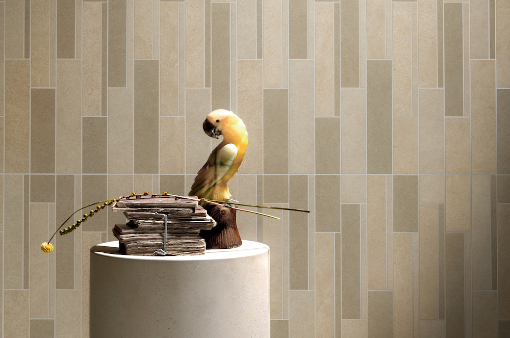
Image credit: Ceramiche Atlas Concorde S.p.A.
The company adds: “we gave the designer our range to be freely mixed and matched, to create a ‘decor collection’ to be presented individually or to be used in combination with our different collections and surfaces.”
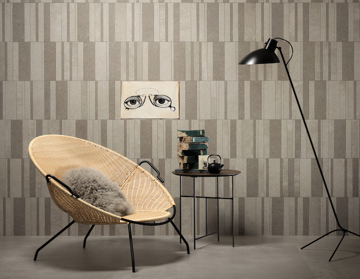
The project is divided into four porcelain tile mosaics inspired by the world of cement and minimalist stones, in shades ranging from warm white to beige with traces of clay and dove grey, from greys in cooler and lighter tones to the darker anthracite and smoke.
Each module of Canone Inverso’s four mosaics has its own particular geometry, in some cases deliberately asymmetrical to create new patterns. Each module also constitutes a colour in the collection, obtained by mixing hues of similar shades selected from the Atlas Concorde range of minimalist cement-effect and stone-effect designs: Boost and Dwell (cement effect), Raw (cement plaster effect), Arkshade (minimalist cement effect), Kone (minimalist limestone effect).
The graphics of the individual tiles recall the cement and stone concept and refer to the collections they derive from, in perfect colour and stylistic harmony. Aesthetically, the surfaces have an almost smooth touch or a slight three-dimensional structure with a perfectly matte texture.
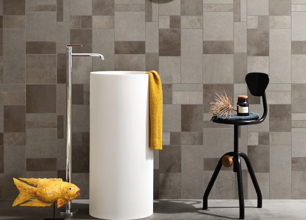
Image credit: Ceramiche Atlas Concorde S.p.A.
An important added value of Canone Inverso is the possibility of creating refined combinations of each mosaic with Atlas Concorde collections. In particular:
Canone Inverso 1 matches the colors that compose it: Kone White, Arkshade White, Boost White and Dwell Off White.
Canone Inverso 2 goes well with the nuances of Arkshade Dove, Kone Beige, and Arkshade Clay.
Canone Inverso 3 combines with Kone Pearl, Kone Silver, and Raw Pearl.
Canone Inverso 4 reflects the color moods of Dwell Smoke, Boost Smoke, and Arkshade Lead, obviously in any format and in the matte version.
Canone Inverso finds its natural application wherever there is not only the need to decorate floors and walls, but above all, a desire to redesign spaces with decorative elements that act as furnishing elements. A new tool to interpret ceramic tiles in a creative and personalized way, in line with the latest demands of high-end interior design.
Atlas Concorde is one of our recommended suppliers. To keep up to date with their news, click here. And, if you are interested in becoming one of our recommended suppliers, please email Katy Phillips by clicking here.
Main image credit: Ceramiche Atlas Concorde S.p.A.