During London Design Week 2020, Design Centre Chelsea Harbour is sheltering many of the product launches, teasers and conversations that are expected to make a noise on the design scene this season. Editor Hamish Kilburn identifies some of the prominent styles, colours and trends to look out for…
“We champion creative excellence,” said Becky Metcalfe, Head of Content at Design Centre Chelsea Harbour (DCCH). “And we have certainly seen a move towards inform choices.”
Now that there is more demand among consumers for conscious and meaningful designs to compliment seamless service, hotel designers are widening their lenses to understand the narrative, craft and creative vision of new collections launched.
It is this change in behaviour that is enforcing most, if not all, of the strong styles that I discovered during my time at London Design Week 2020.
1) Botanical paradise on earth
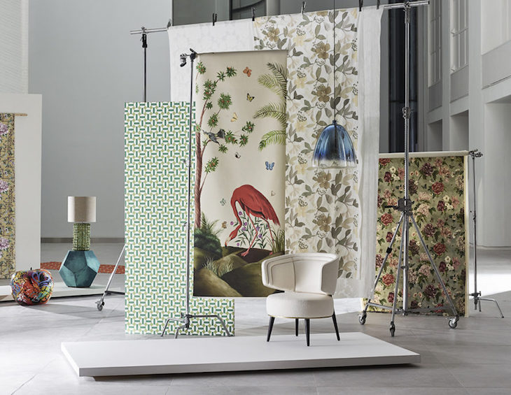
With biophilic design being put front and centre at the moment around the world, conversations and the products that are launching are finding the balance between indoor space and the great outdoors – think exotic gardens where fragrance and sound are depicted in patterns and colours. Sanderson’s floral showroom, which houses hundreds of new designs this week, highlighted the creative possibilities that can emerge when designers open the door to outdoor influence with purpose. Other brands to leverage nature in design include Pierre Frey’s enriched wallcoverings, Abbott & Boyd’s capture of birds and Bec Brittain’s Taxonomy collection seen in the Tai Ping showroom that explores unexpected paradoxes inspired by the minutiae of insect anatomy and pleating techniques.
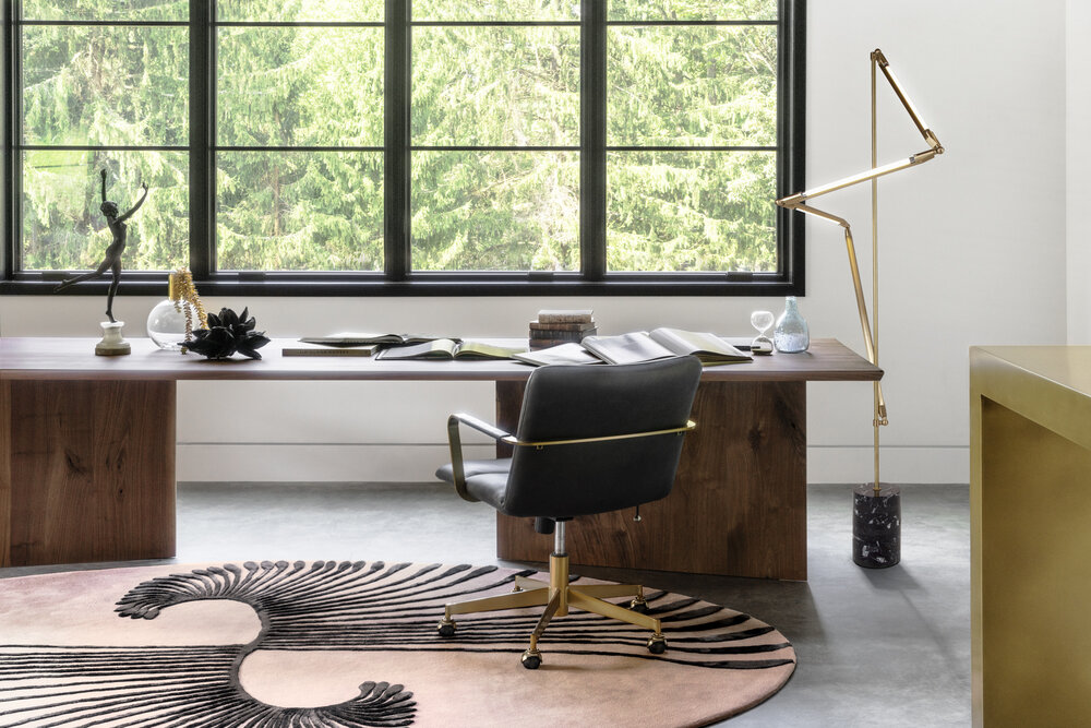
Image credit: Taxonomy collection by Bec Brittain/Edward Fields Carpet Makers/Tai Ping
2) Land of the rising sun – everyone is talking about Japan
Considering the incredible oriental principles – not to mention the in-depth culture, heritage and authentic craftsmanship – it’s hardly surprising that many designers and brands are finding inspiration in Japan. There are parallels between the demand for simple, elegant luxury and the minimalist aesthetics of design in Japan (take a look at Muji to see this in action). Wallcovering brands such as Arte are exploring Japanese techniques and diverse styles, such as the Kimono pattern motif, to create new textured layers to their collections.
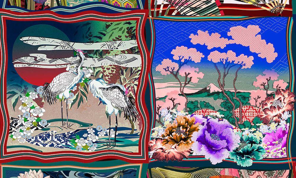
Image credit: Arte Wallcovering
Taking the theme in a different direction, Arteriors’ Trapeze Sconce is an effortless example of how Japanese influence can be balanced delicately in elegant lighting. With so much yet to explore, we expect more designers and brands to delve into the archive of Japan’s design heritage to invest in timeless practice and precious pieces.
3) Embracing imperfections
Admittedly, this isn’t anything new. In fact, designers, consumers and brands alike have been championing and demanding one-off products that can’t be replicated for as long as time. But recently, with timelessness and narrative playing so much importance in any design scheme – and while designers become more adventurous with materials – this look is everywhere. Lighting brand Vaughan is celebrating a proud authentic look and feel with its Chalk White collection, while wallcoverings brand Harlequin is keeping in touch with nature by using natural materials and creating an interesting weave structure.
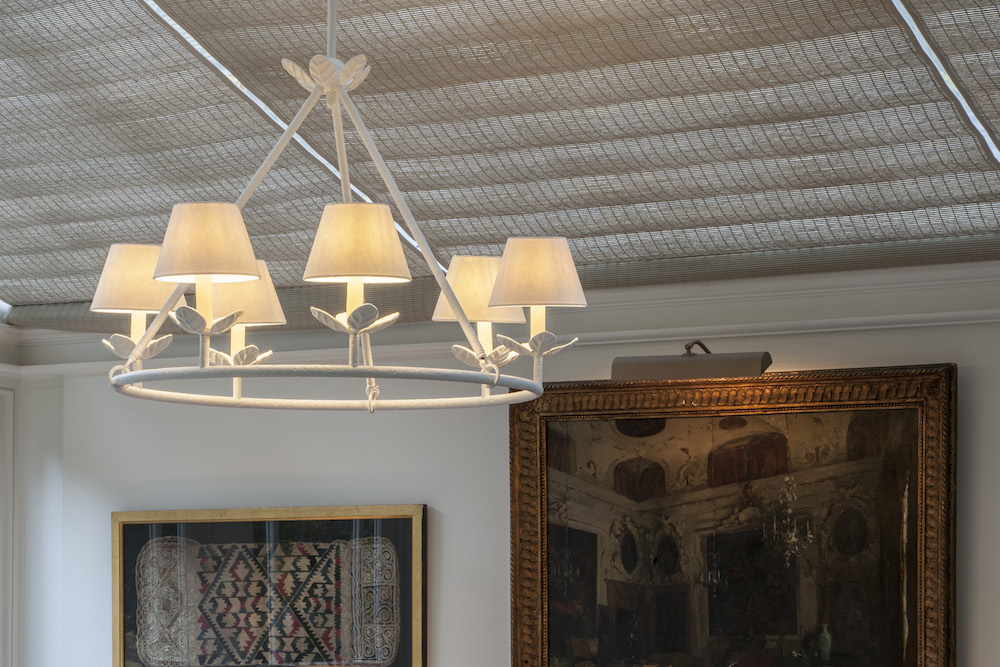
Image credit: Vaughan’s Chalk White collection is a curation of six products
Meanwhile, Parkside Architectural Tiles are showcasing their fantastical imperfect Spectre collection of tiles, which have proved a hit with designers and architects looking to add personality onto the walls of new and existing spaces.
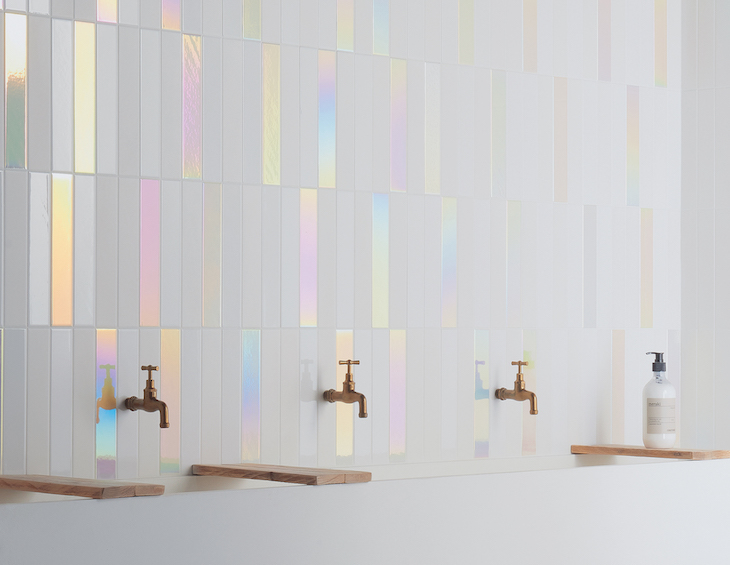
Image caption: Spectre collection by Parkside Architectural Tiles
A relatively new brand thats DNA is very much focused on creating this look is Ilala, curated by Miranda Vedral, which proudly presented its idiosyncratic handwoven furniture and lighting during the event.
4) Amplifying craftsmanship in all areas
There are more and more brands out there that are willing to collaborate with experts to produce the highest quality and the most interesting designs. With a digital overload from social media and a move to challenge the disposable mindset, brands such as Porta Romana have enhanced tactility in products and styles, which is putting momentum behind the sustainable movement.
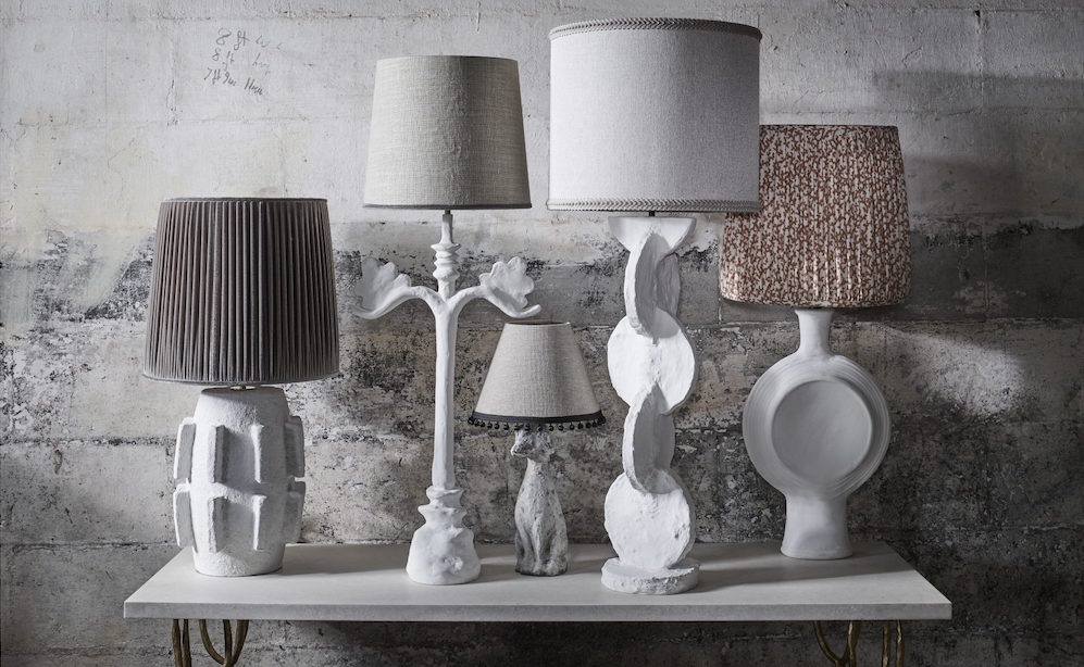
Image credit: Porta Romana
5) Take a walk on the wild side
As we have identified before, the eco-conscious world is allowing for more adventurous influences to emerge to the surface. During the showrooms in Chelsea, there was a clear and defined theme of endangered species being used in wallcoverings, fabrics and soft furnishings. Some of the brands that are mastering this with style include Altfield, Anthology, Harlequin and Andrew Martin.
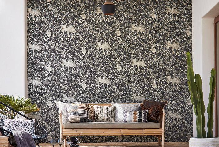
Image credit: Harlequin’s Mirador Collection
6) Warm colours are in!
Finally, in the doom and gloom of the current economic climate, designers and brands are discovering the warmer end of the colour spectrum. Designs from Edelman Leather, Vaughan and Zoffany are all setting their style compass to rosy red, which suggests there is a new confidence in the air. Grasping the statement-like benefits of using primary colours, British brand David Hunt Lighting has recently opened up its archives to find unique techniques and craft that has inspired their latest collections of pendants and chandeliers. In the Design Avenue – a hotspot for talent and unmatched styles – there was arguably no brand more colourful and bold than Timorous Beasties, but with their intricate signature of styles, would you really expect anything less?
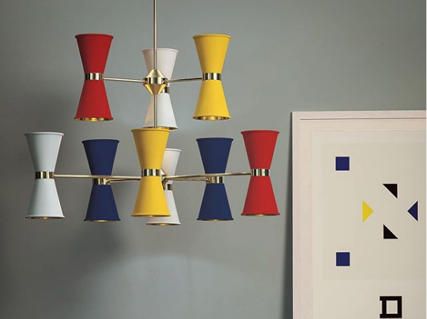
Image credit: David Hunt Lighting/Instagram
7) Home Heritage
An interesting theme to explore on the international hotel design scene – and one that no doubts divides the industry – there seems to be a move towards home-from-home comforts, but not perhaps as you would expect. We know that lobbies are becoming more lounge-like, but in addition there is an interest to explore storied providence. Brands such as Zimmer + Rhode, Samuel & Sons and Holland & Sherry are all using this to drive their latest designs, and I suspect more brands will keep this in mind when innovating new products in the future to add further meaning in design.
If you identified anything at the show that you believe we should be sharing our readers, please tweet us @HotelDesigns.
Main image credit: Design Centre Chelsea Harbour

