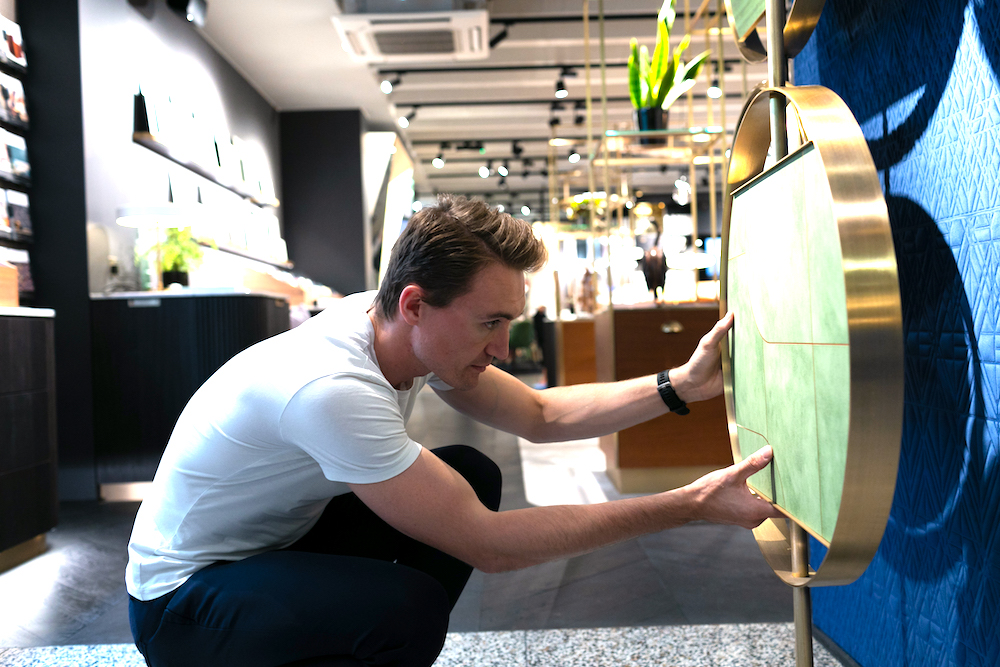
Following a colourful year in the hot seat at Hotel Designs, editor Hamish Kilburn looks ahead to a more meaningful future of interior design moments and trends as he gives his thoughts on Pantone’s Colour of the Year, Classic Blue…
If I have learned anything in 2019 from listening to the leading designers, architects, hoteliers and developers who are no doubt shaping the future of the international hotel design scene, it is that every hotel design brief is unique and different.
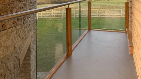
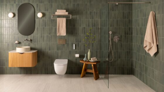
By giving a new project a fresh perspective on the drawing board and when specifying products, the industry has been able to drive forwards; to unveil creative and exciting spaces unlike anywhere else in the world. The most common element used to emphasise an interior design scheme to create these statement spaces is indeed colour.
A few weeks ago, Hotel Designs was among the first to unveil Pantone’s Colour of the Year. In doing so, I witnessed two things. Firstly, that Pantone is bolding making a defiant move away from the warm, buoyant and energised Living Coral in order to focus on a deeper, calmer and more connected hue as its colour of 2020. My second realisation was more of an affirmation, which was that many within the interior design community continue to turn their heads away from yet another trend – and I have sympathy for those individuals.
“The aim of a commercial designer is to create style and not to repurpose fashion.”
As someone who receives many trend and colour forecasts, all of which are full of contradictions and confusing conclusions, I totally get why there’s a resistance among the leading designers and architects to accept trends. After all, the aim of a commercial designer is to create style and not to repurpose fashion. But every so often, a trend becomes more of a movement; a reflection of modern times, if you like, in order to add meaning into what can often feel like a senseless flow of Instagram and Pinterest posts and mindless moodboards.
It may shock you, therefore, that I recently succumbed to the demand and pressure and put my name to a trends forecast. Hoping to inspire and to create the ingredients for new conversations, as opposed to limit designers in where they should be sourcing their inspiration from, my feature was written sensitively for those who, like me, usually avoid the forecasts.
“If you only have the capacity to humour just one trend this winter, then by all means choose Classic Blue.”
In two separate editorial roundtables that Hotel Designs hosted recently, there was one motif that was louder than others. While each discussion was attended by different leading designers and architects, all seemed to agree that their clients have become much more informed around the connections between design, architecture and people. As a result, now more than ever before, commercial designers and architects are able to make decisions with greater purpose; to create extra layers, instil a stronger sense of place and to make a space more functional so that it can withstand the evolving demands of modern travellers.
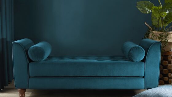
While the industry, as a whole, becomes more aware of the environment, sustainable practice and the need for designing consciously, Pantone’s Classic Blue is in my opinion a nod to just how thoughtful design in the hospitality arena currently is. And therefore, if you only have the capacity to humour just one trend this winter, then by all means choose Classic Blue.
On the surface, it’s fair to say that Pantone’s Colour of the Year can be seen as safe, uninspiring and for the lack of a better phrase, just a bit dull. However, when considering the context – and relating it back to the world we are currently trying to make better a place – then Classic Blue becomes a symbol of hope and prosperity.
Having lived through the shelf lives of Greenery in 2017, Ultra Violet in 2018 and more recently Living Coral in 2019, Classic Blue on the contrary has longevity and feels like a harmonious step back to embracing the basics. The colour slots in nicely to create harmony in an era that is obsessed with technology and is increasingly lacking in time.
Classic Blue is flexible as well as firm. It’s dependable, thought-provoking and, paired with the right colour, it can create a number of different ambiances that are more meaningful, allowing the designer to take control. Classic Blue is non-aggressive, simple and has boundless uses in order to create endless interior scenarios.
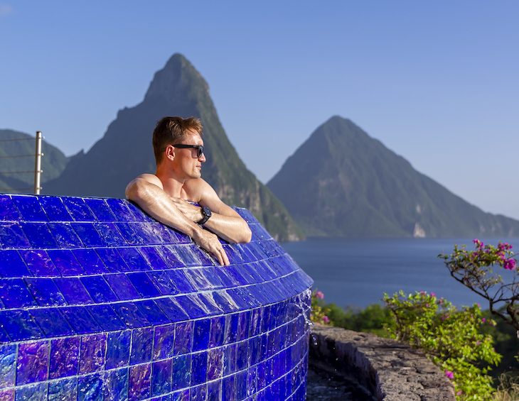
Moving away from the aesthetical properties, blue is also considered to be beneficial to the mind, body and spirit, with experts going as far to say that it produces a calming effect. The shimmering blue infinity pool in the sanctuary I checked in to at Jade Mountain in Saint Lucia earlier this year certainly had that impact. If nothing else, Classic Blue is peaceful and a strong foundation for creativity to flourish on top.
“It’s been an extraordinary year to be at the helm of the editorial desk.”
Allowing Pantone’s Colour of the Year 2020 to work its magic early; to slow down my human metabolism on the editorial desk as I reflect on some of Hotel Designs’greatest moments of 2019, here are this year’s most-read stories:
- Winners of The Brit List Awards 2019 announced
- The interior designer behind The Rosewood Bangkok
- Hotel Designs’ 30 Under 30 unveiled
- In Conversation With Martin Brudnizki
- 7 hotel concepts on the boards that will rock your world
- Checking in: Anse Chastanet and Jade Mountain, Saint Lucia
- Software and technology that is enhancing the overall hotel experience
- New research suggests that hotels are not doing enough to be eco-friendly
As you can see, it’s been an extraordinary year to be at the helm of the editorial desk, which was complete with an extensive rebrand in Q1, publishing exclusive interviews, hotel reviews in far-flung destinations around the world, sharing up-to-date daily news coverage and hosting a plethora of engaging events.
Thank you for being a significant part of our journey, and helping us complete our ultimate goal, which is to define the point on international hotel design. All that is left to say is happy holidays and I look forward to reconnecting with new projects to put under the editorial lens in the New Year.
Editor, Hotel Designs