Design

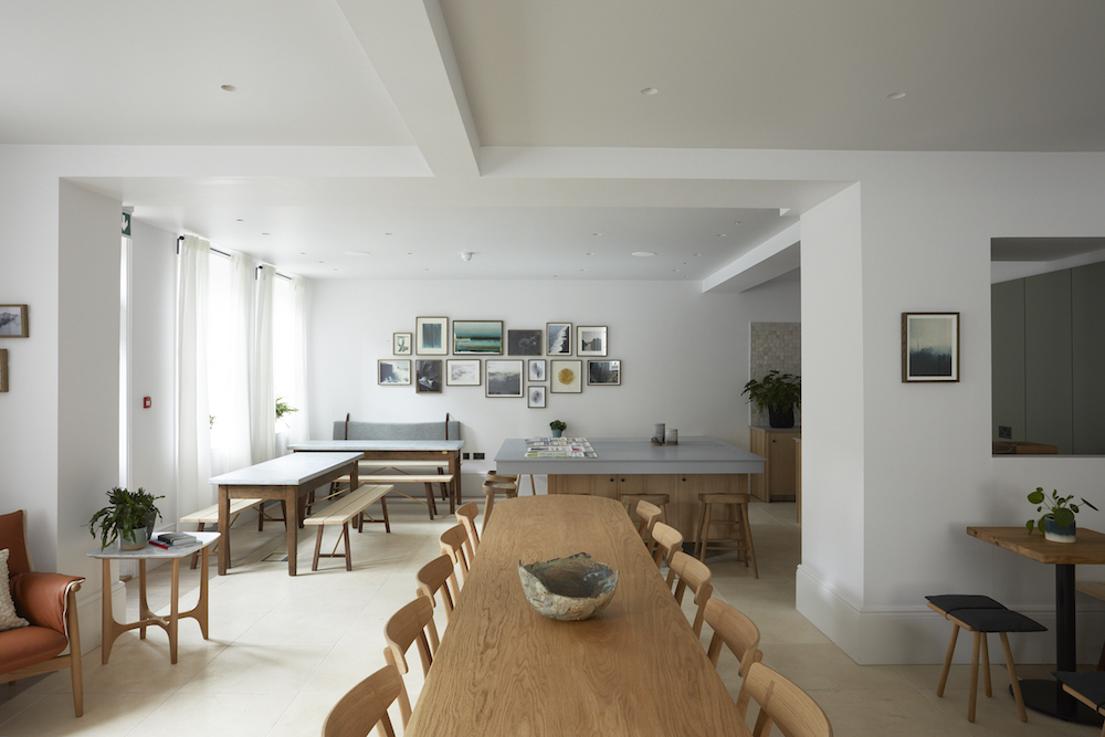
    room2 Chiswick - lobby

    Part 68: maximising the social & economic impact of the hotel sector

    1024 640 Hamish Kilburn

    Reminding the industry how the hotel sector can maximise its social and economic impact, Andy Jansons, Managing Director of Jansons Properties, writes about the direct, indirect and social affects of good hospitality and hotel design…

    Hotels provide far more than just a bed to sleep in when you are away from home. They are hubs of activity that bring people from all walks of life together, offering restaurants, bars, leisure facilities, event rooms, and providing a meeting space for those staying. However, the multi-faceted nature of a hotel is often undervalued along with the economic and social benefits they bring. From the inception of a hotel development right up to the day-to-day running of a fully operational service, hotels produce enormous economic and social benefit to their surrounding areas- both directly and indirectly.

    Direct Benefits

    Though it may seem obvious, the most direct benefit of hotel development is that it enables an encourages people to visit an area that they may not have otherwise visited. The nature of the hotel will determine which type of traveller will visit, however, the existence of a hotel in an otherwise unremarkable area can make it a destination for those planning a holiday or business trip. Hotels located in a city centre will cater to both tourist travel and business travel whereas employment orientated hotels may be located near business estates or motorways for practicality. Business tourism is a huge industry with millions of people travelling to and within the UK each year for conferences and short stay work trips. Hotels are often central to corporate travel, catering to all the needs of the group including providing meeting rooms or events spaces for larger groups.

    Hotel developments are therefore also excellent for employment and not just for those employed as hotel staff at the end of the process. Before any building has begun and planning permission has been granted, consultants must be brought in to prepare structural plans and put in planning applications for the project. This initial stage involves a huge number of professionals, including contractors, architects, planning consultants, quantitative surveyors, and even conservation experts, all of which contribute to the planned proposal of the hotel. Typically, hotel developers will employ local experts, bringing employment opportunities directly to the area. Once planning consent is granted, the next stage is to begin construction which involves the employment of regional contractors and a work force of anywhere between 50-100 people on site, though this is dependent on the size of the project. Construction can last anywhere between a few months to two years during which time local construction workers have stable employment and income. Finally, once the hotel is opened for business, local jobs are generated and local people are employed at varying different levels, from reception to the kitchens.
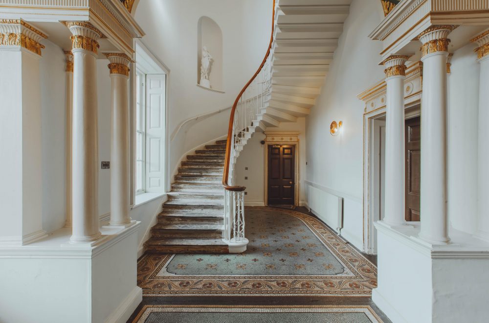
    Staircase

    Image Caption: Birch, which opened in 2020, transformed the hospitality landscape in Hertfordshire. | Image credit: Birch/Red Deer/Adam Firman

    Another direct benefit that hotels generate is stimulating economic growth for the region, as hotels often source produce from local vendors. Locally sourcing food goods to supply their restaurants generates great business for local food supplier companies and provides them with a steady revenue. While hotel restaurants are typically solely reserved for hotel guests, some commission independent restaurants and take external bookings. These partnerships give great publicity to local food suppliers and result in strong community engagement between the hotel and local businesses.
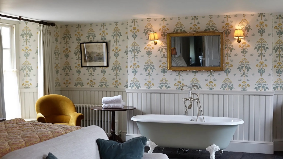
    Bath in suite inside suite inside Soho Farmhouse

    Image caption: Soho Farmhouse was the first ‘house’ in the portfolio to open in the UK outside of a major city. | Image credit: Soho House

    Furthermore, local business directly benefits from hotels as strong advocates of innovation and front runners of the ESG agenda. As many hotels are now diversifying their offering by inviting businesses to use their facilities as hybrid workspaces, this further increases traffic and exposure to those local businesses surrounding the hotel. The growth of companies such as WeWork, is changing how we approach work with many companies no longer seeing the benefit of renting out large offices. New hotel developments provide space for these hybrid environments which in turn benefits businesses looking for new and innovative space. Indirectly, this type of innovative development elevates the ESG status of those businesses who collaborate with the development, meaning that all bodies involved are functioning in a more socially and environmentally efficient way.
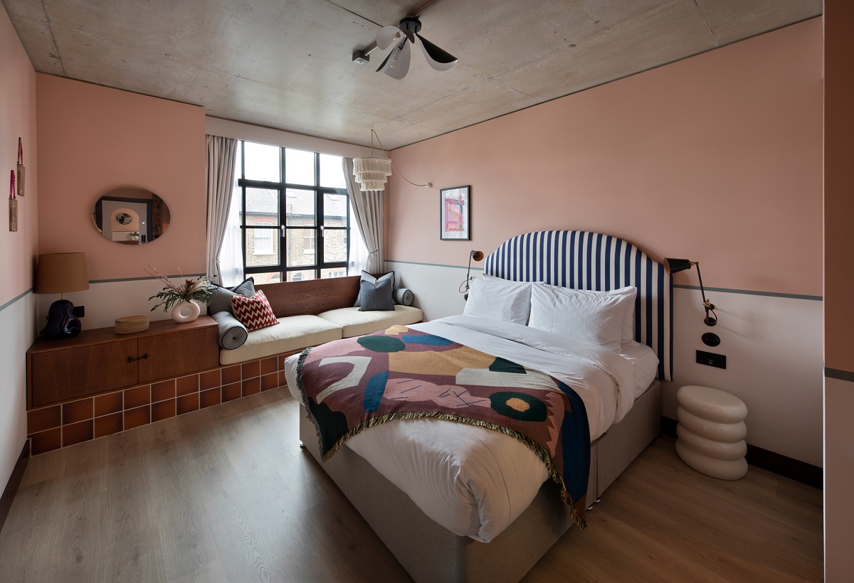
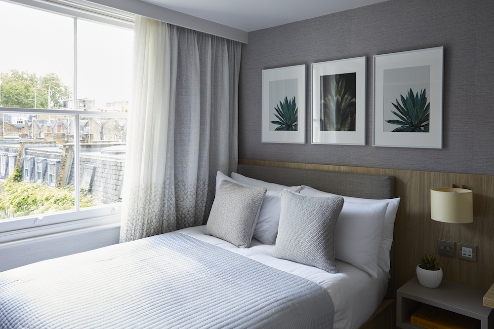
    arts and crafts inspired bedroom design at room2 Chiswick

    Image credit: room2 Chiswick opened this year as the first truly net-zero hotel, and set a new standard in ESG for the hospitality industry.

    Indirect Benefits

    In addition to the direct benefits hotels bring to their area, there are subsequent indirect benefits which bring growth and improvement to the region. One particular benefit is the promotion of local business that happens indirectly as a result of hotel visitors. Travellers looking for activities to entertain themselves during their stay might ask for recommendations or pick up local leaflets from the lobby advertising local events and offerings. These can often include cinema, theatre, restaurants, festivals, art exhibitions and local commerce offerings which then benefit from the patronage of outside visitors. This promotion of the local vicinity can have an impact not only in the short term but also in the long term, as visitors participate positively in local life, they are more likely to return if future trips are necessary. An increase in local engagement will lead to economic growth and social diversification for the region as a whole.

    Another notable benefit of a new hotel is the regeneration focus it brings to the local area. The development of a hotel is often a steppingstone to gentrification as it shifts the socio-economic dynamic of an area and encourages investment from other groups. Furthermore, a hotel development can often include more than just the construction of a hotel, with developments growing to encompass business centres and retail space. The SoCo development in Edinburgh is an excellent example of regeneration in practice. The scheme involved the re-development of a UNESCO World Heritage Site which had been destroyed by a fire in 2002. The final product left the area not only with an Ibis Hotel, but a Sainsbury Local Store, Costa Coffee and the reinstatement of an old nightclub. The regeneration of this area resulted in the further creation of new public realm spaces.

    Rates are an additional indirect economic benefit, bringing more money into the local authority through taxation. This added source of income can be funnelled back into the local area for regeneration and refurbishment. A refurbished town hall, shopping centre, better roads, larger car parks and more green spaces. This has a particular impact on hight street regeneration and will be recognised by the local population; as vacant buildings are used and repurposed, hotels encourage money to be spent which results in better quality commerce and retail offerings.

    Finally, the impact of a hotel development on the civic pride of a region should not be underestimated. A new hotel is a major brand renewal for an area and gives locals the opportunity to showcase their town and cultural offerings. New buildings will give the whole area a facelift and will show that money is being spent on investment in the future of the region. While becoming a destination clearly benefits the economic growth of an area, the social impact is equally significant in boosting local moral and how people feel about the area they live in.

    Main image credit: room2 Chiswick

    Modern bedroom with cork walls

    Part 64: making walls a design feature in cork

    1024 640 Hamish Kilburn
    Part 64: making walls a design feature in cork

    With the sustainable and acoustic qualities of cork far outweighing many other surface materials, we explored how a new collection from Granorte can allow designers and architects to make artistic wall displays using cork…

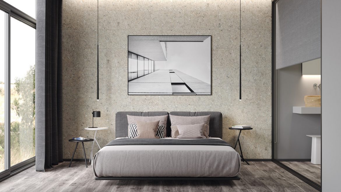
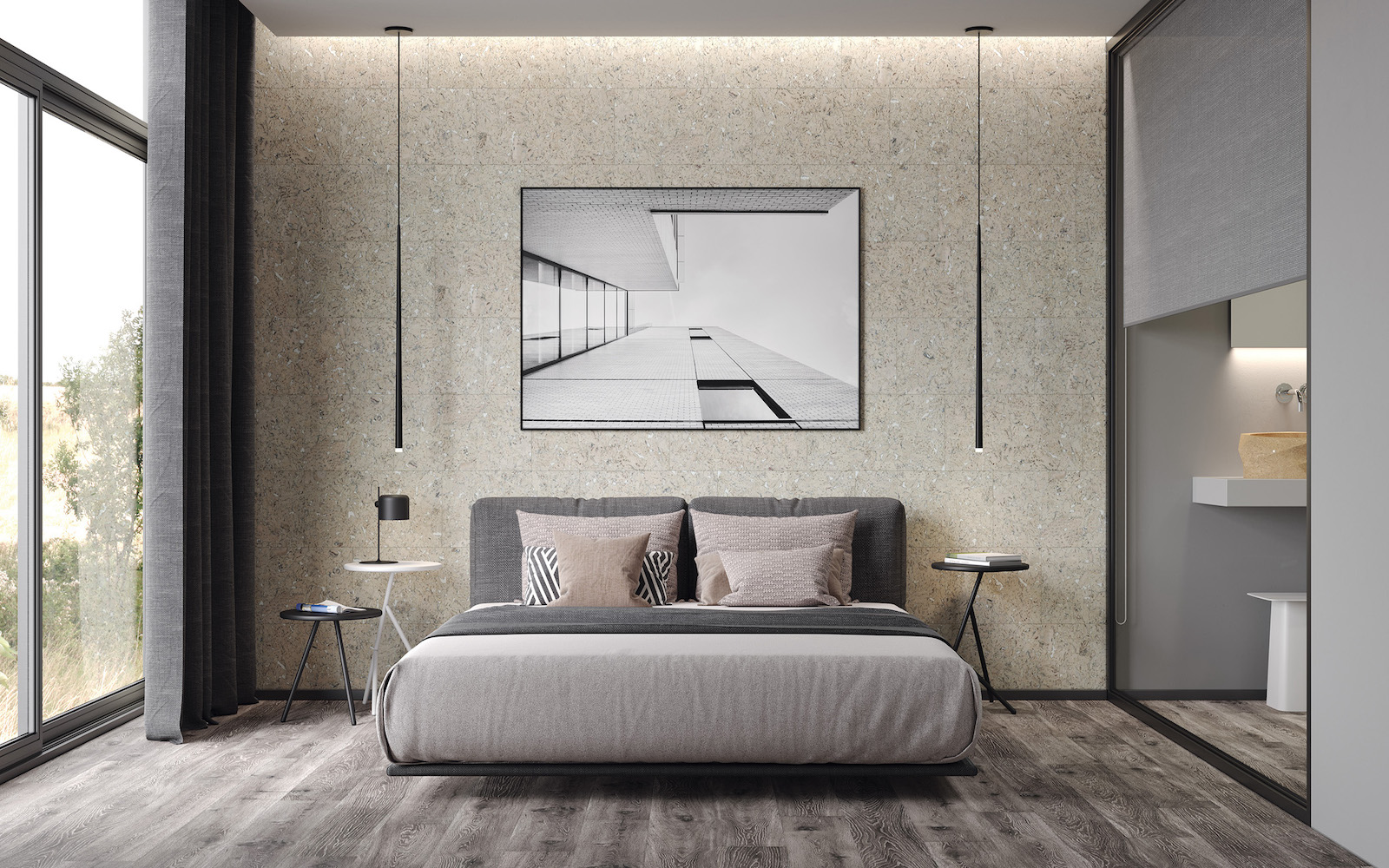
    Modern bedroom with cork walls

    With the beautiful natural texture of cork, WALLTrend  from Granorte comes in 16 designs ready to transform interiors. From the classic look of Grain to the vibrant Twist, rustic Country and organic Primus, the collection is full of unique looks that will lift interiors out of the ordinary and bring the magic touch of cork to walls.

    No matter what the design, every WALLTrend panel also brings cork’s unique qualities. Tactile and warm to the touch, the panels also absorb sound to make rooms quieter and more comfortable. Added to a natural construction that’s easy to look after, recyclable, PVC-free and which retains air quality; WALLTrend not only looks and performs beautifully but also rises to the demand for more sustainable finishes in the home.

    “The time for cork is now and as a new generation begins to appreciate the material for its sustainable characteristics, we’re delighted to able to introduce WALLTrend to the market,” says Paulo Rocha, Granorte. The collection gives consumers a new way to explore the natural and renewable material and experience its unmistakable look. Combined with floors from our TRENDCollection, there’s now a chance to bring the unique qualities of cork from floor to ceiling.”

    Each WALLTrend panel is constructed from an agglomerated cork backing to which a decorative cork veneer is added and then finished with Granorte’s unique PARAWAX matt finish for easy maintenance. The finished panel is exceptionally lightweight and can be glued directly onto walls using a suitable adhesive. Measuring 600 x 300mm, the panels are ready for residential and commercial use, meeting all relevant standards.

    > Since you’re here, why not read about Granorte’s 50-year-young story? 

    Granorte is one of our Recommended Suppliers and regularly features in our Supplier News section of the website. If you are interested in becoming one of our Recommended Suppliers, please email Katy Phillips.

    Main image credit: Granorte

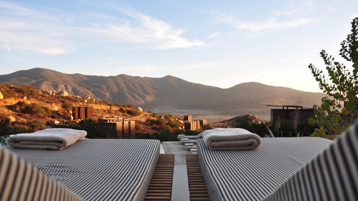
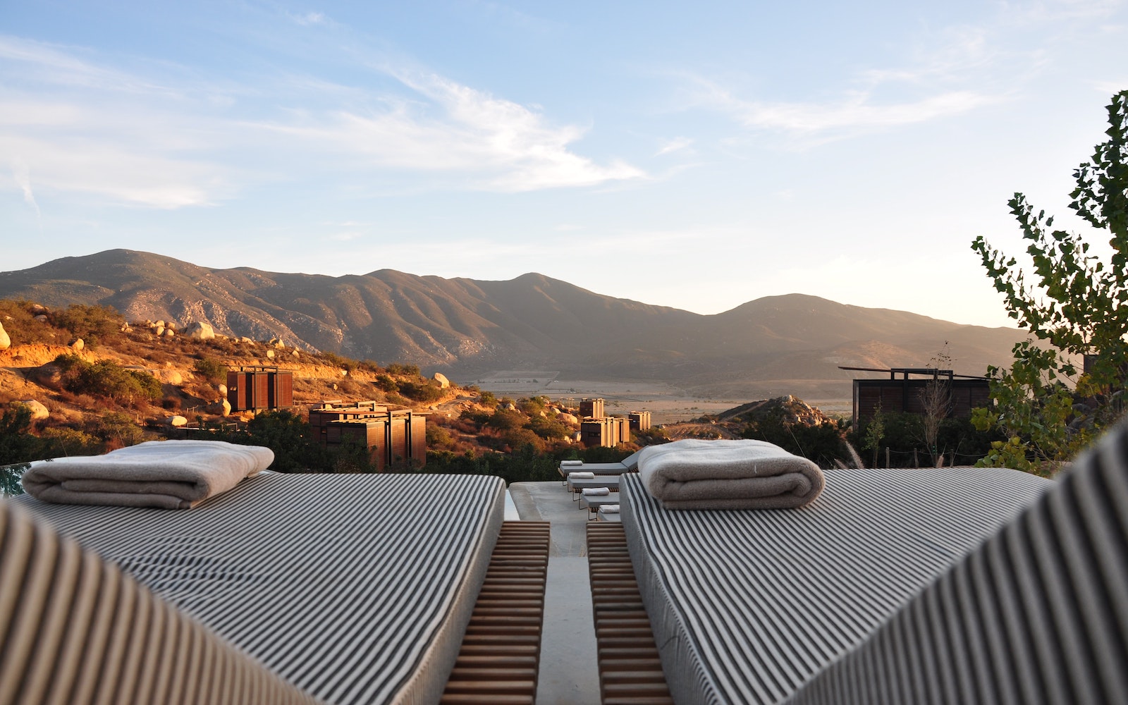
    Two sunbeds overlooking mountains

    Part 62: the value of local in hospitality & design

    1024 640 Hamish Kilburn
    Part 62: the value of local in hospitality & design

    Even before the pandemic and Brexit, hotels were looking at new and innovative ways to source local food, hospitality amenities and design materials. In 2022, the demand for local has amplified, as Andrea Brown, Design Director, Mucca, explains…

    Two sunbeds overlooking mountains

    Luxury hospitality brands have weathered the storm since March 2020, and those fortunate enough to stay above water could use the past few years as a catalyst to rethink their approach. With new consumer patterns and desires emerging during the pandemic, the rules of hospitality have evolved to place more weight on authentic experiences that treat customers like individuals. Options like home-sharing platforms, vacation rentals and glamping all offer an experience that feels unique, private and more memorable than a kitted-out room and valet service.

    A small group of ‘superfans’ is more important to a brand’s success than a crowd of fickle followers, and one way to gain those fans is to become a local destination – an authority on one thing that can’t be found anywhere else. To connect with an elusive audience, luxury hospitality needs to look beyond the physical space to create experiences that feel personal and speak to their setting. This could involve collaborating with the cultural community – the artists, artisans and performers who make their city hum – or engaging a new niche audience with ultra-specific offerings.

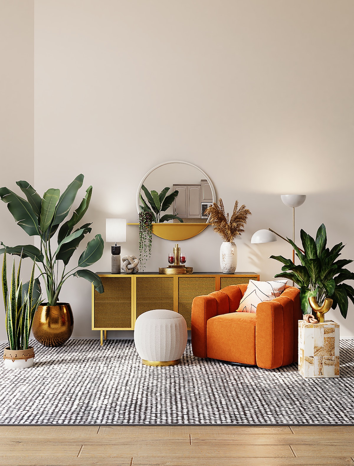
    A boho interior design scheme, with orange armchair, textured rugs and plants

    Image credit: Unsplash

    Curate cool

    Not everyone has time to research and plan before a trip, so help guests out by making them feel like an insider in a world they’ve just discovered. With a captive audience, hotels have a unique opportunity to celebrate the rising stars of their city, while elevating the neighbourhood along with the guest experience.

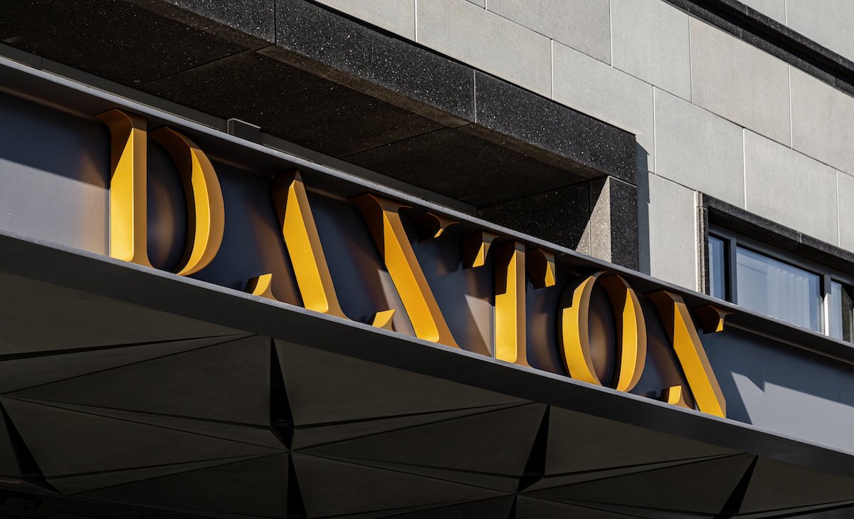
    For example, Daxton Hotel in Michigan has an artsy, edgy vibe that involves its community at every turn. In-room libraries are curated by nearby Cranbrook Art Museum, Michigan-based fitness gurus lead a running club for guests, and the hotel’s restaurant Madame serves up beers exclusively from nearby brewery Griffin Claw. Meanwhile, Viceroy Hotel’s “A Canvas for Discovery” series offers site-specific works created by innovative local artists—from painters to musicians and photographers–that simultaneously support local artists and give the chain some indie credibility.

    Sign of Daxton Hotel

    Image credit: Daxton Hotel

    Make local memorable

    We’ve all stayed in a hotel room that we couldn’t describe after we left, and not because of all the champagne from the minibar. Building a hotel brand around its locality can differentiate it from “bland-lux” and create emotional connections that resonate beyond check-out. That’s the approach of The Chicago Athletic Club hotel, which leverages its former life as an elite men’s club while turning its history on its head with a tongue-in-cheek attitude. References to its sporting past are found everywhere from bathrobes to keycards, while the hotel maintains a modern relevance with local-friendly events like roller skating nights and high-fashion clothing swaps.

    Back of bath robe for Chicago Athletic Association Hotel

    Image credit: Chicago Athletic Association Hotel

    And when luxury means escaping too many air-breathing people to wander a remote island, the experience can still be one of local connection. The exclusive Thanda Island resort rejuvenates not only guests but its sea-dwelling community, offering a chance to participate in marine conservation efforts and support endangered whale sharks.

    Engage personal passions

    Establishing a tribe of true fans means speaking to them in their language. The rise of niche hotels shows that the experience is king (or queen), and travelers will go out of their way to pursue a passion. Those guests will become virtual brand ambassadors, doing the work for you by spreading the word to their like-minded friends.

    A great example of this is W Hotels, which are targeting musicians and music lovers by offering professional-level music studios for guests looking to eat, sleep and make sweet music. Other hotels might wince at the thought of rock bands rolling up, but W has embraced the idea of becoming a music industry haunt that caters to a dedicated fanbase.

    No one wants to make predictions these days, and staycations may be here to stay,  but luxury hospitality brands can retool their approach and adapt their identities to the new needs of travellers. Whether the guest experience is one of discovering a local gem or finding new like-minded mates, the focus should be on creating a lasting connection. Who knows, maybe sometime in the distant future, a hotel stay will make us feel like visitors to a galaxy far, far away.

    Main image credit: Unsplash

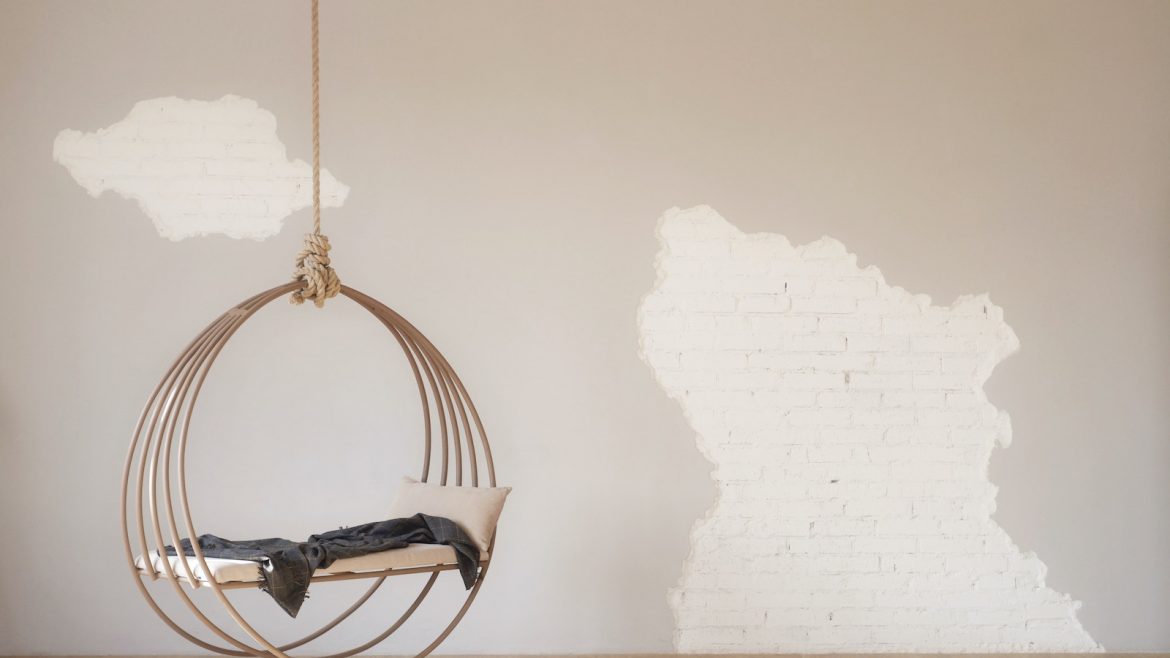
    A interior swing with rustic wall

    Part 61: 7 interior design rules to break

    1024 640 Hamish Kilburn

    Think of this element of the Guide to Hotel Design as the troublesome classmate – you know the one – who finds pleasure in going against the lecturer’s every word. In this smug and creative feature, Charlie Svensson explores the loopholes that allow designers and architects to break the rules…

    Interior design, just like any art, is part intuitive and part rational. This means that half of the work of an interior designer is studying the geometry of the space. The designer keeps some conventional rules that help achieve an aesthetic room in mind. So, measuring the space and choosing furniture that’s proportional to it is a first step, along with choosing a colour palette. But the interior expert also avoids certain textures, methods, and furniture based on those underlying rules.

    Nevertheless, some designs don’t look right even if they tick all the interior design laws. The eye and our taste aren’t always perfectly in line with geometry’s strict policies. Therefore, the other half of the designer’s work should be breaking some rules in favour of an ‘unexplainable’ visual pleasure. The transgression of these rules can offer character to a room and make it feel more ‘at home’.
    Here are seven interior design rules that you can strategically break to elevate your space.

    1) Symmetry

    One of the essentials of interior design is symmetry. While most of the time symmetry can make a space seem clearly structured and organised, it can also make it dull, flat, and generic. Experts will often suggest two identical bedside tables, two identical picture frames centered above the bed, and so on. But the last thing anyone wants is something that seems like a furniture showroom.

    Moreover, symmetry isn’t always a wise choice for rooms with asymmetry. Maybe the room isn’t a square, and it has a protruding wall or some other peculiar feature. In these cases, symmetry doesn’t suit the geometry well. So, when you choose your furniture or decor, think twice before choosing plain symmetry. Try to play with different elements and see how it looks. Remember that a healthy dose of asymmetry can break the monotony of the room, making it tridimensional and dynamic.

    2) Matching decor

    Along with symmetry, many designers keep it safe and pick matching decor: if the wall is beige, all the decor is beige. The result is a two-dimensional space that feels sterile and monotonous. Hence, you should try and mix patterns, textures, and colours, not just shades of the same grey.
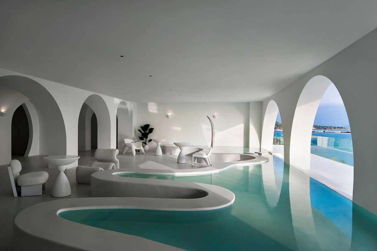
    the water is part of the design at the Sumei Skyline Coast Boutique Hotel

    Image credit: GS Design

    For instance, you can choose an eclectic style that mixes modern furniture with bold and detailed antiques. Sure, it’s challenging to find an equilibrium between radically different styles. Nonetheless, the result can be stunningly chic.

    The key to success is choosing the decor pieces that have a different style but tie in with the colour palette you chose. Otherwise, you can select a similar style in a different texture. The elements should relate to each other somehow while bringing some visual interest to the table.

    The perfect example is mixing old with new: the sofa, the walls, and modern decor. Meanwhile, the artwork, the drawer, the lamp can interest and a sense of industrial vintage. Lastly, everything can be tied together by a selection of warm colours.

    3) Matching metals

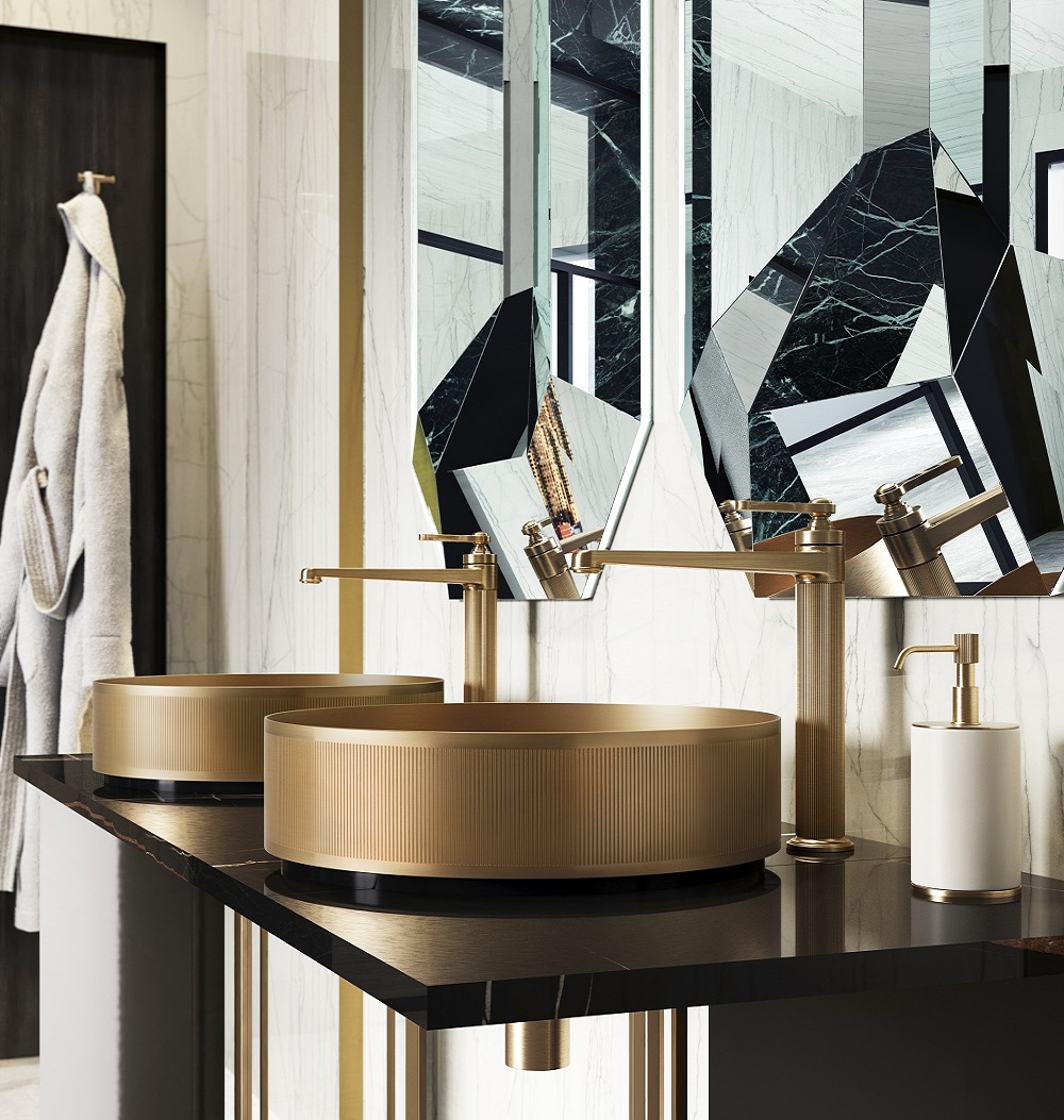
    When it comes to bathrooms and kitchens, matching metals is common. But this obsession with making everything identical turns spaces into cold-feeling rooms. If your bathroom has a spa aesthetic, you might add golden accents to spice up the space with bamboo furniture and a wooden floor. Play with options and find what looks appropriate.

    art deco bathroom inspiration

    Image credit: Gessi

    4) Small furniture for small rooms

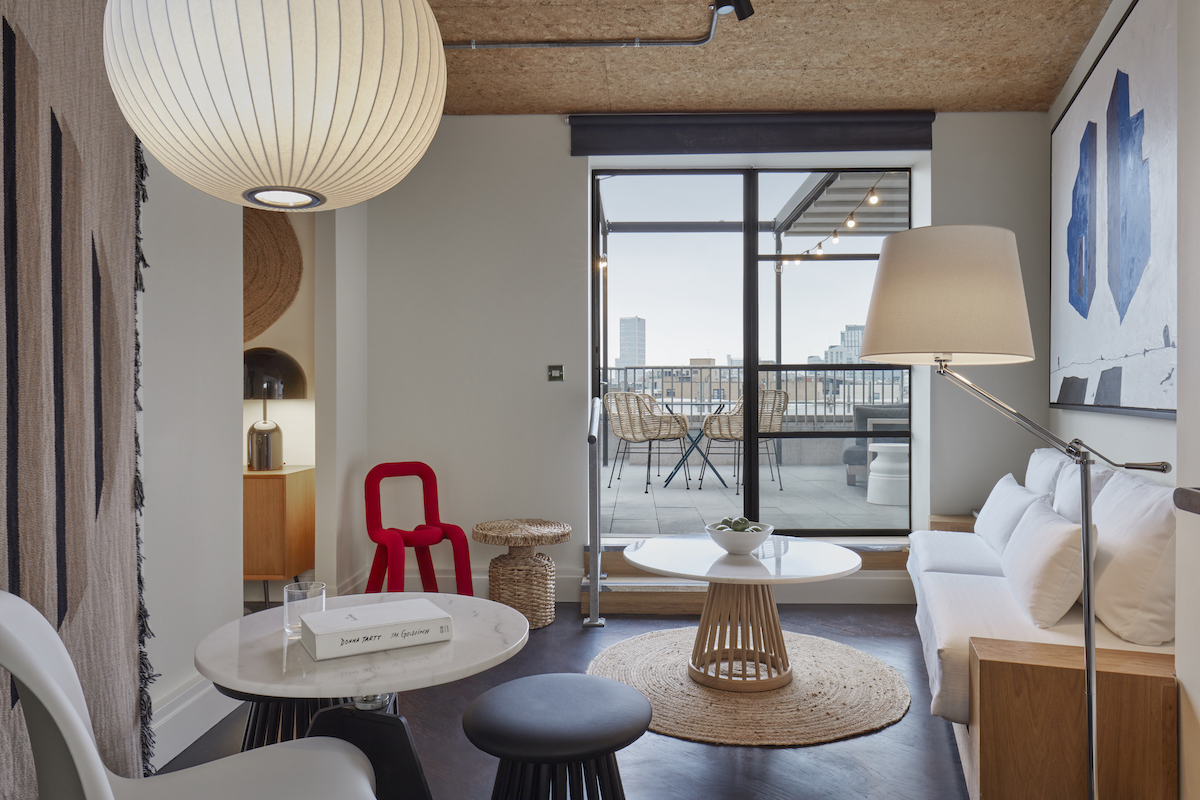
    A common misconception in interior design is that furniture needs to be perfectly proportional to the room. This way of thinking often leads to having a room that looks heavy, cluttered or both. The key is to remember the importance of the room’s ‘weight’, not the size. So, pick three main items that take up volume.
    One Hundred Shoreditch suite, with red chair and calming interior design

    Image credit: Lore Group/One Hundred Shoreditch

    The furniture should be moderate: a queen-size bed for a small room, a four-person sofa for a medium-size living room. Or you could make one of these main items more dominant. For instance, a small living room can become a sofa room with two big sofas that take up a lot of space. To balance it out, designers may want to try to reduce the number of other elements in the room.

    5) Bold colours only the accents

    One of the most famous interior design fact is ‘light colours widen the space’. So, many people are often scared of bold and/or non-conforming colour schemes, even in large rooms. Sure, painting the walls in navy blue might not be the best for a living room, but it can add layers (and personality) in the bathroom.

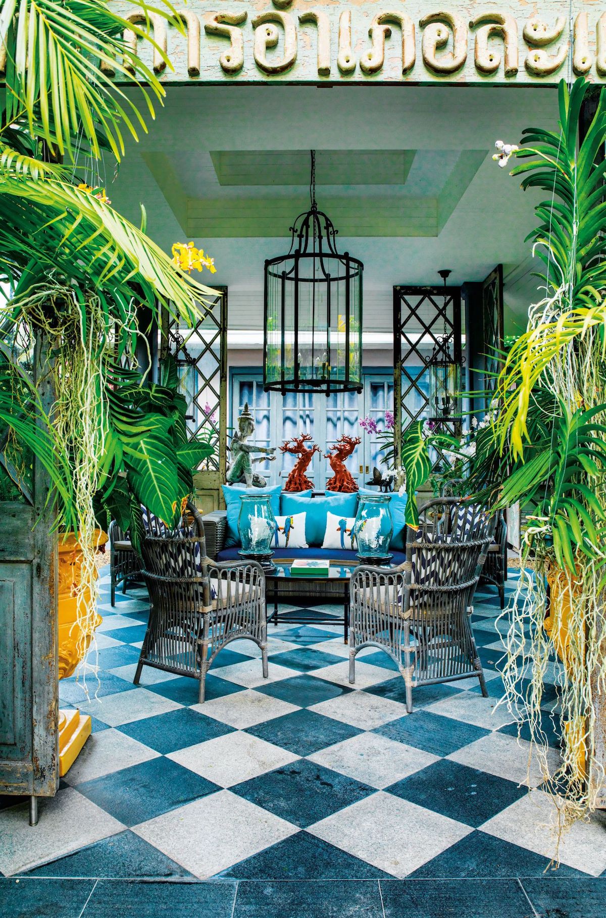
    A colourful residential project designed by Bill Bensley

    Image credit: Bill Bensley

    The winning card is picking your style. Maybe you’re trying to achieve formal, or industrial, or urban jungle. Establish the furniture and decor that works. Then, figure out if a wall could bring out those elements. For instance, if you’re going for Parisian chic decor, you might use a lot of white furniture. In this case, a dark grey wall can bring out the decor and tie everything beautifully without making the room feel small, heavy and cluttered.

    6) Avoid faux plants

    Green elements, such as plants and flowers can elevate any space. They can add a bit of colour and make the room lively. But real plants can become a burden when it comes to upkeep (especially in hotels) to take care of plants – and there are some great faux plants that are also sustainable.

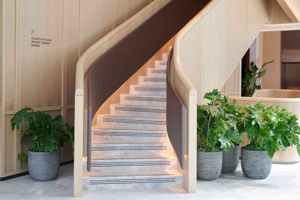
    Planters and contemporary starcase in lobby of Pan Pacific

    Image credit: Pan Pacific London

    Sure, they’re not the real deal, but they can come in handy when you travel a lot, for example. Also, you can use them in combination with real ones. This way, you get the same effect without more work.

    They’re also great for outdoors because they can stay green all year round. Just make sure that you pick the ones that look real and preferably made from recycled materials.

    7) Walls should never match the floor or ceiling

    Previously, we mentioned that symmetry and matching everything isn’t always the best choice. This time, matching the floor or ceiling to the walls can give off a luxurious look to any room. Again, this needs to be planned carefully beforehand, but your room will seem tailored if you decide to go with it.

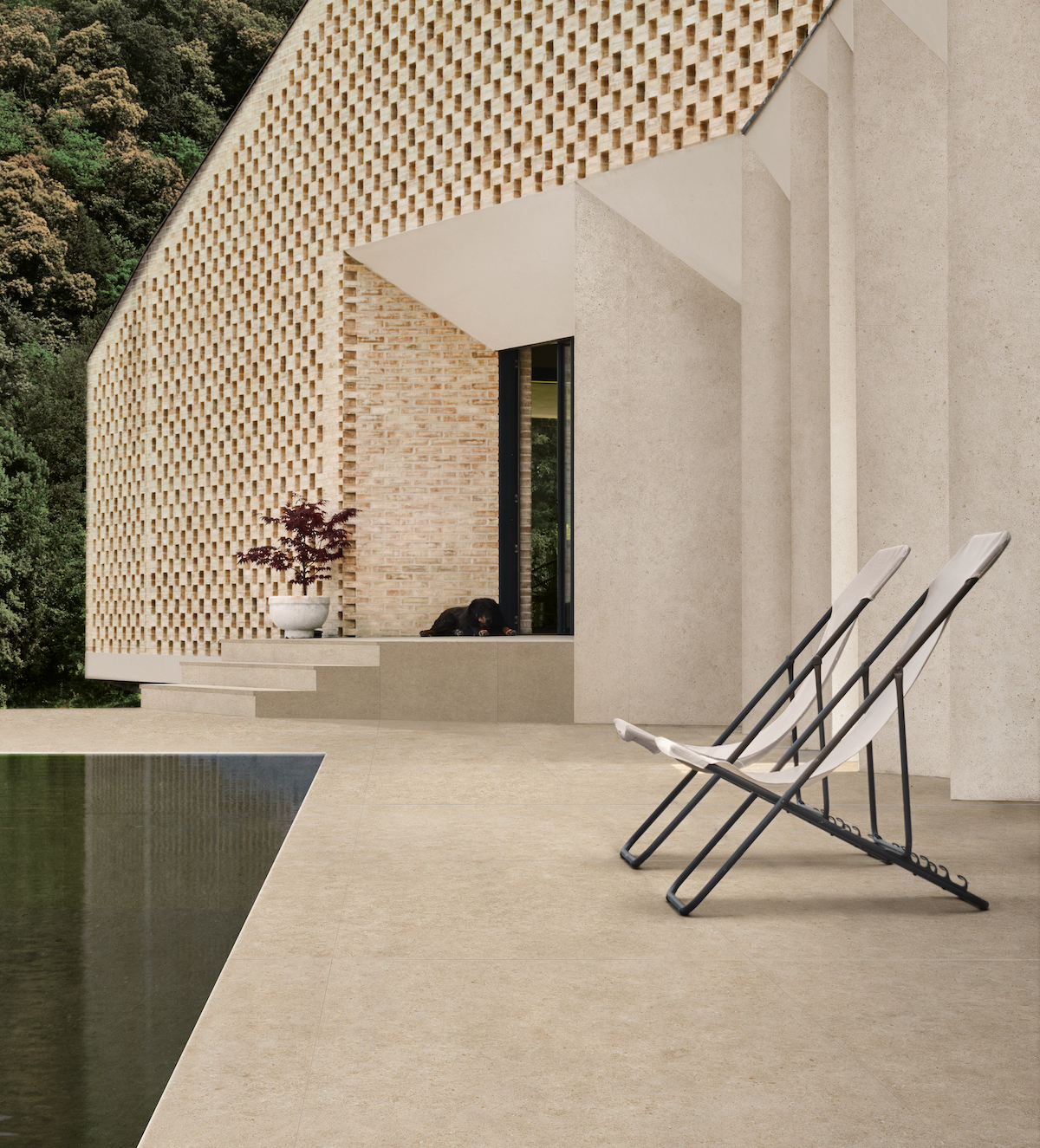
    A contemporary building made from Boost Stone from Atlas Concorde

    Image credit: Atlas Concorde S.p.A

    Generally, eclectic rooms with many decor and textures benefit from matching walls and ceilings because they add a sense of continuity within the room. Nonetheless, keep your style in mind before making a decision.

    > Since you’re here, why not read about creating a cohesive design language between bedroom and bathroom?

    Main image Unsplash

    Part 60: Maximising the value of tiles for hotel lighting

    730 565 Hamish Kilburn

    Leading tile supplier CTD Architectural Tiles’ sales director – architectural, Andrew Sadler, discusses the three key considerations for choosing the right tile to complement hotel lighting…

    The use of tiles in interior design for hotels has long been a popular choice for floors and walls alike. As well as providing a relatively easy-to-clean surface, design possibilities are almost endless thanks to the huge variety of tiles now available – with a variety of choice for any style, requirement and budget.

    But one thing that can be easily overlooked when it comes to choosing the right tile for a hotel interior project is the impact of lighting beyond its potential to alter the perceived colour of tiles. Lighting can vary not only from hotel to hotel but also from room to room within a hotel, so it’s important to approach each project from a bespoke perspective, and to utilise your tile supplier’s knowledge of each product range.

    As a starting point, we recommend considering shapes and textures, materials and even inclusivity alongside colour when it comes to choosing tiles that will perfectly complement the existing lighting.

    Considering shape and texture

    Not only will different lighting conditions affect the perceived colour of tiling, but it can also impact the perceived texture. This particularly applies to timber-effect and stone-effect tiles, where softer lighting is more likely to make the tiles appear flat while harsher lighting can highlight the texture of these tiles – so it’s important to choose the right tile texture for different areas of the hotel, depending on the lighting.

    While the appearance of a tile’s texture can be impacted by lighting, tile texture and shapes can also be used with lighting to create an attractive design through the use of shadows.

    Some tile designs work perfectly with lights to create a striking effect which is unique to the combination of the two. Collections such as the Three-D range we supply at CTD Architectural Tiles have been designed with various decorative shapes, with each creating shadow effects for a striking finish. Inspired by three-dimensional art and geometry, this type of tile interacts with lighting to create shadows, altering perspective and creating unique wall patterns.

    The Three-D tile range has been designed to create shadow effects for a striking finish

    Image credit: CTD Architectural Tiles

    Considering materials

    A common consideration when it comes to choosing tiles is gloss versus matt – with each offering its own unique benefits to a project. Matt tiles not only have a reputation for being non-slip and requiring minimal cleaning, but they are also a popular choice for creating a rustic effect.

    But while matt tiles are ideally suited to some projects, the right gloss tiles will interact well with lighting to alter the perception of the space. Light reflecting on the surface of gloss tiles can make the space appear wider, and therefore make the room feel larger than it is, making it the ideal choice for smaller areas of the hotel such as bathrooms. The interaction between gloss tiles and light can also make a room appear brighter – another benefit for areas of the hotel which receive little or no natural light.

    Considering inclusivity

    Not only is careful consideration of materials useful in creating a stunning design, but it’s also vital for creating inclusive spaces within hotels, particularly hotel bathrooms which, under the Equality Act 2010, must be accessible to those with complex needs.

    One of the key ways to do this is to consider the Light Reflectance Values (LRVs) of the tiles in the design of a project – ultimately this is the amount of light reflected from objects, in this case tiles. LRVs measure the visual contrast between different elements of the space such as between the floors and walls, and it’s therefore vital to consider the LRVs of tiles when designing a hotel’s interior.

    CTD Architectural Tiles is one of the brands that has taken advantage of our Black Friday package. To keep up to date with supplier news, click here

    Main image credit: CTD Architectural Tiles

    Part 58: Creating a cohesive design language between bedroom & bathroom

    730 565 Hamish Kilburn

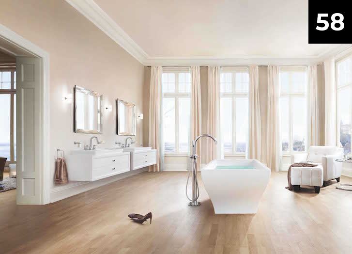
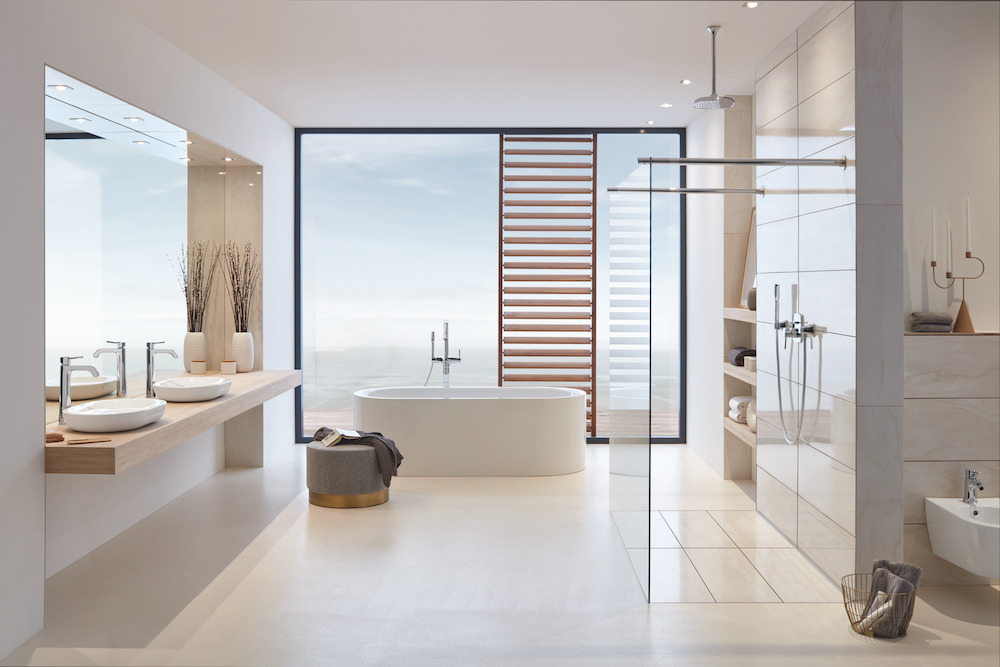
    With wellness and wellbeing creeping up on the agenda in modern hotels, more emphasis is being put on bathroom design to ensure these areas, within the context of the overall hotel experience, become more than practical spaces. When designing the bathroom, designers should consider creating a cohesive design narrative that compliments other areas of the hotel, especially the bedroom. Nick Brown, Leader, Hospitality UK, LIXIL EMENA, who is responsible for overseeing hospitality projects for the GROHE brand in the UK, writes…

    In recent years, the bathroom has shifted from a purely functional space designed for hygiene and cleanliness to one that now also embodies wellness and relaxation. Much like the bedroom provides a sanctuary for sleep, rest and recuperation, the bathroom now also has a similar role to play in providing the space for us to take care of not only our personal needs on a physical level but on an emotional level too.

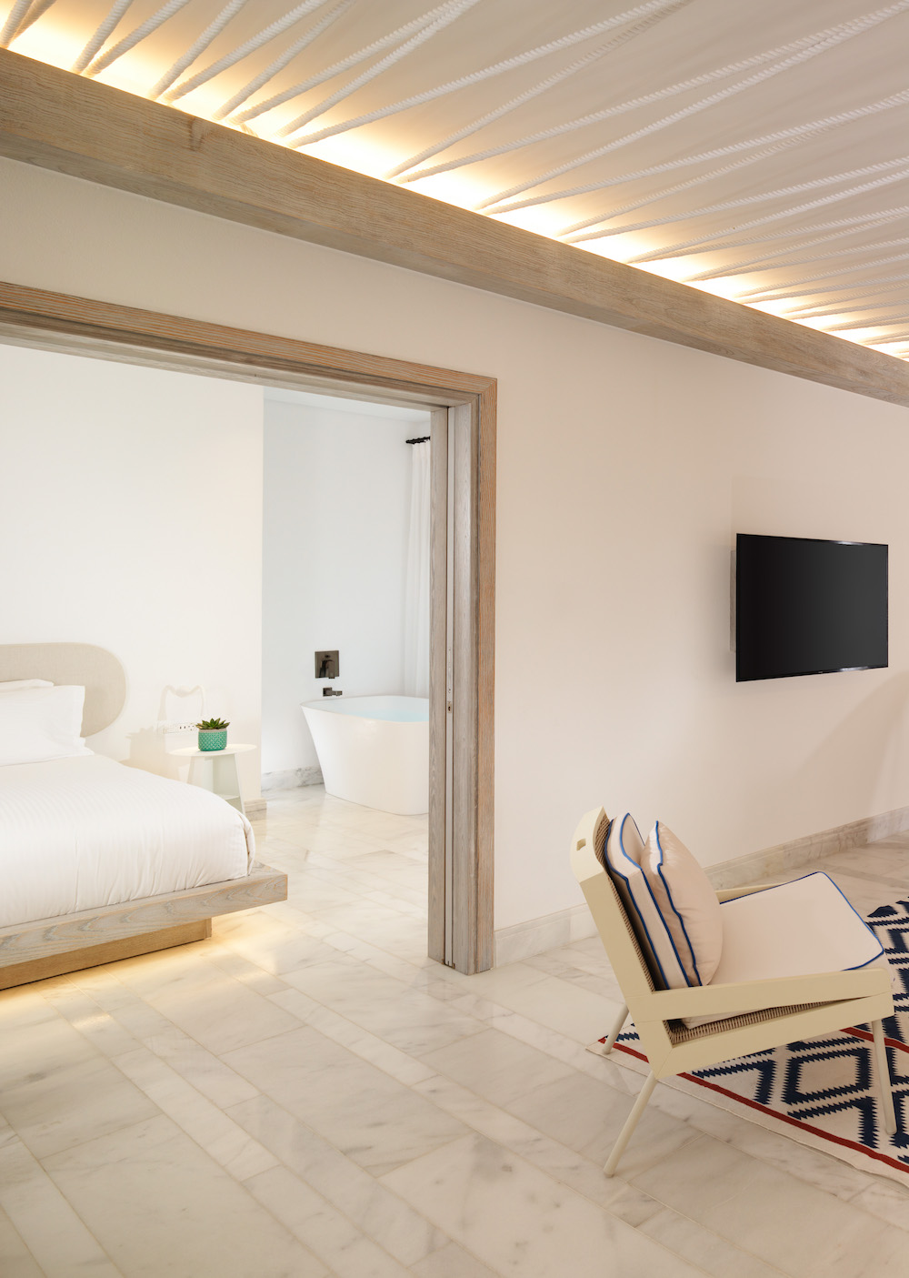
    Therefore, as the purpose of the bathroom has shifted towards more of a living space, there has been an increasing synergy between bedroom and bathroom design. The harsh boundaries that once separated individual spaces have now been broken down and we are seeing the merging of bedroom and bathroom coming into one shared space more and more.

    Other factors such as urbanisation have played into this shift also. The increasing demand for more housing and living spaces in busy urban areas has created the need for micro-living environments that use clever innovations and solutions to optimise on available space. This trend is not only being seen in the residential market but in hotels too, particularly those in busy city centres where space is also at a premium.

    Similarly, space is often at a premium for hotels in urban areas and particularly those in busy city centres. Designers and suppliers are recognising this need for a more cohesive language between bedroom and bathroom and not only adapting the layout of these spaces but also reconsidering product designs, shapes and colour finishes too. Meanwhile, designers also face the challenge of creating a layer of privacy and the option for the guest to shut off and create a divide if they wish to and typically look to more streamlined, discreet or integrated solutions to provide the best of both worlds.

    As designers begin to open up these spaces and physically bring the bathtub or basin into the bedroom, manufacturers are also re-imagining product forms and providing design options that align with the softer aesthetics of a bedroom.

    For example, ceramics in soft curves and organic forms are usually far more suited to a cohesive bedroom/bathroom space than harsh geometric shapes or patterns. The sight lines in a bedroom should be soft on the eye, favouring more minimalist design in order to instil a sense of quiet and calmness that can help guests unwind and drift off.

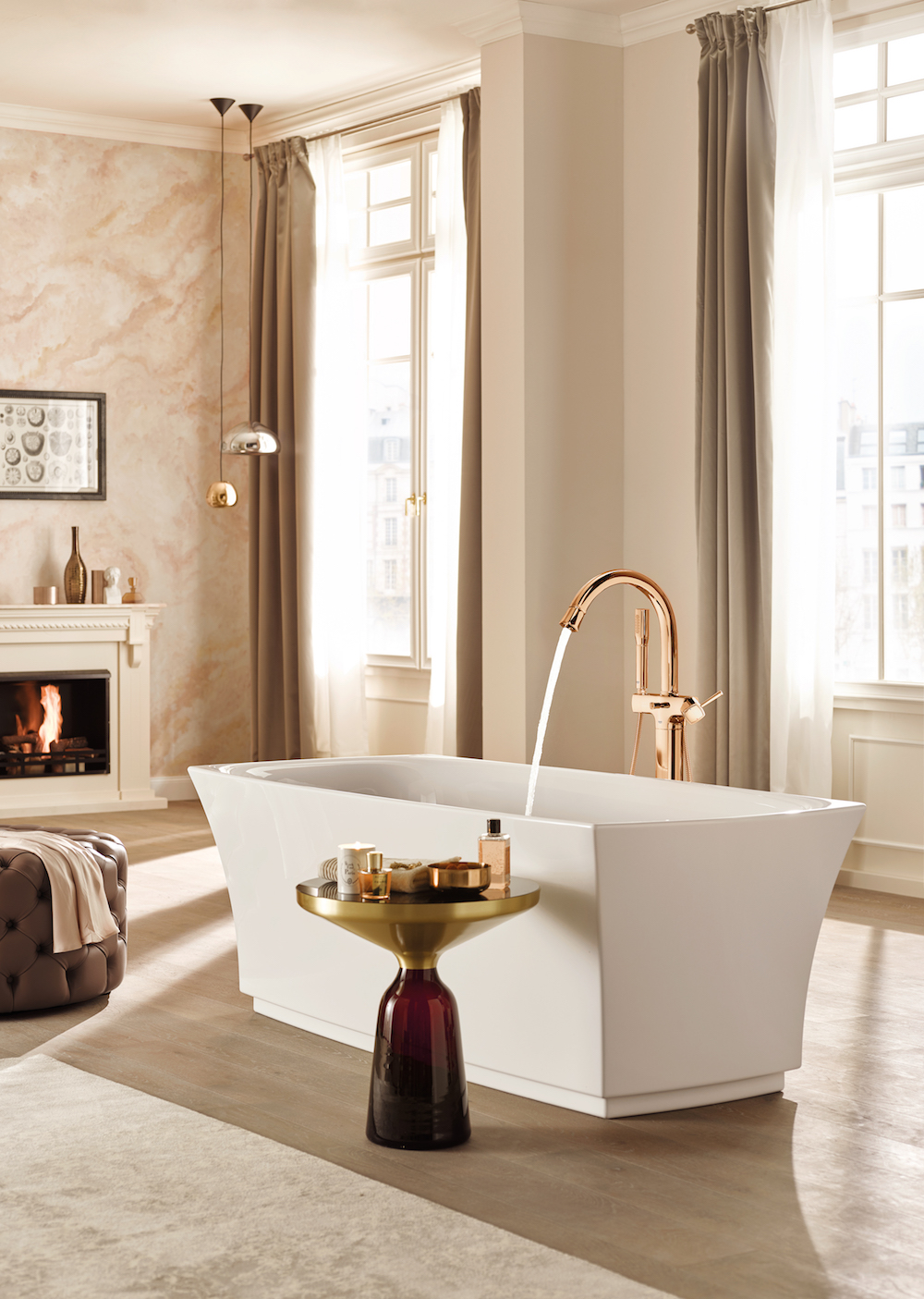
    GROHE bathroom lifestyle shot featuring Grandera shower, tap and bath filler

    Image credit: GROHE

    Bathroom design has shifted away from being merely functional, sterile and clinical to embrace colour and personalisation, allowing for a greater sense of character and an enhanced home-from-home appeal. With the need for design language between bedroom and bathroom to be more in sync than ever before, the psychology of colour will play an increasing important role in how designers bring hotel spaces to life. Rich metallic finishes bring warmth into a space and create cohesion across bedroom and bathroom touchpoints, from light switches and furniture to brassware and accessories. Alternatively, muted metal finishes like nickel can offer a more understated look that creates harmony within the two zones whilst still being sophisticated and minimalist.

    Designers can also play with contrasting or complementing textures to create both similarity and difference within the space simultaneously.

    > Since you’re here, why not read our roundtable on stylish sustainability in wellness?

    GROHE is one of our Recommended Suppliers and regularly features in our Supplier News section of the website. If you are interested in becoming one of our recommended suppliers, please email Katy Phillips.

    Main image credit: GROHE

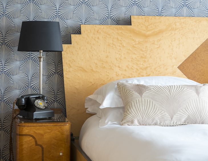
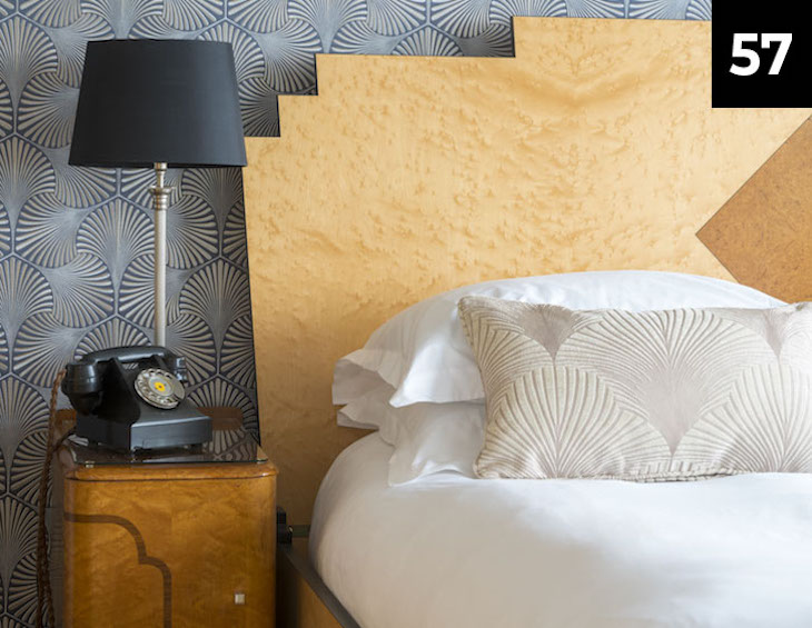
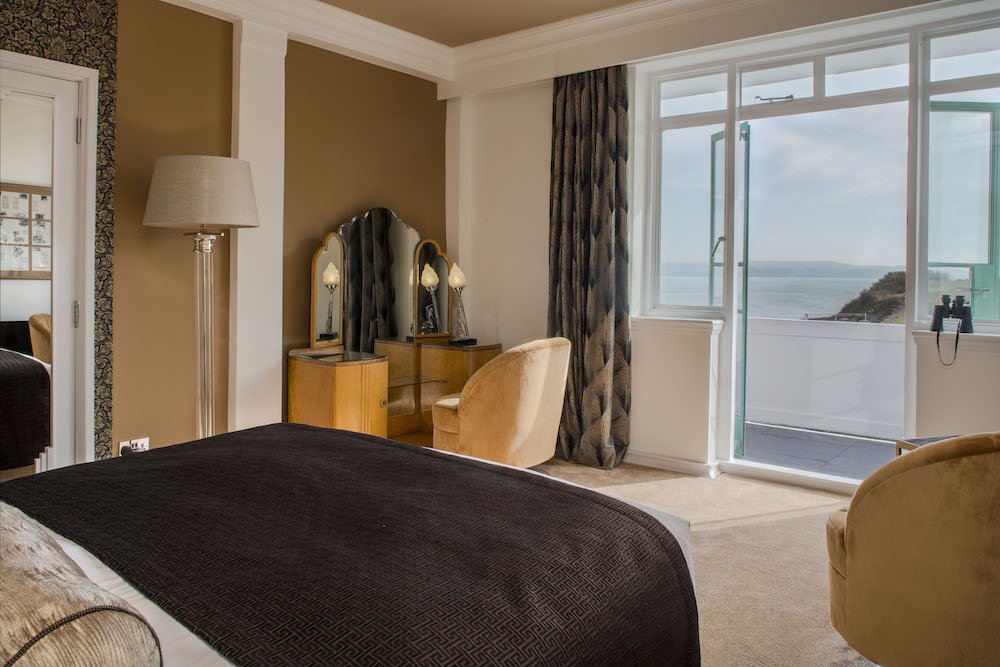
    Guestroom inside Burgh Island Hotel

    Part 57: Refurbishing hotels with authenticity

    730 565 Hamish Kilburn

    In the next article within the editorial series, Editor Hamish Kilburn and Giles Fuchs, Owner of Burgh Island Hotel, explain how designers and hoteliers can revamp their look and feel while also being sensitive to their building’s history and heritage…

    For many hotels, their individuality and charm is rooted in deep historical connections. In the wake of the pandemic, the vintage ambience and sense of escapism this creates has perhaps never been more important for guests’ experience.

    As a result, there is a risk that, when these classic and unique hotels need to undergo refurbishment, it creates a clash between the desire to preserve history and need to cater for 21st century guests. However, the two are not mutually exclusive. The recent revamp of bedrooms in Devon’s iconic Burgh Island Hotel, following the renovation of the hotel’s public areas, perfectly demonstrates how refurbishments don’t have to mean compromising their unique character or impressive history. In fact, the co-existence of old and new might just be the perfect combination for today’s guests.

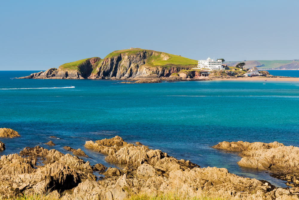
    Burgh Island Hotel

    Image credit: Burgh Island Hotel

    Consult the experts

    Maintaining a rich history throughout a revamp can be challenging- there is a fine line between something appearing simply ‘old’ instead of ‘historic’. To tread this line carefully and ensure that history is not lost, consulting and engaging with experts is essential.

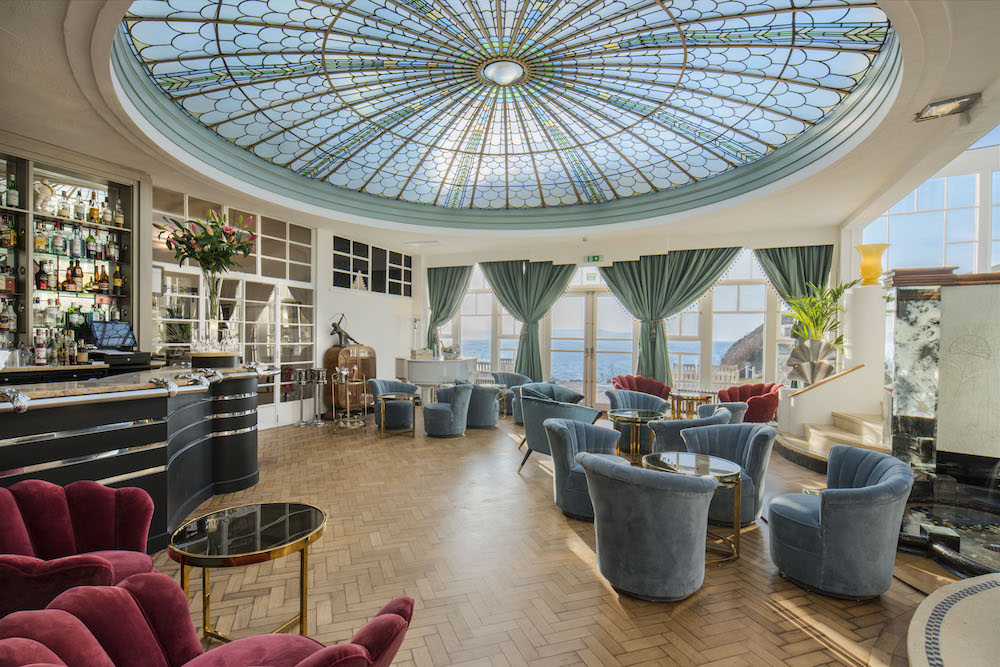
    For example, at the Burgh Hotel, experts including Art Historians, Art Deco experts and experienced interior designed have been crucial to ensuring the authenticity of the hotel is preserved during renovation works – whether that’s restoring the iconic domed Crittal skylight in the Palm Court Bar or refreshing the design of the bedrooms. For instance, bold geometrics influenced by Cubism adorn some of the bedrooms, whilst the vibrant colours and lavish materials transport the guests right back to the roaring 20s.

    Palm Court at Burgh Island

    Image caption/credit: Palm Court at Burgh Island Hotel

    Beyond the aesthetic, the names of rooms also pay homage to the hotel’s history, putting its famous past front and centre. Whether it’s Agatha’s Beach House, where Agatha Christie wrote the infamous ‘And Then There Were None’, or The Jessie Matthews Room, named after the designer of the hotel’s corridors in the early 20th century, the hotel’s Art Deco style is unmistakeable.

    Understanding your audience

    While drawing on expertise is crucial to maintaining authenticity, equally key to a successful refurbishment is understanding your target audience.

    For example, keeping the guests’ values in mind throughout any renovation can be key to future-proofing your offering, with latest research by booking.com revealing that more than 50 per cent of global travellers develop feelings of annoyance if their accommodation is not engaging in sustainable practices, something they prioritise in their stay.

    Moreover, a staggering 80 per cent believe sustainable travel is vital. So, for historic buildings, refurbishment offers a clear opportunity to adopt more sustainable and environmentally friendly practices, whilst simultaneously appealing to the growing environmental consciousness of modern guests. At Burgh Island, for instance, solar panels have been installed over the hotel’s disused tennis court, repurposing existing space to enhance its renewable energy commitments without compromising on the traditional Art Deco style of the architecture.

    Another hotel brand that is pathing the way for other brands to follow when it comes to meaningful sustainability is Inhabit Hotels, which is committed to focus on green initiatives and green policies by monitoring and reducing consumption levels, converting environmental efforts into cost-reduction and revenue generating opportunities whilst promoting the corporate and social responsibilities mandate contained below.

    A 1920s design bedroom

    Image credit: Burgh Island Hotel

    Balancing expectations

    Guests who seek to gain a sense of escapism or of ‘stepping back in time’ through their holiday accommodation should not have to compromise by giving up technology and detaching from society. The two can, and should, easily co-exist to create the perfect balance between authenticity and modern luxury. In fact, modern amenities such as contactless check-ins and motion-censored lighting can contribute to a far smoother guest journey and movement through the hotel, without detracting from a historical setting.

    While lockdown restrictions have eased, hybrid working culture remains the ‘new normal’. According to FlexJobs’ latest remote working statistics, 97 per cent of workers still desire some form of remote working moving forward. This cultural shift has paved the way for a new form of vacation – the ‘workation’. In September this year holiday giant TUI even launched a range of specialised ‘workation’ packages, kitted out with reliable wi-fi, ample desk space and natural lighting.

    Drawing on the history of its location should not preclude hotels from taking part in this trend. Indeed, on Burgh Island, Agatha’s Beach House is now a sophisticated, modern, and connected beach retreat, which would make the perfect location for a working holiday. First built in the 1930s as a writer’s retreat for Agatha Christie herself, the room still maintains a certain historic charm and connection to its history, despite offering the creature comforts of modern luxury.

    Elsewhere, Grantley Hall has been in the headlines recently following its personality-packed revamp. Inside the building that dates back to 1680 is a modern hotel. The owners were determined the property would retain the sumptuous extravagance of its past during its conversion to a five-star luxury destination. One of its successful approaches to this brief was to inject character into the carpet design. Damasks were fused with herringbones with subtle, luxurious grounds and bold accent pops. Grand florals were used to bring the flora from the surrounding gardens into the property.

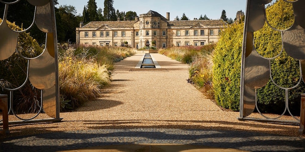
    Outside image of Grantley Hall

    Image credit: Grantley Hall

    Authenticity meets luxury

    So, classic, and traditional hotels need not shy away from refurbishment due to fears to losing their unique authenticity. In fact, it is quite the opposite. Through consultation with the right expert and understanding the expectations of your guests, refurbishment is a great opportunity to align with 21st Century standards of modernity and luxury, without compromising on that original charm.

    > Since you’re here, why not read our guide on how hotels can meaningfully design for social distancing?

    All references are available upon request.

    Main image credit: Burgh Island Hotel

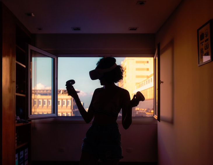
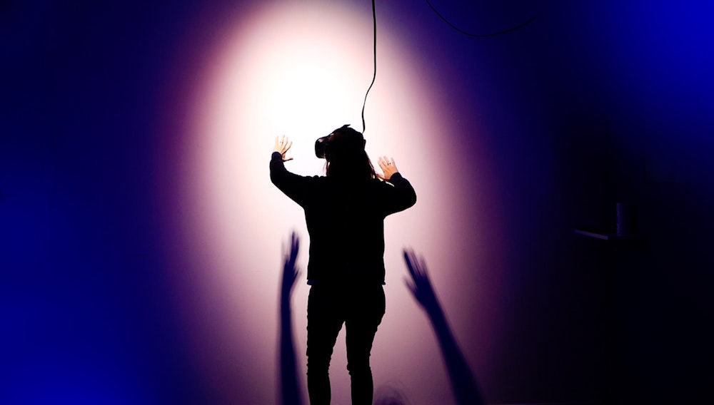
    image of woman in hotel with virtual reality headset

    Part 54: How virtual reality can transform the hotel experience

    730 565 Hamish Kilburn

    GTHD

    A GUIDE TO HOTEL DESIGN PT 54:
    HOW VIRTUAL REALITY CAN TRANSFORM THE HOTEL EXPERIENCE

    Agnieszka Wilk, Co-Founder & CEO of Decorilla Online Interior Design, reveals how virtual reality (VR) can transform hotel design and the hospitality industry…

    Even before we were stripped of many fundamental aspects of our regular lives due to the pandemic, virtual reality (VR) was rapidly evolving – the launch of Google Cardboard, Facebook’s Oculus Rift, and Samsung’s VR headsets triggered VR technologies’ inevitable move to expand beyond serving the gaming and entertainment industries.

    Since then, VR has created a bespoke, immersive interior design experience for the hotel industry’s players and designers. After 2020, the value and relevance of VR to a variety of professional settings has solidified even more. Many more interior designers are also realising the power of visualisation and its functions for remote collaboration on projects.

    Over the last few years, we have witnessed the technology being incorporated into the guest experience at hotels. Plus, with travel greatly diminished, the ability to simulate an environment using a headset, will become a big part of travel and tourism in the future too. However, less is known and discussed about how VR can benefit hotel designers. How does it work? Will it increase profit margins? How can we leverage it? Let’s dive in. 

    Hotel owners should invest now to save later

    Virtual reality is a computer technology that combines hardware and software to generate realistic images, sounds and sensations in order to immerse a user in a simulated three-dimensional environment. Using a headset that projects an image through goggles, users are able to see the projected image from a full 360-degrees. 

    Integrate this technology into the interior design industry and it’s possible to create beautifully designed spaces that are affordable. Hotel owners and designers can instantly see the visual and financial implications for changes to their plans, saving hours of time and money.

    Picture this; a boutique hotel owner wants to make design changes, has tight deadlines but can be indecisive. These upgrades will decide how their hotel will look for the next 10-20 years. With the help of VR and 3D rendering, top designers, regardless of location, can develop a clear idea of what they need to create this specific ‘contemporary chic’ interior. The hotel owner chooses from various photos of interior design spaces to decide on their preferred styles and favourite brands, as well as having direct input in the design process to move walls, change fabrics, and upgrade the carpets. Plus, the price bracket is dependent on the amount of design concepts required and the experience of the designers. 

    This all prevents costly mistakes as the spaces can be viewed before they exist, which also allows hoteliers to build trust with the partners they are working with. They can make this investment early on to avoid misunderstandings and save more money later… and it’s all accessible through a mobile phone or goggles.  

    A new Dimension for the client-designer relationship

    Building trusting relationships is one of the major success factors in the work between designers and their clients. With transparent insight, they can overcome imagination limits and boost a client’s experience. 

    Designers aspire to sell their vision and show their clients the high-end products that are trending. However, hotel owners may struggle to visualise proposed designs with basic 2D renderings of their 3D projects, and therefore may not get on board with the idea. With VR, designers are able to share their thoughts clearly so the clients feel informed and comfortable, without ever needing to go on site. 

    Everyone who has refurbished or designed a hotel from scratch has reached that point where they could no longer imagine how all the textiles, pieces of furniture, or material would fit together. With VR, clients are guaranteed to be captivated; they can almost feel the materials, see how the light falls, check how the room works and figure out if a desk really fits in a particular corner.

    Additionally, if designers create avant-garde hotel designs and pitch to their clientele using VR, the individual hotel owners can use the 3D renderings as marketing collateral. This could increase room sales and boost hotel revenue through enticing guests – they’ll know what to expect as the rendering of the rooms and communal areas would be identical to their potential holiday lodgings. 

    Of course, it is worth remembering that this is a contentious subject with interior design studios in 2021 spending more than ever during pitch phases – a line will need to be drawn at some point to establish how much tech should go into the client pitch in order to not only make it a fair but also to keep the window open for the designer to introduce new ideas/fabrics/furniture once the pitch has been won. There are arguments out there to suggest that VR and too much tech will eliminate this luxury. 

    Image of woman walking with VR headset on

    Image credit: Unsplash/Stella Jacob

    In regards to the consumer-facing experience, the “try before you buy” VR experience for potential hotel guests is already a tried-and-tested model. Hotels such as The Marriott IndyPlace provide virtual tours which allow guests to explore the rooms so they know what they are buying into and this has dramatically boosted conversion rates. The same could work for designers and their clients. 

    VR offers a memorable and immersive experience where designers can brainstorm with hotel owners in a 3D environment – they can see their furniture and items to scale, spot mistakes before they happen, zoom, rotate and save time regarding quotes for contractors and suppliers. Not to mention the sustainability factor; VR minimises waste and surplus material. 

    How can interior designers embrace VR further in 2021?

    Let’s take one of the latest trends in the hospitality business: Home furnishing brands moving into the hotel business as design sources, partners or property owners. In other words, using a specific brand to set a design aesthetic in hotels. Many interior designers have already crossed into the hospitality industry like Kelly Wearstler with San Francisco Proper, or Roman and Williams with Guild Freehand Hotel.

    The theory behind the trend is that customers will stay in the properties, have a unique hospitality experience, love the furnishings and want to mimic the look in their own homes. A handful of these hotels even supply a catalogue in the rooms to allow for fast and easy product discovery which some believe “connotes a sense of quality and luxury”. Normally, if we go to a hotel and like the decoration, furniture and accessories, we never dare ask where they are from, and we never find out. 

    If these selected hotels had a VR section on their website for virtual tours, there could be an added feature allowing customers to click on any item they loved in their room; the shabby-chic chairs, fringed lamp shades, and those ridiculously comfortable king size beds, and find out exactly where they are from. 

    The hotels would seem like a real-life catalogue and spaces to shop. Hotel design would immediately become more accessible for different types of interior designers too – they could pull items out of a hotel room and place that mid-century sofa, Pop Art painting, or geometric fabric into a design they are working on for a client on a VR application. It’s a powerful marketing tool for the hospitality designers, and ideal for residential designers too. 

    High-end tech is not only changing the face of international hotel services for guests through virtual hotel tours, enhancing the relationship between hotel and visitor. It is also allowing designers to set themselves apart from their competitors and stay ahead of the curve. These innovations couldn’t be more topical as VR is on track to become an $80 billion industry by 2025. 

    Main image credit: Unsplash/Vinicius Amnxamano

    Part 52: Spa design in the new era of wellness

    730 565 Hamish Kilburn

    GTHD

    A GUIDE TO HOTEL DESIGN PT 52:
    SPA DESIGN IN THE NEW ERA OF WELLNESS

    In the next decade, spa design will seamlessly blend wellness, technology and touch to enhance the guest journey, future-proofing the business for years to come, as Sparcstudio explains…

    The future of spa and wellness design remains positive. Out of crisis comes innovation and we have witnessed this in 2020 in the way that many spas have pivoted their business in response to the changing rules and regulations set out of governments around the world. During the year we have considered the impact of the pandemic for spa and wellness design and believe that spas of the future will have to be mindful of personal space for each guest, designing the wellness space to maximise comfort while embracing nature – connecting the inside with the natural world outside.

    Sparcstudio has identified a number of design trends for hotel investors and spa operators to be aware of when planning their next project.

    Spa in nature

    Post-Covid I believe there will be an even greater emphasis on outdoor spa-ing and a link to nature. Guests will want to escape hermetically sealed artificial environments and will  embrace the outside. Natural pools and Spa gardens will be even more key such as the ones we helped to create at South Lodge Spa.

    A spa garden doesn’t have to include expensive hydro pools and heat cabins. Maximise the use of any outdoor space as part of your spa experience. Be it a garden, courtyard or roof terrace or just a view through an open window. Outdoor sensory experiences could include individual relax zones dotted around an aromatic herb garden, daybeds arranged around a firepit sprinkled with cedar chips, or playful swinging seats alongside a beautiful trickling water feature.

    Personalised and Individual spaces

    Personalised spaces within large spa communal relaxation spaces will give way to smaller more intimate couples spaces spread throughout the journey. Expect to see pod changing rooms and spaces where guests can enjoy shared treatment experiences for two people or a small private group.

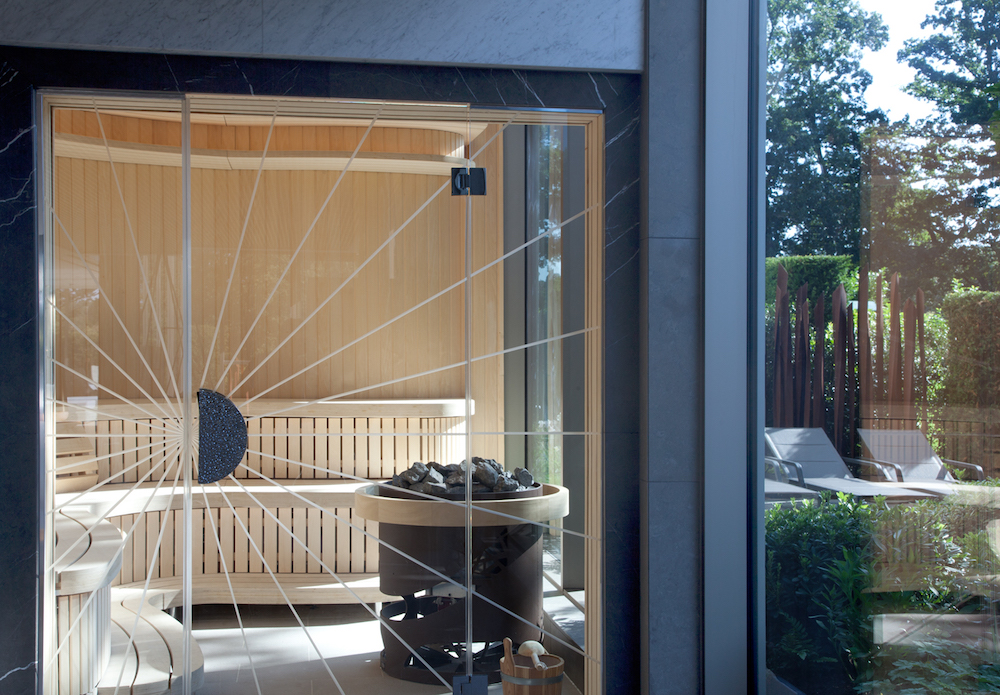
    A glass door into a spa

    Image credit: Cottonmill Spa at Sopwell House

    Free to roam areas such as pools and thermal suites and relaxation spaces will need to rely more on signage and other methods to inform about levels of usage. The new added transparency in thermal suite design is a great benefit in that guests can check via glass enclosures as to how busy a heat cabin is prior to entering. Where rooms are dark or enclosed it is possible to incorporate an electronic screen to the exterior of the room such as the one that was designed for the Meditation room at Sopwell Cottonmill Spa. The small screen communicates via sensors to indicate which of the beds are occupied. This has the added benefit of minimising disturbance of guests already in a room by opening the door to check to see if a bed is available.

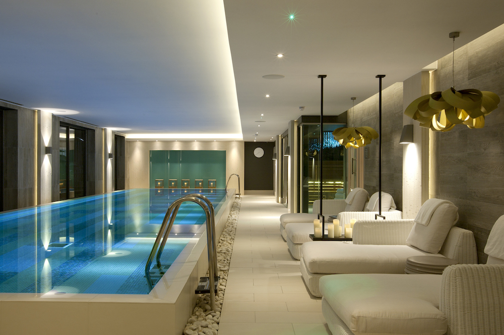
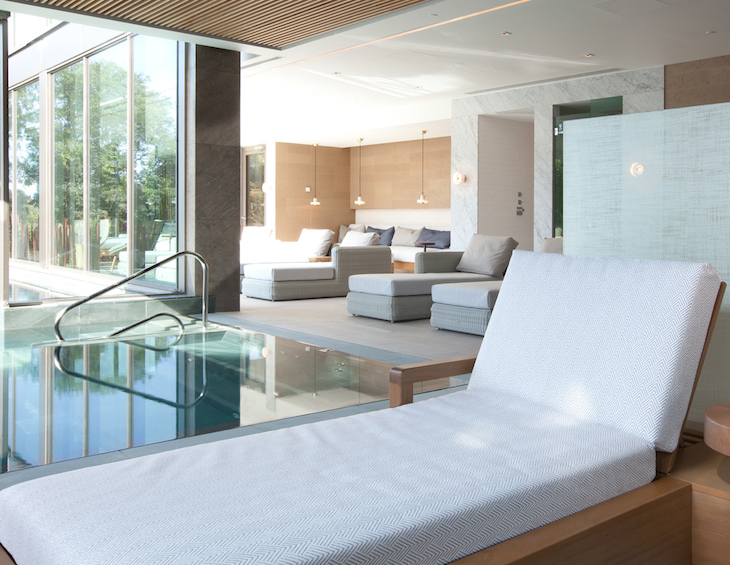
    A luxury pool and seating area

    Image credit; Dormy House

    Health is the new wealth

    We think there will be a further blurring of the lines between wellness, spa and fitness offers and that there will be even more demand for these facilities post-Covid as we seek to be healthier in mind and body. We anticipate there being a move away from the concept of a ‘spa’ as a once in while treat, and that there could be an increase in the spa as a Private Members Club similar to the model that can be experienced at the Club at Cottonmill Sopwell House Hotel, where spa becomes as regular a  isit  as the traditional gym and incorporates yoga spin and fitness facilities.

    Led by technology

    Intelligent use of technology will be adapted to create safe spaces for guests – self-cleaning rooms, UV robots, anti-viral fogging, ‘Star Trek’ type sensor opening doors, and RFID Touch Technology for opening lockers and to pay for services for example. We don’t think this will translate into clinical sensory deprived environments – but tech should enable and facilitate in a discreet way. For example, Cottonmill Spa at Sopwell House has digital screens to indicate available space within the Relax Room.

    The importance of clean air in spas will see the introduction of mechanical ventilation and air conditioning antivirus treatment systems. These will become commonplace as will the opportunity to naturally heat and ventilate spaces. Expect to see an explosion in the utilisation of outdoor space in spas where spa and wellness experiences in the fresh air will prove popular with guests.

    Since you’re here, why not read our 5-minutes-with interview with Beverley Bayes, Director of Sparcstudio?

    New build properties will rely on naturally antiseptic materials such as copper and include homogenous and large-scale floor and wall finishes which reduce grout and are easier to clean.

    With all technological advances and design developments, spa designers must always consider how to integrate the human experience into a guest journey – perhaps drawing on the ‘barefoot luxury’ style we designed at the Spa at South Lodge design, this ideal must always maintain priority, so that it is elegant, beautiful, functional and people friendly.

    Sparcstudio is one of the brands that has taken advantage of our Industry Support Package. To keep up to date with supplier news, click here.

    Main image caption: Sparcstudio

    Part 51: Designing & communicating in a digital world

    730 565 Hamish Kilburn

    GTHD

    A GUIDE TO HOTEL DESIGN PT 51:
    DESIGNING & COMMUNICATING IN A DIGITAL WORLD

    Matthew Harvey, Director of Hidden Media, explains why now is the best time to invest in a strong website design to amplify a clear and consistent brand image…

    Hotel design is the art of balancing form and function in a visual and physical sense to create a building that, despite its size, often stands out for the small details; details that represent the ethos and communicate the values of a hotel.

    Like any business, a hotel needs to have a raison d’être and distinction from other hotels. These individualities are characterised in the layout, design and styling within a hotel, but how are these communicated to potential guests on the other side of the world?

    Web design and digital marketing is much the same as hotel design; striking a balance between form and function to provide the service, information or function that a user is looking for, whilst communicating the values and brand message in the visual layout, design and style.

    “Effective storytelling compels a reader to embark upon teasing and choreographed tour.” – Matthew Harvey, Director, Hidden Media.

    Whilst many will simply reach for a hero shot – that one killer – captivating and all-encompassing picture that sits at the top of a website page or on a piece of marketing collateral, that does little to tell a story or take a potential guest on a journey.

    Effective storytelling compels a reader to embark upon teasing and choreographed tour, that beguiles and enchants, providing an immersive experience through the use of words, pictures and video. It’s not just about the ‘big picture’, hints and glimpses often have more to say. 

    Scrolling on a smartphone is natural and easy. Your storyboard is much longer than wide. A good digital journey matches form with function, so touch points, easy booking, contact requests and promotions flow with the journey a customer takes.

    The balance between form and function

    Pre-pandemic we were already looking at online sources accounting for in excess of 80 per cent of bookings, this is naturally now going to be higher with an even greater shift online. Dependent on sector and location you can expect that at least 70 per cent of all digital touchpoints being made on a mobile device. Your website can be your best, or your worst salesperson.

    Your customer journey can be broken down into three crucial stages:

    • Awareness – Mostly achieved through content marketing, advertising, promotion, placement or ‘advocacy’ (we’ll discuss this in another feature).
    • Consideration – This is when your website really steps into play, making it easy for people to find the information they need for their research, communicating your key messages, keeping them engaged, helping them reach out to you and compelling them to the next stage…
    • Decision – Help to convert your customers with well-placed and well-timed promotions, supported with peer reassurance/reviews, and by reducing friction points, such as employing a simple booking/reservation system.

    The consideration stage can take hours or days. Some statistics would indicate that 90 per cent of your website visitors are not yet ready to make their ‘decision’ and will visit at least three more websites before they finally decide to make a booking/reservation. Which is all the more reason why your website needs to offer a user experience that’s as memorable as a stay at your hotel.

    “The hotel industry lays claim to many large, multinational brands with some of the worst websites.” – Matthew Harvey, Director, Hidden Media.

    Understanding that there is a balance between form and function is about telling the story, showing style, enthusing service levels and shouting about what makes your hotel different and stand out whilst thinking about the end user, the guest, researcher and paying customer. They need to be able to quickly, easily and confidently book.

    Without naming and shaming, the hotel industry lays claim to many large, multinational brands with some of the worst websites that completely fail to reflect their values, the style and design of their hotels or their slick service.

    The art of storytelling

    What is it that compels someone to stay at your hotel? How do they feel about your brand and what does it stand for? What makes your hotel special or different?

    A collage of images and ideas pinned to a wall

    Image credit: Andy Art T/Unsplash

    Asking yourself these questions is a really simple starting strategy. And although some of the answers could be very literal, such as, “an ocean side location with minimalist architecture, an individual private pool and fine seafood dining,” the art of storytelling is triggering the emotive connections and communicating your message, often in a subliminal way.

    A movie trailer is careful not to become a spoiler, instead it’s a teaser that makes you want to buy the film. Storytelling doesn’t give everything away in the first paragraph, it instead creates a journey for your potential guest to explore your website and experience everything that your hotel, rooms, restaurant, facilities and location has to offer. 

    Much like interior design has to flow, each ‘chapter’ of the story leads naturally into the next, giving your guest everything they need during the consideration stage and over the line to the decision stage.

    Main image credit: Brooke Lark/Unsplash

    Part 48: Creating meaningful signage & surfaces

    730 565 Hamish Kilburn

    GTHD

    A GUIDE TO HOTEL DESIGN PT 48:
    CREATING MEANINGFUL SIGNAGE & SURFACES

    Signbox explores how designers and hoteliers can cc cover all bases when it comes to signage and surfaces in order to help create the perfect guest experience…

    It may start with the ease of reservation, the first impression or the receptionists’ welcome, but there’s no doubt what happens next is critical when it comes to creating a hotel guest experience that’s memorable for all the right reasons.

    First and foremost, interaction is everything – not just the meet and greet and relationship with the concierge, but the way guests connect with and relate to their surroundings. It has to go deeper than décor – it has to be functional, informative, exciting, versatile and carry a consistent corporate identity.

    Signbox has all these bases covered with an incredible range of digitally printed hotel wallcovering solutions and environmental graphics solutions that embrace a wide range of materials, from glass and metallics to printed vinyl and tick all the boxes when it comes to giving the guest the experience they’ll be writing home about.

    Exciting digitally printed wallpaper

    This is where digital hotel wallcoverings really get exciting! Digitally printed wallcoverings are an innovative display solution that combine eye-catching scenes with inspired mood setting and practical hotel signage and messaging. Regardless of the size of the space or its function, Signbox digitally printed wallpapers offer a uniquely ingenious twist for traditional hotel interiors.

    Signbox’s digitally printed wallpaper and wallcoverings incorporate photographs, logos, typography, symbols, corporate imagery and logos to create fresh and exciting hotel areas that make every space work harder for its guests and breathe new life into areas that might otherwise have been underutilised or tired.

    The applications for digitally printed wallpaper are as endless as the designs themselves. Within corporate guest areas, bold, dynamic digitally printed, large format supergraphics serve to motivate and inspire performance while, back in the heart of the hotel, they create powerful aesthetic backdrops that can be as easy on the eye as they are conceptually groundbreaking, depending on the purpose of the space.

    Each digitally printed wallcovering is digitally inkjet printed at Signbox’s vast Egham manufacturing base onto Digimura 2.1 material, which is fire rated to EN13501 and is EN15102 wallcovering compliant. All conform to Signbox’s award-winning benchmarked standards of quality and best practice and all offer remarkable customised wallcovering options.

    Go interactive with digital signage surfaces

    Hotel guests who feel able and compelled to interact with their environments are likely to score their experience more highly if they can access personalised hotel messaging intuitively.

    Signbox has a range of digital signage solutions for hotel environments that make light work of displaying announcements, wayfinding messages, alerts and live data and media streams to keep everyone informed and interacting. Corporate hotel guests will love this real-time multimedia content platform of choice with its seamless presentation and communications tools that work effortlessly across business centres, meeting rooms, conference areas and lounges.

    Other guests will enjoy interacting with touch screen display technologies that help speed up the check in process, find their way around the hotel, select dining menus, discover events and on-site facilities as well as serving as invaluable emergency alert systems.

    Signbox’s digital signage surfaces include its stunning Displayhub display solution that incorporates interactive HD LED touchscreen displays within a full-length glass fascia with NFC (near field communication) options. At the other end of the interactive digital signage scale you’ll find vast video walls with tiled LCD panels, LED tiles or laser rear projection cube systems. These offer unrivalled bespoke digital display options that not only transform the hotel interior space, but demand attention for guests keen to stay in touch with customised content and information, hotel branded advertisements and broadcast media.

    Wallcoverings with a touch of glass 

    For areas that demand privacy, safety or security screening or a more customised, bespoke branded wallcovering solution, glass manifestation answers the call. With the capability to transform the look and feel of a hotel area, from receptions and lobbies to corporate hotel spaces, Signbox’s 3M glass manifestation films can be customised to suit a hotel brand identity scheme at a fraction of the cost of tradition bespoke digital printed glazing film and wallcovering methods.

    Flexible hotel display wallcoverings  

    When it comes to hotel promotions, corporate events or simply when the message or theme needs to change to keep the look fresh, it’s time to think outside the box. Signbox’s Teslaflex system is an ingenious printed ferrous film with a high-grade magnetic base and self-adhesive backing to display photographic-quality graphics. This superb hotel display wallcovering solution is ultra-lightweight and quick and easy to apply and is perfect for short-term guest messages or hotel campaigns.

    a colourful abstract art wallcovering

    Image caption: Digitally printed wallcovering combination | Image credit: Signbox

    Other display wallcoverings include digital canvas art – digital canvas prints that can be inkjet printed to cover any space or environment with a bespoke wallcovering approach for spaces that take account of hotel branding and the physical and practical form of each area. Then there’s Signbox’s engineered Kube framing display solution. It’s a lightweight frame and tension fabric system that can be printed in sizes from 25cm2 to 3m x 10m supersize and is designed to add an ultra-cool touch to a hotel interior.

    Never underestimate the power of environmental graphics

    This is just a collection of Signbox’s wider bespoke wallcovering solutions that fall under the signage category of ‘environmental graphics’. Indeed, so vital is this concept that EG, the name behind Signbox’s renowned digital print division, is today the most popular choice when hotel and hospitality, corporate workplace and retail sector signage strategy.

    You can explore the entire EG collection of groundbreaking digitally printed wallcoverings, digital wallpaper graphics, supergraphics and bespoke digitally printed wallcovering solutions by viewing the EG brochure.

    Why all the signs should point to a perfect guest experience

    It’s easy to see how next generation digitally printed wallcoverings, digitally printed supergraphics, customised digital wallcoverings and bespoke wallcovering solutions can quite literally transform the hotel space. But more than that is the power of a custom digital wallcovering – whether digitally printed wallpaper or bespoke display wallcovering, digitally printed supergraphic or large format video wall – to transform the hotel guest experience into a personal, interactive and enriching journey that inspires repeat bookings and loyalty to the hotel brand.

    Signbox is one of our recommended suppliers. To keep up to date with their news, click here. And, if you are interested in becoming one of our recommended suppliers, please email  Katy Phillips by clicking here.

    Main image caption: Large format digitally printed display for reception space | Image credit: Signbox

    Part 47: The quest for originality in art consultancy

    730 565 Hamish Kilburn

    GTHD

    A GUIDE TO HOTEL DESIGN PT 47:
    THE QUEST FOR ORIGINALITY IN ART CONSULTANCY

    As an international art consultancy, Artelier specialises in curating art for luxury hospitality, residential, yacht and aviation projects. At a time when there is an inexhaustible supply of art online, Artelier explain why organic and thorough research is essential for offering originality in a hotel art collection.

    Drawing on their experience in sourcing contemporary art by leading global artists, Artelier’s art consultants reveal what it takes to avoid the pitfalls of the typical luxury aesthetic found online.

    Rarely has there been a time when art has been accessible to so many. Whilst at one time art would mainly have been encountered at galleries or fairs, there are now endless online resources that make art readily available for a wide audience within moments. Online search engines and social media have also given emerging artists platforms for sharing their own work, providing them with the opportunity to gain international attention regardless of where they are based. While the democratisation of access to art is a welcome development, it has also brought an influx of lower-quality art online, making it ever more important to be able to discern which artworks are worth the investment.

    Image credit: Artelier

    Turning solely to online resources when curating art collections for hotels has many potential pitfalls. The online art market has become inundated with artists who are relatively less credible in professional circles; rather than being early-career artists who are growing their recognition, these more amateur artists often lack the experience or training to create truly original work.

    While the notion of ‘originality’ is naturally slippery with regards to art – and indeed, most professional artists acknowledge that they find inspiration by building on existing ideas – here the line is much more distinct. Many amateur artists working at this calibre seem to replicate others’ ideas or follow art ‘trends’, yet they create works that are altogether poorer examples, as they lack the finesse of professional artists. This leads to an overcrowded market of exceedingly similar artworks, that do not offer exciting and challenging ideas. Search engine websites therefore often present an ever more diluted mix of the same imagery, reworked to varying degrees of success.

    The pitfalls of art sales websites

    Without a professional eye, sourcing art from art sales websites such as Artfinder or Saatchi Art may lead designers to overspend on uninspiring art. It is not clear how artists have been vetted on such websites, and which artworks are put up for sale is likewise not thoroughly regulated. The question arises as to whether these websites are truly capable of offering a refined selection of artworks, which have been edited for quality. Instead, art sales websites are geared towards offering as much quantity as possible to the consumer, regardless of artistic merit.

    In cases like these, too much choice may well be an issue. While the breadth and diversity of artworks online reflects the spectrum of work being produced today, if truly special artworks are few and far between, unearthing them can be an arduous process. To put this into perspective, only 3-5% of the artists found on art sales websites would stand up to Artelier’s scrutiny when they research new artists to add to their database – and for this reason, Artelier largely use other research methods for discovering new artists to connect with.

    Although there are many reputable artists who present interesting and skilful works online, there are nonetheless plenty of examples of artworks that are less expertly executed. Even if the pieces look generally passable on screens, in person they can lack depth and craftsmanship. It is difficult to determine the quality of the execution online without the practice that an art specialist has at examining works. Unfortunately, this can lead to severe disappoint for the buyer once they receive what is clearly the correct work, but in much poorer quality than they were expecting. As a result, rather than making use of art’s potential to bring together a design scheme and add a layer of sophistication, generic artworks can undermine the quality of the design.

    Another concerning aspect is that the price of artworks on art sales websites are often self-evaluated, and so determined by artists themselves; this often leads to ludicrously overpriced pieces flooding the websites. This can be shockingly observed when choosing to filter the search engines from high-to-low price, where too often many of the most expensive artworks are generic in style and by undistinguished artists. These prices are outside of the usual art market forces – in more traditional sales contexts, artworks would be evaluated by way of complex factors, such as their provenance, the artist’s background, and the artistic merit of the piece. The practice of being able to set prices at many thousands of pounds for a work by an unknown artist may leave these websites susceptible to opportunists. Some people may take advantage, seeking to sell a piece to an unsuspecting consumer who believes the price tag would reflect the skill and reputation of the artist. Without the market knowledge and trained eye of art specialists, it is easy to be led to believe an artwork is worth its price.

    Pinterest and the dilution of original ideas

    The explosion of available visual media through platforms like Pinterest and Instagram has made creative ideas disperse rapidly. Yet, the over-reliance of many art consultants on these platforms for inspiration has also led to a staleness of aesthetic, and a tendency to stick to art ‘trends’. Artists themselves often look to online media to develop their ideas, causing many to simply create versions of generic styles, and for the presence of true originality to become ever more diluted.

    Image credit: Artelier

    These search engines are often the primary resources for less experienced consultants, who may lack the capability of finding artists from more organic sources – such as being rooted in arts communities and growing networks over time – and the experience to spot potential at new shows and fairs. The overall effect of this approach is a trapped repertoire of art being sourced for luxury commercial design. As a result, the general predictability in the art does not fit with the intentions of cutting-edge interior designers, who are seeking to break new ground.

    It goes without saying that art which is characteristically similar to its counterparts will fall not even close to the aesthetic criteria of a sophisticated and discerning hotel guest. Curating art for hotels therefore demands responding to the client’s brief in a surprising way, which requires thorough, in-depth research that is amassed over time.

    Interpreting a theme in a visually interesting way takes a breadth of knowledge and creative thinking, in order to form subtle connections that go beyond design trends. While Pinterest presents many excellent examples of both under-the-radar talent and established artists, it cannot be the principal research method, as it simply takes more to fulfil the expectations of a luxury client.

    Organically evolving a quality database

    Discovering artists from the ground up gathers a more diverse range of artworks, and represents the true spectrum of ideas and innovative uses of materials in global contemporary art. Artelier’s research methods are guided by this attitude, and so they seek to become embedded in international artist communities and establish direct connections with artists and galleries. As well as undergoing in-depth research, they are regularly approached by artists themselves, and similarly galleries reach out if they feel an artist they represent especially suits Artelier.

    These connections have been established through 20 years’ worth of experience in the industry, allowing Artelier continue to grow a strong repertoire of associated artists. Artelier’s database currently includes 10,000 artists who have been individually researched by Artelier’s team, maintaining the highest of standards through an acute instinct for quality and a wealth of art market expertise.

    Image credit: Artelier

    Through this organic research method, Artelier prioritise artists who demonstrate an ingenuity of thought, and are true masters of their mediums. Rather than being driven by popular trends, an art specialist’s trained eye is capable of recognising genuine talent. This allows Artelier to be ahead of the curve in terms of proposing stimulating and impressive artworks, rather than being limited to following the online trend of the moment.

    When clients approach Artelier with a particular brief or theme in mind, they therefore respond to the hotel client’s concepts with artworks that are truly original, even if the client’s concept is itself inspired by a trend. By offering high-quality artists who are capable of creating artworks that are tailored to the hotel’s context, Artelier ensures the longevity of the stylistic choices and make artworks a worthwhile investment. Such artworks are not typically encountered on online art search engines, and for this reason Artelier chooses not to rely on them as a major resource for research.

    A complex thematic approach

    Through experience, Artelier understands that truly innovative ideas need to be developed from internal, rather than external, influences. At the beginning of a project, their approach is therefore to think like an artist – looking for subtleties within artistic themes, and seeking to unearth complex connections. The process of developing a thematic response to a project brief becomes centred around invention, rather than re-creating versions of what already exists. Since Artelier’s approach involves internally generating ideas for newly commissioned artworks, the outcome is something completely fresh – this brings the critical element of the unexpected to hotel design.

    When exploring potential themes for a hotel art collection, it is necessary to root the artworks in their context: artworks must speak to the unique culture of the area, reflect the ethos of the hotel brand, and create an air of luxury which exceeds the expectations of high-end travellers. These key considerations speak to the core of many hotel project briefs. In a recently completed luxury hotel development in Bahrain, for example, Artelier was asked to curate a portfolio of art that related to local history, and referenced the sense of a meeting point between cultures and communities.

    After extensive research into the exceptional aspects of Bahrain’s history and geography, Artelier identified a narrative between several interrelated themes. These centred around concepts of navigation, archaeology of the area, local ancient crafts, and the natural wonders of the nearby sea. Together, these themes formed a coherent basis for the proposed art collection; Artelier could then begin to refer to their database, and contemplate how the themes can be reflected in specific artworks.

    Image credit: Artelier

    ‘Ready-made’ art vs. nurturing creativity

    The appeal of shopping for and finding an artwork that is readily available, much like a product, has led to the popularity of sourcing ‘ready-made’ artworks for hotel design projects. The trap of sourcing artworks in this way, however, is that these pieces will always be limited to what has already been done – once these works are out there, regardless of how novel the idea may have been originally, they will be copied and popularised.

    For the initial stages of a project, there are advantages in looking at ready-made artworks – often designers benefit from a visual hook they can use to assemble a mood board, and the wealth of imagery online is a perfect, quick tool for this. While the artworks at this stage would be interesting enough, inevitably there will be a sense of the familiar about them. Without an insight into the art market, it is difficult to spot an artist who is doing something truly innovative and leading trends.

    For Artelier, the process behind sourcing artworks is inherently creative, as they continuously build upon initial concepts, and foster creative thought through collaboration with artists. Once artists have been selected for a project, Artelier closely works with them to develop existing concepts; the artists’ creative input and intimate knowledge of their materials expand initial ideas into something that has not been done before. This collaborative process encourages the risk-taking and experimental attitude that feeds creative work. As newly commissioned artworks are created specifically for a given hotel project, Artelier are able to develop something utterly unique, in its truest sense: tailor-made, freshly created, and one-of-a-kind.

    For these new art commissions, Artelier often collaborates with emerging artists who they discover through a variety of sources. Artelier specialises in talent-spotting artists who have the potential to work on high-profile commissions, but need the support of someone who has experience with delivering art to luxury clients in a variety of contexts. In this way, genuine, professional artists have their work nurtured, and their creativity given space to grow – Artelier understand the difference that a substantial commission can make to a deserving, but relatively under-the-radar, artist. If this talent is utilised, however, this gives the best opportunity for boundary-pushing ideas.

    The longevity of innovative art

    Every innovative idea will, inevitably, make it to online art search-engines and social media platforms; industry professionals will begin to take note, and use these novel concepts for their inspiration. However, by continuing to approach artistic research with a commitment to talent-spotting and fostering the growth of new ideas, Artelier maintains a pioneering vision that enables them to always stay ahead of the curve.

    Artelier is one of the brands that has taken advantage of our Industry Support Package. To keep up to date with supplier news, click here. And, if you are interested in also benefitting from this  three-month editorial package, please email Katy Phillips by clicking here.

    Main image credit: Artelier

    Part 46: How to meaningfully use CGI when planning new spaces

    730 565 Hamish Kilburn

    GTHD

    A GUIDE TO HOTEL DESIGN PT 46:
    HOW TO MEANINGFULLY USE CGI WHEN PLANNING NEW SPACES

    The multi-faceted realm of CGI can be an invaluable resource to any person or company when planning an interior space. Technical drawings of the space can seamlessly be imported into 3D design software. From here the process of CGI starts and can take three main routes.

    Route one

    The technical CAD drawings are transformed into accurate 3D representations of the interior space(s). Many simple 3D software packages allow users with a moderate degree of computer software expertise to create a representative view of the interior space.

    Style and photo realism are not key features or abilities of this type of software. However, a revealing view of the space can be created, with bespoke fit-out features and furniture included.

    Route one CGI visuals are perfect for the initial stages of planning. The accuracy of the visualised spaces allows for technicalities to be worked out and the space to be ‘filled’ accurately.

    Whilst they lack any resemblance of realism, these can suffice for some interior space design requirements. As the skills required to generate this style of CGI are minimal, so are the associated costs.

    Route two

    Route two CGI visuals take things up to a more realistic level. The accurate 3D spaces of Route 1 are built up to generate visualisations that are not only more aesthetically pleasing, but they also allow for the interior design ideas to be communicated better.

    Classed as ‘in-house’ CGI, these visualisations offer good levels of accuracy and visual style without a huge price tag. Cost savings are possible as the visualisation team creating the images are focused on providing a clear vision of the interior space as an overall view. With less time invested into adding photorealism through specialist scene lighting, high polygon models and high-quality texture maps.

    The reduced quality allows the CG images to be edited much easier, allowing for revisions to be made and alterative versions of the interior space to be shown.

    This form of CG image is excellent for planning, as good levels of accuracy and clearer visual communication of the design ideas, allow for planners and clients to understand the space better.

    Overall, Route two CGI visuals offer great bang for your buck, but with limitations.

    Route three

    The full photorealistic CGI phase. Used to truly communicate an interior design and guarantee planners/clients are engaged and approving of the interior space design idea.

    The costs associated with the Route 3 CG imagery is higher and, in some cases, can be deemed expensive. However, these are visualisations that blur the lines between reality and virtual space. The CGI can not only be used as part of the planning phase, it’s accuracy and photo realism allows it to be used for marketing purposes as it accurately depicts the final interior design as it would appear once constructed/fitted-out. Therefore, the additional costs associated with these high-quality photorealistic CGI visualisations are offset and in most cases the return on investment is greater than what is offered via the use of Route one or Route two CGI.

    Meaningfully utilising CGI

    Which route to take with your CGI requirements is dependent on several factors:

    Size of project – smaller projects may offer less intricacy and aesthetic appeal, therefore investing significantly in CGI is not likely to provide good ROI. Larger projects offer more potential for creativity, ensure that potential is fulfilled with several Route 3 CGI visuals.

    Budget – Should budget be a key factor, route 2 CG images would suit best, these offer a balance between visual appeal and accuracy.

    Competition – For interior design and fit-out firms who are bidding for popular tenders, the Route 3 CGI offering is best. The increased quality and visual attraction that is offered is likely to elevate the design ideas above other offerings.

    Deadline – Route 2 CGI services can be produced within just a few days, allowing for tight deadlines to be met without missing out on the ability to offer up attractive visuals for client review.

    Ultimately choosing the correct CGI studio will be one of the strongest factors for creating visualisations that are meaningful and successful when planning a space. The right studio will guide you based on the above criteria, utilising custom workflow and design practices to accommodate your requests and produce what has been requested. Therefore, it is vital that communication between client and CGI studio is clear, concise and covers all of the criteria mentioned above. With all of this knowledge a quality CGI studio will provide the correct results.

    North Made Studio is one of the brands that has taken advantage of our Industry Support Package. To keep up to date with supplier news, click here. And, if you are interested in also benefitting from this three-month editorial package, please email Katy Phillips by clicking here.

    Main image credit: North Made Studio

    Part 45: The role bespoke lighting plays in modern hotels

    727 524 Hamish Kilburn

    GTHD

    A GUIDE TO HOTEL DESIGN PT45:
    THE ROLE BESPOKE LIGHTING PLAYS IN MODERN HOTELS

    The almost all pervasive use of a standardised approach to the construction of medium height and tall buildings does not help with differentiation; a key attribute for any hotel as first impressions are vital. The skilful application of façade lighting can help a great deal, as the LED lighting specialists at Illumination Physics explain…

    The use of glass and aluminium in unitised or non-unitised curtain wall construction is pervasive in most modern facades for reasons of cost, performance, and speed of construction: The advantages are irrefutable. However, the facades all look inevitably similar.

    Older or more classical hotel designs that do not use all glass facades and use stone and other non-reflective surfaces present an entirely different challenge.

    The properties of a double glazed glass panel is determined by factors such as wind load and these dictate the width of the vision glass. There is a magic number of approximately 1500mm between the vertical metal mullions and varies only a little around the world. Any wider; the glass has to be thicker and stronger (and more expensive). Any narrower and the windows seem claustrophobic and the amount of metalwork increases (and is more expensive).

    The vertical distance between floors (slab to slab), is also driven by a magic number. High ceilings may be spacious but they cost more because less floors can be built in a certain rise. As a consequence the height of a floor, and hence the height of a curtain wall panel will be somewhere between 3.5 and 3.8 metres. Part of the panel will been to be a window and part will need to be opaque to hide the edge of the slab (the spandrel panel).

    Architects and façade consultants strive to achieve any elaboration that is possible with all types of glass and metal structures, but to casual observers, there is a strong resemblance between edifices of many types because the texture is the same.

    Hotels, perhaps more than any other genre of building, need to exude a personality and should differentiate themselves from each other and other similar modern structures in the vicinity. The curtain wall system can make it difficult to discern a building as a hotel or an office sometimes.

    The one great tool available to distinguish a building and lend it personality, and make a statement, is integrated façade lighting. The curtain wall business has been highly developed over decades but the addition of integrated façade lighting is still immature and hence there are great opportunities for innovation.

    To illustrate this potential, the following examples demonstrate projects in which façade lighting has helped to develop and articulate the personality of four very different hotels. All of the projects are constructed with modern façade technology and each of them have developed their character through lighting.

    The DoubleTree Hilton in Zagreb, Croatia

    Wooden fins on a modern glass building is novel, but provided a striking visual element in daylight, adding interest to the facade. At night the effect was lost, unlit the fins became just shadows. The night time interest was restored by integrating a small custom LED light fixture into the base of each fin. The same width as the fin, the light fixture goes unnoticed by day. After dusk however, it provides an eye catching display that uses subtle warm white and cool white light in a dynamic display, without resorting to coloured light. This was suitable artistic restraint that suited this location.

    Image caption: The integrated façade lighting clearly distinguishes the Double Tree Hilton from the similarly proportioned rectangular commercial buildings the surround it. Custom design and manufacture by illumination Physics.

    The building is now clearly not an office tower. The lighting display is playful but sophisticated. An ideal message for the positioning of this hotel.

    Technically simple, cost effective and totally reliable. The equipment was installed by the electrical contractor with guidance from illumination Physics.

    City of Dreams, Macau – Retail Expansion

    The retail expansion of the podium in 2015 produced a new 250m wide curved façade, 20 metres high, constructed of glass and aluminium. City of Dreams contained four hotels at that time and a casino. The expansion was a major development of the Cotai Strip and a statement needed to be made. Lighting would be the key for that message.

    Image caption: The new retail façade of City of Dreams now dominates the start of the Cotai Strip in Macau. The use of very warm white light and cool white light are used as a metaphor for gold and silver in a display that is constantly evolving. Design and build by illumination Physics.

    The signature use of highly coloured neon and now LED have been all pervasive in Macau since the 60s.  Those hotel personality messages are unmistakeable.

    The new podium at City of Dreams should be treated differently. It would need to demand attention, overt; but not in red, green and blue colour mixing. There is already too much of that. The image of the retail expansion also needed to be distinctly up-market and for once, primary colours would not help.

    A different approach would be the one to stand out. The 90 tall light boxes would be illuminated by washing the back panel with two offset focuses, one in very warm white (gold) and one in very cool white (silver) as a metaphor. A custom linear light fixture was specially created. The display is animated and demands attention but the dynamic changes are neither fast nor slow, creating an image of class in deference to the high-end retail brands contained within. The building demands attention and yet clearly communicates its personality.

    The Marina Bay Sands, Singapore

    Designed by Moshe Safdie Architects, the three iconic towers joined at the summits by the Skypark have become the contemporary image of Singapore. These were not the only opportunity to create a personality, or many personalities as it turned out. The hotel towers needed little help.

    However, at the base of the towers sit three wide low buildings; The Theater, The Exhibition Hall and the MICE centre. The creative company Laservision had identified that the acres of grey convex Clip-Loc aluminium roofing, whist not an asset in day time, might be exploited at night.

    illumination Physics developed a luminaire design that was able to evenly illuminate the compound curved surfaces. The overall display utilised more than 1000 custom light fixtures that were among the first to adopt RGBA (red, green, blue & amber) LEDs rather than the more prevalent RGB or RGBW (red, green, blue & white). The inclusion of amber allowed the creation of a true warm white – a specific requirement of the architect, as well as a palate of colours previously unseen. Dynamic control grants the Sands the ability to adopt many personalities and moods according to the time of day and special events such as Singapore’s National Day when the red and white colours of the flag are used.

    The Kempinski Hotel Clubhouse, Yinchuan, China

    It gets very cold in this part of the world (the average annual daily temperature is 8.9℃) and hence the sporting, spa and pool facilities must be indoors and yet feel spacious and open. It was logical that Novum structures would provide two organically shaped self-supporting glass and steel geodetic domes. This magnificent engineering would be lost at night unless it was celebrated with lighting, which is what illumination Physics did. Each node in the dome was equipped with a direct view LED pixel, a custom designed luminaire that was integrated into the structure at each node. In addition, linear indirect wash lights were installed, hidden around the perimeter of each dome.

    The combination of these two light sources creates two views of the domes. From the inside a sky can be created complete with stars. From the outside the glowing domes arouse curiosity and attract attention in a way that invites people in to places of warmth and relaxation. Ideal for this hotel.

    The square peg and round hole issue

    illumination Physics was founded on a specific philosophy. illumination Physics would focus on the exact needs of the project above all else. Integrated architectural lighting requires that the design of lighting equipment must be perfectly adapted for fit and function and also maintainability. Custom design played a key role in the success of all of these hotel based projects. Our manufacturing facilities are organised for agility and flexibility so that a particular type of light fixture can be designed, proven and produced as, if not more quickly than an off-the- shelf product. The support for illumination Physics’ products has extended for a decade and the company have debunked the popular myth that custom products are more expensive. Illumination Physics apply the same level of care to projects large and small.

    Illumination Physics is one of the brands that has taken advantage of our Industry Support Package. To keep up to date with supplier news, click here. And, if you are interested in also benefitting from this  three-month editorial package, please email Katy Phillips by clicking here.

    Main image credit: Marina Bay Sands

    Part 44: 6 ways to add nature into interior design

    730 565 Hamish Kilburn

    GTHD

    A GUIDE TO HOTEL DESIGN PT 44:
    6 WAYS TO ADD NATURE INTO INTERIOR DESIGN

    Getting in touch with nature has moved from the eco-friendly fringes to the mainstream in the hospitality industry. Designer and author Angelina Schmidt shares tips on how designers can seamlessly add natural elements within an interior design scheme… 

    The indoor-outdoor trend is about more than adding some greenery into hotel lobbies. It’s rooted in the term “biophilia”, which refers to our desire as humans to connect with nature. “Biophilic design” refers to using these principles in architectural and interior design. Here are some tips on how you can extend these ideas to your room design.

    Wood

    From floor to ceiling and all the space between, wood is a natural choice when using nature in guestroom design, but should not be limited to the bedroom. Wooden floors in common spaces are durable, easy to clean, and blend well with countless design themes.

    Minimalist room with wooden coffee table

    Image credit: Pixabay

    Make a statement in these areas with a wood ceiling (these are a trending design feature right now). Wooden accent walls add warmth and cosiness that’s hard to duplicate with other materials. Consider smaller touches like wood accent shelves or wood fireplace mantles. Wooden coffee tables, desks, lighting fixtures, and accessories will also bring a touch of nature to any room.

    Stone

    There are so many ways to incorporate stone into interior design. From flooring to feature walls to decorative accents, stone offers a timeless and natural charm. Surround a fireplace or cover a wall with stone veneer.

    Image credit: Pixabay

    In rooms with kitchens, perhaps use stacked stone as a backsplash or around a kitchen island. Remodeling the bathrooms? How about a river pebble shower floor or slate tiles for the shower walls? Be sure to properly seal the natural stone in bathrooms and use slip-resistant materials for the floors.

    The power of plants

    Biophilic design is about more than plants. Greenery can play a role in helping travellers feel connected to nature. Potted plants help green up common spaces and individual rooms. Aloe, jade, and snake plants are good low maintenance choices.

    Whit room with white bed and plants

    Image credit: Pixabay

    For an upscale touch, consider luxe plants such as a bird of paradise or bonsai tree. Add pops of colour with strategically placed floral arrangements. Dried flowers last longer than fresh ones, and they’re the epitome of low maintenance. Faux flowers and greenery have come a long way, and they don’t need any care.

    Natural light

    The more the better! Natural light feeds our minds, bodies, and souls and can promote a sense of wellbeing. Take advantage of natural light in as many rooms as possible. If you’re redesigning a property or building a new one, incorporate windows to let in the light and maximise the view.

    Glass windows in coffee shop

    Image credit: Pixabay

    Choose lighter colour palettes to reflect light rather than absorb it. Remove heavy window coverings and keep windows clean. Clean windows allow in more light and improve the appearance of your space.

    Breathe life into your walls 

    Living or green walls are having a moment in interior design. They’re popular in office buildings, shopping centres, and hotel lobbies.

    Living wall

    Image credit: PxFuel

    Living walls need regular care and an adequate watering system. Make sure you’ve planned for this because dead or dying plants are an eyesore.

    Accessories, with Nature in Mind

    Hang pictures of natural settings or landscapes, or display art made from natural items like stones, wood, or shells. Wallpaper or carpet with nature-inspired patterns is another option. So is bedding or accent pillows with floral or leaf designs.

    Modern interior scheme with cow-like rug and stone objects on the wall

    Image credit: Pixabay

    Your guests’ connection to the outdoors doesn’t have to end at your property’s entrance. Use these biophilic tips to help incorporate nature into your room design. While these ideas won’t replace going outside, they can provide your guests with an environment that helps them feel connected to nature.

    Main image credit: Pixabay

    Part 43: Installing EV charging points in your hotel

    730 565 Hamish Kilburn

    GTHD

    A GUIDE TO HOTEL DESIGN PT 43:
    INSTALLING EV CHARGING POINTS IN YOUR HOTEL

    As businesses are changing, and demand for electric cars on the rise, hotels are installing EV charging points into car parks. Utility Team explains what hoteliers should consider when modernising to cater for the eco demand…

    It is clear that the future of automotive is electric and if you’re not already, maybe you should be considering installing EV charging points at your business premises.

    The number of all electric and plug-in hybrid electric vehicles is forecast to increase exponentially over the coming years, this is something even the most ardent fan of the combustion engine and petrol head would find difficult to dispute. With this, the need for EV charging points will similarly need to grow with some degree of correlation.

    The Government has declared a ban on the sale of petrol and diesel cars to begin in 2035, this is to work towards the overall net-zero target put on the UK of 2050. The BBC clarify the point “When will petrol and diesel cars be banned? The ban is being introduced in 2035 – five years earlier than previously planned. Experts said the original target of 2040 would be too late if the UK wanted to achieve its target of emitting virtually zero carbon by 2050. The ban is also being expanded to hybrid cars and plug-in hybrids, which had not been included under the original proposals. As a result, people will be able to buy only electric or hydrogen cars and vans.”

    This may lead many occupiers of business premises to consider installing EV charging points. There are of course many different options and providers. Should you opt for rapid charging points? How will these be supplied? Do you have enough capacity? These are just a few of the questions you will likely ponder.

    In order to make an informed decision, it is important to understand what you are trying to achieve; this will very much depend upon the type of premises you occupy and what type of business you operate.

    For example, the owner/operator of a retail park/shopping centre will want to attract visitors but will also want them to remain on-site for a while. So a rapid charging point where the user may sit in their car for 15 minutes and then drive off may not be the best option. Similarly, a slow charging point that would mean a space is occupied for hours by the same vehicle would not be suitable.

    Occupiers of office buildings may want to provide charging points for staff and visitors, again which type of devices are best? How do you decide who can use them? How do you determine if there is any ‘benefit in kind’ that needs to be considered? How do you stop disruption to work with people moving vehicles around the car park to allow others to use the devices?

    These again are all questions that should be considered before any installation takes place.

    Currently, demand for charging points in comparison to the traditional petrol station is low, you will rarely see a queue at locations that are available to the public, however, this will change. The Guardian highlighted an interesting point ‘Electric vehicle (EV) sales are accelerating rapidly, with the Society of Motor Manufacturers and Traders (SMMT) figures for September 2019 showing a 236.4% rise year-on-year.’  Whether you are considering installing these devices to attract customers or to benefit employees there are many factors to consider in order to avoid the project becoming a token gesture or something that causes more problems than it solves.

    Taking independent advice is key to ensure your installation caters for your current and future demand scenarios as well as providing a system that manages the use of the devices throughout your organisation.

    Utility Team can advise on a variety of green energy initiatives, managing the project from start to finish (if required) as well as providing interest-free funding opportunities for energy-efficient equipment or initiatives. In particular, we can help you with any EV charging point project from trickle to rapid chargers and self-owned to leased charging points.

    Main image credit: Utility Team

    Part 42: Using a 360-degree approach in bathroom design

    730 565 Hamish Kilburn

    GTHD

    A GUIDE TO HOTEL DESIGN PT 42:
    USING A 360-DEGREE APPROACH IN BATHROOM DESIGN

    Aiming to reduce the number of out-of-service rooms when a bathroom product malfunctions, bathroom specifier Utopia Projects explains why their 360-degree approach is vital when designing bathrooms and wet rooms for the modern traveller…

    Imagine this all-too-common scenario in a hotel: the guest calls down to reception to complain that the shower is not working.

    For the individual checked in, a swift upgrade to a junior suite and a few drinks vouchers will suffice. For the hotel, though, which now shelters an unoccupied and therefore unsellable room, it’s a race against time to rectify the problem. If corners were cut during the design of the bathrooms, it will usually be exposed here, and the property will most likely have to contact the manufacturers to order a new part after the maintenance staff has finally identified the broken element, causing unnecessary delays. Sound familiar?

    On the other hand, hotel bathrooms that have been designed sensitively will have pre-empted the inevitable of malfunctioning equipment. Needless to say, services that specify quality branded products and that have access to all spare parts help to eliminate long-lead times for new product parts.

    A recent UK study, commissioned by Ideal Standard, found that “73 per cent of designers agreed that washrooms are the most difficult rooms to design and plan in commercial projects.” As the rise in wellness and wellbeing points a critical lens on the hotel bathroom, designers are working harder than ever to evolve purposefully designed bathrooms and washrooms, all within the often-tight budgets from the client.

    Utopia Projects is a unique service that works with designers after the layout of a bathroom has been established. Helping to create statement bathrooms for the likes of University Arms Cambridge, Oddfellows on the Park and most recently the Stock Exchange Hotel Manchester, the team have a solid relationship with some of the UK’s leading designers.

    How the 360-degree approach works

    The designer focuses on capturing the theme and overall concept while Utopia Projects suggests an appropriate specification. “Some designers will ask for entry- as well as mid-spec in order to get the difference between both,” explains Richard Goodier, Director at Utopia Projects. “Once we have provided these free of charge, they will then present these specs to the client for approval.”

    Having a second pair of eyes in the bathroom from early stages right through until completion allows designers to concentrate on other areas of the design process. “We stock the products and supply to schedules, which we break it down to first fit and second fit,” adds Goodier. “After the job is complete, we have easy access to all the spare parts to all of the products we have specified.” The company goes as far to give the maintenance staff on site access to www.hotelspares.co.uk and an easy to use  booklet that is made up of all the products specified in the hotel, so that if a problem were to surface, they would be able to identify the issue swiftly.

    Times are changing

    The conventional hotel bathroom as we know it has become a thing of the past. An example of an hotel bathroom breaking design barriers is The South Place Hotel, London which was chosen as the setting of BBC’s award-winning drama series, The Bodyguard. The ultra-contemporary hotel required a specific brief, and was the first new-build hotel to open within London’s city walls. “When designing hotel bathrooms, there is a lot more to consider than just the products,” says Goodier. “The South Place Hotel was an exciting project for us to be involved in, Conran & Partners who were the interior designers had a very clear image of the design brief they were trying to achieve. The products used within this set-up had to be stylish & modern yet with functionality. Always up for a challenge, we were tasked with sourcing a glass bath for the hotel suits which we had handmade in Italy, as well as having bespoke flush plates made with the hotel logo to reflect the level of detail given to this project.

    “Utopia Projects prides itself on keeping its clients up to date on regulation changes as well as only working with WRAS-approved products and brands.”

    Technology has opened the door for new software to creep in.. Online ‘shops’ are becoming more sophisticated, going as far as allowing designers to use virtual tools to create specifications with just a few clicks. The danger of this, however, is that cutting corners could lead to missed or unsuitable products being specified. Specialists, such as the workforce at Utopia Projects, cast experienced eyes over all specifications and sense-check everything as part of the 360-degree approach.

    In addition, the new wave of tech-driven products is being introduced into the market at a rapid pace and more emphasis is being put on sustainability and quality. Utopia Projects prides itself on keeping its clients up to date on regulation changes as well as only working with WRAS-approved products and brands. Taking on the 360-degree approach to bathroom design, bathroom experts at Utopia Projects are determined to help designers meet ambitious hotel briefs with the knowledge, experience and the skill required to meet the growing demands of consumers who arguably see the bath, shower and WC as important as the bed.

    Main image credit: The Biltmore Hotel, designed by Goddard Littlefair

    Part 41: Designing meaningful co-working spaces

    730 565 Hamish Kilburn

    GTHD

    A GUIDE TO HOTEL DESIGN PT 41:
    DESIGNING MEANINGFUL CO-WORKING SPACES

    Art and FF&E logistics company Momentous explains why we must react to consumer demands for a flexible hotel public areas. The company’s Mike Brazier has explains what designers should consider when creating flexible working spaces… 

    I’ve just finished a consultation regarding a workplace project in central London where we are hoping to support, and now I’m on my way to join a work colleague for a meeting to discuss logistics support with an interior design and hotels projects contact of ours.

    The destination is the beautiful five-star St Martins Lane Hotel. It’s centrally based and extremely convenient when you’re buzzing around the city looking for a relaxed space to meet clients.

    I arrive following an eventful tube journey (not an uncommon situation in the capital) but the large and open hotel lobby instantly creates a strong sense of calm.

    As well as bar, a lobby and a restaurant, there is also a snug (AKA- The Den); a peaceful retreat from the metropolis outside, ideal for checking emails as well as providing a good base for meetings in the city. As I set myself down and open my laptop, I take a look around and notice that I’m not alone. In fact, I realise there are quite a few other business people nestled around the room, all checking their emails, holding meetings and working pretty effectively. My colleague arrives shortly after me and it gives us some time to catch up, it all feels very constructive.

    Masculine furniture inside a den-like snug

    Image caption: The Den inside St Martin Lane Hotel, London

    A fortunate appeal to the agile worker

    When our contact arrives, the discussion instantly turns to the unique attributes of ‘bleisure’ hotels and the benefits they offer to agile workers. With hotel groups such as Hoxton Hotels and Citizen M leading a movement to create design-led, practical public areas, could the possibility of exchanging our offices for hotels as co-working locations be a reality?

    Image credit: Hoxton Hotels

    Of course, what we are talking about is nothing new. Business men and women have been holding meetings in coffee shops and hotels since commerce began. And co-working has been shaping the workplace market for years with companies such as WeWork, its many contemporaries and HubbleHQ creating flexible and funky workspace options for the next generation of businesses. Yet, hotel co-working offers something deeper.

    In fact, when you look at hotels as another new option for co-working spaces, it starts to make a lot of sense. Many of them have the basic demands that consumers require. They are often located exactly where you need them to be with amazing travel links. They have Wi-Fi, power sockets, chairs, tables, informal meeting areas, boardroom-style rooms, refreshments and they are not dull spaces.

    It is hardly any surprise to see that many of the large hotel chains such as AccorHotels X WOJO, Marriott International and their Sheraton brand are redesigning their lobbies are following quirky hotel brands to create co-working spaces and rethinking the type of services and resources that would convert the casual agile working visitor into adopting them as a patron willing to pay more for their services.

    What hotel designs can be implemented do to capitalise on this opportunity for coworking?

    Based on the collective experience of interior design, hotels and workplace in the room you can imagine that we had plenty of ideas flashing around. One of the key challenges would be that workplaces can get quite noisy with phone calls and the general level of communication, so hotels would need to work on a way around this.

    Data security, networks and call handling, are all factors that need to be taken into consideration. In reality, these are all challenges that a designer and workplace specialist would have no problem overcoming. There are also some ready and off the shelf options that can be easily incorporated. Work pods can solve many of the challenges listed above and we have access to those today. The trick would be, how do hotels get this to flow into their existing core hotel proposition.

    For hotels that are restricted with space, usually urban hotels, the hotel lobby has to work harder. For it to be able to transformed into different atmospheres throughout the day, the lobby has to be flexible in its design. Using a neutral coloured surface, with art pieces injecting personality, the lobby will become a blank canvas of ideas. Modular furniture will adapt with your guests’ needs and can allow the space to transform quickly without fuss.

    There isn’t a ‘one size fits all’ solution for designing co-working spaces in hotels. One thing is for certain, the hotels that are at the curve of this movement are using innovation, new technology and clever design to to create meaningful functional spaces that are appealing to work and hold meetings in.

    Main image credit: St Martins Lane Hotel

    Part 40: How to design luxury accommodation in pub hotels

    730 565 Hamish Kilburn

    GTHD

    A GUIDE TO HOTEL DESIGN PT 40:
    HOW TO DESIGN LUXURY ACCOMMODATION IN PUB HOTELS

    Following a rise in smaller and boutique design projects emerging on the hotel design scene, interior designer Sarah Ward offers tips and tricks for designing bespoke luxury accommodation in pubs…

    I’m sure I’m not the only one who is glad that pubs have transformed from dark smoky dens into welcoming meeting places for everyone – serving fantastic food, and often with a few luxury rooms to stay in, too.

    For weekend mini-breaks, a pub hotel can offer the most characterful place to stay in a rural village. I’m thinking of somewhere where walks finish with a pint or a glass of good wine beside a roaring fire.

    The appeal of a pub over a hotel is often friendliness. For single travellers they can be more tempting than a corporate-style hotel, even if it means a little extra travel. The likelihood is that a pub will attract locals as well as travellers, signalling a convivial atmosphere.

    My top tips for designing luxury accommodation in pubs aren’t that different from what I’d suggest in a hotel. Sometimes the only distinction between the two is the atmosphere. What every pub needs is an element of cosiness and comfort. The best pub accommodation is warm, comfortable and homely with a dash of luxury: great toiletries, top-quality beds and bedding, some special wool-covered cushions, for example. As Coco Chanel said, ‘Luxury must be comfortable, otherwise it is not luxury.’ Pub accommodation should never be soulless and should always offer a hospitable atmosphere.

    Here are a few key points for designing luxury accommodation in pub hotels.

    Continuity– The style of the whole pub should be harmonious. Pub hotel design never works when it’s obvious that all the attention has gone into creating a cosy eating and drinking area, with the rooms clearly an afterthought with basic furniture, fixtures and linens. Both communal and sleeping areas need to feel part of a whole, with themes carried through. Though overly themed pubs are a no-no – you don’t want a too-often repeated fabric, for example. The design has to be subtle, with a similar colour palette throughout.

    Image credit: Interiors by Sarah Ward

    Family feel– Many pubs are traditionally family-run businesses. It’s the friendly atmosphere of being in a homely environment that should be brought to the fore when decorating a pub. And that should be created even if it isn’t family-run. For the rooms, this means adding a few individual touches. Pub accommodation shouldn’t all be identical. Interesting materials, cushions, rugs, and lamps come to mind, as well as the odd attractive ornament, or books on a bookshelf. But don’t go for a cluttered look: it’s too Marmite – some love it, many don’t, and it’s hard to get right. That’s where a good interior designer can really add value. We have contacts and connections all over the industry, and can source high-quality interesting bespoke pieces for projects, from artworks to armchairs. We can arrange things in the best way so that there’s still a feeling of space and flow in each area.

    Original features– Lovely old pubs often have a wealth of original features, from fireplaces to wonky exposed beams and braces. Don’t cover these up. People want an authentic feel. It’s good to integrate some of the old features, referencing them in your theme. So, an old station pub should have pieces relevant to its original use – a station clock, perhaps, or artwork made from old timetables or posters. Again, a good interior designer will help make sure this works and isn’t kitsch. And for original features that you do want to cover – Victorian plumbing pipes, for example – then an interior design specialist will offer solutions, maybe boxing them in in a way that creates a storage solution.

    Bedding– Crisp sheets are a must. And go for comfortable beds that are as large as the room allows. I would recommend a selection of cushions and a choice of soft pillows, and maybe a luxury throw in a contrasting colour to add interest. If the pub doesn’t have a turn-down service as a hotel would, then make sure there’s somewhere for guests to stash bed cushions at night.

    Storage– Storage can often be an issue in pub rooms, some of which can be small if you’re working with an old building. If you’re having to create somewhere for guests to place and hang clothes or coats, an interior designer will be able to design something that fits cleverly into a small space. This is better than just offering hooks with hangers.

    Materials– Go as luxury and as cosy as your budget affords. I associate British pubs with winter cosiness and rural bliss, and therefore I’d use natural wools and a palette of colours that matches the great outdoors. These are warm earthy tones, against a fairly neutral base. I’d include a comfortable and stylish chair in an attractive material in a pub hotel room. I’d always use heavy curtains and make sure they black out all the light, too.

    Sustainability– Make sure you’re offering good quality toiletries in recyclable materials. Also, the better the quality the better the sustainability with things like fabrics. Consumers are concerned about the planet, and you need to show in your offering (food and accommodation) that you are, too. Use local products from small producers if possible. This always adds a welcome touch to a room, and shows the owners have thought about what they’re doing. No-one wants little capsules of milk with their coffee, for example – so offering fresh in a pretty jug (or mini flask) is always better. Likewise, a packet of generic shortbread is boring, but a handmade biscuit is delicious and special. The same goes for a cushion, or a piece of art. According to a 2019 survey by Taxi2Airport, 76% of holidaymakers want hotels to do more to be greener. So, inform your guests about green credentials, whether that’s using eco-friendly cleaning materials or not using single-use plastics.

    Bathrooms– Bathrooms don’t necessarily need to be totally luxe in a pub – but make sure the basics are covered: good lighting and mirrors, soft towels with somewhere to hang them, and a heated towel rail if possible. Everyone loves a roll-top bath, and pub-hotels suit them well, often with a Victorian-style feel. Local toiletries, as mentioned in the sustainability section, are always a good addition. Go for large, refillable luxury shampoos, conditioners and soaps. They hit the eco-button and there are lots of great ones available now. Even in a bathroom, bespoke pieces, such as mirrors, soap dishes and glasses to put your toothbrush in can make the difference between dull and stylish.

    Noise– Noise can be a problem in pubs. Spend money on good insulation, glazing, and close-fitting doors to aid sound-proofing. If you have wooden floorboards, you need a large thick rug to muffle sound.

    Welcome– As we all know, as well as a lovely environment and good food and accommodation, it’s people who make pubs. Make sure all staff are well trained, not just in serving at the bar, but in customer service for overnight guests, too.

    Sarah Ward – Interiors by Sarah Ward www.interiorsbysarahward.com

    Part 39: Sustainability in hotels – are you doing your part?

    1024 683 Hamish Kilburn

    GTHD

    A GUIDE TO HOTEL DESIGN PT 39:
    Sustainability in hotels – are you doing your part?

    Sustainable tourism is not just a rising travel trend. Sustainability also quickly becoming a priority – if not a moral imperative – for hospitality leaders and hotel businesses around the world. Hotel Bookings resource STAAH explains…

    Guide to Hotel Design
    Image credit Inhabit Hotels

    Over the past several decades, hoteliers have turned their focus to the importance of sustainability in the hospitality industry as it relates to hotel development and operations, including the environmental, economic and social impact.

    Sustainability is one of the most important issues currently facing our world. Here are some ways that you can put your best green foot forward and get amongst the initiatives used by other hotels around the world:

    Cutting down on food waste.
    For example, by growing food onsite, sourcing food locally, and shifting social norms to ensure that “plate waste” is no longer considered acceptable.

    Eliminating plastic.
    A step beyond recycling, doing away with single-use plastic products can help limit the huge amount of waste stemming from creating and discarding these items. Getting rid of plastic water bottles and plastic bags is a good place to start.

    Creating a paperless hotel.
    A task made easy by a modern property management system, which will simplify operations and streamline the guest experience while reducing carbon emissions.

    Minimising water usage beyond the hotel room.
    In addition to encouraging guests to be mindful of their water and towel usage, some properties are turning to innovations such as showers that filter their own water.

    Integrating sustainability into the hotel architecture.
    In building new properties, there is a “three-zero-concept” approach: using local construction materials and skills (zero kilometers), prioritizing energy management and lower emissions (zero carbon dioxide), and introducing life-cycle management into the building process (zero waste).
    These are just a few steps that your property can take to minimise its environmental impact. Many hospitality businesses have made a useful commitment to sustainability by making simple changes to their usual practice.

    For example, in the accommodation sector, some properties have had success with encouraging guests to reuse towels and to request a change of linen, rather than making it a daily norm. This small gesture can save a hotel a great deal in costs, while also reducing the hotel’s impact on the environment.

    The key to making these changes successfully is educating guests and customers on why you are asking them to make these changes with you.

    STAAH is one of our recommended suppliers. To keep up to date with their news, click here. And, if you are interested in becoming one of our recommended suppliers, please email Katy Phillips by clicking here.

    Tap with water

    Part 37: Putting sustainability front and centre in the bathroom

    730 565 Hamish Kilburn

    GTHD

    PART 37: PUTTING SUSTAINABILITY FRONT AND CENTRE IN THE BATHROOM

    Recommended Supplier Roca discusses sustainability in order to highlight how the international hotel design industry can save water and reduce wastage… 

    Water consumption varies in hotels depending on the presence of swimming pools, saunas, laundry and catering facilities. However, water accounts for 10 per cent of utility bills in many hotels, with taps, toilets and showers comprising around 40 per cent of this total.

    Any way we can reduce water consumption is going to be good for the hotel and good for the environment.

    Bathroom manufacturing has become more sustainable in recent years and Roca has remained at the forefront of sustainable design by creating products that conserve water and protect the environment. For example, the bathroom manufacturer has reduced the capacity of its WC cisterns to optimise water consumption and developed plumbing products that shrink energy usage.

    Guests are also being far more aware of the need to reduce water and energy consumption. In-roads have already been made in this regard, with a growing number of bathrooms now having a dual-flush cistern.

    The objective is to stop unnecessary waste of water, without negatively impacting the perception of the user.

    The right choice of products plays an important part in the management of water usage. And we deliberately say ‘management’ of water usage, because, although the overall aim is to reduce water usage, each of the products still has to work effectively. The objective is to stop unnecessary waste of water, without negatively impacting the perception of the user.

    Water saving developments

    Firstly, let’s look at some products that have been designed to reduce water-usage.

    One of the latest innovations to hit the market are rimless toilets. The box rim has been eliminated, making the pan much easier to clean and eliminating areas in which bacteria can accumulate. The shape of the pan has also been redesigned, allowing us to flush very efficiently with as little as a 4/2L dual flush cistern. Considering that the average flush for new WCs is between 4L and 6L, a product like this can help to save considerable amounts of water.

    Water saving technology can also be found in many brassware solutions. For example, Cold Start technology ensures water is only heated when it is required. Traditionally, when you turn on a tap, the water will be warm. This will automatically trigger the boiler, which can be expensive and wasteful, especially in a home where multigenerational families use water at different times.

    Roca also has an exclusive piece of technology in its ECO disc cartridge, which helps to save water and energy. As the tap handle is raised, a slight resistance is reached at 50 per cent of the water flow and lifting beyond this bite point produces a full flow. The cartridge includes a temperature limiter which can be set at installation to eliminate the risk of scalding.

    Innovation and product development are making significant headway in delivering greater water savings. For instance, the ground-breaking W+W from Roca uses waste water from the basin to fill the WC cistern, thereby reducing water usage by up to 25 per cent compared to a standard 6/3 litre dual-flush WC. The W+W basin has two wastes – the basin waste and one further down the waste pipe. The user has the option of either diverting it to the mains or recycling it by storing it in the cistern ready for the next flush.

    Our Responsibility

    As well as delivering bathroom solutions that save water and reduce wastage, Roca actively works to improve sanitation and increase access to water across the world. 

    Created in 2010, the We Are Water Foundation is a Roca initiative which reinforces the brand’s historic engagement with society. On a planet with about 768 million people without access to drinking water and 2.7 billion without basic sanitation infrastructure, the Foundation aims to achieve two main objectives. First, to contribute to the spread of a new culture of water which is more caring, just and sustainable, and second, to help the world’s poorest and those with major water and sanitation problems.

    The vision of the We Are Water Foundation is to continue growing worldwide, especially in countries where the Roca Group can, through its activities, participate more intensively to identify collaboration projects and contribute to the solution for water and sanitation problems.

    Sustainable manufacturing

    Roca also knows that how its products are produced is important so has created the Eco-Roca project, which looks at the production processes at its factory, as well as the development of its products and the social activities of the company. The project has two core goals, to cut CO2 emissions and to manage waste-free industrial processes via its Zero Waste Programme.

    We have a greater understanding of the value of water and its wastage than ever before. Hoteliers and guests are mindful about the amount of water they are using and want ways to reduce it. It’s time to think seriously about water conservation.

    Main image credit: Roca