Sheltered in a former bank in the capital city, Riggs Washington D.C. is emerging from the pandemic as a statement hotel that offers a new kind of luxury on the east coast. Writer and cinematic storyteller Ollie Wiggins checks in to the Caroline Harrison suite and interviews interior design legend Jacu Strauss in order to understand the hotel design narrative that is not what it first seems…
The highly anticipated Riggs Washington D.C. opened its doors in early 2020, but considering the unforeseen circumstances around the pandemic that shortly followed, the hotel’s grand opening period was cut short as hospitality worldwide hunkered down for a turbulent year. So, for the sake of this review, I am prepared to erase 2020 from our memories in order to instead celebrate the arrival of what has already become one of Washington’s most exciting hotel openings of the decade. This 181-key hotel aims to offer unparalleled luxury and a breath of fresh air to the thriving and modern metropolis.
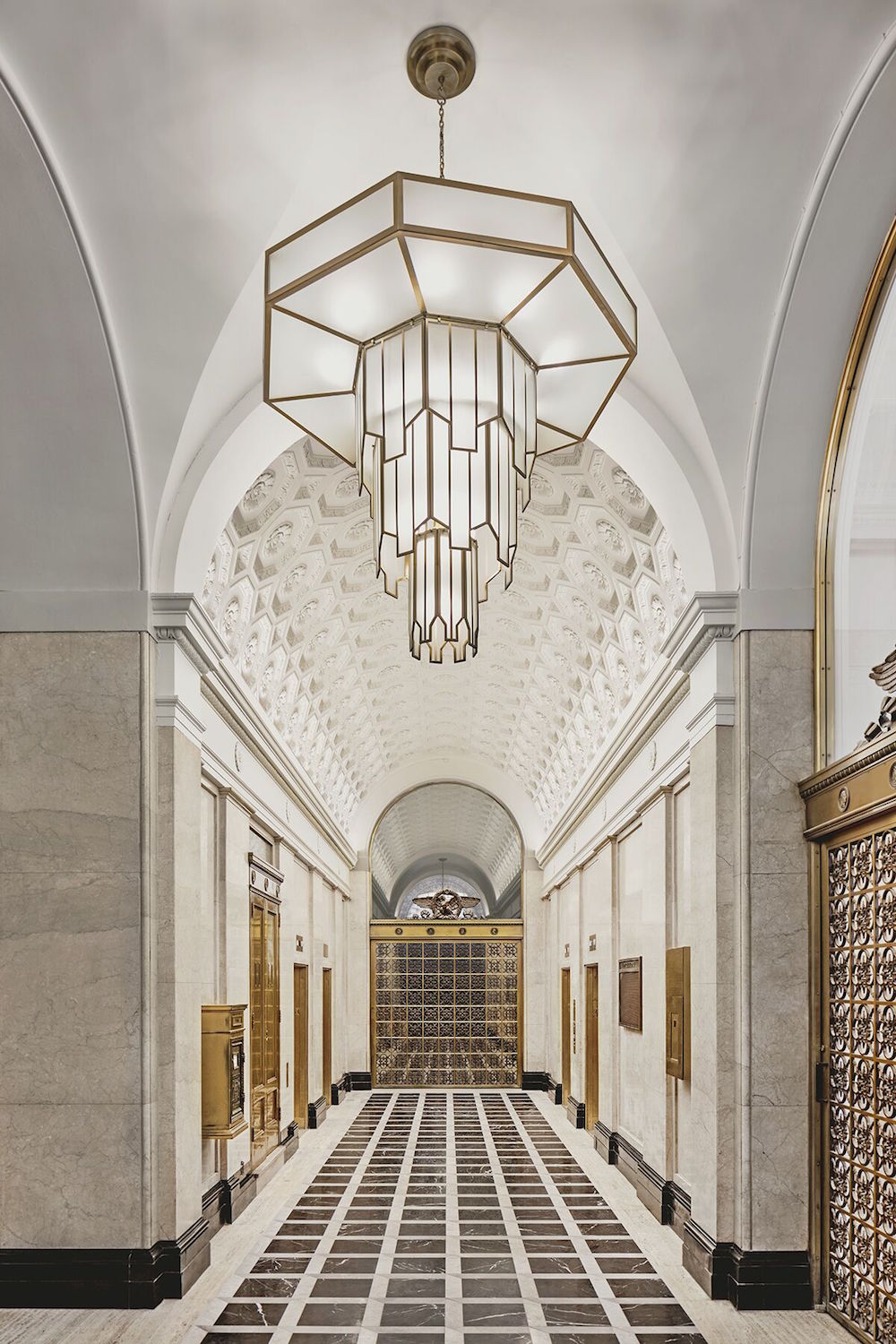
- Image caption: The hotel’s high-vaulted ceilings were blank canvas’ for Jacu Strauss’ vision for a bold, inviting entrance into the hotel. | Image credit: Riggs Washington D.C.
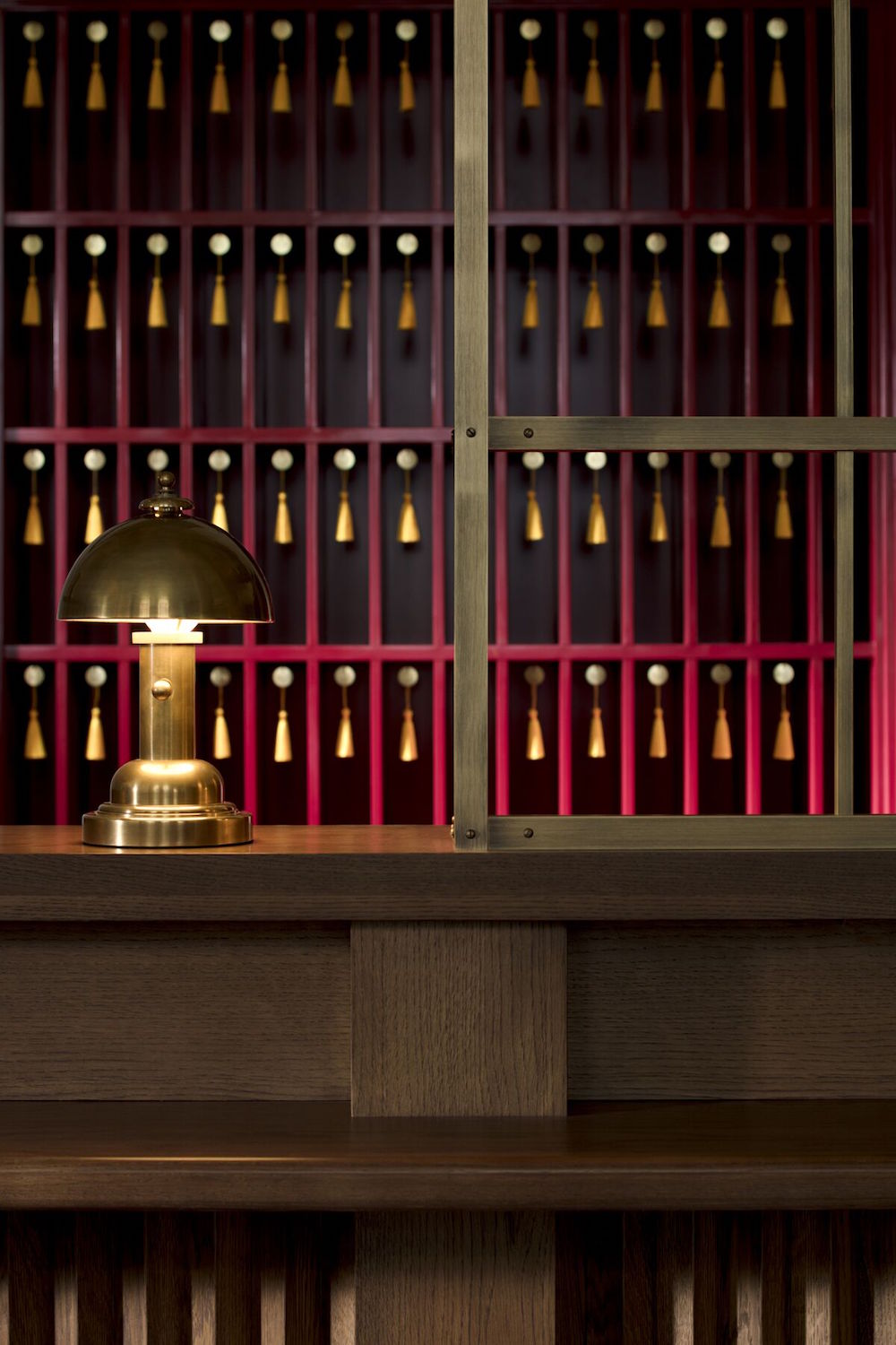
- Image caption: A close-up of the timeless check-in desk. | Image credit: Riggs Washington D.C.
Sitting down with Jacu Strauss, the Creative Director of Lore Group and the brainchild behind Sea Containers London and Pulitzer Amsterdam, it becomes immediately apparent how important the setting was and is to him – he is clearly passionate about DC. “It’s just a really beautiful city,” he says. “Great architecture, and noticeably lacking skyscrapers, it has a certain rhythm to it.” With Jacu’s projects across the world, he’s famous for putting time, energy and resources in to research an area and its needs. Keen to avoid what he describes as a “cookie cutter approach”, it is about the neighbourhoods, the greater contexts of the city and its people. With D.C., he felt he’d found a real gap in the hospitality market. “You have lifestyle brands as well as more traditional, institutional luxury hotels that are really established here and do what they do perfectly,” Strauss explains. “But we wanted to bridge that gap between lifestyle and luxury and become an institution that sits alone.”
It would have been all too easy to make this imposing gothic building into another institutional hotel. And there is no escaping the fact that it is sheltered in what used to be a bank – the ceilings are enormous for starters. The name of the hotel is synonymous with banking throughout DC; many presidents banked with the brand and it even provided the bank loan the US government needed to buy Alaska. Strauss freely admits that he is not the first to turn a bank into a luxury hotel, citing The Ned in London as a prime example. It is perhaps for this reason that he is keen to make sure the building is not tied to its former use. “We really wanted to depart from banking and make it about other things as well,” Strauss explains. “We wanted to celebrate both the legacy of the building and history of the city through unexpected details and a thoughtful approach to guest experience.” So it is perhaps no surprise then that he says he wants to evoke the spirit of the bank, preserving and restoring much of the beautiful old building with playful nod’s to it’s rich and storied past. It is in this way he hopes that the building will reflect a sense of timelessness, which he hopes will give the hotel longevity.
Upon entering the hotel on F street, I am immediately struck by how authentically period the building feels. Whilst Strauss said he was keen to avoid the sense that the building was stuck in the past, it is hard to imagine the entrance hall has changed at all in the 130 years since it was built. The original marble floors and columns, for example, have not lost their shine or luster. The intricate recessed carvings on the arches of the barrelled ceiling have been meticulously restored and the gold trim on the American eagle that presides over the entryway is as bright and splendid as one would hope.
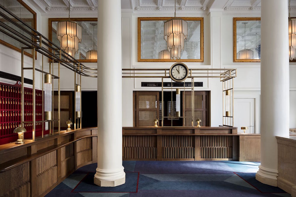
Image caption: The lobby/reception area has been designed to give a sensitive nod to the building’s past. | Image credit: Riggs Washington D.C.
To the right, the commanding entrance hall is replaced with a warm and welcoming check-in area. There is still the impressive sense of space and grandeur from the high-vaulted ceilings and federalist columns, but the marble floor has been replaced by a luxurious blue carpet. Comfortable arm chairs and soft furnishings help temper the building’s stark gothic feel without taking away from the majestic first impression. On the wall hangs an enormous medallion of Juno Moneta, the Roman goddess of money, modelled on an insignia Strauss discovered when first exploring the building. It gives the impression of inventing without betraying that the designer was keen to create; whilst a new addition to the building, the medallion feels timeless and totally in keeping with the property’s past. Behind a desk and a gold trimmed screen are the friendly reception staff. Whilst a new safety feature for the current pandemic, the gilt edged dividers feel true to the former use of the building and one can imagine the bank’s customers standing in front of them as they discussed the handling of their finances.
“The wooden parquet flooring gives the air of a stately home, where marble would have felt too austere and carpet too subaltern.”
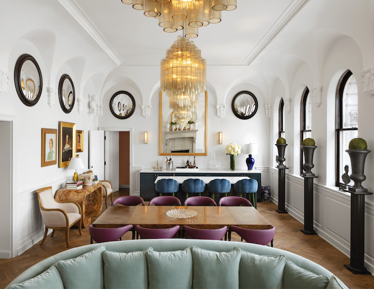
Upon checking in, I am taken first to the Riggs suite, once the boardroom of the bank, now an impressive function room with enviable views of the city. Here, a room that could have felt stark with its hard lines and gothic arches has been made to feel luxurious and comfortable. The wooden parquet flooring gives the air of a stately home, where marble would have felt too austere and carpet too subaltern. Upholstered chairs around a long dining table reinforce this feeling of luxury and recall the room’s former use. On the walls of this room, no doubt once occupied exclusively by men, now hang the portraits of inspirational looking women in a variety of styles and from different cultures. In fact, the room is full of feminine touches including the soft green carpet, delicate oak furniture, copious plants and plush velvety sofas and cushions. It is part of Strauss’ efforts to neutralise what he sees as the overly masculine world of banking with feminine touches.
“Riggs is the only hotel in the area that has chosen to name its suites them after first ladies.”
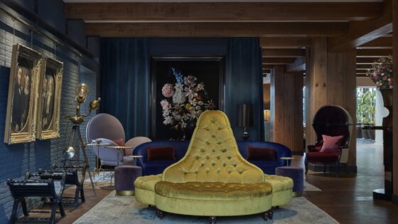
I am fortunate enough to be staying in the Caroline Harrison Suite. The general manager proudly explains that whilst many hotels in the city have suites named after presidents, Riggs is the only hotel in the area that has chosen to name its suites them after first ladies – yet another example of the way Strauss has injected elements of femininity into all aspects of the hotel’s design. The room is a rich blue with sumptuous, heavy-velvet curtains, a sofa and pillows with a design that calls to mind the ornate patterns of the dividers that separated customers from tellers. The carpet, whilst pristine, has been made to look distressed as though it is itself part of the building’s history.
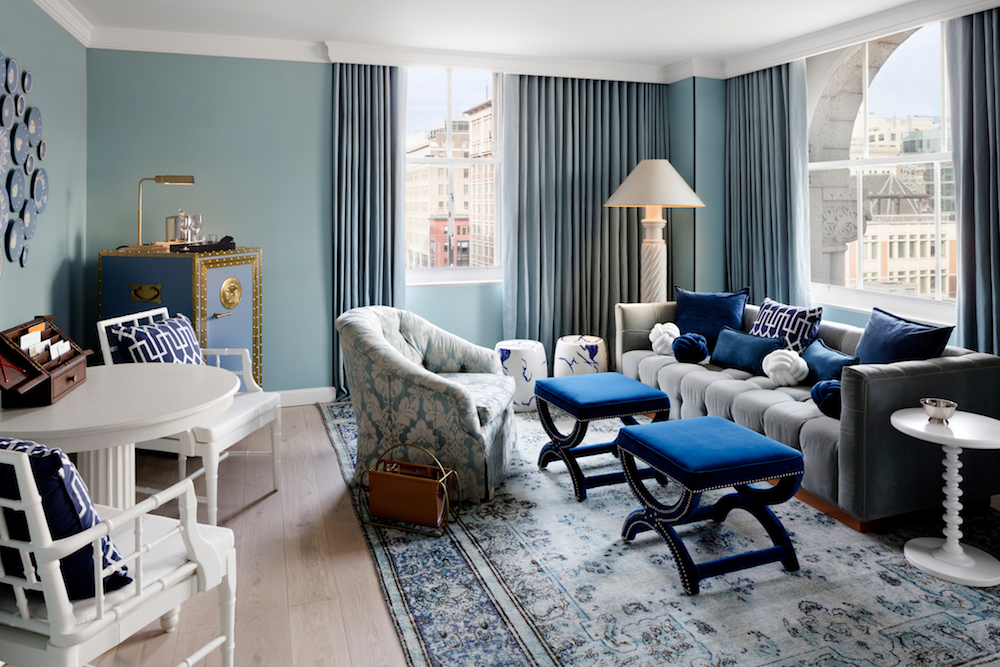
Image caption: The living room inside the Caroline Harrison Suite. | Image credit: Riggs Washington D.C.
Throughout the room are an eclectic collection of objets; lampshades in the form of dogs, contemporary takes on classical urns, a porcelain lantern with an Asian feel. Strangely, they help anchor the building in its Washington location by creating the sense that these pieces may have been gifted to the first lady by visiting dignitaries on some state visit from long ago. This feeling is complemented by the Jasperware plates and medallions hanging on the wall that celebrate significant events in the nation’s history; the signing of the declaration of independence and the start of JFK’s ill-fated presidency. Behind the luxurious four-poster bed is a feature wall with fun and quirky wallpaper that calls to mind the illustrations in a children’s book or the work of Ken Done. It contrasts aptly with the block colours and bold design choices in the rest of the space.
The other three first lady suites, named after Ida McKinley, Louisa Adams and Angelica Van Buren have their own distinct styles and decor. The Van Buren is particularly striking with its rich red walls and velvet curtains complimented by ornate gold furniture. Of particular interest, too, are the classical busts that adorn the shelves, all of classical female deities, as well as contemporary artwork inspired once again by the profile of Juno Moneta.
Each of the hotel’s other rooms are designed to offer something personal and unexpected. Whether it’s the colour of the wall or the shape of the space, each one feels different and offers something unique to the guest so that no two stays are ever quite the same.
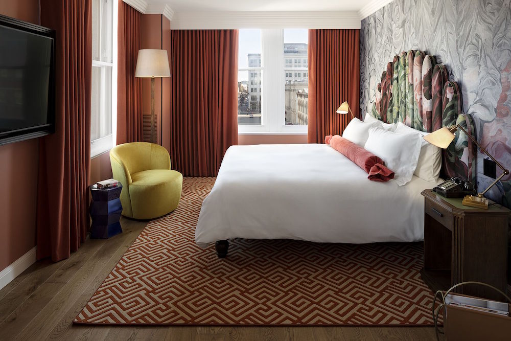
Image caption: Jacu Strauss collaborated with longtime friend George Benson to create the unique headboards in the guestrooms. | Image credit: Riggs Washington D.C.
Perhaps most striking in each room are the custom made headboards, the shape suggestive of the ripples of theatrical curtains. To achieve this unique style, Strauss collaborated with longtime friend George Benson to create these stunning pieces. The abstract swirling pattern used on both the headboards and wallpaper is inspired by a detail on a painting Jacu saw whilst at the Met Gallery in New York and was created by Benson’s company Voutsa specifically for the hotel. It adds a fun and cheeky dimension as well as a sense of movement to what were once the bank’s offices. Eagle eyed guests may spot that the pattern is also used on the inside of the bespoke umbrellas that are provided in each room.
Next to the bed are small oak bedside tables with green leather inlay designed to feel like the writing desks that would once have been used in this building. To achieve a strong and timeless lighting scheme, Strauss collaborated with bespoke lighting brand Chelsom in order to ensure that each space was effortlessly lit in order to radiate the hotel’s luxe style and distinct personality. For example, gilt desk lamps sit on top of the bedside tables to reinforce the writing desk association and invite you to imagine the bank clerks hunched over their work in the previous century. Each room also contains a replica bank safe complete with the insignia of Juno on the outside and housing the minibar and room’s safe inside. It is the most overt reminder of the building’s former life as well as a fun talking point for guests.
Since you’re here, why not read about Chelsom’s Edition 27 lighting collection?
“I can’t help wondering if the powerful rain shower head is a nod to Obama’s request that one be added to The White House for the duration of his incumbency.”
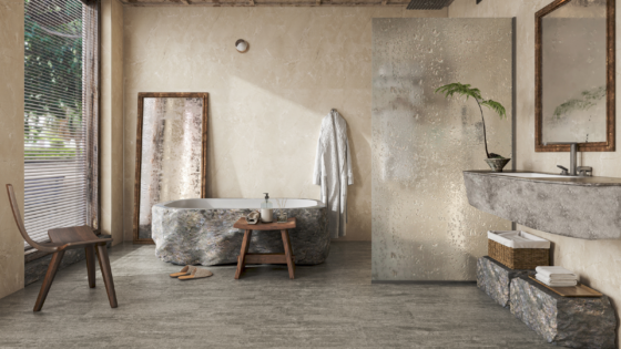
Inside the bathrooms, the Italian Carrara marble tiles on the floor and walls create a sense of grandeur and security. Even the shape of the shiny metallic taps is reminiscent of the handle of a safe and reinforces the idea that one has walked into the bank’s impregnable strong room. The deep free-standing bath makes for a luxurious bathing experience and I can’t help wondering if the powerful rain shower head is a nod to Obama’s request that one be added to The White House for the duration of his incumbency.
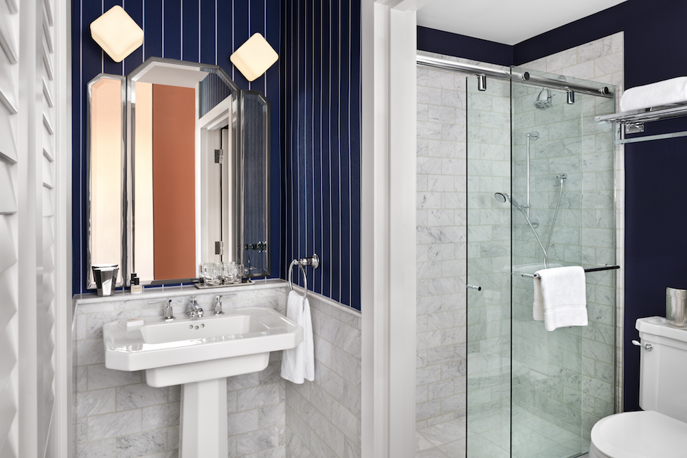
Image credit: Luxurious bathrooms inside the hotel. | Image credit: Riggs Washington D.C.
Strauss said that he wanted each of the rooms to feel like a safety deposit box, with the contents of each being unique and valuable. This certainly comes across and is particularly evident from the door to each room. Every door features the front of a safety deposit box, complete with a non-working keyhole and golden circular medallion bearing the likeness of Juno Moneta. On the walls and floor, the sumptuous, rich, red carpets evoke a feeling of warmth. They contrast directly with the imposing lobby of the building and give the sense that you are exploring a more intimate and sequestered part of the hotel. On the walls of the corridors are a collection of paintings, some depicting classical figures and others in a more contemporary style as if these pieces have been placed here by customers trusting the bank to protect their artistic investments. The lifts too are worthy of note, featuring marble floors and mirrors covered in silver leaf, which gives them an opulent antiquarian aspect.
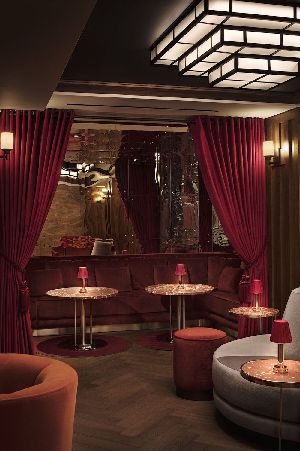
- Image caption: The Silver Lyan bar. | Image credit: Riggs Washington D.C.
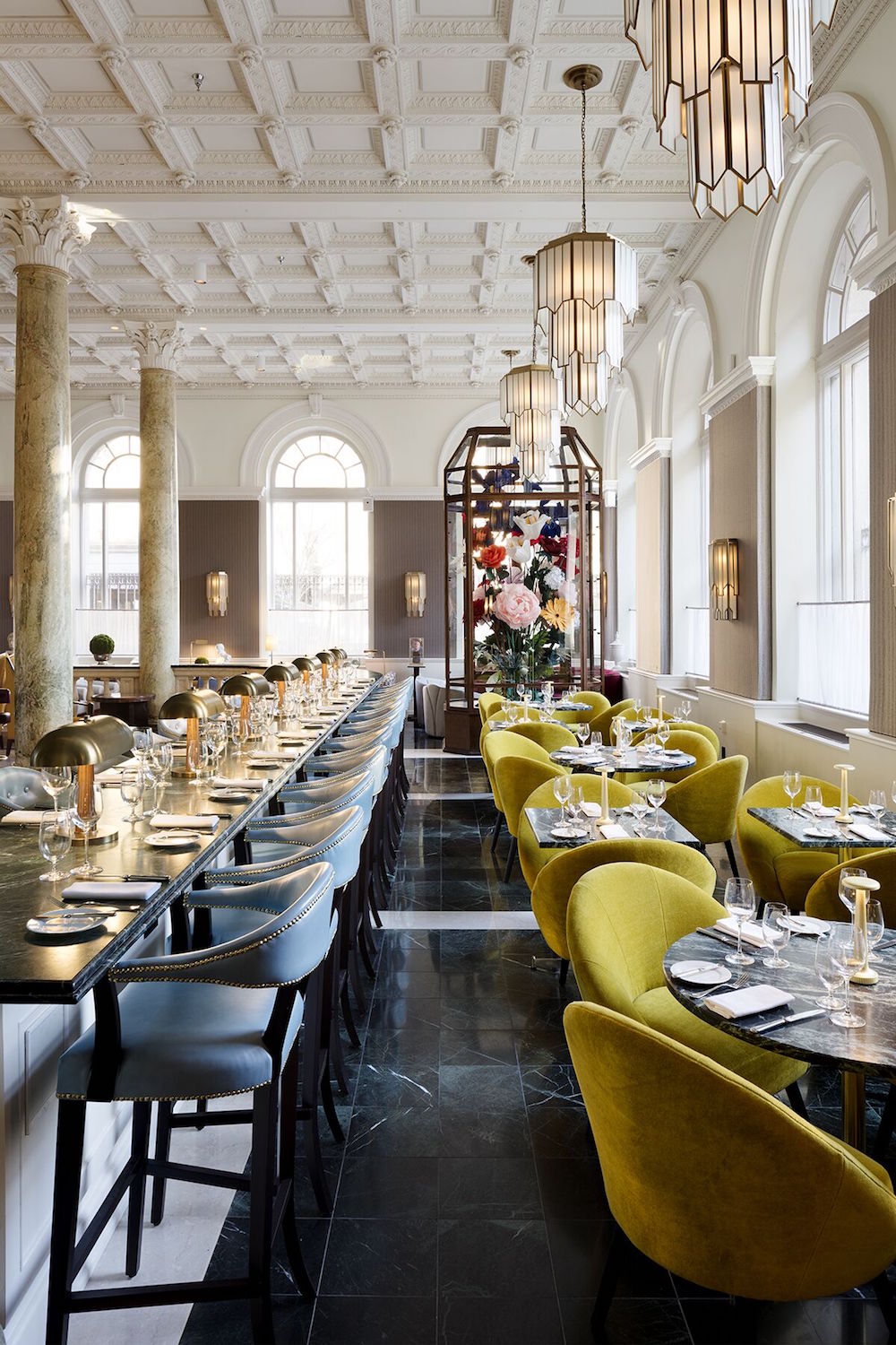
- Image caption: Cafe Riggs Dining Room. | Image credit: Riggs Washington D.C.
In the bar and restaurant it is clear that Strauss has attempted to bring something new to the city. “There may have been a certain standard of food and beverage outlets here that became quite institutionalised, and not necessarily in a good way,” he admits to me. “So, it didn’t have much diversity, and going against that convention – especially in an area of the hotel that is typically most criticised – was really changing. DC is becoming a real foodie city.” Strauss’ aim was to provide something “bright and elegant, inspired by the grand cafes of Europe,” and that is certainly case here at Riggs. The high-vaulted ceilings provide a massive sense of space and the circular marble tables together with the trendy wooden and velvet chairs would not feel out of place in a continental eatery. It is no coincidence that the chairs themselves are the colour of money, in America at least. It would have been easy to use an overabundance of green throughout the hotel for its pecuniary associations and the decision not to do this in the rest of the development feels remarkably restrained.
The luxury of space in the bar area has provided one of the largest challenges in converting this part of the building. With the huge height of the room, Strauss and his team were keen to make sure the scope of the space was being fully utilised. To that end, Strauss installed massive velvet curtains, so weighty that their use necessitated reinforcing the wall. He also commissioned a bouquet of oversized fabric flowers from Ukraine – its bright colours and whimsical design are suggestive of the works of Lewis Carroll or Edward Lear. Yet despite their sheer scale (they come in at an eye-watering two storeys high) everything in the room feels perfectly in proportion. Even the six foot four inch gilt chandeliers that Strauss designed himself help to make the space feel intimate without taking away from the sense of grandeur.
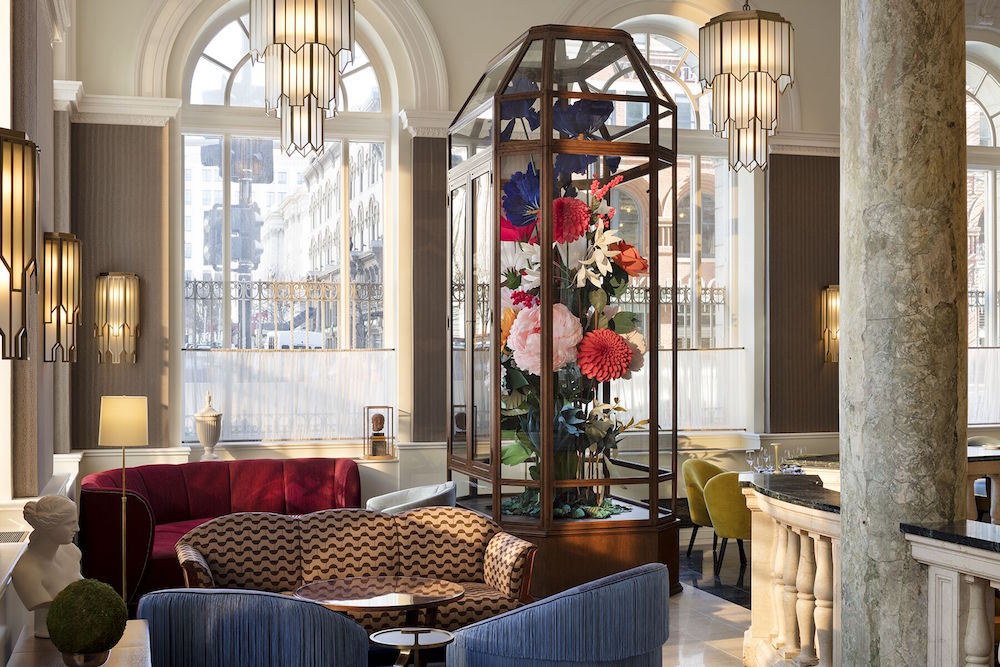
Image caption: Jacu Strauss commissioned a bouquet of oversized fabric flowers from Ukraine, which has become a statement piece in the public area of the hotel. | Image credit: Riggs Washington D.C.
I journey downwards to the subterranean Silver Lyan bar, described by the hotel manager as an adult playground. It’s not hard to see why, the theming is fun without being gimmicky and the low ceilings, dark lighting and deep red chairs give the air of that most uniquely American thing: a speakeasy. There are also an array of fun little touches around the bar; secret messages hidden as optical illusions in the wall panelling, lighting inspired by classical Asian designs and hundreds of sporting trophies in cases across the walls, which Strauss is quick to tell me were all won by female athletes.
Across the hall is the gym and fitness area, which perhaps rather tauntingly has an oversized gumball machine outside, which feels uniquely American and once again helps to play with the sense of scale and disrupt the sense of solemnity in the building. Despite the restrictions currently in place due to Covid-19, I can’t resist sampling one or two. The gym itself has enough equipment to ensure that even the most ardent of fitness fanatics can ensure they get a good workout and the marble pillars hardwood floors provide a sense of decadence as you sweat your way towards your fitness goals. There are also fun touches around the room, like the leather punching bag, that invites one to imagine a circus strongman with a handlebar moustache hard in training. There is also the door to what once would have been the bank’s strongroom, with its intricate mechanism, bolts and rivets on display.
As I check out, I am reminded of something Strauss said to me, that a hotel should provide an elevated experience rather than simply being “a home away from home” and Riggs Washington D.C. is certainly not that. It is a building that has always been about showmanship that has left lasting impression of strength and security.
Strauss’ next project, the Lyle in D.C., will be much more about calm and comfort – think mattresses like marshmallows that he describes as the “most comfortable” he has ever slept on. Yet here, the way The Lore Group has managed to turn what could have been a stark and austere building into something welcoming without losing any of the sense of grandeur is impressive. To summarise, Riggs DC embraces its past whilst remaining pitch perfect for its current use, ensuring its future place in the city for years to come.
Main image credit: Riggs Washington D.C.

