We set renowned furniture designer Rock Galpin a comfortable mission to kickstart the year: to write the exclusive design review of ME Dubai, the brainchild of the late Zaha Hadid, which has become the destination’s latest architectural marvel…
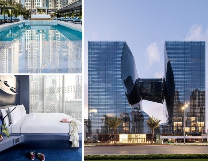
Being a designer myself, and familiar with the pioneering and expansive body of work of Zaha Hadid since her very first project, I was very much looking forward to reviewing the recently opened ME Dubai, which is sheltered inside The Opus.
Known as Hadid’s ‘legacy project’, ME Dubai is the only hotel in the world to have both its interiors and exteriors designed by Zaha Hadid Architects (ZHA) – and its futuristic architecture, characterised by curves, sharp angles and bold materials epitomises the studio’s unique design style.
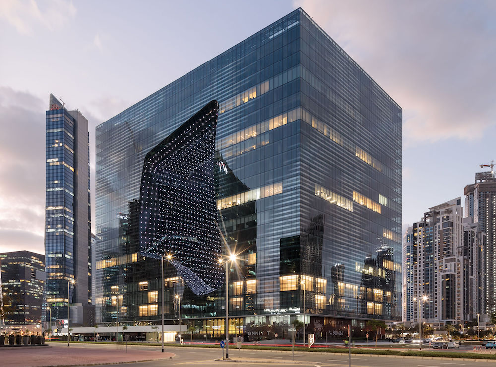
Image caption: Set in Dubai’s Burj Khalifa district, the Opus is a mixed-use mirrored glass building, designed by Zaha Hadid Architects, that shelters ME Hotel’s latest property. | Image credit: ME Dubai
Inside the 93-key hotel you can find lighting, furniture, patterns, bespoke-shaped products, rugs and seamless features and detailing, all of which have been designed by the forward-thinking studio – it really is a celebration of Hadid’s full scope of work and will be remembered, no doubt, for this.
Following Hadid’s passing, Christos Passas, who recently won Architect of the Year at The Brit List Awards 2020, was responsible for the project that aimed to ‘leave its mark’ in the urban space of Dubai. “I think the idea of having a coherent approach, to both interior and exterior design, is very compelling and indeed it requires a whole lot of commitment by the designer,” he told Hotel Designs. “We were given the opportunity to transit intellectually and emotionally from an architectural, large scale project to the finer details of the building that have to do with the user interfaces and the experience of the visitor. Such a context can allow designers to develop more holistic experiences for the user and to express the clients vision in a much more consistent and eloquent way.”
First impressions count
Having recovered in awe from taking in the huge glass cube facade and amorphic structure of the building in person, the entrance into the hotel itself is subtle and aptly plays down your reaction to what is to follow, with its minimal led forecourt dot lights, at night, tracing a suggested route to the door for cars. The proceeding experience, as you head into the reception is simply quite special.
Approaching the lobby, I was not surprised to be suitably impressed by the vast and completely and utterly unique parametric design styling of the four-storey atrium.
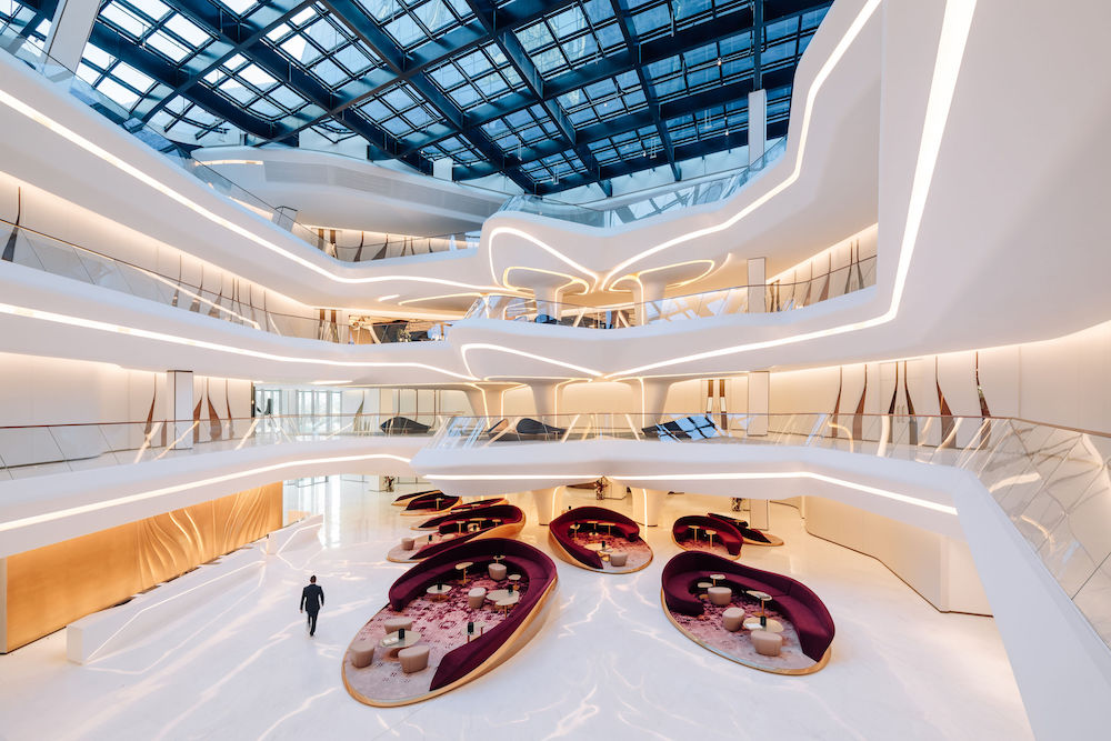
Image caption: The expansive atrium inside the ME Dubai, which is a strong first impression. | Image credit: ME Dubai
“Here, all the rules are broken and re-written with inspiring results.”
Sweeping and fluid mezzanine balconies flow in rhythm around all floors, traced by a light channel and a sloped-in continuous glass railing at an impossible angle. There are so many examples of bold innovation and experimentation which demonstrate very advanced design vision and engineering feats indeed. Hadid’s undulating, fluid and visually engaging design typology references, for me, a soft bio mimicry that clearly push the technological boundaries of materials, fabrication and build possibilities. Here the rules are not only being broken they are being re-written with inspiring results.
Whilst the atrium is an addictive dream for any photographer, myself included, it does somehow feel perhaps lacking a little something if it’s aiming to house a ‘warm’ hotel reception. Therefore, I question whether the design in this space is too hard – are softer acoustics and materials absent? Some would argue that as a hotel lobby, the space is too sparse (or too white perhaps).
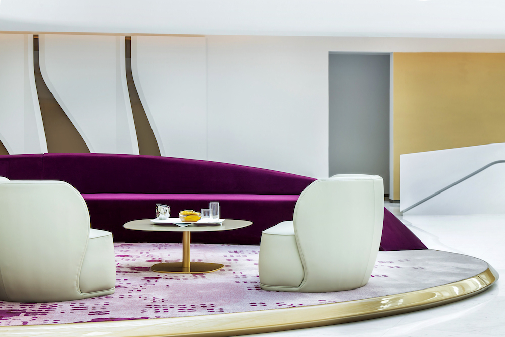
Image caption: ME Dubai is the only hotel in the world only hotel in the world to have both its interiors and exteriors designed by Zaha Hadid Architects (ZHA). | Image credit: ME Dubai
The large oval-shaped seating zones carefully positioned around, which feature built-in sweeping curved sofas, provide neat social areas that create necessary micro enclaves of activity. These softer social spaces, within a vastly white atrium, work well but feel almost not enough to create warmth, softness and a welcoming feeling. In fact, it feels a little sterile – a tad cold – but nonetheless, no one can argue against this space being spectacular! When the hotel is up to speed, with a healthy occupancy and the vibrancy and colour of many guests, it may fill that void.
“If you love progressive architecture and interior design that pushes the boundaries, bringing interior typology and technology closer to us, then you will no doubt be impressed with ME Dubai.”
QUICK-FIRE ROUND
Hotel Designs: What will you remember most about the hotel?
Rock Galpin: The dynamic and compelling relationship between architecture and interior design and the emotive impact that this parametric based design has when experienced first hand.
HD: What should guests experience when checking in?
RG: DESEO Restaurant, bar and pool complete with Ibiza DJ, and the Wagu steak and Rum sponge. The 18:00 ‘lights on’ till 00:00 where the building’s facade comes to life with LEDs – most notable is the inner ‘hole’ which is more intensely lit.
HK: What could be improved?
RG: The extreme, experimental interior is impressive to say the least, however, there needs to be a further appraisal of how people feel in this space; how they react, how they interact and their needs in order to improve guest engagement. Despite the staff being lovely, the service throughout the hotel was, when I checked in at least, a little erratic.
HK: What was your favourite area of the hotel?
RG: DESEO restaurant and bar and of course the atrium.
HK: Can you describe the hotel in a sentence or two?
RG: This is a unique and inspiring hotel to be experienced first-hand. If you love progressive architecture and interior design that pushes the boundaries, bringing interior typology and technology closer to us, then you will no doubt be impressed with ME Dubai.
Between spaces, an often-forgotten part of the hotel experience
There’s a lovely journey to be had when walking from your room to most parts of the hotel, as you’re pleasurably forced to walk along the atrium mezzanines taking in beautiful elevated views of the upper floors. Aside from the DESEO restaurant and pool area, there is a distinctive lack of outdoor space in the hotel, so you do feel somewhat incubated with some light passing through the atrium roof.
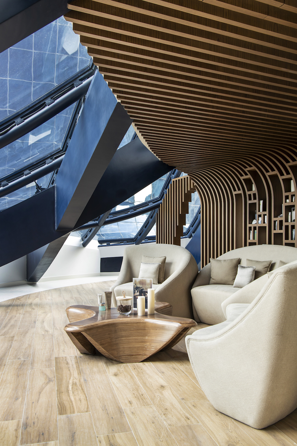
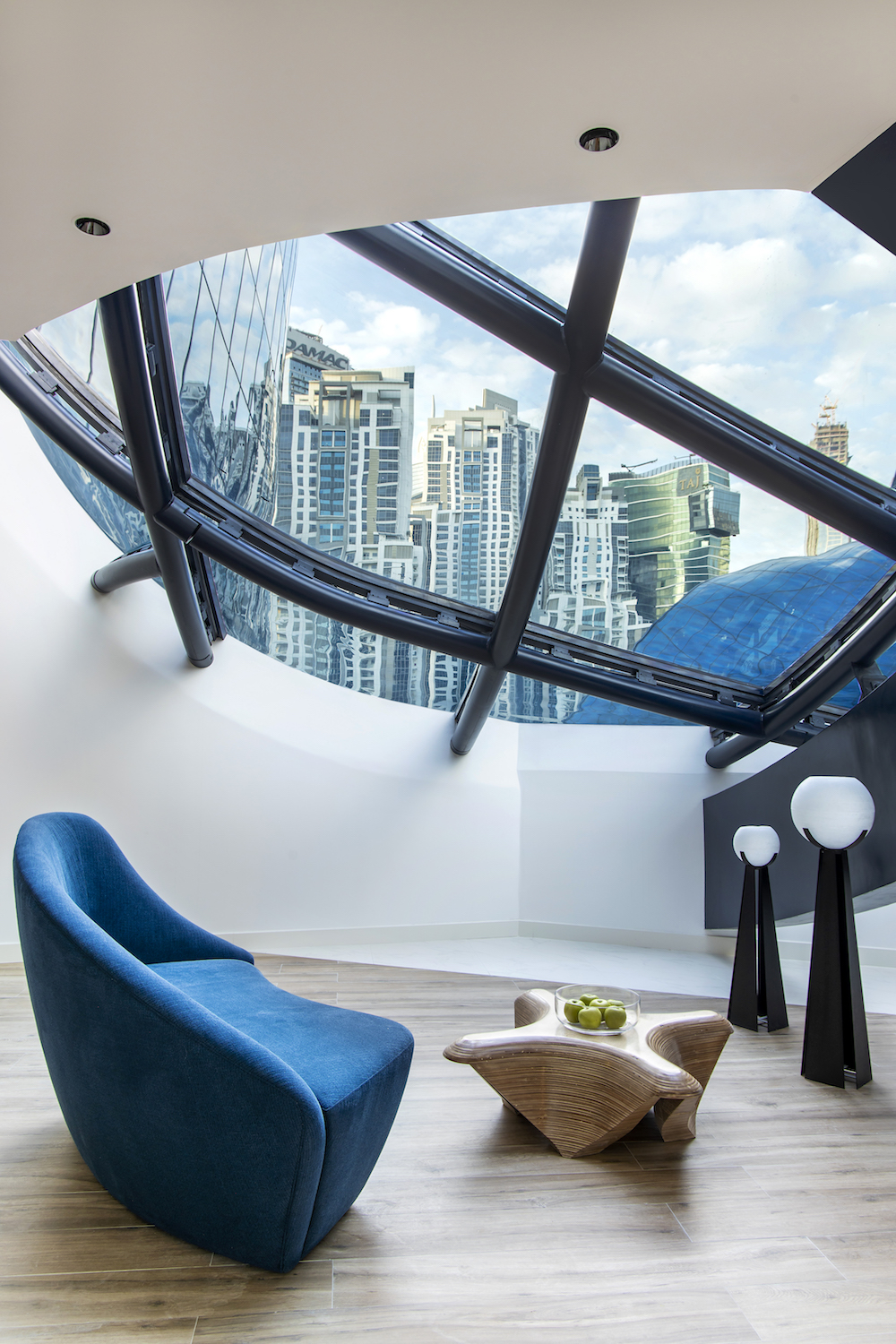
- Image caption: The hotel has multiple viewing spaces that act as lounge areas. | Image credit: ME Dubai
- Image caption: The hotel’s ‘in-between areas’ have been thoughtfully designed by ZHA. | Image credit: ME Dubai
Guestrooms and Suites
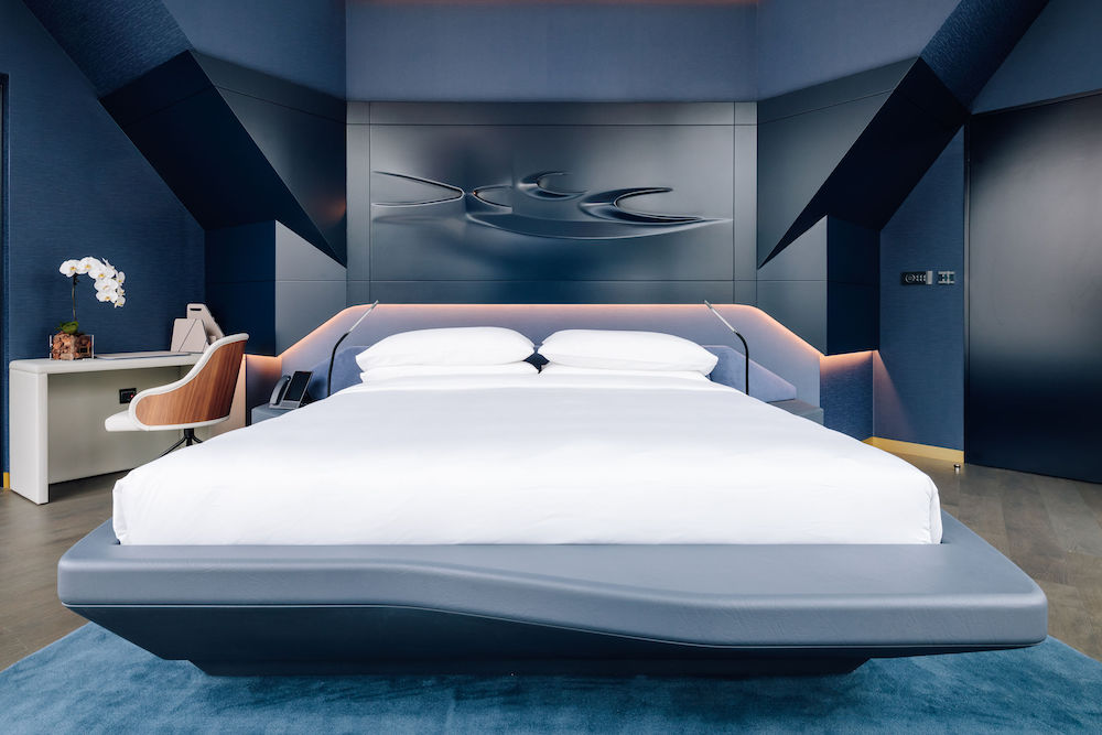
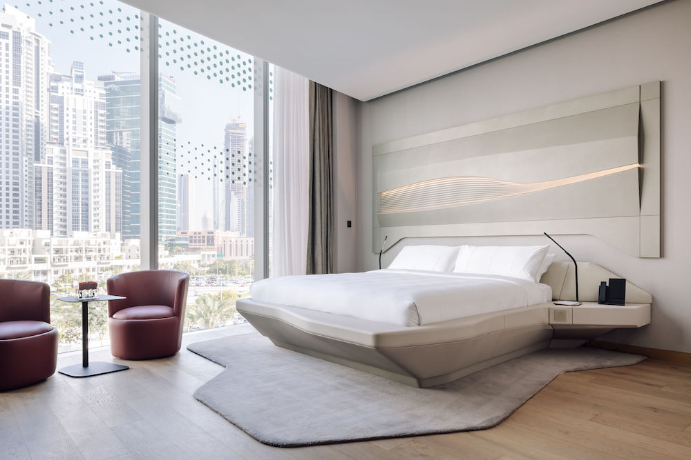
I had the opportunity to explore two category rooms; the standard Aura room at 47m squared and the much larger Personality Suite at 92m square. There are two colour schemes. Desert is much more subtle – think spiritual and cool. Meanwhile, the Midnight Blue scheme is deeper and more intimate that also packs a masculine punch. Both are equally as beautiful and any decision for either style will be down to personal preference.
- Image caption: The Midnight Blue, dark and moody design scheme. | Image credit: ME Dubai
- Image caption: The light and airy Desert themed rooms inside the hotel. | Image credit: ME Dubai
Aura Room
The first impression of the generously sized Aura room was of light – there’s lots of it – from floor-to-ceiling windows which span the width of the whole room. The beds are quite something! Not only are they large, but they are super comfortable, with an angled cushioned Alcantara headrest at 45 degrees, which works really well.
The built-in cantilever bedside tables are a well-considered feature – there are no ugly plug sockets in sight. Instead, these are hidden under the table with a useful, minimal touchtronic operated black light arm sprouting upwards from the tables, with two useful USB ports at the base. The bed base also features flat areas to the frame that extend useful seats, which works well with the complementary, asymmetric matching rug underneath.
“No wall was perpendicular to another.”
As I started to look more at the interior, I was surprised to realised that no wall was perpendicular to another and that many materials are cut on the angle or applied in complex shapes. The full marble bathroom, for example, white in the Aura and black in the Personality Suites, runs on the diagonal in both directions, so the pieces are actually rhombus shaped. These features very much reflect the entire design approach, to experiment and push the limits of what has conventionally been done up until now.
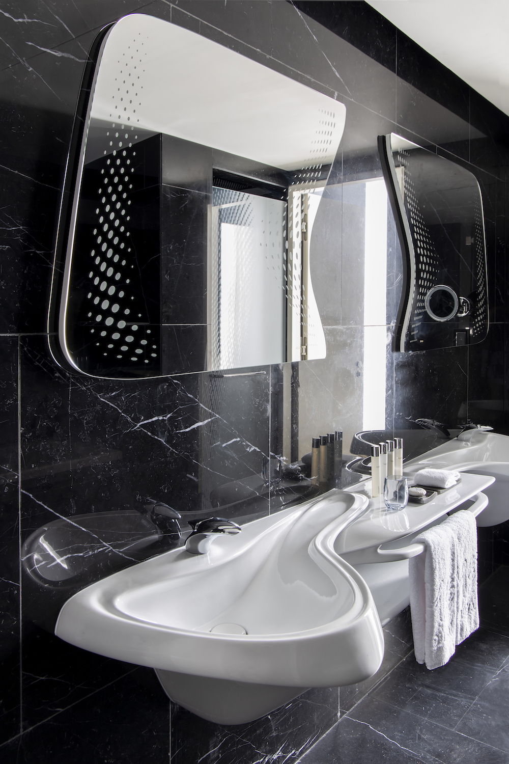
- Image caption: All bathroom fitting are designed by ZHA and follow suit to studio’s typology. | Image credit: ME Dubai
- The hotel’s 74 rooms are timelessly designed to compliment the architecture appropriately. | Image credit: ME Dubai
Personality Suite
The Personality Suite, similar to the Passion Suite, is 92m square and is one of the hotels larger mid-level rooms. It’s differentiated by a separate lounge/dining area and two bathrooms, one with bath, double sinks and shower cubicle the other with toilet, bidet and another sink. The Midnight Blue suite felt special. The deep blues and darker colour scheme had more contrast to that of the Desert scheme. The black and white quartz streaked marble throughout the whole bathroom is beautiful, offset by the amorphic ZHA shaped double sink and mirrors, with parametric laser etched patination.
“The technology in the rooms match the design form in being progressive.”
All bathroom fittings are designed by ZHA and follow suit to studio’s typology. The technology in the rooms match the design form in being progressive, with touch plates on many walls for the double-skinned electric curtains and lighting throughout. In fact, download the ME Hotels App and you have full mobile electrical control of the entire suite, including the two large TVs.
The lounge area, complete with the boomerang shaped ZHA sofa and beautifully crafted dark wood desk blended in and, looks aesthetically harmonious. However, the comfort and desire to want to use this space was sorely missing. The sofas are extremely hard, no doubt to retain the sculpted form, but off-putting in terms of comfort and relaxation, where the lounge should be king.
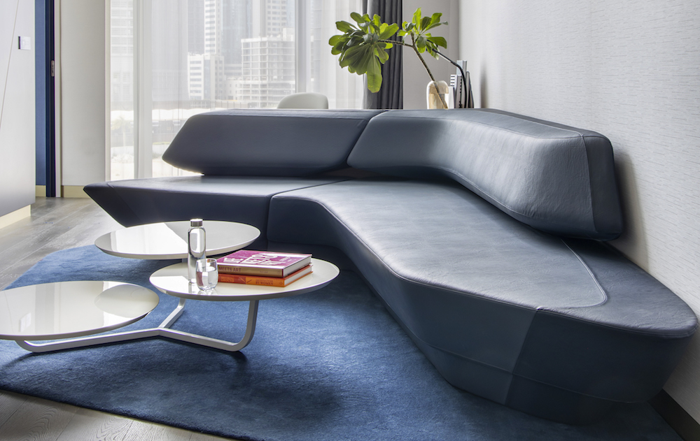
Image caption: A ZHA designed sofa in one of the Midnight Blue themed suites. | Image credit: ME Dubai
The F&B experience
The F&B journey within the luxury hotel starts on the ground floor. Botanica, described as a gin bar, features an Italian accent throughout and doubles as a lunchtime restaurant. It occupies part of the lobby, where the reception dominates with its music, reverberation and activity that is heard through the pale-slatted wooden walls of the bar. The space is soft, comfortable and pleasant, lending itself more to a relaxed lounge bar/restaurant.
Meanwhile, Central is the designated breakfast restaurant that seems quite lifeless outside of breakfast time, inward looking to the Atrium, which gives you the opportunity to take more of those lovely views in. This would seem a hard, austere place for a morning bite, however, despite the reverberation from lower down, the experience was actually very pleasant being relaxed and quite peaceful.
Where the Botanica, on the ground floor, is perhaps lacking some atmosphere, DESEO makes up for it ten-fold – in fact it is real contrast in most ways and a very welcome part of the hotel experience. This is where the up-tempo vibes lives.
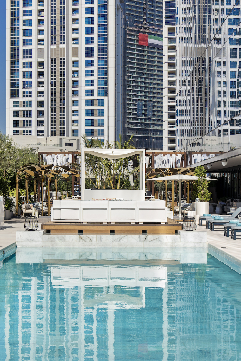
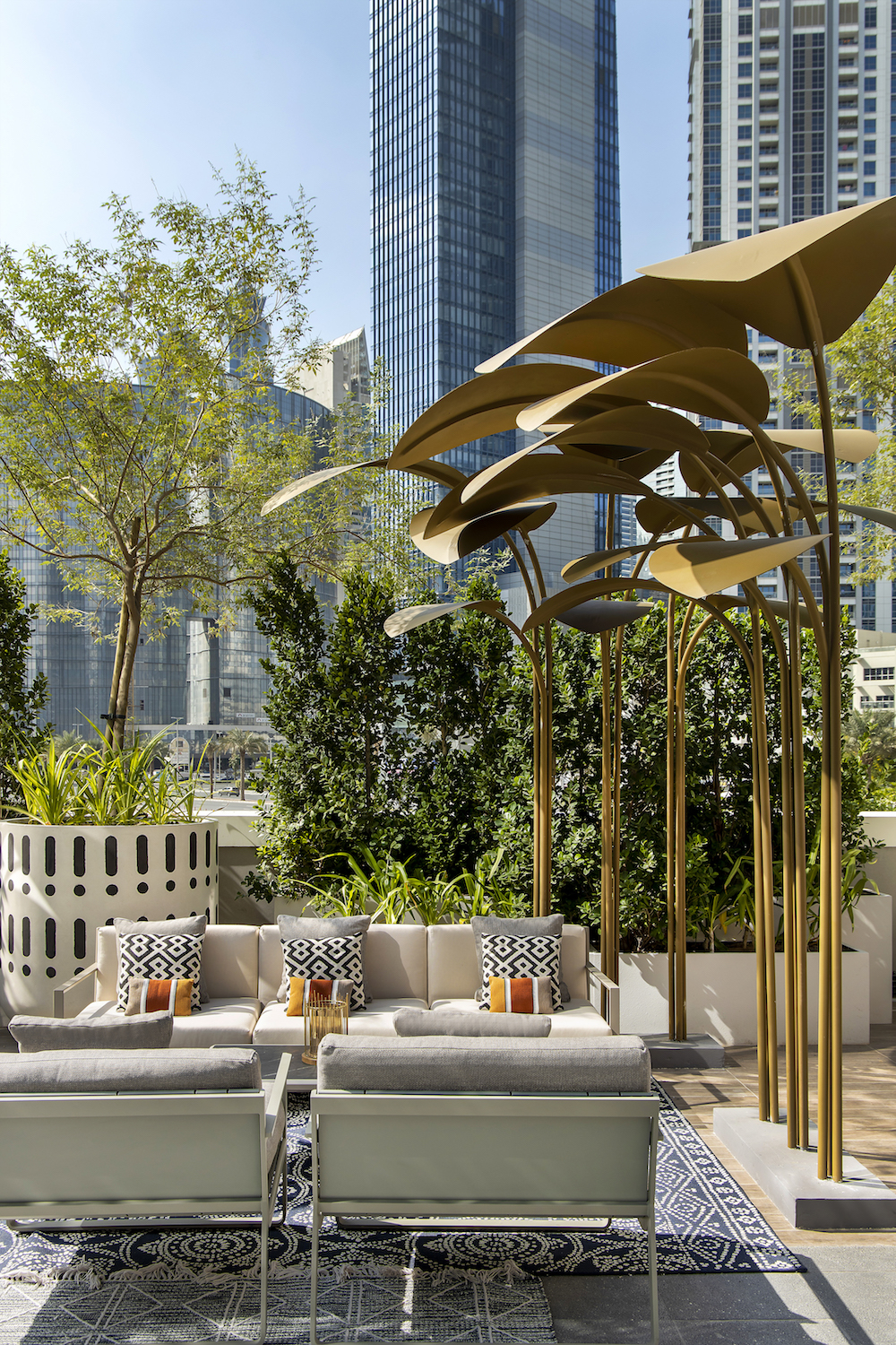
The design of the restaurant uses Downtown skyscrapers as a backdrop and contrasts this with a leafy green design scheme that is simply lovely. With a raised freestanding bar and a wooden pergola adorned by a thousand wind cones, the impression was of movement and energy, mix that with a DJ on an Ibiza-style white podium – his back to a rectangular pool lined by sun loungers one side, slatted cabana’s the other – you realise DESEO has what it takes.
- Image credit: ME Dubai, designed by Zaha Hadid Design
- Image credit: ME Dubai, designed by Zaha Hadid Design
The gym is a generous in size and a pleasant space to work up a good sweat. there is also a sauna, which is an intimate small, pined welcome addition. On the fourth floor, a little bit out the way, but worth a trip just for the quirky space complete with high tech curved glass, as it’s on the cusp of the atrium’s ceiling curving into the vertical inner ‘void’ wall is a specialist massage treatment facility.
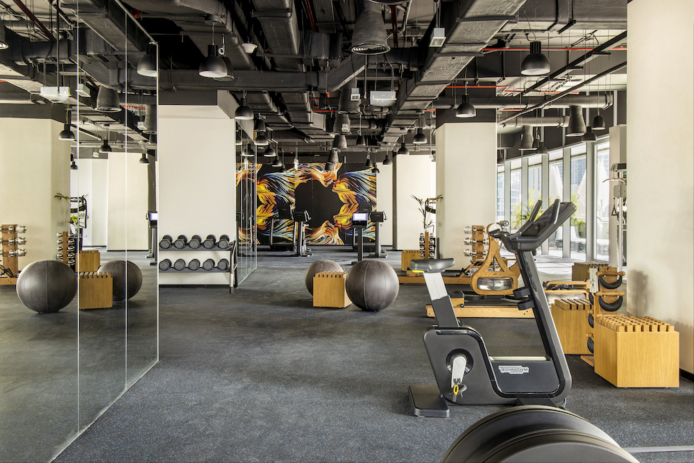
Image caption: The hotel features a state-of-the-art industrial-style gym. | Image credit: ME Dubai
In addition, and not to be missed, there are two excellent restaurants, which are also part of The Opus building. The Maine is a big favourite of mine, from interior to food quality, and Roka restaurant is also a fantastic new asset to the local area.
Standing out in a city like Dubai, which is no shrinking violet, is one thing. But sheltering an interior design scheme that is equally as impressive as its architecture is an almost impossible task. The interior design scheme inside ME Dubai seamlessly compliments the buildings unique architectural form and meets, I would argue, the ever-changing demands of modern travellers and in-the-know locals alike.
Over and out,
Rock.
Main image credit: ME Dubai

