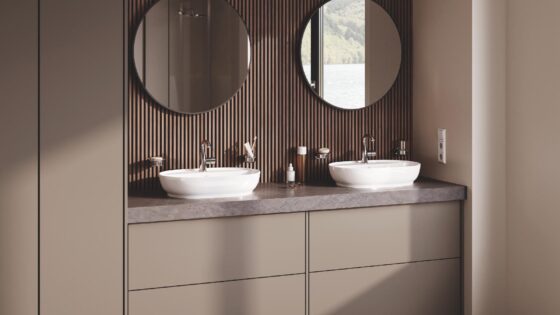
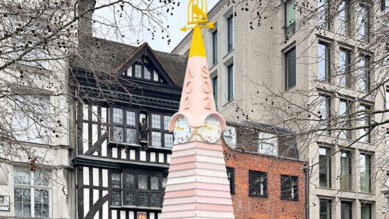
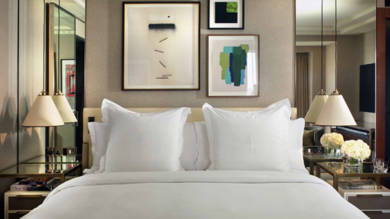
Following on from the popular feature that explained how to style a hotel’s narrative for design press, Hotel Designs asks photographer Brenden Cox of The Towner what to consider when framing and capturing a hotel’s interior design scheme…
One of the first questions I always ask a client when I’m photographing is: ‘what are you trying to say’ and ‘who is your target audience’. These questions play a vital role in dictating what these images will look like.
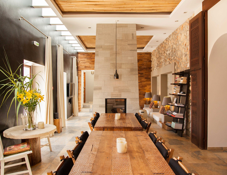
If your hotel has a strong and consistent message, why not express this with your photography?
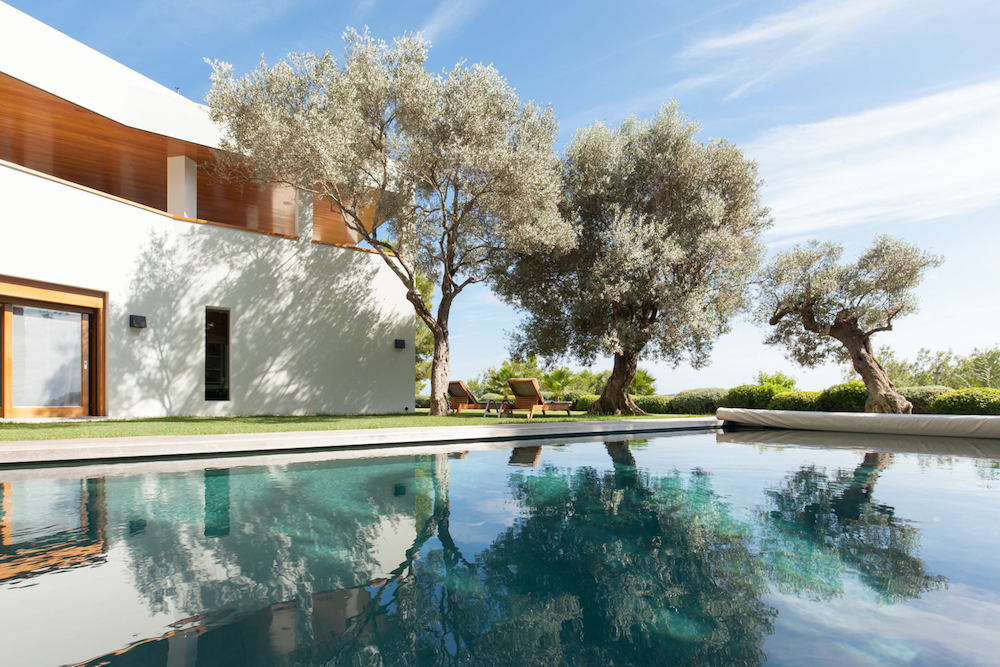
Image caption: A luxury villa in Ibiza | Image credit: Image credit: Brendan Cox/The Towner
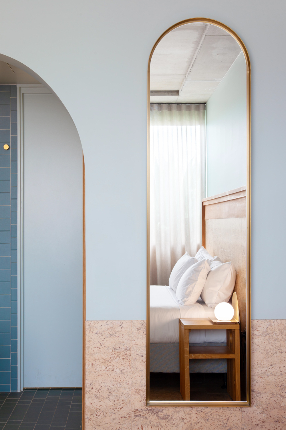
People will choose a hotel as they want to be part of the story that the hotel has created. Joseph Campbell wrote that all good stories start with a ‘Call To Adventure’ which is exactly what these photos need to be. Unique angles of rooms or communal spaces makes you want to explore what is around the next corner. Framing an image through a doorway or partly into a room draws the viewer in and excites their imagination. This can also help hide some unflattering but necessary utilities, make these angles work for you! Draw your viewer in and capture their attention with what they find.
- Image caption: The The Calile Hotel Brisbane: Image credit: Brendan Cox/The Towner
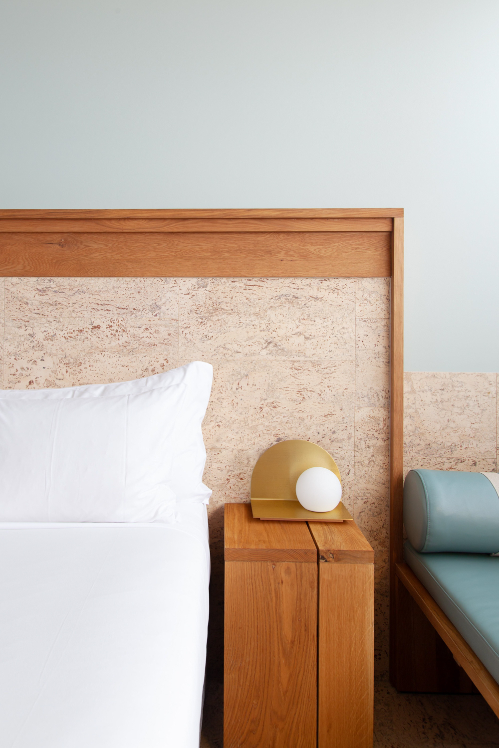
- Image caption: The The Calile Hotel Brisbane: Image credit: Brendan Cox/The Towner
Showing what a space looks like is a very important part of advertising your hotel, but as with any great story it comes down to the details. Showing off interesting and unique textures, fabrics and finishes in a hotel gives a taste of what the customer can experience. The great thing is these images can be shot all year round. When booking photoshoots, walking the line of wanting to have beautiful weather but not wanting to disrupt your clientele can be extremely difficult. That is why focusing on detail shots can help increase your content and will compliment beautifully those ‘Hero Shots’ you capture when you have nice weather.
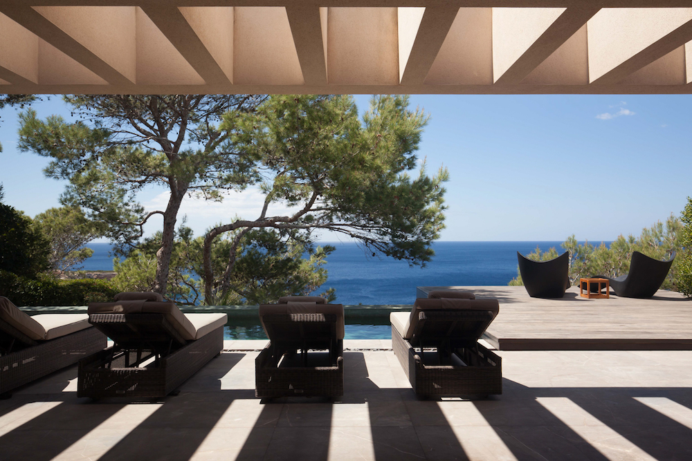
Image caption: Luxury villa in Ibiza: Image credit: Brendan Cox/The Towner
Customers are also usually looking for a certain type of atmosphere when choosing a hotel. Is your hotel in a busy area, surrounded by the lights of the city and the noise and romance of late night dinner spots? Then a dark and moody photograph, showing off the rich textures and colours of your hotel’s interiors, suggests the perfect intimate hideaway. Fitting perfectly with the holiday experience your customer is piecing together in their mind. This is all about playing a role in the story that they are trying to create.
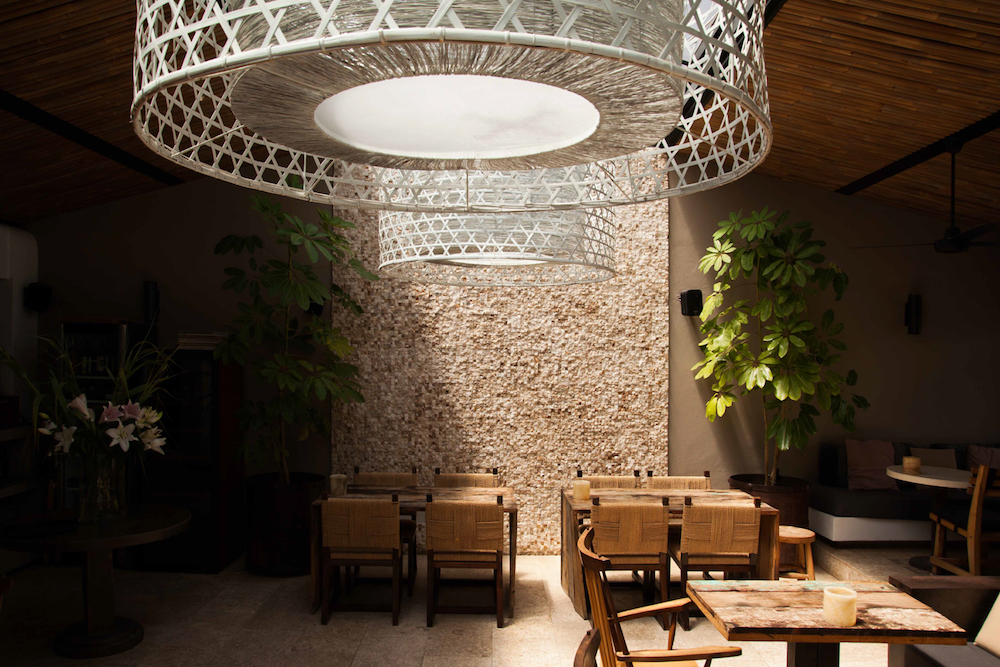
Image caption: The Giri, Ibiza | Image credit: Brendan Cox/The Towner
Conversely, are you trying to appeal to young families, big groups or people just travelling for business. Having your images wide and bright gives comfort to parents that they will be able to see where their children are playing. Groups know there is space for everyone and there will be no shock about what it looks like when arriving. A photograph is there to put the viewers mind at ease, that the hotel will deliver on what their message says. A dark and rich photograph of a hotel restaurant has the same importance as a wide and well-lit image of that hotels conference room. It is all about what you are trying to say!
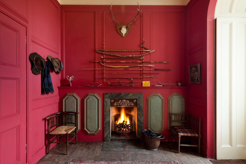
Image caption: Inside Eilean Shona Hotel, Vanessa Branson’s island, Scotland | Image credit: Brendan Cox/The Towner
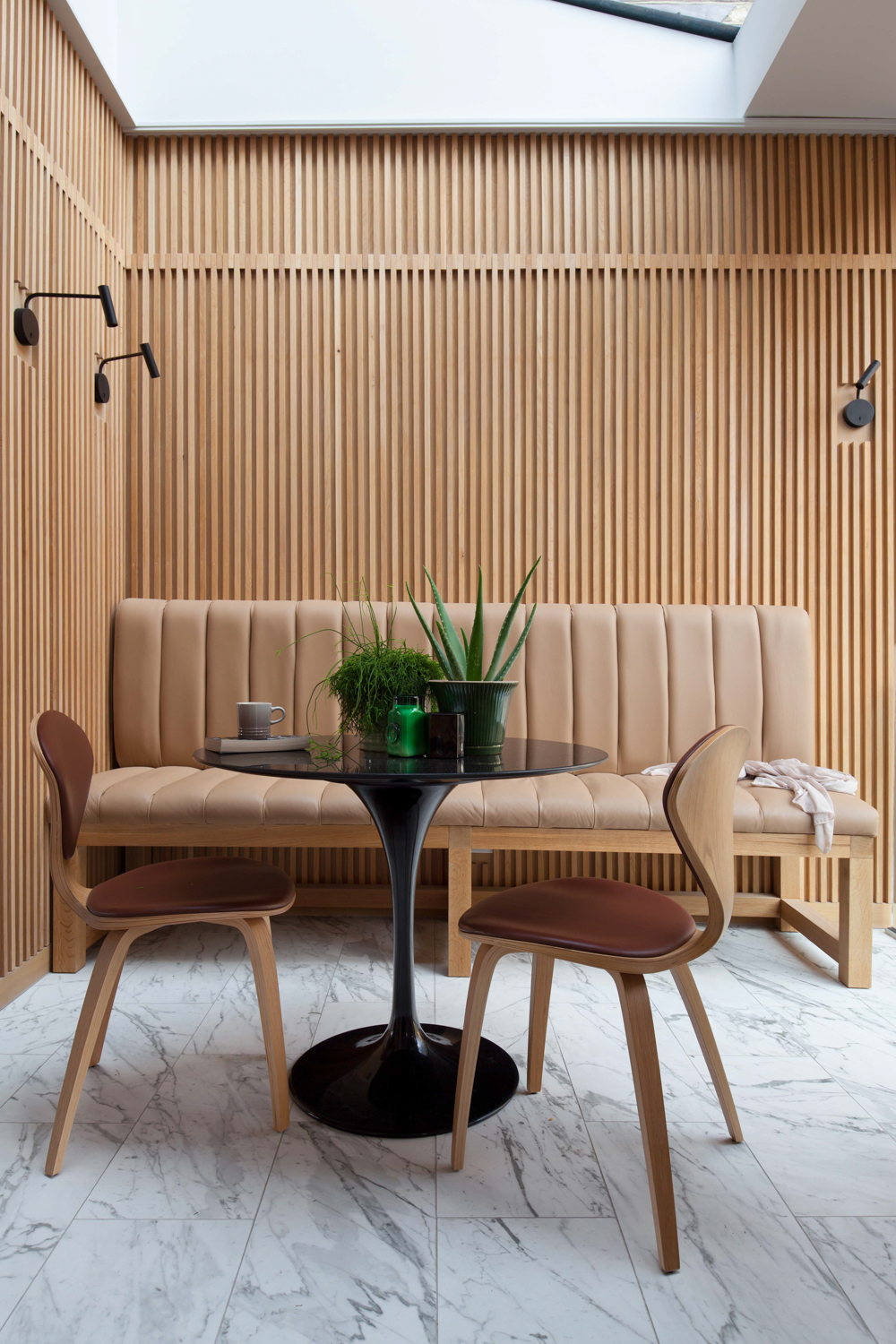
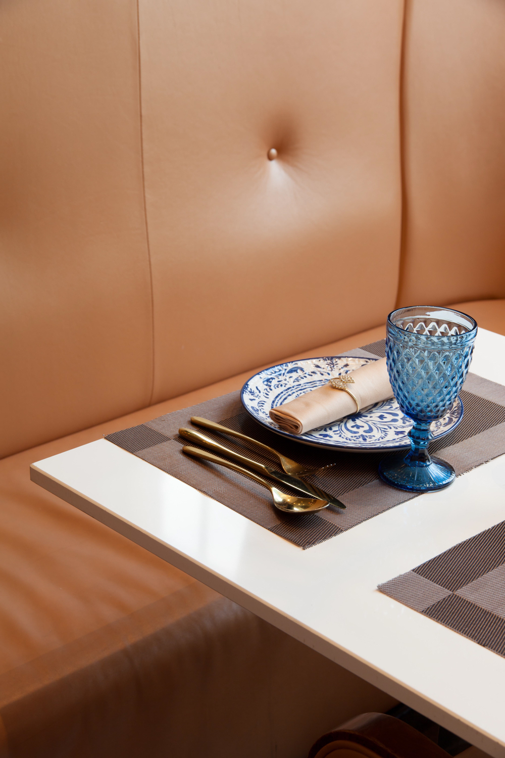
Colour plays a very significant role in expressing what a space has to offer. A photographer will usually take the lead of the interior designer or stylist who has decorated a room by trying to reiterate what it is they are trying to say. Dark woods and rich upholstery will compliment beautifully with a warm light and deep saturation. Reds and oranges are associated with hunger and desire, drawing the viewer in and leaving them wanting more.
- Image caption: The interiors of a luxury residential property designed by architect Harvey Langston Jones | Image credit: Brendan Cox/The Towner
- Image caption: The interiors of a luxury residential property designed by architect Harvey Langston Jones | Image credit: Brendan Cox/The Towner
When showcasing a rooftop pool or beautiful garden and outdoor area, blues and greens express relaxation, nature and freshness. Using these colours has the added benefit of really making an image stand out. Colours are incredibly versatile and are there to be used to your advantage. Try and keep your branding in mind when discussing with your photographer as well. Most companies have a style guide which all their promotional materials reside within, so why wouldn’t your photos?
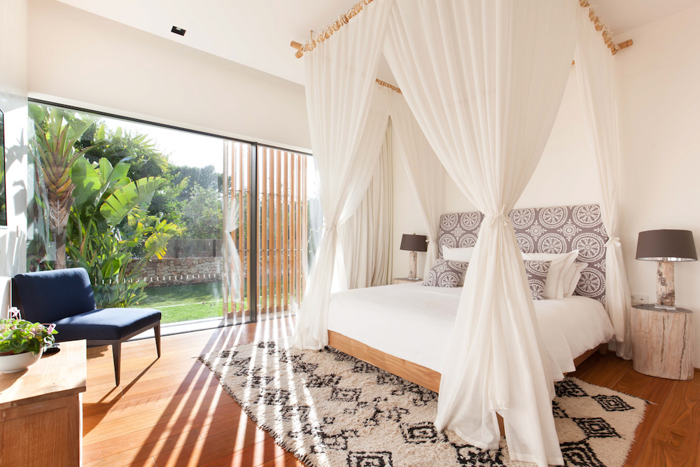
Image caption: Luxury villa in Ibiza | Image credit: Brendan Cox/The Towner
One of the best ways to tell a story with photographs, is juxtaposing them in a way that celebrates not only your beautiful hotel but also the area in which it is located. This again will be closely tied to the interior designers approach and how they have tied the styling into the look and history of the surrounding area. Images of white towels and large glass windows, complimented next to rolling surf and white sandy beaches, tell your potential customers all they need to know to convince them to stay!
This is also a great opportunity to really make you hotel stand out from the crowd. How is your space interesting and unique to the area it inhabits. Images of a busy London street next to a photo of a chic Japanese inspired interior excites the imagination and curiosity. As well as images of an open African savannah adjacent to a secluded glass room overhanging it, tells such a vivid story with only two images.
With all this in mind, the most important thing is to really try and explore what you can achieve with your imagery. Due to the rise of social media people are always on the lookout for what is new and exciting. Staying in a hotel can be luxurious and full of adventure, and that should be taken advantage of when planning a photoshoot.
Main image credit: The Towner/Brendan Cox

