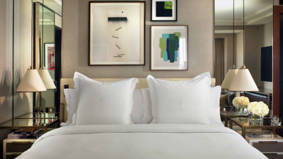
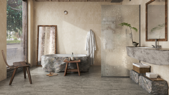
One of the stand-out moments from HIX 2021 was undoubtedly the installations that were displayed in the Hotel Tomorrow gallery. Designed collaboratively by Conran and Partner, Areen Design and stroop design, the aim was to reflect the coming together of co-working spaces and hotels. Editor Hamish Kilburn, who spent six months following the designers, moderated the panel discussion on the HIX Talks stage that explored every corner of the concept in detail. Pauline Brettell writes…

HIX 2021 has been two years in the making – like the entire hospitality industry, the event was subjected to Covid-19 cancellations and delays – but finally, last week saw the experiential trade show in the spotlight at London’s Business Design Centre. True to its manifesto and guiding principles, HIX presented us with not only new products and practical design solutions to marvel over, but it also opened discussion and debate around issues of direction, design and, of course, sustainability.
The spaces in which this spirit of debate and conversation were most visible, were the two installations, along with the discussions that were taken to the HIX Talks stage as a result.
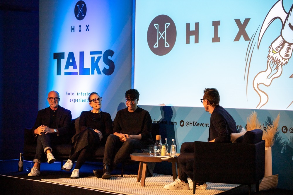
- Image caption: Editor Hamish Kilburn speaking to Balkaran Bassan (Areen Design) and other designers about a WFHotel concept that was designed for HIX | Image credit: HIX
- Image caption: The WFHotel project, which was six months in the making, was on display at the Hotel Tomorrow gallery. | Image credit: HIX
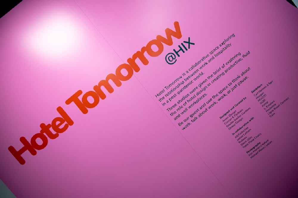
The first of these immersive settings was the WFHotel installation, which presented designers with the challenge of re-looking at the hotel as a “new productive, fluid and well workplace”, and all that that means. It was a collaborative installation by the design studios of Areen Design, Conran & Partners, and stroop design. The three hand-selected studios worked together to present us with emerging possibilities. The designers representing the studios, Balkaran Bassan, Tina Norden and Vince Stoop joined forces with editor Hamish Kilburn on the HIX Talks stage to explain the process and discuss the thoughts and ideas that resulted in the set, and just how the conversation developed into one that hopefully initiated debate and discussion rather than coming up with a formulaic answer or response. “The access we had into these studios was unprecedented,” said Kilburn. “It allowed us to follow the process from concept through to completion, to understand how each area of the installation evolved and mutate over time. “For me, though, the most inspiring element of this project was how it changed from being a competition between three studios to a purposeful collaboration, which really helped enforce this year’s theme of HIX: ‘all together now’.”
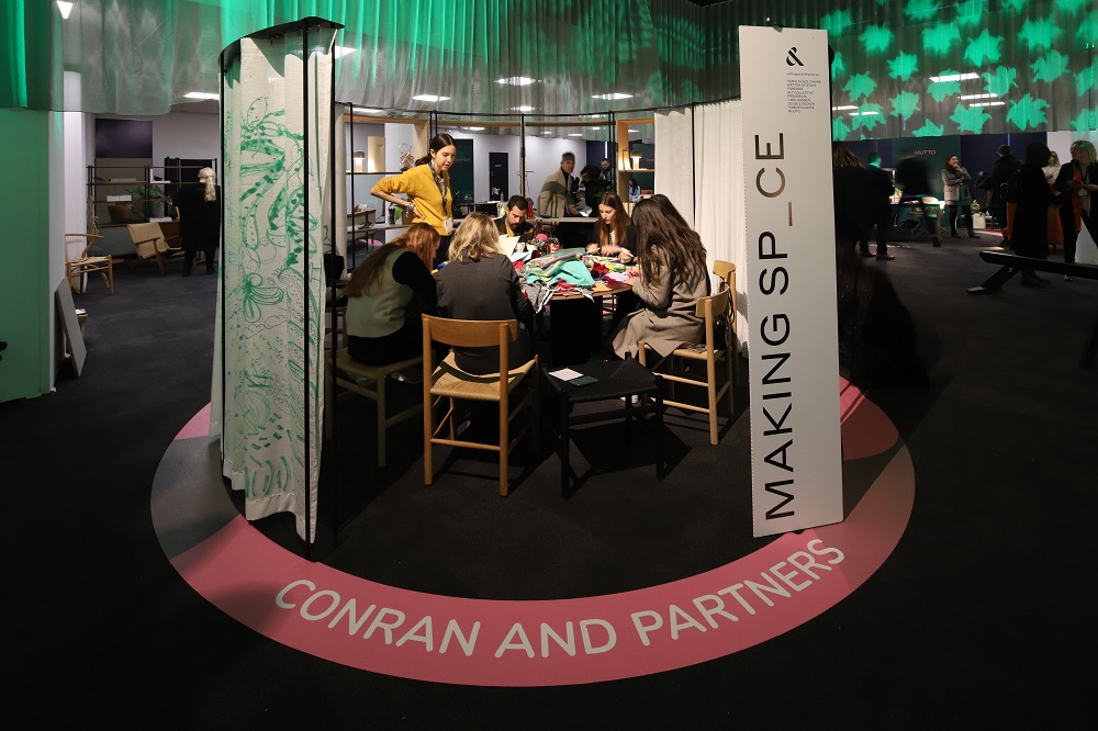
Although the project was a collaborate effort, each designer was able to create their own section within the overall installation. While there is clearly a need to overlap and integrate, the installations and the conversation that followed could be broadly divided into community and function, comfort and cocooning and wellness and nature. “It was inspiring to see how each design studio approached the brief differently,” Kilburn explained. “Conran and Partners injected the energy of community when they decided to launch workshops on their pod on the hour so that the space would transform in time. Meanwhlile, Areen Design created an art installation-style safe cocoon nest that brought down the heart rate. stroop design, very much inspired by its own situation of launching recently with no physical base, was inspired by nature – and unveiled its co-working pod as a walk-in-the-park experience. Outside these three areas, the studios worked together to help set the scene, using visuals and sound as tools for transformation from one area of the show to another.”
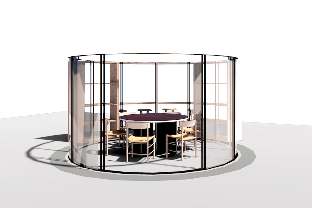
Discussing the question of community and function, Conran & Partners developed an interactive and community based focus to the design question. As explained by Tina Norden, while hotels have clearly always had to design for people, this concept took it a step further, encouraging the people using the space to define it and refine it, according to function and needs. Rather than over designing a space, the circular workspace was stripped back to allow for flexibility – flexibility of space and design being a key them throughout the discussion – to allow the people using the space to use it according to their needs in that moment.
- Image credit: The render supplied by Conran and Partners of the WFHotel concept shows a stripped back design scheme within the Circle of Life product by Table Place Chairs. | Render credit: Conran and Partners.
- Image caption: The Conran and Partners’ set was a conveyer belt of activity at HIX 2021, designed to transform throughout the show as a result of the on-the-hour creative events. | Image credit: HIX
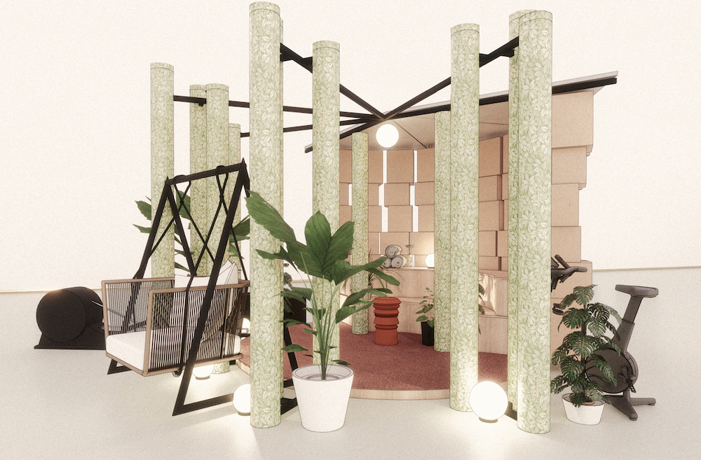
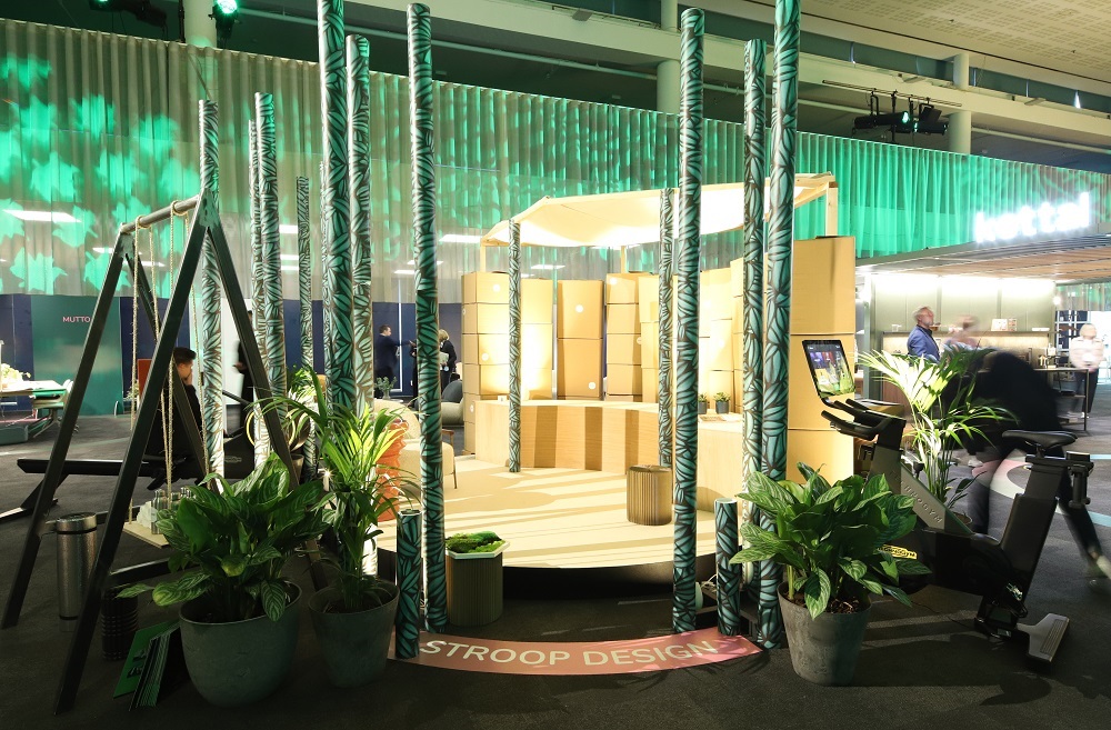
The theme of wellness was explored by stroop design. Identifying the ‘work from wherever’ fluidity that has emerged out of the pandemic, and combining it with the importance of nature, especially in the urban built environment, was the focus. Stroop spoke about the need to maximise the ‘pockets of nature’ presented to us, along with the importance of nature in our wellbeing and therefore the importance of integrating that into the workplace and in so doing, ensuring a work, wellness balance.
- Image caption: stroop design’s render of the immersive co-working set imagined for HIX. | Render credit: stroop design.
- Image caption: The finished set from stroop design was a blend of biophilic design and solution-driven hospitality. | Image credit: HIX
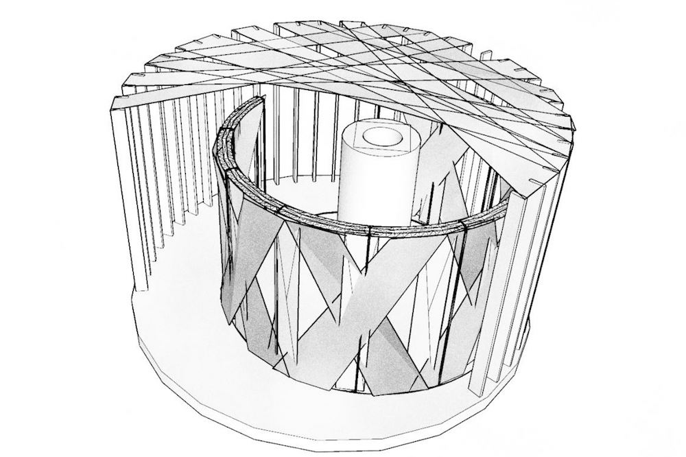
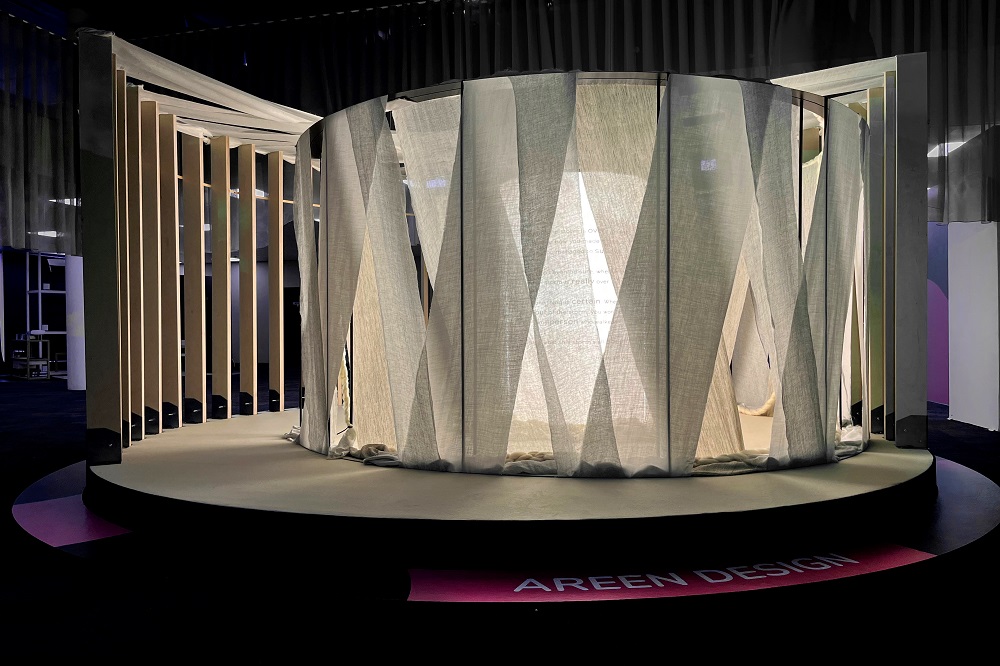
Becoming a lot more introspective, and really championing the ‘circle of life’ motif that ran through all three installations, Areen Design created a soft and fluid quiet space, a space to cocoon. It was a place for thought, which provided an important counterbalance to the busy communality of the other spaces. Heightened by soft surfaces and lack of colour interference, this space gave a heightened sense of calm, and was a design devoid of unnecessary distraction.
“Not long after being presented with the brief and exploring initial ideas, the conversation soon developed from one of competition into one of collaboration – and this ethos was a positive note that sounded throughout the discussion.”
- Image caption: The sketch of the set designed by Areen Design was created to transport guests into a tech-free zone of tranquility. | Render credit: Areen Design
- Image credit: Image caption: The finished set from Areen Design was a calming space that was a valuable part of the whole HIX experience. | Image credit: Areen Design
Having identified the differences, it was soon clear in discussion that the overall installation was all about collaboration and commonality. It was a process that, as mentioned by Kilburn, started out as a competition; a call to arms for three design studios to compete and establish who could come up with the best workplace solution. However, not long after being presented with the brief and exploring initial ideas, the conversation soon developed from one of competition into one of teamwork – and this ethos was a positive note that sounded throughout the discussion.
There was, as already mentioned, a clear theme or key word which emerged out of this discussion; flexibility. The need for flexible spaces and flexible design, to accommodate flexible purpose and mood. Coming out of the pandemic, lines and boundaries have been blurred as our personal spaces have had to be more multi-functional. We are now projecting those experiences onto what we want from public and hospitality spaces, specifically when it comes to design requirements around our co-working space. All three designers discussed at length the need for the need for that concept of flexibility to be applied to the design process as much as to the design itself. People have had to find the ‘space’ at home for work, play and wellness, and now expect hotels to deliver the same. A successful co-working space is about more than providing a socket to charge your phone, people are demanding a place that allows them to be creative, to work, to be responsive.
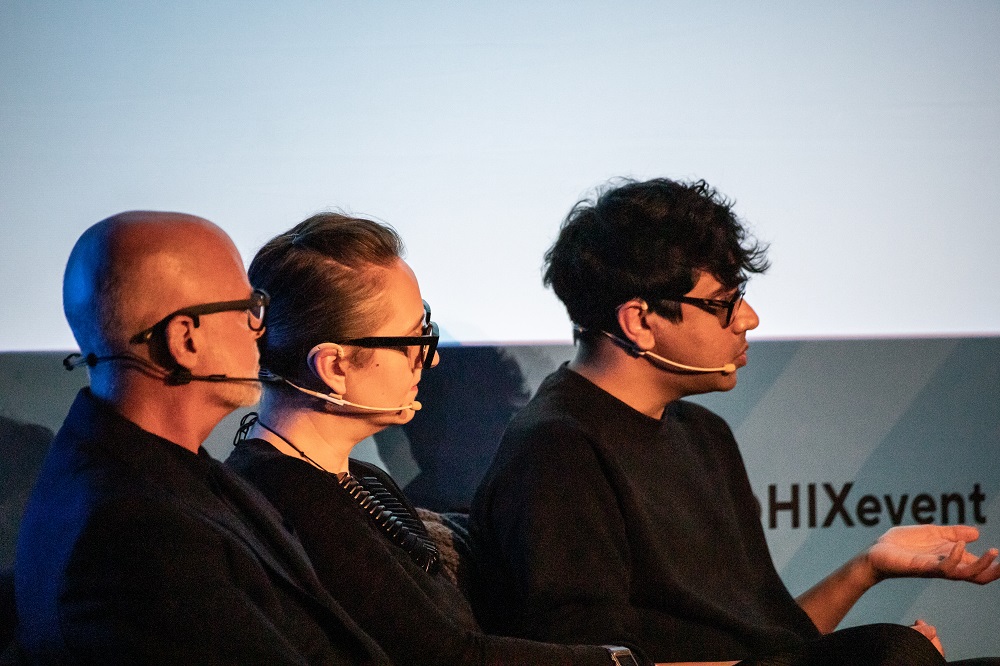
Image caption: Balkaran Bassan, Tina Norden and Vince Stroop were on the HIX Talks stage last week, explaining how their WFHotel concepts developed. Image credit: HIX
Another key theme of this discussion was that, along with the spirit of partnership, there developed an understanding of what we have in common rather than differences, so while on the surface the studios offered three very different design solutions, there was, as discussed by Tina Norden, Conran and Partners, “the red thread that ran through the designs”. The points the installations had in common were as important as their differences, and in fact ideally, aspects of all were required for a successful WFHotel space. The singularity of purpose, that red thread, strengthened the individual designs as they all presented us with different aspects of that flexible new space.
All three designs brought something different into the mix and highlighted the different elements that are required when we are looking critically at hotel design for tomorrow, a tomorrow which is rapidly becoming today. As with a lot of subjects, the questions around co-working spaces and design requirements where already happening before society got locked down, but Covid-19 and the ensuing shifts in society have accelerated this discussion. The WFHotels installation can therefore be seen as a starting point, and possibly even a challenge to start thinking more critically. As Bassan, succinctly put it, these installations should be seen as “conceptual thought bubbles,” that float into other conversations rather than a prescriptive solution.
The entire installation was described by stroop design as a “palette cleanser” from the main exhibition hall – it was a place to decompress after the hard sell of the main event where people where visually vying for space. In this space it was palpably quieter, and a lot calmer. There was a sense of community and common purpose, yet within that there remained space for so many different threads to be followed and discussions to be had.
If it was about creating an experience, then the circle of life swathed in fabric by Areen Design certainly did that, and as you walked into and quietly took time to explore the folds of fabric, you were confronted with the words of Haruki Murakami; “you won’t even be sure, whether the storm is really over. But one thing is certain. When you come out of the storm, you won’t be the same person who walked in. That’s what this storm is all about”
The storm isn’t over, and the world is certainly not the same, but the conversation about what that means for the industry is certainly taking place as we try and work out exactly what the storm is all about. Hopefully, we are able to take back the narrative, and ensure that with some conscious and considered design we can somehow charge the conversation with an increased positivity and energy.
And the suppliers…
The designers have expressed their sincere gratitude to the companies that and people who helped them throughout this process (and in some instances at very last minute) to achieve each their visual goals. Below is a nod to those brands; the often forgotten or at the very least, under-amplified, manufacturers that are vital part of the puzzle.
Conran and Partners: Alt Collective, Table Place Chairs, Matter of Stuff, Foresso, Fredericia, Carl Hansen & Son, Double Decker, Tomoko Kakita, Muuto
Areen Design: Alt Collective, Table Place Chairs, The Romo Group, Villa Nova, Latham Timber
stroop design: Technogym London, Elite Wallcovering by Article, Leaflike, Gubi, Ligne Roset, Astro Lighting, Romo Fabrics, Solid Surfaces, The Alt Collective, The Sunbeam Group
Main image credit: HIX

