While Hotel Designs continues its Spotlight On Bars & Restaurants, Hilton Hotel Münich City opens Juliet Rose, a new destination bar…
Interior design firm Goddard Littlefair has completed a striking new destination bar called Juliet Rose at the Hilton Hotel Münich City. The city’s new place-to-be bar was inspired by the F&B concept of unusual botanical extracts and the importance of process in the creation of its singular drinks.
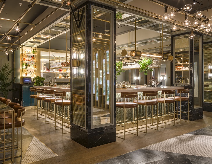
The scheme was inspired by the F&B concept of unusual botanical extracts and the importance of process in the creation of its singular drinks, which includes a range of signature cocktails and what is said to be the best coffee in Munich. The result is an exciting and theatrical zoned space with an alchemical, laboratory feel; a perfect back-drop for outstanding drinks to be made and delivered. The scheme both stands out from and also works subtly in harmony with the overall hotel, which has also undergone a thorough revamp by the Goddard Littlefair team.
The bar’s name, Juliet Rose, is taken from one of the most elite roses in the world, developed over a 15-year period by renowned rose breeder David Austin. As well as lending the concept connotations of craftsmanship and the long-term pursuit of perfection, the ‘Rose’ reference will also be easily understood by a local audience as a nod to Rosenheimer Strasse, the street onto which the bar’s dedicated entrance faces, as well as the Rosenheimer Platz metro station, on top of which the hotel stands.
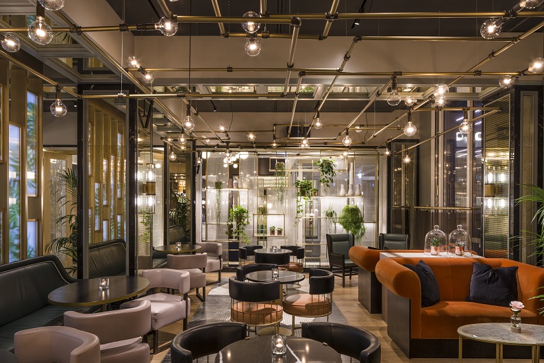
Image credit: Gareth Gardner
The generously-apportioned, 90-seat, 180 sq m bar is located on the hotel’s ground floor, with easy access from both the hotel’s spacious new reception, as well as via its own dedicated Rosenheimer Strasse entrance, introduced to maximise passing trade. Customers can additionally access the hotel and bar directly from the metro station and an adjacent car park below, arriving via a special circulation route through the ground floor of the hotel, offering intriguing glimpses of the back of the bar through semi-opaque windows, so that the bar is referenced and announced from every possible angle.
Juliet Rose is made up of four different seating zones, each with different stand-out features, plus two bars. The main ‘ceremony bar’ is a stunning, monolithic U-shaped design that guests coming from the hotel entrance see as soon as they enter the space, at the far end of a central approach. A second, smaller-scale coffee bar is made of the same dramatic moss-green and highly-polished granite, with the choice of material referencing the earthiness of botanical ingredients. The granite for the main bar has been book-matched to ensure dramatic textural veining from the front. Above and behind the main bar, the gantry structure is made up of brass sections, with an industrial/lab feel, underscored by an apothecary-style bottle display. The barman prepares cocktails at its centre, making full use of dry ice, bell jars and a sense of reveal.
‘The overall design approach for the space was based on form and order, with drama, freedom and an opposing sense of randomness created by the furniture and accessorising’, architect David Lee Hood, Associate at Goddard Littlefair, explained. ‘When it came to structure, we added a number of new elements to the space to give a feeling of overall order and symmetry, whilst also ensuring playful visibility between zones via glazed screens offering varying privacy levels.’
As visitors arrive from the hotel down the entry circulation route for example, they pass between two large-scale, floor-to-ceiling screens (with added ‘peep holes’), where a brass-effect structure features ribbed glass OLED panels with a striking inset palm print. The screens were bespoke-manufactured for the project and are just one of many bespoke items that ensure design integrity and exclusivity for the project. A second highly striking screen-wall faces the hotel entrance lobby, passed by guests on their way to either the bar or front reception, and is made up of a brass shelving structure with glass backlit panels where a textured opaque manifestation gives the impression of a linen-style finish and plays with light. The structure is decorated on the inner side with judiciously-placed planting.
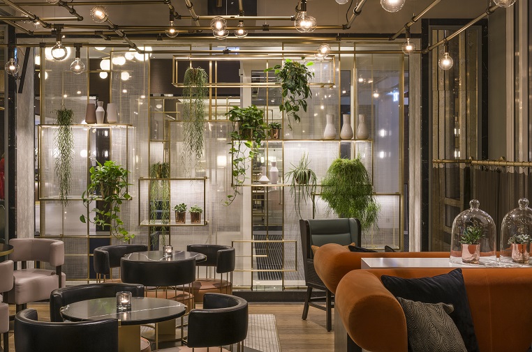
Image credit: Gareth Gardner
As the existing columns in the space are quite dominant, the design team made a feature of them by using new cladding and mirroring. An existing ceiling was removed so that the space’s full height could be used, with a dramatic new lighting structure that uses brass pipes and large, exposed lamps to add to the geometric, laboratory feel. Inset mirrors within the ceiling area reinforce the structure, as well as adding reflection and sparkle. Architectural lighting for the scheme was created together with DPA Lighting, whilst the stand-out decorative pieces were all bespoke-designed by Goddard Littlefair, with advice from DPA, and manufactured by Peters Design. As well as the overhead grid structure, these include a stand-out ‘test tube’ style pendant light located over the main bar and a number of vertical, glass-clad wall lights, which refer to the test-tube decorative light in style. A number of mid-wall lights throughout feature a circular fitting with a pole attachment to each side. These add layering and create a lower-level light source to bring light to the tables. Flooring throughout features stained oak timber surround and inset panels, made up of a geometric pattern of small white mosaic areas, plus larger slices set at interesting angles.
The four main seating zones include a casual drop-in area, directly to the left of the entrance, primarily for daytime use for coffee and cakes. Further casual seating is to the right, whilst the two sections further back and along both sides of the bar, for day or evening use, feature a mixture of seating types, as well as a communal high table, for groups, cocktails evenings and special events. Planting is used throughout, both for biophilic appeal and to underline the ‘botanical ingredients’ bar concept.
Furniture throughout includes sofas in bottle green leather and loose seating upholstered in pale oyster pink or else in deep orange leather with thin brass upstands and dark turquoise seat backs. Tables are either a marble-effect silestone, a brass-edged timber-topped design or, for the higher communal table, a series of easily-conjoined tables featuring a print taken from a magnified gold-veined leaf print, supplied by Fameed Khalique and manufactured by the lead contractor on the scheme, Engels.
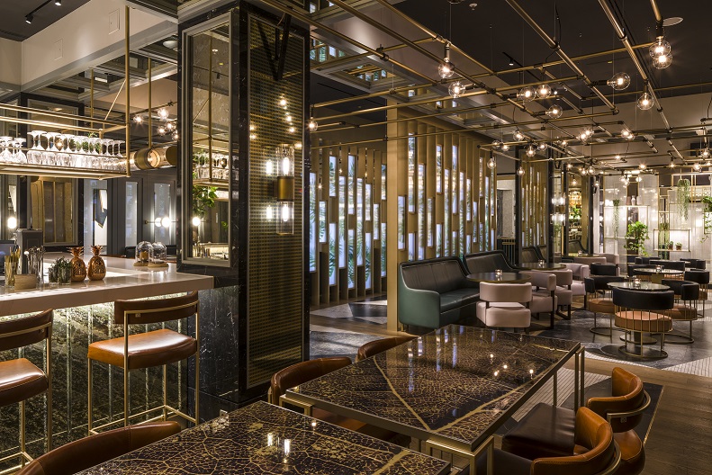
Image credit: Gareth Gardner
Four windows which look directly out onto Rosenheimer Strasse, alongside the bar, feature a special chain-mail curtain with a clip detail, playing once again with light and screening, whilst effectively obscuring the busy street view and ensuring customers are enveloped by the bar’s atmosphere.
Located behind the street entrance to the bar, on the other side of a draft lobby area, are two stand-out pieces of bespoke-designed joinery: a waiter station and a moveable cocktail bar, both in high-gloss lacquer with blue-green tones to work well with the planting and moss-green granite bars. The cocktail bar has a removable top with ice and a sink inside so that it can be moved around to cater to guests anywhere in the space.
The hotel reception lobby that connects with the bar features a design treatment in keeping with the overall hotel design scheme, inspired by German Expressionism and particularly Der Blaue Reiter art movement, which had its origins in the city. Stand-out design features in the reception area include feature lighting loops, designed by Goddard Littlefair and manufactured by LED-C4; a high-gloss hexagonal mosaic-fronted reception desk with brass edging; a striking reception back-wall with a pale grey wallcovering and bronze effect vertical dividing strips; a marble fireplace area and artworks chosen by art consultants ARTIQ, taking a cue from the dynamism and strong colour of early 20th century German Expressionism, but updating that for today’s context, with new artworks commissioned for the hotel from contemporary artists. The artworks that lead towards Juliet Rose are partly-abstracted paintings which reference a more natural theme, in keeping with the F&B concept, with bold and interplaying curved lines.
Main image credit: Gareth Gardner

