The world’s most iconic budget hotel brand is undergoing a major redesign following the growing demands of the modern traveller. To understand all the design details of the new generation of ibis Hotels, editor Hamish Kilburn sat down with Damien Perrot, Senior Vice President, Design Solutions for Accor, to find out more about how the new ibis was conceived in three separate designs…
With more than 1,170 economy hotels open worldwide, ibis has become somewhat of a trailblazer in the congested budget sector of the hotel industry. Opening up in neighbourhoods that before the ‘70s may well have not existed for the modern traveller, the company’s aggressive expansion into tier two cities bridged the gap between travellers and the freedom to explore the world while on a budget.
With the aim to ‘shake up budget hotel standards’, the brand, which is known for its basic and standardised design, is now in the process of reinventing itself to become more flexible to cater to a wider demographic. Using interior design as its tool, Ibis’ latest face lift includes new guestrooms, F&B areas and living spaces. “Its transformation is primarily based on customer behaviour and how guests instinctively use the spaces,” said Steven Taylor, Chief Brand Officer at Accor in the official statement from the brand. “Today, the brand is a truly vibrant place where travellers and non-staying and local customers alike can dine, sleep, work and feel welcome.”
Leading the extensive brand renovation is Damien Perrot, Senior Vice President, Design Solutions for Accor. “I wanted to achieve a design that was living, vibrant and real,” he told Hotel Designs. “The objective, in terms of design, is to attract people and allow our guests to have a great experience that will naturally encourage them to return.”
“Perrot launched competitions in America, Asia and Europe in order to garner inspiration from all corners of the world.”
The design, marketing and brand team came together with the ambition to rethink ibis as if it was created today. “The simple fact was that we felt obliged to confront the way in which our guests’ behaviour and lifestyles have changed,” explained Perrot. “Our idea was not to radicalise the form, but instead to create a concept in line with that of the modern travellers’ needs of today.” In order to keep the thoughts open and fresh, Perrot launched design competitions open to all in America, Asia and Europe in order to garner inspiration from all corners of the world. “The brief being light in context around what we wanted was key as we did not want to restrict the designers’ creative flow,” adds Perrot. As a result, the brand was able to handpick the designers who put forward realistic and brand-worthy solutions to the challenge.
Following the competition, the new ibis was to be divided into three concepts drawn up from three separate design studios. Studio Innocad from Europe, Studio FGMF from Latin America and Studio Soda from Asia together were Perrot’s answer to the new generation of ibis hotels.
The concept is a modular, flexible and customisable approach for architecture and interior, for renovation as well as new construction of ibis hotels. Designed around the fluid transition between inside and outside, the different settings of social spaces invite travellers and locals to explore several atmospheres and areas and are importantly not limited to be in one design during their customer journey.
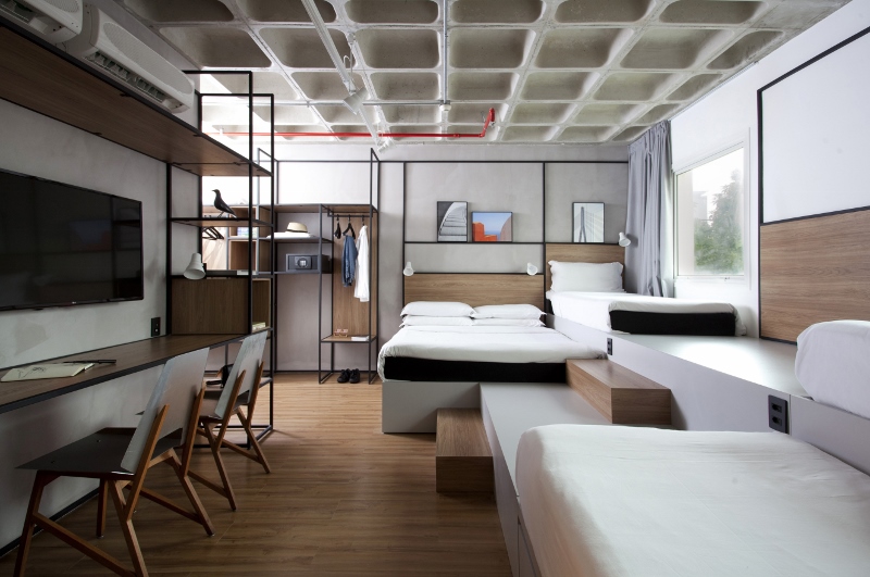
Image credit: FGMF/ibis hotels
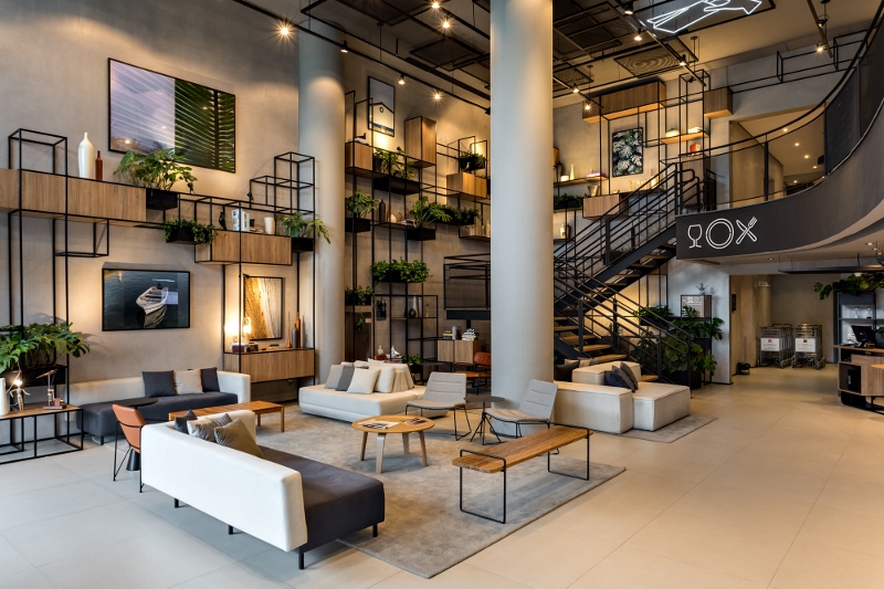
Urban living comes to the heart of the hotels with the design concept from Studio FGMF while the street outside becomes an integral part of the lobby. Unveiling a new pedestrian walkway, the hotel concept is gallery of local inspiration.
Meanwhile, the guestrooms have been imagined to be comfortable in a modern style, featuring a bookshelf as a centrepiece. A functional layout opens up new possibilities for guests to relax in the home-from-home setting.
Flexible, modular and contemporary, the concept that was imagined by Studio Soda is one that offers everything the modern guest is looking for; comfort combined with warmth. The lobby has been specifically designed to welcome the outside world, with a terrace area that extends out onto the street. The result is a public area that is welcome and free for guests to eat, relax, work or play.
“When we are rethinking ‘the new’, it is essential to forget what it is today,” explained Perrot when confronting the challenges of the project. “After the big idea in terms of design, the question is how can we apply that into our existing hotels. That’s a really big challenge, but I think we have succeeded.

Image caption: Damien Perrot, Senior Vice President, Design Solutions for Accor
“The other challenge is to not be distracted by trends. Each design concept that was accepted stayed true to the DNA of the brand, which is very modern. Throughout the project, I want to demonstrate that modernity is in line with a new way of living.”
With the ambitious plans to redesign all hotels in the ibis portfolio by 2022, the aim is not for all hotels to be identical to one another. Instead, each property is aimed to have its own quirky personality. “Each concept is not 100 per cent defined. But the designer will apply the concept on projects and select different furniture and lighting to suit the hotel,” said Perrot. “In order to be able to roll this out globally, we have to have guidelines and style book. Each document helps the designers to roll out this concept. In those guidelines, we explain the boundaries that can and can’t be broken to achieve the final design of the individual hotel.”
Each hotel to adopt the new design concept will be better equipped and better designed to personalise the overall guest experience. The refreshing, and very different, designed concepts suggest heavily that ibis strongly believe a good hotel experience is much beyond experiencing a good night’s sleep. To achieve that overall home-from-home experience, the brand has redefined its public areas, F&B environment and guestrooms allowing its guests to tailor-make their own travel experience when checking in.
Main image credit: FGMF/ibis hotels

