Following the impressive VIP Suite that was unveiled Sleep & Eat 2019, interior designer Yuna Megre joins editor Hamish Kilburn for a five-minute chat on how the design concept came together…
It was one of the most popular elements of last year’s Sleep & Eat. Not only was the VIP Suite fit for purpose – giving designers, architects and the press a place to hide from the exhibition – but it was also flawlessly designed to look and feel like a premium space.

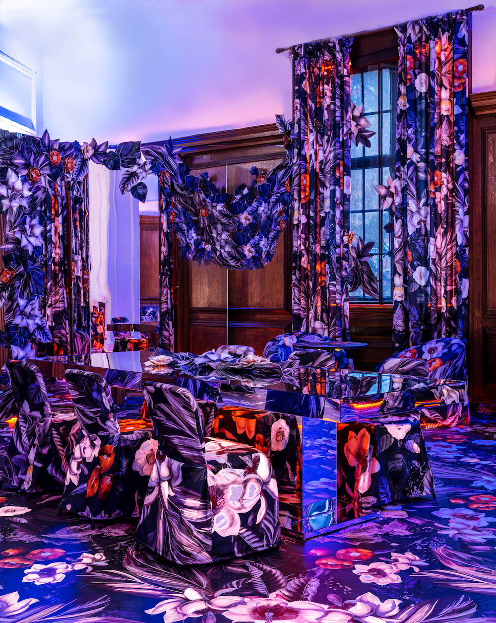
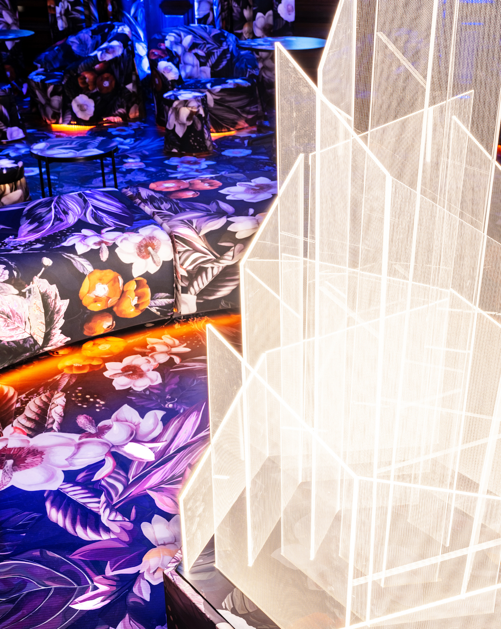
Named ‘Gather’ by the designers, the original oak panelled Olympia Club Room was transformed into a whimsical flora and fauna-inspired space. Drapes, upholstery and even the flooring were in a fabric depicting exotic flowers. Specially designed by MEGRE INTERIORS cascades of fabric flowers looped through the space and, in the epicentre, a large-scale light installation flickered warmly like a fire. Surrounded by orbicular seating – referencing the circular gathering places of human history and drawing a parallel to the primeval pleasure of coming together around a fire pit – the space was inviting, exciting and original.
- Image credit: Megre Interiors
- Image credit: Megre Interiors
Hamish Kilburn: Sum up your Sleep & Eat 2019 experience in one sentence?
Yuna Megre: Meaningful, inspiring, humbling experience, and there was an overwhelming appreciation of our ‘Gather’ concept.
HK: What was the brief?
YM: The brief was to create a VIP lounge that would reflect this year’s theme of the event of Social Flexibility. We went beyond that brief and created an experience rather than just a space, attacking all senses and immersing guests into a powerful atmosphere.
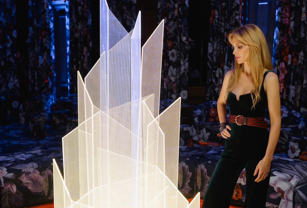
Image caption: Yuna Megre inside the VIP Suite at Sleep & Eat 2019
HK: Can you explain your choice of materials?
YM: Straight away we knew we would keep to a mono-material / look as much as possible to create an atmosphere of immersion and to make shapes disappear, taking a back seat to colour and pattern. Originally we were aiming to cover all surfaces with fabric, and developed such fabric with Sahco, that could withstand all the application we would need. However, in development, we came to the conclusion that for fire safety, for ease of cleaning, for ease of application – we will produce glue backed vinyl with the same print to use on floors and some furniture. We further pushed the boundaries by creating fabric flowers and leaves that matched those drawn on the print and strategically placing them as if they burst out from the two dimensional world into the three-dimensional one. Everything but the print we wanted to disappear as much as possible and to create some spacial illusions – which we achieved through the use of mirrored furniture and surfaces. We also view the scent and music that we created for this project as the materials we used. Because for a concept to be experiential and immersive it must work with all human senses.
“It is no longer enough to design spaces. We have to design experiences, environments, emotions.” – Yuna Megre, Founder and Head of Design at MEGRE INTERIORS.
HK: How does your design challenge conventional ideas of a public space?
It goes beyond space – that I feel is the biggest challenge to the convention. The way that our world is evolving, the way we consume our surrounding is evolving. It is no longer enough to design spaces. We have to design experiences, environments, emotions. There has never been such a cross-disciplinary overlap as today between interior design, event and experience design, art, digital design. And we are only at the beginning of this new paradigm. Our concept explores this new reality, a new approach to public spaces. It looks at space as an environment of interaction which has to create an emotion, a memory, rather than just serve a function.
HK: Can you explain your use of layers within the design?
YM: As we used a mono-material approach, we layered the project through senses rather than conventional visual layering. We addressed all six senses – the visual, the sound, the smell, the touch and with it ergonomics, the taste, and our last but most important one – emotion. We unravelled the concept of gather through them all. This is layering in the new era of design, not just visual layering.
HK: What were the main challenges throughout this project?
YM: Many people believed it could not be done. Throughout the journey multiple people were telling us to simplify it, to make it less complex. But we achieved what we set out to do, at 60 per cent of original cost estimations, on time, with everything as we envisioned. It is our teams approach to everything we do. There is always a solution, always to get things done. If you cannot see it, you are not looking hard enough. GATHER was such an overwhelming success because of this unwavering dedication to the concept and the support of all-out partners and contractors.
Main image credit: Megre Interiors

