Intrigued to find out to what extent the power of interior design can lift a building, editor of Hotel Designs Hamish Kilburn checked in to review the one and only Gleneagles…
Positioned in 344 hectares of land, under Perthshire’s Ochil Hills, is a Scottish jewel. The ever-majestic Gleneagles first soared to be a natural star in the spotlight when it first opened its grand doors in 1924. Its ‘cutting of the ribbon’ was celebrated with Scotland’s first ever outside broadcast, and these moments of the hotel’s many milestones can be found injected into the fabrics of many pockets of the today’s Gleneagles.
Since the 1920s, ‘The Glen’ has served many important purposes and duties outside of being a luxury hotel in the country hills. During WW2, like many hotels of its time, it was converted into a hospital. In 2005, it witnessed world leaders tackle tough debates at the 31st G8 Summit. And most recently, in 2014, it’s famous golf course was the stage of the Ryder Cup.
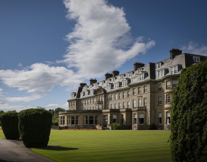
With all great hotels, comes great renovations – and in this case even larger responsibility in maintaining a priceless charm throughout. In 2016, just after the hotel was sold to the ‘hipster team’ behind Hoxton Hotels, Ennismore, a multi-million-pound upgrade was announced. Calling for sensitive brushes and creative minds, the task to revamp the building fell onto the shoulders of four leading design firms under watchful eye of lead architecture firm 3D Reid. David Collins Studio, Timorous Beasties, Macaulay Sinclair and Goddard Littlefair together gave the hotel more than just a lick of paint. Instead, they bravely and boldly went about redesigning, re-crafting and to some degree restructuring the hotel to ensure that it created both a warm and inviting space which also gave an appropriate nod to its history in all the right places.
As I enter the building and walk up the steps, my pre-conceived perceptions of what I thought would be an overly stuffy and ‘far too posh’ hotel are immediately erased. Instead, thanks to the wonderful work of David Collins Studio, the large, airy lobby, which sits on luscious green carpet, creates the kind of first impression that many hotels from around the world can only strive to achieve.
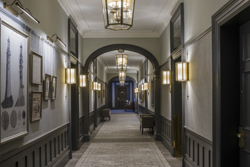
Image credit: Goddard Littlefair
The long corridors, designed by Goddard Littlefair and lit by Heathfield, are unlike any I have walked through before. It took 20 minutes for me to reach my suite. The fascinating art and original memorabilia, conceived by ARTIQ, hang on delicate gold chains as a further reminder of what the hotel walls have witnessed over the years. Although each piece is different, together they tell a tale of rich Scottish tradition, which is further explored in the rooms.
The guestroom experience
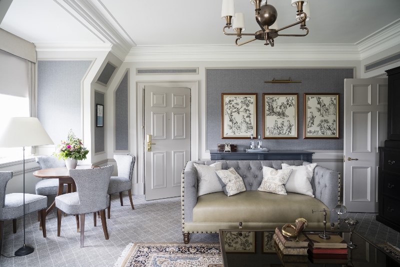
The Legacy Suite on the fourth floor is, like all the other 25 suites, aptly named after famous Scottish whiskey. The left door to room 404 opens into what is a large and comfortable living area, while the right door to 405 opens onto the bedroom. With a timeless pastel palette, the whole suite is outlined by wood panelling, which creates a high-end residential style throughout.
Formed of a lobby area, lounge, bedroom, bathroom and a dressing room, the overall look and feel of The Legacy Suite is that of a club lounge, where Chesterfield sofas and robust, hard-wearing materials reflect sporting activities and the feel of country life.
A sense of place is very much underlined in the design of the estate-like rooms. Goddard Littlefair worked with local craftsmen, fabric producers and upholsterers wherever possible, referencing the many classic fabrics Scotland is renowned for, supporting Scottish businesses and paying respect to long-standing links between the hotel and particular manufacturers.
The lounge is complete with an upholstered leather sofa, club chairs in olive-green buttoned leather, as well as a bespoke coffee table and a dining area that seats four people comfortably.
Separating the living area from the bedroom – something that not many other hotels can achieve because of lack of space – is a quirky corridor which leads to an unparalleled view which stretches over the estate. This area allows the suite to naturally breathe and very much makes the room look and feel large and spacious.

Image caption: The Legacy Suite (rooms 404 & 405)
The bedroom on the other side of the suite is a plush oasis with the same soft hues as what is in the living room, again creating a warm and inviting atmosphere. The oversized burgundy headboard is comforting, while natural light floods in through the panelled windows, which again look out onto the grounds. The flooring is a bespoke carpet and the rugs were sourced from India with varying colourways and designs selected individually to work the scheme. The rugs are in taupe with hints of green, a further nod to its luscious location.
The en-suite hand-picked marble bathroom is, quite frankly, fit and designed for a king. It is complete with a large bath on one side and a high-powered separate shower on the other, which is divided appropriately with vanity units and square basins from Villeroy & Boch with Perrin & Rowe brass finish taps. Completing the bathroom are ornate mirrors with an antique finish to communicate a timeless feel that marries up with the building’s age.
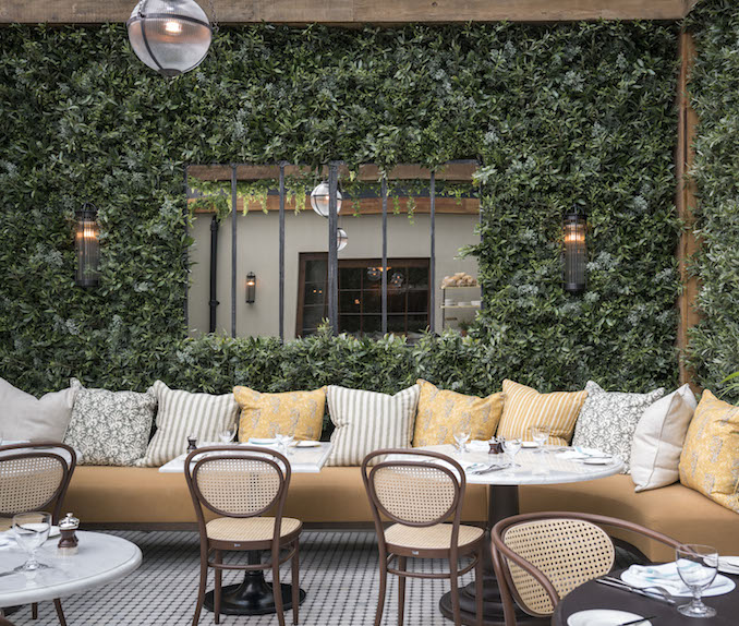
Image caption: The Birnam Brasserie
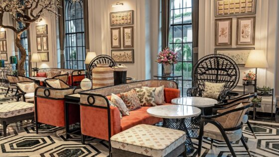
Elsewhere in the hotel, the public areas are equally impressive. The hotel shelters no less than nine bars and restaurants – of which the Strathearn is the main one and most formal. The Birnam Brasserie, designed by Ennismore Design Studio stands out as it is, unlike what I imagined, a casual dining experience designed in a conservatory-like space with many plants around the restaurant – including a full-sized living wall – playing on the concept of indoor-outdoor living to perfection.
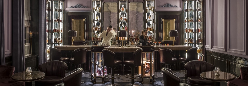
Image credit: The American Bar
Every decent hotel experience should end with a night cap in the bar. The award-winning American Bar, designed by David Collins Studio, is the perfect setting for such a thing. Layered with cashmere walls, the bar is a time machine taking guests back to the 1920s, complete with just the right injection of ’20s glamour, without the cliché glitz.
Meeting rooms
The glue that holds the whole meeting experience together, in my opinion, is the newly unveiled Ochil House. Inspired by the original private members clubs, Ennismore Design Studio has carved out each of the six rooms available to hire to create light, open and refined meeting spaces. Named after their original rooms in the hotel – including The Card Room, The Reading Room, The Writing Room and The Broadcasting Room – these spaces give an appropriate nod to the hotel’s storied history.
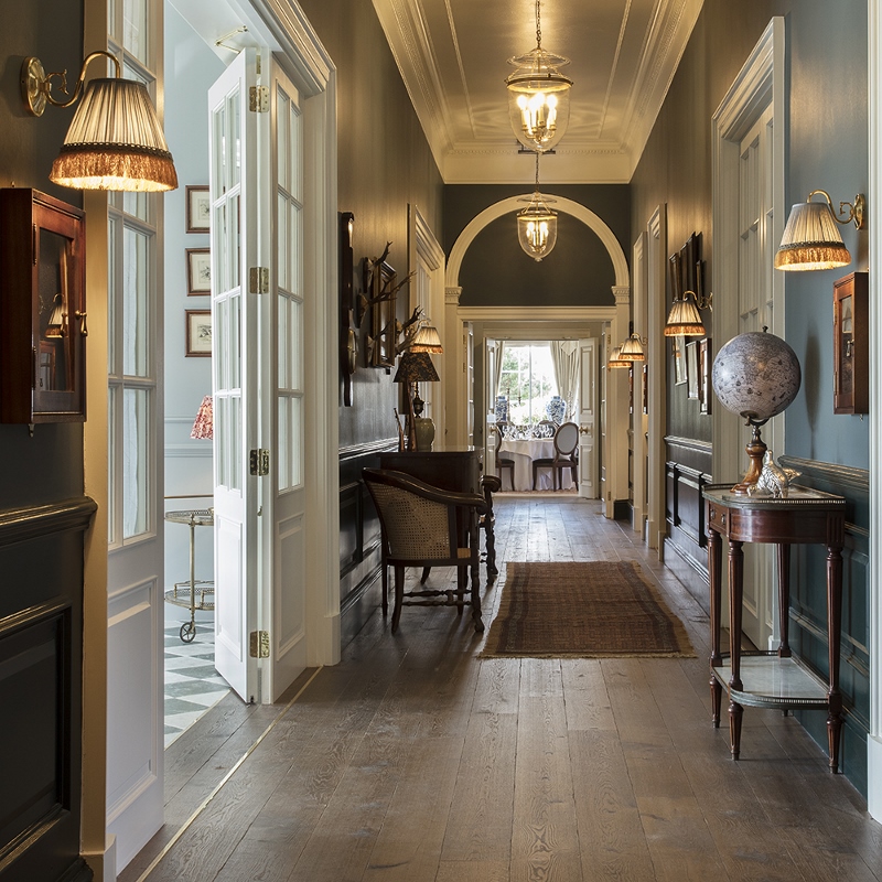
Image caption: Ochil House
“The overarching ambition of the design was to inspire, arouse ideas and stimulate conversation – encouraging guests to look around, explore and discuss, rather than sit at a table in a blank function room,” said Charlie North, design director at Ennismore. “It’s a reinvention of the meeting space concept – somewhere that’s not just practical but also beautiful, as well as homely, welcoming and fun – and a place where people naturally want to gather and enjoy conversation.”
Since checking out of Gleneagles, London – or anywhere for that matter – hasn’t quite looked or felt the same. The majestic countryside estate in the heart of Scotland made a lasting impression and it is as much a jewel today as it was in 1924.

