A year after hospitality lost its colour due to the outbreak of Covid-19, we’ve asked brand strategist Emma Potter to inject our pages with some vibrancy. Here, she explores colour’s role in post-pandemic hospitality and hotel design…
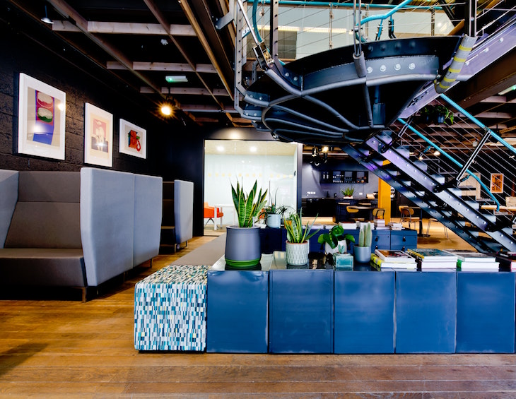
The pandemic has created a seismic shift in human behaviour. We have adapted well to new ways of working and new ways of communicating with our friends, family and colleagues, but how will the hospitality industry connect with the post-corona consumer? Through colour and savvy design is how.
I think it’s fair to say that the last year has been a rollercoaster of emotions from worry and anxiety with the announcement of the first lockdown in March 2020 to frustration and confusion with the ongoing uncertainty as we enter a new year. Arguably it is in times like these where we are able to see just how powerful a tool colour is – used correctly and purposefully, it has the ability to control the emotional noise that surrounds us.
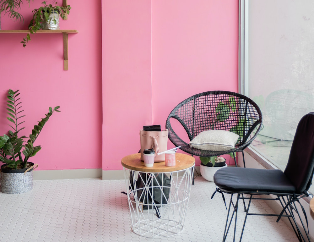
Image credit: Stefen Tan/Unsplash
Like many other sectors, the hospitality industry has been hit exceptionally hard all over the world but I’m sure the appetite that many have to travel, see and experience new destinations remains pretty solid. Having been cooped up in our homes and restricted to our local areas (in some cases only a 5km radius from our front door) as human beings, we are craving a change of scene; to get away from our daily routine, and to have shared experiences with loved ones that help us reset, recharge and refocus.
As we continue to move through 2021 – a year of optimism and solutions – I believe colour will play an increasingly significant part in hotel design. Whilst the world is undergoing one of the largest global ‘resets’ in decades – with many people re-evaluating their lives, how they use their homes, where they want to live, their choice of career, right down to the way they wish to show-up and be present in the world – this is also a tremendous opportunity for hotels to ‘reset’ and re-open refreshed and reinvented.
In some instances, that may be a guest that’s looking for a high-end, luxury and high-tech experience that gives them the power to control and operate everything contactless. For others, who crave environmentally values, they will want to immerse themselves in nature and find a destination that has focused on bring the outdoors in, adopting a more biophilic style to their architecture and design. Moreover, perhaps hoteliers have taken this time to become more conscious to source all their products locally and from sustainable sources. In all cases, the two types of customers are very different and demand a different colour schemes and design style – and yet, they are often sheltered in the same hotel, which creates somewhat of a challenge for the design team. But it’s not impossible. One hotel that manages to perfectly balance both sustainable approaches and extreme luxury is Jade Mountain in Saint Lucia, which was reviewed in 2019 by Hotel Designs.
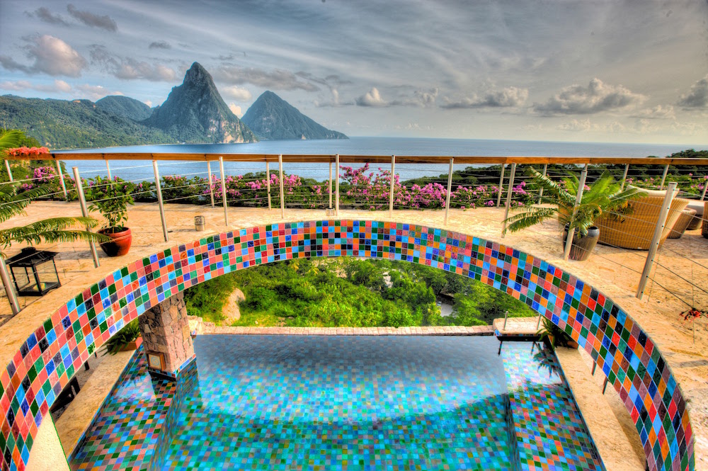
Image credit: Jade Mountain
Given the fact we’ve had so much screen time in the past 12 months, post-pandemic it’s likely we will see a surge of the environmentally values based consumer – and the hoteliers and designers who inject this feeling with purpose will the ones who come out on top.
“Choosing a colour scheme for a hotel is an expensive decision to get wrong.” – Emma Potter.
In addition, just as colour has the ability to create an effective and productive workplace, it also has the authority to evoke an emotion and a positive memorable experience during a guest’s stay. Remember, guests are making decisions based on their emotions and therefore colour can often influence our emotions and change our behaviour – so it’s imperative for a hotel to get their colour scheme right to establish true, meaningful connections with their guests.
Common pitfalls to avoid when choosing colour
Choosing a colour scheme for a hotel is hugely complex and an expensive decision to get wrong. It’s important to think about what the hotel brand stands for; who their ideal guest is (who do they want to appeal to), what do they want their hotel to offer that others don’t, what behaviours do they want to elicit, what feeling’s do they want to evoke, what memories do they want their guests to take away with them – all of these elements and more need a huge amount of consideration.
“Choosing a colour scheme because it’s ‘on trend’ means you’re following someone else’s version of ‘good’ or ‘great’.” – Emma Potter.
So, when choosing a colour scheme, consider this:
- Brilliant white – I would recommend that you avoid choosing brilliant white to paint a space, whether it’s big or small. From a psychological standpoint, white may be perceived as perfection to bring a sense of calm and quite; yet on the flip side it makes a space feel sterile, cold and lifeless. It reminds me of stark, clinical hospitals. Instead, check out the brands, such as Arte, that celebrate imperfection in nature.
- Over saturation – Just as it’s important not to saturate a space with brilliant white, it’s equally not advisable to saturate a space with any ‘one’ colour. All colours, with the exception of pure greys, have positive and negative psychological aspects. Of course, grey may make us feel safe because it has the capacity to help us blend in with the background but for me it’s quite non-descript and when surrounded by it for too long depletes my energy levels, resulting in me feeling drained and lethargic. Equally if I was immersed in a red space initially, I may feel energised and excited but if I remain in a red room for a long period of time, I’m likely to become agitated and annoyed because I’ve been over stimulated by the colour.
- Think about the space as a whole – When designing for a space it’s easy to get carried away with the colour scheme on the walls, but it’s important to think about the space as a whole. There are many elements to consider, from the walls, carpets, and cabinetry, to soft furnishings (including fabric type and textures as well as the construction of and / or print pattern), to lighting, glassware and the many accessories that adorn and embellish an environment. Think about the design journey and space as ‘one’ and the experience you with so take your guests on will flow.
- Tonal harmony – A colour scheme will always come together and be a success when the colours chosen relate and come from the same tonal group. When colours don’t harmonise it generally creates a sense of confusion or disharmony which guests will pick up on innately, but what they won’t always be able to identify or articulate is ‘why’ they feel this sense of discomfort. In essence it all comes down to selecting a colour palette that has tonal harmony.
- Trends are not timeless – I imagine that, certainly when it comes to residential design, opting for a colour scheme because it’s ‘on trend’ is more common than we realise – perhaps a client has picked out the colour because they have seen it in a magazine. Yet to help us choose the right colour scheme it would be good to understand how, as humans, we relate to colour – be that psychologically, personally and symbolically. Additionally, it makes senses to understand the influence of both the positive and negative traits, plus the application and proportion of colour used to create the desired results. Choosing a colour scheme because it’s ‘on trend’ means you’re following someone else’s version of ‘good’ or ‘great’, and not tuning into your intuition to discover your own. There are many well-respected paint-manufactures who make trend predictions at the beginning of every year like Pantone, Dulux, Farrow and Ball or Benjamin Moore – these are great places to go for inspiration, but in the end, make sure you select a colour palette and design style that’s right for your brand and the experience you wish to create – in the end it’s all about creating an immersive and memorable customer journey.
- Create sense of place – Achieving a strong sense of place in hotel design without straying into cliché territory is often a major challenge in any project. Colour can be a subtle way to reflect the natural landscapes as well as the personality of the destination. Take the newly opened Moxy Miami South Beach, for example. Gregg Keffer, Partner and Studio Leader at Rockwell Group delibrately chose a vibrant colour and design scheme that broke boundaries while capturing the “bright, carefree sophistication” of South Beach.
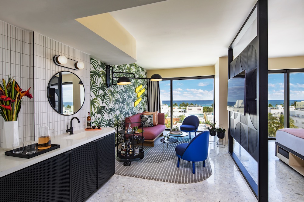
Image credit: Moxy Hotels
Clever ways of injecting colour to enhance wellbeing
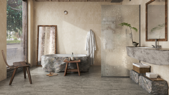
The idea of connecting hotel design and hospitality with nature is not new, yet in response to the pandemic there has been some discussion of the re-emergence and rise of biophilic design – it’s become mainstream! This builds on the idea that as humans we have an innate attraction to, and love of, the nature world. This would possibly explain why people will happily pay more for a room with a view of never-ending, undulating mountain ranges or the expansive horizon of the sea because these vistas will most likely deliver an incredible glowing sunrise to start your day whilst sipping on a delicious cup of freshly brewed coffee or tea, or to end your day with a mesmerising sunset whilst enjoying a chilled glass of rose or perhaps a gin and tonic as a sundowner.
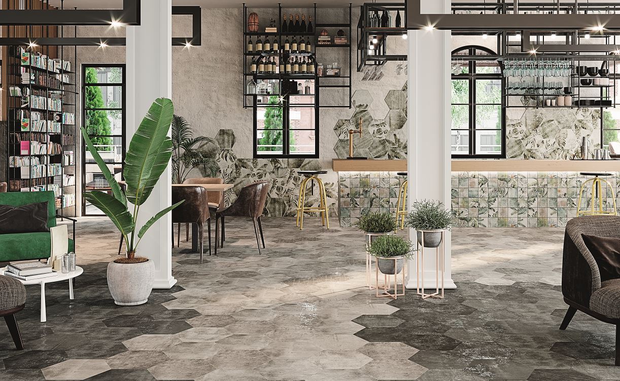
Image credit: CTD Architectural Tiles
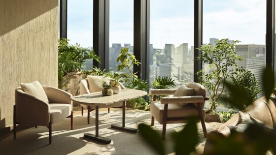
In essence, ‘biophilia’ means ‘love of life’, however, when it comes to biophilic design this does not mean putting in a few plants as a token gesture. It means embracing all elements of biophilic design, a true engagement of all our senses – sight, taste, hearing, touch and smell – to help us understand and absorb what’s going on around us. Take art outside the frame, using tiles from the likes of CTD Architectural Tiles. Use natural materials such as wood, maximising natural light, making organic shapes a priority, and using a range of plants to create a sense of the great outdoors – all of which helps to balance our emotions and support our emotional wellbeing whilst introducing a natural range of tones, shapes and colours.
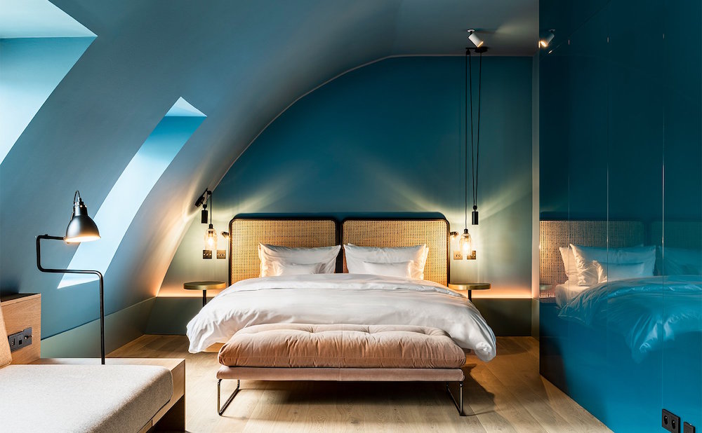
Image credit: Conran and Partners
In this way, not only do we create a space where guests feel safe and secure, we enable them to better connect with themselves by creating a peaceful, tranquil environment, making it a memorable meaningful experience that they’ll want to come back for, time and time again, year in, year out. After all, that is the end goal, right?
Main image Upsplash

