Set in the Silesian coalfields, Katowice is a city of concrete. Dotted around the skyline of this grey city are sets of the pithead lifting gear. Along its roads march blocks housing the flats, hotels and shopping centres of a modern Polish city. Many are painted and there are new, more stylish blocks added by the banks and other institutions moving here from Western Europe (see Design Club Gallery Designers Sources for images of Katowice).
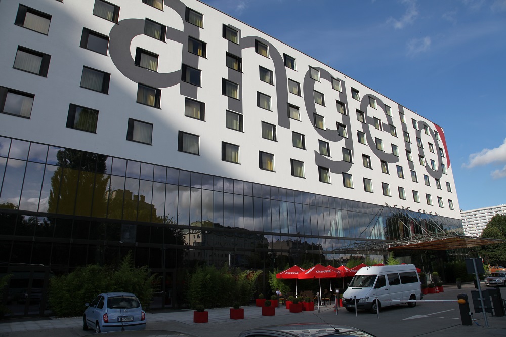
One of these new buildings is Vienna International’s new Hotel Angelo. This is another concrete block painted white with sharp painted graphics on the outside, a canopy and a garden area screening an external terrace. Set end on to the main road the hotel has its own underground parking and large coach parking area outside. The glazed canopy of the entrance doors and the sharp external graphics give a hint of the strong colour used throughout a striking interior.
The painted concrete areas are lifted by sitting on a glass walled lower two floors. The meeting rooms on the rear elevation break out of the block in both scale and colour. This is subtle architecture.
Like the previously reviewed hotel (the Radisson Blu Frankfurt) this too has concrete columns inside, but these have been placed rationally in relation to the interior. They are slim and painted white so don’t intrusively break up the views through the hotel, nor add industrial touches to the sophisticated interior design. Another similarity with Frankfurt is the staircase to a mezzanine floor off which opens the busy meeting and conference rooms, but its placement is used creatively to break up the space and create a private bar area.
On this large rectangular floor the public areas are defined using colour from lampshades as well as painted walls and backlit counters. Strong fabrics on the seating areas and lines of simple strongly coloured lampshades also help definition of the spaces. The reception desk, back lit in yellow faces the door, with the lifts immediately adjacent allowing simple security oversight, supplementing the use of the electonic room keys to activate the lift.
The positioning of the desk with the adjacent maitre d’ station at the entrance to the restaurant allows good management control across the whole of the public areas as well as enabling staff to provide an easy smiling service. In this hotel the relationship between design and operation has been worked harmoniously.
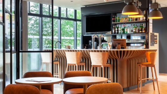
Food is served both in the main restaurant and bistro area adjacent to the bar, as well as within the bar area. Definition of the spaces is managed well through design, with lounge areas in the bar along with a cleanly designed bistro area, complete with its own direct access to the same kitchens as the main restaurant. The design of the bar in particular makes intelligent use of the fragmented spaces available to create different areas. Behind the bar is an area with a large TV screen where events could be followed, such as a football match. In front of the bar is another large screen but the area here is much more like a traditional lounge bar. Between the two is another lounge with the intimacy and style of a private lounge despite being an open space.
Tack on the space of the bistro and the design is stylish, intelligent, provoking a variety of uses by guests without appearing to demarcate. Even the placement of the public access net computers is intelligent, in a separate area under the staircase but overseen by the bar allowing service of food and drinks to be simply delivered.
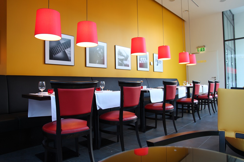
The outside terrace works off the main restaurant, screened by bamboo planting and pots. With strong red umbrellas and the same red on the pots against the fresh green of the bamboo, even this area echoes the style of the interior. In the restaurant, the use of red lampshades on tracks means they can be kept directly over the tables, all at the same height; this provides a visual line of repetitive elements that is both attractive and hypnotically fascinating to the eye.
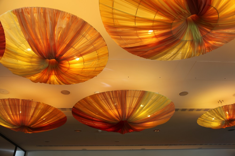
The two food and drink areas are separated by the reception lobby; definition and visual interest to this area is given again by the use of the lampshades, in this area looking like slightly blowsy upturned umbrellas. In a large concrete defined area like this, the ceiling could easily be a deadening blank canvas, but the interior designer has cleverly made it into an attractive, visually patterned area by both day and night. The use of strong splashes of colour in the shades as well as bold panels of colour on the wall adds to the visual delight as does strong art work.
The staff seem to take pleasure in their work place too making for a presentation of the hotel on entry, when emerging from the lifts, down the stairs or from the conference zone that is a delight. This whole area is as well designed a space as I have seen in a long time anywhere, and one which the staff obviously feel is enabling to them.
Taking the lift to the bedroom floors shows the same intelligent use of artwork and the spaces. On the executive floors, the large lift lobbies hold easy chairs, some strong artwork and another set of public internet stations. These act as business centres on each business floor. Adjacent to the workstations are placed coffee machines and cups so business guests have the opportunity to gossip at the coffee machine or to take fresh brewed coffee back to their rooms.
Corridors use the standard black yellow red colour scheme with the door reveals red colouring coupled with the carpet design showing clearly where room doors are an minimising the tunnel effect of lengthy corridors. Plenty of artwork, mainly imagery of Katowice itself adds visual interest to the corridors although the imagery in the lift lobby does more, imparting drama and cleverly sized to almost the same size as the window.
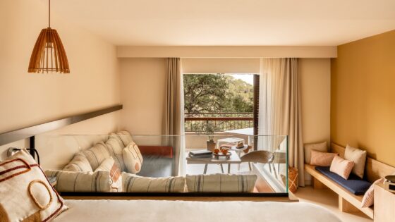
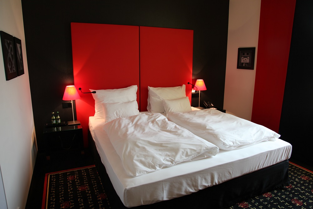
Bedrooms carry the colour scheme through with the white linens on the beds and the white in the bathrooms making the overall effect crisp and clean. There are plenty of pictures in the bedroom, including one that is only revealed when the curtains are drawn! Bedrooms are the standard hotel bedroom layout and are reasonably sized, but like the ground floor everything has been thought through and positioned properly. The sensibly sized desk has easily accessible sockets.
White wall behind the desk faces the black wall behind the red bedhead. Both are lit by lamps carrying red lightshades with a kind of transition between the two being made by the black and red curtains, which also provides effective blackout.
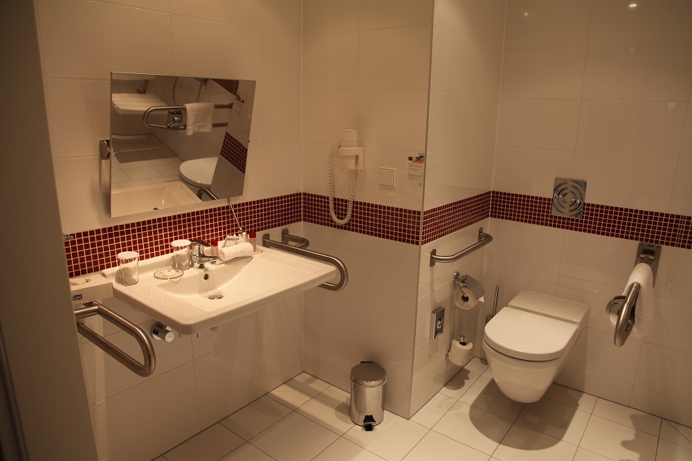
Bathrooms follow the current pattern of provision in hotels at this level in that some 65% of bedrooms have shower rooms rather than bathrooms. Bathrooms have the shower over the bath. Both are well sized and carry the colour scheme through, being predominantly white with a red mosaic border half way up the wall and black vanity units. With everything else white or chrome the whole has a sharpness and integrity that the writer found very aesthetically satisfying.
Coming into an hotel at this level so well thought out brings a sigh of relief and appreciation by comparison with the groping that can characterise so many, more ambitious, schemes in supposedly better hotels.
If all Angelo’s are going to be like this then Vienna International had better get on and build more – and in Western Europe as well as in the countries of Central Europe.
From a Visit made in August 2010. Words and Pictures are Copyright. ©Patrick Goff/HotelDesigns