I have just featured two hotels (Cube and Ongava) where the guests’ needs, in terms of why they are at those locations, has driven the form of the hotel. In the case of Cube the operator has intelligently analysed a European market and completely reworked the form of the hotel to meet the function demanded of the building by the resultant guest profile.
Operator and designer have worked together to provide solutions that result in the hotel running all year round at very high occupancy rates. In effect, the architecture has been driven by the guest profile and the building has been designed from the inside out.
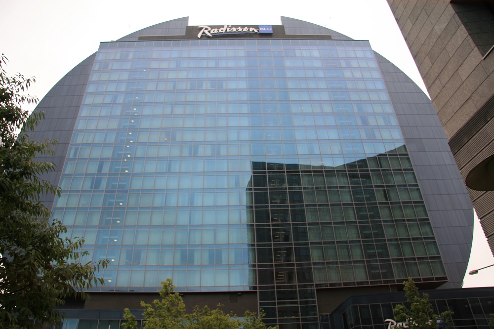
Award winning architecture, an iconic building, does not necessarily make for a good hotel. At Frankfurt the Radisson Blu is a classic example of where the function is dictated by the building form. The operator, Rezidor, has gained an iconic building with the added advantage of it being a highly visible position at the end of a motorway into the city, where it sits like an architectural full stop to the highway. The building is like a full stop in the sense that its form is circular, a form that then generates myriad problems for the interior designers and the operator.
As an ex-designer of hotels I like to try to get my head inside the head of the designer and understand what was trying to be achieved. Here the designer definitely lost out in a confused and difficult interior space riven with slabs and columns by what I see as the usual architect’s indifference to operational criteria or internal functioning. The architect created a powerful external statement that gave presence to the hotel without enabling the interior to work. For example the services to the rooms in the arcs of the circular building probably drop straight down as a chord through the various floors, the rooms becoming longer and longer as they near the circumference, then shrinking again and losing height as they get towards the top of the arc.

Why are the hotel groups so seduced by architecture that they forget that the guest experience owes little or nothing to this aspect of the building? I was recently asked by Marriott whether I would choose a modern hotel or a historic conversion/refurbishment. I replied I would choose the most comfortable with the best bathroom. What is it about these operators that they cannot see that architectural ‘genius’ does not necessarily equal guest appreciation? After all that has been written and said over the years about the need for hotels to be designed from the inside out, it saddens me to see an operation like Rezidor, led by Kurt Ritter – perhaps the greatest of our contemporary hoteliers, succumbing to the same old tired architectural blandishments. Yes, they have a landmark building, but internally and operationally it is failing.
Maybe location is imperfect — falling between three stools. Close to but not a part of the business and banking district. Within sight of, but not close to, the exhibition halls. Close enough to the airport to have aircrew staying but not close enough to be an airport hotel. But such imperfections are commonplace and can be overcome by operational excellence. Given a malfunctioning poorly designed interior dominated by a visually intrusive staircase and a wine ‘tower’ that is not a tower, nor close enough to serve the restaurant, achieving operational excellence is made much more difficult to achieve.
The wine tower is a device Rezidor have used in other Radisson Blu hotels (see Stansted for example) but as a spectacle this one is near useless as it is positioned half way up the staircase and is little more than a glass walled cellar. As such it would have made more sense both visually and operationally to be next to the restaurant, possibly in place of the glass screen that sets the food operation apart from the rest of the ground floor areas. As it is, it makes staff walk half way up the staircase to fetch wine, and is virtually invisible from anywhere except the conference breakout zone on the mezzanine.
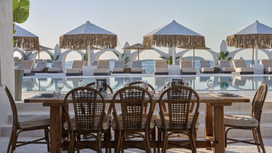
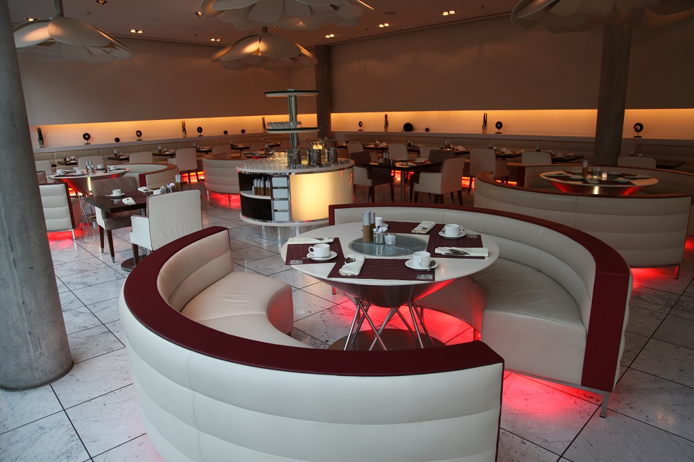
There are three restaurant areas. One with rose lighting, attractively set under seats and tables which leads from an adjoining bistro area that in turn runs off the lobby. Here the team are running a popular business lunch operation which makes me wonder why the third area, set at the front of the hotel, isn’t made similarly successful.
My suggestion would be to turn this closed space into a typical Gästehaus bar/bistro operation. The food offering in this part of Frankfurt seems to be re-interpretations of Italian, Turkish or other nationalities. Given many guests are tourists to Germany it would seem something local would be profitable. It might also attract a beer and wurst local audience, making the space popular instead of it being dark – especially given its visible presence on the street side of the hotel. If this were a W it would be seen as the ‘Friday night millionaire’ corner of the hotel, the place to be seen, but original design has failed to attract a local trade and the hotel guests prefer the bar.
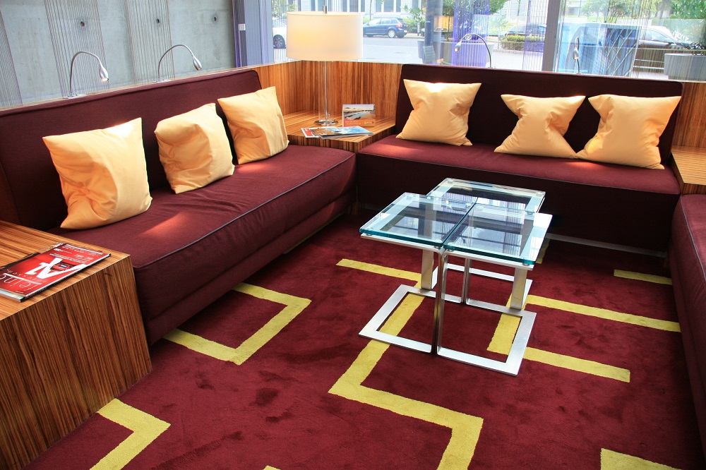
The bar is successful and neatly designed although the delivery route for stock is actually through the bar itself which is obviously less than ideal. With a clear view of the terrace, staff are able to effectively service the tables and the area is quite stylish. In between the bar and restaurant is an area broken by grey concrete columns and the lift shafts. Here is the lobby seating and reception desks, but the space is dominated by a long staircase that cuts intrusively across the double height windows. The area attempts openness, seeks grandeur, but feels claustrophobic. The interior designer has created a clever seating ‘box’ the sides of which lift to reveal power points and shelf space for laptops. On top of the sides are blue LED light fittings linked to the ceiling area by fibre cables which create a beam of blue light from each fitting.
Unfortunately the failure rate appears high, and the result is like a pretty girl’s grin when teeth are missing or blackened: disappointing and slightly shocking. It is also commented on negatively by guests. I know that Rezidor cut back on spending in the recession, but with the exterior signage missing lamps rendering it unreadable, this seems a somewhat dubious area of saving to make!
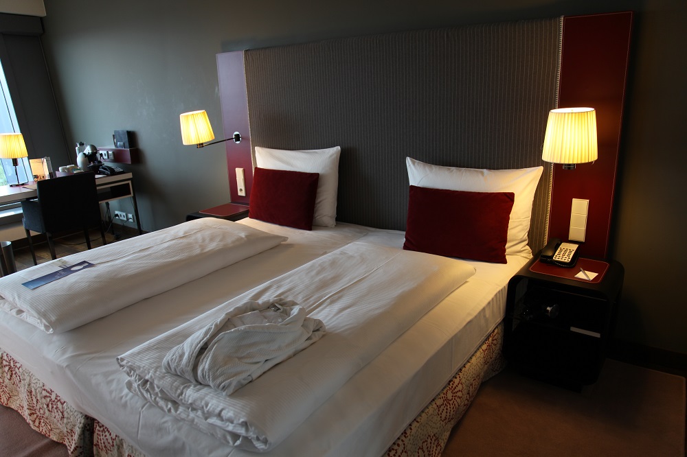
The bathrooms in the hotel are amongst the best I have seen in terms of interior design, including things such as retractable washing lines, and should be the standard for any four star hotel to mimic. The bathrooms also use digitally printed wallpaper to great visual effect and the use of colour in the different bedroom types is also striking and strong. Again, the structure imposes itself, giving bedroom floor to ceiling windows and creating odd sizes in the curves of the ends of the circular building.
Here are placed the business rooms and suites so the varying size can be used to great effect in changing the kinds of rooms created. Whilst the designer shows considerable expertise in the handling of the standard room this assured flair isn’t as much in evidence in the suites where the length creates a number of problems. The windows are all on the ends of these rooms so the lighting becomes important, especially during daylight hours. Stopping one end of the room being shrouded in gloom by comparison with the window end requires an assured handling of the lighting balance.
The standard bedrooms reflect the brand standards, now also being rolled out in the US by the Carlson owners of the Radisson brand, They too have adopted the Radisson Blu naming, the Blu of course a reference to the original European brand owners SAS airlines whose logo was also a blue square. Indeed the previous design director for Rezidor, Gordon McKinnon, is now working in a similar role in Carlson US. For the first time we potentially have a mass market brand with standard room type across all continents.
Bedroom schemes range from funky to somewhat masculine conservative in the business rooms.All are well laid out and thought through. Sockets are in the right places and lighting the lighting is good. At four star Rezidor get it right and this is probably as good as it gets – although as standards continue to rise it will be interesting to see where the upgrade comes – a separate shower perhaps as well as bath?
All the more surprising then that the suites don’t carry the same conviction. Whilst bedrooms match the quality of the standard rooms and bathrooms too are well designed the lounge area seem a little at a loss as to how they should be to set out. Whilst everything is there they lack seem to me to lack some physical and emotional comfort, with large spaces with large pieces of furniture, but very masculine and corporate in feel.Even top businessmen need an environment in which they can relax.
At the top of the circular building is the spa and pool area, taking advantage of the curve to place a glass roof over the pool and giving the area some of the best views of Frankfurt. There is a gym and some spacious well planned and detailed massage rooms. The wellness area is guarded by access via key card only, and I am continually surprised that this simple implementation of electronic key control isn’t a standard in all hotels to give added security to guests.The lift doesn’t move without key input providing some measure of security to all floors, and it also is needed to open doors in the spa.
This is a high visibility building with its garden pool and terrace. The restaurants and spa ought to have been buzzing. During my visit in August 2010 Europe was emerging from recession and Germany had shown growth of 2% in one quarter. Although quite busy the hotel was by no means full. I know August is a holiday month and Germany is putting towels on loungers by pools the world over, but it does not seem to be attracting any local business. For reasons one has to look to the location and the design.
Imposing from the outside the closure of one cafe shows that the interior is not targeted profitably on a suitable guest profile. Watching Korean, Nigerian, English and French guests struggling to master an international menu in a restaurant that was totally international in styling, I couldn’t help wondering if making it a little more German wouldn’t help with both the simplification of the menu and attracting the local community.
But then I’m just a designer who dislikes grey concrete columns scattered carelessly through an interior. Criticising the food is just a reflection of the irritation I felt at the architecture.
Words and Pictures ©Patrick Goff. Made after a visit in August 2010