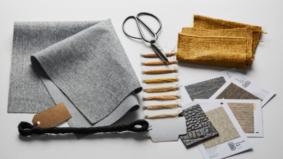
At the beginning of this year Style Library Contract shared 4 design trends they see as having the greatest influence in hospitality design during 2017.
After Clerkenwell Design Week, the home of leading British brands Zoffany, Harlequin, Sanderson, Scion, Morris & Co., Anthology and FROne share four colour trends for Summer 2017 – ZEN, NOMAD, BLISS, and Pantone’s GREENERY…
NOMAD
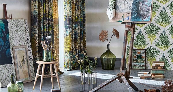
The word Harlequin means ‘varied in colour or decoration’, which sums the in-house studio’s eclectic design ethos perfectly. Driven by their love of colour, collections are inspired from around the world. The intensity of colour found in nature is evident in Fauvisimo’s powerful colour palette which ranges from cobalt blues and deep magentas to moody greys, on trend mustards, highlights of muted greens, blush pinks and honey shades.
 ZEN
ZEN
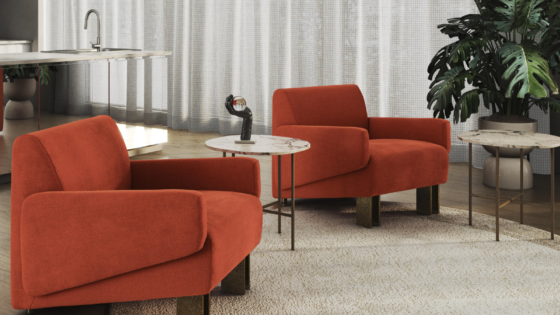
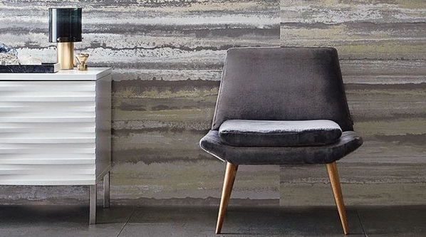
Moody metropolitan tones in subtle textures and combinations of matt and shine capture the essence of Anthology, a new generation of contract specification fabrics and wallcoverings. Sophisticated complexity that interior designers and hotel groups worldwide can easily access.
 BLISS
BLISS
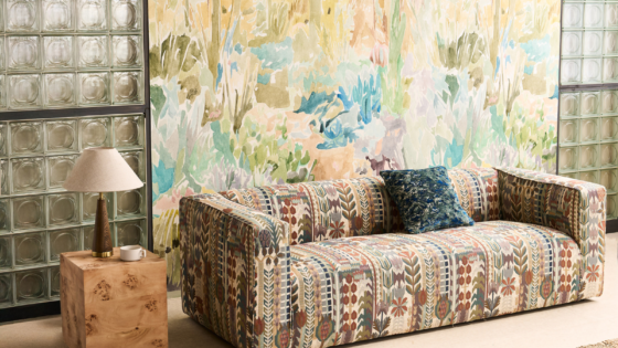
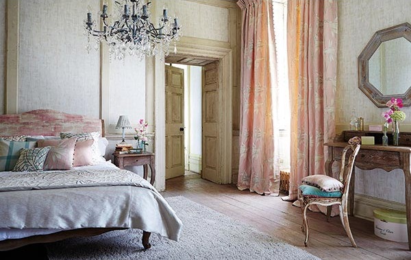
Harlequin’s Poetica range is an enchanting homage to the natural beauty and intrinsic charm of England’s spectacular countryside and delightful cottage gardens. Drawn with a refreshing lightness of hand and tinted in watery hues, it creates a shabby-chic contemporary look for a romantic escape.
 GREENERY
As part of their Alchemy of Colour research, the Zoffany studio identified their own unique colour palette, which includes a dazzling malachite green. During this process Peter Gomez, Head of Design for the Zoffany Studio, experimented with a number of green shades and advises, ‘Be bold and use this colour in its purest form in a plain fabric, a great way to introduce a contemporary look is to champion green in a lustre effect against natural linens. Green really sits well off shades of sunstone and russets.
