Simon O’Mahony, Managing Director of Mitre Linen, explains how soft furnishings, linen and colour can help a hotel stand out from the crowd…
Hospitality is a congested market, and customers are increasingly discerning with a huge range of options to choose from. In short, it’s crucial to stand out by having a clear identity which extends into every room of your hotel. Having a well-defined offering clearly positions your business and makes it more appealing to particular customers. What’s more, using colour can help bring the values of your business into every room.
Colour experts Pantone have outlined eight key palettes which will lead colour trends in 2018. Understanding and integrating these into hotel rooms will help to emphasise the luxurious decadence of a countryside spa or add a splash of vibrancy to a city centre base. What’s more, using soft furnishings and linen to celebrate these trends is an attractive and luxurious alternative to a complete overhaul, without the associated expense. These eight trends are:
Playful
Playful colours are for those who don’t take life too seriously. With a palette dominated by yellows and lime greens, these shades can work brilliantly in informal communal spaces such as coffee bars and dining spaces. Bringing this trend into individual rooms can add a zest of bright playfulness, whilst throw cushions are the ideal way of adding a spark which can still be moved to reveal the blissful tranquillity of classic white bed linen.
Discretion
Pantone suggest that Discretion is Playful’s more responsible elder sibling, offering refinement and subtlety to quality hotel spaces. Led by rustic elderberry and fern tones, Discretion is a vital part of the luxurious accoutrements of bespoke accommodation. Use it to draw the eye to finishing touches such as Mitre Linen’s Chatsworth or Reflections bed runners.
Image caption: Heritage Serenity range from Mitre Linen
Verdure
Taking its name from lush greenery, the Verdure palette is all about emphasising health and vitality. Perfect for spas, country retreats and eco-conscious premises, typical Verdure colours include paler celery greens and organic berry purple. The Comfort Enigma massage couch cover from Mitre Linen is ideal for offering Verdure’s serene and relaxing qualities, whilst Nova towels are available in mint green tones for a delicious alternative to classic white spa towels.
Far-fetched
Far-fetched but not inconceivable, this palette is all about recreating the fragrances of a Moroccan bazaar or the sights and sounds of a bustling Beijing backstreet. Warm, earthy and terracotta tones dominate here, highlighted with carefully chosen rose and peach items. Why not try using Mitre Linen’s Mocha sheets and valances as a basis for your exotic oasis and draw customers’ eyes with contrasting finishing touches.
Hint: Before committing to the far-fetched palette – make sure it suits your location – will guests expect an exciting and exotic experience?
Resourceful
Are you feeling brave? The Resourceful palette explodes with bold contrasts of rich velvet blues and classic burned oranges. Redefining classic 1960’s London chic, Resourceful requires flair and creativity to integrate into your hotel rooms and can be built around signature pieces of period furniture. Dazzle patterns are also great for creating pulsating clashes that make for memorable spaces.
 Of course, this palette isn’t necessarily associated with rest and relaxation, so party-oriented boutiques and socially-driven aparthotels are Resourceful’s key markets. Build a bold backdrop with the geometric pattern of Mitre Linen’s Essentials Sweden curtains or introduce the rich blues of the Essentials Spectrum navy collection.
TECH-nique
As the name may suggest, TECH-nique celebrates the rise of technology and the way this influences our lives. Frosted colours dominate here, as do hot flamingo pinks and turquoise tones. TECH-nique embraces utilitarian and simple design and is the efficient way to add quirk to entry level rooms. Use sparingly and rely on the enduring appeal of clean and crisp whites in order to carry this palette.
Intricacy
Intricacy is an abundance of neutral metallics with flourishes of dramatic berry red and yellow. Ideal for glorifying a penthouse suite or creating dramatic dining and entertaining spaces, Intricacy needs to be led by bold furniture choices and celebrated with the luxurious feel and striking looks of Mitre Linen’s Sovereign bedspreads.
Intensity
Pantone’s final palette is easily their most bold. Intensity is… intense. Blacks and golds make for intensely strong looks for that strictly presidential vibe. Whilst obviously not suitable for an entire room, carefully using Intensity can create dramatic dressing spaces and premium, luxurious suites.
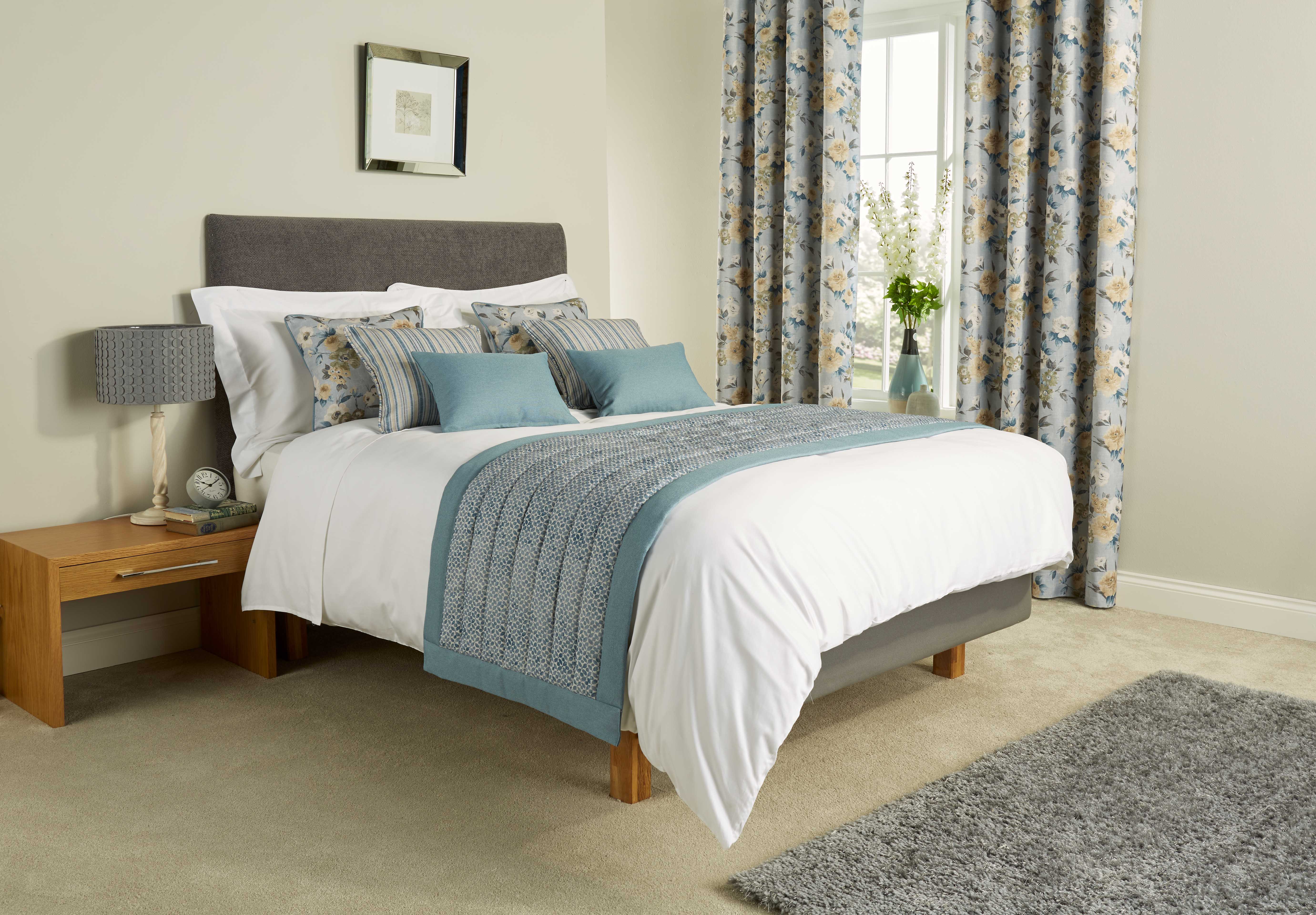
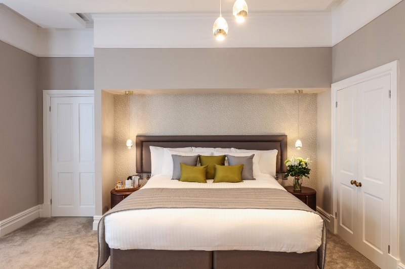
Image caption: Nostalgia Sky runners from Mitre Linen
What’s fashionable for hotel rooms in 2018?
Pantone’s Colour of The Year rings throughout the fashion world and 2018’s colour is Ultra-Violet. As Pantone state: “Enigmatic purples have also long been symbolic of counterculture, unconventionality, and artistic brilliance. Musical icons Prince, David Bowie, and Jimi Hendrix brought shades of Ultra Violet to the forefront of western pop culture as personal expressions of individuality.”
In such a competitive and unpredictable hospitality environment, maybe adding some Bowie to your bedrooms isn’t a bad idea.