Pantone Colour of the Year 2020 is Classic Blue, a reassuring presence instilling calm, confidence, and connection…
Following 2019’s refreshing Living Coral, Pantone has announced Classic Blue as the Pantone Colour of the Year for 2020; a timeless and enduring hue elegant in its simplicity. Suggestive of the sky at dusk, the reassuring qualities of the thought-provoking. PANTONE 19-4052 Classic Blue highlight our desire for a dependable and stable foundation from which to build as we cross the threshold into a new era.
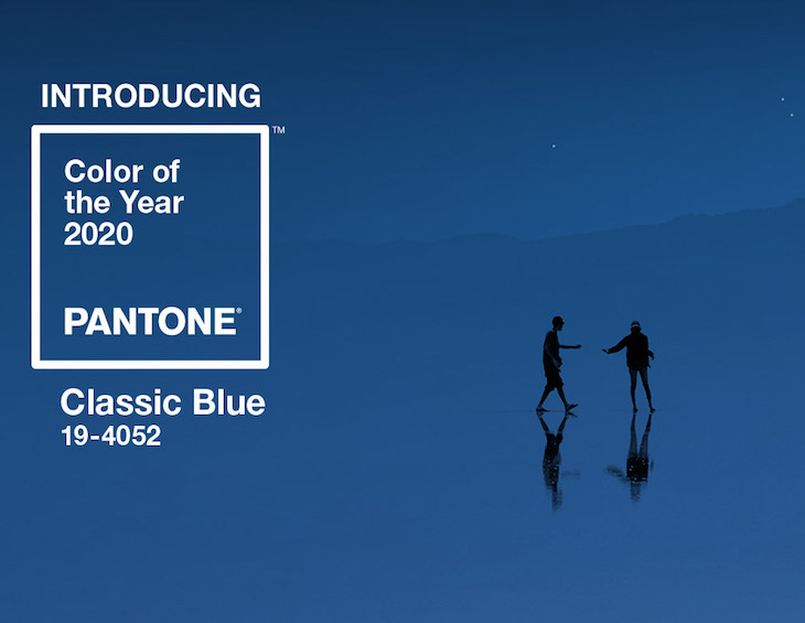
“We are living in a time that requires trust and faith. It is this kind of constancy and confidence that is expressed by PANTONE 19-4052 Classic Blue, a solid and dependable blue hue we can always rely on,” said Leatrice Eiseman, Executive Director of the Pantone Colour Institute. “Imbued with a deep resonance, PANTONE 19-4052 Classic Blue provides an anchoring foundation. A boundless blue evocative of the vast and infinite evening sky, PANTONE 19-4052 Classic Blue encourages us to look beyond the obvious to expand our thinking; challenging us to think more deeply, increase our perspective and open the flow of communication.”
Imprinted in our psyches as a restful colour, PANTONE 19-4052, Classic Blue brings a sense of peace and tranquility to the human spirit, offering refuge. Aiding concentration and bringing laser-like clarity, PANTONE 19-4052, Classic Blue re-centers our thoughts. A reflective blue tone, Classic Blue fosters resilience.
As technology continues to race ahead of the human ability to process it all, it is easy to understand why we gravitate to colours that are honest and offer the promise of protection. Non-aggressive and easily relatable, the trusted PANTONE 19-4052, Classic Blue lends itself to relaxed interaction. Associated with the return of another day, this universal favorite is comfortably embraced.
“The Pantone Colour of the Year highlights the relationship between trends in colour and what is taking place in our global culture at a moment in time, a colour that reflects what individuals feel they need that colour can hope to answer.” added Laurie Pressman, Vice President of the Pantone Colour Institute. “As society continues to recognise colour as a critical form of communication, and a way to express and affect ideas and emotions, designers and brands should feel inspired to use colour to engage and connect. The Pantone Colour of the Year selection provides strategic direction for the world of trend and design, reflecting the Pantone Colour Institute’s year-round work doing the same for designers and brands.”
“As we all head into a new era, we wanted to challenge ourselves to find inspiration from new sources that not only evolve our Colour of the Year platform.” – Laurie Pressman, Vice President of the Pantone Colour Institute.
To fully bring to life the true meaning of PANTONE 19-4052 Classic Blue, Pantone has translated PANTONE 19-4052 Classic Blue into a multi-sensory experience. By extending the sensory reach of PANTONE 19-4052 Classic Blue, Pantone is hoping to reach a greater diversity of people to provide everyone with an opportunity to engage with the Colour of the Year 2020 in their own unique way.
“As we all head into a new era, we wanted to challenge ourselves to find inspiration from new sources that not only evolve our Colour of the Year platform, but also help our global audiences achieve richer and more rewarding colour experiences,” added Pressman. “This desire, combined with the emotional properties of PANTONE 19-4052 Classic Blue, motivated us to expand beyond the visual, to bring the 2020 Pantone Colour of the Year to life through a multi-sensory experience.”
For 21 years, Pantone’s Colour of the Year has influenced product development and purchasing decisions in multiple industries, including fashion, home furnishings, and industrial design, as well as product packaging and graphic design. Past selections for Colour of the Year include:
- PANTONE 16-1546 Living Coral (2019)
- PANTONE 18-3838 Ultra Violet (2018)
- PANTONE 15-0343 Greenery (2017)
- PANTONE 15-3919 Serenity and PANTONE 13-1520 Rose Quartz (2016)
- PANTONE 18-1438 Marsala (2015)
- PANTONE 18-3224 Radiant Orchid (2014)
- PANTONE 17-5641 Emerald (2013)
- PANTONE 17-1463 Tangerine Tango (2012)
- PANTONE 18-2120 Honeysuckle (2011)
- PANTONE 15-5519 Turquoise (2010)
- PANTONE 14-0848 Mimosa (2009)
- PANTONE 18-3943 Blue Iris (2008)
- PANTONE 19-1557 Chili Pepper (2007)
- PANTONE 13-1106 Sand Dollar (2006)
- PANTONE 15-5217 Blue Turquoise (2005)
- PANTONE 17-1456 Tigerlily (2004)
- PANTONE 14-4811 Aqua Sky (2003)
- PANTONE 19-1664 True Red (2002)
- PANTONE 17-2031 Fuchsia Rose (2001)
- PANTONE 15-4020 Cerulean (2000)
Main image credit: Pantone