Hotel Designs editor Hamish Kilburn popped in to Signbox’s HQ in Surrey, England, to investigate how quality navigating tools are made…
At first, I wasn’t sure whether I was in Signbox’s reception or whether I was in a luxury hotel lobby. Walking through the door, I immediately recognised some of the commercial signs on the walls that I had previously seen in a number of high-end international hotels. It was while sitting in the reception I realised – probably the for the first time if I’m to be honest – just how visual signage in public spaces has to be. What once was a two-dimensional instruction has now transformed into an extension of the interior design of a space itself – not the mention the accuracy in order to comply with the constantly evolving health and safety laws.
I say this because good-quality signs in hotels should not stand out as bulky objects dictating directions. Instead, they should seamlessly blend in to provide a user-friendly and natural navigation through the public spaces and beyond into the guestrooms and suites.
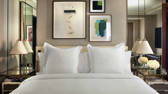
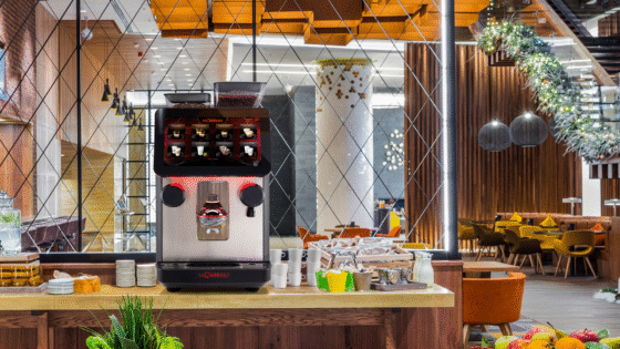
I deliberately targeted my visit to the headquarters of Signbox to be during the middle of their next big project. The brief was to design and produce all the signage for a new luxury five-star hotel in Cyprus. Parklane, a Luxury Collection Resort & Spa, Limassol is planned to open next spring inside a 1960s exterior shell. In order to complete a modern look and feel, opening up the hotel was a must for the architects and interior designers. This required quality signs around the enlarged resort. All of a sudden, an opportunity opened itself up for Signbox to design, manufacture and install all the modern signs for the very modern hotel.
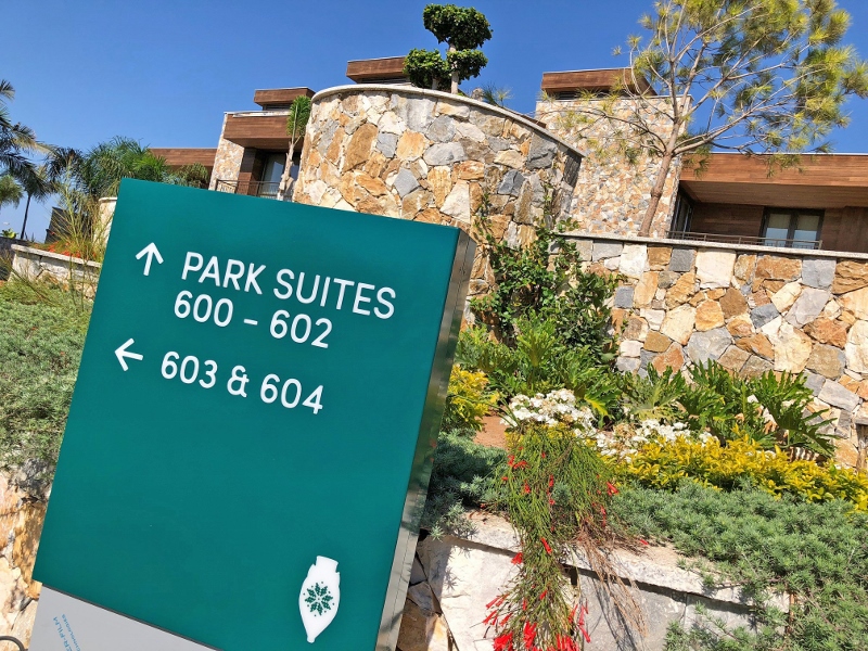
Image caption: Public area signs at Parklane, a Luxury Collection Resort & Spa, Limassol
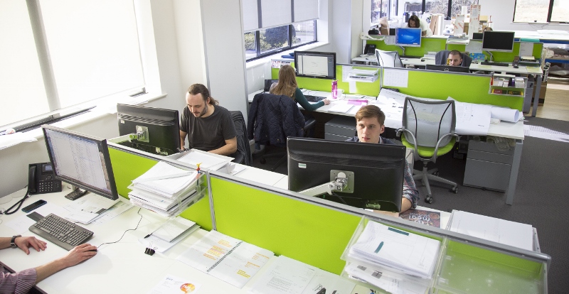
The first task for the sign experts was to sign off the artwork and designs of a total of 70 external signs and 822 internal signs, just six months after being hired by the client. The inspiration behind the product in this hotel came from the ‘60s, the ‘70s and today. A group of talented graphic designers sit upstairs away from the heavy machinery designing and perfecting fonts (in both English and Greek), styles and icons.
“Signbox designed, manufactured and installed the most iconic sign in the UK.”
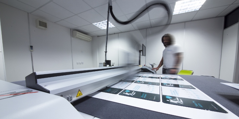
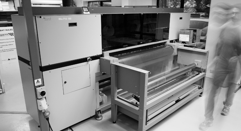
Once this was signed off in May, the company began the manufacturing process, which consists of cutting and printing the final designs onto glass signs made of as well as other materials. “Glass, in particular, is becoming a more popular choice for clients for a number of reasons,” explains managing director Mark Bartlett. “Firstly, it’s sustainable, which is a big draw. Glass is also easy to clean and looks modern. Finally, glass actually has the same consistency in thickness from end to end. Other materials, such as acrylic or timber is not as easy to work with during the printing process because its not the same consistency throughout.
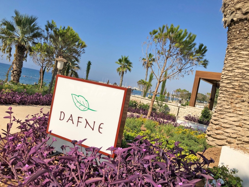
Image caption: Public area signs at Parklane, a Luxury Collection Resort & Spa, Limassol
As well as fitting out large-scale projects like the hotel in Cyprus, Signbox also has an E-shop which sells standardised products such as funky toilet signs.
The company doesn’t only work across hotels. In fact, Signbox designed, manufactured and installed the most iconic sign in the UK. The revolving tri-sided New Scotland Yard sign still stands today as one of the company’s biggest challenges. The sign that weighs more than a mini cooper was required to include LED illumination. “This was a challenge because we had to create a system that illuminated whilst revolving,” explains Mark. “We literally had the sign set up in the factory to work out a way around this.” Another issue came with all the media attention that New Scotland Yard attracts. The sign had to revolve no more or no less than 7.9 rotations per minute. Any faster or slower would distort the TV cameras and create blurring on the TV screen. It also had to be silent.
From my short and sweet visit, Signbox has shown me that signs are an extension of design – and should be carefully considered and relevant to the overall aim of the design.
The project itself is now in full swing, and Hotel Designs will catch up with the team once the hotel has officially rut the ribbon.
Signbox are one of our recommended suppliers. To keep up to date with their news, click here. And, if you are interested in becoming one of our recommended suppliers, click here.

