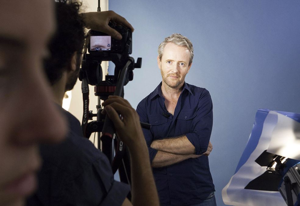
Under blue, cloudless skies in London’s Clerkenwell district, Hamish Kilburn meets Mutina’s Ronan Bouroullec to understand more about his interior design partnership with Domus and how, with a new collection, he has opened up links between music and interior design…
It was while I was watching a panel discussion on interior design tile trends at this year’s Clerkenwell Design Week when the question of what musical instrument our industry is most similar to crossed my mind.
Celebrating the launch of a new partnership between Mutina and Domus, the irregular shapes and uneven tones of the new tile collection, Piano, gave me the answer. Just like an 88-key grand piano, which alone is a striking interior design feature in any room or suite, international hotel design can also strike many chords. While some notes collaborating together are powerful enough to send a shiver down your spine, others effortlessly blend perfectly into the atmosphere. Another similar feature between our industry and monochrome object is the skill and practice that is required to become an ‘expert’ – let alone the many setbacks that are often experienced along the way.
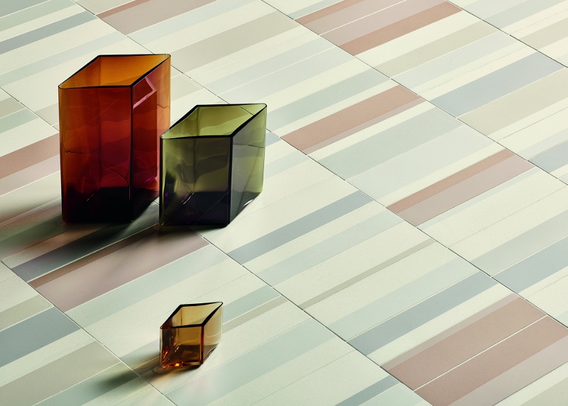
Image credit: Domus
Replicating the percussion instrument in all manners of ways, the Piano range is made with coloured clays to which layers of glaze are added in different widths. There are five base colours: white, grey, blue, green and pink and two rectangular sizes (7.5 x 30cm and 10 x 30cm). The tiles are arranged by colour and are grouped together by the lead colourway in the same box, this allows for the greatest variation and ability to create a vibrant fitted tile layout. Piano is suitable for floors and walls, both indoors and outdoors.
In order to learn more about the new range and the designer behind it, I sat down with Ronan Bouroullec, who is one half of the genius behind Piano.
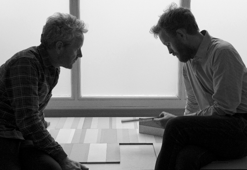
Image credit: Ronan and Erwan Bouroullec
Hamish Kilburn: Where do you tend to find inspiration for ideas?
Ronan Bouroullec: I look at materials and how they form. I never find inspiration from movies or an experiences in life. It’s always a look and the tactile aspect that inspires me.
HK: Are the challenges always the same when designing products?
RB: No! The challenges are always different. It’s difficult to list them all – there are many, and they are everywhere. I don’t think many people understand how long the process really takes. There are many point of views and opinions that you have to take in along the way, making it a long journey full of many twists and turns.
HK: Can you explain what you meant when you said at Clerkenwell Design Week that you prefer to be less known in the industry?
RB: I like to be in front of people that do not respect me too much. That sounds odd, I know, but I like to be able to prove myself to others. There is always a good reason why I have designed something in such a way, and I enjoy to be in front of someone who would question that, allowing me to explain.
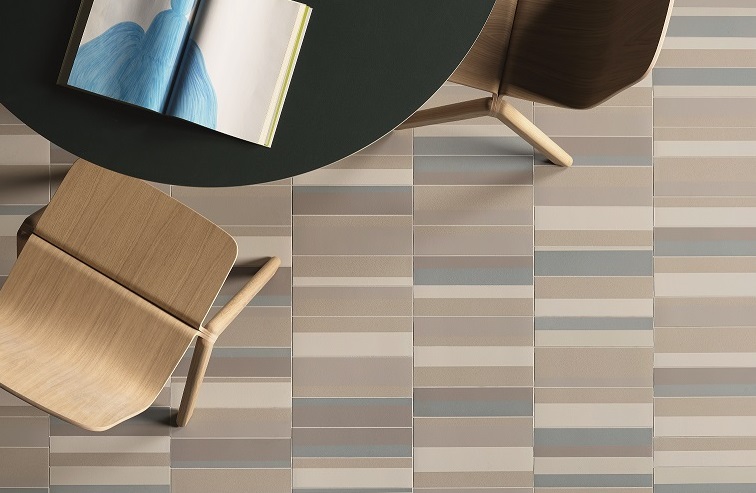
Image credit: Domus
HK: Your latest piece with Domus Tiles is called Piano. Was there a designer growing up that really struck a chord with you?
RB: I was 15 years old when I decided I wanted to be a designer. As far as I can remember, I have always been impressed with objects and things. I had a lot of inspiration along the way but there was not one mentor that I consider to be more superior than the other. They all helped.
HK: What advice would you give to young designers?
RB: My advice would be to work. It can be difficult to survive, at times, but the skill is not to give up. Try to find other ways to get through it and some years can feel longer than others.
HK: How important is collaboration?
RB: As a designer, you are nothing without collaboration. You can have a good idea, but if there was no one to manufacture it then your idea would only ever be a dream. It would not exist. We work and operate in a collective environment.
HK: How do you react to trends?
RB: Honestly, I don’t want to know about them. I try to do something that I feel is different, new and interesting. Trends have already passed. I try to do something in advance. This can sometimes become a trend, which is very flattering. I like to be copied because people will only ever copy good things.
To read more about the editor’s highlights of Clerkenwell Design Week, click here.
Main image credit: Mutina

