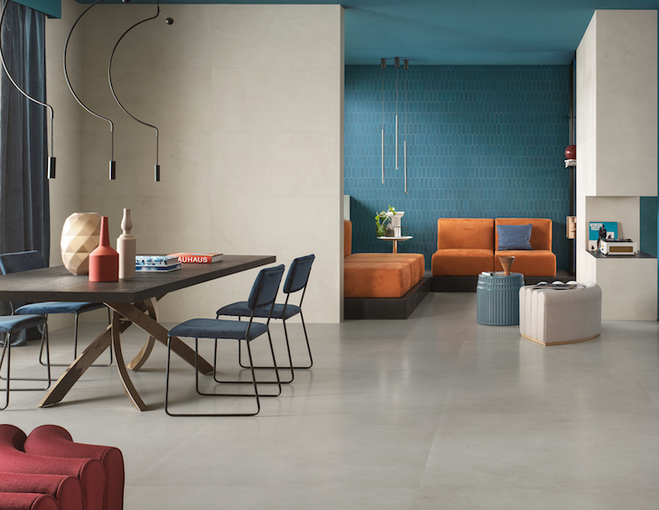
Hot off the heals of presenting a dynamic Product Watch at Hotel Designs LIVE, Atlas Concorde launches a new colour palette in the Prism Collection…
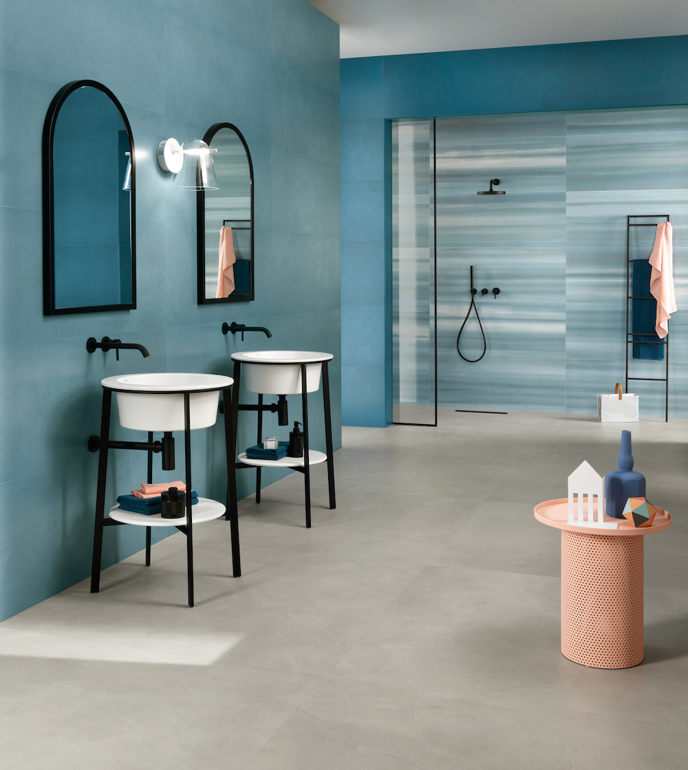
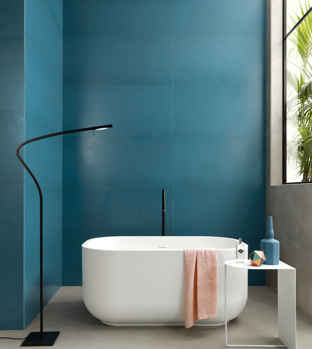
In interior design, colour is key. Just as sunlight splits into the colours of the rainbow when it goes through a prism, Atlas Concorde’s Prism collection transforms space with the magic of a 13-tone palette.
The original palette was specially selected by the Lissoni Associati studio led by Piero Lissoni, an exceptional colour consultant who described the design process in the following way. “We based the concept on the effect of light through a prism,” said Lissoni. “These colours are what we imagined would be the result of prism light transformed into a rainbow. We then worked on this refracted light to try to reproduce it on the tile surface, a palette modified to become domestic colours or architectural colours.”
The graphic effect inspired by the flowing beauty of hand-troweled resin, calibrated according to each size, defines the temperament of each tone with a soft texture, sinuous lines, and an authentic look. With Atlas Concorde’s Prism colour is the key to understanding the character of the environment, while the floors and walls become protagonists of the interior’s style, capable of taking any architectural project to the next level.
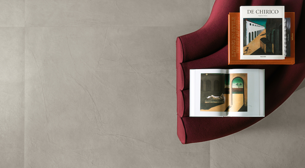
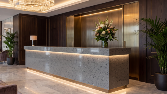
Image credit: Ceramiche/Atlas Concorde S.P.A
What atmospheres does Prism evoke? The metaphysical scenery of Giorgio de Chirico’s paintings immediately comes to mind, always evocative and exciting. The suggestion combines the “new decò” trend of contemporary architecture, opting for classic codes reinterpreted with an unprecedented freedom. While colour is the common thread, the sinuous graphics of the hand-troweled resin effect is the detail that reflects the personality of those who choose it and match its style.
“The explosion of colour that the Prism palette offers is accompanied by all the practical benefits of porcelain tiles.”
Atlas Concorde’s Prism collection combines the beauty of resin with the performance of porcelain tiles. The explosion of colour that the Prism palette offers is accompanied by all the practical benefits of porcelain tiles such as resistance to time, weight, and stains and ease of cleaning, installation, and maintenance. Prism is also available in the large 120×278 cm format, offers modularity of the floor and wall tiles, and can be ordered with a Silk finish – velvety to the touch and with a subtle gloss – providing additional design tools to shape spaces that express the taste and identity of those who live in them.
The colours range from warm, welcoming tones that can be combined with most wall tile shades to cool, contemporary tones that can be used with all the wall tile shades. The colours are designed to be matched in varying shades or broken up with accents like grape.
-
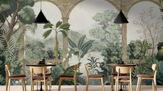
- image credit: Ceramiche/Atlas Concorde S.P.A
-
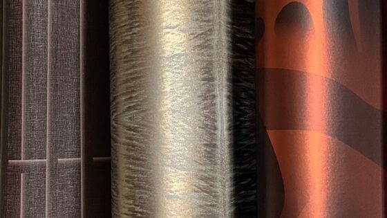
- image credit: Ceramiche/Atlas Concorde S.P.A
> Since you’re already here, why not read more about Atlas Concorde’s debut decor collection by Piero Lissoni?
Wall decorations
GRADIENT – 50 x 120cm decoration
Decoration made in a 50×120 cm format. The surface features soft nuances that recreate the strokes of a dry brush. 120×278 cm matching decoration.
BRUSH – 50 x 120cm decoration
Decoration made in a 50 x 120 cm format. A strong identity distinguishes the graphics with shaded brush strokes that add three-dimensionality to the decoration.
GOLD – 50 x 120cm decoration
Decoration made in a 50 x 120 cm format. The minimalist, simple graphics are enriched by the earthy effects of the delicate, contemporary geometric texture. The resin effect is thus expressed in an original manner with a precious appearance.
WIGGLE MOSAIC
For use only on walls. The mosaic features interlocking geometric shapes that create a strongly three-dimensional effect thanks to some tiles with a reflective surface. Available in different colour combinations.
BEAD MOSAIC
For use only on walls. Sinuous geometric shapes fit together to create a mosaic with a horizontal arch, simple but with lines that blend perfectly with the product’s graphics. Suitable for decorating rooms with an attractive but non-invasive pattern.
Q MOSAIC
For use only on walls, the mosaic consists of small square tiles with a slight shine.
ENIGMA DECORATION
The Enigma decoration creates a geometric pattern enriched by sparkling effects that complement most of the colours of the resin-effect surfaces of the Prism collection.
Atlas Concorde was a Product Watch Partner for Hotel Designs LIVE, which will return on February 23, 2021.
Main image credit: Ceramiche/Atlas Concorde S.P.A