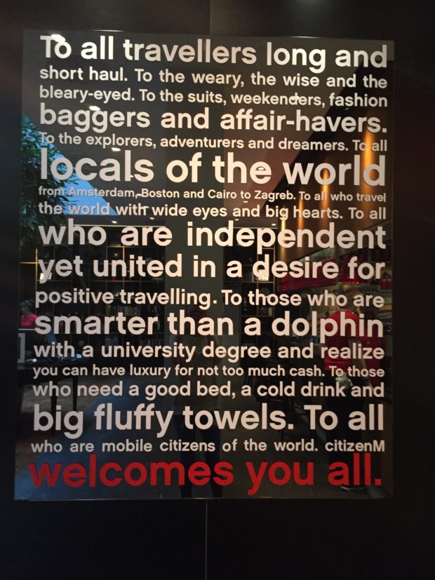
For nearly a decade now, citizenM has been altering perceptions of what a hotel can and should be – with its ‘Living Room’ concept and modern take on what travellers need from a hotel. The Dutch chain has been blazing a trail in its native Netherlands and across Europe since 2008; blending ‘instantly-iconic’ interiors and furnishings with technology to create a unique guest experience for the ‘city-break, millennial’ types.
I had the pleasure of sampling this quirky approach during a recent stay at one of the latest additions to its UK offering at the Tower of London property. While the hotel’s entrance is inconspicuous in comparison to some of its more illustrious neighbours, the building’s exterior and interiors are anything but.
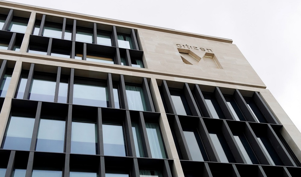
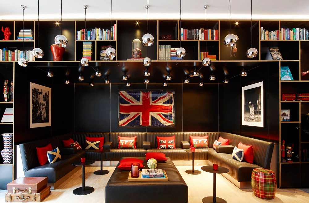
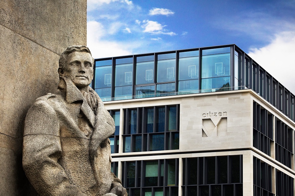
The rectangular-clad façade is a stark juxtaposition of modernity against the overtly historic Tower of London just a stone’s throw away. And as soon as I enter the reception-cum-lounge-cum-dining area, I’m met with a brilliant visual treat for the senses. It might sound like an odd mix to combine all three with no regard for distinct separation, but the free-flowing design of the spaces has been treated with the utmost respect; utilising clever chainmail curtains and highly effective wayfinding to create the impression of three distinct entities.
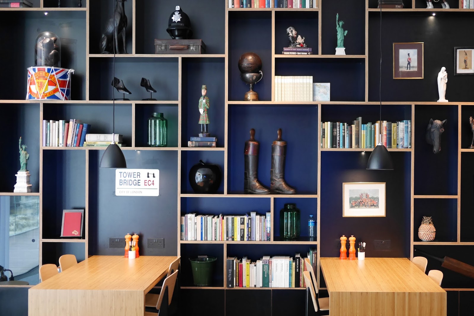
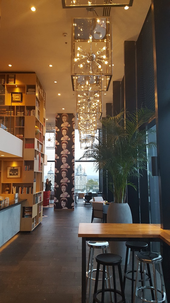
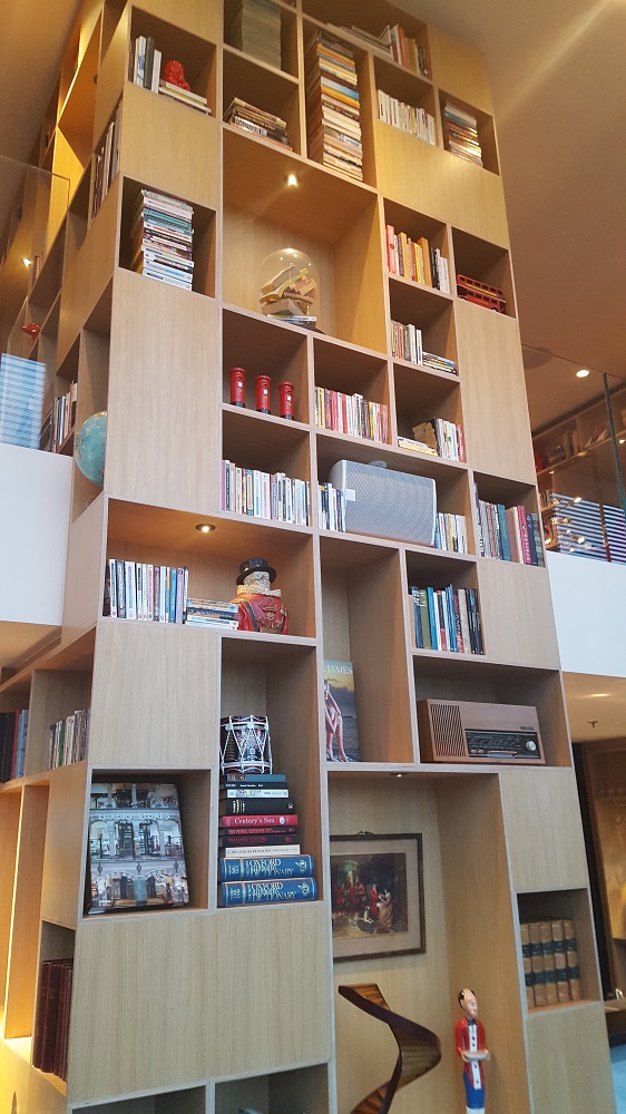
I’m a huge fan of the contemporaneous and wonderfully ‘kitsch Britannia’ feel of the space, and judging by the buzz of people using the space to work, network and relax, I’m not the only one. The walls lined with striking and lively photography and art, floor-to-ceiling shelves filled to the brim with more literature than a hipster could shake a stick at plus a mixture of delightful vintage pieces and Vitra furniture all go to create a fantastic space that demonstrates the citizenM brand ethos perfectly – and with a touch of style too. For those new to the concept, this communal area makes for a great first impression.
*As if to emphasise the brand concept, doing away with a traditional reception desk has allowed for the placement of self-service check-in pods. I always love to see technological innovation in hotels, especially when it actually enhances the guest experience; this does – an easy-to-use system and not technology for technology’s sake.*
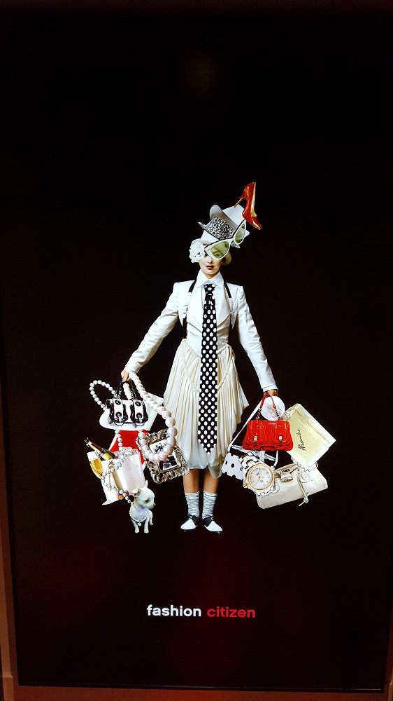
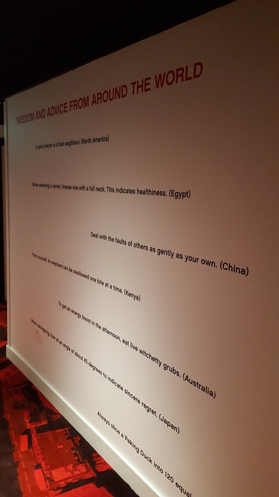
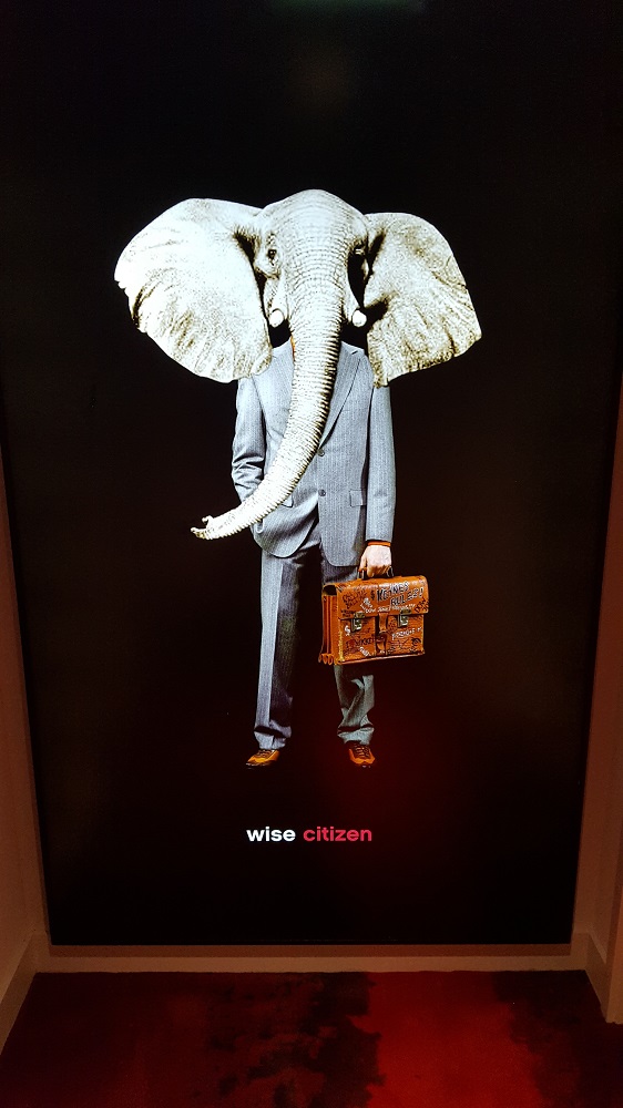
The quirky and leftfield décor continues even in the lifts and corridors on the way up to the room. Each lift cubicle is fitted out in a different style and inspirational photography and quotes line the walls. And then there’s the rooms themselves…
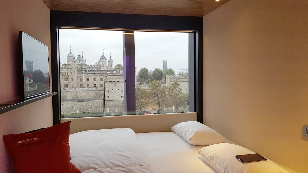
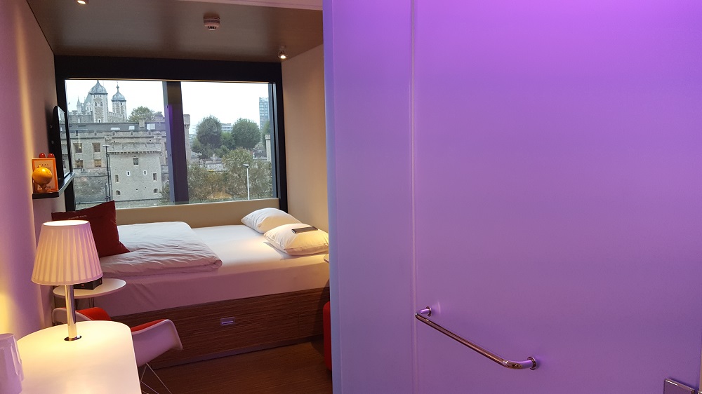
I was offered an external-view room which, with views directly onto the Tower of London, Tower Bridge and the London cityscape beyond, I definitely recommend; watching the sunrise over the Thames makes for a dramatic start to any day.
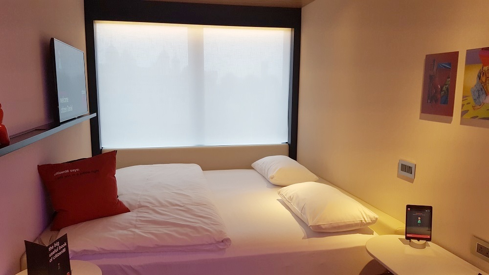
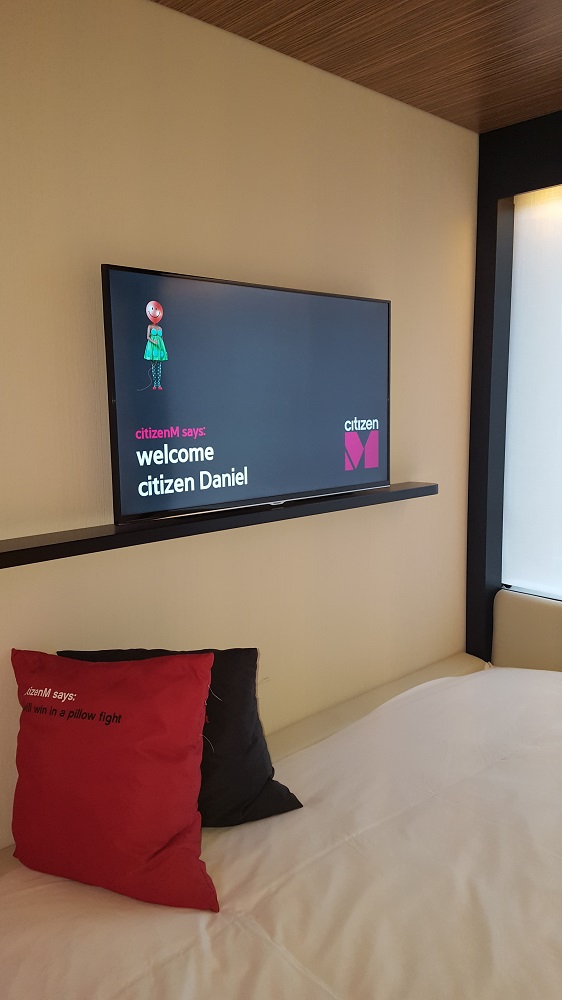
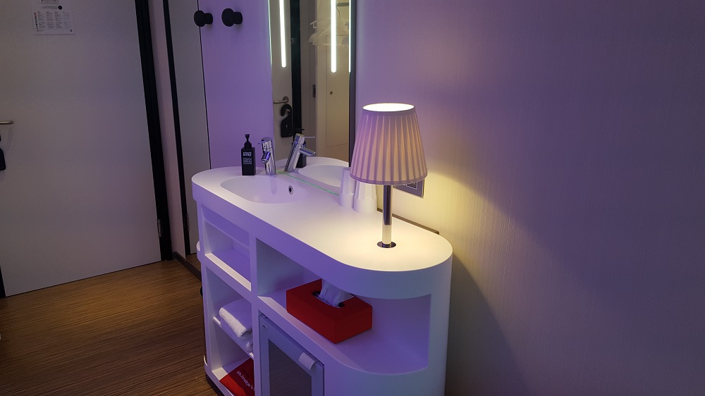
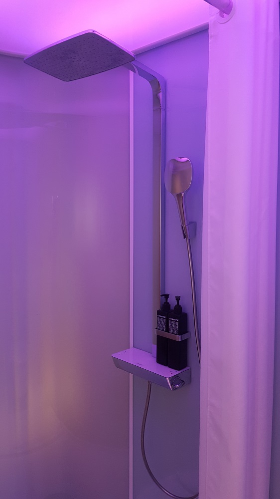
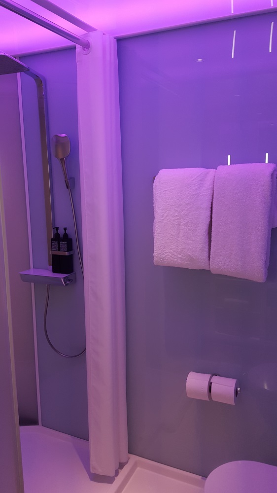
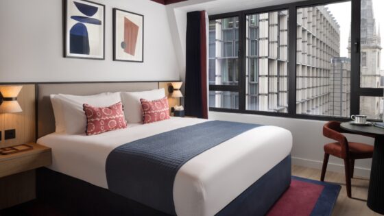
While small, the 370 rooms are fantastically formed and include everything a guest would need. The space has been utilised to perfection. The wall-to-wall Sealy bed against the window makes for a unique layout, but doesn’t feel cramped especially as it includes space-saving luggage stores stowed underneath, which more than makes up for the shortage of hanging space. The self-contained bathroom and rain-shower unit is a wonderful example of economic design, with privacy being maintained with curved, frosted glass. Having seen images of the rooms beforehand, I feared this might be a little too ‘university dormitory-esque’ and with space at a premium I worried about noise pollution from adjacent rooms and the corridor, but my fears on both counts are allayed immediately on entering.
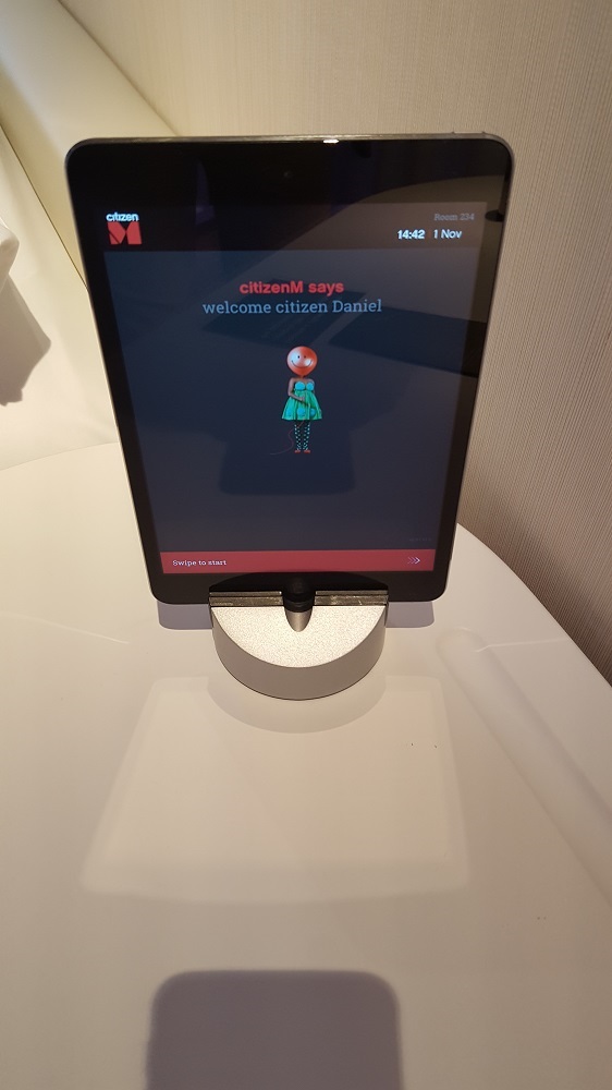
The biggest selling point for me has to be the iPad, from which central and mood lighting, the television, music and curtains can be controlled. An ingenious touch, and something that stands out long after checking-out. Another design choice I found myself giving a thumbs up for is the universal power sockets, as someone who often forgets adapters when travelling, this consideration from the designers is indicative of the ‘everything you need, nothing you don’t’ concept of citizenM. Make no mistake, this space isn’t designed for spending hours at a time in. This is a practical-but-fun base for exploring the city. And it fits the bill perfectly.
Once checked-in, I have time to take in a drink at the Cloud M cocktail bar, located on the top floor. The interior theme running throughout makes its way up here too, with Queen Elizabeth print wallcoverings, stunning bespoke brass light fittings and floor-to-ceiling bookshelves bringing a frisson of frivolity to the space. The attention to detail in the design here completes a top-to-bottom clean sweep for the hotel in terms of creating interesting, unique and stimulating interiors. The 180-degree panoramic views over London are definitely a bonus, too.
This was my first experience of a citizenM property close-up. I was intrigued by the concept and I wasn’t disappointed – it has been carried out exceptionally. The designers have carefully thought out the process of designing a hotel that caters to guests’ needs with utmost efficiency without bombarding them with frilly extras, whilst at the same time creating interiors of a quirky quality rarely seen this close to central London and at these prices. A near-perfect balance of practicality and aesthetics.
With more properties on the horizon, I can safely say this won’t be my last experience of a citizen property…
Based on a visit in November 2016
Photos: Daniel Fountain / citizenM

