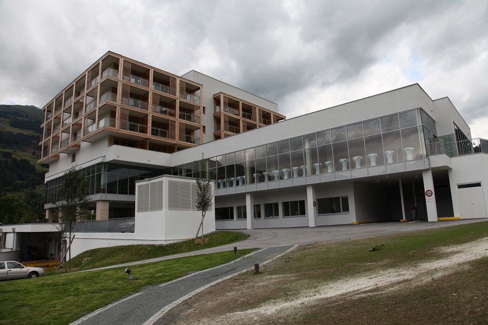
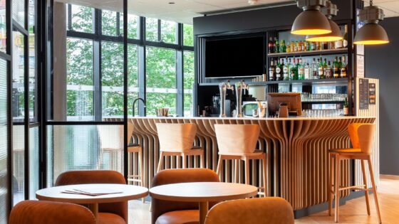
Any ski hotel will fill if it is positioned at the bottom of the ski-lifts. The Royal Spa sits on the edge of Jochberg, just 7 km from Kitzbühel, and at the bottom of not one but two ski lifts. As Mr. Hilton famously said ‘location, location, location’. It provides the ultimate in skiing luxury. The trick for most is not filling rooms whilst the ski season is in full swing, but in filling rooms out of season. Kitzbühel is one of Austria’s main ski centres, a busy trendy place to be off piste, in summer still busy but still presenting hotels with the same problem – what do you do without snow?
For Cube the answer lay in attracting mountain bikers and the hotel was structured with the cycle path within the atrium so that the bikes could be taken to the rooms and the audience was clearly defined. Here in the atmosphere of luxury and indulgence the task is much harder – five star resort luxury and Lycra do not easily go together, although the hotel does offer mountain bike hire as part of the draw.
Golf too makes up part of the attractions on offer, with four courses in Kitzbühel and the hotel constructing its own driving range, putting and chipping greens and a golf simulator with a golf pro in attendance. Curiously Austrians are required to taken an exam before being allowed to golf on the country’s courses – a measure perhaps of how elitist the sport is here? More likely a measure of how little flat land there is on which to build a golf course.
The Royal Spa has, as its name suggests, created as a part of its answer to attracting the guests one of Europe’s largest and most luxurious Spas. Here we are not just talking about massage or beauty treatment, although both are covered, but the full sybaritic experience with added attractions, such as plastic surgery to extend the range of holistic cosmetic and beauty treatments available.
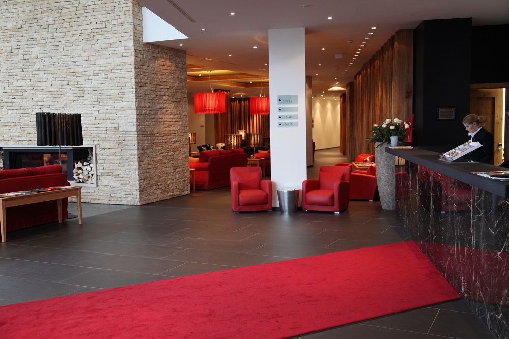
The Spa and Leisure areas cover two floors with the Spa and treatment rooms on the lower level. The Reception is supersized with a large sales counter for beauty products and a waiting area.
Twin corridors lead to pampering and treatment rooms, some of which are for couples. Design is sophisticated and the space is broken up by good lighting and changes of surfaces. The range of available treatments is enormous and with a plastic surgeon in attendance for face lifts etc, it extends the range of beauty treatments well beyond what is normally offered in an hotel spa.
The separation from the Leisure area has enabled the creation of a totally different ambiance in the Spa proper, and it is silent and calming with the mix of sophisticated fabrics and surfaces perfectly enhanced by the lighting. Treatment rooms are also well designed with good indirect lighting, their own showers and good sound insulation.
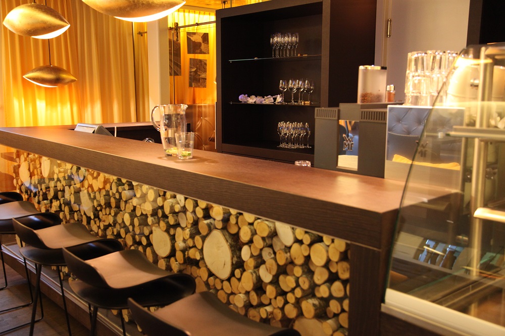
As well as the more antiseptic treatment rooms there are rooms for couples which have rich loungers with scatter cushions. Apart from the timber front of the reception desk the slightly rustic treatment of the Leisure areas is avoided in favour of black against stone and rich reds of upholstery and paint finishes. Access is through the dedicated lift and its own lobby, so staff have easy control of the entrance area from the front desk, enabling privacy and security to be maintained quite simply. The upper Leisure area has two pools – an indoor pool and a separate pool outdoors. The outdoor pool can be entered from the inside for those hardy souls who like to swim throughout the snowy Austrian winter. The design of the upper area is curious.
The ceiling echoes a wave form, but the room is divided by partitions that appear to be a pastiche of the Austrian local vernacular homes own wood stores. Maybe there is some local tradition that I am unaware of whose symbology is being echoed, but the use of logs of various kinds along with simple planks to break up a large area is unconvincing. The theme is carried through the front of the areas reception and food counters bringing a slightly primitive touch into an otherwise sophisticated interior space.
The adjacent bistro area enables guests to spend the day in their ‘cossies’ without venturing into the other areas of the hotel, and the space has large lounging areas, including discreet private cabanas, two seat enclosed chairs and quiet zones to offer alternatives to the pool.
To be honest, I don’t understand the decor around the pool. I understand that desire to use natural materials and even the urge to reflect locale – indeed if that is the intent then I applaud it – but the way in which the timber is used seems to lack finesse to my English eyes. The larch trunks, planks and logs screening the various seating areas around the pool leave me floundering to see the logical underpinnings and the apparent randomness of the arrangement may reflect the random log piles around local homes but leaves me struggling to see the aesthetic. Indeed it leaves me with a strong urge to look for a stove to stoke.
Yet the designer demonstrates such sophistication in areas such as the signage and the lift lobby that I think the failing must be mine, and must be cultural in some way.
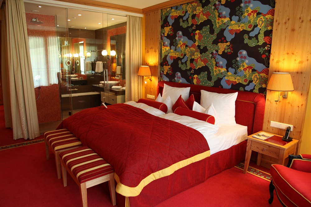
In the bedroom areas the local timbers have been used again, so the pale bleached look of new knotty pine – sorry, native larch, dominates. The timber has been used freely and works well with the rich gold and red colour scheme of the fabrics and carpets. Until that is it comes to flooring where the softness of the larch means that flooring is of white oak, close in tone, similar in colour but quite different in grain. Further wood confusion strikes in the suite, where the mahogany of traditional furniture competes with the light flooring and bleached look of the larch.
Detailing in the use of the timber is however beautifully done, and it will no doubt darken with age to the deep honey colour that can be seen in the bars and bistros that dot the area. The light wood has also been used for the furniture throughout, so the overall effect is harmonious.
The bathrooms are a glass cube containing both wash hand basins, soaking tubs and walk-in showers with both rain heads and hand shower units. However the openness of the glass cube has apparently led to guest complaints, so a curtain has been added around the outside – which makes peeking a more voyeuristic pleasure! Bathrooms and bedrooms are both well lit and where the room is a suite there is a separate toilet in the lobby. Red mosaic tiling and rich brown stone complete the bathroom colour scheme. The power of the showers and the fit of the doors combine so that when a shower is on full the door opens slightly with the pressure change letting water accumulate on the bathroom floor, a phenomenon I have noticed in other bathrooms.
All the bathrooms have balconies which are very private from each other. Deep enough too that even on a wet August afternoon it is possible to sit out, be dry and read a book. The rich curtains provide very effective blackout and room lighting, desk etc are all well judged.
The timber is again used in the restaurant to create completely panelled spaces. Whilst its lightness works well for eyes whom oak is the most beautiful of timbers, its use falls short of suggesting luxury. Also the use of light oak in the floors only emphasises the difference in grain – it might have been better to use a darker oak against the larch.
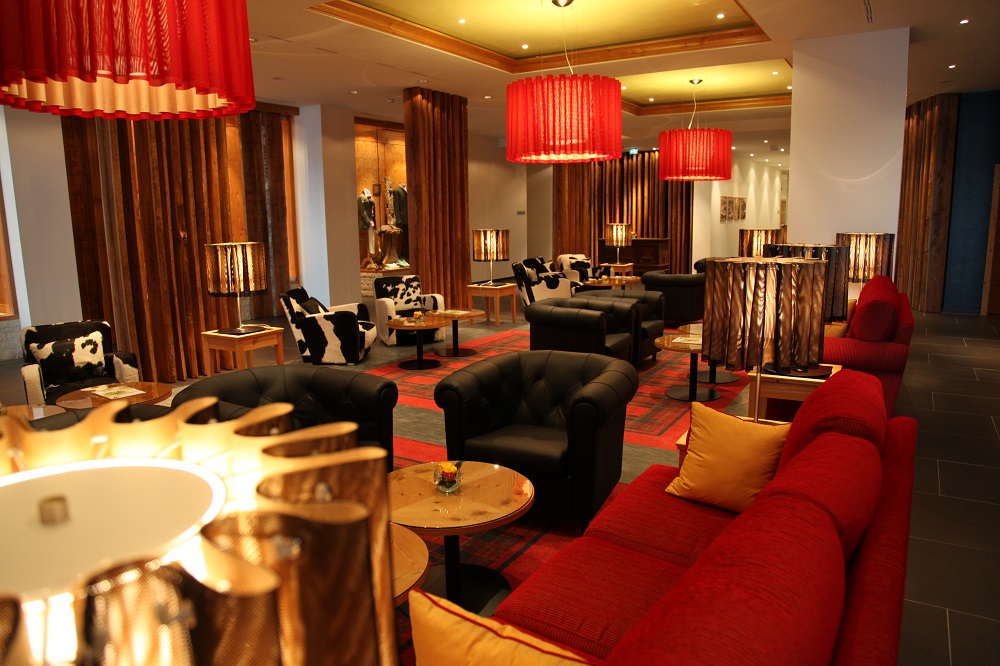
The restaurant opens on a large mezzanine area which is a library by day and a pre-dinner drinks area at night. It also leads through to the well designed and extensive conference facilities which are also a part of the answer to the lack of snow. In Austria there is a surprising amount of industry on the valley floors and the new facilities are already successfully attracting a high level of business. Dramatic lighting pieces bring interest to the lounges and they also have large fireplaces for those coming in off the slopes in winter. The bar is large and carries the red theme through contrasting it against black. Again there are library areas adding a green colour to the mix, and a cigar room too. These area are dramatic with their strong colour and lighting.
The mezzanine leads through to the lift lobby and a grand staircase from the ground floor. The balcony overlooks the main entrance and the reception lobby below and panels of natural stone contrast against black and red with strong black and white upholstered chairs and red sofas. The interior drama reflects the drama of the building as one approaches from Kitzbühel, its modernity and physical presence dominating the drive across the valley bottom from Kitzbühel to Jochberg. This is a confident modern statement architecturally, backed up by a confident modern set of interiors, both of which have drama and presence in a landscape which is itself full of the drama of the mountains.
© Words & Pictures Patrick Goff
Made on a visit in August 2010. The hotel opened in December 2009

