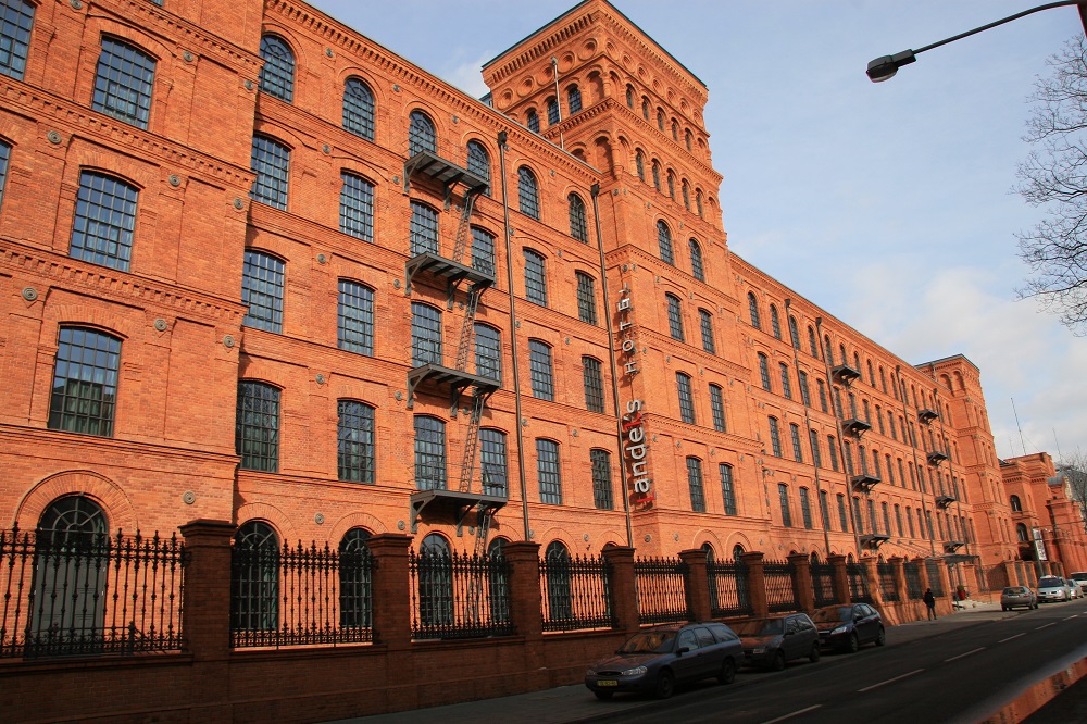
It has been a pleasure in the first part of 2010 to have seen a succession of beautifully designed hotels – the Arch, the Wit and now Andel’s hotel in Łódź, Poland. Whilst Chicago’s Wit is a new build, with all the benefits that it brings, the Arch and Andel’s are both reconstructions of 19th Century properties. I use the term reconstruction deliberately because to say refurbishment would in both cases underplay the rôle that the teamwork of owner, designer and architect aligned with exceptional contractors has brought to the project. In all three cases it is evident that strong owners have kept a clear sight of the end product they wanted and have made sure the money is spent on the finishes to achieve the required standard, and the required style statement.
Some think that the quality of fine hotels, like those of Anouska Hempel that started the whole boutique craze, is down to the decorative elements. Certainly Hempel’s use in Blakes of sharp down lighting on contrasting table cloths with accent flowers was stunning in the early 1980’s, but that detail was not the key element of why Blakes worked so well for so long. The decorative was but one piece of the puzzle – the main strengths were down to careful space planning of the interiors, careful attention to detail and an eye for where spectacle and theatre can be created in the interiors.
In an hotel such as Łódź (and the Arch) the interior could have failed but didn’t thanks to clever planning and design. By taking risks, the team has created a stunning re-use of a building that may otherwise have fallen prey to the demolition crew and are reaping many awards for having done so. The philosophy has been about not only creating a successful hotel but also about respect for the past, for the history of the building. Throughout the historic structure, cast iron columns, brick jack arches and other features have been retained and enhanced by pieces of machinery salvaged from the dereliction that was here before.
Old structures pose particular problems for interior designers,and here it was the modular of the columns, which with bays three metres wide was quite a bit smaller that current trends, never mind the historic bedroom width of 3.66m (12 feet if you are an imperialist).
Incidentally did you know that the 3.66m/12foot width was the original width of Axminster carpet looms? Bedroom width was set so as not to create any waste on carpet installation and became a standard until the turn of the century.
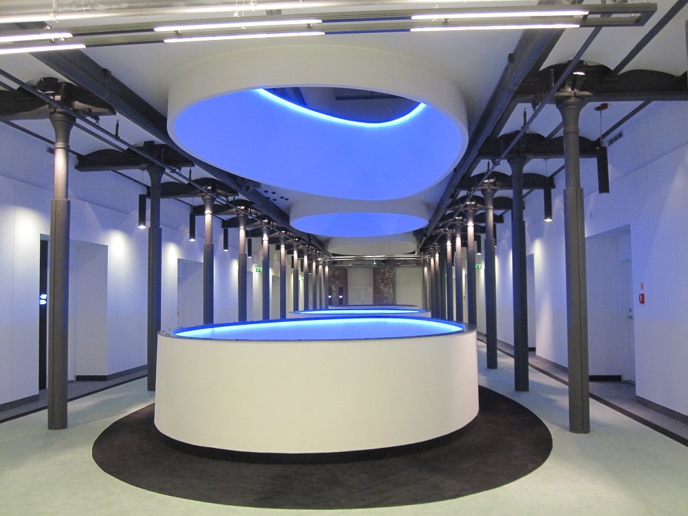
The span of the bays is obviously just one of the problems in planning that an old building like this creates. Its length, the width and the lack of daylight at the heart of the building were also major headaches. Like many truly creative teams the designers here produced a dramatic design solution that produced a major part of the drama of the interiors, by simply punching through the floors of the building to create internal light wells. The difficulties of providing fire protection were resolved by automatic flame proofing barriers that drop down around the holes to ensure smoke and flame is not transmitted to the bedroom areas in event of fire. The holes’ edges are lit with colour changing LED lighting and projected images and become the dominant visual element in first(and second and third)impressions.
The designers have played with the spaces and materials, using organic forms to offset the severity of the original construction, using colour playfully too. On occasion the furniture viewed from floors above through the ‘light wells’ has the appearance of liquorice allsorts, whilst ground floor carpets echo the holes in the ceiling. Curve against straight line angle works to produce visually engaging areas that delight the eye. The amount of space for guests provides a true feeling of luxury.
Using the lift core and restaurant areas also help to break up the length of the building. The need for corridor connection between the conference areas and main lobby on the ground floor is used to break up the large restaurant spaces to create smaller, more intimate dining areas.
The length of the building also allows a second entrance for the conference and meeting room area, with its own reception desk. Security for guestrooms is reinforced by the use of key card operation for the lifts. Guestrooms are contained between the pool and spa on the top floor and the reception, dining and bar areas on the ground floor.
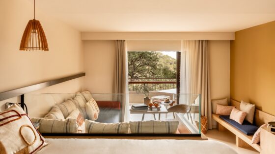
Despite the problems caused by the nature of the jack arches, the bedroom uses the space well, with added length compensating for decreased width – in fact allowing spaces to work better, giving larger bathrooms that are long enough for a soaking tub and a separate walk-in shower adjacent to the separate toilet. The extra length also allows for the creation of an area away from the bed for the desk, as well as for a large armchair and seating area.
The bedroom desk is large enough to work on comfortably, suiting the orientation of the hotel which, as a large conference hotel, is targeted mainly on the business market. The separate entrance and own reception desk for the conference area however, keeps the hotel functions separate.
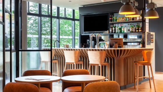
The design of the restaurant, which is divided into half a dozen areas of varying size supports this separation, allowing for conference delegates to eat separately from small family gatherings or individual guests. In addition, the bar end of the capacious public areas has a separate bistro type zone for those who want to meet and snack.
Bedroom floors have of course, the drama of the light wells punching through allowing views down to the floors below or up to the skylights above. The circular wall surrounding the openings can also have video imagery projected onto them. Preventing areas opening onto bedroom corridors from forming a fire chimney is difficult. Here the resolution is shutters that come down from the ceiling closing the light wells off from the means of escape. The constantly changing LED lights, set under the rim of the wall, cap around the light wells and create a continuous drama of light and colour, particularly at night.
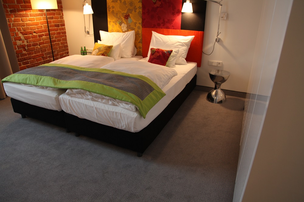
Lighting design throughout is very well done. Bedrooms have their own drama with light thrown up into their brick arched ceilings whilst the use of large anglepois style bedhead lights mean that it is possible to read comfortably in bed whilst also moving the light if need be. Good task lighting at the desk and sockets that are in the right place also help make for an efficient work environment if one is needed. Romance is not forgotten however, with the use of historic fabric patterns from the archive of products produced by the mill on cushions and bedhead linking to the past.
In the generously sized bathrooms, which have separate walk-in showers as well as soaking tubs and separate toilet areas, a touch of romance is also brought in by the use of an under sink light. I first saw this device of a coloured light under the sink beautifully used in the Meridien Vienna where it was eau de nil in colour. Here it is a rich plum panel, preventing the design becoming too clinical.
Overall the feel of the bedroom is of spaciousness despite their narrow width. With their deeply recessed opening windows flooding them with daylight and skilful lighting at night they are exceptional for Łódź’s first four star hotel and set a standard which many supposed five stars fail to attain.
“This is, truly, a stunning hotel conversion – Blackburn, Preston why did you pull your mills down?”
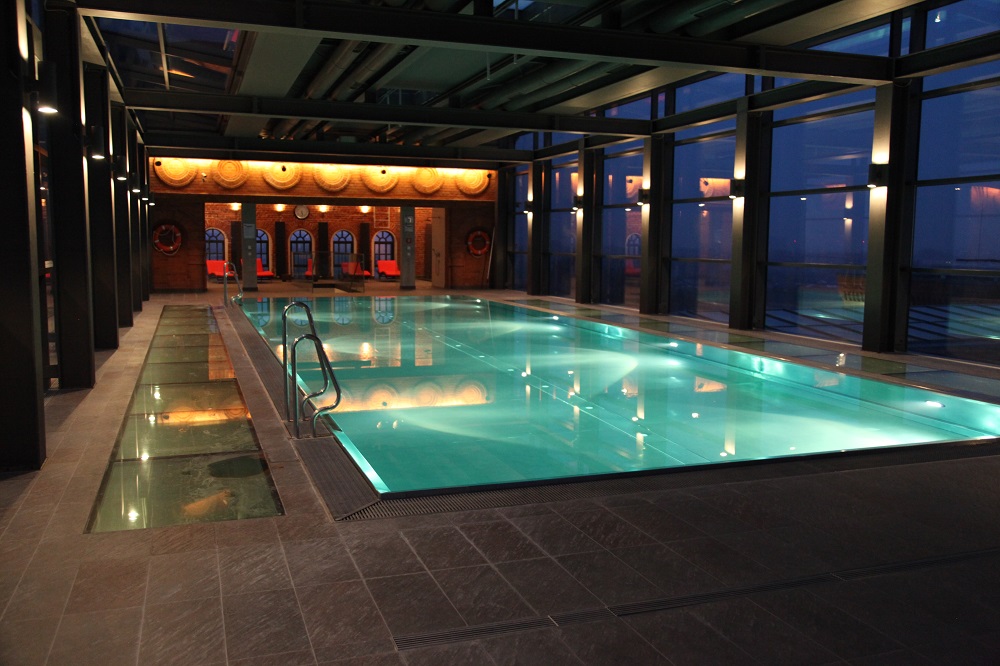
The drama of the design, architectural and interior, continues on the top floor with spa and 1,300 m² fully glass-enclosed ballroom/function rooms. The interior mix of reclaimed and exposed industrial surface along with sophisticated contemporary finishes continues in the spa and treatment room. In an architectural tour de force, the old factory emergency water tank has been refurbished (hardly seems to do the process justice) and turned into a spectacular roof top swimming pool, the end of which projects many feet over the edge of the building line. With windows in the floor as well as all surrounding glass, the pool offers spectacular views over the new shopping centre, housed in other restored buildings from the life of this, one of the largest mills in Poland.
The team of client, architect and interior designer along with very capable builders have transformed the building. Adjacent, the palace of the owner (seems hardly appropriate to call it his house) has also been transformed, restored to a Museum of high Victorian mid-European taste (for an example of an hotel in the similar style have a look at Noma).
With duplex suites, 3,100 m² of conference and function spaces, spectacular pool, spa, restaurants and 278 bedrooms the hotel brings a new dimension to hospitality in central Poland. The stunning architecture and theatrical interiors are already bringing awards from ceremonies in New York and London, as well as in Continental Europe.
Location is excellent, on the edge of the city centre adjacent to the ‘Manufactura’ shopping centre. This is, truly, a stunning hotel conversion – Blackburn, Preston why did you pull your mills down?
Design
Developers:Warimpex
Architect:the Polish-Austrian team of OP Architekten
Interior Designers: Jestico + Whiles
Operator: Vienna International
Allwords & pictures copyright Patrick Gof

