World-famous architect Jean-Michel Gathy has revealed what he values most when designing a space; colour.
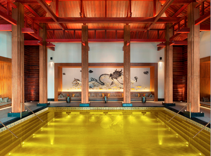
Gathy’s signature designs have inspired many leading architectural works, which are showcased in a list of some of the most recognised hotels and resorts including the One&Only Reethi Rah, Cheval Blanc Randheli; Maldives, St. Regis Lhasa; Tibet, Viceroy Snowmass; Aspen Colorado, Park Hyatt Sanya Sunny Bay; Sanya, The Chedi Andermatt; Switzerland, Aman Canal Grande; Venice, Amanwana; Moyo Island Indonesia and Aman Summer Palace; Beijing, Amanyara; Turks & Caicos, and The Setai in Miami, Florida.
Born in Belgium, Gathy founded Denniston in 1983, an architecture firm with a specific niche market, where he specialises in the creation of innovative designs for up-market hotels and other establishments in the industry. Thanks to its forward thinking architecture, design and technology applications in a constant state of evolution, DENNISTON has been able to retain its position as the market leader and a reference point for all designers in the industry.
With a career that has spanned almost four decades, Gathy shares his top five reasons why utilising colour is an important element when designing a space.
- Colour Creates Mood: When it comes to selecting the colour palette for a space, Gathy stresses that colour is a very powerful element that can set the tone for a room. “Colour has an immediate effect on mood—the ability to calm or invigorate—and creates energy and depth of field,” says Gathy. “It’s a powerful thing, and used intelligently, it can be a beacon for inspiration.”
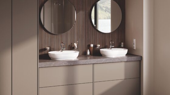
- Say No to Monotone: Gathy advises that one should steer clear of tonal colour palettes as they don’t add enough excitement. “Too much tone on tone is quite boring. The colours you choose do not always have to match, but should rather complement one another,” adds Gathy.
- Messaging is Everything: Colour can send a strong message to guests and Gathy suggests taking the intention behind the colour palette in your home very seriously. “Colour has an immediate and enormous effect on the atmosphere. If you enter a dark home, your mood instantly changes,” says Gathy. Choosing colour schemes that carry the message you want to convey in your home will ensure that guests inherently understand your personality and overall aesthetic.
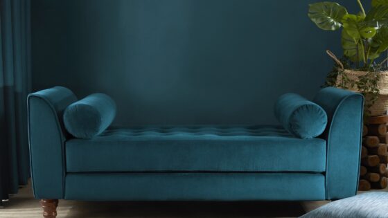
- Proportion is Key: Bold colours and patterns are great to use, but in moderation. Gathy advises that colour proportion must be appropriate to the palette and pleasant to the eye. “Be careful not to over-mix patterns, otherwise they’ll start to compete with each other. Offset patterns with neutral breaks to create balance so the eye isn’t challenged. For example, if you have busy, multi-coloured pillows, opt for a more streamlined geometrical rug in black and white or tones of beige. Grounding the room with neutrals means you can add colourful highlights in the way of pillows, throw blankets, and rugs,” advises Gathy.
- Cohesive Connection: Adhering to unique themes in each room can work well, but it’s important to maintain a sense of continuity throughout suggests Gathy. “The beauty of decorating a home is that each room can look and feel distinctive, so you can use a different colour scheme in every space if you choose. The trick is to create cohesiveness by choosing complementary colours where rooms connect,” says Gathy.


