In the third instalment of Designing Instagrammable, Valé Architects explores how public art can be used as a not-so-secret weapon to create an authentic sense of place…
Pablo Picasso once said that art’s purpose is to wash daily life’s dust off our souls. If that’s true, then we owe a great debt to the many public and street artists for keeping our spirits clean and the art authentic.
Public art has been around since we were still hanging out in caves painting mammoths. When done well it can make us think, act and feel in ways we didn’t do before. Done badly and it’ll be laughed at or worse – ignored entirely.
As part of Valé’s ongoing investigation into what makes hospitality design remarkable, we’ll focus on the role of public art in putting otherwise unremarkable places on the map. We’ll also look at why this is relevant to your own business.
Art versus design
As designers we’re usually more than happy to be called artists. Yet, many artists would shudder at the idea of being called designers. So what’s the deal here?
Artists and designers both create visual compositions, but their motives are different. The artist wants to create an emotional bond with their audience, while the designer wants to motivate that audience towards taking a particular action – like buying a product.
Looking at it differently, artists are often the experimenters, while designers are the implementers whose role it is to merge creativity with wider commercial goals.
But more interesting than the definition of art is the general public’s response to it. Public art always intends to connect with a far larger audience than fine art. Historically that audience was mostly limited to locals and visitors, along with perhaps a small circle of unfortunate souls back home sitting through the holiday snaps.
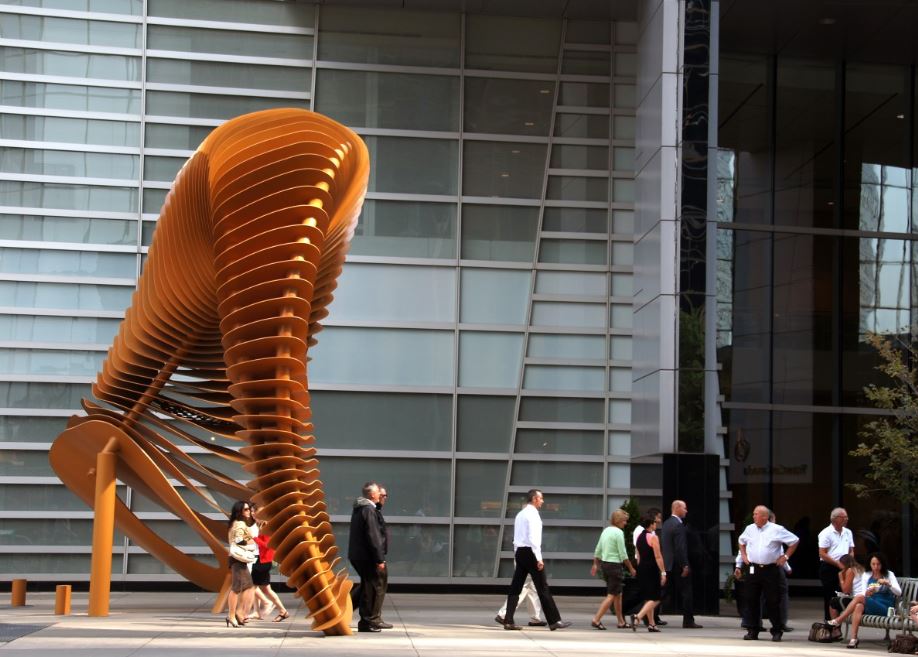
But with a high-quality camera in everybody’s pocket, 2.2bn active Facebook users and more than 1 billion active Instagrammers each month, the potential audience for a public art or design piece is now limitless.
Over the past ten years, literally everybody has become a photographer, art critic and influencer all at once. They’ll share what they feel is remarkable with their tribe, regardless of whether it constitutes art or not.
Regenerating small communities
A great example of how public art and social media go hand in hand can be found in the small outback town of Coonaplyn in South Australia.
Once a bustling rural town, Coonaplyn had been down the dumps following the centralisation of its local businesses to other nearby towns. The local Coorong District Council felt something big needed to happen to put the town back on the map. It commissioned Brisbane based artist Guido Van Helten to turn five large grain silos in the centre of town into one large piece of public art.
Famous for his large-scale portraits, Van Helten created a series of murals each immortalising a particular local resident. The response from the town was overwhelmingly positive. As local business owner Debbie Thompson put it: “you can’t make people stop, but you can create a reason for them to stop”.
Coorong District Council’s bet paid off because the art led to a significant increase in the number of cars stopping on their way through town. Local officials estimated that the stopping rate went up by around 40 cars per hour, which eventually led to the opening of a new cafe and grocery store.
That may not sound like a lot, but in a town where the main street was littered with boarded up shops, every little bit counts – not to mention the less tangible social benefits such a huge shift in local civic pride.
Public art in urban spaces
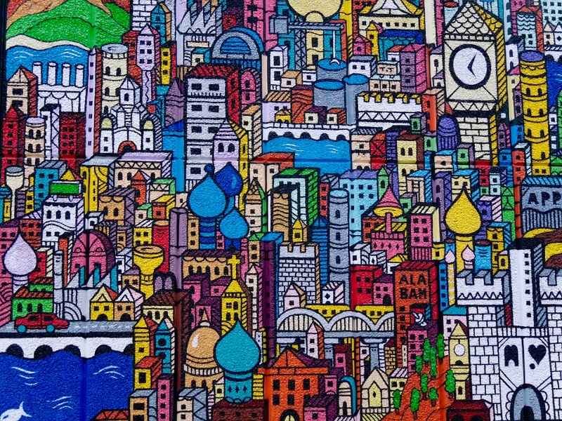
It’s not just struggling small towns who benefit from a cleverly injected shot of well executed public art.
We spoke to David Don, a visual artist and the organiser of the Brisbane Street Arts Festival, who’s been at the forefront of the explosion in mural art internationally for many years. Don has produced street art for a number of projects commissioned by Brisbane City Council, as well as major property developers in the area.
Their strategy is to turn public spaces into a type of ‘experiential immersion’ for local people and visitors.
According to Don a growing number of developers now see quality street art as a must-have in both new and existing projects. “Art brings an authenticity to a location. It creates moments of surprise, narrative and activity. But equally, it has the potential to bring serious economic benefits.” he adds.
Brisbane gallerist and curator John Stafford agrees. He feels the city is an example of how local councils increasingly see public art not only as a tool for creating safer communities but also for producing a sense of reassurance that a public space and the people in it are being cared for. According to Safford and as far as the city is concerned: “This approach not only benefits local community members but has the effect to boost tourism and the city’s brand and identity as a New World City”.
Aware of how social media can make art a much more sustainable career choice, younger artists are increasingly blurring the lines between art and design.
Local Brisbane property developers like Aria have been integrating public art into their projects for a very long time. Their strategy is to turn public spaces into a type of ‘experiential immersion’ for local people and visitors.
It benefits the community, the local economy, and of course the developers themselves. After all, greater footfall and community affinity is more than likely to be reflected in higher property values.
Art and design come together
Aware of how social media can make art a much more sustainable career choice, younger artists are increasingly blurring the lines between art and design.
Take Red Hong Yi for example, internationally renowned artists famous for creating portraits using everyday materials.
Known as Red, her work is particularly interesting because it seeks a strong emotional connection, while also encouraging the viewer to take a particular course of action. She therefore effortlessly brings art and design together, with some of her art pieces lending themselves particularly well for commercial brands.
She created an art piece for the Facebook Singapore office which was made entirely out of chopsticks. Her purpose was to inject some fun and creativity into the building. “The engineers housed in the building are coding all day so it balances the right brain thinking”.
According to Red, most of the companies she works for see ‘public’ art inside their buildings as critical not only for conveying their brand, but on a more subconscious level also for encouraging their staff’s own creative process.
In the future, she sees many more artists collaborating with big brands. It’s a win-win situation for both, with artists able to support themselves better financially, while helping big brands show off in a creative way.
What does this have to do with you?
So what does all this have to do with your hospitality business? Everything.
If a town of two hundred people in the Australian outback can put itself on the map to the point that you are reading about it right now, then think of the value which a beautifully designed space or carefully curated art piece can bring to your own business.
It’s a mantra we’ve repeated many times as part of this series – remarkability is key.
Provide your guests with a sense of amazement, creativity and fun the moment they step into your space
Inside the hotel, understanding the customer and client’s needs is paramount. If travellers have made the effort to travel to a destination because of its certain vibe, then reflecting and balancing this in the interiors, and in the artwork inside the hotel, is paramount, as the creatives at British design firm Goddard Littlefair know all too well. We spoke to them to get their insight as industry leaders. “Interpreting our client’s brief correctly and effectively is paramount and we conduct in-depth research into market and lifestyle trends to pinpoint exactly what a target market demands,” said Richard McCready-Hughes, the creative director. “We also find that some of our best work is delivered when there is a clear resonance between the aspirations and wants of our client’s target customer and the design team themselves. This is something we consider very carefully when assembling project teams.
“Working on the Principal Edinburgh Charlotte Square, we were briefed to focus on a traveller tribe that wanted all the reassurance of luxury service, but was also looking for as sense of authenticity, belonging and assimilation with the city they were visiting. We wanted the hotel to speak immediately to these guests and evoke the sense that they were instinctively ‘understood’ and being welcomed into the home of a much loved, slightly eccentric, family member. Carefully-selected artwork and vintage pieces provide a sense of place, familiarity and nostalgia, but the overall effect is one of warmth and modernity.”
So, get clear on what your brand stands for and who your future guests are. Then dazzle with quality design and art. Provide your guests with a sense of amazement, creativity and fun the moment they step into your space.
But whatever art or design you choose, make sure it reflects your brand, and make sure it creates the right emotional response among your future guests. Most importantly, be original. Doing an exact copy of someone else’s great design is neither creative nor fun. A poorly executed version will only be remarkable on Instagram for the wrong reasons.
Then sit back and watch your guests do your PR for you on social media. And just like Coonaplyn, maybe your business will make into one of our future articles.
Learn more about designing for niche guests in the Niche Hotel Design Guide by Valé.
Missed the last two articles on Designing Instagrammable? It’s okay, catch up on part one here and part two here.

