Having created striking artwork for some of the world’s most stylish interiors, was The Address Downtown artist Beth Nicholas’ most challenging project to date? Editor of Hotel Designs Hamish Kilburn sits down with the artist to find out more…
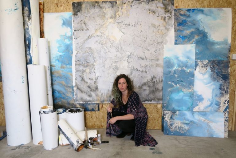
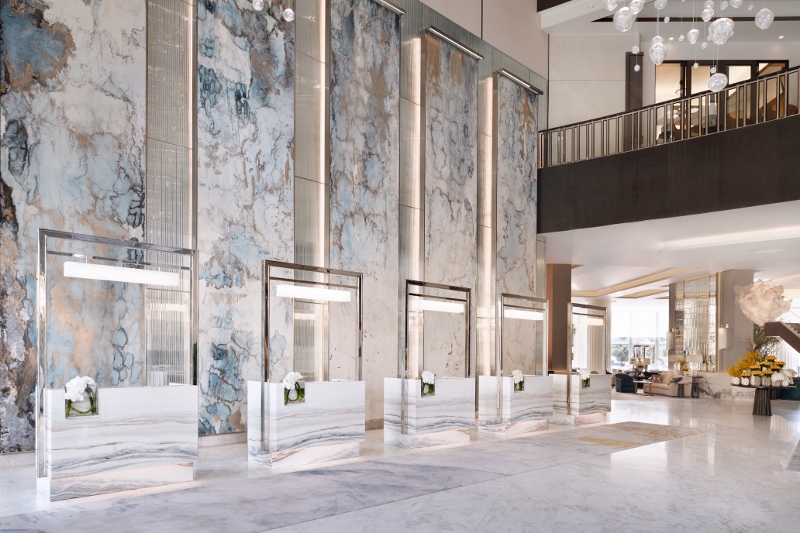
Known artist Beth Nicholas is used to seeing her masterpieces on the walls of some of the world’s finest examples of hotel design. Among working with clients such as Christian Louboutin, Langham Hotels and Waldorf Astoria, one of the most challenging briefs came recently when she was asked to create a large art installation for The Address Downtown Dubai‘s lobby area. I was fortunate enough to catch up with Nicholas after the hotel had reopened and she could finally take a sigh of relief now that her art is the first impression for guests checking in.
Hamish Kilburn: What was the design brief?
Beth Nicholas: Essentially, I was just asked to paint big, really big. I have never had a commission that was 8.5 metres before – and it was gob-smacking figuring out how to do that. I don’t tend to get design briefs from clients that often. What I get instead is people asking me about specific colours. With The Address Downtown we developed a colourway that had both silver and gold in it, as well as my iconic blue.
Soho Myriad, who were the art consultants for that, really like to challenge their artists. Quite often, they ask you to produce something larger than what you would usually go, but this particular project took that to new heights, literally. I don’t think they have ever commissioned anything quite that large.
“Honestly, I have never seen marble like it; it’s utterly beautiful!”
HK: In regards to this particular project, what inspired you?
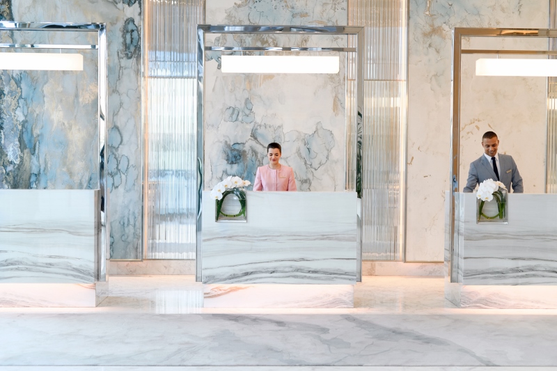
BN: Honestly, I have never seen marble like it; it’s utterly beautiful! There is some marble in that entrance lobby that is purple and they have split the marble down the middle and turned it. The result is like a mirror image, a bit like when you were a child and folded paper over paint. My work resembles that material in a lot of ways with a lot of natural formations that are very similar to some of the lines and shapes within marble. I had been given a lot of information about the space and the rest of the colours that were used in the hotel. That inspired the work.
“To be honest, everything that could go wrong did go wrong.”
HK: How long did it take?
The brief came about a year and half before I produced the work. The production of the pieces took three months, and my normal technique did not work. To be honest, everything that could go wrong did go wrong. I had to hire a warehouse outside Newport. It was an old, former carpet warehouse and there were holes in the ceiling. I remember it like it was yesterday. It was Autumn, so the rain had started. I would come into the space in the morning to find raindrops on my work. On top of this, I had to essentially create a new technique because my usual technique did not work at that scale. That was terrifying.
On top of all of that, my work takes a while to dry. As the weather was getting worse, my pieces would take longer to dry and I was running out of time. As a solution, I hired massive turbo air dryers – it looked like a scene out of Singing In The Rain – and eventually I figured it out, but it was certainly a challenge.
“I often think of my work in relation to that beautiful Japanese pottery, where they fill the gaps with gold.”
HK: Tell me more about how Wabi-Sabi has influenced your technique
BN: I have been in love with the aesthetic of Wabi-Sabi for a long time. Every time I describe what it means, it’s different. Wabi-Sabi is a Japanese concept that is very difficult to translate into English. Part of Wabi-Sabi is to appreciate the concept of transients that move and shape over time. I often think of my work in relation to that beautiful Japanese pottery, where they fill the gaps with gold. If you look at my work, you see similar cracks as you do in ceramics. I can’t produce a painting that is exactly the same as the last one, and so my work is very detailed. So Wabi-Sabi, for me, is the exploration of how things have changed and developed, which is why there is so my synergy between my work and the environment.
Nicholas’ work is evocative of oceans and the minerals beneath the earth as well as aerial photographs. The paintings are rendered in ink and applied to sheets of paper which are illuminated from behind, further enhancing their impact.
Since launching her eponymously-named company, Beth Nicholas Studios, in 2009, Nicholas’s paintings have won plaudits for their beauty and originality, are created through a unique method which she constantly evolves through trial and experimentation.
Image Credits: Portrait of Beth Nicholas © Mae Maciver; Beth Nicholas art commission at Address Downtown, Dubai, June 2018 © Nicolas Dumont, courtesy of Address Downtown ”

