The newly renovated bathrooms in the 25hours Hotel Hafencity in Hamburg show how Bette and the bathrooms contribute to the branding…
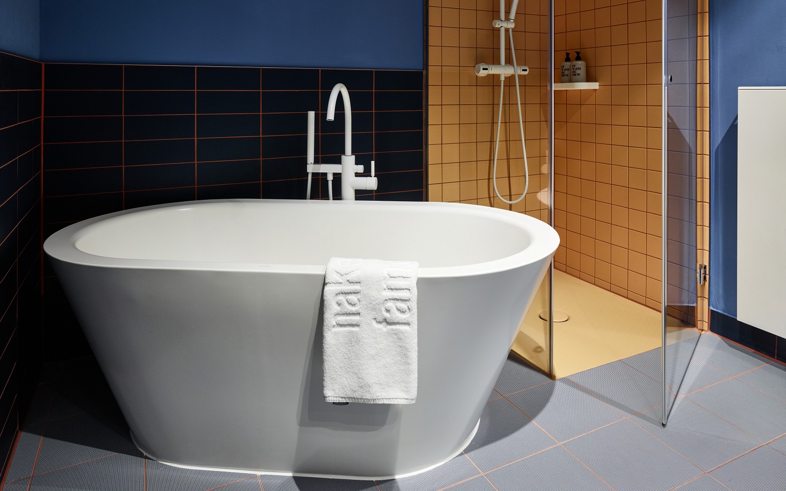
Thematic interior design and style-defining colour codes can help hotels strengthen the emotional bond with guests and increase recognition. In the case of 25hours Hotel Hafencity the coloured shower trays and free-standing baths by Bette, help the bathrooms become an important part of the hotel’s maritime narrative.
The hotel design shows how exciting interior design can be combined with a colour code to create a special atmosphere. The architecture firm Stephen Williams Associates, together with Eventlabs, freelance creative director Markus Stoll and interior designer Conni Kotte, have thematically aligned the hotel with the contrasts of harbour and ocean, homesickness and wanderlust.
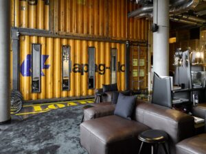
Image credit: 25hours / Bette
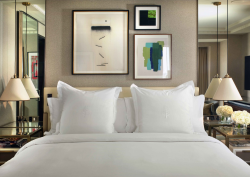
The rooms, affectionately called guest berths, are warm and cosy, in the spirit of a sailor’s home in a foreign port. Elements and materials from shipbuilding are included and wallpaper, drawn by Berlin illustrator Jindrich Novotny Welt, tells real-life seafaring stories of dangerous crossings, romantic encounters and painful farewells.
Over the past year, the hotel’s 170 bathrooms were remodelled, integrated more strongly into the hotel’s shipping theme and adapted to the maritime colour scheme of the rooms. Details such as the picture wallpaper were also incorporated.
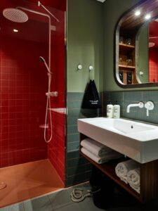
New, bold colour combinations now feature in the bathrooms, symbolic of the deep, unfathomable sea. Mostly in dark shades of blue and green – colours known for their calming and relaxing effect, which contribute to an atmosphere of peace and relaxation.
“The redesign of the bathrooms in the 25hours Hotel HafenCity is more than just a project for us,” said Carola Husemann, Head of Project Management Germany-Austria at Bette. “With our coloured shower trays and free-standing baths we are continuing the hotel story in the bathroom. We are proud to take our guests on this creative and emotional sea voyage. Our products are not only practical and aesthetically pleasing, but also make an unforgettable statement with their colours, perfectly underlining the spirit and brand essence of the hotel.”
The showers have a contrasting colour spectrum, with wall tiles and ceiling in red, orange and yellow, symbolising the buoys on the high seas. These colours stand for energy and vitality and create an arc of tension with the calming blue and green.The appearance of the shower areas is completed by the colour coordinated BetteFloor shower trays made of glazed titanium steel in carnelian, curry and edelweiss. They are also equipped with an anti-slip surface to help ensure a secure footing and reduce the risk of slipping.
The BetteSolid waste outlets in the showers are colour-coordinated with the shower trays. They are also designed so that hair and dirt are simply washed away with the swirling water, ensuring that the drains always remain clear and are easy to clean.
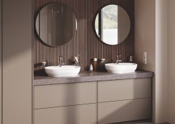
The ceramics and fittings in the bathrooms are in classic white, reminiscent of the spray of the waves, sails or white clouds above the open sea. At the same time, the white forms a neutral contrast to the other colours in the bathrooms.
Some of the bathrooms feature a free-standing BetteStarlet Oval Silhouette bath in white. The sleek and elegant oval baths are visually reminiscent of small sailing yachts. In combination with the deep blue and green of the sea and the colourful buoys, the result is a coherent, atmospheric colour palette.
Bette is one of our Recommended Suppliers and regularly features in our Supplier News section of the website. If you are interested in becoming one of our Recommended Suppliers, please email Katy Phillips.
Main image credit: Bette


