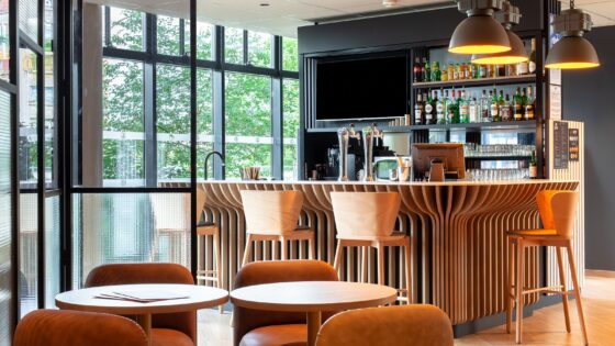
Putting new in old, contemporary into antique, can be a difficult trick. Mix in English vernacular style and wave a designers’ wand. Magic in the Kings’ Head in Cirencester lifted my spirits almost as soon as I walked in the door.
Open space with views that interest and also excite. Informality combined with tradition. There is space to pause and stare before engaging with the staff. History in view, from the exposed wall construction to the Roman mosaic under the floor lit and seen through a glass floor panel.
Doorways and openings that say there’s more beyond. Eclectic and stylish both operator and designer, architect and builders have worked hard to preserve and project the sense of Englishness and history embodied by both the town and the property. This is not just a revitalising of one run down old hotel this is the redevelopment of a significant and important collection of buildings making up a large part of Cirencester’s heart. If there is a downside it is that it is too close to Jeremy Clarkson…
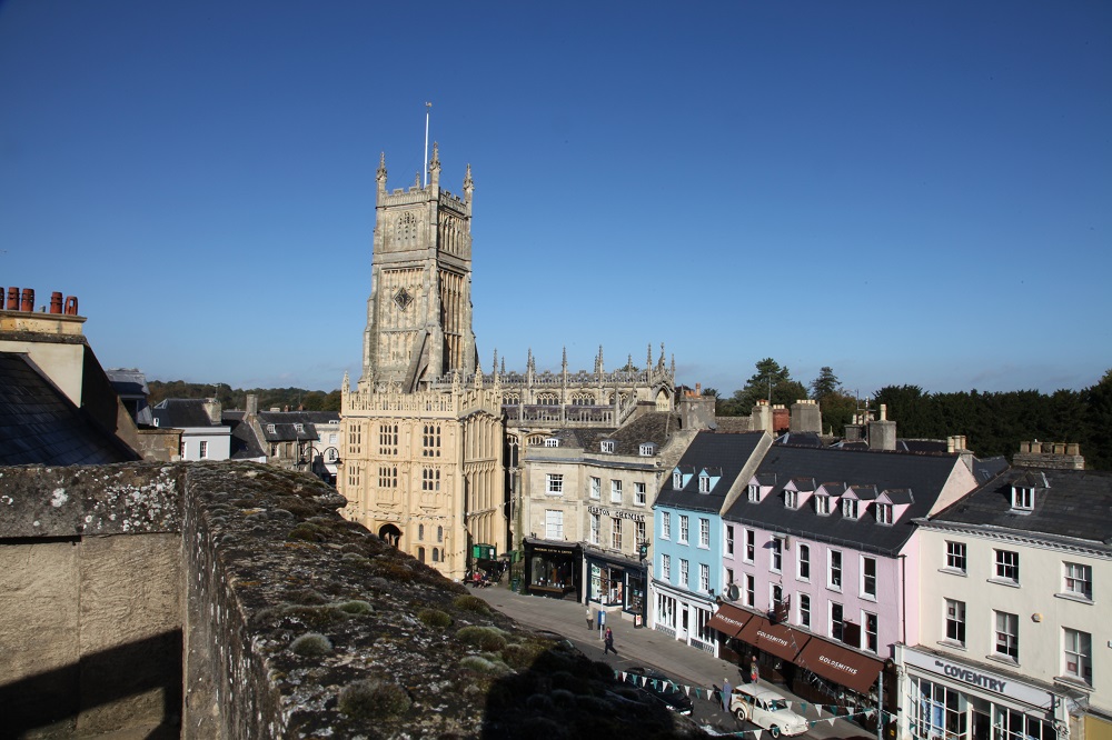
This is Range Rover land. The Cotswolds surrounding Cirencester are one of the most affluent areas of England outside the hideously expensive capital city. ‘Chelsea tractors’ abound, but local is also strong and is reflected in the abundance of local foods and the street market that sets up outside the hotel.
Given the affluence of the area the only surprise about the Kings Head is that it has taken so long for it to happen. That the owner has vision is a given, but the adaptation owes a great deal to the local influences and suppliers so cleverly employed and developed by designers Calico alongside an hotel management team that are also tapped into the same vernacular.
I have talked before in articles about the resurgence of an English vernacular. It can be seen in hotels as diverse as the revamped Mercure Box Hill, less convincingly in the Mondrian on London’s Southbank of the Thames, more successfully in seaside hotels like St. Michaels Hotel in Falmouth.
Whilst the Scots shriek about their identity, in our own quiet way many English designers are bringing back the pride in being English through their stylish reinterpretation of traditional forms, forms that emphasise visual and psychological comfort; forms that don’t seek to shout style in an egotistical ‘look at me I’m a designer’ manner, but quietly provide a guest with a place in which they can comfortably be themselves; forms which say ‘this is where you are’ too, acknowledging both location and history.
The Kings Head does all this, and more.
Here the design of much of the furniture, fabrics and more has been originated by the designers. Yet the origination has been faithful to what has gone before — this is design at its best, evolutionary not revolutionary, founded in an understanding of locality and identity alike.
The designers told me: “We were involved from the very beginning and can remember walking around before many rooms had walls. We advised on layouts sourced & procured all FF & E items, we advised on the concept mood and feel of the hotel, choosing colour schemes through to set up. We were fortunate that the hotel is a truly beautiful building with so many original and interesting details that just needed to be exposed.”
Design of hotels, perhaps more than most buildings, need to be a team effort, involving owners, operator and designers. Design has to work from the inside out, and the designers here stress that they we part of a team, saying: “It was a team effort! A collaboration between the owners Mark & Alison Booth, the building contractors, and the interior designers.”
More than this, of course , there would have been architect and structural engineers, QS etc. but in my experience the role of other professionals in hotels is less important in realising the full potential of the earning power of an hotel. In my experience the sensitivity of the contractor involved to the history and sense of place is also vital to making a success of such a project. Here the designers praise the building contractors saying: “They under took the task with great compassion as at most stages new parts of the building became exposed and then had to be incorporated into the design.”
Typical of many projects on historic sites, at one stage in the project there was a 2 year delay to explore the archaeology, and given the cost of creating an hotel like this (reported to me as £7.5 million so far) then this must have added grey hair to the developers head, as time is definitely money. However here the respect given to the existing structures (because this was more than one building, but a series of interlinked buildings of different ages) has resulted in some magical interior space, including in some of the currently 45 bedrooms.
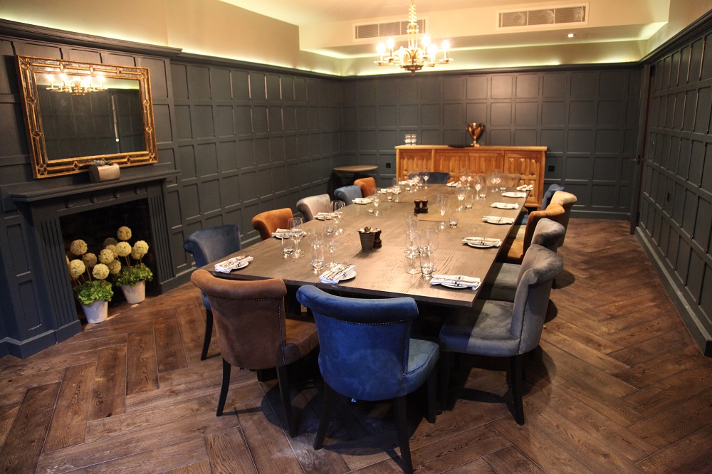
There are plans (and spaces) to expand the number of bedrooms, and given the ability of the hotel to host quite large functions and meetings, increased bedroom numbers will be needed. On my visit two functions for 400 people had already been booked and the expansion of the public areas with additional bar and dining space as well as the completion of the spa and gym were all in hand.
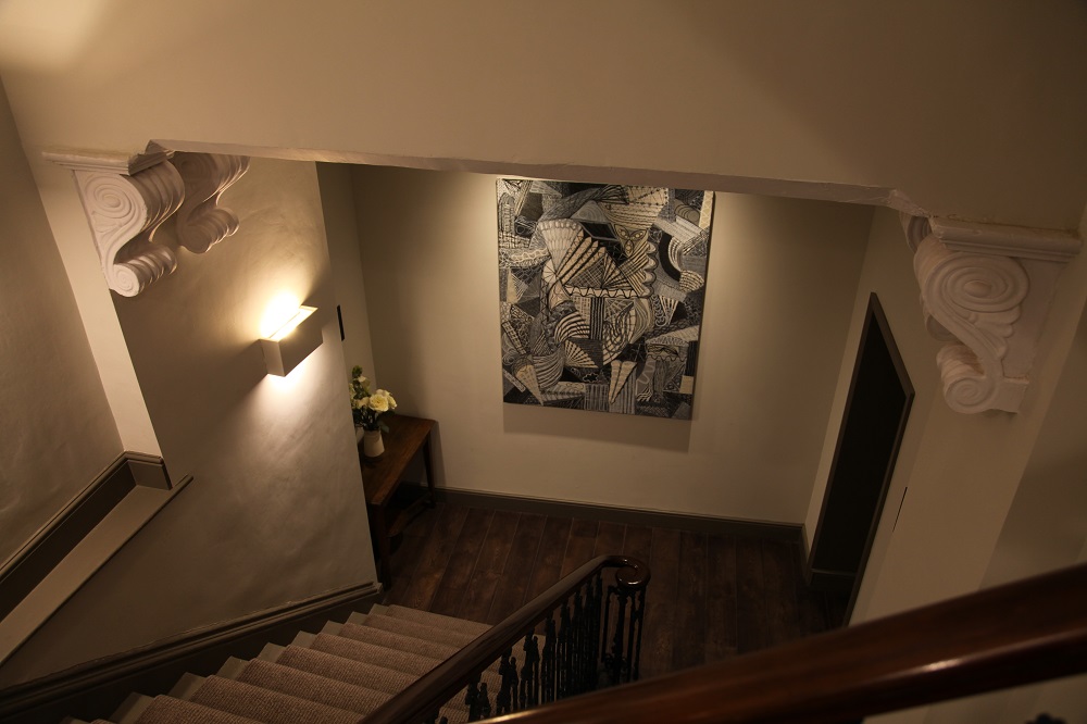
The labyrinthine layout springs surprises at every turn. There is a staircase where the details of the bracket holding the hand rails feature heads that change in age with each floor.There are stone walls, sensitively lit , with pieces of Roman mosaic leaning against them. Antiquity maximised in impact, married to the best of modern lighting.
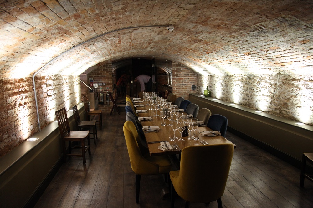
The spaces being re-purposed (as the current phrase would have it) are interesting in themselves. A previous generation made its wealth from wool, for which Britain in earlier centuries was a major producer. Whole towns based their wealth on the wool trade and here the cellar previously used, it is believed, as a wool ‘warehouse’ will serve a new generation as a bar/bistro and function area.
There is a secret little roof garden onto which open meeting rooms and a function space. There is a glorious Georgian or high Victorian ballroom with stylish chandeliers. All these spaces creating a sense that as one explores the hotel further more secrets will be revealed.
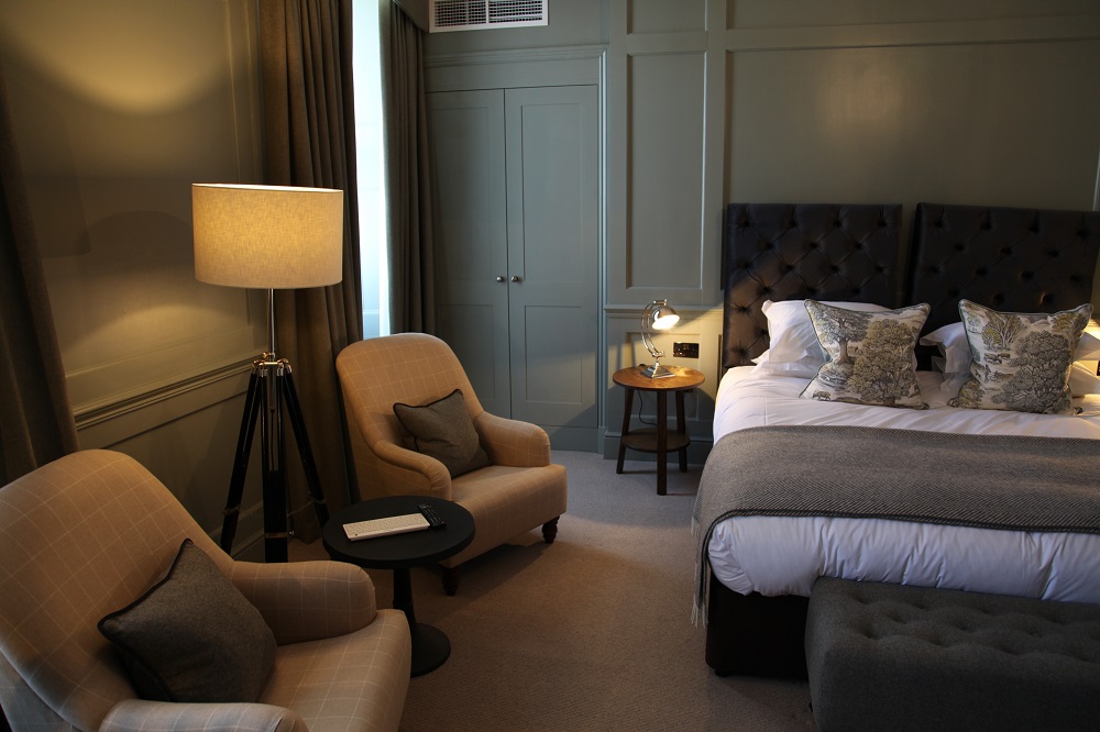
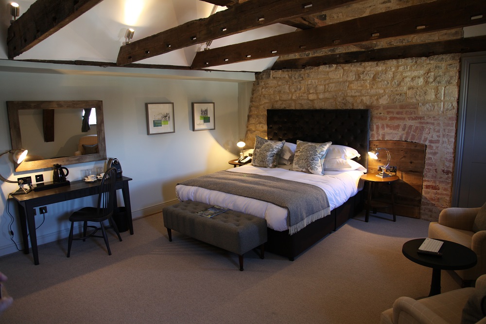
The current bedrooms are all individual in style, and original roof timbers, fireplaces and construction have been kept and featured in the sensitive interior design. Panelled rooms have been kept panelled, although the panelling may well have been completely renewed. The interest in the antique has not extended to guest services and a comprehensive TV entertainment system compliments a free and efficient Wi-Fi service throughout the hotel.
The hotel is not only adding a spa and gym, that will be open to non-residents but other buildings in the complex structure ware planned to be utilised as office space with the tenants having access to hotel facilities. This holistic approach to the property is cleverly building in additional income streams to the business.
Bedrooms are spacious and most offer a soaking tub and separate shower, Clever use is made of ceramic tiling that mimics timber flooring, giving bathrooms and antique look , whilst there is nothing antique about the performance of the power showers in their wet room enclosures.
Whilst many London hotels have shrunken bedrooms, often forcing designers to innovate to provide space for luggage as well as the guest, here space is not an issue, the building layout having been developed to ensure all bedroom are a good size.
Corridors frequently shown, in their meandering path around the building, the different construction elements with exposed beams, exposed brickwork and rough plaster finishes highlighted by well placed LED lighting. The hotel is comfortable not only for the guest as an hotel, but it is also comfortable with its history and location. The property enhances Cirencester and encapsulates it from its Roman status through Saxon, Georgian and Victorian to enthusiastically embracing English style in the 21st Century.
The design approach here is a delight, the vernacular blended skilfully with the contemporary. Perhaps because the hotel is not a major brand it shares an approach seen more commonly in South Africa where brands are noticeable by their absence leaving hotels like Chappies or the Royal at Riebeck to carry the same local identity.
The Kings’ Head delighted me. It deserves design awards. It deserves to succeed. If early indicators are right it is already doing so…
©Words and Pictures Patrick Goff
From a visit in October 2014

