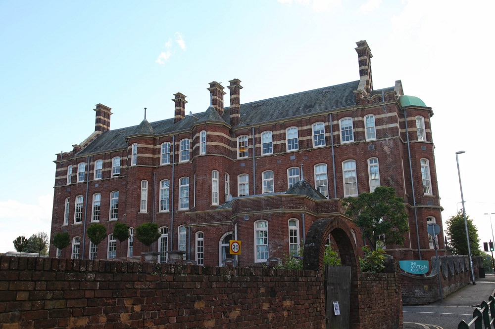
Unmissable as you drive in to Exeter, this 60 bedroom hotel occupies a spectacular example of a re-engineered building. The hotel is a conversion of the West of England Eye Hospital for Swire Group. The foundation stone was laid originally on the 11th April 1899 to a design by Sir Alfred Brummell Thomas. The entrance includes a large 18th century marble fireplace that was taken from the former house on the site.
Swire Group are reputed to be one of the ‘hongs’ portrayed in James Cavell’s novel ‘Noble House’, having existed as a trading house in Hong Kong since the early years of the 19th century. Currently Swire is a UK headquartered multi million pound conglomerate operating shipping, aviation, and property groups. Magdalen Chapter is the second of their Chapter branded hotels in the UK, the other being in Cheltenham. The group also has developed and owns hotels in Asia, including Coral Sea Hotels, Indigo Beijing etc…
When the eye hospital closed in 1992, the building was eventually sold and converted into the Hotel Barcelona at a cost of £2.6 million, opening in 2001. It was acquired by Swire group at the end of 2008. Designers Feilden Clegg Bradley Studios are the masterminds behind this reported £6.8 million relaunch of the Magdalen Chapter, which reopened in 2012, and in fact was not fully completed on my visit, as the spa remained unfinished. The designers have master planned an extension of the old hotel, imaginatively embracing the garden area as a part of the theatre of the building.
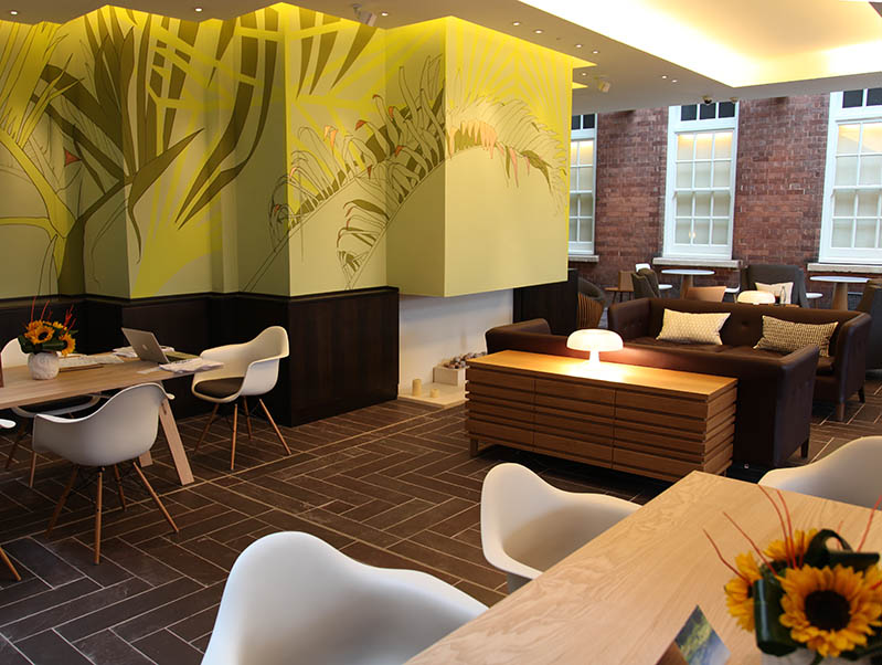
At the front the grandeur of the original “hybrid baroque style” exterior is maintained, with the imposing entrance opening into the original hallway. Whilst the original structure is evident, and there remain reminders dotted around of the original use of the building, the architects have not been overawed by conservation, and have created a thoroughly modern set of spaces as public areas.
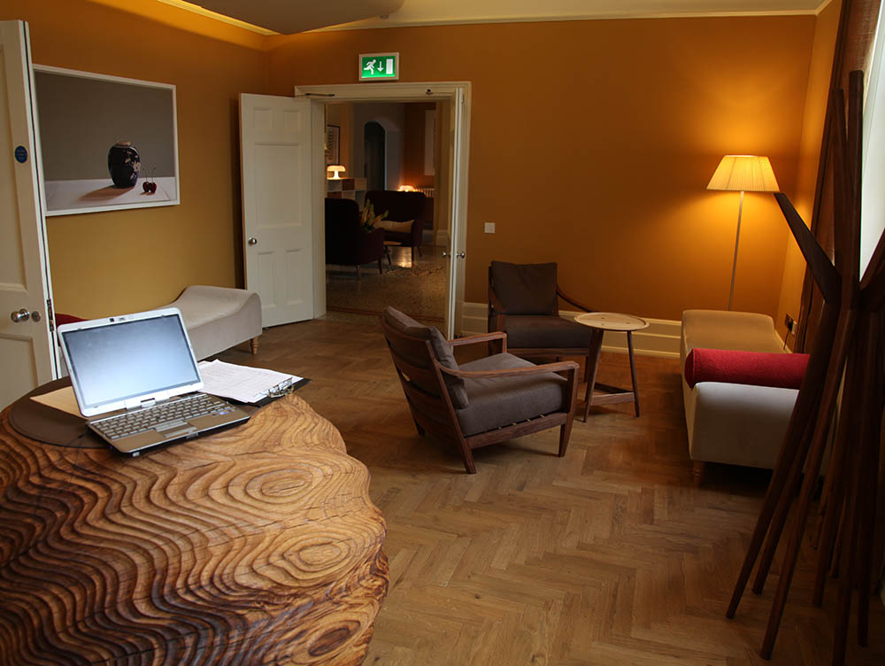
The operator has adopted a similar ‘deskless’ check in system to that previously shown at Andaz, but here there is a lack of focus and the signage is a little over discreet, causing a little loss of confidence, a little confusion, in the incoming guest, easily solved by having a ‘greeter’ at the front door – maybe necessary too because of the limited car parking available on approach, which may need marshalling. In the Andaz the ‘deskless’ reception is a way of enabling personal service to the guest, with greeters always present to greet arriving guest and to sit down with them and book them in. Here staff are often invisible leaving the guest somewhat baffled as to where to go, although the lonely lap top balanced on top of the carving is a clue that this is the ‘desk’. This half-baked approach, neither fish nor fowl, provides neither an identifiable desk, nor the welcoming smile that characterises the Andaz approach.
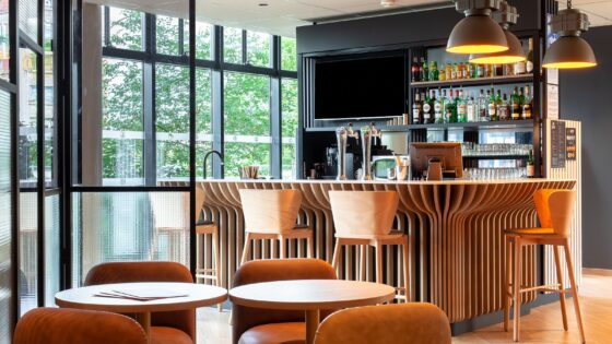
The designers have succeeded elsewhere in blending the best features of the pre-existing building with their contemporary extensions. Whilst the bar area is the most cramped space it is actually well placed to service all the public areas. It’s comfortable seating creates a clubby atmosphere, encouraging guests to linger , but behind it is the library and off that a new space has been created to make a large lounge which acts as both a social area and a bistro for less formal dining than that available in the beautifully designed restaurant.
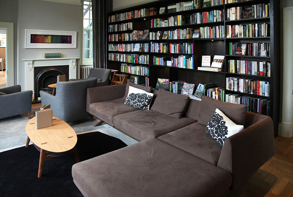
The library itself has a small area which can be used for informal meetings or semi-private dining, as well as the bookshelves and comfortable sofas for guest to enjoy. This new extension is part of a circle of buildings surrounding the garden. What appears as a garden shed is in fact a self sufficient meeting room on one side, whilst on the opposite is a spa with an ‘indoor/outdoor’ pool, treatment rooms and its own log burner for heating. This latter links to the bar/bistro with a patio and the whole, with the restaurant opening to the garden, will be delightful on a sunny summers day, if England ever sees one again.
The link from the front area of the hotel to the restaurant can be through the bar but there is also a quiet corridor link with glimpses into a small internal garden space. The restaurant itself also has a private dining area and a show kitchen. The maitre d’ point is intelligently placed adjacent to the entrance and here the staff seem eminently able to greet all incoming guests. Restaurant design is optimistic. How else can one describe a space designed to open to the garden in one of the wettest summers on record, other than as optimistic?
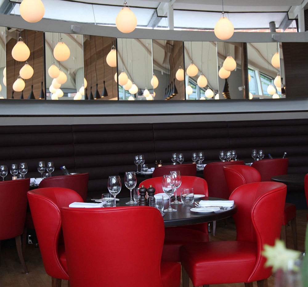
Tables are a good size , and unlike many restaurants are laid out to leave a sensible amount of space between seated guests for servers to move easily. This may seem a minor point but if waiting staff can serve easily they will serve quickly and with a smile, much easier to do both if the design is enabling, as it is here.
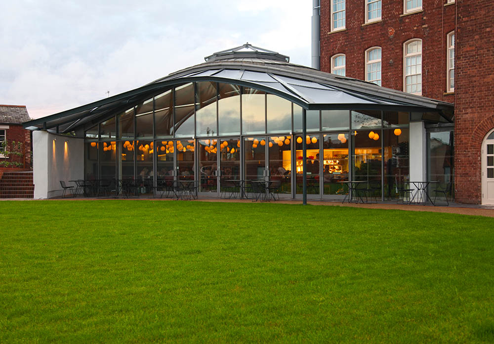
The extension that is the restaurant sits like a tent on the edge of the garden’s lawn area, and doors along the frontage will all open up to allow diners to spill our onto the terrace in summer, but their glazing also allows the interior to be flooded with light. A central supporting column prevents the space becoming the dominant feature allowing a feeling of intimacy to pervade as the space is visually broken up. The column itself is used as the basis for a central circular seating unit, preventing the structure dominating and along with banquette seating along the back wall allowing flexibility in seating types and arrangements. Colour is strong in the upholsteries but otherwise predominantly neutral.There are two areas, on off the restaurant and one off the library that can act as private dining areas, one of which is a formal private dining room that can be closed off , yet is a part of the restaurant itself.
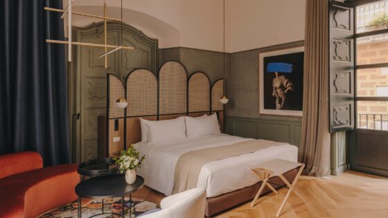
The planning and layout of the areas of bar and the food operation are well done, and allow easy service routes to the main lounge, and to other snacking zones.The planning also allows easy service to be given to the meeting room, spa areas and the external meeting room. The extension and development of the additional areas has been done intelligently and sensibly (the two do not always go together) by the architects and designers. The layout of the previous hospital, into wards etc., also has helped with the bedroom layouts. Corridors have natural daylight and the rooms are generously sized high ceilinged, and a number have his and her bathrooms, a feature also seen in bedrooms at the luxury One and Only hotels, and in luxury establishments such as Bushmans Kloof.
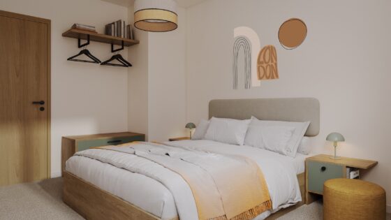
Bedrooms align with the fenestration of the building, giving bright airy rooms. They are large and the high ceilings enhance their spaciousness. Despite the large windows blackout is effective and the beds, with their organic Naturalmat mattresses, have plenty of space around them. Corridor runs are short making guest access easy and the building works well as an hotels – maybe instead of converting office buildings hotels groups should be looking to convert many of the small redundant hospitals appearing as health services coagulate into larger unit sizes offering wider ranges of expertise. Certainly with Victorian healthcare being so strongly linked to fresh air and sunlight these buildings with their large windows and areas flooded with daylight give the guest a great experience and some of the interiors carry heritage items that lift them out of the ordinary.
Click on the image below this script to see an example of what I mean – tile patterns and round windows are surely inherited from a previous existence. Architectural details throughout are a delight and have been sensitively preserved in the conversion. With just 60 high quality rooms and high quality public areas I wonder whether this hotel should be operating at a higher rating than it does. In places the service matches the space – in the restaurant, food operation and bar service, for example, yet I feel that there is potential here that is as yet unrealised by the operator to lift the service to a higher level.
There are problems with guest parking, although the offsite car park is remarkably adjacent, but that apart the building seems to lend itself to its new use. The front has a street presence that is strong, whilst the new additions around the garden area to the rear make this into something special as an hotel. The designer has enhanced the buildings sense of place and created a terrific stage for the theatre of hotel keeping.
© Patrick Goff, Words and Pictures. From a stay at the end of July 2012.

