Lighting has always been an essential tool in a designers’ skillset and now, more than ever, it is being used to not only elevate a design but to amplify a brand. With this in mind, Editor Hamish Kilburn sat down with leading designers in the Franklite showroom in London, to explore the role lighting can play in a hotel design arena that is constantly looking to evoke and express changing parameters through layers of design…
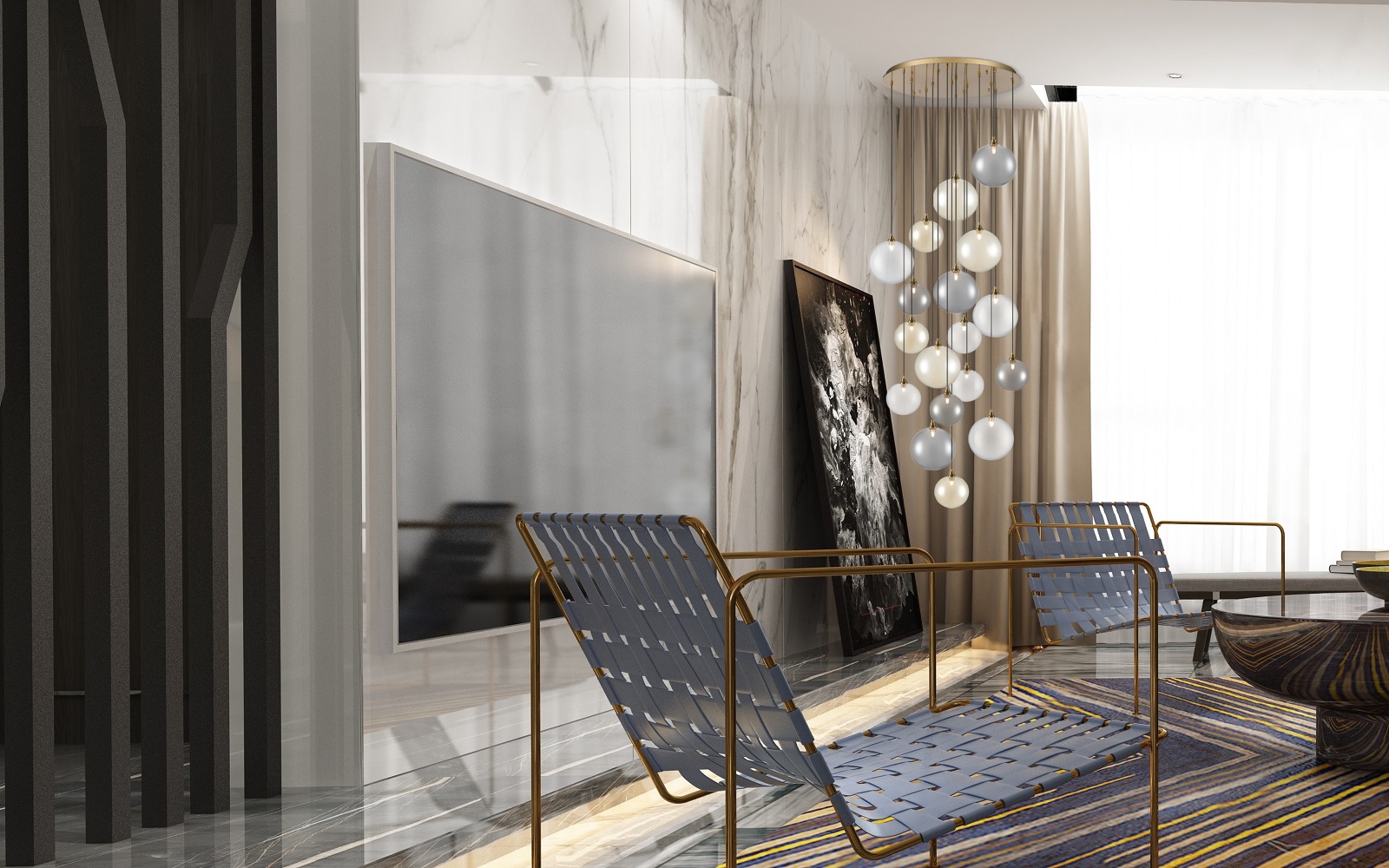
With lighting, the science behind it and its role in enhancing wellness concepts increasingly topping the hotel design agenda, it felt appropriate for this last roundtable of the year to take a closer look at just how lighting is being used to change the perspective of a design, as well as its role in facilitating the design of more flexible solutions.
On the panel:
- Leanne Armstrong: Founder and Creative Director, Black Ivy Design
- Claire Smith: Director, ABDA Design
- Meredith Hull: Associate, Conran and Partners
- Moritz Waldemeyer: Founder and Head of Design, Waldemeyer
- Nazanin Farahbod: Product Designer, Waldemeyer
- Dale Atkins: Founder and Owner, Rosendale Design
- Marl Lissauer: Export Director, Franklite
- Nicholas Hickson: Founder and Director, THDP
The conversation kicked off with, following on from the topic that dominated HIX this year, looking at personalising spaces and shifting points of view, Editor Hamish Kilburn asking the designers around the table how, in their experience does lighting play into this? Is there more of an awareness of the design-power of lighting and if so, how is it being used?
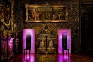
Image caption: Chatworth House | Image credit: Waldemeyer
Moritz Waldemeyer: People are starting to understand that you can use lighting for storytelling. In a theatrical sense it can set the scene and create a ‘moment’, it can change a room completely by simply changing the focus. Lighting can direct the focus on to certain details and objects and away from others.
Dale Atkins: Lighting is always at the forefront of our designs and all the Rosendale lighting schemes are done in-house. A good lighting design can make a huge difference to any project, it can transform a space – simply put a candle in an empty room and you are immediately telling a story. There are two key elements to harness when maximising lighting – colour temperature and colour rendering. Both these aspects can be used to enhance an environment in ways that are often inherent and subconscious.
Leanne Armstrong: We can dictate where the focal points are, just by manipulating the lighting and there are so many different ways to do this. From what temperature to use, to positioning to the style of light fitting. Again, this all comes back to the narrative and how essential it is to keep cohesion here. When designing it is always key to take cues from the brand, for instance lighting design for a Six Senses will be totally different to a Hard Rock Hotel with totally different guest experiences at the heart of each brand.
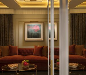
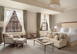
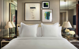
Image credit: Lansdowne Club / Rosendale design
The conversation continued around the table, looking to see if and how lighting technology has changed both the design and the expectation around lighting. Two key trends emerged: the first being a return – on the surface of things – to a more simpler pared back approach – with the focus on a flick of a switch rather than a scrabble for the remote. However, concepts like intuitive, user friendly and flexible lighting solutions, are in fact supported by the improvements made below the surface in terms of technology. The technology has improved and is in fact working harder to be less apparent and more user friendly.
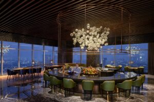
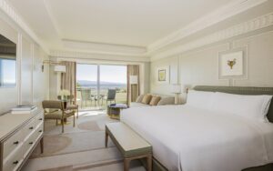
Image caption: Psrk Hyatt Jakarta | Image credit: Conran and Partners
Meredith Hull: Interestingly, at Conran and Partners we are currently working on a project where the client has specified that the space needs to really work all day, all the time – its not just a morning evening specific space. It needs to look great all day and we are exploring – using technology and lighting – how we can explore that.
LA: At We are busy with a project in a basement, the building dates back to the 1800’s. We’re dealing with extremely low ceilings with no scope for pendant lights, so are playing around with wall lights, table lamps and floor lamps to add layers and give a very dark and moody ambiance where certain features are really highlighted such as artwork and wall coverings. We really want the artwork to enforce the narrative and we are having fun playing with the shade as well as light to guide the guests through the experience.
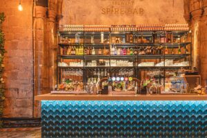
Image caption: Dhillons Spire Bar | Image credit: Black Ivy Design
MW: There does seem to be a disconnect in the industry – you have designers, lighting manufacturers and the tech people. the people developing the technology are not designers and don’t know what the end user wants.
DA: It really comes down to understanding the user demographic because the technology is there and it is great but ultimately the end user needs to feel that it enhances their experience rather than is an obstacle that needs to be dealt with. In our work on the Lansdowne Club rooms where scaled back on the technology but made sure there was still flexibility within the lighting design.
LA: Guests simply want a beautifully lit room that functions well for what task they desire, but also these controls need to be simple and easy to use. There’s nothing worse than a guest being stuck in a badly lit room, that has been carefully designed to give a lovely guest experience, just because the guest can’t work the over complex controls!
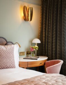
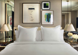
Image credit: Lansdowne Club / Rosendale design
Editor Hamish Kilburn went on to ask if lighting can be used as a tool to enhance a brand story? Increasingly brands are looking outside of the traditional branding box to differentiate a property, and lighting has become key to this. It can be used to enhance design and architectural elements, as well as to amplify those qualities and emotions that are the more subtle part of branding, elements that speak directly to audience.
DA: Lighting can reflect the direction a brand is going and when there are a lot of visual queues like colours and materials being used that relate to a brand, the with architectural lighting can often be used to enhance these elements. Architectural lighting is less about story telling than about directing the eye and evoking a feeling as sometimes you don’t even need to know that it is there. You can layer spaces and create ambience but not necessarily a design feature or a statement. Light can be used to emphasise elements of a brand – from colour to texture, evoking a sense of brand.
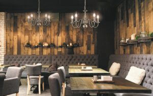
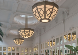
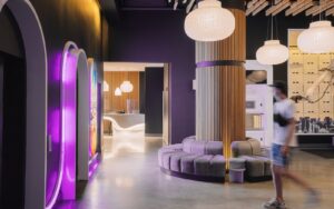
Image caption: Mondrian | Image credit: Franklite
Increasingly, spaces are being designed around how they make a guest feel rather than only being about how it looks and with these more emotive elements being key in defining a space, there is clearly a role for lighting, in all its layers and nuances, to introduce and highlight the more emotive and sensory side of a design.
?? : We work a lot with IHG brands brands who have clear design guidelines to capture a different audience, guidelines as to how to do it with a clear focus on the public areas. It is in the public areas that lighting can definitely paly a part in the design process.
Kilburn went on to ask if the hotel industry still has a lot to learn when it comes to harnessing the emotional qualities of lighting and creating experiences, rather than the more functional approach it currently has?
Nazanin Farahbod: With our focus at Waldemeyer being exactly that, I feel that the entrance areas in hotels are often neglected when it comes to the experiential qualities of lighting. These are the spaces which can be used to create experiences and really optimise first impressions – focus on creating the emotions through an experience because that is what people will remember.
HK: Picking up on comments around wellness and emotions and also the movement of lighting, is there an opportunity for designers to work more with the movement of lighting to create changing spaces and seeing lighting as a less static design tool?
MW: Animated light is a key element when it comes to capturing and communicating an idea – it is a way of using lighting imaginatively and in a less static manner. The animated light from a firelplace is an obvious example, but you can capture that idea and then play with it, recreate the feeling in a more abstract way to create a memorable experience.
DA: Some clients certainly see the value in more experiential lighting, especially in the public areas – when you walk in you have one chance to make a great first impression. We recently created an installation activated by movement that also involves colour and it makes a strong statement, elevating the guest experience in this case, in a playful way.
Finally in a quick-fire free for all the designers listed some of the hotel lighting design pitfalls that need to be avoided at all costs! Ranging from over complicated lighting to single source lighting that can’t be adjusted, questionable bathroom lighting – whether too much of it or too little – definitely came out on top!
Franklite is one of our Recommended Suppliers and regularly features in our Supplier News section of the website. If you are interested in becoming one of our Recommended Suppliers, please email Katy Phillips.
Main image credit: Franklite


