Many current hotels and serviced apartments cater for Joe Average. It’s all about focusing on the key touch points and doing them well, says Cathy Mocke, Design Director at Select Property Group…
When you’re travelling for work and staying in a hotel or serviced apartment, what are things that most help you to feel settled and relaxed?
For me, it’s important that wherever you stay feels comfortable and relaxed, but still has an element of ‘specialness’ to it. I guess ‘home-from-home’ is the obvious tagline that you’d use. It’s also imperative that everything works really well, from both an operational and design perspective. Easy arrival, easy check-in, comfortable bed, good shower, good lighting. If you’re travelling for business you’re not in your room for very long, so everything needs to be easy, intuitive and comfortable.
In my experience, too many current hotel and serviced apartment options cater for ‘Joe Average’. Brands can tend to be too prescriptive at the expense of the end user experience. Many brand standards dictate “we need to have this, this and this”, but in actuality the customer doesn’t need all of these things. Often, because these places have so much ‘brand standard’ stuff in the rooms and in the building as a whole, they don’t have any one thing that’s done well. Instead they have a lot of things done in an average sort of way.
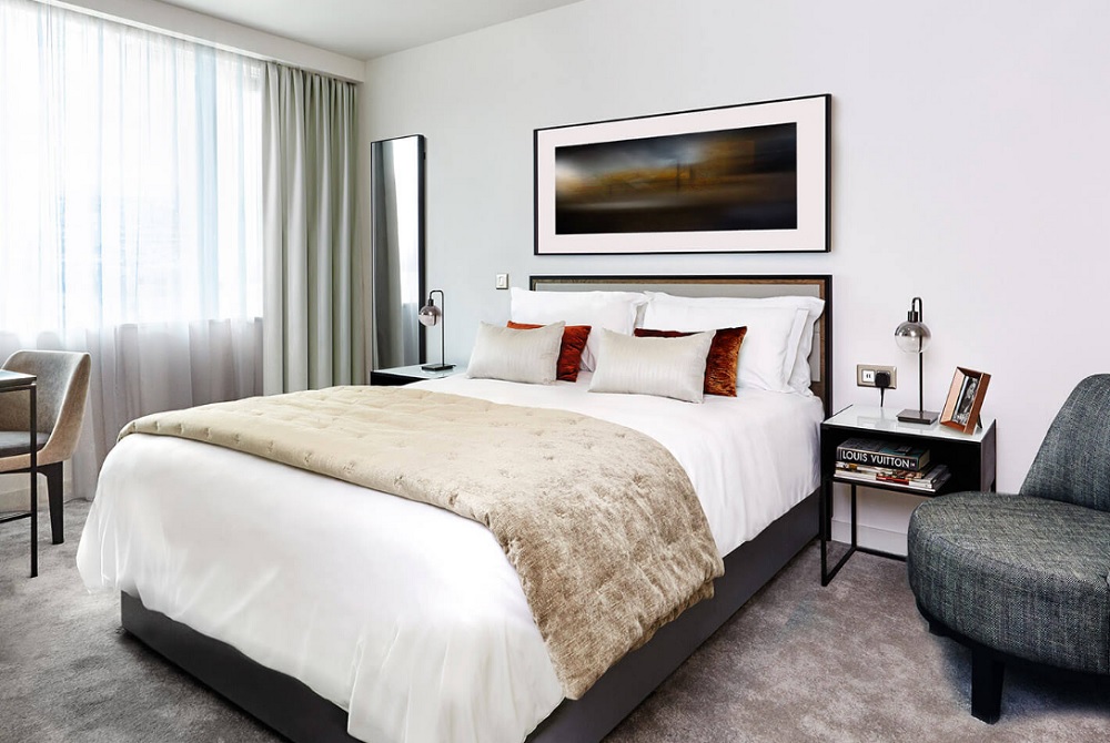
So when it comes to designing a new product for the business traveller, as we have been doing at Select Property Group with CitySuites, it’s about focusing on key touch points and doing them really well.
Calming rooms and light spaces
With CitySuites, what we’re trying to do is offer something that gives you that extra level of luxury, but still retains the comforts of home, something that very few established brands can claim to offer.
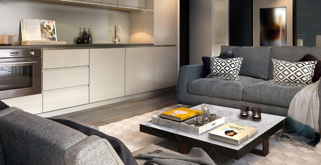
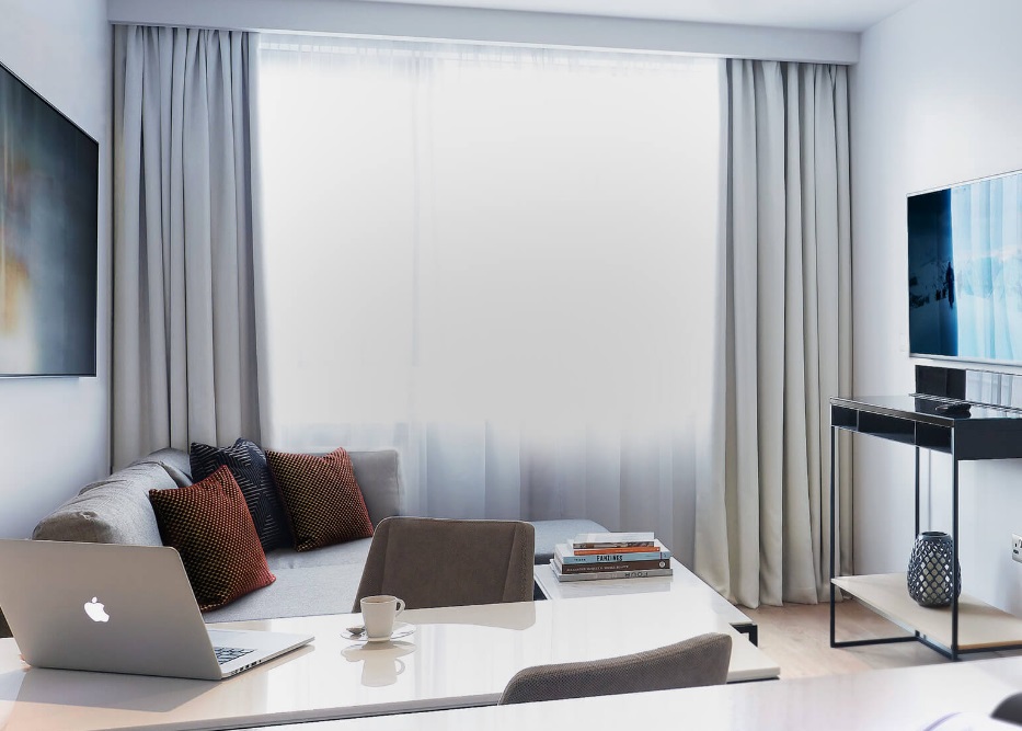
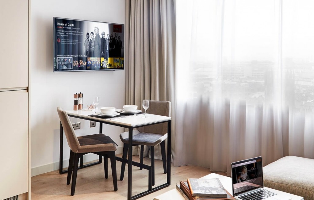
When designing the rooms, we really thought about how the customer will actually use that space and what they need. From the kitchen, to the shower, to the lounge space, what do you need to put into it that makes it usable, whether you’re staying for a week or a month? It’s about creating bright, light spaces. That goes to the choice of materials and maximising light, space and outlook. The studios are also very generously proportioned so that you don’t feel like you’re sleeping in your living room. There’s plenty of space to move around. The bathrooms are very well appointed and generously designed.
The first impression upon entry into the apartment is extremely important. You don’t want to walk through corridors and lobbies. You want to walk into the main space, and straight into somewhere that immediately permeates an element of quality and space and home.
Design led by the location
With every CitySuites building, the interior design and selection of the furniture and finishes will be informed by the location of the building itself.
In addition to the living experience, creating that sense of place is important and adds another dimension to the design and avoids a formulaic approach to the interiors. That’s what CitySuites is all about – connecting to each city, highlighting its idiosyncrasies and character specific to the setting and location of each building.
So for the brand’s first development in Manchester, located on the site of an old railway station, we brought relevant materials like wrought steel into the design of the furniture. The furniture has all been bespoke designed for that particular project, so that it fits comfortably into the spaces that we have but also has a strong reference to the location’s industrial past, but with a refined edge.
Then we brought in some luxury elements like marble and glass to create that luxurious eclectic feel. The artwork has also been specifically designed to reflect the location and its proximity to the river.
The end result is that you can walk into any CitySuites and, while there’s the consistency in terms of the service and quality that you’d expect from every accommodation brand, you will see a level of design that connects you to the location you happen to be in at that moment.
Doing the simple things well raises the benchmark of quality
If everything has a simple ease to it, from the service to the features you need the most, it naturally creates a positive memory that will make you want to stay again. By focusing on the touch points that really matter and making them really good, it makes your stay really easy and comfortable.
But that positive experience should start from the moment you walk through the main doors. CitySuites Manchester, for example, is quite a striking building, and we want that ‘wow’ impression to be carried on when you enter the building itself.
So with the design of the reception space, we do this with the dark timber, copper and natural materials and some unexpected features that greet you immediately. This experience might be a little more theatrical than within the apartments because you’re trying to create an impression, but it’s still understated and elegant. Again it’s about people feeling special about the building and thinking “someone has taken care in the design of this space.”
Of course, you can design it all to the nth degree, but if you haven’t got the operational team to give that amazing user experience, it’s all for nothing. Design and operation needs to work together. But if you can marry these together effortlessly, you’ll have a product that sets itself apart from anything else a business traveller has available to them.
For more information visit www.citysuites.com

