

At the close of 2024, we waited with bated breath to see which shade would be crowned Pantone’s Colour of the Year 2025. Enter Mocha Mousse – a ‘versatile’ brown with ‘delectable’ notes. But did the luxury A&D world really embrace this ‘mellow hue’? And as 2025 winds down, are brighter contenders stepping into the spotlight?
In recent years, earthy hues have surged to the forefront of interior design. With wellness still high on the agenda – and its associated ‘return to nature‘ – hospitality designers continue to ground their projects in brown tones that echo the organic. And, according to Elle Decor, this trend isn’t going anywhere fast.
But as 2025 progresses – and 2026 looms – these earthy palettes are evolving. In hotels we are seeing bolder, more saturated interpretations: ochre yellows, terracotta reds, and dark oranges. The throughline? Au naturel is timeless.
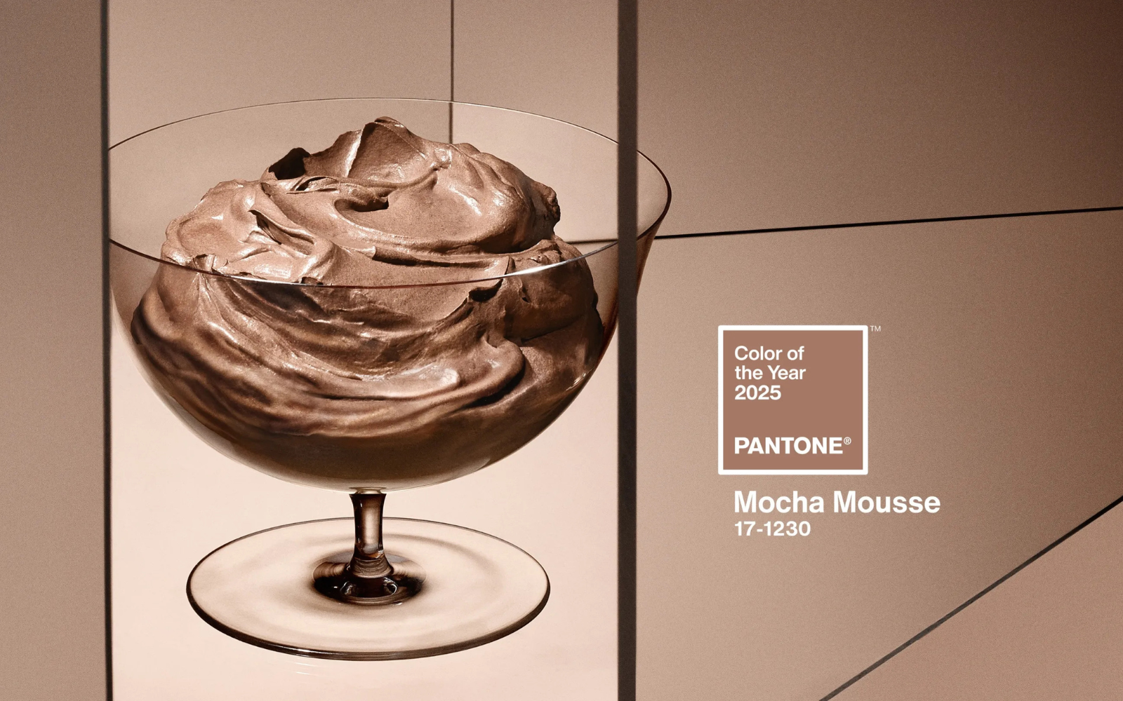
Image credit: Pantone
Which is where Pantone’s Colour of the Year, Mocha Mousse, starts to fall short in hospitality design. Dubbed by Vogue ‘a seasonal addition to the Starbucks menu‘, it captures the current zeitgeist in a single, highly specific hue – one that is fleeting by nature. And in the hotel industry, where trends need staying power (for at least seven or so years), Mocha Mousse will likely prove a tricky hue to pin down.
So it begs the question: did Mocha Mousse ever truly land in the world of hotel interior design? Let’s take a look at some of this year’s hottest projects to find out.
Delectable by name, delectable by nature
Entered through a single copper door – a diadem before a heavenly descent – MR PORTER, the wickedly good, Stygian-by-design steakhouse by Baranowitz + Kronenberg, is more Espresso Martini than Mocha Mousse.
-

- Image credit: Stevie Campbell
-

- Image credit: Stevie Campbell
At its heart: a palette of rich rustic tones; a ceiling of mirror-polished copper panels, below, brushed metals, tobacco velvet upholstery, natural stone, and grazing light create a warm, tactile, and cinematic ambience. The main dining room glows with layers of brass, copper, and gold – each surface contributing to a slow-burning glow.
Fearlessly flirting with the line between ‘dinner and sinner’, Baranowitz + Kronenberg indulge the brown trend but in a way that aligns more with MR PORTER’s substantial steaks than with Pantone’s coquettish Mocha Mousse. Where Pantone’s shade feels playful, the restaurant’s deeper palette evokes something much more sexy and dramatic.
Described as ‘nurturing’ with ‘the delectable qualities of chocolate and coffee’, it should come as no surprise that Mocha Mousse appears most evidently within the décor of eateries such as MR PORTER, or Santi by Michaelis Boyd.
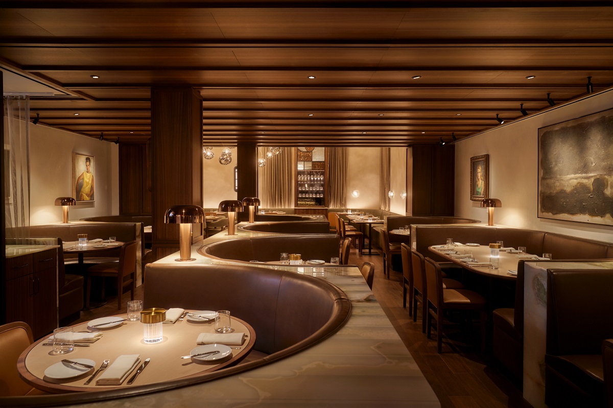
Image credit: Seth Caplan
At Santi, Mocha Mousse presides with its edible quality: smooth leather seating in rich chocolate tones looks like a perfectly poised liquid ganache. The half-moon banquettes, almost poured into place, are edged in a cool green stone – an ever so smooth pairing that creates a delicate contrasting dialogue between touch, sight and feel. In the restaurant setting, with the expected additions of taste and smell, you have an experiential Pentefecta of F&B design – which the ‘delectable’ Mocha-choca-latte tones underpin.
In with the old, in with the new
While Mocha Mousse captures the current global zeitgeist, its shadey sisters have been embraced in contemporary hotel interiors less as a nod to the now, and more as an homage to the past.
Albion Nord’s design for The Belmond Britannic Explorer, the first luxury sleeper train in England and Wales, uses an earthy palette to bridge the gap between carriage interiors and the dynamic landscapes outside. While amber glass, chestnut textiles, and carefully sourced antiques tell a sepia-toned story of the glamorous heritage of roving hotels and British craftsmanship.
-
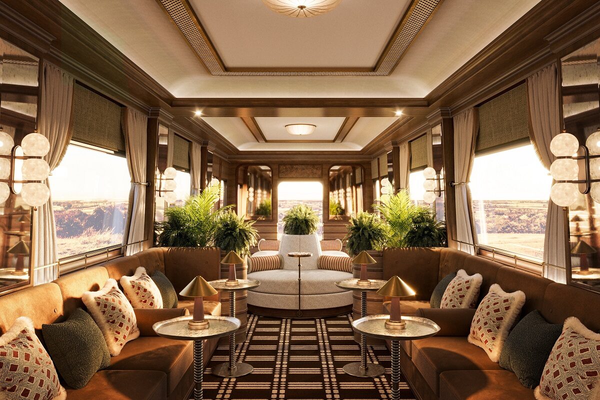
- Image credit: Belmond
-
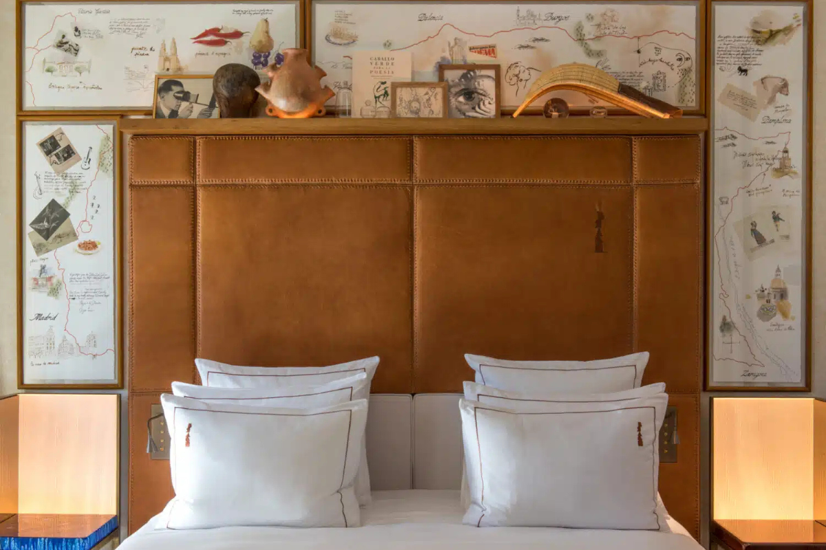
- Image credit: Guillaume de Laubier / Brach Madrid
A similar narrative unfolds at Brach Madrid, a Philippe Starck-universe creation. Here, brown also evokes the romance of vintage. Tan leather bed headboards are framed by personal sketches and aged travel notes from journeys across Spain, while the walls carry browning images of two lovers and their journey – a design gesture weaving together both an intimate tale and the complex history of Franco-era Madrid.
At Brach, Starck’s intention is to leave guests ‘completely in the realm of the emotional’, by tugging on the heart strings of time and an aesthetic sentimentality.
At Hotel Humano, lighter clay tones meet deep red-wine shades, offering warmth balanced with the freshness of the surrounding Mexican landscape. Anticipating the year’s advancing colour trends, the interiors layer dark orange, off-white, and wine-hued textiles with screens, doors, and furniture crafted from tropical woods. Gentle, indirect lighting bathes each space in a soft glow, while fully bespoke, locally made furnishings anchor the design in Oaxaca’s artisanal traditions.
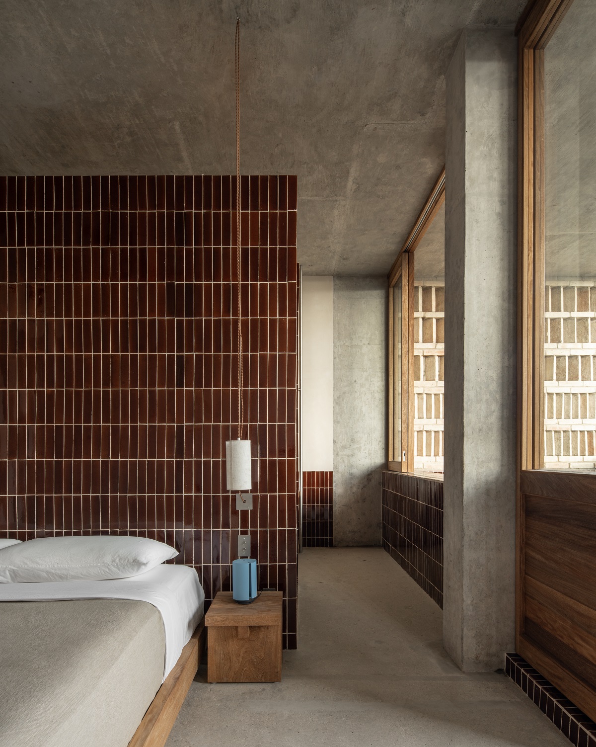
Image credit: Fabian Martínez
The result is a contemporary aesthetic steeped in regional craft – something which reaches way deeper than Mocha Mousse’s mellowness ever could.
Mocha Mousse: a hit or a miss?
Insofar as Mocha Mousse is part of the broader brown spectrum, then it is a hit. Browns in all their nuanced shades have taken hold across hospitality – from windows to walls, upholstery, ceramics, linen, and so on. But if you expected this ‘mellow hue’ to sweep through hotel interiors wholesale, you’d be disappointed.
The truth is, the ‘colour of the year‘ concept rarely suits hospitality: hotels need visual identities that last closer to a decade, and between now and then we’ll have nine other Pantone hues to consider.
Still, Mocha Mousse’s ties to nature, to the organic richness of cocoa and the soil, echo through hospitality spaces in ways that will endure long after Pantone has crowned its next darling. As we move through Q3 and Q4 of 2025, natural tones will keep evolving, shifting toward richer, jewel-like depths. Come October, yellow looks set to take centre stage, bringing a little light into life – from bright, sunlit shades to weathered ochres.
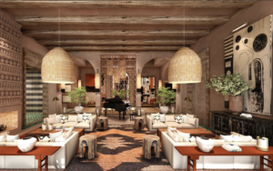
Main image & credit: Hôtel Borsari