The Londoner is “theatricality and intimacy on an extraordinary scale,” said Anna Lambert after she checked in for the night to explore the hotel everyone is talking about on London’s Leicester square. More than a review, Lambert sat down with the mastermind designers, George Yabu and Glenn Pushelberg, Founders of Yabu Pushelberg, to understand the design DNA of the hotel – including the many challenges the team faced along the way…
With the UK premier of Top Gun Maverick taking place a mere 100 metres from its door that evening, arguably there cannot have been a more appropriate time at which to have checked in to the latest ground-breaking (in every sense of the phrase) offering from Edwardian Hotels London, The Londoner.
The glamour and excitement outside on Leicester Square is entirely reflected in the space that greets the guest when they step through the hotel’s doors – something that was always the intention of its designers at Yabu Pushelberg, who describe project in its entirety as, “an ode to the art of performance”.
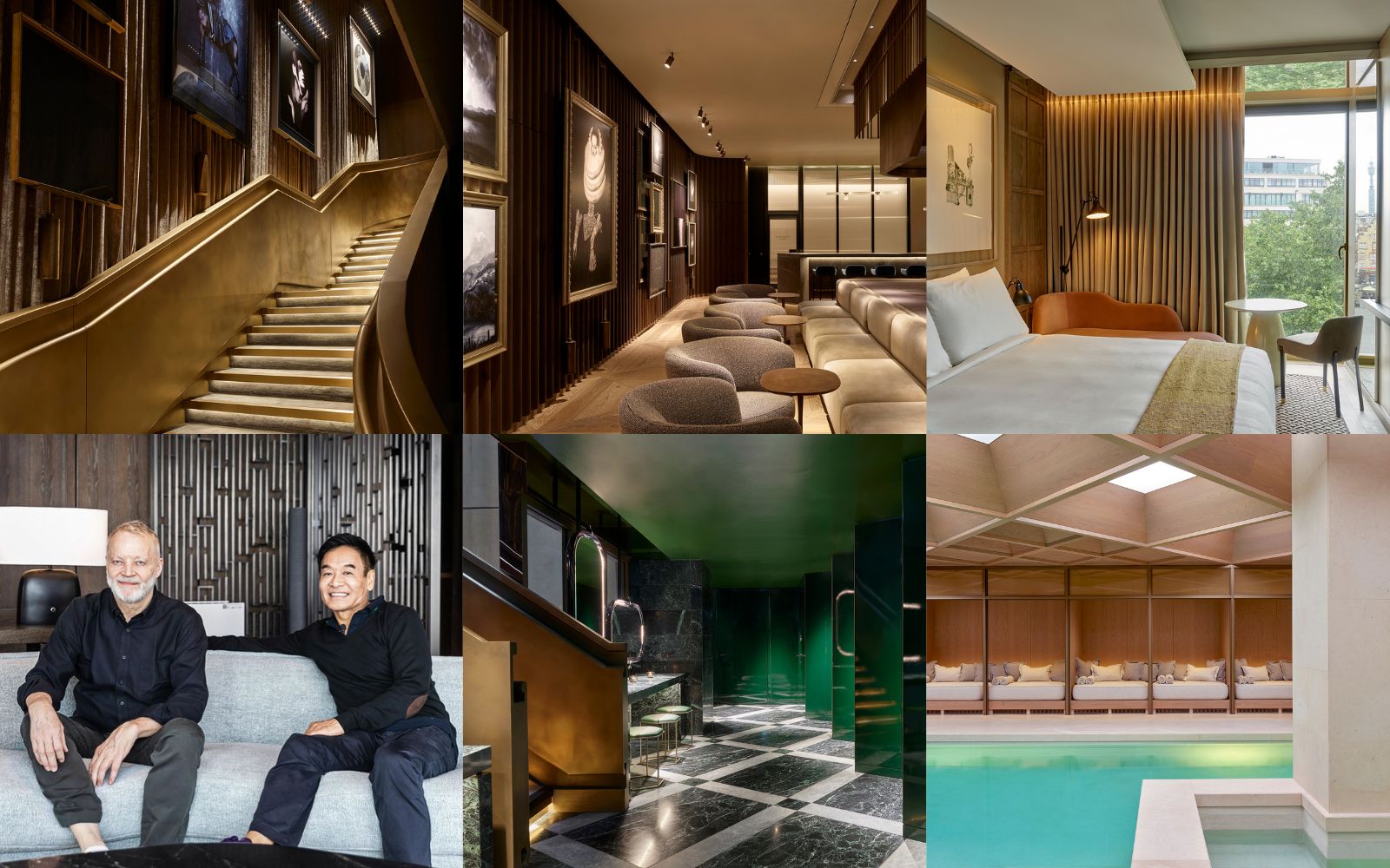
This remarkable, first-of-its-kind super-boutique hotel – 16 storeys high (and deep) and with a staggering 350 rooms – manages to be both spectacular and cocooning at one and the same time, through thoughtful zoning, expertly curated art and a rich yet muted colour palette using – of course – the finest materials. I caught up with the team at Yabu Pushelberg, as well as George Yabu and Glenn Pushelberg themselves, to find out how they succeeded in creating individuality and intimacy, yet on such a jaw-dropping scale, in this unique project.
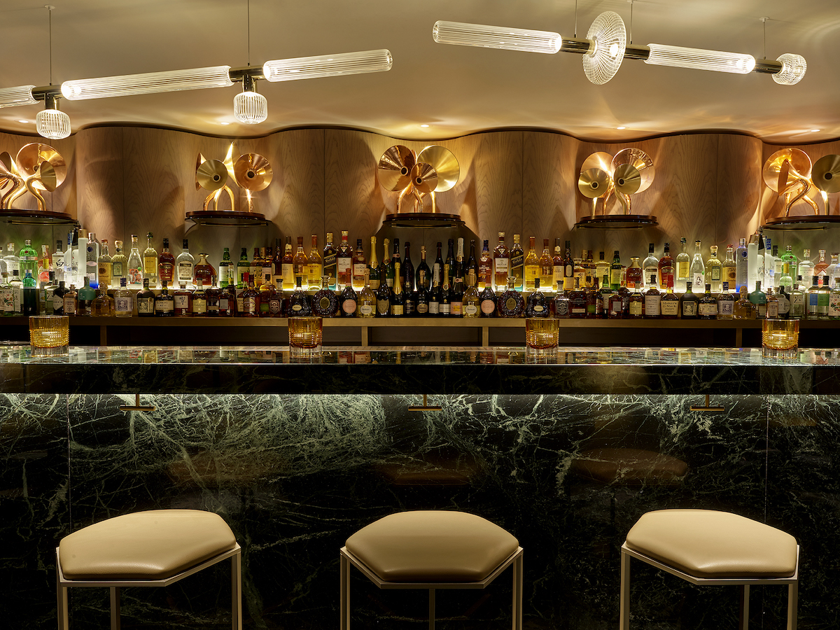
Image credit: Henry Bourne images
Anna Lambert: Tell me about the team involved in creating The Londoner’s design…
Yabu Pushelberg: We are a highly collaborative practice, so although the main team was from our New York studio, the entire project team spanned both of our offices and drew upon the expertise of all of our specialty teams too: in lighting, styling, industrial design, textiles. The main interiors team is about 10-12 people, but when we consider all the other hands that touched the project, it’s a bigger number. For us, this way of working is really exciting and is at the core of our practice. All these varying perspectives and areas of expertise really come through in the finished design. It’s extremely textured and thoughtful. No detail was left untouched.
“The financial risk of that endeavour alone really bound us all together.” – Yabu Pushelberg.
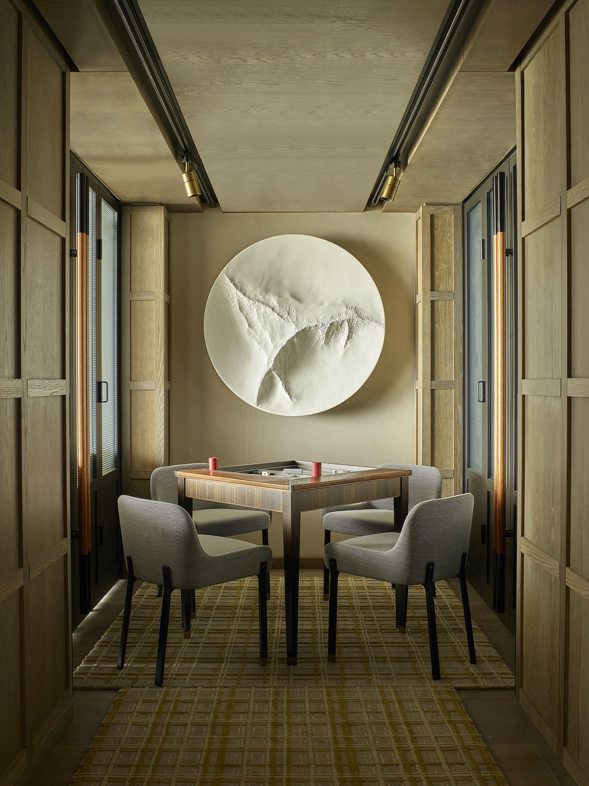
Image credit: Henry Bourne images
AL: Are you able to tell me about the budget, and any particular challenges in design terms that the site posed?
YP: We can’t speak about budget for confidentiality reasons, of course, but a lot of factors create an exceptional project. Our client took a risk on this project, excavating many levels below ground – and in the heart of London! – in order to accommodate an expanded amenity offering [multiple restaurants and lounges, a rooftop bar and underground spa with swimming pool and a vast ballroom are just some of those amenities]. The financial risk of that endeavour alone really bound us all together. We were emboldened by their commitment. This is a new type of luxury hotel for London and also a legacy project for Edwardian London Hotels. The Client treated us as true partners in bringing this vision to life, so it was of the upmost importance that we delivered.
AL How did you come up with the overall concept for the hotel?
George Yabu: The hotel was designed to play into the roots of Leicester Square as London’s historic theatre district. We created layers of programming up into the sky and deep into the earth that emphasise this extraverted, alluring, playful voice.
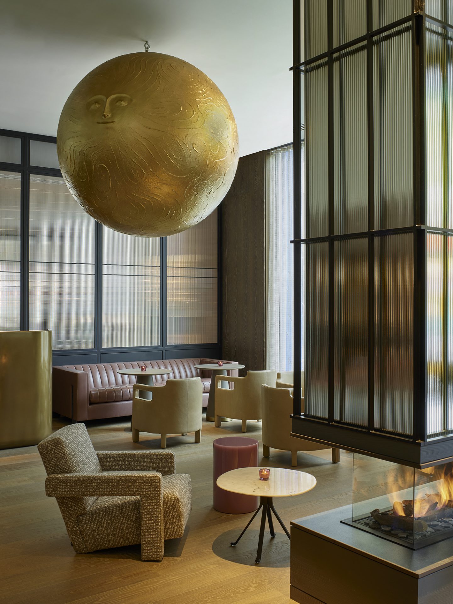
AL: That sense of playfulness, theatricality and largesse comes across from the get-go: at check-in you’re greeted by the sight of Andrew Rae’s giant metallic moonhead, floating benevolently overhead, and I loved, too, how the lobby bar is like a stage in itself, with the guests as ‘living theatre’. From that lobby to the roof terrace bar 8 at the top of its building, with its extraordinary sculptural rope installation, there’s a tremendous energy to the place.
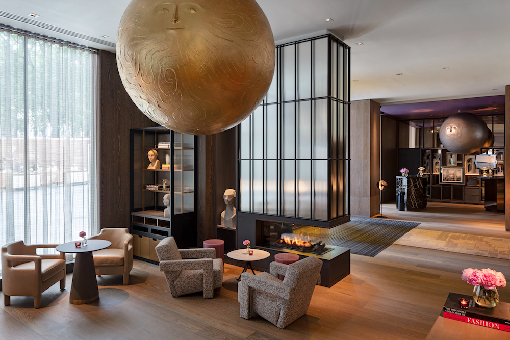
Image credit: Andrew Beasley
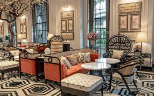
Glenn Pushelberg: The hotel is an homage to performance, with each public space imbued with the character of someone essential for bringing a production to life. For example, Whitcomb’s all day dining space is an ode to the screenwriter. Its poetically layered design gives the space character and a unique storyline, with specific decorative details, such as the abundant harvest table, introducing elements of whimsy and fantasy.
AL: I appreciated the flexibility of Whitcomb’s as a space, too – it had a totally different vibe at breakfast, when those harvest tables you mention were laden buffet-style, to that in the evening when the tables were pared back and the portraits and sculptures (especially the wires faces visible on the ceiling) really came into their own. There’s so much, then, in terms of service and experience for a guest at The Londoner to enjoy, but what for YP is the most important aspect of this sort of project?
Glenn Pushelberg: It was most important to create somewhere exuberant, a joyful expression of not only its location but also of its cultural context. The history of London theatre provides such rich material. We wanted to create an experience with substance that was thoughtful, transcending the moment through its design.
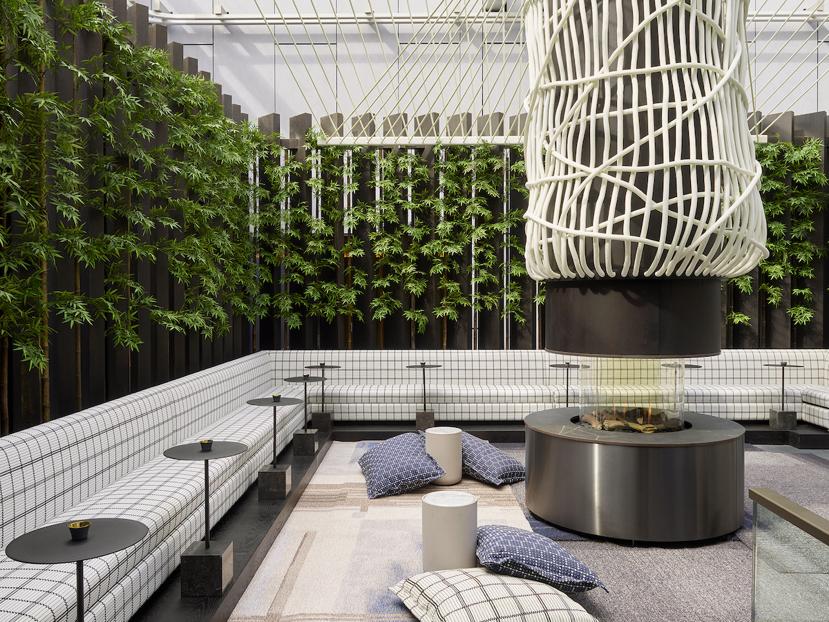
Image credit: Henry Bourne images
AL: And you’ve certainly achieved it. The Residence, for me, encapsulates that sense of thoughtful design. Yes, it’s an intimate, club-like space just for hotel guests – somewhere they can relax, socialise do business if they want to – but then, as part of it, you’ve got the Y Bar, which is neutral by day, but with those amazing symbols and characters on the walls, it really becomes visible at night. It’s all stimulating without being too much. Even in the larger public spaces, that sense of intimacy and ‘one-off’-ness is always there. What techniques did you utilise to ensure that, despite its scale, The Londoner still has that enveloping, intimate feel?
George Yabu: We broke the public spaces into multiple, smaller interconnected spaces, giving each area individual personalities while creating connectivity through one overall design narrative. We leaned on seduction as a device to draw visitors through the giant hotel. Through carefully curated view corridors, for example, there is a sense of veiling and unveiling, so that one can take in and absorb all the details. There is a real feeling of discovery as you wander through all the chambers – like leisurely book chapters instead of a quick synopsis of the overall hotel narrative.
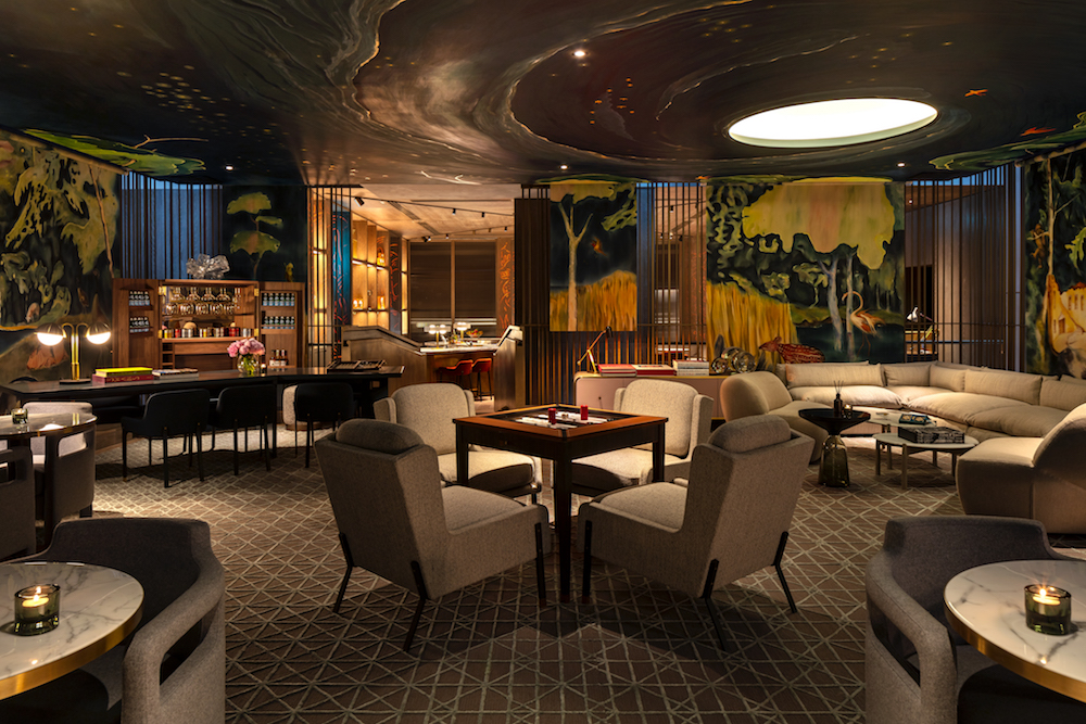
Image credit: Andrew Beasley
AL: Yes, and it’s the painstaking attention to detail that’s especially impressive and keeps guests guessing as to what they’ll discover next…
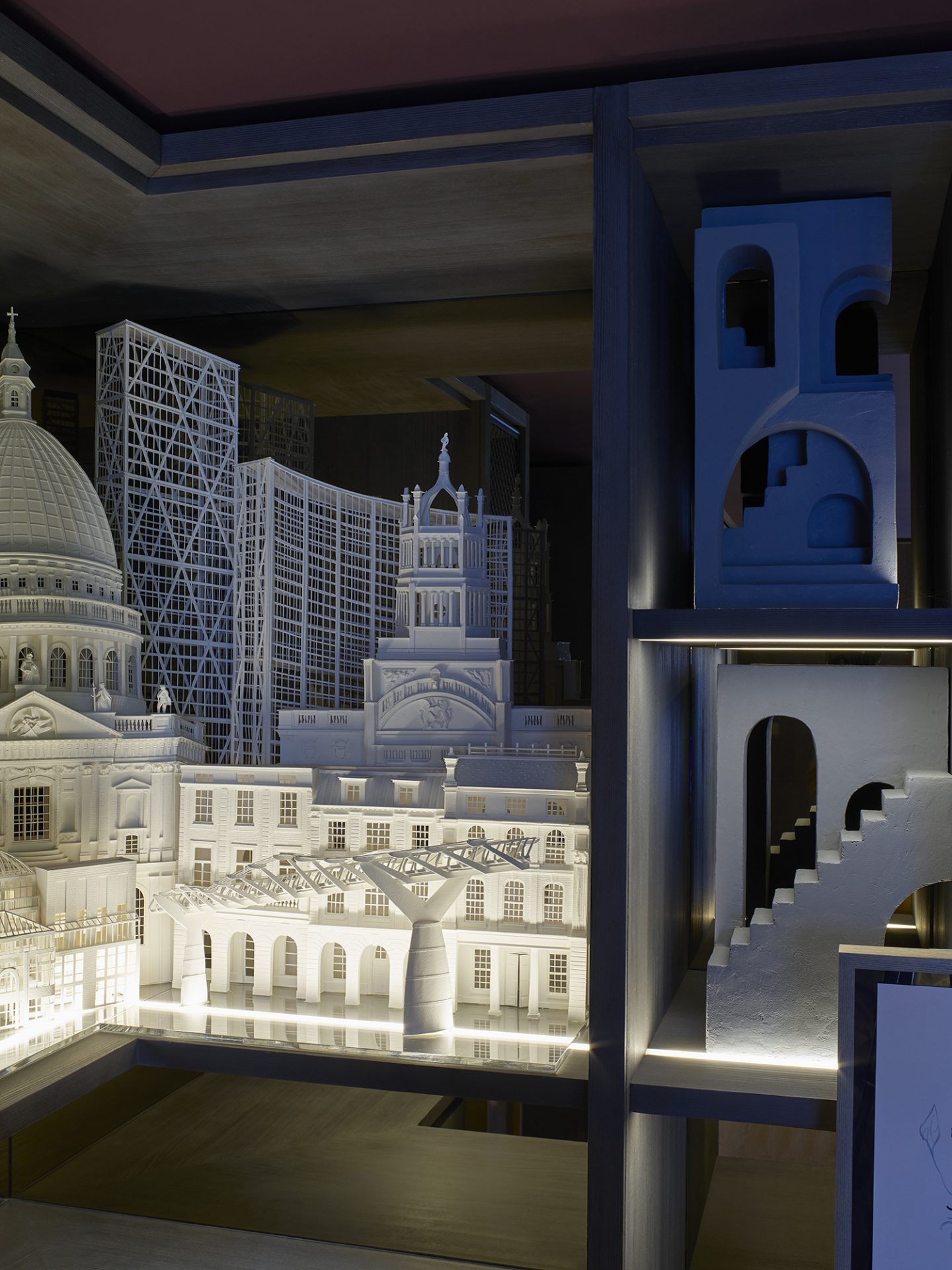
Glenn Pushelberg: One of the things we cherish most about the Londoner is the incredible layer of styling we were able to apply to each and every space. Our decorative arts team touches on each of our projects, however the Londoner served as a one-of-a-kind canvas to fully explore our stylistic creativity. From custom gramophones in the club to playful oversized slices of fruit carved from colourful stone in the spa, this final styling layer is what really brings each space to life with an exceptionally unique personality and subsequently [for the guest] a unique experience.
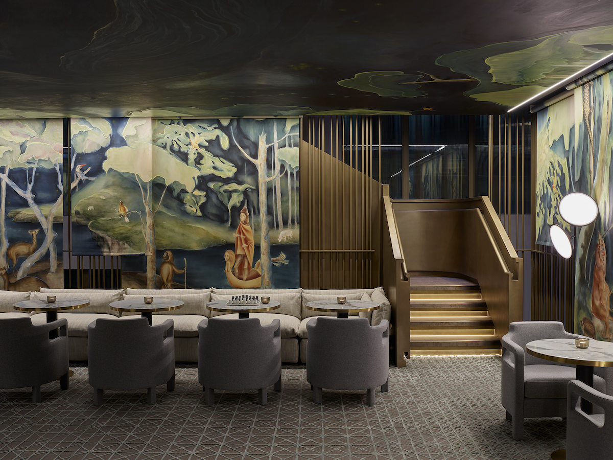
Image credit: Henry Bourne images
AL: And of course as well as styling, so much of the ambience is achieved via your choice of colour palette and materials – what was your primary aim in selecting them?
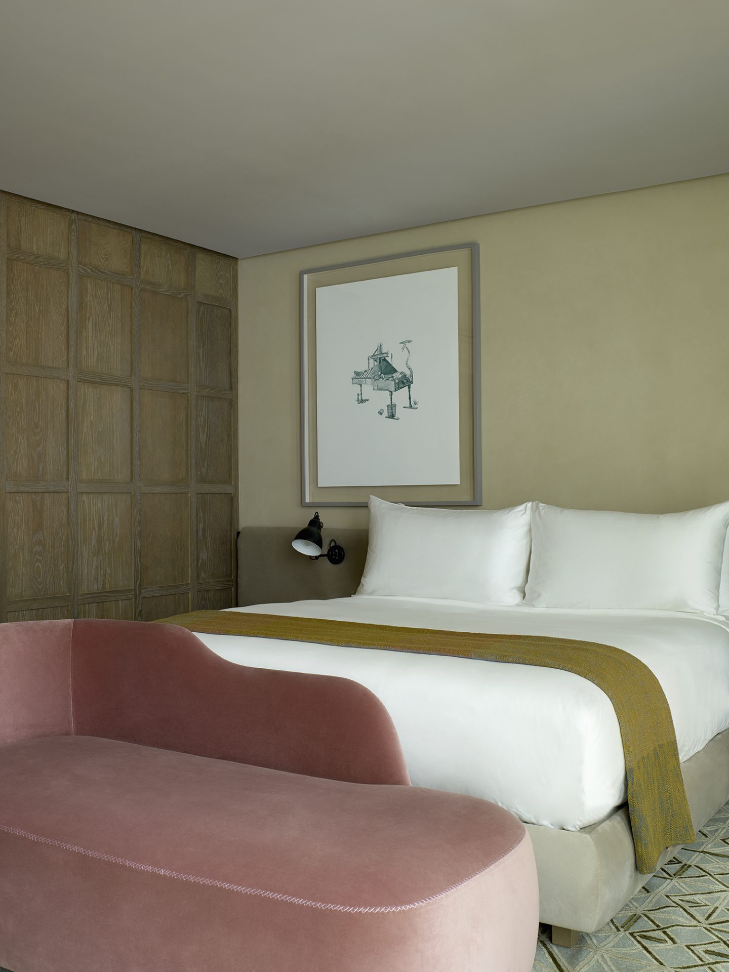
George Yabu: Materiality was essential to give each space a distinctive energy. The club features vivacious yellows while the whiskey bar is wrapped entirely in mirror, creating an intimate jewel box of boozy treasures. The guestrooms take on a neutral palette to invite rest and relaxation. They feature bespoke works of art that serve as headboards and depict scenes from nature to enhance comfort and introduce a more personal feel to each private space.
AL: Yes, certainly the look and feel of the guestroom I stayed in couldn’t have been more conducive to relaxation – understated opulence meets supreme comfort would be how I’d describe it. I appreciated the attention to detail – that handles on the wardrobes that gave out a pleasing ‘ting’ when you touched them; the sense that everything was beautifully finished. As a guest, the room was my space and mine alone, and as such it was special to me. You’ve got a lot of space to choose from, I know, but which areas of The Londoner give you special satisfaction and why?
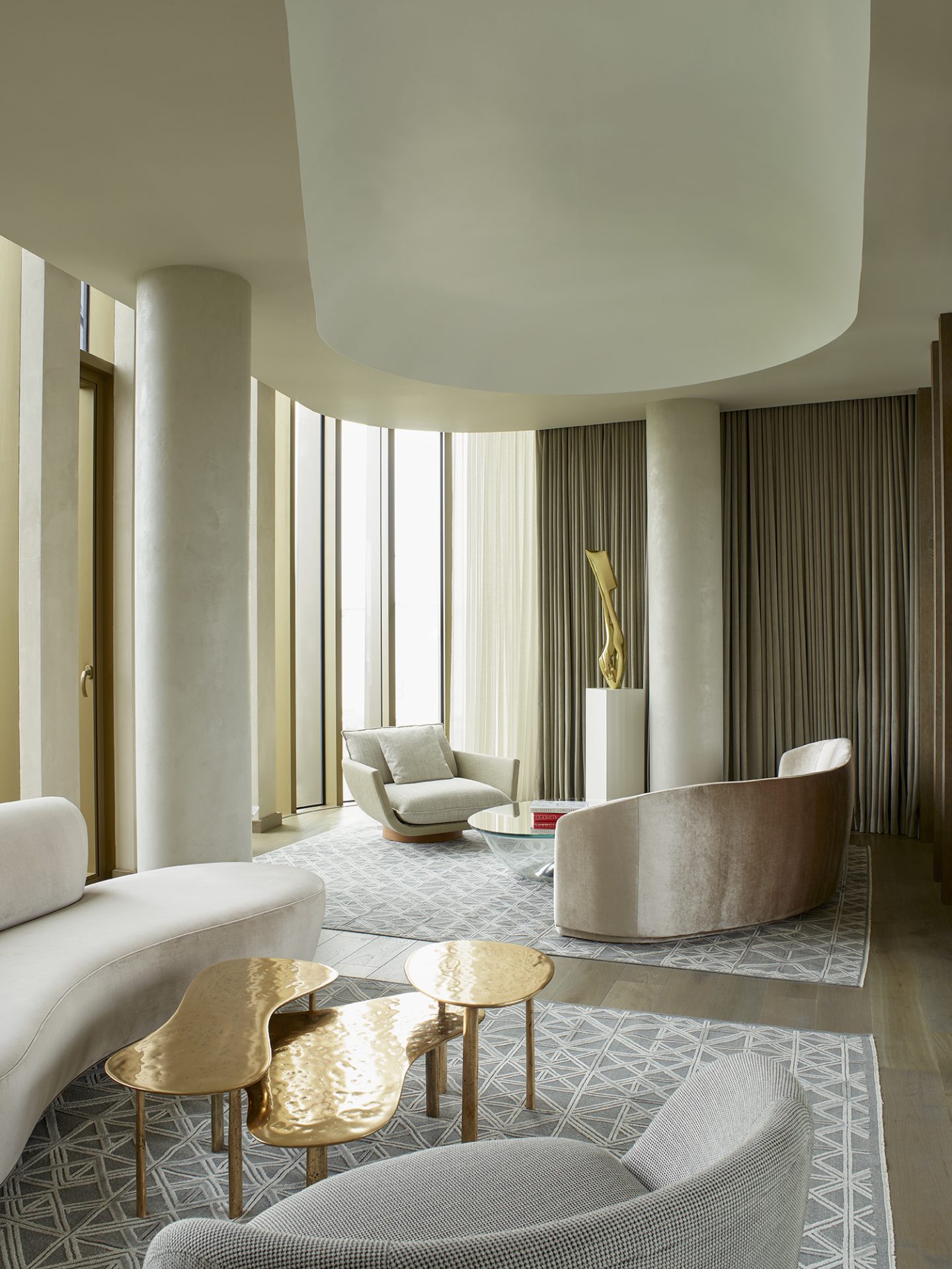
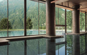
George Yabu: The pool level is spectacular. It’s in one of the basement levels, but it feels like its above ground – magical! The Presidential Suite is one of the quirkiest spaces in the hotel. It’s playful but still elegant and refined. You can really feel the theatricality of The Londoner here.
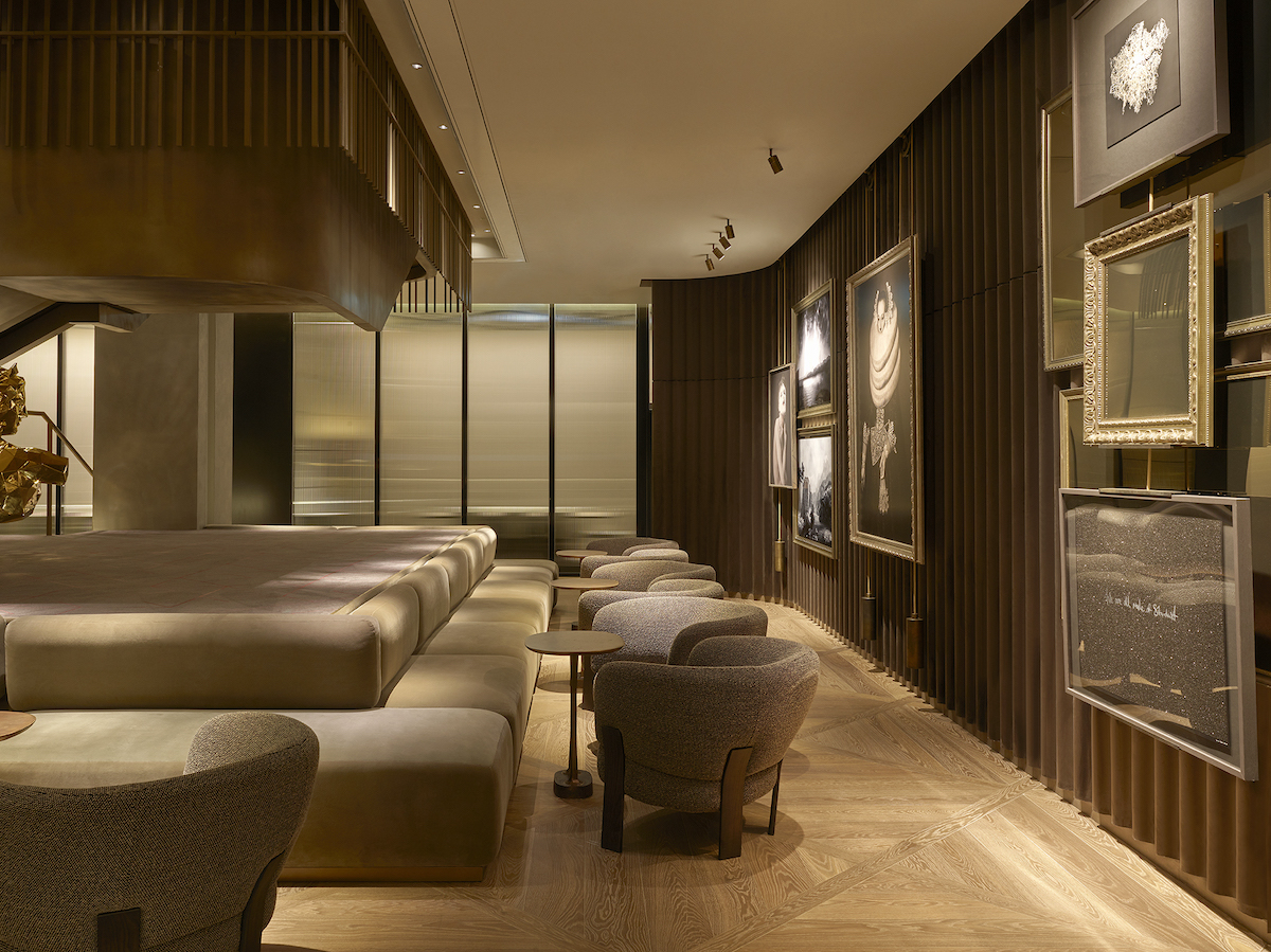
Image credit: Henry Bourne images
Glenn Pushelberg: I love the cocktail bar. The space is very small and intimate, completely covered in wood panel. Hidden within the panels is a lighting effect that looks like graffiti. It’s crazy artistic.. it doesn’t ‘fit the mould’ and completely transforms from day to night. In my opinion it’s the best room in the hotel. Generally, all the food + beverage spaces within The Londoner are quite special. There the hidden whiskey room that George mentioned – I won’t tell you where it is – that is worth seeking out. It has mirrored walls and sumptuous green velvet. Really fun and unexpected.
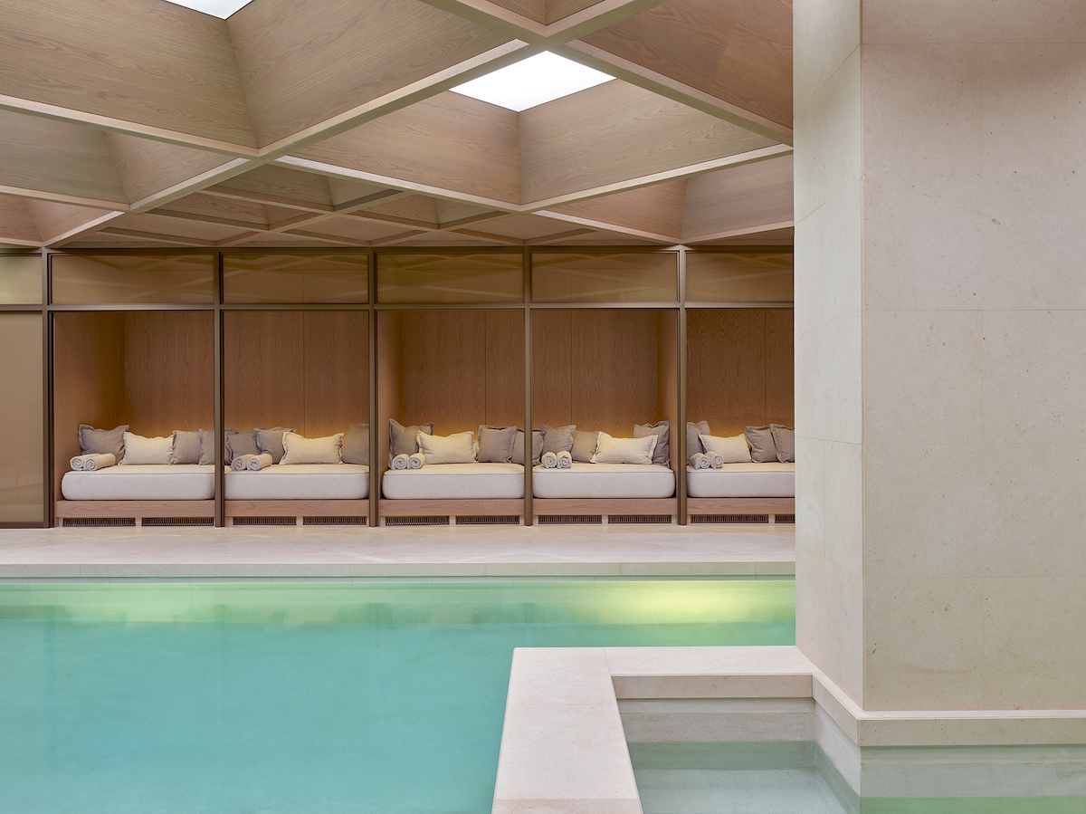
Image credit: Henry Bourne images
AL: Yes! I found it: a discreet door that led to a glamorous, theatrical, unexpected sanctuary. And I guess that’s a phrase that could be used to define The Londoner as a whole.
The Londoner’s arrival is more than just another luxury hotel in the capital. It’s meaningful design and effortless style has the power to shake up – even transform – the local neighbourhood that has for years been considered a tourist trap.
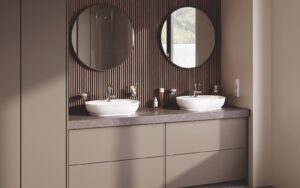
> Since you’re here, why not read more about how The Londoner created a new dialogue between design & wellness, or a case study on how the bathrooms were designed?
Main image credit: Yabu Pushelberg/Henry Bourne images


