Launching today, Harlequin x Henry Holland is a collaboration that combines Harlequin’s mastery of colour with Henry Holland’s signature style in clay work to create a cool, effortlessly curated collection of fabric and wallpaper that sits at the intersection of ceramics and interiors…
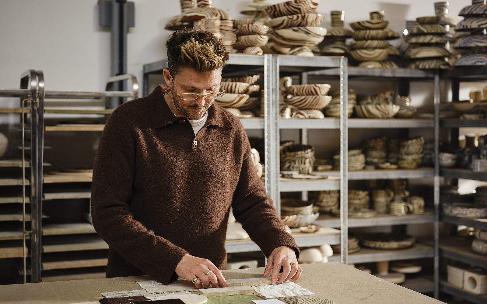
This collaborative collection reveals Hollands’s work, combined with Harlequin’s vision for empowered home interiors rooted in character and coloured for living. Holland’s love of Nerikomi, the Japanese pottery technique, and a dive into the extensive Harlequin archive for hand-selected designs has culminated in a textural collection for interiors.
Tones derived from grounded, chocolatey hues pervade the collection for designs that feel artisanal, organic and effortless in equal measure. Translating Henry’s work in ways not seen before, statement wallpapers and textural fabrics for drapery and upholstery cocoon interiors in organic layers of design.
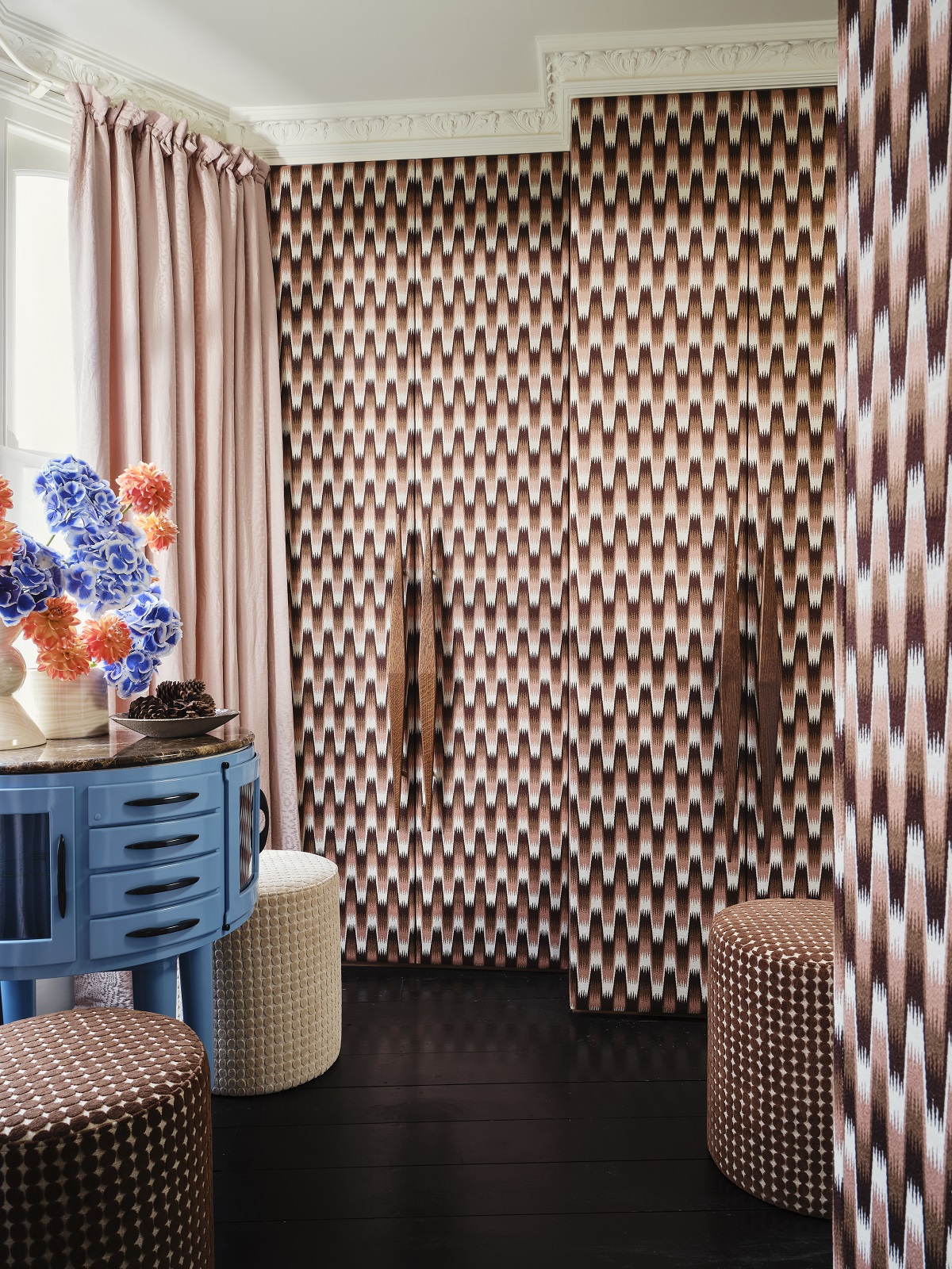
Image credit: Harlequin
Southborough is an embroidered chevron ombre that harnesses the tones found in Holland’s clay work. The design cocoons interiors in deepening shades of Rose, Chocolate, Matcha and Pacific. The colours intensify throughout the ombre, giving new meaning to this mesmerising stepped chevron design.
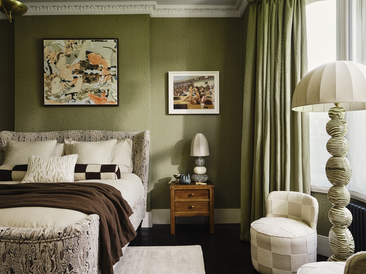
Image credit: Harlequin
Elsworthy is a moiré-style wallpaper, with a silk emboss, which gives the feeling of fabric on the wall. Subtle and organic formations of the moiré’s character are revealed in this design.
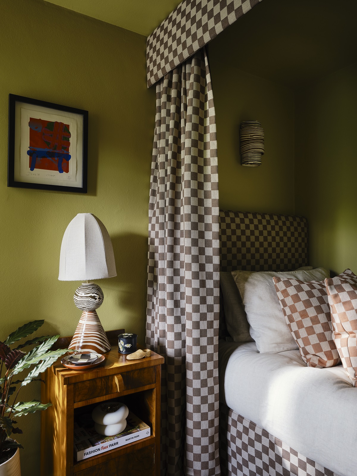
Checkerboard designs don’t come more perfectly formed than Blenets Check Mini. This is a weave with design intention, a grounding coordinate and a statement in its own right. Interlocking yarns reveal tightly woven blocks of colour in a checkerboard sequence. Structured and scaled, every colourway of Blenets Check Mini feels earthy yet elevated.
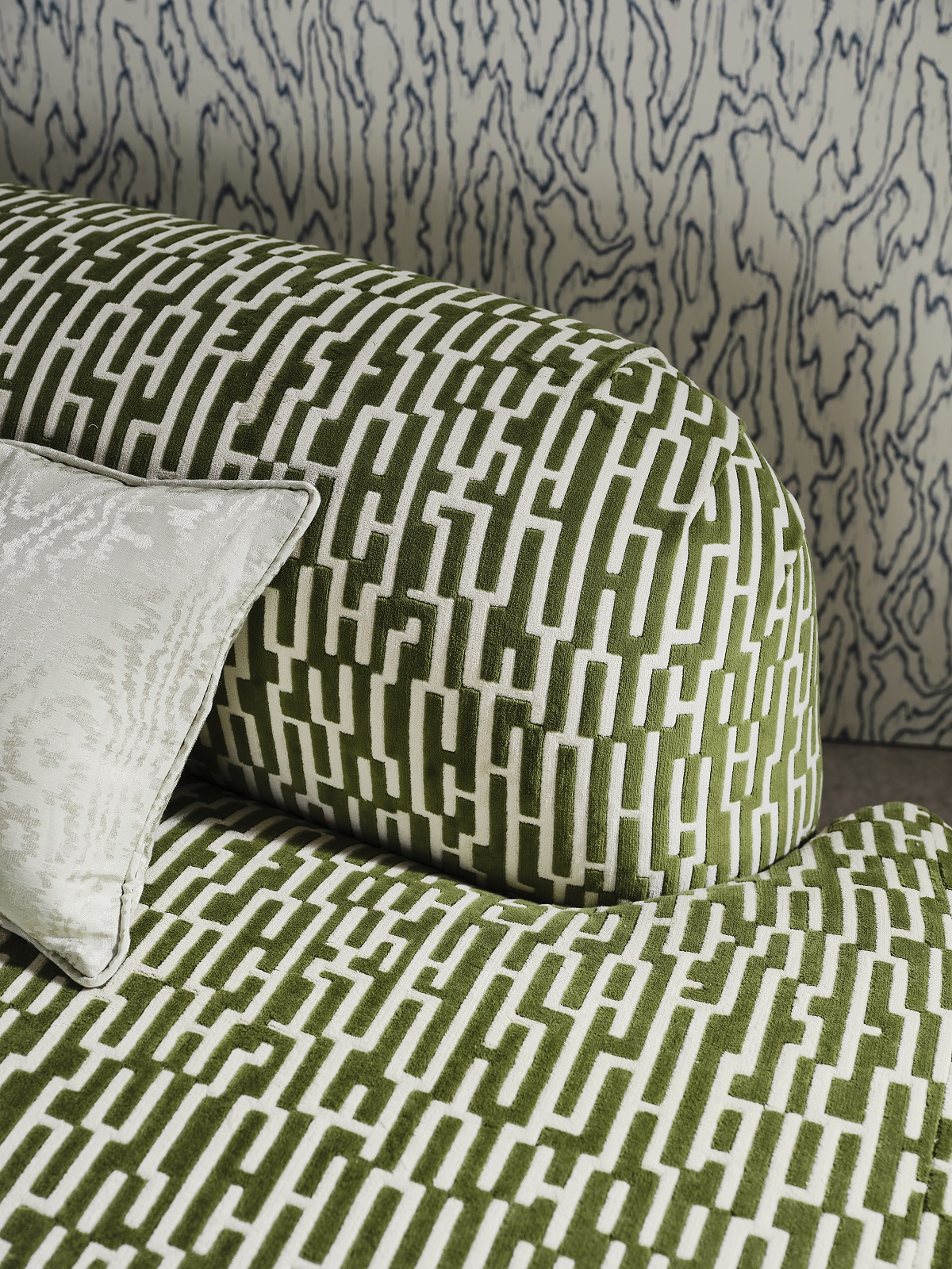
And finally, putting its stamp on the collection, Great Hey is a ladder design in Jacquard cotton velvet, which smartly places Holland’s signature ‘h’ in formation. the design appears almost hidden within the cloth.
“A great colour palette mixes well between tones and shades within a cohesive story,” commented Holland. ” This collection’s palette can be interpreted in a multitude of ways for people to curate looks that reflect who they are… this synthesis of colour has universal, useable appeal. I can’t wait to see how the collection is applied in interiors”.
Sanderson is one of our Recommended Suppliers and regularly features in our Supplier News section of the website. If you are interested in becoming one of our Recommended Suppliers, please email Katy Phillips.
Main image credit: Harlequin


