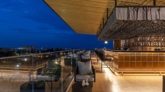
One of the perks of my job is being able to see the progression of hotels from mere ideas and drawings right through to the bricks and mortar of a completed project. And one thing that always fascinates me is how much (and sometimes how little) the finished product can differ from the concept first visualised by designers and architects.
So, it’s a welcome treat to be given a guided tour of a hotel and its eventual form by one of the people commissioned to design it — as I recently got to do with Dexter Moren of the eponymous firm of associates at the Hilton London Bankside.
Located in what is now one of the most fashionable and ‘trendy’ areas of the capital, this five-star property built on the site of a former banknote recycling shed might never have come to fruition. Bankside’s industrial past and ‘rustic’ character meant that Dexter Moren Associates (DMA) and design firm Twenty2Degrees were originally briefed to create a mixed development combining a budget hotel, conference and leisure facilities — something more befitting of the surroundings at the time; as ‘south of the river wasn’t the place for five-star properties at the time’, Dexter reminds me.
Fast forward a decade and then some — the ever-growing reputation of The Globe, the Tate Modern and more recently The Shard — and throw in the considerable money spent on regenerating the area; the brief was clearly changed to combine those separate ‘sectors’ into one urban-inspired and luxurious property. Thankfully, for those of us now lucky enough to see the end product first-hand, the Hilton group agreed to back developers Splendid Hotels. And the rest, as they say, is history…
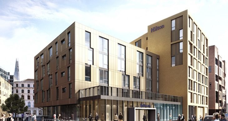
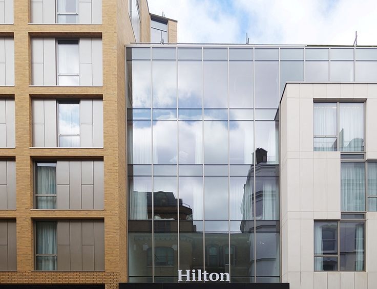
Off the bat, it’s clear to see the exterior of the hotel is heavily inspired by the cutting edge, artistic modernity of its locale. Dexter explains to me the rationale behind the separate but thematically-connected facades of the two adjoining elements of the building and their differing heights (restrictions on building any higher than current and proposed neighbours meant one element had to be lower than the other), both use a striking combination of traditional brickwork and metallic cladding, all of which go to fit in with the surrounding buildings.
Arriving at the hotel via the porte-cochere is the perfect segue between the exterior and interior, with its stunning pressed tinwork on the ceiling and dazzling display of bespoke industrial lights designed by DMA and Twenty2Degrees — hinting at the fact that the inside will continue the ‘design voice’ proudly expressed on the outside. Likewise, the lobby area echoes the clearly defined theme running throughout and, as with so many of the hotel’s public spaces, particularly impressive here is the lighting fixture specifically designed for the high-ceilinged reception area.
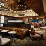
Again, I’m struck by the delicate balance of industrial chic and clean-lined elegance that has been achieved. Also, unlike many hotels I’ve visited in the past, the executive lounge is situated on the ground floor and while still retaining a sumptuous feel and serene atmosphere — as well as a stunning light well letting in natural light — it has been built to back onto the kitchen facilities for the ease of access for staff, who have a centralised point of entry for each food and beverage outlet thanks to clever design.
- The industrial aesthetic of the lobby
- Some of the artwork scattered around the hotel
- The stunning interiors of the executive lounge (Photos: London Hilton Bankside)
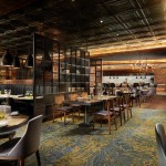
Little nods to the Bankside history run throughout the design of the hotel’s F&B offerings too; namely the Distillery Bar and the restaurant OXBO. The former is a destination cocktail venue with old world charm, the name of which is a reference to the Stephenson & Howell Standard Works distillery that occupied part of the site during the 1800s. The latter has been designed with both exclusivity and functionality in mind – perforated steel screens provide privacy in the open space as well as being strategically positioned to allow for smaller groups of guests to ensure the restaurant retains a ‘lively’ vibe — being both the dining space for hotel guests and a walk-in option for non-guests.
Many of the decorative items, such as the crystal decanters have been sourced from local markets and antiques dealers in Bermondsey and Spitalfields and are combined to give the space a light-hearted, authentic feel. The lighting is a bespoke design for the restaurant and was manufactured by British lighting company Northern Lights and Danish company Fransden Project. The restaurant’s wide range of cuisine is hinted at by the ‘Mounted Not Stuffed’ artwork by David Farrer, a cornucopia of papier-mâché animal heads scattered throughout the restaurant.
It’s here I can make a quick aside to the fantastic Penny Wall in the bar, designed to reflect the aforementioned use of the site as a banknote warehouse, which contains nearly 17,000 hand-applied pennies and sits impressively on a wall that had to be reinforced to take the extra weight. With coins dating from 1864 and an opportunity for civic leaders, dignitaries and the local community to add a penny to the wall themselves, it’s the hotel fitting into its surroundings in a very real and actionable way.
- The clean-line elegance of The Distillery
- Detail of David Farrer’s artwork in OXBO
- OXBO Restaurant’s excellent use of materials to create space (Photos: London Hilton Bankside)
Moving upstairs and the guestrooms have not been exempted from the industrial, London aesthetic. The corridor carpets, with their brown and green hues and again designed by Twenty2Degrees and DMA, were commissioned to reflect the ‘ebb and flow’ of the River Thames just a stone’s throw away. With the guestroom materials including concrete-effect wall coverings and limed timber, these sharp materials are contrasted by sleek Italian-style furniture and upholstery as well as winged headboards that create the warmth required in luxurious rooms. Bold greys dominate in the bathrooms – floor and half-wall tiles combine with the pale travertine tiling on the rest of the walls to create a clean, clinical feel.
And one of the elements of room design that I found most interesting and useful was the separate entrance area for ‘adjoining’ rooms — rather than an adjoining entrance built into the wall of each room, both rooms have an individual front door behind a centralised front door to create a ‘hallway’ of sorts. As Dexter pointed out, this helps with noise control between the rooms and offers an added layer of privacy — especially for those travelling with families.
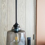
- Pendant lighting and reading light built into the bedroom wall
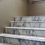
- Steps to the subterranean Ballroom
But the jewel in the crown of this slick, stylish hotel is the grand ballroom on the sub-ground level. The breath-taking space is something the hotel (and Dexter himself) are very proud of — and rightly so. With a separate entrance built at the rear of the hotel building to allow event or function attendees to arrive separately from the hullabaloo of the main entrance, the ballroom is accessed in grand style by a sweeping staircase with marble treads, brass handrail and smoked glass balustrade.
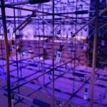
Aside from the sheer scale of the space, the luxury and attention to detail marks this as a wonderfully unique location in the heart of the capital. It is designed to be flexible, with as little or as much space an event may require on offer as well as being able to open out to include balcony areas and the lobby for arrivals or break-outs. The dark walls are complemented by a pale carpet and subtly patterned wall-covering. For me, however, the centrepiece is the inclusion of ultra-modern chandeliers whose individual, interlinked cubed LED lights are a work of ingenuity and beauty.
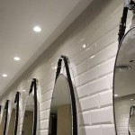
- Mirror detail in the bathrooms
- The quirky ‘Urban Fox’ artwork in the bedrooms
- LED, ultra-modern chandeliers above the Ballroom (Photos: dextermoren.com)
And that’s the best way to summarise the Hilton London Bankside — a combination of brilliant and beautiful design. From the use of space – like the well-equipped gym and 17-metre swimming pool hidden away underground – to the bold and memorable interiors, Dexter Moren’s team and Twenty2Degrees have created a property with a clear and cemented identity. The brief to create a luxurious hotel in this part of London has been met and exceeded. But it’s in the little touches that this project truly shines. From the playful ‘Urban Fox’ motif referenced subtly more than 100 times throughout the hotel including in the bedrooms — in reference to a fox that would visit the site during construction — to the work of young British artists scattered throughout the property in a tribute to the Tate Modern around the corner.
A Hilton-branded hotel, which has more in common with a boutique offering than a cookie-cutter repeat, which from pavement to bedroom makes it very clear that it ‘belongs’ in its up-and-coming locale south of the Thames, that keeps luxury prevalent throughout and is designed with detail at the forefront? A project I never thought I’d see — but thanks to Dexter and the work of his team, the reality is better than the imaginings of this humble journalist. Bravo…
Words by Daniel Fountain. Based on a tour in November, 2015
www.hilton.com/hilton-london-bankside

