Stepping out of the underground and into the concrete oasis of calm that is Buckle Street Studios by Locke felt like a great way to combine a busy London trip with experiencing the hybrid design concept of flexible hotel space first hand – all those buzzwords made tangible. Pauline Brettell writes…
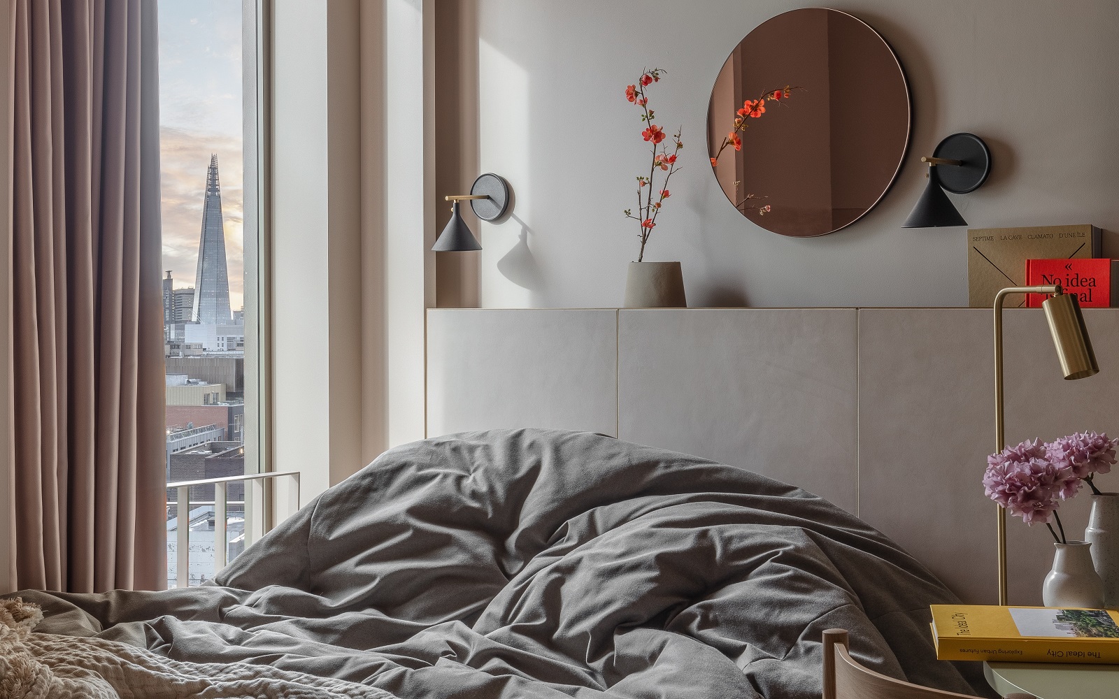
Located in Aldgate, East London, you already feel more like a local and less like a tourist by opting for a studio space in The Buckle Street Studios, and that is precisely the point. The small-but-perfectly-formed studio spaces have been designed by the creative talent of Grzywinski + Pons, to provide visitors with that hybrid mix of hotel, home and studio that allow you to work, play and relax in a space that you can make your own. There is an immediate sense of this being a place to lay your hat.
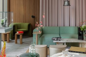
Image credit: Buckle Street Studios / Grzywinski + Pons / Nicholas Worleyrs
Stepping off the busy London street and into the public areas, Buckle Street Studios does feel more curated gallery than hotel lobby, with light flooding in through industrial-sized glass frontage, well-designed corners, hard edges and soft seating, along with a minimalist concept store style display that catches the eye, and piques interest. The Makers Space in the lobby is a feature that underlines the brand ethos of locality of space, with the makers on display all predominantly based in and around the area. The dramatic suspended floral arrangement is a focal point that draws your attention up and creates an interesting contrast to the hard edges of the exposed structure. Again, these spaces, despite the double volume, have a sense of intimacy and you do feel like you can step in and rearrange the seating to suit your purpose, from quiet conversation to a more formal meeting.
“Buckle Street Studios is the cherry on top of an exceptionally busy year of new openings across Europe for Locke. The project is another masterstroke in design by Grzywinski+Pons, and an example of how hotels as spaces are evolving to become increasingly hybrid and versatile,” said Eric Jafari, Chief Development Officer and Creative Director, Locke. “The concept store and Makers Space is a particularly exciting project for us, and we hope that it will enable guests and locals to discover some of the most talented emerging creatives in the UK.”
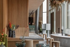
Image credit: Buckle Street Studios / Grzywinski + Pons / Nicholas Worleyrs
Moving from the public space into the lift, again there is the sense of location and community in the details, with a notice for a yoga class in the evening, and the monthly book club meeting on the mezzanine. It all goes back to the brand notion of ‘finding your tribe’, of community and connection, an antidote to the anonymity of travel, and an answer to the flexibility afforded by remote working.
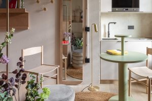
Image credit: Buckle Street Studios / Grzywinski + Pons / Nicholas Worleyrs
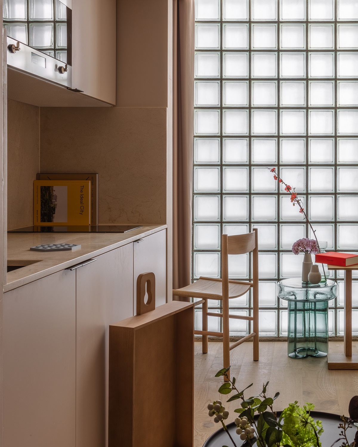
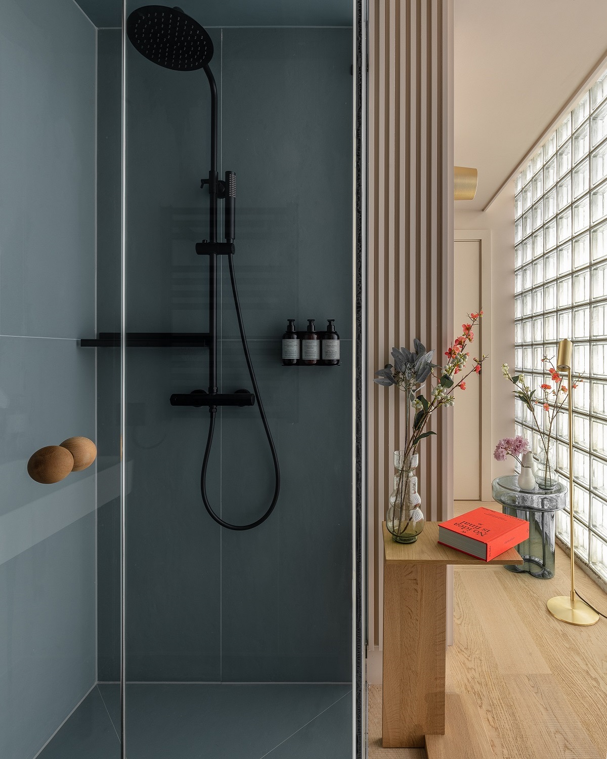
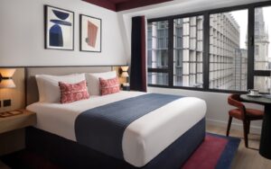
Opening the door into the studio, home for the night, everything was in place for a comfortable working visit. There is a suggestion of the Le Corbusier ethos of a space being ‘a machine for living in’ in the studios, with functionality being at the core of the design. Space is maximised without being crowded, and for this to be achieved it must work hard below the surfaces. In fact, the surfaces within the design create an interesting juxtaposition with a lot of hard edged concrete housed within the unapologetically industrial exterior, all softened with round upholstered edges in soft calm colours and velvety textures.
With just enough time to offload my suitcase and, for those more organised than me, to make use of the ample storage to hang clothes and stash a bag, I was able to make myself a strong coffee while checking my emails, all while admiring the urban landscape view from the window. Again, that trademark mix of functionality and comfort with practical surfaces and economic shapes all softened with softer notes of luxury in the pared down palette of soft neutrals and sophisticated pastels.
Lighting is given the same attention as the furniture and fittings, with bespoke details designed to maximise the space along with its multi-functionality. In a space that is required to be bedroom, boardroom and living room, lighting needs to address all of these functions, and the plan within the studio space maximised natural light, something often overlooked in hotel design, while including the more focussed and functional options in a user-friendly format.
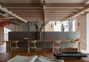
Image credit: Buckle Street Studios / Grzywinski + Pons / Nicholas Worleyrs
While there is ample work space within the studios, should you get tired of your own company, there is of course the more communal option in the public and mezzanine area downstairs. This area feels like an extension of the private studio space, with the same quiet and understated scheme, along with all the facilities required for a functional workspace – and of course there is that great display of biophilic glory in the rafters to calm your senses and connect you to nature despite being in the centre of the city.
With Buckle Street being more apartment block than hotel, the hotel offering in Locke Leman is adjacent with its shared facilities available to all guests. If you aren’t staying long enough to stock up the fridge in your studio or simply need some refreshment and respite from your routine, The Shaman coffee shop and restaurant is perfect for a flat white and croissant en-route to the station. If you are concerned about not getting your step count up to speed, not usually a problem for visitors to London, there is also a communal workout space which guests at the studios have access to.
Finally, going back to that buzzword of ‘hybrid design’ and the concept of flexible hotel space that is being discussed across the hotel design boards at the moment – Buckle Street Studio delivers on all fronts. It is that merging of function and blurring of lines on offer here that presents guests with some very stylish and contemporary solutions in the heart of London.
Main image credit: Buckle Street Studios / Grzywinski + Pons / Nicholas Worleyrs


