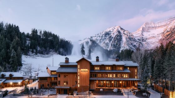
Not a Trump Tower. A small building by Chicago’s standards, only 27 storeys high. Small but almost perfectly formed. Perhaps the ‘lightning streak’ of yellow down the outside is not the most successful feature I have seen on a building and the signage is definitely one sided. Location next to the El might seem odd, but as with the Marriott in London’s Docklands that nestles against the DLR, the train is not evident inside and its proximity is like a transfusion line from Chicago’s main blood stream. The life it promises is made good inside the hotel which is one of the most beautifully designed modern hotels I have seen in the US. I enjoyed Hotel 1000 in Seattle, and the Kimpton’s Alexis across the road but this one is better – its advantage being that it was purpose built. Here the building planning works a dream.
The location may not be on the so-called ‘Magnificent Mile’ which seems to me to only be magnificent if you are a shopping addict or aficionado of modern architecture. Here are the University campuses, the broadcast studio, the art school, the City Cultural Centre and library. It is a district once falling into dereliction, dominated by Macy’s and whose regeneration kicked off when the city fathers had the foresight to save the Burnham building.
A block away this is now the eponymous Kimpton (and shortly to be subject of one of our Reviews). With a youthful and media audience on its doorstep, theWit has been planned and designed in a way that draws this audience whilst having the design maturity to appeal to the older moneyed market that will provide the true spend and profitability longer term.
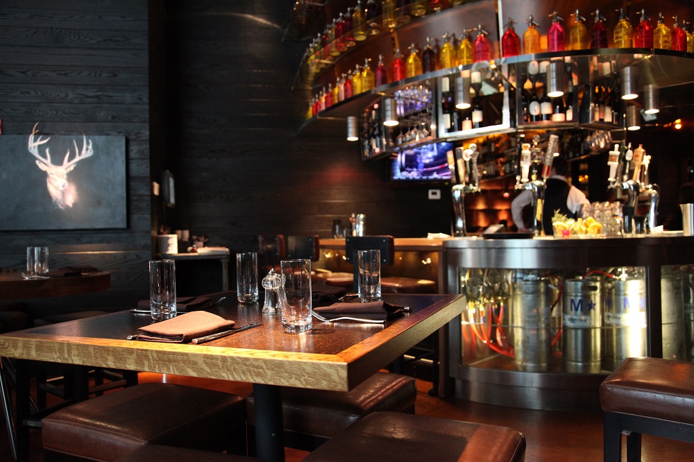
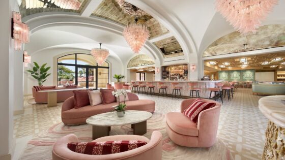
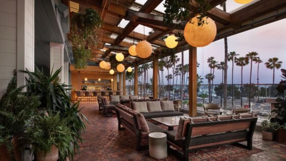
A clever balancing act has been struck between being fashionable and having a timeless quality to the design, a trick usually missed by so-called fashion hotels in my experience. This has been helped considerably by the good interior layout planning where lessons from other hotels have been learned. The bar and restaurant have a street frontage, named State Lake after a famous local café that used to be on the site, giving an historical validity to an eatery here. The speciality restaurant stair climbs from inside the street windows to the bar, pre dinner drinks being possible in a high visibility, high profile area. This is an area UK pub designers used to refer to (tongue in cheek) as a ‘Friday Night millionaire corner’ where someone could splash money around on a Friday night in high visibility as if they had more than they actually did. This is a parable for the cash-strapped years after bankers follies perhaps?
The restaurant sits on the floor above, approached either from the staircase in the bistro or from the mezzanine floor above reception. In reception a staircase leads to the Mezzanine from beside the concierge desk, allowing security to be maintained both through supervision and also because the integrity of the lift’s room card recognition system is not broken. External guests going to the nightclub bar operation on the top floor can only use the lift from bottom to top – without the key card intermediate stops at bedroom floors are not possible.
he library-like mezzanine space also provides for the informal business meetings that are such a normal part of lobby life and a queuing area for those wishing to gain access to the rooftop or waiting for seats in the Restaurant, such is the immediate popularity of this stylish hotel. One wall of the space is dominated by a mural of a phoenix, echoing the themes of the light fittings, symbolic of the rebirth of this area of Chicago. With a library feel, the height of the space is still large enough to create a grand sensation, a feel that carries through to the access and conference areas and to the spa.
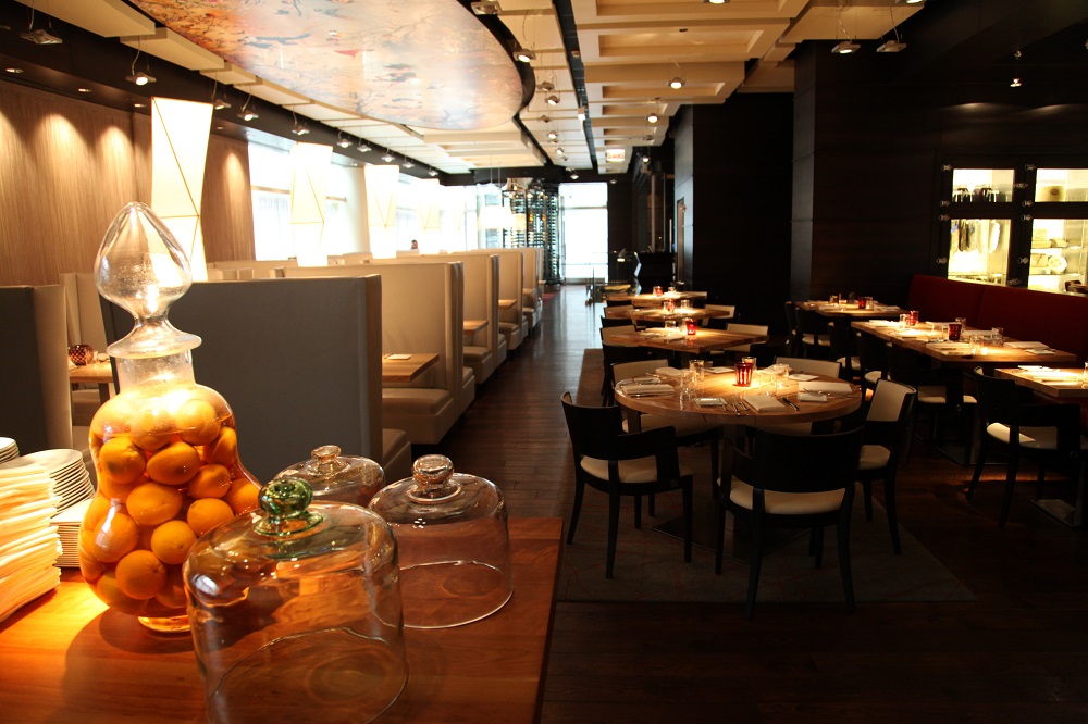
The clever design of the restaurant plays with the space there. A chef’s table, intimate booths and a couple of classical private dining spaces create a busy and buzzing feel, yet allow privacy as well. At the top of the stairs from the bar side is a glazed private dining area and the foot of the same staircase has the lounge feeling pre-dinner drinks area. None of the spaces are overlarge and every part is used, creating a busy feel yet not feeling crammed. The bar itself does that difficult trick so often done well in America of creating a space that works well as a bar without creating an intimidating feel to the restaurant. Therefore, the restaurant remains a very comfortable and intimate area.
“library like Mezzanine space also provides for the informal business meetings that are such a normal part of lobby life”
The main restaurant offers flexible dining spaces yet it too manages to create intimate dining spaces. The show kitchen adjacent to the chef’s table enhances the intimacy of the space. Maitre’d desk faces the door from the mezzanine. With the addition of the barbeque and ‘grazing’ bar on the rooftop there is a multiplicity of eating areas done with style and offering a variety of different approaches to food – nor, unlike most US establishments, are portions intimidating. This is an hotel that has learned many of the lessons of the last 15 years in its execution, not just from interior design but other areas of the hospitality operation too.
The design surprises continue through into the bedroom areas. Each lift lobby has a small ‘library’ continuing the theme from the Mezzanine, with busts of famous thinkers, books and so forth arranged around a small bookshelf and display case.
However that is not the surprise, rather it is the sound of birdsong that fills the corridors -totally unexpected in urban Chicago. Not enough just to have birdsong either, for as dusk draws in so the sound changes to the sound of crickets and the hoot of owls. Indeed I noticed the far off ringing of church bells too, delightfully bucolic.
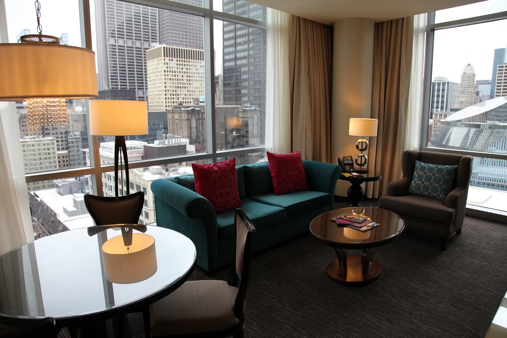
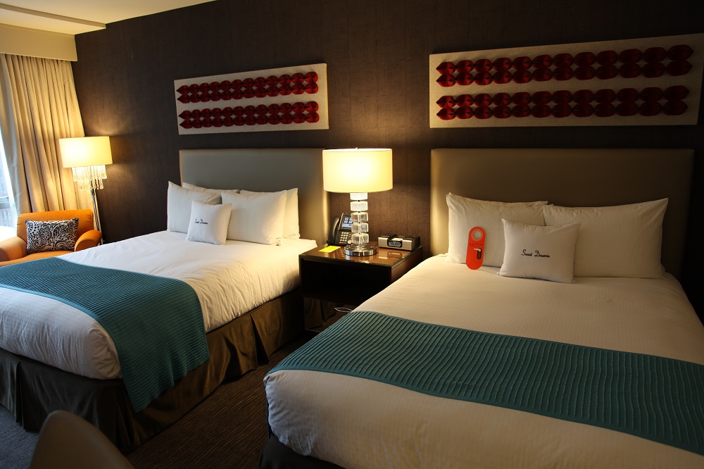
Standard bedrooms offer the choice of either a tub or a walk-in shower room type and all have floods of daylight from enormous picture windows filled with the skyline of Chicago. Colours are generally muted with accents being provided by touches of sharp secondary colours – turquoise or orange and lightened with strong patterns in wallpaper and carpets. Chromatically well balanced the result is visually as well as physically comfortable. The desks are generously sized enabling an easy working situation to be set up, enhanced by the free Wi-Fi.
Sockets are well placed and generous lighting ensures that there is never a gloomy corner to struggle with.
Bathrooms are well designed with good contrasts in the materials used and excellent lighting levels. Unfortunately the wash hand basins are stupidly shallow and wide, making a wet shave laborious and a good wash difficult without using the shower.
In the suites large baths and walk-in showers complement the large vanity units. Suites also boast kitchens and dining areas, complete with microwaves, hobs and fridges, as well as wardrobes for outdoor gear separate from the wardrobe for indoor clothes. Useful coat hooks are provided, a thoughtful touch in many countries often missed in UK hotels, but which allows damp outdoor garments to be hung away from shirts dresses and so on.
Whilst theWit has echoes from many hotels nothing it does is incredibly innovative. But it is encouraging to me as a designer to see that the owner and designers have pulled together all the lessons of the last ten years advances in hotel design. Firstly in planning and layout, secondly in terms of food/hospitality operation and finally in terms of spa operation and business rooms.
Restaurant on the front to give a profile, a ‘Friday Night millionaires corner’ for the poseur to see and more importantly be seen, a screening room for the local arts and media market, plenty of facilities for local businessmen, good location, good staff and good bedrooms. On top of this nice operational and design touches such as birdsong in the corridors to give an individual personality to the hotel enabling guests to feel a loyalty and identify with the hotel.
Too often hotel chains have innovative layouts and food operations such as Marriott’s Courtyard Paris, thought through staffing and economics, sourced and defined design solutions and then not had the mangement skills to carry through the work. Design management is rarely recognised nor reinforced as a positive management imperative.
Doubletree has produced a fine hotel, well planned, well designed and already popular. If they can manage the design and planning elements in the next hotel then maybe they will be able to create a chain of very successful properties. Clear brief, good planning and design, and quality throughout will always create winners.
TheWit is a winner.
Architecture: Jackie Koo
Interior Design: Cheryl Rowley
Restaurant Design: The Johnson Studios
All words & pictures copyright Patrick Goff

