Refreshed? Mint is the new brand name for City Inns as they continue to grow the group, this being one of two large hotels they will add during 2011. The second, opening in May 2011 is in Amsterdam. Pepped up? This hotel is the latest in a clutch pepping up Pepys Street hard by the Tower of London. Here in a new ‘hotel quarter ‘ Mint joins a Novotel, Grange and Apex whilst a further five star will soon start construction in the strange building across the road.
The City of London is changing quickly as legions of clerks in bowlers with ink stained fingers vanish, another part of its past, replaced by computers nestling in buildings on sites that were once warehouses full of sugar, coffee, spices and other goods now delivered further downriver in containers at Tilbury.
Now the City is finance predominantly, needing less space than warehousing and gradually it is again becoming a desirable place to live as well as one of the world’s most popular tourist destinations, boasting around 25 million visitors a year. Many of these visitors are oblivious to the history, don’t know who Samuel Pepys was, and are only aware of the charms of Tower Bridge when they see it from the roof top bar that is such an attractive feature of this new building. The target audience for this hotel is the local banking industry, which, given London’s status currently as an international banking centre, is a very large audience. As with many hotels that cater for a business market, most of the rooms are shower only. In my view this unfortunate approach leaves hotels struggling to satisfy the family market at the weekends. Families may, with small children will certainly, prefer an hotel that offers a bath with the room, not just the shower.
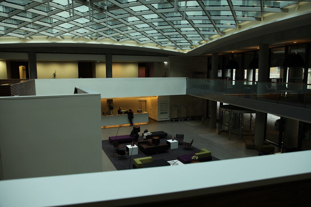
As a generality, I find architectural interiors lacking in finesse but here the impact of the architecture is managed brilliantly. There are flaws, which I will come to later, but the initial impact of the design of the reception lobby is powerful with a strong visual aesthetic that I found myself enjoying more and more over the two days of my stay. This building delights with the geometry of the interiors and surprises with the views of the same geometry externally.
The first shock is on entry when the geodesic styled ceiling gives a view up the internal lightwell, which has what is claimed as the largest ‘living’ wall in Europe. Most of the space is double height, and around the edge runs a mezzanine that forms the breakout area for the meeting and conference spaces on two side, whilst another side forms a kind of cloister of small more intimate spaces for those little family or business meetings. The hotel enhances the usefulness of this space with free high-speed internet, which is continued throughout the hotel.
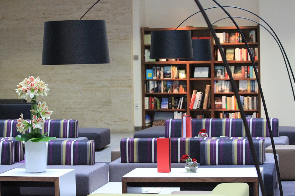
The space is architectural, sculptural, a sensation emphasised by the lighting by night. The sense of this as a sculptural space is enhanced by the use of ‘architectural’ furniture – you know the stuff, metal framed, slabs of foam, ergonomically appalling, designed to require a sitter to recline as if in a Roman toga and all looking as if the designer was given only a straight edge and one set square. The architectural purity of this space was spoiled after opening by the addition of some visual variety in the form of bookcases along one wall that add a decorative element through the book spines, to enliven the otherwise too formal space.
The staircase carves its way up one side providing a dramatic white diagonal whilst the reception desk provides a strong horizontal across another side. The result is some entertaining abstract shapes when viewed from various places, with an almost artistic purity. The height and use of carpet renders it a relatively quiet space and tucked under the staircase is a bar, one of three in the hotel. One of the attributes that sets this hotel apart from many others is the staff. Helpful, friendly, well trained they reflect well on the operator, from the greeter at the entrance to the waiting staff. When a jogger twisted her ankle, they were quick with ice and a compress, bringing coffee etc. whilst she was attended to.
The reception desk is long with more than half a dozen workstations along it. Unusually for an hotel everywhere is equipped with those fruit computers, and the screens can be turned to share their contents with the guest. The same brand is used as the entertainment centres in the bedrooms, giving access to television, movies and the web, all included in the room cost.
It is in access to the bedrooms that the architecture works least well. The corridors are long and a little bleak, unrelieved by any images and little colour whilst detailing is simple, minimalist. Nothing decorative lifts the environment. Where the austerity of touch works in the more complex areas of the lobbies etc., here it is just very plain. Unfortunately, this can make it a little disorienting for guests as there is little to distinguish one floor from another.
Access to the guests floors via the lift lobby is secure passing both reception desk and being overseen by the reception for the main restaurant. Unlike most hotels here there is generous lift provision and one lift accesses the Sky Lounge, the rooftop bar that is a feature of this hotel. Lift lobbies have views at every level but once out of the lift lobby there are no clues to help a guest recognise they are on their floor.
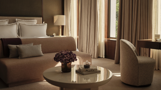
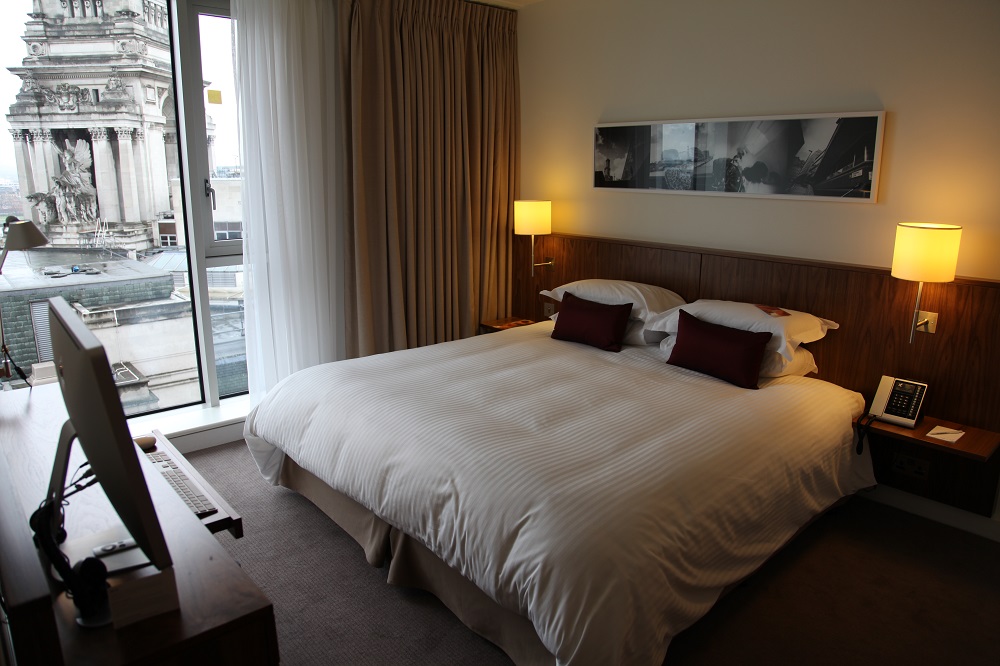
The bedrooms themselves are well designed with plain fabrics and carpets. The lack of decoration and the simplicity is almost basic but the service levels and provision of the facilities in the room lifts the hotel above this. All the rooms have good work desks with mirrors above with workstations and keyboards for those who do not want to work on their own laptops. In the suites there are large screens with good sound systems attached, in the bedrooms the large fruit computer screens stand for TV’s as well as working computers – sensible as it enables timeshift TV viewing using online services such as the BBC’s i-Player. Ample sockets allow for those who need to charge laptops/cameras/phones/music players.
Shower rooms are efficient and well laid out. In the DDA rooms the styling is good in chrome and white, perfectly acceptable to the non-DDA guest so no need for these rooms to be last let or considered below the standard elsewhere in the hotel.
All rooms are air-conditioned but windows open allowing fresh air into the rooms. In a surprisingly quiet location for central London this aids the green credentials, allowing rooms to work without the air-conditioning being turned on. The hotel planning is intelligent, with a bar in the lobby, a bar on the roof with terraces alongside private dining areas and another bar on the ground floor. The bar in the lobby sits under the stairs and is essential to service the art performances the hotel is intent on making a regular feature of ‘lobby life’.
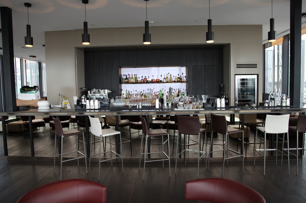
The rooftop terrace was popular from opening. With views across the London skyline and down onto the Tower of London its popularity has grown to the extent that the Hotel is now considering whether to charge membership. Already it is difficult to book for afternoon tea and evenings see a crush. It has a large roof terrace and a balcony over the street that is closed off until a solution is found to protect pedestrians below from objects falling from the bar – a great shame as this is where the best views can be obtained.
Alongside the reception is the Fenchurch bar. Windows onto Pepys Street and a pedestrian way leading from there to Fenchurch Street station it makes good use of its position of high visibility. Inside it has private seating areas created down the window side allowing for small meetings or gatherings of friends to take place in semi-private.
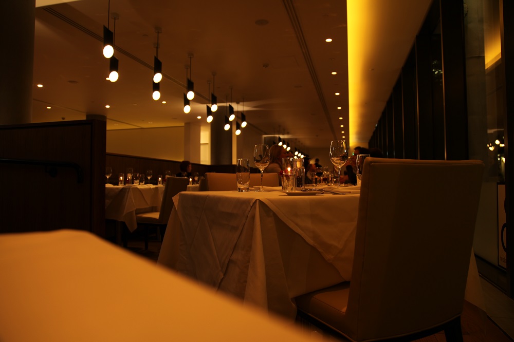
In an area teeming with offices the restaurant already does a brisk lunchtime trade to the office workers and also maximises its position to have a street facing side, again on a main pedestrian route to Fenchurch Street, one of London’s smaller commuter termini. All the bars are stylish and the rooftop bar (predictably the ‘SkyLounge’)also offers a function room for private dining with views to the Gherkin, Stock Exchange and the London skyline.
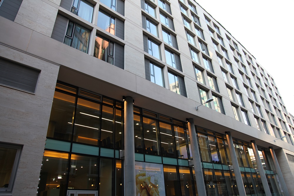
This is a large hotel, with over 500 bedrooms. It doesn’t appear large and the public areas integration of parts such as the conference and meeting rooms lends itself to busy use of public areas but there is still separation. The internal planning is sized well to cope with the numbers. Not only does the internal planning work well but the building is oriented so as to maximise the potential of the site, from the integration of the passenger car drop off at the front and the car park entrance to the visible presence on the street of bars and restaurant. The architecture is strong and creates a stylish hotel . Whilst interiors are sculptural, architectural, and to this designers eyes lack a little inspiration they are still fascinating and work well visually and operationally – something more style oriented hotels opened recently noticeably fail to achieve.
With a superb location this is an hotel that will deservedly become very successful, and make a Mint…
Written after a visit in March 2011. Words and images © Patrick Goff

