Here’s how Tremend Architects used 20th-century Warsaw architecture as inspiration when it transformed a heritage building in the city centre into a design-led aparthotel…
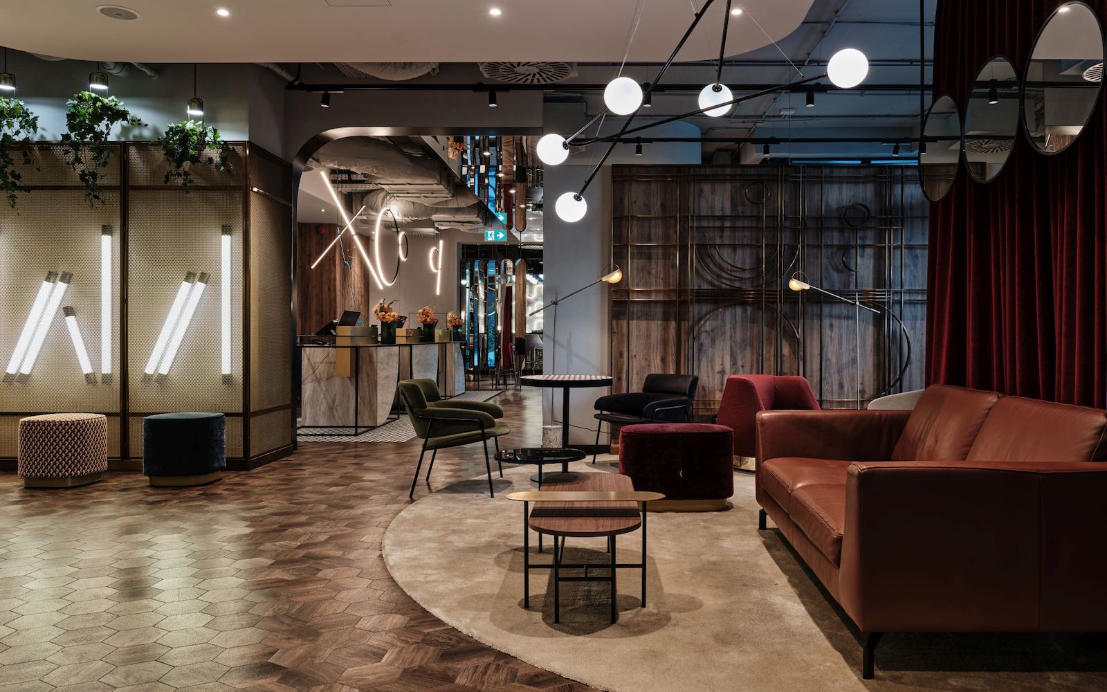
In the heart of business-focused, vibrant Wola district in Warsaw – on Grzybowska street – the Royal Tulip Warsaw Apartments Hotel is now open, and very much part of the local community, adding a new meaningful layer to the city’s already buzzing hotel scene.
The interior design concept, imagined by Tremend Architects, is a remarkable story of 20th-century Warsaw. The overarching theme was inspired by the art and architecture of the capital city. The design narrative starts exactly where the property is located today.
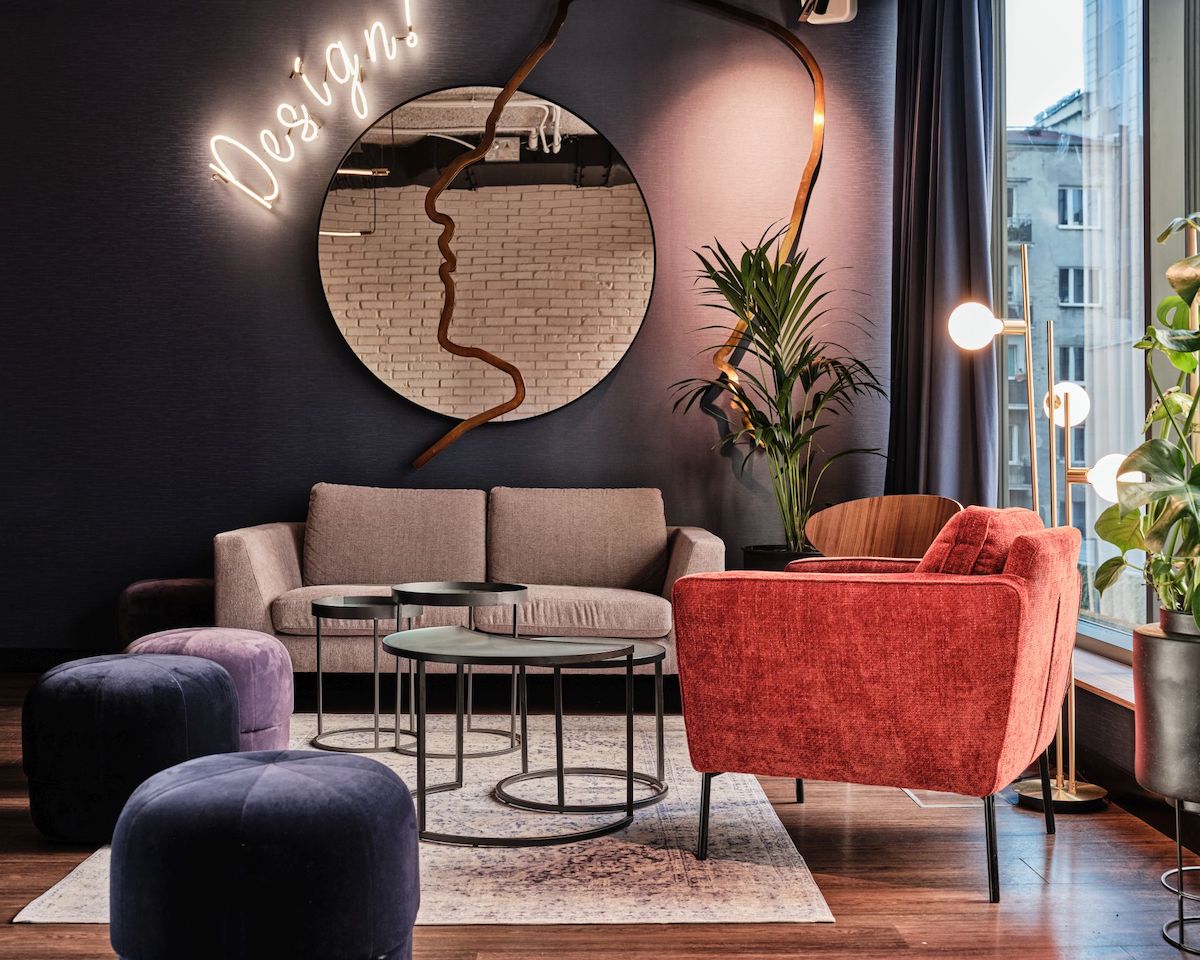
Image credit: Piotr Gesicki
The arrival experience takes place, quite literally, on the border of the city centre and Wola districts, just like Grzybowska street, which in fact connects both of these districts. It is also, where the architects found the urban plan of Warsaw from the 20th century, which is what the design of the whole ground floor refers to. It resembles a giant carving on the wall and allows the guests to familiarise themselves with the interior concept, welcoming them to explore the analogies.
The lobby area boldly relates to the urban architecture of the city. From the very beginning, there are parallels to Rotunda, a famous and iconic building in the city designed from 1960–1969 by chief architect Jerzy Jakubowicz. The oval-shaped reception desk resembles the significant facility with its form and is the only circular element of the interior, similar to the actual Rotunda. Another analogy to the city centre of the 20th century is a black-and-white floor, made of so-called Warsaw ‘gorseciki’. Those familiar with Warsaw may also notice the inspiration with Wars and Sawa neons, the joinery from Smulikowskiego street, or the secessionist balcony railing of the tenement house from Piękna 44 street.
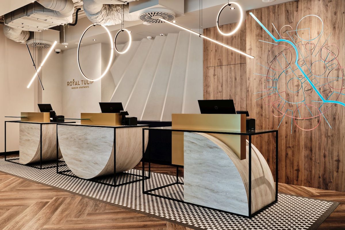
Image credit: Piotr Gesicki
Hotel cafe ‘swaWola’, with its interior and function working together, brings to mind the former coffee roaster ‘Pluton’. Once again, the black-and-white mosaic proudly presents itself on the floor, where guests will also notice golden strips reminding of old railway tracks. It is a reference to the tram station located in the area. Similarly, the cafe desk resembles the former rail vehicles.
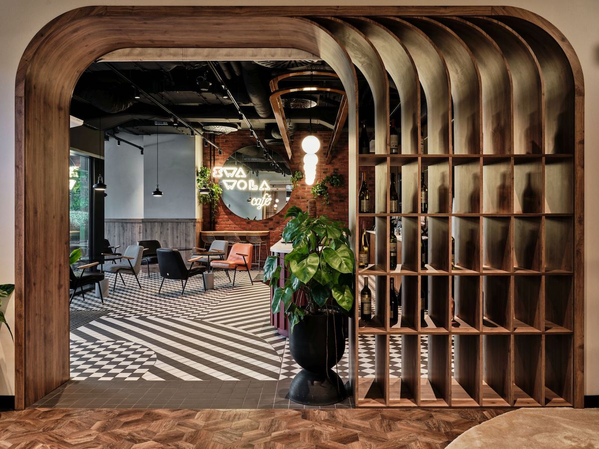
Image credit: Piotr Gesicki
Among other parts characteristic of the Wola district, guests will find a brick wall, resembling former gasworks, colourful boards referring to photographic glasses of Foton lounge, or golden and brass elements, which are a tribute to Hefr’s cutlery factory.
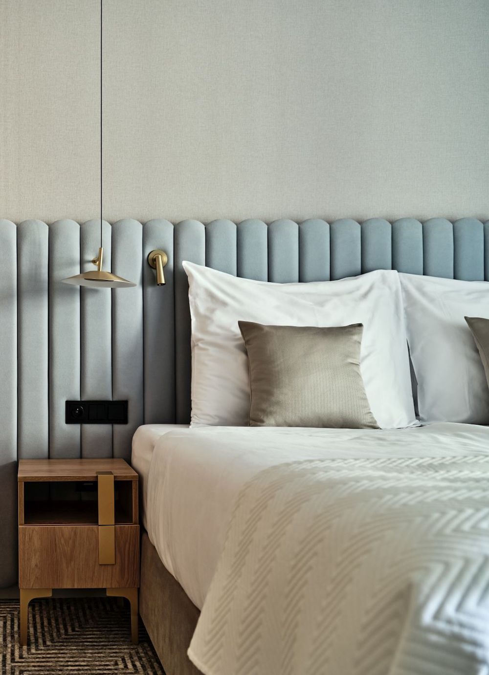
The apartments themselves also refer to the storied history and architecture of particular Warsaw districts. In each of them, the wall is decorated with the graphic of a district map in its symbolic colour. The trademark of Powiśle is the blue tone of Vistula, for Żoliborz it is green of Kępa Potocka Park.
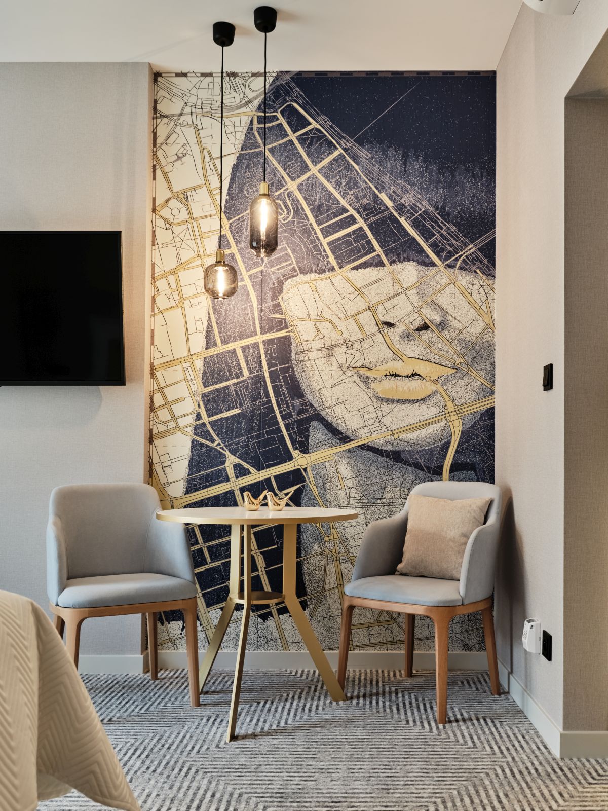
Image credit: Piotr Gesicki
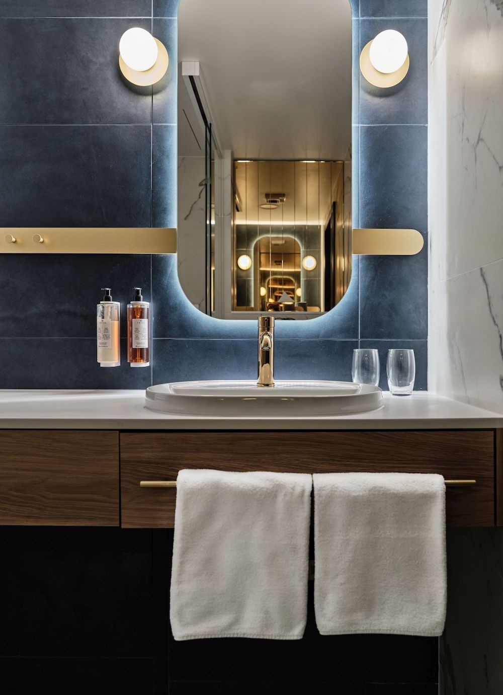
In a family room, inspired by the Mokotów district, guests will walk in to a wine-red colour of the greenery. The apartment, inspired by Saska Kępa, is held in bright colours, broken by dusty orange, characteristic of the facades from the district. Each mosaic pattern, which dominates the floor of the particular apartment, refers to the mosaic style of the individual district. Again, it is a nod to the unforgettable Warsaw ‘gorseciki’. The bathrooms are finished with large format tiles with white marble imitation.
The interior design of Royal Tulip Warsaw Apartments is a sentimental journey through 20th-century Warsaw. By exploring the history of the districts, the hope is that guests can then discover new analogies and, perhaps, even see and feel the city differently, having understood its architectural context.
Main image credit: Piotr Gesicki


