With the aim to put decorative lighting under the spotlight, Editor Hamish Kilburn, in association with Vaughan, invited a handful of interior designers to understand trends, materials and more…
Lighting has long been considered one of the most integral elements in hotel design. In today’s arena, designers have noticed a shift as design sectors – such as hotels, residential and office design – have collided. The rule book as to how to light a space has been almost erased and, in its place, enters new, innovative schemes that are simply changing the way spaces look and feel, and even going as far to helping brands establish their identity.
With the possibilities almost endless, Hotel Designs in association with Vaughan, wanted to hear from designers who are themselves using lighting in clever ways to transform buildings.
On the panel:
- Shane Brady, Co-Founder, Brady Williams
- Dale Atkinson, Founder, Rosendale Design
- Amal Yusuf, Design Manager, David Collins Studio
- Gemma McCloskey, Founder and Creative Director, Cúpla
- Hayley Roy, Founder, Harp Design
- Lucy Vaughan, Co-Founder, Vaughan
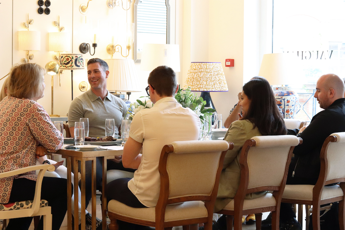
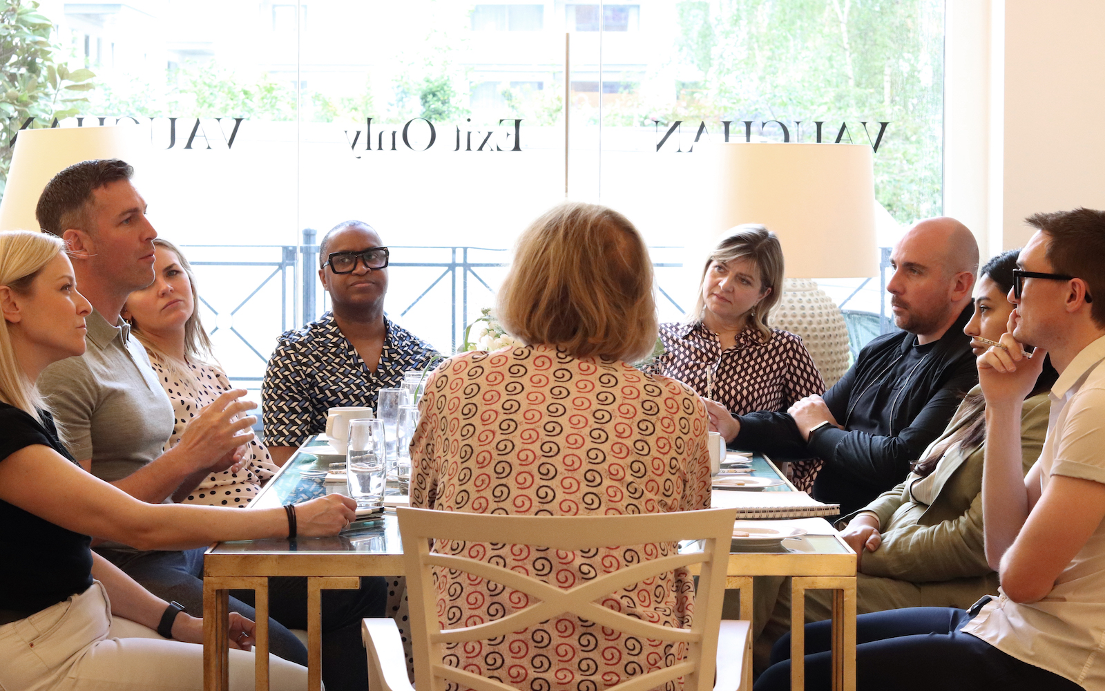
Image caption: The Vaughan showroom at DCCH was the perfect venue to shelter the conversation about decorative lighting. | Image credit: Vaughan
Hamish Kilburn: How has the demand for hotels to feel more residential inspired a change in demand for decorative lighting?
Shayne Brady: When I started as a junior, hotels were littered with ceiling spotlights – we affectionately called it ‘a case of ceiling acne’. Over the past 10 years, I would say, clever brands have transformed lighting and paired it back. And that, to me, is the residential feeling. I don’t think hotel rooms need complicated control panels. Without all that unnecessary distraction, I think lighting then becomes much more flattering.
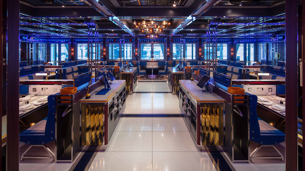
Image caption: Bob Citi Citi diner, designed by Brady Williams Studio, which includes bespoke lighting from Dernier & Hamlyn | Image credit: Bob Citi Citi
Dale Atkinson: In terms of how hotels are run, they more likely than not will be designed to be a home-away-from-home. Usually, guests are checking in to an aspirational feeling, almost wishing their house replicated the same style and feeling. A ceiling littered with spots, therefore, is not appealing and it’s not what people are used to in their own home anyway! Decorative lighting – I’m talking about beautiful chandeliers and pendants – is much more welcoming.
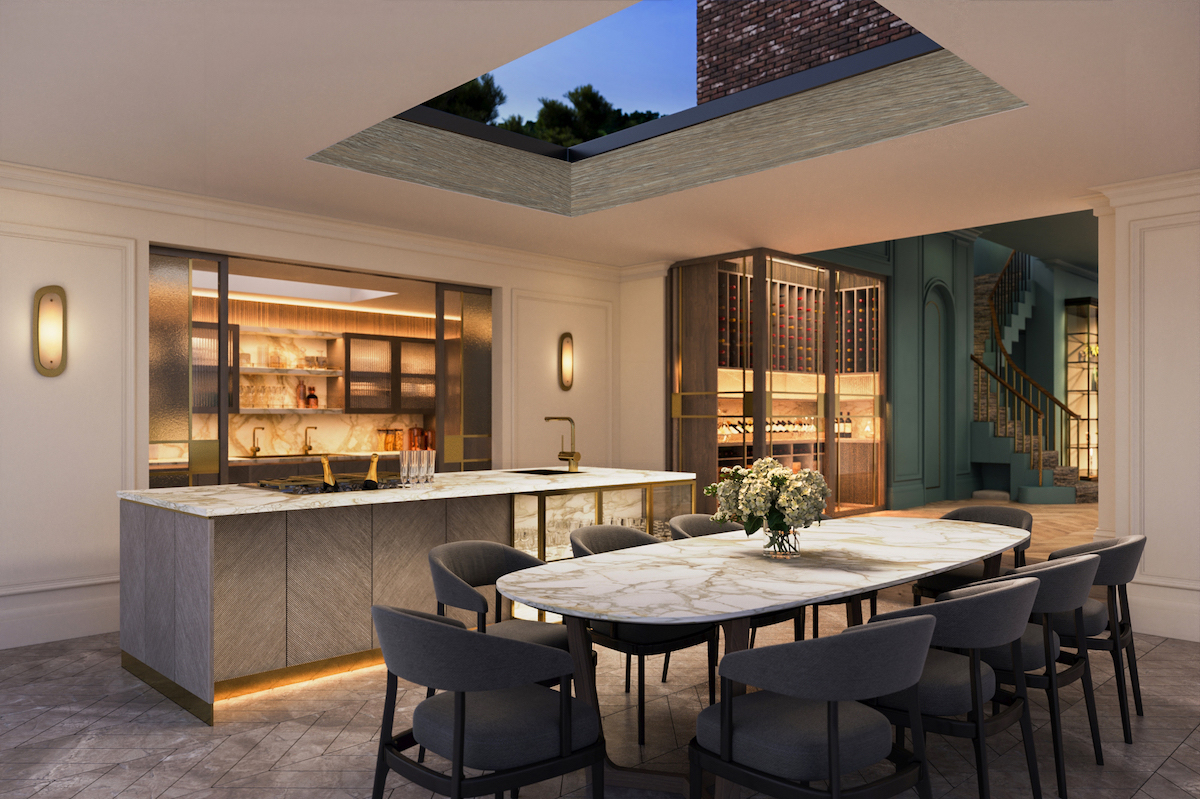
Image caption: In 2014, Dale Atkinson founded Rosendale Design. Since then, the interior designer has worked on many hospitality and residential projects that eloquently and meaningfully challenge conventional approaches to design. | Image credit: Rosendale Design
Amal Yusuf: I really saw this change when Airbnb entered the market. In the early days, that brand was designed to offer a cheaper place to stay. But then people started to take photographs of their digs, on the balcony or of the lighting. And it looked much better than being top-lit. That’s when hoteliers started to take notice and brand guidelines started to change. The focus shifted. A lot of that was to do with how the guest felt in the space.
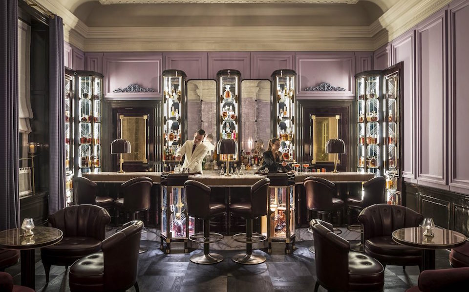
Image caption: The American Bar inside Gleneagles, designed by David Collins Studio. | Image credit: Ennismore
Gemma McCloskey: These days, the light is in fact a piece of art! For me, to be honest, the structure of the lighting often informs other elements, such as furniture.
HK: Recently at Hotel Designs, we have been working with scientists to understand the benefits of circadian lighting design. In my research, it has been refreshing to see technology, science and design working together. But what you are saying is that the demand for hotel lighting, right now, is for controls to be simple…
DA: Public areas within hotels have to constantly evolve throughout the day. Lighting, and lights that dim, plays an extensive role when creating that ever-changing atmosphere. You have to also consider what surfaces you are lighting as well, because you could be transforming the space, through lighting, not necessarily how you intended to light the product.
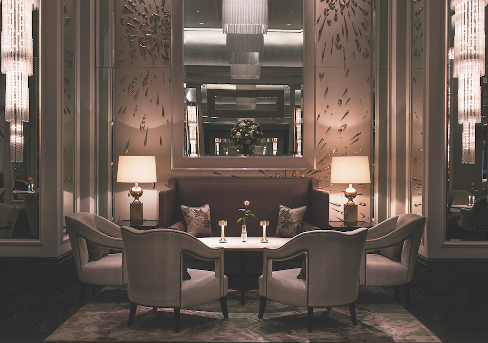
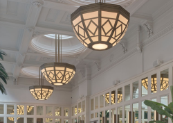
Image caption: Langham Palm Court, featuring lighting supplied by Vaughan | Image credit: Langham Hotels
Hayley Roy: We have a lot of F&B projects, and in the public areas it is vital to have lots of different settings – and to have them pre-set so that it’s easy for the staff to operate. In addition to mood lighting, you also need to think practically as well. So, it’s important to have settings for cleaning and versatile lighting settings for all kinds of events. In public spaces, I can really see the value in circadian lighting.
HK: Is it harder to light hotels in colder climates?
DA: Design certainly has to be harmonious with everything and everyone else in the room. When I am designing in the UK, I do try to create more warmth in the lighting. However, I would say that brands are designing hotels around the world that have the same design DNA – especially private members’ clubs, where guests will recognise the feeling of the brand wherever they are. I think things have developed so much now that lighting can also reflect the brand itself, which is kind of wonderful.
SB: We start all of our projects with the words around how we want the space to feel. We start with, say, 10 words that we leave on the table.
We just finished a Mandarin Oriental project, for example. The word we wanted people to feel as they walked into the public areas was ‘titillated’ and ‘excited for what could happen’. Once you establish the emotion, you then move on to the practical aspect as to how we make that feeling come to life through design. You can’t forget that people have an emotional relationship to these spaces. Life happens in hotels!
HK: That leads me nicely on to talk about zoning. These days, hotels shelter many ‘feelings’, as we have just established, some of which contrast others. How can we achieve this through lighting?
Simon Hamilton: It’s so important to use lighting as a tool to create contrasting spaces, as it’s subtle and non-obtrusive.
I designed a hotel in Venice where we really focused on the emotion. Venice is a beautiful and romantic destination, and the hotel had to emphasise with the drama of the city. We put together a mixture of lighting, and included dimming lights in the public areas, which is a really effective way to change the energy of a space. I would go as far to say that lighting can manipulate guests. It’s very subtle, but brands use it as a tool to change your mindset. Clever lighting makes you feel like you belong in that space.
HR: The work-from-home culture has really given birth to the ‘work from hotel’ movement. I have been speaking with clients about even designing ‘Zoom rooms’ where clients can make business calls from. This is where lighting and its positive wellbeing qualities comes into play.
Lucy Vaughan: I think lighting and wellbeing has always gone hand-in-hand. I was speaking to someone recently who told me that pink has been an incredibly popular colour in their product, and I am guessing it’s because of the feel-good factor that pink radiates. Since hearing that, I have been researching more to explore that hue.
AY: I’m not surprised because it is the most used Instagram filter!
HK: Many of these decorative lighting products come from such a personal place, and yet they are so accessible to a commercial audience. How do you balance that?
DA: I see people like Lucy Vaughan as a contemporary artists, in a way. When you hear about the design narratives behind these design processes, you then discover a story or a memory that has been replicated and transformed into a product.
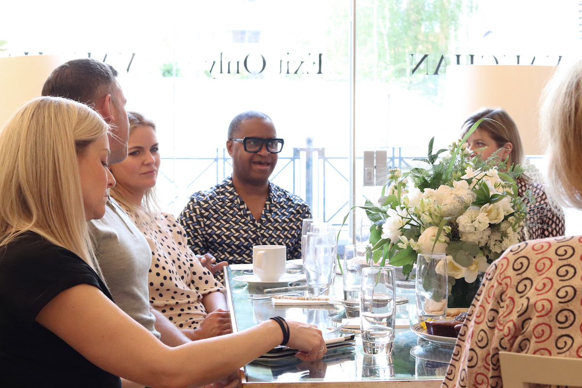
Image caption: The roundtable, sheltered in the Vaughan showroom, captured interesting ideas from a range of interior designers. | Image credit: Vaughan
Lucy, where does your inspiration come from when you design new collections?
LV: I don’t know, it can literally come from anywhere. Here’s a great example. So, your readers can’t see but we have biscuits on the table, and I am really loving the shape of them – they are almost like flowers. If we blew it up it would make a really nice backlit to a bathroom wall light, which I would then make in an antique brass finish or nickel. Seriously, I am just visual and inspiration comes from literally everywhere. I also love making with nature, which grounds me.
HK: With everything we are seeing around us today, Lucy, would you say that lighting is being considered as art?
LV: From my perspective, I am an artist – and that for me has always been a large part of the project. In my world, designing lighting, it’s all about layering, which is the same for any artist. I love making products that look good at every age. And it is true what they say: creative people are terrible at admin!
HK: Is lighting always the starting block when working on any luxury interior design project?
SB: A lot of our spaces have to work and evolve from breakfast right through to the end of the day, so lighting therefore informs other aspects of the design. We generally start with great lighting.
We just finished The Maine in Hanover Square. We decided that the lower floor would feature the biggest chandelier that we could possibly make – a 3.5 metre crystal chandelier – and then the room started from there, because we wanted so desperately to capture that moment of old-world glamour of when theatre met cabaret.
GM: I have just finished a design project that had to completely transform day to night from an art gallery to a dining room. We decided to do this by designing a 10-metre bronze beam that featured lights within it that drops down when the room transforms.
HK: What are the major pitfalls to avoid when specifying lamps and freestanding lights?
GM: I think it’s a shame when you have a beautiful product but the manufacturers has not done anything to hide wires.
DA: This isn’t a pitfall, but I would like to see more ‘collections’. As much as we love discussing and working with bespoke ideas, I think it’s nice also to browse through a collection.
HK: In the latest collection, Lucy, there’s an emphasis on brushed brass. What makes this material so special?
LV: It’s just such a lovely finish. It feels real and it is always changing – it’s designed to last!
Vaughan is one of our Recommended Suppliers and regularly features in our Supplier News section of the website. If you are interested in becoming one of our recommended suppliers, please email Katy Phillips.
Main image credit: Vaughan


