


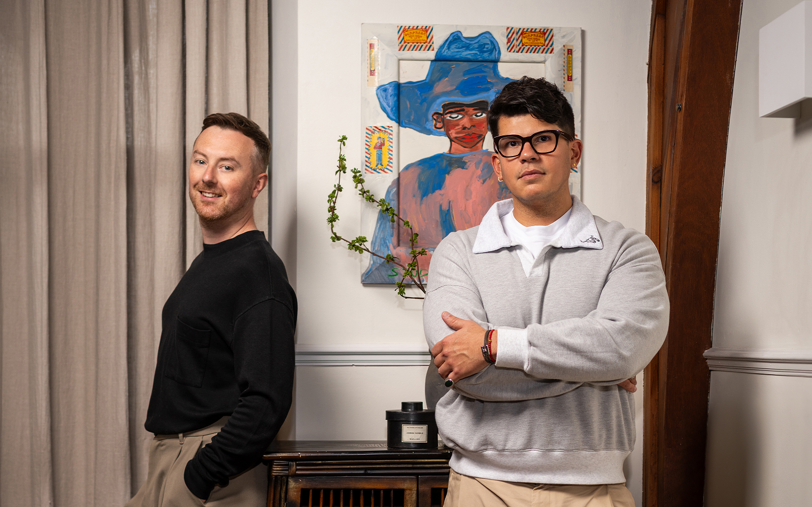
In conversation with Hotel Designs, Studio Sixty7 Founders Jose Rivero and Lee McNichol discuss reshaping the visual language of Maldivian hospitality design through material honesty, local collaboration and a deeper understanding of what island luxury really means…
When Jose Rivero and Lee McNichol of Studio Sixty7 were commissioned to design Sun Siyam’s five-star resorts Iru Fushi and Olhuveli, they made a deliberate choice to resist the obvious. Rather than chase the ocean-and-sand postcard that defines most people’s idea of the Maldives, they turned inward — to the dense vegetation, the filtered light through coconut palms, the terrestrial identity of islands the world too often flattens into just blue water. The result is two resorts that feel genuinely rooted in place, shaped by local craftspeople, native materials, and a design philosophy that treats cultural heritage as more than decoration.
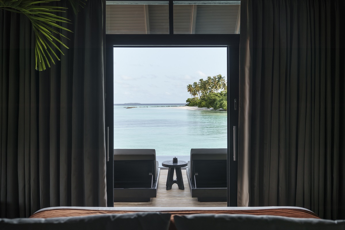
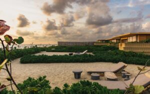
Image credit: Sun Siyam Iru Fushi
Hotel Designs: As a studio, you mention a philosophy of bridging cultural heritage with contemporary design – how did that philosophy specifically shape your approach in the Maldives?
Studio Sixty7: The Maldives has its own building logic, developed over centuries in direct response to the climate and the ocean. Open-air layouts, timber structures, thatched forms: these traditions exist for a reason. The temptation is always to replicate them, to produce something that reads as heritage. What we tried to do instead was understand why those traditions exist and carry that reasoning forward. Local craftspeople were part of that process from the start, not brought in at the end to add authenticity. The result is spaces that breathe, move between inside and outside, and feel genuinely Maldivian. Not because they copy the past, but because they understand it.
HD: Many resort designs lean into the ‘tropical postcard’ aesthetic – how does your vision differ, what was your design emphasis?
SS7: The postcard version of a place is always a flattening of it. It takes somewhere with a complex identity and reduces it to its most recognisable image. For the Maldives, that image is always ocean and sand. What gets left out is the land. The density of the vegetation, the particular quality of light filtering through coconut palms, the texture of the place when you step back from the water’s edge. That is where our design emphasis sits. Spatial quality, material honesty, natural light. A rooted and contextual translation of luxury rather than spectacle. The cultural references are there, but they are embedded into the foundations rather than performed.
-
- Image credit: Sun Siyam Iru Fushi
HD: You mention that “green means land” for Maldivians—how did this insight transform your early design concepts?
SS7: It reoriented everything. The default assumption in resort design is that the ocean is the protagonist. Every view framed toward the blue, every space oriented to face the water. Understanding that green is the land, as distinct and as meaningful as the sea, shifted the whole approach. Lush planting and shaded spaces moved to the centre of the concept. The resort needed to feel anchored in the island, not just set upon it. That sense of groundedness, arriving somewhere with a terrestrial identity and not just a coastal one, is what separates the experience from the postcard.
HD: How did collaboration with local craftspeople influence not just materials, but the narrative of the spaces?
SS7: Working with local craftspeople changed what the spaces are about. Their techniques, their patterns, the particular way they make things: these informed the design from the outset rather than being applied afterwards. Textures, screens, detailing: each carries cultural meaning because it came from that process of collaboration, not from a mood board. We came to know so many of the island’s artists during the project. Their understanding of local materials allowed us to elevate the texture of particular plants, to understand how the vegetation filters Maldivian light in ways that are specific to this place. The resort became a narrative of local identity rather than a generic luxury proposition.
-
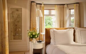
- Image credit: Sun Siyam Olhuveli
HD: Following on from this your work highlights local materials and textures—how did you curate a palette that feels both refined and rooted in place?
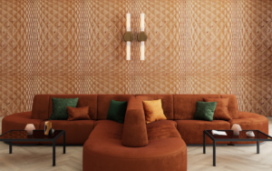
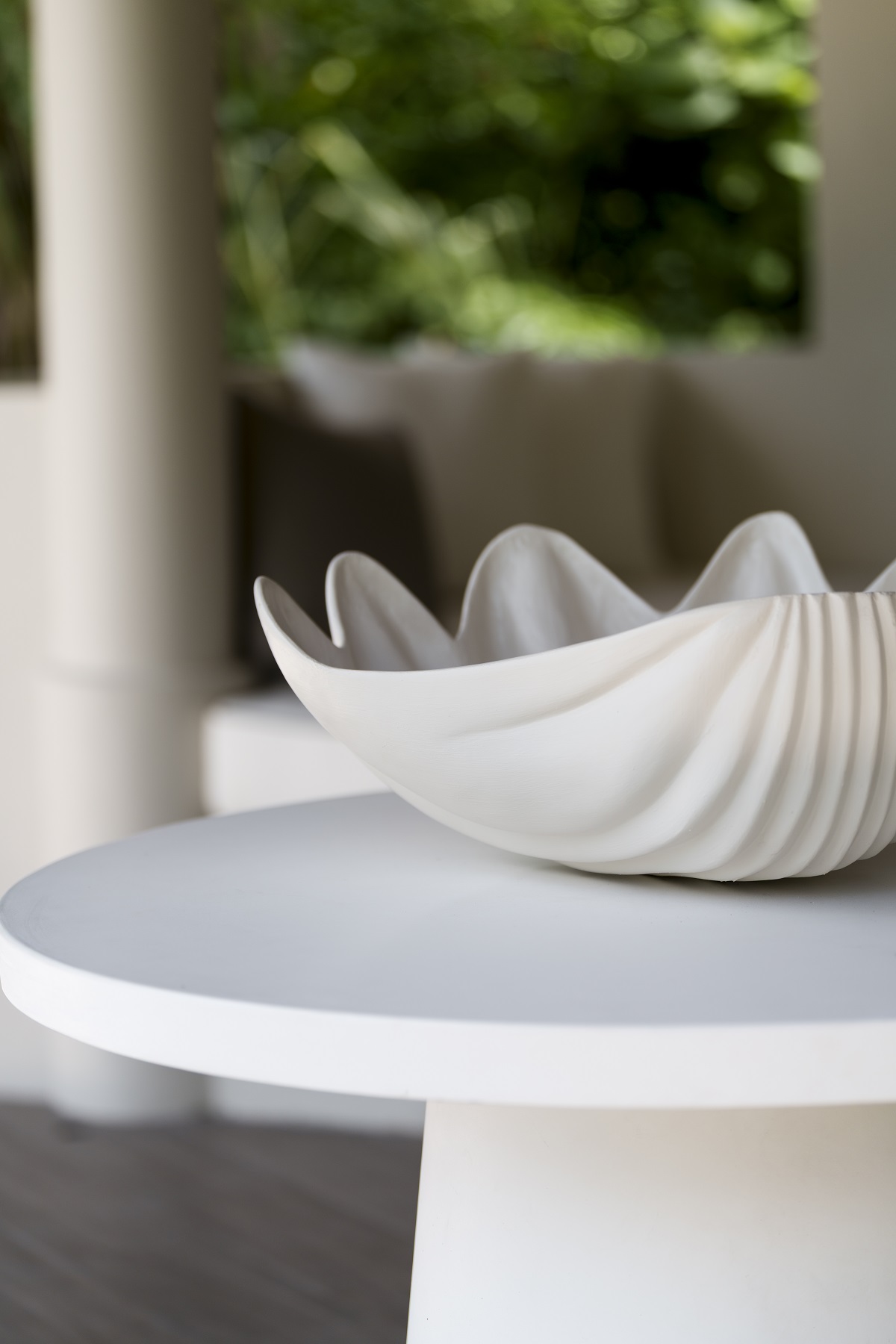
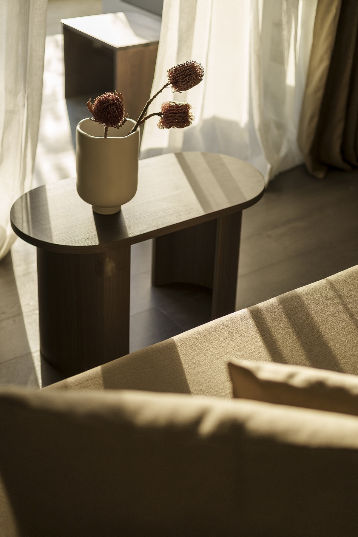
SS7: We started with materials that are native or culturally familiar. Timber, woven fibres, textured finishes. Then we worked on how they are used rather than what they are. The goal was never rustic. It was elevation. Natural textures paired with cleaner lines and a controlled colour palette, so the materials retain their authenticity while feeling cohesive and considered. Grounded in place, but quietly sophisticated.
HD: Focussing more directly on the projects – Olhuveli and Iru Fushi – which came first? And how did the designs relate or impact on each other?
SS7: Iru Fushi came first. It was the project that established the barefoot luxury aesthetic, the design language for the luxury collection within the Sun Siyam brand. Olhuveli sits within the lifestyle collection, and it built on those foundations while pushing further. More colour, more playfulness, but the same core values running underneath: spatial flow, material integrity, a confident and expressive design rooted in the same sensibility. The two resorts are in conversation with each other, each articulating a different register of the same ethos.
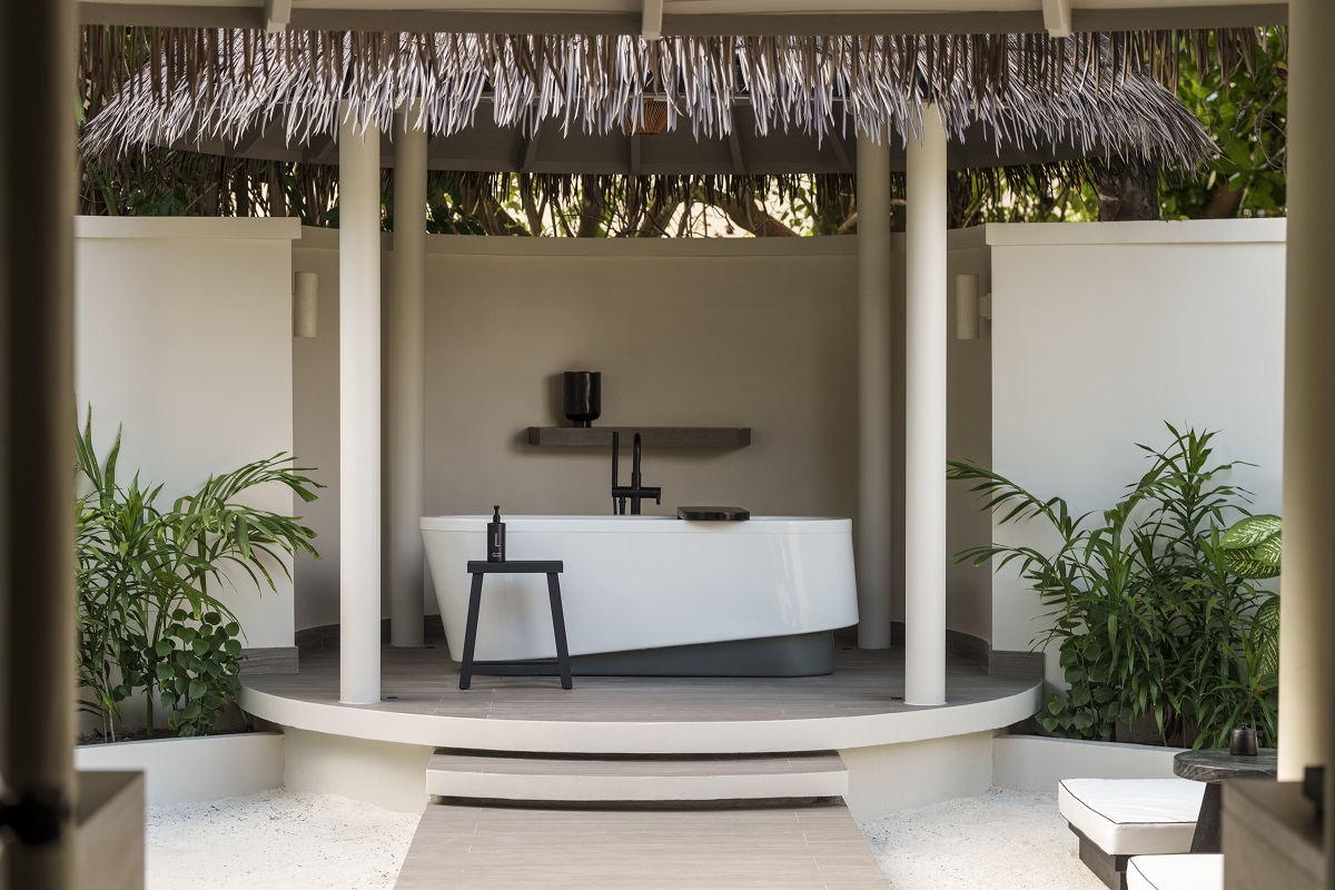
Image credit: Sun Siyam Iru Fushi
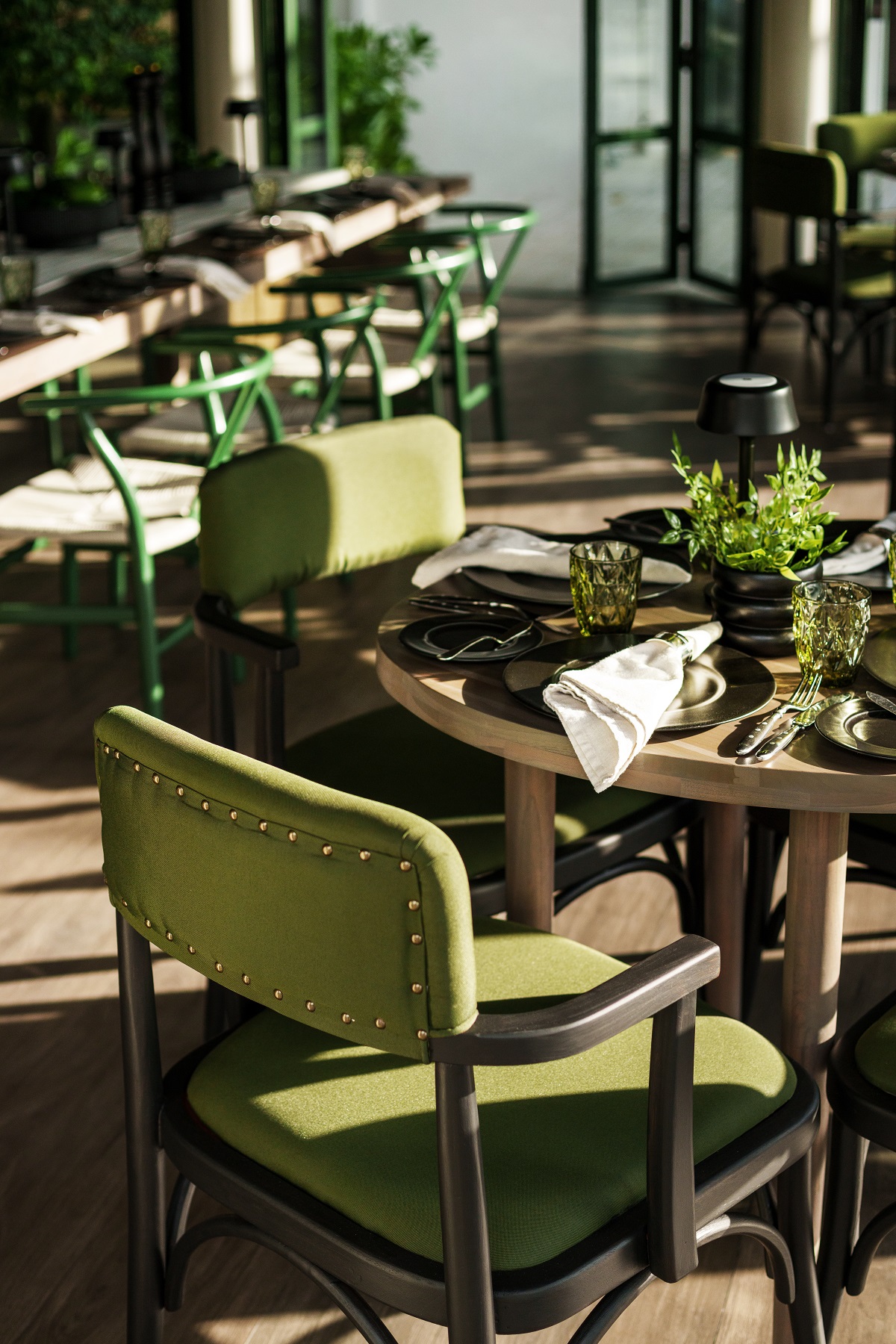
HD: In Olhuveli’s dining spaces, you blur the boundary between interior and exterior—what were the key design moves that made this possible?
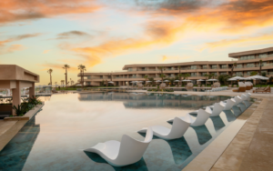
SS7: It is driven by a consistent material language and a direct relationship to the beach. Timber, stone, woven elements: the same textures continue from the interiors out into terraces and pathways, softening the threshold between built space and sand. The large open doors in forest green reflect the greenery outside, so the density of the vegetation feels like it is continuing into the space rather than being viewed through a frame. The beach and sea are not a backdrop. They become an active extension of the architecture, with private dining pavilions and a transition between inside and shoreline that feels entirely natural.
HD: Iru Fushi takes a more restrained, muted approach—what guided this tonal shift compared to Olhuveli?
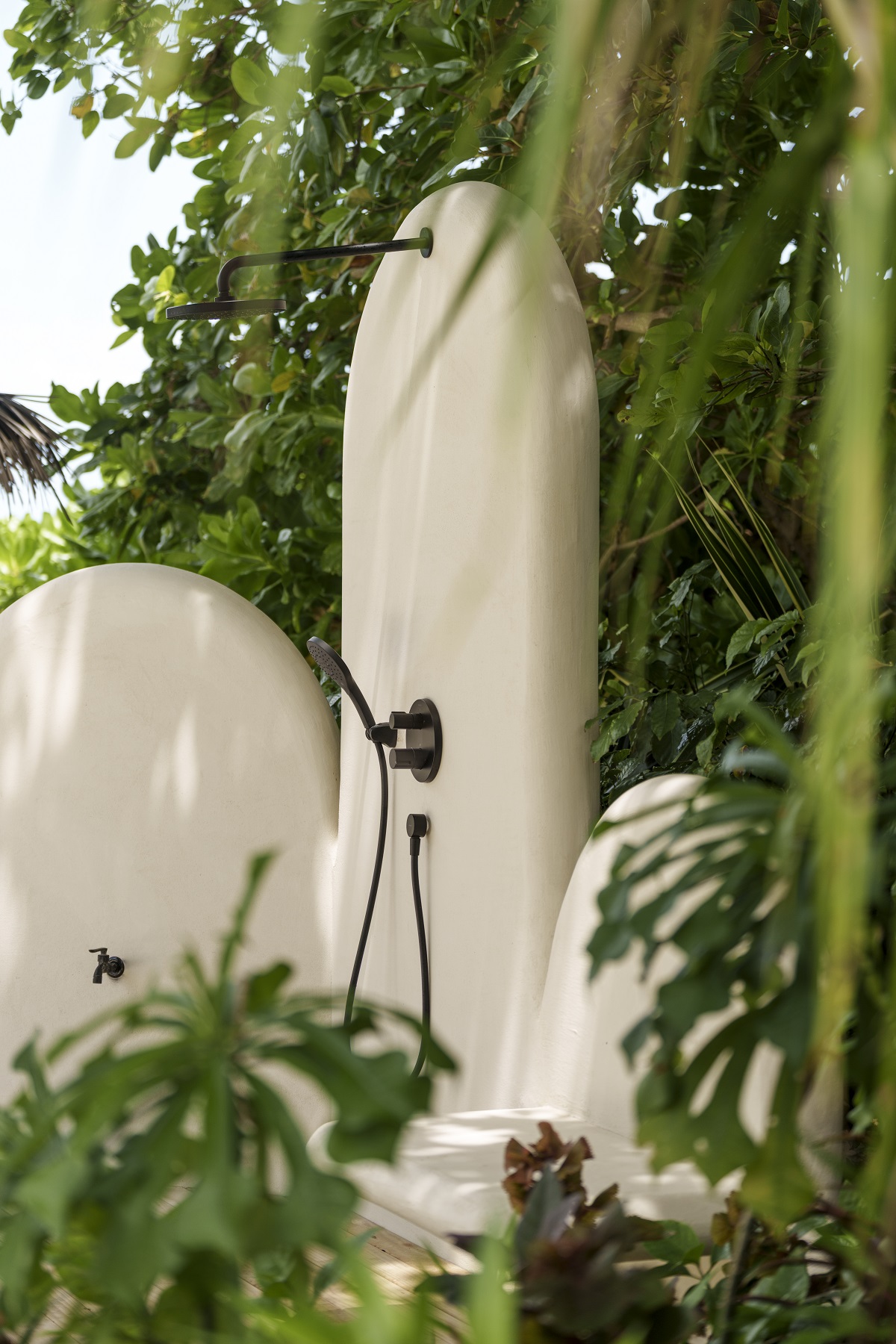
SS7: The two resorts sit within different collections under the Sun Siyam brand. Iru Fushi is in the luxury collection, which called for calm, natural, and considered. The muted tones and natural linens are not restraint for its own sake. They are the right register for a setting that asks guests to slow down. The tactile surfaces and quieter palette reflect the green hues and shadow patterns of coconut palms, pandanus, and breadfruit trees. Specific to this island, this light, this landscape. Not a generic tropical palette, but one that belongs to Iru Fushi.
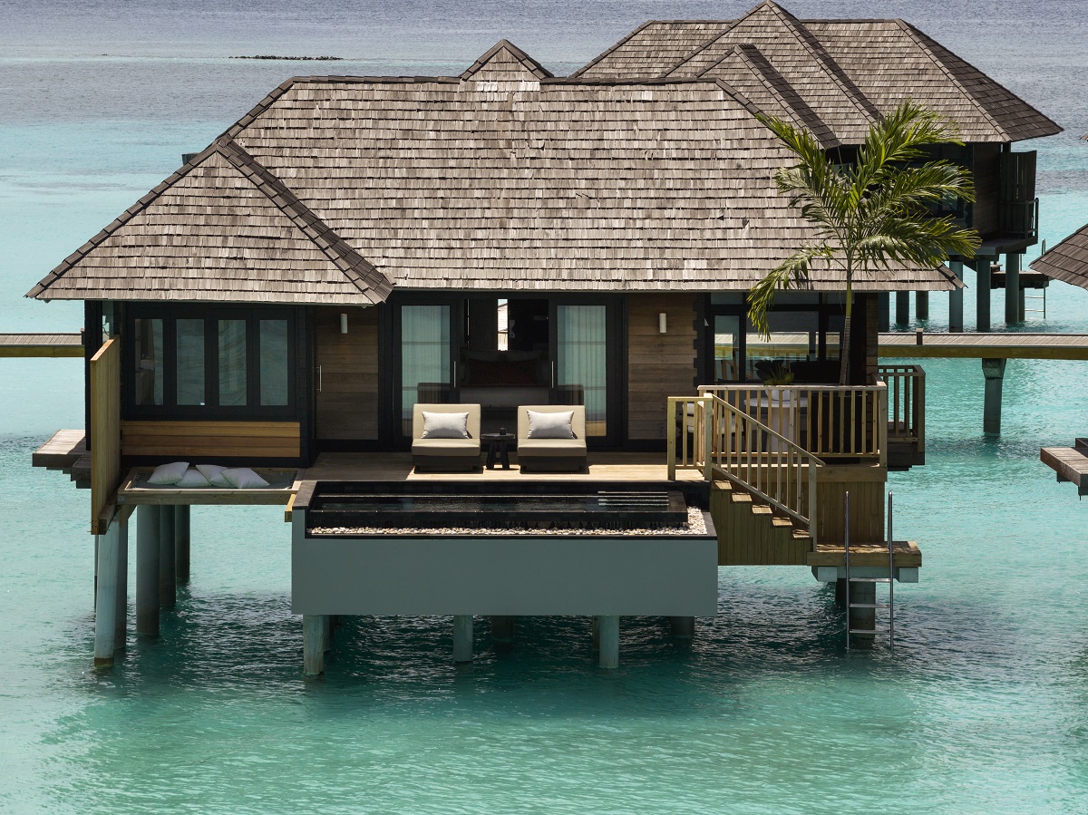
Image credit: Sun Siyam Iru Fushi
HD: You aim to help guests experience “island life beyond sand and sea”—what moments or design details most effectively achieve this?
SS7: Shaded garden paths. Tactile local materials. Quieter, more intimate spaces that reveal a different rhythm to the islands. The wellness spa plays a significant role in this. An organic, neutral palette and soft natural forms that encourage stillness. These are the moments that sit outside the postcard image of the Maldives. They ask guests to be present in the landscape rather than just facing it, to engage with the island as a place rather than a backdrop.
HD: In what ways do your spaces encourage guests to slow down and engage more consciously with their surroundings?
SS7: Through gentle transitions between shade and breeze, between enclosed space and open landscape. Guests move through open-air pavilions and threshold spaces that frame views of the ocean and vegetation, creating natural moments of pause rather than destinations to arrive at and leave. The tactile, locally inspired materials heighten awareness of place. Filtered natural light does the same. The experience is a calm and sensory engagement with the island environment, rather than a series of amenities to move between.
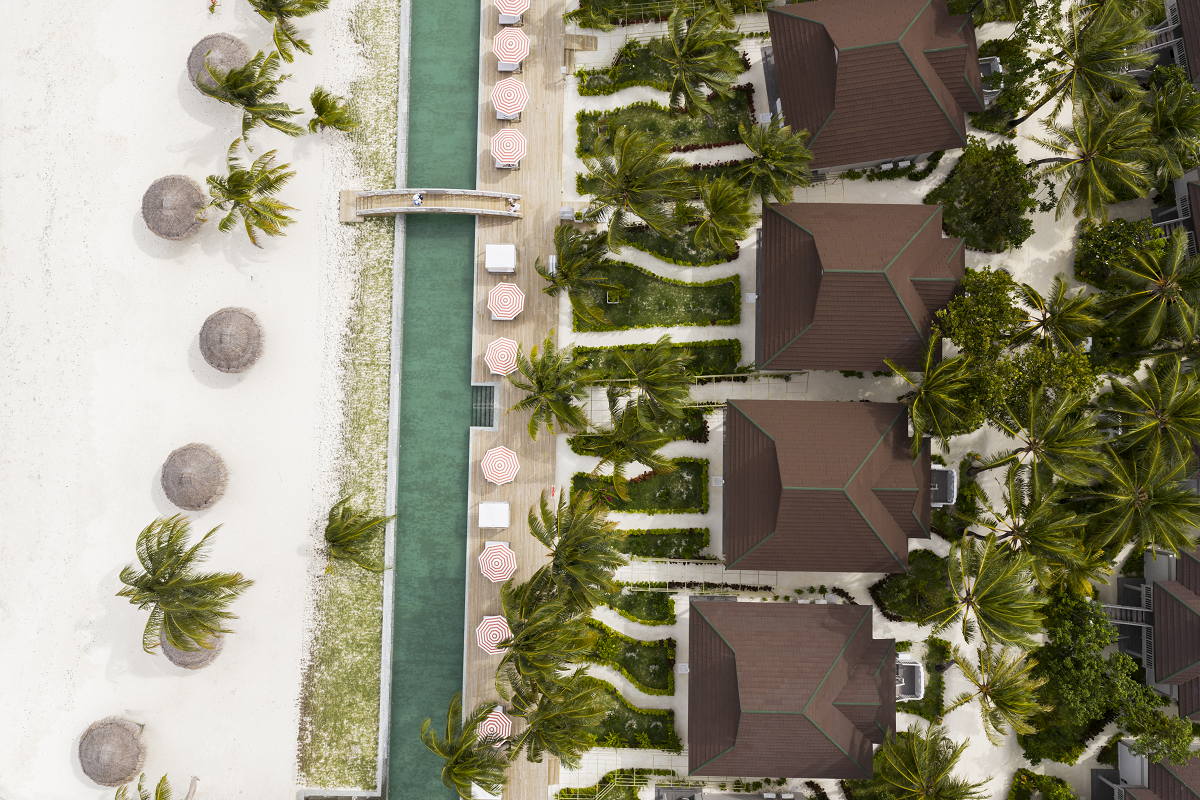
Image credit: Sun Siyam Olhuveli
HD: Beyond sourcing local materials, how does sustainability inform your long-term design decisions in fragile island ecosystems? And how do you balance luxury expectations with environmental and cultural sensitivity?
SS7: Sustainability begins with minimising impact. Reducing land disturbance, avoiding overdevelopment, designing with the natural terrain and vegetation rather than against it. At a resort like Iru Fushi, the instinct should always be to showcase what is already there rather than impose something upon it. Working with local artisans and craftspeople reinforces that approach. It creates a guest experience that is embedded in the place, not imported into it. Luxury and environmental sensitivity are not competing values here. They are the same decision.
HD: Looking back, is there a design decision that fundamentally changed the direction of the project?
SS7: The commitment to less. Not minimalism as an aesthetic, but restraint as a philosophy. The decision to trust the materials, the light, and the landscape rather than layering on top of them. The rooms are where that is felt most clearly. Soft forms, organic lines, a quality of stillness that lets the views do their work. Everyone needs that kind of reset. We think these rooms make it possible.
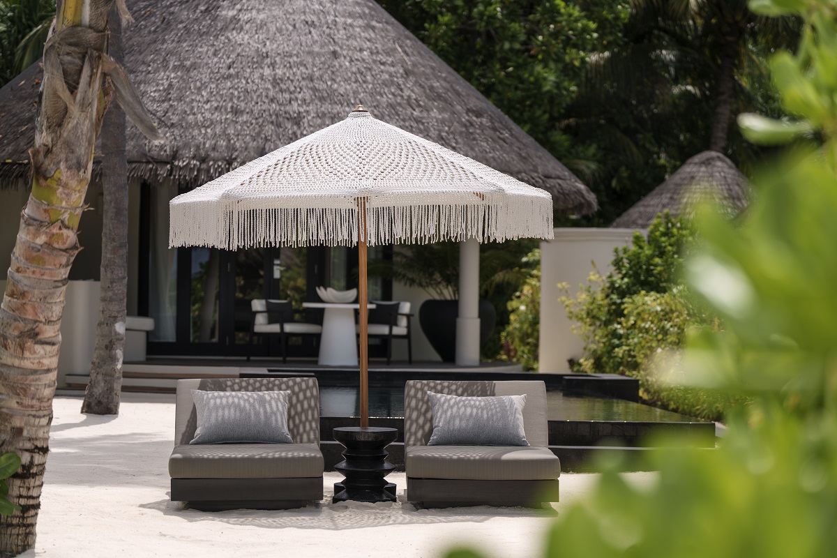
Image credit: Sun Siyam Iru Fushi
Finally – on a quickfire note…
Your favourite element of each design?
That’s a tricky one, but we are really proud of the softness and organic forms we’ve been able to achieve in the rooms. They really allow you to relax, switch off and enjoy the spectacular views – we all need that reset in life, and we think these rooms allow for that.
And the most challenging?
Watching everyone on holiday while we’re installing is often hard to watch! Although we feel incredibly lucky, but a dip in the pool wouldn’t go amiss! If only we could install from the pool!
Main image credit: Studio Sixty7